1.2 What is R and why do data scientists use it?
From your introductory reading from the Getting Ready chapter you were encouraged to think about defining data and the role of data scientists.
Data science, is an empirical discipline. It is the science of studying the “empirical phenomena of modeling methodologies” (Mount 2020). It is not, however, the study of the areas it is applied to, or even of the development of the tools it uses. Methods that are seen to practically work are further used and developed. This means they evolve. For this reason it’s generally unhelpful to think simply of right or wrong methods: instead try to think of better or worse; more or less appropriate to a problem or context.
Data science is an exciting discipline that allows you to turn raw data into understanding, insight, and knowledge. – Hadley Wickham
Moving on, R is an important tool that many data scientists use.
R is an open, purpose-designed, highly-extensible, statistical and data analysis programming language. It is interpreted rather than compiled. It is an example of what computer scientists refer to as a functional programming language i.e., based on mathematical functions. However, it is also possible to write imperative-style code (as per Java or C) using R so we might more usefully think of it as a hybrid language.
1.2.1 R and the R Ecosystem
R is an open source environment for statistical computing, data analysis and visualisation. It runs on a wide variety of computing platforms and its development is managed by the R Consortium. Back in 2012 Oracle estimated that there were over 2 million users13 and has been adopted in a wide range of application areas including biotech, finance, research and high technology industries.
Advantages of R include:
- designed by statisticians, as opposed to computer scientists, so it’s easy (easier?) to use
- has powerful data handling, wrangling and storage capabilities
- an extensive range of operators for calculations on lists, vectors and matrices
- a large, coherent and integrated collection of tools for data analysis
- extremely flexible graphical facilities to produce production quality images for data analysis and visualisation
- interactive dashboards
- access to a large, open community that facilitates collaboration and open science (Marwick, Boettiger, and Mullen 2018)
- easy integration with other languages e.g., C, C++, or FORTRAN for efficiency (since interpreted languages can have performance issues when processing very large data sets or computationally-intensive algorithms)
- widely used by researchers, so the latest algorithms and machine learning methods quickly become available to the entire Data Science community
Along with Python14, R is one of the most in demand skills for Data Science practitioners in industry, academia, and government. This chapter introduces some key concepts and skills to help you tackle real-world data analysis challenges using R.
The term “ecosystem” is intended to characterise R as a fully planned and coherent system, rather than an incremental accumulation of highly specific and inflexible tools, as is often the case with other data analysis software, particularly commercial software. See the R project homepage (Team 2022) for more details and (Sellers 2019) for a focus on the R ecosystem.
1.2.2 Demand for R programmers
How useful are R skills? An analysis of 2681 data scientist job postings from 8 North American cities on January 25th, 2020 indicated the top 10 tools required by the employers are:
Python (62%)
SQL (40%)
R (39%)
Spark (21%)
Cloud (20%)
Amazon Web Services (20%)
Java (19%)
Tensorflow (16%)
Hadoop (15%)
SAS (13%)
The data was collected by analysing online job adverts for data scientists on the Indeed website in North America. Note that Tools is a categorical and multi-valued attribute of a job listing, i.e., one listing could have zero or more tool categories associated, thus the percentages do not sum to 100%.
Since we’re thinking about data and data analysis, it would be helpful to visualise the data. Unfortunately, we don’t have access to the raw data so we will need to reproduce it. Therefore I have ‘scraped’15 some of the data from their article and plugged this into R (see below). Don’t worry about the coding details for the present.
# Reproduce the data from the January 2020 required tools/skills analysis for Data Scientists

percent <- c(62,40,39,21,20,20,19,16,15,13)
skill <- c("Python","SQL","R","Spark","Cloud","AWS","Java","TensorFlow","Hadoop","SAS")
# Generate the pie chart
pie(percent, main="Pie chart of in demand data scientist skills", labels=skill)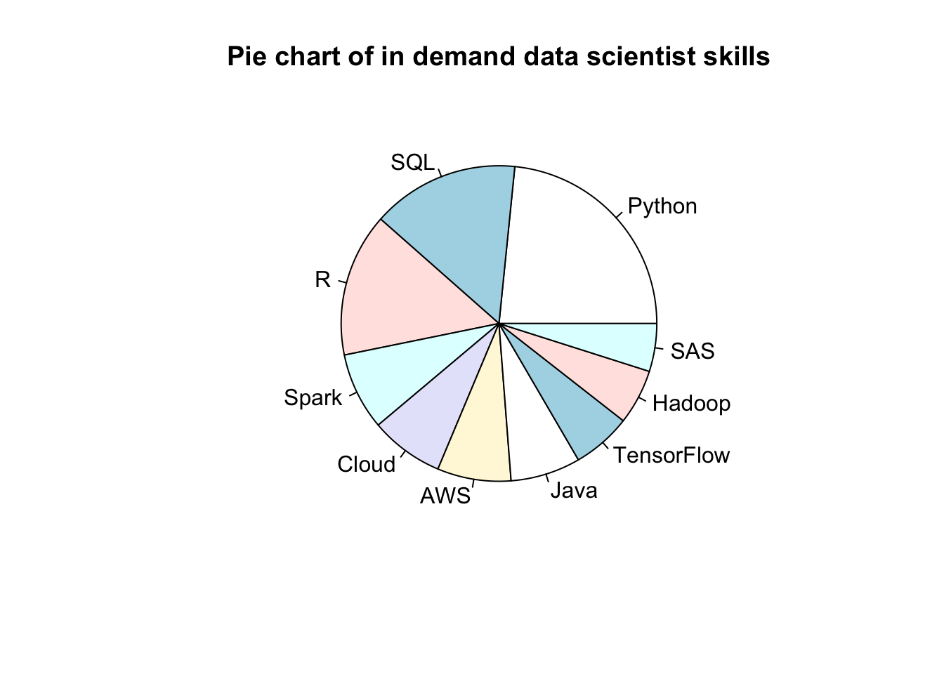
Many Data Scientists (e.g., (Few 2007) are quite critical of pie charts (where each segment is proportional to the overall contribution to the whole). What do you think is problematic about this chart? For instance, consider the impact of having multi-valued data. How might the data visualisation be improved?)
As an alternative, we can create a bar chart (where each bar represents a category and the height is proportional to the count or in our case the percentage). Since R and Python are skills of particular interest, I’ve added some differential shading. Again don’t worry unduly about the R code, but note that some comments, prefaced by #, have been added to try explain the overall purpose and also the more arcane parts of code. If you want to run it yourself you can either use the icon in the top righthand corner of the code block to copy and paste the R code into the Console Pane of RStudio or you can download the code embedded in an RMarkdown16 file from here.
# NB we have already reproduced the data: percent and tool come from the previous piechart chunk
# as the vectors percent and skill.

# Generate a bar chart
barplot(percent,
main="Bar chart of in-demand Data Scientist skills (Jan 2020)",
sub = "Source: https://j.mp/2Ga8CD1",
ylab="Percentage of listings that mention tool",
names.arg=skill,
cex.names = 0.6,                                     # shrinks text size so fits on x-axis
col="darkolivegreen",                                # colour of the bars
density=c(100, 50, 100, 50, 50, 50, 50, 50, 50, 50)) # Shades Python and R in a darker colour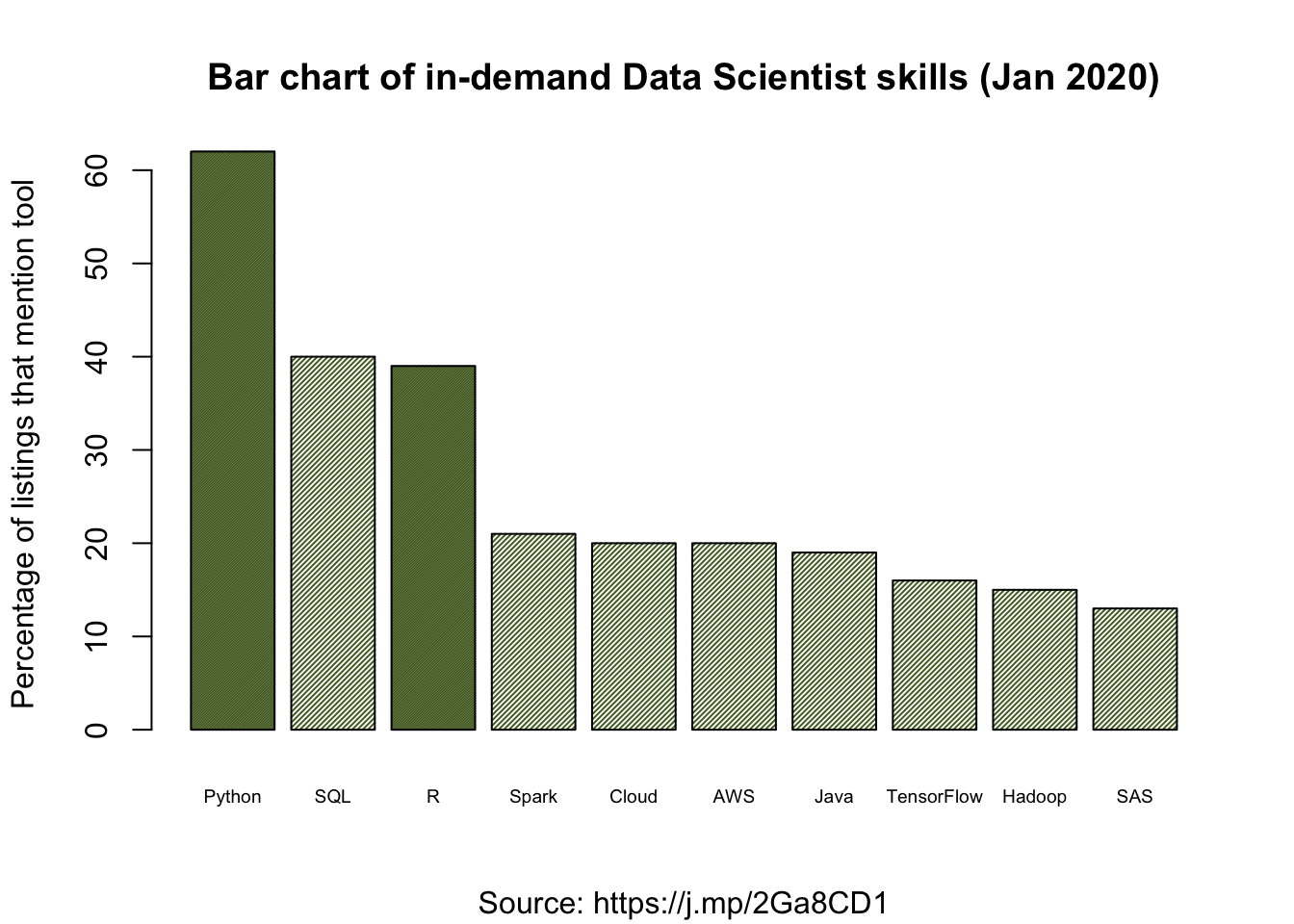
Probably you will consider this bar chart to be an improvement, but it’s not perfect. Can you think of any further improvements or clarifications? (Hint: some of the bars are quite hard to read off the exact proportion.) Remember that if the goal of Data Science is to communicate findings, then how we present information is of vital importance. For this reason we will return to this topic (Chapter 4) to dig deeper on data visualisation.
It’s important to look at the data critically. Here some of the categories seem to overlap or be quite non-specific e.g., “Cloud” and “Amazon Web Services”. Plus, the job listings selected from indeed might not be representative of all jobs, perhaps there are particular biases? Likewise, 2,681 listings sounds like a lot, but is it? Are there seasonal effects? Then perhaps the text scraping algorithm could introduce bias due to the terms it can, and cannot, recognise. Finally, 14% of the sampled job listings are excluded (since it is stated that only 86% of adverts identified skills).
1. What issues do you believe might be relevant when evaluating this data?
2. To what extent do these issues compromise our confidence in the results?
1.2.3 History of R
The R programming language was initially developed by Ross Ihaka and Robert Gentleman at the University of Auckland, New Zealand in the 1990s (Ihaka and Gentleman 1996), and is currently maintained by the R Development Core Team. Version 1.0.0 of R was released on February 29, 2000. At the time of writing (November, 2021) we are on version 4.1.2.
R was originally based upon the commercial statistical language S+ (and S its predecessor) but has subsequently been considerably extended. As an open source project, R has frequent releases along with a major annual release, typically in October. Make sure the version you use is at least 4.0.
There are two explanations for the name R. First, it follows from and is based on S and S+. Second, R is the shared first initial of the original developers Ross Ihaka and Robert Gentleman.
See also David Smith’s public talk at a satRdays 2020 workshop, where he examines 20 years of R history (the main part lasts about 16 minutes).
References
Current user levels are hard to judge but with say 25% annual growth this yields a 2024 level of the order of 29m.↩︎
There is a vocal, and to my mind not very fruitful, debate as to whether R or Python is ‘best’ for Data Science. You can achieve pretty much the same in either language and since R allows the integration of Python it can largely boil down to personal preference. Some people argue Python is better for machine learning and R for statistics, but again deep learning libraries such as Keras and TensorFlow can easily be accessed from R. In the end, since our focus is data, we have chosen R.↩︎
Scraping is to extract data from some human-readable output coming from another source, in this case from the text and graphics of a pdf report.↩︎
You will learn about RMarkdown files shortly in Section on Using RStudio.↩︎