Chapter 4 Prediction, R-squared, and Modeling
rm(list=ls()) # Caution: this clears the EnvironmentA prediction is an estimate of the value of \(y\) for a given value of \(x\), based on a regression model of the form shown in Equation \ref{eq:regmod4}. Goodness-of-fit is a measure of how well an estimated regression line approximates the data in a given sample. One such measure is the correlation coefficient between the predicted values of \(y\) for all \(x\)-s in the data file and the actual \(y\)-s. Goodness-of-fit, along with other diagnostic tests help determining the most suitable functional form of our regression equation, i.e., the most suitable mathematical relationship between \(y\) and \(x\).
\[\begin{equation} y_{i}=\beta_{1}+\beta_{2}x_{i}+e_{i} \label{eq:regmod4} \end{equation}\]4.1 Forecasting (Predicting a Particular Value)
Assuming that the expected values of the error term in Equation \ref{eq:regmod4} is zero, Equation \ref{eq:pred4} gives \(\hat{y}_{i}\), the predicted value of the expectation of \(y_{i}\) given \(x_{i}\), where \(b_{1}\) and \(b_{2}\) are the (least squares) estimates of the regression parameters \(\beta_{1}\) and \(\beta_{2}\).
\[\begin{equation} \hat{y}_{i}=b_{1}+b_{2}x_{i} \label{eq:pred4} \end{equation}\]The predicted value \(\hat{y}_{i}\) is a random variable, since it depends on the sample; therefore, we can calculate a confidence interval and test hypothesis about it, provided we can determine its distribution and variance. The prediction has a normal distribution, being a linear combination of two normally distributed random variables \(b_{1}\) and \(b_{2}\), and its variance is given by Equation \ref{eq:varf4}. Please note that the variance in Equation \ref{eq:varf4} is not the same as the one in Equation \ref{eq:varfood}; the former is the variance of the estimated expectation of \(y\), while the latter is the variance of a particular occurrence of \(y\). Let us call the latter the variance of the forecast error. Not surprisingly, the variance of the forecast error is greater than the variance of the predicted \(E(y|x)\).
As before, since we need to use an estimated variance, we use a \(t\)-distribution instead of a normal one. Equation \ref{eq:varf4} applies to any given \(x\), say \(x_{0}\), not only to those \(x\)-s in the dataset.
\[\begin{equation} \widehat{var(f_{i})}=\hat{\sigma}\,^2\left[ 1+\frac{1}{N}+\frac{(x_{i}-\bar{x})^2}{\sum_{j=1}^{N}{(x_{j}-\bar{x})^2}} \right], \label{eq:varf4} \end{equation}\]which can be reduced to
\[\begin{equation} \widehat{var(f_{i})}=\hat{\sigma}\,^2+\frac{\hat{\sigma}\,^2}{N}+(x_{i}-\bar{x})^2\widehat{var(b_{2})} \label{eq:varf41} \end{equation}\]Let’s determine a standard error for the food equation for a household earning $2000 a week, i.e., at \(x=x_{0}=20\), using Equation \ref{eq:varf41}; to do so, we need to retrieve \(var(b_{2})\) and \(\hat{\sigma}\), the standard error of regression from the regression output.
library(PoEdata)
data("food")
alpha <- 0.05
x <- 20
xbar <- mean(food$income)
m1 <- lm(food_exp~income, data=food)
b1 <- coef(m1)[[1]]
b2 <- coef(m1)[[2]]
yhatx <- b1+b2*x
sm1 <- summary(m1)
df <- df.residual(m1)
tcr <- qt(1-alpha/2, df)
N <- nobs(m1)   #number of observations, N
N <- NROW(food) #just another way of finding N
varb2 <- vcov(m1)[2, 2]
sighat2 <- sm1$sigma^2 # estimated variance
varf <- sighat2+sighat2/N+(x-xbar)^2*varb2 #forecast variance
sef <- sqrt(varf) #standard error of forecast
lb <- yhatx-tcr*sef
ub <- yhatx+tcr*sef
The result is the confidence interval for the forecast \((104.13, 471.09)\), which is, as expected, larger than the confidence interval of the estimated expected value of \(y\) based on Equation \ref{eq:varfood}.
Let us calculate confidence intervals of the forecast for all the observations in the sample and draw the upper and lower limits together with the regression line. Figure 4.1 shows the confidence interval band about the regression line.
sef <- sqrt(sighat2+sighat2/N+(food$income-xbar)^2*varb2)
yhatv <- fitted.values(m1)
lbv <- yhatv-tcr*sef
ubv <- yhatv+tcr*sef
xincome <- food$income
dplot <- data.frame(xincome, yhatv, lbv, ubv)
dplotord <- dplot[order(xincome), ]
xmax <- max(dplotord$xincome)
xmin <- min(dplotord$xincome)
ymax <- max(dplotord$ubv)
ymin <- min(dplotord$lbv)
plot(dplotord$xincome, dplotord$yhatv,
     xlim=c(xmin, xmax),
     ylim=c(ymin, ymax),
     xlab="income", ylab="food expenditure",
     type="l")
lines(dplotord$ubv~dplotord$xincome, lty=2)
lines(dplotord$lbv~dplotord$xincome, lty=2)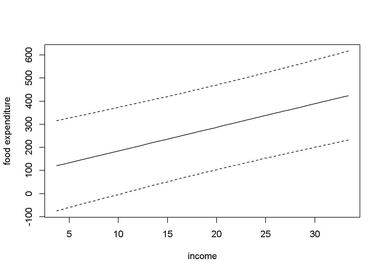
Figure 4.1: Forecast confidence intervals for the \(food\) simple regression
A different way of finding point and interval estimates for the predicted \(E(y|x)\) and forecasted \(y\) (please see the distinction I mentioned above) is to use the predict() function in R. This function requires that the values of the independent variable where the prediction (or forecast) is intended have a data frame structure. The next example shows in parallel point and interval estimates of predicted and forecasted food expenditures for income is $2000. As I have pointed out before, the point estimate is the same for both prediction and forecast, but the interval estimates are very different.
incomex=data.frame(income=20)
predict(m1, newdata=incomex, interval="confidence",level=0.95)| fit | lwr | upr |
|---|---|---|
| 287.609 | 258.907 | 316.311 |
predict(m1, newdata=incomex, interval="prediction",level=0.95)| fit | lwr | upr |
|---|---|---|
| 287.609 | 104.132 | 471.085 |
Let us now use the predict() function to replicate Figure 4.1. The result is Figure 4.2, which shows, besides the interval estimation band, the points in the dataset. (I will create new values for income just for the purpose of plotting.)
xmin <- min(food$income)
xmax <- max(food$income)
income <- seq(from=xmin, to=xmax)
ypredict <- predict(m1, newdata=data.frame(income),
                  interval="confidence")
yforecast <- predict(m1, newdata=data.frame(income),
                  interval="predict")
matplot(income, cbind(ypredict[,1], ypredict[,2], ypredict[,3],
                      yforecast[,2], yforecast[,3]),
        type ="l", lty=c(1, 2, 2, 3, 3),
        col=c("black", "red", "red", "blue", "blue"),
        ylab="food expenditure", xlab="income")
points(food$income, food$food_exp)
legend("topleft",
        legend=c("E[y|x]", "lwr_pred", "upr_pred",
                "lwr_forcst","upr_forcst"),
        lty=c(1, 2, 2, 3, 3),
        col=c("black", "red", "red", "blue", "blue")
        )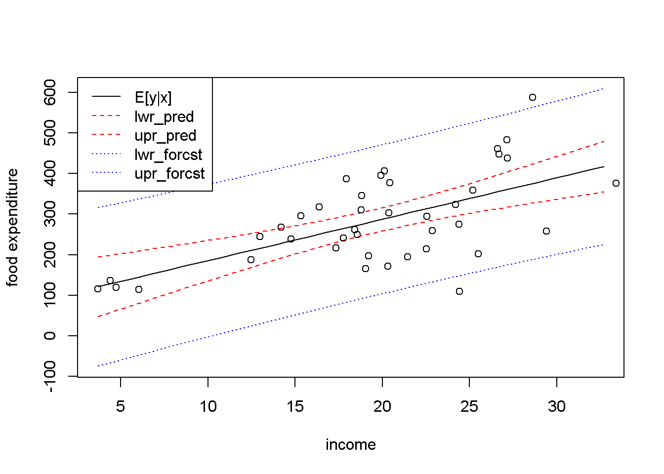
Figure 4.2: Predicted and forecasted bands for the \(food\) dataset
Figure 4.2 presents the predicted and forecasted bands on the same graph, to show that they have the same point estimates (the black, solid line) and that the forecasted band is much larger than the predicted one. Put another way, you may think about the distinction between the two types of intervals that we called prediction and forecast as follows: the prediction interval is not supposed to include, say, 95 percent of the points, but to include the regression line, \(E(y|x)\), with a probability of 95 percent; the forecasted interval, on the other hand, should include any true point with a 95 percent probability.
4.2 Goodness-of-Fit
The total variation of \(y\) about its sample mean, \(SST\), can be decomposed in variation about the regression line, \(SSE\), and variation of the regression line about the mean of \(y\), \(SSR\), as Equation \ref{eq:sst4} shows.
\[\begin{equation} SST=SSR+SSE \label{eq:sst4} \end{equation}\]The coefficient of determination, \(R^2\), is defined as the proportion of the variance in \(y\) that is explained by the regression, \(SSR\), in the total variation in \(y\), \(SST\). Dividing both sides of the Equation \ref{eq:sst4} by \(SST\) and re-arranging terms gives a formula to calculate \(R^2\), as shown in Equation \ref{eq:rsqformula4}.
\[\begin{equation} R^2=\frac{SSR}{SST}=1-\frac{SSE}{SST} \label{eq:rsqformula4} \end{equation}\]\(R^2\) takes values between \(0\) and \(1\), with higher values showing a closer fit of the regression line to the data. In \(R\), the value of \(R^2\) can be retrieved from the summary of the regression model under the name r.squared; for instance, in our food example, \(R^2=0.385\). \(R^2\) is also printed as part of the summary of a regression model, as the following code sequence shows. (The parentheses around a command tells \(R\) to print the result.)
(rsq <- sm1$r.squared) #or## [1] 0.385002sm1 #prints the summary of regression model m1##
## Call:
## lm(formula = food_exp ~ income, data = food)
##
## Residuals:
## Min 1Q Median 3Q Max
## -223.03 -50.82 -6.32 67.88 212.04
##
## Coefficients:
## Estimate Std. Error t value Pr(>|t|)
## (Intercept) 83.42 43.41 1.92 0.062 .
## income 10.21 2.09 4.88 0.000019 ***
## ---
## Signif. codes: 0 '***' 0.001 '**' 0.01 '*' 0.05 '.' 0.1 ' ' 1
##
## Residual standard error: 89.5 on 38 degrees of freedom
## Multiple R-squared: 0.385, Adjusted R-squared: 0.369
## F-statistic: 23.8 on 1 and 38 DF, p-value: 0.0000195If you need the sum of squared errors, \(SSE\), or the sum of squares due to regression, \(SSR\), use the anova function, which has the structure shown in Table 4.1.
anov <- anova(m1)
dfr <- data.frame(anov)
kable(dfr,
caption="Output generated by the `anova` function")| Df | Sum.Sq | Mean.Sq | F.value | Pr..F. | |
|---|---|---|---|---|---|
| income | 1 | 190627 | 190626.98 | 23.7888 | 0.000019 |
| Residuals | 38 | 304505 | 8013.29 | NA | NA |
Table 4.1 indicates that \(SSE=\) anov[2,2] \(=3.045052\times 10^{5}\), \(SSR=\) anov[1,2] \(=1.90627\times 10^{5}\), and \(SST=\) anov[1,2]+anov[2,2] \(=4.951322\times 10^{5}\). In our simple regression model, the sum of squares due to regression only includes the variable income. In multiple regression models, which are models with more than one independent variable, the sum of squares due to regression is equal to the sum of squares due to all independent variables. The anova results in Table 4.1 include other useful information: the number of degrees of freedom, anov[2,1] and the estimated variance \(\hat{\sigma}\,^2=\)anov[2,3].
4.3 Linear-Log Models
Non-linear functional forms of regression models are useful when the relationship between two variables seems to be more complex than the linear one. One can decide to use a non-linear functional form based on a mathematical model, reasoning, or simply inspecting a scatter plot of the data. In the food expenditure model, for example, it is reasonable to believe that the amount spent on food increases faster at lower incomes than at higher incomes. In other words, it increases at a decreasing rate, which makes the regression curve flatten out at higher incomes.
What function could one use to model such a relationship? The logarithmic function fits this profile and, as it turns out, it is relatively easy to interpret, which makes it very popular in econometric models. The general form of a linear-log econometric model is provided in Equation \ref{eq:linlog4}.
\[\begin{equation} y_{i}=\beta_{1}+\beta_{2}log(x_{i})+e_{i} \label{eq:linlog4} \end{equation}\]The marginal effect of a change in \(x\) on \(y\) is the slope of the regression curve and is given by Equation \ref{eq:linlogslope4}; unlike in the linear form, it depends on \(x\) and it is, therefore, only valid for small changes in \(x\).
\[\begin{equation} \frac{dy}{dx}=\frac{\beta_{2}}{x} \label{eq:linlogslope4} \end{equation}\]Related to the linear-log model, another measure of interest in economics is the semi-elasticity of \(y\) with respect to \(x\), which is given by Equation \ref{eq:linlogelast4}. Semi-elasticity suggests that a change in \(x\) of 1% changes \(y\) by \(\beta_{2}/100\) units of \(y\). Since semi-elasticity also changes when \(x\) changes, it should only be determined for small changes in \(x\).
\[\begin{equation} dy=\frac{\beta_{2}}{100}(\%\Delta x) \label{eq:linlogelast4} \end{equation}\]Another quantity that might be of interest is the elasticity of \(y\) with respect to \(x\), which is given by Equation \ref{eq:linlogelast41} and indicates that a one percent increase in \(x\) produces a \((\beta_{2}/y)\) percent change in \(y\).
\[\begin{equation} \% \Delta y = \frac{\beta_{2}}{y}(\% \Delta x) \label{eq:linlogelast41} \end{equation}\]Let us estimate a linear-log model for the food dataset, draw the regression curve, and calculate the marginal effects for some given values of the dependent variable.
mod2 <- lm(food_exp~log(income), data=food)
tbl <- data.frame(xtable(mod2))
kable(tbl, digits=5,
caption="Linear-log model output for the *food* example")| Estimate | Std..Error | t.value | Pr…t.. | |
|---|---|---|---|---|
| (Intercept) | -97.1864 | 84.2374 | -1.15372 | 0.25582 |
| log(income) | 132.1658 | 28.8046 | 4.58836 | 0.00005 |
b1 <- coef(mod2)[[1]]
b2 <- coef(mod2)[[2]]
pmod2 <- predict(mod2, newdata=data.frame(income),
                interval="confidence")
plot(food$income, food$food_exp, xlab="income",
     ylab="food expenditure")
lines(pmod2[,1]~income, lty=1, col="black")
lines(pmod2[,2]~income, lty=2, col="red")
lines(pmod2[,3]~income, lty=2, col="red")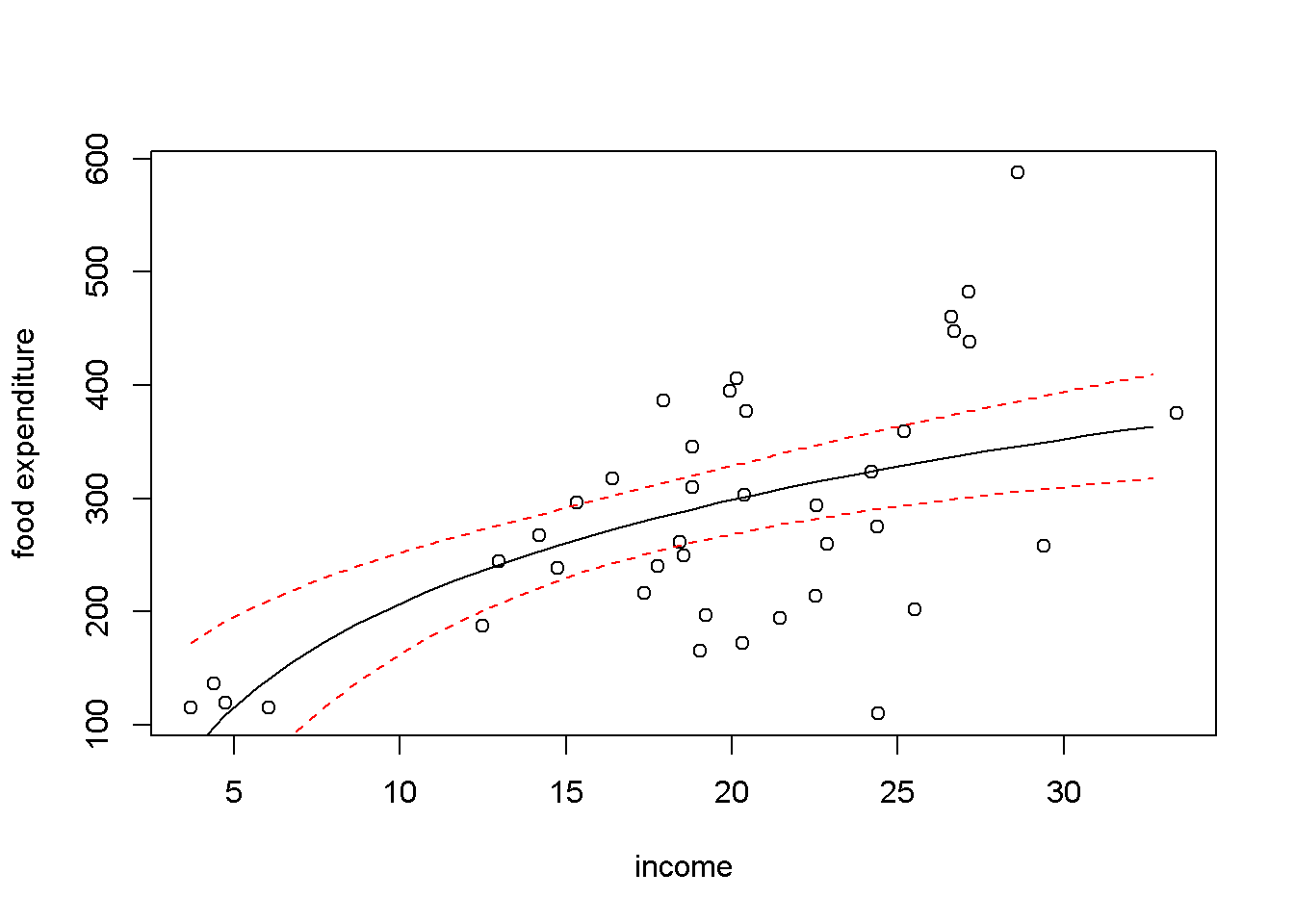
Figure 4.3: Linear-log representation for the \(food\) data
x <- 10 #for a household earning #1000 per week
y <- b1+b2*log(x)
DyDx <- b2/x    #marginal effect
DyPDx <- b2/100 #semi-elasticity
PDyPDx <- b2/y  #elasticity
The results for an income of $1000 are as follows: \(dy/dx =13.217\), which indicates that an increase in income of $100 (i.e., one unit of \(x\)) increases expenditure by $ \(13.217\); for a 1% increase in income, that is, an increase of $10, expenditure increases by $ \(1.322\); and, finally, for a 1% increase in income expenditure incrases by \(0.638\)%.
4.4 Residuals and Diagnostics
Regression results are reliable only to the extent to which the underlying assumptions are met. Plotting the residuals and calculating certain test statistics help deciding whether assumptions such as homoskedasticity, serial correlation, and normality of the errors are not violated. In R, the residuals are stored in the vector residuals of the regression output.
ehat <- mod2$residuals
plot(food$income, ehat, xlab="income", ylab="residuals")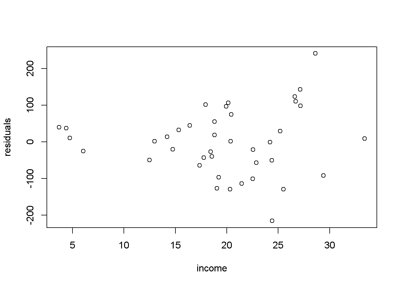
Figure 4.4: Residual plot for the \(food\) linear-log model
Figure 4.4 shows the residuals of the of the linear-log equation of the food expenditure example. One can notice that the spread of the residuals seems to be higher at higher incomes, which may indicate that the heteroskedasticity assumption is violated.
Let us draw a residual plot generated with a simulated model that satisfies the regression assumptions. The data generating process is given by Equation \ref{eq:residsim4}, where \(x\) is a number between \(0\) and \(10\), randomly drawn from a uniform distribution, and the error term is randomly drawn from a standard normal distribution. Figure 4.5 illustrates this simulated example.
\[\begin{equation} y_{i}=1+x_{i}+e_{i}, \;\;\; i=1,...,N \label{eq:residsim4} \end{equation}\]set.seed(12345) #sets the seed for the random number generator
x <- runif(300, 0, 10)
e <- rnorm(300, 0, 1)
y <- 1+x+e
mod3 <- lm(y~x)
ehat <- resid(mod3)
plot(x,ehat, xlab="x", ylab="residuals")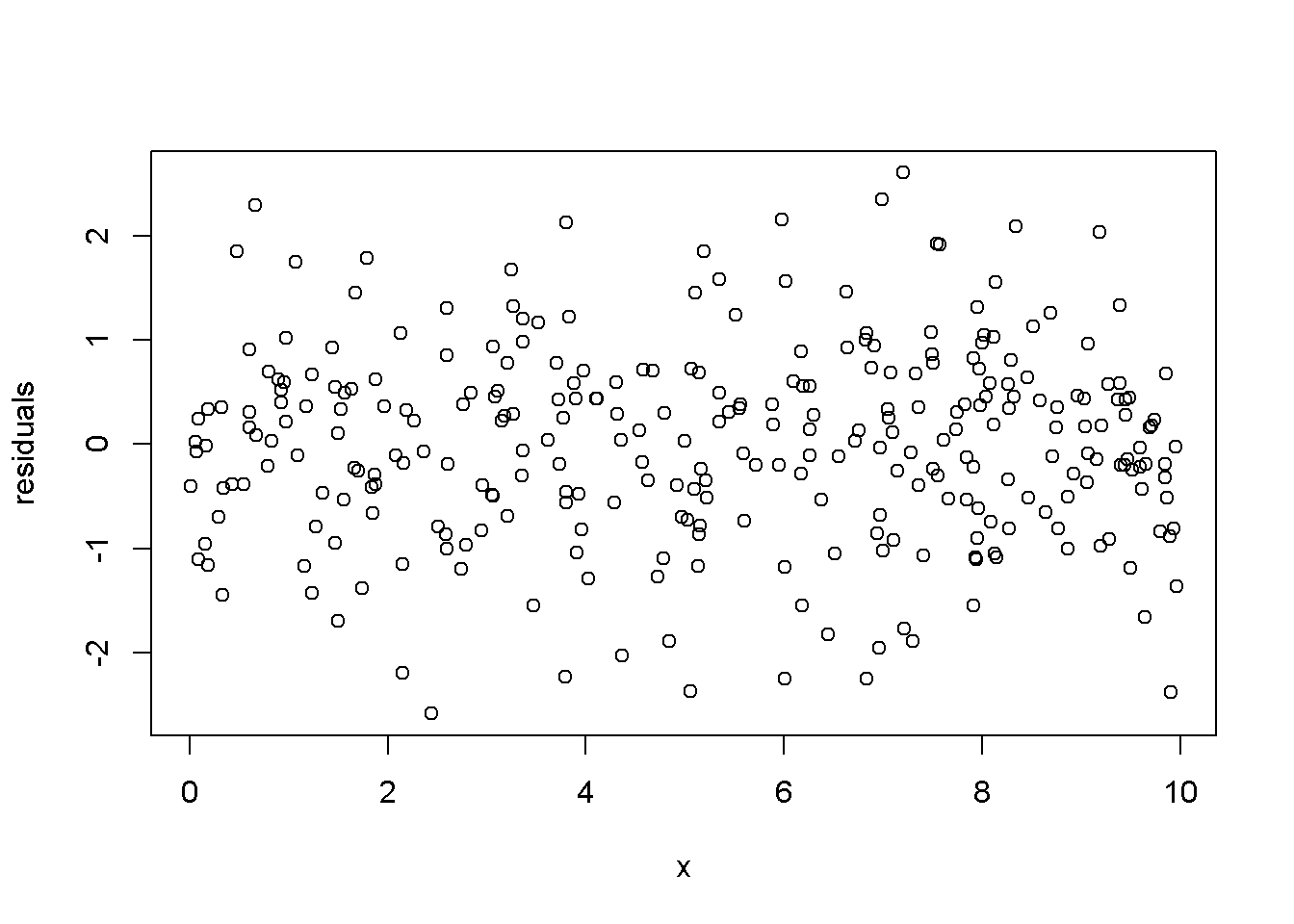
Figure 4.5: Residuals generated by a simulated regression model that satisfies the regression assumptions
The next example illustrates how the residuals look like when a linear functional form is used when the true relationship is, in fact, quadratic. The data generating equation is given in Equation \ref{eq:quadsim4}, where \(x\) is the same uniformly distributed between \(-2.5\) and \(2.5\)), and \(e \sim N(0,4)\). Figure 4.6 shows the residuals from estimating an incorrectly specified, linear econometric model when the correct specification should be quadratic.
\[\begin{equation} y_{i}=15-4x_{i}^2+e_{i}, \;\;\; i=1,...,N \label{eq:quadsim4} \end{equation}\]set.seed(12345)
x <- runif(1000, -2.5, 2.5)
e <- rnorm(1000, 0, 4)
y <- 15-4*x^2+e
mod3 <- lm(y~x)
ehat <- resid(mod3)
ymi <- min(ehat)
yma <- max(ehat)
plot(x, ehat, ylim=c(ymi, yma),
xlab="x", ylab="residuals",col="grey")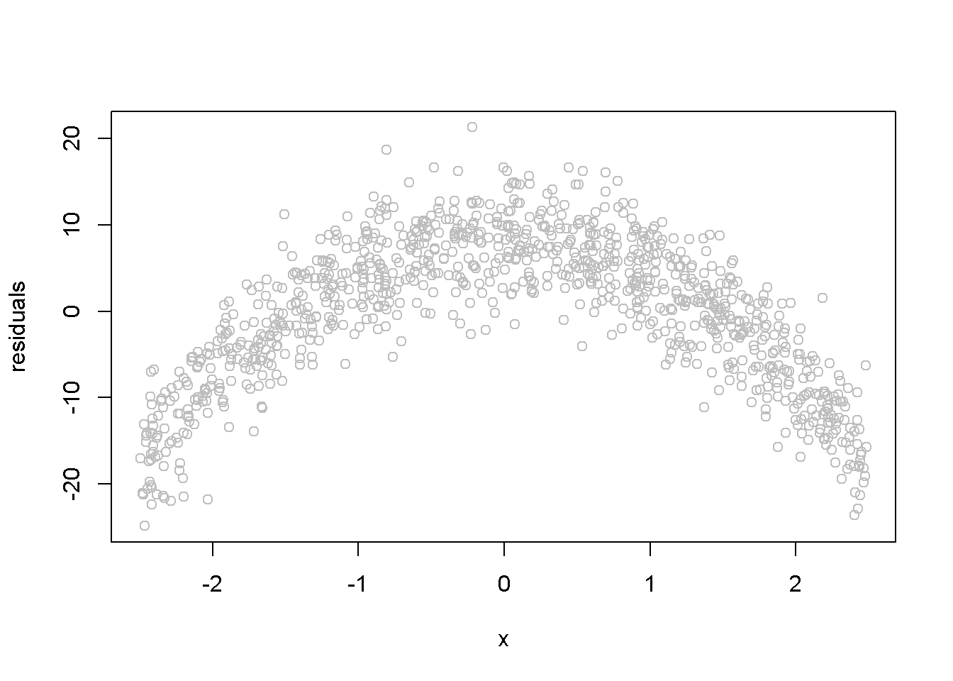
Figure 4.6: Simulated quadratic residuals from an incorrectly specified econometric model
Another assumption that we would like to test is the normality of the residuals, which assures reliable hypothesis testing and confidence intervals even in small samples. This assumption can be assessed by inspecting a histogram of the residuals, as well as performing a Jarque-Bera test, for which the null hypothesis is “Series is normally distributed”. Thus, a small \(p\)-value rejects the null hypothesis, which means the series fails the normality test. The Jarque-Bera test requires installing and loading the package tseries in R. Figure 4.7 shows a histogram and a superimposed normal distribution for the linear food expenditure model.
library(tseries)
mod1 <- lm(food_exp~income, data=food)
ehat <- resid(m1)
ebar <- mean(ehat)
sde <- sd(ehat)
hist(ehat, col="grey", freq=FALSE, main="",
     ylab="density", xlab="ehat")
curve(dnorm(x, ebar, sde), col=2, add=TRUE,
      ylab="density", xlab="ehat")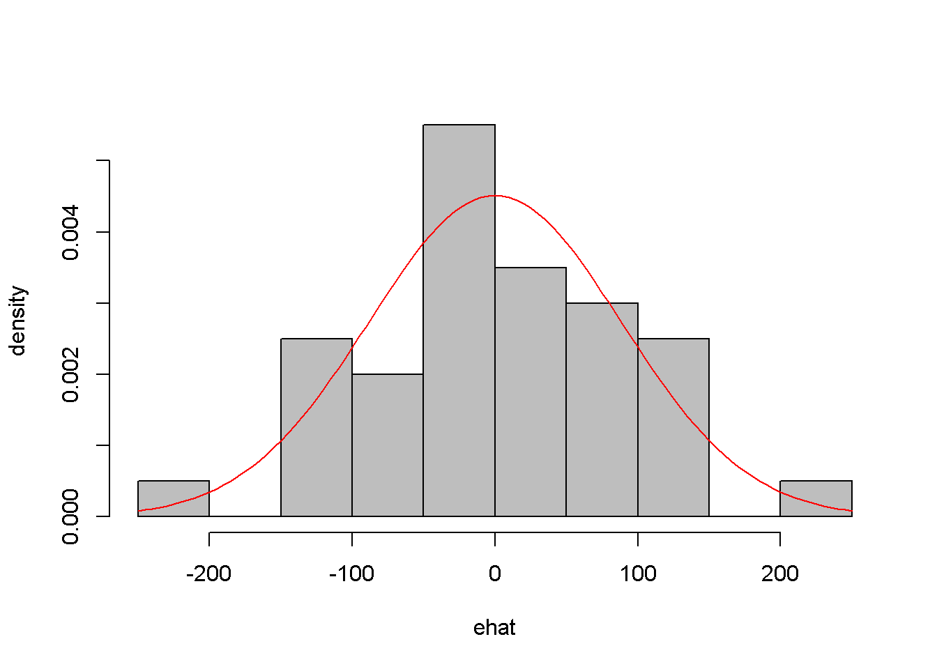
Figure 4.7: Histogram of residuals from the \(food\) linear model
jarque.bera.test(ehat) #(in package 'tseries')##
## Jarque Bera Test
##
## data: ehat
## X-squared = 0.06334, df = 2, p-value = 0.969While the histogram in Figure 4.7 may not strongly support one conclusion or another about the normlity of ehat, the Jarque-Bera test is unambiguous: there is no evidence against the normality hypothesis.
4.5 Polynomial Models
Regression models may include quadratic or cubic terms to better describe the nature of the dadta. The following is an example of quadratic and cubic model for thewa_wheat dataset, which gives annual wheat yield in tonnes per hectare in Greenough Shire in Western Australia over a period of 48 years. The linear model is given in Equation \ref{eq:wheateq4}, where the subscript \(t\) indicates the observation period.
\[\begin{equation}
yield_{t}=\beta_{1}+\beta_{2}time_{t}+e_{t}
\label{eq:wheateq4}
\end{equation}\]
library(PoEdata)
data("wa_wheat")
mod1 <- lm(greenough~time, data=wa_wheat)
ehat <- resid(mod1)
plot(wa_wheat$time, ehat, xlab="time", ylab="residuals")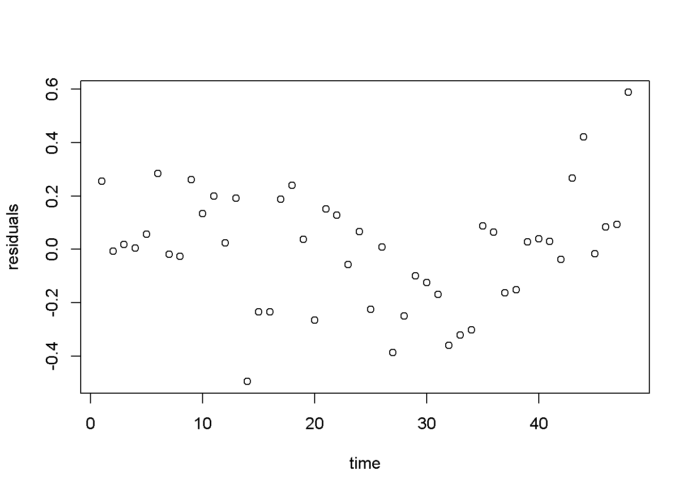
Figure 4.8: Residuals from the linear \(wheat yield\) model
Figure 4.8 shows a pattern in the residuals generated by the linear model, which may inspire us to think of a more appropriate functional form, such as the one in Equation \ref{eq:cubewheat4}.
\[\begin{equation} yield_{t}=\beta_{1}+\beta_{2}time_{t}^3+e_{t} \label{eq:cubewheat4} \end{equation}\]Please note in the following code sequence the use of the function I(), which is needed in R when an independent variable is transformed by mathematical operators. You do not need the operator I() when an independent variable is transformed through a function such as \(log(x)\). In our example, the transformation requiring the use of I() is raising time to the power of \(3\). Of course, you can create a new variable, x3=x^3 if you wish to avoid the use of I() in a regression equation.
mod2 <- lm(wa_wheat$greenough~I(time^3), data=wa_wheat)
ehat <- resid(mod2)
plot(wa_wheat$time, ehat, xlab="time", ylab="residuals")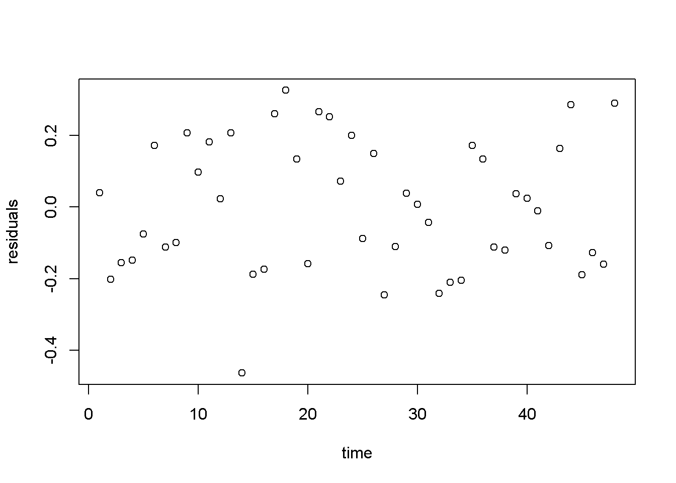
Figure 4.9: Residuals from the cubic \(wheat yield\) model
Figure 4.9 displays a much better image of the residuals than Figure 4.8, since the residuals are more evenly spread about the zero line.
4.6 Log-Linear Models
Transforming the dependent variable with the \(log()\) function is useful when the variable has a skewed distribution, which is in general the case with amounts that cannot be negative. The \(log()\) transformation often makes the distribution closer to normal. The general log-linear model is given in Equation \ref{eq:loglin4}. \[\begin{equation} log(y_{i}) = \beta_{1}+ \beta_{2}x_{i}+e_{i} \label{eq:loglin4} \end{equation}\]The following formulas are easily derived from the log-linear Equation \ref{eq:loglin4}. The semi-elasticity has here a different interpretation than the one in the linear-log model: here, an increase in \(x\) by one unit (of \(x\)) produces a change of \(100b_{2}\) percent in \(y\). For small changes in \(x\), the amount \(100b_{2}\) in the log-linear model can also be interpreted as the growth rate in \(y\) (corresponding to a unit increase in \(x\)). For instance, if \(x\) is time, then \(100b_{2}\) is the growth rate in \(y\) per unit of time.
- Prediction: \(\hat{y}_{n}=exp(b_{1}+b_{2}x)\), or \(\hat{y}_{c}=exp(b_{1}+b_{2}x+\frac{\hat{\sigma}^2}{2})\), with the “natural” predictor \(\hat{y}_{n}\) to be used in small samples and the “corrected” predictor, \(\hat{y}_{c}\), in large samples
- Marginal effect (slope): \(\frac{dy}{dx}=b_{2}y\)
- Semi-elasticity: \(\%\Delta y = 100b_{2}\Delta x\)
Let us do these calculations first for the yield equation using the wa_wheat dataset.
mod4 <- lm(log(greenough)~time, data=wa_wheat)
smod4 <- summary(mod4)
tbl <- data.frame(xtable(smod4))
kable(tbl, caption="Log-linear model for the *yield* equation")| Estimate | Std..Error | t.value | Pr…t.. | |
|---|---|---|---|---|
| (Intercept) | -0.343366 | 0.058404 | -5.87914 | 0 |
| time | 0.017844 | 0.002075 | 8.59911 | 0 |
Table 4.3 gives \(b_{2}=0.017844\), which indicates that the rate of growth in wheat production has increased at an average rate of approximately \(1.78\) percent per year.
The wage log-linear equation provides another example of calculating a growth rate, but this time the independent variable is not \(time\), but \(education\). The predictions and the slope are calculated for \(educ=12\) years.
data("cps4_small", package="PoEdata")
xeduc <- 12
mod5 <- lm(log(wage)~educ, data=cps4_small)
smod5 <- summary(mod5)
tabl <- data.frame(xtable(smod5))
kable(tabl, caption="Log-linear 'wage' regression output")| Estimate | Std..Error | t.value | Pr…t.. | |
|---|---|---|---|---|
| (Intercept) | 1.609444 | 0.086423 | 18.6229 | 0 |
| educ | 0.090408 | 0.006146 | 14.7110 | 0 |
b1 <- coef(smod5)[[1]]
b2 <- coef(smod5)[[2]]
sighat2 <- smod5$sigma^2
g <- 100*b2               #growth rate
yhatn <- exp(b1+b2*xeduc) #"natural" predictiction
yhatc <- exp(b1+b2*xeduc+sighat2/2) #corrected prediction
DyDx <- b2*yhatn          #marginal effect
Here are the results of these calculations: “natural” prediction \(\hat{y}_{n}=14.796\); corrected prediction, \(\hat{y}_{c}=16.996\); growth rate \(g=9.041\); and marginal effect \(\frac{dy}{dx}=1.34\). The growth rate indicates that an increase in education by one unit (see the data description using ?cps4_small) increases hourly wage by \(9.041\) percent.
Figure 4.10 presents the “natural” and the “corrected” regression lines for the wage equation, together with the actual data points.
education=seq(0,22,2)
yn <- exp(b1+b2*education)
yc <- exp(b1+b2*education+sighat2/2)
plot(cps4_small$educ, cps4_small$wage,
     xlab="education", ylab="wage", col="grey")
lines(yn~education, lty=2, col="black")
lines(yc~education, lty=1, col="blue")
legend("topleft", legend=c("yc","yn"),
       lty=c(1,2), col=c("blue","black"))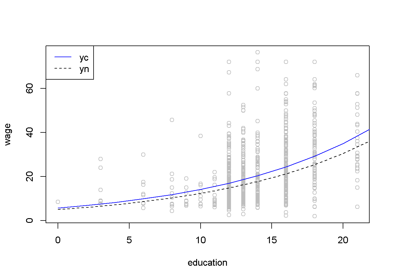
Figure 4.10: The ‘normal’ and ‘corrected’ regression lines in the log-linear \(wage\) equation
The regular \(R^2\) cannot be used to compare two regression models having different dependent variables such as a linear-log and a log-linear models; when such a comparison is needed, one can use the general \(R^2\), which is \(R_{g}^2=\lbrack corr(y, \hat{y} \rbrack ^2\). Let us calculate the generalized \(R^2\) for the quadratic and the log-linear wage models.
mod4 <- lm(wage~I(educ^2), data=cps4_small)
yhat4 <- predict(mod4)
mod5 <- lm(log(wage)~educ, data=cps4_small)
smod5 <- summary(mod5)
b1 <- coef(smod5)[[1]]
b2 <- coef(smod5)[[2]]
sighat2 <- smod5$sigma^2
yhat5 <- exp(b1+b2*cps4_small$educ+sighat2/2)
rg4 <- cor(cps4_small$wage, yhat4)^2
rg5 <- cor(cps4_small$wage,yhat5)^2
The quadratic model yields \(R_{g}^2=0.188\), and the log-linear model yields \(R_{g}^2=0.186\); since the former is higher, we conclude that the quadratic model is a better fit to the data than the log-linear one. (However, other tests of how the two models meet the assumptions of linear refgression may reach a different conclusion; \(R^2\) is only one of the model selection criteria.)
To determne a forecast interval estimate in the log-linear model, we first construct the interval in logs using the natural predictor \(\hat{y}_{n}\), then take antilogs of the interval limits. The forecasting error is the same as before, given in Equation \ref{eq:varf41}. The following calculations use an education level equal to 12 and \(\alpha=0.05\).
# The *wage* log-linear model
# Prediction interval for educ = 12
alpha <- 0.05
xeduc <- 12
xedbar <- mean(cps4_small$educ)
mod5 <- lm(log(wage)~educ, data=cps4_small)
b1 <- coef(mod5)[[1]]
b2 <- coef(mod5)[[2]]
df5 <- mod5$df.residual
N <- nobs(mod5)
tcr <- qt(1-alpha/2, df=df5)
smod5 <- summary(mod5)
varb2 <- vcov(mod5)[2,2]
sighat2 <- smod5$sigma^2
varf <- sighat2+sighat2/N+(xeduc-xedbar)^2*varb2
sef <- sqrt(varf)
lnyhat <- b1+b2*xeduc
lowb <- exp(lnyhat-tcr*sef)
upb <- exp(lnyhat+tcr*sef)
The result is the confidence interval \((5.26, \; 41.62)\). Figure 4.11 shows a \(95\%\) confidence band for the log-linear wage model.
# Drawing a confidence band for the log-linear
# *wage* equation

xmin <- min(cps4_small$educ)
xmax <- max(cps4_small$educ)+2
education <- seq(xmin, xmax, 2)
lnyhat <- b1+b2*education
yhat <- exp(lnyhat)
varf <- sighat2+sighat2/N+(education-xedbar)^2*varb2
sef <- sqrt(varf)
lowb <- exp(lnyhat-tcr*sef)
upb <- exp(lnyhat+tcr*sef)
plot(cps4_small$educ, cps4_small$wage, col="grey",
     xlab="education", ylab="wage", ylim=c(0,100))
lines(yhat~education, lty=1, col="black")
lines(lowb~education, lty=2, col="blue")
lines(upb~education, lty=2, col="blue")
legend("topleft", legend=c("yhat", "lowb", "upb"),
       lty=c(1, 2, 2), col=c("black", "blue", "blue"))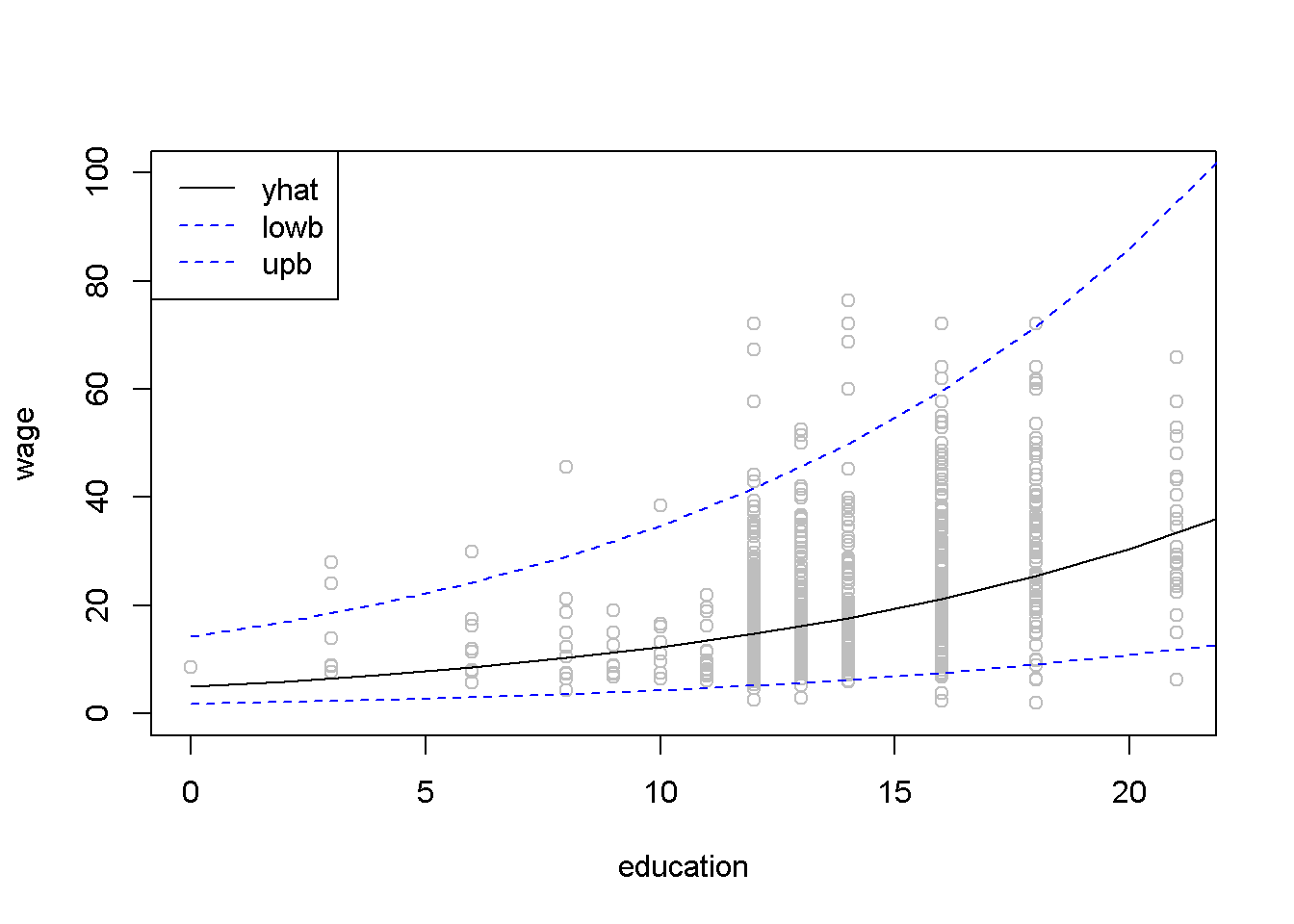
Figure 4.11: Confidence band for the log-linear \(wage\) equation
4.7 The Log-Log Model
The log-log model has the desirable property that the coefficient of the independent variable is equal to the (constant) elasticity of \(y\) with respect to \(x\). Therefore, this model is often used to estimate supply and demand equations. Its standard form is given in Equation \ref{eq:logloggen4}, where \(y\), \(x\), and \(e\) are \(N \times 1\) vectors. \[\begin{equation} log(y)=\beta_{1}+\beta_{2}log(x)+e \label{eq:logloggen4} \end{equation}\]# Calculating log-log demand for chicken
data("newbroiler", package="PoEdata")
mod6 <- lm(log(q)~log(p), data=newbroiler)
b1 <- coef(mod6)[[1]]
b2 <- coef(mod6)[[2]]
smod6 <- summary(mod6)
tbl <- data.frame(xtable(smod6))
kable(tbl, caption="The log-log poultry regression equation")| Estimate | Std..Error | t.value | Pr…t.. | |
|---|---|---|---|---|
| (Intercept) | 3.71694 | 0.022359 | 166.2362 | 0 |
| log(p) | -1.12136 | 0.048756 | -22.9992 | 0 |
Table 4.5 gives the log-log regression output. The coefficient on \(p\) indicates that an increase in price by \(1\%\) changes the quantity demanded by \(-1.121\%\).
# Drawing the fitted values of the log-log equation
ngrid <- 20 # number of drawing points
xmin <- min(newbroiler$p)
xmax <- max(newbroiler$p)
step <- (xmax-xmin)/ngrid # grid dimension
xp <- seq(xmin, xmax, step)
sighat2 <- smod6$sigma^2
yhatc <- exp(b1+b2*log(newbroiler$p)+sighat2/2)
yc <- exp(b1+b2*log(xp)+sighat2/2) #corrected q
plot(newbroiler$p, newbroiler$q, ylim=c(10,60),
     xlab="price", ylab="quantity")
lines(yc~xp, lty=1, col="black")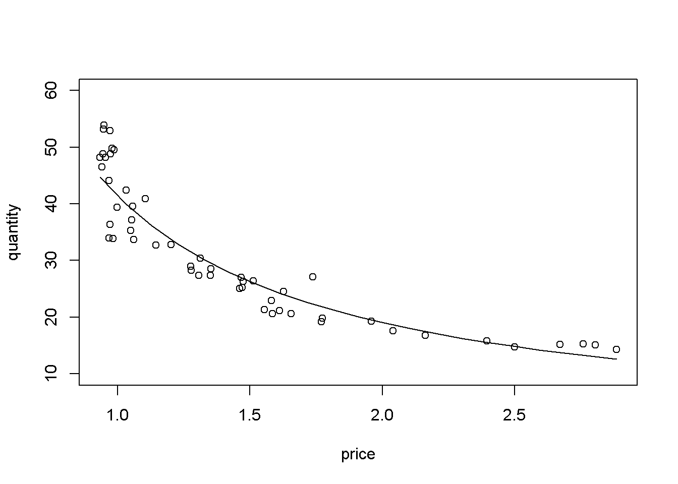
Figure 4.12: Log-log demand for chicken
# The generalized R-squared:
rgsq <- cor(newbroiler$q, yhatc)^2
The generalized \(R^2\), wich uses the corrected fitted values, is equal to \(0.8818\).