5.8 Multi-column layout (*)
Pandoc’s Markdown supports the multi-column layout for slides but not other types of documents. In this recipe, we show how to use the multi-column layout in normal HTML documents and LaTeX documents. This recipe was inspired by Atsushi Yasumoto’s solutions to the knitr issue https://github.com/yihui/knitr/issues/1743.
The recipe will be much simpler if you only need to consider HTML output, because arranging HTML elements side by side is relatively simple via CSS. It will be even simpler if you only need to arrange the text output of a code chunk side by side. Below is the first example:
---
output: html_document
---

```{r attr.source="style='display:inline-block;'", collapse=TRUE}
1:10  # a sequence from 1 to 10
10:1  # in the reverse order
```
The CSS attribute display: inline-block; means the output code blocks (i.e., the <pre> tags in HTML) should be displayed as inline elements. By default, these blocks are displayed as block-level elements (i.e., display: block;) and will occupy whole rows. The chunk option collapse = TRUE means the text output will be merged into the R source code block, so both the source and its text output will be placed in the same <pre> block.
If you want to arrange arbitrary content side by side in HTML output, you can use Pandoc’s fenced Div. The name “Div” comes from the HTML tag <div>, but you can interpret it as an arbitrary block or container. A Div starts and ends with three or more colons (e.g., :::). A Div with more colons can contain Divs with fewer colons. An important and useful feature of the fenced Div is that you can attach attributes to it. For example, you can apply the CSS attribute display: flex; to an outside container, so that the inside containers will be placed side by side:
---
output: html_document
---

:::: {style="display: flex;"}

::: {}
Here is the **first** Div.

```{r}
str(iris)
```
:::

::: {}
And this block will be put on the right:

```{r}
plot(iris[, -5])
```
:::

::::
In the above example, the outside Div (::::) contains two Divs (:::). You can certainly add more Divs inside. To learn more about the very powerful CSS attribute display: flex; (CSS Flexbox), you may read the guide at https://css-tricks.com/snippets/css/a-guide-to-flexbox/. The CSS Grid (display: grid;) is also very powerful and can be used in the above example, too. If you want to try it, you may change display: flex; to display: grid; grid-template-columns: 1fr 1fr; grid-column-gap: 10px;. See the guide at https://css-tricks.com/snippets/css/complete-guide-grid/ if you want to learn more about the grid layout.
It is trickier if you want the layout to work for both HTML and LaTeX output. We show a full example below that works for HTML documents, LaTeX documents, and Beamer presentations:
---
output:
  html_document:
    css: columns.css
  pdf_document:
    keep_tex: true
    includes:
      in_header: columns.tex
  beamer_presentation:
    keep_tex: true
    includes:
      in_header: columns.tex
---

# Two columns

Below is a Div containing three child Divs side by side. The Div
in the middle is empty, just to add more space between the left
and right Divs.

:::::: {.cols data-latex=""}

::: {.col data-latex="{0.55\textwidth}"}
```{r, echo=FALSE, fig.width=5, fig.height=4}
par(mar = c(4, 4, .2, .1))
plot(cars, pch = 19)
```
:::

::: {.col data-latex="{0.05\textwidth}"}
\
<!-- an empty Div (with a white space), serving as
a column separator -->
:::

::: {.col data-latex="{0.4\textwidth}"}
The figure on the left-hand side shows the `cars` data.

Lorem ipsum dolor sit amet, consectetur adipiscing elit, sed do
eiusmod tempor incididunt ut labore et dolore magna aliqua. Ut
enim ad minim veniam, quis nostrud exercitation ullamco laboris
nisi ut aliquip ex ea commodo consequat. Duis aute irure dolor
in reprehenderit in voluptate velit esse cillum dolore eu fugiat
nulla pariatur.
:::
::::::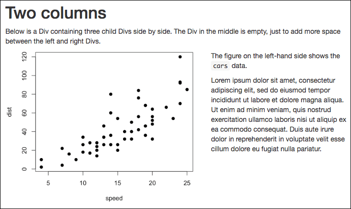
FIGURE 5.3: A two-column layout that works for HTML, LaTeX, and Beamer output.
Figure 5.3 shows the output. In this example, we used an outside Div with the class .cols and three inside Divs with the class .col. For HTML output, we introduced an external CSS file columns.css, in which we applied the Flexbox layout to the outside Div so the inside Divs can be placed side by side:
.cols {display: flex; }For LaTeX output (pdf_document), we have to introduce some dirty hacks stored in columns.tex to the LaTeX preamble to define the LaTeX environments cols and col:
\newenvironment{cols}[1][]{}{}

\newenvironment{col}[1]{\begin{minipage}{#1}\ignorespaces}{%
\end{minipage}
\ifhmode\unskip\fi
\aftergroup\useignorespacesandallpars}

\def\useignorespacesandallpars#1\ignorespaces\fi{%
#1\fi\ignorespacesandallpars}

\makeatletter
\def\ignorespacesandallpars{%
  \@ifnextchar\par
    {\expandafter\ignorespacesandallpars\@gobble}%
    {}%
}
\makeatother
The col environment is particularly complicated mainly because Pandoc starts a new paragraph for each Div in LaTeX output, and we have to remove these new paragraphs. Otherwise, the Divs cannot be placed side by side. The hacks were borrowed from https://tex.stackexchange.com/q/179016/9128.
For Beamer output, we apply the same hacks in columns.tex. Please note that Pandoc has provided some special Div’s for slide shows, such as ::: {.columns}, ::: {.column}, and ::: {.incremental}. Because they already have their special meanings, you must be careful not to use these types of Div’s if you intend to convert a Div to a LaTeX environment in the way mentioned in this section. That is why we did not use the Div types columns or column, but chose to use cols and col instead.
For more information about fenced Div’s, please refer to Section 9.6.