3 데이터 시각화
3.1 들어가기
“간단한 그래프는 데이터 분석가에게 다른 어떤 것보다도 많은 정보를 제공한다.” — 존 튜키 (John Tukey)
이 장에서는 ggplot2 를 이용하여 데이터를 시각화하는 법을 배울 것이다. R 에서 그래프를 만드는 시스템이 몇명 있지만 이 중 가장 우아하고 다재다능한 시스템 중 하나는 ggplot2 이다. ggplot2 는 그래프를 설명하고 작성하는 시스템인 그래픽 문법 으로 그래프를 구현한다. ggplot2 로 하나의 시스템을 배우고 이를 여러 곳에 적용할 수 있다.
3.1.1 준비하기
이 장에서는 tidyverse 의 핵심 요소 중 하나인 ggplot2 를 집중적으로 살펴본다. 이 장에서 사용할 데이터셋, 도움말 페이지, 함수에 접근하기 위해 다음의 코드를 실행하여 tidyverse 를 로드하라:
library(tidyverse)
#> ── Attaching packages ─────────────────────────────────────── tidyverse 1.3.1 ──
#> ✓ ggplot2 3.3.5     ✓ purrr   0.3.4
#> ✓ tibble  3.1.6     ✓ dplyr   1.0.7
#> ✓ tidyr   1.1.4     ✓ stringr 1.4.0
#> ✓ readr   2.1.0     ✓ forcats 0.5.1
#> ── Conflicts ────────────────────────────────────────── tidyverse_conflicts() ──
#> x dplyr::filter() masks stats::filter()
#> x dplyr::lag()    masks stats::lag()
이 한 줄의 코드만 입력하면 tidyverse 핵심 패키지들이 로드되는데, 거의 모든 데이터 분석에서 이 패키지들을 사용할 것이다. 또한 이 코드는 tidyverse 의 어떤 함수가 베이스 R 함수들(혹은 이미 로드한 다른 패키지의 함수들)과 충돌하는지도 알려준다.
실행한 뒤 “there is no package called ‘tidyverse’” 라는 오류 메시지가
뜨면 먼저 아래와 같이 패키지를 설치한 후 library() 를 다시 실행해야 한다.
install.packages("tidyverse")
library(tidyverse)
패키지는 한 번만 설치하면 되지만, 새로운 세션을 시작할 때마다 다시 로드해야 한다.
어떤 함수나 데이터셋이 어느 패키지에서 왔는지 명시해야 할 경우에는 특수형식인
package::function() 을 사용할 것이다.
예를 들어 ggplot2::ggplot() 은 ggplot2 패키지의 ggplot() 함수를 사용한다는
것을 명시한다.
3.2 첫 단계
다음의 질문에 답하기 위해 그래프를 이용해 보자. 엔진이 큰 차가 작은 차보다 연료를 더 많이 소비하는가? 이미 답은 알고 있겠지만, 답을 정교하게 만들어보자. 엔진 크기와 연비의 관계는 어떠한가? 양의 관계인가? 음의 관계? 선형인가? 비선형인가?
3.2.1 mpg 데이터프레임
ggplot2 에 있는 mpg 데이터프레임(다른 표현으로 ggplot2::mpg)으로 여러분의 답을
확인할 수 있다. 데이터프레임은 변수들(열)과 관측값들(행)의 직사각형 형태
모음이다. mpg 에는 미 환경보호당국이 수집한 차 모델 38 개에 대한 관측
값들이 포함되어 있다.
mpg
#> # A tibble: 234 × 11
#>   manufacturer model displ  year   cyl trans      drv     cty   hwy fl    class
#>   <chr>        <chr> <dbl> <int> <int> <chr>      <chr> <int> <int> <chr> <chr>
#> 1 audi         a4      1.8  1999     4 auto(l5)   f        18    29 p     compa…
#> 2 audi         a4      1.8  1999     4 manual(m5) f        21    29 p     compa…
#> 3 audi         a4      2    2008     4 manual(m6) f        20    31 p     compa…
#> 4 audi         a4      2    2008     4 auto(av)   f        21    30 p     compa…
#> 5 audi         a4      2.8  1999     6 auto(l5)   f        16    26 p     compa…
#> 6 audi         a4      2.8  1999     6 manual(m5) f        18    26 p     compa…
#> # … with 228 more rows
mpg 에는 다음과 같은 변수들이 있다:
displ: 엔진크기 (단위: 리터)hwy: 고속도로에서의 자동차 연비 (단위: 갤런당 마일, mpg) 같은 거리를 주행할 때, 연비가 낮은 차는 연비가 높은 차보다 연료를 더 많이 소비한다.
mpg 에 대해 더 알고자 한다면 ?mpg 를 실행하여 해당 도움말 페이지를 이용하라.
3.2.2 ggplot 생성하기
다음의 코드를 실행하여 mpg 데이터 플롯을 그려라. displ 를 x 축, hwy 을 y 축에 놓아라.
ggplot(data = mpg) +
  geom_point(mapping = aes(x = displ, y = hwy))
이 플롯은 엔진 크기(displ)와 연비(hwy) 사이에 음의 관계가 있음을 보여준다.
다른 말로 하면 엔진이 큰 차들은 연료를 더 많이 소비한다.
이제 연비와 엔진크기에 대한 여러분의 가설이 확인되거나 반증되었는가?
ggplot2 에서는, ggplot() 함수로 플롯을 시작한다.
ggplot() 을 하면 좌표시스템이 생성되고 레이어를 추가할 수 있다.
ggplot() 의 첫 번째 인수는 그래프에서 사용할 데이터셋이다.
따라서 ggplot(data = mpg) 를 하면 빈 그래프가 생성되지만,
그리 흥미로운 것이 아니므로 생략하겠다.
그래프는 ggplot() 에 하나 이상의 레이어를 추가해서 완성된다.
함수 geom_point() 는 플롯에 점 레이어를 추가하여 산점도를 생성한다.
ggplot2에는 여러 지옴(geom) 함수가 있는데, 각각은 플롯에 다른 유형의 레이어를 추가한다.
이 장에서 다양한 함수를 배울 것이다.
ggplot2의 지옴 함수 각각에는 mapping 인수가 있다.
이 인수는 데이터셋의 변수들이 시각적 속성으로 어떻게 매핑될지를 정의한다.
이 인수는 항상 aes()와 쌍을 이루는데 aes() 의 x, y 인수는 x, y축으로 매핑될 변수를 지정한다.
ggplot2 는 매핑된 변수를 data 인수(우리 경우엔 mpg)에서 찾는다.
3.2.3 그래프 작성 템플릿
이제 코드를 ggplot2로 그래프를 만드는, 재사용 가능한 템플릿으로 바꿔보자. 그래프를 만들려면 다음의 코드에서 괄호 안의 <>로 둘러쌓인 부분을, 해당되는 데이터셋, 지옴 함수, 매핑모음으로 바꾸어라.
ggplot(data = <DATA>) +
  <GEOM_FUNCTION>(mapping = aes(<MAPPINGS>))
이 장의 나머지 부분에서는 이 템플릿을 완성하고 확장하여 다른 유형의 그래프
들을 만드는 법을 살펴볼 것이다.
<MAPPINGS> 부분부터 시작해보자.
3.2.4 연습문제
ggplot(data = mpg)을 실행하라. 어떤 것이 나오는가?mpg에 행이 몇개 있는가? 열은 몇개인가?drv변수는 무엇을 의미하는가? 이를 알아보기 위해?mpg을 실행하여 도움말을 읽으라.hwyvscyl산점도를 그리라.classvsdrv산점도를 그리면 어떻게 되는가? 이 플롯은 왜 쓸모가 없는가?
3.3 심미성 매핑
“그래프는 전혀 예상하지 못한 것을 보여줄 때 가장 큰 가치를 가진다.” — 존 튜키
다음의 그래프에서 한 그룹의 점들(빨간색으로 강조)은 선형 추세를 벗어나는 것처럼 보인다. 이 차들은 예상한 것보다 연비가 높다. 이 차들을 어떻게 설명할 수 있을까?

연비가 높은 차들은 하이브리드 차라고 가설을 세워보자.
이 가설을 검정하는 방법으로 각 차의 class 값(차종)을 살펴보는 방법이 있다.
mpg 데이터셋의 class 변수는 차를 소형, 중형, SUV 같은 그룹으로 분류한다.
이상값들이 하이브리드 차들이라면 소형이나 경차로 분류되었을 것이다.
(이 데이터들은 하이브리드 트럭이나 SUV가 대중화되기 전에 수집되었음을 염두에 두자.)
class 같은 세 번째 변수를 심미성(aesthetic) 에 매핑하여 이차원 산점도에
추가할 수도 있다.
심미성은 플롯 객체들의 시각적 속성이다. 심미성에는 점의 크기, 모양, 색상 같은 것들이 포함된다. 심미성 속성값을 변경하여 점을 (다음 그림처럼) 다른 방법으로 표시할 수 있다.
데이터를 설명할 때 ‘값’이라는 용어를 이미 사용했으므로 심미성 속성을 설명할 때는 ‘수준(level)’이라는 용어를 사용하자.
여기에서는 크기, 모양, 색상의 수준을 변경하여 다음과 같이 점을 작게
혹은 삼각형이나 파란색으로 만들었다.

플롯의 심미성을 데이터셋의 변수들에 매핑해서 데이터에 대한 정보를 전달할
수 있다.
예를 들어 점의 색상을 class 변수에 매핑하여 각 차의 차종을 나타낼 수 있다.
ggplot(data = mpg) +
  geom_point(mapping = aes(x = displ, y = hwy, color = class))
(해들리처럼 영국식 영어를 선호한다면 color 대신 colour를 사용할 수도 있다.)
심미성을 변수에 매핑하기 위해서는 aes() 내부에서 심미성 이름을 변수 이름과
연결해야 한다.
ggplot2는 변수의 고유한 값에 심미성의 고유한 수준(여기서는 고유한 색상)을
자동으로 지정하는데, 이 과정을 스케일링(scaling) 이라고 한다.
ggplot2는 어떤 수준이 어떤 값에 해당하는지를 설명하는 범례도 추가한다.
플롯의 색상들을 보면 이상값 중 다수가 2인승 차임을 보여준다.
이 차들은 하이브리드 차가 아닌 것 같고, 놀랍게도 스포츠카들이다!
스포츠카들은 SUV와 픽업트럭처럼 엔진이 크지만, 차체가 중형차나 소형차처럼 작아서
연비가 좋다.
다시 생각해보면 이 차들은 엔진 크기가 컸기 때문에 하이브리드일 가능성이 낮다.
앞의 예제에서 class 변수를 색상 심미성에 매핑했지만 이 변수를 같은
방법으로 크기(size) 심미성에 매핑할 수도 있다.
이 경우, 각 점의 크기는 차종을 나타낼 것이다.
여기서 경고가 뜨는데, 순서형이 아닌 변수(class)를 순서형 심미성(size)으로
매핑하는 것은 바람직하지 않기 때문이다.
ggplot(data = mpg) +
  geom_point(mapping = aes(x = displ, y = hwy, size = class))
#> Warning: Using size for a discrete variable is not advised.
class 를 점의 투명도를 제어하는 알파(alpha) 심미성이나 점의 모양을 제어하는
모양(shape) 심미성에 매핑할 수도 있다.
# Left
ggplot(data = mpg) +
  geom_point(mapping = aes(x = displ, y = hwy, alpha = class))
# Right
ggplot(data = mpg) +
  geom_point(mapping = aes(x = displ, y = hwy, shape = class))

SUV 에는 무슨 일이 일어난 건가? ggplot2 는 한번에 여섯 개의 모양만 사용할 수 있다. shape 심미성을 사용할 때 추가되는 그룹은 플롯되지 않는 것이 기본값이다.
각 심미성에 대해, 심미성 이름과 나타낼 변수를 연관시키기 위해 aes() 를 사용하라.
aes() 함수는 레이어가 사용하는 각 심미성 매핑을 모아 레이어의 매핑 인수로 전달한다.
이러한 문법은 x 와 y 에 관한 유용한 직관을 강조한다: 한 점의 x, y 위치도 심미성, 즉 데이터에 관한 정보를 표현하기위해 변수에 매핑할 수 있는 시각적 특징이다.
심미성을 매핑했다면, ggplot2 가 나머지를 담당한다. 매핑된 심미성에 대해 적절한 스케일을 선택하고, 수준과 값 사이의 매핑을 설명하는 범례(legend) 를 만든다 x, y 심미성에 대해 ggplot2 는 범례를 만들지 않지만, 눈금(tick mark)과 라벨이 있는 축 선을 생성한다. 축 선은 범례처럼 작동한다: 위치와 값 사이의 매핑을 설명한다.
지옴 심미성의 속성을 수동으로 설정할 수도 있다. 예를 들어 우리 플롯에서 모든 점을 파란색으로 만들 수 있다.
ggplot(data = mpg) +
  geom_point(mapping = aes(x = displ, y = hwy), color = "blue")
색상 설정을 이와 같이 하면 변수에 대한 정보는 전달되지 않고 플롯 외양만 변경된다. 심미성을 수동으로 설정하려면 심미성 이름을 지옴 함수의 인수로 설정하면 된다. 즉, aes() 외부이다. 해당 심미성에 적절한 수준을 선택해야 한다:
문자열 형태의 색상 이름
mm 단위의 점 크기
Figure 3.1 에 나타난, 수치형 형태의 점 모양
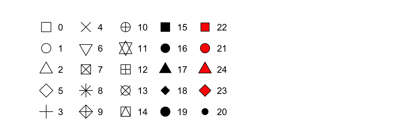
Figure 3.1: R has 25 built in shapes that are identified by numbers. There are some seeming duplicates: for example, 0, 15, and 22 are all squares. The difference comes from the interaction of the colour and fill aesthetics. The hollow shapes (0–14) have a border determined by colour; the solid shapes (15–20) are filled with colour; the filled shapes (21–24) have a border of colour and are filled with fill.
3.3.1 연습문제
-
What’s gone wrong with this code? Why are the points not blue?
ggplot(data = mpg) +
  geom_point(mapping = aes(x = displ, y = hwy, color = "blue"))
Which variables in
mpgare categorical? Which variables are continuous? (Hint: type?mpgto read the documentation for the dataset). How can you see this information when you runmpg?Map a continuous variable to
color,size, andshape. How do these aesthetics behave differently for categorical vs. continuous variables?What happens if you map the same variable to multiple aesthetics?
What does the
strokeaesthetic do? What shapes does it work with? (Hint: use?geom_point)What happens if you map an aesthetic to something other than a variable name, like
aes(colour = displ < 5)? Note, you’ll also need to specify x and y.
3.4 자주 일어나는 문제들
R 코드를 실행하기 시작하면서 문제들에 봉착할 것이다. 걱정하지 말라. 모든 사람에게 일어나는 일이다. 나는 R 코드를 수년간 작성해왔지만, 작성한 코드가 실행되지 않는 일이 매일같이 발생한다!
우선 실행 중인 코드와 이 책의 코드를 차분하게 비교하라. R 은 극도로 까다롭고 문자를 잘못 위치시키면 완전히 다르게 될 수 있다. ( 가 모두 ) 와 짝을 이루고, " 가 모두 다른 " 와 짝을 이루는지 확인하라.
때론 코드를 실행해도 아무 일도 일어나지 않을 수 있다.
콘솔의 좌측을 체크하라. 즉, + 라면 R 은 여러분이 표현문을 완성한 것으로 생각하지 않고 마저 끝내기를 기다린다는 의미이다.
보통은 이런 경우 esc 키를 눌러서 현재 명령처리를 중단하고 처음부터 다시 시작하는 게 쉽게 처리하는 방법이다.
ggplot2 그래프를 생성할 때 자주 일어나는 일은 + 를 잘못된 곳에 입력하는 것 이다. 라인의 시작이 아니라 마지막에 와야 한다. 다른 말로, 코드를 다음과 같이 실수로 작성하지 않았는지 확인하라.
ggplot(data = mpg)
+ geom_point(mapping = aes(x = displ, y = hwy))
여전히 해결을 못했다면 도움말을 열어보라.
모든 R 함수는 도움말이 있는데, 콘솔에서 ?function_name 을 실행하거나 RStudio 에서 함수 이름을 선택하고, F1 키를 누르면 된다. 도움말이 도움되지 않아도 걱정하지 말라. 즉, 도움말 대신 예제로 넘어가서 실행하려고 하는 코드에 해당하는 것을 찾아보자.
도움이 되지 않는다면 차분하게 오류 메시지를 읽어보자. 답이 그곳에 묻혀있는 경우가 많다! 그러나 R 이 처음이라면 답이 오류 메시지에 있어도, 이해하지 못할 것이다. 다른 훌륭한 도구는 구글이다. 오류 메시지로 구글에서 검색해보라. 같은 문제에 빠졌다가 온라인에서 도움을 얻은 사람들이 있을 수 있다.
3.5 Facets
변수를 추가하는 방법으로 심미성을 이용하는 방법을 보았다. 또 다른 방법은 범주형 변수에 특히 유용한 방법인데, 플롯을 면분할(facet, 데이터 각 서브셋을 표시하는 하위 플롯)로 나누는 것이다.
플롯을 하나의 변수에 대해 면분할하기 위해서는, facet_wrap() 을 이용하면 된다. facet_wrap() 의 첫 번째 인수로는 ~ 와 뒤에 변수 이름이 따라오는 공식(formula)이어야 한다. (여기서 “공식”은 R 데이터 구조의 한 형태이며 “등식(equation)”과 같은 의미가 아니다.) facet_wrap() 에 전달하는 변수는 이산형이어야 한다.
ggplot(data = mpg) +
  geom_point(mapping = aes(x = displ, y = hwy)) +
  facet_grid(drv ~ cyl)
플롯을 두 변수 조합으로 면분할하기 위해서는 facet_grid() 를 플롯 호출에 추가하면 된다.
facet_grid() 의 첫 번째 인수도 정형화되어 있다.
이번에는 공식이 두 개의 변수가 ~ 로 분리되어 있는 형태이어야 한다.
ggplot(data = mpg) +
  geom_point(mapping = aes(x = displ, y = hwy)) +
  facet_grid(drv ~ cyl)
열이나 행으로 면분할하고 싶지 않다면 변수 이름 대신 . 를 이용하라. (예: + facet_ grid(. ~ cyl))
3.5.1 연습문제
What happens if you facet on a continuous variable?
-
What do the empty cells in plot with
facet_grid(drv ~ cyl)mean? How do they relate to this plot?ggplot(data = mpg) + geom_point(mapping = aes(x = drv, y = cyl))
-
What plots does the following code make? What does
.do?ggplot(data = mpg) + geom_point(mapping = aes(x = displ, y = hwy)) + facet_grid(drv ~ .) ggplot(data = mpg) + geom_point(mapping = aes(x = displ, y = hwy)) + facet_grid(. ~ cyl) -
Take the first faceted plot in this section:
ggplot(data = mpg) +
  geom_point(mapping = aes(x = displ, y = hwy)) +
  facet_wrap(~ class, nrow = 2)
What are the advantages to using faceting instead of the colour aesthetic? What are the disadvantages? How might the balance change if you had a larger dataset?
Read
?facet_wrap. What doesnrowdo? What doesncoldo? What other options control the layout of the individual panels? Why doesn’tfacet_grid()havenrowandncolarguments?-
Which of the following two plots makes it easier to compare engine size (
displ) across cars with different drive trains? What does this say about when to place a faceting variable across rows or columns?ggplot(data = mpg) + geom_point(mapping = aes(x = displ, y = hwy)) + facet_grid(drv ~ .) ggplot(data = mpg) + geom_point(mapping = aes(x = displ, y = hwy)) + facet_grid(. ~ drv)

-
Recreate this plot using
facet_wrap()instead offacet_grid(). How do the positions of the facet labels change?ggplot(data = mpg) + geom_point(mapping = aes(x = displ, y = hwy)) + facet_grid(drv ~ .)
3.6 기하 객체
두 플롯은 비슷해 보이는가?


두 플롯은 동일한 x 변수, 동일한 y 변수를 포함하고, 동일한 데이터를 나타낸다. 그러나 둘은 같지 않다. 각 플롯은 데이터를 표현하는 시각 객체가 다르다. ggplot2 문법으로는 두 플롯이 다른 지옴(geom)을 사용한다고 말한다.
지옴은 데이터를 나타내기 위해 플롯이 사용하는 기하 객체(geometric object)를 의미한다. 사람들은 플롯이 사용하는 지옴의 유형으로 플롯을 기술한다. 예를 들어 막대 그래프는 막대 지옴을 이용하고, 선 그래프는 라인 지옴을, 박스 플롯은 박스 플롯 지옴을 이용하는 식이다. 산점도는 포인트 지옴을 사용한다. 위에서 보았듯이, 같은 데이터로 플롯을 그리기 위해 다른 지옴을 사용할 수 있다. 왼쪽의 플롯은 포인트 지옴을 사용했고, 오른쪽의 플롯은 평활 (smooth) 지옴, 즉 데이터에 적합된 평활선을 이용했다.
플롯에서 지옴을 바꾸기 위해서는 ggplot() 에 추가하는 지옴 함수를 변경하면 된다. 예를 들어 다음의 코드를 사용하여 앞의 플롯들을 만들었다.
# left
ggplot(data = mpg) +
  geom_point(mapping = aes(x = displ, y = hwy))
# right
ggplot(data = mpg) +
  geom_smooth(mapping = aes(x = displ, y = hwy))
ggplot2의 모든 지옴 함수는 mapping 인수를 가진다. 그러나 모든 심미성이 모든 지옴과 작동하는 것은 아니다. 점의 shape(모양)을 설정할 수 있지만, 선의 “shape” 을 설정할 수는 없다. 반면, 선의 linetype(선 유형)을 설정하는 것을 생각해볼 수 있다. geom_smooth() 는 linetype으로 매핑된 변수의 고유값마다 다른 형태의 선을 그린다.
ggplot(data = mpg) +
geom_smooth(mapping = aes(x = displ, y = hwy, linetype = drv)) for each type of drive train. Confidence intervals around the smooth curves are also displayed.")
여기서 geom_smooth() 는 자동차의 동력전달장치를 의미하는 drv 값에 기초하여 차 모델들을 세 개의 선으로 분리한다. 선 하나는 값이 4인 점들 모두를 표시하고, 다른 선은 f 값을 가진 모든 점을, 또 다른 선은 r 값을 가진 모든 점을 표시한다. 여기서 4 는 사륜구동, f 는 전륜구동, r 은 후륜구동을 나타낸다.
이것이 이상하게 들린다면 원 데이터 위에 선들을 겹쳐 그린 후, 선과 점을 drv 에 따라 색상을 입히면 좀 더 명료하게 만들 수 있다.
 as well as smooth curves (where line type is determined based on drive train as well). Confidence intervals around the smooth curves are also displayed.")
이 플롯은 같은 그래프에 두 개의 지옴을 포함하고 있는 것을 주목하라! 흥미로운가? 그러면 자, 기대하시라. 다음 절에서는 같은 플롯에 다중의 지옴을 놓는 방법을 배울 것이다.
ggplot2에는 40개가 넘는 지옴이 있고, 확장 패키지에는 더 많은 지옴이 있다. (예제는 https://exts.ggplot2.tidyverse.org/gallery/에 있다). 포괄적인 개요는 ggplot2 치트시트에서 가장 잘 볼 수 있는데 http://rstudio.com/cheatsheets에서 얻을 수 있다. 더 배우고 싶은 지옴이 있다면 ?geom_smooth 같이 도움말을 이용하라.
geom_smooth()을 포함한 많은 수의 지옴은 데이터의 여러 행을 표시하기 위해 하나의 기하 객체를 사용한다. 이러한 지옴들에 대해 그룹(group) 심미성을 설정하여 다중 객체를 그릴 수 있다. ggplot2는 그룹 변수의 각 고유값에 따라 별도의 객체를 그린다. 실제로 ggplot2는 (linetype 예제에서와 같이) 심미성을 변수에 매핑할 때마다 이 지옴들에 대한 데이터를 자동으로 그룹화한다. 그룹 심미성은 기본적으로 범례를 추가하거나 구별시켜주는 기능들을 추가하지 않기 때문에, 이 기능을 활용하면 편리하다.
ggplot(data = mpg) +
  geom_smooth(mapping = aes(x = displ, y = hwy))

ggplot(data = mpg) +
  geom_smooth(mapping = aes(x = displ, y = hwy, group = drv))

ggplot(data = mpg) +
  geom_smooth(
    mapping = aes(x = displ, y = hwy, color = drv),
    show.legend = FALSE
  )


같은 플롯에 여러 지옴을 표시하려면 ggplot() 에 여러 지옴 함수를 추가하라.
ggplot(data = mpg) +
  geom_point(mapping = aes(x = displ, y = hwy)) +
  geom_smooth(mapping = aes(x = displ, y = hwy))
그러나 이렇게 하면 코드에 중복이 생긴다.
y-축을 hwy 대신 cty 를 표시하도록 변경한다고 해보자. 두 군데에서 변수를 변경해야 하는데, 하나를 업데이트하는 것을 잊어버릴 수 있다. 이러한 종류의 중복을 피하려면 매핑 집합을 ggplot() 으로 전달하면 된다.
이렇게 하면 ggplot2는 이 매핑들을 전역 매핑으로 처리하여 그래프의 각 지옴에 적용한다.
다른 말로 하면 다음의 코드는 이전 코드와 동일한 플롯을 생성한다.
ggplot(data = mpg, mapping = aes(x = displ, y = hwy)) +
  geom_point() +
  geom_smooth()
지옴 함수에 매핑을 넣으면 ggplot2는 해당 레이어에 대한 로컬 매핑으로 처리 한다. 이렇게 되면 해당 레이어에만 이 매핑이 추가되거나 전역 매핑을 덮어쓴다. 즉, 다른 레이어마다 다른 심미성을 표시하는 것이 가능하다.
ggplot(data = mpg, mapping = aes(x = displ, y = hwy)) +
  geom_point(mapping = aes(color = class)) +
  geom_smooth()
같은 원리로 레이어마다 다른 data 를 지정할 수 있다. 여기서 우리의 평활선 은 mpg 데이터셋의 서브셋인 경차만을 표시한다.
geom_smooth() 의 로컬 데이터 인수는 해당 레이어에 한해서만 ggplot() 의 전역 데이터 인수를 덮어쓴다.
ggplot(data = mpg, mapping = aes(x = displ, y = hwy)) +
  geom_point(mapping = aes(color = class)) +
  geom_smooth(data = filter(mpg, class == "subcompact"), se = FALSE)
(filter() 의 작동 방식에 대해서 다음 장에서 배울 것이다. 이 장에서는 이 명령어가 경차만 선택하라는 것으로 이해하라.)
3.6.1 연습문제
What geom would you use to draw a line chart? A boxplot? A histogram? An area chart?
-
Run this code in your head and predict what the output will look like. Then, run the code in R and check your predictions.
ggplot(data = mpg, mapping = aes(x = displ, y = hwy, color = drv)) +
  geom_point() +
  geom_smooth(se = FALSE)
What does
show.legend = FALSEdo? What happens if you remove it?
Why do you think I used it earlier in the chapter?What does the
seargument togeom_smooth()do?-
Will these two graphs look different? Why/why not?
ggplot(data = mpg, mapping = aes(x = displ, y = hwy)) + geom_point() + geom_smooth() ggplot() + geom_point(data = mpg, mapping = aes(x = displ, y = hwy)) + geom_smooth(data = mpg, mapping = aes(x = displ, y = hwy)) -
Recreate the R code necessary to generate the following graphs. Note that wherever a categorical variable is used in the plot, it’s
drv.


3.7 통계적 변환
다음으로, 막대 그래프(bar chart)를 보자. 막대 그래프는 간단할 것 같지만, 플롯에 대해 미묘한 것을 드러내기 때문에 흥미로운 차트이다.
geom_bar()로 그려지는 기본 막대 그래프를 생각해보라. 다음의 차트는 diamonds 데이터셋에서 cut 으로 그룹한 다이아몬드의 총 개수를 표시한다.
diamonds 데이터셋은 ggplot2에 있으며 약 ~54,000개 다이아몬드 각각의 가격(price), 캐럿(carat), 색상(color), 투명도(clarity), 컷(cut)과 같은 정보가 있다. 차트는 저품질 컷보다 고품질 컷의 다이아몬드가 더 많음을 보여준다.

이 차트는 x축으로 diamonds 의 변수 중 하나인 cut 을 표시한다. y축으로 카운트를 표시하는데 카운트는 diamonds 의 변수가 아니다!
카운트는 어디서 오는가? 산점도와 같은 다수의 그래프는 데이터셋의 원 값을 플롯으로 그린다. 막대 그래프와 같은 다른 그래프는 플롯으로 그릴 새로운 값을 계산한다.
막대 그래프, 히스토그램, 빈도 다각형은 데이터를 빈(bin) 계급으로 만든 후, 각 빈에 떨어지는 점들의 개수인 도수를 플롯한다.
평활 차트들은 데이터에 모델을 적합한 후 모델을 이용한 예측값을 플롯한다.
박스 플롯은 분포의 로버스트(robust)한 요약값을 계산한 후 특수한 형태의 박스로 표시한다.
그래프에 사용할 새로운 값을 계산하는 알고리즘은 통계적 변환의 줄임말인 스탯(stat)이라고 부른다. 다음의 그림은 이 과정이 geom_bar() 와 어떻게 작동하는 지를 보여준다.
 begins with the diamonds data set. 2. geom_bar() transforms the data with the \"count\" stat, which returns a data set of cut values and counts. 3. geom_bar() uses the transformed data to build the plot. cut is mapped to the x-axis, count is mapped to the y-axis.")
stat 인수의 기본값을 조사하여 한 지옴이 어떤 스탯을 사용하는지 알 수 있다.
예를 들어 ?geom_bar 를 하면 stat 이 “count” 임을 보여주는데, 이는 geom_bar() 가 stat_count() 를 이용함을 의미한다.
stat_count() 는 geom_bar() 와 같은 페이지에 문서화되어 있으며, 스크롤해서 내려가면 ‘Computed Variables’이라고 하는 절을 볼 수 있다.
두 개의 새로운 변수인 count, prop 을 계산한 방법을 설명한다.
지옴과 스탯을 서로 바꿔서 사용할 수 있다. 예를 들어 이전 플롯을 geom_bar() 대신 stat_count() 를 사용하여 생성할 수 있다.
ggplot(data = diamonds) +
  stat_count(mapping = aes(x = cut))
모든 지옴은 기본 스탯이 있고 모든 스탯은 기본 지옴이 있기 때문에 이것이 가능하다. 다시 말하면 일반적으로 내부 통계적 변환에 대해 신경 쓸 필요 없이 지옴을 사용할 수 있다. 명시적으로 스탯을 사용해야 하는 이유는 세 가지이다.
-
기본 스탯을 덮어쓰고 싶을 수 있다. 다음의 코드에서
geom_bar()의 스탯을 count(기본값)에서 identity로 변경했다. 이렇게 하면 막대의 높이를 \(y\) 변수의 원 값으로 매핑할 수 있다. 안타깝게도 사람들이 막대 그래프에 대해 이야기 할 때, 막대의 높이가 데이터에 존재하는 그래프를 의미하기도 하고, 또는 행을 세서 생성되는, 앞서 본 막대 그래프를 의미하기도 한다.demo <- tribble( ~cut, ~freq, "Fair", 1610, "Good", 4906, "Very Good", 12082, "Premium", 13791, "Ideal", 21551 ) ggplot(data = demo) + geom_bar(mapping = aes(x = cut, y = freq), stat = "identity")
(전에
<-나tribble()을 보지 못했더라도 걱정하지 말라. 문맥에서 의미를 추론 할 수 있고, 이들의 정확한 역할을 곧 배울 것이다!) -
변환된 변수에서 심미성으로 기본 매핑을 덮어쓰고자 할 수 있다. 예를 들어 빈도가 아니라 비율의 막대 그래프를 표시하고자 할 수 있다.
ggplot(data = diamonds) +
  geom_bar(mapping = aes(x = cut, y = after_stat(prop), group = 1))
스탯이 계산한 변수를 찾기 위해서는
geom_bar()도움말에서 ‘Computed Variables’ 제목의 절을 살펴보라. -
코드에서 통계적 변환에 주의를 많이 집중시키고자 할 수 있다. 예를 들어 계산하는 요약값에 주의를 집중시키고자 고유한 x 값 각각에 대해 y 값을 요약하는
stat_summary()를 사용할 수 있다.ggplot(data = diamonds) + stat_summary( mapping = aes(x = cut, y = depth), fun.min = min, fun.max = max, fun = median ) of diamonds in ggplot2::diamonds. For each level of cut, vertical lines extend from minimum to maximum depth for diamonds in that cut category, and the median depth is indicated on the line with a point.")
ggplot2에서 20개가 넘는 스탯이 있다. 각 스탯은 함수이므로 평소 하듯이 도움말을 볼 수 있다(예: ?stat_bin).
스탯 전체 목록을 보려면 ggplot2 치트시트<http://rstudio.com/cheatsheets를 보라.
3.7.1 연습문제
What is the default geom associated with
stat_summary()? How could you rewrite the previous plot to use that geom function instead of the stat function?What does
geom_col()do? How is it different togeom_bar()?Most geoms and stats come in pairs that are almost always used in concert. Read through the documentation and make a list of all the pairs. What do they have in common?
What variables does
stat_smooth()compute? What parameters control its behaviour?-
In our proportion bar chart, we need to set
group = 1. Why? In other words what is the problem with these two graphs?ggplot(data = diamonds) + geom_bar(mapping = aes(x = cut, y = after_stat(prop))) ggplot(data = diamonds) + geom_bar(mapping = aes(x = cut, fill = color, y = after_stat(prop)))
3.8 위치조정
막대 그래프와 연관된 마법이 하나 더 있다.
막대 그래프에 색상을 입힐 수 있는데, color 심미성을 이용하거나 좀 더 유용하게는 fill 을 이용하면 된다.
ggplot(data = diamonds) +
  geom_bar(mapping = aes(x = cut, color = cut))
ggplot(data = diamonds) +
  geom_bar(mapping = aes(x = cut, fill = cut))

fill 심미성을 다른 변수(예: clarity)에 매핑하면 어떤 일이 일어나는지 잘 보자. 누적 막대 그래프가 생성된다. 각각의 색상이 입혀진 직사각형은 cut 과 clarity 의 조합을 나타낸다.

position 인수로 지정하는 위치조정에 의해 막대 누적이 자동으로 수행된다.
누적 막대 그래프를 원하지 않는다면 다음의 "identity", "dodge", "fill" 세 옵션 중 하나를 선택하면 된다.
-
position = "identity"를 하면 각 객체를 그래프 문맥에 해당되는 곳에 정확히 배치한다. 막대와 겹치기 때문에 막대에 대해서는 그다지 유용하지 않다. 겹치는 것을 구별하려면 alpha를 작은 값으로 설정하여 막대들을 약간 투명하게 하거나,fill = NA로 설정하여 완전히 투명하게 해야 한다.ggplot(data = diamonds, mapping = aes(x = cut, fill = clarity)) + geom_bar(alpha = 1/5, position = "identity") ggplot(data = diamonds, mapping = aes(x = cut, colour = clarity)) + geom_bar(fill = NA, position = "identity")

identity 위치 조정은 포인트와 같은 2차원 지옴에서 더 유용한데 여기에서는 identity가 기본값이다.
-
position = "fill"을 하면 누적막대처럼 동작하지만 누적막대들이 동일한 높이가 되도록 한다. 이렇게 하면 그룹들 사이에 비율을 비교하기 쉬워진다.
-
position = "dodge"를 하면 겹치는 객체가 서로 옆에 배치된다. 이렇게 하면 개별 값들을 비교하기 쉬워진다.. In each group there are eight bars, one for each level of clarity, and filled with a different color for each level. Heights of these bars represent the number of diamonds with a given level of cut and clarity.")
막대 그래프에는 유용하지 않지만 산점도에는 매우 유용한, 다른 형태의 조정도 있다. 우리의 첫 번째 산점도를 떠올려보라. 데이터셋에 234개 관측값이 있는데도 플롯에서 126개 점만 표시하고 있다는 것을 눈치챘는가?

hwy 와 displ 의 값들이 반올림이 되어서 점들이 격자 위에 나타나 많은 점이 서로 겹쳤다. 이 문제를 오버플롯팅이라고 한다. 이러한 방식은 많은 데이터가 어디에 있는지 보기 힘들게 만든다. 데이터 포인트들이 그래프에 걸쳐 동일하게 퍼져있는가? 아니면 hwy 와 displ 의 특정 조합이 109개 값을 포함하고 있는가?
위치 조정을 지터(jitter, 조금씩 움직임)로 설정하여 이 격자 방법을 피할 수 있다. position = "jitter" 를 하면 각 점에 적은 양의 랜덤 노이즈가 추가된다.
이렇게 하면 어느 두 점도 같은 양의 랜덤 노이즈를 받을 가능성이 없기 때문에 포인트가 퍼지게 된다.
ggplot(data = mpg) +
  geom_point(mapping = aes(x = displ, y = hwy), position = "jitter")
랜덤을 추가해서 그래프를 개선하는 게 이상해 보이지만, 작은 스케일에서는 그래프가 덜 정확해지는 대신, 큰 스케일에서는 더 표현력이 있게 된다.
이 방법은 매우 유용하며 ggplot2에는 geom_point(position = "jitter") 를 축약한 geom_ jitter() 가 있다.
위치 조정에 대해 더 배우고 싶으면 다음과 같이 각 조정과 연관된 도움말 페이지를 찾아보라: ?position_dodge, ?position_fill, ?position_identity, ?position _jitter, ?position_stack.
3.8.1 Exercises
-
What is the problem with this plot? How could you improve it?
ggplot(data = mpg, mapping = aes(x = cty, y = hwy)) +
  geom_point()
What parameters to
geom_jitter()control the amount of jittering?Compare and contrast
geom_jitter()withgeom_count().What’s the default position adjustment for
geom_boxplot()? Create a visualisation of thempgdataset that demonstrates it.
3.9 좌표계
좌표계는 아마도 ggplot2에서 가장 복잡한 부분일 것이다. 기본 좌표계는 각 점의 위치를 결정할 때 x와 y 위치가 독립적으로 움직이는 데카르트(Cartesian) 좌표계이다. 이것 말고도 도움이 되는 다른 좌표계들이 많다.
-
coord_flip()은 x와 y축을 바꾼다. (예를 들어) 수평 박스 플롯이 필요할 때 유 용하다. 라벨이 길어서 x축과 겹치지 않고 들어맞게 하기 힘들 경우에도 유용하다.ggplot(data = mpg, mapping = aes(x = class, y = hwy)) + geom_boxplot() ggplot(data = mpg, mapping = aes(x = class, y = hwy)) + geom_boxplot() + coord_flip(). In the first plot class is on the x-axis, in the second plot class is on the y-axis. The second plot makes it easier to read the names of the levels of class since they're listed down the y-axis, avoiding overlap.")
. In the first plot class is on the x-axis, in the second plot class is on the y-axis. The second plot makes it easier to read the names of the levels of class since they're listed down the y-axis, avoiding overlap.")
하지만, 두 변수의 심미성 매핑을 바꾸어서 같은 결과를 얻을 수도 있다는 것을 주목하라.
ggplot(data = mpg, mapping = aes(y = class, x = hwy)) + geom_boxplot().")
-
coord_quickmap()을 하면 지도에 맞게 가로세로 비율이 설정된다. ggplot2로 공간 데이터를 플롯할 때 매우 중요하다(안타깝게도 이 책에서는 다루지는 않는다).nz <- map_data("nz") ggplot(nz, aes(long, lat, group = group)) + geom_polygon(fill = "white", colour = "black") ggplot(nz, aes(long, lat, group = group)) + geom_polygon(fill = "white", colour = "black") + coord_quickmap()

-
coord_polar()는 극좌표를 사용한다. 극좌표를 사용하면 막대 그래프와 Coxcomb 차트 사이의 흥미로운 관계를 볼 수 있다.bar <- ggplot(data = diamonds) + geom_bar( mapping = aes(x = cut, fill = cut), show.legend = FALSE, width = 1 ) + theme(aspect.ratio = 1) + labs(x = NULL, y = NULL) bar + coord_flip() bar + coord_polar()

3.9.1 연습문제
Turn a stacked bar chart into a pie chart using
coord_polar().What does
labs()do? Read the documentation.What’s the difference between
coord_quickmap()andcoord_map()?-
What does the plot below tell you about the relationship between city and highway mpg? Why is
coord_fixed()important? What doesgeom_abline()do?ggplot(data = mpg, mapping = aes(x = cty, y = hwy)) + geom_point() + geom_abline() + coord_fixed()
3.10 그래픽 레이어 문법
이전 절에서 산점도, 막대 그래프, 박스 플롯을 만드는 법을 포함하여 훨씬 많은 것을 배웠다. ggplot2로 어떤 유형의 플롯도 만들 수 있는 기반을 배웠다. 이를 확인하기 위해 코드 템플릿에 위치 조정, 스탯, 좌표계, 면분할을 추가해보자:
ggplot(data = <DATA>) +
  <GEOM_FUNCTION>(
     mapping = aes(<MAPPINGS>),
     stat = <STAT>,
     position = <POSITION>
  ) +
  <COORDINATE_FUNCTION> +
  <FACET_FUNCTION>
새 템플릿에는 7개의 파라미터가 있는데, 괄호 안에 표시되어 있다. ggplot2 가 데이터, 매핑, 지옴 함수를 제외하고는 유용한 기본값들을 제공하기 때문에 실제로는 일곱 파라미터 모두 제공해야 하는 경우는 거의 없다.
템플릿의 일곱 파라미터로 그래프 문법이 구성되는데, 이는 플롯을 작성하는 공식 시스템이다. 이 그래프 문법은, 어떤 플롯도 데이터셋, 지옴, 매핑 집합, 스탯, 위치 조정, 좌표계, 면분할 구성표의 조합으로 고유하게 설명할 수 있다는 직관에 기반하고 있다.
어떻게 작동하는지 보기 위해 맨 처음부터 기본 플롯을 어떻게 만들지를 생각해보라. 데이터셋부터 시작해서 이를 (스탯을 이용하여) 표시하고 싶은 정보로 변환할 것이다.
 to table of counts where each row represents one level of cut and a count column shows how many diamonds are in that cut level. Steps 1 and 2 are annotated: 1. Begin with the diamonds dataset. 2. Compute counts for each cut value with stat_count().")
다음으로 변형된 데이터의 각 관측값을 나타낼 기하 객체를 고를 것이다. 데이터의 변수들을 나타내기 위해 지옴의 심미성 속성을 이용할 것이다. 각 변수의 값들을 심미성 수준에 매핑할 것이다.
 to table of counts where each row represents one level of cut and a count column shows how many diamonds are in that cut level. Each level is also mapped to a color. Steps 3 and 4 are annotated: 3. Represent each observation with a bar. 4. Map the fill of each bar to the ..count.. variable.")
그런 다음 지옴을 위치시킬 좌표계를 선택할 것이다. x와 y 변수들의 값을 표시하기 위해 객체의 위치(그 자체로 심미성 속성)를 사용할 것이다. 이 시점에서 그래프가 완전히 만들어지지만, 좌표계 내에서 지옴의 위치를 더 조정하거나(위치 조정), 그래프를 하위 플롯들로 나눌 수 있다(면분할). 하나 이상의 레이어를 추가하여 플롯을 확장시킬 수도 있다. 추가되는 각 레이어는 데이터셋, 지옴, 매핑 집합, 스탯, 위치 조정을 사용한다.
 to bar chart where each bar represents one level of cut and filled in with a different color. Steps 5 and 6 are annotated: 5. Place geoms in a Cartesian coordinate system. 6. Map the y values to ..count.. and the x values to cut.")
이 방법을 사용하여 상상하는 어떤 플롯도 만들 수 있다. 즉, 이 장에서 배운 코드 템플릿을 사용하여 수십만 종류의 고유한 플롯을 만들 수 있다.