17 Advance: data-visualization
17.1 Introduction
A Picture Is Worth a Thousand Words
When exploring the data, a quick way is to use visualization tools, because graph is more straightforward and illustrative than table. Below are several examples of good visualization.
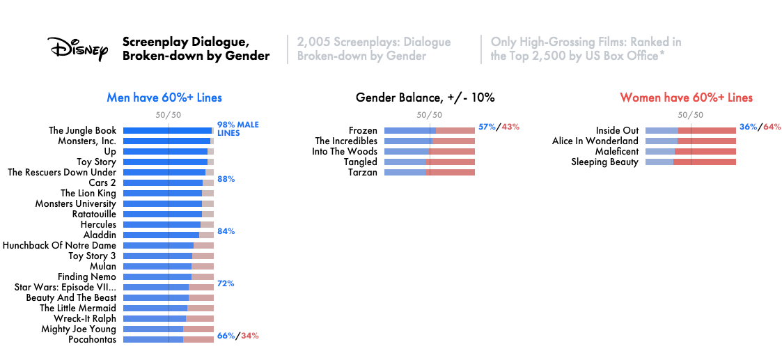
Film Dialogue (broken down by gender)
In R, one of the most powerful and popular visualization tools is the ggplot2 package. ggplot2 has an underlying grammar, based on the Grammar of Graphics, that allows you to compose graphs by combining independent components. This makes ggplot2 powerful. Rather than being limited to sets of pre-defined graphics, you can create novel graphics that are tailored to your specific problem. While the idea of having to learn a grammar may sound overwhelming, ggplot2 is actually easy to learn: there is a simple set of core principles and there are very few special cases.
It is worth noting that this chapter only covers static graphs, the majority of them use the Cartesian coordinate system (x-axis and y-axis).
Reference:
17.2 Frequently used graphs in Psychology
在心理学中,往往会在数据分析的两个阶段运用到 data visualization ,探索阶段和统计分析阶段,前者是利用 data visualization 初步探寻数据中存在的模式、规律及变量之间的关系,后者则是利用 data visualization 将统计分析的结果呈现出来。虽然是不同阶段,但绘制 graph 的过程没有区别,都是将数据转变为 graph。
心理学中常用的 graph 包括 bar, line, point, histogram, 等等,称这些为基本类型。
17.2.1 Basic graphs: bar, line, point, histograms, etc.
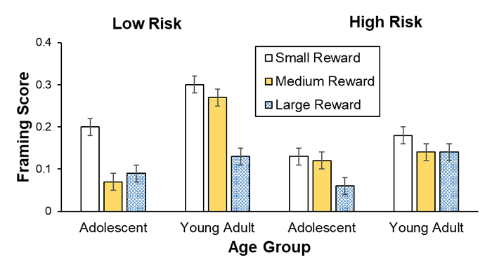
Note. Framing scores of adolescents and young adults are shown for low and high risks and for small, medium, and large rewards (error bars show standard errors).
- APA style: Sample line graph
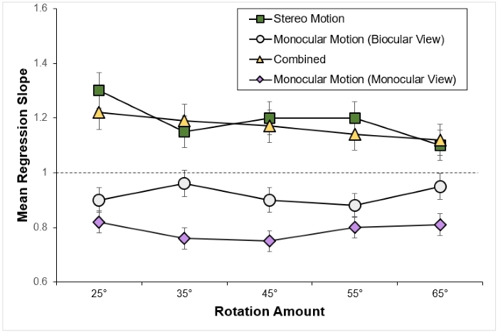
Note. Mean regression slopes in Experiment 1 are shown for the stereo motion, biocularly viewed monocular motion, combined, and monocularly viewed monocular motion conditions, plotted by rotation amount. Error bars represent standard errors. From “Large Continuous Perspective Change With Noncoplanar Points Enables Accurate Slant Perception,” by X. M. Wang, M. Lind, and G. P. Bingham, 2018, Journal of Experimental Psychology: Human Perception and Performance, 44(10), p. 1513 (https://doi.org/10.1037/xhp0000553 Add to Citavi project by DOI). Copyright 2018 by the American Psychological Association.
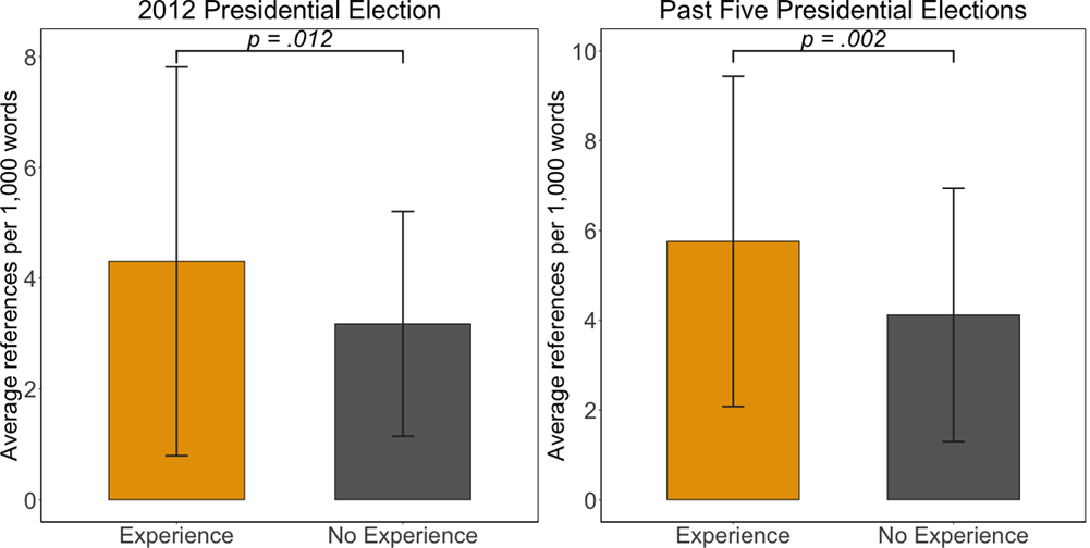
In every 1,000 words of news reports and tweets, journalists who had covered previous presidential campaigns made significantly more references to the 2012 presidential elections (M = 4.30, SD = 3.51) than those without any prior experiences (\(M = 3.17, SD = 2.03\)), \(t(151.73) = -2.53, p = .012\), Cohen’s \(d = 0.39\) (see the left panel of Fig 2). As demonstrated in the center panel of Fig 2, similar patterns held for the past five presidential elections (\(t(136.88) = -3.09, p = .002\), Cohen’s \(d = 0.50\)). Compared to journalists who had not covered any prior presidential elections (\(M = 4.12, SD = 2.82\)), journalists with experiences of campaign coverage used more words relating to the past five presidential elections in their news reporting of the 2016 race (\(M = 5.76, SD = 3.68\)). These results with moderate effect size suggest that anchoring on the past occurred in news coverage of the 2016 race according to journalists’ prior experience of presidential campaign coverage (supporting H3).
17.2.2 Advanced graph: matrix of basic graphs
当实验条件变得复杂时,就需要针对不同的实验条件绘制 graph,然后按照一定的顺序组合起来,实现比较的目的。本质上运用不同实验条件下的数据绘制的 graph 还是之前介绍的几种基本类型,只是额外多了一个组合的步骤。
在学习完本章内容以后,就可以轻松地绘制出上述 graphs。
在假定数据已经整理成tidy data的情况下,data visualization 只有两个基本步骤:
- 脑海中构思绘制什么样的 graph;
- 用
ggplot2实现。
最难的其实是第一步,因为需要在脑海中就完成将数据转变为 graph 的过程。
17.3 Step 1: make a graph in your mind
在脑海中构思如何将数据转变为 graph 的过程中,有一个非常重要的概念——变量(variable)。
17.3.1 Variable in graph
在 data cleaning 章节讲到tidy data的概念时提到,tidy data最重要的特征就是一个 variable 一列,而绘制 graph 就是将原本是数字形式储存的 variable 信息用 graph 的形式呈现而已。图的复杂程度与 graph 中所蕴含的 variable 个数有直接联系。同时,单个 graph 中能够一次性清晰地呈现的 variable 个数是有上限的。
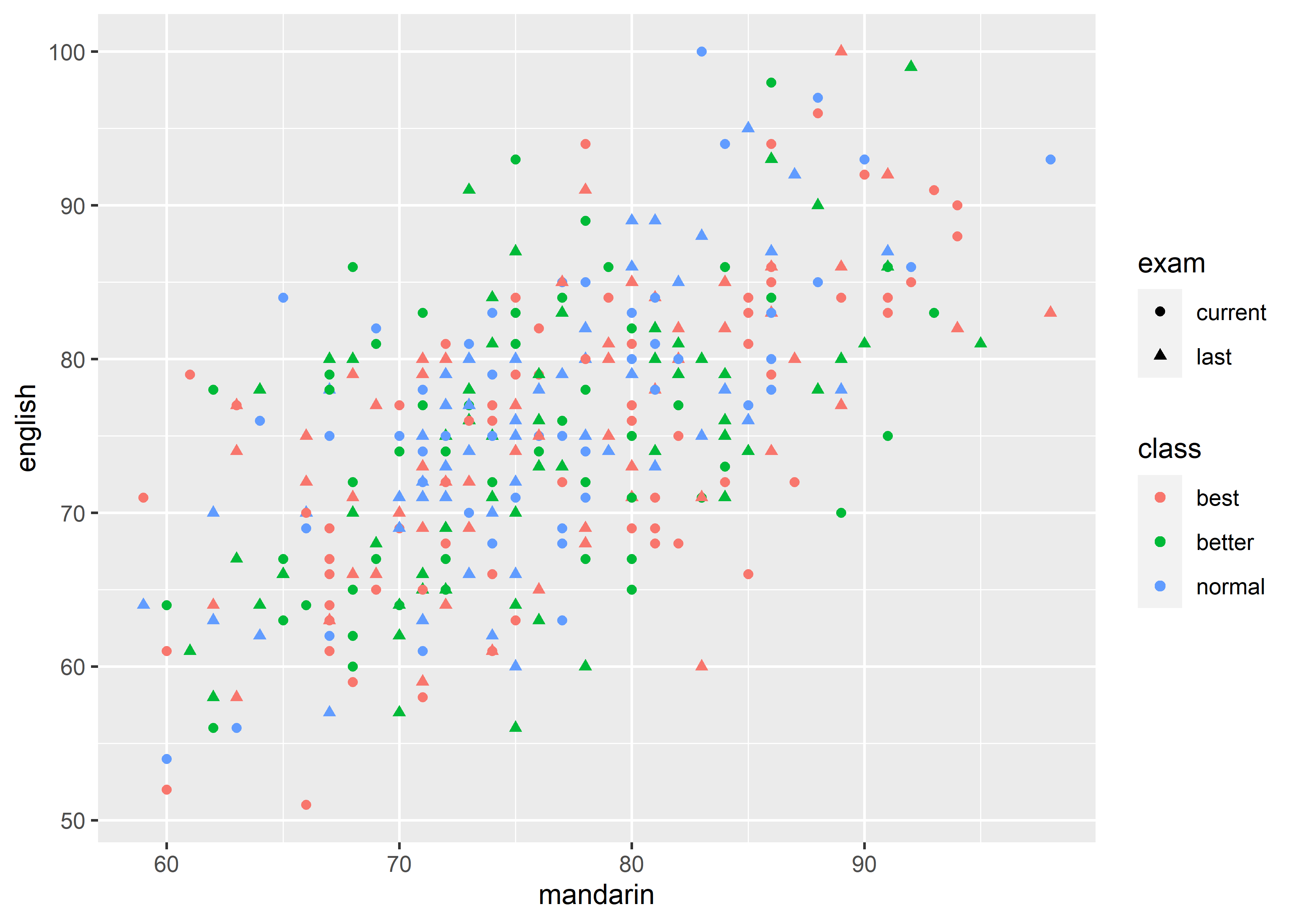
一般情况下,按照心理学研究中的惯例,会将 variable 分为两大类,independent variable (IV,自变量)和 dependent variable (DV 因变量)。数据分析关心的是二者之间的关系,所以 data visualization 也是要服务于这个目的,能够清晰地呈现出 IV、DV 以及二者之间的关系才是合适的 graph。绘制 graph 时通常会将 DV 作为 y 轴(y-axis),将 IV 作为 x 轴(x-axis)。看一个简单的例子:
很显然,这是一张 point graph,并且只展现了 2 个 variables (mandarin 和 math)的信息。反过来,如果想要绘制出这样的 point graph,数据中必须有 2 个 variables(2 列)。
17.3.1.1 Continuous vs discrete
根据具体数值,可以将 variable 分为两类,连续(continuous)和离散(discrete)。上一个例子中,mandarin 和 math 都是 continuous 的。continuous variable 和 discrete variable 适用的 graph 是不同的,需要根据具体情况来决定。在大多数情况下,DV 是 continuous 的,IV 可以是 continuous 也可以是 discrete 的,其中 discrete IV 可以作为分组标签。
例如,如果想要研究 class (IV) 和 mandarin (DV) 的关系,那么显然前者是一个 discrete variable, 后者是一个 continuous variable,此时如果还用 point graph就不合适了。
应改为 bar graph:
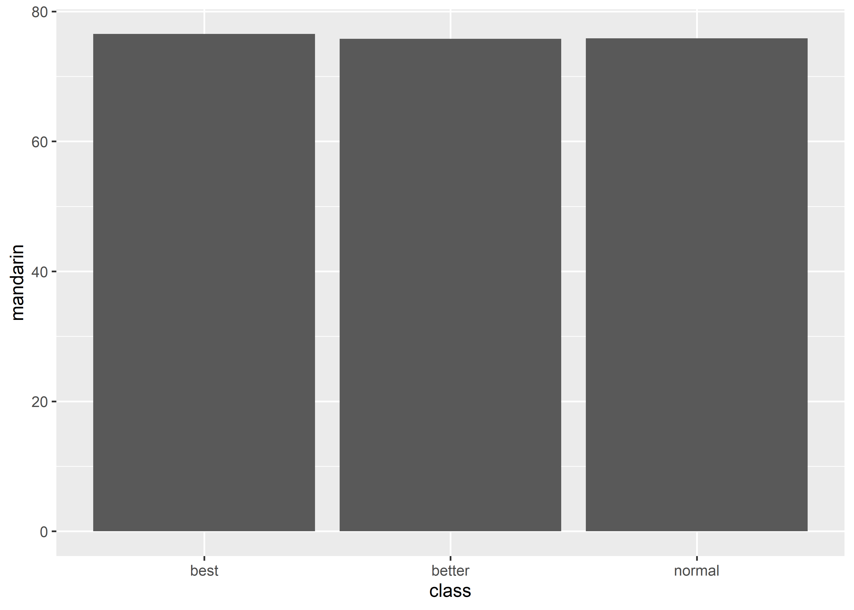
上面的 graph 呈现的是不同 class 的 mandarin 均值,class 很自然地就作为分组标签。同样,这个 graph 也只呈现了 2 个 variables 的信息。反过来,如果想要绘制出这样的 bar graph,数据必须有 2 列,唯一的不同是在于这两列数据只有 3 行,储存的是各 class 在 mandarin 上的均值:
#> class mandarin
#> 1 best 76.52482
#> 2 better 75.80833
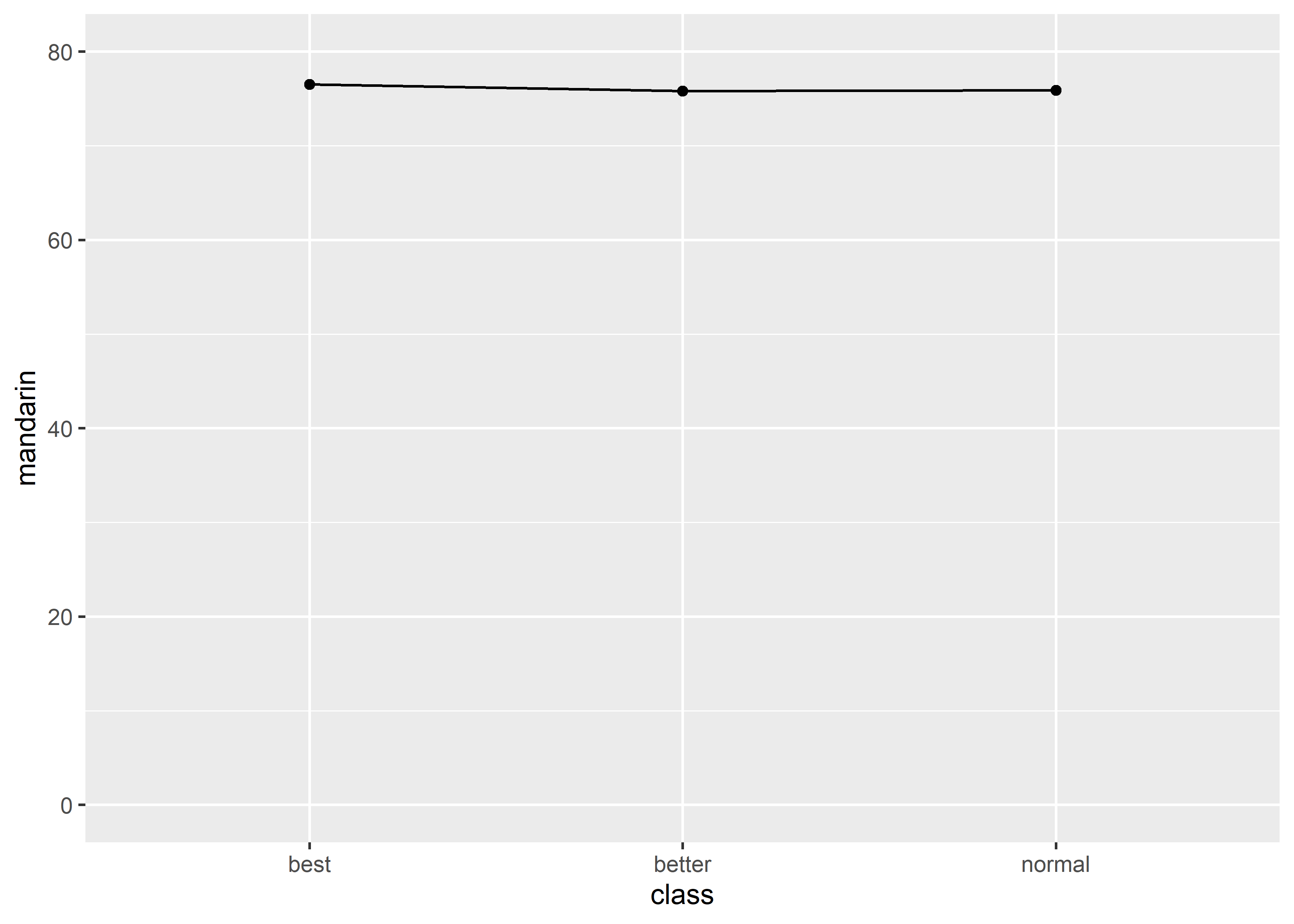
#> 3 normal 75.88288同样的数据,也可以改用 line + point graph,在可视化均值的时候,两种类型的 graphs 呈现的信息是完全等价的:
从前面的例子不难看出,最基本的 graphs 只能呈现出 2 个 variables 的信息,为数不多的例外是 histogram:
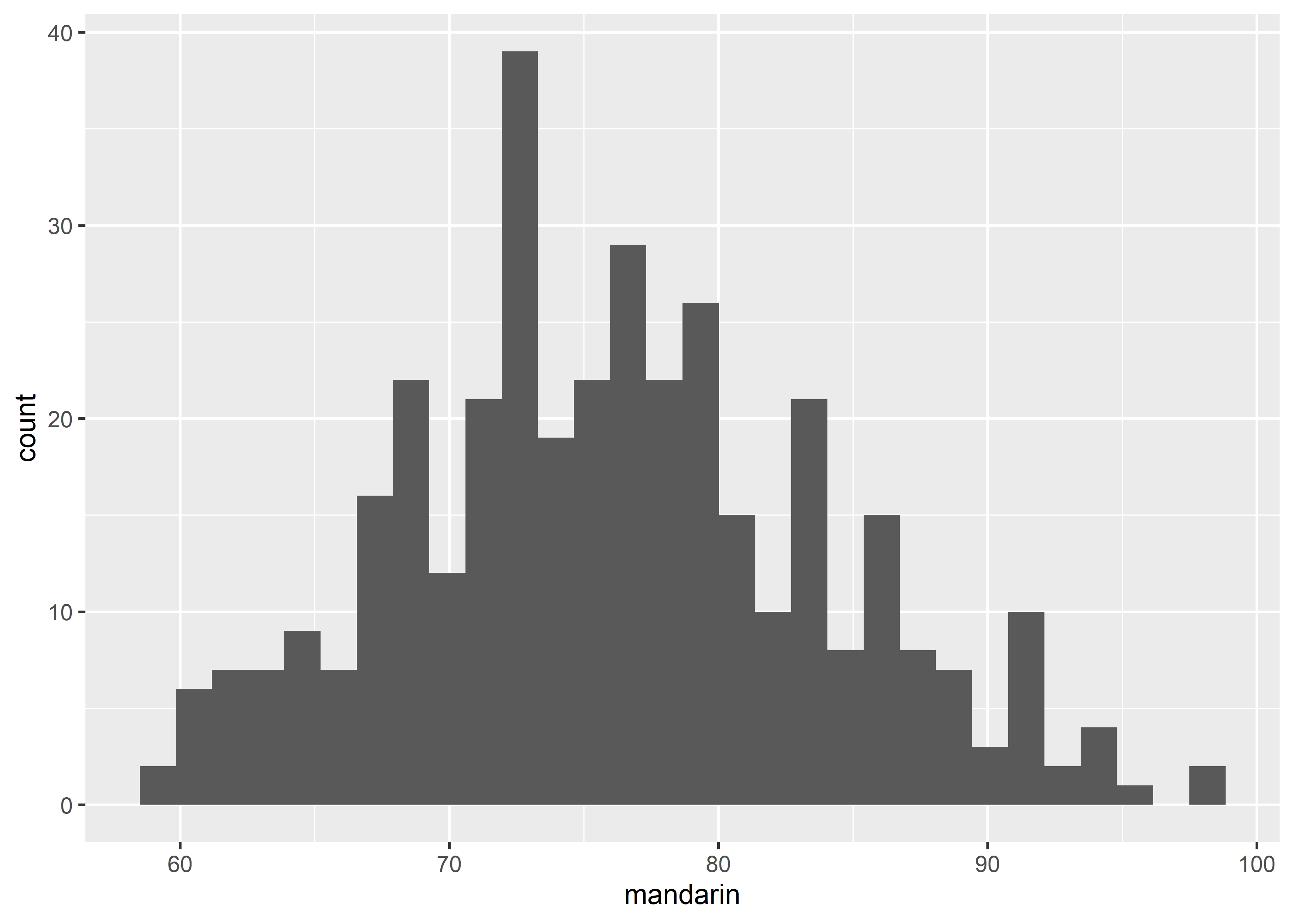
histogram 只能呈现 1 个 continuous variable 的信息,x-axis 代表该 variable,y-axis 是将该 variable 分成若干区间然后计数的结果。
17.3.1.2 Complex graph with multiple variables
那如果需要在 basic graph 里一次性清晰地呈现多于 2 个 variables 的信息该怎么办?
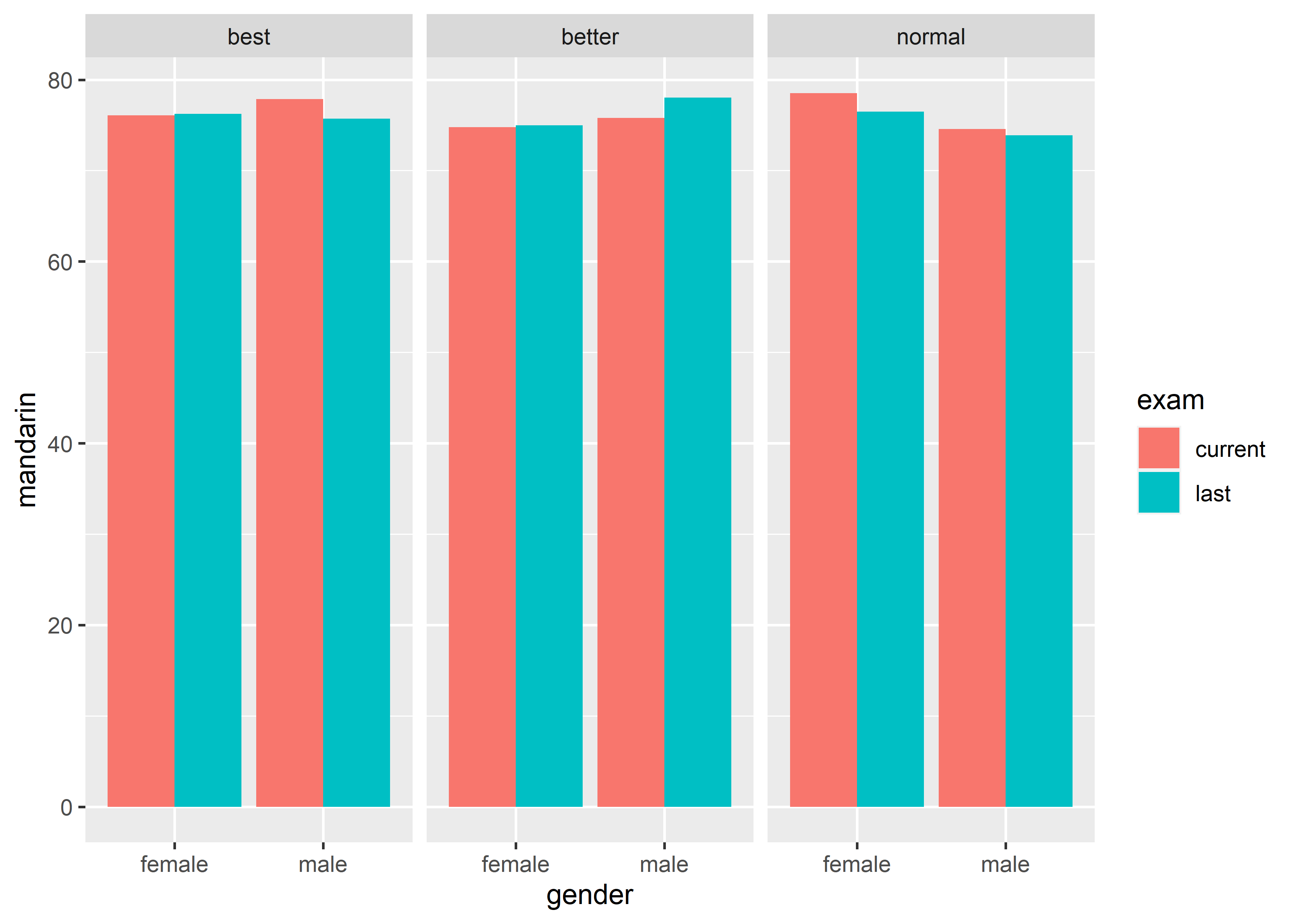
- 3 variables, gender (discrete, IV), exam (discrete, IV) and mandarin (continuous, DV);
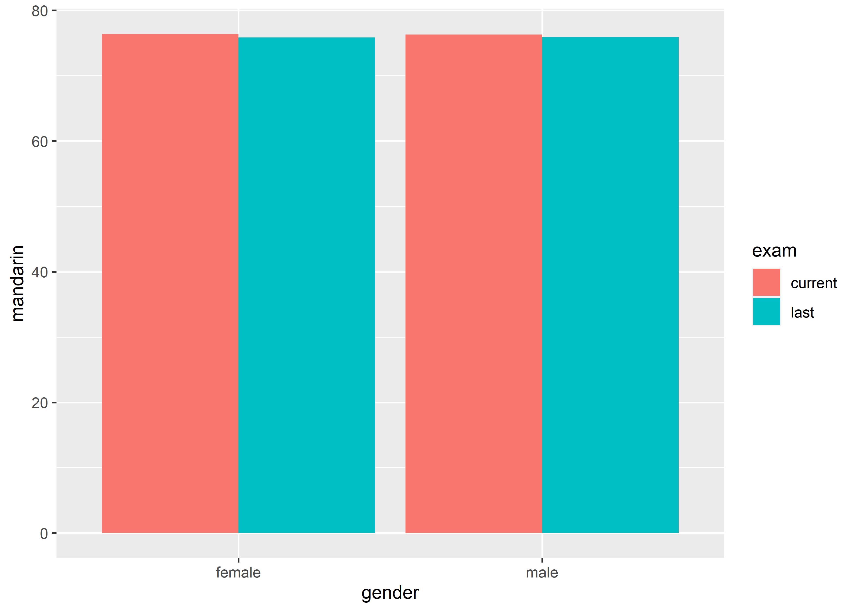
上图呈现的是不同的 gender 在两次考试(last 和 current)上的均值,一共是 3 个 variables。反过来,要绘制出这样的 graph,数据必须有 3 列:
#>   gender    exam mandarin
#> 1 female current 76.36667
#> 2   male current 76.31111
#> 3 female    last 75.86111
#> 4   male    last 75.90476
上面的 graph 可以视作是单张 graph 中可以一次性清晰地呈现的 variables 个数的上限,即 3 个。再呈现更多的 variables 就会让 graph 变得逐渐臃肿。
此时,使用 matrix of subgraphs 的方式呈现会更加清晰。
- 4 variables, gender (discrete, IV), class (discrete, IV), exam (discrete, IV) and mandarin (continuous, DV):
反过来,要画出这样的 graph,数据必须有 4 列:
#>    gender  class    exam mandarin
#> 1  female   best current 76.06061
#> 2    male   best current 77.86842
#> 3  female better current 74.76667
#> 4    male better current 75.80000
#> 5  female normal current 78.51852
#> 6    male normal current 74.59259
#> 7  female   best    last 76.21951
#> 8    male   best    last 75.72414
#> 9  female better    last 74.97297
#> 10   male better    last 78.03571
#> 11 female normal    last 76.46667
#> 12 male normal last 73.88889- 5 variables, gender (discrete, IV), class (discrete, IV), school (discrete, IV), exam (discrete, IV) and mandarin (continuous, DV):
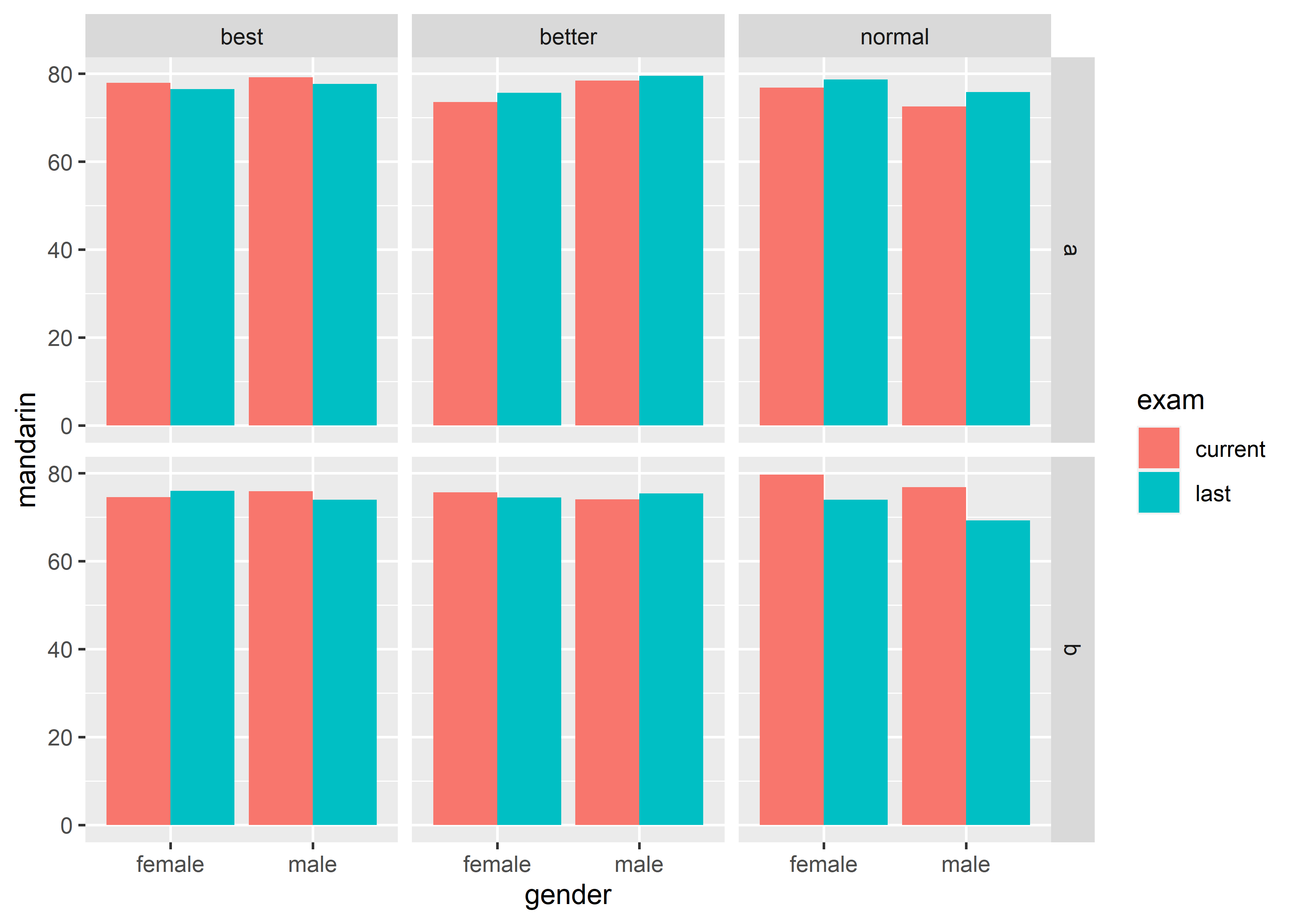
反过来,要绘制出这样的 graph,数据必须有 5 列:
#>    gender  class    exam school mandarin
#> 1  female   best current      a 77.86667
#> 2    male   best current      a 79.17391
#> 3  female better current      a 73.50000
#> 4    male better current      a 78.40000
#> 5  female normal current      a 76.81818
#> 6    male normal current      a 72.50000
#> 7  female   best    last      a 76.45455
#> 8    male   best    last      a 77.64286
#> 9  female better    last      a 75.62500
#> 10   male better    last      a 79.50000
#> 11 female normal    last      a 78.68750
#> 12   male normal    last      a 75.84211
#> 13 female   best current      b 74.55556
#> 14   male   best current      b 75.86667
#> 15 female better current      b 75.61111
#> 16   male better current      b 74.06667
#> 17 female normal current      b 79.68750
#> 18   male normal current      b 76.84615
#> 19 female   best    last      b 75.94737
#> 20   male   best    last      b 73.93333
#> 21 female better    last      b 74.47619
#> 22   male better    last      b 75.40000
#> 23 female normal    last      b 73.92857
#> 24   male normal    last      b 69.25000
上面的 graph 可以视作是 matrix 的方式能够一次性清晰地呈现的 variables 个数上限,即 5 个。
假定数据已经整理成tidy data,在明确了 variables 和 graph 之间的关系后,对于绘制 graph 时需要用到几列就能做到心里有数了。
17.4 Step 2: produce the graph in your mind using ggplot2
至此,就能大体上完成 data visualization 的第一步,已经知道要绘制什么样的 graph,并且要知道要把数据整理成什么样子。万事俱备,只欠ggplot2。如何把脑海中的 graph 使用ggplot2绘制出来,只需要掌握它的 grammar of graphics 即可。
Grammar of graphics 一共包含 5 个成分,3 个关键成分和 2 两个额外成分。
17.4.1 Three key components
ggplot2的核心就是 Grammar of Graphics,它可以简单理解为:任意图形都是将数据(data)映射(mapping)到几何对象(geometric objects, geom)的图形属性(aesthetic attribute,aes)上去。
上述理解只需要 3 个关键成分即可:
-
data; -
aes: a set of aesthetic mappings between variables in the data and visual properties; -
geom: at least one layer which describes how to render each observation. Layers are usually created with ageomfunction.
例如(图片改动自R for Data Science (2nd edition)):
- 整理数据,描述统计;
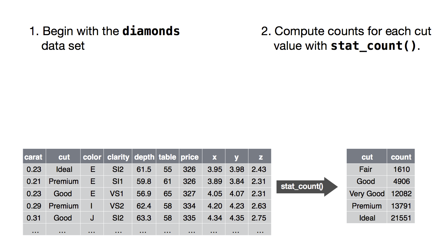
- 将 data 中的 cut (variable) maps 到 color 上;
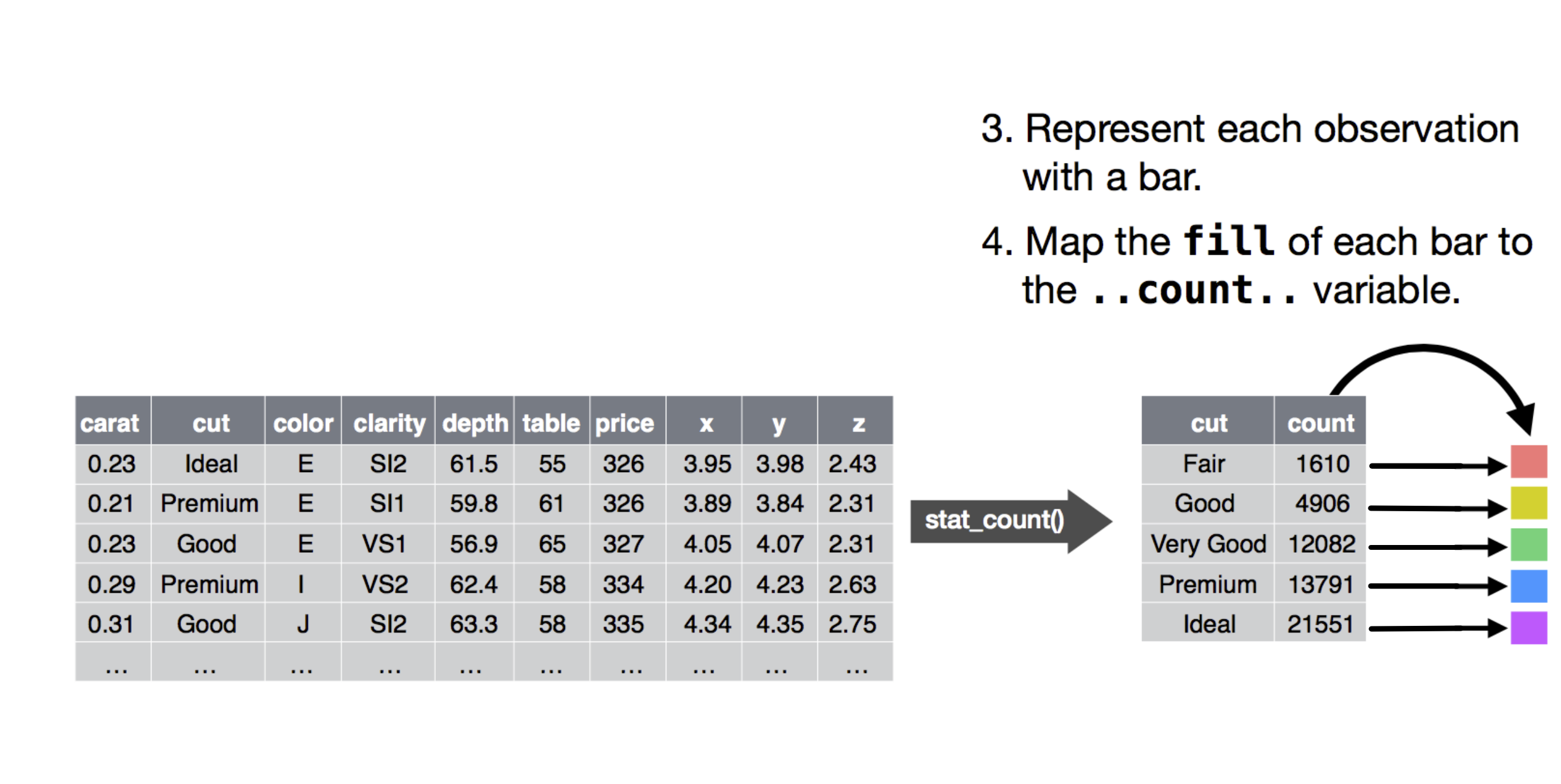
- 将 data 中的 cut maps 到 x-axis,将 count maps 到 y-axis 上,使用 bar graph 来最终呈现上述所有 mappings。
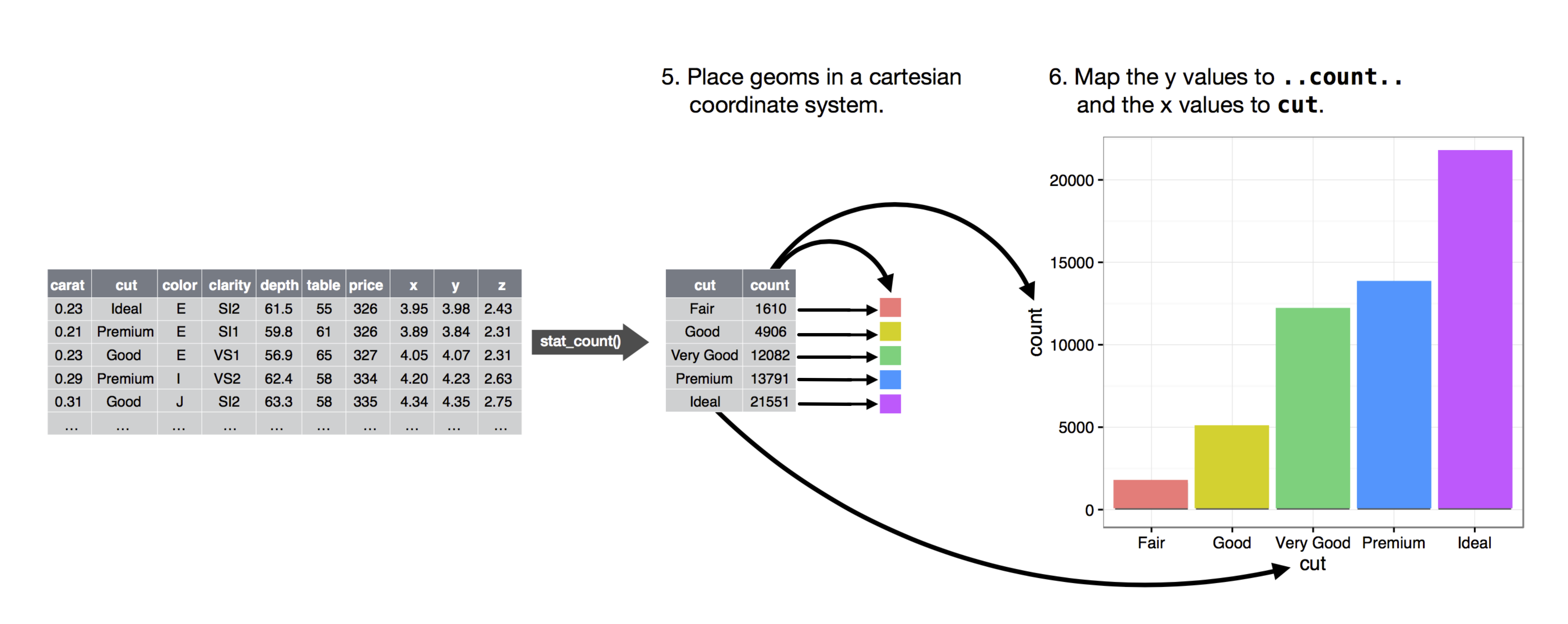
使用 3 个关键成分绘制 graph 的通用代码模板如下:
其中,ggplot()用来初始化一个ggpolt object。<GEOM_FUNCTION>则是具体的 graph 类型,aes(<MAPPINGS>)是针对所使用的 graph 类型的 aesthetic mappings。ggplot2采用了一种多层的设计,不同层之间用+分割。这种结构化的设计可以方便地通过叠加不同的层绘制复杂的 graph,这一点会在后续的讲解中得到充分体现。
ggplot()中使用的data是 global 的,可以继承给<GEOM_FUNCTION>,同样,ggplot()中的aes(<MAPPINGS>)也是 global 的,例如:
上述代码中,<GEOM_FUNCTION_01>和<GEOM_FUNCTION_02>都从ggplot()中继承了mapping = aes(<MAPPINGS>)的设定。同时,有 global 也就意味着有 local,即如果有需要的话,每一层都可以使用自己独立的data和aes()(详见 some tricks 小节),例如:
ggplot(data = <DATA>, mapping = aes(<MAPPINGS>)) +
  <GEOM_FUNCTION_01>(data = <DATA_01>, mapping = aes(<MAPPINGS_01>)) +
  <GEOM_FUNCTION_02>(data = <DATA_02>, mapping = aes(<MAPPINGS_01>))
例如,要绘制上述例子中的 bar graph,具体代码如下:
diamonds |>
  dplyr::count(cut, name = "count") |>
  ggplot() +
    geom_col(mapping = aes(x = cut, y = count, fill = cut))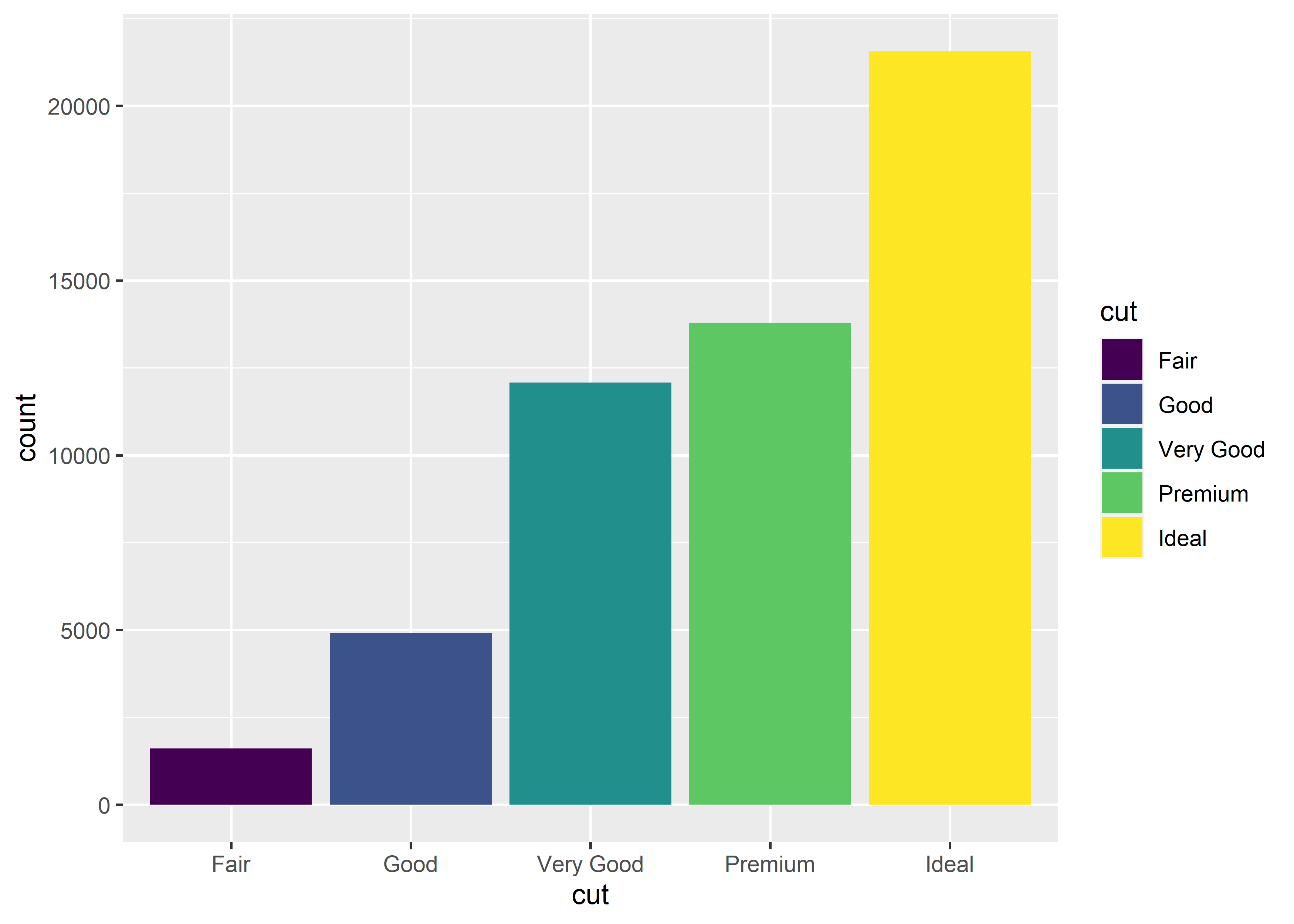
3 个关键成分中的data只需整理成tidy data即可,下面来分别看geom和aes。
17.4.1.1 geom
geom决定了scale的最终呈现形式,所以不同的 graph 对应不同的geom_fun。常用的如下:
- line:
geom_line(), x discrete,y continuous; - point:
geom_point(), x continuous, y continuous; - bar:
geom_bar()orgeom_col(), x discrete, y continuous; - histogram:
geom_histogram(), x continuous; - error bar:
geom_errorbar(), x discrete, y continuous.
基本用法
- point:
geom_point(), x continuous, y continuous;
data_exams |>
  ggplot() +
    geom_point(mapping = aes(x = mandarin, y = english))
- bar:
-
geom_bar(), x discrete; -
geom_col(), x discrete, y continuous.
-
# geom_bar() makes the height of the bar proportional to the number of cases in each group
data_exams |>
  ggplot() +
    geom_bar(aes(x = age))
# geom_col leaves the data as is, it makes heights of the bars to represent values (summed, if multiple) in the data.
data_exams |>
  ggplot() +
    geom_col(aes(x = age, y = mandarin))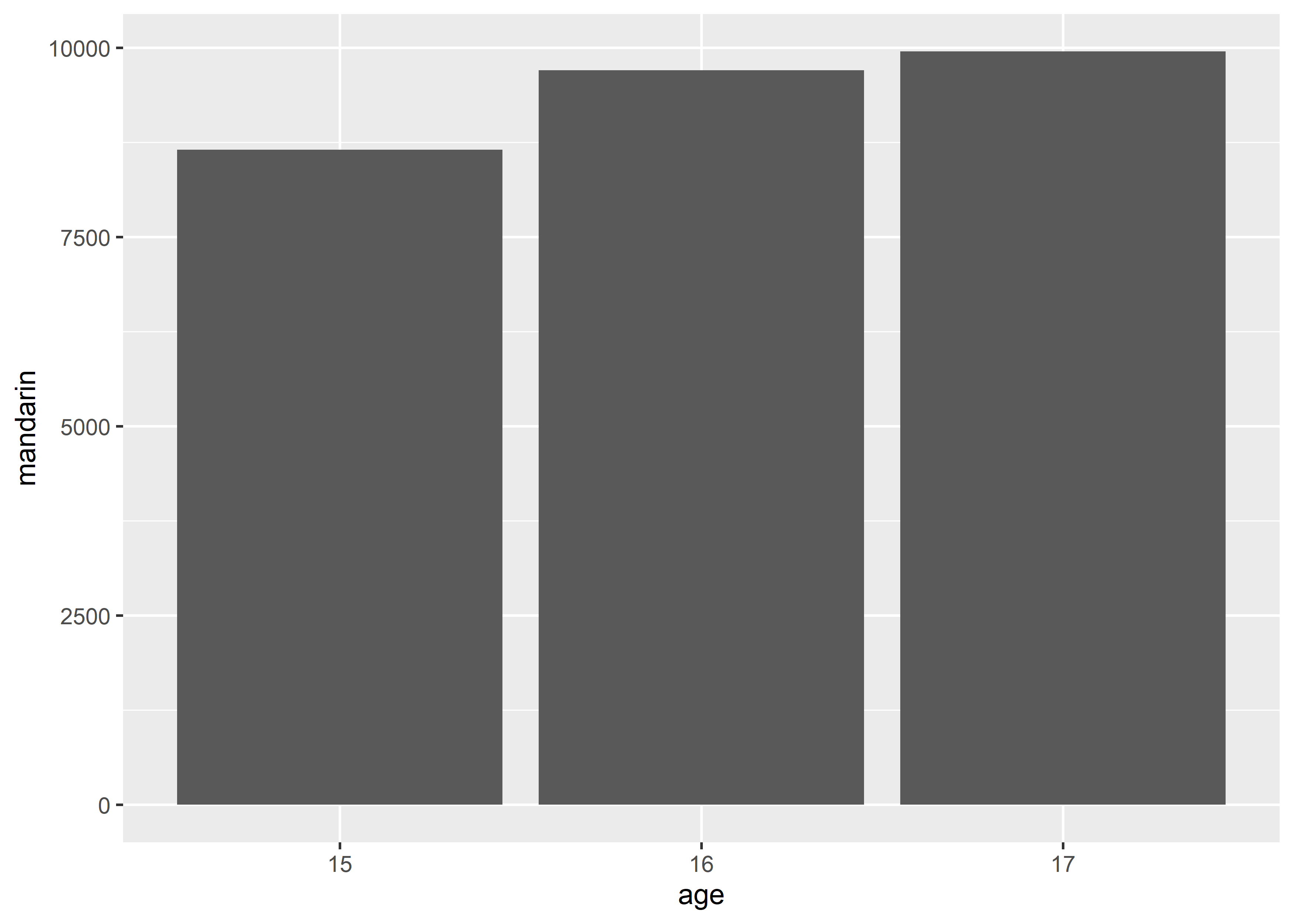
# geom_col() equivalent
data_exams[, c("age", "mandarin")] |>
  aggregate(.~age, sum) |>
  ggplot() +
    geom_col(aes(x = age, y = mandarin))
# geom_bar() equivalent
data_exams |>
  dplyr::count(age, name = "count") |>
  ggplot() +
    geom_col(aes(x = age, y = count))
# use geom_col() for mean comparison,
data_exams[, c("age", "mandarin")] |>
  aggregate(.~ age, mean) |>
  ggplot() +
    geom_col(aes(x = age, y = mandarin))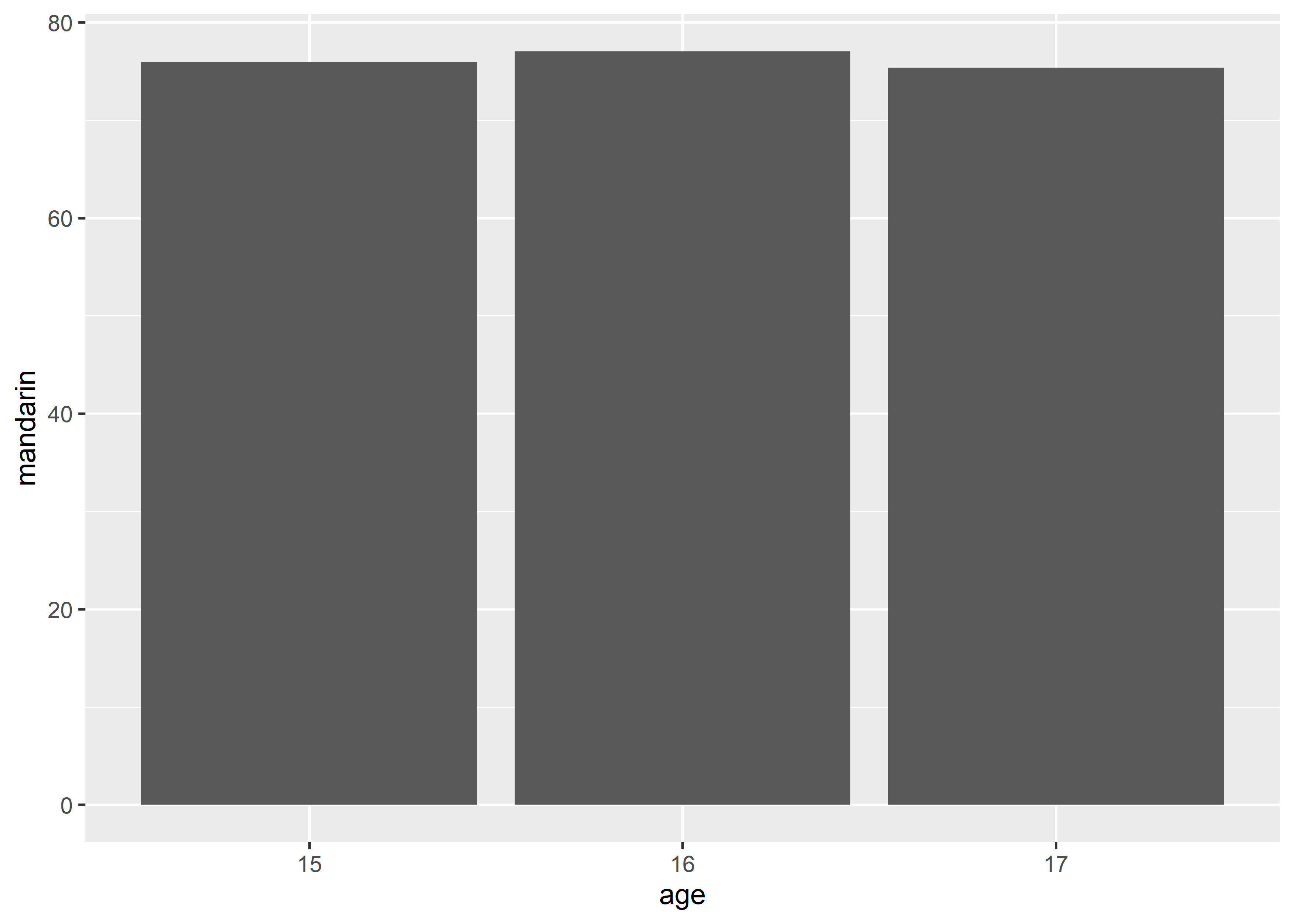
- histogram:
geom_histogram(), x continuous;
data_exams |>
  ggplot() +
    geom_histogram(mapping = aes(x = mandarin))
#> `stat_bin()` using `bins = 30`. Pick better value with
#> `binwidth`.
- error bar:
geom_errorbar(), x discrete, y continuous.
data_exams |>
  dplyr::group_by(gender)  |>
  dplyr::summarise(
    mean = mean(mandarin),
    se = sd(mandarin)/sqrt(nrow(data_exams))
  ) |>
  ggplot() +
    geom_errorbar(mapping = aes(x = gender, ymin = mean - se, ymax = mean + se))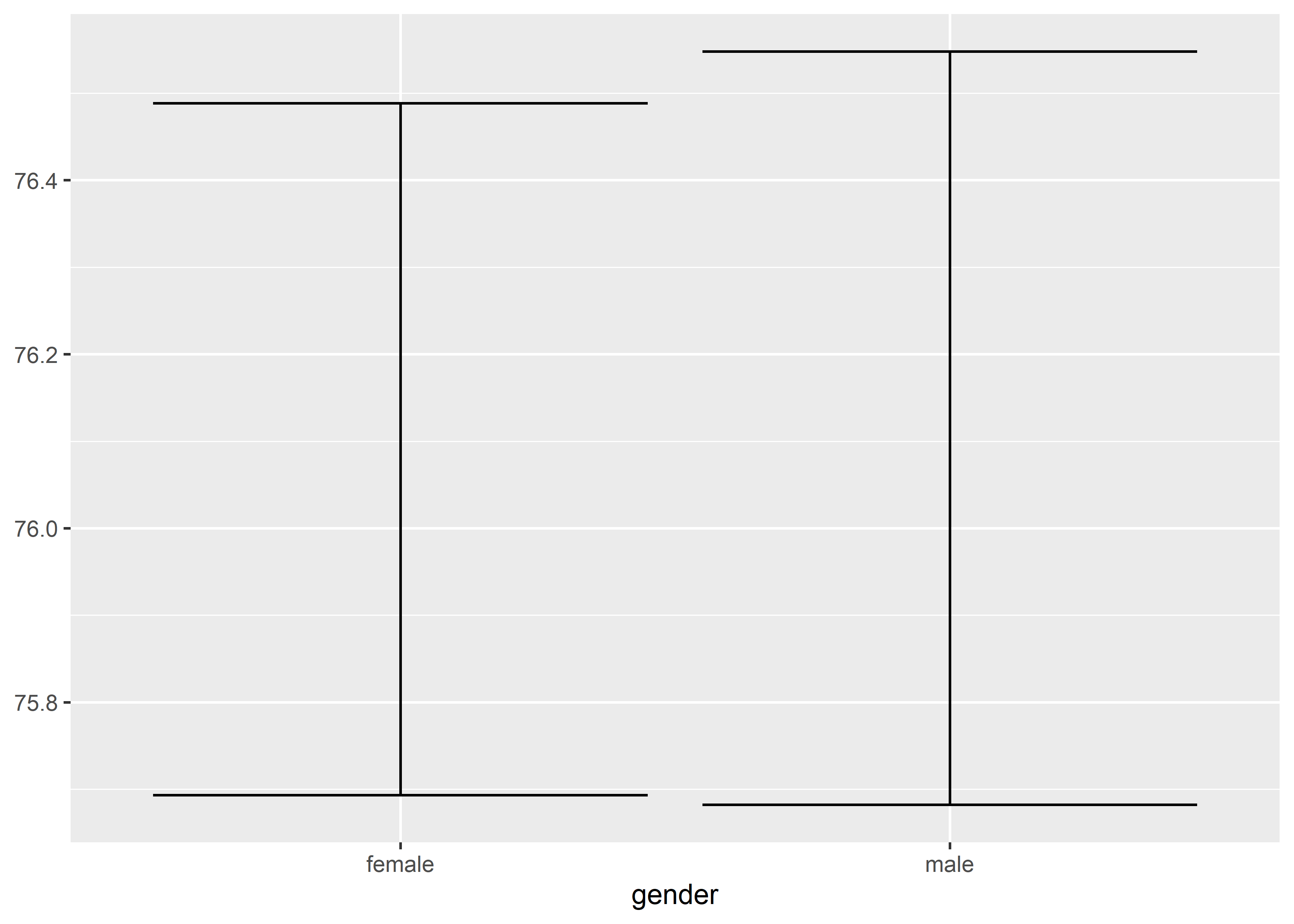
17.4.1.2 aes: scale
ggplot2将data map 到 aes 的过程统称为 scaling,因为每一种aes都可以视作是将data map 到一个特定的scale上。换言之,一个 graph 里有多少个aes mapping,就有多少个scales。
aes要素最主要的有两种:
-
position: 数据在 graph 中的位置,对应 x-axis 和 y-axis; -
colororfill: graph 中元素的颜色,前者适用于 line 和 point,后者适用于 bar 和 histogram。
除此之外,还有以下几种额外的aes要素:
-
group: graph 中元素的分组,适用于 line graph,同一组元素会用同一条线连接,只适用于 discrete variable; -
linetype: line graph 中线条的形状,只适用于 discrete variable; -
shape: point graph 中点的形状,只适用于 discrete variable。 -
size: i.e. point graph 中点的大小,最适用于 continuous variable。
以上所有scale都可以作为argument包裹在aes()中,然后整体作为mapping这个argument的value。
-
position,xand/ory
data_exams |>
  ggplot() +
    geom_point(mapping = aes(x = mandarin, y = english))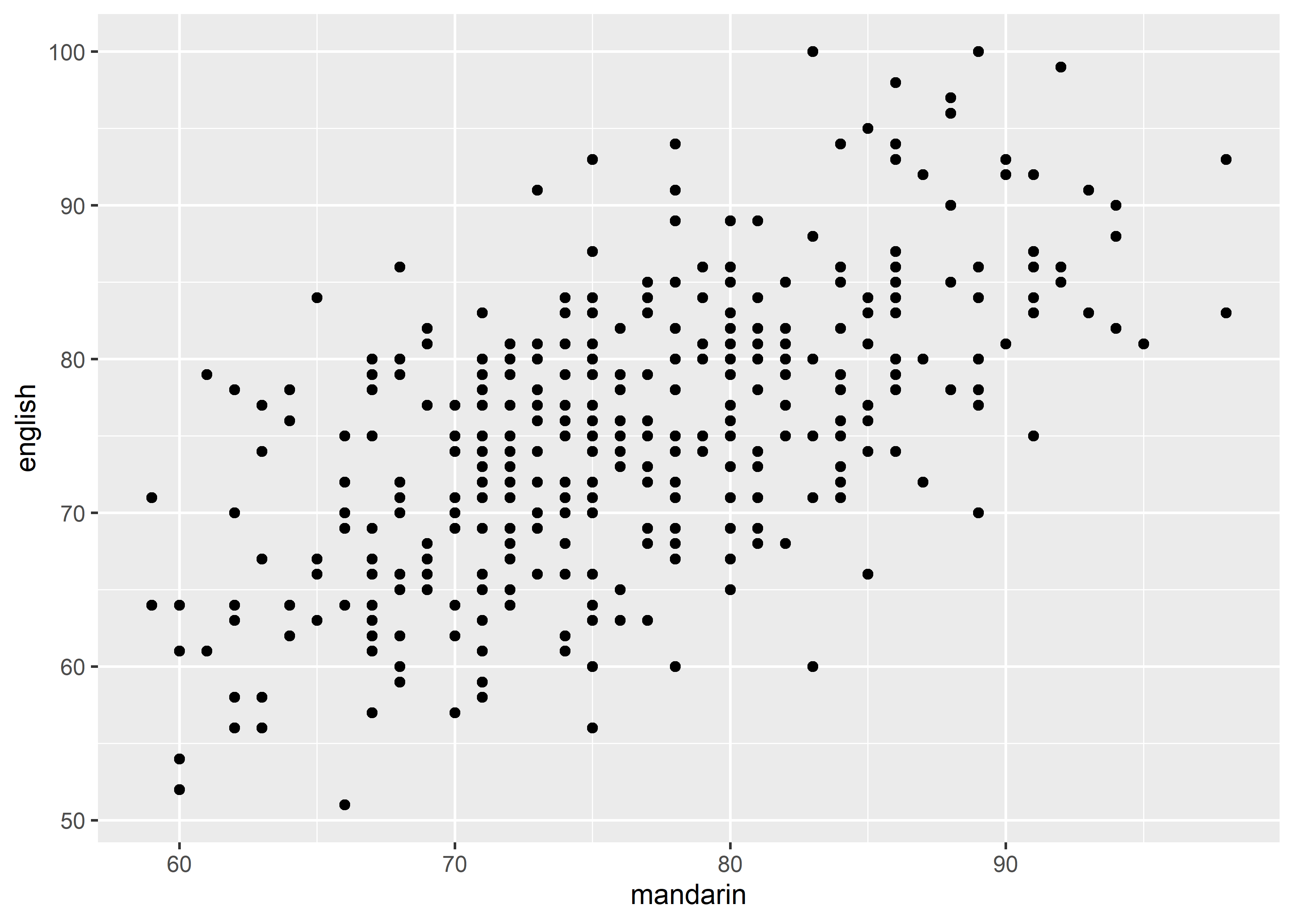
-
colororfill
# color example 1, point, discrete
data_exams |>
ggplot() +
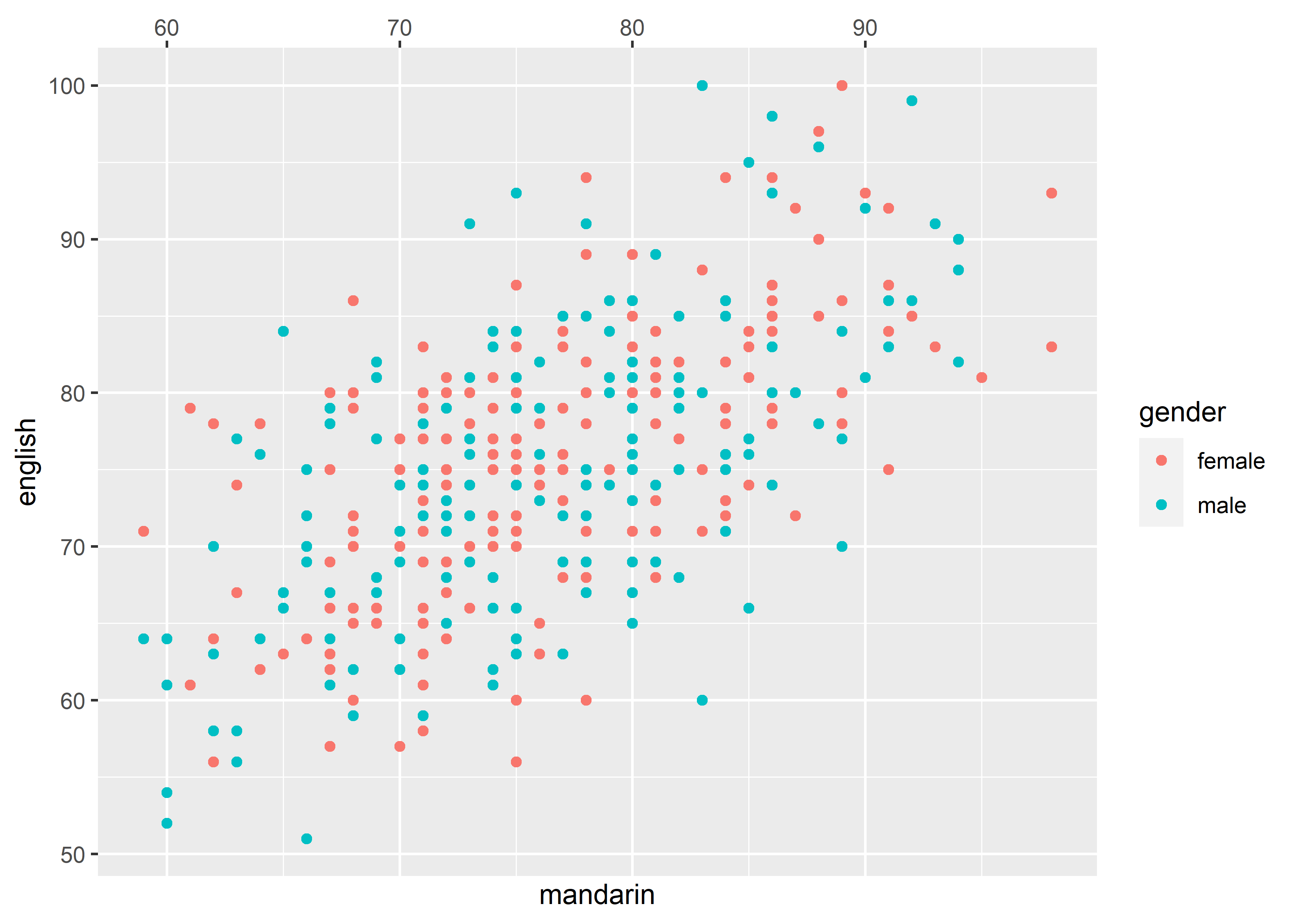
geom_point(mapping = aes(x = mandarin, y = english, color = gender))
# color example 2, point, continuous
data_exams |>
  ggplot() +
    geom_point(mapping = aes(x = mandarin, y = english, color = math))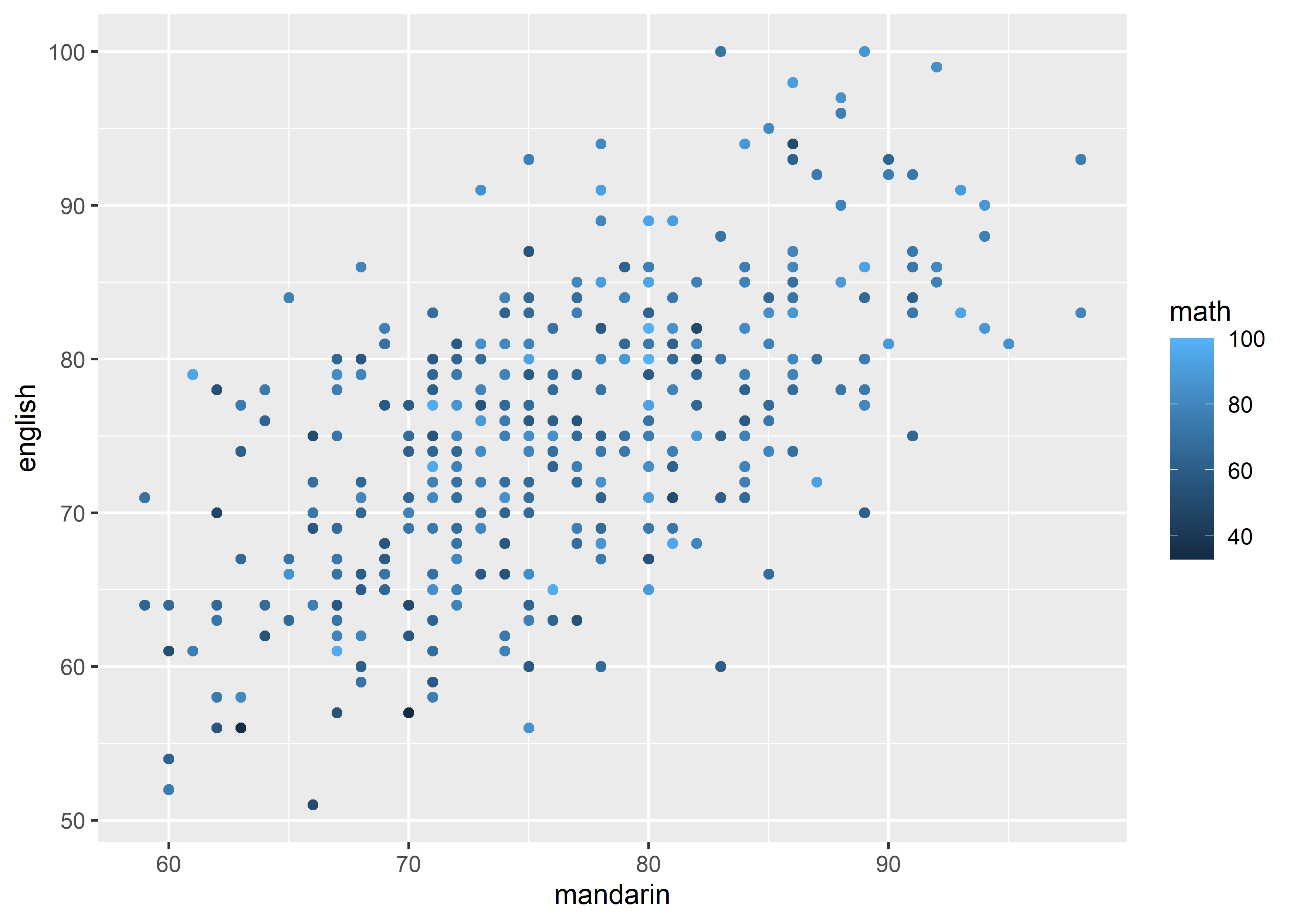
# fill example 1, bar, discrete
data_exams |>
  ggplot() +
    geom_bar(aes(x = age, fill = gender))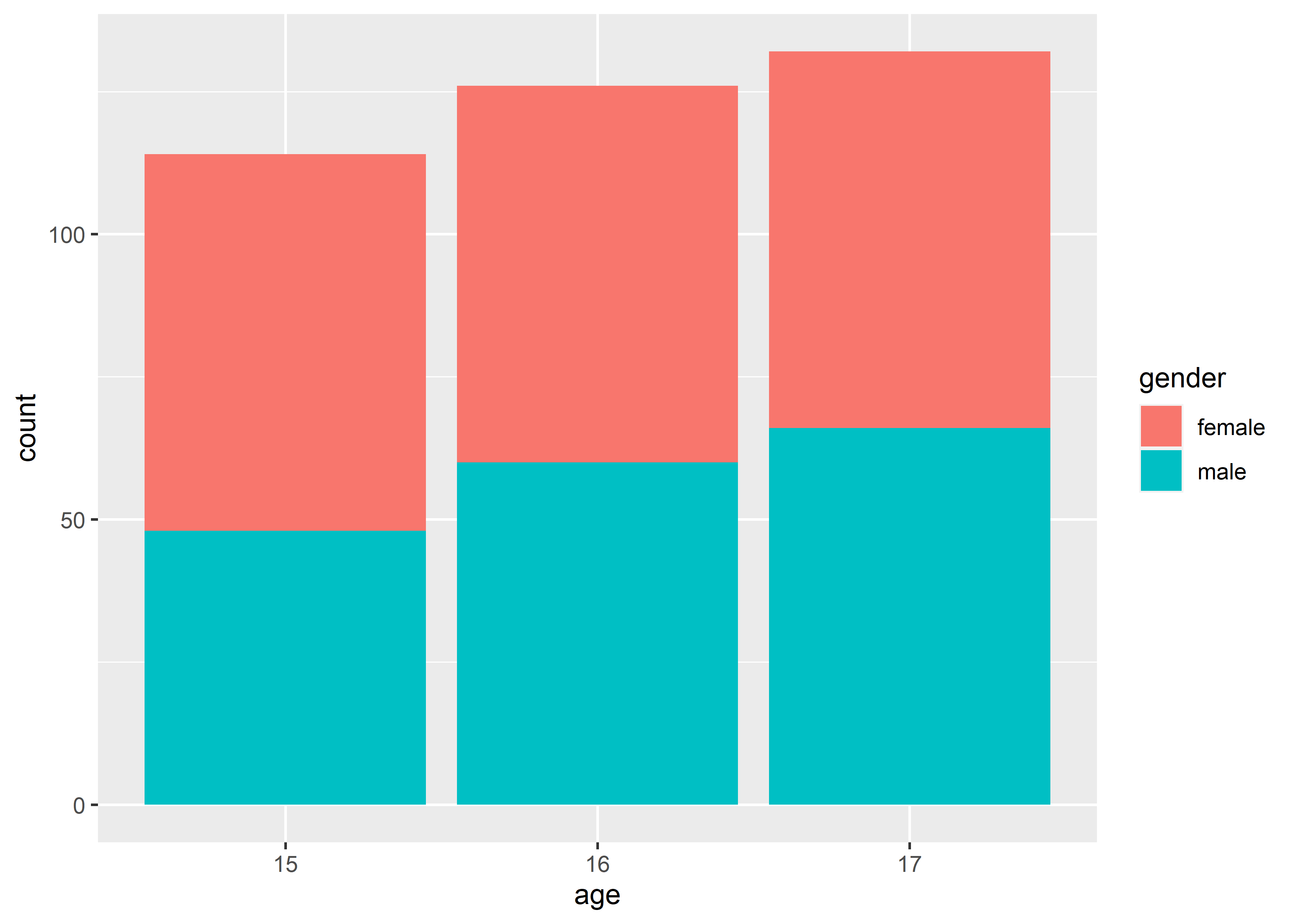
# fill example 2, bar, continuous
diamonds |>
  dplyr::count(cut, name = "count") |>
  ggplot() +
    geom_col(mapping = aes(x = cut, y = count, fill = count))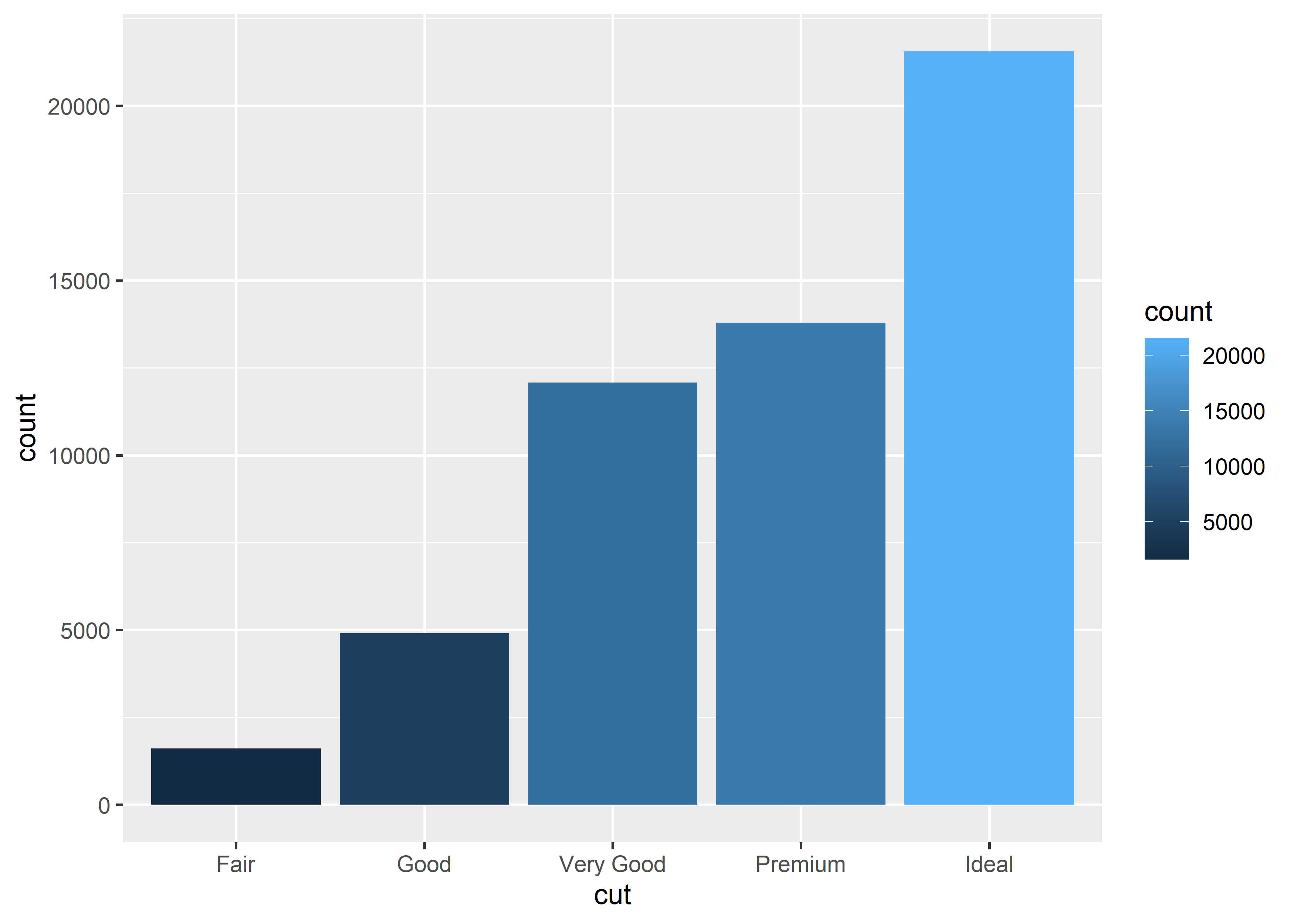
# fill example 3, histogram
data_exams |>
  ggplot() +
    geom_histogram(mapping = aes(x = mandarin, fill = gender))
#> `stat_bin()` using `bins = 30`. Pick better value with
#> `binwidth`.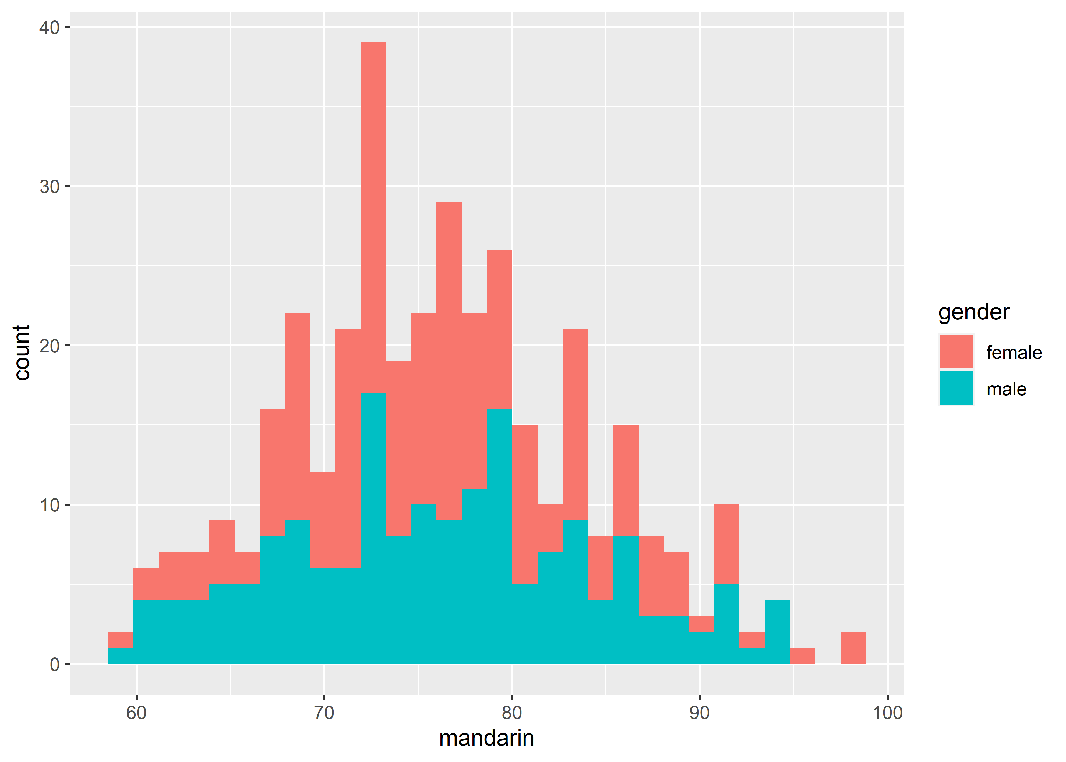
其中,bar 和 histogram 中的 bin 情况下默认都是采用堆叠(stack)的方式,如果需要调整,请参考 modify the graph 小节。
注意一个细节,如果希望color或fill能代表一个额外的 variable(既非 x-axis 所对应的 variable,又非 y-axis 所对应的 variable),从而实现给 graph 多添加一个分组的信息,那么需要将该 variable 作为 color或fill 的参数(参见上面的例子)。反之,如果只是想让图形变成彩色,并不额外添加分组的信息,那么有两种方式:
- 放在
aes()内,将 x-axis 对应的 variable 作为color或fill的value;
data_exams |>
  ggplot() +
    geom_bar(aes(x = age, fill = age))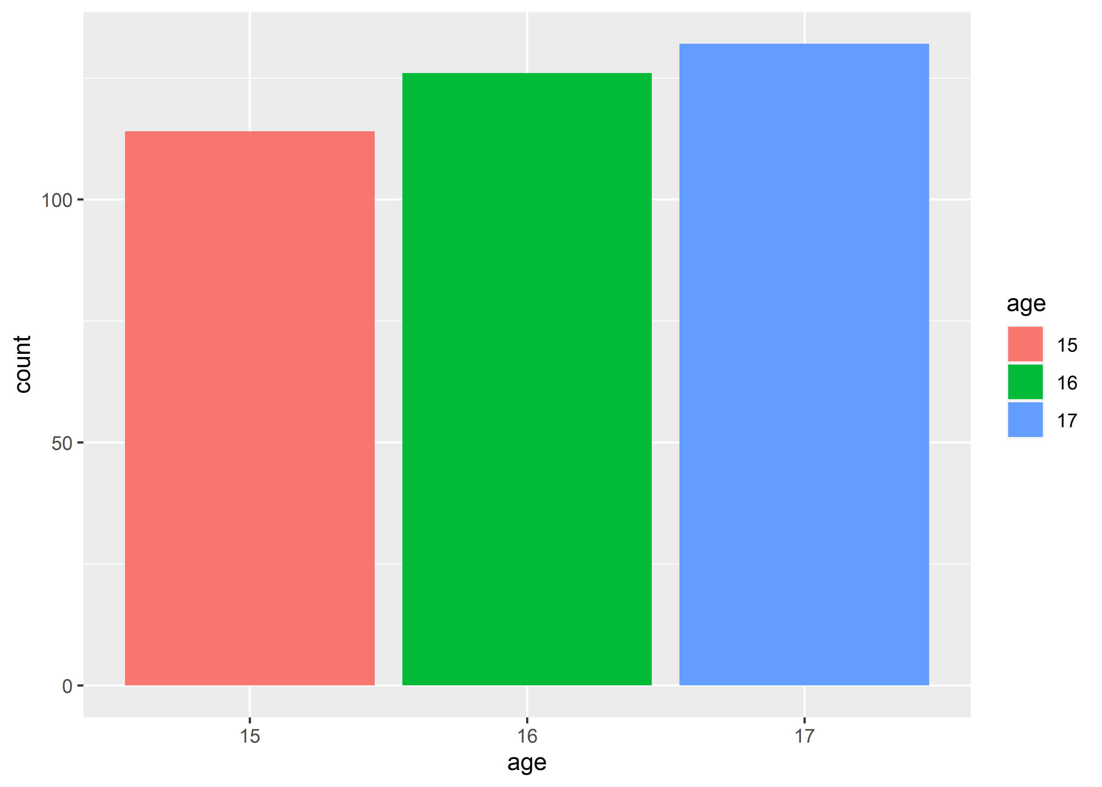
- 放在
aes()外,将color或fill作为setting,实现固定整个 graph 内所有对应元素为同一颜色的效果。
data_exams |>
  ggplot() +
    geom_bar(aes(x = age), fill = "blue")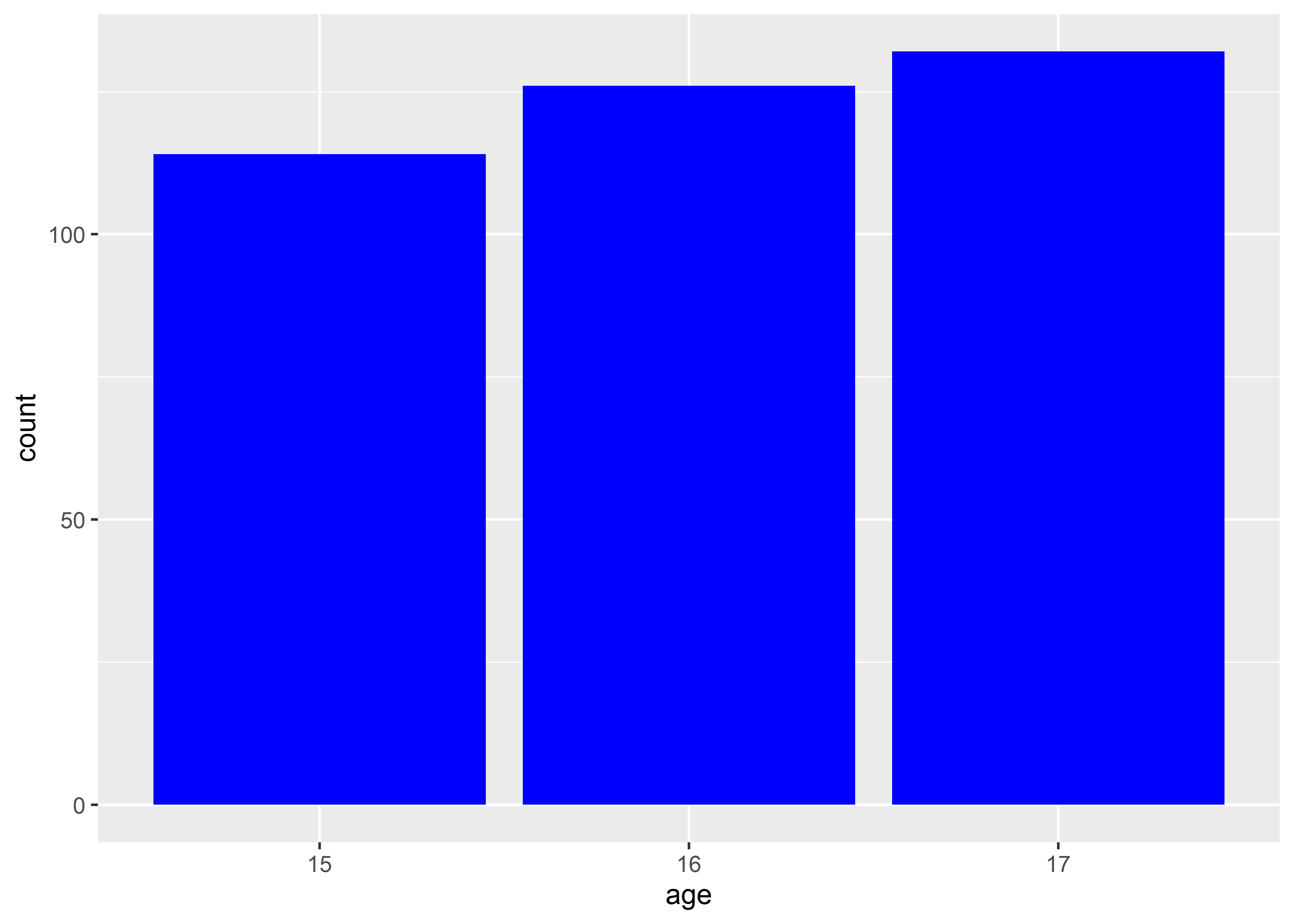
注:放在aes()外的这个小技巧也同样适用于shape、linetype和size,只要放在aes()外,就变成一个 setting,作用于整个 graph。
以上两种方式可以根据需要选择。
-
group: discrete variable
正常情况下,line graph 会自动将坐标系空间里的若干个点连起来形成 line,所以需要知道哪些点是在同一组,就用同一条线连这些点。group就是用来控制这个分组,分组显然是要依据 discrete variable。
data_exams[, c("class", "gender", "english")] |>
  aggregate(.~ class + gender, mean) |>
  ggplot() +
    geom_line(mapping = aes(x = class, y = english, group = gender))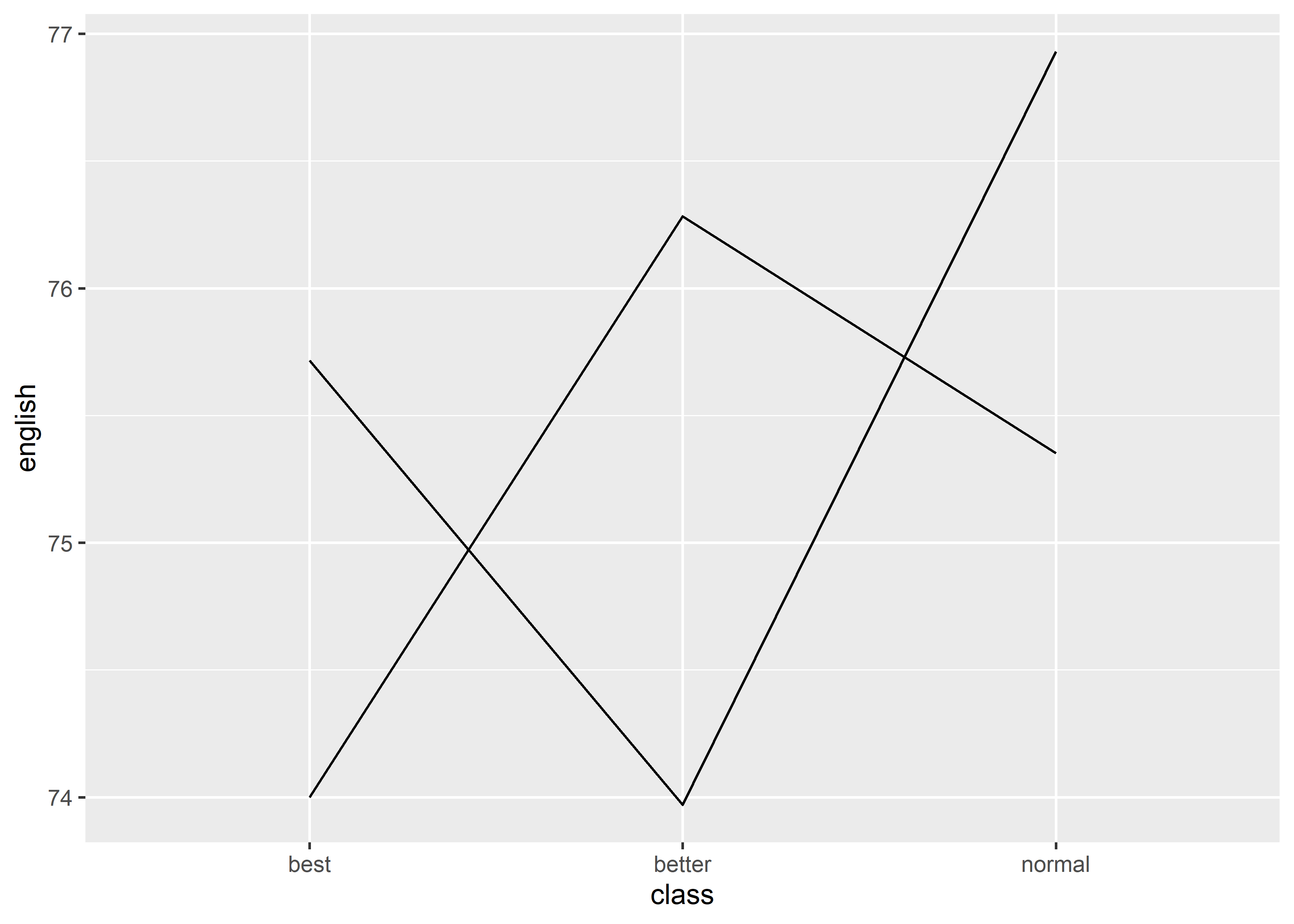
但上述 line graph 中的不同 line 的指向并不清晰,所以可以通过增加color的方式标明:
# group + color
data_exams[, c("class", "gender", "english")] |>
  aggregate(.~ class + gender, mean) |>
  ggplot() +
    geom_line(mapping = aes(x = class, y = english, group = gender, color = gender))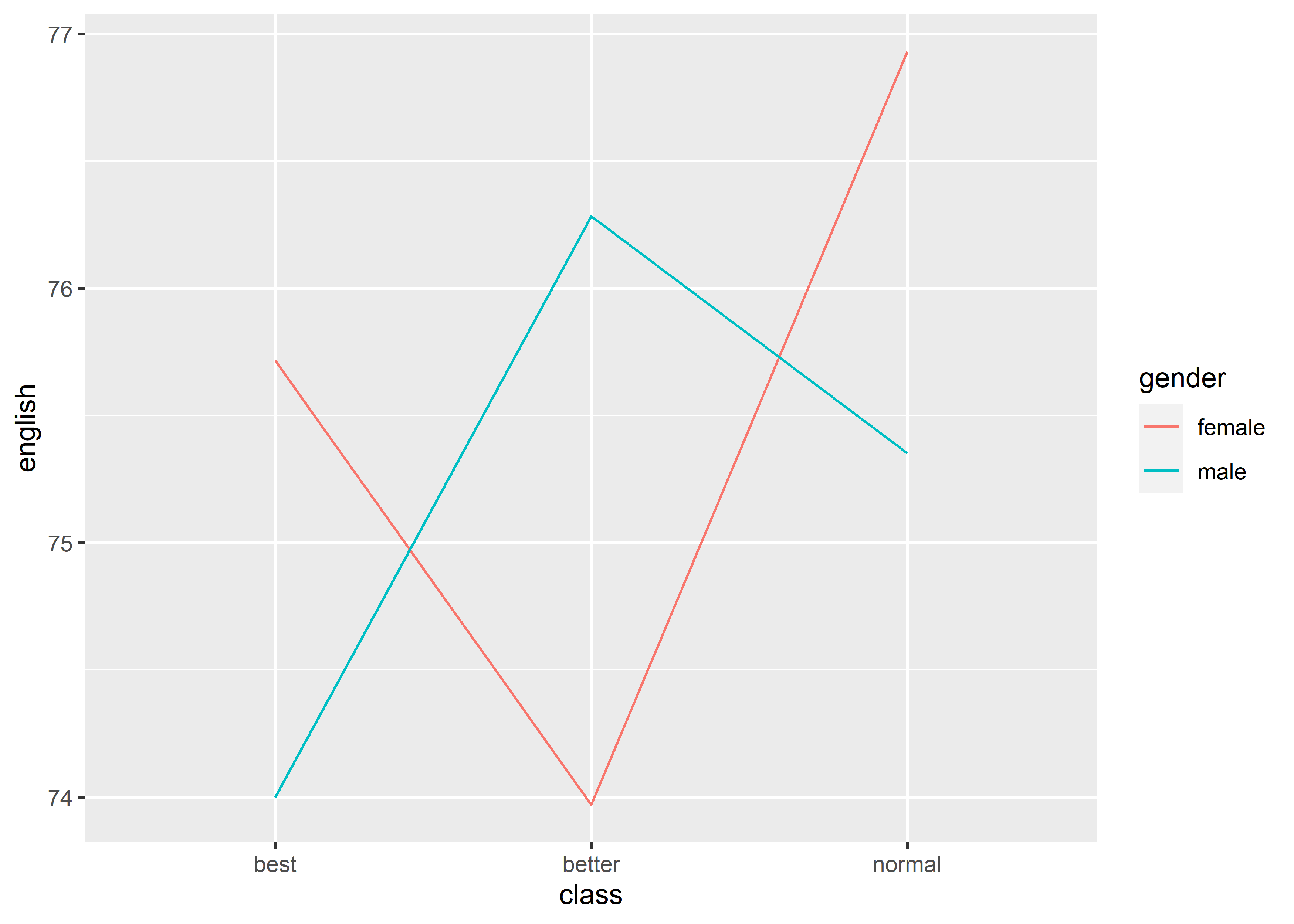
注意,此时color和group要使用同一 discrete variable。使用color + group的方式也是给 line graph 多呈现了一个 discrete variable 的信息。
-
linetype: discrete variable
linetype和color的效果类似,只不过一个是改变形状,另一个是改变颜色。linetype同样也需要搭配group使用
data_exams[, c("class", "gender", "english")] |>
  aggregate(.~ class + gender, mean) |>
  ggplot() +
    geom_line(mapping = aes(x = class,
                            y = english,
                            group = gender,
                            linetype = gender))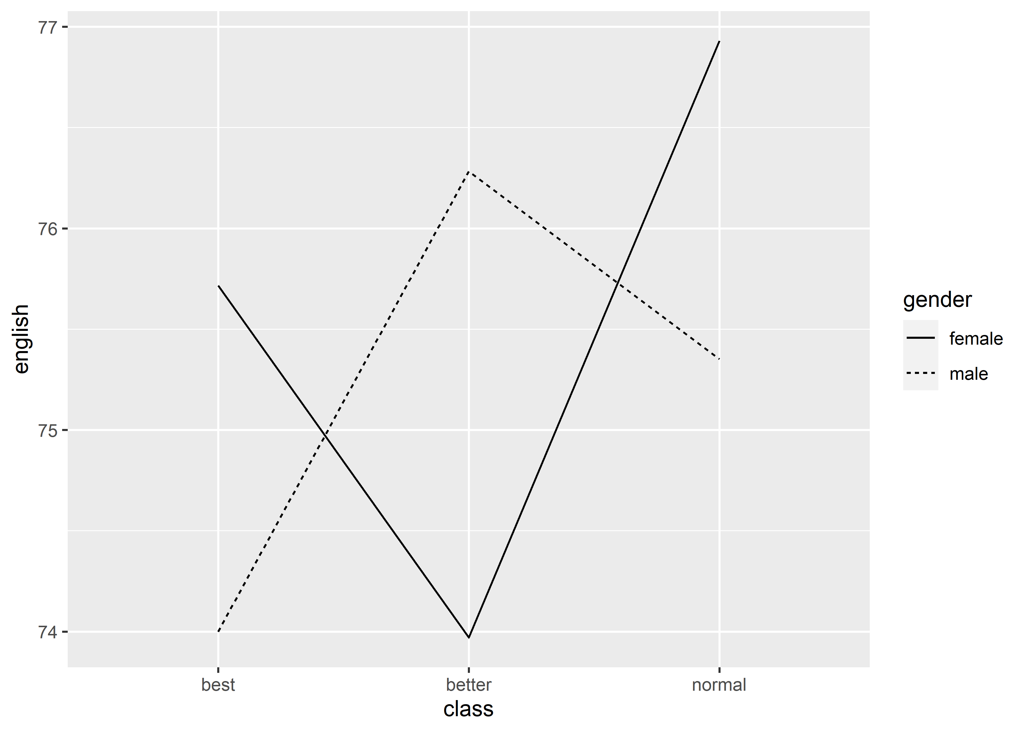
同样,linetype也可以和color组合使用:
data_exams[, c("class", "gender", "english")] |>
  aggregate(.~ class + gender, mean) |>
  ggplot() +
    geom_line(mapping = aes(x = class,
                            y = english,
                            group = gender,
                            linetype = gender,
                            color = gender))
-
shape: discrete variable
data_exams |>
  ggplot() +
    geom_point(mapping = aes(x = mandarin, y = english, shape = class))
shape也可以和color组合使用,让图像更加清晰,但注意二者要使用同一 discrete variable。
data_exams |>
  ggplot() +
    geom_point(mapping = aes(x = mandarin, y = english, shape = class, color = class))
-
size: continuous variable or discrete variable with meaningful scale
head(data_exams)#> gender age class school exam mandarin math english
#> 1 female 16 better b last 72 74 75
#> 2 female 16 normal a current 76 61 75
#> 3 female 15 best b current 71 76 58
#> 4 male 17 normal a current 77 54 63
#> 5 female 15 best a last 82 77 80
#> 6 male 15 best a current 60 76 52
# continuous, recommended
data_exams |>
  ggplot() +
    geom_point(mapping = aes(x = mandarin, y = english, size = math))
# discrete, not recommended
data_exams |>
  ggplot() +
    geom_point(mapping = aes(x = mandarin, y = english, size = age))
#> Warning: Using size for a discrete variable is not advised.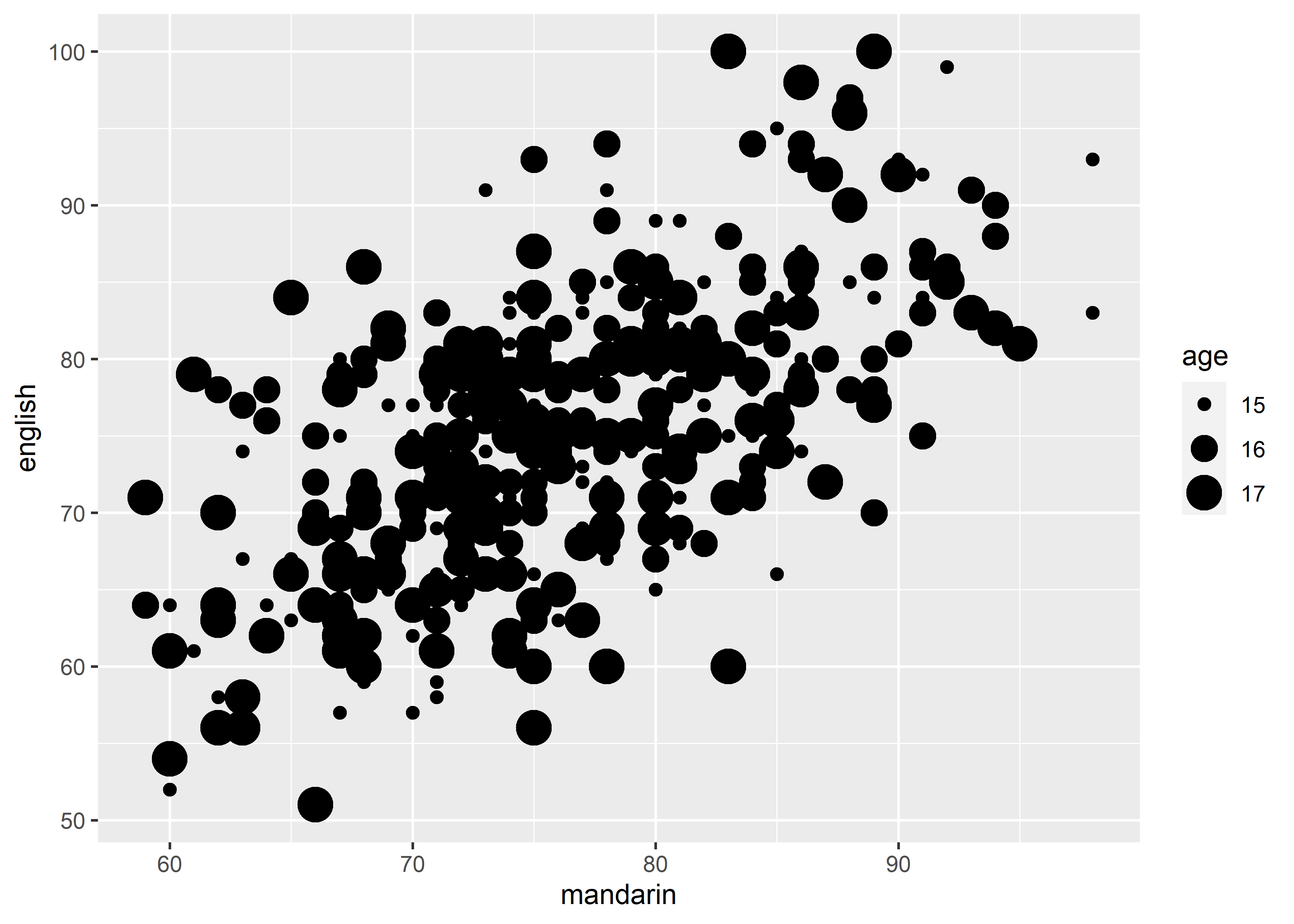
总结一下,如果要在单张 graph 呈现 3 个 variables 的信息时,如 1 continuous DV + 2 IV(其中 1 个是 discrete),那么就可以在各种 graph 里使用以下scale来实现,假定 discrete variable 为 var_dis,continuous variable 为 var_con:
-
color = var_dis(+ group = var_disforgeom_line()when x-aix variable is discrete), orcolor = var_con; -
fill = var_dis(forgeom_bar()) orfill = var_con(forgeom_histogram()); -
linetype = var_dis(+ group = var_disforgeom_line()when x-aix variable is discrete); -
shape = var_dis(e.g.geom_point()); -
size = var_con(e.g.geom_point()).
另外再补充两点细节:
- x-axis variable in
geom_line(): factor vs numeric
line graph 的 x-axis 天然适合 discrete variable。在R中,可以大致上将character atomic vector或factor视作是discrete。但geom_line()在处理这两种类型的 variable 时,会看到如下提示并给出空白的 Graph:
data_exams[, c("class", "mandarin")] |>
  aggregate(.~ class, mean) |>
  ggplot() +
    geom_line(mapping = aes(x = class, y = mandarin))
#> `geom_line()`: Each group consists of only one observation.
#> ℹ Do you need to adjust the group aesthetic?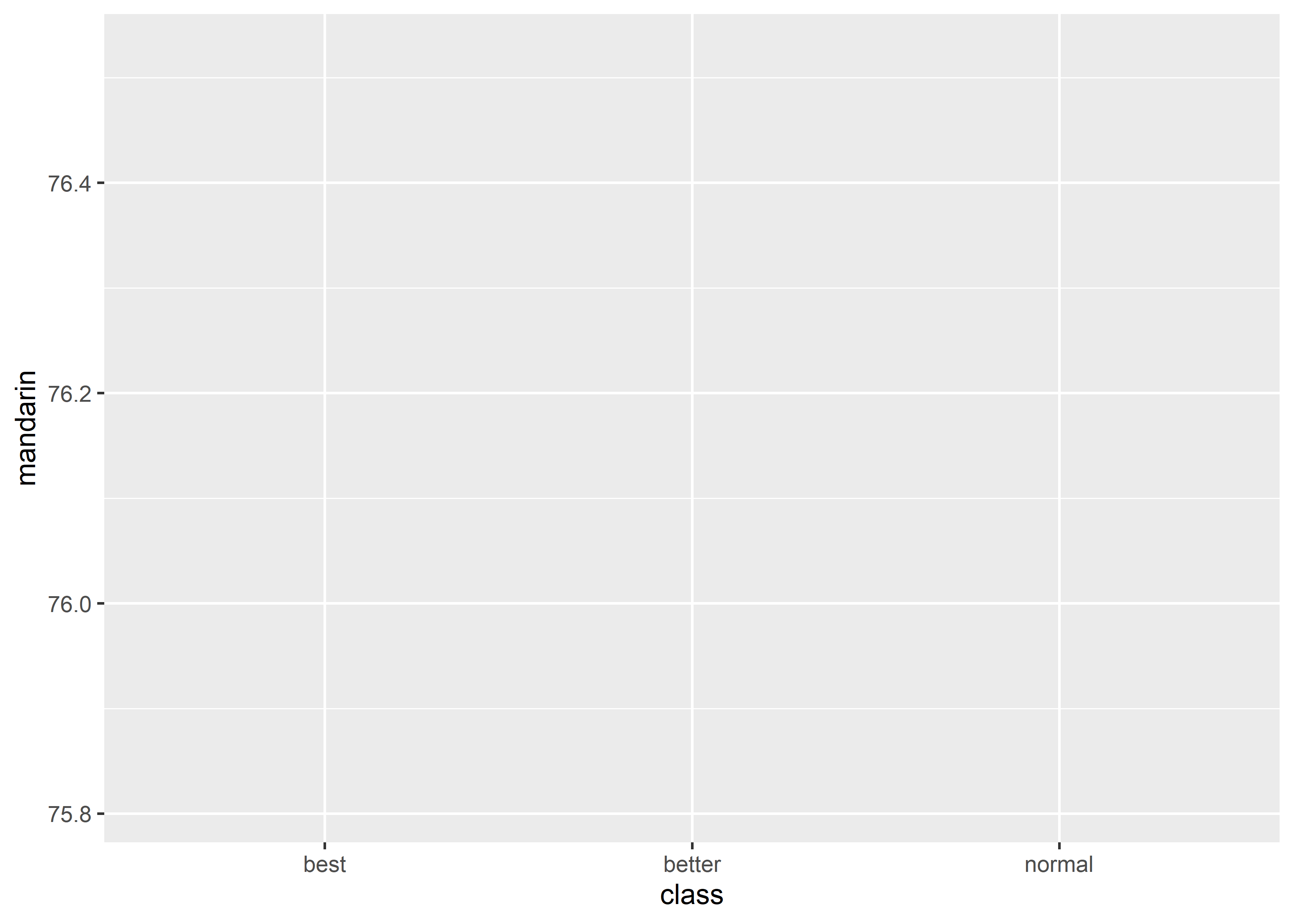
这是因为 line graph 本质上是将坐标系中的点连起来,geom_line()需要知道哪些点是用同一条线连起来,所以就需要提供group信息,否则geom_line()无法出图。针对这种情况,有两种解决方案:
# solution 1, add group (recommended)
data_exams[, c("class", "mandarin")] |>
  aggregate(.~ class, mean) |>
  ggplot() +
    geom_line(mapping = aes(x = class, y = mandarin, group = 1))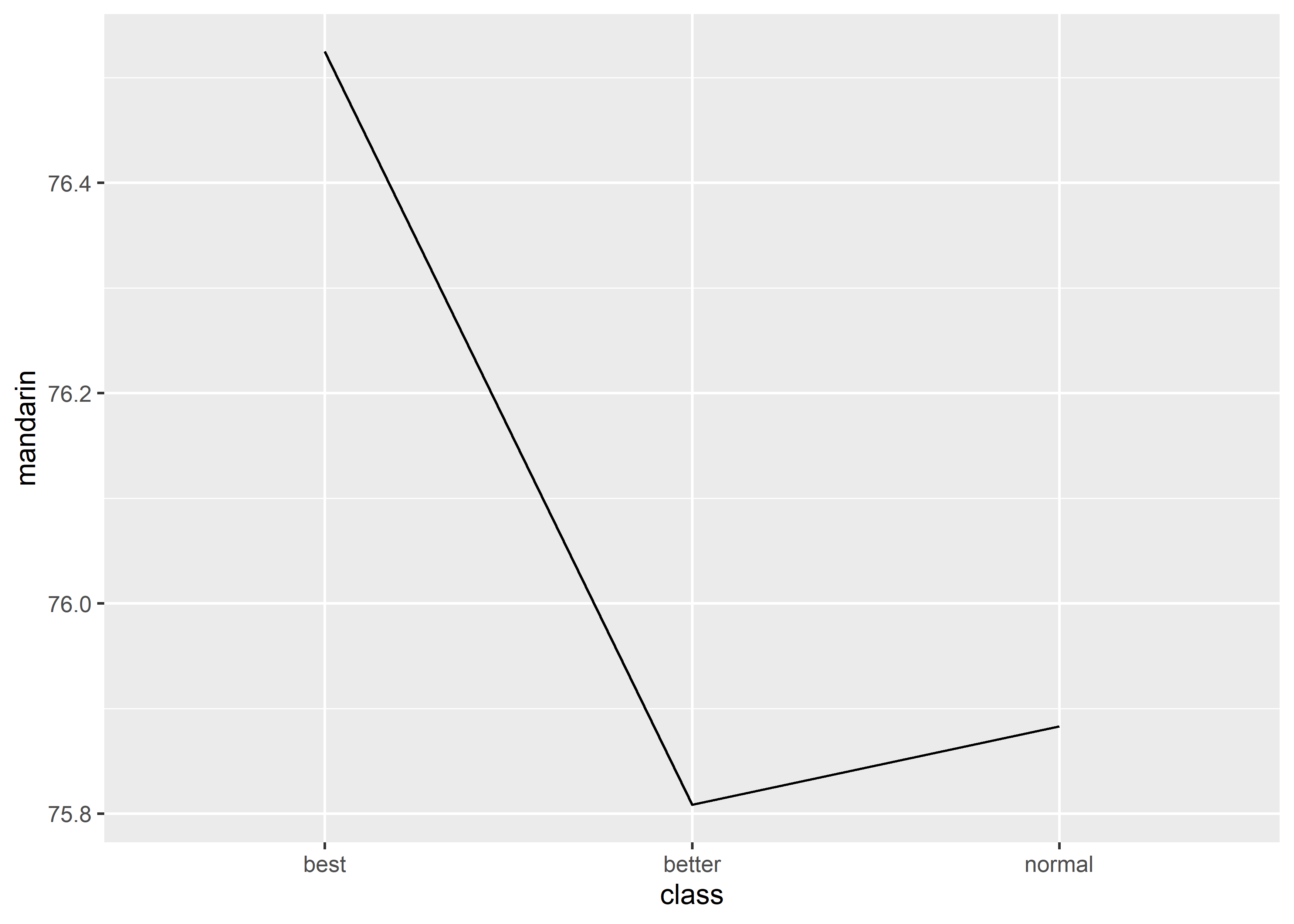
# solution 2, convert x into continuous variable
data_exams$class <- factor(data_exams$class, labels = 1:3)
data_exams[, c("class", "mandarin")] |>
  aggregate(.~ class, mean) |>
  ggplot() +
    geom_line(mapping = aes(x = as.numeric(class), y = mandarin))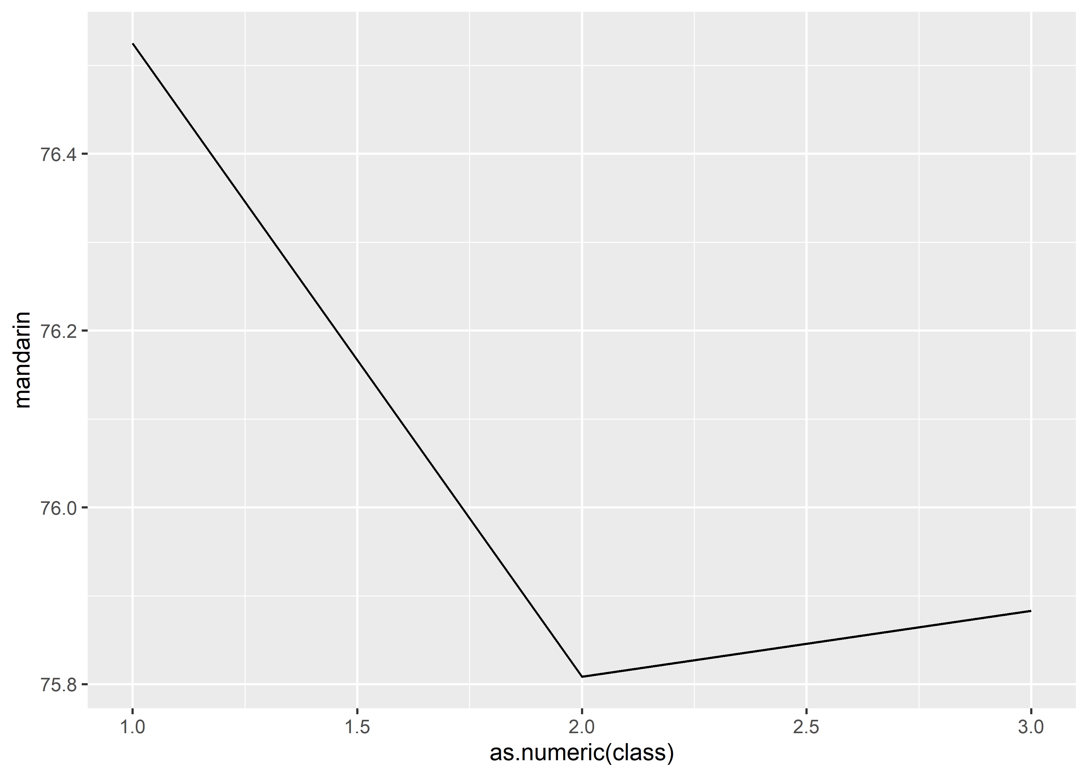
- combine different graphs: line + point + errorbar
心理学研究中最常见的均值比较折线图可以用geom_point() + geom_line() + geom_errorbar()的方式绘制:
data_exams[, c("class", "gender", "mandarin")] |>
  dplyr::group_by(class, gender)  |>
  dplyr::summarise(
    mean = mean(mandarin),
    se = sd(mandarin)/sqrt(nrow(data_exams))
  ) |>
  ggplot(mapping = aes(x = class, y = mean, color = gender)) +
    geom_point() +
    geom_line(mapping = aes(group = gender)) +
    geom_errorbar(mapping = aes(ymin = mean - se, ymax = mean + se))
#> `summarise()` has grouped output by 'class'. You can
#> override using the `.groups` argument.
# what will happen if we remove the group argument in aes()?如果希望 point 的区别更加明显,还可以增加shape:
data_exams[, c("class", "gender", "mandarin")] |>
dplyr::group_by(class, gender) |>
dplyr::summarise(
mean = mean(mandarin),
se = sd(mandarin)/sqrt(nrow(data_exams))
) |>
ggplot(mapping = aes(x = class, y = mean, color = gender)) +
geom_point(mapping = aes(shape = gender)) +
geom_line(mapping = aes(group = gender)) +
geom_errorbar(mapping = aes(ymin = mean - se, ymax = mean + se))#> `summarise()` has grouped output by 'class'. You can
#> override using the `.groups` argument.17.4.2 Two additional components
17.4.2.1 facet: matrix of many similar graphs
当数据中可用作分组信息的 discrete variable 很多时,单一的 graph 显然无法承载这么多信息(最多同时呈现 1 continuous DV + 2 IV)。此时就需要facet,绘制一个大的 graph matrix,每一个 element 是一个 graph,对应整个数据集中的一个 subset。
有两个函数可以使用:
-
facet_wrap(): “wraps” a 1d ribbon of panels into 2d. -
facet_grid(): produces a 2d grid of panels defined by variables which form the rows and columns.
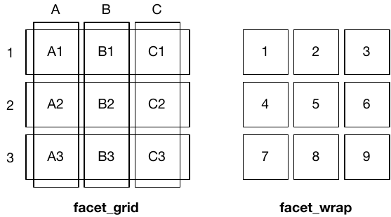
(图片来自ggplot2: Elegant Graphics for Data Analysis (3rd edition))
facet_wrap(facets, nrow = NULL, ncol = NULL):
-
facets: A set of variables or expressions quoted byvars()and defining faceting groups on the rows or columns dimension. For compatibility with the classic interface, can also be a formula or character vector. Use either a one sided formula,~a + b, or a character vector,c("a", "b"). -
nrow, ncol: Number of rows and columns.
#> # A tibble: 205 × 11
#> manufacturer model displ year cyl trans drv cty
#> <chr> <chr> <dbl> <int> <int> <chr> <chr> <int>
#> 1 audi a4 1.8 1999 4 auto… f 18
#> 2 audi a4 1.8 1999 4 manu… f 21
#> 3 audi a4 2 2008 4 manu… f 20
#> 4 audi a4 2 2008 4 auto… f 21
#> 5 audi a4 2.8 1999 6 auto… f 16
#> 6 audi a4 2.8 1999 6 manu… f 18
#> 7 audi a4 3.1 2008 6 auto… f 18
#> 8 audi a4 quat… 1.8 1999 4 manu… 4 18
#> 9 audi a4 quat… 1.8 1999 4 auto… 4 16
#> 10 audi a4 quat… 2 2008 4 manu… 4 20
#> # ℹ 195 more rows
#> # ℹ 3 more variables: hwy <int>, fl <chr>, class <chr>#> [1] "compact" "midsize" "minivan" "pickup"
#> [5] "subcompact" "suv"
ggplot(data = data_plot, aes(displ, hwy)) +
geom_blank() +
facet_wrap(~class, ncol = 3)
# equivalent 01
# facet_wrap(vars(class), ncol = 3)
# equivalent 02
# facet_wrap("class", ncol = 3)facet_grid(rows = NULL, cols = NULL):
-
rows,cols: A set of variables or expressions quoted byvars()and defining faceting groups on the rows or columns dimension. For compatibility with the classic interface,rowscan also be aformulawith therows(of the tabular display) on theLHSand thecolumns(of the tabular display) on theRHS; the dot in the formula is used to indicate there should be no faceting on this dimension (either row or column).
-
. ~ aspreads the values ofaacross the columns. This direction facilitates horizontal comparisons ofyposition, because the vertical scales are aligned.
#> # A tibble: 205 × 11
#> manufacturer model displ year cyl trans drv cty
#> <chr> <chr> <dbl> <int> <int> <chr> <chr> <int>
#> 1 audi a4 1.8 1999 4 auto… f 18
#> 2 audi a4 1.8 1999 4 manu… f 21
#> 3 audi a4 2 2008 4 manu… f 20
#> 4 audi a4 2 2008 4 auto… f 21
#> 5 audi a4 2.8 1999 6 auto… f 16
#> 6 audi a4 2.8 1999 6 manu… f 18
#> 7 audi a4 3.1 2008 6 auto… f 18
#> 8 audi a4 quat… 1.8 1999 4 manu… 4 18
#> 9 audi a4 quat… 1.8 1999 4 auto… 4 16
#> 10 audi a4 quat… 2 2008 4 manu… 4 20
#> # ℹ 195 more rows
#> # ℹ 3 more variables: hwy <int>, fl <chr>, class <chr>#> [1] "compact" "midsize" "minivan" "pickup"
#> [5] "subcompact" "suv"
ggplot(data = data_plot, aes(displ, hwy)) +
geom_blank() +
facet_grid(. ~ cyl)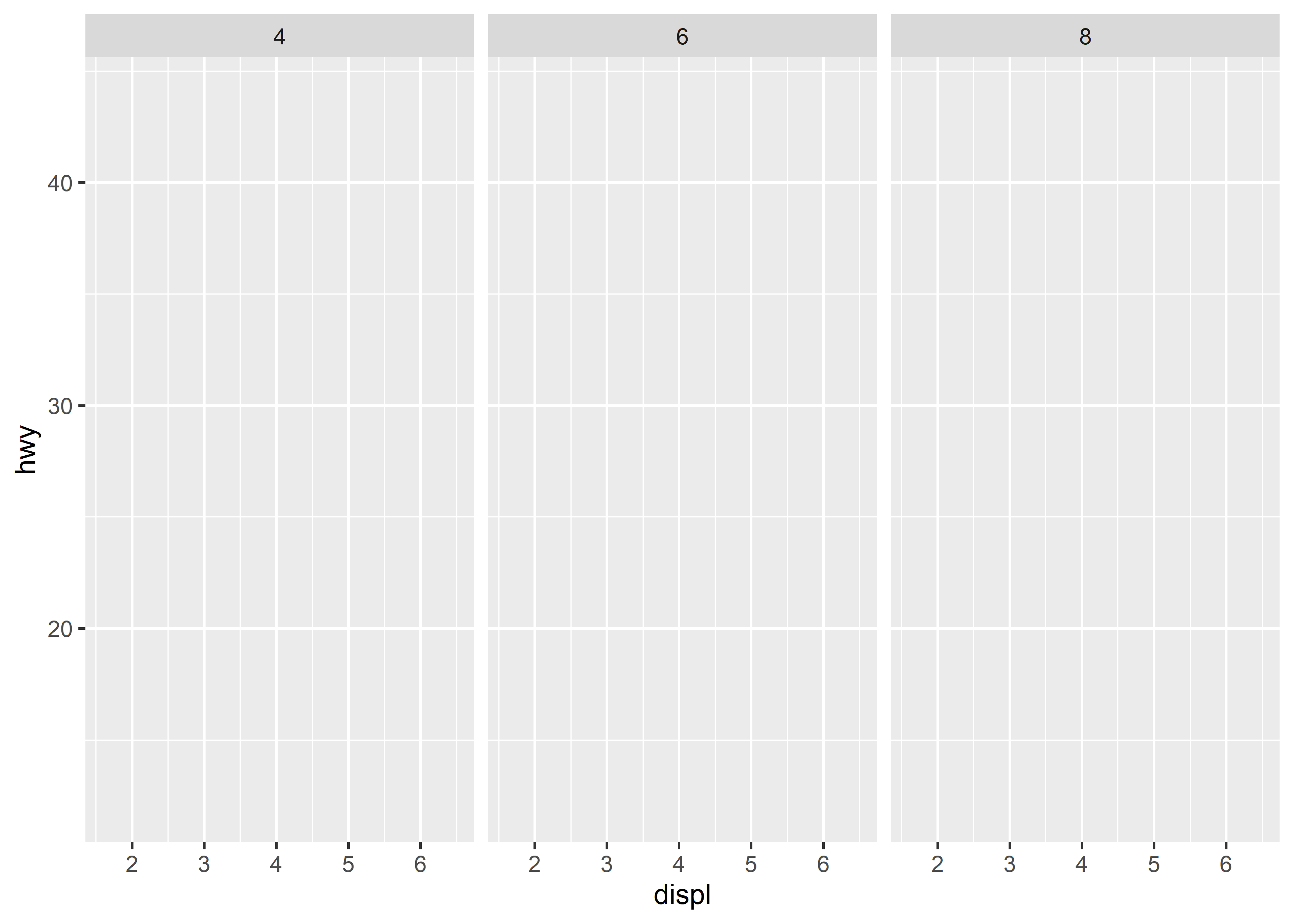
# equivalent
# facet_grid(cols = vars(cyl))-
b ~ .spreads the values ofbdown the rows. This direction facilitates vertical comparison ofxposition because the horizontal scales are aligned.
data_plot <- mpg[mpg$cyl != 5 & mpg$drv %in% c("4", "f") & mpg$class != "2seater", ]
levels(factor(data_plot$class))#> [1] "compact" "midsize" "minivan" "pickup"
#> [5] "subcompact" "suv"
ggplot(data = data_plot, aes(displ, hwy)) +
geom_blank() +
facet_grid(drv ~ .)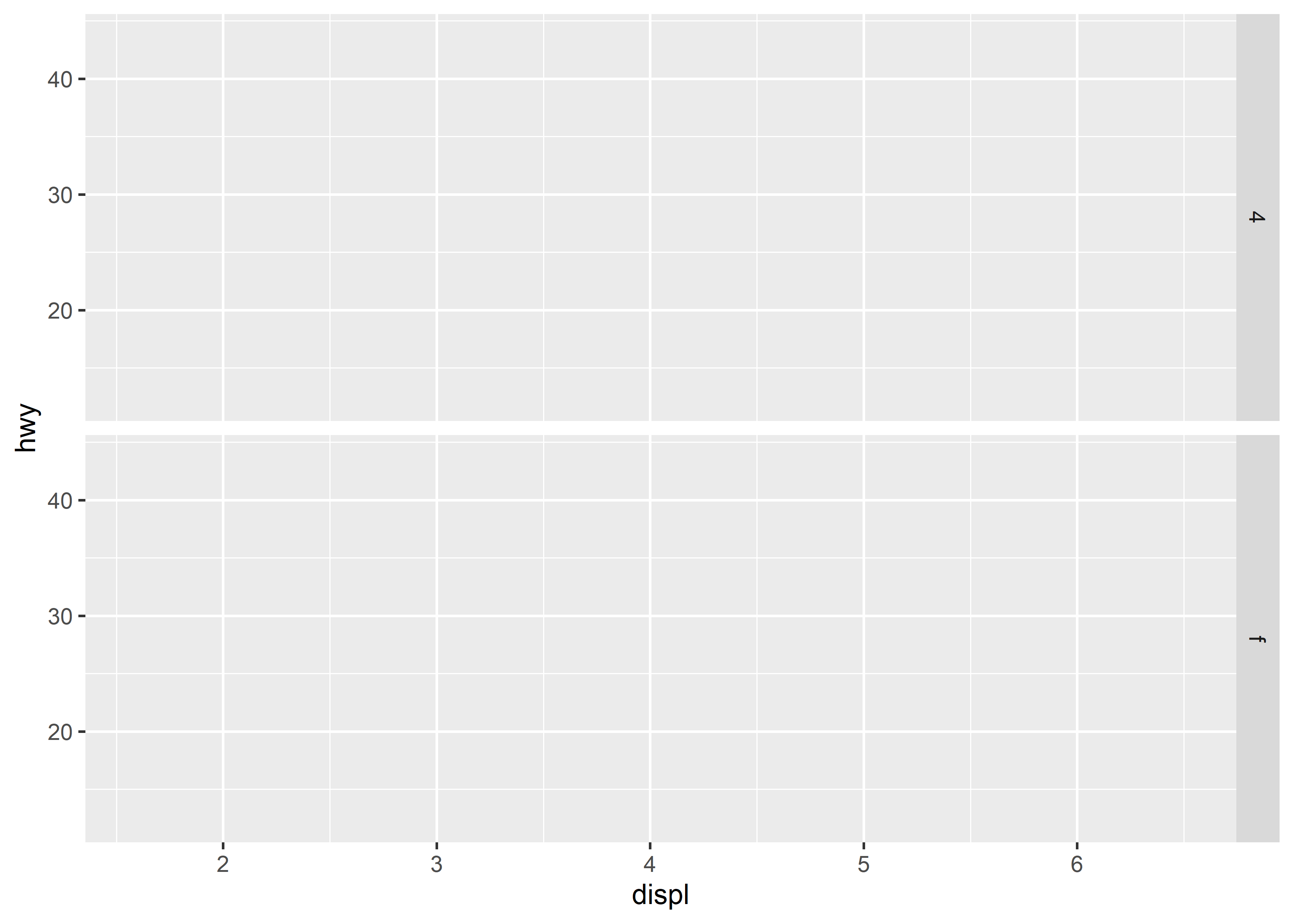
# equivalent
# facet_grid(rows = vars(drv))17.5 Modify graph*
前面展示的都是所有 graph 在默认设定下的用法,但显然有部分图形看起来是很难看的,例如:
#> `summarise()` has grouped output by 'class'. You can
#> override using the `.groups` argument.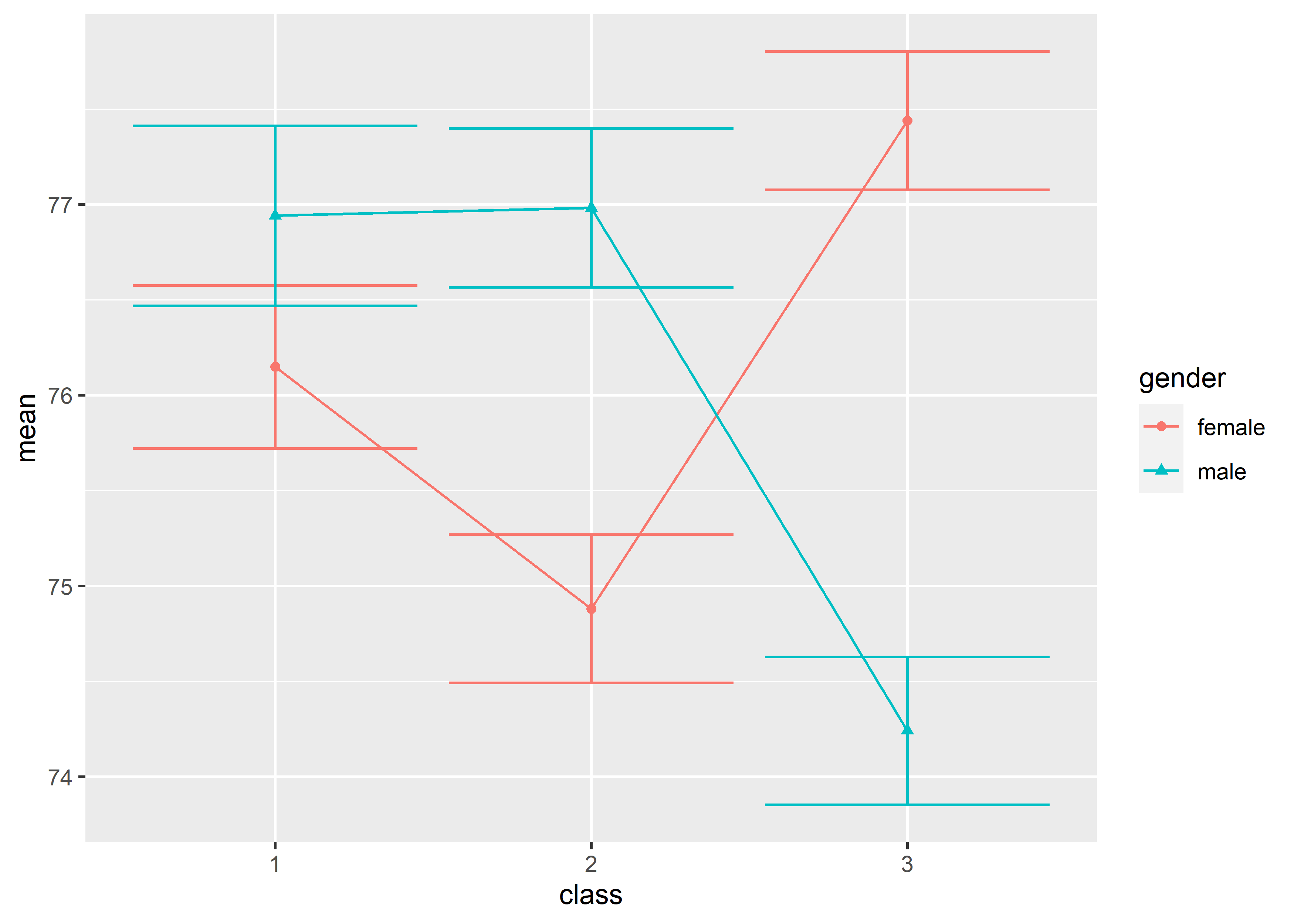
调整成这样就好看多了:
#> `summarise()` has grouped output by 'class'. You can
#> override using the `.groups` argument.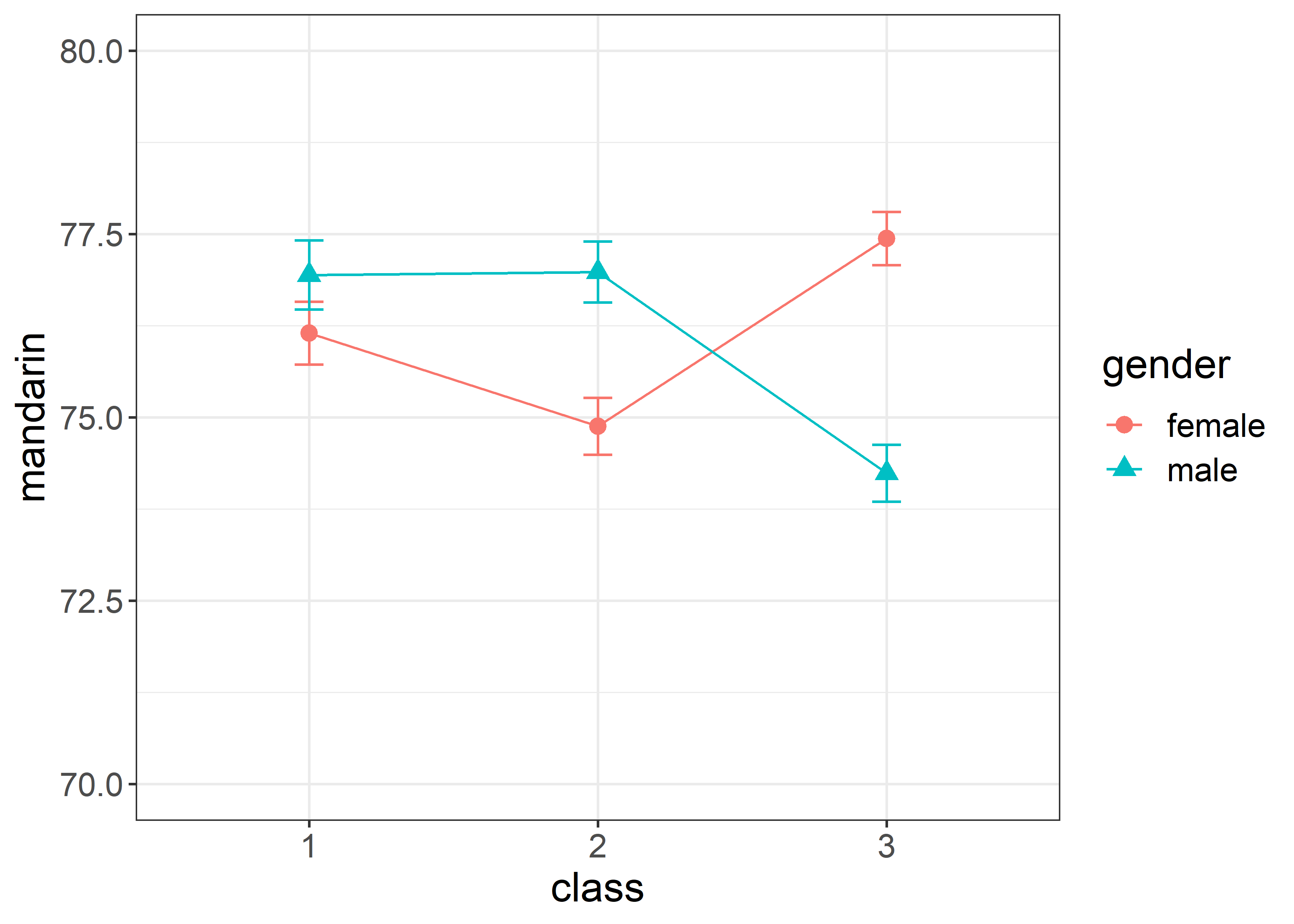
所以,这时候就需要知道如何调整 graph 中的视觉要素。通常一张 graph 可以包含的视觉要素如下图所示:
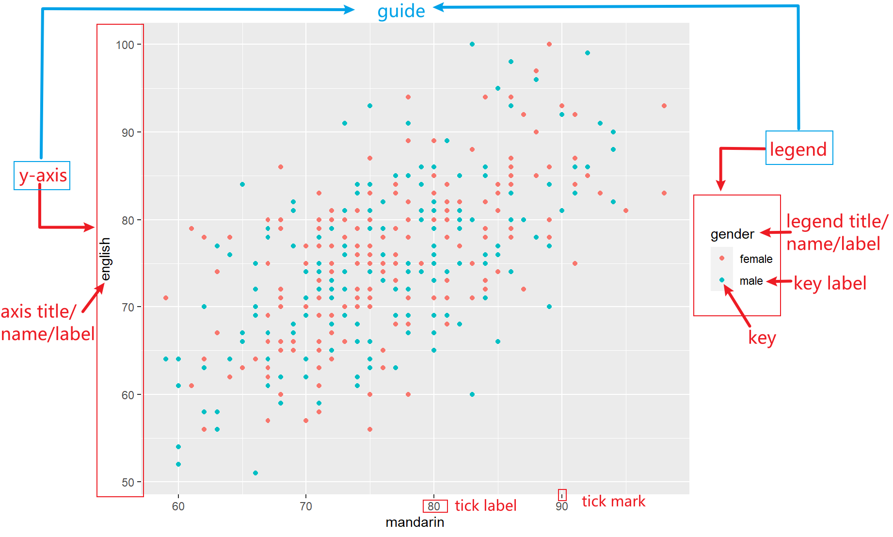
其中与scale紧密联系的一个概念是guide。axis或legend就是guide。只有借助guide,才可以知道 graph 中的 point 是如何与data一一对应的。
17.5.1 Frequently modified visual elments
ggplo2根据使用的频率,给 graph 最经常被调整的几个视觉元素配置了单独的function(),包括lims(), labs(), guides()。
-
lims(...): The maximum and minimum of the scale. A name–value pair. The name must be an aesthetic, and the value must be either a length-2 numeric, a character, a factor, or a date/time. A numeric value will create a continuous scale. If the larger value comes first, the scale will be reversed. You can leave one value as NA if you want to compute the corresponding limit from the range of the data. A character or factor value will create a discrete scale. A date-time value will create a continuous date/time scale.
data_exams |>
  ggplot() +
    geom_point(mapping = aes(x = mandarin, y = english, color = gender)) +
    lims(x = c(50, 100), y = c(50, 100))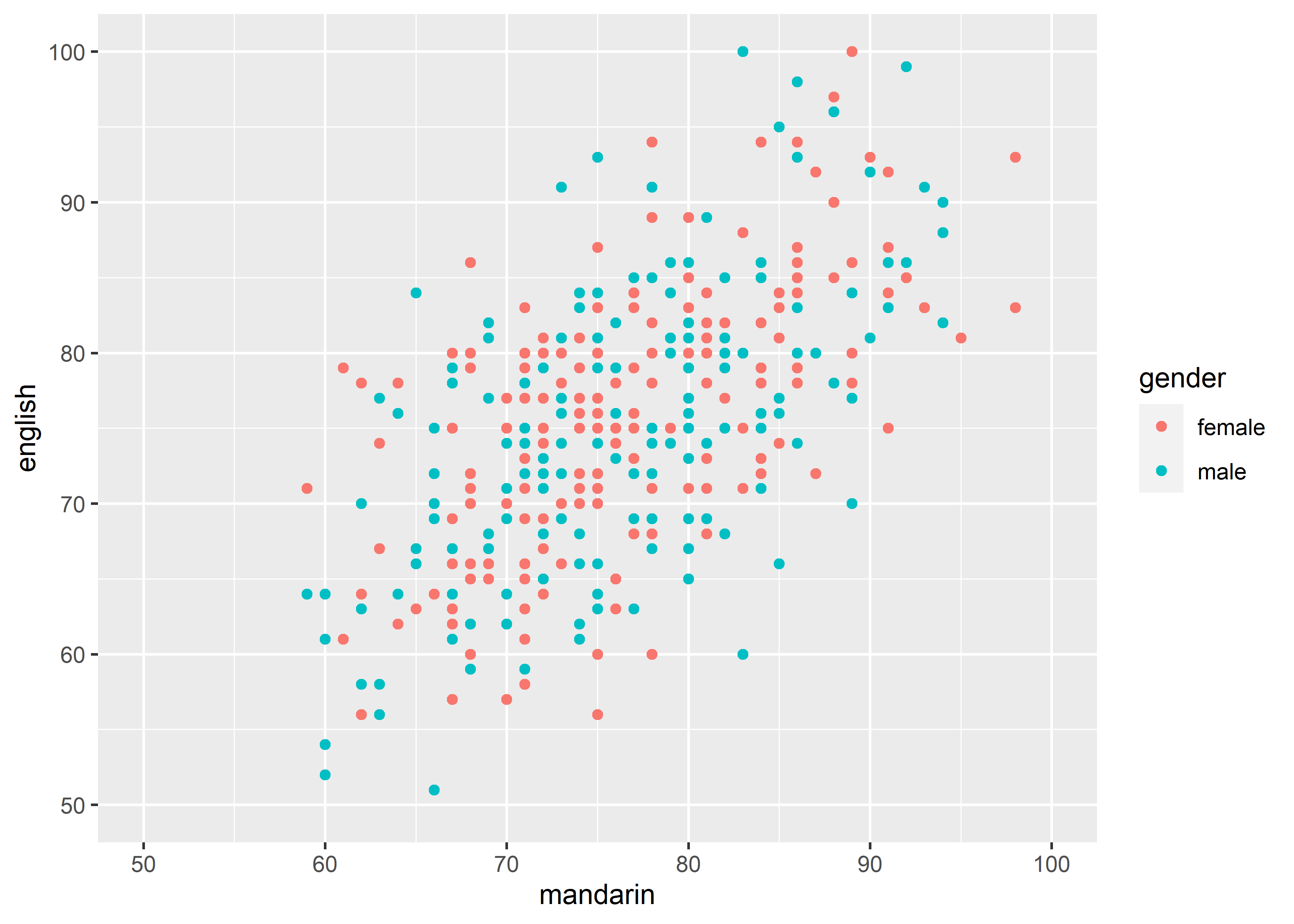
-
labs(): The labels of scale and plot.
labs(
  ...,
  title = waiver(),
  subtitle = waiver(),
  caption = waiver()
)-
...: A list of new name-value pairs. The name should be an aesthetic.
data_exams |>
  ggplot() +
    geom_point(mapping = aes(x = mandarin, y = english, color = gender)) +
    labs(x = "语文", y = "英语", color = "性别")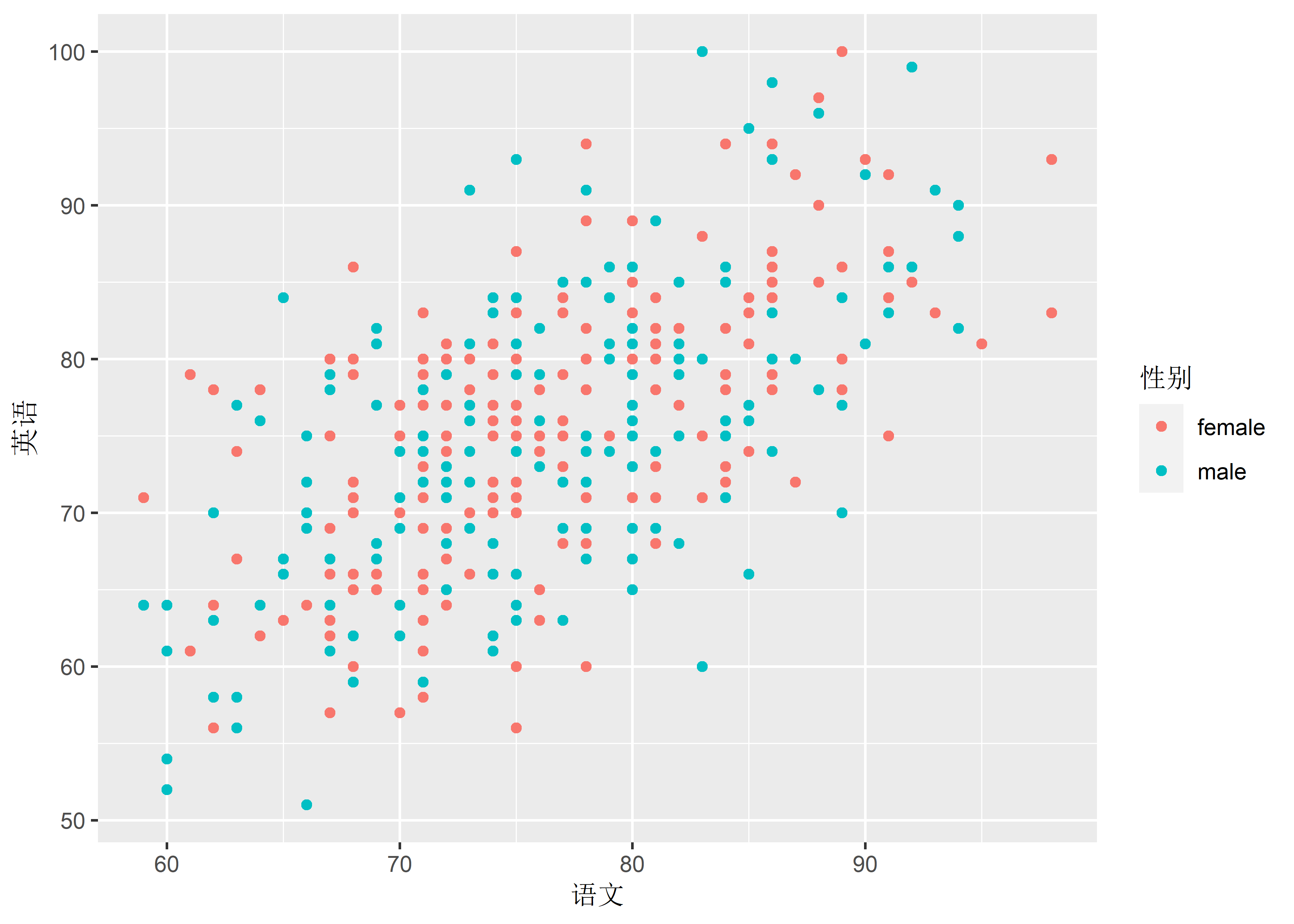
# labs(x = NULL, y = NULL, color = NULL) to remove corresponding label-
title: Graph title.
data_exams |>
  ggplot() +
    geom_point(mapping = aes(x = mandarin, y = english, color = gender)) +
    labs(title = "This is a title")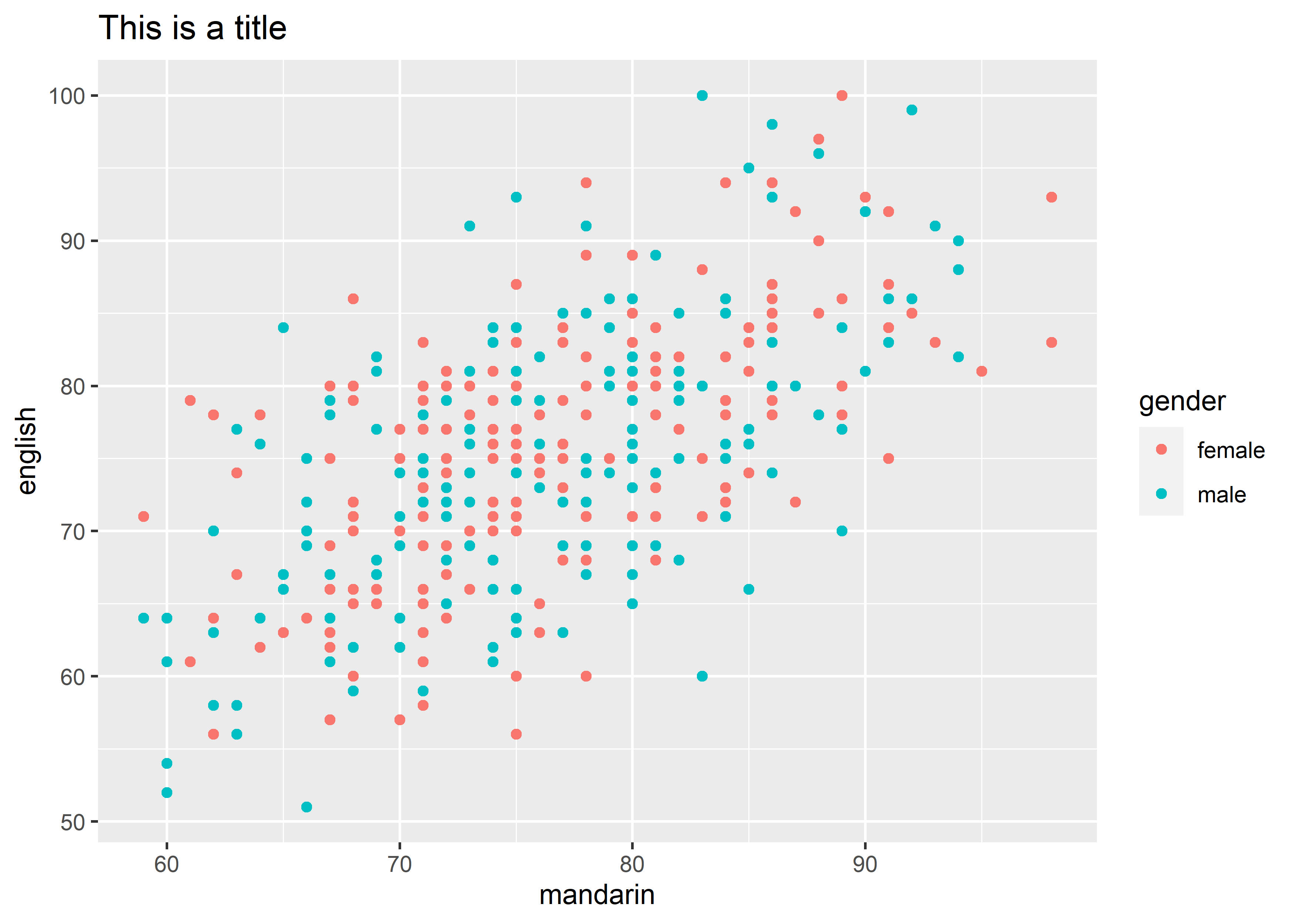
-
subtitle: Graph subtitle.
data_exams |>
  ggplot() +
    geom_point(mapping = aes(x = mandarin, y = english, color = gender)) +
    labs(title = "This is a title",
         subtitle = "This is a subtitle")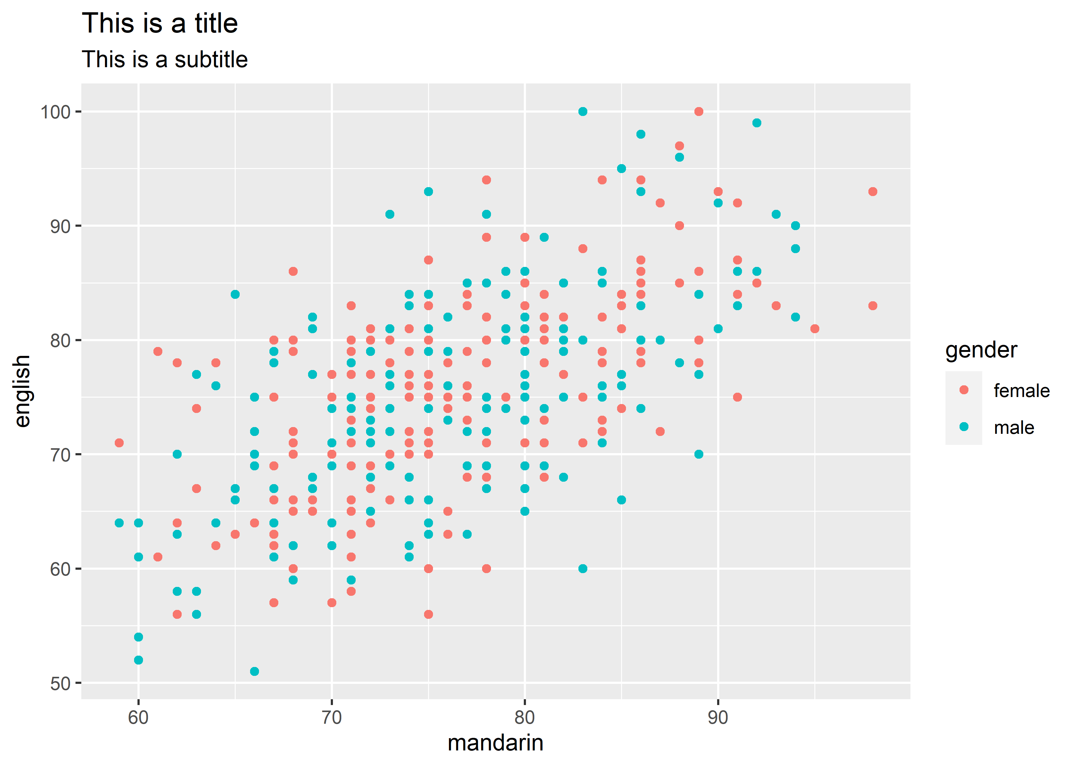
-
caption: The text for the caption which will be displayed in the bottom-right of the plot by default.
data_exams |>
  ggplot() +
    geom_point(mapping = aes(x = mandarin, y = english, color = gender)) +
    labs(title = "This is a title",
         subtitle = "This is a subtitle",
         caption = "This is a caption")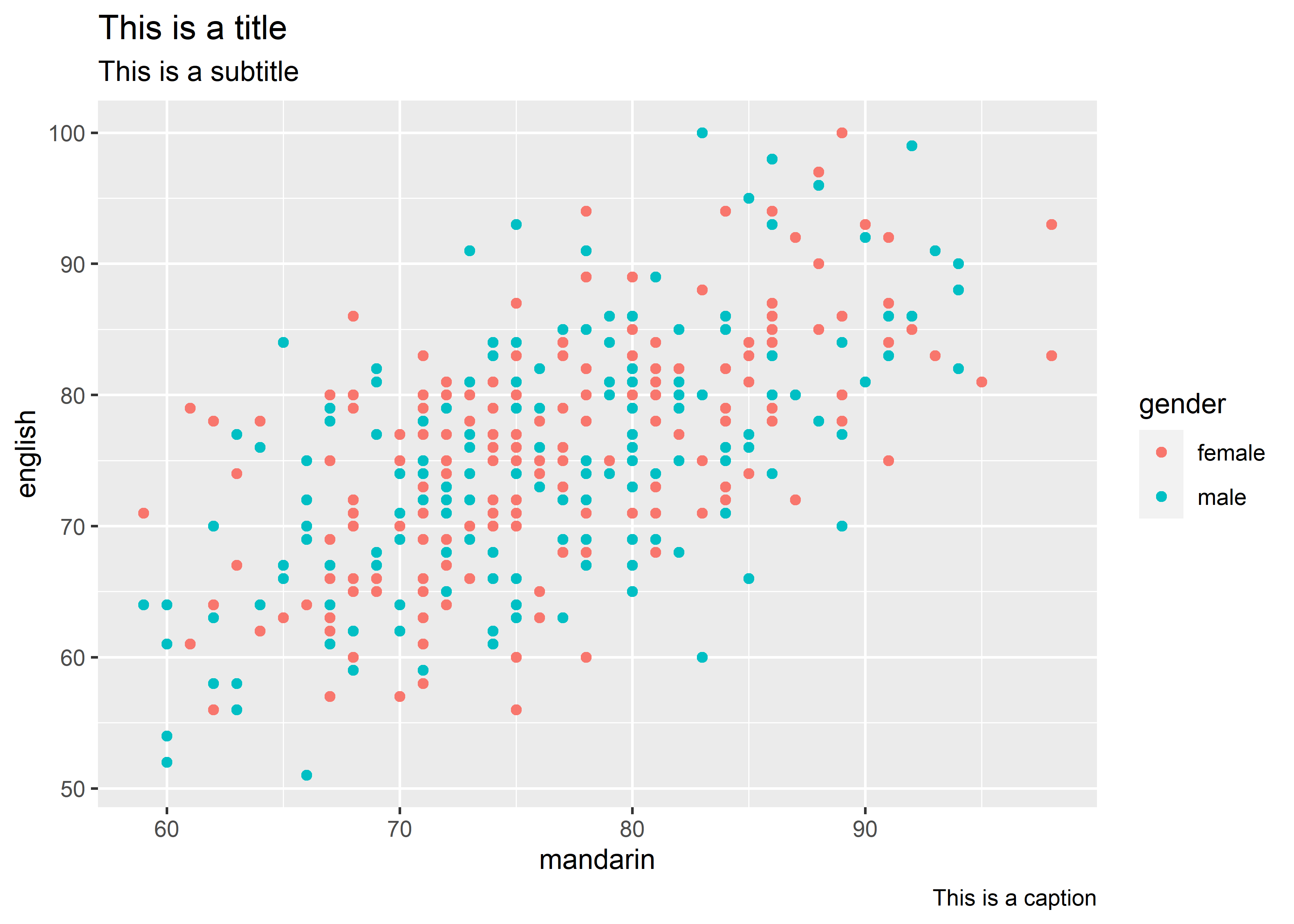
-
guides:
17.5.2 Modify scale
一张 graph 里面所有的要素可以根据是否与数据有关分为两大类:
- data related element:
aes - non-data element: background color, font size, typeface, etc.
17.5.3 data related element: scale
ggplot2中scale由scale_xxx()来控制,scale_xxx()的命名由 3 个部分组成:
- The
scaleprefix; - The name of the corresponding aesthetic (e.g.,
x,color,shape, etc.); - The nature of the scale (e.g., continuous, discrete, etc.)
以下图为例:

图中一共有 3 个scales,分别对应scale_x_continuous(),scale_y_continuous()和scale_color_discrete()。下面以scale_x_continuous()和scale_x_discrete()为例讲解:
17.5.3.1 scale_x_continuous和scale_y_continuous
scale_x_continuous(
  name = waiver(),
  breaks = waiver(),
  n.breaks = NULL,
  labels = waiver(),
  limits = NULL,
  guide = waiver(),
  position = "bottom" # or "top", position = "left"/"right" for scale_y_continuous()
)-
name: The name of the scale. Used as the axis title.
data_exams |>
  ggplot() +
    geom_point(mapping = aes(x = mandarin, y = english, color = gender)) +
    scale_x_continuous(name = "语文")
-
breaks: The positions of the tick marks. The algorithm may choose a slightly different number to ensure nice break labels.
data_exams |>
  ggplot() +
    geom_point(mapping = aes(x = mandarin, y = english, color = gender)) +
    scale_x_continuous(breaks = seq(40, 100, 10))
# though not all tick marks are displayed, we can check whether the breaks works as expected using the labels,
# recommend to use breaks together with limits-
n.breaks: Number of tick marks. The algorithm may choose a slightly different number to ensure nice break labels.
data_exams |>
  ggplot() +
    geom_point(mapping = aes(x = mandarin, y = english, color = gender)) +
    scale_x_continuous(n.breaks = 3)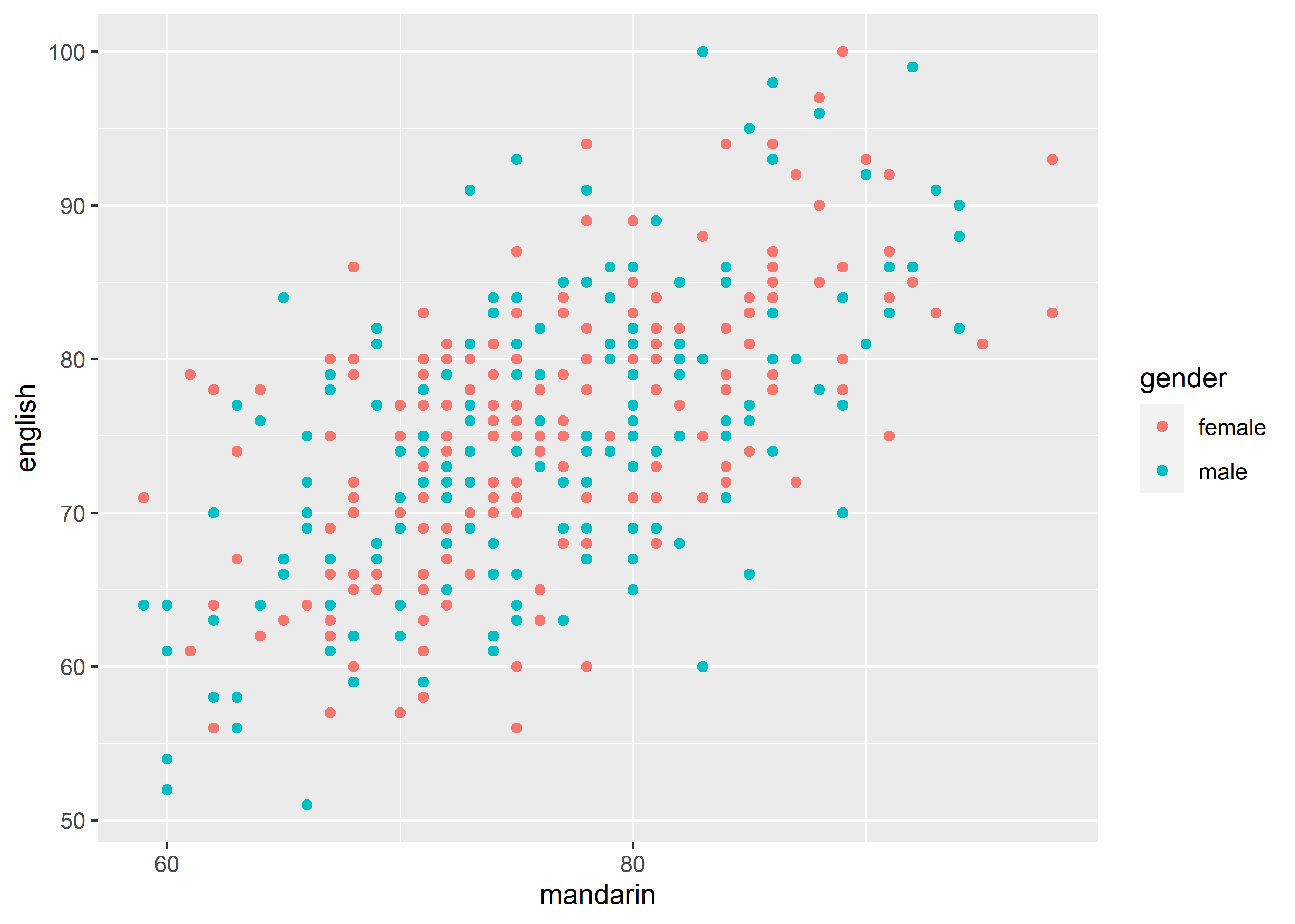
-
labels: Tick labels. Must be the same length asbreaks.
data_exams |>
  ggplot() +
    geom_point(mapping = aes(x = mandarin, y = english, color = gender)) +
    scale_x_continuous(breaks = c(60, 70, 80, 90),
                       labels = c("六十", "七十", "八十", "九十"))
-
limits: A numeric vector of length two. The limits of the scale.
data_exams |>
  ggplot() +
    geom_point(mapping = aes(x = mandarin, y = english, color = gender)) +
    scale_x_continuous(limits = c(40, 100))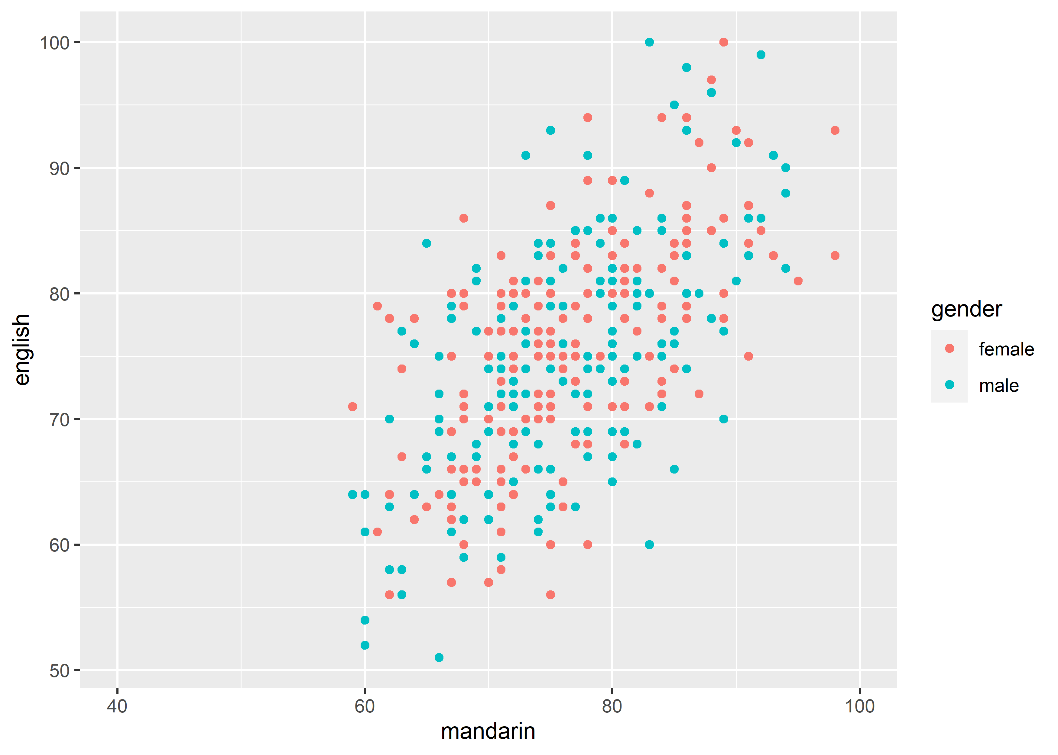
-
guide: Control the visual representation of scale.
因为此时讲解的是x-axis,对应的是guide_axis()。更多的guide请参考 Scale guides。
guide = guide_axis(
  title = waiver(),
  check.overlap = FALSE,  # silently remove overlapping labels
  angle = NULL,
  n.dodge = 1,
  position = waiver()
)-
title: # scale title
data_exams |>
  ggplot() +
    geom_point(mapping = aes(x = mandarin, y = english, color = gender)) +
    scale_x_continuous(guide = guide_axis(title = "语文")) # equivalent to scale_x_continuous(name = "语文")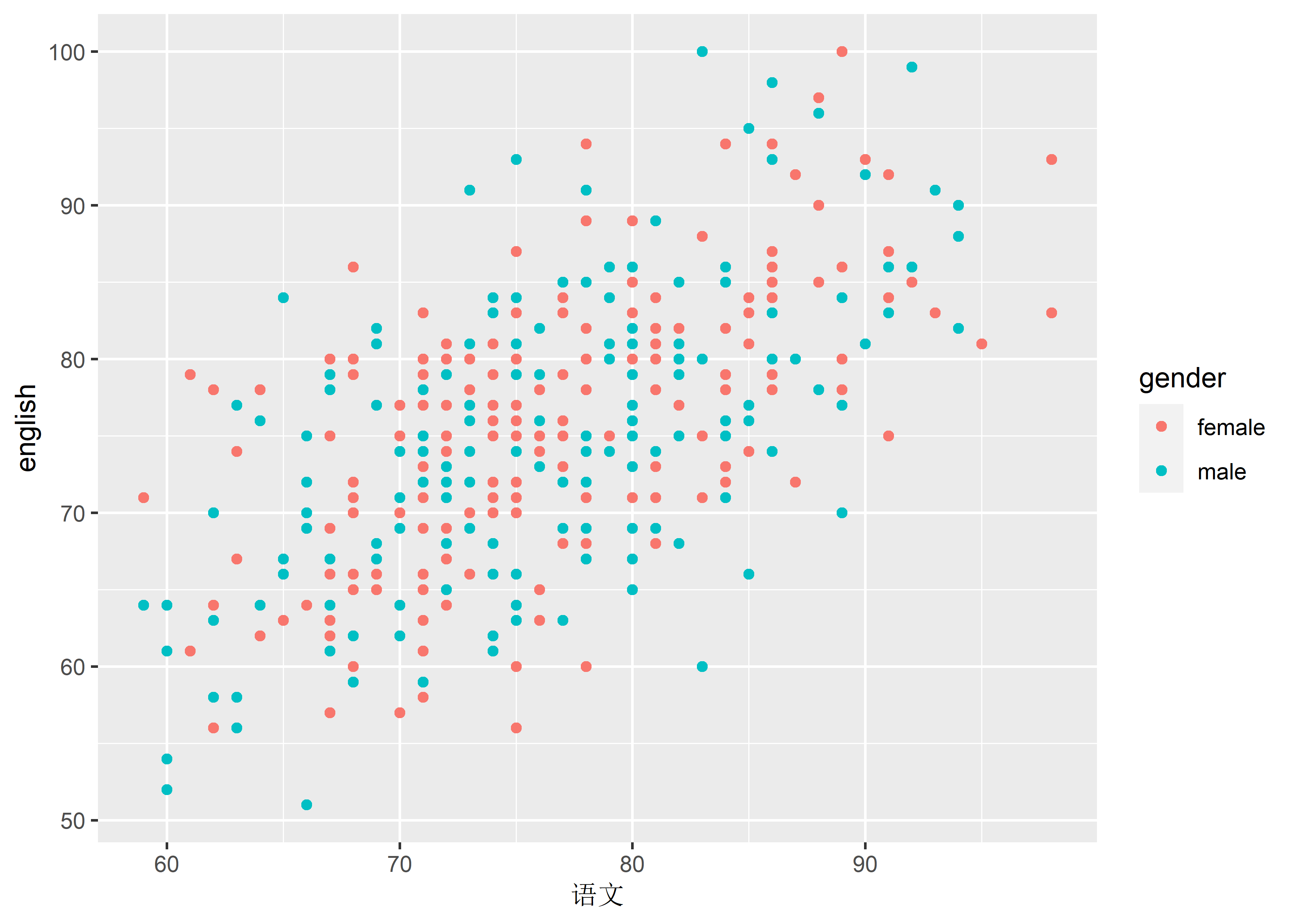
-
check.overlap: # silently remove overlapping labels
data_exams |>
  ggplot() +
    geom_point(mapping = aes(x = mandarin, y = english, color = gender)) +
    scale_x_continuous(limits = c(60, 100),
                       breaks = 60:100,
                       labels = 60:100 + 1000,
                       guide = guide_axis(check.overlap = TRUE))
#> Warning: Removed 2 rows containing missing values or values outside
#> the scale range (`geom_point()`).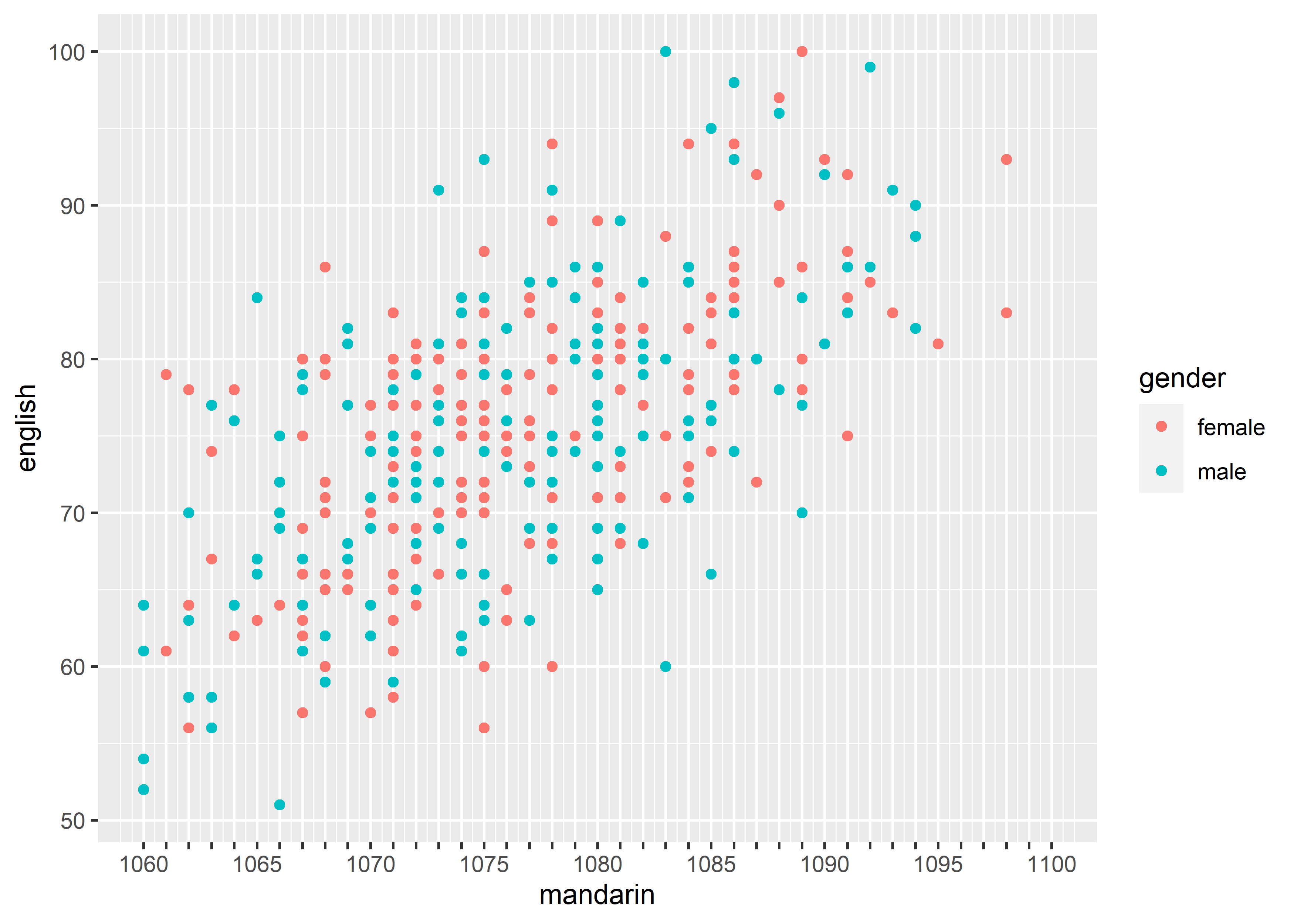
-
angle: The angle of tick label.
data_exams |>
  ggplot() +
    geom_point(mapping = aes(x = mandarin, y = english, color = gender)) +
    scale_x_continuous(limits = c(60, 100),
                       breaks = 60:100,
                       labels = 60:100 + 1000,
                       guide = guide_axis(angle = 45))
#> Warning: Removed 2 rows containing missing values or values outside
#> the scale range (`geom_point()`).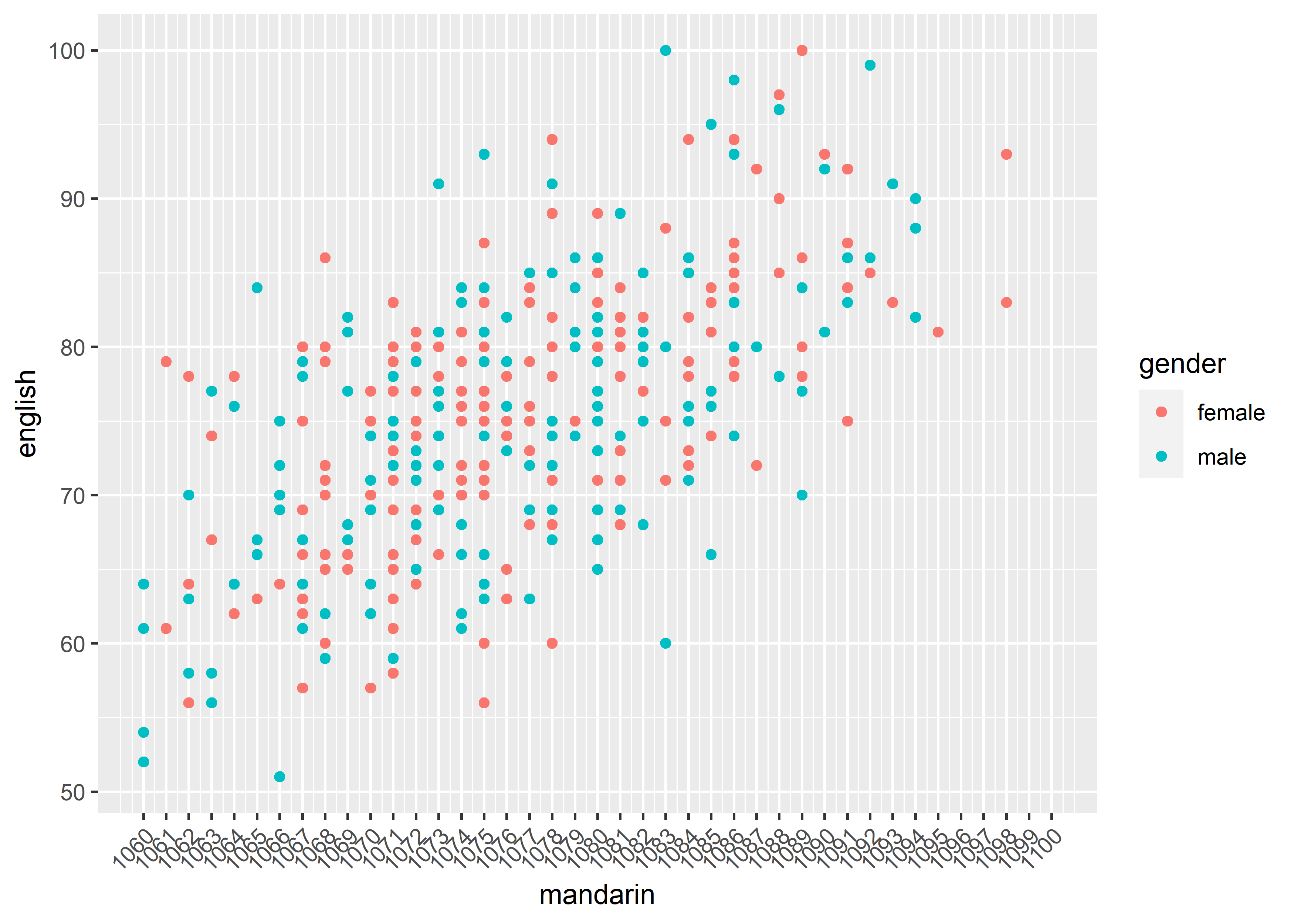
-
n.dodge: # The number of rows (for vertical axes) or columns (for horizontal axes) that should be used to render the labels. This is useful for displaying labels that would otherwise overlap.
data_exams |>
  ggplot() +
    geom_point(mapping = aes(x = mandarin, y = english, color = gender)) +
    scale_x_continuous(limits = c(60, 100),
                       breaks = 60:100,
                       labels = 60:100 + 1000,
                       guide = guide_axis(n.dodge = 2))
#> Warning: Removed 2 rows containing missing values or values outside
#> the scale range (`geom_point()`).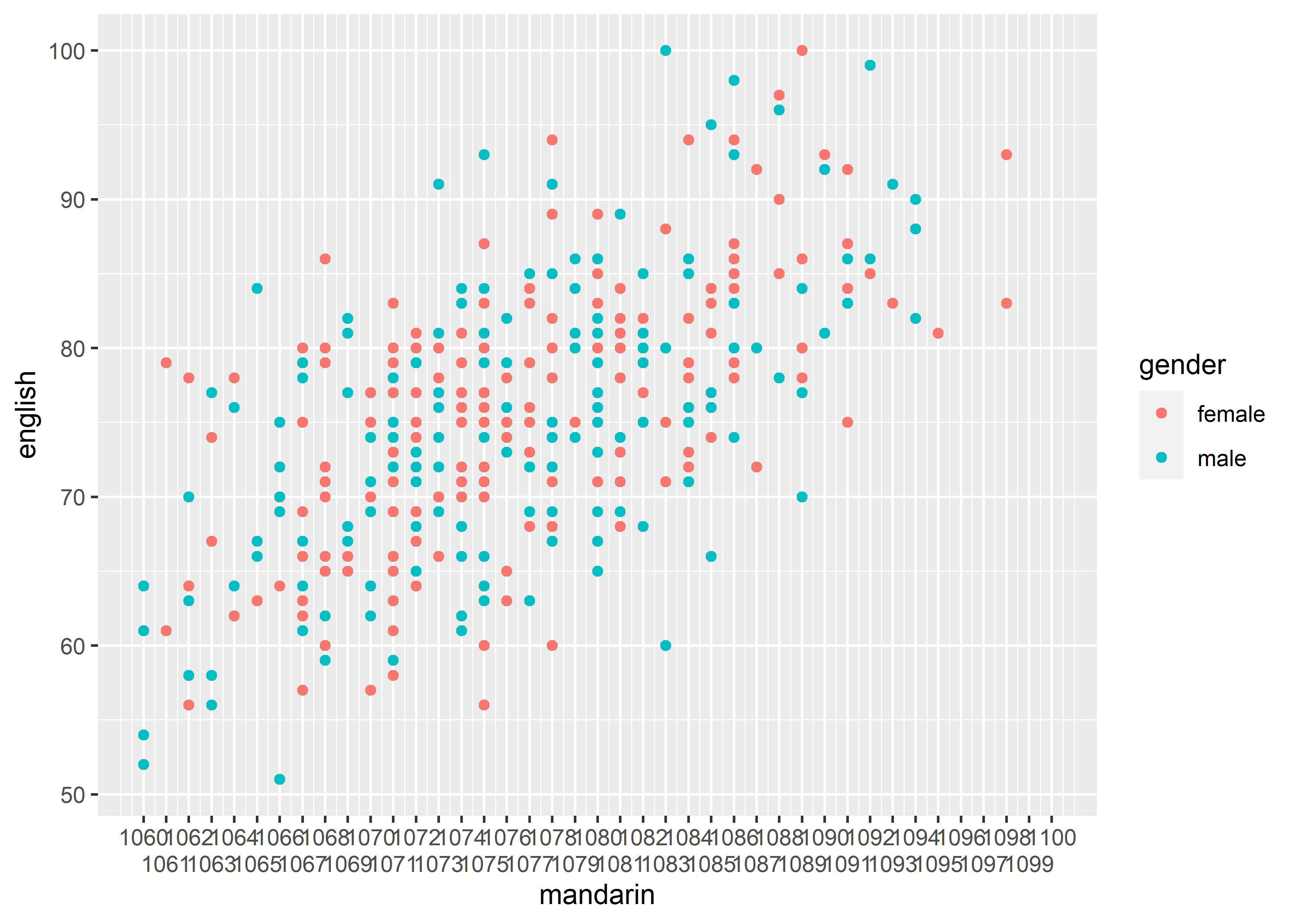
-
position: The position of
data_exams |>
  ggplot() +
    geom_point(mapping = aes(x = mandarin, y = english, color = gender)) +
    scale_x_continuous(guide = guide_axis(position = "top")) # equivalent to scale_x_continuous(position = "top")