Appendix A: Data vizualization examples
1 Can we use infograpics & data vizualization everywhere?
- Simple answer: Yes
- Infographics & graphs can (and should) be used across almost all stages of scientific research and sections of a paper
- Usual structure
- Introduction
- Use graphs to highlight relevance of research (e.g., highlight gaps in evidence)
- Theory & review of literature
- Use graphs to explain theory/hypotheses or summarize literature (highlighting gaps)
- Methods, data, measures
- Use graphs to explain data, design, methods or measures
- Findings & results
- Use graphs to visualize results
- Conclusion
- Introduction
2 Data visualization examples
- In groups: Inspect the figures below (figure + figure notes) (Don’t read the footnotes! I can provide some background afterwards).
- Q: What does the graph show? What is the story?
- Q: How much data (dimensions/variables) are visualized and how are they encoded?
- Q: What do you like about them and what do you dislike (what is good/bad)?
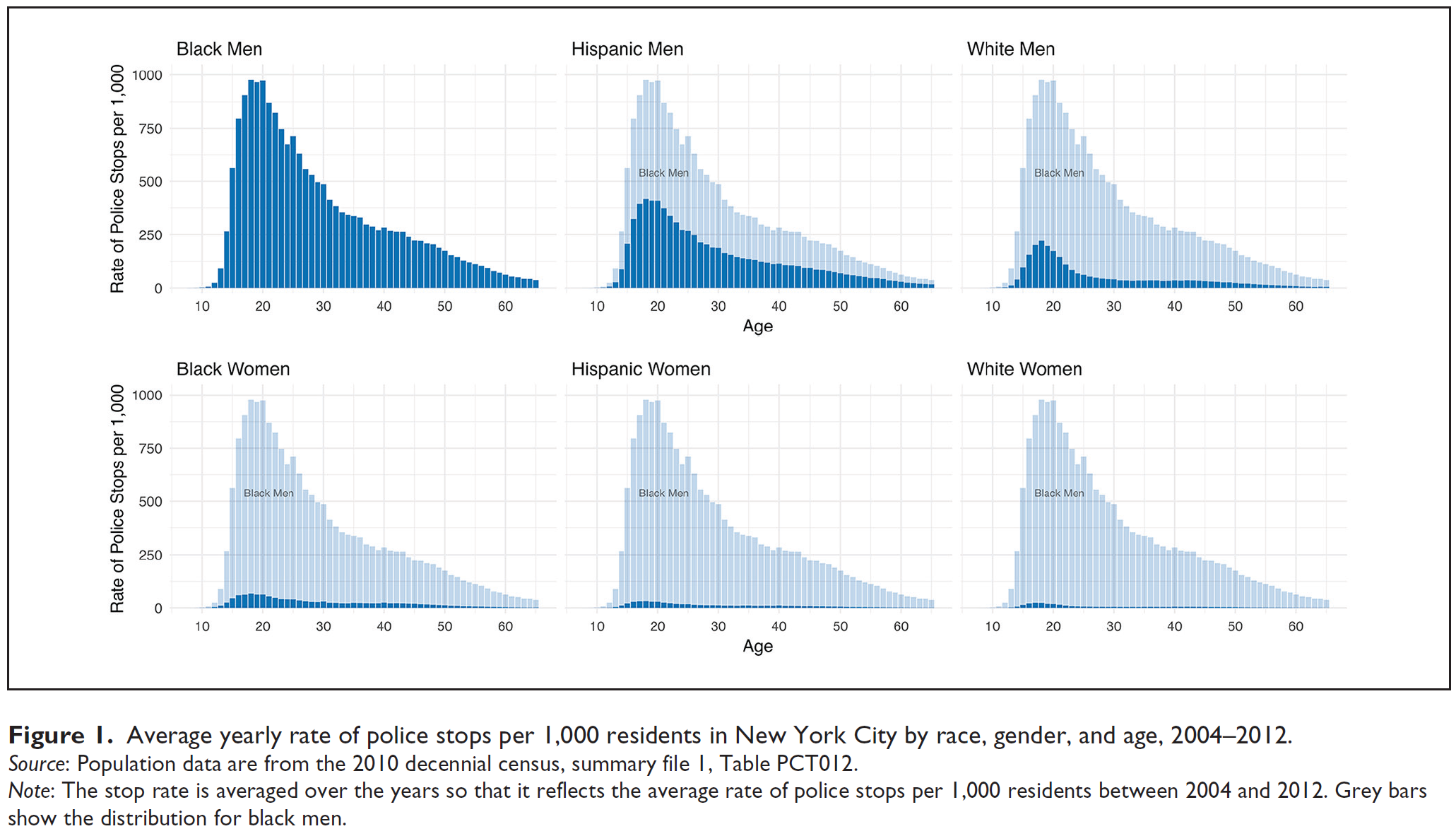
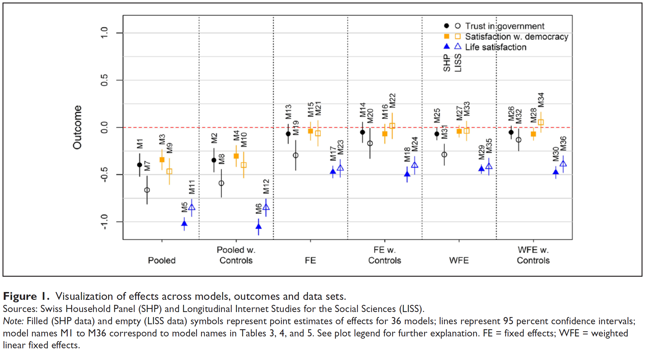
- Figure 1 published in Figures and Legewie (2019) illustrates the use of histograms and visualizes descriptive data on police stops.1
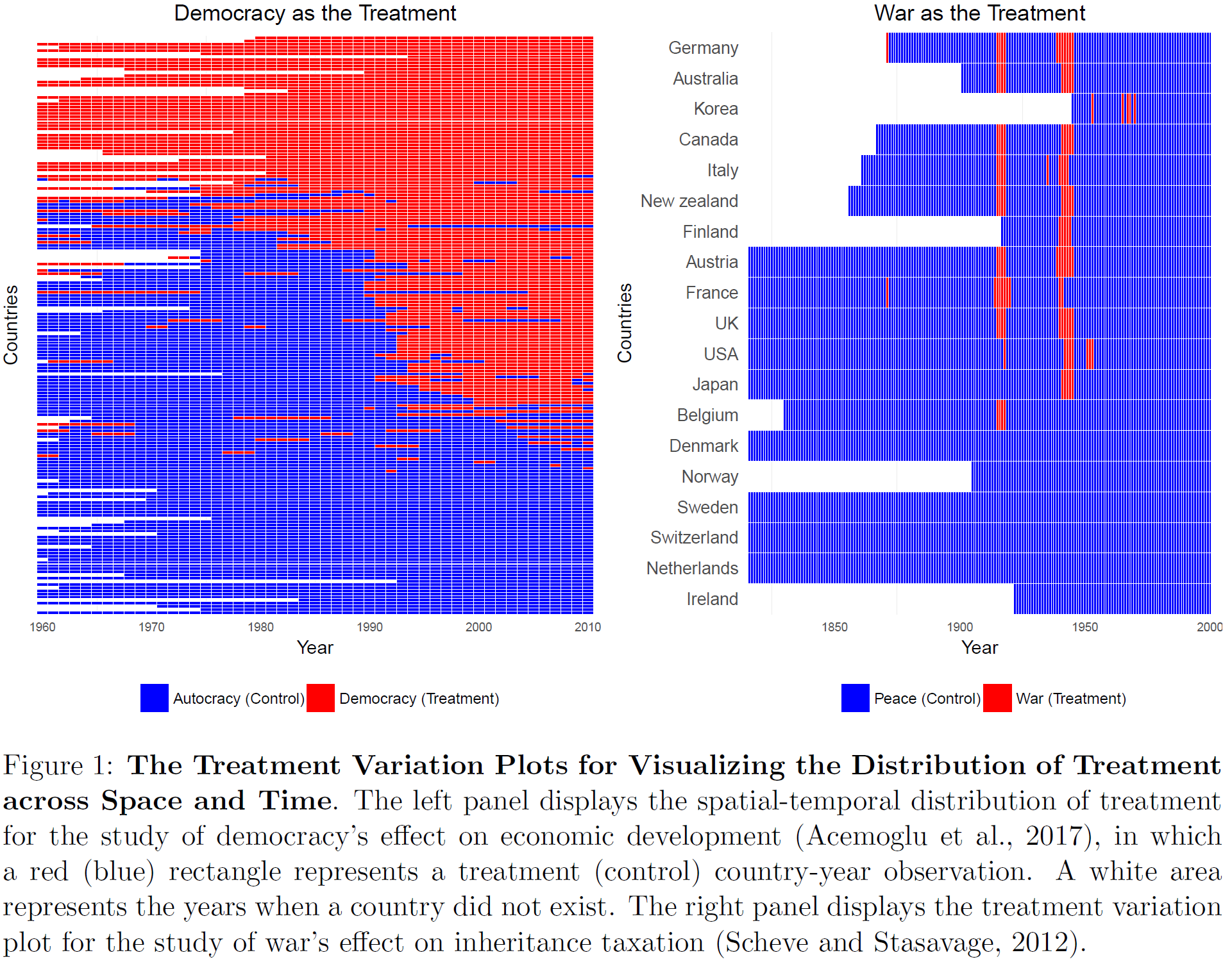
- Figure 2 published in Imai, Kim, and Wang (2018) illustrated the use of heatmaps and visualizes a dichotomous treatment variable over time periods (panel data).2
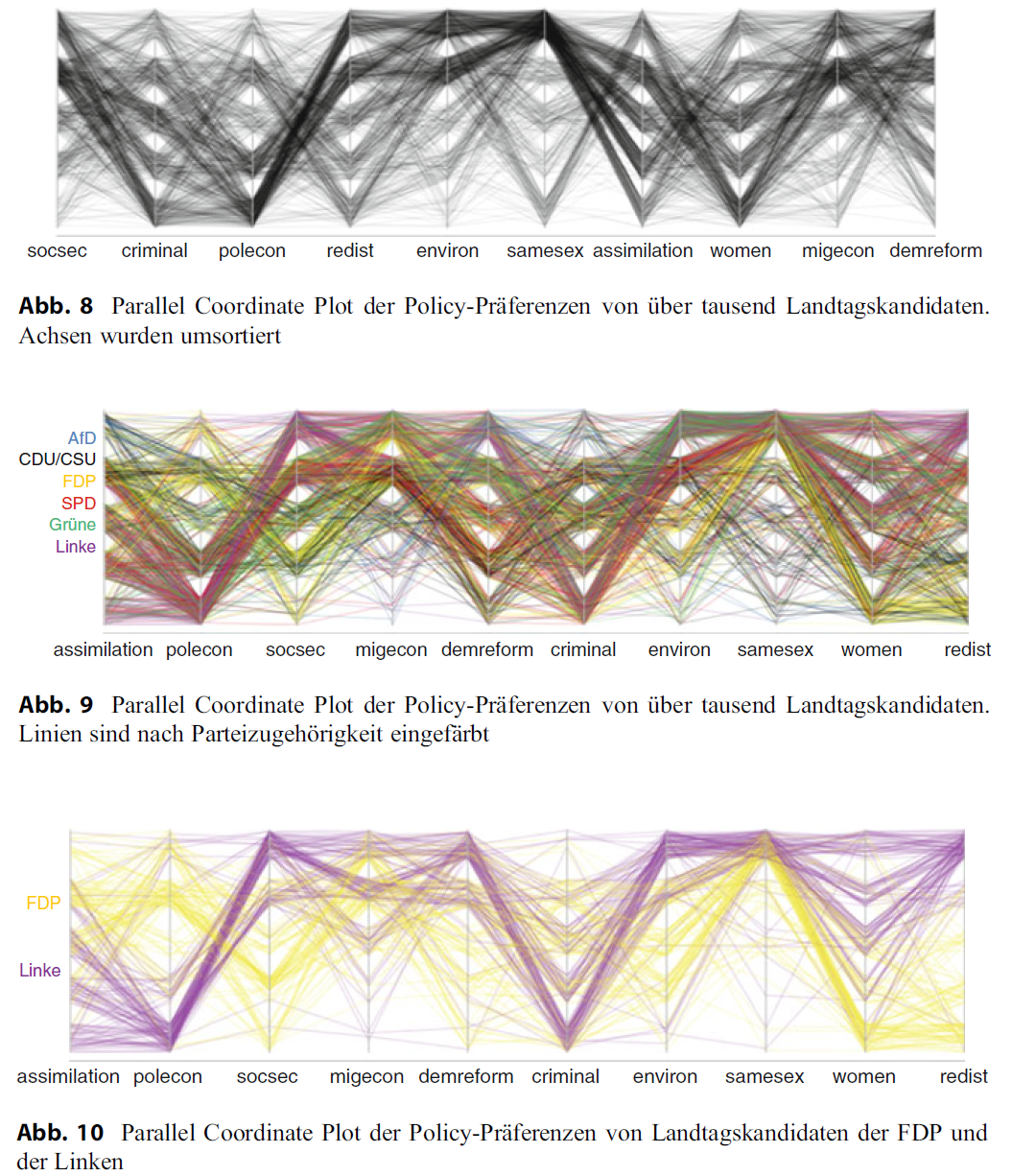
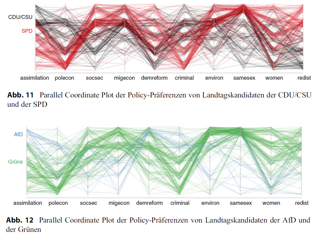
- Figure 3 and Figure 4 (5 Figures in total) published in Traunmüller (2020) illustrates the use of parallel coordinates plots to visualize the policy preferences of law-makers. The policy preferences are measured on 5-point scales. To avoid overplotting jittering and alpha-blending was used. First plot: Among the candidates, there seems to be a relatively high consensus regarding environmental protection and the rights of same-sex couples: Most lines run at the upper end of the axes. Conversely, more controversial policy areas are women’s advancement and dealing with criminals: Here, the lines are evenly distributed across the entire span of the axis, and all five scale points are more or less equally occupied. At the same time, the intersecting pattern indicates a negative correlation: Candidates who advocate for stronger women’s advancement are more likely to be against tightening measures against criminals—and vice versa.
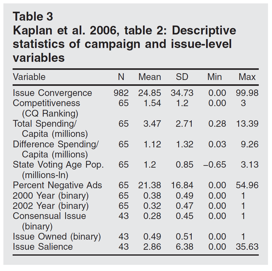
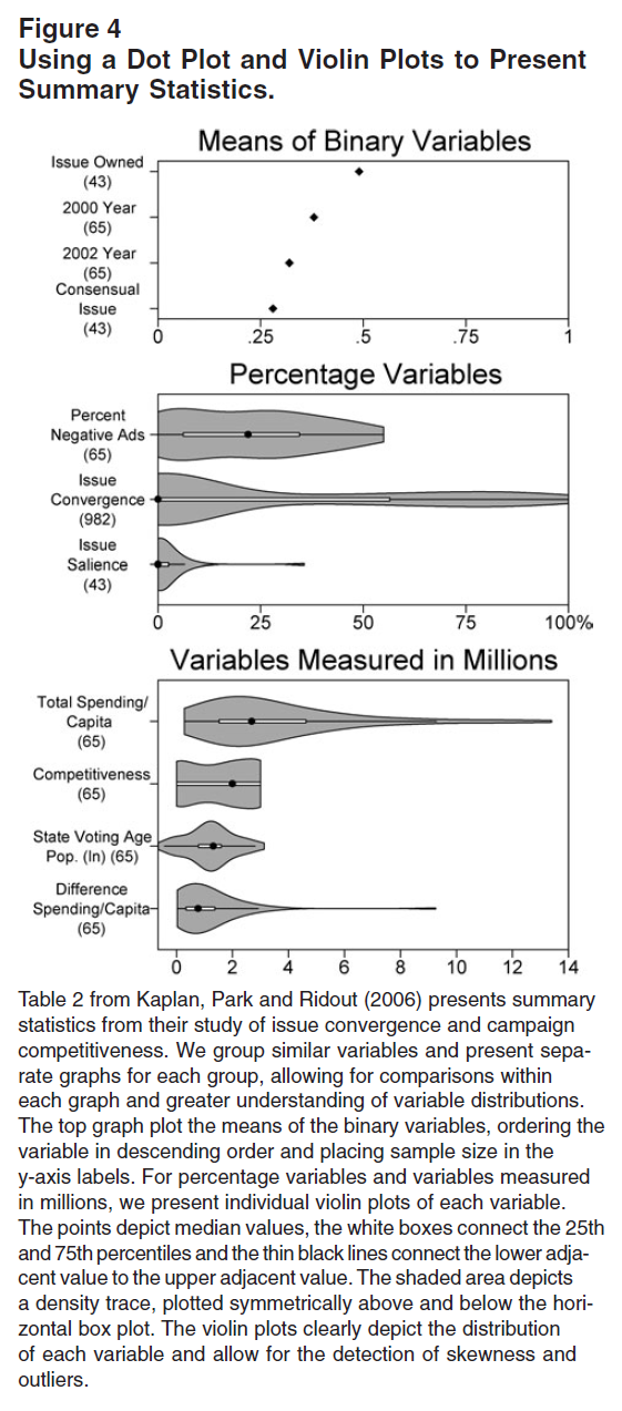
- Figure 5 (table) and Figure 6 display tabled data (summary statistics from an analysis of issue convergence and campaign competitiveness) and a corresponding violin plot published in Kastellec and Leoni (2007). “The violin plots reveal several characteristics of the data that are not apparent from the table. First, many of the variables exhibit substantial skewness. For instance, while the median of both”Issue Convergence” and “Issue Salience” are 0, their tails extend well to the right. In addition, the presence of observations well beyond the upper adjacent values of “Total Spending/Capita” and “Difference Spending/Capita” indicates the existence of outliers (indeed, there is only one observation of the latter that is greater than four). These are details that one would be hard-pressed to glean from a table, even one that went beyond reporting only means and standard deviations.” (Kastellec and Leoni 2007, 760)
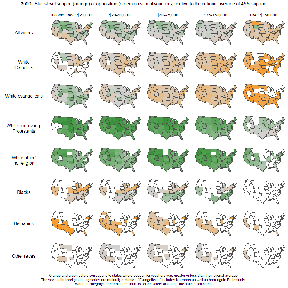
- Figure 7 (Source) uses small multiples of maps to visualize state-level support for school vouchers.
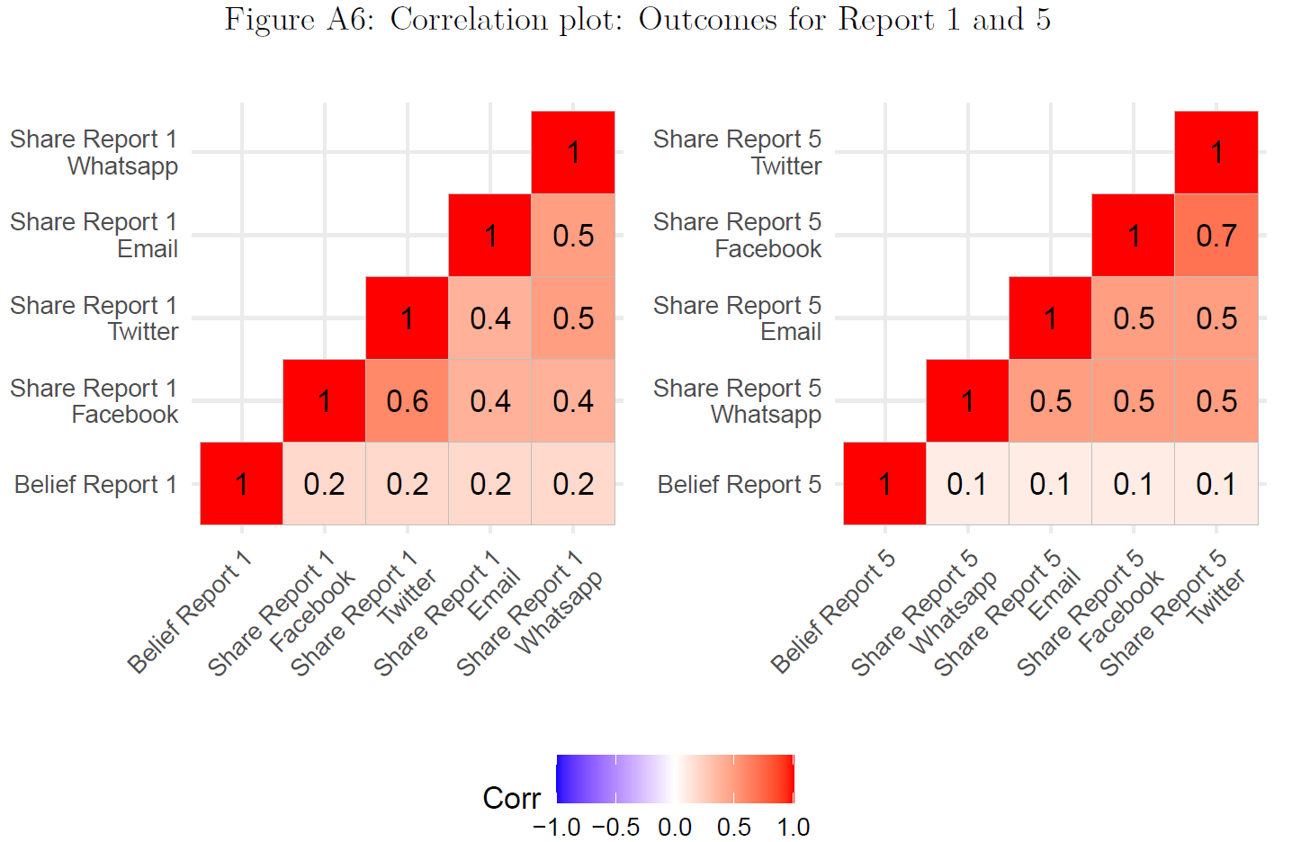
- Figure 8 published in Bauer and Clemm von Hohenberg (2021) uses correlograms to visualize two correlation matrices indicating the correlations between different outcome measures namely the belief and the sharing measures for new reports (Report 1 and 5 respectively (Pearson correlations)). First, the correlation between our belief measure (Scale: 0-6) and our sharing measures (Scale: 0,1) seems quite low, especially given that the latter are asked directly after our belief measure. Second, the correlations between the different sharing measures are higher, however, also not particularly high.
- Figure 10 published in König et al. (2022) uses a network graph for “retweeting activity in our sample, with nodes coloured according to party affiliation. As was expected by the assumed strategic use of retweets, party clusters stand out very clearly as separable communities. The Christian Democratic sister parties are an exception in this regard, as their nodes are strongly intertwined. Individual exceptions of nodes appearing separate from their party clusters can be explained by these accounts’ low total number of network interactions, leading to detrimental positioning by the layout algorithm. Most major parties, while identifiable as clusters, are linked by many connections. In contrast, the right-wing populist AfD is singled out and appears at the very margin of the graph.” (König et al. 2022, 539)

- Figure 11 published in Clemm von Hohenberg and Bauer (2021) (Socius) uses a dot plot of means to plot trust ratings.4
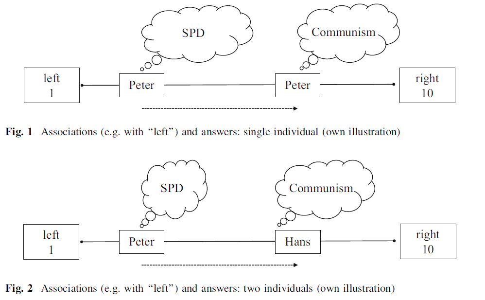
- Figure 12 published in Bauer et al. (2017) illustrates the underlying theory/hypotheses, i.e., that individuals might interpret survey questions (or concepts in them) differently which might affect their measurement values.
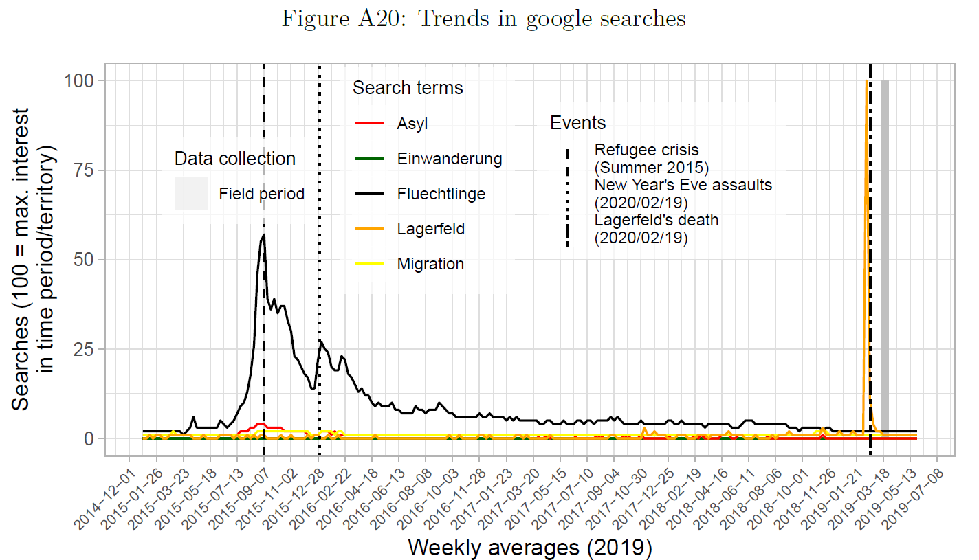
- Figure 13 published in Bauer and Clemm von Hohenberg (2021) uses a line plot to illustrate the timing of data collection, i.e., that the issue of immigration/refugees was not particularly salient during the period of data collection of the study.
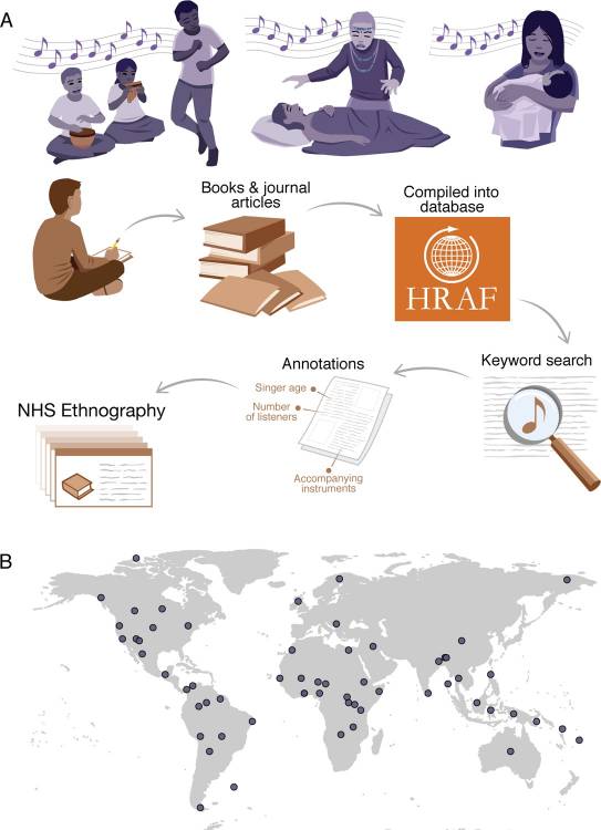
- Figure 14 published in Mehr et al. (2019) was used to illustrate the data collection process, i.e., the sequence from acts of singing to the ethnography corpus.5
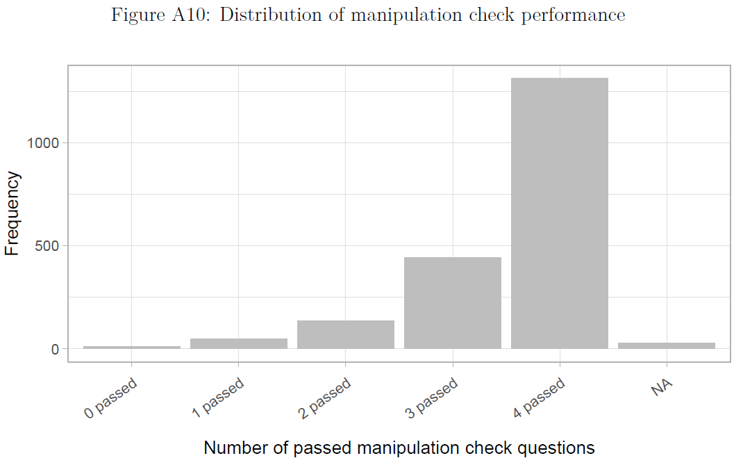
- Figure 15 published in Bauer and Clemm von Hohenberg (2021) used a barplot to highlight data quality/problems, i.e., how many people passed a manipulation check in an experiment.
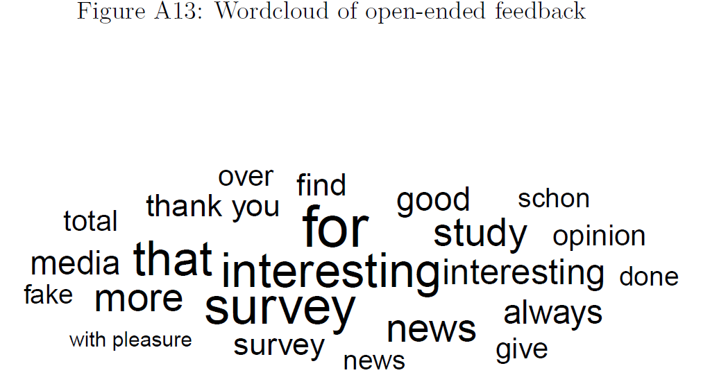
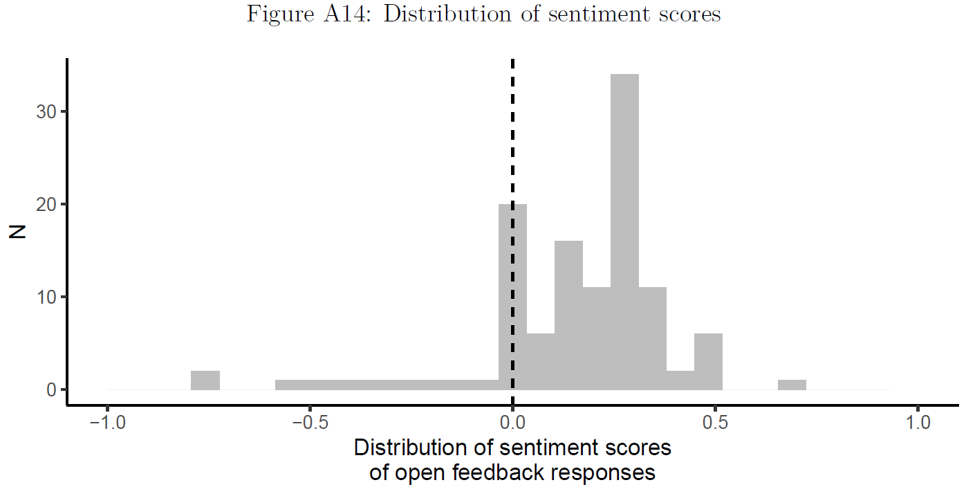
- Figure 16 (wordcloud) and Figure 17 (histogram) used in Bauer and Clemm von Hohenberg (2021) to illustrate study participant sentiment (data quality/problems), i.e., whether people were frustrated (or not) after participating in a study that involved deception.
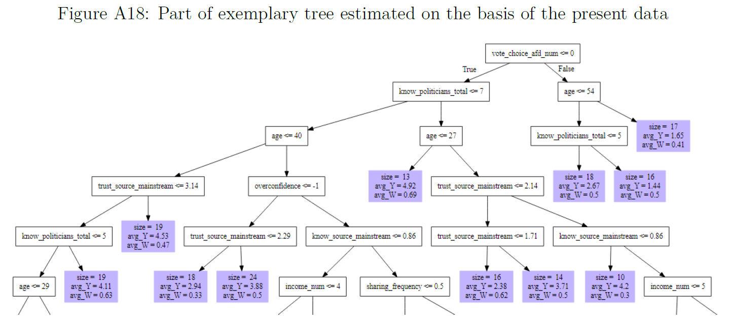
- Figure 18 was used in Bauer and Clemm von Hohenberg (2021) (Appendix) to explain methods, i.e., the logic underlying causal forests used to estimate treatment heterogeneity in experiments.
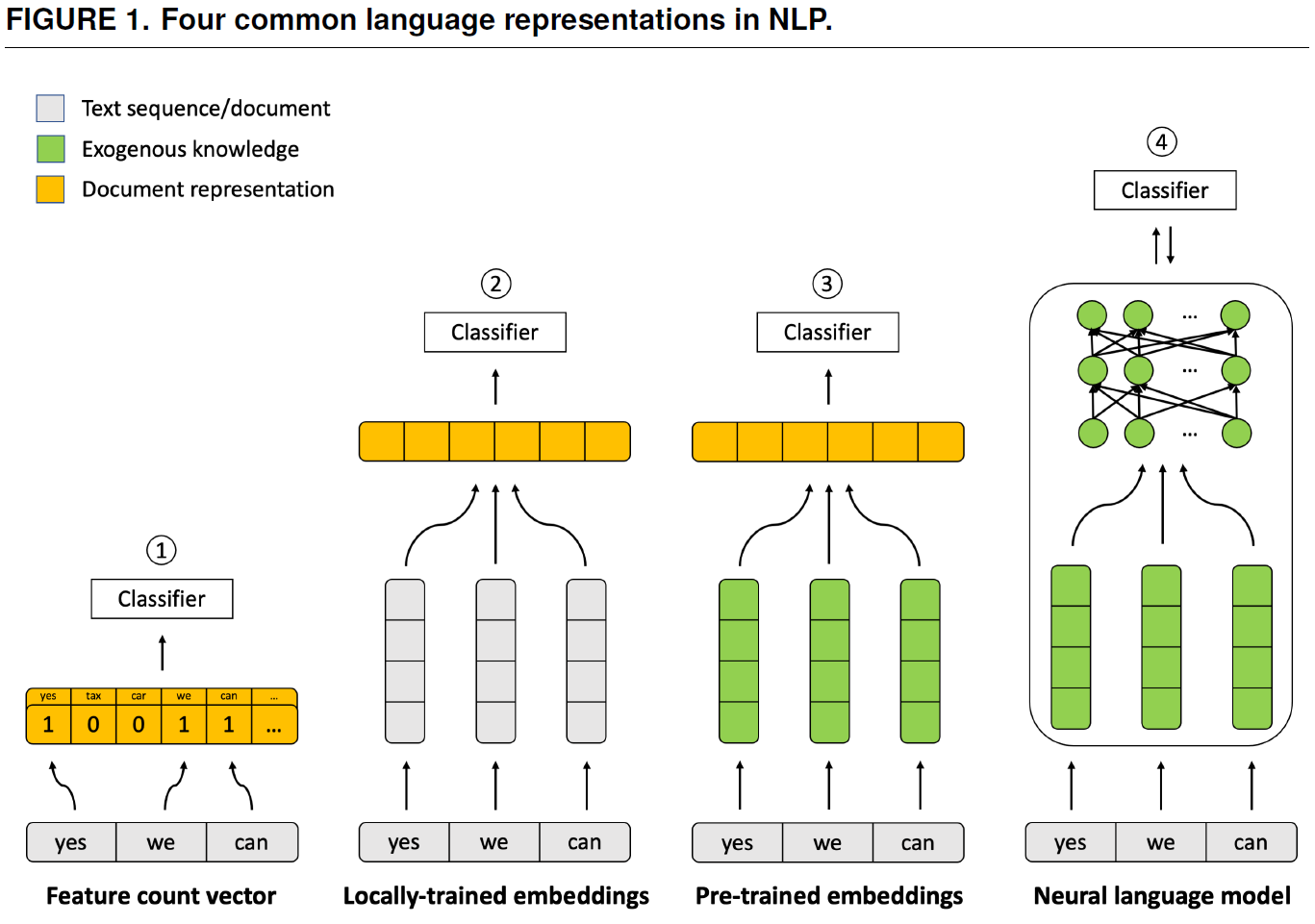
- Figure 19 was used in Bonikowski, Luo, and Stuhler (2022) to explain methods, i.e., how language is represented in different NLP methods.
!
Naturally, there are much more sophisticated visualization such as this amazing explanation of How randomized response can help collect sensitive information responsibly. Naturally, this may not be feasible if your research team does not comprise several people with the necessary skills.
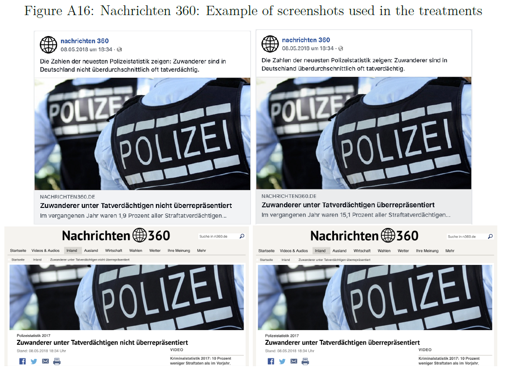
- Figure 20 was used in Bauer and Clemm von Hohenberg (2021) (Appendix) to explain measures, i.e., how the experimental treatment looked like. Often we can use simple photos here.
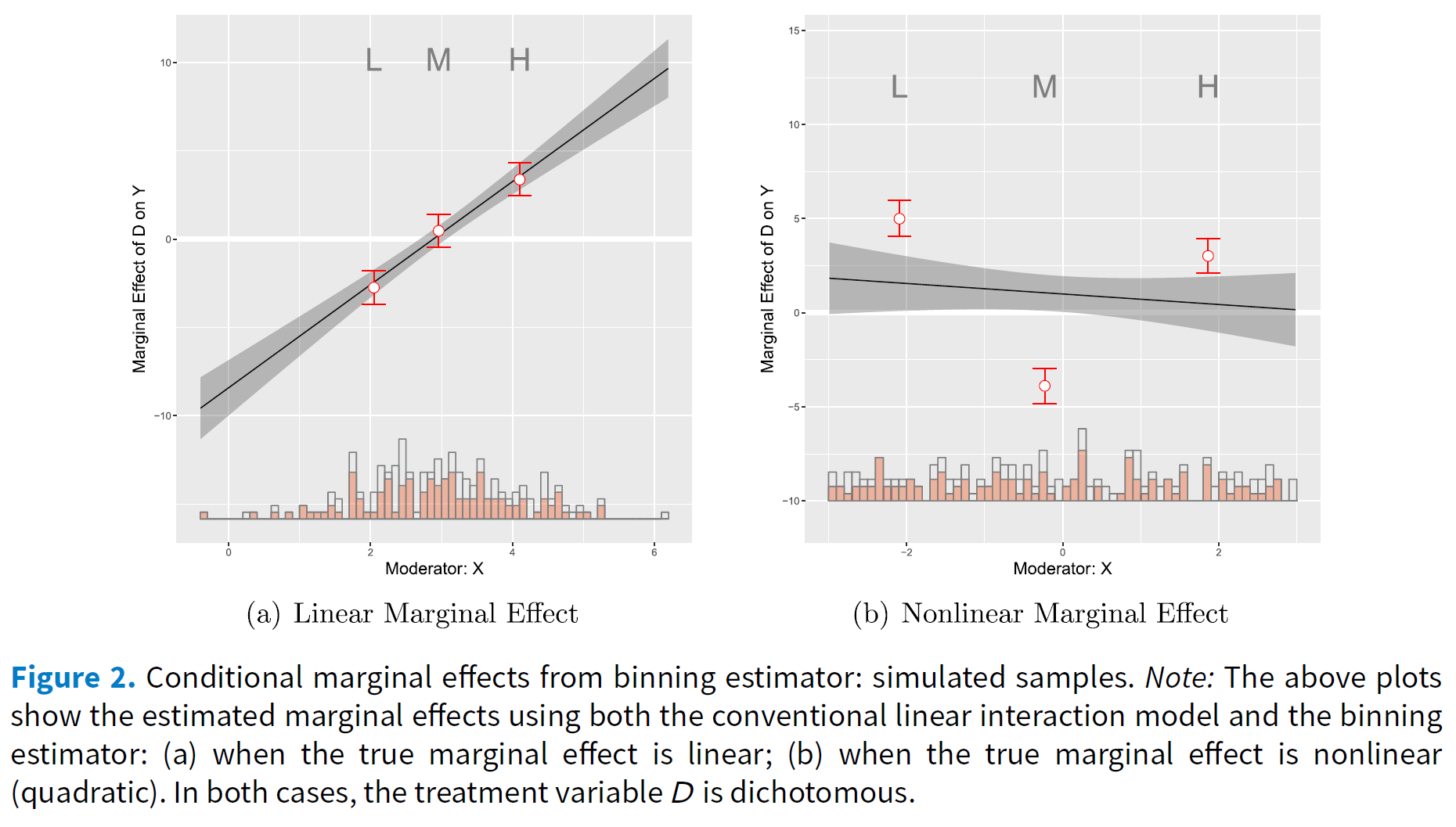
- Figure 22 published in Hainmueller, Mummolo, and Xu (2016) visualizes simulated data to illustrate the distributions that may underlie linear estimates of interaction effects.7
Finally, one of many examples in which interactive data visualization is used. Wuttke, Schimpf, and Schoen (2020) study the measurement of populist attitudes. In addition to the actual paper they provide a shiny app in which users can interact with the data and produce various plots for subsets.
3 Retake: What did we learn from these examples?
- Visualization…
- …allows us to see things that were otherwise invisible (e.g. Hainmueller, Mummolo, and Xu 2016; Imai, Kim, and Wang 2018)
- e.g., variation underlying our variables/statistical estimates
- … can summarize a lot of information (e.g., model estimates) in a comprehensible way (e.g., Bauer 2018)
- Comparisons across multiple categories, comparison of effect across stat. models
- …may (should) tell a story (think of Minard’s graph) (e.g., Figures and Legewie 2019)
- …may be used to explain things (e.g., Imai, Kim, and Wang 2018)
- …may be used to visualize many data dimentions e.g., 11
- …can be used to persuade others of facts (e.g., Figures and Legewie 2019) (see also Forensic architecture = visual detectives)
- …allows us to see things that were otherwise invisible (e.g. Hainmueller, Mummolo, and Xu 2016; Imai, Kim, and Wang 2018)
- Mindset: data ↔︎ graph/visualization
References
Bauer, Paul C. 2018. “Unemployment, Trust in Government, and Satisfaction with Democracy: An Empirical Investigation.” Socius 4 (January): 1–14.
Bauer, Paul C, Pablo Barberá, Kathrin Ackermann, and Aaron Venetz. 2017. “Is the Left-Right Scale a Valid Measure of Ideology?” Political Behavior 39 (3): 553–83.
Bauer, Paul C, and Clemm von Hohenberg. 2021. “Believing and Sharing Information by Fake Sources: An Experiment.” Political Communication 38 (6): 647–71.
Bonikowski, Bart, Yuchen Luo, and Oscar Stuhler. 2022. “Politics as Usual? Measuring Populism, Nationalism, and Authoritarianism in U.S. Presidential Campaigns (1952–2020) with Neural Language Models.” Sociol. Methods Res. 51 (4): 1721–87.
Clemm von Hohenberg, Bernhard, and Paul C Bauer. 2021. “Horseshoe Patterns: Visualizing Partisan Media Trust in Germany.” Socius 7 (January): 23780231211028786.
Figures, Kalisha Dessources, and Joscha Legewie. 2019. “Visualizing Police Exposure by Race, Gender, and Age in New York City.” Socius 5 (January): 2378023119828913.
Hainmueller, J, J Mummolo, and Y Xu. 2016. “How Much Should We Trust Estimates from Multiplicative Interaction Models? Simple Tools to Improve Empirical Practice.”
Helbling, Marc, and Richard Traunmüller. 2018. “What Is Islamophobia? Disentangling Citizens’ Feelings Toward Ethnicity, Religion and Religiosity Using a Survey Experiment.” Br. J. Polit. Sci., 1–18.
Imai, Kosuke, In Song Kim, and Erik Wang. 2018. “Matching Methods for Causal Inference with Time-Series Cross-Section Data.” Princeton University 1.
Kastellec, Jonathan P, and Eduardo L Leoni. 2007. “Using Graphs Instead of Tables in Political Science.” Perspectives on Politics 5 (4): 755–71.
König, Tim, Wolf J Schünemann, Alexander Brand, Julian Freyberg, and Michael Gertz. 2022. “The EPINetz Twitter Politicians Dataset 2021. A New Resource for the Study of the German Twittersphere and Its Application for the 2021 Federal Elections.” Polit. Vierteljahresschr. 63 (3): 529–47.
Mehr, Samuel A, Manvir Singh, Dean Knox, Daniel M Ketter, Daniel Pickens-Jones, S Atwood, Christopher Lucas, et al. 2019. “Universality and Diversity in Human Song.” Science 366 (6468).
Traunmüller, Richard. 2020. “Datenvisualisierung für Exploration Und Inferenz.” In Handbuch Methoden Der Politikwissenschaft, edited by Claudius Wagemann, Achim Goerres, and Markus B Siewert, 619–50. Wiesbaden: Springer Fachmedien Wiesbaden.
Wuttke, Alexander, Christian Schimpf, and Harald Schoen. 2020. “When the Whole Is Greater Than the Sum of Its Parts: On the Conceptualization and Measurement of Populist Attitudes and Other Multidimensional Constructs.” Am. Polit. Sci. Rev. 114 (2): 356–74.
Footnotes
Description of the figure: “Because this visualization provides data across the lines of race, gender, and age, there are several comparative analyses that can be drawn. Trends can be seen within racial groups, gender groups, and ag e groups. All charts are parabolic in shape. Across all race-gender intersections, police exposure increases in late adolescence, peeks in early adulthood, and steadily declines as age increases thereafter. Across each race group, police stops on men far outnumber police stops on women. For both men and women, black residents experience the highest rate of pedestrian stops, with whites and Hispanic residents following in that particular order. For example, at age 20, black males are stopped 2.4 times more than their Hispanic counterparts and 5.6 times more than their white counterparts. Black females are stopped 2.2 times more than Hispanic women and 3.5 times more than white women” (Figures and Legewie 2019, 1–2).↩︎
Description of the figure: ” In the left panel of Figure 1, we present the distribution of the treatment variable for the Acemoglu et al. (2017)study where a red (blue) rectangle represents a treated (control) country-year observation. White areas indicate the years when countries did not exist. We observe that many countries stayed either democratic or autocratic throughout years with no regime change. Among those who experienced a regime change, most have transitioned from autocracy to democracy, but some of them have gone back and forth multiple times. When ascertaining the causal effects of democratization, therefore,we may consider the effect of a transition from democracy to autocracy as well as that of a transition from autocracy to democracy.The treatment variation plot suggests that researchers can make a variety of comparisons be-tween the treated and control observations. For example, we can compare the treated and control observations within the same country over time, following the idea of regression models with unit fixed effects (Imai and Kim, 2016). With such an identification strategy, it is important not to compare the observations far from each other to keep the comparison credible. We also need to be careful about potential carryover effects where democratization may have a long term effect, introducing post-treatment bias. Alternatively, researchers can conduct comparison within the same year, which would correspond to the identification strategy of year fixed effects models. In this case, we wish to compare similar countries with one another for the same year and yet we may be concerned about unobserved differences among those countries.The right panel of Figure 1 shows the treatment variation plot for the Scheve and Stasavage(2012) study, in which a treated (control) observation represents the time of interstate war (peace)indicated by a red (blue) rectangle. As in the left plot of the figure, a white area represent the time period when a country did not exist. We observe that most of the treated observations are clustered around the time of two world wars. This implies that although the data set extends from1816 to 2000, most observations in earlier and recent years would not serve as comparable control observations for the treated country-year observations.” (Imai, Kim, and Wang 2018, 7–8).↩︎
These are estimates of many models in a single graph (2 different datasets \(\times\) 3 outcomes \(\times\) 6 different estimation strategies). The graph summarizes the main coefficient contained three different tables (Table 3, 4 and 5). (Not good: Potentially too many estimates, Dependent variable not indicated; Good: Control outcome, summarizes a lot of information)↩︎
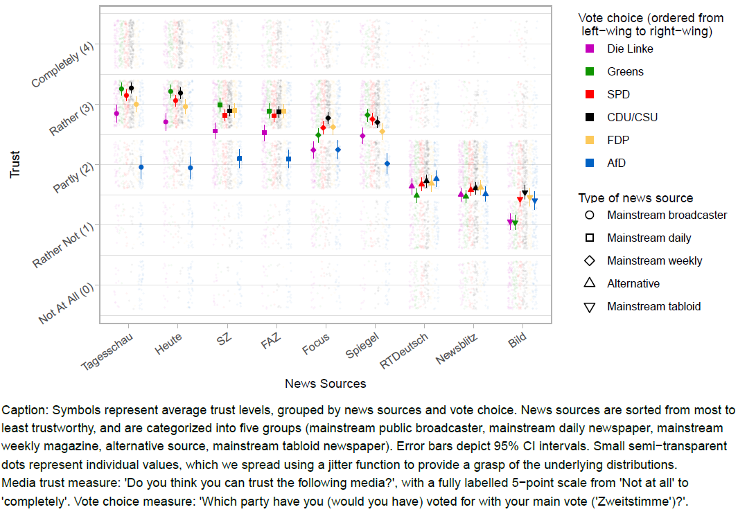
Germany is an interesting case to study: It has a multi-party system with several centrist parties on the one hand, and the populist right-wing party Alternative für Deutschland (Afd) as well as the left-wing Linke on the other hand. Although media trust in Germany is comparably high, mainstream outlets have increasingly been tainted as the “lying press”. Germany has also seen the emergence of “alternative”, sometimes foreign-funded, media that peddle misinformation. In such a news ecosystem, illustrating media trust at the level of outlets can be particularly informative. Our data is from an online survey conducted in March 2019 with a quota sample that is approximately representative of the German population in terms of age, gender and place of residence. Of the nine sources, seven are long-standing, mainstream outlets (further categorized into public broadcasters, dailies, weeklies and tabloid) and two are recent “alternative” outlets. Outlets are ordered according to their average trustworthiness. For mainstream media sources, we find a “horseshoe” pattern: Voters of both the left-wing populist and right-wing populist parties have lower levels of trust, although this trend is much stronger among voters of the right-wing AfD. Remarkably, the trust gap between AfD voters and voters of the more centrist parties is highest for the outlet that is most trusted in general, i.e. the public broadcaster Tagesschau. The underlying distributions, illustrated by the semi-transparent points, show that only among AfD voters, a substantial proportion does “not at all” trust this source. For the alternative outlets, the trust gap between centrist and populist voters disappear. For example, AfD voters are slightly more trusting of the Russia-funded RT Deutsch, but this difference is negligible. Last, the widely circulated tabloid Bild, known for its often populist style, scores generally low, especially among voters of the most left-leaning parties.(Not good: not color-blind friendly; Type of news source necessary? Points not that informative)↩︎
Figure note: The illustration depicts the sequence from acts of singing to the ethnography corpus. (A) People produce songs in conjunction with other behavior, which scholars observe and describe in text. These ethnographies are published in books, reports, and journal articles and then compiled, translated, catalogued, and digitized by the Human Relations Area Files organization. We conduct searches of the online eHRAF corpus for all descriptions of songs in the 60 societies of the Probability Sample File (B) and annotate them with a variety of behavioral features. The raw text, annotations, and metadata together form the NHS Ethnography. Codebooks listing all available data are in Tables S1–S6; a listing of societies and locations from which texts were gathered is in Table S12.↩︎
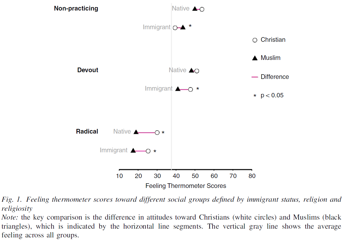
Title of the study is “What is Islamophobia? Disentangling Citizens’Feelings Toward Ethnicity, Religion and Religiosity Using a Survey Experiment”: Description of the figure: “Figure 1 presents the average feeling thermometer scores that respondents gave toward the groups we differentiate in our survey experiment. The average feeling thermometer score across all groups is around 38 (vertical gray line). The key comparison we are interested in is the difference in attitudes toward Christians (white circles) and Muslims (black triangles), and how this difference behaves when the groups are described as more or less religious and whether they are immigrants or native British.62The horizontal line segments indicate the difference” (Helbling and Traunmüller 2018, 10).↩︎
Description of the figure: “Figure 2(a) was generated using the DGP where the standard multiplicative interaction models the correct model and therefore the LIE assumption holds. Hence, as Figure 2(a) shows,the conditional effect estimates from the binning estimator and the standard multiplicative interaction model are similar in both datasets. Even with a small sample size (i.e.,N=200), the three estimates from the binning estimator, labeled L, M, and H, sit almost right on the estimated linear marginal-effect line from the true standard multiplicative interaction model. Note that the estimates from the binning estimator are only slightly less precise than those from the true multiplicative interaction model, which demonstrates that there is at best a modest cost in terms of decreased efficiency from using this more flexible estimator. We also see from the histogram that the three estimates from the binning estimator are computed at typical low, medium, and high values of X with sufficient common support which is what we expect given the binning based on terciles.Contrast these results with those in Figure 2(b), which were generated using our simulated data in which the true marginal effect of D is nonlinear. In this case, the standard linear model indicates a slightly negative, but overall very weak, interaction effect, whereas the binning estimates reveal that the effect of D is actually strongly conditioned by X:D exerts a positive effect in the low range of X, a negative effect in the mid range of X, and a positive effect again in the high range of X. In the event of such a nonlinear effect, the standard linear model delivers the wrong conclusion. When the estimates from the binning estimator are far off the line or when they are non-monotonic, weave evidence that the LIE assumption does not hold” (Hainmueller, Mummolo, and Xu 2016, 10–11).↩︎