Academic posters
- Learning outcomes: Learn…
- …a few basics about academic posters.
- Sources: How to Create a Research Poster, Creating Scientific Posters, Faulkes (2021) (best reading!)
1 Research posters & poster sessions
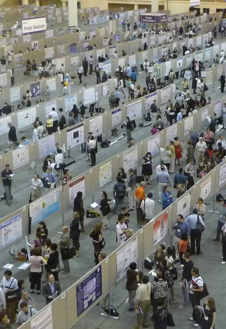
- Most conferences have poster sessions
- “Choice” of talk vs. poster depends on: type of project, size of conference, your comfort level in different situations, goals of presenting the project
- Usually, you stand beside your poster to explain & tell the story (see here)
- Research posters: summarize research concisely and attractively
- Aims: Highlight your research; Generate discussion; Get feedback; Network
- Posters facilitate one-on-one conversations!
- Twitter poll: What’s the average time you WANT to spend talking to a presenter at a conference poster?
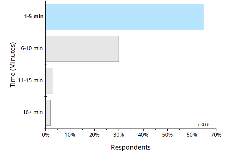
- Q: Should our poster be understandable without explanation?
2 Questions for starters
- What is/are my research question(s)?
- What is the most important/interesting/astounding finding from my research project?
- How can I visually share my research with conference attendees? Should I use charts, graphs, photos, images?
- What kind of information can I convey during my talk/conversations that will complement my poster?
3 Exercise: What do you like/dislike?
- Please discuss with your neighbor: What do you like/dislike about the posters?
- More examples in Faulkes (2021) for inspiration
- Fig. 1.2/p. 4; Fig. 4.5/p. 31; Fig. 6.1/p. 57; Fig. 7.6/p. 70; Fig. 7.11/p. 77; Fig. 7.12/7.13/p. 78
Insights
- Trust poster
- Bad: Too much text; No explicit research questions;
- Polarization poster
- Bad: Not enough text?; Does not work without author’s explanation; Graphs too complex?; Structure not clear;
- Paper: https://osf.io/preprints/socarxiv/e5vp8
4 What makes a good poster?
- Important information should be readable from about 10 feet away
- Title is short and draws interest
- Word count: 300 to 800 words
- Text is clear and to the point
- Use of bullets, numbering, and headlines facilitate reading
- Effective use of graphics, color and fonts
- Consistent and clean layout
- Includes acknowledgments, your name and institutional affiliation
- Follow classic structure: Intro/puzzle/research question, theory, methods, results, conclusion (familiarity!)
- Best poster awards: Google image search (e.g., see here)
5 Basic design choices
- Format: Usually A0, wide or long (84cm x 118cm)1
- Set size from the start in your software, e.g., in PowerPoint (Slide size/Foliengröße; cf. Faulkes (2021), Fig. 5.3/p. 50)
- Color: Generally stick to dark colors (Q: Which colors should we avoid?)
- Font family: Stick to plain fonts (avoid Comic Sans), not more than 2-3 fonts
- Font size and style: See next slide
- Spacing: Leave breathing room around your text (less is more)
- Gives clear distinction between sections of your poster
- Alignment: Use left-alignment on text to prevent awkward spacing and stretching of font
6 Text and type
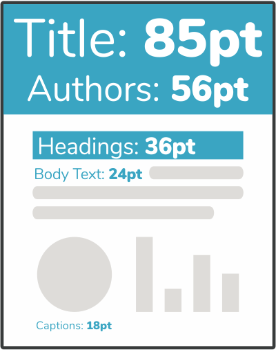
- Use readable font (1 point/pt is equal to 1/72 of an inch)
- Title: ~80pt
- Author: ~40pt
- Section titles: ~60pt
- Text: ~36pt
- Typefaces can be used to create distinctive look
- Sans serif fonts generally perform well on posters
- Setting text too close together is a common error
7 Graphs & images
- Posters = visual medium → graphics provide fastest, best way to inform viewers
- Posters = large format → make sure images are not distorted or pixelated
- Take your own photos/graphs when possible (and respect copyright/licensing)
- Font within graph should have minimum font size
- Ideally 150-300dpi resolution (Test: Big display or zoom in)
- Set other aspects in ggplot (e.g., width, height, font size, captions etc.)
- General rules for good (data) visualization apply!
8 Data & color
- Presenting data
- Simple/common graphs often better than more nuanced but uncommon graphs
- Tables are bad (if possible do not use them!)
- Flowcharts are an underused way of showing processes
- Anything can be an infographic (e.g., data collection, measures, hypotheses, etc.)
- Colors
- Color = accessibility issue (pick color-blind friendly colors)
- Powerful but easy to misuse (try out different schemes, ColorBrewer!)
- Make sure colors reflect scale type (nominal/qualitative = distinct colors)
- Possible to exclude white for sequential colors
- Make sure connected elements/categories are consistently colored (e.g., highly educated)
- Printed ink colors can look differently from screen colors
- Beyond paper: Poster not limited to paper; online resources, video may provide interactivity
9 Layout, grids, background and title
- Layout
- Top of poster is more valuable space than bottom
- People expect consistent path from top left of to bottom right
- Grids
- Make grid, then line up edge of every element on poster to at least one other element
- White space is not wasted space (organizes your content!)
- Boxes usually look desperate rather than organized (but..)
- Background: Busy background (e.g., photograph) obscures content
- Title bars
- Title most important part of poster (all that most people will ever read!)
- People care less about other information usually stuck in title bars (author etc.)
- Institutional logo less interesting than you think it is
- Ideally: Visit a poster session around you!
- More discussion by Faulkes: Blocks of text; Sections; Images and graphics; Fine-tuning; Before you print; Printing; Travel; Networking and presentation; After the conference
10 Software for posters
- …try to get different examples from colleagues
- Beware of priming (do not simply copy your colleagues)
- PowerPoint (Templates: 1, 2, 3)
- Adobe Illustrator, Photoshop, and InDesign (never used them..)
- Open Source Alternatives: OpenOffice as free alternative to MS Office
- R
- Possible but takes time!
- Academic conference posters using {posterdown} (2022)
- How to make a poster in R (2018)
- Using Shiny to Create an Academic Poster (2022) (Poster example)
- Packages & templates: Poster templates
- always check recent activity on github and who is involved
- posterdown
- pagedown
References
Faulkes, Zen. 2021. Better Posters: Plan, Design and Present an Academic Poster. Pelagic Publishing Ltd.
Footnotes
841 mm x 1189 mm, 84.1 cm x 118.9 cm or 33.1 inches x 46.8 inches.↩︎