| sex | age | religion | treatment_text | ethnicity_census | personal_income | employment_status |
|---|---|---|---|---|---|---|
| Male | 41 | Christianity | Unhappy (No Moral Change) | Mixed | [10K, 20K) | Part-Time |
| Female | 55 | Spiritualism | Happy (No Moral Change) | White | <10K | Not in paid work |
| Male | 45 | NonReligious | Neutral (Yes Moral Change) | White | [20K, 30K) | Full-Time |
| Male | 25 | NonReligious | Neutral (No Moral Change) | White | [30K, 40K) | Full-Time |
| Female | 52 | NonReligious | Neutral (Yes Moral Change) | White | <10K | Part-Time |
| Male | 53 | Christianity | Unhappy (Yes Moral Change) | White | <10K | Part-Time |
Visualizing descriptive statistics
- Learning outcomes: Learn how to…
- …visualize combinations of different variables.
- …make graphs for publications.
- …use different geoms.
- …add summary statistics to plots.
- …manipulate data for a plot.
- …plot ordered variables (and order categories).
- …plot graphs next to each other.
- …search for solutions online.
Sources: Original material; Wickham (2010)
1 Description basics
- (Research) Question: How are observations (≈ units) distributed across values/categories of a variable (or several)?
- Objective:
- Show distributions (causality?), exploration & presentation, replace summary tables
- Data
- Uni-dimensional vs. multi-dimensional data (e.g., joint distribution)
- Time just another dimension/variables
- Data can be aggregated (e.g., means across time)
- Usage: Mostly in methods section or in the appendix (sometimes results!)
- Note: Description is just as important as explanation
- Types of graphs
- Depend on the data types and number of dimensions/variables
- Numeric (quantitative: discrete, continuous), categorical (qualitative: nominal, ordinal)
- 1, 2, 3 etc. variables
- See decision tree here (and another one here)
- Depend on the data types and number of dimensions/variables
2 Exploratory summary graphs
- Learning outcomes: Learn how to…
- …produce a quick exploratory plot for your data.
ggpairs()(GGallypackage): Provides quick and dirty overview of many variables and their relationships- Don’t plot too many variables!
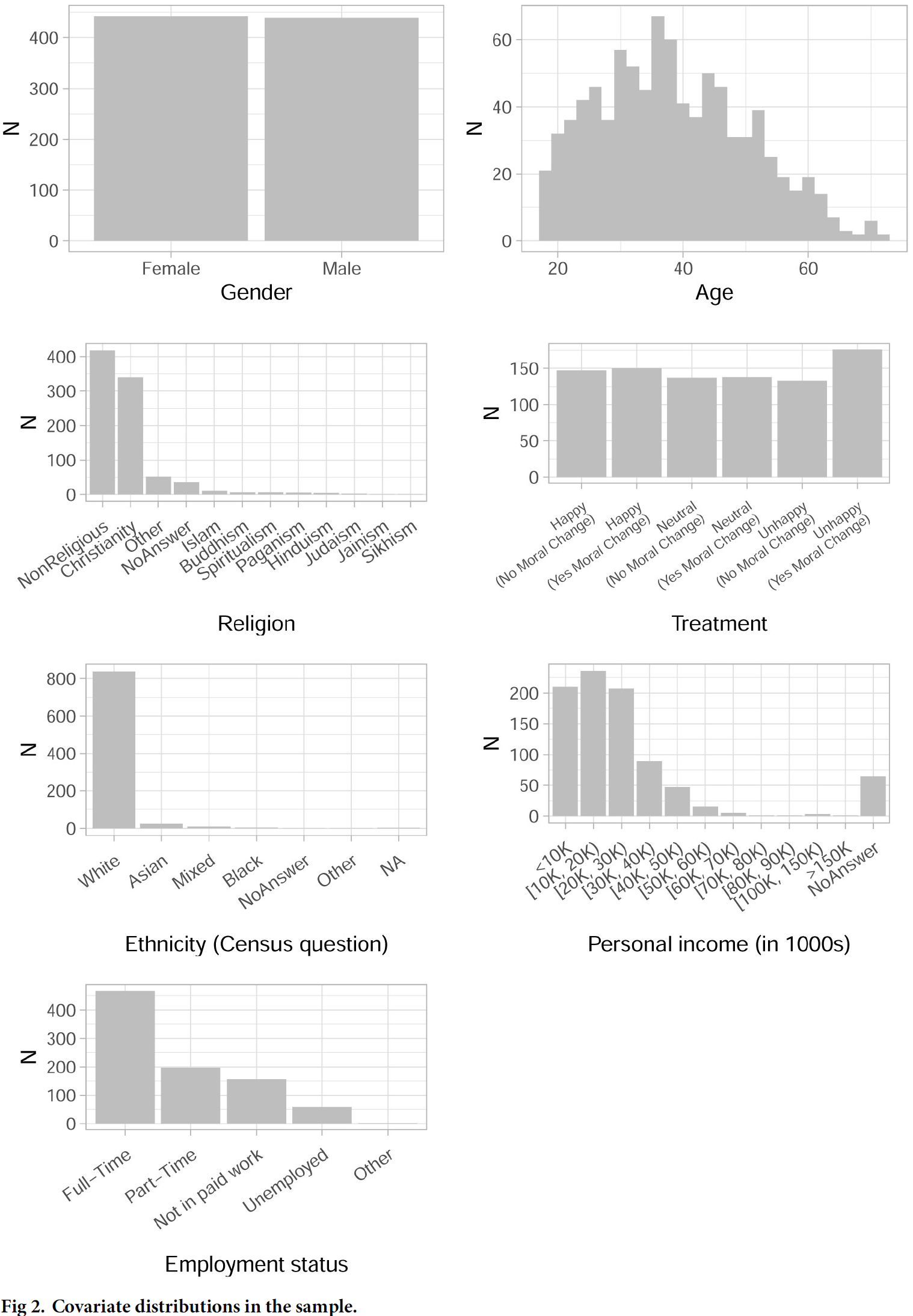
- Figure 1 provides an example. The data is shown in Table 1.1
- Q: What does Figure 1 show? How useful is it?

2.1 Lab: Data & Code
# data_bauer_poama.csv
data <- read_csv(sprintf("https://docs.google.com/uc?id=%s&export=download",
                         "1QeDCki2Auu3OZK7qMRh2xbq0u7n1Fy_8"))
ggpairs(data %>% dplyr::select(sex, age, employment_status)) +
  theme(axis.text.x = element_text(angle = 45, hjust = 1)) # religion,
# You can set the cardinality threshold: Maximum number of levels allowed in a character / factor column
3 Several variables: Categorical/numerical
- Learning outcomes: Learn how to…
- …spot errors in a graph.
- …visualize several single variables.
- …make summary graph for publication.
- …add summary statistics to plots.
- …manipulate data for a plot.
- …plot ordered variables (and order categories).
- …plot graphs next to each other.
- …search for solutions online.
3.1 Data & Packages & functions
- Data: One categorical or numerical variable (1 dimension), several plotted next to each other
- Packages & functions:
geom_histogram(): Histograms show distribution of a single numeric/quantitative variable (Frequency polygons:geom_freqpoly())2- Provide a lot of information about the distribution but need more space than boxplots
- Bin the data, then count the number of observations in each bin (then show either bars or lines)
binwidth: Control the width of bins (ALWAYS experiment with that, default is 30)breaks: Set manual bin cutoffs
geom_bar(): Barplots show distribution categorical/qualitative variables
- Recommendations
- Use consistent strategy to visualize or indicate missings
- Show missings as annotation in histograms or as category in barplots (last of ordered categories)
- Survey data: Sometimes it could make sense to be more specific and also show “refusals”, “don’t know” etc. (make the sample transparent!)
- Create final labels in data for plot
data_plotto avoid errors
3.2 Graph
- Here we’ll reproduce (criticize and improve) part of Figure 23.
- Questions:
- What does the graph show? What are the underlying variables (and data)?
- How many scales/mappings does it use? Could we reduce them?
- What do you like, what do you dislike about the figure? What is good, what is bad?4
- What kind of information could we add to the graph (if any)?
- How would you approach a replication of the graph?
3.3 Lab: Data & Code
We start by inspecting the data with View(data) and str(data): What do we see?*
# data_bauer_poama.csv
# data <- read_csv(sprintf("https://docs.google.com/uc?id=%s&export=download",
#                          "1QeDCki2Auu3OZK7qMRh2xbq0u7n1Fy_8"))

data <- read_csv("data/data_bauer_poama.csv",
                 col_types = cols())

# TIP: Use styler package to style code

# View(data)
# str(data)

# Age ####
p1 <- ggplot(
  data,
  aes(x = age)
) +
  geom_histogram(binwidth = 2, fill = "gray") +
  labs(x = "Age", y = "N") +
  theme_light()

# Religion ####
# Get categories in ranked order
levels_ranked <- data %>%
  dplyr::select(religion) %>%
  count(religion) %>%
  arrange(desc(n)) %>%
  dplyr::pull(religion)
# Create factor
data$religion_fac <- factor(data$religion,
  levels = levels_ranked,
  ordered = TRUE
)

p2 <- ggplot(data, aes(x = religion_fac)) +
  geom_bar(fill = "gray") +
  labs(x = "Religion", y = "N") +
  theme_light() +
  theme(
    axis.text.x = element_text(
      angle = 40,
      hjust = 1,
      vjust = 1,
      margin = margin(0.2, 0, 0.3, 0, "cm")
    ),
    plot.title = element_text(hjust = 0.5),
    plot.margin = margin(0.5, 0.5, 0, 0.5, "cm")
  )

# Employment status
data$employment_status_fac <- factor(data$employment_status)
p3 <- ggplot(data, aes(x = employment_status_fac)) +
  geom_bar(fill = "gray") +
  labs(x = "Employment status", y = "N") +
  theme_light() +
  theme(
    axis.text.x = element_text(
      angle = 35,
      hjust = 1,
      vjust = 1,
      margin = margin(0.2, 0, 0.3, 0, "cm")
    ),
    plot.title = element_text(hjust = 0.5),
    plot.margin = margin(0.5, 0.5, 0, 0.5, "cm")
  )

library(patchwork)
p1 + p2 + p3
3.4 Exercise
- We’ll split into teams and improve Figure 3 together. Use the code of the subplot above that we assign to you (p1, p2, p3) to create one of the plots below.
- Histogram of age (p1):
- Add additional statistics (mean, median, sd)
- Tip: Use
geom_vline(aes(xintercept = mean(...)),col='red',size=1)to add lines. - Use
annotate("text", label = paste("Mean:", round(mean(data$age))),...)to add lables.
- Tip: Use
- Add additional statistics (mean, median, sd)
- Barplot of religion (p2): Reduce rare categories to one category called
Other religion.- Tip: Recode the religion variable:
data$religion_fac <- recode(data$religion_fac, "Sikhism" = "Other") - Tip: Or use the
fct_lump()function.
- Tip: Recode the religion variable:
- Barplot of employment status (p3)
- Add labels with absolute (relative) number for the bars
- Search solution here: https://community.rstudio.com/t/regarding-adding-bar-labels-at-the-top-of-each-bar-in-ggplot-in-rstudio/14226/4
- Order categories (see how it’s done in the code for the
religion plotabove)
- Add labels with absolute (relative) number for the bars
- In the end explain to others what you did to improve the plot.


Exercise solution
# HISTOGRAM

# Age ####
ggplot(
  data,
  aes(x = age)
) +
  geom_histogram(binwidth = 2, fill = "gray") +
  labs(x = "Age", y = "N") +
  theme_light() +
  geom_vline(aes(xintercept = mean(age)), col = "red", size = 1) +
  geom_vline(aes(xintercept = median(age)), col = "blue", size = 1) +
  annotate("text",
    label = paste(
      "Mean:", round(mean(data$age)),
      "\nMedian:", round(median(data$age)),
      "\nSD:", round(sd(data$age))
    ),
    x = 60, y = 60,
    size = 3,
    colour = "black",
    hjust = 0.5,
    vjust = 0.5
  )


# Religion

levels_ranked <- data %>%
  dplyr::select(religion) %>%
  count(religion) %>%
  arrange(desc(n)) %>%
  dplyr::pull(religion)
# Create factor
data$religion_fac <- factor(data$religion,
  levels = levels_ranked
)

data$religion_fac <- recode(data$religion_fac,
  "Sikhism" = "Other",
  "Jainism" = "Other",
  "Hinduism" = "Other",
  "Paganism" = "Other",
  "Spiritualism" = "Other"
)
# Alternative: data$religion_fac <- fct_lump(data$religion_fac, n = 10)

ggplot(data, aes(x = data$religion_fac)) +
  geom_bar(fill = "gray") +
  labs(x = "Religion", y = "N") +
  theme_light() +
  theme(
    axis.text.x = element_text(
      angle = 40,
      hjust = 1,
      vjust = 1,
      margin = margin(0.2, 0, 0.3, 0, "cm")
    ),
    plot.title = element_text(hjust = 0.5),
    plot.margin = margin(0.5, 0.5, 0, 0.5, "cm")
  )


# Employment
# Get ranked categories
levels_ranked <- data %>%
  dplyr::select(employment_status) %>%
  count(employment_status) %>%
  arrange(desc(n)) %>%
  dplyr::pull(employment_status)
# Create factor
data$employment_status_fac <- factor(data$employment_status,
  levels = levels_ranked
)


ggplot(data, aes(x = employment_status_fac)) +
  geom_bar(fill = "gray") +
  labs(x = "Employment status", y = "N") +
  theme_light() +
  theme(
    axis.text.x = element_text(
      angle = 35,
      hjust = 1,
      vjust = 1,
      margin = margin(0.2, 0, 0.3, 0, "cm")
    ),
    plot.title = element_text(hjust = 0.5),
    plot.margin = margin(0.5, 0.5, 0, 0.5, "cm")
  ) +
  geom_text(stat = "count", aes(label = round((after_stat(count)) / sum(after_stat(count)), 2), vjust = -0.5))
Another solution
- Another solution using
geom_table_npc().
library(ggpmisc)

# data_bauer_poama.csv
# data <- read_csv(sprintf("https://docs.google.com/uc?id=%s&export=download",
#                          "1QeDCki2Auu3OZK7qMRh2xbq0u7n1Fy_8"))

data <- read_csv("data/data_bauer_poama.csv",
                 col_types = cols())

summ <- data %>%
  summarize(Mean = mean(age),
            Median = median(age),
            SD = sd(age),
            N = n(),
            Missing = sum(is.na(age)))

ggplot(data,  aes(x=age)) +
  geom_histogram(binwidth=2, fill = "gray") +
  labs(x="Age", y = "N")+
  theme_light() +
  geom_table_npc(data = summ, label = list(summ), npcx = 0.42, npcy = 1, hjust = 0, vjust = 1) +
  geom_vline(aes(xintercept = mean(age)), col='red', size=2) +
  geom_vline(aes(xintercept = median(age)), col='blue', size=2)
3.5 Exercise: Higlighting things to focus attention
- Below two quick example of how we could highlight certain facts in histograms or barplots. In practice it might be helpful to add annotations in the graph.
- Data in the graph can be colored by simply adding additional
geomson top. - In order to change the color of words you need to use
<span style='color:orange;'>...</span>in combination withtheme(plot.title = element_markdown()).
- Data in the graph can be colored by simply adding additional
- Please us the code below but this time…
# data_bauer_poama.csv
# data <- read_csv(sprintf("https://docs.google.com/uc?id=%s&export=download",
#                          "1QeDCki2Auu3OZK7qMRh2xbq0u7n1Fy_8"))

data <- read_csv("data/data_bauer_poama.csv",
                 col_types = cols())

library(ggtext)
ggplot(
  data,
  aes(x = age)
) +
  geom_histogram(binwidth = 2, fill = "gray") +
    geom_histogram(data = data %>% filter(age>55),
                                 aes(x = age),
                                 binwidth = 2, fill = "blue") +
  labs(x = "Age", y = "N") +
  theme_light() +
    labs(title = "Only a small percentage in the sample <span style='color:blue;'>is over 55</span>.") +
  theme(plot.title = element_markdown())
library(ggtext)
levels_ranked <- data %>%
  dplyr::select(religion) %>%
  count(religion) %>%
  arrange(desc(n)) %>%
  dplyr::pull(religion)
# Create factor
data$religion_fac <- factor(data$religion,
  levels = levels_ranked
)

data$religion_fac <- recode(data$religion_fac,
  "Sikhism" = "Other",
  "Jainism" = "Other",
  "Hinduism" = "Other",
  "Paganism" = "Other",
  "Spiritualism" = "Other"
)

ggplot(data, aes(x = religion_fac)) +
  geom_bar(fill = "gray") +
    geom_bar(data = data %>% filter(religion == "Christianity"),
                     aes(x = religion_fac),
                     fill = "red") +
  labs(x = "Religion", y = "N") +
  theme_light() +
  theme(
    axis.text.x = element_text(
      angle = 40,
      hjust = 1,
      vjust = 1,
      margin = margin(0.2, 0, 0.3, 0, "cm")
    ),
    plot.title = element_markdown(),
    plot.margin = margin(0.5, 0.5, 0, 0.5, "cm")
  ) +
    labs(title = " <span style='color:red;'>Christians</span> are only the second biggest group in the sample.")
Exercise solution
ggplot(
  data,
  aes(x = age)
) +
  geom_histogram(fill = "gray",
                             breaks = seq(15,75,5)) +
    geom_histogram(data = data %>% filter(age<25),
                                 fill = "blue",
                             breaks = seq(15,75,5)) +
  labs(x = "Age", y = "N") +
  theme_light() +
    labs(title = "Only a small percentage in the sample <span style='color:blue;'>is younger than 25</span>.") +
  theme(plot.title = element_markdown())
levels_ranked <- data %>%
  dplyr::select(religion) %>%
  count(religion) %>%
  arrange(desc(n)) %>%
  dplyr::pull(religion)
# Create factor
data$religion_fac <- factor(data$religion,
  levels = levels_ranked
)

data$religion_fac <- recode(data$religion_fac,
  "Sikhism" = "Other",
  "Jainism" = "Other",
  "Hinduism" = "Other",
  "Paganism" = "Other",
  "Spiritualism" = "Other"
)

ggplot(data, aes(x = religion_fac)) +
  geom_bar(fill = "gray") +
    geom_bar(data = data %>%
                        filter(religion == "Islam"|
                                        religion == "Buddhism"|
                                        religion == "Judaism"),
                     aes(x = religion_fac),
                     fill = "red") +
  labs(x = "Religion", y = "N") +
  theme_light() +
  theme(
    axis.text.x = element_text(
      angle = 40,
      hjust = 1,
      vjust = 1,
      margin = margin(0.2, 0, 0.3, 0, "cm")
    ),
    plot.title = element_markdown(),
    plot.margin = margin(0.5, 0.5, 0, 0.5, "cm")
  ) +
    labs(title = "<span style='color:red;'>Islam, Buddhism</span> and <span style='color:red;'>Judaism</span> only make up a small percentage of the sample.")
4 Non-aggregated vs. aggregated data: Barplot example
- Learning outcomes: Learn…
- …the difference between plotting aggregated and non-aggregated data.
- …logic behind ordering scales.
4.1 Data & Packages & functions
- Data: One categorical variable
- Challenge: Either feed original raw data or summarized/processed data to ggplot
- Packages & functions:
geom_bar(): Expects unsummarised data (each observation contributes one unit to the height of each bar)geom_bar(stat ="identity"): Tellgeom_barnot to aggregate/summarize the data!factor(party, ordered = TRUE, levels = c(...)): Convert variable to ordered factorstr(data): Check data types +levels(data$party): Check levels and orderingdput(unique(data$party)): Quickly extract categories from character vector to reorder
4.2 Graph
- First, we keep the code/graph simple (no ordering, labels etc.)…
# data_twitter_influence.csv
#data <- read_csv(sprintf("https://docs.google.com/uc?id=%s&export=download",
#"1dLSTUJ5KA-BmAdS-CHmmxzqDFm2xVfv6"),
 #                       col_types = cols())

data <- read_csv("data/data_twitter_influence.csv",
                 col_types = cols())

  p1 <- ggplot(data, aes(x = party)) +
    geom_bar() +
    theme(axis.text.x = element_text(angle = 45, hjust = 1))

# Or summarize the data first:
  data_plot <- data %>%
    group_by(party) %>%
    summarize(n = n()) %>% ungroup()
  p2 <- ggplot(data_plot, aes(x = party, y = n)) +
    geom_bar(stat ="identity") +
    theme(axis.text.x = element_text(angle = 45, hjust = 1))

  p1 + p2 +
  plot_layout(ncol = 2)
Now, let’s reorder the party variable according to ideology, i.e., with DieLinke being the most left party and AfD the most right party. This can be done through converting the corresponding variable to an ordered factor.
# data_twitter_influence.csv
#data <- read_csv(sprintf("https://docs.google.com/uc?id=%s&export=download",
#"1dLSTUJ5KA-BmAdS-CHmmxzqDFm2xVfv6"),
 #                       col_types = cols())  %>%
    # select(party)

data <- read_csv("data/data_twitter_influence.csv",
                 col_types = cols()) %>%
    select(party)

data <- data %>%
    mutate(party = factor(party, ordered = TRUE,
                                                levels = c("DieLinke", "Greens", "SPD", "FDP", "CDU_CSU", "AfD")))
# str(data)
# levels(data$party)

  p1 <- ggplot(data, aes(x = party)) +
    geom_bar() +
    theme(axis.text.x = element_text(angle = 45, hjust = 1))

# Or summarize the data first:
  data_plot <- data %>%
    group_by(party) %>%
    summarize(n = n()) %>% ungroup()

  p2 <- ggplot(data_plot, aes(x = party, y = n)) +
    geom_bar(stat ="identity") +
    theme(axis.text.x = element_text(angle = 45, hjust = 1))

  p1 + p2 +
  plot_layout(ncol = 2)
5 Further examples
5.1 Categorical variables (2+)
- Learning outcomes: Learn…
- …to manipulate data first and visualize it thereafter
- …how to use
pivot_longer(ggplot likes long format!) - …how to visualize unordered and ordered variables
- …how to name scales and create manual ones
- …how to create labels from data
- Make sure the only thing that you might to add for the labels is gsub, i.e., ideally no substantive changing of label names
- …how to size text elements
5.1.1 Data & Packages & functions
- Data: Two or several categorical variables
- Challenge: We need to summarize the data as to obtain frequencies (absolute or relative)
- Create long format dataframe that contains the frequencies of different category combinations
- Packages & functions:
tidyrandpivot_longer()functiondplyrand functions such assummarize(),mutate()etc.
5.1.2 Graph
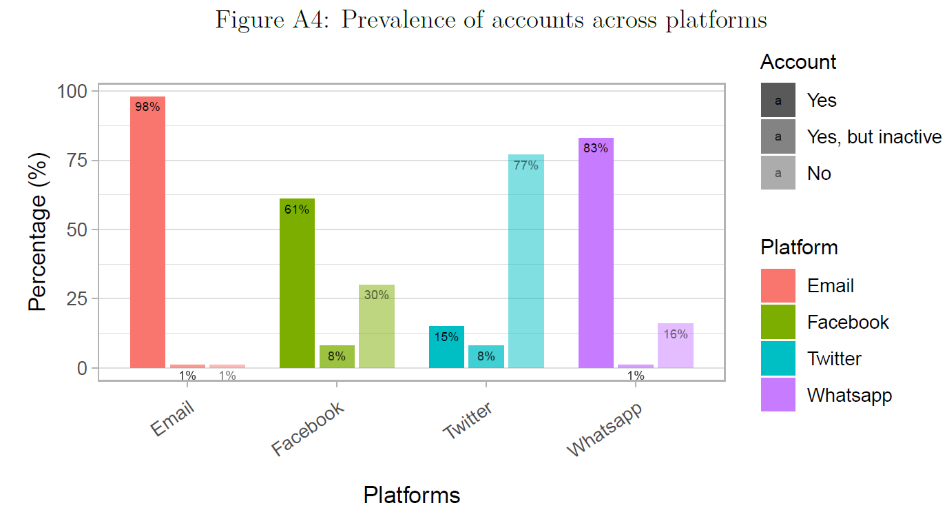
- Here we’ll reproduce and maybe criticize as well as improve Figure 8
- Questions:
- What does the graph show? What are the underlying variables (and data)?5
- How many scales/mappings does it use? Could we reduce them?6
- What do you like, what do you dislike about the figure? What is good, what is bad?
- What kind of information could we add to the graph (if any)?
- How would you approach a replication of the graph?
5.1.3 Lab: Data & Code
We start by importing the original (unsummarised data). As you can see below we have categorical string variables.
# data_account_prevalence.csv
#data <- read_csv(sprintf("https://docs.google.com/uc?id=%s&export=download",
#                         "1xbffXai-HqWS2Q17KoB_MCCY7YOpskyH"))

data <- read_csv("data/data_account_prevalence.csv",
                 col_types = cols())

kable(head(data))| account_email | account_fb | account_twitter | account_whatsapp |
|---|---|---|---|
| Yes | Yes | No | Yes |
| Yes | Yes | No | Yes |
| Yes | Yes, but I dont use it | No | Yes |
| Yes | Yes | No | Yes |
| Yes | No | No | Yes |
| Yes | Yes | Yes | Yes |
Subsequently, we summarize/aggregate the data producing a dataframe that contains the percentage of people in each category (Yes, Yes, but inactive, No) across the four variables. It’s a good idea to call the data that builds the basis for our plot data_plot as to keep the original dataset data. Let’s go through the code below step by step:
# Creating plot data
  data_plot <- data %>%

      pivot_longer(cols = account_email:account_whatsapp, # formerly gather
                   names_to = "variable",
                   values_to = "value") %>%

      group_by(variable) %>%

      summarize(pct.Yes = mean(value == "Yes", na.rm=TRUE),
                pct.Inactive = mean(value == "Yes, but I dont use it", na.rm=TRUE),
                pct.No = mean(value == "No", na.rm=TRUE)) %>%

      pivot_longer(cols = pct.Yes:pct.No, # formerly gather
                   names_to = "category",
                   values_to = "value") %>% # only keep variables of interest

      mutate(category = factor(category, # Create factor for ordering
                               levels = c("pct.Yes", "pct.Inactive", "pct.No"),
                               ordered = TRUE)) %>%

      mutate(value = round(value,2)) %>%
      mutate(value = 100 * value)

# Change the labels and translate to english! (so we can direclty pull them out later)
  data_plot$category <- gsub("Inactive", "Yes, but inactive", data_plot$category)
  data_plot$category <- gsub("pct.", "", data_plot$category)

  data_plot$category <- factor(data_plot$category,
                               levels = c("Yes", "Yes, but inactive", "No"),
                               ordered = TRUE)
  data_plot$variable <- factor(data_plot$variable)

  data_plot$variable <- str_to_title(gsub("fb", "facebook", gsub("account_", "",
                                          data_plot$variable)))
data_plot| variable | category | value |
|---|---|---|
| Yes | 98 | |
| Yes, but inactive | 1 | |
| No | 1 | |
| Yes | 61 | |
| Yes, but inactive | 8 | |
| No | 30 | |
| Yes | 15 | |
| Yes, but inactive | 8 | |
| No | 77 | |
| Yes | 83 | |
| Yes, but inactive | 1 | |
| No | 16 |
Check out the variables in the data. Importantly, there is an ordered factor in there:
tibble [12 × 3] (S3: tbl_df/tbl/data.frame)
 $ variable: chr [1:12] "Email" "Email" "Email" "Facebook" ...
 $ category: Ord.factor w/ 3 levels "Yes"<"Yes, but inactive"<..: 1 2 3 1 2 3 1 2 3 1 ...
 $ value   : num [1:12] 98 1 1 61 8 30 15 8 77 83 ...
Now we have prepared the data we can plot it in Figure 9 (fairly easy!). Again let’s go through this step by step:
  # CHECK
# Creating the plot
ggplot(data_plot,aes(x = variable, y = value))+
  geom_bar(stat="identity",
           width=0.7,
           position = position_dodge(width=0.8),
           aes(fill = factor(variable),
               alpha=category)) +
  geom_text(position = position_dodge(width=0.8),
           aes(alpha=category,
               label = paste(value,"%", sep="")),
           vjust=1.6,
           color="black",
           size=2) +

  scale_fill_discrete(name="Platform") +

  scale_alpha_discrete(name="Account",
                       range=c(1, 0.5)) +
  xlab("Platforms")+
  ylab("Percentage (%)")+
  theme_light() +
theme(axis.text.x=element_text(angle=35,hjust=1,vjust=1, margin=margin(0.2,0,0.3,0,"cm")),
      plot.title = element_text(hjust = 0.5),
      plot.margin = margin(0.5, 0.5, 0, 0.5, "cm"),
      panel.grid.major.x = element_blank(),
      legend.title = element_text(size=10),
      legend.text = element_text(size=9))
Strictly speaking the coloring in Figure 9 would not be necessary as the platforms are already encoded on the x-Axis. Figure 9 uses 4 mappings (x, y, alpha/luminance, color) for three variables. Hence, we could also use a grayscale version of the graph that you see below in Figure 10.7
# Creating the plot
ggplot(data_plot,aes(x = variable, y = value))+
  geom_bar(stat="identity",
           width=0.7,
           position = position_dodge(width=0.8),
           aes(#fill = factor(variable),
               alpha=factor(category))) +
  geom_text(position = position_dodge(width=0.8),
           aes(alpha=factor(category),
               label = paste(value,"%", sep="")),
           vjust=1.6,
           color="black",
           size=2) +


  scale_alpha_discrete(name="Account",
                       range=c(1, 0.5),
                       labels=c("Yes", "Yes, but inactive", "No")) +

  scale_x_discrete(labels=str_to_title(gsub("fb", "facebook",
                                            gsub("account_", "", unique(data_plot$variable))))) +

  xlab("Platforms")+
  ylab("Percentage (%)")+
  theme_light() +
theme(axis.text.x=element_text(angle=35,hjust=1,vjust=1, margin=margin(0.2,0,0.3,0,"cm")),
      plot.title = element_text(hjust = 0.5),
      plot.margin = margin(0.5, 0.5, 0, 0.5, "cm"),
      panel.grid.major.x = element_blank(),
      legend.title = element_text(size=10),
      legend.text = element_text(size=9))
5.1.4 Exercise
- Load the summarized data (we’ll skip the data management steps).
# data_sharing_frequency_summarized.csv
#data_plot <- read_csv(sprintf("https://docs.google.com/uc?id=%s&export=download",
                              #"16oXege9RqvtIkBppZvkQNb4gl-lmSyoU"))
data_plot <- read_csv("www/data/data_sharing_frequency_summarized.csv")
head(data_plot)| variable | category | value |
|---|---|---|
| Daily | 7 | |
| Daily | 7 | |
| Daily | 7 | |
| Daily | 17 | |
| Rarer | 67 | |
| Rarer | 53 |
- Try to recreate Figure 11 using the code from Figure 9. There is a mistake in Figure 11. Can you spot it?
- How would we modify the code (data) if you want to show just 2 out of four variables or just 3 out of 5 categories?
- How could we visualize a fourth categorical variable?
- Here we used colors for differentiating. What would be an alternative way?

Exercise solution
data_plot$category <- factor(data_plot$category,
                             levels = c("Daily", "Once a week", "A few times a month", "A few times a year",
"Rarer"),
ordered = TRUE)

ggplot(data_plot, aes(x = variable, y = value)) +
  geom_bar(
    stat = "identity",
    width = 0.7,
    position = position_dodge(width = 0.8),
    aes(
      fill = factor(variable),
      alpha = factor(category)
    )
  ) +
  geom_text(
    position = position_dodge(width = 0.8),
    aes(
      alpha = factor(category),
      label = paste(value, "%", sep = "")
    ),
    vjust = 1.6,
    color = "black",
    size = 2
  ) +
  scale_fill_discrete(name = "Platform") +
  scale_alpha_discrete(name = "Sharing frequency") +
  xlab("Platforms") +
  ylab("Percentage (%)") +
  theme_light() +
  theme(
    axis.text.x = element_text(angle = 35, hjust = 1, vjust = 1, margin = margin(0.2, 0, 0.3, 0, "cm")),
    plot.title = element_text(hjust = 0.5),
    plot.margin = margin(0.5, 0.5, 0, 0.5, "cm"),
    panel.grid.major.x = element_blank(),
    legend.title = element_text(size = 10),
    legend.text = element_text(size = 9)
  )
5.2 Numeric vs. categorical: Various plot types
- Learning outcomes: Learn…
- …about plot types to visualize numeric vs. categorical.
5.2.1 Data & Packages & functions
- Data: 1 categorical variable, 1 numeric variable
- Packages & functions:
geomjitter()offers the same control over aestheticsgeompoint()(size, color, shape)geomboxplot(),geomviolin(): You can control the outline color or the internal fill color
- Strengths and weaknesses
- Boxplots summarize distribution with five numbers (minimum, first quartile, median, third quartile, and maximum)
- Jittered plots show every point but only work with relatively small datasets
- Violin plots give the richest display, but rely on the calculation of a density estimate, which can be hard to interpret (see here)
- Important: A combination of all three might be nice
5.2.2 Graph
- Figure 12 visualizes different ways of plotting a categorical vs. a numerical variable.
- Questions:
- What does the graph show? What are the underlying variables (and data)?
- How many scales/mappings does it use? Could we reduce them?
- What do you like, what do you dislike about the figure? What is good, what is bad?
- What kind of information could we add to the graph (if any)?
- How would you approach a replication of the graph?

5.2.3 Lab: Data & Code
# data_twitter_influence.csv
# data <- read_csv(sprintf("https://docs.google.com/uc?id=%s&export=download",
#                                 "1dLSTUJ5KA-BmAdS-CHmmxzqDFm2xVfv6"),
#                         col_types = cols())
data <- read_csv("data/data_twitter_influence.csv")
data_plot <- data

p1 <- ggplot(data_plot, aes(x = party, y = account_age_years)) + geom_point()+
    theme(axis.text.x = element_text(angle = 30, hjust = 1))
p2 <- ggplot(data_plot, aes(x = party, y = account_age_years)) + geom_jitter()+
    theme(axis.text.x = element_text(angle = 30, hjust = 1))
p3 <- ggplot(data_plot, aes(x = party, y = account_age_years)) + geom_boxplot()+
    theme(axis.text.x = element_text(angle = 30, hjust = 1))
p4 <- ggplot(data_plot, aes(x = party, y = account_age_years)) + geom_violin()+
    theme(axis.text.x = element_text(angle = 30, hjust = 1))
  p1 + p2 + p3 + p4 +
  plot_layout(ncol = 2)
5.2.4 Combining boxplot, violinplot and jitter
# data_twitter_influence.csv
# data <- read_csv(sprintf("https://docs.google.com/uc?id=%s&export=download",
#                                 "1dLSTUJ5KA-BmAdS-CHmmxzqDFm2xVfv6"),
#                         col_types = cols())
data <- read_csv("data/data_twitter_influence.csv")
data_plot <- data
ggplot(data_plot, aes(x = party, y = account_age_years)) +
  geom_violin(alpha = 0.5, width = 1, fill = 'lightblue')+
    geom_boxplot(width = 0.25, fatten = 3, width = 0.3)+
      geom_jitter(color="black", size=2, alpha = 0.3, width = 0.2) +
    theme(axis.text.x = element_text(angle = 30, hjust = 1)) +

  theme_classic()
5.3 Numeric vs. numeric: Correlograms
- Learning outcomes: Learn…
- …about correlograms to summarize bivariate relations between many variables.
5.3.1 Data & Packages & functions
- Data: Several numeric variables
- Correlogram: Visualizes correlations between continuous variables present in the same dataframe
- Package:
ggcorrplot(github)
5.3.2 Graph
- Figure 13 visualizes correlation matrix in Table 2 for the dataframe
mtcars.- Keep in mind that this works for numeric variables only.
| mpg | cyl | disp | hp | drat | wt | |
|---|---|---|---|---|---|---|
| mpg | 1.0 | -0.9 | -0.8 | -0.8 | 0.7 | -0.9 |
| cyl | -0.9 | 1.0 | 0.9 | 0.8 | -0.7 | 0.8 |
| disp | -0.8 | 0.9 | 1.0 | 0.8 | -0.7 | 0.9 |
| hp | -0.8 | 0.8 | 0.8 | 1.0 | -0.4 | 0.7 |
| drat | 0.7 | -0.7 | -0.7 | -0.4 | 1.0 | -0.7 |
| wt | -0.9 | 0.8 | 0.9 | 0.7 | -0.7 | 1.0 |

5.3.3 Lab: Data & Code
5.4 Numeric vs. numeric: Scatterplots + smoother
- Learning outcomes: Learn…
- …how to visualize a classic scatterplot lines for model and smoother.
5.4.1 Data & Packages & functions
- Data: Several numeric variables
geom_smooth(): Adds smoothergeom_smooth(se= FALSE): Display confidence interval around smooth?
method = "loess"- Default for small n, uses a smooth local regression(as described in?loess)
- Wiggliness of the line is controlled by the span parameter, which ranges from 0 (exceedingly wiggly) to 1 (not so wiggly)
- If n > 1000 alternative smoothing algorithm is used (Wickham 2016, 19)
5.4.2 Graph
- Figure 14 and Figure 15 provide two examples:
- Questions:
- What does the graph show? What are the underlying variables (and data)?
- How many scales/mappings does it use? Could we reduce them?
- What do you like, what do you dislike about the figure? What is good, what is bad?
- What kind of information could we add to the graph (if any)?
- How would you approach a replication of the graph?


5.4.3 Lab: Data & Code
# data_twitter_influence.csv
# data <- read_csv(sprintf("https://docs.google.com/uc?id=%s&export=download",
#                          "1dLSTUJ5KA-BmAdS-CHmmxzqDFm2xVfv6"))
data <- read_csv("data/data_twitter_influence.csv",
                 col_types = cols())

ggplot(data %>% filter(followers_count<50000),
       aes(x = account_age_years,
           y = followers_count)) +
           geom_point(alpha =0.5) +
           facet_wrap(~party) +
  ylab("Number of followers") +
  xlab("Account age (in years)") +
  scale_x_continuous(breaks = c(0, 5, 10), limits = c(0,10)) +
  geom_smooth(method=lm,  color = "black", fill="lightgray") +
  geom_smooth(span =  0.3) +
theme_light()ggplot(data %>% filter(followers_count<50000),
aes(x = account_age_years,
y = followers_count,
color = factor(party))) +
geom_point(alpha =0.5) +
#facet_wrap(~party) +
ylab("Number of followers") +
xlab("Account age (in years)") +
scale_x_continuous(breaks = c(0, 5, 10), limits = c(0,10)) +
geom_smooth(method=lm, aes(fill=party, color=party)) +
theme_light()5.5 Numeric vs. various variables
- Learning outcomes: Learn…
- …how to generate ggplot plots in loops (
aes_string) - …how to visualize a numeric variable (Y) vs. different variables (X)
- …how to create graphs conditional on loop elements depending on variable types
- …use elements in ggplot2 object and assign loop objects globally.
- …how to generate ggplot plots in loops (
5.5.1 Graph
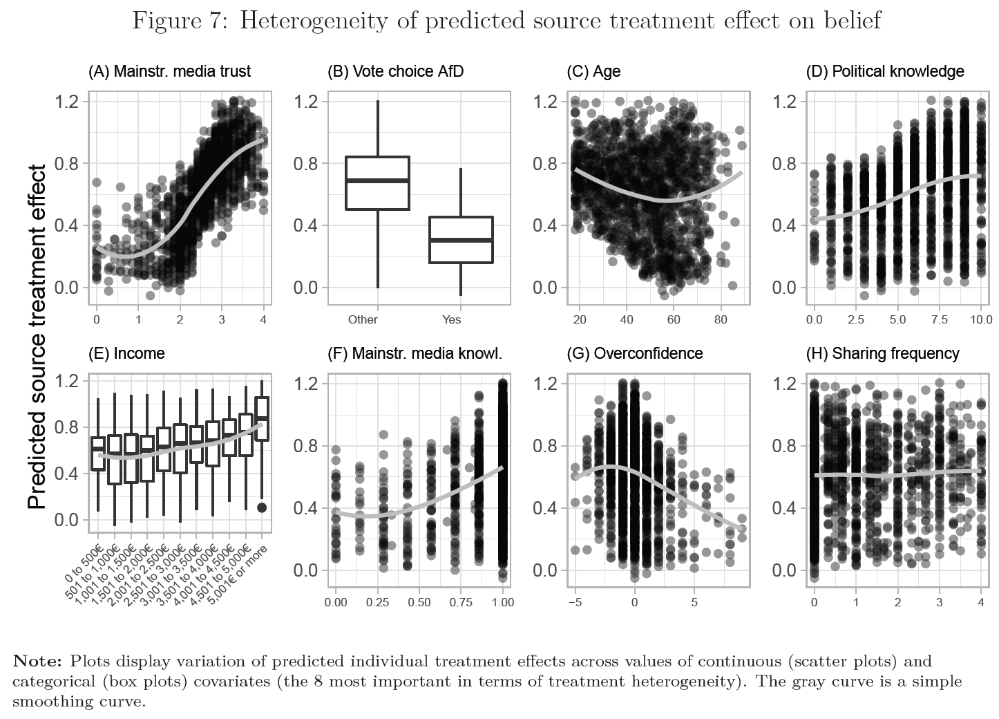
- Here we’ll reproduce parts of Figure 16
- Questions:
- What does the graph show? What are the underlying variables (and data)?8
- How many scales/mappings does it use? Could we reduce them?
- What do you like, what do you dislike about the figure? What is good, what is bad?
- What kind of information could we add to the graph (if any)?
- How would you approach a replication of the graph?
5.5.2 Lab: Data & Code
Let’s check out (and load) the datasets the underlie the plot first.
data_loop: Contains the variables names (variable) and labels (label) and type (type) of different covariates.- We’ll loop over the content of this dataframe (it’s ordered by the variable importance)
data_heterogeneity: Contains covariate values across individuals, as well as predictions for each individual (these are the predictions for a causal effect)- This is that data that is getting visualized.
# data_loop.csv
# data_loop <- read_csv(sprintf("https://docs.google.com/uc?id=%s&export=download",
#                               "1ELtshmxQWS0T8mFR1uh5IH_r57ynP8MZ"))
data_loop <- read_csv("data/data_loop.csv")
kable(data_loop)| Importance | variable | label | type |
|---|---|---|---|
| 0.3680689 | trust_source_mainstream | Mainstr. media trust | continuous |
| 0.1248805 | vote_choice_afd_num | Vote choice AfD | categorical |
| 0.0786331 | income_num | Income | categorical |
# data_treatment_heterogeneity.csv
# data_heterogeneity <- read_csv(sprintf("https://docs.google.com/uc?id=%s&export=download",
#                                             "1sYLKmFi4uZsDDxNZdcwjD-eTHcVWql_X"))
data_heterogeneity <- read_csv("data/data_treatment_heterogeneity.csv")
kable(head(data_heterogeneity))| predictions | trust_source_mainstream | vote_choice_afd_num | income_num |
|---|---|---|---|
| 1.1508661 | 3.2857143 | 0 | 11 |
| 0.6617550 | 3.0000000 | 0 | 6 |
| 0.4056240 | 1.0000000 | 0 | 11 |
| 0.3809769 | 2.0000000 | 0 | 3 |
| 0.6726859 | 2.5714286 | 0 | 3 |
| 0.2334704 | 0.5714286 | 1 | 10 |
On the basis of data_loop and data_heterogeneity we then write a loop the cycles through values of data_loop and generates the corresponding plots (code could be rewritten to directly check the class of those variables).
- The things that are varies are variable name, label and variable type.
- There are two variable types
numericandcategorical.
for(i in 1:nrow(data_loop)){
  #print(i)

  # Try this out (understand the loop) with i <- 1

  # Define objects taking them from the looping dataframe
  var_name <- data_loop$variable[i]
  var_label <- data_loop$label[i]
  var_type <- data_loop$type[i]

  # Create a plot number
  plot_number <- LETTERS[seq(from = 1, to = nrow(data_loop))][i]

  # Define angle conditionally
  if (var_name %in% c("income_num")){angle <- 45}else{angle <- 0}

  # Select data for plot
  data_plot <- data_heterogeneity %>% select(var_name, predictions)
  # select takes strings and non-strings

  # CREATE PLOT DEPENDING ON VARIABLE TYPE
  if(var_type == "continuous") { # Continous variable

    p <- ggplot(data_plot, aes_string(x = as.name(var_name),
                                      y = as.name("predictions"))) +
      geom_point(alpha = 3/10) +
      geom_smooth(method = "loess", span = 1, se=F, colour="gray") +
      labs(title = paste0("(", plot_number, ") ", var_label)) +
      theme_light() +
      theme(axis.text.x = element_text(size = 6, angle = angle),
            axis.title.x = element_blank(),
            plot.title = element_text(size = 8))

    } else { # Categorical variable

      # Convert from tibble
      data_plot[,var_name] <- factor(round(data_plot[,var_name])%>% dplyr::pull(1))

      p <- ggplot(data_plot,
                  aes_string(x = as.name(var_name),
                             y = as.name("predictions"))) +
        geom_boxplot() +
        geom_smooth(method = "loess", se=FALSE, aes(group=1), colour="gray") +
        labs(title = paste0("(", plot_number, ") ", var_label)) +
        theme_light() +
        theme(axis.text.x = element_text(size = 6, angle = angle,
                                         hjust = 1, vjust = 1),
              #axis.title.y = element_blank(),
              axis.title.x = element_blank(),
              plot.title = element_text(size = 8))
    }
    assign(paste("p", i, sep=""), p) # Create object
}

  p1$labels$y <- "Predicted source\ntreatment effect" # Q:?
  p2$labels$y <- p3$labels$y <- " " # Q:?

  p1 + p2 + p3 + plot_layout(ncol = 3)
5.6 Time: Line charts & events
- Learning outcomes: Learn…
- …how to plot dates
- …how to make line plots
- …how to create manual legends for various elements
- …how to visualize events & data collection periods
5.6.1 Data & Packages & functions
- Data: 1+ Numeric variables vs. time variable
- Line and path plots typically used for time series data (see Appendix [Line vs. path plots])
- Time dimension is shown on the x-axis from left to right
- Line plots (
geom_line()): join the points from left to right- Have time on the x-axis, showing how a single variable has changed over time
- Path plots (
geom_path()): join them in the order that they appear in the dataset (in other words, a line plot is a path plot of the data sorted by x value) - Below we’ll also use
gtrends()from thegtrendsRpackage to obtain search frequencies. - And we’ll use
pivot_wider()from thetidyrpackage as well asas.Date()for conversion to a date variable (see here for formats) new_scale_color(): Can be used to reset a scale if we want to generate several legends (ggnewscalepackage)- And we’ll use scale modification to show proper legends in line plots
5.6.2 Graph
- Here we’ll reproduce Figure 18 (but with ggplot2) (Bauer et al. 2020) (see also Bauer & Clemm von Hohenberg 2022)
- Questions:
- What does the graph show? What are the underlying variables (and data)?
- How many scales/mappings does it use? Could we reduce them?
- What do you like, what do you dislike about the figure? What is good, what is bad?
- What kind of information could we add to the graph (if any)?
- How would you approach a replication of the graph?
5.6.3 Lab: Data & code
We’ll start by preparing the data.
- We download data from Google on Google Searches. Table 3 shows the first few rows. Currently, gtrendsR access to Google is buggy (see here for error code 429). Hence, data below are loaded locally.
library(gtrendsR)
# Words to search for
search.words <- c("GDPR", "DSGVO") # Does not work anymore


# Download google trends
    # google.trends <- gtrends(search.words,
    #                          gprop = "web",
    #                          time = "2018-03-01 2018-11-16",
    #                          geo = "DE")[[1]]
#write_csv(google.trends, "data_google_trends.csv")
google.trends <- read_csv("www/data_google_trends.csv")


google.trends <- google.trends %>%
    pivot_wider(names_from = c("keyword", "geo"), values_from = "hits") %>%
    dplyr::select(-time, -gprop, -category)

# Replace "<1" with 0
google.trends <- google.trends %>%
        mutate_all(funs(str_replace(., "<1", "0")))

# Convert date variable to 'Date' class
google.trends$date <- as.Date(google.trends$date, "%Y-%m-%d")

# Mutate factor to numeric and reorder
google.trends <- google.trends %>%
  #mutate_if(is.factor, as.character) %>%
mutate_if(is.character, as.numeric)| date | GDPR_DE | DSGVO_DE |
|---|---|---|
| 2018-03-01 | 1 | 4 |
| 2018-03-02 | 1 | 4 |
| 2018-03-03 | 0 | 1 |
| 2018-03-04 | 0 | 1 |
| 2018-03-05 | 1 | 5 |
| 2018-03-06 | 2 | 5 |
- We plot the data an add our own annotations in Figure 19. Let’s go through the code together.
The code for a simple line plot is as follows:
# The simple line plot
ggplot(data = google.trends) +
      geom_line(aes(x = date, y = DSGVO_DE),
                    color = "black") +
      geom_line(aes(x = date, y = GDPR_DE),
                    color = "blue")
The more complicted version is below.
library(ggnewscale)
# The complicated version
ggplot(data = google.trends) +
      geom_rect(aes(fill = "fieldperiod"),
                xmin = as.Date("2018-04-16", "%Y-%m-%d"),
                xmax = as.Date("2018-04-23", "%Y-%m-%d"),
                ymin = 0, ymax = 100, alpha = 0.2) +
        geom_rect(aes(fill = "fieldperiod"),
                  xmin = as.Date("2018-07-24", "%Y-%m-%d"),
                  xmax = as.Date("2018-08-02", "%Y-%m-%d"),
                ymin = 0, ymax = 100, alpha = 0.2) +
        geom_rect(aes(fill = "fieldperiod"),
                  xmin = as.Date("2018-10-29", "%Y-%m-%d"),
                  xmax = as.Date("2018-11-07", "%Y-%m-%d"),
                ymin = 0, ymax = 100, alpha = 0.2) +
      geom_line(aes(x = date, y = DSGVO_DE, color = "dsgvocolor")) +
      geom_line(aes(x = date, y = GDPR_DE, color = "gdprcolor")) +
      theme_light() +
      ylab("Searches (100 = max. interest in time period/territory)") +
      xlab("Month (2018)") +
      scale_colour_manual(name="Google Searches", values=c(gdprcolor = "darkgreen",
                                                  dsgvocolor = "black"),
                          labels = c("GDPR Searches",
                                     "DSVGO Searches")) +
      scale_fill_manual(name="Field periods",
                        values=c(fieldperiod="gray"),
                        labels = c("Wave 1, 2 and 3")) +
      new_scale_color() +
           scale_colour_manual(name="Events",
                               values=c(Policy_implementation = "red"),
                               labels = c("Policy implementation (25th of May)")) +
      geom_vline(aes(xintercept = as.Date("2018-05-25"), color = "Policy_implementation")) +
  theme(
    legend.position = c(.95, .95),
    legend.justification = c("right", "top"),
    legend.box.just = "right",
    legend.margin = margin(6, 6, 6, 6),
    legend.background = element_rect(fill=alpha('white', 0.8)))
5.6.4 Exercise
- Use the code from above and investigate Google searches for two other topics (e.g. “COVID” and “Hydroxychloroquine”). Choose a sensible time period for your search. And choose a sensible geographic area (e.g.,
geo = "US"). - Convert the data into longformat etc. (following the steps above) so that you can visualize it as a lineplot in ggplot.
- Add events to your lineplots (e.g., one could take one of Trump’s tweets as an event).
- Try to visualize a legend (it’s challenging!).
5.6.5 Newer graph: Salience of events across time
As published in Bauer & Clemm von Hohenberg (2022). Currently, gtrendsR access to Google is buggy (see here for error code 429).
- Potentially, it might be difficult to collect older data from Google trends.
#library(tidyverse)
#library(lubridate)

# Words to search for
search.words <- c("Einwanderung", "Flüchtlinge", "Asyl", "Migration", "Lagerfeld")

# Download google trends
data_google_trends <- gtrends(search.words,
                                                          gprop = "web",
                                                          time = "2014-12-31 2019-06-03",
                                                          geo = "DE",
                                                            onlyInterest = TRUE
                                                            )[[1]]


data_google_trends <- data_google_trends %>%
  pivot_wider(names_from = c("keyword", "geo"), values_from = "hits") %>%
  dplyr::select(-time, -gprop, -category)

# Replace "<1" with 0
data_google_trends <- data_google_trends %>%
  mutate_all(funs(str_replace(., "<1", "0")))


# Convert date variable
data_google_trends$date <- as.Date(data_google_trends$date, "%Y-%m-%d")

# Mutate factor to numeric and reorder
data_google_trends <- data_google_trends %>%
  mutate_if(is.factor, as.character) %>%
  mutate_if(is.character, as.numeric)


names(data_google_trends) <- str_replace_all(names(data_google_trends), "ü", "ue")

# Aggegregate
data_google_trends <- data_google_trends %>%
  mutate(
    week = week(date),
    week_start = floor_date(date, "weeks", week_start = 1),
    week_end = ceiling_date(date, "weeks", week_start = 1)
  ) %>%
  group_by(week_start) %>%
  summarise(
    date = first(date),
    week_end = first(week_end),
    Einwanderung_DE = mean(Einwanderung_DE),
    Fluechtlinge_DE = mean(Fluechtlinge_DE),
    Asyl_DE = mean(Asyl_DE),
    Migration_DE = mean(Migration_DE),
    Lagerfeld_DE = mean(Lagerfeld_DE)
  )


ggplot(
  data = data_google_trends,
  aes(x = week_start)
) +
  geom_rect(aes(fill = "fieldperiod"),
    xmin = as.Date("2019-03-14", "%Y-%m-%d"),
    xmax = as.Date("2019-03-29", "%Y-%m-%d"),
    ymin = 0, ymax = 100, alpha = 0.2
  ) +
  geom_line(aes(x = week_start, y = Einwanderung_DE, color = "Einwanderung")) +
  geom_line(aes(x = week_start, y = Fluechtlinge_DE, color = "Fluechtlinge")) +
  geom_line(aes(x = week_start, y = Asyl_DE, color = "Asyl")) +
  geom_line(aes(x = week_start, y = Migration_DE, color = "Migration")) +
  geom_line(aes(x = week_start, y = Lagerfeld_DE, color = "Lagerfeld")) +
  theme_light() +
  ylab("Searches (100 = max. interest\nin time period/territory)") +
  xlab("Weekly averages (2019)") +
  scale_colour_manual(name = "Search terms", values = c(
    Einwanderung = "darkgreen",
    Fluechtlinge = "black",
    Asyl = "red",
    Migration = "yellow",
    Lagerfeld = "orange"
  )) +
  scale_fill_manual(
    name = "Data collection",
    values = c(fieldperiod = "gray"),
    labels = c("Field period")
  ) +
  new_scale_color() + # Add a new scale (ignore previous color scale)
  geom_vline(aes(
    xintercept = as.Date("2015-09-07"),
    linetype = "dashed"
  )) +
  geom_vline(aes(
    xintercept = as.Date("2015-12-31"),
    linetype = "dotted"
  )) +
  geom_vline(aes(
    xintercept = as.Date("2019-02-19"),
    linetype = "twodash"
  )) +
  scale_linetype_manual(
    name = "Events",
    values = c(
      "dashed",
      "dotted",
      "twodash"
    ),
    labels = c(
      "Refugee crisis\n(Summer 2015)",
      "New Year's Eve assaults\n(2020/02/19)",
      "Lagerfeld's death\n(2020/02/19)"
    )
  ) +
  scale_x_date(
    date_breaks = "8 weeks",
    date_labels = "%Y-%m-%d" # ,
    # limits = c(as.Date("2018-12-31"), as.Date("2019-06-03"))
  ) +
  theme(
    legend.position = c(.80, .99),
    legend.justification = c("right", "top"),
    legend.box.just = "right",
    legend.box = "horizontal",
    legend.direction = "vertical",
    legend.margin = margin(6, 6, 6, 6),
    axis.text.x = element_text(angle = 45, hjust = 1, size = 7),
    legend.title = element_text(size = 9),
    legend.text = element_text(size = 8),
    legend.background = element_rect(fill = adjustcolor("white", alpha.f = 0.7)),
    legend.key = element_rect(fill = adjustcolor("white", alpha.f = 0.7), color = NA),
    legend.key.size = unit(0.6, "cm")
  )
5.7 Time: Means across time (or other categories)
- Learning outcomes: Learn…
- …how to plot error bars
- …how to dodge graph elements
5.7.1 Data & Packages & functions
- Data: Various one-dimensional distributions (several single variables)
- Plot type: Dot plot with error bars
geom_errorbar(): To create error barsposition=position_dodge(0.6): Dodge graph elements
5.7.2 Graph
- We’ll reproduce and maybe criticize as well as improve Figure 20
- Questions:
- What does the graph show? What are the underlying variables (and data)?
- How many scales/mappings does it use? Could we reduce them?
- What do you like, what do you dislike about the figure? What is good, what is bad?
- What kind of information could we add to the graph (if any)?
- How would you approach a replication of the graph?

5.7.3 Lab: Data & Code
The data has already been pre-processed, i.e., we have a dataframe that contains both our means as well as 90% and 95% percent confidence intervals for different subsamples of the data (as well as the full sample). The subsample are constructed from information on whether certain respondents participated across all waves or not. The dataframe also provides information on how these means should be grouped.
# data_gdpr_means_time.csv
# data <- read_csv(sprintf("https://docs.google.com/uc?id=%s&export=download",
#                          "1Ay7g1iIaCyxuDj2ce8UNc4kSRubForMN"))
data <- read_csv("data/data_gdpr_means_time.csv")
pd <- position_dodge(0.6)
ggplot(data, aes(x = wave,
                 y = gdpr.know.num.mean,
                 color = factor(label),
                 group = factor(label))) +
       geom_errorbar(aes(ymin=gdpr.know.num.mean - ci_90,
                         ymax=gdpr.know.num.mean + ci_90,
                         color = factor(label)),
                colour="black",
                size = 1,
                width=.0,
                position=pd) +
       geom_errorbar(aes(ymin=gdpr.know.num.mean - ci_95,
                         ymax=gdpr.know.num.mean + ci_95,
                         color = factor(label)),
                colour="black",
                size = 0.4,
                width=.1,
                position=pd) +
       geom_point(size = 3,
                  position=pd) +
  scale_shape(solid = FALSE) +
  ylim(0, 100) +
  ylab("% GDPR Awareness") +
  scale_x_discrete(labels = c(
    "Wave 1 (N = 2093)\nApr 16 - 23, 2018",
    "Wave 2 (N = 2043)\nJul 24 - Aug 02, 2018",
    "Wave 3 (N = 2112)\nOct 29 - Nov 07, 2018"
  )) +
  theme_light() +
  theme(axis.title.x = element_blank()) + scale_color_manual(
    values = c("black", "#e41a1c", "#377eb8", "#4daf4a", "#984ea3", "#ff7f00"),
    name = "Participation",
    breaks = levels(factor(data$label)),
    labels = c(
      "Full Sample",
      "Only W1 (N = 532)",
      "Only W2 (N = 482)",
      "Only W3 (N = 843)",
      "W1 and W2 (N = 292)",
      "W1, W2 and W3 (N = 1269)"
    )
  )
5.8 Time: Slope charts
5.8.1 Data & Packages & functions
- Data: Panel data with time points on one variable
- Example is taken from the vignette of the package
newggslopegraph()function from theCGPfunctionspackage- Set min/max with
+ scale_y_continuous(limits = c(0, 20)) - For other versions or packages see package author’s blog post, 1, 2
- Set min/max with
5.8.2 Graph(s)
- Figure 22 (Data from 2002) and Figure 23 depict slope graphs for the data in Table 4 and Table 5.
- Questions:
- What does the graph show? What are the underlying variables (and data)?
- How many scales/mappings does it use? Could we reduce them?
- What do you like, what do you dislike about the figure? What is good, what is bad?
- What kind of information could we add to the graph (if any)?
- How would you approach a replication of the graph?
| Year | Survival | Type |
|---|---|---|
| 5 Year | 99 | Prostate |
| 10 Year | 95 | Prostate |
| 15 Year | 87 | Prostate |
| 20 Year | 81 | Prostate |
| 5 Year | 96 | Thyroid |
| 10 Year | 96 | Thyroid |

| Year | Country | GDP |
|---|---|---|
| Year1970 | Sweden | 46.9 |
| Year1979 | Sweden | 57.4 |
| Year1970 | Netherlands | 44.0 |
| Year1979 | Netherlands | 55.8 |
| Year1970 | Norway | 43.5 |
| Year1979 | Norway | 52.2 |

5.8.3 Lab: Data & Code
head(newgdp)
custom_colors <- tidyr::pivot_wider(newgdp,
                   id_cols = Country,
                   names_from = Year,
                   values_from = GDP) %>%
  mutate(difference = Year1979 - Year1970) %>%
  mutate(trend = case_when(
    difference >= 2 ~ "green",
    difference <= -1 ~ "red",
    TRUE ~ "gray"
    )
  ) %>%
  select(Country, trend) %>%
  tibble::deframe()
newggslopegraph(newgdp,
                Year,
                GDP,
                Country,
                Title = "Gross GDP",
                SubTitle = NULL,
                Caption = NULL,
                LineThickness = .5,
                YTextSize = 4,
                LineColor = custom_colors
)
5.9 Sankey diagrams
- Google: “A sankey diagram is a visualization used to depict a flow from one set of values to another. The things being connected are called nodes and the connections are called links. Sankeys are best used when you want to show a many-to-many mapping between two domains (e.g., universities and majors) or multiple paths through a set of stages (for instance, Google Analytics uses sankeys to show how traffic flows from pages to other pages on your web site).”
References
Bauer, Paul C, Frederic Gerdon, Florian Keusch, and Frauke Kreuter. 2020. “The Impact of the GDPR Policy on Data Sharing/Privacy Attitudes.” Preliminary Draft, 1–22.
Bauer, Paul C, and Andrei Poama. 2020. “Does Suffering Suffice? An Experimental Assessment of Desert Retributivism.” PLoS One 15 (4): e0230304.
Wickham, Hadley. 2010. “A Layered Grammar of Graphics.” J. Comput. Graph. Stat. 19 (1): 3–28.
———. 2016. Ggplot2: Elegant Graphics for Data Analysis. Springer.
Footnotes
Boxplot: A boxplot graphically represents the distribution of a dataset by depicting its median, lower quartile (25th percentile), upper quartile (75th percentile), minimum and maximum values within the interquartile range, and potential outliers using a central rectangular box, extending whiskers, and individual data points for outliers. (ChatGPT).↩︎
geom_density(): Underlying computations are more complex + assumption that are not true for all data (continuous, unbounded, and smooth) → use the others (Wickham 2016, 23).↩︎The figure was published in Bauer and Poama (2020) that is based on a survey experiment studying the effect of an offender’s suffering on perceived justice of punishment. The figure shows individual-level data on socio-demographics.↩︎
Focus on scale categories, distributions, information etc.↩︎
Data: Data is four categorical variables with the same ordered categories. In the graph they are combined, i.e., the four variables are combined into two categorical variables:
Platformwith unordered categories andAccountwith 3 ordered categories.↩︎We use both the x-scale and color for the same mapping namely platforms. This could be reduced.↩︎
One could also think of choosing colors that are also discernible when printed in grayscale instead of luminance.↩︎
Data: Data is four categorical variables with the same ordered categories. In the graph they are combined, i.e., the four variables are combined into two categorical variables:
Platformwith unordered categories andAccountwith 3 ordered categories.↩︎