Animations & movies
- Learning outcomes: Learn…
- …when animations/movies are helpful (story telling!)
Sources: Original material; (Pedersen2024?)
1 Motivation
- Central question: Can animations & movies make us see things that we wouldn’t have seen without? (e.g., acceleration)
- Other tutorials & examples: (see various)
- Temperature time series
- Optical illusion
- Election Results of the German Bundestagwahl by Gender
- Voter Turnout in German Federal Elections
- Placing Animations side-by-side with magick
- The Datasaurus Dozen
- World Cup Goal Animation
- Tracking of hurricanes and typhoons
2 Packages
gganimatepackage (contributors): gganimate is an extension of the grammar of graphics, as implemented by the ggplot2 package, that adds support for declaring animations using an API familiar to users of ggplot2 (see??gganimate).- How does it work?
- Produce plots for each of the variable values over which you animate
- Estimate in-between states (this is done automatically)
- Show frames (series of plots) as a film
- How does it work?
3 Concepts
- Official vignette provides a great overview
- Frame: One image that you produce (frames = serious of images)
- Easing: Decisions on how the change from one value to another should progress (e.g., linear)
ease_aes(): Ignore and use default or set easing (e.g,ease_aes(y = 'bounce-out'))1
- Labeling: Tell audience what you are animating over (e.g., time)!
- Solution: gganimate provides a set of variables for each frame, which can be inserted into plot (glue syntax)
- e.g.,
p + ggtitle(title = 'Winning and loosing friends/followers (Date: {frame_time})')
- e.g.,
- Solution: gganimate provides a set of variables for each frame, which can be inserted into plot (glue syntax)
- Object permanence: Graphic elements should only transition between instances of same underlying phenomenon
- i.e., we would connect repeated observations of same individual/country with line, but not different ones (same logic here)
- Enter and exit: Animations of appearance and disappearance of data (see vignette)
enter_fade(): Fade in dataexit_shrink(): Shrink out dataenter_drift()andexit_drift(): Drift data in/out
- Rendering: See next slide
4 Concepts: Rendering
- Enter/exist simply make appear things (we may want to have more control!)
- Gganimate’s animation model
- Dimensionless in same way as ggplot2 describe plots independent of the final width and height of the plot
- → final number of frames and frame-rate are only given when you ask gganimate to render animation
- Dimensionless in same way as ggplot2 describe plots independent of the final width and height of the plot
animate(): Render a gganim object- nframes: The number of frames to render (default 100)
- fps: The framerate of the animation in frames/sec (default 10)
- dev: The device to use for rendering the single frames (defaults to ‘png’)
- renderer: sets the function used to combine each frame into an animate (defaults to
gifski_renderer()2) - → if you dislike defaults change argument in
animate()directly
5 Graph
- Here we’ll reproduce Figure 1.
- Questions:
- What does it show? What does the underlying data probably look like? What kind of variables are we dealing with?
- What do you like, what do you dislike about the figure? What is good, what is bad?
- What kind of information could we add to this figure?
- How would you approach the figure if you want to replicate it?
- How many scales/mappings does it use? Could we reduce them?
6 Lab: Data & code
- The code for Figure 1 is shown below.
- Learn…
- …how to produce an anmiation (using gganimate).
- …understand the underlying data.
- …understand choices in the animation process.
We’ll work with Twitter data from German politicians that includes their follower numbers, friends numbers and number of retweets across time. First, let’s load and inspect data we are using:
library(gganimate)
library(tidyverse)
library(lubridate)
library(gifski)


# data_animation_twitter.csv
# data_plot <- read_csv(sprintf("https://docs.google.com/uc?id=%s&export=download",
#                          "16wFKPhGt2OKZlWjz-tj6OplZXB69Dftb"),
#                  col_types = cols())

data_plot <- read_csv("data/data_animation_twitter.csv")

# Inspect dataset
str(data_plot)
spc_tbl_ [2,968 × 6] (S3: spec_tbl_df/tbl_df/tbl/data.frame)
$ screen_name : chr [1:2968] "ABaerbock" "ABaerbock" "ABaerbock" "ABaerbock" ...
$ date_creation : POSIXct[1:2968], format: "2021-05-06 00:01:54" "2021-05-07 00:01:53" ...
$ last_name : chr [1:2968] "Baerbock" "Baerbock" "Baerbock" "Baerbock" ...
$ followers_count: num [1:2968] 246540 248257 250292 256250 259197 ...
$ friends_count : num [1:2968] 1469 1469 1469 1469 1470 ...
$ statuses_count : num [1:2968] 4290 4291 4293 4297 4299 ...
- attr(*, "spec")=
.. cols(
.. screen_name = col_character(),
.. date_creation = col_datetime(format = ""),
.. last_name = col_character(),
.. followers_count = col_double(),
.. friends_count = col_double(),
.. statuses_count = col_double()
.. )
- attr(*, "problems")=<externalptr> | screen_name | date_creation | last_name | followers_count |
|---|---|---|---|
| ABaerbock | 2021-05-06 00:01:54 | Baerbock | 246540 |
| ABaerbock | 2021-05-07 00:01:53 | Baerbock | 248257 |
| ABaerbock | 2021-05-08 00:01:55 | Baerbock | 250292 |
| ABaerbock | 2021-05-09 00:01:54 | Baerbock | 256250 |
| ABaerbock | 2021-05-10 00:01:53 | Baerbock | 259197 |
| ABaerbock | 2021-05-11 00:01:55 | Baerbock | 261481 |
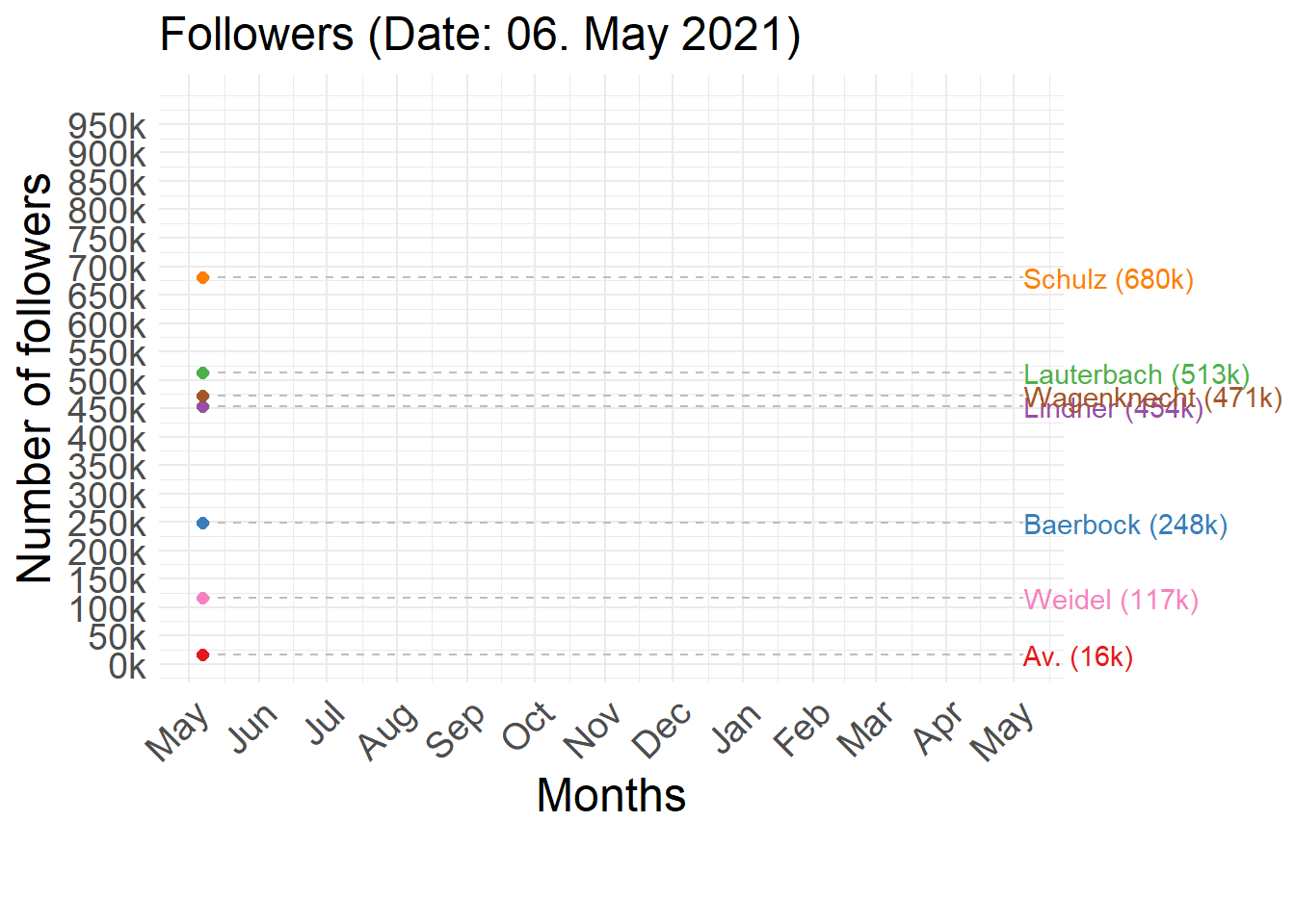
We’ll start with a crude (but simple version of the animation):
# Create the plot
ggplot(data_plot,
       aes(x = date_creation,
           y = followers_count,
           group = last_name,
           colour = last_name)) + # party,
    geom_line() +
  transition_reveal(date_creation)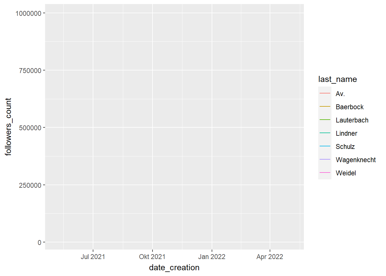
Then we extend the code to make the animation more attractive and informative.
# Extract maximums of scales
max_yaxis <- max(data_plot$followers_count)
max_xaxis <- max(data_plot$date_creation)

# Generate the plot
  p <- ggplot(data_plot,
       aes(x = date_creation,
           y = followers_count,
           group = last_name,
           colour = last_name)) + # party,
  geom_line() +
  geom_segment(aes(xend = max_xaxis,
                   yend = followers_count),
               linetype = 2,
               colour = 'grey') +
  geom_point(size = 2) + # "bottom"
  geom_text(aes(x = max_xaxis,
                label = paste0(last_name, " (",
                               paste0(round(followers_count/1000,0), "k"),")")),
            hjust = 0) +
    scale_colour_manual(values = c("Av." = '#e41a1c',
            "Baerbock" = '#377eb8',
            "Lauterbach" = '#4daf4a',
            "Lindner" = '#984ea3',
            "Schulz" = '#ff7f00',
            "Wagenknecht" = '#a65628',
            "Weidel" = '#f781bf')) +
  theme_minimal() +
  theme(plot.margin = margin(5.5, 90, 40, 5.5),
        text = element_text(size = 18),
        axis.text.x = element_text(angle = 45, hjust = 1),
        plot.title = element_text(size=18))+
  theme(legend.position="none") +
  xlim(as.Date("2020-12-14"), as.Date("2021-11-30")) +
  scale_x_date(date_breaks = "1 month",
               labels = function(x){format(ymd(x), "%b")}) +
  ylim(0, max_yaxis) +
  scale_y_continuous(breaks = seq(0, max_yaxis, 100000),
                     labels = paste0(seq(0,max_yaxis, 100000)/1000, "k"))  +
  transition_reveal(date_creation) +
  coord_cartesian(clip = 'off') +
  labs(title = 'Followers (Date: {format(frame_along, "%d. %b %Y")})',
       x = "Months",
       y = "Number of followers")


p
Finally, we can also store our animation. First we have to generate it with animate() (and choose different options here). Then we have to save it in a gif file.
# Animate (create images) and store
p_animated <- animate(p,
        duration = 5, # length in seconds
        end_pause = 6, # Pause after one run - in fps
        fps = 5, # Choose a higher number!
        width = 7,
        height = 4,
        units = "in",
        res = 200,
        renderer = gifski_renderer())

# Store the animation as one gif
anim_save(animation = p_animated,
          "animation_twitter.gif",
          path = "data/")
Animation with a play button (using plotly):
data(gapminder, package = "gapminder")
gg <- ggplot(gapminder,
                         aes(x = gdpPercap,
                                y = lifeExp,
                                color = continent)) +
  geom_point(aes(size = pop,
                             frame = year,
                             ids = country)) +
  scale_x_log10()
ggplotly(gg)
# Exercise
- You can choose between...
1. ...changing and potentially improving @fig-twitter-animation. You could try to animate it differently. Also you might try to save the animation differently (e.g., choose higher fps - frames per second) or pick another variable, e.g., `friends_count` instead of `followers_count`.
2. ...animating some of your own data (potentially this takes longer).
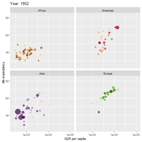
3. ...playing around with the gapminder dataset used in the animation in @fig-gapminder-animation below ([official example](https://github.com/thomasp85/gganimate) of the package).
- e.g., pick another variable and/or change the animation details.
```{=html}
<!--
+ Ideas for cool animations
+ The coming and going of hashtags
+ The evolution of responses rates in different surveys
+ The rise of twitter among german politicians
--># install.packages("gapminder")
# library(gapminder)
# library(ggplot2)
# library(gganimate)
gapminder <- gapminder %>% filter(continent!="Oceania")
p <- ggplot(gapminder, aes(gdpPercap, lifeExp, size = pop, colour = country)) +
geom_point(alpha = 0.7, show.legend = FALSE) +
scale_colour_manual(values = country_colors) +
scale_size(range = c(2, 12)) +
scale_x_log10() +
facet_wrap(~continent) +
labs(title = 'Year: {frame_time}', x = 'GDP per capita', y = 'life expectancy') +
transition_time(year) +
ease_aes('linear')
p_animated <- animate(p)
# Create folder to store animation beforehand
anim_save("animation_gapminder.gif",
animation = p_animated,
path = "www/images/")