| x1 | y1 | x2 | y2 | x3 | y3 | x4 | y4 |
|---|---|---|---|---|---|---|---|
| 10 | 8.04 | 10 | 9.14 | 10 | 7.46 | 8 | 6.58 |
| 8 | 6.95 | 8 | 8.14 | 8 | 6.77 | 8 | 5.76 |
| 13 | 7.58 | 13 | 8.74 | 13 | 12.74 | 8 | 7.71 |
| 9 | 8.81 | 9 | 8.77 | 9 | 7.11 | 8 | 8.84 |
| 11 | 8.33 | 11 | 9.26 | 11 | 7.81 | 8 | 8.47 |
| 14 | 9.96 | 14 | 8.10 | 14 | 8.84 | 8 | 7.04 |
| 6 | 7.24 | 6 | 6.13 | 6 | 6.08 | 8 | 5.25 |
| 4 | 4.26 | 4 | 3.10 | 4 | 5.39 | 19 | 12.50 |
| 12 | 10.84 | 12 | 9.13 | 12 | 8.15 | 8 | 5.56 |
| 7 | 4.82 | 7 | 7.26 | 7 | 6.42 | 8 | 7.91 |
| 5 | 5.68 | 5 | 4.74 | 5 | 5.73 | 8 | 6.89 |
Introduction
- Learning outcomes (first intuitions): Learn…
- …what data visualization is.
- …about arguments why we should visualize.
- …how to approach/inspect (published) graphs.
- …about variables/dimensions/aestetics.
Sources: Original material; Healy (2018); Tufte (2001);
1 What is data visualization?
- Infographics are graphic visual representations of information, data, or knowledge intended to present information quickly and clearly
- Data visualization: “is a collection of methods that use visual representations to explore, make sense of, and communicate quantitative data.” (Stephen Few, Blog, Books)
- More definitions…
- Statistical graph (Definition) (wow!)
- “Data visualization is the graphic representation of data. It involves producing images that communicate relationships among the represented data to viewers of the images. This communication is achieved through the use of a systematic mapping between graphic marks and data values in the creation of the visualization. This mapping establishes how data values will be represented visually, determining how and to what extent a property of a graphic mark, such as size or color, will change to reflect changes in the value of a datum.” (Wikipedia)
- “main goal of data visualization is to communicate information clearly and effectively through graphical means. It doesn’t mean that data visualization needs to look boring to be functional or extremely sophisticated to look beautiful. To convey ideas effectively, both aesthetic form and functionality need to go hand in hand, providing insights into a rather sparse and complex data set by communicating its key-aspects in a more intuitive way. Yet designers often fail to achieve a balance between form and function, creating gorgeous data visualizations which fail to serve their main purpose — to communicate information” (Friedman)
2 Why look?
2.1 Anscombes’s quartet (1)
- Table 1 displays Anscombe’s quartet (Anscombe 1973), a dataset (or 4 little datasets) often used to illustrate the usefulness of visualization (xs and ys have same means)
- Q: What does the table reveal about the data? Is it easy to read?
2.2 Anscombes’s quartet (2)
- Table 2 shows results from a linear regression based on Anscombe’s quartet (Anscombe 1973)
- Q: What do we see now?
| y1 (Dataset 1) | y2 (Dataset 2) | y3 (Dataset 3) | y4 (Dataset 4) | |
|---|---|---|---|---|
| (Intercept) | 3.000 | 3.001 | 3.002 | 3.002 |
| (1.125) | (1.125) | (1.124) | (1.124) | |
| x1 | 0.500 | |||
| (0.118) | ||||
| x2 | 0.500 | |||
| (0.118) | ||||
| x3 | 0.500 | |||
| (0.118) | ||||
| x4 | 0.500 | |||
| (0.118) | ||||
| Notes: some notes... | ||||
2.3 Anscombes’s quartet (3)
- Figure 1 finally visualizes the data underlying those data
- Q: What do we see here? What is the insight?

2.4 The Datasaurus Dozen
- Figure 2 displays the datasaurus dozen as animated by Tom Westlake (see here, original by Alberto Cairo)
- Q: What do we see here? What is the insight?

2.5 Voter turnout and income inequality
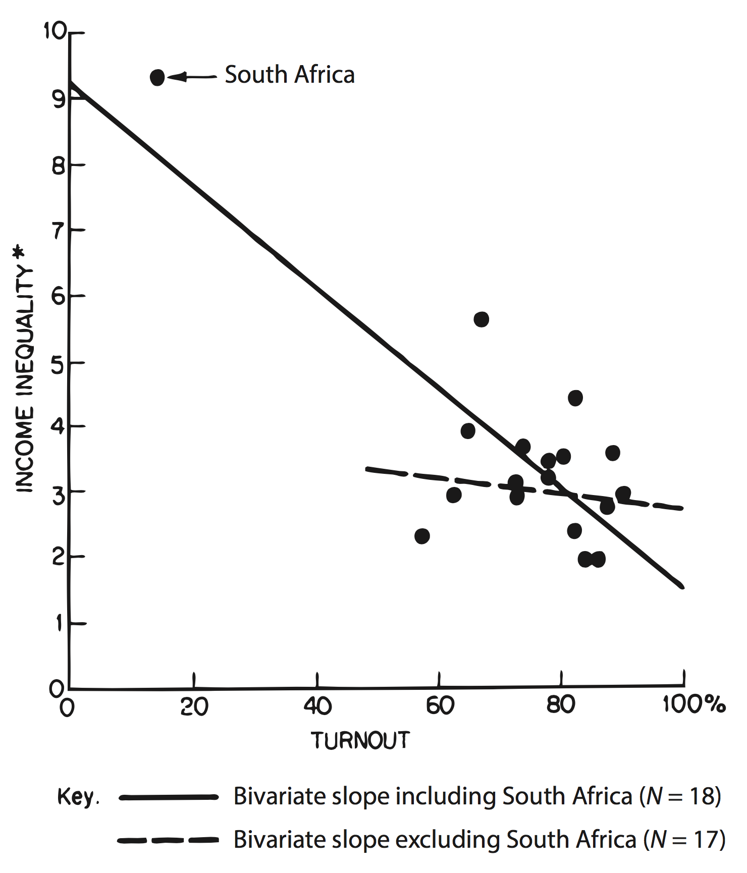
- “Figure 1.2 shows a graph from Jackman (1980), a short comment on Hewitt (1977). The original paper had argued for a significant association between voter turnout and income inequality based on a quantitative analysis of eighteen countries. When this relationship was graphed as a scatterplot, however, it immediately became clear that the quantitative association depended entirely on the inclusion of South Africa in the sample.” (Healy 2018, 3)
- See also Figure 1.3: What data patterns can lie behind a correlation? The correlation coefficient in all these plots is 0.6.
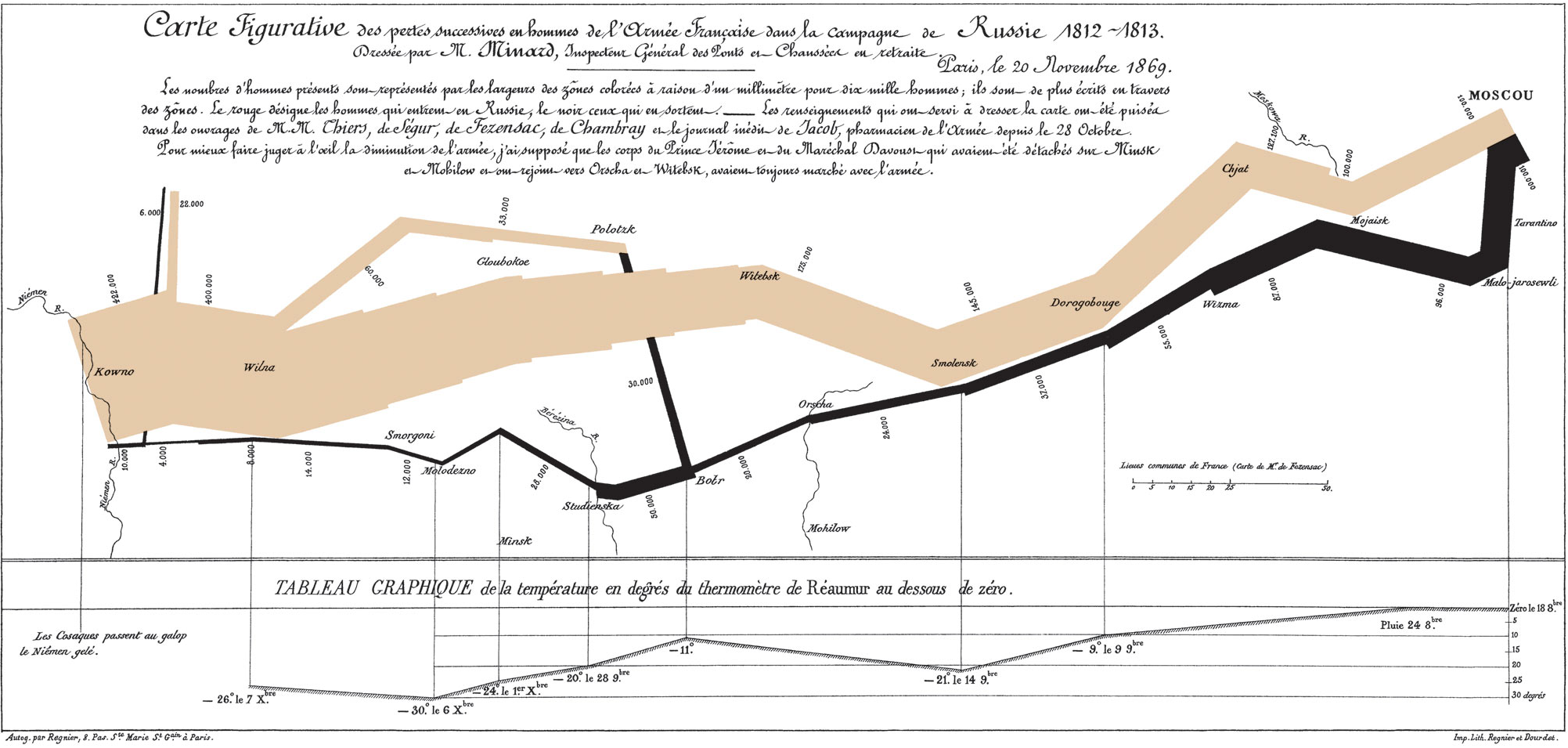
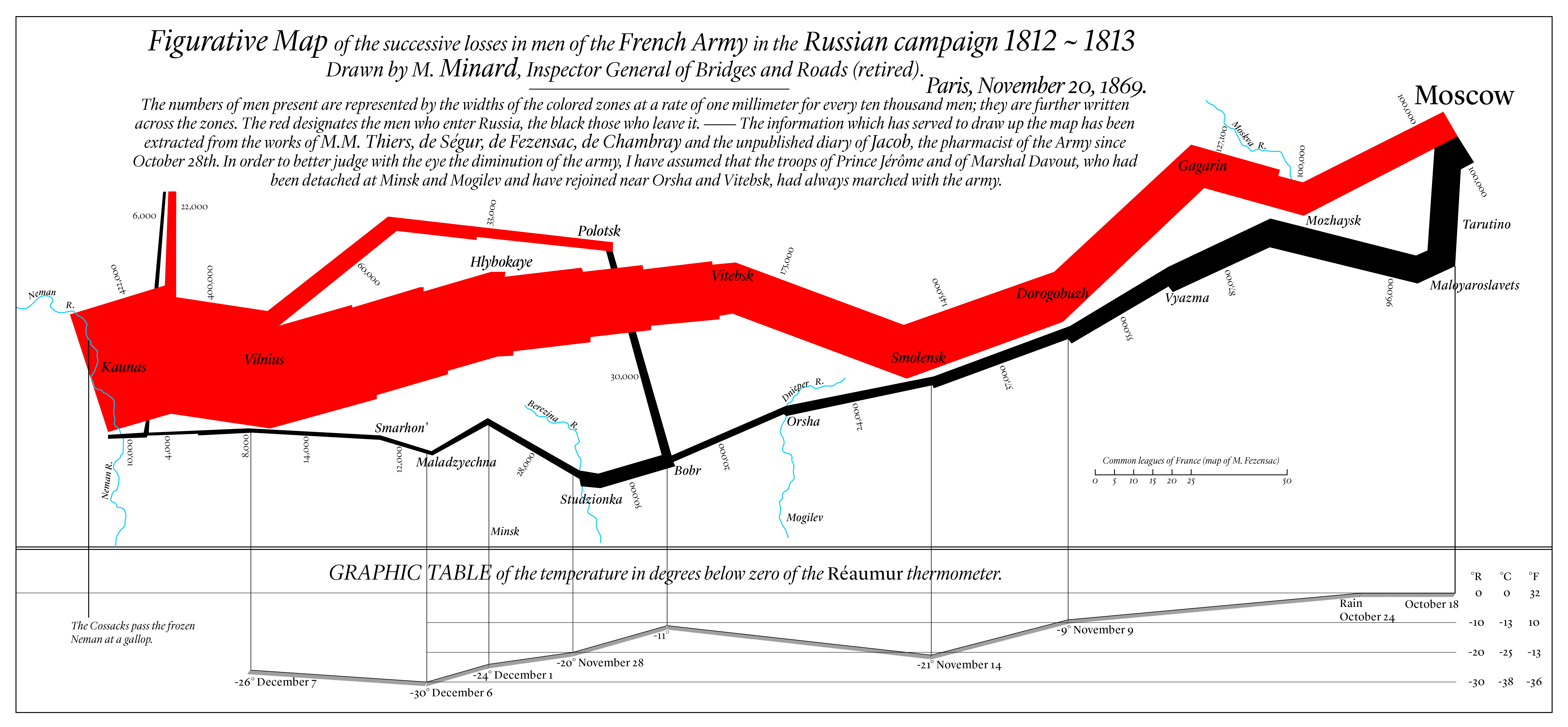
3 Exercise: The “best” graph ever drawn
- Use Strg + “+”(mouswheel) to zoom into Figure 3 below (either english or french version) and please discuss the following questions in groups
- What is shown on the graph? What story does it tell us?
- How much data (dimensions/variables) are visualized? How are the encoded?
- What do you like about the graph, what don’t you like? (Source: Wikipedia)
- Figure 4 provides an English version (see ggplot2 version here).
4 First lessons on what is a good graph…
- Tufte: Charles Joseph Minard’s graph (check out the other graphs)
- “may well be the best statistical graphic ever drawn”
- “tells a rich, coherent story with its multivariate data […]. Six variables are plotted: the size of the army, its location (longitude/latitude) on a two-dimensional surface, direction of the army’s movement, and temperature on various dates during the retreat from Moscow” (Tufte 2001, 2:40)
- “Graphical excellence is the well-designed presentation of interesting data—a matter of substance, of statistics, and of design….[It] consists of complex ideas communicated with clarity, precision, and efficiency….[It] is that which gives to the viewer the greatest number of ideas in the shortest time with the least ink in the smallest space….[It] is nearly always multivariate….And graphical excellence re-quires telling the truth about the data” (Tufte 2001, 2:51; as cited in Healy and Moody 2014, 109)
- Pragmatism: Healy and Moody (2014, 109): Tour de force such as Minard’s “can be […] admired, but there are no compositional principles on how to create that one wonderful graphic in a million.” (Tufte 2001, 2:177)
- The best one can do for “more routine, work a day designs” is to suggest some guidelines such as “have a properly chosen format and design,” “use words, numbers, and drawing together,” “display an accessible complexity of detail,” and “avoid content-free decoration, including chartjunk” (Tufte 2001, 2:177)
- Re-visions of Minard
5 Minard in ggplot
?@fig-Minard-ggplot-two and the tables below illustrate that the underlying data is spread across several datasets (and temperature is not show in the graph!)
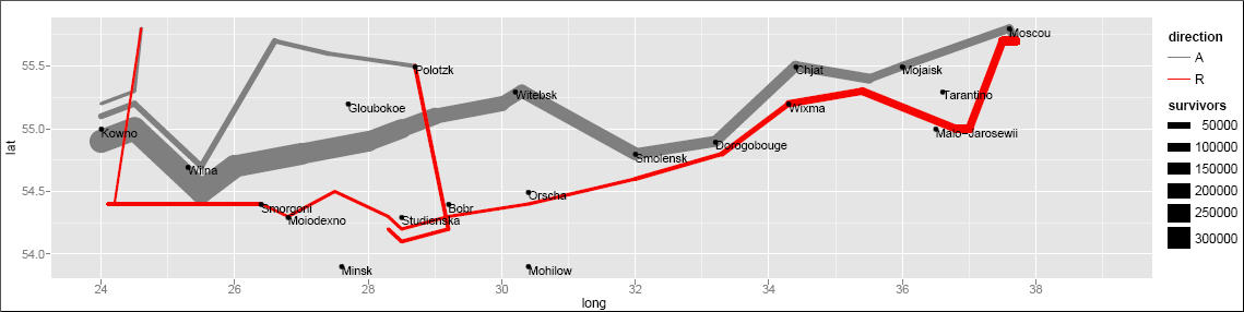 * See folder “data/Minard” and subsets of the data below.
| long | lat | survivors | direction | group |
|---|---|---|---|---|
| 24.0 | 54.9 | 340000 | A | 1 |
| 24.5 | 55.0 | 340000 | A | 1 |
| 25.5 | 54.5 | 340000 | A | 1 |
| 26.0 | 54.7 | 320000 | A | 1 |
| 27.0 | 54.8 | 300000 | A | 1 |
| 28.0 | 54.9 | 280000 | A | 1 |
| long | lat | city |
|---|---|---|
| 24.0 | 55.0 | Kowno |
| 25.3 | 54.7 | Wilna |
| 26.4 | 54.4 | Smorgoni |
| 26.8 | 54.3 | Moiodexno |
| 27.7 | 55.2 | Gloubokoe |
| 27.6 | 53.9 | Minsk |
| long | temp | month | day | date |
|---|---|---|---|---|
| 37.6 | 0 | Oct | 18 | NA |
| 36.0 | 0 | Oct | 24 | NA |
| 33.2 | -9 | Nov | 9 | 1812-11-09 |
| 32.0 | -21 | Nov | 14 | 1812-11-14 |
| 29.2 | -11 | Nov | 24 | 1812-11-24 |
| 28.5 | -20 | Nov | 28 | 1812-11-28 |
References
Anscombe, F J. 1973. “Graphs in Statistical Analysis.” Am. Stat. 27 (1): 17–21.
Healy, Kieran. 2018. Data Visualization: A Practical Introduction. Princeton University Press.
Healy, Kieran, and James Moody. 2014. “Data Visualization in Sociology.” Annu. Rev. Sociol. 40 (July): 105–28.
Tufte, Edward R. 2001. The Visual Display of Quantitative Information. Vol. 2. Graphics press Cheshire, CT.