Visualizing geographic data

Sources: Original material; Wickham (2010)

1 Geographic data: Vector boundaries & Area metadata

  • Vector boundaries (polygons)
    • Data frame with one row for each ‘corner’ of a geographical region
      • lat and long: location of a point
      • group: a unique identifier for each continuous region
      • id: the name of the region
      • Separate group and id are necessary because geographical unit isn’t necessarily one polygon (e.g., islands of Hawaii)
    • Shape files contain vector boundary data (read them with e.g., st_read())
  • Area metadata
    • Sometimes metadata is associated with an area (rather than a point), e.g., census data on the county level
    • We’ll see an example further below

2 Geographic data: Point metadata

  • Point metadata
    • Connect locations (defined by lat and lon) with other variables
# library(ggmap)
register_google(key = "##############")
# library(rnaturalearth)
# library(sf)
cities <- c("MUNICH", "BERLIN", "MANNHEIM", "REGENSBURG", "HAMBURG")
germany_cities <- bind_cols(name = cities, geocode(cities))
head(germany_cities)
name lon lat
MUNICH 11.58198 48.13513
BERLIN 13.40495 52.52001
MANNHEIM 8.46604 49.48746
REGENSBURG 12.10162 49.01343
HAMBURG 9.98717 53.54883
worldmap <- ne_countries(scale = 'medium', type = 'map_units',
                         returnclass = 'sf')
Germany <- worldmap[worldmap$name == 'Germany',]
ggplot() + geom_sf(data = Germany) + theme_bw()+ 
geom_point(data = germany_cities, aes(x = lon, y = lat), 
        colour ="red")

3 Geographic data: Raster image

  • Raster image
    • Draw a traditional image underneath some data you want to show
    • e.g., get raster map of given area from ggmap package (e.g., relying GoogleMaps)1
    • Download may be timeconsumg so better cache it as rds file.
    • Define area by specifying bbox
    • API key: See ?get_googlemap() and ?register_google() [You will need an API key]
# library(ggmap)
register_google(key = "##############")
p1 <- ggmap(get_googlemap(center = c(10.329930, 51.296475), zoom = 3))
p2 <- ggmap(get_googlemap(center = c(10.329930, 51.296475), zoom = 4))
p3 <- ggmap(get_googlemap(center = c(10.329930, 51.296475), zoom = 5))
p4 <- ggmap(get_googlemap(center = c(10.329930, 51.296475), zoom = 6))
grid.arrange(p1, p2, p3, p4, ncol=2)
Figure 1: Rasters from Google Maps

4 Packages & functions

5 Graph

  • Here we’ll reproduce Figure Figure 2 (shorter session) or Figure 3 (longer session)
  • Questions:
    • What does it show? What does the underlying data probably look like? What kind of variables are we dealing with?
    • What do you like, what do you dislike about the figure? What is good, what is bad?
    • What kind of information could we add to this figure?
    • How would you approach the figure if you want to replicate it?
    • How many scales/mappings does it use? Could we reduce them?
Figure 2: Map(s) visualizing vote share of the greens


Figure 3: Map(s) visualizing a design


5.1 Lab: Data & Code

  • Learning objectives
    • Creating maps with ggplot2
    • Learn how to plot shape files (polygons) with ggmaps
    • Understand sf data.frames(s)
    • Learn how to plot subets of maps
    • Learning how to plot several maps together
    • Learn how to colour particular polyhons (longer session)
    • Learn how to aggregate maps (longer session)

We start by importing the data, namely a shape file of Germany (you can get that here) as well as some voting data on the level of municipalities. You need to download the shape files from this link: https://drive.google.com/drive/folders/1LGm-kBDZhFc01ncBBvtFHPfC2eXXdooT?usp=sharing and change the path to the folder where you store them below.

# library(sf)

# Load vote share data on the municipality level: data_votes_municipalities.csv
# data_voteshares <- read_csv(
#   sprintf("https://docs.google.com/uc?id=%s&export=download",
#           "1f3ZKXEzg-vpDL37hietMsnpSDXFw4zgG"),
#                         col_types = cols())


data_voteshares <- read_csv("data/data_votes_municipalities.csv",
                        col_types = cols())
kable(head(data_voteshares))
AGS Wahlkreis municipality state share.cdu_csu2017 share.cdu2017 share.csu2017 share.spd2017 share.fdp2017 share.dielinke2017 share.greens2017 share.afd2017
01001000 1 Flensburg, Stadt Schleswig-Holstein 0.2884122 0.2884122 0 0.3137588 0.0681140 0.1137327 0.1148574 0.0753335
01002000 5 Kiel, Landeshauptstadt Schleswig-Holstein 0.2767015 0.2767015 0 0.3203291 0.0715934 0.0799988 0.1388073 0.0681959
01003000 11 Lübeck, Hansestadt Schleswig-Holstein 0.3259105 0.3259105 0 0.3457753 0.0638918 0.0000000 0.1238492 0.0935190
01004000 6 Neumünster, Stadt Schleswig-Holstein 0.3611685 0.3611685 0 0.3071194 0.0715285 0.0623480 0.0692789 0.1053928
01051001 3 Albersdorf Schleswig-Holstein 0.4439733 0.4439733 0 0.2392489 0.1211387 0.0448213 0.0539067 0.0763174
01051002 3 Arkebek Schleswig-Holstein 0.5000000 0.5000000 0 0.1636364 0.1363636 0.0181818 0.1181818 0.0636364
# Load shape files
  # Download the shape files: https://drive.google.com/drive/folders/1LGm-kBDZhFc01ncBBvtFHPfC2eXXdooT?usp=sharing
  # Adapt the folder "www/data" to your file location
  data_map <- st_read(dsn = "www/data", layer = "VG250_GEM", options = "ENCODING=ASCII", quiet = TRUE)

  # See column geometry
  data_map$AGS <- as.character(data_map$AGS)


Since, the map data is now stored as a sf dataframe (?class(data_map)) we can simply join it with other the data data_voteshares.

The identifer we use to match the map data with out vote share data is called AGS (Amtlicher Gemeindeschlüssel), a standard identifer for municipalities in Germany.

data_map <- left_join(data_map, data_voteshares, by="AGS")

Let’s have a quick look at the map. Figure 4 plots the shape file with gray borders around the areas. It’s a bit convoluted since there are a lot of polygons defined in the map data (11435 municipalities):

ggplot() + 
  geom_sf(data = data_map, 
          fill = "white", 
          color = "black", 
          size = 0.001)
Figure 4: The whole shape file

In Figure Figure 5 we add geographic area metadata, namely the vote share of the green party in 2017 share.greens2017 (this is simple as we add it to the dataframe beforehand):

ggplot() + 
  geom_sf(data = data_map, 
          aes(fill = share.greens2017), colour = NA) + # fill but turn of borders
  scale_fill_gradient(low = "white", high = "darkgreen", na.value = NA) 
Figure 5: Map with green party shares

Potentially, it could help to add a few cities for the interpretation of the map as in Figure 6.

# City data (latitude, longitude) converted
# to sf object
cities <- data.frame(name = c("MUNICH", "BERLIN", "MANNHEIM", "REGENSBURG", "FREIBURG", "HAMBURG"),
                                         lon = c(11.5819806, 13.404954, 8.4660395, 12.1016236, 7.8421043, 9.99), 
                                         lat = c(48.1351253, 52.5200066, 49.4874592, 49.0134297, 47.9990077, 53.5)) %>%
    st_as_sf(coords = c("lon", "lat"), crs = "WGS84")

# Add cities
ggplot() +
  geom_sf(
    data = data_map,
    aes(fill = share.greens2017), colour = NA
  ) + # fill but turn of borders
  scale_fill_gradient(low = "white", high = "darkgreen", na.value = NA) +
  geom_sf(
    data = cities,
    colour = "black"
  )
Figure 6: Map with green party shares and cities

6 Exercise

  • In this little exercise the idea is to recreate the fine-grained map in Figure 6 and below you find the code to do so. Make sure to download the necessary files and place them in the right folder (also adapting the paths).
  1. Use the same code but now generate a map the visualizes the share of the AFD in blue coloring (see share.afd2017). Go through the code step-by-step to inspect what happens.
  2. Once you have done this please zoom into Bavaria and provide a map thereof (you will need to filter data_map for the state of "Bayern" and create a new object data_map_bayern). Either omit the cities or only visualize Munich by creating a new dataframe cities_bayern that only includes Munich.
  3. Can you find out how to add a text label to the city of Munich and label the x- and y-axis (see geom_sf_text())?
library(sf)

# Load vote share data on the municipality level: data_votes_municipalities.csv
# data_voteshares <- read_csv(
#   sprintf("https://docs.google.com/uc?id=%s&export=download",
#           "1f3ZKXEzg-vpDL37hietMsnpSDXFw4zgG"),
#                         col_types = cols())

data_voteshares <- read_csv("data/data_votes_municipalities.csv",
                        col_types = cols())

# Load shape files
  # Download the shape files: https://drive.google.com/drive/folders/1LGm-kBDZhFc01ncBBvtFHPfC2eXXdooT?usp=sharing
  # Adapt the folder "www/data" to your file location
    # Use "." for working directory
  data_map <- st_read(dsn = "www/data", layer = "VG250_GEM", options = "ENCODING=ASCII", quiet = TRUE)

  # See column geometry
  data_map$AGS <- as.character(data_map$AGS)
  
  
  data_map <- left_join(data_map, data_voteshares, by="AGS")
  
  
# to sf object
cities <- data.frame(name = c("MUNICH", "BERLIN", "MANNHEIM", "REGENSBURG", "FREIBURG", "HAMBURG"),
                                         lon = c(11.5819806, 13.404954, 8.4660395, 12.1016236, 7.8421043, 9.99), 
                                         lat = c(48.1351253, 52.5200066, 49.4874592, 49.0134297, 47.9990077, 53.5)) %>%
    st_as_sf(coords = c("lon", "lat"), crs = "WGS84")

# Add cities
ggplot() +
  geom_sf(
    data = data_map,
    aes(fill = share.greens2017), colour = NA
  ) + # fill but turn of borders
  scale_fill_gradient(low = "white", high = "darkgreen", na.value = NA) +
  geom_sf(
    data = cities,
    colour = "black"
  )
Exercise solution
# 1.


library(sf)

# Load vote share data on the municipality level: data_votes_municipalities.csv
# data <- read_csv(
#   sprintf("https://docs.google.com/uc?id=%s&export=download",
#           "1f3ZKXEzg-vpDL37hietMsnpSDXFw4zgG"),
#                         col_types = cols())

data <- read_csv("data/data_votes_municipalities.csv",
                        col_types = cols())

# Load shape files
  # Download the shape files: https://drive.google.com/drive/folders/1LGm-kBDZhFc01ncBBvtFHPfC2eXXdooT?usp=sharing
  # Adapt the folder "www/data" to your file location
  data_map <- st_read(dsn = "www/data", layer = "VG250_GEM", options = "ENCODING=ASCII", quiet = TRUE)

  # See column geometry
  data_map$AGS <- as.character(data_map$AGS)
  
  
  data_map <- left_join(data_map, data_voteshares, by="AGS")
  
  
# to sf object
cities <- data.frame(name = c("MUNICH", "BERLIN", "MANNHEIM", "REGENSBURG", "FREIBURG", "HAMBURG"),
                                         lon = c(11.5819806, 13.404954, 8.4660395, 12.1016236, 7.8421043, 9.99), 
                                         lat = c(48.1351253, 52.5200066, 49.4874592, 49.0134297, 47.9990077, 53.5)) %>%
    st_as_sf(coords = c("lon", "lat"), crs = "WGS84")

# Add cities
ggplot() +
  geom_sf(
    data = data_map,
    aes(fill = share.afd2017), colour = NA
  ) + # fill but turn of borders
  scale_fill_gradient(low = "white", high = "darkblue", na.value = NA) +
  geom_sf(
    data = cities,
    colour = "black"
  )

# 2.
data_map_bayern <- data_map %>% filter(state=="Bayern")
cities_bayern <- cities %>% filter(name == "MUNICH")

ggplot() +
  geom_sf(
    data = data_map_bayern,
    aes(fill = share.afd2017), colour = NA
  ) + # fill but turn of borders
  scale_fill_gradient(low = "white", high = "darkblue", na.value = NA) +
  geom_sf(
    data = cities_bayern,
    colour = "black"
  )

# 3.
ggplot() +
  geom_sf(
    data = data_map_bayern,
    aes(fill = share.afd2017), colour = NA
  ) + # fill but turn of borders
  scale_fill_gradient(low = "white", high = "darkblue", na.value = NA) +
  geom_sf(
    data = cities_bayern,
    colour = "black"
  ) +
  geom_sf_text(data = cities_bayern, 
                         aes(label = name),
                         hjust = 0) +
    labs(x = "Longitude",
             y = "Latitude",
             fill = "Share AfD (2017)")

7 Combinations of maps (longer session)


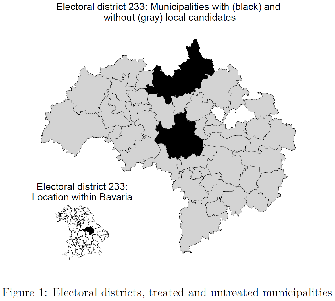
Now let’s try visualizing Figure 3. In contrast, to Figure Figure 4 and Figure 5, it doesn’t show all of Germany. Rather it is used to illustrate a comparative strategy.

  1. It zooms into German to show Bavaria on the lower right.
  2. It zooms into Bavaria to show the electoral district in the middle.
  3. It colours municipalities within the electoral district 233.
  4. It adds titles.

We’ll start by showing the different maps separatedly in a grid. Then we put them together.

# MAP 1: Bavaria within Germany
data_map_states <- aggregate(data_map, by = list(data_map$SN_L), mean) # SN_L = STATE
p1 <- ggplot() +
  # Draw Germany
  geom_sf(data = data_map_states, 
                fill = "white", color = "black", size = 0.1) +
  # Draw Bavaria (filled black)
  geom_sf(data = data_map_states %>% filter(Group.1 == "09"), fill = "black", color = "black") +
  theme_void() +
  ggtitle("Bavaria:\nLocation within Germany") +
  theme(plot.title = element_text(color = "black", size = 10, hjust = 0.5))


# MAP 2: Elector district within Bavaria
# Take out map of Bavaria
data_map_bavaria <- data_map %>%
  filter(SN_L == "09") %>%
  dplyr::select("Wahlkreis")
# Aggregate the map data to the level of electoral districts
data_map_bav_elec_dist <- aggregate(data_map_bavaria,
  by = list(data_map_bavaria$Wahlkreis),
  mean
) %>% select(Wahlkreis)
# Create a new object that only contains electoral district 233
data_map_bav_elec_dist_233 <- data_map_bav_elec_dist %>%
  filter(Wahlkreis == 233)

p2 <- ggplot() +
  # Draw bavaria
  geom_sf(
    data = data_map_bav_elec_dist, fill = "white", color = "black",
    size = 0.1
  ) +
  # Draw electora district 233
  geom_sf(data = data_map_bav_elec_dist_233, fill = "black", color = "black") +
  # geom_sf(data = map_electoral_district_233_bb, fill = NA, color = "red", size = 0.8) +
  theme_void() +
  ggtitle("Electoral district 233:\nLocation within Bavaria") +
  theme(plot.title = element_text(color = "black", size = 10, hjust = 0.5))

# MAP 3:
# Take out map of electoral district 233
data_map_mun_dist_233 <- data_map %>% filter(Wahlkreis == 233)


# Take out map subsets that we want to color black later
map_color_black <- data_map_mun_dist_233 %>%
  filter(Wahlkreis == 233, municipality == "Regensburg")
map_color_black2 <- data_map_mun_dist_233 %>%
  filter(Wahlkreis == 233, municipality == "Regenstauf, M")

# Take out subset that we want to color gray (not Regensburg!)
map_color_gray <- data_map_mun_dist_233 %>%
  filter(Wahlkreis == 233, municipality != "Regensburg")


p3 <- ggplot() +
  # draw electoral district 233
  geom_sf(data = data_map_mun_dist_233, fill = NA, colour = "black", size = 0.1) +
  # draw all municipalities (not Regensburg) in light gray
  geom_sf(data = map_color_gray, fill = "lightgray", colour = "black", size = 0.1) +
  # Draw municipalites Regensburg/Regenstauf in black
  geom_sf(data = map_color_black, fill = "black", colour = "black", size = 0.1) +
  geom_sf(data = map_color_black2, fill = "black", colour = "black", size = 0.1) +
  theme_void() +
  ggtitle("Electoral district 233: Municipalities with (black) and\nwithout (gray) local candidates") +
  theme(
    legend.position = "none",
    axis.title = element_blank(),
    axis.text = element_blank(),
    axis.ticks = element_blank(),
    panel.background = element_blank(),
    plot.margin = unit(c(0, 0, 0, 0), "cm"),
    plot.title = element_text(color = "black", size = 10, hjust = 0.5)
  )

library(patchwork)
p1 + p2 + p3
Figure 7: 3 maps next to each other


Subsequently, we plot all three maps together in Figure Figure 8:

gg_inset_map <- ggdraw() +
  draw_plot(p3) +
  draw_plot(p1, x = 0.015, y = 0.05, width = 0.25, height = 0.25) +
  draw_plot(p2, x = 0.25, y = 0.05, width = 0.25, height = 0.25)

gg_inset_map
Figure 8: Identifcation: Candidates’ residence within certain municipalities (electoral district 233, Regensburg)


Or use grid.arrange() in Figure Figure 9:

grid.arrange(p1,p2,p3,                               
             ncol = 2, nrow = 2, 
             layout_matrix = rbind(c(1,2), c(3,3)))
Figure 9: Maps side by side

8 Side-by-side & interactive maps

Below we use the code from above to recreate to maps for Bavaria visualizing the shares of both the greens and the AFD next to each other using the patchwork package. Then we use the ggplotly function to make one of the maps interactive. We add aes(label = municipality) in the ggplot() function so that they are recognized by plotly for the interactive graph.

library(patchwork)
library(plotly)

library(sf)

# Load vote share data on the municipality level: data_votes_municipalities.csv
# data_voteshares <- read_csv(
#   sprintf("https://docs.google.com/uc?id=%s&export=download",
#           "1f3ZKXEzg-vpDL37hietMsnpSDXFw4zgG"),
#                         col_types = cols())

data_voteshares <- read_csv("data/data_votes_municipalities.csv",
                        col_types = cols())

# Load shape files
  # Download the shape files: https://drive.google.com/drive/folders/1LGm-kBDZhFc01ncBBvtFHPfC2eXXdooT?usp=sharing
  # Adapt the folder "www/data" to your file location
  data_map <- st_read(dsn = "www/data", layer = "VG250_GEM", options = "ENCODING=ASCII", quiet = TRUE)

  # See column geometry
  data_map$AGS <- as.character(data_map$AGS)
  data_map <- left_join(data_map, data_voteshares, by="AGS")


# Filter for Bavaria
data_map_bayern <- data_map %>% filter(state=="Bayern")


p1 <- ggplot(data = data_map_bayern,
                         aes(label = municipality)) +
  geom_sf(
    data = data_map_bayern,
    aes(fill = share.greens2017), colour = NA
  ) + # fill but turn of borders
  scale_fill_gradient(low = "white", high = "darkgreen", na.value = NA) +
    theme_light(base_size = 8) + 
    theme(legend.position = "bottom")


p2 <- ggplot(data = data_map_bayern,
                         aes(label = municipality)) +
  geom_sf(
    data = data_map_bayern,
    aes(fill = share.afd2017), colour = NA
  ) + # fill but turn of borders
  scale_fill_gradient(low = "white", high = "darkblue", na.value = NA) +
    theme_light(base_size = 8) + 
    theme(legend.position = "bottom")

p3 <- p1 + p2

p3

Interactive map
# Make map interactive with tooltip
ggplotly(p1)

Interactive map

Finally, we can save our interactive map as an html file.

# Saving the plot
p <- ggplotly(p1, tooltip = "text")
htmlwidgets::saveWidget(p, "data/graph.html")

9 Aggregating & subsetting maps

  • Below an example of how maps & data can be aggregated to a higher level. Unfortunately the map does not look perfect because we would need to clean up the shape files.
    • We can simply use aggregate() and filter().
    • Section 7 above provides a further examples of aggregation and filtering.
library(sf)

# Load vote share data on the municipality level: data_votes_municipalities.csv
# data_voteshares <- read_csv(
#   sprintf("https://docs.google.com/uc?id=%s&export=download",
#           "1f3ZKXEzg-vpDL37hietMsnpSDXFw4zgG"),
#                         col_types = cols())

data_voteshares <- read_csv("data/data_votes_municipalities.csv",
  col_types = cols()
)

# Load shape files
# Download the shape files: https://drive.google.com/drive/folders/1LGm-kBDZhFc01ncBBvtFHPfC2eXXdooT?usp=sharing
# Adapt the folder "www/data" to your file location
# Use "." for working directory
data_map <- st_read(dsn = "www/data", layer = "VG250_GEM", options = "ENCODING=ASCII", quiet = TRUE)
data_map$AGS <- as.character(data_map$AGS)
data_map <- left_join(data_map, data_voteshares, by = "AGS")


# Aggregate map data to the level of federal states
# Variable "state" contains state identifiers
data_map_states <- aggregate(data_map,
  by = list(data_map$state),
  FUN = mean, # use mean across subunits
  na.action = na.omit
) # omit missings


# Visualize the map
ggplot() +
  geom_sf(
    data = data_map_states,
    aes(fill = share.greens2017), colour = NA
  ) + # fill but turn of borders
  scale_fill_gradient(
    low = "white",
    high = "darkgreen",
    na.value = NA
  )

# Take a subset of the map (data) using filter()
data_map_bavaria <- data_map %>%
  filter(state == "Bayern")

# Visualize the map
ggplot() +
  geom_sf(
    data = data_map_bavaria,
    aes(fill = share.greens2017), colour = NA
  ) + # fill but turn of borders
  scale_fill_gradient(low = "white", high = "darkgreen", na.value = NA)

10 Visualizing cross-country data (Europe & Eurostat)

Below we rely on the eurostat package that provides access to the Eurostat database to visualize data across European countries at different levels of aggregation (cf. eurostat vignette). The eurostat vignette also illustrates an example using the tmap package.

We start by identifying some interesting statistic that we want to visualize. Below we take the At-risk-of-poverty rate with the Eurostat identifier ilc_li41.

library(eurostat)
library(tidyverse)
library(sf)
library(giscoR)
library(ggtext)
library(kableExtra)


#library(tmap)

# Search for interesting statistics
interesting_stats <- search_eurostat(pattern = "unemployment")
# View(interesting_stats) # ilc_li41 = At-risk-of-poverty rate by NUTS regions
interesting_stats %>% 
  kable %>%
  kable_styling("striped", full_width = F) %>% 
 scroll_box(width = "100%", height = "200px")
title code type last.update.of.data last.table.structure.change data.start data.end values hierarchy
Long-term unemployment (12 months and more) by sex, age, educational attainment level and NUTS 2 regions (%) lfst_r_lfu2ltu dataset 24.04.2024 24.04.2024 1999 2023 2889213 5
Regional disparities in unemployment rates (NUTS level 2, NUTS level 3) lfst_r_lmdur dataset 30.08.2023 03.01.2024 1999 2022 7802 5
Regional disparities in long-term unemployment rates (NUTS level 2) lfst_r_lmdltu dataset 25.10.2023 25.10.2023 1999 2022 665 5
Transition from unemployment to employment by sex, age and degree of urbanisation (annual averages of quarterly transitions, estimated probabilities) - experimental statistics lfsi_long_e03 dataset 14.03.2024 14.03.2024 2011 2023 3707 5
Transition from employment to unemployment by sex, age and degree of urbanisation (annual averages of quarterly transitions, estimated probabilities) - experimental statistics lfsi_long_e04 dataset 14.03.2024 14.03.2024 2011 2023 5172 5
Long-term unemployment rates by sex enpe_lfsa_urgan2 dataset 31.01.2024 31.01.2024 2005 2022 315 7
Long-term unemployment by level of disability (activity limitation) - % of total unemployment lfsa_upgadl dataset 23.04.2024 23.04.2024 2022 2022 10480 4
Supplementary indicators to unemployment by level of disability (activity limitation) lfsa_sup_dl dataset 23.04.2024 23.04.2024 2022 2022 2835 4
Long-term unemployment by sex - annual data une_ltu_a dataset 02.05.2024 14.03.2024 2003 2023 11751 6
Long-term unemployment by sex - quarterly data une_ltu_q dataset 02.05.2024 14.03.2024 2003-Q1 2023-Q4 141366 6
Supplementary indicators to unemployment - annual data lfsi_sup_a dataset 02.05.2024 14.03.2024 2003 2023 65939 6
Supplementary indicators to unemployment - quarterly data lfsi_sup_q dataset 02.05.2024 14.03.2024 2003-Q1 2023-Q4 801095 6
Long-term unemployment by sex (1996-2020) - annual data une_ltu_a_h dataset 24.04.2024 03.01.2024 1996 2020 26979 6
Long-term unemployment by sex (1992-2020) - quarterly data une_ltu_q_h dataset 24.04.2024 03.01.2024 1992-Q2 2020-Q4 337332 6
Supplementary indicators to unemployment (1992-2020) - annual data lfsi_sup_a_h dataset 24.04.2024 03.01.2024 1992 2020 125539 6
Supplementary indicators to unemployment (1992-2020) - quarterly data lfsi_sup_q_h dataset 24.04.2024 03.01.2024 1992-Q1 2020-Q4 1634477 6
Transition from unemployment to employment by sex, age and duration of unemployment (annual averages of quarterly transitions, estimated probabilities) - experimental statistics lfsi_long_e01 dataset 14.03.2024 14.03.2024 2011 2023 15063 6
Transition from unemployment to employment by sex, age and previous work experience (annual averages of quarterly transitions, estimated probabilities) - experimental statistics lfsi_long_e02 dataset 14.03.2024 14.03.2024 2011 2023 12129 6
Transition from unemployment to employment by sex, age and degree of urbanisation (annual averages of quarterly transitions, estimated probabilities) - experimental statistics lfsi_long_e03 dataset 14.03.2024 14.03.2024 2011 2023 3707 6
Transition from employment to unemployment by sex, age and degree of urbanisation (annual averages of quarterly transitions, estimated probabilities) - experimental statistics lfsi_long_e04 dataset 14.03.2024 14.03.2024 2011 2023 5172 6
Unemployment by sex, age and duration of unemployment (1 000) lfsq_ugad dataset 24.04.2024 15.03.2024 1998-Q1 2023-Q4 1634258 6
Long-term unemployment (12 months or more) as a percentage of the total unemployment, by sex and age (%) lfsq_upgal dataset 24.04.2024 15.03.2024 1998-Q1 2023-Q4 181419 6
Supplementary indicators to unemployment by sex and age lfsq_sup_age dataset 24.04.2024 15.03.2024 2006-Q1 2023-Q4 485766 6
Supplementary indicators to unemployment by sex and educational attainment level lfsq_sup_edu dataset 24.04.2024 15.03.2024 2006-Q1 2023-Q4 328776 6
Unemployment by sex, age and duration of unemployment (1 000) lfsa_ugad dataset 24.04.2024 24.04.2024 1983 2023 541297 6
Unemployment by sex, age, duration of unemployment and distinction registration/benefits (%) lfsa_ugadra dataset 24.04.2024 24.04.2024 1983 2023 2848708 6
Long-term unemployment (12 months or more) as a percentage of the total unemployment, by sex, age and citizenship (%) lfsa_upgan dataset 24.04.2024 24.04.2024 1995 2023 458078 6
Long-term unemployment (12 months or more) as a percentage of the total unemployment, by sex, age and country of birth (%) lfsa_upgacob dataset 24.04.2024 24.04.2024 1995 2023 453774 6
Supplementary indicators to unemployment by sex and age lfsa_sup_age dataset 24.04.2024 24.04.2024 2006 2023 122346 6
Supplementary indicators to unemployment by sex and educational attainment level lfsa_sup_edu dataset 24.04.2024 24.04.2024 2006 2023 84461 6
Supplementary indicators to unemployment by sex and citizenship lfsa_sup_nat dataset 24.04.2024 24.04.2024 2006 2023 45579 6
Supplementary indicators to unemployment by sex and country of birth lfsa_sup_cob dataset 24.04.2024 24.04.2024 2006 2023 45528 6
Long-term unemployment by level of disability (activity limitation) - % of total unemployment lfsa_upgadl dataset 23.04.2024 23.04.2024 2022 2022 10480 6
Supplementary indicators to unemployment by level of disability (activity limitation) lfsa_sup_dl dataset 23.04.2024 23.04.2024 2022 2022 2835 6
Long-term unemployment (12 months and more) by sex, age, educational attainment level and NUTS 2 regions (%) lfst_r_lfu2ltu dataset 24.04.2024 24.04.2024 1999 2023 2889213 7
Regional disparities in unemployment rates (NUTS level 2, NUTS level 3) lfst_r_lmdur dataset 30.08.2023 03.01.2024 1999 2022 7802 7
Regional disparities in long-term unemployment rates (NUTS level 2) lfst_r_lmdltu dataset 25.10.2023 25.10.2023 1999 2022 665 7
Tables by benefits - unemployment function spr_exp_fun dataset 17.05.2024 03.01.2024 1990 2021 309724 5
Long-term unemployment by sex - annual data une_ltu_a dataset 02.05.2024 14.03.2024 2003 2023 11751 6
Long-term unemployment (12 months or more) as a percentage of the total unemployment, by sex, age and citizenship (%) lfsa_upgan dataset 24.04.2024 24.04.2024 1995 2023 458078 6
Long-term unemployment (12 months or more) as a percentage of the total unemployment, by sex, age and country of birth (%) lfsa_upgacob dataset 24.04.2024 24.04.2024 1995 2023 453774 6
Supplementary indicators to unemployment by sex and citizenship lfsa_sup_nat dataset 24.04.2024 24.04.2024 2006 2023 45579 6
Supplementary indicators to unemployment by sex and country of birth lfsa_sup_cob dataset 24.04.2024 24.04.2024 2006 2023 45528 6
Long-term unemployment by sex - annual data une_ltu_a dataset 02.05.2024 14.03.2024 2003 2023 11751 5
Long-term unemployment (12 months or more) as a percentage of the total unemployment, by sex, age and citizenship (%) lfsa_upgan dataset 24.04.2024 24.04.2024 1995 2023 458078 5
Long-term unemployment (12 months or more) as a percentage of the total unemployment, by sex, age and country of birth (%) lfsa_upgacob dataset 24.04.2024 24.04.2024 1995 2023 453774 5
Youth unemployment by sex, age and educational attainment level yth_empl_090 dataset 24.04.2024 24.04.2024 1983 2023 186270 4
Youth unemployment rate by sex, age and country of birth yth_empl_100 dataset 24.04.2024 24.04.2024 1995 2023 84811 4
Youth unemployment rate by sex, age and NUTS 2 regions yth_empl_110 dataset 24.04.2024 24.04.2024 1999 2023 202086 4
Youth long-term unemployment rate (12 months or longer) by sex and age yth_empl_120 dataset 24.04.2024 24.04.2024 1983 2023 19692 4
Youth long-term unemployment rate (12 months or longer) by sex, age and NUTS 2 regions yth_empl_130 dataset 24.04.2024 24.04.2024 1999 2023 33681 4
Youth unemployment ratio by sex, age and NUTS 2 regions yth_empl_140 dataset 24.04.2024 24.04.2024 1999 2023 202086 4


Then we download the corresponding meta data using the get_eurostat() function and the identifier ilc_li41. We filter the data for a particular TIME_PERIOD. And filter for a particular aggregation level, e.g., using nchar(geo) == 4 we make sure to filter out the NUTS-2 levels where the identifier has 4 characters (e.g., BG34) as described here. You can filter country-level (nchar(geo) == 2), NUTS-1 level (nchar(geo) == 3) or NUTS-2 level (nchar(geo) == 4). Figure 10 visualizes data at the NUTS-2 level.

Figure 10: Source: https://ec.europa.eu/eurostat/web/nuts
# Download attribute data from Eurostat
data_poverty <- eurostat::get_eurostat("ilc_li41", time_format = "raw") %>%
  # subset to have only a single row per geo
  filter(TIME_PERIOD == 2021, nchar(geo) == 4) %>% # Filter 2022 and NUTS-3 level
    rename(poverty = values)

indexed 0B in  0s, 0B/s
indexed 2.15GB in  0s, 2.15GB/s
                                                                              

Then we load the spatial data using the get_eurostat_geospatial() function from the giscoR package and merge the two datasets.

# Download geospatial data from GISCO
data_map <- get_eurostat_geospatial(nuts_level = 2, year = 2021)

# merge with attribute data with data_data
data_map <- inner_join(data_map, data_poverty, by = "geo")


Subsequently, we can visualize our map using the code we discussed in the sections above. The map in Figure 11 only shows countries where the poverty data is available for that particular level of aggregation.

ggplot() +
  geom_sf(
    data = data_map,
    aes(fill = poverty), colour = NA
  ) + # fill but turn of borders
  scale_fill_gradient(low = "white", high = "red", na.value = NA) + 
    coord_sf(xlim = c(-15, 35), 
                        ylim = c(34, 71)) +
  labs(
    title = "Poverty across Europe (NUTS-2 level, 2021)",
    subtitle = "There is a strong variation of poverty across European regions.",
    caption = "Note: The graph visualizes At-risk-of-poverty rate by NUTS regions (eurostat identifier: ilc_li41) from the year 2021. The at-risk-of-poverty rate is the share of people with an equivalised disposable income (after social transfer) below the at-risk-of-poverty threshold, which is set at 60 % of the national median equivalised disposable income after social transfers.",
    x = "Longitude",
    y = "Latitude",
    fill = "At-risk-of-poverty rate"
  ) +
  theme_light() +
  theme(
    legend.position = "right",
    plot.title = element_text(color = "black", size = 14, face = "bold"),
    plot.subtitle = element_text(color = "black", size = 12),
    plot.caption = element_textbox_simple(
      color = "black",
      face = "italic",
      hjust = 0,
      size = 7,
      width = grid::unit(4, "in"),
      padding = margin(5, 0, 0, 0)
    ),
    plot.margin = margin(b = 0.4,  # increase bottom margin
                         unit = "cm")
  )
Figure 11: Poverty across Europe


We can create the map above also on different levels as illustrated in the code chunks below. We have to adapt the filter data aggregation level by adapting nchar(geo) == ... and get the right shape files using nuts_level = ... in the get_eurostat_geospatial() function.


Below an example for the country-level in Figure 12:

library(eurostat)
library(tidyverse)
library(sf)
library(giscoR)
library(ggtext)


# Download attribute data from Eurostat
data_poverty <- eurostat::get_eurostat("ilc_li41", time_format = "raw") %>%
  # subset to have only a single row per geo
  filter(TIME_PERIOD == 2021, nchar(geo) == 2) %>% # Filter 2022 and NUTS-3 level
  rename(poverty = values)

# Download geospatial data from GISCO
data_map <- get_eurostat_geospatial(nuts_level = 0, year = 2021)

# merge with attribute data with data_data
data_map <- inner_join(data_map, data_poverty, by = "geo")


ggplot() +
  geom_sf(
    data = data_map,
    aes(fill = poverty), colour = NA
  ) + # fill but turn of borders
  scale_fill_gradient(low = "white", high = "red", na.value = NA) + 
    coord_sf(xlim = c(-15, 35), 
                        ylim = c(34, 71)) +
  labs(
    title = "Poverty across Europe (country-level, 2021)",
    subtitle = "There is a strong variation of poverty across European regions.",
    caption = "Note: The graph visualizes At-risk-of-poverty rate (eurostat identifier: ilc_li41) from the year 2021. The at-risk-of-poverty rate is the share of people with an equivalised disposable income (after social transfer) below the at-risk-of-poverty threshold, which is set at 60 % of the national median equivalised disposable income after social transfers.",
    x = "Longitude",
    y = "Latitude",
    fill = "At-risk-of-poverty rate"
  ) +
  theme_light() +
  theme(
    legend.position = "right",
    plot.title = element_text(color = "black", size = 14, face = "bold"),
    plot.subtitle = element_text(color = "black", size = 12),
    plot.caption = element_textbox_simple(
      color = "black",
      face = "italic",
      hjust = 0,
      size = 7,
      width = grid::unit(4, "in"),
      padding = margin(5, 0, 0, 0)
    ),
    plot.margin = margin(b = 0.4,  # increase bottom margin
                         unit = "cm")
  )
Figure 12: Poverty across Europe


Below an example on the NUTS-1 level in Figure 13:

library(eurostat)
library(tidyverse)
library(sf)
library(giscoR)
library(ggtext)


# Download attribute data from Eurostat
data_poverty <- eurostat::get_eurostat("ilc_li41", time_format = "raw") %>%
  # subset to have only a single row per geo
  filter(TIME_PERIOD == 2021, nchar(geo) == 3) %>% # Filter 2022 and NUTS-3 level
  rename(poverty = values)

# Download geospatial data from GISCO
data_map <- get_eurostat_geospatial(nuts_level = 1, year = 2021)

# merge with attribute data with data_data
data_map <- inner_join(data_map, data_poverty, by = "geo")


ggplot() +
  geom_sf(
    data = data_map,
    aes(fill = poverty), colour = NA
  ) + # fill but turn of borders
  scale_fill_gradient(low = "white", high = "red", na.value = NA) + 
    coord_sf(xlim = c(-15, 35), 
                        ylim = c(34, 71)) +
  labs(
    title = "Poverty across Europe (NUTS-1 level, 2021)",
    subtitle = "There is a strong variation of poverty across European regions.",
    caption = "Note: The graph visualizes At-risk-of-poverty rate (eurostat identifier: ilc_li41) from the year 2021. The at-risk-of-poverty rate is the share of people with an equivalised disposable income (after social transfer) below the at-risk-of-poverty threshold, which is set at 60 % of the national median equivalised disposable income after social transfers.",
    x = "Longitude",
    y = "Latitude",
    fill = "At-risk-of-poverty rate"
  ) +
  theme_light() +
  theme(
    legend.position = "right",
    plot.title = element_text(color = "black", size = 14, face = "bold"),
    plot.subtitle = element_text(color = "black", size = 12),
    plot.caption = element_textbox_simple(
      color = "black",
      face = "italic",
      hjust = 0,
      size = 7,
      width = grid::unit(4, "in"),
      padding = margin(5, 0, 0, 0)
    ),
    plot.margin = margin(b = 0.4,  # increase bottom margin
                         unit = "cm")
  )
Figure 13: Poverty across Europe

References

Wickham, Hadley. 2010. “A Layered Grammar of Graphics.” J. Comput. Graph. Stat. 19 (1): 3–28.
———. 2016. Ggplot2: Elegant Graphics for Data Analysis. Springer.

Footnotes

  1. OpenStreetMaps does not work anymore… https://github.com/dkahle/ggmap/issues/117.↩︎