9.2 The Individual Stock Symbol Output

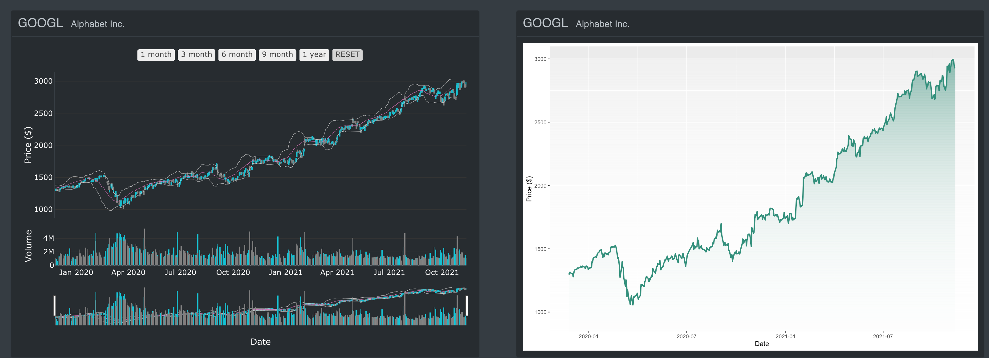
Figure 9.2: The Individual Stock Symbol Plots
When the user clicked on the “Explore” button, which was on “Stock Symbol Templates”, the output of the individual stock symbols appeared below. It contained 2 plots, I used the plotly andggplot2 packages to demonstrate the visualization. Let’s take a look at the codes for plotly. The following function plot_function (stock, name_stock) is stored in global.R.
9.2.1 plotly package
We use the time series chart to visualize the movement of stock prices over time. Since date and time information is continuous categorical data, the points are plotted along the x-axis and connected by a solid line. For financial applications, plotly can also be used to create candlestick charts plot_ly( data = data, x = date , type = "candlestick", open = , close = , high = , low = ) which are axes date by default.
The arguments for plot_ly() with type=“candlestick” are slightly different, x is the date and you have the argument for open, close, high and low. You can set the color when the price goes up or down. I added “rangeselector” with 5 different buttons in the x axis. Finally, I added “Bollinger Bands” to the “Candlestick” plot and the “Volume” attribute to the plot.
9.2.2 ggplot2 package
This is the time series plot, it is quite similar to the plotly package, but I just wanted to show you how to use a color gradient for geom_area. You can modify the color here grad_df <- data.frame(yintercept = seq(0, max(stock$Open), length.out = 1000),alpha = seq(1,0.0, length.out = 1000)).