12.2 The outputs
12.2.1 The information boxes
Let’s talk about the single box user interface. I start with the order from top to bottom and left to right. I used width = 3 for each box. In the next chapter 13.2 you will learn how to reply and apply user input to create these boxes.
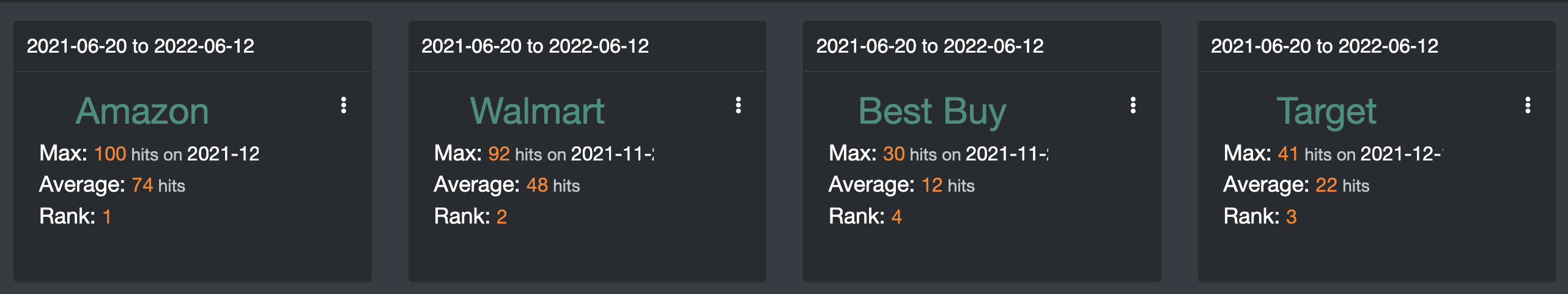
Figure 12.5: Information Boxes - Interface UI
- The date
title = htmlOutput(paste("1", name[[a]]), style = "text-align:left;") - I split the layout to 2 columns
cellWidths = c("70%", "30%") - In the left column, it’s typical text information, so I used the
renderText()to render andhtmlOutput()to print out the output
- Name of the keyword
- Maximum hits
- Average hits.
- Rank
- In the right column
- There is an icon, which is
dropdownButton() - When you click the icon, there are 2 buttons namely delete and explore
actionButton()buttons, I assignedonclick = 'Shiny.setInputValue(\"btnRem\", this.id, {priority: \"event\"})',the button, useful for knowing which keyword we are citing.
box(
  width = 3,
  title = htmlOutput(paste("1", name[[a]]), style = "text-align:left;"),
  splitLayout(
    cellWidths = c("70%", "30%"),
    tagList(
      htmlOutput(name[[a]], style = "text-align:center;color:#32907c"),
      htmlOutput(paste("2", name[[a]]), style = "text-align:left;padding-left:10px;"),
      htmlOutput(paste("3", name[[a]]), style = "text-align:left;padding-left:10px;"),
      htmlOutput(paste("5", name[[a]]), style = "text-align:left;padding-left:10px;"),
      br()
    ),
    div(
      style = "text-align:right;height:150px;",
      tags$style(
        "#dropdown-menu-mydropdown2 {background-color: transparent;border-color: white;min-width:100px}
        .btn-custom {background-color: transparent; color: #FFF;}.caret{display: none;}"
      ),
      dropdownButton(
        inputId = "mydropdown2",
        label = "",
        icon = icon("fas fa-ellipsis-v"),
        status = "custom",
        circle = FALSE,
        actionButton(
          paste0("delete_", group[[a]]),
          "Remove ",
          onclick = 'Shiny.setInputValue(\"btnRem\", this.id, {priority: \"event\"})',
          style = "background-color: transparent;color:white;border-color: transparent;height:20px"
        ),
        br(),
        actionButton(
          paste0("explore_", group[[a]]),
          "Explore",
          onclick = 'Shiny.setInputValue(\"btnExp\", this.id, {priority: \"event\"})',
          style = "background-color: transparent;color:white;border-color: transparent;height:20px"
        )
      )
    )
  )

)
12.2.2 Compared breakdown by Region
A US map figure used to compare keywords by region. In this case, use LealetOutput(" map ", width =" 100% ", height =" 500px ") to display the map. Let’s use Amazon, Walmart, Best Buy, and Target as examples. I chose blue for Amazon, orange for Wal-Mart, green for the best buy and purple for the target audience.
The colors on the map represent the highest percentages of the area. Percentage calculated from a search of all four terms by state.
We will discuss more about how to apply the hoover on the back end of this chapter. You can use Google search to search for cities or states on the map.
And finally, a drop-down menu with the “Download” button will appear in the upper right corner of the box. Leave it as it is for now. Go back to the next chapter 13.3 to understand the details.
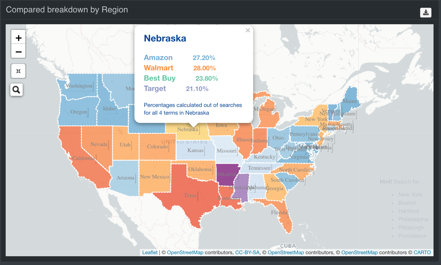
Figure 12.6: Google Map - Interface UI
12.2.3 3D Relative Network Plot
I used the networkD3 library and theforceNetwork()function to create the 3D relative network. It is quite complicated to process the data before you even have a plot, you can read the next chapter 13.4. We can learn how the relative keyword is related, one thing for us is to look at it when analyzing.
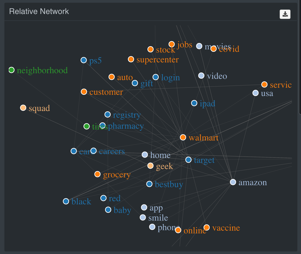
Figure 12.7: Google Network Visualization - Interface UI
12.2.4 Interest Over Time Plot
The bar graph represented the average number of results. The line graph represented the number of hits per date. How to use plotly for bar and line charts we will learn in the next chapter 13.5
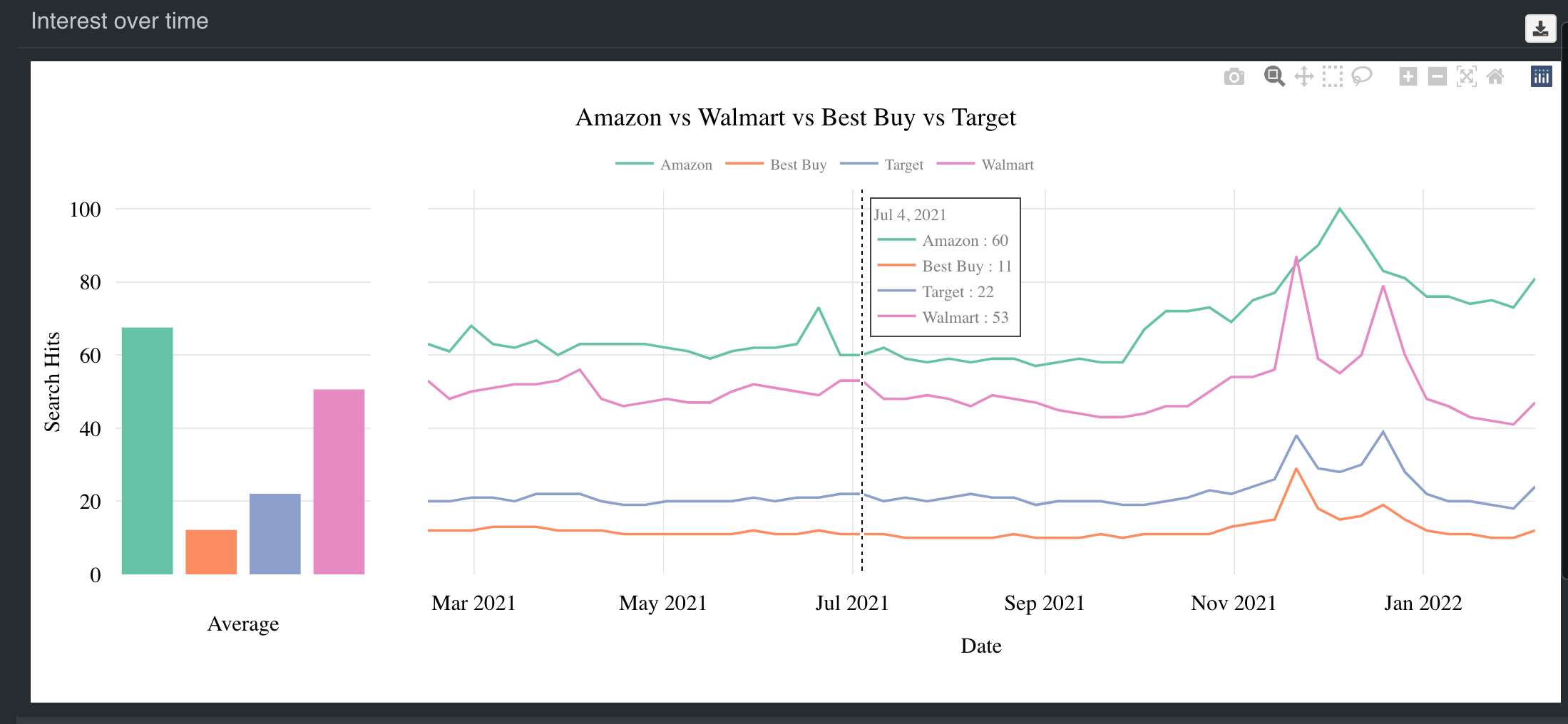
Figure 12.8: Google Trend Linechart - Interface UI
12.2.5 Related Queries Tables
At the end of the output there are 2 tables, Breakdown Compared for Related Searches and Breakdown Compared for Metropolitan Areas. Again, we will use datatable to create the tables. The next chapter @ref (google-server-table) shows how to create these tables.
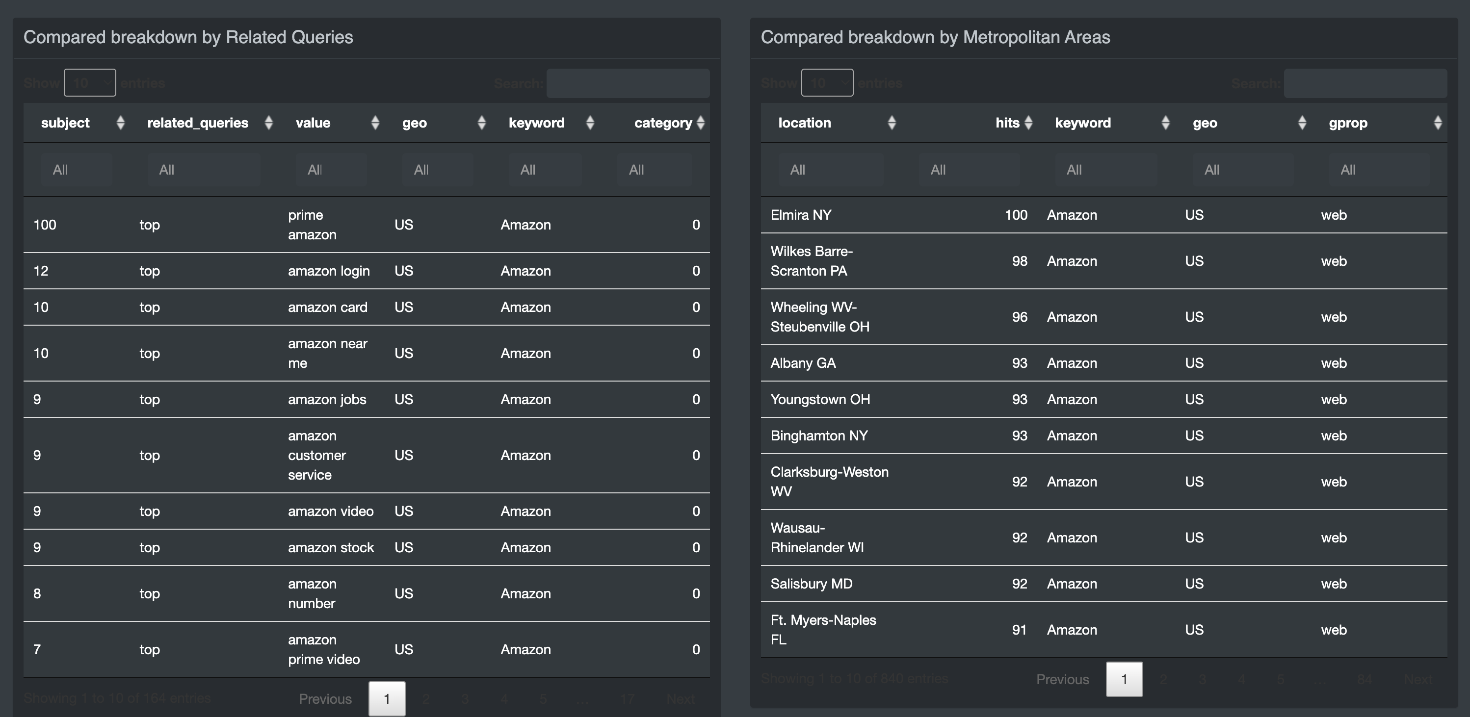
Figure 12.9: Tables - Interface UI