Chapter 2 Categorizing and Summarizing Information
2.1 How to Tell a Story

Figure 2.1: A Heartwarming Tale of Extreme Weather Events and Traumatic Brain Injury
When you tell a story, you usually have to leave some things out. If you saw a movie and a friend asked you to describe the plot, it wouldn’t be terribly helpful if you described literally everything that happened in the movie – that would take longer than just watching the movie – you would likely instead discuss the basic conflict, the characters, the most interesting dialogue, and (if your friend doesn’t mind spoilers) the film’s resolution. If your partner asks you about your day, you wouldn’t respond with a minute-by-minute description of each interaction you had with each person complete with an estimate of the amplitude of their speaking voice, the ambient temperature throughout the day, and how much your breakfast cost to the penny; you might instead give a description of your global mood, a basic rundown of what you did during the day, and talk about anything that stood out as particularly funny, frustrating, or otherwise noteworthy. And if you wrote a history of an entire country, or described the evolution of species, or told the story of the formation of the Planet Earth, you’d have to leave a lot of details out – if you kept all the details in then you wouldn’t survive all the way to the end.
We make choices about what to include in our stories – sometimes without even thinking about it (and sometimes we don’t remember or don’t know all of the details). When we summarize data, we’re telling stories about that data and we make choices in doing so.
This page is all about data: how we categorize it and how we summarize it. We are going to cover some of the different types of data, how we summarize data, and how what we leave in and what we leave out affect the story we tell about the data. And, of course, I have made some choices on what to include and what not to include on the page. There’s only so much we can cover.
2.2 Types of Data
2.2.1 Statistics and Parameters
In conversational English, pretty much any number that describes a fact can be called a “statistic.” In the field of statistics, however, the term has a specific connotation: a statistic1 is a number that describes a sample or samples2. Something like the proportion of 100 people polled at random who answered “yes” to survey question is a statistic. The average reaction time of 30 participants in a psychology study is a statistic. Something like the number of people who live in Canada? That’s not technically a statistic. Because the people who live in Canada is an entire population.3, the number of them is an example of a parameter4 Thus, statistics describe samples, and parameters describe populations.
Why is knowing that distinction important? It is not – I repeat, not – so that you can correct people who use the term statistic in casual conversation when you know that technically they should say parameter: that’s not a good way to make friends. It’s important for a couple of reasons:
It is specifically important to know whether a number refers to a sample or to a population for use in some statistical procedures.5
It is generally important to know that we use statistics to make inferences about parameters.
On that second point: scientists are rarely interested only in the subjects used in their research. There are exceptions – like case studies or some clinical trials – but usually scientists want to generalize the findings from a sample to the population. A cognitive researcher isn’t interested in the memory performance of a few participants in an experiment so much as what their performance means for all humans; a social psychologist studying the behavioral effects of prejudice does not mean to describe the effects of prejudice for just those who participate in the study but for all of society. It is unrealistic in the vast majority of scientific inquiries to measure that which they are interested in about the entire population – even researchers who do work with population-level data are working with things like census data and are thus somewhat limited in the types of questions they can investigate (that is, they can only work with answers to questions asked in the census they are working with).
Hypothetically, if you could invite the entire population to participate in a psychology experiment – if you could bring the nearly 8 billion people on earth to a lab – then most of the statisical tests to be discussed in this course would be irrelevant. If, say, the whole population had an average score of \(x\) in condition A and an average score of \(x+1\) in condition B, then the results conclusively would show that scores are higher in condition B than in condition A: no need in that case for fancy stats.
Statistical tests, therefore, are designed for analyzing small samples*6 and for making inferences from those data about larger populations. In part because statistical tests are designed for samples that are much, much smaller in number than populations is that in those cases that researchers do have large amounts of data, the tests we run will almost always end up being statistically significant. Results of statistical tests should always be subject to careful scientific interpretation: perhaps more so when statistical significance is more a product of huge sample sizes than it is a meaningful finding in small ones.
There is also a notational difference between statistics and parameters. Symbols for statistics use Latin letters, such as \(\bar{x}\) and \(s^2\); symbols for parameters use Greek letters, such as \(\mu\) and \(\sigma^2\). So, when you see a number associated with a Latin-letter symbol, that is a measurement of a sample, and when you see a number associated with a Greek-letter symbol, that is a measurement of a population.
2.2.2 Scales of Measurement
Data are bits of information7, and information can take on many forms. The ways we analyze data depend on the types of data that we have. Here’s a relatively basic example: suppose I asked a class of students their ages, and I wanted to summarize those data. A reasonable way to do so would be to take the average of the students’ ages. Now suppose I asked each student what their favorite movie was. In that case, it wouldn’t make any sense to report the average favorite movie – it would make more sense to report the most popular movie, or the most popular category of movie.
Thus, knowing something about the type of data we have helps us choose the proper tools for working with our data. Here, we will talk about an extensive – but not exhaustive – set of data types that are encountered in scientific investigations.
2.2.2.1 S.S. Stevens’s Taxonomy of Data
The psychophysicist S.S. “Smitty” Stevens proposed a taxonomy of measurement scales in his 1946 paper *On the Theory of Scales of Measurement that was so influential that is often described without citation, as if the system of organization Stevens devised were as fundamental as a triangle having three sides, or the fact that \(1+1=2\). To be fair, it’s a pretty good system. And, it is so common that it would be weird not to know the terminology from that 1946 paper. There are some omissions, though, and we will get to those after we discuss Stevens’s data types.
2.2.2.1.1 Discrete Data
Discrete data8 are data regarding categories or ranks. They are discrete in the sense that there are gaps between possible values: whereas a continuous measurement like length or weight can take on an infinite amount of values between any two given points (e.g., the distances between 1 and 2 meters include 1.5 meters, 1.25 meters, 1.125 meters, 1.0675 meters, etc.), a measurement of category membership can generally only take on as many values as there are categories; and a measurement of ranks can only take on as many values as there are things to be ranked.
2.2.2.1.1.1 Nominal (Categorical) Data
Nominal (categorical) data9 are indicators of category membership. Examples include year in school (e.g., freshman, sophomore, junior, senior, 1st year, etc.) and ice cream flavor (e.g., cookie dough, pistachio, rocky road, etc.). Nominal or categorical (the terms are 100% interchangeable) data are typically interpreted in terms of frequency or proportion, for example, how many 1st-year graduate students are in this course?, or, what proportion of residents of Medford, Massachusetts prefer vanilla ice cream?.
2.2.2.1.1.2 Ordinal (Rank) Data
Ordinal (rank) data10 are measurements of the relative rank of observations. Usually these are numeric ranks (as in a top ten list), but they also can take on other descriptive terms (as in gold, silver, and bronze medal winners in athletic competition). Ordinal (or rank – like nominal and categorical, ordinal and rank are 100% interchangeable) data are interpreted in terms of relative qualities. For example, consider the sensation of pain: it’s impossible to objectively measure pain because it’s an inherently subjective experience that changes from person to person. Instead, medical professionals use a pain scale like the one pictured here:
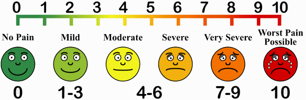
Figure 2.2: Looks like the red face murdered six people in prison, so maybe that’s more of an emotional pain.
Pain is therefore measured in terms of what is particularly painful (or not painful) to the medical patient, and their treatment can be determined as a result of whether pain is mild or severe compared to their baseline experience, or whether pain is improving or worsening.
2.2.2.1.2 Continuous (Scale) Data
Continuous (scale) data11 , in contrast to discrete data, can take an infinite number of values within any given range. That is, a continuous measure can take on values anywhere on a number line, including all the tiny inbetween spots. Continuous (or scale data – these are also 100% interchangeable terms) data have values that can be transformed into things like averages (unlike categorical data) and are meaningful relative to each other regardless of how many measurements there are (unlike rank data). There are two main subcategories of continuous data in Stevens’s taxonomy, and the difference between those two categories is in the way you can compare measurements to each other.
2.2.2.1.2.1 Interval Data
Interval data12 are data with meaningful subtractive differences – but not meaningful ratios – between measurements. The classic example here has to do with temperature scales. Imagine a day where the temperature is \(1^{\circ}\) Celsius. That’s pretty cold! Now imagine that the temperature the next day is \(2^{\circ}\) Celsius. That’s still cold! You likely would not say that the day when it’s \(2^{\circ}\) Celsius is twice as warm as the day before when it was \(1^{\circ}\) out, because it wouldn’t be! The Celsius scale (like the Fahrenheit scale) is measured in degrees because it is a measure of temperature relative to an arbitrary 0. Yes, \(0^{\circ}\) isn’t completely arbitrary because it’s the freezing point of water, but it’s also not like \(0^{\circ}\) C is the bottom point of possible temperatures (0 Kelvin is, but we’ll get to that in a bit). In that sense, the intervals between Celsius measurements are consistently meaningful: \(2^{\circ}\) C is 1 degree warmer than \(1^{\circ}\) C, which is the same difference between \(10^{\circ}\) C and \(11^{\circ}\) C, which is the same difference between \(36^{\circ}\) C and \(37^{\circ}\) C. But ratios between Celsius measurements are not meaningful – \(2^{\circ}\) is not twice as warm as \(1^{circ}\), \(15^{\circ}\) is not a third as warm as \(45{\circ}\) C, and \(-25{\circ}\) C is certainly not negative 3 times as warm as \(75^{\circ}\) C.
2.2.2.1.2.2 Ratio Data
Ratio data13, as the name implies, do have meaningful ratios between values. If we were to use the Kelvin scale instead of the Celsius scale, then we could say that 2 K (notice there is no degree symbol there because Kelvin is not relative to any arbitrary value) represents twice as much heat as 1 K, and that 435 K represents 435 times as much heat as 1 K because there is a meaningful 0 value to that scale – it’s absolute zero (0 K). Any scale that stops at 0 will produce ratio data. A person who weighs 200 pounds weighs twice as much as a person who weighs 100 pounds because the weight scale starts at 0 pounds; a person who is 2 meters tall is 6/5ths as tall as somebody who is 1.67 meters tall (note that it doesn’t matter that you will never observe a person who weighs 0 pounds or stands 0 meters tall – it doesn’t matter what the smallest observation is, just where the bottom part of the scale is). Interval differences are also meaningful for ratio data, so all ratio data are also interval data, but not all interval data are ratio data (it’s a squares-and-rectangles situation).
Here is an important note about the difference between interval and ratio data:

just replace “a kid” with “in stats class” and “quicksand” with “the difference between interval and ratio data.” The important thing is to know that both are continuous data and that continuous data are very different from discrete data.
2.2.2.1.3 Categories that Stevens Left Out
So, our man Smitty has taken some heat for leaving out some categories, and subsequently people have proposed alternate taxonomies. I’m not going to pile on poor Smitty – leaving things out is a major theme of this page! – but keeping in mind what we said at the beginning of this section about the type of data informing the type of analysis, there are a couple of additional categories that I would add. Data of these types all have a place in Stevens’s taxonomy, but have special features that allow and/or require special types of analyses.
2.2.2.1.3.1 Cardinal (Count) Data
Cardinal (count)14 data are, by definition, ratio data: counts start at zero, and a count of zero is a meaningful zero. But, counts also have features of ordinal (rank) data: counts are discrete (like most of the dialogue in the show, Two and a Half Men is an unfunny joke15, based on the absurdity of continuous count data) and their values imply relativity between each other. As counts become larger and more varied, the more appropriate it is to treat them like other ratio data, but data with small counts (the actually most famous example of this is the number of 19th century Prussian Soldiers who died by being kicked by horses or mules – as you may imagine, the counts were pretty small) are distributed in specific ways and are ideally analyzed using different tools like Poisson and negative binomial modeling.
2.2.2.1.3.2 Proportions
Proportions16, like counts, can rightly be categorized as ratio data but have special features of their own. For example, the variance and standard deviation of a proportion can be calculated in both the traditional manner (follow the hyperlinks or scoll down to find the traditional equations), but also in its own way.17 Because proportions by definition are limited to the range between zero and one, they tend to arrange themselves differently than data that are unbounded (that is, data look different when they are squished).
Proportional data are also similar to count data in that they A. are often treated like ratio data (which is not incorrect) and B. are often analyzed using special tools. In general, the shape of distributions of proportions are beta distributions – we will talk about those later.
2.2.2.1.3.3 Binary Data
Binary (dichotomous) data18 are, as the name implies, data that can take one of two different values. Binary data can be categorical – as in yes or no or pass or fail – or numeric – as in having 0 children or more than 0 children – but regardless can be given the values \(0\) or \(1\). Binary data have a limited set of possible distributions – all \(0\), all \(1\), and some \(0\)/some \(1\). We will discuss several treatments of binary data, including uses of binomial probability and logistic regression.
2.2.3 Dependent and Independent Variables, Predictor Variables and Predicted Variables
Another important way to categorize variables is in terms of input and output. Take for example a super-simple physics experiment: rolling a ball down a ramp. In that case, the input is whether we push the ball or not (that’s a binary variable); and the output is whether it rolls or not (also binary). Most of the time, we are going to use the term independent variable19 to describe the input and dependent variable20 to describe the output, and our statistical analyses will focus on the extent to which the dependent variable changes as a function of changes to the independent variable.
The other terminology we will use to describe inputs and outputs is in terms of predictor variable21 and predicted (outcome) variable. Those terms are used in the context of correlation and regression (although the terms independent and dependent are used there as well). The predictor/predicted terms are similar to the independent/dependent terms in that the latter is considered to change as some kind of function of changes in the former. They are also similar in that the former are usually assigned to be the \(x\) variable and the latter are usually assigned to be the \(y\) variable.
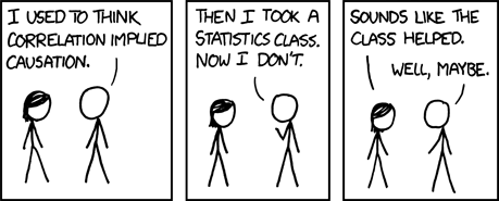
They are different – and this is super-important – in that changes in an independent variable are hypothesized to cause changes in the dependent variable, while the changes in a predictor variable are hypothesized to be associated with changes in the predicted variable, because correlation does not imply causation.
2.3 Summary Statistics
2.3.1 A Brief Divergence Regarding Histograms
The histogram22 is both one of the simplest and one of the most effective forms of visualizing sets of data. They will be covered at length on the page on data visualization, but a brief introduction here will be helpful tools for describing the different ways that we summarize data.
A histogram is a univariate23 visualization. Possible values of the variable being visualized are represented on the \(x\)-axis and the frequency of observations of each of those values are represented on the \(y\)-axis (this frequency can be an absolute frequency – the count of observations – or a relative frequency – the number of observations as a proportion or percentage of the total number of observations). The possible values represented on the \(x\)-axis can be divided into either each possible value of the variable or into bins of adjacent possible values: for example, a histogram of people’s chronological ages might put values like \(1, 2, 3, ..., 119\) on the \(x\)-axis, or it might use bins like \(0 - 9, 10 - 19, ..., 110-119\). There is no real rule for how to arrange the values on the \(x\)-axis, despite the fact that default values for binwidth and/or number of bins are built in to statistical software packages that produce histograms: it is up to the person doing the visualizing to choose the width of bins that best represents the distribution of values in a data set.
Here’s an example of a histogram:
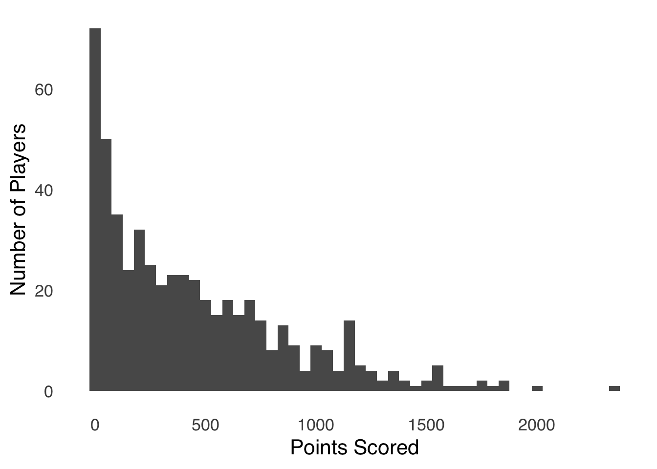
Figure 2.3: Histogram of Points Scored by Players in the 2019-2020 NBA Season
This histogram represents the number of points scored by each player in the 2019-2020 NBA season (data from Basketball Reference). Each bar represents the number of players who scored the number of points represented on the \(x\)-axis. The number of points are sorted into bins of 50, so the first bar represents the number of players who scored 0 – 50 points, the second bar represents the number of players who scored 51 – 100 points, etc. All of the bars in a histogram like this one are adjacent to each other, which is a standard feature of histograms that shows that each bin is numerically adjacent to the next. That layout implies that difference between one bar and the next is a difference in the grouping of the one variable – gaps between all of the bars (as in bar charts) imply a categorical difference between observations, which is not the case with histograms. Apparent gaps in histograms – as we see in Figure 2.3 between 1900 and 1950 and again between 2000 and 2300, are really bars with no height. In the case of our NBA players, nobody scored between 1900 and 1950 points, and nobody scored between 2000 and 2300 points.24
Again: histograms will be covered in more detail in the page on data visualization. For now, it suffices to say that histograms are a good way to see an entire dataset and to pick up on patterns. Thus, we will use a few of them to help demonstrate what we leave in and what we leave out when we summarize data.
2.3.2 Central Tendency
Central tendency25 is, broadly speaking, where a distribution of data is positioned. The central tendency of a dataset is similar to a dot on a geographic map that indicates a city’s position: while the dot indicates a central point in the city, it doesn’t tell you how far out the city is spread in each direction from that point, nor does it tell you things like where most of the people in that city live. In that same sense, the central tendency of a distribution of data gives an idea of the midpoint of the distribution, but doesn’t tell you anything about the spread of a distribution, or the shape of a distribution, or how concentrated the distribution is in different places.
So, the central tendency of a distribution is basically the middle of a distribution – but there are several ways to define the middle: each measure is a different way to tell the story of the center aspect of a distribution.
2.3.2.1 Mean
When we talk about the mean26 in the context of statistics, we are usually referring to the arithmetic mean of a distribution: the sum of all of the numbers in a distribution divided by the number of numbers in a distribution. If \(x\) is a variable, \(x_i\) represents the \(i^{th}\) observation of the variable \(x\), and there are \(n\) observations, then the arithmetic mean symbolized by \(\bar{x}\) is given by:
\[\bar{x}=\frac{\sum_{i=1}^n{x_i}}{n}.\] That equation might be a little more daunting than it needs to be.27
For example, if we have \(x=\{1, 2, 3\}\), then:
\[\bar{x}=\frac{1+2+3}{3}=2.\] The calculation for a population mean is the same as for a sample mean. In the equation, we simply exchange \(\bar{x}\) for \(\mu\) (the Greek letter most similar to the Latin m) and the lower-case \(n\) for a capital \(N\) to indicate that we’re talking about all possible observations (that distinction is less important and less-frequently observed than the distinction between Latin letters for statistics and Greek letters for parameters, but I find it useful):
\[\mu=\frac{\sum_{i=1}^Nx_i}{N}.\]
2.3.2.1.1 What the Mean Tells Us
- The mean gives us the expected value28 of a distribution of data. In probability theory, the expected value is the average event that could result from a gamble (or anything similar involving probability): for example, for every 10 flips of a fair coin, you could expect to get \(5~heads\) and \(5~tails\). The expected value is not necessarily the most likely value – in one flip of a fair coin, the expected value would be \(1/2~heads~and~1/2~tails\), which is absurd (a coin can’t land half-heads and half-tails) – but it is the value you could expect, on average, in repeated runs of gambles.
In the context of a variable \(x\), the expected value of \(x\) – symbolized \(E(x)\) – is the value you would expect, on average, from repeatedly choosing a single value of \(x\) at random. Let’s revisit the histogram of point totals for NBA players in the 2019-2020 season, now adding a line to indicate where the mean of the distribution lies:
## Warning: Using `size` aesthetic for lines was deprecated in
## ggplot2 3.4.0.
## ℹ Please use `linewidth` instead.
## This warning is displayed once every 8 hours.
## Call `lifecycle::last_lifecycle_warnings()` to see
## where this warning was generated.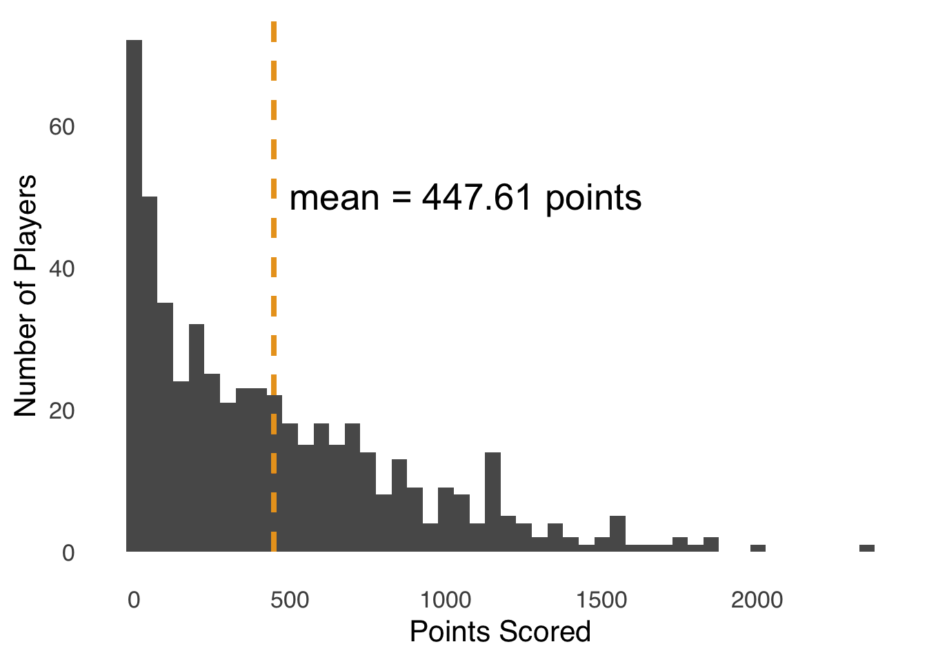
Figure 2.4: Histogram of Points Scored by Players in the 2019-2020 NBA Season; Dashed Line Indicates Mean Points Scored
On average, NBA players scored 447.61 points in the 2019-2020 season. Of course, nobody scored exactly 447.61 points – that’s not how basketball works. But, the expected value of an NBA player’s scoring in that season was 447.61 points: if you selected a player at random and looked up the number of points, occasionally you would draw somebody who scored more than 1500 points, and occasionally you would draw somebody who scored fewer than 50 points, but the average of your draws would be the average of the distribution.
For any given set of data \(x\), we can take a number \(y\) and find the errors29 between \(x_i\) and \(y\): \(x_i-y\). The mean of \(x\) is the number that minimizes the squared errors \(\left( x_i-y \right)^2\). For example, imagine you were asked to guess a number from a set of six numbers. If those numbers were \(x=\{1, 1, 1, 2, 3, 47\}\), if you guessed “2,” then you would be off by a little bit if one of the first five numbers were drawn, but you would be off by a lot –45 – if the sixth number were drawn, and that error would look even worse if you were judged by _the amount you were off were squared – \(45^2=2,025\). Now, you may ask, in what world would such a scenario even happen? Well, as it turns out, it happens all the time in statistics: when we describe data, we often have to balance our errors to make consistent predictions over time, and when our errors can be positive or negative and exist in a 2-dimensional \(x, y\) plane, minimizing the square of our errors becomes super-important (for more, see the page on correlation and regression).
Related to points (1) and (2), the mean can be considered the balance point of a dataset: for every number or number less than the mean, there is a number or are numbers greater than the mean to balance out the distance. Mathematically, we can say that:
\[\sum_{i=1}^n \left( x_i-\bar{x} \right)=0\] For those reasons, the mean is the best measure of central tendency for taking all values of \(x\) into account in summarizing a set of data. While that is often a positive thing, there are drawbacks to that quality as well, as we are about to discuss.
2.3.2.2 What the Mean Leaves Out
- The mean is the most susceptible of the measures of central tendency to outliers.30 In Figure 2.5, the gross revenue of major movie releases for the year 1980 are shown in a histogram. In that year, the vast majority of films earned betwee $0 and $103 million, with one exception…
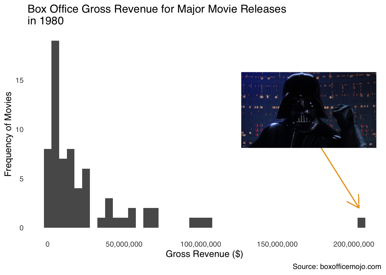
Figure 2.5: Luke, I am your outlier!
The exception was Star Wars Episode V: The Empire Strikes Back, which made $203,359,628 in 1980 (that doesn’t count all the money it made in re-releases), nearly twice as much as the second-highest grossing film (9 to 5, which is a really good movie but is not part of a larger cinematic universe). The mean gross of 1980 movies was $24,370,093, but take out The Empire Strikes Back and the mean was $21,698,607, a difference of about $2.7 million (which is more than 13% of 1980-released movies made on their own). The other measures of central tendency don’t move nearly as much: the median changes by $63,098 depending on whether you include Empire or not, and the mode doesn’t change at all.
We’re left with a bit of a paradox: the mean is useful because it can balance all values in a dataset but can be misleading because the effect of outliers on it can be outsized relative to other measures of central tendency. So is the mean’s relationship with extreme values a good thing or a bad thing? The (probably unsatisfying) answer is: it depends. More precisely, it depends on the story we want to tell about the data. To illustrate, please review a pair of histograms. Figure 2.6 is a histogram depicting the daily income in one month for an imaginary person who works at an imaginary job where they get paid imaginary money once a month.
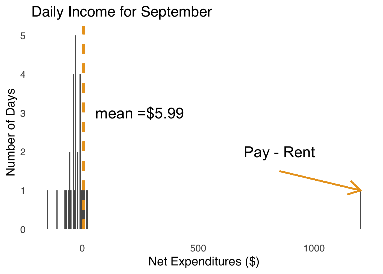
Figure 2.6: Daily Expenditures for a Real Month for an Imaginary Person
We can see that for 29 of the 30 days in September, this imaginary person has negative net expenditures – they spend more money than they earn – and for one day they have positive net expeditures (the day that they both get paid and have to pay the rent) – they earn much more than they spend. That day with positive net expeditures is the day of the month when they get paid. Payday is a clear outlier – it sits way out from the rest of the distribution of daily expenditures. But, if we exclude that outlier, the average daily expenditure for our imaginary person is $-35.19 and if we include the outlier, the average daily expenditure is $5.99 – the difference between our imaginary person losing money every month and earning money every month. Thus, in this case, using the mean with all values of \(x\) is a better representation of the financial experience of our imaginary hero.
Now, let’s look at another histogram, this one with a dataset of 2 people. Figure 2.7 is a histogram of the distribution of years spent as President of the United States of America in the dataset \(x=\{me, Franklin~Delano~Roosevelt\}\).
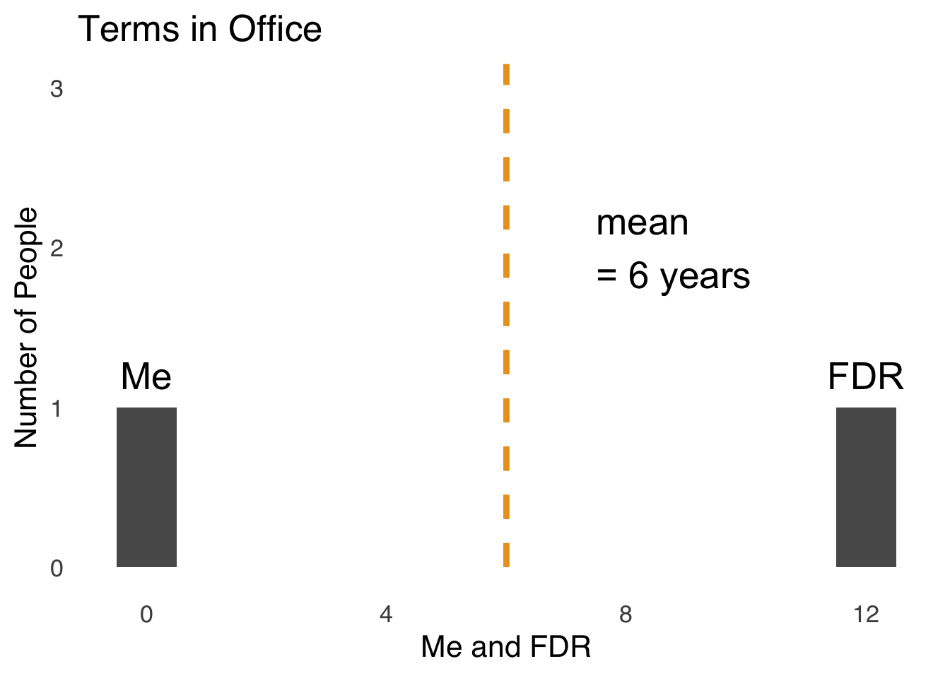
Figure 2.7: Terms Spent as US President: Me and Franklin Delano Roosevelt
Here is a case where using the mean is obviously misleading. Yes, it is true that the average number of years spent as President of the United States between me and Franklin Delano Roosevelt is six years. I didn’t contribute anything to that number: I’ve never been president and I don’t really care to ever be president. So, to say that I am part of a group of people that averages six years in office is true, but truly useless. Thus, some judgment is required when choosing to use the mean to summarize data.
- This is also going to be true of the median, and to a lesser extent the mode, but using the mean to summarize data leaves out information about the shape of the distribution beyond the impact of outliers. In Figure 2.8, we see three distributions of data with the same mean but very different shapes.
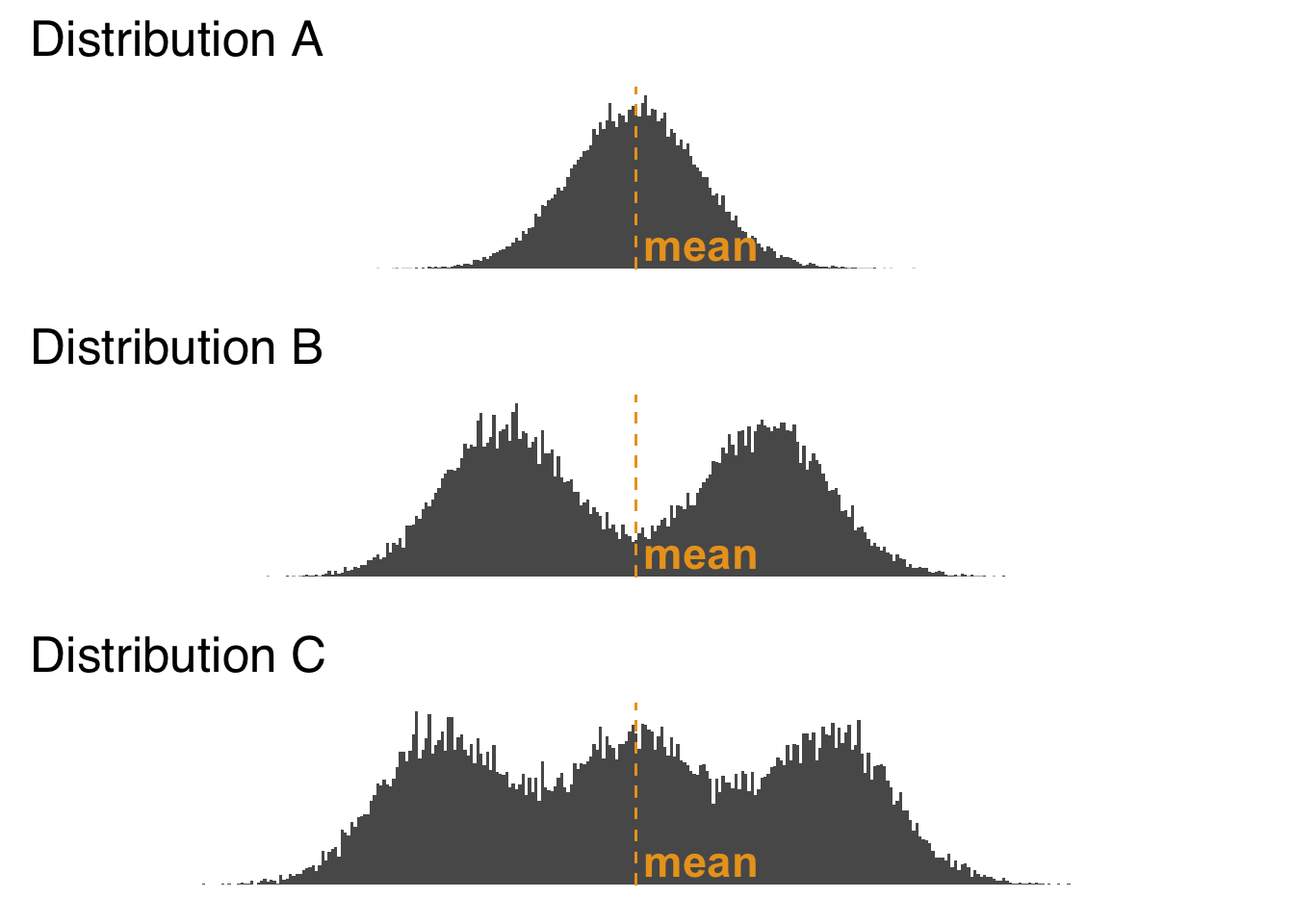
Figure 2.8: Histogram of Three Distributions with the Same Mean
As shown in Figure 2.8, Distribution A has a single peak, Distribution B has two peaks, and Distribution C has three peaks (the potential meanings of multiple peaks in distributions is discussed below in the section on the mode). But, you wouldn’t know that if you were just given the means of the three distributions. We lose that information when we go from a depiction of the entire distributions (as the histograms do visually) to a depiction of one aspect of the distributions – in this case, the means of the distributions. Information loss is a natural consequence of summarization 31: it happens every time we summarize data. It is up to the responsible scientist to understand which information is being lost in any kind of summarization (incidentally, histograms and other forms of data visualization are great ways to reveal details about distributions of data) and to choose summary statistics accordingly.
2.3.2.3 Median
The median32 is the value that splits a distribution evenly in two parts. If there are \(n\) numbers in a dataset, and \(n\) is odd, then the median is the \(\left( \frac{n}{2}+\frac{1}{2} \right)^{th}\) largest value in the set; if \(n\) is even, then the median is the average of the \(\left( \frac{n}{2}\right)^{th}\) and the \(\left( \frac{n}{2}+1 \right)^{th}\) largest values. That makes it sound a lot more complicated than it is – here are two examples to make it easier:
\[if~x=\{1, 2, 3, 4, 5\},\] \[then~median(x)=3\] \[if~x =\{1, 2, 3, 4\},\] \[then~median(x)=\frac{2+3}{2}=2.5\]
2.3.2.3.1 What the Median Tells us
- The median tells us more about the typical values of datapoints in a distribution than does the mean or the mode. For that reason, the median is famously used in economics to describe the central tendency of income – income can’t be negative (net worth can) so it is bounded by 0, and has no upper bound and thus is skewed very, very positively.33
The median is used for a lot of skewed distributions in lieu of the mean not only because it is more resistant to outliers than is the mean, but also because it minimizes the absolute errors made by predictions. By absolute errors we mean the absolute value of the errors \(|x_i-y|\), where \(y\) is the prediction and \(x_i\) is one of the predicted scores. Thus, when we use the median in the case of income, we are saying that representation is closer (positively or negatively) to more of the observed values than any other number.
- The median is the basis of comparison used in two important nonparametric tests: The Mann-Whitney \(U\) test and the Wilcoxon Signed-ranks test. It is used in those tests due to its applicability to both continuous data and ordinal data.
The median is also the basis of a set of analytic tools known as robust statistics, a field established to try to limit the influence of outliers and non-normal distributions. Robust statistics as a field is beyond the scope of this course, but I encourage you to read more if you are interested.
2.3.2.3.2 What the Median Leaves Out
Like the mean, the median does not tell us much about the shape of a distribution.
Outside of the field of Robust Statistics and certain nonparametric tests, the median, unlike the mean, is not a measure of central tendency used in classical statistical tests.
2.3.2.4 Mode
The mode34 The mode is the most likely value or values of a distribution to be observed. A distribution is unimodal if it has one clear peak, as in part a of Figure 2.9. A distribution is bimodal if it has two clear peaks, as in part b. Distributions with more than one peak are collectively known as multimodal distributions.
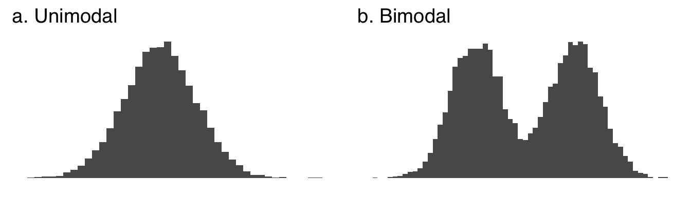
Figure 2.9: A Unimodal and a Bimodal Distribution
Multimodality itself is of great scientific interest. As we will cover at length when we discuss frequency distributions, unimodality is a common assumption regarding patterns of data found in nature. When multiple modes are encountered, it may be a sign that there are multiple processes going on – for example, the distribution of gas mileage statistics for a car will have different peaks for driving in a city (with lots of starts and stops that consume more gas) and for driving on the highway (which is generally more fuel-efficient). Multimodality can also suggest that there is actually a mixture of distributions in a dataset – for example, a dataset of the physical heights of people might show two peaks that reflect a mixture of people assigned male at birth and people assigned female at birth, two groups that tend to grow to different adult heights.
One note on multimodality: multiple peaks don’t have to be exactly as high as each other. Multimodality is more about a peaks-and-valleys pattern than a competition between peaks.
2.3.2.4.1 What the Mode Tells us
In a unimodal frequency distribution, the mode is the maximum likelihood estimate35 of a distribution. In terms of sampling, it’s the most likely value to draw from a distribution (because there are the most observations of it). In a multimodal distributions, the modes are related to local maxima of the likelihood functions. Don’t worry too much about that for now.
The mode minimizes the total number of errors made by a prediction. A nice example that I am stealing from my statistics professor is that of a proprietor of a shoe store. If you want to succeed in shoe-selling, you don’t want to stock up on the mean shoe size – that could be a weird number like 8.632 – nor on the median shoe size – being off by a little bit doesn’t help you a lot here – you want to stock up the most on the modal shoe size to fit the most customers.
Uniquely among the mean, median, and mode, the mode can be used with all kinds of continuous data and all kinds of discrete data. There is no way to take the mean or median of categorical data. You can but probably shouldn’t use the mean of rank data36 (the median is fine to use with rank data). Because the mode is the most frequent value, it can be the most frequent continuous value (or range of continuous values, depending on the precision of the measurement), the most frequent response on an ordinal scale, or the most frequent observed category.
Unlike the mean and the median, the mode can tell us if a distribution has multiple peaks.
2.3.2.4.2 What the Mode Leaves Out
Like the other measures of central tendency, the mode doesn’t tell us anything about the spread, the shape, or the height on each side of the peak of a distribution. There are some sources out there – and I know this because I have never said it in class nor written it down in a text but have frequently encountered it as an answer to the question what is a drawback of using the mode? – that say that the mode is for some reason less useful because “it only takes one value of a distribution into account.” That’s wrong for one reason – there can be more than one mode, so it doesn’t necessarily take only one value into account – and misleading for another: the peak of a distribution depends, in part, on all the other values being less high than the peak. To me, saying that the peak of a distribution only considers one value is like saying that identifying the winner of a footrace only takes one runner into account. I think the germ of a good idea in that statement is that we don’t know how high the peak of a distribution is, or what the distribution around it looks like, but that’s a problem with central tendency in general.
Although, related to that last part: the mode doesn’t really account for extreme values, but neither does the median.
2.3.3 Quantiles
Quantiles37 are values that divide distributions into sections of equal size. We have already discussed one quantile: the median, which divides a distribution into two sections of equal size. Other commonly-used quantiles are:
| Quantile Name | Divides The Distribution Into |
|---|---|
| Quintiles | Fifths |
| Quartiles | Fourths |
| Deciles | Tenths |
| Percentiles | Hundreths |
At points where quantiles coincide, their names are often interchanged. For example, the median is also known as the 50th percentile and vice versa, the first quartile is often known as the 25th percentile and vice versa, etc.
2.3.3.1 Finding quantiles
Defining the quantile cutpoints of a distribution of data is easy if the number of values in the distribution are easily divided. For example, if \(x=\{0, 1, 2, 3, ..., 100\}\), the median is \(50\), the deciles are \(\{10, 20, 30, 40, 50, 60, 70, 80, 90\}\), the 77th percentile is \(77\), etc.. When \(n\) is not a number that is easily divisible by a lot of other numbers, it gets a bit more complicated because there are all kinds of tiebreakers and different algorithms and stuff. The things that are important to know about finding quantiles are:
- We can use software to find them (for example, the R code is below),
- Occasionally, different software will disagree with each other and/or what you would get by counting out equal proportions of a distribution by hand, and
- Any disagreement between methods will be pretty small, probably inconsequential, and explainable by checking on the algorithm each method uses.
2.3.4 Spread
2.3.4.1 Range
The Range38 is expressed either as the minimum value of a variable and the maximum value of a variable (e.g._\(x\) is between \(a\) and \(b\)), or as the difference between the highest value in a distribution and the lowest value in a distribution (e.g., the range of \(x\) is \(b-a\)). For example:
\[x=\{0, 1, 1, 2, 3, 5, 8, 13, 21, 34, 55\}\] \[Range(x) = 55 – 0 = 55\]
The range is highly susceptible to outliers: just one weird min or max value can risk gross misrepresentation of the dataset. For that reason, researchers tend to favor our next measure of spread…
2.3.4.2 Interquartile Range
The Interquartile range39 is the width of the middle 50% of the data in a set. To find the interquartile range, we simply subtract the 25th percentile of a dataset from the 75th percentile of the data.
\[IQR=75th~percentile-25th~percentile\]
2.3.4.3 Variance
Variance40 is both a general descriptor of the way things are distributed (we could, for example, talk about variance in opinion without collecting any tangible data) and a specific summary statistic that can be used to evaluate data. The variance is, along with the mean, one of the two key statistics in making inferences.
There are two equations for variance: one is for a population variance parameter, and the other is for a sample variance statistic. Both equations represent the average squared error of a distribution. However, to apply the population formula to a sample would consistently underestimate the variance of a sample41 and thus an adjustment is made in the denominator.
2.3.4.3.2 Sample Variance
\[s^2=\frac{\sum{\left(x-\bar{x} \right)^2}}{n-1}\]
Aside from the differences in symbols between the population and sample equations – Greek letters for population parameters are replaced by their Latin equivalents for the sample statistics – the main difference is in the denominator. The key reason for the difference is related to the nature of \(\mu\) and \(\bar{x}\). For any given population, there is only one population mean – that’s \(\mu\) – but there can be infinite values of \(\bar{x}\) (it just depends on which values you sample). In turn, that means that the error term \(x-\bar{x}\) depends on the mean of the sample (which, again, itself can vary). That mean is going to vary a lot more if \(n\) is small – it’s a lot easier to sample three values with a mean wildly different from the population mean than it is to sample a million values with a mean wildly different from the population mean – so the bias that comes from using the population mean equation to calculate sample variance is bigger for small \(n\) and smaller for big \(n\).
To correct for that bias, the sample variance equation divides the squared errors not by the number of observations but by the number of observations that are free to vary given the sample mean. That sounds like a very weird concept, but hopefully this example will help:
If the mean of a set of five numbers is \(3\) and the first four numbers are \(\{1, 2, 4, 5\}\), what is the fifth number?
\[3=\frac{1+2+4+5+x}{5}\]
\[15=12+x\] \[x=3\]
This means that if we know the mean and all of the \(n\) values in a dataset but one, then we can always find out what that one is. In turn, that means that if you know the mean, then \(n-1\) of the values of a dataset are free to vary except one: that last one has to be whatever value makes the sum of all the values equal \(\bar{x}/n\).In general, the term that describes the number of things that are free to vary is degrees of freedom42, and for calculating a sample mean, the degrees of freedom – abbreviated df – is equal to \(n-1\), so that is the denominator we use for the sample variance.
On a technical note, the default calculation in statistical softwares is, unless otherwise specified, the sample standard variance. If you happen to have population-level data and want to find the population variance parameter, just multiply the result you get from the software by \((n-1)/n\) to change the denominator.
2.3.4.4 Standard Deviation
The standard deviation43 is the square root of the variance. It is a measure of the typical deviation (reminder: deviation = error = residual) from the mean (we can’t really say “average deviation from the mean,” because technically the average deviation from any mean is zero). The standard deviation has a special mathematical relationship with the normal distribution, which we will cover in the unit on frequency distributions when that kind of thing will make more sense.
As the standard deviation is the square root of the variance, there is both a population parameter for standard deviation – which is the square root of the population parameter for variance – and a sample statistic for standard deviation – which is the square root of the sample statistic for variance.
2.3.4.4.1 Population Standard Deviation
\[\sigma=\sqrt{\sigma^2}=\sqrt{\frac{\sum{\left(x-\mu \right)^2}}{N}}\]
2.3.4.4.2 Sample Standard Deviation
\[s=\sqrt{s^2}=\sqrt{\frac{\sum{\left(x-\bar{x} \right)^2}}{n-1}}\] As with the variance, the default for statistical software is to give the sample version of the standard deviation, so multiply the result by \(\sqrt{n-1}/\sqrt{n}\) to get the population parameter.
2.3.5 Skew
Like the variance, the skew44 or skewness is both a descriptor of the shape of a distribution and a summary statistic that can be used to evaluate the way a variable is distributed. Unlike the variance, the skewness statistic isn’t used in many statistical tests, so here we will focus more on skewness as a shape and less on skewness as a quantity.
The skew of a distribution be described in one of three ways. A positively skewed distribution has relatively many small values and relatively few large values, creating a distribution that appears to point in the positive direction on the \(x\) axis. Positive skew is often a sign that a variable has a relatively strong lower bound and a relatively weak upper bound – for example, we can again think of income, which has an absolute lower bound at 0 and no real upper bound (at least in a capitalistic system). A negatively skewed distribution has relatively few small values and relatively many large values, creating a distribution that appears to point in the negative direction on the \(x\) axis. Negative skew is a sign that a variable has a relatively strong upper bound and relatively weak lower bound – for example, the grades on a particularly easy test. Finally, a balanced distribution is considered symmetrical. Symmetry indicates a lack of bounds on the data or, at least, that the bounds are far enough away from most of the observations to not make much of a difference – for example, the speeds of cars on highways tend to be symmetrically distributed: even though there is an obvious lower bound (0 mph) and an upper bound on how fast commercially-produced cars can go (based on a combination of physics, cost, and regard for the safety of self and others), neither have much influence on the vast majority of observations.
Figure 2.10 shows examples of a positively skewed distribution, a symmetric distribution, and a negatively skewed distribution.
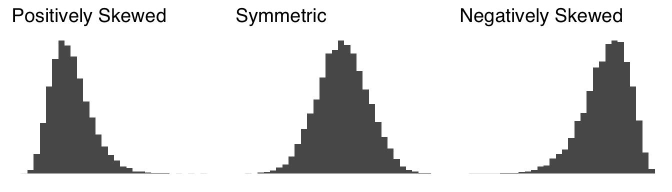
Figure 2.10: Distributions with Different Skews
When we talked about the mode, we talked about the peak (or peaks) of distributions. Here we will introduce another physical feature of distributions: tails45. A tail of a distribution is the longish, flattish part of a distribution furthest away from the peak. For a positively skewed distribution, there is a long tail on the positive side of the peak and a short tail or no tail on the negative side of the peak. For a negatively skewed distribution, there is a long tail on the negative side of the peak and a short tail or no tail on the postive side of the peak. A symmetric distribution has symmetric tails. We’ll talk lots more about tails in the section on kurtosis.
The term skewness is really most meaningful when talking about unimodal distributions – as you can imagine, having multiple peaks would make it difficult to evaluate the relative size of tails. If, for example, you have one relatively large peak and one relatively small peak, is the small peak part of the tail of the large peak? It’s best not to get into those kinds of philsophical arguments when describing distributions: in a multimodal distribution, the multimodality is likely a more important feature than the skewness.
2.3.5.1 Skewness statistics
As noted above, skewness can be quantified. The skewness statistic is rarely used, and if it is used, it is to note that negative values indicate negative skew and positive values indicate positive skew. So, let’s dive briefly into the skewness statistic (and the statistic parameter), and if you should ever need to make a statement about its value, you will know how it is calculated.
As with the variance and the standard deviation, there is an equation describing (mostly theoretical) population-level skewness and another equation describing sample skewness that includes an adjustment for bias in sub-population-level samples.
2.3.5.1.1 Population Skewness
The skewness of population-level data is given by
\[\widetilde{\mu}_3=E\left[ \left( \frac{x-\mu}{\sigma} \right)^3 \right]=\frac{\frac{1}{n}\sum(x-\mu)^3}{\sigma^3}\] with \(\widetilde{\mu}_3\) indicating that it is the standardized third moment of the distribution (for more on what that barely-in-English phrase means, please see the bonus content below) and \(\sigma\) is the standard deviation.
2.3.6 Kurtosis
Kurtosis46 is a measure of the lightness or heaviness of the tails of a distribution. The heavier the tails, the more extreme values (relative to the peak) will be observed. A light-tailed or platykurtic distribution will have very few extreme values. A medium-tailed or mesokurtic distribution will produce extreme values at the same rate as the normal distribution (which is the standard for comparison), and a heavy-tailed or leptokurtic will produce more extreme values than the normal distribution. An example of a platykurtic distribution, an example of a mesokurtic distribution, and an example of a leptokurtic distribution are shown in Figure 2.11.
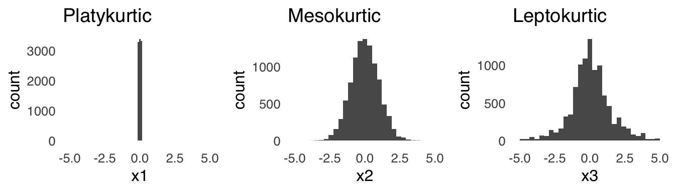
Figure 2.11: Distributions with Different Kurtosis
2.3.6.1 Kurtosis statistics
The kurtosis statistic is used even less frequently than the skewness statistic (this section is strictly for the curious reader). For a perfectly mesokurtic (read: a normal distribution), the kurtosis is 347.
2.3.6.1.1 Population Kurtosis
The kurtosis of population-level data is given by^[The excess kurtosis parameter is given by simply subtracting 3: \[\frac{\sum_{i=1}^N \left( x-\mu\right)^4 }{\left(\sum_{i=1}^N(x-\mu)^2 \right)^2 }-3\]
\[Kurtosis(x)=E\left[ \left( \frac{x-\mu}{\sigma}\right )^4\right]=\frac{\sum_{i=1}^N \left( x-\mu\right)^4 }{\left(\sum_{i=1}^N(x-\mu)^2 \right)^2 }\]
2.3.6.1.2 Sample Kurtosis
The kurtosis of sample data is given by^[The sample excess kurtosis is given by \[\frac{n(n+1)(n-1)}{(n-2)(n-3)}\frac{\sum_{i=1}^n\left(x_i-\bar{x} \right)^4}{s^4}-\frac{3(n-1)^2}{(n-2)(n-3)}\]
\[sample~kurtosis=\frac{n(n+1)(n-1)}{(n-2)(n-3)}\frac{\sum_{i=1}^n\left(x_i-\bar{x} \right)^4}{s^4}\] and that’s all we’ll say about that.
2.4 R Commands
2.4.3 mode
There is no built-in R function to get the mode (there is a mode() function, but it means something different). But, we can install the package DescTools to get the mode we’re looking for.
install.packages(DescTools)49
library(DescTools)
Mode()
## [1] 4
## attr(,"freq")
## [1] 4
2.4.4 quantiles
`quantile(array, quantile)
Example 1: 80th percentile of \(x\)
## 80%
##   5
Example 2: quartiles of \(x\)
## 25% 50% 75%
##   3   4   5
2.4.5 range
The range() command returns the endpoints of the range.
example:
## [1] 1 7to get the size of the range, you can use either range(x)[2]-range(x)[1] or max(x)-min(x)
## [1] 6## [1] 62.4.8 Skewness and kurtosis
Skewness and kurtosis are not part of the base R functions, so we will just need to install a package to calculate those (there are a couple packages that can do that, I just picked e1071).
install.packages(e1071)50
library(e1071)
skewness(x)
## [1] 0## [1] -0.96093752.5 Bonus Content
2.5.1 The mathematical link between mean, variance, skewness, and kurtosis
The mean, variance, skewness, and kurtosis of a distribution are all ways to describe different aspects of the distribution. They are also mathematically related to each other: each is derived using the method of moments, a really old idea (in terms of the history of statistics, which is a relatively young branch of math) that isn’t actively used much anymore (for reasons we’ll discuss in a bit). The basic idea of the method of moments is borrowed from physics: for a object spinning around an axis, the zeroth moment is the object’s mass, the first moment is the mass times the center of gravity, and the second moment is the rotational inertia of the object. When applied to a distribution of data, the \(rth\) moment \(m\) of a distribution of size \(n\) is given by:
\[m_r=\frac{1}{n}\sum_{i=1}^n \left(x_i-\bar{x} \right)^r\]
The mean is defined as the first moment, and the variance is defined as the second moment.
The skewness is the standardized third moment. The third moment by itself is in terms of the units of \(x\) – if \(x\) is pounds, the third moment is in pounds; if \(x\) is in volts, the third moment is in volts – and that doesn’t make a ton of sense when talking about the shape of a histogram (it would be weird to say that the distribution is skewed by three pounds to the left). So, instead, the third moment is standardized by dividing by the cube (to match the cube in the numerator) of the standard deviation (which is the variance to the power of \(3/2\)). Similarly, the kurtosis is the standardized fourth moment: the ratio of the fourth moment to the standard deviation to the fourth power (which is square of the variance, or, the second moment).
Statistic: a number that summarizes information about a sample.↩︎
Sample: a subset of a population↩︎
Population: the entirety of things (including people, animals, etc.) of interest in a scientific investigation↩︎
Parameter: a number that summarizes information about a population↩︎
Most importantly, whether we use fixed effects or random effects models – this is covered in the page on ANOVA and and will be discussed at length in PSY 208.↩︎
*there are probably exceptions, but I can’t really think of any right now↩︎
The word data is the plural of the word datum and should take plural verb forms but often doesn’t. It’s a good habit to say things like “the data are” and “the data show” rather than things like “the data is” and “the data shows” in scientific communication. It’s a bad habit to correct people when they use data as a singular noun: try to let that stuff slide because we live in a society.↩︎
Discrete: data with a limited set of values in a limited range.↩︎
Nominal or categorical Data: Data that refer to category membership or to names.↩︎
Data with relative values.↩︎
Data that can take on infinite values in a limited range (i.e. data with values that are infinitely divisible).↩︎
Interval data: Continuous data with meaningful mathematical differences between values.↩︎
Ratio data: Continuous data with meaningful differences between values and meaningful relative magnitudes among values.↩︎
_Cardinal (count) data:_Integers describing the number of occurrences of events↩︎
*trenchant TV criticism↩︎
_Proportion:_Part of a whole, expressed as a fraction or decimal↩︎
For a proportion \(p\) with \(n\) observations, the variance is equal to \(\frac{p(1-p)}{n}\) and the standard deviation is equal to \(\sqrt{\frac{p(1-p)}{n}}.\)↩︎
Binary (dichotomous) data: data that can take one of two values; those values are often assigned the values of either 0 or 1.↩︎
Independent variable: A variable in an experimental or quasiexperimental design that is manipulated.↩︎
Dependent variable: a variable in an experimental or quasiexperimental design that is measured↩︎
Predictor variable: A variable associated with changes in an outcome. Predicted (outcome) variable: A variable associated with changes in a predicted variable↩︎
Histogram: A chart of data indicating the frequency of observations of a variable↩︎
Univariate: having to do with one variable.↩︎
In case you’re interested: the two little bars at 1950 – 2000 points and at 2300 – 2350 points each represent single players: Damian Lillard (who scored 1,978 points) and James Harden (who scored 2,335 points). Congratulations, Dame and James!↩︎
Central tendency: a summarization of the overall position of a distribution of data.↩︎
Mean: generally understood in statistics to be the arithmetic mean of a distribution; the ratio of the sum of the values in a distribution to the number of values in that distribution.↩︎
There are other means than the arithmetic mean, most famously the geometric mean \[\left( \prod_{i=1}^nx_1 \right)^{\frac{1}{n}}\] and the harmonic mean \[\frac{n}{\sum_{i=1}^n\frac{1}{x_i}}.\] Both of those have important applications, but we won’t get to those in this course.↩︎
Expected value: the average outcome of a probabilistic sample space↩︎
Error: the difference between a prediction and an observed value, also known as residual and deviation↩︎
Outlier: a datum that is substantially different from the data to which it belongs.↩︎
Information loss is also a major theme of this page – it’s what the introduction was all about!↩︎
Median: The value for which an equal number of data in a set are less than the value and greater than the value, also known as the 50th percentile.↩︎
Let’s put income skew this way: if you put Jeff Bezos in a room with any 30 people, on average, everybody in that room would be making billions of dollars a year.↩︎
Mode: The most frequently-occurring value or values in a distribution of data.↩︎
Maximum Likelihood Estimate: the most probable value of observed data given a statistical model↩︎
The use of means and similar mathematical transformations including the variance and standard deviation with interval data is a matter of some debate. To illustrate, let’s imagine that you are asked to evaluate the quality of your classes on a 1 – 5 integer scale (you won’t have to imagine for long – it happens at the end of every semester at this university). The argument in favor of using the mean is that if one class has an average rating of 4.2 and another class has an average rating of 3.4, then of course the first class is generally preferred to the second and the use of means is perfectly legitimate. The argument against using the mean is that there is no way of knowing if, say, a rating of 2 indicates precisely twice as much quality as a rating of 1 or if the difference between a 3 and a 4 is the same as the difference between a 4 and a 5, and that the use of means implies continuity that isn’t there. For the record: I’m in the latter camp, and I would say just use the median or the mode.↩︎
Quantiles: values that divide the distributions into equal parts↩︎
Range: The difference between the largest and smallest values in a distribution of data.↩︎
Interquartile Range: The difference between the 75th percentile value and the 25th percentile value of a distribution of data; the range of the central 50% of values in a dataset.↩︎
Variance: A measure of the spread of a dataset equal to the average of the squared deviations from the mean of the dataset.↩︎
A statistic that is consistently wrong in the same direction is known as a biased estimator. The population variance equation is a biased estimator of sample variance.↩︎
Degrees of freedom (df): the number of items in a set that are free to vary.↩︎
Standard deviation: The typical deviation from the mean of the data set, equal to the square root of the variance.↩︎
Skew (or skewness): The balance of a distribution about its center↩︎
Tail(s): the area or areas of a distribution furthest from the peak.↩︎
Kurtosis: The relative sizes of the tails of a symmetric distribution.↩︎
Some prefer a kurtosis statistic that is equal to zero for a mesokurtic distribution and so sometimes you will see an excess kurtosis statistic that is recentered at 0↩︎
1.
c()is the combine command, which tells R to combine everything inside the parentheses into one object (in this case, an array called \(x\)). 2. The[1]is just an indicator that this is the first (and in this case, only) line of the results↩︎You only need to install a package once to your computer. After that, every time you start a new R session, you just have to call
library(insert package name)to turn it on. The best analogy I have encountered to describe the process is from Nathaniel D. Phillips’s book YaRrr! The Pirate’s Guide to R: a package is like a lightbulb –install.packages()puts the lightbulb in the socket and thenlibrary()turns it on.↩︎You only need to install a package once to your computer. After that, every time you start a new R session, you just have to call
library(insert package name)to turn it on. The best analogy I have encountered to describe the process is from Nathaniel D. Phillips’s book YaRrr! The Pirate’s Guide to R: a package is like a lightbulb –install.packages()puts the lightbulb in the socket and thenlibrary()turns it on.↩︎