Chapter 3 Visual Displays of Data
3.1 About this Page
All of the original visualizations on this page were made using R. Good visualization goes far beyond the software used to make it! Good visualization can be done with a pencil and paper, and it can certainly be done with all kinds of different packages. However, R happens to be an excellent software for data visualization because of all of the packages that have developed to work in R, so all of the packages and code used for the original figures are visible on this page.
3.1.2 Datasets Created for the Figures in This Chapter
## Figure 1
set.seed(77) #Setting a seed makes every random sample you take the same random sample, which is really helpful in this case because the data are the same each time the figures are rendered.

figure1data<-data.frame(rnorm(10000, 0, 1)) #rnorm = random values from a normal distribution
colnames(figure1data)<-"x"

## Figure 2
Data<-c(3.92, 3.30, 3.92, 3.60, 3.24, 3.22, 3.06, 3.37, 3.47, 3.79, 3.98, 3.73, 5.24, 4.09, 3.85, 2.75, 2.03, 1.55, 0.93, 1.16, 1.61, 3.24, 5.67, 6.06)
City<-c(rep("Boston", 12), rep("Seattle", 12))
Month<-rep(c("Jan", "Feb", "Mar", "Apr", "May", "Jun", "Jul", "Aug", "Sep", "Oct", "Nov", "Dec"), 2)

rainfall<-data.frame(City, Month, Data)


## Figure 3

boxplot1.df<-data.frame(rnorm(1000))
colnames(boxplot1.df)<-"data"

## Figure 4

condition1<-rnorm(1000, 4, 4)
condition2<-rnorm(1000, 8, 6)
values<-c(condition1, condition2)
labels<-c(rep("Condition 1", 1000), rep("Condition 2", 1000))
boxplot.df<-data.frame(labels, values)

## Figure 5

barchart.df<-boxplot.df

## Figure 6

barchart.df$sublabels<-c(rep("A", 500), rep("B", 500), rep("A", 500), rep("B", 500))

## Figure 7

samplehist.df<-data.frame(rnorm(10000))
colnames(samplehist.df)<-"x"

## Figure 8
x1<-rnorm(10000)
x2<-rnorm(10000, 3, 1)

### 8a
comp.hist.df<-data.frame(x1, x2)
### 8b
comp.hist.long<-data.frame(c(rep("Variable 1", 10000), rep("Variable 2", 10000)), c(x1, x2))

## Figures 9, 10, 11 use the data from Figure 5

## Figure 12
N <- 200 ### Number of random samples

### Target parameters for univariate normal distributions
rho <- 0.8
mu1 <- 1; s1 <- 2
mu2 <- 1; s2 <- 2

### Parameters for bivariate normal distribution
mu <- c(mu1,mu2) ### Mean
sigma <- matrix(c(s1^2, s1*s2*rho, s1*s2*rho, s2^2),
           2) ### Covariance matrix


scatterplot.df <- data.frame(mvrnorm(N, mu = mu, Sigma = sigma )) ### from MASS package
colnames(scatterplot.df) <- c("x","y")

## Figure 13 uses data from Figure 2

## Figure 14 uses data from The Office Season 5 Episode 9

## Figure 15
clrs <- fpColors(box="royalblue",line="darkblue", summary="royalblue")
labeltext<-c("Variable", "a", "b", "c", "d", "e")
mean<-c(NA, 0.2, 1.3, 0.4, -2.1, -2.0)
lower<-c(NA, -0.1, 0.7, 0, -2.4, -2.5)
upper<-c(NA, 0.5, 2, 0.8, -1.8, -1.3)

## Figure 16 is a reproduction

## Figure 17

county_full <- left_join(county_map, county_data, by = "id")

## Figure 18
edges = data.frame(N1 = c("A1", "A1", "A1", "B1", "B1", "B1"),
                   N2 = c("A2", "B2", "C2", "A2", "B2", "C2"),
                   Value = c(33, 33, 10, 21, 54, 13),
                   stringsAsFactors = F)

nodes = data.frame(ID = unique(c(edges$N1, edges$N2)), stringsAsFactors = FALSE)
nodes$x = c(1, 1, 2, 2, 2)
nodes$y = c(3, 2, 3, 2, 1)
rownames(nodes) = nodes$ID

## Figure 19 is a reproduction

## Figure 20

Values<-c(rchisq(10000, df=1),
          rchisq(10000, df=2),
          rchisq(10000, df=3),
          rchisq(10000, df=4),
          rchisq(10000, df=5),
          rchisq(10000, df=6),
          rchisq(10000, df=7),
          rchisq(10000, df=8),
          rchisq(10000, df=9),
          rchisq(10000, df=10),
          rchisq(10000, df=11),
          rchisq(10000, df=12))

df<-rep(1:12, each=10000)

small.multiple.df<-data.frame(df, Values)
3.2 Making the Audience Smarter

Figure 3.1: Edward Tufte (b. 1942)
Statistician, data scientist, sculptor, and painter Edward Tufte (pictured at right) is responsible for many of the advances in data visualization in the latter part of the 20th century and early 21st century and coined a lot of the vocabulary we will use to describe both good and bad elements of data visualization. One of his guiding principles, paraphrased, is that our goal in presenting statistical analysis is not to dumb down our content for the consumer but to make our audience smarter. Data visualization is an extension of summarization and categorization of data: it’s another tool we have to tell stories about science. It is our responsibility to use data visualization to help illustrate our stories. To that end, when we visualize data, we should try at all times to:
- include all relevant data,
- make clear what is important about the data,
- avoid extra items that may distract a reader, and
- not present the data in misleading ways.
When we share data, we are teachers of the content of our science, and good data visualization is one of our most powerful teaching tools. It’s also really easy to mislead and distract with bad data visualization: the responsibility lies with us to be effective and honest communicators.
3.3 Essentials of Good Visualization
Modern software is making it increasingly easy to create visualizations of all kinds of data.51 Regardless of the simplicity or complexity of figures, there are several principles that apply to all good data visualization.
3.3.1 Maximize the Data-ink Ratio
Data-ink ratio is one of Tufte’s contributions to our data visualization vocabulary. Data-ink (which, I guess now should also be called “data-pixels”) refers to all of the elements in a visualization that describe the data themselves, including: the bars in histograms and bar charts, the points in a scatterplot, the lines in a line plot, etc. There are other elements in figures that aren’t specifically the data but help to put the data in context: including axes, axis labels, arrows and annotations, and trendlines. The principle of maximizing the data-ink ratio reminds us to make as much of our figures about the data as possible.
For example, please see the pair of charts in Figure 3.2. Chart A is based on the house style of the magazine The Economist. It’s not bad! But, there are a few unnecessary elements. Please compare Chart A to Chart 1B: the exact same data are represented, and you lose nothing by removing the background color, nor by removing the horizontal gridlines, nor by removing the ticks on the axes, nor by removing the axis lines. In fact, we gain focus on the data in Chart B by removing all of the unnecessary elements. If possible, remove all of the elements that you can while maintaining all of the information necessary to understand the data, and when in doubt on whether to remove an element, go ahead and try your figure without it: you may find that it wasn’t as necessary as you thought.
lines<-ggplot(figure1data, aes(x))+geom_histogram(binwidth=0.1)+
  theme_economist()+
  ggtitle("A")
nolines<-ggplot(figure1data, aes(x))+geom_histogram(binwidth=0.1)+
  theme_tufte(ticks=FALSE, base_size=16, base_family="sans")+
  ggtitle("B")
keepitclean<-plot_grid(lines, nolines, ncol=2)
keepitclean 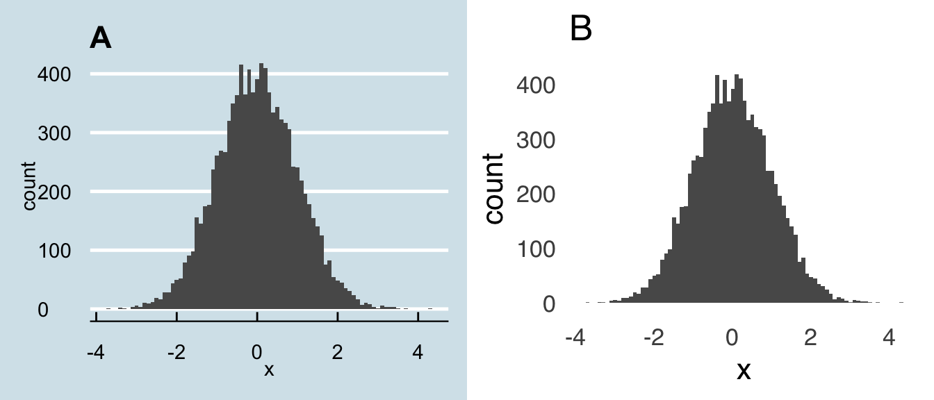
Figure 3.2: Keep it Clean!
So, how can we know precisely what the dimensions of our figures are without gridlines? How do we know exactly how high a bar is, or where exactly a point lies, without ticks on the axes for reference? Well, here’s the thing: you don’t need to know any of that stuff, because:
Figures are for patterns and comparisons.
If the reader needs to know precise values, put them in text and/or a table. The purpose of figures is not to show, for example, the means of two sets of data but to help people get an idea of the relative magnitudes of those means. Data visualizations that are meant to elicit careful examination from the reader – to ask the reader to stare really closely at a figure to discern tiny differences and distances from ticks and gridlines – are counterproductive because they make your story harder to understand instead of easier. Precision is important, but that’s what text and tables are for.
3.3.2 When Not to Visualize Data

Related to the above point, a single number does not necessitate data visualization. And yet: that’s exactly what’s happening with an \(x\) out of \(y\) figure like this:
Not only are such figures unnecessary, they’re often wrong: except in the rare case that a proportion is exactly \(9/10\), there has to be rounding involved. So, just use a number! If you want, you can make it really big to get people’s attention, like this:
90%
People are generally pretty good about understanding single values – there’s no reason to insult their intelligence (and potentially be inaccurate) with paper-doll-looking figures.
3.3.3 Lines and Angles
As a species, humans are pretty good at understanding the relative length of lines and pretty bad at discriminating between different angles. For that reason, a bar chart will always be preferable to a pie chart, a dotplot will always be preferable to a pie chart, an area plot will always be preferable to a pie chart, in fact, everything will be preferable to a pie chart – for more, please see the section on using pie charts below.
A close relative of the pie chart – and one with the same fundamental problem as the pie chart – is the donut chart. Here’s an example that I got from datavizcatalogue.com:
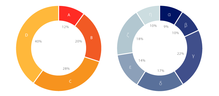
And here is its even more insidious cousin, the 3D donut chart (from amcharts.com):
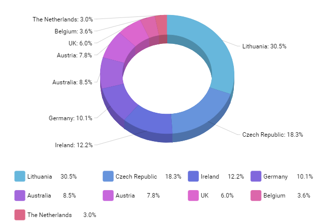
And here is an absolute monstrosity from slidemembers.com, look upon it and gaze into the face of pure evil:
As mentioned earlier, angles are hard enough for us to process. We gain nothing from seeing the side of a donut chart, or seeing it from multiple angles, or torn apart and reassembled. Don’t do any of that stuff. Which brings us to…
3.3.4 Ducks
Duck is another Tufte term – it refers to any kind of ornamentation on a figure that has no actual relevance to the data.

Figure 3.3: The Big Duck in Flanders, NY
Tufte got the term “duck” from the building pictured above. All of the ducky elements of the building are functionally useless: they are just for decoration (it used to be a place that sold ducks and duck eggs, now it’s a tourist attraction).
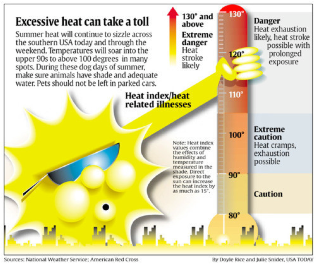
Ducks are found in a lot of popular publications – USA Today is a frequent offender and the most perfect example of the form is shown below – in the form of illustrations and other adornments. You can occasionally find them in scientific writing and reports: a shadow on a figure is a duck. An unnecessary third dimension and/or perspective on a figure is a duck. Don’t take attention away from the creative work that led to scientific discovery with creative work that hides the important information.
3.3.5 Annotations
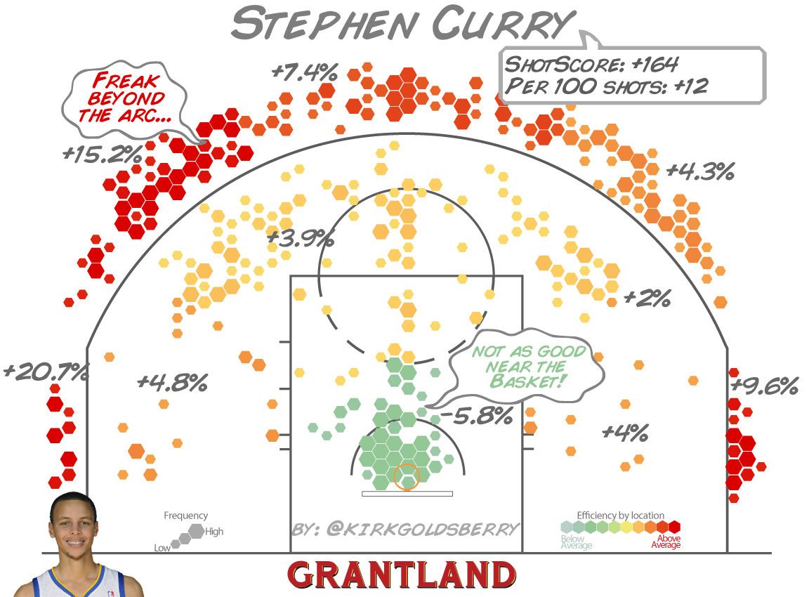
Not all additions to charts are ducks: some are quite useful. Annotations can help draw attention to the important parts of a visualization. NBA analyst (and one-time NBA executive, and geographer by training) Kirk Goldsberry does really nice work with annotation in his basketball-themed data visualizations, for example, this chart shows Stephen Curry’s shooting results from the 2012-2013 NBA season: with annotations on top of the patterns, he provides more information about the patterns in the data and calls attention to the main points.
The benefit of annotation can be as simple as replacing legends to improve readability. In Figure 3.4, the chart on the right uses annotations instead of the legend shown in the chart on the left.
rainfalla<-ggplot(rainfall, aes(x=Month, y=Data, group=City))+
  geom_line(aes(color=City))+
  geom_point(aes(color=City))+
  scale_x_discrete(limits=c("Jan", "Feb", "Mar", "Apr", "May", "Jun", "Jul", "Aug", "Sep", "Oct", "Nov", "Dec"), labels=c("J", "F", "M", "A", "M", "J", "J", "A", "S", "O", "N", "D "))+
  theme_tufte(base_size=12, ticks=FALSE, base_family="sans")+
  labs(x="Month", y="Average Rainfall in Inches")+
  theme(legend.position="bottom")+
  ggtitle("A")+
  ylim(0, NA)

rainfallb<-ggplot(rainfall, aes(x=Month, y=Data, group=City))+
  geom_line(aes(color=City))+
  geom_point(aes(color=City))+
  scale_x_discrete(limits=c("Jan", "Feb", "Mar", "Apr", "May", "Jun", "Jul", "Aug", "Sep", "Oct", "Nov", "Dec"), labels=c("J", "F", "M", "A", "M", "J", "J", "A", "S", "O", "N", "D "))+
  theme_tufte(base_size=12, ticks=FALSE, base_family="sans")+
  labs(x="Month", y="Average Rainfall in Inches")+
  theme(legend.position="none")+
  annotate("text", x=c(9, 11), y=c(3, 5.8), label=c("Boston", "Seattle"), hjust=1)+
  ggtitle("B")+
  ylim(0, NA)


plot_grid(rainfalla, rainfallb, nrow=1)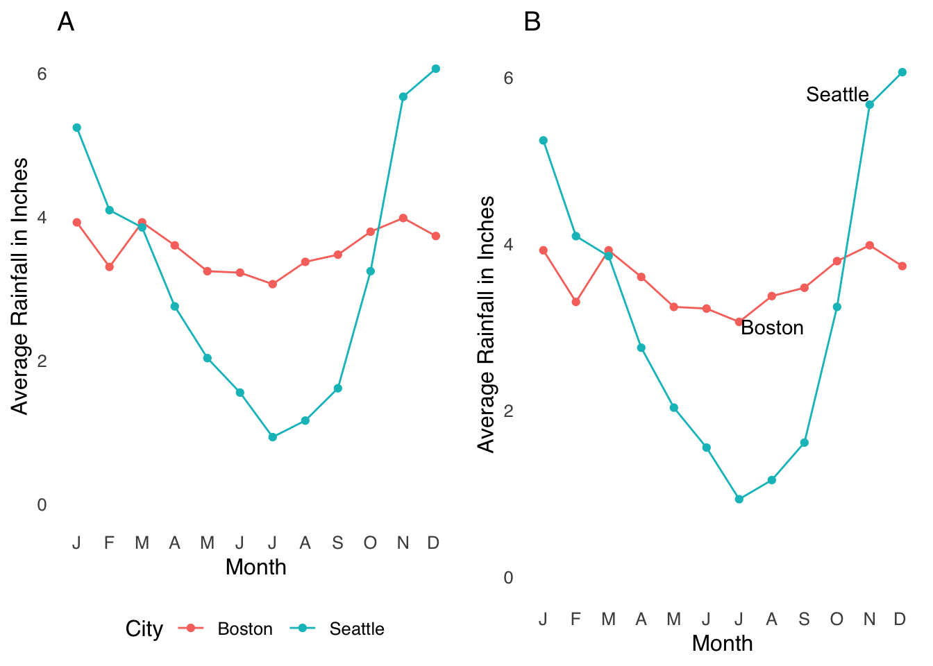
Figure 3.4: Making Legends Into Annotations
Replacing the legend with annotations reduces the effort the reader has to make52: their eyes don’t have to leave the lines of data. That may seem like an extremely small level of effort to be saving, but here’s an important fact about scientific writing:
Reading scientific writing is exhausting and every little bit of relief helps.
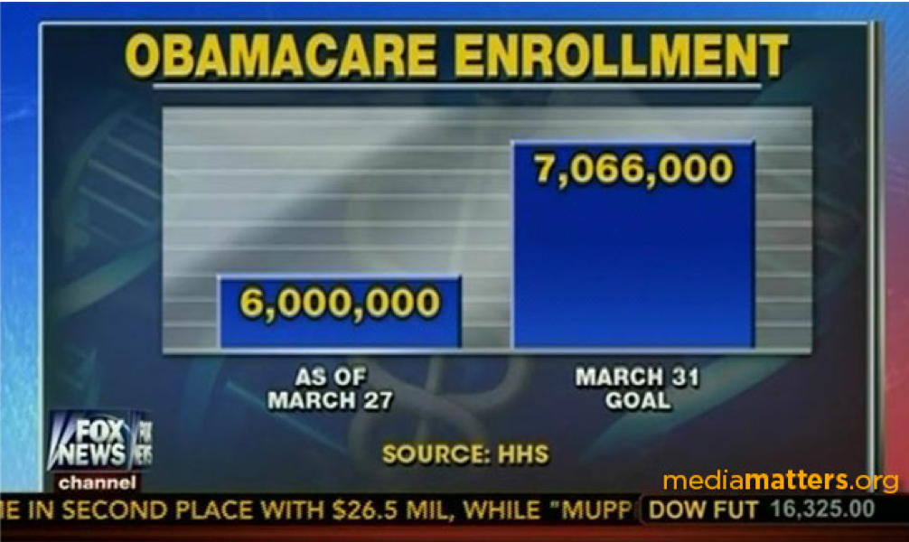
3.3.6 Lying
The classic example of misleading with data visualization is starting a \(y\)-axis at a value other than zero. For example, the following chart uses a \(y\)-axis that starts at 6,000,000 to exaggerate the differences between the two bars:
I had never thought of the possibility of messing with the \(x\)-axis to misrepresent data, but then, in the Spring of 2020, the State of Georgia showed us something new:
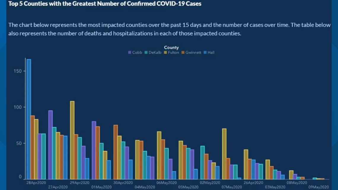
The Georgia Health Department used a color scheme that makes it hard to see the dates on the \(x\)-axis (obviously not the biggest problem here), but if you look closely you can see that the dates are not in chronological order, giving the impression that COVID-19 cases were steadily decreasing over time.
3.3.7 Colors
There is nothing I can write about the use of colors in data visualization that could possibly improve on this blog post by Lisa Charlotte Rost. Go read it.
3.3.8 Fonts
As noted above, the readers of scientific content are working hard, and any little bit you can do to give them a break is a good deed done. Sans serif fonts, generally speaking, are easier to read than serif fonts because they convey the same amount of information with less ornamentation.53 So, if given the choice, sans serif fonts are preferable. However, it’s also nicer-looking if the font in the figures matches the text of a document. I tend to think that mismatched fonts are jarring to the extent that it outweighs any benefit conferred by sans-serif fonts, so if you know your text is going to be, say, written in Times New Roman], I would use that in your figures as well.
3.4 Types of Visualization
Here we’re going to run through some of the more common and useful forms of data visualization. This is by no means an exhaustive list; in fact, there really is no exhaustive list of data visualizations because new ones can always be created. But, using relatively popular forms like the ones below (when appropriate) has the advantage of leveraging people’s experience with these forms for understanding your data, which will likely save your reader some cognitive effort.
3.4.1 Boxplots
The boxplot, also known as the box-and-whisker plot, is an invention of John Tukey – you may have heard of his post-hoc ANOVA test. The boxplot is a visual representation of summary statistics of a distribution of data. Because it’s Tukey’s invention, those summary statistics are usually (and by default in most statistics software) his preferred descriptors of distributions, which are based on quartiles.
The lines in a boxplot are labeled in Figure 3.5. The horizontal line across the box is usually the median and the lower and upper sides of the box are usually the 25th and 75th percentiles, respectively. The whiskers – those lines that extend on either side from the center of each box – represent a definition of the range of values not considered to be outliers. Following Tukey’s recommendations, the default in R is that the length of the top whisker is the difference between the 75th percentile and the observed value that is closest to 1.5 times the interquartile range plus the 75th percentile. In other words, the length of the line is approximately 1.5 times the interquartile range statistic: it can be a little more or less based on where the observed data lie. Then, the length of the lower whisker is the difference between the 25th percentile and the observed value that is closest to 1.5 times the interquartile range subtracted from the 25th percentile.
Any value in a dataset that falls outside of the whiskers is considered an outlier and is plotted individually.
ggplot(boxplot1.df, aes(y=data))+
  geom_boxplot()+
  theme_tufte(base_size=12, base_family="sans", ticks=FALSE)+
  labs(x="Dataset", y="Values")+
  theme(axis.text.x=element_blank(), axis.title.x=element_blank())+
  annotate("text", x=1.75, y=0, label="median", size=6)+
  annotate("text", x=c(-1.75, -1.75), y=c(-0.652, 0.667), label=c("25th\npercentile", "75th\npercentile"), size=6)+
  annotate("text", x=c(0.8, 0.8), y=c(-2.508464,2.560529), label=c("25th percentile\n- 1.5(IQR)", "75th percentile\n+ 1.5(IQR)"), size=6, hjust=0)+
    annotate("text", x=c(0.8, 0.8), y=c(-2.508464,2.560529), label=c("25th percentile\n- 1.5(IQR)", "75th percentile\n+ 1.5(IQR)"), size=6, hjust=0)+
  annotate("text", x=c(-0.8, -0.8), y=c(2.973052, -3.03701), label="outliers", size=6, hjust=1)+
  geom_segment(x=1.2, xend=0.5, y=0, yend=0, arrow=arrow())+
  geom_segment(x=-1.2, xend=-0.5, y=-0.652, yend=-0.652, arrow=arrow())+
  geom_segment(x=-1.2, xend=-0.5, y=0.667, yend=0.6667, arrow=arrow())+
  geom_segment(x=0.76, xend=0.05, y=2.560529, yend=2.560529, arrow=arrow())+
  geom_segment(x=-0.76, xend=-0.05, y=2.973052, yend=2.973052, arrow=arrow())+
  geom_segment(x=-0.76, xend=-0.05, y=-3.03701, yend=-3.03701, arrow=arrow())+
  xlim(-2, 2)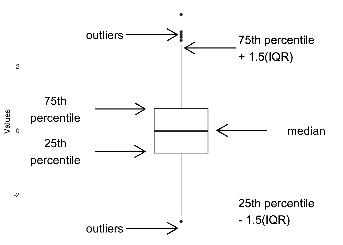
Figure 3.5: Anatomy of the Boxplot
It is possible to override the default values of the boxplot structure – you could, for example, plot the mean instead of the median, or use a different outlier definition – just remember that if you do so to make a clearly visible caption explaining any deviation from the standard definitions to your reader (actually, you might want to include a caption explaining the values even if you use the defaults, because they are hardly common knowledge).
Boxplots are useful because they present a simplified view of the shape of a distribution. For example, if the 25th percentile line is much closer to the median line than the 75th percentile line is, that’s an indicator that the smaller values are more bunched together and that the distribution has a positive skew. Boxplots are even more useful when we compare boxes between different datasets, as in the example in Figure 3.6. When we have boxes for multiple groups, we can easily compare the median of one group to another, the percentiles of one group to another, compare the outliers in each group to each other, etc.
ggplot(boxplot.df, aes(x=labels, y=values))+
  geom_boxplot()+
  theme_tufte(base_size=16, base_family="sans", ticks=FALSE)+
  labs(x="Condition", y="Values")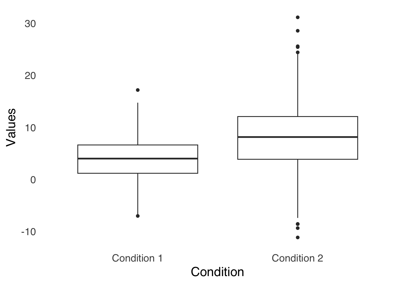
Figure 3.6: Boxplot of Two Groups of Data
3.4.2 Bar Charts
Like boxplots, bar charts are visualizations of summary statistics. Bar charts differ from boxplots because they tend to represent fewer summary stats than do boxplots: typically, they show means and sometimes indicate measures of variance about the means.
Figure 3.7 is a sample bar chart: each bar represents a mean. These are the same data used in Figure 3.6, so we can compare the bars to the boxplots above.
ggplot(barchart.df, aes(x=labels, y=values))+
  stat_summary(fun="mean", geom="bar")+
  stat_summary(fun.data="mean_se", geom="errorbar", width=0.25)+
  theme_tufte(base_size=16, base_family="sans", ticks=FALSE)+
  labs(x="Group", y="Values", caption="Error Bars Indicate Standard Error")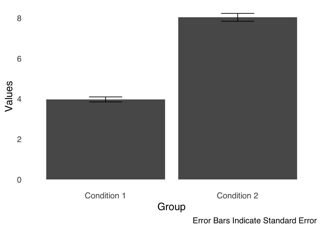
Figure 3.7: A Sample Bar Chart
The bars in Figure 3.7 allow us to compare the means of the two groups. Overlain on the tops of the bars are error bars, which are used to give some idea of the uncertainty of the measurement on each bar. In this case, the length of the part of the error bar above the mean and the length of the part of the error bar below the mean are each equal to the standard error of the mean (which will be discussed at length in the page on differences between two things. Essentially, an error bar is saying the bar is our estimate of the statistic based on our data, but given repeated measurement the statistic could likely be anywhere in this range. The best practice for bar charts is always to include error bars to give context to your data.
Figure 3.8 shows a common variation on the simple bar chart: the grouped bar chart. In this type of chart, we group bars together for easy comparison: for example, in two experiments with two conditions in each experiment, it makes sense to use two groups of two bars (with error bars on each bar, naturally).
ggplot(barchart.df, aes(x=labels, y=values, fill=sublabels))+
  stat_summary(fun="mean", geom="bar", position="dodge")+
  stat_summary(fun.data="mean_se", geom="errorbar", width=0.25, position=position_dodge(width=0.9))+
  theme_tufte(base_size=16, base_family="sans", ticks=FALSE)+
  labs(x="Group", y="Values", caption="Error Bars Indicate Standard Error")+
  scale_fill_discrete(name="Subgroup")+
  theme(legend.position="bottom")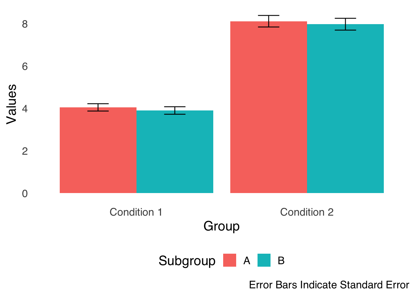
Figure 3.8: A Sample Grouped Bar Chart
3.4.3 Histograms
Histograms, as described in the page on categorizing and summarizing information, are simple and effective ways of showing the entire distribution of a single variable in visual form. The bars of a histogram represent on the \(y\)-axis the frequency or proportion (either is fine but make sure you label which one you’re using on the \(y\)-axis!) of values in ranges – known as bins – defined on the \(x\)-axis. The bars on a histogram are adjacent to each other, indicating that membership in a bin is based only on the way the bins are defined: values in one bin are greater than the values in the bin on the left and less than the values in the bin on the right but are not categorically different (as they are in bar charts). Apparent gaps in the \(x\)-axis indicate that there are no values in the data that fit that bin (but the bin is still there). An example histogram is shown in Figure 3.9:
ggplot(samplehist.df, aes(x))+
  geom_histogram(binwidth=0.1)+
  theme_tufte(base_size=16, base_family="sans", ticks=FALSE)+
  labs(x="Variable Values", y="Frequency")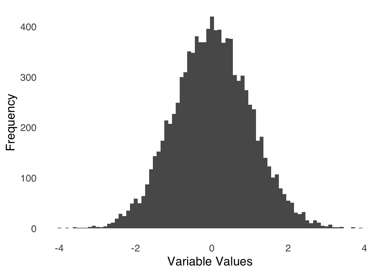
Figure 3.9: Sample Histogram
Visualizing the data in Figure 3.9 shows us that the distribution of the variable is roughly symmetric, with a peak around 0 and tails reaching to \(-4\) and \(4\). There are relatively many observations between \(-1\) and \(1\) and relatively few less than \(-2\) or greater than \(2\).
Sometimes, it is helpful to compare histograms (in the same way we compare boxplots). Figure 3.10 depicts two ways to compare two histograms: in Chart A, the histograms are stacked (with the same \(x\)-axis for proper comparison); in Chart B, the histograms are overlaid.
set.seed(77)

colnames(comp.hist.long)<-c("Variable", "Values")
hist1<-ggplot(comp.hist.df, aes(x1))+
  geom_histogram(binwidth=0.1)+
  theme_tufte(base_size=12, base_family="sans", ticks=FALSE)+
  labs(x="Values of Variable 1", y="Frequency")+
  scale_x_continuous(limits = c(-4, 7))+
  ggtitle("A: Stacked")

hist2<-ggplot(comp.hist.df, aes(x2))+
  geom_histogram(binwidth=0.1)+
  theme_tufte(base_size=12, base_family="sans", ticks=FALSE)+
  labs(x="Values of Variable 2", y="Frequency")+
  scale_x_continuous(limits = c(-4, 7))+
  ggtitle(" ")

stacked_hist<-plot_grid(hist1, hist2, nrow=2)

overlay.hist<-ggplot(comp.hist.long, aes(Values, fill=Variable))+
  geom_histogram(alpha=0.5, position="identity")+
  theme_tufte(base_size=12, base_family="sans", ticks=FALSE)+
  labs(x="Values", y="Frequency")+
  theme(legend.position="bottom")+
  scale_fill_manual(values=c("dodgerblue3", "gray40"))

plot_grid(stacked_hist, overlay.hist+ggtitle("B: Overlain"), nrow=1)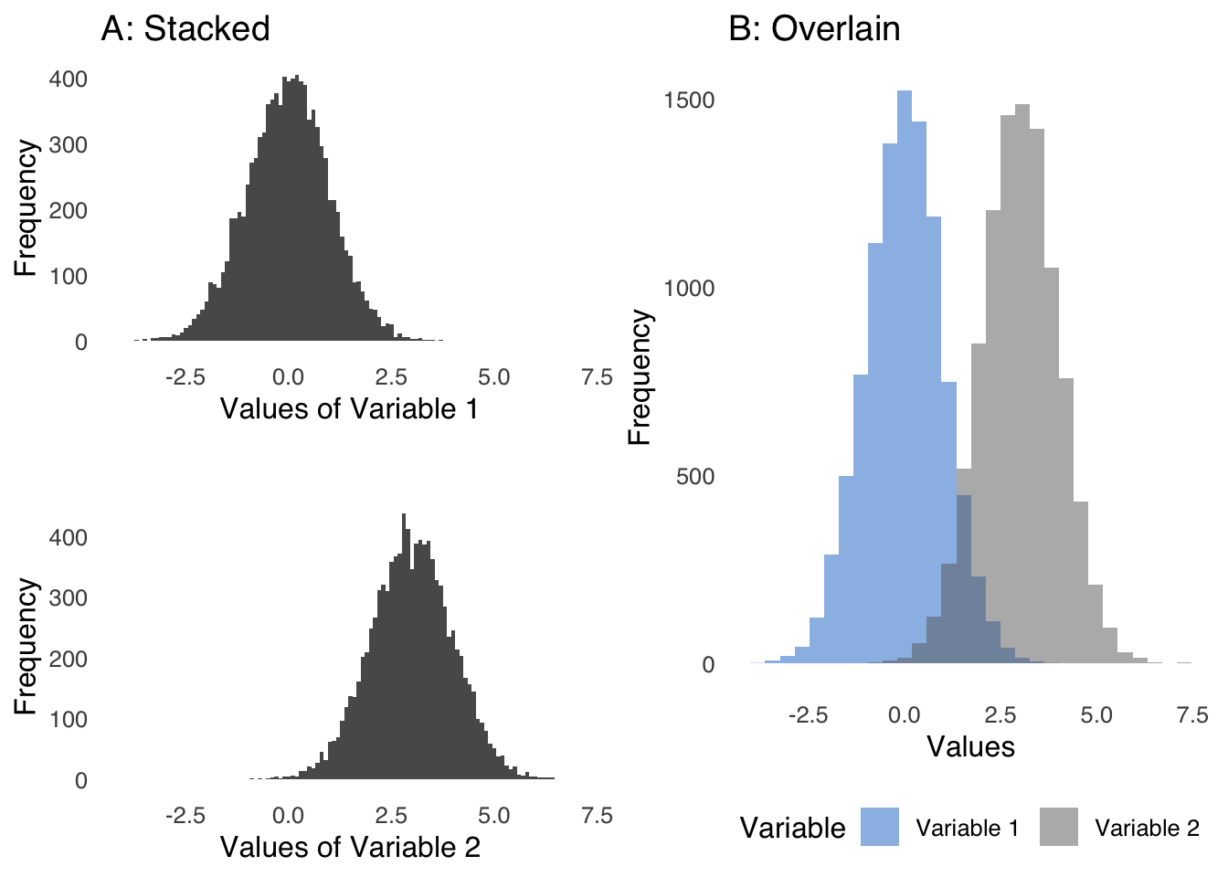
Figure 3.10: Two Forms of Comparative Histograms
3.4.4 Combining Histogram Elements with Bar Chart Elements
As noted above, bar charts are based on summary statistics, and as discussed at length in the page on categorizing and summarizing information, the act of summarizing invariably involves information loss. Taken together, that means that while bar charts are great for comparing a few aspects of different groups of data, a lot of details about those groups are lost.
There are several options that combine the benefits conferred by the shapes of histograms with bar charts. One method is known as a jitterplot, where the individual data points are represented by literal points. Figure 3.11 is an example using the data used to make the bar chart in Figure 3.7.
ggplot(barchart.df, aes(x=labels, y=values))+
  geom_jitter()+
  theme_tufte(base_size=16, base_family="sans", ticks=FALSE)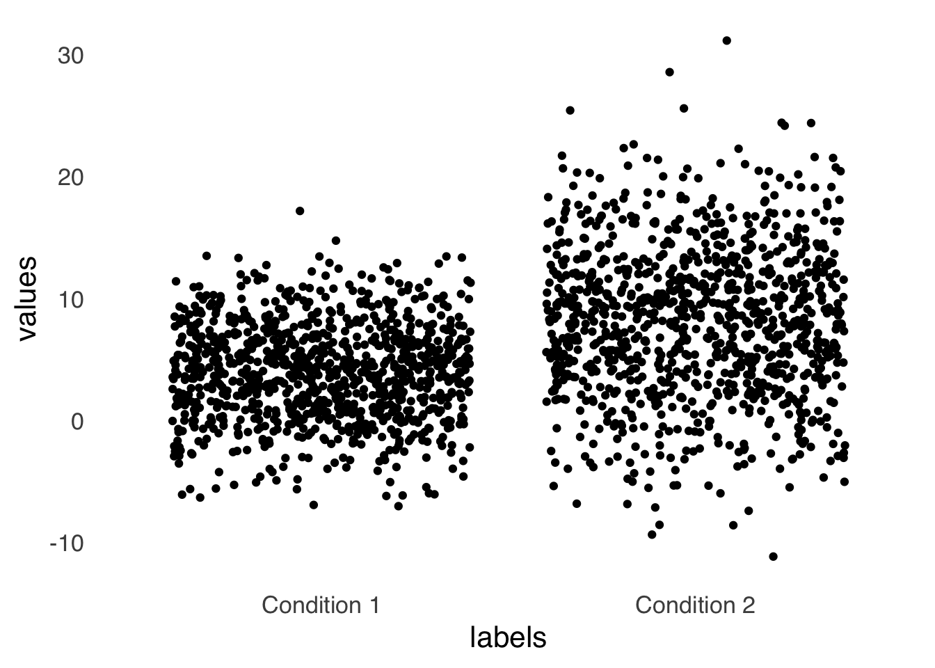
Figure 3.11: An Example Jitterplot
The jitterplot gives a visual representation of the dispersion of the data that may be more salient than error bars. One potential drawback of a jitterplot is that the horizontal distribution of the data is artificial – if multiple points in a dataset have the same value, a jitterplot forces them apart horizontally so that they don’t occupy the same space and all points are visible. Thus, the width adds another dimension that might overestimate the perception of data dispersion.
Another option is the violin plot. Like a jitterplot, a violin plot uses width to indicate concentration of data within a set. Figure 3.12 is an example violin plot, again using the same data as in Figure 3.7 and Figure 3.11:
ggplot(boxplot.df, aes(x=labels, y=values))+
  geom_violin()+
  theme_tufte(base_size=16, base_family="sans", ticks=FALSE)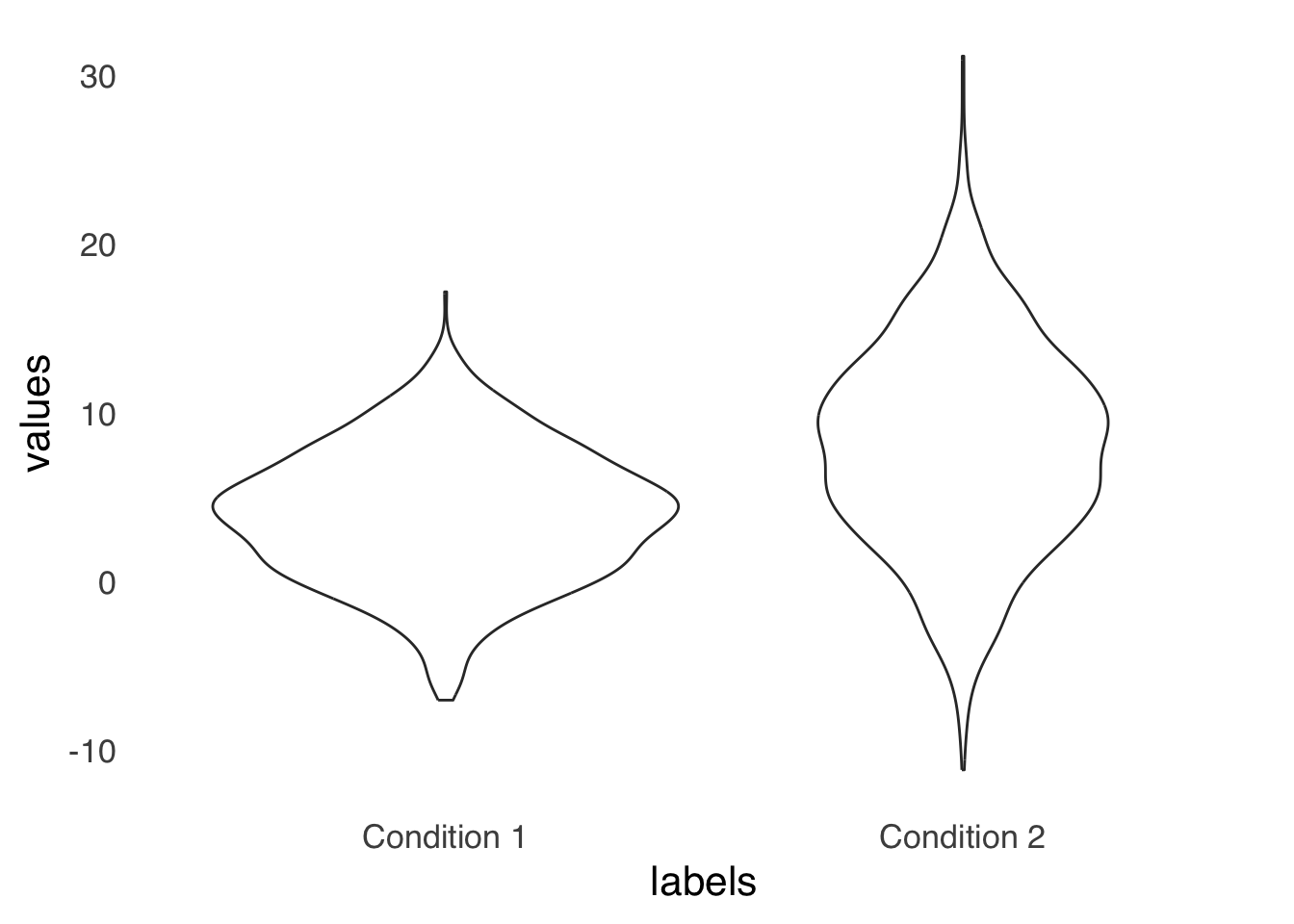
Figure 3.12: An Example Violin Plot
Violinplots share with jitterplots the problem of overestimating perceived dispersion via the addition of the dimension of width. For a violinplot, that issue can be ameliorated by using a half violin plot, as shown in Figure 3.13. By forcing all of the width to go in one direction, it makes comparing relative width easier.
ggplot(boxplot.df, aes(x=labels, y=values))+
  geom_violinhalf()+
  theme_tufte(base_size=16, base_family="sans", ticks=FALSE)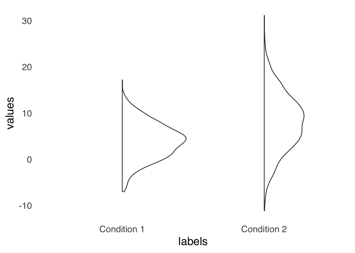
Figure 3.13: An Example Half-violin Plot
A final option is to use comparative histograms as in Figure 3.10. That tends to be my preferred option, but hey, people love bar charts.
3.4.5 Scatterplots
Scatterplots are visualizations of pairs of measurements. Each point in a scatterplot represents two measurements related to the same element: one measurement is represented by the \(x\)-coordinate and the other is represented by the \(y\) coordinate. Scatterplots are closely affiliated with the statistical analyses of correlation and regression: a line of best fit (also known as a least-squares regression line) is often included in scatterplots to highlight the predominant trend in the data, and that line is determined on the basis of correlation and regression analysis statistics. Figure 3.14 presents an example of a scatterplot with a line of best fit based on a linear regression model.
ggplot(scatterplot.df, aes(x=x, y=y))+
  geom_point()+
  geom_smooth(method="lm", se=FALSE)+
  theme_tufte(base_size=16, base_family="sans", ticks=FALSE)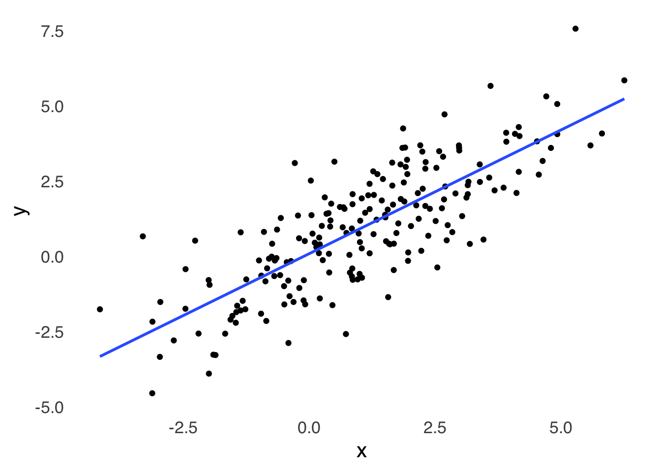
Figure 3.14: A Scatterplot of Randomly Generated Data with \(r \approx 0.8\) Between \(x\) and \(y\)
3.4.6 Line Charts
Line charts are most frequently time-series charts: they indicate change in a variable \(y\) across regularly spaced intervals of \(x\) (time is a natural candidate for \(x\)). An example line chart is depicted in Figure 3.15.
rainfallb+
  scale_x_discrete(limits=c("Jan", "Feb", "Mar", "Apr", "May", "Jun", "Jul", "Aug", "Sep", "Oct", "Nov", "Dec"), labels=c("J", "F", "M", "A", "M", "J", "J", "A", "S", "O", "N", "D "))
## Scale for x is already present.
## Adding another scale for x, which will replace the existing scale.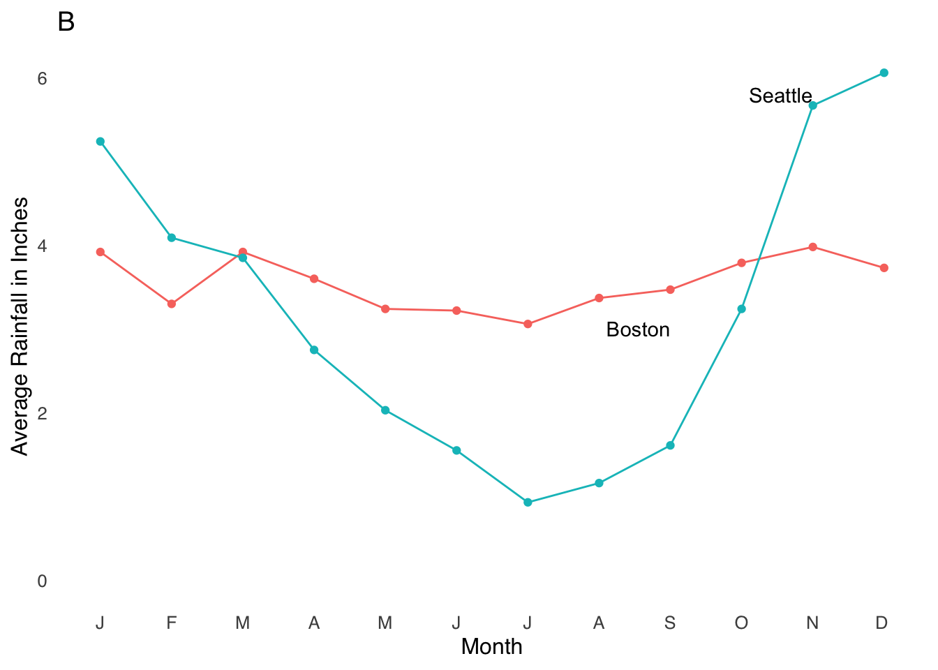
Figure 3.15: A Sample Line Chart Indicating Time Series
While line charts are fairly straightforward, I would recommend one bit of caution: watch out for the post hoc ergo propter hoc54 fallacy: just because event \(B\) comes after event \(A\) does not mean that \(A\) caused \(B\). While time-based charts help us put events in chronological context, we must always be aware that other factors may be at play.

3.4.8 Forestplots
Forestplots are kind of like box-and-whisker plots where the boxes are simpler and the whiskers get most of the attention. They are visualizations of interval estimates55. For example, Figure 3.17 shows interval estimates for five variables (labeled \(A\), \(B\), \(C\), \(D\), and \(E\)).
forestplot(labeltext, mean, lower, upper, xlab="Bars indicate confidence intervals",col=clrs, boxsize = 0.5, txt_gp = fpTxtGp(cex=2))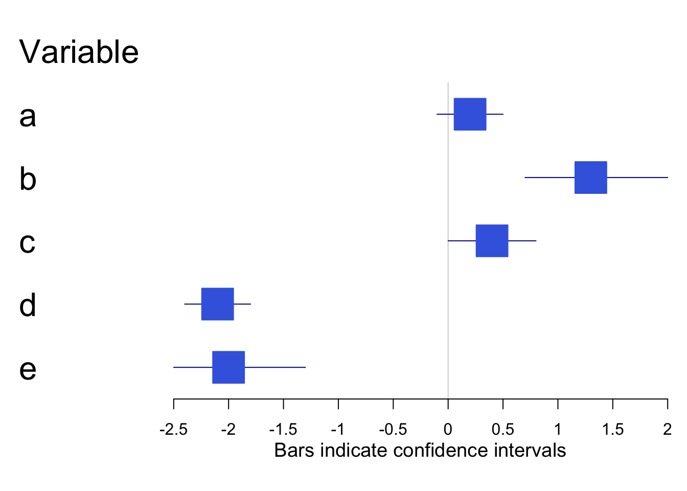
Figure 3.17: Sample Forestplot
3.4.9 Heatmaps
Heatmaps use different hues to indicate patterns of intensity. They are useful for visualizing data that vary by region – if you were to make a heatmap of the places in your home where you spend the most time, and you’re like me, you might have a high-intensity area on your favorite part of the couch and areas of slightly lower intensity on either side of your favorite part of the couch.
The combination of spatial data and intensity data make heatmaps well-suited to visualizing functional magnetic resonance imaging (fMRI) data. In mapping the flow of oxygenated blood to parts of the brain that are active during tasks of interest, fMRI data shows which regions are most intensely activated during a task, those which are somewhat less activated, and those that are not activated at all (relative to baseline activity, that is. For example, Figure 3.18, taken from an article on brain activity in songbirds indicates the areas of the brains of finches that respond to auditory stimuli (the article describes how you get the bird into the brain scanner, if you’re curious). The white areas indicate more intense activation, and the red areas indicate less intense responses.
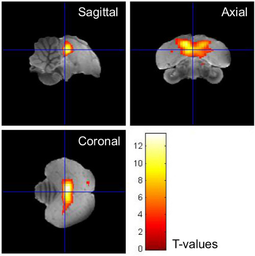
Figure 3.18: Sample Heatmap from fMRI Data
3.4.10 Choropleth maps
Choropleth maps are visualizations of data with geographic components.^[Choropleth is a word invented in the 20th century made by combining the Greek words for (approximately) “place” and “many things” (the “pleth” is the same root as in the word “plethora”). One of my all-time favorite choropleth maps is this one from Maps by Nik that shows all of the areas in the United States where nobody lives:
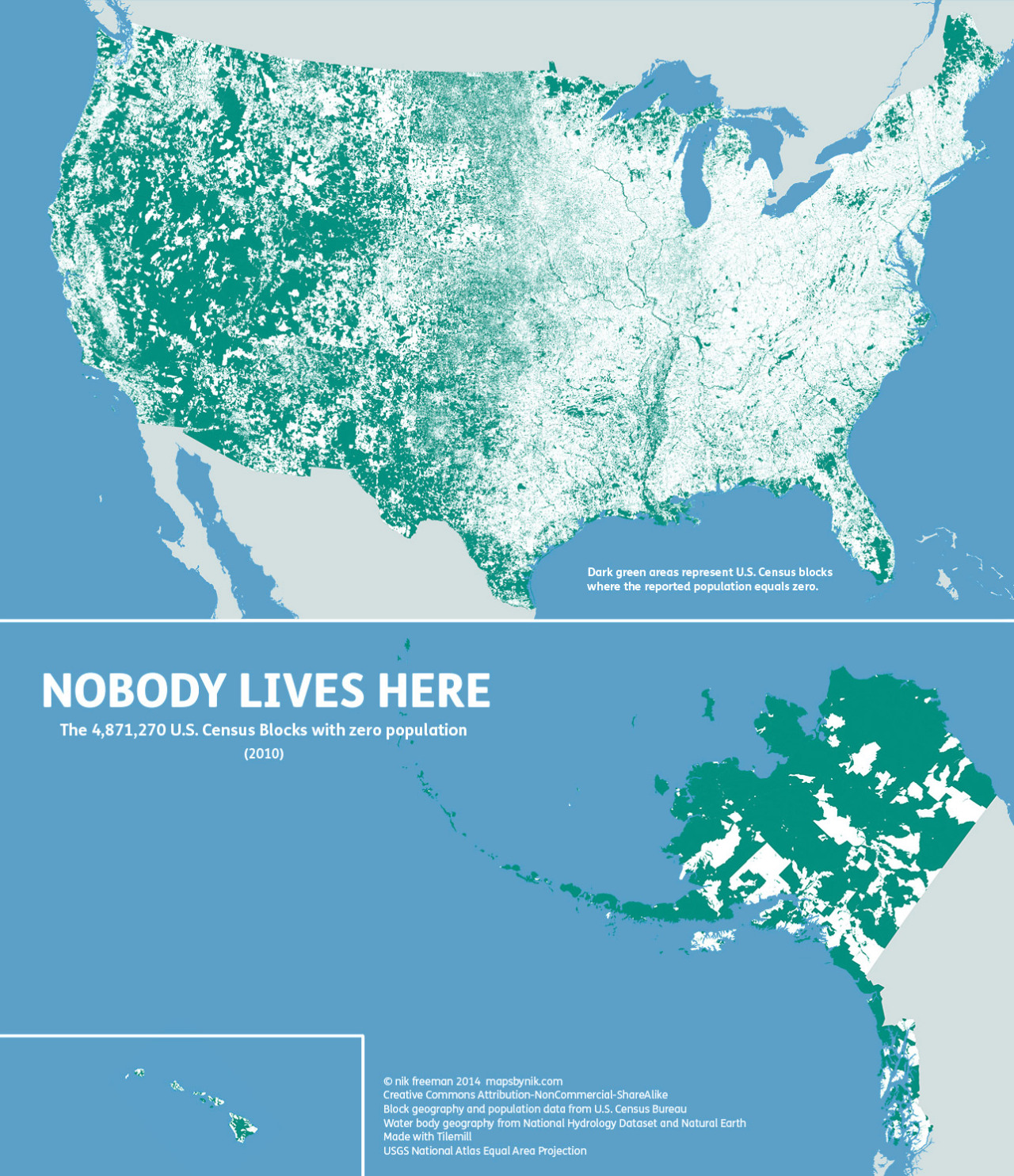
Choropleth maps have excellent data-ink ratios. Choropleth maps can show millions of bits of data in addition to all of the geographic coordinates needed to place them. They’re also, relative to other data visualizations, pretty to look at. However, some restraint must be exercised when using maps to visualize geographic data.
3.4.10.1 Three Cautionary Points About Maps
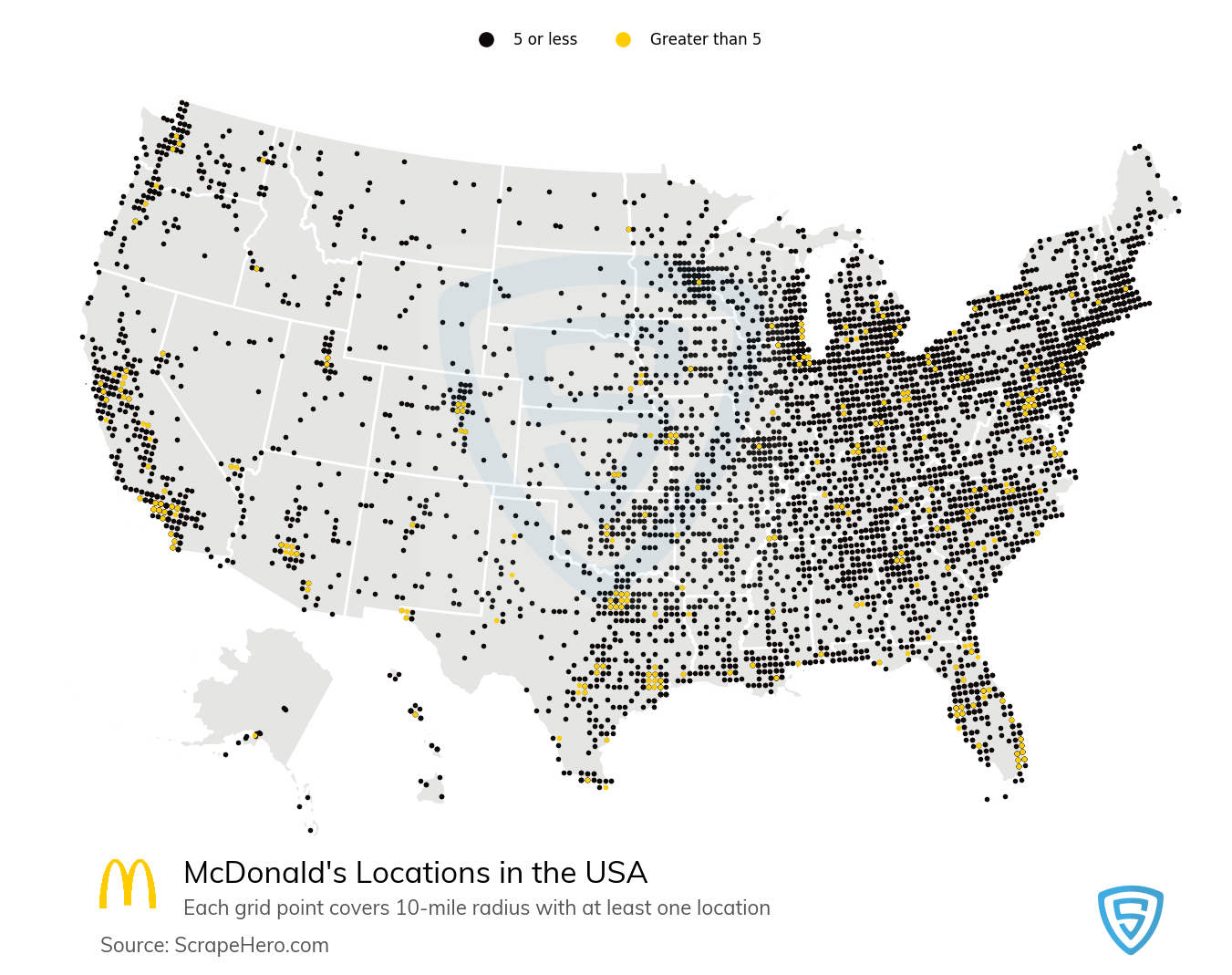
- Things Tend to Happen Where The People Are
Here is a map, courtesy of ScrapeHero.com, of the locations of the 13,816 McDonald’s locations in the United States as of September 1, 2020:
Here is another map, this one of the locations of Hospitals in the USA according to 2017 data from the American Hospital Association:
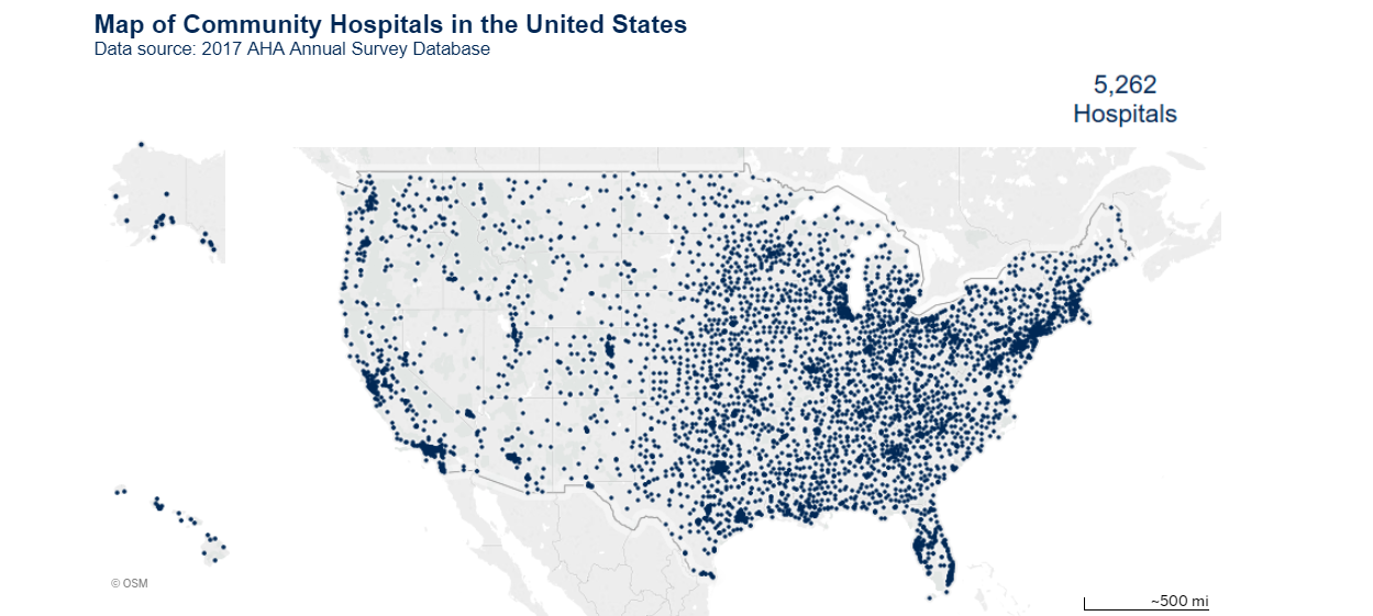
Those maps look suspiciously similar! Are they building hospitals near places with lots of McDonald’s locations? Like, is McDonald’s food so unhealthy that there is higher demand for health services? IS THERE A CONSPIRACY BETWEEN BIG FAST FOOD AND BIG HOSPITAL?

No. No, there is not. There is a clear mediating variable, and it’s population density. Figure 3.19 is a map of population density in the United States:
p <- ggplot(data = county_full,
            mapping = aes(x = long, y = lat,
                          fill = pop_dens,
                          group = group))

p1 <- p + geom_polygon(color = "gray90", size = 0.05) + coord_equal()

p2 <- p1 + scale_fill_viridis_d(labels = c("0-10", "10-50", "50-100", "100-500",
                                        "500-1,000", "1,000-5,000", ">5,000"),
                                direction = 1, option = 'A')+
  theme_tufte(base_size=12, base_family="sans", ticks=FALSE)+
  labs(fill="Population per Square Mile")+
  theme(legend.position="bottom", axis.text=element_blank(), axis.title=element_blank())

p2 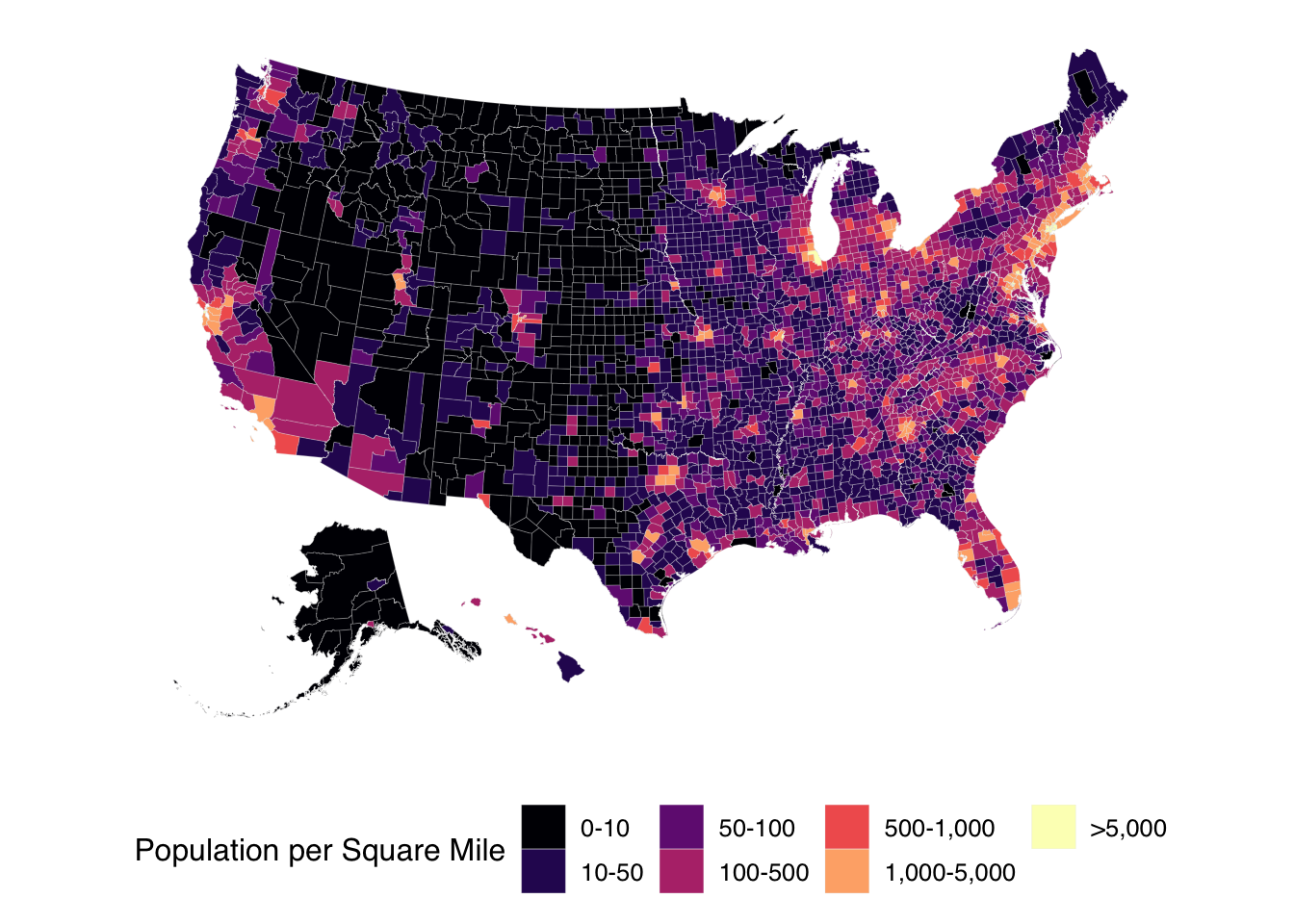
Figure 3.19: Population Density in the USA
Any good map involving demographic information has to take population patterns into account; to not do so is a form of base rate neglect. We as media consumers have to take population patterns into account when presented with geographic information, too, for example: be wary of any assertion that Los Angeles County has the most of anything because LA County is by far the most populous county in the USA.
- Not Everything is a Weather Map
Statistical maps are designed to indicate patterns. It is tempting to infer things like spread or contagion between regions. In the case of a weather map, this is a reasonable thing to do. For example, here is a sample weather map for the United States on September 13, 2020:
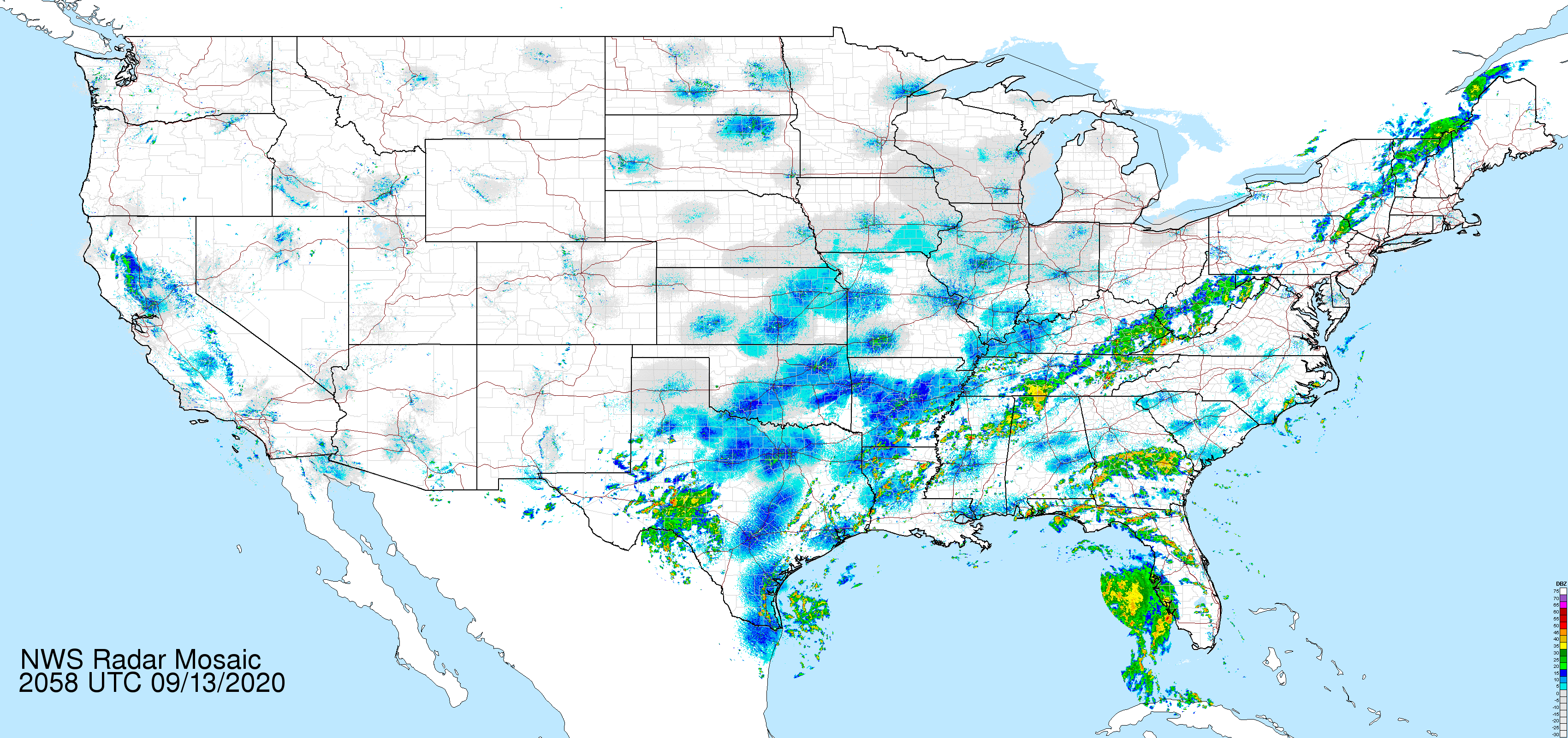
From a weather map, we can learn things about local climates and make inferences about future weather events; for example: the weather in New York City at any given time is a good predictor of the weather in Boston a few hours later.
However, there are lots of things that don’t spread like weather. Below is a map from the US Census indicating the rate of uninsured individuals by state. This is a good example of how policy differences aren’t necessarily predictable between neighboring entities. In the map below, we can see that Arkansas has a low rate of uninsured people relative to neighboring states, particularly Oklahoma, Texas, and Mississippi – all of which, unlike Arkansas, have rejected the expansion of Medicaid, the federally-funded insurance program for low-income and/or disabled individuals. For somebody who is quite familiar with the locations of US states on a map, a map like this might serve as an easy-to-read reference, but it is misleading to think of the uninsured rate as a feature of geography, as things like climate, latitude, proximity to bodies of water, etc. are far less relevant than local policy initatives that alter conditions based on state boundaries.
 [Source: U.S. Census Bureau]
- Maps, themselves, can be misleading.
Maps are a 2D representation of a 3D world, and as such require distortion. For relatively small areas of the world, this isn’t a huge problem: a city map isn’t too much affected by the distortion involved in representing a 3D surface with a 2D one. On the scale of countries and of the world, though, the choice of distortion used to flatten the Earth can lead to serious misrepresentations.
Famously, the Mercator Projection wildly overestimates the surface area of the Earth close to the poles relative to the area of the Earth close to the Equator. As a result, the areas of countries in Europe and North America look much bigger relative to countries in Asia, Africa, and South America. The Mercator Projection is useful for navigation because it preserves shapes and directions – good for 16th century sailors – and promotes a Eurocentric view of the world – bad for the truth. Please compare below the Mercator Projection on the left with the Gall-Peters Projection on the right, which preserves the relative areas of landmasses.
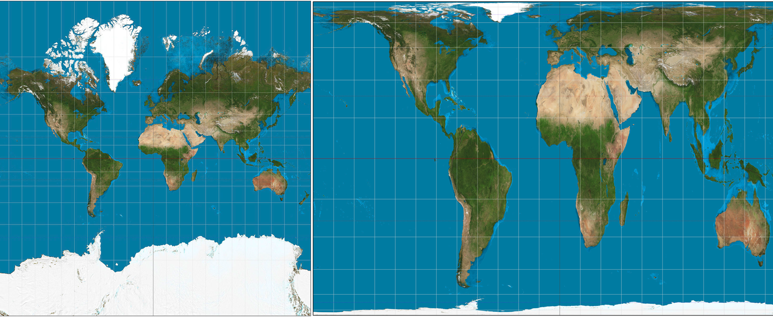
Figure 3.20: The Mercator Projection, left, and the Gall-Peters Equal Area Projection, right
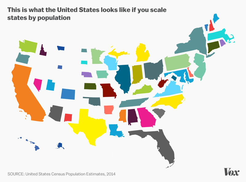
Geography can also be misleading in visualizing data about people. Geographic maps can show us where people live, but if we are interested in, say, frequencies of person-level data per US state, the relative sizes of states can obscure the relative populations of states.
3.4.11 Alluvial Diagrams (aka Sankey Plots, aka Riverplots, aka Ribbonplots)
Alluvial diagrams, also known as Sankey plots, Riverplots, and/or Ribbonplots (any of those are fine)56 are visualizations of flow. For example, Figure 3.21 shows a voting pattern of two fictional elections. In this hypothetical scenario, there are two candidates who received votes in the first election and those same two candidates received votes in the second election along with a third, new candidate. The alluvial diagram shows the pattern of the people who voted in both elections. Each candidate is represented on the sides of the diagram: the points representing each candidate are known as nodes. Some people voted for the same candidate: these are represented by lines known as edges that connect one candidate in the first election to the same candidate in the second election. People who changed their vote are represented by edges that flow from the node of one candidate in the first election to a different candidate in the second election.
palette = paste0(brewer.pal(7, "Set2"), "80")
styles = lapply(nodes$y, function(n) {
  list(col = palette[n+1], lty = 0, textcol = "black")
})
names(styles) = nodes$ID

rp <- makeRiver(nodes, edges, node_labels = c("Candidate A", "Candidate B", "Candidate A", "Candidate B", "Candidate C"), node_styles=styles)

class(rp) <- c(class(rp), "riverplot")

plot(rp, plot_area = 1, yscale=0.01)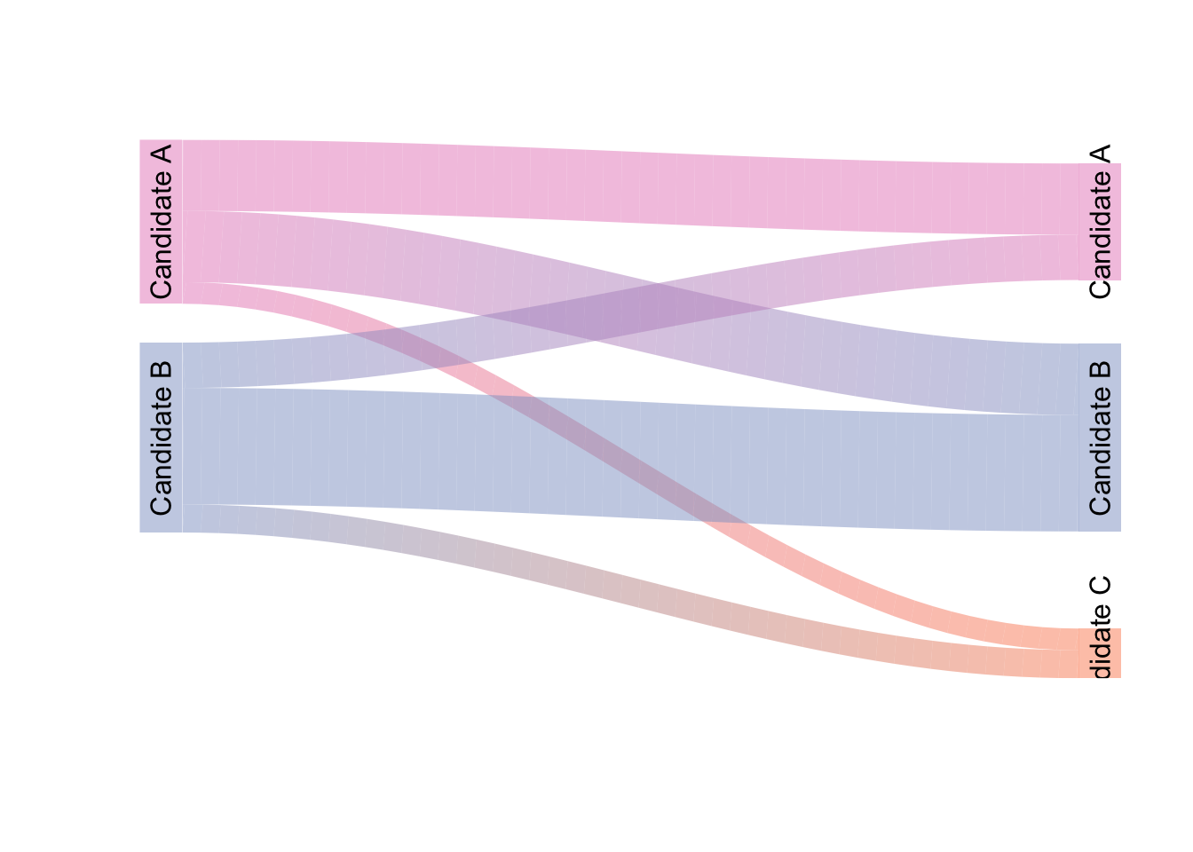
Figure 3.21: A Sample Alluvial Diagram
The main caution I would offer regarding the use of alluvial diagrams is that they can become very difficult to follow as the numbers of nodes and edges increase (in terms of the hypothetical example represented in Figure 3.21, we could add several more candidates to each election and/or add more elections – the flow can become quite confusing). Thus, try to use them for relatively simple flow patterns and always label as clearly as possible.
3.4.11.1 Minard’s Map
In 1869, Charles Minard, a French Civil Engineer and pioneer in the field of data visualization, published a visual summary of the 1812 French invasion of and retreat from Russia that combined elements of time-series charts, alluvial diagrams, and choropleth maps. I’ll let Tufte describe it:
…the classic of Charles Minard (1781-1870), the French Engineer, shows the terrible fate of Napoleon’s Army in Russia. Described by E.J. Marey as seeming to defy the pen of the historial by its brutal eloquence,57 this combination of data map and time-series, drawn in 1869, portrays a sequence of devastating losses suffered in Napoleon’s Russian campaign of 1812. Beginning at left on the Polish-Russian border near the Niemen River, the thick tan flow-line shows the size of the Grand Army (422,000) as it invaded Russia in June 1812. The width of this band indicates the size of the army at each place on the map. In September, the army reaches Moscow, which was by then sacked and deserted, with 100,000 men. The path of Napoleon’s retreat from Moscow is depicted by the darker, lower band, which is linked to a temperature scale and dates at the bottom of the chart. It was a bitterly cold winter, and many froze on the march out of Russia. As the graphic shows, the crossing of the Berezina River was a disaster, and the army finally struggled back into Poland with only 10,000 men remaining. Also shown are the movements of auxiliary troops, as they sought to protect the rear and the flank of the advancing army. Minard’s graphic tells a rich, coherent story with its multivariate data, for more enlightening thatn just a single number bouncing along over time. Six variables are plotted: the size of the army, its location on a two-dimensional surface, direction of the army’s movement, and temperature on various dates during the retreat from Moscow…
It may well be the best statistical graphic ever drawn.
– from The Visual Display of Quantitative Information, Second Edition, p. 40
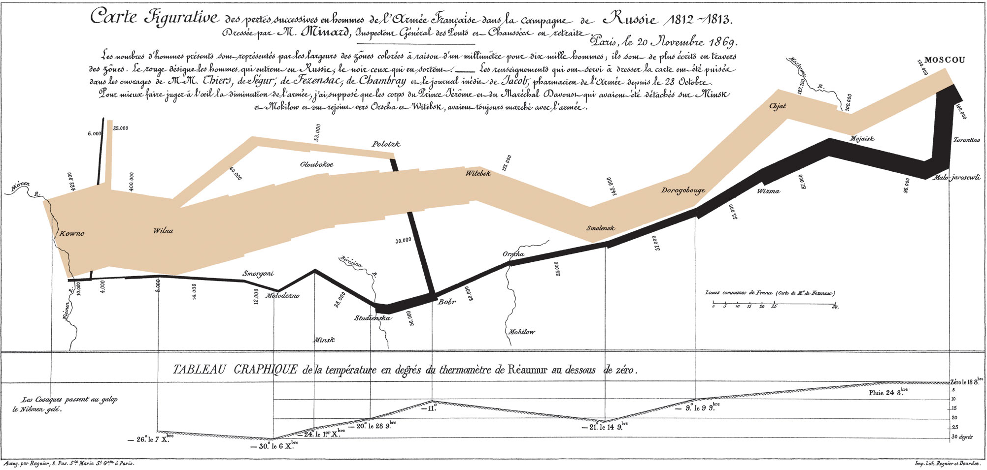
Figure 3.22: Charles Minard’s Time-Series Alluvial Choropleth Map of the French Invasion of and Retreat From Russia
3.4.12 Small Multiples
The last category of data visualization tools we will cover on this page is small multiples. Small multiples are arrangements of small versions of the same visualization that vary by levels of a variable or variables. The idea is that the reader can view the entire arrangement of figures at once in order to easily make comparisons. Figure 3.23 is an example of the use of small multiples: each of the 12 miniature figures is a histogram of random values drawn from the same class of frequency distribution (namely, the \(\chi^2\) distribution). The specifications of the random draws differs only by the single parameter that determines the shape of a given \(\chi^2\) distribution (the degrees of freedom, abbreviated df). In this case, we can easily follow how the distribution migrates to the right and becomes decreasingly skewed as the \(df\) increases thanks to the arrangement of the small multiples of histograms.
ggplot(small.multiple.df, aes(Values))+
  geom_histogram()+
  theme_tufte(base_size=12, base_family="sans", ticks=FALSE)+
  labs(title=bquote(Random~Samples~From~Various~chi^2~Distributions), subtitle="10,000 Samples per Histogram")+
  facet_wrap(~df, labeller = label_bquote(cols=italic(df)==.(df)))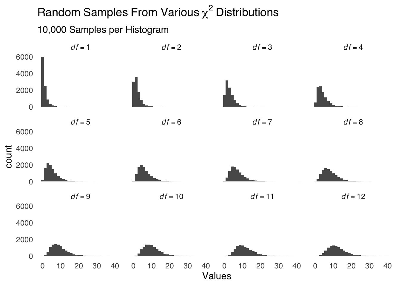
Figure 3.23: An Example of Small Multiples
3.5 Closing Remarks
There are many more ways of visualizing data. The examples discussed here cover a lot of ground, but this is by no means an exhaustive list. As with all scientific tools, I encourage you to use methods that best tell the story that you want to tell about your data rather than to let the tools you are familiar with tell the story for you.
And now, to end the page in grand fashion, I give you…
There is a rich history of hand-drawn data visualization. Data science before computers was not limited by the options available in software packages but it was much harder to make images that were proportional to data, thus, there were fewer visualizations but some of them are super-creative. One example is the famous map made by Charles Minard in 1869 discussed below. I can’t recommend enough the recently-published W.E.B. Du Bois’s Data Portraits: Visualizing Black America, an absolutely spectacular and historigraphically essential collection of W.E.B. Dubois’s sociological analysis of Black Americans at the turn of the 20th century.↩︎
Removing the legend also gives you more space for the data, which is usually desirable in and of itself.↩︎
Sans serif fonts are the data-ink minimizers of the typeface world↩︎
post hoc ergo propter hoc, roughly translated, means “after the thing, therefore because of the thing”↩︎
The bars in a forestplot are a little like error bars, but…well, interval estimates are a whole thing and we’ll talk about them later↩︎
Alluvial refers to a river delta, which such plots can resemble. Sankey is an engineer who used plots to visualize the movement of fluids. The plots also look like rivers or ribbons to people.↩︎
E.J. Marey, La méthode graphique (Paris, 1885), p. 73. For more on Minard, see Arthur H. Robinson, “The Thematic Maps of Charles Joseph Minard,” Imago Mundi, 21 (1967), 95–108.↩︎