Chapter 8 Signal Detection Theory
8.1 Detecting Signals
Have you ever taken a hearing test? If you haven’t – or if it’s been a while since you have – here’s basically how it goes: you wear big over-the-ear headphones and you hear some fuzzy noise. Every once in a while, a tone is played amidst the noise. You instructions are to indicate when you hear the tone and/or in which ear you hear it in.
Here’s a related example: radar operators have to look at radar screens and be able to identify little lights that represent things like airplanes among other little lights that represent things like rainstorms.

Figure 8.1: Signal Detection in Space
The tones in a hearing test and the lights that indicate aircraft on a radar screen are known as signals. The fuzzy sounds in a hearing test and the atmospheric events on a radar screen are known as noise.
It would be perfectly reasonable to think that understanding when people would be able to hear a tone or see a light in noisy situations is pretty easy: if the tone is louder than the noise, people should be able to hear and identify it; if the light is brighter than the noise, people should be able to see and identify it. But, that would be wrong. 157 Human psychology – the way we perceive things, understand them, evaluate them, and make decisions based on them– is much more than a series of direct comparisons of the relative amplitudes of sound or light or other stimuli.*
Here’s an example of how factors other than relative strengths of signal and noise can influence whether or not we see – or at least report seeing – signals in noise. Let’s say I am an experimenter and you are a signal-detecting participant and we run two experiments with monetary awards associated with it. In each experiment, I give you a signal detection task: could be hearing tones, seeing lights, feeling temperature changes, or any other kind of perceptual thing of your choosing (it doesn’t matter to me – it can be whatever helps you understand the example). In Experiment 1, I will give you 1 US Dollar for every time you correctly identify a signal with no penalty for being wrong, and you could earn up to $20 if you get them all. In Experiment 2, I will give you $20 at the start and take away $1 every time you incorrectly identify a signal with no bonus for being right. Far be it from me to assume how you would behave in each of those experiments, but if I had to guess, I would imagine that you might be more likely to identify signals in Experiment 1 than you would be in Experiment 2. It would only be natural to risk being wrong more easily in Experiment 1 and to be more cautious about being wrong in Experiment 2. From a strictly monetary-reward-maximizing perspective, the best strategy would be to say that you are seeing signals all the time in Experiment 1 and to say that you are never seeing signals in Experiment 2. Of course, those are two extreme examples, but we could – and as we’ll explore later in this chapter, do – tweak the schedule of rewards and penalties so that the decisions to make are more difficult.
Signal Detection Theory is a framework for understanding how people make decisions about perceiving signals amid noise.
8.1.1 Hits, Misses, False Alarms, and Correct Rejections
In a signal-detection framework – literal signal-detection tasks like hearing tests and radar and metaphorical signal-detection tasks – there are two possible decisions that a person performing a test – known as an operator – can make at any point in the task:
- The signal is present
- The signal is absent
The contingency table below descibes the possible outcomes of a signal-detection test. If the signal truly is present, an operator can either correctly identify it – a hit – or not identify it – a miss. If the signal truly is absent, an operator can incorrectly say it is there – a false alarm – or correctly not say it is there (or say it is not there) – a correct rejection.
| Yes | No | ||
|---|---|---|---|
| Operator Response | Signal Present | Hit | False Alarm |
| Signal Absent | Miss | Correct Rejection |
8.2 The Signal Detection Metaphor
Since signal detection theory emerged in the psychophysics literature in the years folloiwing World War II158, the framework has been used metaphorically to model choices under different conditions. Medical diagnosis a natural fit for the framework: a medical condition can be either present or absent and a diagnostician can either make a diagnosis or not. We can adapt the SDT contingency table for medical diagnosis thusly:
| Yes | No | ||
|---|---|---|---|
| Diagnosed | Yes | True Positive | False Alarm |
| No | Miss | True Negative |
Another application of the SDT framework to a decision process is one we have already encountered: classical null hypothesis testing. In null hypothesis testing, an effect (either a relationship as in correlation or a difference as in a difference between condition means) can be either present or absent at the population level. The classical analyst must make a decision based on the cumulative likelihood of the data given the null hypothesis whether to reject the null or to continue to assume the null:
8.2.0.1 Classical Hypothesis Testing
| Yes | No | ||
|---|---|---|---|
| Decision | Reject \(H_0\) | Correct Rejection of \(H_0\) | False Alarm (Type-I error) |
| Continue to Assume \(H_0\) | Miss (Type-II error) | \(H_0\) Correctly Assumed |
Null hypothesis testing is a particularly apt example for understanding signal detection because it presents a case where we know there either is a signal – in this case a population-level effect – or there is not, and we know that we won’t catch the signal all the time (the type-II error) and that sometimes we will commit false alarms (the type-I error).
The SDT metaphor as applied to null hypothesis testing – and statistical analysis in general – has been extended so that any real pattern in data can be considered signal and anything in the data that prevents seeing those patterns can be considered noise.159 Please consider these two scatterplots (reproduced from correlation and regression) each representing a of \(n=100\) pairs of \((x, y)\) observations:
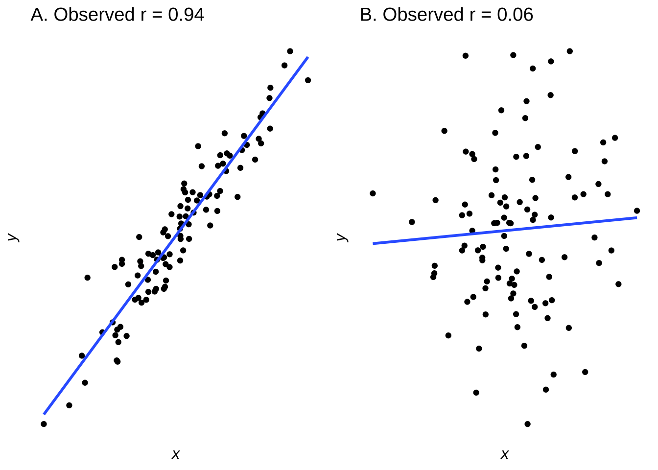
Figure 8.2: Scatterplots of Data Sampled from Bivariate Normals with \(r=0.95\) (left) and with \(r=0.15\) (right)
The \((x, y)\) pairs with population-level correlations of 0.95 and 0.15 led to samples that have correlations of 0.94 and 0.06, respectively. The former correlation is statistically significant at the \(\alpha=0.05\) level (\(p<0.001\)); the latter is not (\(p=0.5423\)). In the signal-detection metaphor, the models indicated by the least-squares regression lines represent the signal and the distances between the lines and the dots represent the noise.
Please recall from correlation and regression that \(R^2\) is the proportion of variance explained by the model. The proportion of the variance that is not explained by the model – that is, \(1-R^2\), is the error. In the SDT framework, the error is noise.
Since \(r^2=0.944^2=0.891\), the model in part A of Figure 8.2 explains 89.1% of the variance in the \(y\) data. It’s an enormous sample size. In SDT terms, it is a signal so strong that it would be visible despite the strength of any noise (or: when the correlation is that strong on the population level, it is nearly impossible to sample 100 observations at random that wouldn’t lead to rejecting the null hypothesis). The error associated with the model is \(1-r^2=0.109\). If we take the error to be the noise, then the signal-to-noise ratio is160 nearly 9:1. The model in part B of Figure 8.2, by contrast, represents an \(r^2\) of \(0.062^2=0.0038\), therefore explaining less than four-tenths of one percent of the variance. Thus, 99.6% of the observed data is explained by error – or noise – and the signal-to-noise ratio is about 4:996. In SDT terms, that is a signal that – while real on the population level – is swallowed by the noise.
8.2.1 Limits of the Signal-Detection Metaphor
Finding signals among noise is a convenient metaphor for a lot of processes involving decisions. For some applications, it may be a little too convenient. Take, for example, please, the application to memory research. Memory would seem to make sense as a candidate to be described by signal detection: memory experiments often include presenting stimuli and then, some time later, asking participants if a stimulus has been shown before or if it is new. In such a paradigm, recognizing an old stimulus is analogous to a hit, not recognizing an old stimulus is analogous to a miss, declaring a new stimulus to be old is like a false alarm, and calling a new stimulus new is like a correct rejection. The SDT metaphor is commonly found in memory theories. However, actual, non-metaphorical signal detection is based on the perception of the relative strength of lights and sounds; human memories are much more complex. When we encode memories, we encode far more than we attend to: contexts, sources, ambient stimuli, and more. Remembering is also not a binary decision: we can remember parts of events and misremember events in part or in total. We frequently report remembering events that never happened, both as individuals and in our collective memories.
So where in a signal-detection-style contingency table would a false memory, or a partially-remembered item, or the source of a memory be placed? That’s not clear to me, and I think it’s because memory and other phenomena – a much longer screed could be written about applying the signal-detection framework to interpersonal interactions, for example – are too complex to be explained by framework of decisions based on the one dimension of relative stimulus strength. Signal detection theory is great for what it does. In the case of more complex phenomena, the signal-detection model is oversimplistic and based on reductive assumptions but gives the impression of scientific rigor and is well-liked by a shocking amount of people, just like reruns of The Big Bang Theory.

8.2.2 Signal + Noise and Noise Distributions
The central tenet of signal detection theory is that the decisions that are made by operators under different conditions are all products of underlying strength distributions of the signal and of the noise. The strength of a signal and the strength of noise occupy more than single points in an operator’s mind: if they did, detecting signals would be deterministic, and operators would always choose based on the stronger of the signal and the noise. We know that operators don’t behave like that, and so the basic theory is that the strength of the signal and the strength of the noise are represented by distributions. We assume that both distributions are normal distributions, as depicted in Figure 8.3. And, we assume that noise is always present, so the distribution usually referred to as the signal distribution is sometimes (and technically more theory-aligned) referred to as the signal plus noise distribution.
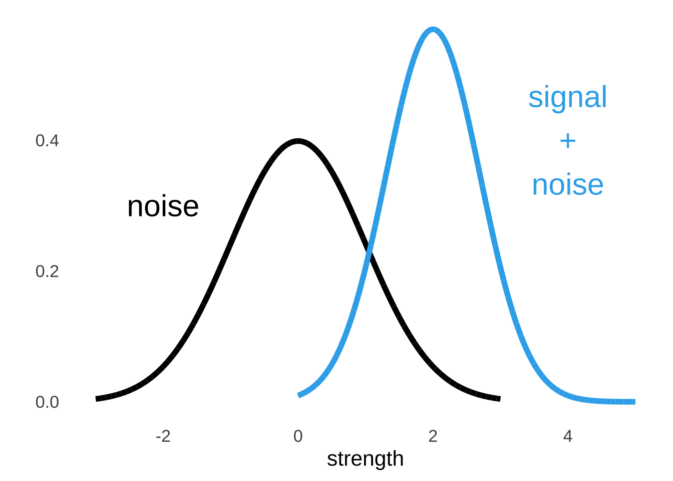
Figure 8.3: Illustration of Noise and Signal + Noise Distributions
We don’t really know what the \(x\) and \(y\) values are for the signal distribution and the noise distribution and it honestly doesn’t matter. All we are interested in is the shapes of the curves relative to each other so that we can learn about how people make decisions based on their relative perceived strength. Since the placement doesn’t matter, we can set one of those curves wherever we want and then measure the other curve relative to the set one. And since we can set either one of the curves wherever we want, to make our mathematical lives easier, it is a very good idea to set the noise distribution to have a mean of 0 and a standard deviation of 1. In other words, we assume that the perception of noise follows a standard normal distribution.161
8.3 Distinguishing Signal from Noise
The point of signal detection theory is to understand the underlying perception of signal strength with respect to noise and how operators make decisions given that perception. Of all of the measurements that come out of signal detection frameworks, three statistics are most frequently used: \(d'\), which measures the discriminability – in terms of the curves, it’s the distance between the peak of the noise curve and the signal (plus noise) curve – between signal and noise, \(\beta\), which measures the response bias – the tendency to say yes or no at any point, and the C-statistic<The “C” in “C-statistic” is the only statistical symbol that is not abbreviated in APA format and I have never found a good explanation for why that is.], which measures the predictive ability of an operator by taking into account both true positives and false alarms.
Of those three, the \(\beta\) statistic is the least frequently used – it’s more in the bailiwick of hardcore SDT devotees – but we’ll talk about it anyway. It will give us perhaps our only opportunity in this course to use probability density as a meaningful measurement, just like the last sentence gave me perhaps my only opportunity to use the word “bailiwick” in a stats reading.
8.3.1 \(d'\)
As noted above, \(d'\) is a measure of the discriminability between noise and signal, and represents the difference between the peaks of the noise and the signal plus noise distributions. Figure 8.4 illustrates the \(d'\) statistic in the context of the two curves.
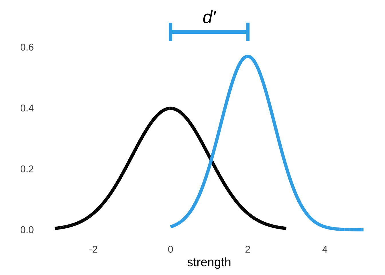
Figure 8.4: Illustration of \(d'\)
It’s relatively easy to pick out a signal when it is on average much stronger than the noise. In a hearing test, it’s easy to pick out the tones if those tones are consistently much louder than the background noise; on a radar screen, it’s easier to pick out the planes when those lights are consistently much brighter than the atmospheric noise. In terms of the visual display of the underlying signal and noise distributions, that sort of situation would be represented by a signal distribution curve with its center further to the right on the strength axis than the center of the noise distribution.
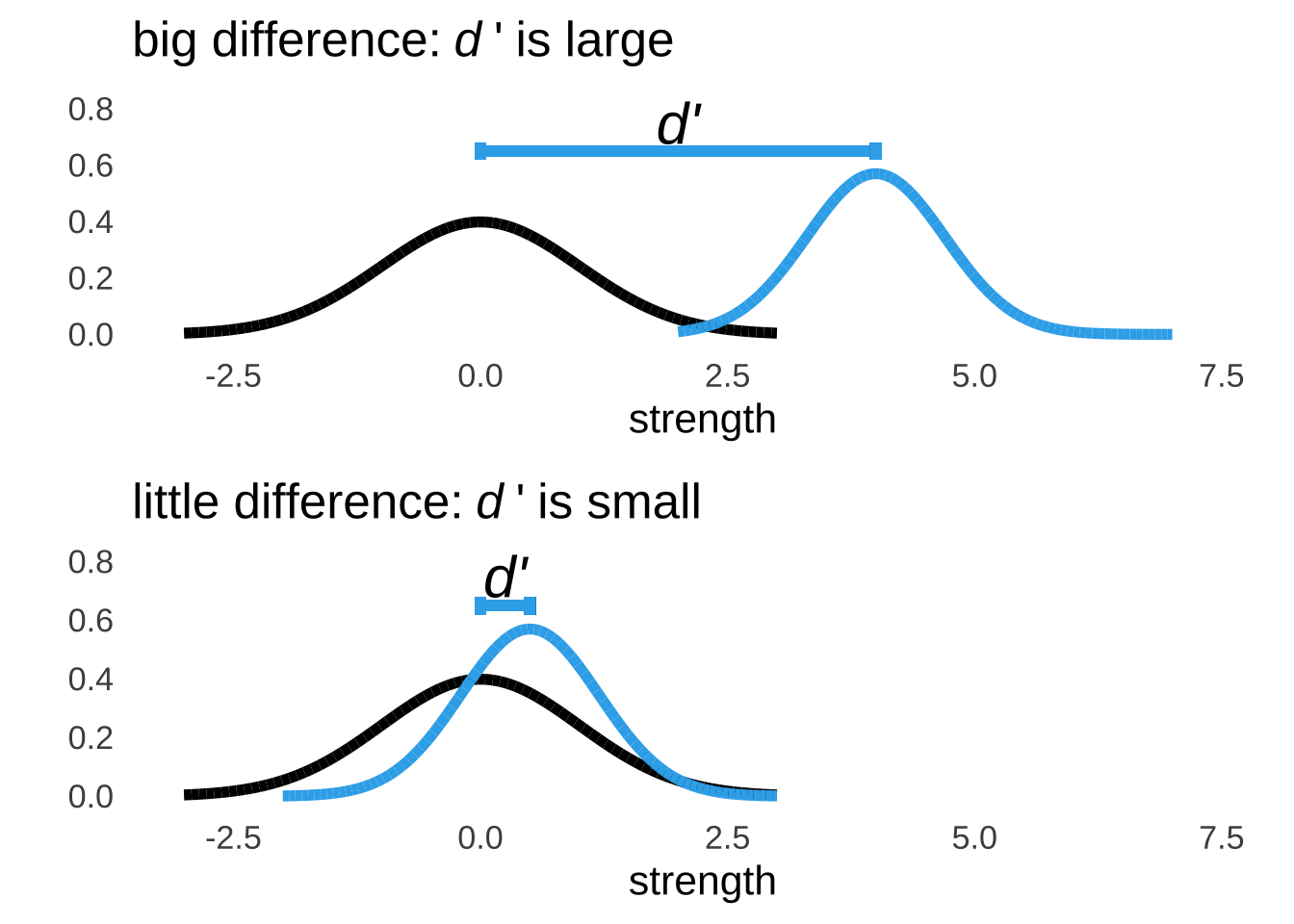
Figure 8.5: Relatively Large and Small Values of \(d'\)
The \(d'\) statistic has no theoretical upper limit and is theoretically always positive. However, it’s pretty much impossible to see a \(d'\) value much greater than 3: since the standard deviation of the noise curve is assumed to be 1, a \(d'\) of about 3 indicates as much of a difference as can be determined (whether the peaks of the distributions are 3 standard deviations apart or 30, no overlap is no overlap). It’s also possible but really unlikely to observe a negative \(d'\). If the perception of noise and the perception of signal plus noise are approximately equal – meaning that the contribution of signal to the signal plus noise curve is approximately nothing – then responses are essentially random, and it is possible that sample data by chance could indicate that the peak of the signal plus noise curve lives to the left of the noise curve.
There is one scenario that would consistently produce a negative value of \(d'\). In the 2018 film Spider-Man: Into the Spider-Verse, high school student (and budding Ultimate Spider-Man) Miles Morales intentionally answers every question on a 100 true-false question test incorrectly.

Figure 8.6: Absolute Masterpiece
As Miles’s teacher points out, somebody with no knowledge of the test material would have an expected score of 50%, which she takes as evidence that Miles had to know all of the answers in order to get each one wrong. Anyway, this is the main, non-chance reason for a negative \(d'\): basically somebody has to either intentionally messing with the experiment or they have the buttons mixed up.
8.3.2 \(\beta\)
The \(\beta\) statistic (not to be confused with the \(\beta\) distribution or any of the other uses of the letter \(\beta\) in this course) is a measure of response bias: whether an operator’s response is more likely to indicate signal or to indicate noise at any point. The \(\beta\) statistic – of which there can be one or there can be many depending on the experiment – is the ratio of the probability density of the signal plus noise curve to the density of the noise curve at a criterion point. If a criterion is relatively strict, then an operator is likely to declare that they perceive a signal only when they have strong evidence to believe so: there will be few hits at a strict criterion point and few false alarms as well. If a criterion is relatively lenient, then an operator is generally more likely to declare that they perceive signals: there will be relatively many hits at a lenient criterion point and many false alarms as well. Stricter criteria, as illustrated in Figure 8.7, are further to the right on the strength axis where the probability density of the signal distribution is high relative to the probability density of the noise distribution (that is, the strength line is higher than the nosie line) than more lenient criteria where the probability density of the noise distribution is higher relative to the probability density of the noise distribution.
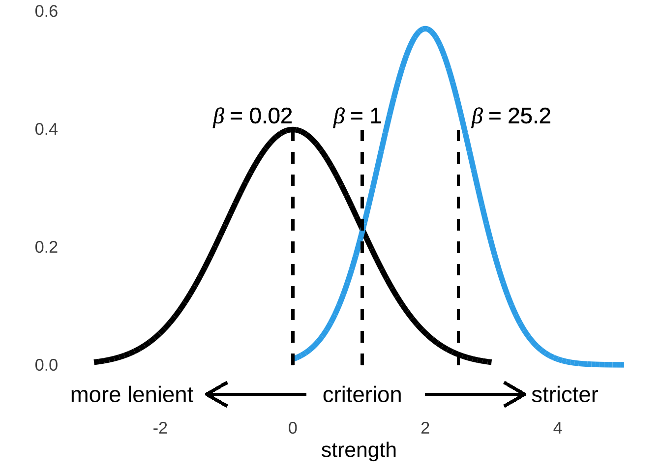
Figure 8.7: Criterion Points and \(\beta\) Values
The term response bias may imply that it describes a feature of a given operator, but that is not necessarily the case. The response bias is largely a feature of the criterion that the operator has adopted, which in turn can vary based on circumstances. For example, in a signal-detection experiment where an operator receives a reward (monetary or otherwise) for each hit that they register with no penalty for false alarms, the operator has motivation to adopt a more lenient criteria – they really should say that the signal is present all the time. Conversely, in a situation where an operator is penalized for false alarms and not rewarded for hits, then the operator may be motivated to adopt a more stringent criterion – they might say that the signal is never present. Signal-detection experiments often take advantage of the variability of criteria in order to measure more of the underlying noise and signal distributions by observing more data points.
8.3.3 C-statistic
The C-statistic is a measure of the predictive power of an operator. It has an hard upper limit of 1 (indicating perfect predictions) and a soft lower limit of 0.5 (indicating indifference between predicting correctly and incorrectly). The C-statistic is related to \(d'\): larger values of \(d'\) are accompanied by larger C-statistics.162
The C-statistic is equal to the area under the Receiver Operator Characteristic (ROC) Curve. It is, equivalently, for that reason also known as the area under the ROC, the AUC (Area Under Curve), or the AUROC (Area Under ROC Curve). So now is probably a pretty good time to talk about the Receiver Operator Characteristic (ROC) Curve.
8.3.3.1 The Receiver Operator Characteristic (ROC) Curve
The Receiver Operator Characteristic (ROC) is a description of the responses made by the operator in a signal detection context. The ROC curve is a plot of the hit rate (on the \(y\)-axis) against the false alarm rate (on the \(x\)-axis). Figure 8.8 is an illustration of what an empirical ROC curve looks like: at different measured points (for example, different decision criteria), the hit rate and the false-alarm rate are plotted. Also included (as is conventional) is the indifference line: a model of what would happen if an operator were precisely as likely to make correct as to make incorrect decisions; an illustration of the pure-chance expectation.
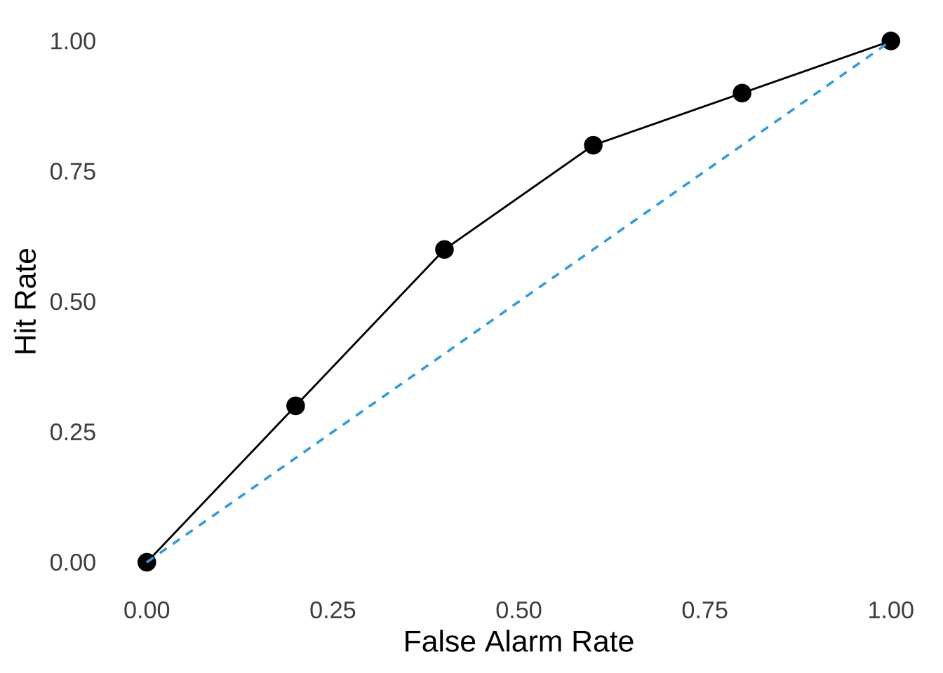
Figure 8.8: A Typical Empirical ROC Curve
Figure 8.9 is an illustration of theoretical ROC curves that have been smoothed according to models (sort of like curvy versions of the least-squares regression line, as if this page needed more analogies). Three curves are included in the figure, representing the expected ROC for when \(d'=3\), when \(d'=2\), and when \(d'=1\), respectively: as \(d'\) gets larger, the ROC curve bends further away from the indifference line.
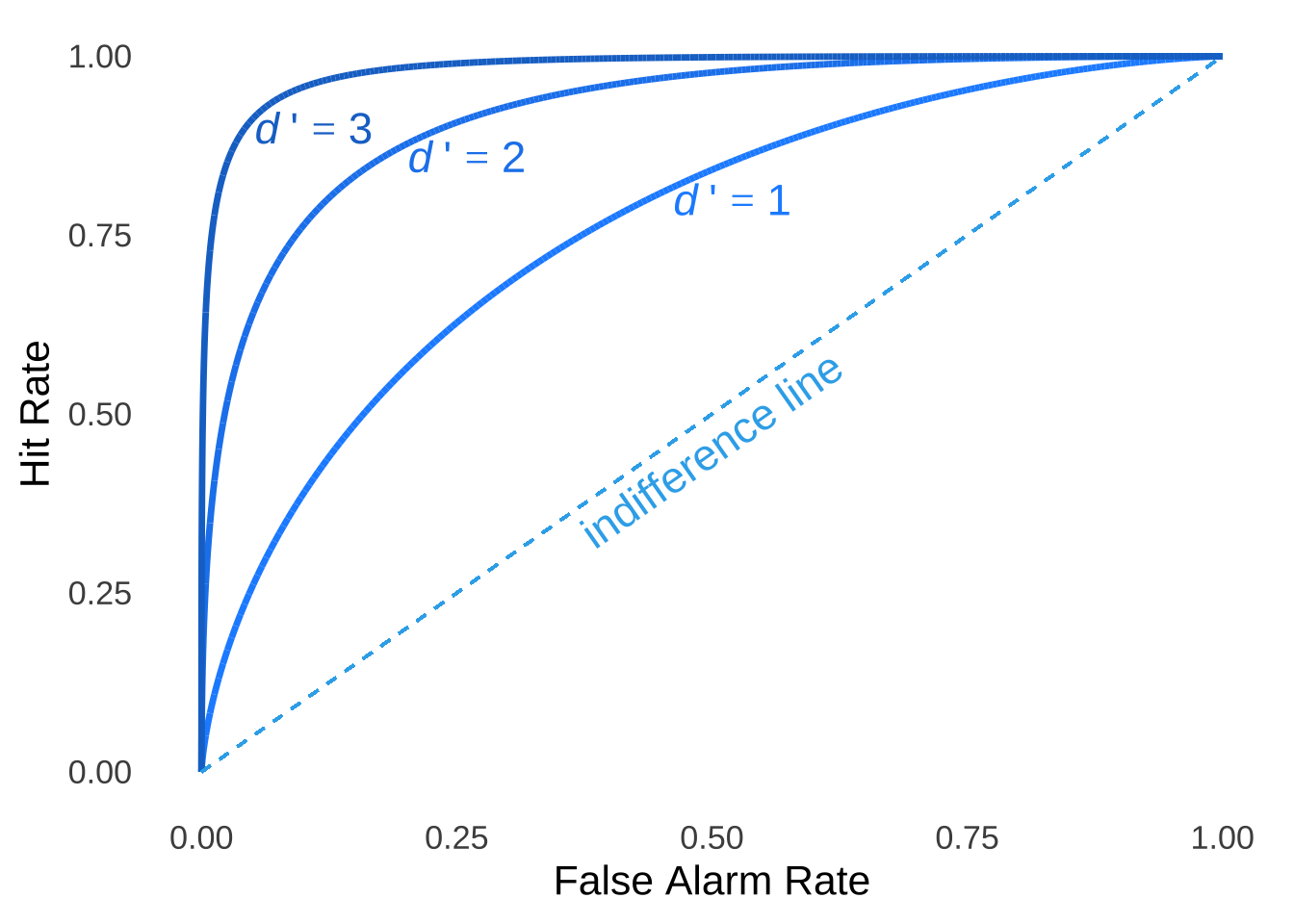
Figure 8.9: Typical Smoothed ROC Curve for Three Values of \(d'\)
The area under the ROC curve for \(d'=1\) in Figure 8.9 – that is, the C-statistic – is 0.76, the C-statistic for \(d'=2\) is 0.921, and the C-statistic for \(d'=3\) is 0.76 (see Figure 8.10)
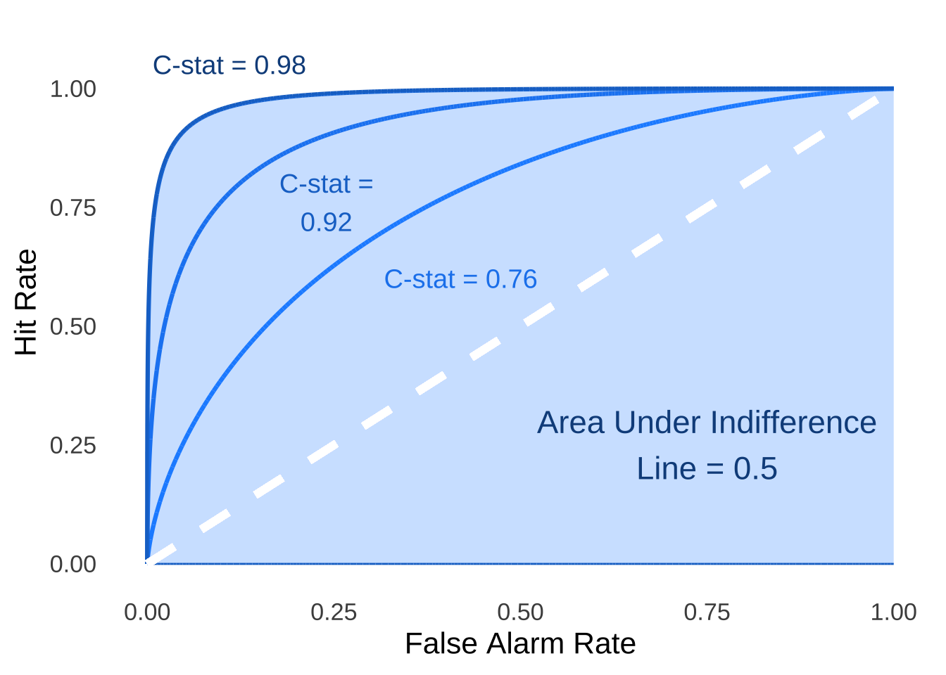
Figure 8.10: C-statistics for Three ROC Curves with \(d'=3\), \(d'=2\), and \(d'=1\)
8.4 Doing the Math
Having covered the conceptual bases of SDT and the measurements it produces, we turn now to the actual calculations. We will spend most of our time with the following dataset from Green and Swets (1966)163 which comes from an SDT experiments with 5 conditions, each condition having 200 target-present trials (from which we get the hit rate) and 200 target-absent trials (from which we get the false alarm rate:
| Condition | Hit Rate | False Alarm Rate |
|---|---|---|
| 1 | 0.245 | 0.040 |
| 2 | 0.300 | 0.130 |
| 3 | 0.695 | 0.335 |
| 4 | 0.780 | 0.535 |
| 5 | 0.975 | 0.935 |
Knowing the hit rates and false alarm rates, we can draw the ROC curve for these data (Figure 8.11):
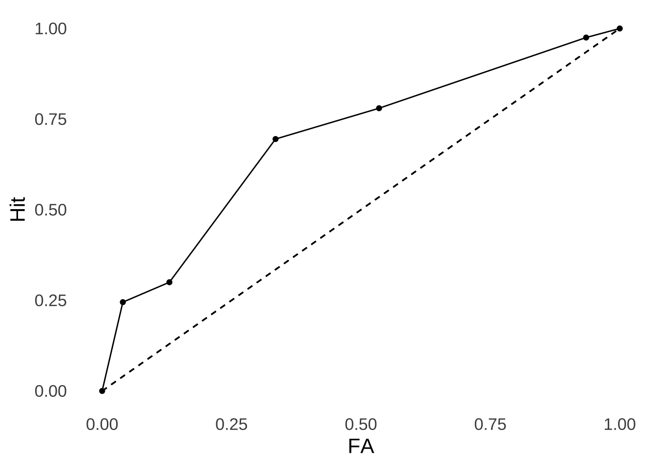
Figure 8.11: Empirical ROC Curve for the Green & Swets (1966) Data.
The hit rate at each point is the frequency at which the individual correctly identified a signal. In terms of the Noise/Signal+Noise Distribution representation, that rate is taken to be the area under the signal+noise distribution curve to the right of a given point on the strength axis: everything to the right of the point (indicating greater strength) will be identified by the operator as a signal.
The false alarm rate at each point is the frequency at which the individual misidentifies noise as a signal. In terms of the Noise/Signal+Noise Distribution representation, that rate is the area under the noise distribution curve to the right of a given point on the strength axis: as with the hit rate, everything to the right of that point will be (mis)identified by the operator as a signal.
Thus, the hit rate and the false alarm rate give us the probabilities that an operator is responding to their perception of signal and noise, respectively, under each condition. Figure 8.12 depicts these probabilities for the signal and noise distributions plotted separately for condition 3 (nothing super-special about that condition, I just had to pick one).
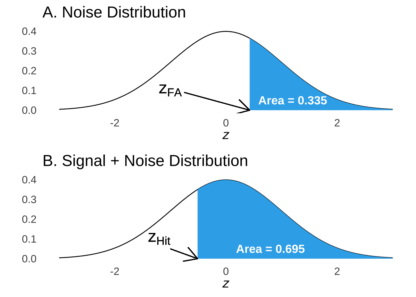
Figure 8.12: Areas Under the Noise and Signal + Noise Curves Indicating Probability of False Alarm and Hit, Respectively
Because both the signal and the noise distributions are normal distributions, based on the area in the upper part of the curve, we can calculate \(z\)-scores that mark the point on those curves that define those areas. Additionally, because the noise distribution is assumed to be a standard normal distribution, the values of \(z_{FA}\) are also \(x\)-values on the strength axis. The signal distribution lives on the same axis, but it’s \(z\)-scores are based on its own mean and standard deviation, and so for the points on the strength axis defined by the criteria which, in turn, vary according to experimental condition (that is, the motivation for adopting more stringent or more lenient criteria are manipulated experimentally), the same \(x\) points will represent different \(z\) values for the signal and for the noise distribution.
Thus, we take the experimentally-observed proportions of hits and false alarms, we consider those to be the probabilities of hits and false alarms, translate those probabilities into upper-tail areas under normal distributions, and find the \(z\)-scores that define those upper-tail probabilities: those will be our \(z_{hit}\) values (for the signal distribution probabilities) and our \(z_{FA}\) values (for the noise distribution probabilities):
| Condition | Hit Rate | False Alarm Rate | \(z_{Hit}\) | \(z_{FA}\) |
|---|---|---|---|---|
| 1 | 0.245 | 0.040 | 0.69 | 1.75 |
| 2 | 0.300 | 0.130 | 0.52 | 1.13 |
| 3 | 0.695 | 0.335 | -0.51 | 0.43 |
| 4 | 0.780 | 0.535 | -0.77 | -0.09 |
| 5 | 0.975 | 0.935 | -1.96 | -1.51 |
At this point, our analyses hit a fork in the road. The observed ROC curve is based on data: it does not change based on how we choose to analyze the data, and the C-statistic does not change either. The \(d'\) and \(\beta\) statistics will change (not a whole lot, but substantially) based on what we believe about the shape of the signal distribution.
8.4.1 Assumptions of Variances
There are two assumptions that we can make about the signal distribution that will alter our evaluation of \(d'\) and \(\beta\).
Equal Variance: The variance of the signal distribution is equal to the variance of the noise distribution.
Unequal Variance: The signal and the noise distributions can have different variances.
There is domain-specific debate – as in this recent example paper regarding recognition memory – over which model is more appropriate and why. I have have no strong opinions on the matter with regard to psychological processes. From an analytic standpoint, it seems to make more sense to start from the unequal variance assumption because it includes the possibility of equal variance (it may be another case of a poorly-named stats thing: the unequal variance assumption might be more aptly called the not assuming the variances are equal but they might be assumption, but that’s really not as catchy). That is, if we start off assuming unequal variance and the variances end up being exactly equal, then that’s ok. Conversely, though, the analyses that come from the equal variance assumption do not even allow for the possibility that the underlying variances could be very different.164
This page will cover both. We will start by analyzing the sample data based on the unequal variance assumption, then circle back to analyze the same data using the equal variance assumption.
8.4.2 SDT with Unequal Variances
We know the mean and the standard deviation of the noise distribution because we decided what they would be: 0 and 1, respectively. That leaves the mean and standard deviation of the signal+noise distribution to find out. Since we decided that the noise would be represented by the standard normal, the mean and standard deviation of the signal+noise distribution become easier to find.
Our sample data come from an experiment with five different conditions, each one eliciting a different decision criterion (and, in turn, a different response bias). To find the overall \(d'\) (and \(\beta\), which will depend on first finding \(d'\)), we will use a tool known as the linearized ROC: a tranformation of the ROC curve mapped on the Cartesian \((x, y)\) plane.165 The linearized ROC plots \(z_{hit}\) on the \(x\)-axis and \(z_{FA}\) on the \(y\)-axis (see Figure 8.13 below). That’s potentially confusing since the ROC curve has the hit rate on the \(y\)-axis and the FA rate on the \(x\)-axis. But, putting \(z_{hit}\) on the \(x\)-axis and \(z_{FA}\) on the \(y\)-axis makes the math much more straightforward, and we only need the linearized ROC to calculate \(d'\), so it’s likely worth a little (temporary) confusion.
Thus, for the linearized ROC and only for the linearized ROC, \(z_{FA}=y\) and \(z_{Hit}=x\).
The slope of the linearized ROC in the form \(y=\hat{a}x+b\) is the ratio of the standard deviation of the \(y\) variable to the ratio of the standard deviation of the \(x\) variable:
\[\hat{a}=\frac{sd_y}{sd_x}=\frac{1.25}{1.07}=1.17.\]
The intercept of the Linearized ROC is an estimate of \(d'\). We know that \(d'\) is the distance between the mean of the noise distribution and the mean of the signal+noise distribution in terms of the standard deviation of the noise distribution. Translating that into the observed data, that means:
\[\hat{y}=\hat{a}x+\hat{b}\] \[\hat{y}=1.17x+\hat{b}\]
Pluggin in the mean of \(z_{FA}\) for \(y\) and the mean of \(z_{Hit}\) for \(x\):
\[0.342=1.17(-0.406)+\hat{b}\] \[0.342-1.17(-0.406)=\hat{b}=0.817=d'\]
The slope of the linearized ROC is also an estimate of the relationship between the standard deviations of the signal and of the noise distributions:
\[\hat{a}\approx\frac{\sigma_s}{\sigma_n}\]
Thus, the following is a visual representation of the Linearized ROC:
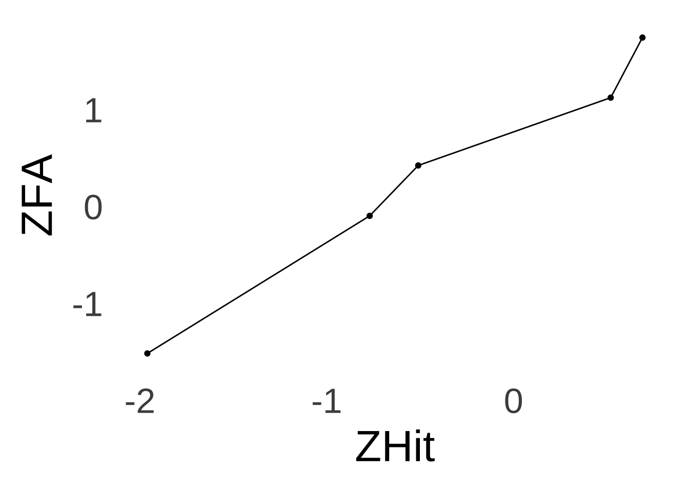
Figure 8.13: Linearized ROC for the Green & Swets (1966) Data.
Because we have assumed that the noise distribution is represented by a standard normal distribution, which by definition has a standard deviation of 1 (again, we could have picked any normal distribution, and now we are glad that we picked the one with a mean of 0 and a standard deviation of 1), our estimate of the standard deviation of the signal+noise distribution is also 1.17. We also know that since \(d'\) is a measure of the distance between the mean of the noise distribution and the mean of the signal+noise distribution in terms of the standard deviation of the noise distribution, that the distance between the means is equal to \(d'/1=d'\) and thus that the mean of the signal+noise distribution is also equal to \(d'\). Our underlying distributions of noise and of signal+noise therefore look like this:
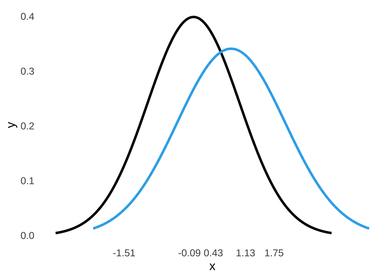
Figure 8.14: The Signal plus Noise and Noise Curves for the Green & Swets (1966) Data Under the Assumption of Unequal Variances.
The \(\beta\) estimates at each criterion point – as noted above – are the ratios of the probability density of the signal plus noise distribution to the probability density of the noise distribution at each point.
We can use the noise distribution to locate points on the strength axis: we assumed the noise distribution is a standard normal so it is centered at 0 and its standard deviation is 1 so the \(z\)-values for the noise distribution are also \(x\) values. Those values are listed on the \(x\)-axis in Figure 8.13 We will use those values to find the probability density at each point for the noise distribution.
Our next step is to find what those \(x\) values represent in terms of the signal plus noise distribution. We will calculate \(z\)-scores for the signal distribution that correspond to each of the criterion points based on the estimates of the mean and standard deviation of the signal distribution we got from the linearized ROC, which are separate from the \(z_{Hit}\) values we got from the hit rates in the experimental data. The mean of the signal distribution is equal to \(d'\): \(\mu_{Signal}=0.817\) and the standard deviation of the signal distribution is estimated by the slope of the linearized ROC: \(\sigma_{Signal}=1.17\). Plugging each \(x\) value, \(\mu_{Signal}\), and \(\sigma_{Signal}\) into the \(z\)-score formula \(z=\frac{x-\mu}{\sigma}\), we arrive at the following values:
ResponseBias<-c("Most Stringent", "$\\downarrow$", "$\\downarrow$", "$\\downarrow$", "Most Lenient")
Criterion<-1:5
xcriterion<-c(1.75, 1.13, 0.43, -0.09, -1.51)
znoise<-xcriterion
zsignal<-(xcriterion-0.817)/1.17

beta.df<-data.frame(ResponseBias, Criterion, xcriterion, znoise, zsignal)

kable(beta.df, "html", booktabs=TRUE, align="c", col.names = c("Response Bias", "Experimental Condition", "Strength ($x$)", "$z_{noise}$", "$z_{signal}$"), escape=FALSE, digits=2) %>%
  kable_styling(full_width = TRUE) %>%
collapse_rows(1)| Response Bias | Experimental Condition | Strength (\(x\)) | \(z_{noise}\) | \(z_{signal}\) |
|---|---|---|---|---|
| Most Stringent | 1 | 1.75 | 1.75 | 0.80 |
| \(\downarrow\) | 2 | 1.13 | 1.13 | 0.27 |
| 3 | 0.43 | 0.43 | -0.33 | |
| 4 | -0.09 | -0.09 | -0.78 | |
| Most Lenient | 5 | -1.51 | -1.51 | -1.99 |
To find the \(\beta\) values at each criterion point, we next find the probability density for each curve given the respective \(z\) values and the mean and standard deviation of each curve. To do so, we can simply use the dnorm() command: to find the densities for the noise distribution – which, again, is a standard normal distribution – we use the values of \(z_{noise}\) as the \(x\) variable in the command dnorm(x, mean=0, sd=1) (as a reminder: mean=0, sd=1 are the defaults for dnorm(), so in this specific case you can leave those out if you prefer), and to find the densities for the signal distribution, we use the values of \(z_{signal}\) as the \(x\) variable in the command dnorm(x, mean=0.817, sd=1.17), indicating the mean and standard deviation of the signal distribution. Then, \(\beta_c\) for each criterion point \(c\) is simply the ratio of the signal density to the noise density.
beta.df$noisedensity<-dnorm(znoise)
beta.df$signaldensity<-dnorm(zsignal, 0.817, 1.17)
beta.df$beta<-beta.df$signaldensity/beta.df$noisedensity

kable(beta.df, "html", booktabs=TRUE, align="c", col.names = c("Response Bias", "Experimental Condition", "Strength ($x$)", "$z_{noise}$", "$z_{signal}$", "Noise Density", "Signal Density", "$\\beta_c$"), escape=FALSE, digits=2) %>%
  kable_styling(full_width = TRUE) %>%
collapse_rows(1)| Response Bias | Experimental Condition | Strength (\(x\)) | \(z_{noise}\) | \(z_{signal}\) | Noise Density | Signal Density | \(\beta_c\) |
|---|---|---|---|---|---|---|---|
| Most Stringent | 1 | 1.75 | 1.75 | 0.80 | 0.09 | 0.34 | 3.95 |
| \(\downarrow\) | 2 | 1.13 | 1.13 | 0.27 | 0.21 | 0.31 | 1.45 |
| 3 | 0.43 | 0.43 | -0.33 | 0.36 | 0.21 | 0.58 | |
| 4 | -0.09 | -0.09 | -0.78 | 0.40 | 0.14 | 0.34 | |
| Most Lenient | 5 | -1.51 | -1.51 | -1.99 | 0.13 | 0.02 | 0.15 |
8.4.3 Equal Variance Assumption
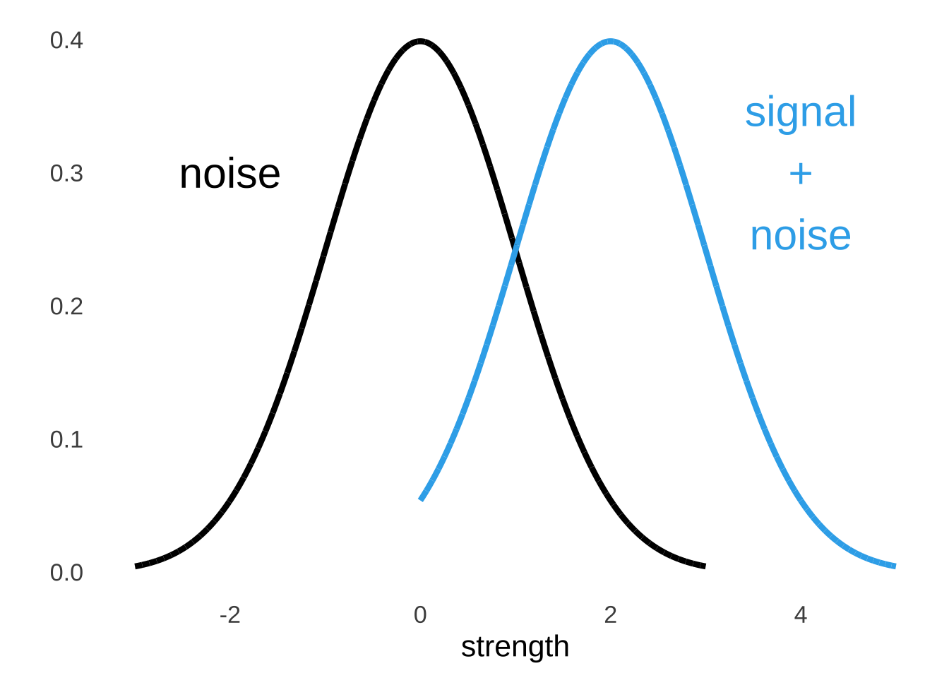
Figure 8.15: Equal Variance Assumption
Under the equal variance assumption, \(\frac{\sigma_{signal}}{\sigma_{noise}}=1\). Thus, we can dispense with finding the slope of the linearized ROC and call it 1. Thus:
\[y=x+d'=\bar{z_{FA}}=\bar{z_{Hit}}+d'\] \[d'=\bar{z_{FA}}-\bar{z_{Hit}}\] Again plugging in the mean of the \(z_{FA}\) values and the mean of the \(z_{Hit}\) values:
\[d'=0.342--0.406=0.748\] The value of \(d'\) found without the assumption of equal variance was \(d'=0.817\), so it’s not an enormous difference.
Because \(d'\) has changed with the change in assumptions, the estimate of the mean of the signal distribution \(\mu_{Signal}\) has also changed: both are now \(d'=\mu_{Signal}=0.748\). Also, since we are now assuming equal variance between the noise and the signal plus noise distributions, the variance and the standard deviation of the signal plus noise distribution are the same as those for the noise distribution, that is to say, \(\sigma^2_{Noise}=1\) and \(\sqrt{\sigma^2_{Noise}}=\sigma_{Noise}=1\) (because we still assume that the noise distribution is a standard normal) and thus \(\sigma^2_{Signal}=1\) and \(\sqrt{\sigma^2_{Signal}}=\sigma_{Signal}=1\). Our estimates of \(\beta_c\) for each criterion point will also change – the \(z\)-scores and the corresponding probability densities for the noise distribution don’t change but the \(z\)-scores and the densities for the signal plus noise distributions do. Replacing the mean and standard deviation of the signal plus noise distribution derived using the unequal-variance assumption – namely: \(\mu_{Signal}=0.817\) and \(\sigma_{Signal}=1.17\) – with the mean and standard deviation of the signal plus noise distribution derived using the equal-variance assumption – \(\mu_{Signal}=0.748\) and \(\sigma_{Signal}=1\), we can update the table of \(z\), probability densities, and \(\beta_c\):
ResponseBias<-c("Most Stringent", "$\\downarrow$", "$\\downarrow$", "$\\downarrow$", "Most Lenient")
Criterion<-1:5
xcriterion<-c(1.75, 1.13, 0.43, -0.09, -1.51)
znoise<-xcriterion
zsignal<-(xcriterion-0.748)

betaequal.df<-data.frame(ResponseBias, Criterion, xcriterion, znoise, zsignal)

betaequal.df$noisedensity<-dnorm(znoise)
betaequal.df$signaldensity<-dnorm(zsignal, 0.748, 1)
betaequal.df$beta<-betaequal.df$signaldensity/beta.df$noisedensity

kable(betaequal.df, "html", booktabs=TRUE, align="c", col.names = c("Response Bias", "Experimental Condition", "Strength ($x$)", "$z_{noise}$", "$z_{signal}$", "Noise Density", "Signal Density", "$\\beta_c$"), escape=FALSE, digits=2) %>%
  kable_styling(full_width = TRUE) %>%
collapse_rows(1)| Response Bias | Experimental Condition | Strength (\(x\)) | \(z_{noise}\) | \(z_{signal}\) | Noise Density | Signal Density | \(\beta_c\) |
|---|---|---|---|---|---|---|---|
| Most Stringent | 1 | 1.75 | 1.75 | 1.00 | 0.09 | 0.39 | 4.48 |
| \(\downarrow\) | 2 | 1.13 | 1.13 | 0.38 | 0.21 | 0.37 | 1.77 |
| 3 | 0.43 | 0.43 | -0.32 | 0.36 | 0.23 | 0.62 | |
| 4 | -0.09 | -0.09 | -0.84 | 0.40 | 0.11 | 0.29 | |
| Most Lenient | 5 | -1.51 | -1.51 | -2.26 | 0.13 | 0.00 | 0.03 |
8.4.3.1 The Area Under the ROC Curve: AUC, or, the C-statistic
The C-statistic is also known as the area under the ROC curve (AUC) and is literally the area under the curve. For the experimental data from Green & Swets, should we want to calculate the C-statistic, we merely need to treat the area under the observed curve as a series of triangles and rectangles as shown in Figure 8.16:
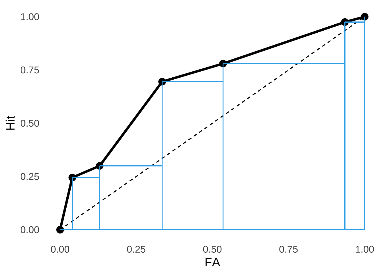
Figure 8.16: Breaking Down The Empirical ROC from the Green & Swets (1966) Data.
If we add up the areas of all those triangles (\(A=\frac{1}{2}bh\)) and all those rectangles (\(A=bh\)), we get an area under the curve – the C-statistic – of \(0.694\)
If you’re wondering something like “if humans can’t make decisions based on objective differences in strength of signals vs. noise, why not let computers do the really important jobs for us,” the short answers are 1. we do, to an extent, and 2. keeping humans involved in signal-detection tasks is a very good idea.↩︎
Fun fact: have you ever heard that eating carrots improves eyesight and/or confers the ability to see in the dark? That’s the result of a WWII British intelligence campaign to prevent Germany from figuring out that Royal Air Force pilots had on-board radar. Carrots are still good for you, though, and can help in maintaining (but not super-powering) eyesight.↩︎
It’s the central conceit of the book The Signal and the Noise by the increasingly insufferable Nate Silver.↩︎
Invoking the idea of a signal-to-noise ratio is mixing metaphors a bit, but it is sometimes used in statistical analyses in the context of effect size.↩︎
The term assumption is commonly used, but it’s not so much an assumption in the sense that we assume that noise is shaped like that, but that we assume it’s true because we can make the shape and position of the noise distribution anything we want and that’s the shape and position we decided on because it makes things like math and interpretation way easier.↩︎
C-statistics can be less than 0.5 for the exact same, Ultimate-Spider-Man-explained reasons that \(d'\) can be negative: it’s an artifact of chance responding or it’s a result of systematic misunderstanding of responses.↩︎
David Green and John Swets’s book is one of the seminal texts on statistical analysis of psychophysical measures. The full citation is: Green, D. M., & Swets, J. A. (1966). Signal detection theory and psychophysics (Vol. 1). New York: Wiley.↩︎
If there is only one experimental condition and thus one criterion point, then the point is moot: you would have to assume equal variances because you wouldn’t have any way of assessing different variances.↩︎
Similar approaches involve creating least-squares regression lines based on condition-specific \(d'\) estimates.↩︎