Chapter 7 Correlation and Regression
7.1 Correlation Does Not Imply Causation…
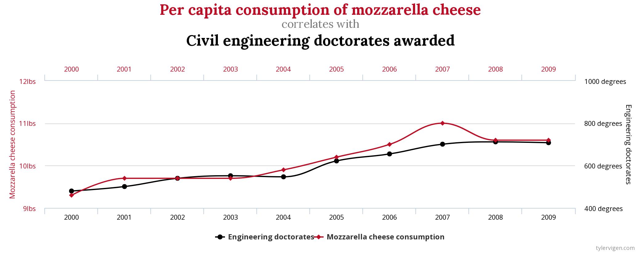
The above chart comes from Tyler Vigen’s extraordinary Spurious Correlations blog. It’s worth your time to go through the charts there and see what he has found in what must be an enormous wealth of data.
Correlation does not imply causation is literally one of the oldest principles in the practice of statistics. It is parroted endlessly in introductory statistics courses by me and people like me. It is absolutely true if we look through enough pairs of variables, we will find some pairs of things that are totally unrelated – like cheese consumption and civil engineering PhD completion – that appear to be connected.
It is also true – and probably more dangerous than coincidence – that there are some variables that correlate not because one causes the other but because a third variable causes both. Take, for example, the famous and probably apocryphal example of the correlation between ice cream sales and violent crime: the idea there is that ambient temperature is correlated with both ice cream consumption and crime rates. Now, the ice cream part of it is most likely just humorous conjecture, and there have been real studies that link heat with aggression, but it is less likely that the link between crime rates with outdoor temperatures is due to heat causing violence, but rather due to higher rates of social interaction in warmer weather that create more opportunities for interpersonal violence.
The decline of sales of digital cameras over the past decade is a well-researched trend. Here, here’s the research:

And here’s another trend in the opposite direction that lines up suspiciously well:
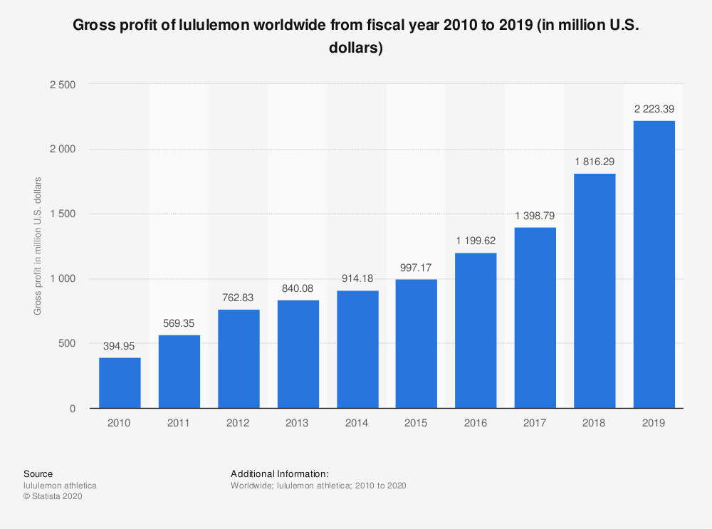
The conclusion is clear: athleisure killed the digital camera.
Or maybe not. But something led to the decline of sales of digital cameras.
7.1.1 …but it Doesn’t Imply NOT Causation either
There is another annual trend that correlates inversely with sales of digital cameras, one wiht a legitimate causal link to that decline in sales:
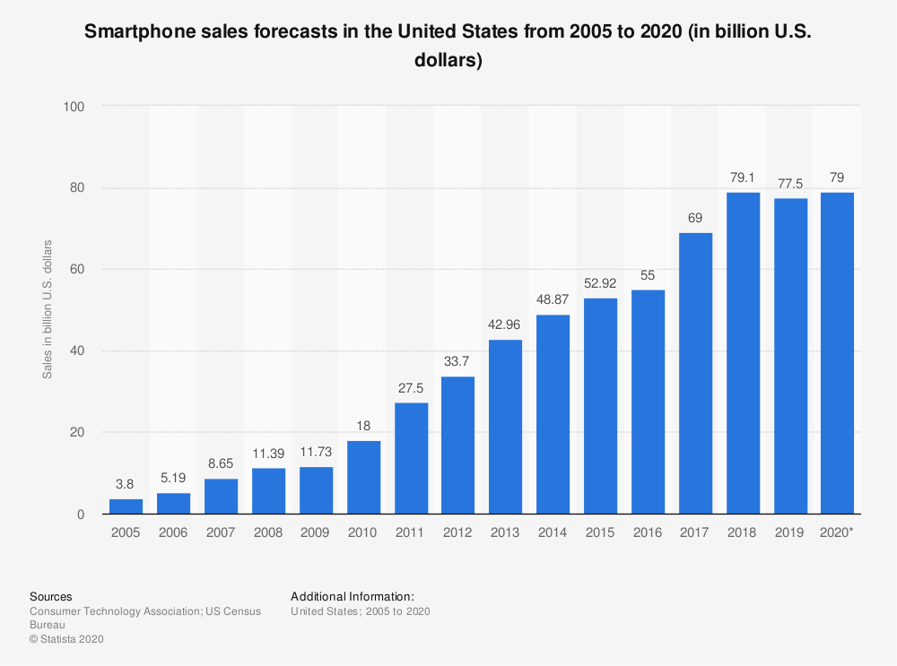
Again, correlation does not imply causation is a true statement. But it is simultaneously true that when there is causation, there is also correlation. In this case, it is fairly reasonable to conclude that digital cameras were rendered irrelevant by smartphones (especially as the quality of phone cameras improves). Correlation techniques – more specifically, regression techniques – are the foundation of most classical and some Bayesian statistical approaches, and as such are widely used in controlled experimentation: the gold standard of establishing causation. So, yes, correlation doesn’t by itself establish cause-and-effect, but it is a good place to start looking.
7.2 Correlation
7.2.1 The Product Moment Correlation Coefficient \(r\)
Correlation is most frequently measured by the frequentist statistic \(r\): the Product Moment Coefficient. We can define \(r\) in a couple of different ways; both are equally correct and, in fact, mathematically equivalent to each other.
The first definition works in the context of a linear relationship between two variables that we will start off calling simply \(x\) and \(y\) – we will have more names for \(x\) and \(y\) later145. One of the basic assumptions of correlation is that there is a linear relationship between \(x\) and \(y\) (although there are ways around that to accomodate cases where the relationship may be consistent but not linear). That means that the relationship between \(x\) and \(y\) is not only predictable and consistent, but also can be expressed in terms of a linear equation, i.e., \(y=a+ bx\)146. The correlation coefficient \(r\) is the slope of a line that relates \(y\) and \(x\); more precisely, it is the slope of the line that relates the standardized scores of \(x\) and \(y\), which we will call \(z_x\) and \(z_y\), respectively. That equation is:
\[\widehat{z_y} = rz_x\]
and we will talk about the hat symbol over \(\widehat{z_y}\) later and at length. That equation and forms of it are the basis of regression, and so we will be spending lots of time with it. But this section is about correlation, so it is sufficient that a passing understanding of the basic standardized regression formula sets us up for the first way we will define the product moment correlation coefficient \(r\).
Definition #1: \(r\) is the coefficient of the ratio of the standardized score (e.g., the \(z\)-score) of a variable \(y\) to the standardized score of a predictor variable \(x\).
\[r=\frac{\widehat{z_y}}{z_x}\] The fact that \(r\) is expressed in terms of \(z\)-scores is super-useful for correlation analysis. \(Z\)-scores are dimensionless, which allows us to make comparisons between two variables that are on vastly different scales (e.g., the correlation between the cost of a cup of coffee in dollars and the U.S. gross domestic product in dollars but many many more dollars), and/or between variables with different units altogether (e.g., the correlation between the height of giraffes in meters and the weight of giraffes in kilograms).
The second definition we will use describes the relationship between \(x\) and \(y\) in a slightly different way. This definition will focus on the covariance between the two variables \(x\) and \(y\).
7.2.1.1 Covariance and the Multivariate Normal Distribution
The covariance of two variables is a measure of the extent to which they are related. The mathematical formula for a sample covariance is:
\[cov_{x, y}=\frac{\sum_{i = 1}^n[(x_i-\bar{x})(y_i-\bar{y})]}{n-1}\]
That formula is really similar to the formula for a sample variance; in fact: the covariance of a variable with itself is simply the variance of that variable:
\[\frac{\sum_{i = 1}^n[(x_i-\bar{x})(x_i-\bar{x})]}{n-1}=\frac{\sum_{i = 1}^n (x_i-\bar{x})^2}{n-1}=s^2\]
Note: the formula for a population covariance is
\[cov_{x, y}=\frac{\sum_{i = 1}^n[(x_i-\mu_x)(y_i-\mu_y)]}{N}\]
This is precisely the same relationship as between the sample variance and the population variance formulas: replace sample means with population means and \(n-1\) with \(N-1\).
Unlike variances – which have a squared term in the numerator and a whole positive integer (\(N\) for a population, \(n-1\) for a sample) in the denominator – covariances can be negative, so there’s no real minimum covariance (it would technically be \(-\infty\)), but the covariance for the least related variables possible is the minimum absolute value of the covariance, which is 0. So, a positive covariance between \(x\) and \(y\) indicates that larger values of \(x\) are associated with larger values of \(y\) and smaller values of \(x\) are associated with smaller values of \(y\); a negative covariance indicates that large \(x\) is associated with small \(y\) (and vice versa), and zero covariance indicates that there is no relationship at all between \(x\) and \(y\).
The product moment correlation coefficient calculation assumes that both variables are sampled from normal distributions. With two normally-distributed variables, and some link between them, we can also say that the data are sampled from a bivariate normal distribution, the two-variable version of the multivariate normal distribution.
To illustrate (literally, because we have lots of charts coming up), let’s talk about two different bivariate distributions, and let’s label them Distribution 1 and Distribution 2. Both distributions have an \(x\) variable and a \(y\) variable. In both population bivariate normal distributions, the mean of \(x\) is 3 \(x\) is 3, the mean of \(y\) is 7, the standard deviation of \(x\) is 4 and the standard deviation of \(y\) is 5. If we call the \(x\) and \(y\) for Distribution 1 \(x_1\) and \(y_1\) and the \(x\) and \(y\) for Distribution 2 \(x_2\) and \(y_2\), we can describe the population means and standard deviations with the following equations:
\[\mu_{x_1}=\mu_{x_2}=3\] \[\sigma_{x_1}=\sigma_{x_2}=4\] \[\mu_{y_1}=\mu_{y_2}=7\] \[\sigma_{y_1}=\sigma_{y_2}=5\] What we have here are two bivariate normal distributions that are identical to each other on the dimension \(x\) and on the dimension \(y\). So, clearly, the distributions must be totally identical, right?
 When we look at \(x_1\) and \(y_1\) for Distribution 1 and \(x_2\) and \(y_2\) for Distribution 2 by themselves, the two distributions appear identical. But, distributions 1 and 2 differ in the relationship between their \(x\) and \(y\) variables.
The difference between Distributions 1 and 2 is that the population covariances between the two variables in each distribution are different. When the corresponding variances of two multivariate distributions are equal (which is the case for this carefully constructed and not-terribly-realistic example, in which \(\sigma_{x_1}=\sigma_{x_2}\) and \(\sigma_{y_1}=\sigma_{y_2}\)), a larger covariance for one of the distributions indicates a closer relationship between the variables within that distribution. In this case, the covariance between \(x\) and \(y\) is greater for distribution 1 – \(cov_{x_1,y_1}=19\) than the covariance in distribution 2 – \(cov_{x_2,y_2}=3\), indicating that \(x_1\) and \(y_1\) are more closely related to each other than are \(x_2\) and \(y_2\). We’ll note for now that most of the time, the corresponding variances in different distributions are not all equal, and we’ll need another kind of measurement. Not to spoil things, but it’s the correlation coefficient.
Let’s take a quick sidebar for an example. Imagine you are a professor teaching two classes: statistics and experimental psychology, and there are a whole lot of students who take both courses. If it were the case that the means and the variances of the grades in each class were identical, would that necessarily mean that every student got the exact same grade in both classes? Of course not! Each student could have the same grade, or grades could tend to be similar, or the grades could be completely unrelated. The extent to which the students’ grades in each class are related to each other can be measured by the covariance.
Now, let’s take \(n=100,000\) samples from Distribution 1 and \(n=100,000\) samples from Distribution 2. Each of those samples has an observed \(x\) value and an observed \(y\) variable (a pair of \(x,y\) observations); each one can be represented as a point in a Cartesian space:
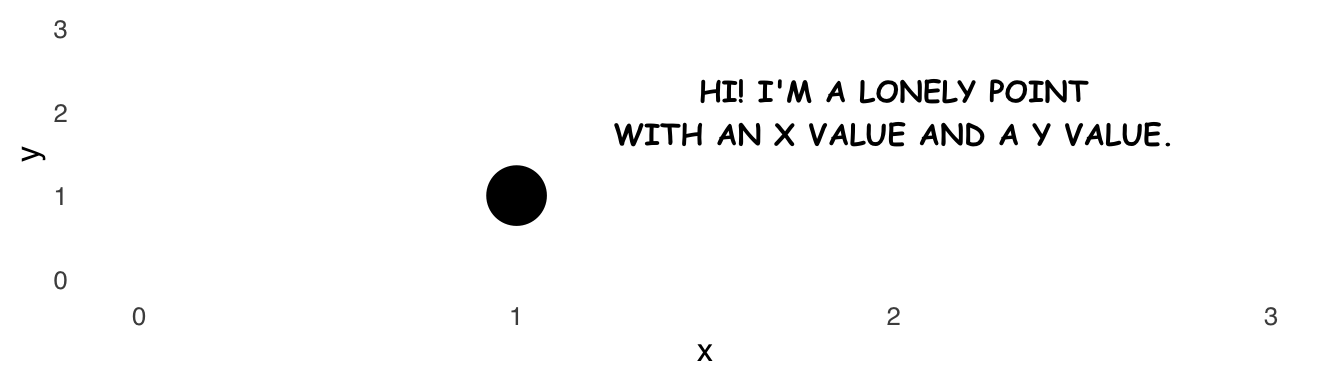
Figure 7.1: a lonely point in x, y space
We can look only at the \(x\) values – ignoring the \(y\) parts of each pair – and plot them in a histogram, as in Figure 7.2
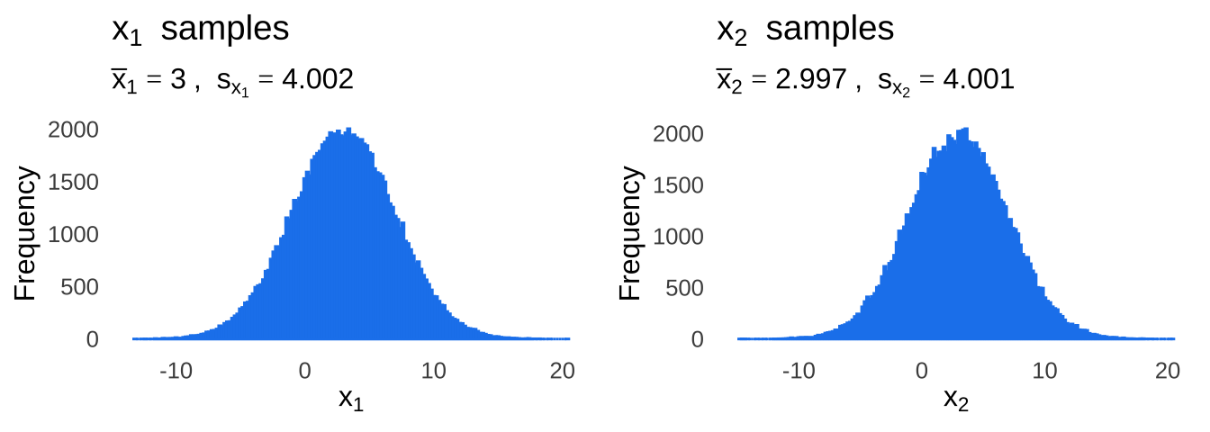
Figure 7.2: Two pretty typical histograms of data sampled from normal-ass distributions.
In Figure 7.3, we can see that the same is true when look only at the \(y\) values, ignoring the \(x\) parts.
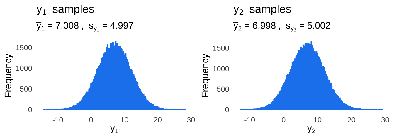
Figure 7.3: Two more pretty typical histograms of data sampled from normal-ass distributions.
Now, let’s plot histograms of the bivariate distributions. Figure 7.4 is an interactive, three-dimensional histogram of Distribution 1: you can click and drag the figure around to see all of it. The floor of the histogram are the \(x\)-axis and the \(y\)-axis – it’s just like a Cartesian \((x, y)\) coordinate plane laid flat on the ground. The vertical dimension – the \(z\)-axis – for this histogram represents the frequency of each observation of \((x, y)\).
Figure 7.4: Histogram of Distribution 1
Looking at that histogram so that the \(x=y\) line is horizontal to our viewpoint (which is the default view in Figure 7.4), the histogram appears to be that of a histogram of samples taken from a normal distribution. When we spin that histogram around (which is done for you in Figure 7.5), we can see that the histogram is almost totally flat, like a plane (the geometry kind, not the flying kind): that’s because \(x_1\) and \(y_1\) are closely related to each other; there’s not much depth because \(x_1\) and \(y_1\) rarely drift away from each other. So, it’s like drawing a histogram on a piece of paper, cutting it out, picking it up, and spinning it around.
Figure 7.5: you spin me right round, baby, right round
Figure 7.6 is an interactive histogram of Distribution 2.
Figure 7.6: Histogram of Distribution 2
When we look at the three-dimensional histogram of Distribution 2 with the \(x = y\) line horizontal to us (the default view in Figure 7.6), it looks like it has pretty much the same shape as when we look at the Distribution 1 histogram (Figure 7.4) from that same angle. But, when we spin the histogram in Figure 7.6 around – see Figure 7.7, we can see that it looks a lot more like a cone than it does a plane. The \(x_2\) and \(y_2\) values are much less closely related to each other than the \(x_1\) and \(y_1\) values are; a point with a given \(x_2\) value could have its \(y_2\) value in lots of different places, including on the diagonal line defined by \(x = y\) but likely off of that diagonal line in a nearly-random scattered pattern.
Figure 7.7: like a record, baby, right round, round, round.
Finally, let’s take a look at the bottoms of Figure 7.4 and Figure 7.6. If we rotate the histograms up and around as in the screencaps in Figure 7.8, we can see the histograms projected onto a a more familiar form of the \((x,y)\) coordinate plane, with the colors we saw on the bars indicating relative frequencies. The flatness of the histogram for Distribution 1 comes through as dots that almost perfectly follow a straight, diagonal line. The roundness of the histogram for Distribution 2 comes through as dots in a circular pattern. These are just pretty ordinary scatterplots now! This is how samples from a bivariate distribution translate into scatterplots.
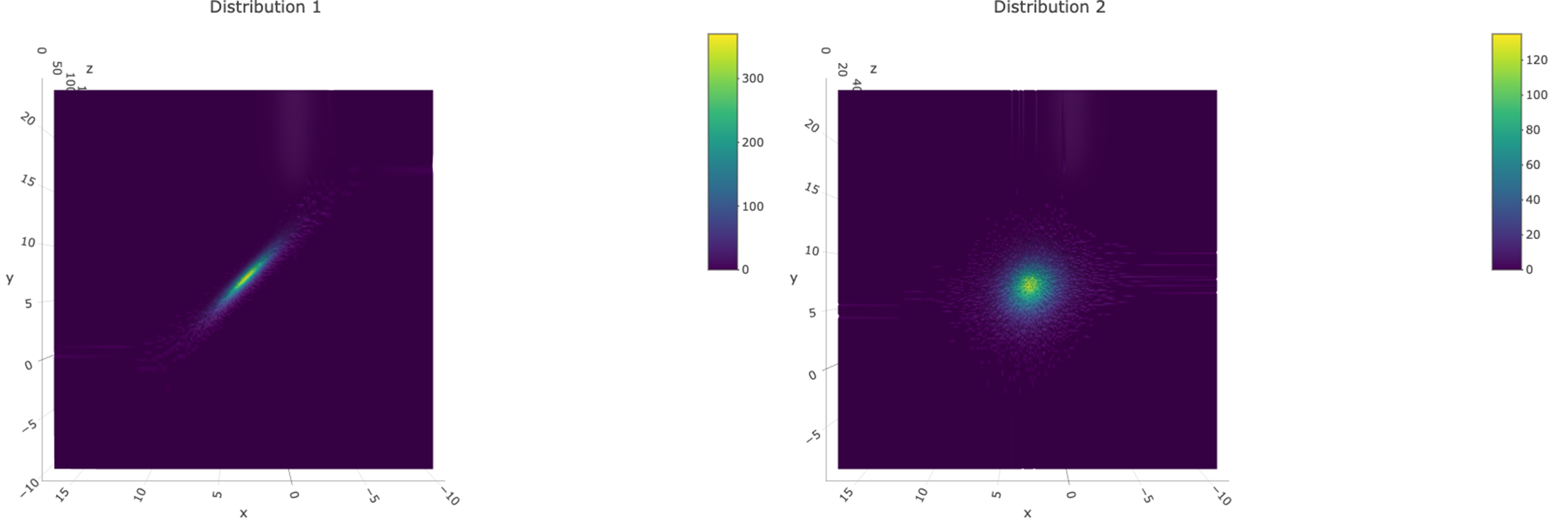
Figure 7.8: The projections on the bottoms of the 3D histograms are scatterplots
I had mentioned earlier that it’s only really meaningful to compare covariances when the underlying variances are equal to each other. Figure 7.9 illustrates the problem with only looking at covariances to compare the relationship between an \(x\) and a \(y\) variable.
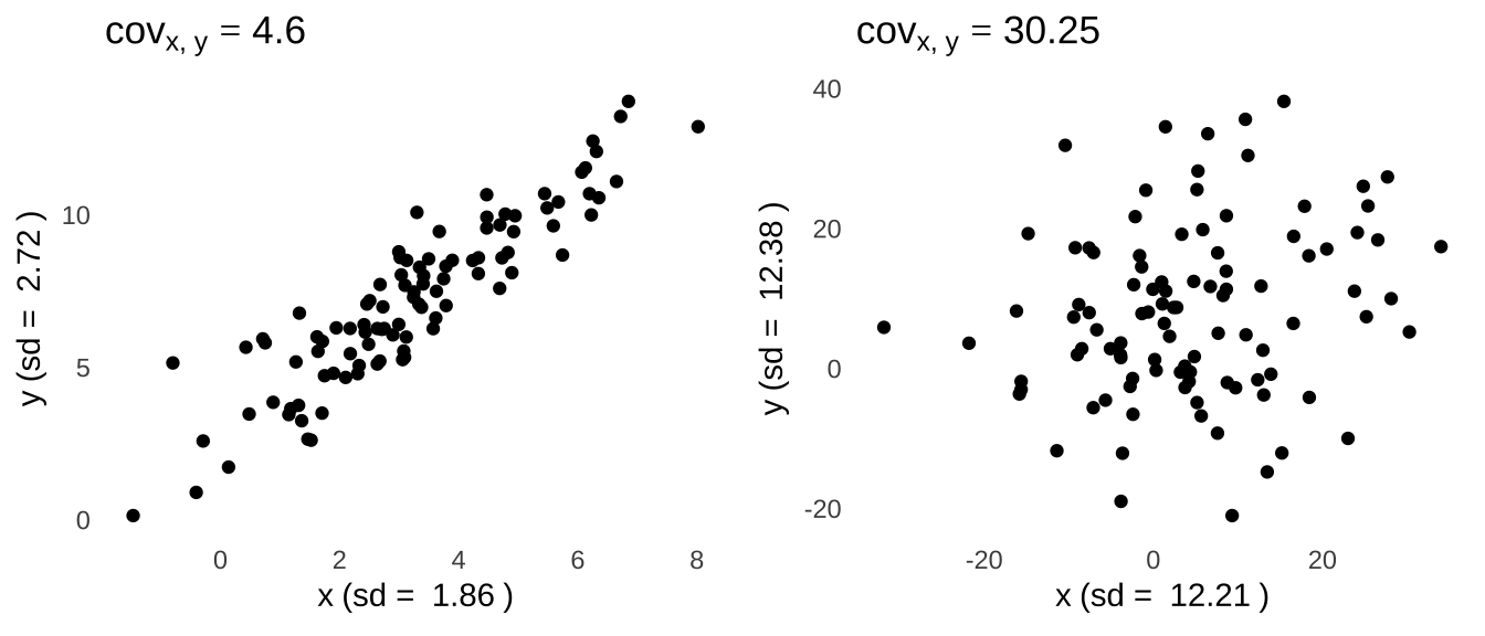
Figure 7.9: The covariance itself is not enough to describe the relationship between two variables because it largely reflects the respective variances of each of the individual variables.
The scatterplot on the left side of Figure 7.9 shows an \(x\) variable and \(y\) variable that are visibly more closely related to each other than the \(x\) and \(y\) variables in the scatterplot on the right. But, the covariance between the variables depicted on the right is \(\sim6.5\times\) the size of the covariance between the variables depicted on the left. The difference here is that there is much more variance in the \(x\) and \(y\) variables plotted in the scatterplot on the right than there is in the \(x\) and \(y\) variables plotted on the left; in terms of the sample covariance formula – \(cov_{x, y}=\frac{1}{n-1}\sum(x-\bar{x})(y-\bar{y})\) – the \(x-\bar{x}\) and \(y-\bar{y}\) terms tend to be bigger for the plot on the right than they are for the plot on the left.
If we wanted to compare the relationships between \(x\) and \(y\) across the two plots, we would need to remove the influence of the different variances of the \(x\) and \(y\) variables. Luckily, we have just the tool for that: we can standardize the variables across the plots by using \(z\)-scores. Plots using the \(z\)-scores and the covariance of the \(z\)-scores are shown in Figure 7.10.
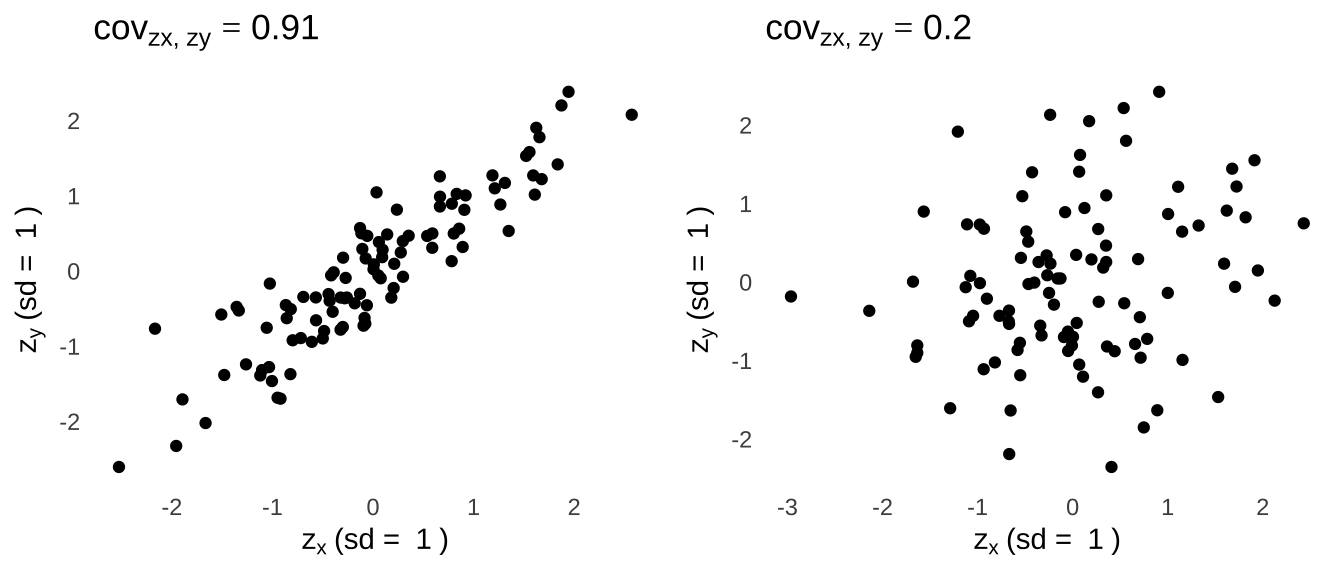
Figure 7.10: Scatterplots and covariances of standardized scores help us to make meaningful comparisons.
Now we can see statistically that the relationship on the left is stronger than the one on the right: all the standard deviations are equal to \(1\), and the covariance of the standardized scores for the left plot is bigger than the covariance of the standardized scores for the right plot. And that is exactly what the correlation coefficient is! In fact, the correlations – measured by \(r\) – between the \(x\) values and \(y\) values in Figure 7.9 are the covariances between \(z_x\) and \(z_y\) (shown in the titles above Figure 7.10)! Thus, correlation is a standardized way of looking at the covariance. Which brings us – at long last – to our second definition:
Definition #2: \(r\) is the standardized form of the covariance.
The statistic \(r\) is standardized to be between \(-1\) and \(1\) by dividing by the product of the standard deviations of \(x\) and \(y\):
\[r = \frac{cov_{x, y}}{sd_x sd_y}\] So, regardless of the magnitudes of the variances of the \(x\) and \(y\) values associated with a bivariate distribution, \(r\) is always on a meaningful scale that stands on its own.
7.2.1.2 Direction and Magnitude
There are two main features of interest to the value of \(r\): its sign (positive or negative) and its magnitude (its absolute value). The sign of \(r\) indicates the direction of the correlation. A positive value of \(r\) indicates that increases in one of a pair of variables correspond generally to increases in the other member of the pair and vice versa: this type of correlation is known as direct or simply positive. A negative value of \(r\) indicates that increases in one of a pair of variables correspond generally to decreases in the other member of the pair and vice versa: that type of correlation is known as indirect, inverse, or simply negative.
The absolute value of \(r\) is a measure of how closely the two variables are related. Absolute values of \(r\) that are closer to 0 indicate that there is a loose relationship between the variables; absolute values of \(r\) that are closer to 1 indicate a tighter relationship between the variables. Jacob Cohen147 recommends the following guidelines for interpreting the absolute value of \(r\):
| Magnitude of \(r\) | Effect Size |
|---|---|
| \(r\gt 0.5\) | Strong |
| \(0.3 \lt r \lt 0.5\) | Moderate |
| \(0.1\lt r\lt 0.3\) | Weak |
| Note: | |
| Cohen considered \(r\) statistics with absolute value less than 0.1 too unlikely to be statistically significant to include. They do exist, but if you wanted to cite Cohen’s guidelines to describe their magnitude you’d have to go with something like ‘smaller than small’ |
The magnitude of \(r\) is an example of an effect size: a statistic that indicates the degree of association (in the case of correlation) or difference (in pretty much every other case) between groups. As with all effect size interpretation guidelines, they are merely intended to be a general framework: the evaluation of any effect size should be interpreted in the context of similar scientific investigations. As Cohen himself wrote:
“there is a certain risk inherent in offering conventional operational definitions for those terms for use in power analysis in as diverse a field of inquiry as behavioral science”
Figure 7.11 illustrates the variety of sign and direction of \(r\) in scatterplots.
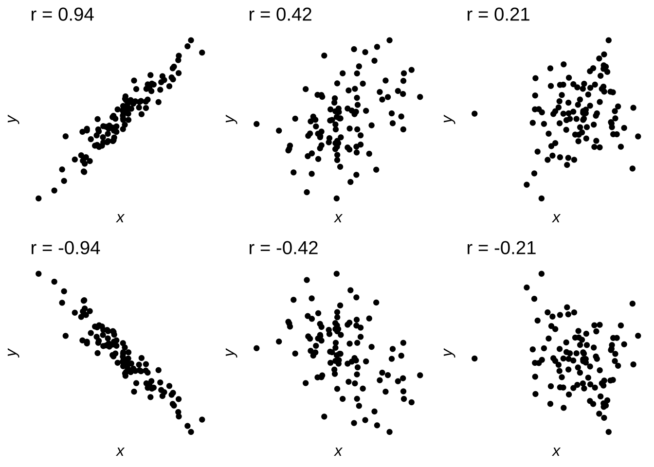
Figure 7.11: Scatterplots Indicating Positive and Negative; Strong, Moderate, and Weak Correlations
7.2.1.3 Hypothesis Testing and Statistical Significance
The null hypothesis in correlational analysis is based on the assumption that \(r\)148 is equal to, greater than or equal to, or less than or equal to 0. A one-tailed test can indicate that a positive correlation is expected:
\[H_0: r \le 0\] \[H_1: r > 0\] or that a negative correlation is expected:
\[H_0: r \ge 0\] \[H_1: r < 0.\] A two-tailed hypothesis suggests that either a positive or a negative correlation may be considered significant:
\[H_0: r=0\] \[H_1: r \ne 0\] Critical values of \(r\) can be found by consulting tables like this one. The critical values of \(r\) are the smallest values given the df – which for a correlation is equal to \(n-2\) – that represents a statistically significant result given the desired \(\alpha\)-rate and type of test (one- or two-tailed).
7.2.1.4 Assumptions of Parametric Correlation
Like most parametric tests in the Classical framework, the results of parametric correlation are based on assumptions about the structure of the data (the assumptions of frequentist parametric tests will get it’s own discussion later. The main assumption to be concerned about149 is the assumption of normality.
The normality assumption is that the data are sampled from a normal distribution. The sample data themselves do not have to be normally distributed – a common misconception – but the structure of the sample data should be such that they plausibly could have come from a normal distribution. If the observed data were not sampled from a normal distribution, the correlation will not be as strong as it would if they were. If there are any concerns about the normality assumption, the best and easiest way to proceed is to back up a parametric correlation with one of the nonparametric correlations described below: usually Spearman’s \(\rho\), sometimes Kendall’s \(\tau\), or, if the data are distributed in a particular way, Goodman and Kruskal’s \(G\).
The secondary assumption for the \(r\) statistic is that the variables being correlated have a linear relationship. As covered below, \(r\) is the coefficient for a linear function: that function does a much better job of modeling the data if the data scatter in a linear function about the line.
If the data are not sampled from a normal distribution and/or linearly related, then \(r\) just won’t work as well. It’s not that the earth beneath the analyst opens up and swallows them whole when assumptions of classical parametric tests are violated: it’s just that they don’t wory as intended, leading to type-II errors (if anything).
7.2.2 Parametric Correlation Example
Let’s use the following set of \(n=10\) paired observations, each with an \(x\) value and a \(y\) value. Please note that it’s pretty rare – but certainly not impossible – to run a correlation with just 10 pairs in an actual scientific study; we’ll just limit it to 10 here because anything more than that gets hard to follow. More importantly, please note that \(n\) refers to pairs of observations in the context of correlation and regression. We get \(n\) not from the number of numbers (which, in this case, will be 20) but by the number of entities being measured, and with correlation each pair of \(x\) and \(y\) are different measurements related to the same thing. For example, imagine we were seeing if there were a correlation between height and weight and we had \(n=10\) people in our dataset: we would have 10 values for heights and 10 values for weights which is 20 total numbers, but the 20 numbers still refer to 10 people.
Where were we? Right, the data we are going to use for our examples. It’s a generic set of \(n=10\) observations numbered sequentially from \(1 \to 10\), 10 observations for a generic \(x\) variable, and 10 observations for a generic \(y\) variable.
| \(n\) | \(x\) | \(y\) |
|---|---|---|
| 1 | 4.18 | 1.73 |
| 2 | 4.70 | 1.86 |
| 3 | 6.43 | 3.61 |
| 4 | 5.04 | 2.09 |
| 5 | 5.25 | 2.00 |
| 6 | 6.27 | 4.07 |
| 7 | 5.34 | 2.56 |
| 8 | 4.21 | 0.33 |
| 9 | 4.17 | 1.49 |
| 10 | 4.67 | 1.46 |
And here is a scatterplot, with \(x\) on the \(x\)-axis and \(y\) on the \(y\)-axis:
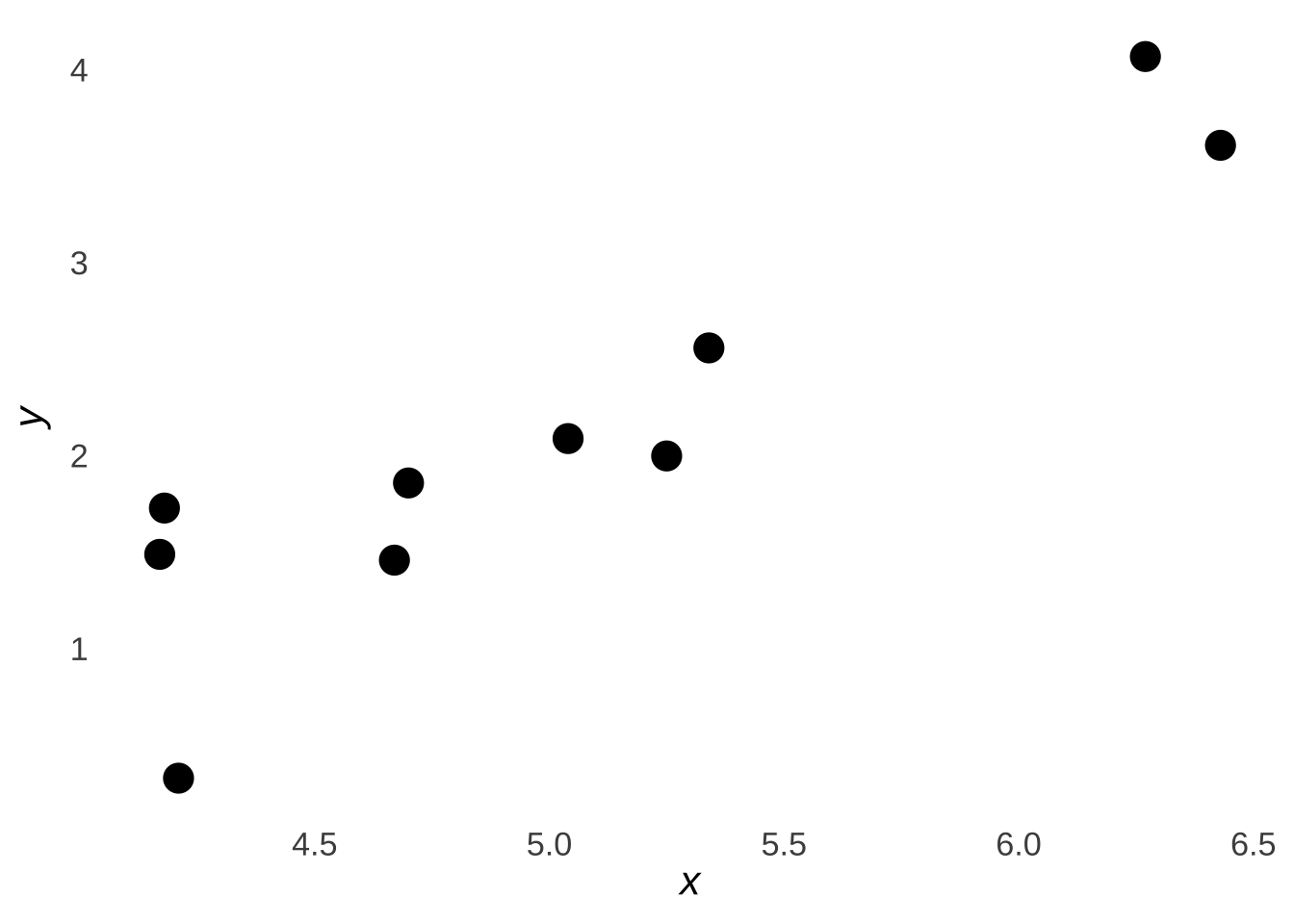
Figure 7.12: Scatterplot of the Sample Data
7.2.2.1 Definitional Formula
The product-moment correlation is the sum of the products of the standardized scores (\(z\)-scores) of each pair of variables divided by \(n-1\):
\[r=\frac{\sum_{i=1}^n z_{x_i}z_{y_i}}{n-1}\] This formula is thus known as the definitional formula: it serves as both a description of and a formula for \(r\). To illustrate, we fill the below table out using our sample data:
| Obs \(i\) | \(x_i\) | \(y_i\) | \(z_{x_i}\) | \(z_{y_1}\) | \(z_{x_i}z_{y_i}\) |
|---|---|---|---|---|---|
| 1 | 4.18 | 1.73 | -1.03 | -0.36 | 0.37 |
| 2 | 4.70 | 1.86 | -0.40 | -0.24 | 0.10 |
| 3 | 6.43 | 3.61 | 1.72 | 1.38 | 2.37 |
| 4 | 5.04 | 2.09 | 0.02 | -0.03 | 0.00 |
| 5 | 5.25 | 2.00 | 0.27 | -0.11 | -0.03 |
| 6 | 6.27 | 4.07 | 1.52 | 1.81 | 2.75 |
| 7 | 5.34 | 2.56 | 0.38 | 0.41 | 0.16 |
| 8 | 4.21 | 0.33 | -1.00 | -1.66 | 1.66 |
| 9 | 4.17 | 1.49 | -1.05 | -0.58 | 0.61 |
| 10 | 4.67 | 1.46 | -0.44 | -0.61 | 0.27 |
Taking the sum of the rightmost column and dividing by \(n-1\), we get the \(r\) statistic:
\[\frac{\sum_{i=1}^nz_{x_i}z_{y_i}}{n-1}=0.9163524\]
We can check that math using the cor.test() command in R (which we could have just done in the first place):
##
##  Pearson's product-moment correlation
##
## data:  x and y
## t = 6.4736, df = 8, p-value = 0.0001934
## alternative hypothesis: true correlation is not equal to 0
## 95 percent confidence interval:
##  0.6777747 0.9803541
## sample estimates:
##       cor
## 0.9163524
7.2.2.2 Computational Formula
\(r\) can alternatively and equivalently be calculated using what is known as the computational formula:
\[r=\frac{\sum_{i=1}^n \left(x-\bar{x} \right) \left(y-\bar{y} \right)}{\sqrt{SS_xSS_y}}\]
where
\[SS_x=\sum_{i=1}^n (x-\bar{x})^2\] and
\[SS_x=\sum_{i=1}^n (x-\bar{x})^2\] That formula is called the computational formula because apparently it’s easier to calculate. I don’t see it. But, here’s how we would approach using the computational formula:
| Obs \(i\) | \(x_i\) | \(y_i\) | \((x-\bar{x})\) | \((y-\bar{y})\) | \((x-\bar{x})(y-\bar{y})\) | \((x-\bar{x})^2\) | \((y-\bar{y})^2\) |
|---|---|---|---|---|---|---|---|
| 1 | 4.18 | 1.73 | -0.85 | -0.39 | 0.33 | 0.72 | 0.15 |
| 2 | 4.70 | 1.86 | -0.33 | -0.26 | 0.08 | 0.11 | 0.07 |
| 3 | 6.43 | 3.61 | 1.40 | 1.49 | 2.09 | 1.97 | 2.22 |
| 4 | 5.04 | 2.09 | 0.01 | -0.03 | 0.00 | 0.00 | 0.00 |
| 5 | 5.25 | 2.00 | 0.22 | -0.12 | -0.03 | 0.05 | 0.01 |
| 6 | 6.27 | 4.07 | 1.24 | 1.95 | 2.43 | 1.55 | 3.80 |
| 7 | 5.34 | 2.56 | 0.31 | 0.44 | 0.14 | 0.10 | 0.19 |
| 8 | 4.21 | 0.33 | -0.82 | -1.79 | 1.46 | 0.67 | 3.20 |
| 9 | 4.17 | 1.49 | -0.86 | -0.63 | 0.54 | 0.73 | 0.40 |
| 10 | 4.67 | 1.46 | -0.36 | -0.66 | 0.23 | 0.13 | 0.44 |
\[\sum(x-\bar{x})(y-\bar{y})=7.2782\] \[SS_x=\sum(x-\bar{x})^2=6.01504\] \[SS_y=\sum(y-\bar{y})^2=10.4878\]
\[r=\frac{\sum(x-\bar{x})(y-\bar{y})}{\sqrt{SS_xSS_y}}=\frac{7.2782}{\sqrt{(6.01504)(10.4878)}}=0.9163524\]
See? Same answer.
7.2.3 Nonparametric correlation
The \(r\) statistic is the standard value used to describe the correlation between two variables. It is based on the assumptions that the data are sampled from a normal distribution and that the data have a linear relationship. If the data violate those assumptions – or even if we are concerned that the data might violate those assumptions – nonparametric correlations are a viable alternative.
Nonparametric correlations – and nonparametric tests in general – are so-named because they do not make inferences about population parameters: they do not involve means, nor standard deviations, nor combinations of the two (as \(r\) is), in either the null or alternative hypotheses. They are, instead, based on the cumulative likelihood of the observed pattern of the data or more extreme unobserved patterns of the data.150
For example, consider the following data:
| \(x\) | \(y\) |
|---|---|
| 1 | 1 |
| 2 | 2 |
| 3 | 3 |
| 4 | 4 |
| 5 | 5 |
| 6 | 6 |
Please notice that \(x\) and \(y\) are perfectly correlated: in fact, they are exactly the same. What is the probability of that happening? To answer that, we need to know how many possible combinations of \(x\) and \(y\) there are, so we turn to permutation.
To find the number of combinations of \(x\) and \(y\), we can leave one of the variables fixed as is and then find out all possible orders of the other variable: that will give us the number of possible pairs. That is: if we leave all the \(x\) values where they are, we just need to know how many ways we could shuffle around the \(y\) values (or we could leave \(y\) fixed and shuffle \(x\) – it doesn’t matter). The number of possible orders for the \(y\) variable (assuming we left \(x\) fixed) is given by:
\[nPr=~_6P_6=\frac{6!}{0!}=720\] So, there are 720 possible patterns for \(x\) and \(y\). The probability of this one pattern is therefore \(1/720=0.0014\). If we have a one-tailed test where we are expecting the relationship between \(x\) and \(y\) to be positive, then the observed pattern of the data is the most extreme pattern possible (can’t get more positive agreement than we have), and \(0.0014\) is the \(p\)-value of a nonparametric correlation (specifically, the Spearman correlation).
##
##  Spearman's rank correlation rho
##
## data:  1:6 and 1:6
## S = 0, p-value = 0.001389
## alternative hypothesis: true rho is greater than 0
## sample estimates:
## rho
##   1
If we have a two-tailed test where we do not have an expectation on the direction of the relationship, then there would be one more equally extreme possible pattern: the case where the variables went in perfectly opposite directions (\(x=\{1,~2,~3,~4,~5,~6\}\) and \(y=\{6,~5,~4,~3,~2,~1\}\) or vice versa). With two patterns being as extreme as the observed pattern, the \(p\)-value would then be \(2/720=0.0028\).
##
##  Spearman's rank correlation rho
##
## data:  1:6 and 1:6
## S = 0, p-value = 0.002778
## alternative hypothesis: true rho is not equal to 0
## sample estimates:
## rho
##   1
7.2.3.1 Spearman’s \(\rho\)
The \(\rho\) is the \(r\) of the ranks: \(\rho\) is also known as the rank correlation. There are fancy equations to derive \(\rho\) from the ranks, but I have no idea why you would need to use them instead of just correlating the ranks of the data
Returning to our example data, we can rank each value relative to the other values of the same variable from 1 to \(n\). Usually the ranks go from smallest to largest, but it doesn’t really matter so much as the same convention is followed for both the \(x\) and the \(y\) values. In the case of ties, take the average of the ranks above and below the tie cluster. If, for example, the data were \(\{4, 7, 7, 8\}\), the ranks would be \(\{1, 2.5, 2.5, 4\}\).
| \(x\) | \(y\) | \(rank(x)\) | \(rank(y)\) |
|---|---|---|---|
| 4.18 | 1.73 | 2 | 4 |
| 4.70 | 1.86 | 5 | 5 |
| 6.43 | 3.61 | 10 | 9 |
| 5.04 | 2.09 | 6 | 7 |
| 5.25 | 2.00 | 7 | 6 |
| 6.27 | 4.07 | 9 | 10 |
| 5.34 | 2.56 | 8 | 8 |
| 4.21 | 0.33 | 3 | 1 |
| 4.17 | 1.49 | 1 | 3 |
| 4.67 | 1.46 | 4 | 2 |
We then could proceed to calculate the correlation \(r\) between the ranks. Or, even better: we can calculate the \(\rho\) correlation for the observed data:
##
##  Spearman's rank correlation rho
##
## data:  x and y
## S = 20, p-value = 0.001977
## alternative hypothesis: true rho is not equal to 0
## sample estimates:
##       rho
## 0.8787879
And note that the \(\rho\) is the same value as if we calculated \(r\) for the ranks151
##
##  Pearson's product-moment correlation
##
## data:  xrank and yrank
## t = 5.2086, df = 8, p-value = 0.0008139
## alternative hypothesis: true correlation is not equal to 0
## 95 percent confidence interval:
##  0.5577927 0.9710980
## sample estimates:
##       cor
## 0.8787879
7.2.3.2 Kendall’s \(\tau\)
Where \(\rho\) is based on patterns of ranks, Kendall’s \(\tau\) correlation is based on patterns of agreement. In the annotated scatterplot in Figure 7.13, the lines connecting four of the possible pairs between the five datapoints – the concordant pairs – move in the same direction (from southwest to north east), while the line connecting one pair of the datapoints – the discordant pair moves in the opposite direction.
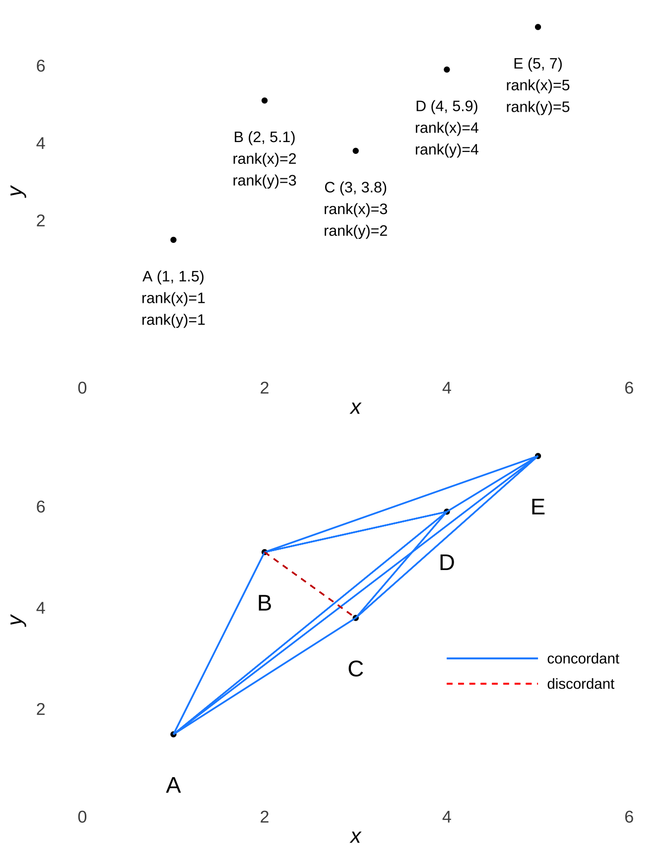
Figure 7.13: Pairwise Comparisons of Sample Dataset with Mixed Concordance and Discordance (Example 3)
The \(\tau\) for the example data (the original example data, not the data for Figure 7.13) is:
##
##  Kendall's rank correlation tau
##
## data:  x and y
## T = 39, p-value = 0.002213
## alternative hypothesis: true tau is not equal to 0
## sample estimates:
##       tau
## 0.7333333
7.2.3.2.1 A Bayesian Nonparametric Approach to Correlation
There is not a lot said about the differences between Classical vs. Bayesian approaches to correlation and regression on this page, mainly because this is an area where Bayesians don’t have many snarky things to say about it. Bayesians may take issue with the assumptions or with the way that \(p\)-values are calculated – and both of those potential problems are addressed in the Bayesian regression approach discussed below – but they are pretty much down with the concept itself.
A recently developed approach152 involves taking the Kendall \(\tau\) concept of concordant pairs and discordant pairs and treating the two pair possibilities as one would successes and failures in a binomial context. Using the number of concordant pairs \(T_c\) as the number of discordant pairs \(T_d\) as \(s\) and \(f\), we can analyze the concordance parameter \(\phi_c\) the same way we analyze the probability \(\pi\) of \(s\): with a \(\beta\) distribution. The \(\phi_c\) parameter is related to Kendall’s \(\tau\):
\[\phi_c=\frac{\tau+1}{2}\] and Figure 7.14 shows how the \(\beta\) distribution of \(\phi_c\) relates to scatterplots of data described by various values of \(\tau\).
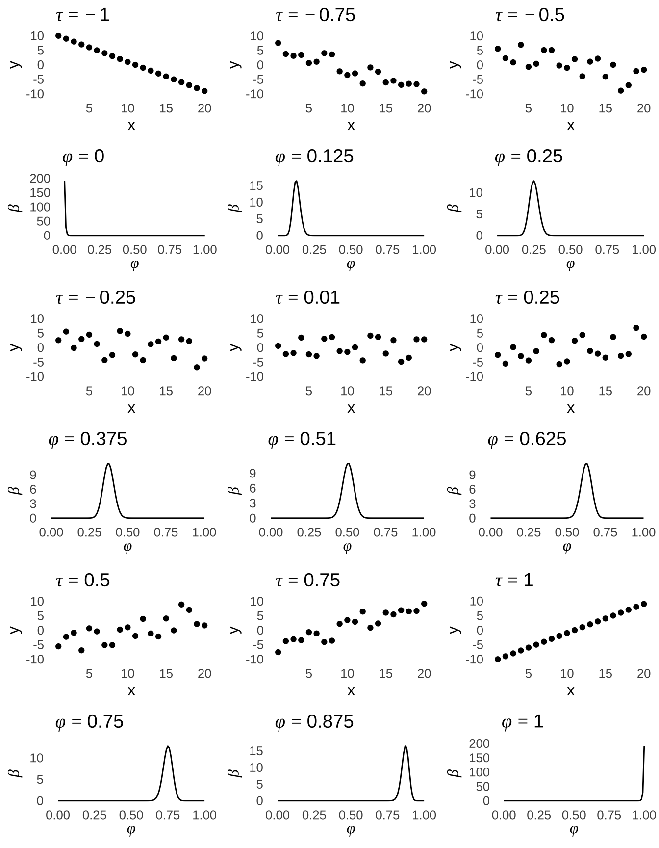
Figure 7.14: \(\hat{\tau}\) Values (\(n=20\)) and Corresponding Posterior \(\beta\) Distributions of \(\phi_c\)
There is a slight problem with the \(\tau\) statistic in the case where values are tied (either within a variable or if multiple pairs are tied with each other). The difference is small, but for a more accurate correction for ties, see the bonus content at the end of this page.
7.2.3.3 Goodman and Kruskal’s \(\gamma\)
Imagine that we wanted to compare the letter grades received by a group of 50 high school students in two of their different classes. Here is a cross-tabulation of their grades:
| A | B | C | D | F | ||
|---|---|---|---|---|---|---|
| Social Studies Grade | A | 6 | 2 | 1 | 2 | 0 |
| B | 2 | 6 | 2 | 1 | 1 | |
| C | 1 | 1 | 7 | 1 | 1 | |
| D | 1 | 1 | 0 | 6 | 3 | |
| F | 0 | 0 | 0 | 0 | 5 |
Goodman and Kruskal’s \(\gamma\) correlation allows us to make this comparison. The essential tenet of the \(\gamma\) correlation is this: if there were a perfect, positive correlation between the two categories, then all of the students would be represented on the diagonal of the table (everybody who got an “A” in one class would get an “A” in the other, everybody who got a “B” in one class would get a “B” in the other, etc.). If there were a perfect, inverse correlation, then all of the students would be represented on the reverse diagonal. The \(\gamma\), which like the other correlation coefficients discussed here ranges from \(-1\) to 1, is a measure to the extent which categories agree. That means that the \(\gamma\) can be used for categorical data, but also for numbers that can be placed into categories (like, the way that ranges of numerical grades can be converted into categories of letter grades).
##     gamma    lwr.ci    upr.ci
## 0.6769596 0.4685468 0.8853724
7.2.4 Nonlinear correlation
One of the assumptions of the \(r\) correlation is that there is a linear relationship between the variables. If there is a non-linear relationship between the variables, one option is to use a nonparametric correlation like \(\rho\) or \(\tau\)153. If there is a clear pattern to the non-linearity, one might also consider transforming one of the variables until the relationship is linear, calculating \(r\), and then transforming it back.
As an example, the data represented in Figure 7.15 are the same example data that we have been using throughout this page, except that the \(y\) variable has been exponentiated: that is, we have raised the number \(e\) to the power of each value of \(y\)
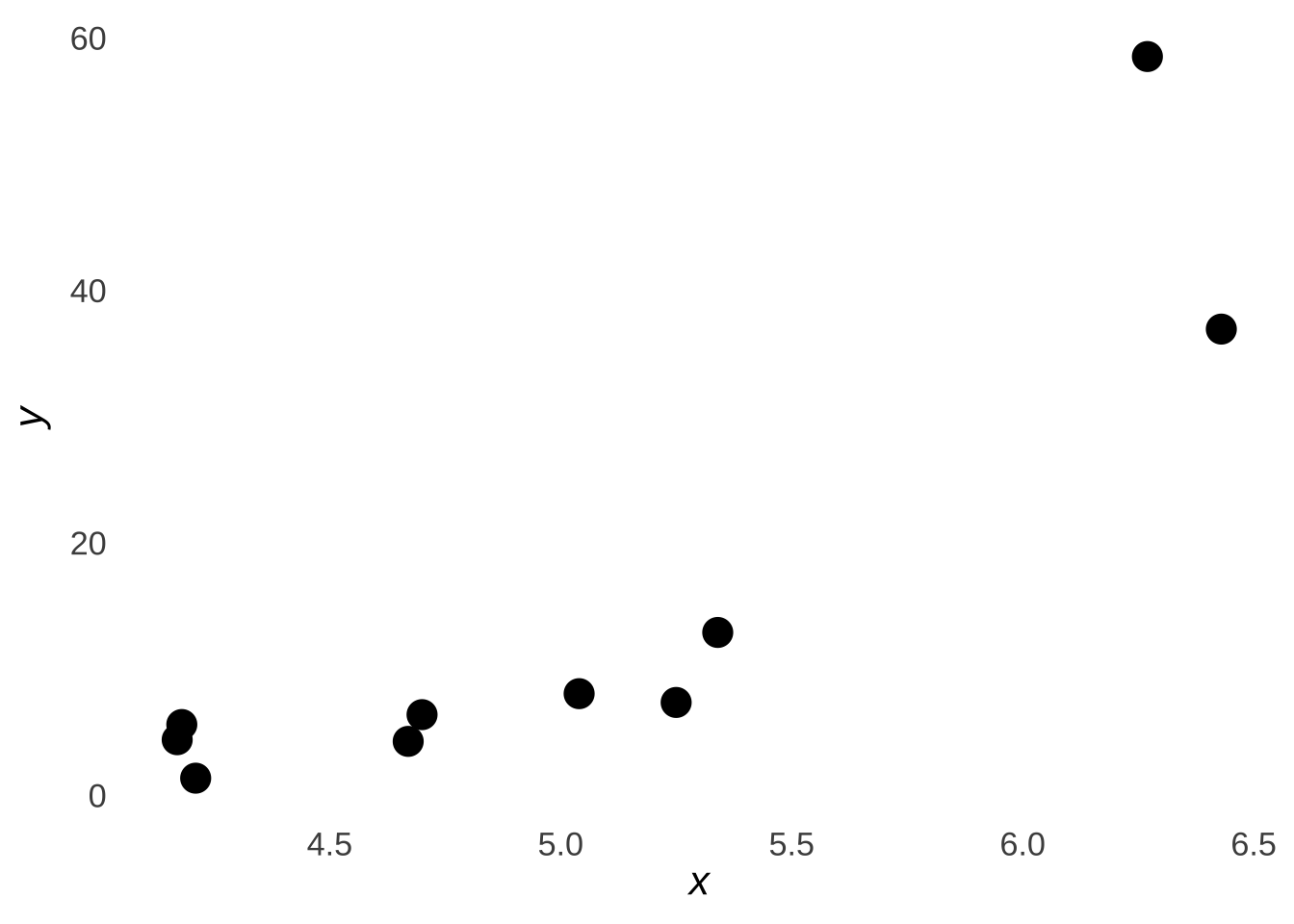
Figure 7.15: Scatterplot of the Sample Data \(x\) and \(e^y\)
We can still calculate \(r\) for these data despite the relationship now looking vaguely non-linear: the correlation between \(x\) and \(e^y\) is 0.86. However, that obscures the relationship between the variables.154 In this case, we can take the natural logarithm \(\ln{e^y}\) to get \(y\) back, and then calculate an \(r\) of 0.92 as we did before. We would then report the nonlinear correlation \(r\), or report \(r\) as the correlation between one variable and the transformation of the other.
The only thing that we can’t do is transform a variable, calculate \(r\), and then report \(r\) without disclosing the transformation. That’s just cheating.
There are, of course, whole classes of variables for which we use transformations, usually in the context of regression. To name a few examples from the unit on probability distributions, when the \(y\) variable is distributed as a logistic distribution, we transform the \(y\) variable in the procedure known as logistic regression; when the \(y\) variable is distributed as a Poisson distribution, we use Poisson regression, and when the \(y\) variable is distributed as a \(\beta\) distribution, we use \(beta\) regression. That’s one area of statistics where the names really are pretty helpful.
A couple of caveats before we move on: some patterns aren’t as easy to spot as logarithms (or, squares or sine waves), and most nonlinear correlations are better handled by multiple regression (sadly, beyond the scope of this course).
7.3 Regression
Correlation is an indicator of a relationship between variables. Regression builds on correlation to create predictive models. If \(x\) is our predictor variable and \(y\) is our predicted variable, then we can use the correlation between the observed values \(x\) and \(y\) to make a model that predicts unobserved values of \(y\) based on unobserved values of \(x\).
7.3.1 The Least-Squares Regression Line
Our regression model is summarized by the least-squares regression line. The least-squares line is the function out of all possible functions of its type that results in the smallest squared distance between each observed \((x, y)\) pair and the function itself. In visual terms, it is the line that minimizes the sum of the squared distances between each point and the line: move the line in any direction and the sum of the squared distances would increase.
Figure 7.16 is a scatterplot of the data introduced earlier in this chapter with the least-squares regression line added in blue.
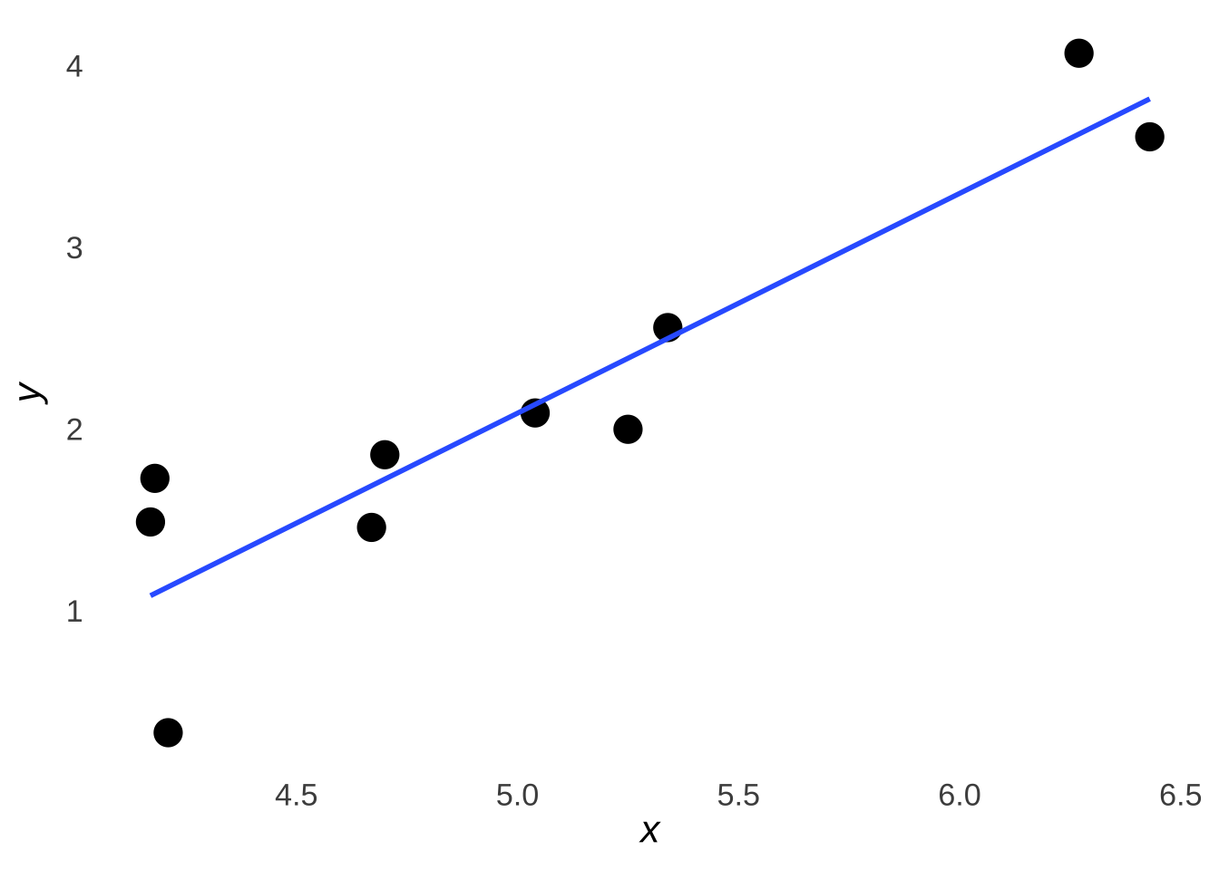
Figure 7.16: The Example Data Plus The Least-Squares Regression Line
With a basic visual inspection, we can see that the line makes a path through the dots and that the dots are pretty randomly scattered around the line (some dots are above the line, some below, some right on it). That’s what we want, and, we’ll talk more about the scatter of the dots in the section of this chapter devoted to prediction errors.
There are two principal ways of expressing the least-squares regression line: the standardized regression equation and the raw-score regression equation.
7.3.1.1 Standardized Regression Equation
The standardized regression equation describes the relationship between the standardized values of \(x\) and the standardized values of \(y\). The standardized values of the variables are the \(z\)-scores of the variables: thus, the standardized regression equation is also called the \(z\)-score form of the regression equation. The standardized regression equation indicates that the estimated \(z\)-score of the \(y\) variable is equal to the product of \(r\) and the \(z\)-score of the \(y\) variable:
\[\hat{z_y}=rz_x\]
Figure 7.17 is a scatterplot of the \(z\)-scores for the \(x\) and \(y\) variables in the example introduced above. The blue line is the least-squares regression line in standardized (\(z\)-score) form. Please note that when \(z_x=0\), then \(rz_x=\hat{z_y}=0\), so the line – as do all lines made by standardized regression equations – passes through the origin \((0,~0)\).
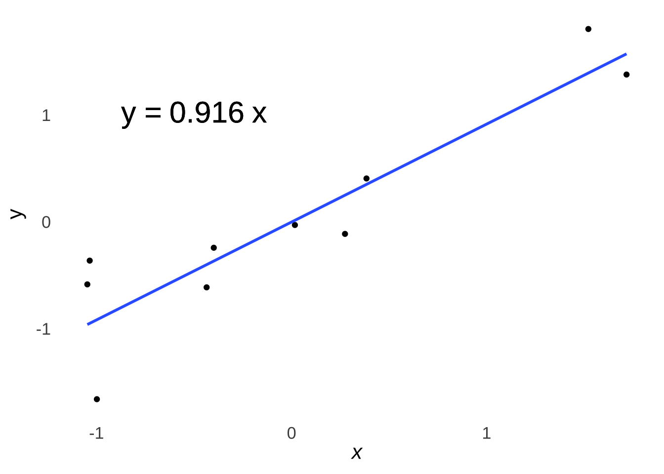
Figure 7.17: Scatterplot of \(z_x\) and \(z_y\)
7.3.1.2 Raw-score regression equation
Technically, the standardized regression equation would be all you would need to model the relationship between two variables – if you knew the mean and standard deviation of each variable and had the time to derive \(x\) and \(y\) values from \(z_x\) and \(z_y\) values. But, the combination of those statistics and the time and/or patience to convert back-and-forth from standardized scores are rarely available, especially when consuming reports on somebody else’s research. It is far more meaningful (and convenient) to put the standardized equation into a form where changes in the plain old raw \(x\) variable correspond to changes in the plain old raw \(y\) variable. That format is known as the raw-score form of the regression equation, and it’s almost always the kind of regression formula one would actually encounter in published work.
The form of the raw-score equation is:
\[\hat{y}=ax+b\] where \(a\) is the slope of the raw-score form of the least-squared regression line and \(b\) is the \(y\)-intercept of the line (that is, the value of the line when \(x=0\) and the line intersects with the \(y\)-axis).
We get the raw-score equation by converting the \(z\)-score form of the equation. Wait, actually, 99.9% of the time we get the raw-score equation using software in the first place, but if we did need to calculate the raw-score equation by hand155, we would first find \(r\), which would give us the standardized equation \(\hat{z_y}=rz_x\), which we would then convert to the raw-score form via the following steps:
- Find the intercept \(b\)
The intercept (of any equation in the Cartesian Plane) is the point at which a line intersects with the \(y\)-axis, meaning that it is also the point on a line where \(x=0\). Thus, our first job is to find what the value of \(y\) is when \(x=0\). We don’t yet have a way to relate \(x=0\) to any particular \(y\) value, but we do have a way to connect \(z_x\) to \(z_y\): the standardized regression equation \(\hat{z_y}=rz_x\).
First, we can find the value of \(z_x\) for \(x=0\) using the \(z\)-score equation \(z=\frac{x-\bar{x}}{sd}\) and plugging 0 in for \(x\). Using our sample data, \(\bar{x}=5.026\) and \(sd_x=0.8175193\), thus:
\[z_x=\frac{0-5.026}{0.8175193}=-6.147867\] From the standardized regression equation, we know that \(\hat{z_y}=rz_x\), so the value of \(\hat{z_y}\) when \(x=0\) is:
\[\hat{z_y}=rz_x=(0.9163524)(-6.147867)=-5.633613\] And then, using the \(z\)-score formula again and knowing that the mean of \(y\) is 2.12 and the sd of \(y\) is 1.0794958, we can solve for \(y\):
\[-5.633613=\frac{y-2.12}{1.079496}\] \[y=-3.961463\] We know then that the raw-score least-squares regression line passes through the point \((0, -3.961463)\), so the intercept \(b=-3.961463\).
It takes two points to find the slope of a line. We already have one – the \(y\)-intercept \((0, -3.961463)\) – and any other one will do. I prefer finding the point of the line where \(x=1\), just because it makes one step of the math marginally easier down the line.
Using the same procedure as above, when \(x\)=1, \(z_x=-4.924654\), \(z_y=-4.512719\), and \(y=-2.751461\). The slope of the line is the change in \(y\) divided by the change in \(x\) \(\left( \frac{\Delta y}{\Delta x} \right)\):
\[a=\frac{\Delta y}{\Delta x}=\frac{-2.751461--3.961463}{1-0}=1.210002\] Thus, our least-squares regression equation in raw-score form is (after a bit of rounding):
\[\hat{y}=1.21x-3.9615\]
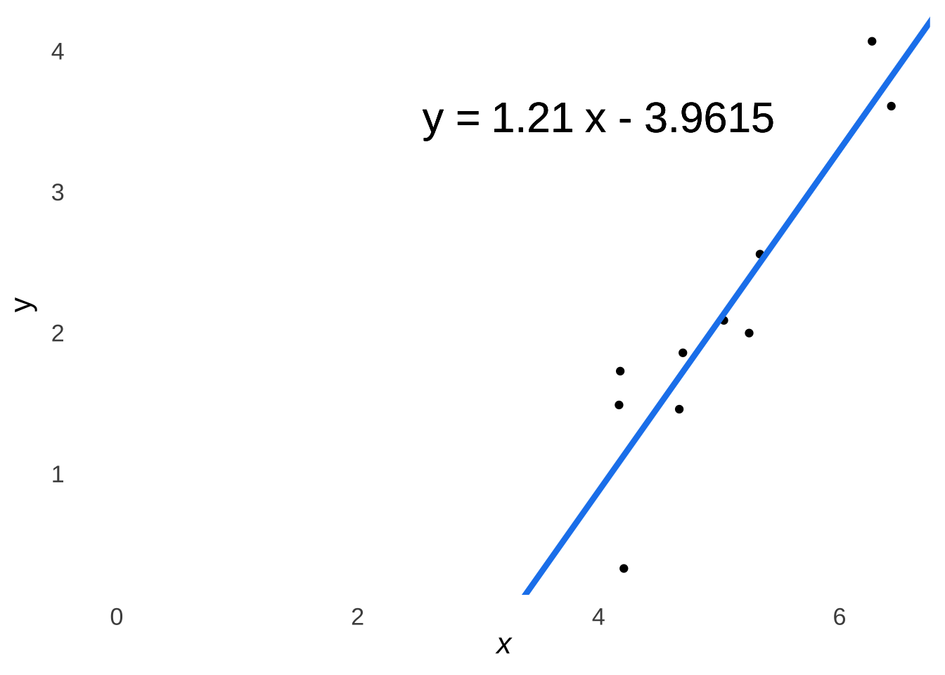
Figure 7.18: Scatterplot of \(x\) and \(y\) Featuring Our Least-Squares Regression Line in Raw-Score Form
But, if all of that algebra isn’t quite your cup of tea, this method is quicker:
##
## Call:
## lm(formula = y ~ x)
##
## Residuals:
##      Min       1Q   Median       3Q      Max
## -0.80264 -0.22414  0.00656  0.33794  0.63366
##
## Coefficients:
##             Estimate Std. Error t value Pr(>|t|)
## (Intercept)  -3.9615     0.9505  -4.168 0.003133 **
## x             1.2100     0.1869   6.474 0.000193 ***
## ---
## Signif. codes:  0 '***' 0.001 '**' 0.01 '*' 0.05 '.' 0.1 ' ' 1
##
## Residual standard error: 0.4584 on 8 degrees of freedom
## Multiple R-squared:  0.8397, Adjusted R-squared:  0.8197
## F-statistic: 41.91 on 1 and 8 DF,  p-value: 0.0001934
7.3.2 The Proportionate Reduction in Error (\(r^2\))
Once you have \(r\), \(r^2\) is pretty easy to calculate:
\[r^2=r^2\]
\(r^2\) as a statistic has special value. It is known – in stats classes only, but known – as the proportionate reduction in error. That title means that \(r^2\) represents the predictive advantage conferred by using the model to predict values of the \(y\) variable over using the mean of \(y\) \((\bar{y})\) to make predictions.
In model prediction terms, \(r^2\) is the proportion of the variance in \(y\) that is explained by the model. Recall that the least-squares regression line minimizes the squared distance between the points in a scatterplot and the line. The line represents predictions and the distance represents the prediction error (usually just called the error). The smaller the total squared distance between the points and the line, the lower the error, and the greater the value of \(r^2\).
Mathematically – in addition to being the square of the \(r\) statistic – \(r^2\) is given by:
\[r^2=\frac{SS_{total}-SS_{error}}{SS_{total}}\] where \(SS_{total}\) is the sum of the squared deviations in the \(y\) variable:
\[\sum (y-\bar{y})^2\] and \(SS_{error}\) is the sum of the squared distances between each \(y\) value predicted by the model at each point \(x\) and the observed \(y\) predicted by the model for each \(x\):
\[\sum (y_{pred}-y_{obs})^2\] The table below lists the squared deviations of \(y\), the predictions \(y_{pred}=ax+b\), and the squared prediction errors156 \((y_{pred}-y_{obs})^2\):
| Obs | \(x\) | \(y\) | \((y-\bar{y})^2\) | \(y_{pred}\) | \((y_{pred}-y_{obs})^2\) |
|---|---|---|---|---|---|
| 1 | 4.18 | 1.73 | 0.1521 | 1.0963 | 0.4015757 |
| 2 | 4.70 | 1.86 | 0.0676 | 1.7255 | 0.0180902 |
| 3 | 6.43 | 3.61 | 2.2201 | 3.8188 | 0.0435974 |
| 4 | 5.04 | 2.09 | 0.0009 | 2.1369 | 0.0021996 |
| 5 | 5.25 | 2.00 | 0.0144 | 2.3910 | 0.1528810 |
| 6 | 6.27 | 4.07 | 3.8025 | 3.6252 | 0.1978470 |
| 7 | 5.34 | 2.56 | 0.1936 | 2.4999 | 0.0036120 |
| 8 | 4.21 | 0.33 | 3.2041 | 1.1326 | 0.6441668 |
| 9 | 4.17 | 1.49 | 0.3969 | 1.0842 | 0.1646736 |
| 10 | 4.67 | 1.46 | 0.4356 | 1.6892 | 0.0525326 |
The sum of the column \((y-\bar{y})^2\) gives the \(SS_{total}\), which is 10.4878. The sum of the column \((y_{pred}-y_{obs})^2\) gives us the \(SS_{error}\), which is 1.6811761. Thus, the proportionate reduction of error – better known to like everybody on Earth as \(r^2\) – is:
\[r^2=\frac{SS_{total}-SS_{error}}{SS_{total}}=0.8397017\] And if we take the square root of 0.8397017, we get the now-hopefully-familiar \(r\) value of \(0.9163524\).
7.3.3 Prediction Errors, a.k.a. Residuals
The error variance is \(1-r^2\)
The jaunty cap sported by \(y\) and \(z_y\) in this chapter indicates that \(y\) and \(z_y\) are estimates. \(rz_x\) does not equal exactly \(z_y\), nor does \(ax+b\) equal exactly \(y\). If they did, then all of the points on the scatterplot would be right on the regression line. There is always error in prediction, hence, the \(\hat{hat}\).
Figure 7.19 visualizes the prediction as lines connecting the observed \(y\) values to the corresponding prediction – i.e., the point on the regression line – at the observed values of \(x\) (the connecting lines are perfectly vertical because both the prediction and the observation have the exact same \(x\) value).
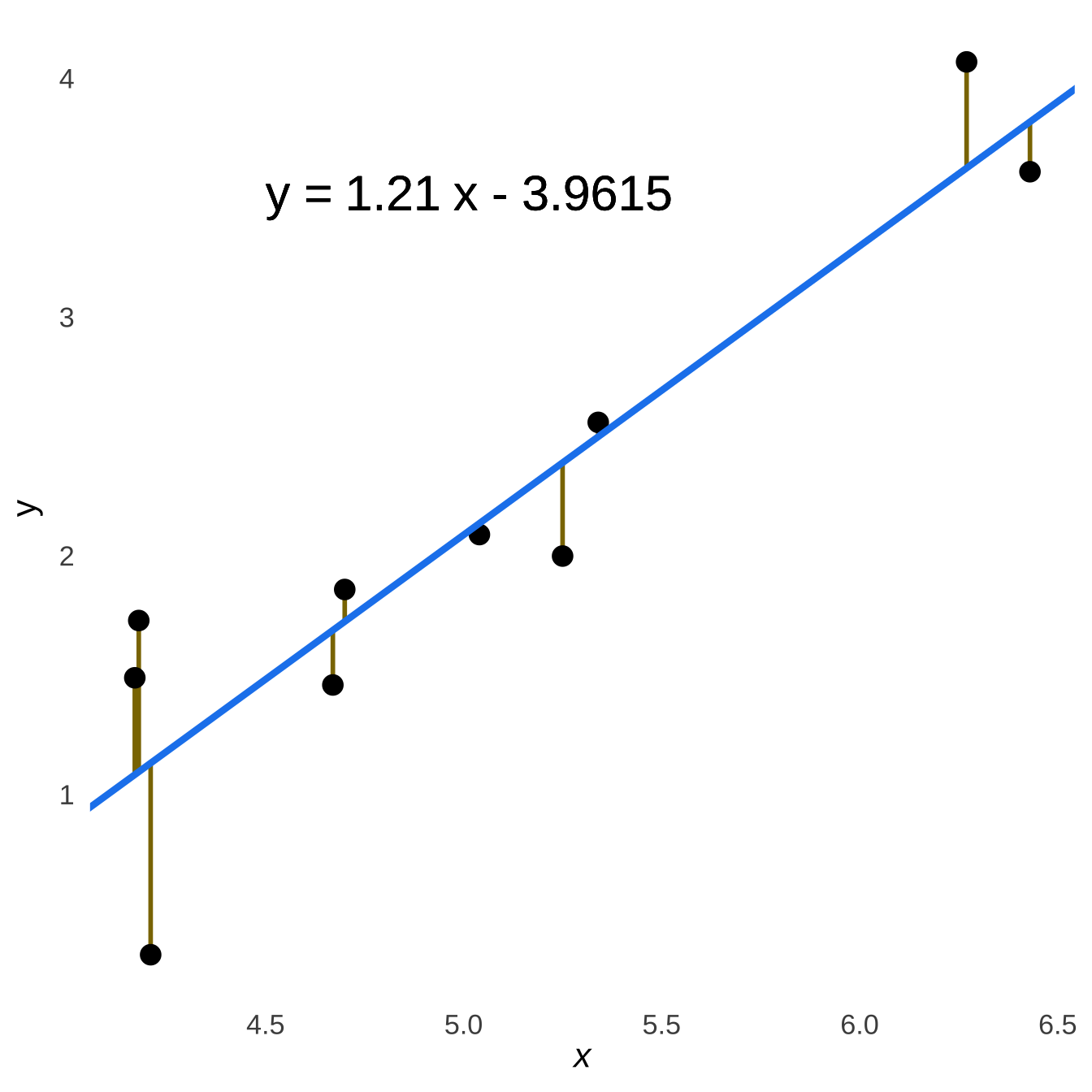
Figure 7.19: Prediction Errors and the Regression Line
The lines going up from the line to the points and the lines going down from the lines to the points – the underestimations and the overestimations made by the model – are balanced across the model: there is no notable tendency for there to be more or bigger underestimations vs. overestimations at any point of the regression line. That is easier to see if we plot the prediction errors by themselves at each point \(x\), as in Figure 7.20:
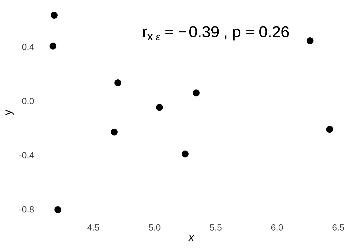
Figure 7.20: Scatterplot of Prediction Errors at each Observed x
Please don’t be fooled by the relatively large magnitude of the value of the coefficient for the correlation between \(x\) and the prediction errors (noted in the scatterplot as \(r_{x\epsilon}\)): it is not significant and therefore there is no correlation and that is not a coincidence. A critical feature of a regression model is that the predictor variable(s) is/are uncorrelated with the prediction errors on the population level, and uncorrelated at the population level means that the population-level correlation is precisely 0. That feature of the least-squares regression line is what makes it the least-squares regression line because ensures that it is the line that minimizes the squared prediction errors. To illustrate, let’s pick a different model – literally a wrong line – and note the relationship between the errors and that line. The top part of Figure 7.21 demonstrates what would happen if – for some reason – the model were wildly miscalculated as \(\hat{y}=0.25x+1\); the bottom part shows a scatterplot of \(x\) and the prediction errors.
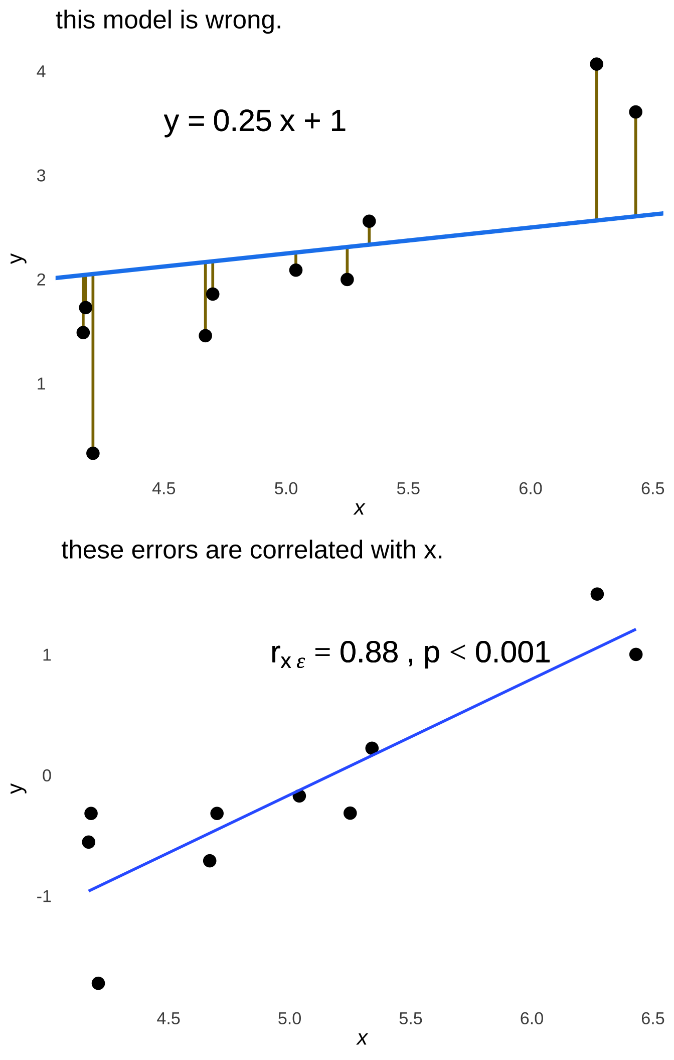
Figure 7.21: Prediction Errors and the Regression Line
Earlier in this chapter, I presented the standardized regression equation \(\widehat{z_y}=rz_x\) (and we showed that the raw-score regression equation \(\hat{y}=ax+b\) is just a re-scaled version of that standardized form). We can prove that the standardized regression equation – and, by extension, both forms of the regression equation – produces the critical feature of uncorrelated errors and \(x\). I think it’s OK to know that the linear model is derived from the correlation coefficient for cases where there is one predictor \(x\) and one predicted \(y\)! This proof and its implications are going to be much more valuable to us as we study multiple regression, so it will be nice to go through it for the simple (i.e. non-multiple) model first.
Given the standardized equation
\[\hat{z_y}=rz_x\].
The error variance is \(1-r^2\), so the \(sd\) of the error* is:
\[\sqrt{1-r^2}\]
We know that the correlation of two variables \(x\) and \(y\) is:
\[\frac{\sum_{i=1}^nz_{x_i}z_{y_i}}{n-1}\]
If we sub in \(\epsilon\) for \(y\), the equation is:
\[\frac{\sum_{i=1}^nz_{x_i}z_{\epsilon_i}}{n-1}\]
Four things we know:
\(\epsilon_i\) is how much prediction \(i\) is off by.
In standardized form, our prediction \(\hat{z}_{y_i}\) is given by \(rz_{x_i}\), so the error is \(\epsilon=z_{y_i}-rz_{x_i}\).
The mean of \(\epsilon\) is always 0, so ** \(z_\epsilon\) is simply \(\frac{\epsilon}{sd_\epsilon}\)**.
The sum of the squares of \(n\) \(z\)-scores is always \(n-1\). \((\sum_{i=1}^nz^2=n-1)\).
The correlation between \(z_x\) and \(\epsilon\) is:
\[r_{\epsilon z_x}=\frac{\sum_{i=1}^n (z_{y_i}-rz_{x_i})z_{x_i}}{\sqrt{1-r^2}(n-1)}\]
We can distribute \(z_{x_i}\):
\[r_{\epsilon z_x}=\frac{1}{(n-1)\sqrt{1-r^2}}\sum_{i=1}^nz_{y_i}z_{x_i}-rz_{x_i}^2\]
Fun little trick about summations: we can distribute those, too:
\[r_{\epsilon z_x}=\frac{1}{(n-1)\sqrt{1-r^2}}\left[\sum_{i=1}^nz_{y_i}z_{x_i}-r\sum_{i=1}^n z_{x_i}^2\right]\]
\(\sum z_{y_i}z_{x_i}\) is \(r(n-1)\).
The sum of any set of squared \(z\)-scores is \(n-1\).
That gives us:
\[r_{\epsilon z_x}=\frac{1}{(n-1)\sqrt{1-r^2}}\left[r(n-1)-r(n-1)\right]\]
The bracket part has to be \(0\)!, SO:
\[r_{\epsilon z_x}=0\]
And if there’s no correlation between ** \(\epsilon\) and \(z_x\), there’s also no correlation between \(\epsilon\) and \(x\)**.
7.4 Bonus Content
7.4.1 Correcting the Kendall’s \(\tau\) Software Estimate
As a general mathematical rule, there are \(\frac{n(n-1)}{2}\) possible comparisons between \(n\) pairs of numbers. We will call the number of concordant-order comparisons of a given dataset \(n_c\). Thus, for the data in Example 1:
A comparison between any two pairs of observations is considered concordant-order if and only if the difference in the ranks of the corresponding variables in each pair is of the same sign.
A comparison between any two pairs of observations is considered discordant-order if and only if the difference in the ranks of the corresponding variables in each pair is of the opposite sign.
We will call the number of discordant-order comparisons of a given dataset \(n_d\).
7.4.1.0.1 Calculation of \(\hat{\tau}\) Without Ties
If there are no ties among the \(x\) values nor among the \(y\) values in the data, we can calculate the sample Kendall \(\hat{\tau}\) statistic using the following formula:
\[\hat{\tau}=\frac{2(n_c-n_d)}{n(n-1)}.\]
7.4.1.0.2 With Ties
When making pairwise rank comparisons, ties in the data reduce the number of valid comparisons that can be made. For the purposes of calculating \(\hat{\tau}\) when there are tied data, there are three types of ties to consider:
\(x\) ties: tied values for the \(x\) variable
\(y\) ties: tied values for the \(y\) variable
\(xy\) ties: pairs where the \(x\) observation and the \(y\) observation are each members of a tie cluster (that is, the pair is doubly tied)
For example, please consider the following data (note: this dataset has been created so that both the \(x\) variables, the \(y\) variables, and the alphabetical pair labels are all in generally ascending order for simplicity of presentation: note that this does not need to be the case with observed data):
| pair | \(x\) | \(y\) | \(rank_x\) | \(rank_y\) |
|---|---|---|---|---|
| A | 1 | 11 | 1.0 | 1.0 |
| B | 2 | 12 | 3.0 | 2.0 |
| C | 2 | 13 | 3.0 | 3.5 |
| D | 2 | 13 | 3.0 | 3.5 |
| E | 3 | 14 | 5.0 | 5.0 |
| F | 4 | 15 | 6.0 | 6.0 |
| G | 5 | 16 | 7.5 | 7.0 |
| H | 5 | 17 | 7.5 | 8.0 |
| I | 6 | 18 | 9.0 | 9.5 |
| J | 7 | 18 | 10.0 | 9.5 |
Let us consider, in turn, the \(x\), the \(y\), and the \(xy\) ties:
- \(x\) ties: In the example data, there are two tied-\(x\) clusters. One tied-\(x\) cluster comprises the \(x\) observations of pair B, pair C, and pair D: each pair has an \(x\) value of 2, and those three \(x\) values are tied for 3rd lowest of the \(x\) set. The other tie cluster comprises the \(x\) observations of pair G and pair H, and those \(x\) values are tied for 7.5th lowest. Thus, there are two \(x\) tie clusters: one of 3 members and one of 2 members. Let \(t_{xi}\) denote the number of tied-\(x\) members \(t_x\) of each cluster \(i\) and let \(m_x\) denote the number of tied-\(x\) clusters. We will then define a variable \(T_x\) to denote the number of comparisons that are removed from the total possible comparisons used to calculate the \(\hat{\tau}\) statistic as such:
\[T_X=\sum^{m_x}_{i=1}\frac{t_{xi}(t_{xi}-1)}{2}\]
For the example data:
\[T_X=\frac{3(2-1)}{2}+\frac{2(2-1)}{2}=4\]
- \(y\) ties: In the example data, there are also two tied-\(y\) clusters. One tied-\(y\) cluster comprises the \(y\) observations of pair C and pair D: each has an \(y\) value of 13, and those two \(y\) values are tied for 3.5th lowest of the \(y\) set. The other tie cluster comprises the \(y\) observations of pair I and pair J, each with an observed \(y\) value of 18 and tied for 9.5th highest position. Thus, there are two \(y\) tie clusters, each with 2 members. Let \(t_{yi}\) denote the number of tied-\(y\) members \(t_y\) of each cluster \(i\) and let \(m_y\) denote the number of tied-\(y\) clusters. We will then define a variable \(T_y\) to denote the number of comparisons that are removed from the total possible comparisons used to calculate the \(\hat{\tau}\) statistic as such:
\[T_Y=\sum^{m_y}_{i=1}\frac{t_{yi}(t_{yi}-1)}{2}\]
For the _example data:
\[T_Y=\frac{2(2-1)}{2}+\frac{2(2-1)}{2}=2\]
- \(xy\) ties: There are two data pairs in the example data that share the same \(x\) rank \(y\) rank – pair C and pair D – and the pairs in each are said to be doubly tied or, that they constitute an \(xy\) cluster. Therefore, for this dataset there is one \(xy\) cluster with two members – the \(x\) and \(y\) values of pair C and the \(x\) and \(y\) values of pair D. Let \(t_{xyi}\) denote the number of members \(t_{xy}\) of each \(xy\) cluster \(i\) and let \(m_{xy}\) denote the number of \(xy\) clusters. We will then define a variable \(T_{xy}\) to denote the number of comparisons that are removed from the total possible comparisons used to calculate the \(\hat{\tau}\) statistic as such:
\[T_{XY}=\sum^{m_{xy}}_{i=1}\frac{t_{xyi}(t_{xyi}-1)}{2}\]
For the example data:
\[T_{XY}=\frac{2(2-1)}{2}=2\]
Earlier, we noted that the maximum number of comparisons between pairs of data – which we can denote \(n_{max}\) – is equal to \(\frac{n(n-1)}{2}\) (where \(n\) equals the number of pairs). In the cases of Example 1, Example 2, and Example 3, there were no \(x\), \(y\), or \(xy\) ties, and so that relationship gave the value for the maximum number of comparisons that was used to calculate \(\hat{\tau}\). Generally, the equation to find \(n_{max}\) – whether or not \(T_X=0\), \(T_Y=0\), and/or \(T_{XY}=0\) is the following:
\[n_{max}=\frac{n(n-1)}{2}-T_X-T_Y+T_{XY}\]
The above equation removes the number of possible comparisons lost to ties by subtracting \(T_x\) and \(T_y\) from the total possible number \(\frac{n(n-1)}{2}\), and then adjusts for those ties that were double-counted in the process by re-adding \(T_{xy}\).
With the number of available comparisons now adjusted for the possible presence of ties, we may now re-present the equation for the \(\hat{\tau}\) statistic as:
\[\hat{\tau}=\frac{n_c-n_d}{n_{max}}\]
7.4.1.0.3 \(\hat{\tau}\) for larger data sets (\(\tau\)-b correction)
To this point, the example datasets we have examined have been so small that identifying and counting concordant-order comparisons, discordant-order comparisons, tie clusters, and the numbers of members of tie clusters has been relatively easy to do. To calculate the Kendall \(\hat{\tau}\) with larger datasets invites a software-based solution, but there is a problem specific to the \(\hat{\tau}\) calculation that can lead to inaccurate estimates when there are tied data in a set.
That problem stems from the specific correction for ties proposed by Kendall (1945), following Daniels (1944), in an equation for a correlation known as the Kendall tau-b correlation \(\hat{\tau_b}\):
\[\hat{\tau_b}=\frac{n_c-n_d}{\sqrt{(\frac{n(n-1)}{2}-T_X)(\frac{n(n-1)}{2}-T_Y)}}\]
In addition to being endorsed by Kendall himself, this equation has been adopted, for example, in R (as well as SAS, Stata, and SPSS), which brings us to our software problem. If there are no ties in a dataset, then the \(\hat{\tau_b}\) denominator simplfies to \(\sqrt{(\frac{n(n-1)}{2})(\frac{n(n-1)}{2})}=\frac{n(n-1)}{2}\), which is the same denominator as in the calculation of \(\hat{\tau}\) when there are no ties. However, when working in R, a correlation test (cor.test()) with the Kendall option (method="kendall") will return \(\hat{\tau_b}\) instead of the desired \(\hat{\tau}\).
If the Kendall correlation statistic is calculated using a program – such as R – that is programmed to return the \(\hat{\tau_b}\) statistic rather than the \(\hat{\tau}\) statistic, then the \(\hat{\tau}\) statistic can be recovered by multiplying by the denominator of the \(\hat{\tau_b}\) calculation and dividing by the proper \(\hat{\tau}\) calculation (in other words: multiply by the wrong denominator to get rid of it and then divide by the correct denominator):
\[\hat{\tau}=\frac{\hat{\tau}_b\sqrt{(\frac{n(n-1)}{2}-T_X)(\frac{n(n-1)}{2}-T_Y)}}{\frac{n(n-1)}{2}-T_X-T_Y+T_XY}.\]
Given that we may be working with larger datasets in using this correction, it may seem that we have traded one problem for another: the above equation may give us the desired estimate of \(\hat{\tau}\), but how do we find \(T_X\), \(T_Y\), \(T_XY\), \(n_c\), and \(n_d\) without using complex, tedious, and likely error-prone counting procedures? The process of counting ties can be handled with coding conditional logic. Alternatively, the R language has several commands in its base package that can be exploited for that purpose. One way to do this is using the table() command. The table() command in R applied to an array, will return a table with each of the observed values as the header (the “names”) and the frequency of each of those values. For example, given an array \(x\) with values [5, 5, 5, 8, 8, 13]], table(x) will return:
## x
##  5  8 13
##  3  2  1
We can restrict the table to a subset with only those members of the array that appear more than once:
## x
## 5 8
## 3 2
And then, we can remove the header row with the unname() command, leaving us with an array of the sizes of each tie cluster in the original array \(x\):
## [1] 3 2We then can use the count of values in that resulting array to represent the number of tie clusters in the original array and the values in that resulting array to represent the number of members in each tie cluster in the original array, a procedure we can use to calculate \(T_X\) and \(T_Y\).
To find doubly-tied values in a pair array – as we need to calculate \(T_XY\) – only a minor modification is needed. We can take two arrays (for example, \(x\) and \(y\)), pair them into a dataframe, and then the rest of the procedure is the same. Thus, given the data from Example 4, :
x<-c(1, 2, 2, 2, 3, 4, 5, 5, 6, 7)
y<-c(11, 12, 13, 13, 14, 15, 16, 17, 18, 18)
xy<-data.frame(x,y)
unname(table(xy)[table(xy)>1])
## [1] 2we reach the same conclusion as we did when counting by hand: there is one \(xy\) cluster with two members in this dataset.
However we count the numbers of tie clusters and the count of members in each tie cluster, once \(T_X\), \(T_Y\), and \(T_XY\) are determined, there are algebraic means for calculating \(n_c\) and \(n_d\).
The value of \(n_c\) follows from algebraic rearrangement of the above equations:
\[n_c=\frac{n(n-1)}{4}-\frac{T_X}{2}-\frac{T_Y}{2}+\frac{T_XY}{2}+\frac{\hat{\tau_b}\sqrt{(\frac{n(n-1)}{2}-T_X)(\frac{n(n-1)}{2}-T_Y)}}{2}\]
The value of \(n_d\) is then found as the difference between \(n_{max}\) and \(n_c\):
\[n_d=n_{max}-n_c\]
because this is a statistics text and statistics texts are just like that↩︎
The linear equation \(y = a + bx\) is also expressed as \(y = ax+b\) or \(y = mx+b\). We’re goingt o use \(y=a +bx\) because it makes talking about regression equations – particularly as we transition to more complex ones – marginally easier↩︎
Cohen, J. (2013). Statistical power analysis for the behavioral sciences. Academic press.↩︎
Normally we would use a Greek letter to indicate a population parameter when discussing null and alternative hypotheses, but the letter \(\rho\) is going to be used for something else later on.↩︎
And, honestly, not that concerned about↩︎
The binomial test used as the Classical example of Classical and Bayesian Inference is an example of a nonparametric test. In that test, the patterns being analyzed were the number of observed successes or more in the number of trials given the assumption that success and failure were equally likely. In the Classical approach to that example, we were not concerned with, parameters like the mean number of successes or the standard deviation of the number of successes in the population.↩︎
The \(p\)-values are different, though, as they are based on permutations. For significance, use the value given by software or feel free to consult this old-ass table↩︎
Full disclosure: I’m an author on a manuscript under review as of 10/2020 describing this approach. Also, by “recently developed,” I mean like “working on it right now.”↩︎
Nonparametric alternatives are usually a good choice when the assumptions of classical parametric tests are violated.↩︎
This is a case where violating assumptions makes type-II errors more likely: the \(r\) value is smaller than it would be otherwise, increasing the chances of missing a real effect.↩︎
Calculating a raw-score regression equation by hand isn’t quite as ridiculous as I’m making it seem. If you’re ever in a situation where you need to work with models that aren’t part of software packages (for example, this one), it’s really helpful to know these steps.↩︎
Note: prediction errors are commonly referred to as residuals.↩︎