Chapter 11 Using R
In a previous chapter we learned some basic R terminology and how to run R, and how to use R to read and view data. We are now ready to start using R with real data.
This chapter will use R to clean and analyze the historical Canadian employment data. We will also develop some simple graphical techniques in ggplot for describing the relationship between two variables, and apply them to the employment data.
Chapter goals
In this chapter, we will learn how to:
- Use the pipe operator.
- Use the
mutatefunction to add or modify variables in a data table. - Use the
filter,select, andarrangefunctions to modify a data table. - Calculate a univariate statistic in R.
- Construct a table of summary statistics in R.
- Recognize and handle missing data problems in R.
- Construct a simple or binned frequency table in R.
- Calculate and interpret the sample covariance and correlation.
- Perform simple probability calculations in R.
- Create a histogram with ggplot.
- Create a line graph with ggplot.
- Distinguish between pairwise and casewise deletion of missing values.
- Construct and interpret a scatter plot in R.
- Construct and interpret a smoothed-mean or linear regression plot in R.
To prepare for this chapter, review the introduction to R. Then open RStudio, load the Tidyverse, and read in our employment data:
library(tidyverse)
EmpData <- read_csv("https://bookdown.org/bkrauth/IS4E/sampledata/EmploymentData.csv")
If you prefer, you can download the employment data file from https://bookdown.org/bkrauth/IS4E/sampledata/EmploymentData.csv and have R read it in locally:
11.1 Data cleaning in R
We will not spend a lot of time on data cleaning in R, as we can always clean data in Excel and export it to R. However, we have a few Tidyverse tools that are useful to learn.
The Tidyverse includes four core functions for modifying data:
mutate()allows us to add or change variables.filter()allows us to select particular observations, much like Excel’s filter tool.arrange()allows us to sort observations, much like Excel’s sort tool.select()allows us to select particular variables.
All four functions follow a common syntax that is designed to work with a convenient Tidyverse tool called the “pipe” operator.
11.1.1 The pipe operator
The pipe operator is part of the Tidyverse and is written %>%. Recall
that an operator is just a symbol like + or * that performs some function
on whatever comes before it and whatever comes after it.
The pipe operator is unusual because it doesn’t allow you to do anything new. Instead, it makes your code easier to read. To see how it works, I will show you a few examples.
Example 11.1 The pipe operator
# This is equivalent to names(EmpData)
EmpData %>% names()
##  [1] "MonthYr"          "Population"       "Employed"         "Unemployed"
##  [5] "LabourForce"      "NotInLabourForce" "UnempRate"        "LFPRate"
##  [9] "Party"            "PrimeMinister"    "AnnPopGrowth"
# This is equivalent to sqrt(2)
2 %>% sqrt()
## [1] 1.414214
# This is equivalent to cat(sqrt(2)," is the square root of 2")
2 %>% sqrt() %>% cat(" is the square root of 2")
## 1.414214  is the square root of 2
As you can see from the examples, R’s rule for interpreting the pipe operator is
that the object before the %>% is taken as the first argument for the
function after the %>%.
The pipe operator does not add any functionality to R; anything you can do with it can also be done without it. But it addresses a common problem: we often want to perform multiple transformations on a data set, but doing so in the usual functional language can lead to code that is highly nested and difficult to read. The pipe operator can be used to create much more readable code, as we will see in the examples below.
11.1.2 Mutate
The most important data transformation function is mutate, which allows us to change or add variables.
Example 11.2 Using mutate() to modify a variable
We will start by changing the MonthYr variable from character (text) to
date, using the as.Date() function:
# Change MonthYr to date format
EmpData %>%
  mutate(MonthYr = as.Date(MonthYr, "%m/%d/%Y"))
## # A tibble: 541 × 11
##    MonthYr    Population Employed Unemployed LabourForce NotInLabourForce
##    <date>          <dbl>    <dbl>      <dbl>       <dbl>            <dbl>
##  1 1976-01-01     16852.    9637.       733       10370.            6483.
##  2 1976-02-01     16892     9660.       730       10390.            6502.
##  3 1976-03-01     16931.    9704.       692.      10396.            6535
##  4 1976-04-01     16969.    9738.       713.      10451.            6518.
##  5 1976-05-01     17008.    9726.       720       10446.            6562
##  6 1976-06-01     17047.    9748.       721.      10470.            6577.
##  7 1976-07-01     17086.    9760.       780.      10539.            6546.
##  8 1976-08-01     17124.    9780.       744.      10524.            6600.
##  9 1976-09-01     17154.    9795.       737.      10532.            6622.
## 10 1976-10-01     17183.    9782.       783.      10565.            6618.
## # ℹ 531 more rows
## # ℹ 5 more variables: UnempRate <dbl>, LFPRate <dbl>, Party <chr>,
## #   PrimeMinister <chr>, AnnPopGrowth <dbl>
As you can see, the MonthYr column is now labeled as a date rather than text. Like Excel, R has an internal representation of dates that allows for correct ordering and calculations, but displays dates in a standard human-readable format.
Mutate can be used to add variables as well as changing them.
Example 11.3 Using mutate() to add a variable
Suppose we want to create versions of UnempRate and LFPRate that are expressed in percentages rather than decimal units:
# Add UnempPct and LFPPct
EmpData %>%
  mutate(UnempPct = 100*UnempRate) %>%
  mutate(LFPPct = 100*LFPRate)
## # A tibble: 541 × 13
##    MonthYr Population Employed Unemployed LabourForce NotInLabourForce UnempRate
##    <chr>        <dbl>    <dbl>      <dbl>       <dbl>            <dbl>     <dbl>
##  1 1/1/19…     16852.    9637.       733       10370.            6483.    0.0707
##  2 2/1/19…     16892     9660.       730       10390.            6502.    0.0703
##  3 3/1/19…     16931.    9704.       692.      10396.            6535     0.0665
##  4 4/1/19…     16969.    9738.       713.      10451.            6518.    0.0682
##  5 5/1/19…     17008.    9726.       720       10446.            6562     0.0689
##  6 6/1/19…     17047.    9748.       721.      10470.            6577.    0.0689
##  7 7/1/19…     17086.    9760.       780.      10539.            6546.    0.0740
##  8 8/1/19…     17124.    9780.       744.      10524.            6600.    0.0707
##  9 9/1/19…     17154.    9795.       737.      10532.            6622.    0.0699
## 10 10/1/1…     17183.    9782.       783.      10565.            6618.    0.0741
## # ℹ 531 more rows
## # ℹ 6 more variables: LFPRate <dbl>, Party <chr>, PrimeMinister <chr>,
## #   AnnPopGrowth <dbl>, UnempPct <dbl>, LFPPct <dbl>
If you look closely, you can see that the UnempPct and LFPPct variables are now included in the data table.
Before we go any further, note that mutate() is a function that returns a
new data table. In order to actually change the original data table, we will
need to use the assignment (<-) operator.
Example 11.4 Modifying a data table
Take a look at EmpData data table.
print(EmpData)
## # A tibble: 541 × 11
##    MonthYr Population Employed Unemployed LabourForce NotInLabourForce UnempRate
##    <chr>        <dbl>    <dbl>      <dbl>       <dbl>            <dbl>     <dbl>
##  1 1/1/19…     16852.    9637.       733       10370.            6483.    0.0707
##  2 2/1/19…     16892     9660.       730       10390.            6502.    0.0703
##  3 3/1/19…     16931.    9704.       692.      10396.            6535     0.0665
##  4 4/1/19…     16969.    9738.       713.      10451.            6518.    0.0682
##  5 5/1/19…     17008.    9726.       720       10446.            6562     0.0689
##  6 6/1/19…     17047.    9748.       721.      10470.            6577.    0.0689
##  7 7/1/19…     17086.    9760.       780.      10539.            6546.    0.0740
##  8 8/1/19…     17124.    9780.       744.      10524.            6600.    0.0707
##  9 9/1/19…     17154.    9795.       737.      10532.            6622.    0.0699
## 10 10/1/1…     17183.    9782.       783.      10565.            6618.    0.0741
## # ℹ 531 more rows
## # ℹ 4 more variables: LFPRate <dbl>, Party <chr>, PrimeMinister <chr>,
## #   AnnPopGrowth <dbl>
As you can see, the MonthYr variable is still listed as a character variable and the new UnempPct and LFPPct variables do not seem to exist.
In order to change EmpData itself, we need to assign that new object back
to EmpData.
# Make permanent changes to EmpData
EmpData <- EmpData %>%
  mutate(MonthYr = as.Date(MonthYr, "%m/%d/%Y")) %>%
  mutate(UnempPct = 100*UnempRate) %>%
  mutate(LFPPct = 100*LFPRate)
We can confirm that now we have changed EmpData: MonthYr is a date
variable, and the variables UnempPct and LFPPct are part of the table.
print(EmpData)
## # A tibble: 541 × 13
##    MonthYr    Population Employed Unemployed LabourForce NotInLabourForce
##    <date>          <dbl>    <dbl>      <dbl>       <dbl>            <dbl>
##  1 1976-01-01     16852.    9637.       733       10370.            6483.
##  2 1976-02-01     16892     9660.       730       10390.            6502.
##  3 1976-03-01     16931.    9704.       692.      10396.            6535
##  4 1976-04-01     16969.    9738.       713.      10451.            6518.
##  5 1976-05-01     17008.    9726.       720       10446.            6562
##  6 1976-06-01     17047.    9748.       721.      10470.            6577.
##  7 1976-07-01     17086.    9760.       780.      10539.            6546.
##  8 1976-08-01     17124.    9780.       744.      10524.            6600.
##  9 1976-09-01     17154.    9795.       737.      10532.            6622.
## 10 1976-10-01     17183.    9782.       783.      10565.            6618.
## # ℹ 531 more rows
## # ℹ 7 more variables: UnempRate <dbl>, LFPRate <dbl>, Party <chr>,
## #   PrimeMinister <chr>, AnnPopGrowth <dbl>, UnempPct <dbl>, LFPPct <dbl>
11.1.3 Filter, select, and arrange
Excel provides a tool called “filtering” that allows you to choose observations
according to some criteria you specify. R has a function called filter()
that fills this purpose.
Example 11.5 Using filter() to choose observations
Suppose we want to know more about the months in our data set with the highest
unemployment rates. We can use filter() for this purpose:
# This will give all of the observations with unemployment rates over 12.5%
EmpData %>%
  filter(UnempPct > 12.5)
## # A tibble: 8 × 13
##   MonthYr    Population Employed Unemployed LabourForce NotInLabourForce
##   <date>          <dbl>    <dbl>      <dbl>       <dbl>            <dbl>
## 1 1982-10-01     19183.   10787.      1602.      12389.            6794.
## 2 1982-11-01     19203.   10764.      1600.      12364.            6839.
## 3 1982-12-01     19223.   10774.      1624.      12398.            6824.
## 4 1983-01-01     19244.   10801.      1573.      12374             6870.
## 5 1983-02-01     19266.   10818.      1574.      12392.            6875.
## 6 1983-03-01     19285.   10875.      1555.      12430.            6856.
## 7 2020-04-01     30994.   16142.      2444.      18586.           12409.
## 8 2020-05-01     31009.   16444       2610.      19054.           11955.
## # ℹ 7 more variables: UnempRate <dbl>, LFPRate <dbl>, Party <chr>,
## #   PrimeMinister <chr>, AnnPopGrowth <dbl>, UnempPct <dbl>, LFPPct <dbl>
As you can see, only 8 of the 541 months in our data have unemployment rates over 12.5% - the worst months of the 1982-83 recession, and April and May of 2020.
Similarly, R has a function called select() that allows you to choose specific
variables.
Example 11.6 Using select() to choose variables
Suppose that we only want to see a few pieces of information about the months with the highest unemployment rates:
# This will take out all variables except a few
EmpData %>%
  filter(UnempPct > 12.5) %>%
  select(MonthYr, UnempRate, LFPPct, PrimeMinister)
## # A tibble: 8 × 4
##   MonthYr    UnempRate LFPPct PrimeMinister
##   <date>         <dbl>  <dbl> <chr>
## 1 1982-10-01     0.129   64.6 Pierre Trudeau
## 2 1982-11-01     0.129   64.4 Pierre Trudeau
## 3 1982-12-01     0.131   64.5 Pierre Trudeau
## 4 1983-01-01     0.127   64.3 Pierre Trudeau
## 5 1983-02-01     0.127   64.3 Pierre Trudeau
## 6 1983-03-01     0.125   64.5 Pierre Trudeau
## 7 2020-04-01     0.131   60.0 Justin Trudeau
## 8 2020-05-01     0.137   61.4 Justin Trudeau
Finally, R has a function called arrange() that sorts observations according
to some criteria you specify.
Example 11.7 Using arrange() to sort observations
Suppose that we want to show months in descending order by unemployment rate
(i.e., the highest unemployment rate first). We can use arrange() to sort
rows in this way:
# This will sort the rows by unemployment rate
EmpData %>%
  filter(UnempPct > 12.5) %>%
  select(MonthYr, UnempPct, LFPPct, PrimeMinister) %>%
  arrange(UnempPct)
## # A tibble: 8 × 4
##   MonthYr    UnempPct LFPPct PrimeMinister
##   <date>        <dbl>  <dbl> <chr>
## 1 1983-03-01     12.5   64.5 Pierre Trudeau
## 2 1983-02-01     12.7   64.3 Pierre Trudeau
## 3 1983-01-01     12.7   64.3 Pierre Trudeau
## 4 1982-10-01     12.9   64.6 Pierre Trudeau
## 5 1982-11-01     12.9   64.4 Pierre Trudeau
## 6 1982-12-01     13.1   64.5 Pierre Trudeau
## 7 2020-04-01     13.1   60.0 Justin Trudeau
## 8 2020-05-01     13.7   61.4 Justin Trudeau
Now I should probably say: these results imply nothing meaningful about the economic policy of either Pierre or Justin Trudeau. The severe worldwide recessions in 1982-83 (caused by US monetary policy) and 2020-2021 (caused by the COVID-19 pandemic) were caused by world events largely outside the control of Canadian policy makers.
Example 11.8 The usefulness of the pipe operator
I mentioned earlier that the pipe operator is never strictly necessary, and that it is always possible to write equivalent R code without it. But it does make our code substantially more clear and readable.
11.1.4 Saving code and data
It is possible to save your data set in R’s internal format just like you would save an Excel file. But I’m not going to tell you how to do that, because what you really need to do is save your code.
Because it is command-based, R enables an entirely different and much more reproducible model for data cleaning and analysis. In Excel, the original data, the data cleaning, the data analysis, and the results are all mixed in together in a single file or even a single worksheet. This is convenient and simple to use in many applications, but it can lead to disaster in more complex projects.
In contrast, R allows you to have three separate files or groups of files
- Your source data
- Leave it exactly as you originally obtained it.
- Don’t forget to document its provenance.
- Your code to clean and analyze the data
- Maintain it carefully using master versions, working copies and archives.
- Your code can be saved in an R script, or as part of an R Markdown document.
- Your code can be split into multiple files, for example one file to clean the data and another to analyze it.
- The code for my own research projects is often split into 10 or more separate files, plus a “master” file that runs them all in the correct order. Running the full sequence takes a few hours, and splitting them allows me to work on one part of the project without having to re-run everything whenever a change is made.
- Your cleaned data and results
- Treat them as temporary output files.
- You should be able to regenerate them from the source data at any time by just re-running your code.
Again, reproducibility means that we always have all of the information to regenerate our results directly from the source data.
Example 11.9 Creating an R script to clean our data
Create an R script called EmpData.R with the following code:
# Load the Tidyverse
library(tidyverse)
# Load the data
EmpData <- read_csv("https://bookdown.org/bkrauth/IS4E/sampledata/EmploymentData.csv")
# Clean the data
EmpData <- EmpData %>%
  mutate(MonthYr = as.Date(MonthYr, "%m/%d/%Y")) %>%
  mutate(UnempPct = 100*UnempRate) %>%
  mutate(LFPPct = 100*LFPRate)
You can now execute this script at any time by entering the command:
11.2 Data analysis in R
Having read and cleaned our data set, we can now move on to some summary statistics.
11.2.1 Univariate statistics
The R function mean() calculates the sample average of any numeric vector.
There are also functions to calculate the sample variance or standard
deviation, the sample median, and many other summary statistics.
Example 11.10 Univariate statistics for a single variable
# MEAN calculates the mean of a single variable
mean(EmpData$UnempPct)
## [1] 8.207112
# VAR calculates the sample variance
var(EmpData$UnempPct)
## [1] 2.923088
# SD calculates the standard deviation
sd(EmpData$UnempPct)
## [1] 1.709704
# MEDIAN calculates the sample median
median(EmpData$UnempPct)
## [1] 7.691411
In real-world data, some variables have missing values for one or more
observations. Values can be missing for various reasons: information may be
unavailable, or the variable may not be applicable to the case. In R, missing
values are given the special value NA which stands for “not available.”
Example 11.11 Missing values in the employment data
The AnnPopGrowth variable in our data set is missing for the first year of data (1976), since calculating the growth rate for 1976 would require data from 1975, and we don’t have that data.
EmpData %>%
  select(MonthYr, Population, AnnPopGrowth) %>%
  print(n=15)  # n=15 means print the first 15 rows
## # A tibble: 541 × 3
##    MonthYr    Population AnnPopGrowth
##    <date>          <dbl>        <dbl>
##  1 1976-01-01     16852.      NA
##  2 1976-02-01     16892       NA
##  3 1976-03-01     16931.      NA
##  4 1976-04-01     16969.      NA
##  5 1976-05-01     17008.      NA
##  6 1976-06-01     17047.      NA
##  7 1976-07-01     17086.      NA
##  8 1976-08-01     17124.      NA
##  9 1976-09-01     17154.      NA
## 10 1976-10-01     17183.      NA
## 11 1976-11-01     17211.      NA
## 12 1976-12-01     17238.      NA
## 13 1977-01-01     17271.       0.0248
## 14 1977-02-01     17302.       0.0243
## 15 1977-03-01     17329.       0.0235
## # ℹ 526 more rows
By default, math in R follows the IEEE-754
standard for numerical arithmetic, which says that any calculation
involving NA should also result in NA.
Example 11.12 Calculations with NA produce NA
Some applications automatically drop missing data from the calculation. This is a simple solution, but R does what it does for a good reason. Missing values can be a sign of an error in the data or code, so we should always catch them and investigate their cause before dropping them.
Once we have investigated the missing values, we can tell R explicitly to
exclude them from the calculation by adding the na.rm = TRUE optional
argument.
Example 11.13 Handling missing values
In the case of our AnnPopGrowth variable, We know why it is missing: we cannot calculate annual growth rates in the first year of our data. So we can exclude the missing values.
Missing values in Excel
Excel also has rules for handling missing values. You can represent missing values in one of two ways:
- Leave cells with missing values blank, or enter some text string like “.”
- Excel will exclude these cells from most statistical calculations,
- This is similar to how R handles
NAvalues with thena.rm=TRUEargument.
- Indicate missing cells with the formula
=NA().- The
NA()function returns the error code#N/A, as will any function ofNA() - This is similar to how R handles
NAvalues by default.
- The
11.2.2 Tables of statistics
Suppose we want to calculate the sample average for each column in our tibble.
We could just call mean() for each of them, but there is a quicker way.
Example 11.14 Producing a table of statistics
Here is the code to do that:
# Mean of each column
EmpData %>%
  select(where(is.numeric)) %>%
  lapply(mean, na.rm = TRUE)
## $Population
## [1] 23795.46
##
## $Employed
## [1] 14383.15
##
## $Unemployed
## [1] 1260.953
##
## $LabourForce
## [1] 15644.1
##
## $NotInLabourForce
## [1] 8151.352
##
## $UnempRate
## [1] 0.08207112
##
## $LFPRate
## [1] 0.6563653
##
## $AnnPopGrowth
## [1] 0.01370259
##
## $UnempPct
## [1] 8.207112
##
## $LFPPct
## [1] 65.63653
I would not expect you to come up with this code, but maybe it kind of makes sense.
- The
select(where(is.numeric))step selects only the columns inEmpDatathat are numeric rather than text. - The
lapply(mean,na.rm=TRUE)step calculatesmean(x,na.rm=TRUE)for each (numeric) columnxinEmpData.
We can use this method with any function that calculates a summary statistic:
# Standard deviation of each column
EmpData %>%
  select(where(is.numeric)) %>%
  lapply(sd, na.rm = TRUE)
## $Population
## [1] 4034.558
##
## $Employed
## [1] 2704.267
##
## $Unemployed
## [1] 243.8356
##
## $LabourForce
## [1] 2783.985
##
## $NotInLabourForce
## [1] 1294.117
##
## $UnempRate
## [1] 0.01709704
##
## $LFPRate
## [1] 0.01401074
##
## $AnnPopGrowth
## [1] 0.00269365
##
## $UnempPct
## [1] 1.709704
##
## $LFPPct
## [1] 1.401074
11.2.3 Frequency tables
We can construct simple frequency tables for discrete variables using the
count() function
Example 11.15 Using count() to make a simple frequency table
# COUNT creates a frequency table for discrete variables
EmpData %>%
  count(PrimeMinister)
## # A tibble: 10 × 2
##    PrimeMinister      n
##    <chr>          <int>
##  1 Brian Mulroney   104
##  2 Jean Chretien    120
##  3 Joe Clark          8
##  4 John Turner        2
##  5 Justin Trudeau    62
##  6 Kim Campbell       4
##  7 Paul Martin       25
##  8 Pierre Trudeau    91
##  9 Stephen Harper   116
## 10 Transfer           9
We can also construct binned frequency tables for continuous variables using
the count() function in combination with the cut_interval() function.
Example 11.16 Using count() to make a binned frequency table
As you might imagine, there are various ways of customizing the intervals just like in Excel.
11.2.4 Covariance and correlation
When two variables are both numeric, we can summarize their relationship using their sample covariance: \[s_{x,y} = \frac{1}{n-1} \sum_{i=1}^n (x_i-\bar{x})(y_i-\bar{y})\] and their sample correlation: \[\rho_{x,y} = \frac{s_{x,y}}{s_x s_y}\] where \(\bar{x}\) and \(\bar{y}\) are the sample averages and \(s_{x}\) and \(s_{y}\) are the sample standard deviations as defined previously.
The sample covariance and sample correlation can be interpreted as estimates of the corresponding population covariance and correlation as defined previously.
The sample covariance and correlation can be calculated in R using the cov()
and cor() functions. These functions can be applied to any two columns of
data.
Example 11.17 using cov() and cor() to calculate a covariance/correlation
You can calculate the covariance and correlation of the unemployment rate and labour force participation rate by executing the following code:
# For two specific columns of data
cov(EmpData$UnempPct, EmpData$LFPPct)
## [1] -0.6126071
cor(EmpData$UnempPct, EmpData$LFPPct)
## [1] -0.2557409
As you can see, unemployment and labour force participation are negatively correlated: when unemployment is high, LFP tends to be low. This makes sense given the economics: if it is hard to find a job, people will move into other activities that take one out of the labour force: education, childcare, retirement, etc.
Both cov() and cor() can also be applied to (the numeric variables in) an
entire data set. The result is what is called a covariance matrix or
correlation matrix.
Example 11.18 using cov() and cor() to calculate a covariance/correlation matrix
# Covariance matrix for the whole data set (at least the numerical parts)
EmpData %>%
  select(where(is.numeric)) %>%
  cor()
##                  Population   Employed Unemployed LabourForce NotInLabourForce
## Population        1.0000000  0.9905010  0.3759661   0.9950675        0.9769639
## Employed          0.9905010  1.0000000  0.2866686   0.9964734        0.9443252
## Unemployed        0.3759661  0.2866686  1.0000000   0.3660451        0.3846586
## LabourForce       0.9950675  0.9964734  0.3660451   1.0000000        0.9509753
## NotInLabourForce  0.9769639  0.9443252  0.3846586   0.9509753        1.0000000
## UnempRate        -0.4721230 -0.5542043  0.6249095  -0.4836022       -0.4315427
## LFPRate           0.4535956  0.5369032  0.1874114   0.5379437        0.2568786
## AnnPopGrowth             NA         NA         NA          NA               NA
## UnempPct         -0.4721230 -0.5542043  0.6249095  -0.4836022       -0.4315427
## LFPPct            0.4535956  0.5369032  0.1874114   0.5379437        0.2568786
##                   UnempRate    LFPRate AnnPopGrowth   UnempPct     LFPPct
## Population       -0.4721230  0.4535956           NA -0.4721230  0.4535956
## Employed         -0.5542043  0.5369032           NA -0.5542043  0.5369032
## Unemployed        0.6249095  0.1874114           NA  0.6249095  0.1874114
## LabourForce      -0.4836022  0.5379437           NA -0.4836022  0.5379437
## NotInLabourForce -0.4315427  0.2568786           NA -0.4315427  0.2568786
## UnempRate         1.0000000 -0.2557409           NA  1.0000000 -0.2557409
## LFPRate          -0.2557409  1.0000000           NA -0.2557409  1.0000000
## AnnPopGrowth             NA         NA            1         NA         NA
## UnempPct          1.0000000 -0.2557409           NA  1.0000000 -0.2557409
## LFPPct           -0.2557409  1.0000000           NA -0.2557409  1.0000000
# Correlation matrix for selected variables
EmpData %>%
  select(UnempRate, LFPRate, AnnPopGrowth) %>%
  cor()
##               UnempRate    LFPRate AnnPopGrowth
## UnempRate     1.0000000 -0.2557409           NA
## LFPRate      -0.2557409  1.0000000           NA
## AnnPopGrowth         NA         NA            1
Each element in the matrix reports the covariance or correlation of a pair of variables. As you can see:
- The matrix is symmetric since \(cov(x,y) = cov(y,x)\).
- The diagonal elements of the covariance matrix are \(cov(x,x) = var(x)\)
- The diagonal elements of the correlation matrix are \(cor(x,x) = 1\).
- All covariances/correlations involving AnnPopGrowth variable are
NAsince AnnPopGrowth containsNAvalues.
Just like with univariate statistics, we can exclude missing values when calculating a covariance or correlation matrix. However, there are two slightly different ways to exclude missing values from a data table with multiple columns/variables:
- Pairwise deletion: when calculating the covariance or correlation of two variables, exclude observations with a missing value for either of those two variables.
- Casewise or listwise deletion: when calculating the covariance or correlation of two variables, exclude observations with a missing value for any variable.
The use argument allows you to specify which approach you want to use.
Example 11.19 Pairwise and casewise deletion of missing values
# EmpData has missing data in 1976 for the variable AnnPopGrowth
# Pairwise will only exclude 1976 from calculations involving AnnPopGrowth
EmpData %>%
  select(UnempRate, LFPRate, AnnPopGrowth) %>%
  cor(use = "pairwise.complete.obs")
##                UnempRate    LFPRate AnnPopGrowth
## UnempRate     1.00000000 -0.2557409  -0.06513125
## LFPRate      -0.25574087  1.0000000  -0.48645089
## AnnPopGrowth -0.06513125 -0.4864509   1.00000000
# Casewise will exclude 1976 from all calculations
EmpData %>%
  select(UnempRate, LFPRate, AnnPopGrowth) %>%
  cor(use = "complete.obs")
##                UnempRate    LFPRate AnnPopGrowth
## UnempRate     1.00000000 -0.3357758  -0.06513125
## LFPRate      -0.33577578  1.0000000  -0.48645089
## AnnPopGrowth -0.06513125 -0.4864509   1.00000000
In most applications, pairwise deletion makes the most sense because it avoids throwing out data. But it is occasionally important to use the same data for all calculations, in which case we would use listwise deletion.
Covariance and correlation in Excel
The sample covariance and correlation between two variables (data ranges) can
be calculated in Excel using the COVARIANCE.S() and CORREL() functions.
11.2.5 Probability distributions in R
Just like Excel, R has a family of built-in functions for each commonly-used probability distribution.
Example 11.20 Some probability distributions
The dnorm(), pnorm(), and qnorm() functions return PDF, CDF, and quantile
functions of the normal distribution, while the rnorm() function returns a
vector of normally distributed random numbers:
# The N(0,1) PDF, evaluated at 1.96
dnorm(1.96)
## [1] 0.05844094
# The N(1,4) PDF, evaluated at 1.96
dnorm(1.96,mean=1,sd=4)
## [1] 0.09690415
# The N(0,1) CDF, evaluated at 1.96
pnorm(1.97)
## [1] 0.9755808
# The 97.5 percentile of the N(0,1) CDF
qnorm(0.975)
## [1] 1.959964
# Four random numbers from the N(0,1) distribution
rnorm(4)
## [1] -0.9655123  1.8525324 -0.2945118  2.1551472
There is a similar set of functions available for the uniform distribution
(dunif, punif, qunif, runif), the binomial distribution (dbinom,
pbinom, qbinom,rbinom), and Student’s T distribution (dt, pt, qt,
rt), along with many others.
11.3 Using ggplot
Section 10.5.2 in Chapter 10 introduced the ggplot package and command for creating graphs. This section explores the syntax and capabilities of ggplot in substantially more detail.
11.3.1 Syntax
The ggplot function has a non-standard syntax:
- The first expression/line calls
ggplot()to set up the basic structure of the graph:- The
dataargument tells R which data set (tibble) will be used. - the
mappingargument describes the main aesthetics of the graph, i.e., the relationship in the data we will be graphing.
- The
- The rest of the command is one or more expressions separated by a
+sign. These are called geometries and are graph elements to be included in the plot.
A single graph can include multiple aesthetics and geometries, as we will see shortly.
Example 11.21 Syntax for two ggplot graphs
In Section 10.5.2, we used ggplot to create a line graph:
and a histogram:
To review the syntax of these two commands:
- Each starts by calling
ggplot()to set up the basic structure of the graph:- The
data=EmpDataargument says to use theEmpDatatibble as its source data - the
mappingargument describes the main aesthetics of the graph, i.e., the relationship in the data we will be graphing.- For the line graph, our aesthetic includes two variables:
mapping = aes(x = MonthYr, y = UnempPct). - For the histogram, our aesthetic includes only one variable:
mapping = aes(x = UnempPct). If we were to include other variables, they would be ignored.
- For the line graph, our aesthetic includes two variables:
- The
- The rest of the command is one or more statements separated by a
+sign. These are called geometries and are graph elements to be included in the plot.- The
geom_histogram()geometry says to produce a histogram. - The
geom_line()geometry says to produce a line. The results of these two commands are depicted in Figure 11.1 below.
- The
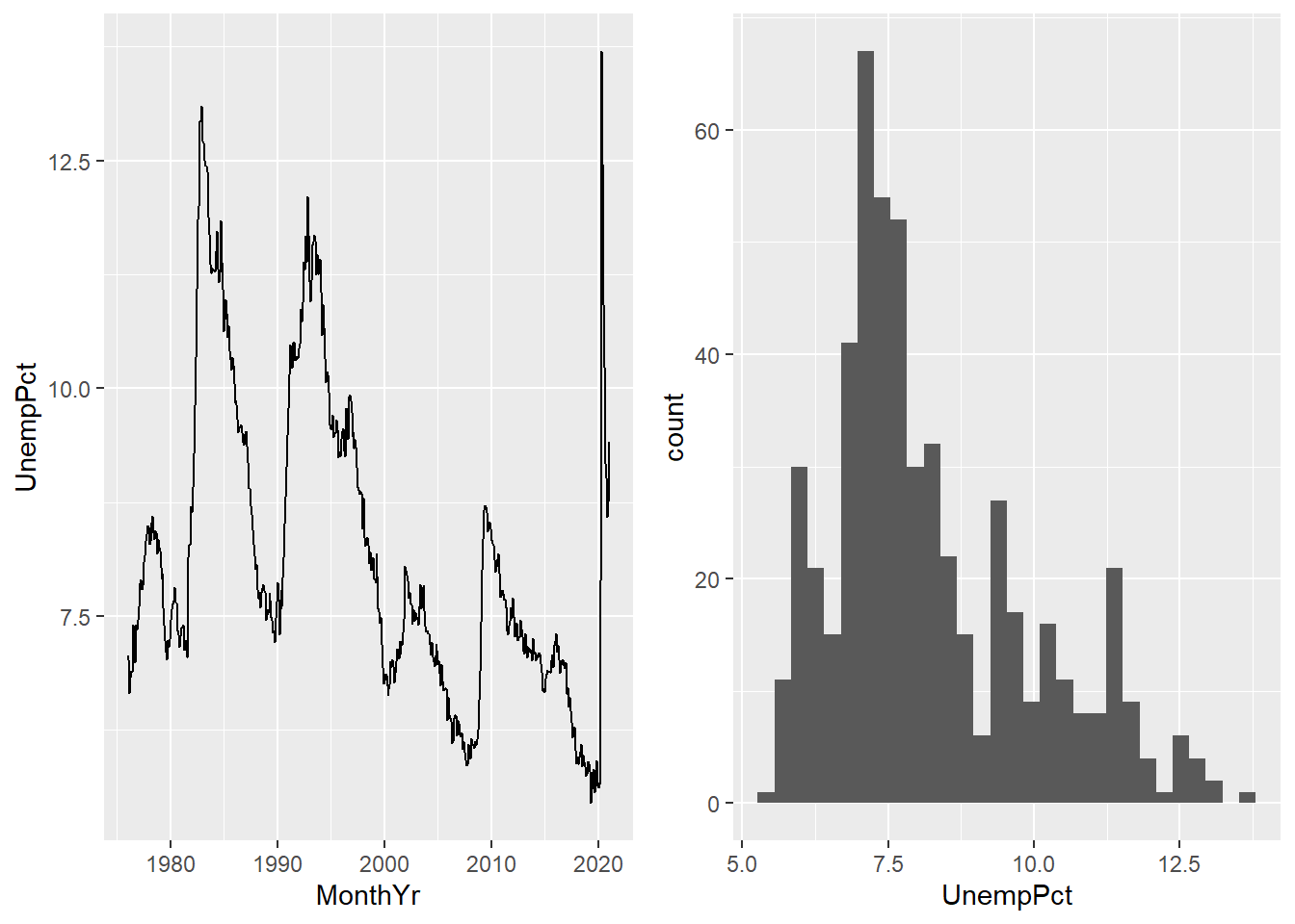
Figure 11.1: Some basic ggplot graphs
11.3.2 Modifying a graph
Like Excel, the basic ggplot graph gives us some useful information but we can improve upon it in various ways.
11.3.2.1 Titles and labels
You can use labs() to add titles, subtitles, alt text, etc. You can also use
xlab() and ylab() to change the axis titles.
ggplot(data = EmpData,
       aes(x = MonthYr,
           y =UnempPct)) +
  geom_line() +
  labs(title = "Unemployment rate",
      subtitle = "January 1976 - January 2021",
      alt = "Time series of Canada unemployment rate, January 1976 - January 2021",
      caption = "Source: Statistics Canada, Labour Force Survey",
      tag = "Canada") +
  xlab("") +
  ylab("Unemployment rate, %")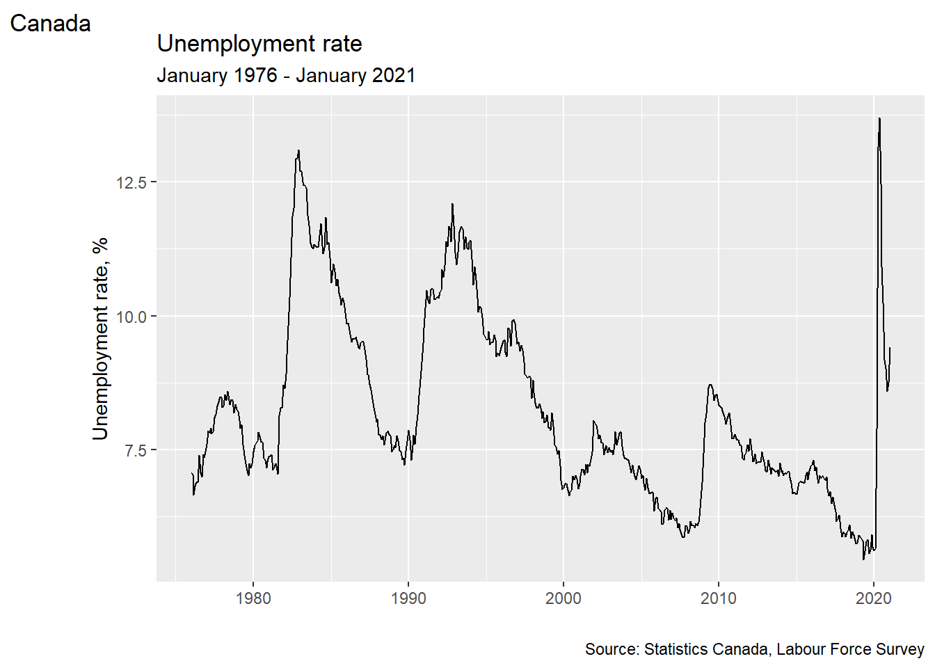
11.3.2.2 Color
You can change the color of any geometric element using the col= argument.
Colors can be given in ordinary English (or local language) words like “red”
or “blue.” There are hundreds of built in color names including “beige”,
“hotpink” and four different shades of “chartreuse”. You can get the full list
of built-in color names by executing the expression colors() in the command
window. You can also set custom colors using color codes in RGB or CMYK
format.
Some geometric elements, such as the bars in a histogram, also have a fill color.
ggplot(data = EmpData,
       aes(x = UnempPct)) +
  geom_histogram(col = "darkorchid",
                 fill = "chartreuse")
## `stat_bin()` using `bins =
## 30`. Pick better value
## `binwidth`.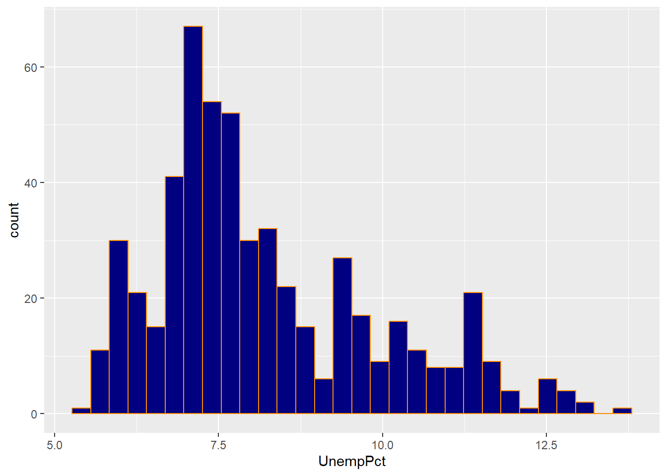
As you can see, the col= argument sets the color for the exterior of each bar,
and the fill= argument sets the color for the interior.
11.3.3 Adding graph elements
We can include multiple geometries in the same graph.
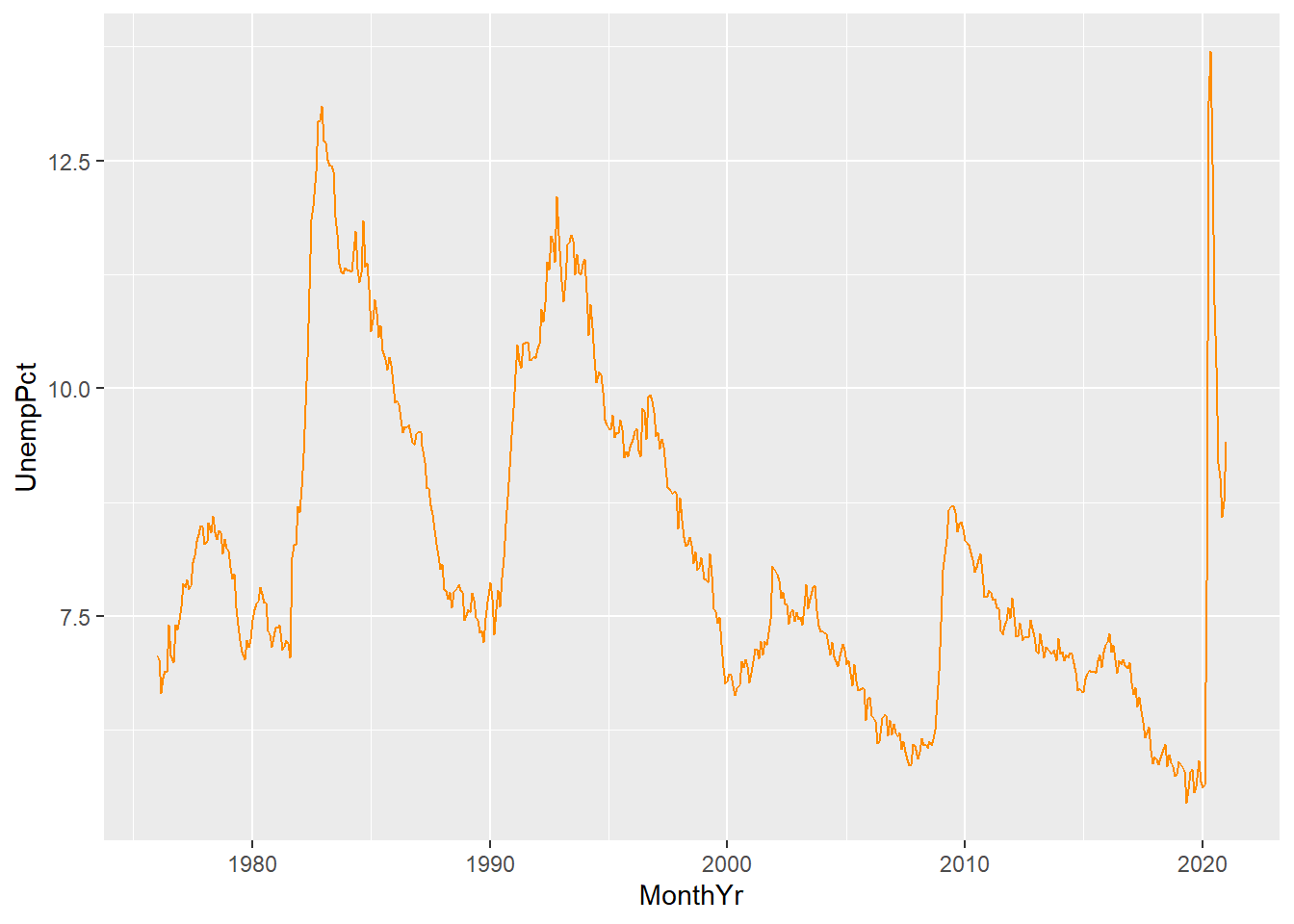
For example, we can include lines in our time series graph for both unemployment and labour force participation:
ggplot(data = EmpData,
       aes(x = MonthYr,
           y = UnempPct)) +
  geom_line(col = "navyblue") +
  geom_line(aes(y = LFPPct),
            col = "darkorange")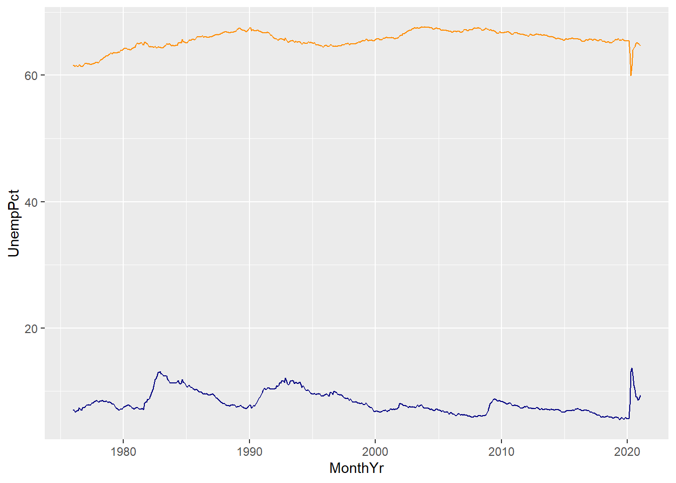
A few things to note here:
- The third line gives
geom_line()an aesthetics argumentaes(y=LFPPct). This overrides the aesthetics in the first line.
- We have used color to differentiate the two lines, but there is no legend or label to tell the reader which line is which. We will need to fix that.
- The vertical axis is labeled UnempPct which is the name of one of the variables but not the other. We will need to fix that.
When including multiple elements, we may need to add information clarify what
element describes. We can add a legend, but it is better (and friendlier to
the color-blind) to just label the lines. We can use the geom_text geometry
to do this:
ggplot(data = EmpData,
       aes(x = MonthYr)) +
  geom_line(aes(y = UnempPct),
            col = "navyblue") +
  geom_text(x = as.Date("1/1/2000", "%m/%d/%Y"),
            y = 15,
            label = "Unemployment",
            col = "navyblue") +
  geom_line(aes(y = LFPPct),
            col = "darkorange") +
  geom_text(x = as.Date("1/1/2000", "%m/%d/%Y"),
            y = 60,
            label = "LFP",
            col = "darkorange")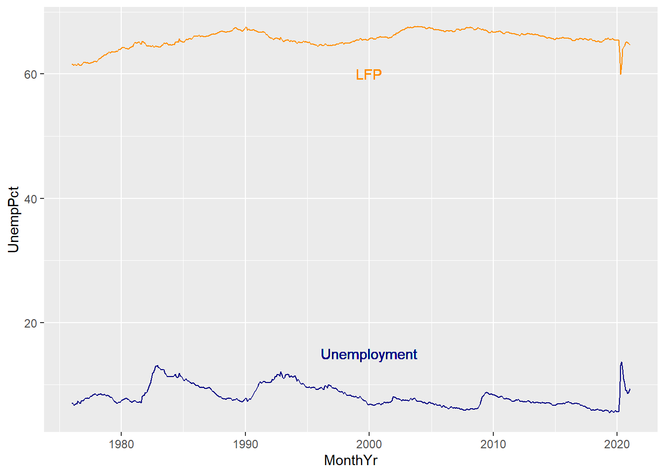
Note that we used color to reinforce the relationship between the label and
text, and we used the x= and y= arguments to place the text in a particular
location. You will usually need to try out a few locations to get something
that works.
Finally, we can combine all of these elements.
# Use RGB codes to exactly match the color scheme of this book
AstroBlue <- "#002D62"
AstroOrange <- "#EB6E1F"
# Fancy histogram
ggplot(data = EmpData,
       aes(x = UnempPct)) +
  geom_histogram(binwidth = 0.5,
                 fill = AstroBlue) +
  geom_density() +
  labs(title = "Unemployment rate",
      subtitle = paste("January 1976 - January 2021 (",
                     nrow(EmpData),
                     " months)",
                     sep = "",
                     collapse = ""),
      alt = "Histogram of Canada unemployment rate, January 1976 - January 2021",
      caption = "Source: Statistics Canada, Labour Force Survey",
      tag = "Canada") +
  xlab("Unemployment rate, %") +
  ylab("Count")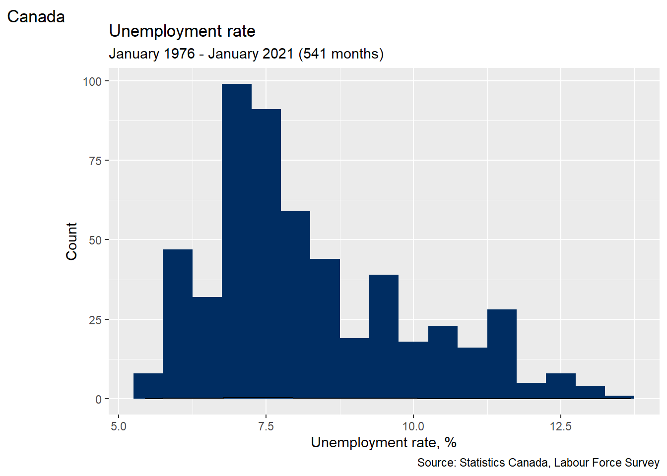
# Use RGB codes to exactly match color scheme of this book
AstroBlue <- "#002D62"
AstroOrange <- "#EB6E1F"
# Fancy time series plot
ggplot(data = EmpData,
       aes(x = MonthYr)) +
  geom_line(aes(y = UnempPct),
            col = AstroBlue) +
  geom_text(x = as.Date("1/1/2000", "%m/%d/%Y"),
            y = 15,
            label = "Unemployment", col=AstroBlue) +
  geom_line(aes(y = LFPPct),
            col = AstroOrange) +
  geom_text(x = as.Date("1/1/2000", "%m/%d/%Y"),
            y = 60,
            label = "LFP",
            col = AstroOrange) +
  labs(title = "Unemployment and LFP rates",
      subtitle = paste("January 1976 - January 2021 (",
                     nrow(EmpData),
                     " months)",
                     sep = "",
                     collapse = ""),
      alt = "Time series of Canada unemployment and LFP, January 1976 - January 2021",
      caption = "Source: Statistics Canada, Labour Force Survey",
      tag = "Canada") +
  xlab("") +
  ylab("Percent")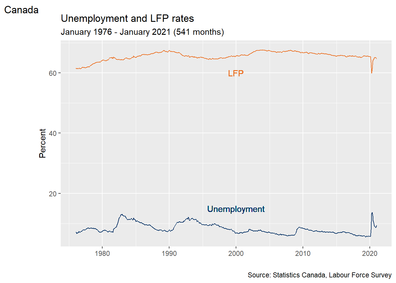
11.4 Visualization and prediction
Bivariate summary statistics like the covariance and correlation provide a simple way of characterizing the relationship between any two numeric variables. Frequency tables, cross tabulations, and conditional averages allow us to gain a greater understanding of the relationship between two discrete or categorical variables, or between a discrete/categorical variable and a continuous variable.
Another approach is to visualize the relationship between the variables, or to predict the value of one variable based on the value of the other variable. The methods that we will explore in this section are primarily graphical. You will learn more about the underlying numerical methods in later courses.
11.4.1 Scatter plots
A scatter plot is the simplest way to visualize the relationship between two variables in data. The horizontal (\(x\)) axis represents one variable, the vertical (\(y\)) axis represents the other variable, and each point represents an observation. In some sense, the scatter plot shows everything you can show about the relationship between the two variables, since it shows every observation.
Scatter plots can be created in R using the geom_point() geometry. For
example, the code below creates a scatter plot with the Candian unemployment
rate on the horizontal axis, and the LFP rate on the vertical axis.
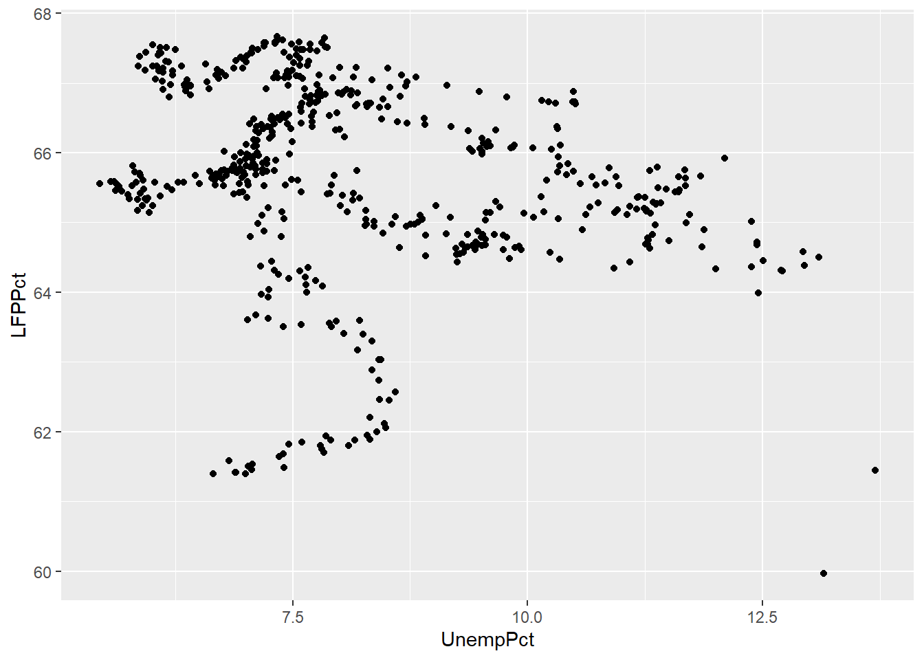
Note that the scatter plot is consistent with the negative relationship between the two variables indicated by the correlation we calculated earlier (-0.2557409). At the same time, it is clear that this negative relationship is not very strong.
11.4.1.1 Jittering
If both of our variables are truly continuous, each point represents a single observation. But if both variables are actually discrete, points can “stack” on top of each other. In that case, the same point can represent multiple observations, leading to a misleading scatter plot.
For example, suppose we had rounded our unemployment and LFP data to the nearest percent:
# Round UnempPct and LFPPct to nearest integer
RoundedEmpData <- EmpData %>%
  mutate(UnempPct = round(UnempPct)) %>%
  mutate(LFPPct = round(LFPPct))
The scatter plot with the rounded data would look like this:
# Create graph using rounded data
ggplot(data = RoundedEmpData,
       aes(x = UnempPct,
           y = LFPPct)) +
  geom_point(col = "darkorange")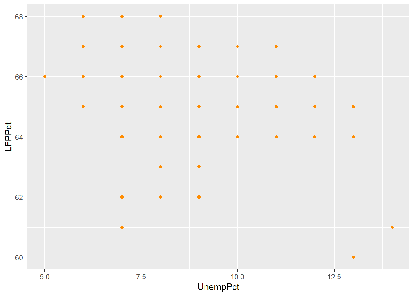
As you can see from the graph, the scatter plot is misleading: there are 541 observations in the data set represented by only 40 points.
A common solution to this problem is to jitter the data by adding a small
amount of random noise so that every observation is at least a little different
and appears as a single point. We can use the geom_jitter() geometry to
create a jittered scatter plot.
ggplot(data = RoundedEmpData,
       aes(x = UnempPct,
           y = LFPPct)) +
  geom_point(col = "darkorange") +
  geom_jitter(size = 0.5,
              col = "navyblue")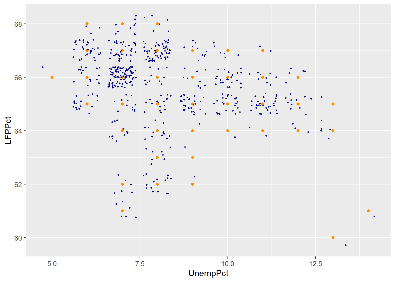
As you can see the jittered rounded data (small blue dots) more accurately reflects the original unrounded data than the rounded data (large orange dots).
11.4.1.2 Using color as a third dimension
We can use color to add a third dimension to the data. That is, we can color-code points based on a third variable by including it as part of the plot’s aesthetic.
We can use color to represent a third variable, whether it is continuous or discrete. ggplot can usually tell the difference:
# Party is discrete/categorical, so each value is represented by a distinct color
ggplot(data = EmpData,
       aes(x = UnempPct,
           y = LFPPct,
           col = Party)) +
  geom_point()
# MonthYr is (nearly) continuous, so values are represented along a spectrum
ggplot(data = EmpData,
       aes(x = UnempPct,
           y = LFPPct,
           col = MonthYr)) +
  geom_point()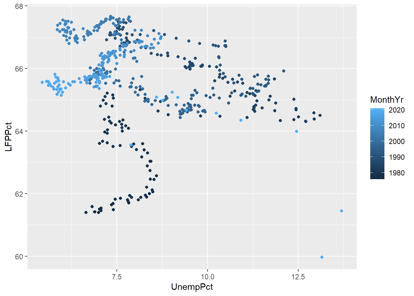
As we discussed earlier, you want to make sure your graph can be read by a reader who is color blind or is printing in black and white. So we can use shapes in addition to color. We may also want to modify the color scheme since red-green is the most common form of color blindness.
ggplot(data = EmpData,
       aes(x = UnempPct,
           y = LFPPct,
           col = Party,
           shape = Party)) +
  scale_color_manual(values=c("deepskyblue", "red", "gray")) +
  geom_point()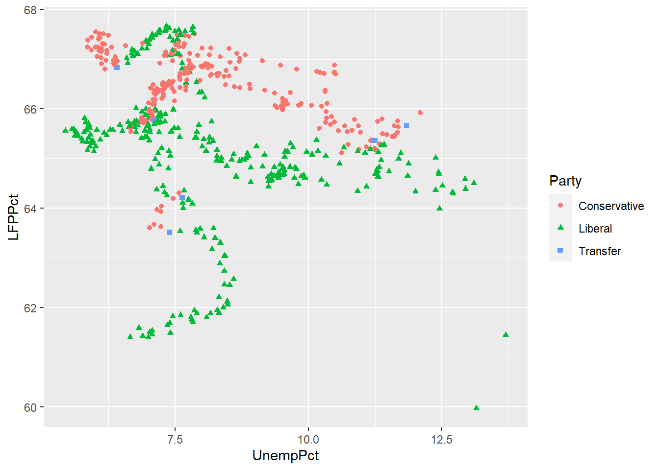
Scatter plots in Excel
Scatter plots can also be created in Excel, though it is more work and produces less satisfactory results.
11.4.2 Binned averages
We earlier used an Excel Pivot Table to construct a conditional average of the variable \(y_i\) (UnempRate in the example) for each value of some discrete variable \(x_i\) (PrimeMinister in the example).
When the \(x_i\) variable is continuous, it takes on too many distinct values to construct such a table. Instead, we would want to divide its range into a set of bins and then calculate averages within each bin. We can then plot the average \(y_i\) within each bin against the average \(x_i\) within the same bin. This kind of plot is called a binned scatterplot.
Binned scatterplots are not difficult to do in R but the code is quite a bit more complex than you are used to. As a result, I will not ask you to be able to produce binned scatter plots, I will only ask you to interpret them.
Here is my binned scatter plot with 20 bins:
ggplot(data = EmpData,
       aes(x = UnempPct,
           y = LFPPct)) +
 geom_point(size = 0.5) +
  stat_summary_bin(fun = 'mean',
                   bins=20,
                   col = "darkorange",
                   size = 3,
                   geom = 'point') +
  stat_summary_bin(fun = 'mean',
                   bins = 20,
                   col = "darkorange",
                   linewidth = 0.5,
                   geom = 'line')
The number of bins is an important choice. More bins allows us to find more complex patterns in the relationship. But more bins also means fewer observations per bin, which means more noise (variance) in our estimates.
The graph below includes the original binned scatter plot based on 20 bins (orange), and adds a line based on 4 bins (dark blue) and a line based on 100 bins (light blue).
ggplot(data = EmpData,
       aes(x = UnempPct,
           y = LFPPct)) +
  geom_point(size = 0.5) +
  stat_summary_bin(fun = 'mean',
                   bins = 4,
                   col = "navyblue",
                   linewidth = 0.75,
                   geom = 'line') +
  stat_summary_bin(fun = 'mean',
                   bins = 20,
                   col = "darkorange",
                   linewidth = 0.75,
                   geom = 'line') +
  stat_summary_bin(fun = 'mean',
                   bins = 100,
                   col = "lightblue",
                   linewidth = 1.0,
                   geom = 'line') +
  geom_text(x = 13.8,
            y = 64.2,
            label = "4 bins",
            col = "navyblue") +
  geom_text(x = 13.8,
            y = 62.5,
            label = "20 bins",
            col = "darkorange") +
  geom_text(x = 12.8,
            y = 66,
            label = "100 bins",
            col = "lightblue")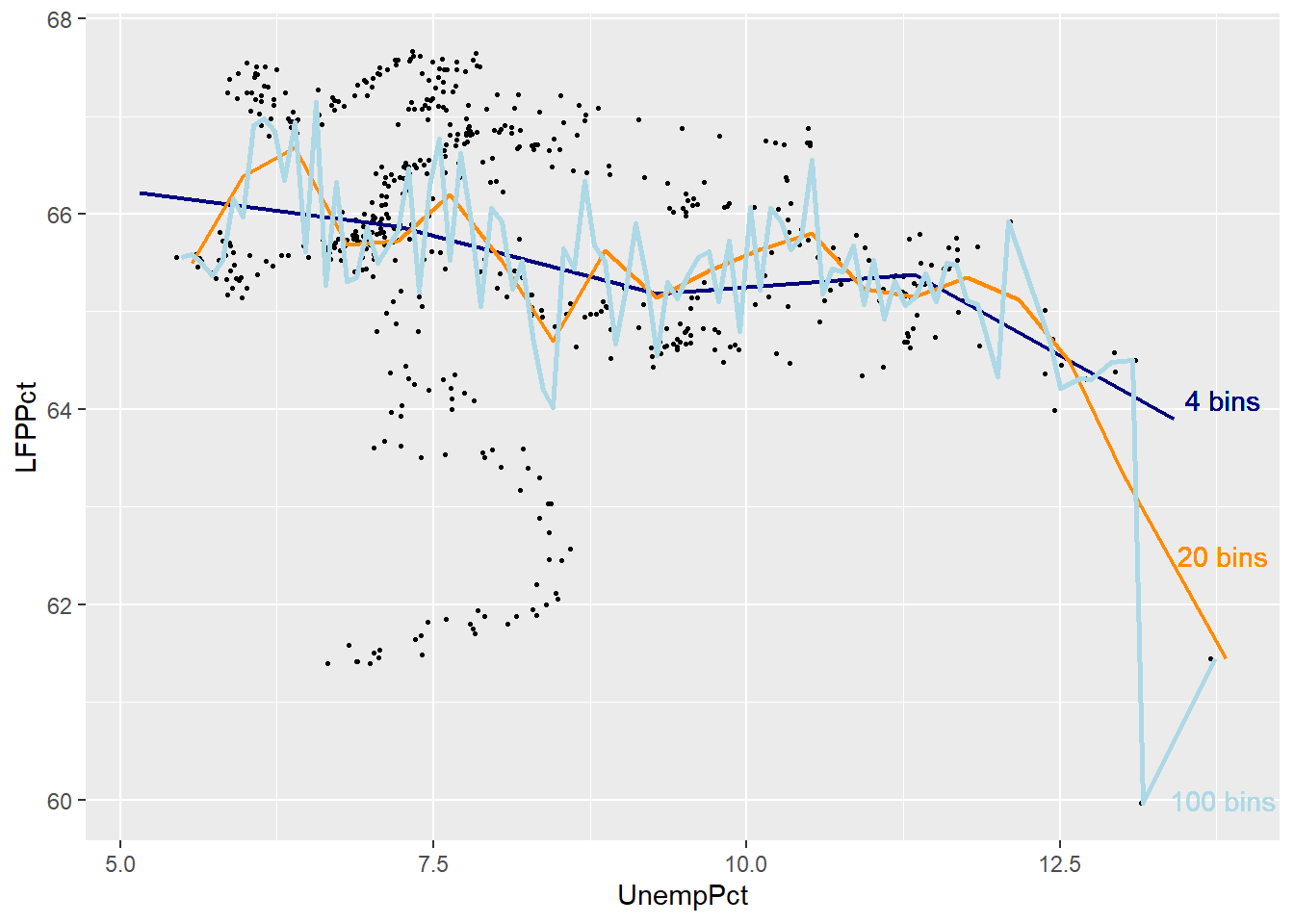
As you can see, the binned scatterplot tends to be smooth when there are only a few bins, and jagged when there are many bins.
If we think of binned scatterplots and conditional averages as predictions, there is a trade-off between bias (too few bins may lead us to miss important patterns in the data) and variance (too many bins may lead us to see patterns in the data that aren’t really part of the DGP).
11.4.3 Smoothing
An alternative to binned averaging is smoothing, which calculates a smooth curve that fits the data as well as possible. There are many different techniques for smoothing, but they are all based on taking a weighted average of \(y_i\) near each point, with high weights on observations with \(x_i\) close to that point and low (or zero) weights on observations with \(x_i\) far from that point. The calculations required for smoothing can be quite complex and well beyond the scope of this course.
Fortunately, smoothing is easy to do in R using the geom_smooth() geometry.
ggplot(data = EmpData,
       aes(x = UnempRate,
           y = LFPRate)) +
  geom_point(size = 0.5) +
  geom_smooth()
## `geom_smooth()` using method
## = 'loess' and formula = 'y ~
## x'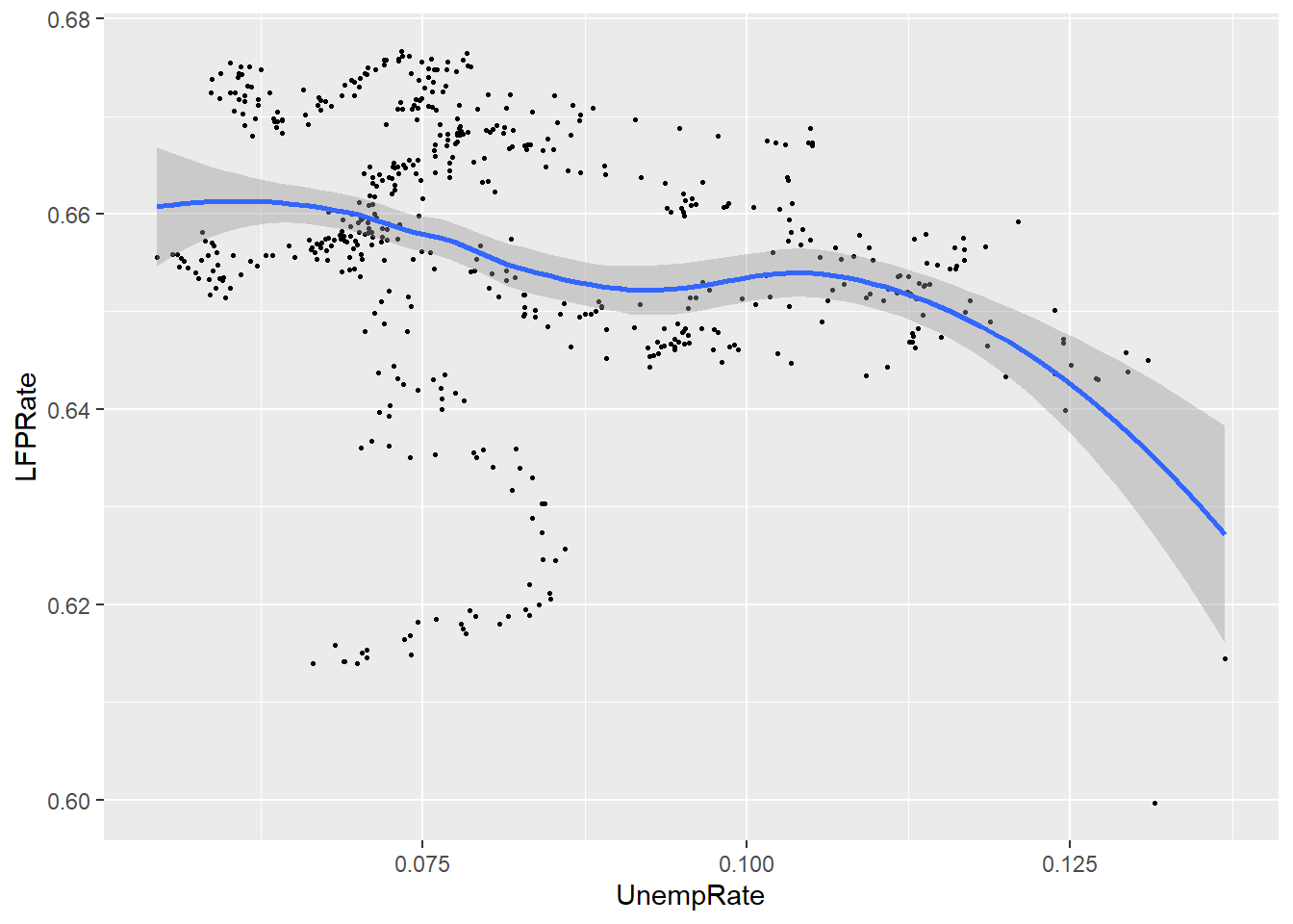
Notice that by default, the graph includes both the fitted line and a 95% confidence interval (the shaded area around the line). Also note that the confidence interval is narrow in the middle (where there is a lot of data) and wide in the ends (where there is less data).
11.4.4 Linear regression
Our last approach is to assume that the relationship between the two variables is linear, and estimate it by a technique called linear regression. Linear regression calculates the straight line that fits the data best.
You can include a linear regression line in your plot by adding the
method=lm argument to the geom_smooth() geometry.
ggplot(data = EmpData,
       aes(x = UnempPct,
           y = LFPPct)) +
  geom_point(size = 0.5) +
  geom_smooth(method = "lm")
## `geom_smooth()` using formula
## = 'y ~ x'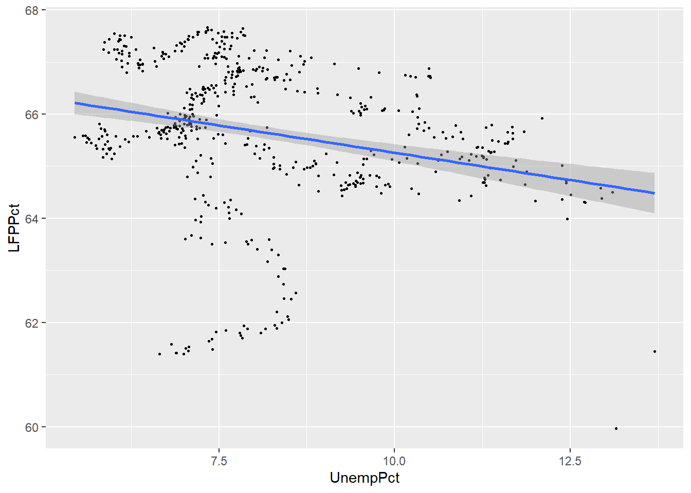
We can compare the linear and smoothed fits to see where they differ:
ggplot(data = EmpData,
       aes(x = UnempPct,
           y = LFPPct)) +
  geom_point(size = 0.5) +
  geom_smooth(col = "darkorange",
              fill = "orange") +
  geom_smooth(method = "lm",
              col = "navyblue",
              fill = "lightblue")
## `geom_smooth()` using method
## = 'loess' and formula = 'y ~
## x'
## `geom_smooth()` using formula
## = 'y ~ x'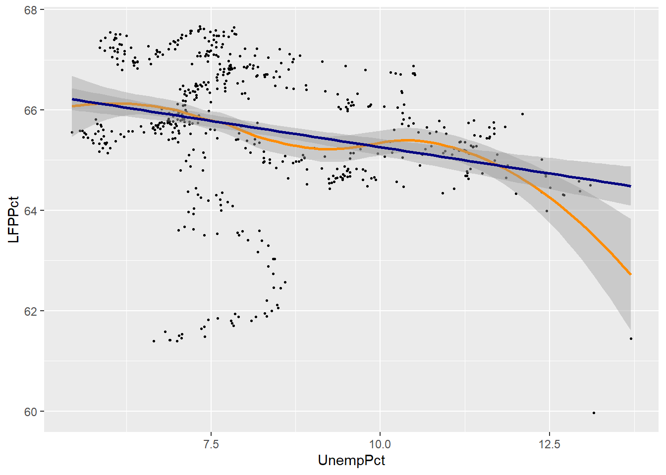
As you can see, the two fits are quite similar for unemployment rates below 12%, but diverge quite a bit above that level. This is inevitable, because the smooth fit becomes steeper, but linear fit can’t do that.
Linear regression is much more restrictive than smoothing, but has several important advantages:
- The relationship is easier to interpret, as it can be summarized by a single number (the slope).
- The linear relationship is much more precisely estimated
These advantages are not particularly important in this case, with only two variables and a reasonably large data set. The advantages of linear regression become much larger when you have more than two variables to work with. As a result, linear regression is the most important tool in applied econometrics, and you will spend much of your next econometrics course learning to use it.
Chapter review
As we have seen, we can do many of the same things in Excel and R. R is typically more difficult to use for simple analysis tasks, and there is nothing wrong with using Excel when it is easier. But the usability gap gets smaller with more complicated tasks, and there are many tasks where Excel doesn’t do everything that R can do. You should think of them as complementary tools, and be comfortable using both.
In this chapter we learned how to use the pipe operator, the four key Tidyverse functions for cleaning data, and the necessary tools for calculating univariate statistics. In addition, we learned the basics of ggplot.
This chapter has also provided a brief view of some of the main techniques for prediction and the visualization of relationships between variables. Econometrics is mostly about the relationship between variables: price and quantity, consumption and savings, labour and capital, today and tomorrow. So most of what we do is multivariate analysis.
The methods used here only scratch the surface of the available techniques and their implications. Any subsequent course you take in econometrics will place heavy emphasis on multivariate methods, especially linear regression. Those more advanced methods will build on the core ideas introduced in this course: probability, random variables, estimation, and inference. They will also further develop your coding skills in R or a similar statistical package. I hope this course has given you a strong base for your further studies.
Practice problems
Answers can be found in the appendix.
GOAL #1: Use the pipe operator
GOAL #2: Use the mutate function to add or change a variable
GOAL #3: Use the filter, select, and arrange functions to modify a data table
- Starting with the data table
EmpData:- Add the numeric variable Year based on the existing variable MonthYr. The
formula for Year should be
format(MonthYr, "%Y"). - Add the numeric variable EmpRate, which is the proportion of the population (Population) that is employed (Employed), also called the employment rate or employment-to-population ratio.
- Drop all observations from years before 2010.
- Drop all variables except MonthYr, Year, EmpRate, UnempRate, and AnnPopGrowth.
- Sort observations by EmpRate.
- Give the resulting data table the name
PPData.
- Add the numeric variable Year based on the existing variable MonthYr. The
formula for Year should be
GOAL #4: Calculate a univariate statistic in R
GOAL #5: Construct a table of summary statistics in R
GOAL #6: Recognize and handle missing data problems in R
- Starting with the
PPDatadata table you created in question (1) above:- Calculate and report the mean employment rate since 2010.
- Calculate and report a table reporting the median for all variables in
PPData. - Did any variables in
PPDatahave missing data? If so, how did you decide to address it in your answer to (b), and why?
GOAL #7: Construct a simple or binned frequency table in R
- Using the
PPDatadata set, construct a frequency table of the employment rate.
GOAL #8: Calculate and interpret the sample covariance and correlation
- Using the
EmpDatadata set, calculate the covariance and correlation of UnempPct and AnnPopGrowth. Based on these results, are periods of high population growth typically periods of high unemployment?
GOAL #9: Perform simple probability calculations in R
- Calculate the following quantities in R:
- The 45th percentile of the \(N(4,6)\) distribution.
- The 97.5 percentile of the \(T_8\) distribution.
- The value of the standard uniform CDF, evaluated at 0.75.
- 5 random numbers from the \(Binomial(10,0.5)\) distribution.
GOAL #10: Create a histogram with ggplot
- Using the
PPDatadata set, create a histogram of the employment rate.
GOAL #11: Create a line graph with ggplot
- Using the
PPDatadata set, create a time series graph of the employment rate.
GOAL #12: Distinguish between pairwise and casewise deletion of missing values
- In problem (2) above, did you use pairwise or casewise deletion of missing values? Did it matter? Explain why.
GOAL #13: Construct and interpret a scatter plot in R
- Using the
EmpDatadata set, construct a scatter plot with annual population growth on the horizontal axis and unemployment rate on the vertical axis.
GOAL #14: Construct and interpret a smoothed-mean or linear regression plot in R
- Using the
EmpDatadata set, construct the same scatter plot as in problem (4) above, but add a smooth fit and a linear fit.