Chapter 10 Simpson’s Paradox and Fixed Effects
This week, our goals are to…
Create linear regressions that correctly fit clustered, non-independent samples of data.
Specify and interpret the results of fixed effects regression models using multiple approaches.
Apply robust standard errors to OLS regression models.
Announcements and reminders
- In a recent assignment, you submitted ideas for your final project for this course. We plan to respond to everyone regarding your project ideas by the end of this week. If you do not hear from us by then, please contact us.
10.1 Simpson’s Paradox and clustered observations
So far, we have looked at multiple types of regression analysis. We started with ordinary least squares (OLS) regression and then we explored modifications to OLS or regression methods designed for different types of dependent variables. These alternate methods are used when OLS is not appropriate for the data that we have.
In this chapter, we will look at another situation in which OLS is not appropriate, at least in the usual way we might use it. As you likely recall, it is a requirement of most of the techniques we have learned so far that the observations in your data be independently sampled. In other words, they should not have any particular relationship to each other. However, this is often not the case in data that we collect. In this chapter, we will learn techniques called fixed effects and clustered standard errors which will allow you to correctly fit models to samples of data in which the observations are not independent.
We will learn about this topic by going through an example together. This example is designed to demonstrate the need for special regression techniques when we are analyzing data that is not independent.
Imagine that you are a researcher interested in studying the association between number of hours spent studying and MCAT score.
Here are the two key variables of interest:
- Dependent variable –
mcat. This is the MCAT score of each sampled pre-medical student, given as a percentile, meaning that it is on a scale from 0 to 100. - Independent variable –
study. This is the number of hours that a student spent studying for the MCAT.
In the next section, we will load and examine our data.
10.1.1 Load and prepare data
We will begin the example by loading the data below. You can copy and paste this R code onto your own computer and follow along.
The following code loads our data:
study <- c(50,53,55,53,57,60,63,65,63,67,70,73,75,73,77)
mcat <- c(77,76,77,78,79,73,74,73,75,75,63,64,65,66,70)
classroom <- c("A","A","A","A","A","B","B","B","B","B","C","C","C","C","C")

prep <- data.frame(study, mcat, classroom)
In the code above, we created three vectors: study, mcat, and classroom. We then created a data frame (dataset) called prep that has these three vectors as columns. Each observation (row) in this data is a person who was studying for the MCAT. For each person, we know how many hours they studied and the percentile score that they achieved on the MCAT.
Please note that these data have been generated for illustrative purposes only. They are not data from a true experiment, even though they may be plausible under certain conditions that are discussed below.
10.1.2 Examine initial trend
Now that we have loaded the data, we can use the code below to examine it visually in a scatterplot:
if (!require(dplyr)) install.packages('dplyr')
library(dplyr)

if (!require(ggplot2)) install.packages('ggplot2')
## Warning: package 'ggplot2' was built under R version 4.2.3library(ggplot2)
p <- prep %>% ggplot(aes(study,mcat))
p + geom_point(aes())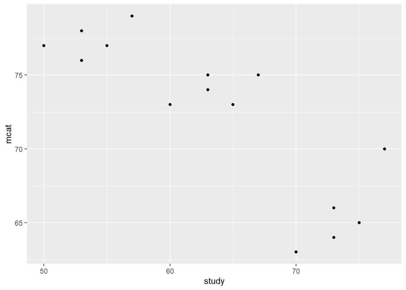
Above, we loaded the dplyr and ggplot2 packages. We then created an empty plot called p in which the y-axis is mcat and the x-axis is study. We then added points to this empty plot to make the scatterplot that we wanted to see. It is not required for you to understand all of the code above. To use this code to make your own scatterplot, replace study with your independent variable and replace mcat with your dependent variable.
As you can see from the scatterplot, there appears to be a negative trend between mcat and study. In the following section, we will fit a regression line to this data to confirm this.
10.1.3 Plot initial trend
Now that we have loaded and inspected the data, we are ready to run a linear regression. We can use the code below:
fit1 <- lm(mcat ~ study, data = prep)
summary(fit1)
##
## Call:
## lm(formula = mcat ~ study, data = prep)
##
## Residuals:
## Min 1Q Median 3Q Max
## -6.0552 -1.6407 0.2373 1.8715 4.5302
##
## Coefficients:
## Estimate Std. Error t value Pr(>|t|)
## (Intercept) 104.90952 6.01519 17.441 2.12e-10 ***
## study -0.51220 0.09375 -5.464 0.000109 ***
## ---
## Signif. codes: 0 '***' 0.001 '**' 0.01 '*' 0.05 '.' 0.1 ' ' 1
##
## Residual standard error: 3.083 on 13 degrees of freedom
## Multiple R-squared: 0.6966, Adjusted R-squared: 0.6733
## F-statistic: 29.85 on 1 and 13 DF, p-value: 0.0001087eq1 = function(x){104.9 + -0.512*x}
p +
geom_point() +
stat_function(fun=eq1)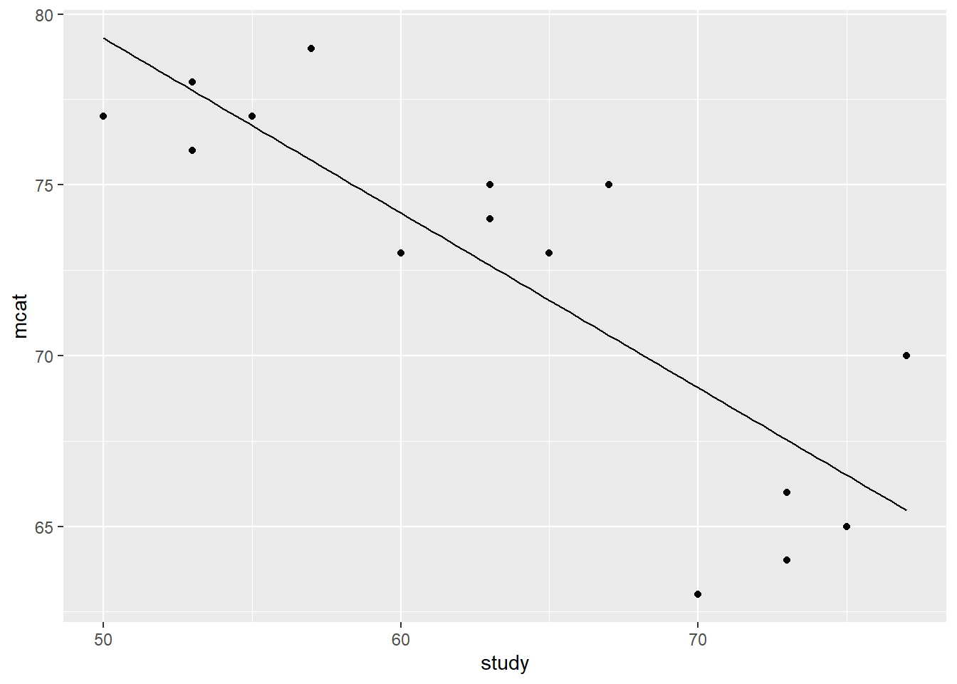
Above, we ran an OLS linear regression the way we always do, using the lm function. We saved this regression result as fit1. We then added the equation of the regression result as a line on the very same scatterplot we had inspected previously. It is not required for you to understand all of the code used above.
To use this code to make your own similar scatterplot:
- Remember that
pwas created and stored already. That is the scatterplot withmcatplotted againststudy. - Replace
104.9 + -0.512*xwith the equation that you wish to plot on the scatterplot. - Leave everything else as it is.
As you can see from both the regression summary table as well as the line in the scatterplot, there is indeed a negative relationship between MCAT score and hours spent studying. But this doesn’t make sense, does it? Wouldn’t we expect there to be a positive relationship between these two variables? Shouldn’t your MCAT score be higher if you study more?
Read on to see what was really going on in this data!
10.1.4 Inspect trend again
You may have noticed that when we created the prep dataset above, we didn’t mention the third variable that was also included. This third variable was called classroom. As it turns out, the 15 students in our dataset are drawn from three different classrooms. These classrooms are called A, B, and C and they each have a different teacher.
Let’s once again inspect our data, but this time we will identify each classroom separately with its own color:
p + geom_point(aes(col = classroom))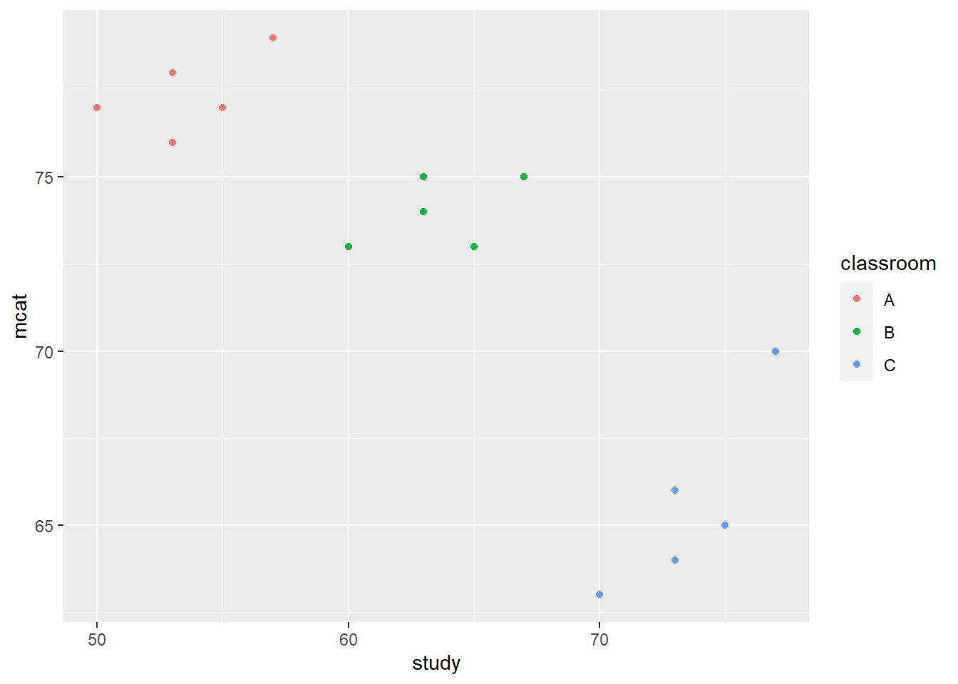
Above, we used the same code we did earlier to make a scatterplot, but additionally, we assigned a color to members of each classroom (the computer selected the colors on its own). It is not required for you to understand all of this code. To use this code to make your own scatterplot with colored groups, replace classroom with the name of your grouping variable.
Now we can see that within each classroom, there might actually be a positive trend that we expected.
Another way we can quickly inspect this data is to look at a boxplot in which the dependent variable—MCAT score percentile—is separated by classroom:
boxplot(mcat ~ classroom, data = prep)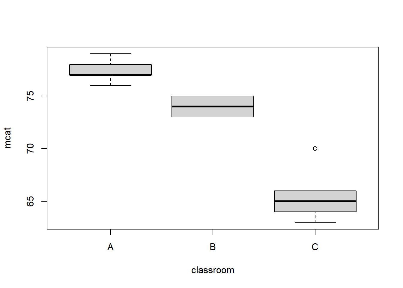
As you can see above, the data from the three classrooms are not overlapping much or at all. This is another good indicator that we need to be looking at our outcome of interest—MCAT score percentile—at the group level rather than just in our overall sample.
In the next section, we will re-fit the data once again and we will account for the separate classrooms.
10.1.5 Specify a new model – varying classroom intercepts
Now we know that we have to change the regression model somehow to account for the different classrooms in our data. The first thing we will try is adding a dummy variable187 for each classroom.
When we want to make dummy variables out of a variable that already exists in our data, we can use the class(...) function to make sure that the variable in question is a factor variable, meaning that it is coded in R as a categorical variable. Here is how we do that in this example:
class(prep$classroom)## [1] "character"As you can see, the variable classroom is indeed coded as a factor variable. This means that it is a qualitative categorical variable. R will automatically make separate dummy variables for us for each classroom, if we add classroom as an independent variable in our regression model. We did not use this shortcut earlier in this textbook, so that we could fully understand that a dummy variable is a binary variable coded as either 0 or 1 for each observation. But now we will take advantage of this shortcut and let R create dummy variables for us automatically.
The code below runs the new regression which adds one dummy variable for each classroom:
fit2 <- lm(mcat ~ study + classroom, data = prep)
summary(fit2)
##
## Call:
## lm(formula = mcat ~ study + classroom, data = prep)
##
## Residuals:
## Min 1Q Median 3Q Max
## -1.6177 -1.0765 0.1000 0.7647 2.9000
##
## Coefficients:
## Estimate Std. Error t value Pr(>|t|)
## (Intercept) 53.7529 8.5136 6.314 5.73e-05 ***
## study 0.4412 0.1584 2.785 0.01773 *
## classroomB -7.8118 1.8241 -4.282 0.00129 **
## classroomC -20.6235 3.2945 -6.260 6.17e-05 ***
## ---
## Signif. codes: 0 '***' 0.001 '**' 0.01 '*' 0.05 '.' 0.1 ' ' 1
##
## Residual standard error: 1.431 on 11 degrees of freedom
## Multiple R-squared: 0.9447, Adjusted R-squared: 0.9296
## F-statistic: 62.66 on 3 and 11 DF, p-value: 3.344e-07Above, we ran and stored a regression result as fit2. This is the same as fit1 from above except there is now a dummy variable added for Classroom B and Classroom C. Classroom A is the reference category and has been left out automatically.
Here is what we learn from the regression results above:
- For each additional hour spent studying, a student’s MCAT score is predicted to be 0.44 units higher, controlling for which classroom a student belongs to.
- A member of Classroom A is predicted to get an MCAT score of 53.75 units if they study for 0 hours.
- A member of Classroom B is predicted to get an MCAT score that is 7.81 units lower than a comparable188 member of classroom A.
- A member of Classroom C is predicted to get an MCAT score that is 20.62 units lower than a comparable member of classroom A.
The number we care about is the 0.44 estimate, which is the new estimate of the relationship between MCAT score and hours spent studying, which is what we are trying to find out in this research. When we created fit1 earlier, the coefficient estimate for this relationship was negative. Now it is positive after we added dummy variables for each classroom.
We can once again visualize this result. This time, we take the same scatterplot we used above—including the color coding for each classroom—and we add in three lines corresponding to the regression equations for each classroom.
The code below creates such a plot for us (it is not required for you to understand all of this code):
eqA = function(x){53.7 + 0.44*x}
eqB = function(x){53.7 - 7.8 + 0.44*x}
eqC = function(x){53.7 - 20.6 + 0.44*x}
p +
  geom_point(aes(col = classroom)) +
  stat_function(fun=eqA) +
  stat_function(fun=eqB) +
  stat_function(fun=eqC) +
  theme(legend.background = element_rect(fill = "transparent"),
        legend.justification = c(0, 1),
        legend.position = c(0, 1))
Above, we asked the computer to plot eqA, eqB, and eqC along with the scatterplot we had made before. As you can see, the line corresponding to each classroom fits quite well with the sampled student data we have from each classroom.
The code below also shows another way to create the same chart, but in a more automated way. In the code above, we had to manually write the regression equation for each of the three lines. In the code below, the lines are drawn for us automatically (it is not required for you to understand all of this code):
# calculate predicted values for fit2
prep$fit2pred = predict(fit2)

# make same plot as before
# and add lines for fitted values
ggplot(prep, aes(x = study, y = mcat, color = classroom) ) +
     geom_point() +
     geom_line(aes(y = fit2pred), size = 1)
## Warning: Using `size` aesthetic for lines was deprecated in ggplot2 3.4.0.
## ℹ Please use `linewidth` instead.
## This warning is displayed once every 8 hours.
## Call `lifecycle::last_lifecycle_warnings()` to see where this warning was
## generated.
To use the code above to make your own similar scatterplot:
- Replace
fit2with the name of your own regression model. - Replace
studywith the name of your own independent variable. - Replace
mcatwith the name of your own dependent variable. - Replace
classroomwith the name of your own grouping variable. - You can leave the rest of the code exactly as it appears above.
We can also add in an additional line from fit1 that shows our results before we looked at the classroom level, again without having to manually type in the equation ourselves.
The following code achieves this:
# calculate fitted values for fit1
prep$fit1pred = predict(fit1)

# make same plot as before
# and add lines for fitted values
ggplot(prep, aes(x = study, y = mcat, color = classroom) ) +
     geom_point() +
     geom_line(aes(y = fit2pred), size = 1) +
  geom_line(aes(y = fit1pred), size = 1, color = 'black')
Let’s review what we just did…
In the plot above:
- We have a downward sloping line with a slope of -0.51. This shows how we initially estimated the relationship between
mcatandstudybefore we accounted for Simpson’s paradox. - We have an upward sloping line with a slope of 0.44 for members of Classroom A only. This shows the estimated relationship between
mcatandstudyonly for members of Classroom A. - We have an upward sloping line with a slope of 0.44 for members of Classroom B only. This shows the estimated relationship between
mcatandstudyonly for members of Classroom B. - We have an upward sloping line with a slope of 0.44 for members of Classroom C only. This shows the estimated relationship between
mcatandstudyonly for members of Classroom C.
By assigning a dummy variable corresponding to each classroom that a student was in, we created a unique intercept for each classroom. In fit1 initially, there was just one intercept for the entire regression model. With dummy variables, there are now three separate intercepts. These dummy variables “captured” variation in the dependent variable (MCAT score) that was related to differences across/between classrooms. The study coefficient then tells us the within-classroom relationship between MCAT score and hours spent studying, which is truly what we want to know. We want to know the relationship between mcat and study, net of any differences (meaning controlling for any differences) between classrooms.
Our data was structured such that it was clustered at the classroom level. The students in our sample were not independent of one another! The OLS assumption of an independently drawn sample was violated. We had to control for it somehow before we had a trustworthy regression result.
By allowing the computer to vary the intercepts at the classroom level and create a unique intercept for each classroom, we completely changed how the regression model fit the data. Adding dummy variables to a regression model makes it a fixed effects model. A “fixed effect” simply means a set of dummy variables that we add to a regression model for the purposes described above, which in this case “asked” the computer to give us a slope estimate of study while controlling for any between-classroom differences.
To restate, it turned out that when we looked across classrooms—also called between classrooms—and ignored that there might be classroom-specific factors we want to control for—we found erroneously that there was a negative trend. When we controlled for the separate classrooms by adding a classroom fixed effect using dummy variables, we correctly found a positive trend. This is Simpson’s Paradox.
Why did this paradox occur?
Let’s brainstorm about why our results may have been clustered at the classroom level. Here are some possibilities:
Different teacher quality: Classrooms A, B, and C all had different teachers. Perhaps Classroom A had the best teacher, whose instruction is most effective. Therefore, Classroom A’s students got the best scores, despite studying the least. But, within classroom A, there were still some students who studied more than others, and those students got even higher scores, which is why we still see a positive trend within each classroom.
Different social cohesion: Perhaps the students in Classroom A got along better with each other and worked more collaboratively than those in the other two classrooms. Perhaps this additional social cohesion in Classroom A allowed for Classroom A students to get higher scores than those in the other classrooms, despite studying less.
Both of the constructs above—teacher quality and social cohesion—vary from classroom to classroom but they are fixed for all of the students who belong to the same classroom as each other. When we added a fixed effect at the classroom level, we controlled for these types of differences that varied from classroom to classroom.
Note that to create the fixed effects model, we still used the lm(...) function in R that we have always used for OLS regression. The way in which we specified this regression model is what makes it a “fixed-effects” model.
10.1.6 Simpson’s Paradox
What we saw in the example above is a demonstration of Simpson’s Paradox: The initial trend that we see in the data is false because we fail to look at the group level.189 Once we look at the group level, we see a completely different trend.
Simpson’s Paradox is at play any time we have data that is clustered into separate groups. When our data is clustered, we cannot use OLS linear regression without making modifications to it. Instead, we must use a fixed effects regression model or a different model that is designed to account for clustered data. In many of the upcoming chapters, we will look at different ways in which Simpson’s Paradox is present in our data and how to correct for it.
10.1.7 Optional resources
The following book chapter introduces fixed effect models in more technical terms and also walks through another example. You are not required to read this, but you can refer to it if you think it would be helpful or if you would like to see another example:
- Chapter 10: “Regression with Panel Data” in Introduction to Econometrics with R by Hanck et al.
The following article shows a number of nice examples of Simpson’s Paradox in multiple settings. Simply looking at some of the figures and their captions may also be useful:
- Kievit, R., Frankenhuis, W. E., Waldorp, L., & Borsboom, D. (2013). Simpson’s paradox in psychological science: a practical guide. Frontiers in psychology, 4, 513. https://doi.org/10.3389/fpsyg.2013.00513
10.1.8 Specify a new model – varying classroom slopes and intercepts
Above, we added a “fixed effect” at the classroom level to give each classroom its own intercept in the regression model. Then, we looked at the coefficient estimate of the study variable, which gave us the slope of the relationship between mcat and study for all students overall, but controlling for classroom. So, to review, we ended up with one slope and many intercepts in the regression model that we created earlier in this chapter.
But what if we want to see if there is a different slope for each classroom? What if the relationship between mcat and study actually varies from classroom to classroom? In other words we now want many slopes and many intercepts, together. Well, it turns out that we have actually done that before, using interaction terms.
Below, have a look at the code to interact study and classroom in a regression model and then view the results:
fit3 <- lm(mcat ~ study * classroom, data = prep)
summary(fit3)
##
## Call:
## lm(formula = mcat ~ study * classroom, data = prep)
##
## Residuals:
## Min 1Q Median 3Q Max
## -1.8456 -0.9081 0.3750 0.7500 1.3750
##
## Coefficients:
## Estimate Std. Error t value Pr(>|t|)
## (Intercept) 64.00000 12.94426 4.944 0.000798 ***
## study 0.25000 0.24127 1.036 0.327152
## classroomB -1.69118 20.08310 -0.084 0.934734
## classroomC -63.88235 21.98172 -2.906 0.017420 *
## study:classroomB -0.06618 0.34121 -0.194 0.850523
## study:classroomC 0.63971 0.34121 1.875 0.093574 .
## ---
## Signif. codes: 0 '***' 0.001 '**' 0.01 '*' 0.05 '.' 0.1 ' ' 1
##
## Residual standard error: 1.258 on 9 degrees of freedom
## Multiple R-squared: 0.965, Adjusted R-squared: 0.9456
## F-statistic: 49.65 on 5 and 9 DF, p-value: 2.775e-06Above, we created a new regression model called fit3. The parameters in this model are:
Intercept: This is the intercept for the reference category of classroom, which is Classroom A. Members of Classroom A with 0 hours of studying are predicted to have an MCAT score of 64.classroomBdummy variable: This is the difference in the intercept between Classroom B and Classroom A. Members of Classroom B with 0 hours of studying are predicted to have an MCAT score of \(64.00 - 1.69 = 62.31\) units.classroomCdummy variable: This is the difference in the intercept between Classroom C and Classroom A. Members of Classroom C with 0 hours of studying are predicted to have an MCAT score of \(64.00 - 63.88 = 0.12\) units.studyon its own: this is the slope for the reference level of classroom, which is Classroom A. Members of Classroom A are predicted to score 0.25 units higher on the MCAT percentile scale for each additional hour of study.study*classroomB: This is the difference between the slope of Classroom B and Classroom A. For each additional hour of studying, Classroom B members are predicted to score an additional \(0.25-0.066 = 0.184\) units on the MCAT.study*classroomC: This is the difference between the slope of Classroom C and Classroom A. For each additional hour of studying, Classroom C members are predicted to score an additional \(0.25+0.64 = 0.89\) units on the MCAT.
Note that in the results above, the intercepts also vary from classroom to classroom, not just slopes.
This is pretty complicated! But it accomplished what we wanted.
Like we have done before with interactions, we can visualize the three different groups and the predicted relationship between mcat and hours for each one:
if (!require(interactions)) install.packages('interactions')
library(interactions)
interact_plot(fit3, pred = study, modx = classroom, plot.points = TRUE)
As the plot above shows, based on our data, it appears that the predicted returns to studying are predicted to be greatest in the weakest classroom (Classroom C), which we can tell because the line for Classroom C has the steepest positive slope. However, the outcomes in Classroom C are nevertheless worse overall than in the stronger two classrooms.
If we are not interested in looking separately at each classroom’s slope, then having just varying intercepts but only one slope estimate (as we did in the fixed effects model earlier, without interactions) may be sufficient. But if we want a separate slope estimate for each classroom, we can add an interaction term as demonstrated above.
10.2 Robust standard errors
Earlier in this chapter, we learned how to fit a fixed effects model to data that is clustered. We saw—due to Simpson’s paradox—that the estimated slopes are very different with and without the fixed effect (classroom dummy variables) added to the regression. We also practiced interpreting the slope coefficient in a fixed effects model. We did not, however, look at the confidence intervals and p-values of the estimates in our regression models.
These statistics that we use for inference are no longer calculated correctly when we use OLS and have clustered data. Therefore, we have to modify how we calculate them when we do a fixed effects regression.
Clustered data can result in residuals that are heteroskedastic and/or correlated with each other, which violates the OLS assumptions. In a random sample with no clustering, the residual of one person in the sample will not give us any information about any other person’s residual. In clustered data, one person’s residual might tell us about another person’s residual. For example, if two students are in the same classroom, they may fall on the same side of the regression line and both have positive (or both have negative) residuals. We can compensate for this problem by calculating robust standard errors for our fixed effects regression model.
Below, we will review what standard errors are in a regression model and then learn about robust standard errors.
10.2.1 Standard errors in regression models
So far in this textbook, we have focused on confidence intervals as the most important inferential statistic in a regression model. And we have focused on p-values as an indicator of confidence in an alternate hypothesis in a hypothesis test. In the context of regression analysis, another inferential statistic called standard error is also calculated for each independent variable as well as the intercept in every regression model. We can see this if we re-examine our regression results from any regression model that we have run so far in our work together. Below, we will use our saved regression model fit2 from earlier in the chapter as an example.
Here is the result of fit2:
summary(fit2)##
## Call:
## lm(formula = mcat ~ study + classroom, data = prep)
##
## Residuals:
## Min 1Q Median 3Q Max
## -1.6177 -1.0765 0.1000 0.7647 2.9000
##
## Coefficients:
## Estimate Std. Error t value Pr(>|t|)
## (Intercept) 53.7529 8.5136 6.314 5.73e-05 ***
## study 0.4412 0.1584 2.785 0.01773 *
## classroomB -7.8118 1.8241 -4.282 0.00129 **
## classroomC -20.6235 3.2945 -6.260 6.17e-05 ***
## ---
## Signif. codes: 0 '***' 0.001 '**' 0.01 '*' 0.05 '.' 0.1 ' ' 1
##
## Residual standard error: 1.431 on 11 degrees of freedom
## Multiple R-squared: 0.9447, Adjusted R-squared: 0.9296
## F-statistic: 62.66 on 3 and 11 DF, p-value: 3.344e-07Above, we know that the slope estimate of study is 0.44 units for our sample. The standard error of this estimate is 0.16. We can think of the standard error as the standard deviation of the slope estimate in our population of interest. In our population of interest, the slope describing the association between mcat and study is 0.44 with a population standard deviation of 0.16. This population-level standard deviation of the slope estimate is called the standard error.190
Confidence intervals are calculate directly from the standard errors. Since confidence intervals have more meaning to us than the standard errors and p-values, we should always focus on confidence intervals when interpreting regression results. It is good to be aware of the relationship between confidence intervals, standard errors, and p-values, but the main focus should be on the interpretation of the confidence intervals when looking at regression results.
Another column in the regression table is the t-value. When the computer calculates regression estimates for us, it is technically calculating a distribution of possible slopes that might define the relationship between the dependent variable and each independent variable in the population. For example, the computer calculated that the relationship between mcat and study has a number of possible slopes in the population. A distribution of all of these slopes has a mean of 0.44 and a standard error of 0.16. This distribution of slopes is a normal distribution. The computer then conducts a t-test on this distribution for us. The p-value that we receive in the regression output (0.018 in this case for study) is the p-value corresponding to that t-test. It is not required for you to fully understand this process.
Here are some guidelines related to the inferential statistics discussed above:
Smaller standard errors lead to narrower confidence intervals, higher t-values, and lower p-values.
Larger standard errors lead to wider confidence intervals, lower t-values, and higher p-values.
Above, we looked at the standard errors for fit2, which were calculated the way standard errors usually are in OLS. When OLS assumptions are violated, as in our example with students belonging to separate groups (classrooms), we need to modify these standard errors—which will in turn modify our confidence intervals—to be more appropriate for the situation.
10.2.2 Calculating robust standard errors in R
We will now calculate robust standard errors that are adjusted for clustering into groups of our observations within our data (clustering of our students into classrooms).
The code below calculates robust standard errors for fit2, which was the OLS regression with fixed effects (dummy variables) for each classroom:
if (!require(lmtest)) install.packages('lmtest')## Warning: package 'zoo' was built under R version 4.2.3library(lmtest)
if (!require(sandwich)) install.packages('sandwich')
library(sandwich)
coeftest(fit2, vcov = vcovHC, type = "HC1")##
## t test of coefficients:
##
## Estimate Std. Error t value Pr(>|t|)
## (Intercept) 53.75294 9.45145 5.6873 0.0001408 ***
## study 0.44118 0.17438 2.5300 0.0279714 *
## classroomB -7.81176 1.75453 -4.4523 0.0009749 ***
## classroomC -20.62353 3.00849 -6.8551 2.746e-05 ***
## ---
## Signif. codes: 0 '***' 0.001 '**' 0.01 '*' 0.05 '.' 0.1 ' ' 1Above, the regression result fit2 is displayed and the standard errors (and the t-values and p-values that go along with it) have been changed. Clustered (also called robust) standard errors were calculated using the HC1 method, one of the most common methods for correcting standard error estimates when there is clustering. To use the code above for your own work, you would replace fit2 with the name of your own regression model and the rest of the code would stay the same.
We can compare the robust standard errors above with the results without robust standard errors below:
summary(fit2)##
## Call:
## lm(formula = mcat ~ study + classroom, data = prep)
##
## Residuals:
## Min 1Q Median 3Q Max
## -1.6177 -1.0765 0.1000 0.7647 2.9000
##
## Coefficients:
## Estimate Std. Error t value Pr(>|t|)
## (Intercept) 53.7529 8.5136 6.314 5.73e-05 ***
## study 0.4412 0.1584 2.785 0.01773 *
## classroomB -7.8118 1.8241 -4.282 0.00129 **
## classroomC -20.6235 3.2945 -6.260 6.17e-05 ***
## ---
## Signif. codes: 0 '***' 0.001 '**' 0.01 '*' 0.05 '.' 0.1 ' ' 1
##
## Residual standard error: 1.431 on 11 degrees of freedom
## Multiple R-squared: 0.9447, Adjusted R-squared: 0.9296
## F-statistic: 62.66 on 3 and 11 DF, p-value: 3.344e-07As we compare these two outputs, we see that the standard error for the study estimate is 0.158 with OLS without any correction and 0.174 with cluster-robust standard errors. In other words, when we use cluster-robust standard errors, we are less certain about the result (the 95% confidence interval will be larger). Therefore, using cluster-robust standard errors give us a more conservative estimate of the regression coefficient. You’ll see that the p-value is higher with the cluster-robust standard errors (0.02797) than with the ordinary estimate (0.01773), meaning that we are less certain about our conclusion with the cluster-robust estimate than the ordinary one. If the p-value of the cluster-robust estimates are still statistically significant, then we can be more certain in our conclusion, since the result held up under more conservative test conditions.
We can also calculate the confidence intervals corresponding to fit2 with and without robust standard errors. We will use the confint(...) function to conveniently do this.
First we look at the 95% confidence intervals for fit2 based on robust standard errors:
confint(coeftest(fit2, vcov = vcovHC, type = "HC1"))## 2.5 % 97.5 %
## (Intercept) 32.95044907 74.555433
## study 0.05737895 0.824974
## classroomB -11.67346556 -3.950064
## classroomC -27.24517410 -14.001885In the code above, we simply took the code coeftest(fit2, vcov = vcovHC, type = "HC1") which we had used before to calculate robust standard errors and we inserted all of this code within the confint(...) function.
Now let’s calculate 95% confidence intervals for fit2 without robust standard errors, by simply inserting fit2 into the confint(...) function:
confint(fit2)## 2.5 % 97.5 %
## (Intercept) 35.01456247 72.4913199
## study 0.09256859 0.7897843
## classroomB -11.82666212 -3.7968673
## classroomC -27.87457326 -13.3724856We can now interpret the predicted relationship between mcat and study for our population from each of these outputs above.
With robust standard errors: We are 95% certain that for every one unit increase in
study,mcatis predicted to increase by as little as 0.057 units and as much as 0.82 units on average, controlling for all other independent variables.Without robust standard errors: We are 95% certain that for every one unit increase in
study,mcatis predicted to increase by as little as 0.093 units and as much as 0.79 units on average, controlling for all other independent variables.
In this case, the confidence interval for the robust model is wider—meaning less certain—than the confidence interval for the non-robust (regular) model. Since we know that we have non-independence in our data, we should trust the robust version more.
From now on, I recommend that you always use robust standard errors when doing any type of linear regression and compare them to the standard errors that you get in the initial regression output.
Note that even if we have corrected for the violation of one regression assumption by using fixed effects modeling and robust standard errors, we still always have to all of the diagnostic tests associated with any particular regression model and pass all of the tests before we can trust the results. That did not change just because of the new modeling techniques in this chapter. Furthermore, any trustworthy model we do succeed in making can only tell us about associations between variables, not causal effects, as we know from learning about causal inference before.
10.3 Fixed effects in the plm package
So far in this chapter, we have just used the OLS regression function lm(...) to create our fixed effect regressions. However, there is also a package called plm that is specifically designed to run fixed effects regressions for us. In this section, we will re-run fit2 from above using the plm package and compare the results.
First, load the plm package:
if (!require(plm)) install.packages('plm')## Warning: package 'plm' was built under R version 4.2.3library(plm)Next, we’ll specify fit4 using the plm(...) function that is contained within the plm package.
Here’s the code to re-run fit2 using the plm() function:
fit4 <- plm(mcat ~ study, index = c("classroom"), data = prep, model = "within", effect = "individual")
summary(fit4)
## Oneway (individual) effect Within Model
##
## Call:
## plm(formula = mcat ~ study, data = prep, effect = "individual",
## model = "within", index = c("classroom"))
##
## Balanced Panel: n = 3, T = 5, N = 15
##
## Residuals:
## Min. 1st Qu. Median 3rd Qu. Max.
## -1.61765 -1.07647 0.10000 0.76471 2.90000
##
## Coefficients:
## Estimate Std. Error t-value Pr(>|t|)
## study 0.44118 0.15839 2.7854 0.01773 *
## ---
## Signif. codes: 0 '***' 0.001 '**' 0.01 '*' 0.05 '.' 0.1 ' ' 1
##
## Total Sum of Squares: 38.4
## Residual Sum of Squares: 22.518
## R-Squared: 0.4136
## Adj. R-Squared: 0.25368
## F-statistic: 7.75862 on 1 and 11 DF, p-value: 0.017731Here are some features of the output above:
n = 3– This is telling us that there were three groups (classrooms) in the data.T = 5– This is telling us that there were five observations in each group.N = 15– This tells us that there were a total of 15 observations in the data overall.0.44118– This is the estimate forstudy. It is the same as before, withfit2.
Note that if we wanted to add more independent variables than just study—let’s call them age and sex as an example—we would add these right after study using plus signs the way we do in our lm(...) regressions. Here is what it would look like:
fit4 <- plm(mcat ~ study+age+sex, index = c("classroom"), data = prep, model = "within", effect = "individual")Additionally, we can get the intercepts for each group:
fixef(fit4)## A B C
## 53.753 45.941 33.129These are the predicted MCAT score percentiles for the members of each classroom when the hours of studying is equal to 0.
Let’s compare the results above with the ones we got before when we just used the lm(...) function.
Here’s a copy of the results from before:
summary(fit2)##
## Call:
## lm(formula = mcat ~ study + classroom, data = prep)
##
## Residuals:
## Min 1Q Median 3Q Max
## -1.6177 -1.0765 0.1000 0.7647 2.9000
##
## Coefficients:
## Estimate Std. Error t value Pr(>|t|)
## (Intercept) 53.7529 8.5136 6.314 5.73e-05 ***
## study 0.4412 0.1584 2.785 0.01773 *
## classroomB -7.8118 1.8241 -4.282 0.00129 **
## classroomC -20.6235 3.2945 -6.260 6.17e-05 ***
## ---
## Signif. codes: 0 '***' 0.001 '**' 0.01 '*' 0.05 '.' 0.1 ' ' 1
##
## Residual standard error: 1.431 on 11 degrees of freedom
## Multiple R-squared: 0.9447, Adjusted R-squared: 0.9296
## F-statistic: 62.66 on 3 and 11 DF, p-value: 3.344e-07All of the estimates are exactly the same in fit4 and fit2!
10.3.1 Robust standard errors in plm
Next, let’s consider clustered standard errors. The code below shows us the results of fit4 once again but correcting the standard errors, just like we did before for fit2:
if (!require(lmtest)) install.packages('lmtest')
library(lmtest)

if (!require(sandwich)) install.packages('sandwich')
library(sandwich)

coeftest(fit4, vcov = vcovHC, type = "HC1")
##
## t test of coefficients:
##
## Estimate Std. Error t value Pr(>|t|)
## study 0.44118 0.19022 2.3192 0.04063 *
## ---
## Signif. codes: 0 '***' 0.001 '**' 0.01 '*' 0.05 '.' 0.1 ' ' 1Now the standard error for study is higher, at 0.190. Before, when we calculated robust standard errors above for fit2, the standard error for the study estimate was 0.174.
The reason for this difference is that the standard error correction on the lm object fit2 only corrects for heteroskedasticity, whereas the standard error correction on the plm object fit4 corrects for both heteroskedasticity and autocorrelation.191
Keep in mind that heteroskedasticity and autocorrelation are both problems that, if they are present in an OLS regression model, cause us to not be able to trust our regression results.
Therefore, it may be best to use the plm package whenever possible in your own research since it is meant for fixed effects analysis and it will calculate the most conservative robust standard errors. Whenever you do quantitative analysis of your own, you want to always make sure to use the correct type of standard errors for your specific data. Furthermore, whenever you read analyses conducted by others, you also want to question whether the correct standard errors were used in the results that you are seeing.
We can also produce 95% confidence intervals for the estimates in fit4 based on the robust standard errors:
confint(coeftest(fit4, vcov = vcovHC, type = "HC1"))## 2.5 % 97.5 %
## [1,] 0.02249477 0.8598582Above, we simply took the code that we used before to calculate robust standard errors on fit4—coeftest(fit4, vcov = vcovHC, type = "HC1")—and put it within the confint(...) function. The output shows us the 95% confidence interval for our slope estimate so that we can make a meaningful inference about our quantitative relationship of interest in our population of interest.
10.4 Assignment
In this week’s assignment, you will practice comparing fixed effects and other OLS regression models to each other. An example of this process is modeled earlier in this chapter.
First, let’s learn about the dataset that you will be using this week. I want to preface this by reminding you that the data we used in the example earlier in this chapter were fake data that were generated for illustrative purposes. In your assignment, you will use genuine observational educational data. I mention this because it is important for you to remember that real-world data is often much more messy and convoluted than fake data!
Please download the data for this week’s assignment from D2L. The file is called GaloComplete.sav. Save the file to your working directory (which might just be the folder where your RMD code file is located).
Next, use the exact following code to load the data and recode some of the variables:
if (!require(foreign)) install.packages('foreign')
library(foreign)

df <- read.spss("GaloComplete.sav", to.data.frame = TRUE)
df$meduc <- as.numeric(df$meduc)
df$school <- as.factor(df$school)
Please read the following description of this data:192
The GALO data in file galo are from an educational study by Schijf and Dronkers (1991). They are data from 1377 pupils within 58 schools. We have the following pupil-level variables: father’s occupational status, focc; father’s education, feduc; mother’s education, meduc; pupil sex, sex; the result of GALO school achievement test, GALO; and the teacher’s advice about secondary education, advice. At the school level we have only one variable: the school’s denomination, denom. Denomination is coded 1 = Protestant, 2 = nondenominational, 3 = Catholic (categories based on optimal scaling).
In this assignment, you will investigate the following research question:
What is the relationship between GALO score (dependent variable) and mother’s education (independent variable)?
Important notes:
- After examining this using OLS, you will add a fixed effect for each school, using the
schoolvariable. Please ignore all other variables. - Note that the
schoolvariable must be coded as a qualitative factor variable (which it should be by default). The variable identifying your groups (schoolin this case) cannot be coded as a numeric variable. - Any time you are asked to interpret results, DO NOT give interpretations for every single school dummy variable. Just focus on answering the research question or interpreting estimates for other independent variables.
- DO NOT use the
denomvariable for any tasks in this assignment, unless otherwise noted. The purpose of this assignment is examine and control for differences across schools, not across denominations.
10.4.1 Explore data and run OLS regression
Task 1: Write a standardized dataset description for the data you are using in this assignment.
Task 2: Determine how many girls in our sample attend protestant schools. This is the only task in this assignment in which you can use the denom variable.
Task 3: Create a scatterplot to visualize the relationship between GALO score and mother’s education. Make sure the correct variable is on the correct axis.193 Do not yet add any colors for groups.
Task 4: Run an OLS linear regression—called reg1—to fit this data. If we just used this regression model and didn’t do any further analysis, what would the answer to our research question be? Note that this regression model will not yet account for Simpson’s Paradox.
10.4.2 Visualize Simpson’s Paradox and run fixed effects regression
Task 5: Make another scatterplot of GALO score plotted against mother’s education. This time, add colors for students at each school. Are you able to visualize any group-level trend? Note that multiple ways to do this are shown in the appendix of this book. Click here to go to the relevant section, if you would like.
Task 6: Create a boxplot to see if you can notice differences in GALO score across the different schools. What do you notice?
Task 7: Run a fixed effects regression—called reg2—using the lm(...) function. You will add a fixed effect for each school. Show and interpret the results for both your sample and population.194 How do these results differ from your OLS result from before that didn’t have the fixed effects? Reminders: You can now use a shortcut to add the fixed effects; you do not need to add each dummy variable to your regression formula individually. DO NOT use the denom variable in this task.
Task 8: Make another fixed effects regression model—called reg3—that includes two additional independent variables as controls. These two additional variables should be individual-level variables, such as characteristics that vary from person to person (rather than school to school). Interpret the results for both sample and population.
Task 9: Run, present, and briefly interpret the results of all OLS regression diagnostics, for reg3. You have done this at least twice before: once in an assignment and another time in Oral Exam #1. Be sure to work through this quickly and re-use your code from before.
Task 10: Create the same fixed effects regression model as reg3, but this time using the plm(...) function. Call this new regression model reg4. How do the results of reg3 and reg4 compare?
Task 11: Why do we use fixed effects models? How do they help us analyze our data? Respond in no more than four sentences.
10.4.3 Calculate cluster-robust standard errors
Task 12: Calculate cluster-robust standard errors for the fixed effects regression you ran with the plm(...) function, which you saved as reg4. Present and interpret your results for both sample and population. Be sure to generate and interpret confidence intervals when appropriate.
10.4.4 Run a varying slopes model
Task 13: Using interaction terms and the lm(...) function, give each school its own predicted slope. In other words, create a varying-slopes model to answer our research question. Save this as reg5. What did you learn from this regression model?
Task 14: Plot the results of the varying-intercepts model using the tools provided in the interactions package. Use the code and explanation below as a guide.
Additional code:
if (!require(interactions)) install.packages('interactions')
library(interactions)

if (!require(RColorBrewer)) install.packages('RColorBrewer')
library(RColorBrewer)

interactions::interact_plot(reg5, pred = meduc, modx = school, colors= rep("#000000",length(levels(df$school))), vary.lty=FALSE)
The reason we had to add extra arguments to the interact_plot function is because—unlike in the example earlier in the chapter—there are too many schools in our GALO data for the interact_plot function to plot using its default (typical) settings. As you can see, when there are too many groups and/or the data are too complex, visual representations of our data are less useful.
Here is another version of the end of the code that might be helpful:
interactions::interact_plot(reg5, pred = meduc, modx = school, colors= rep("#000000",length(levels(df$school))), vary.lty=FALSE) + theme(legend.position = "none")The code above should eliminate the legend at the side of the chart (which is anyway not useful if every line is the same color).
10.4.5 Additional items
You have now reached the end of this week’s assignment. The tasks below will guide you through submission of the assignment, remind you of any other items you need to complete this week, and allow us to gather questions and/or feedback from you.
Task 15: You are required to complete 15 quiz question flashcards in the Adaptive Learner App by the end of this week.
Task 16: Please email Nicole and Anshul to schedule your Oral Exam #2, if you have not done so already.
Task 17: Please write any questions you have for the course instructors (optional).
Task 18: Please write any feedback you have about the instructional materials (optional).
Task 19: Knit (export) your RMarkdown file into a format of your choosing.
Task 20: Please submit your assignment to the D2L assignment drop-box corresponding to this chapter and week of the course. And remember that if you have trouble getting your RMarkdown file to knit, you can submit your RMarkdown file itself. You can also submit an additional file(s) if needed.
Remember that a dummy variable (also called a binary or dichotomous variable) is a variable that just has two values only which the computer interprets as 0 or 1.↩︎
This is just another way to say that members of Classroom B are predicted to have MCAT scores that are 7.81 units lower than those in Classroom A on average, controlling for all other independent variables.↩︎
In our example, the groups were classrooms.↩︎
Standard error is a specific type of standard deviation that refers to a population of interest, rather than our sample. For more clarification, if you wish, see: Altman, D. G., & Bland, J. M. (2005). Standard deviations and standard errors. BMJ, 331(7521), 903. https://doi.org/10.1136/bmj.331.7521.903.↩︎
Explained in Section 10.5: “The Fixed Effects Regression Assumptions and Standard Errors for Fixed Effects Regression” in Introduction to Econometrics with R by Hanck et al. You are not required to read about this.↩︎
Source: Datasets. https://multilevel-analysis.sites.uu.nl/datasets/.↩︎
Remember: There is a rule about whether the independent variable or dependent variable goes on the vertical or horizontal axis. Please be sure to always follow this rule!↩︎
Remember: The best and most meaningful way to interpret regression results for the population is by looking at confidence intervals.↩︎