Chapter 9 Matching to Reduce Model Dependence and Logistic Regression Variants
This week, our goals are to…
Use matching techniques to prepare data for use in estimating associations between a continuous outcome and binary independent variable.
Choose regression models based on the type of dependent variable in the data.
Identify the uses and interpret the results of the following types of regression models: Poisson regression, ordinal logistic regression, and multinomial logistic regression.
Announcements and reminders
In last week’s assignment, you submitted your preliminary thoughts or plans about your final project. We intend to reply to each of you about your project plans with feedback. We will prioritize those of you who need to find data to use. If we forget to contact you about your project—either by e-mail or feedback in D2L—within one week, please follow up with us.
This week’s chapter is about two completely separate topics: a) “controlling” for variables and matching, b) regression models for less common dependent variables.
Please schedule your Oral Exam #2 if you have not done so already.
9.1 “Controlling” for variables
We begin this chapter with a review of what it means to “control” for a variable in an analysis. This term can often be confusing. We will walk through what we mean by this below. This section is optional (not required) to read.
To “control” for a variable can also be described as…
- Holding constant a variable.
- Making an apples to apples comparison.
- Looking at a relationship of interest at the same level of all other variables.
Let’s use an example from the hsb2 data in the openintro package that we have used before:
if (!require(openintro)) install.packages('openintro')
library(openintro)

ols <- lm(science ~ gender + schtyp + read + socst, data=hsb2)
Above, we created a regression model with science as our dependent variable and gender, schtyp, read, and socst as independent variables. Remember that you can run ?hsb2 on your own computer to read about this dataset.
Let’s look at the results table:
summary(ols)##
## Call:
## lm(formula = science ~ gender + schtyp + read + socst, data = hsb2)
##
## Residuals:
## Min 1Q Median 3Q Max
## -18.7755 -5.2406 0.1677 4.5438 27.0176
##
## Coefficients:
## Estimate Std. Error t value Pr(>|t|)
## (Intercept) 17.11751 3.08799 5.543 9.56e-08 ***
## gendermale 2.10552 1.09256 1.927 0.0554 .
## schtypprivate 0.17981 1.48090 0.121 0.9035
## read 0.52210 0.06784 7.696 6.85e-13 ***
## socst 0.12358 0.06484 1.906 0.0581 .
## ---
## Signif. codes: 0 '***' 0.001 '**' 0.01 '*' 0.05 '.' 0.1 ' ' 1
##
## Residual standard error: 7.637 on 195 degrees of freedom
## Multiple R-squared: 0.417, Adjusted R-squared: 0.4051
## F-statistic: 34.87 on 4 and 195 DF, p-value: < 2.2e-16Now let’s visualize a portion of our regression results only:
if (!require(interactions)) install.packages('interactions')
library(interactions)

interact_plot(ols, pred = read, modx = gender, plot.points = TRUE)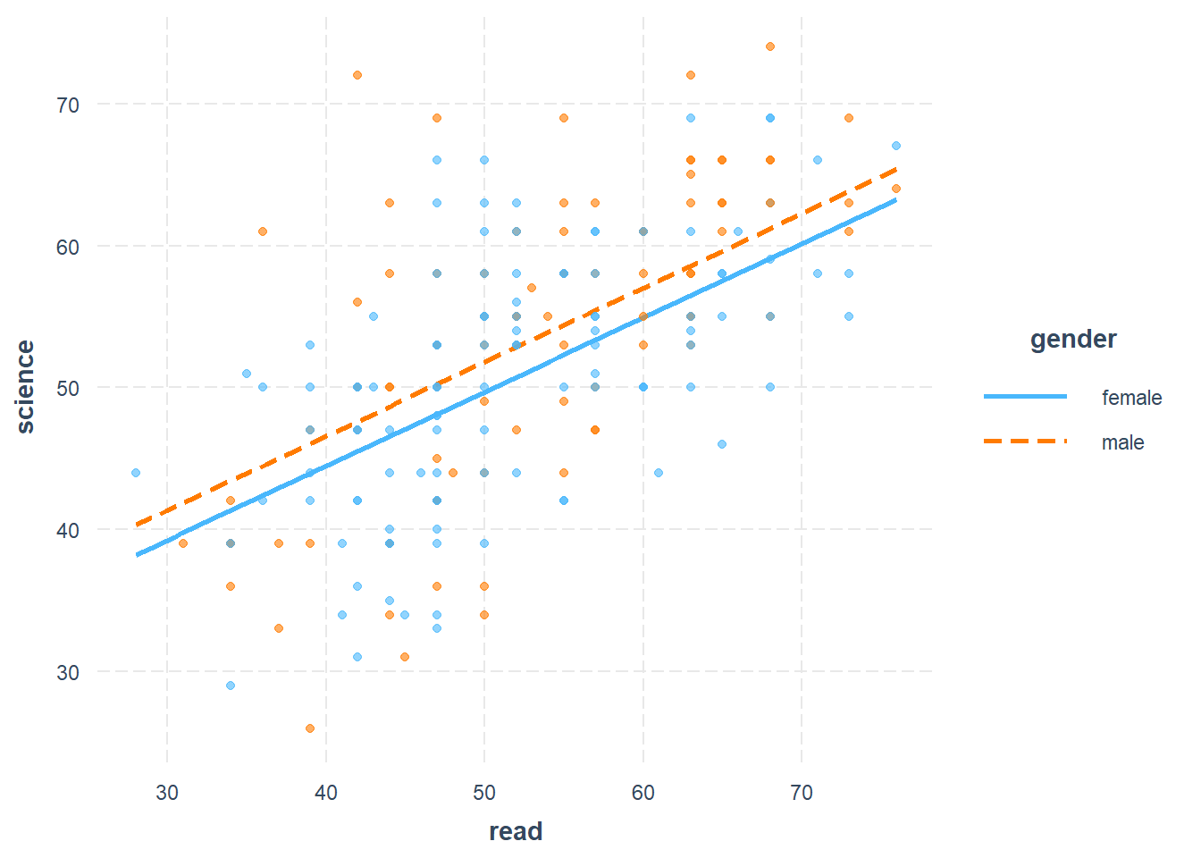
Above, we plot science score against reading score separately for females and males. We see regression lines for the relationship between science and read, separately for females and males. The solid blue line shows the predicted linear relationship between science and read for females. The dotted red line shows the relationship between science and read for males. Our regression model also had a school type dummy variable and social studies score as independent variables as well; we left these variables out of the plot. We are only focusing on science, reading, and gender in the plot above.
Our goal is to figure out the relationship between the dependent variable science and each independent variable, unrelated from the relationship between the dependent variable science and every other independent variable.
Here are some examples of our goal:
- We want to know the relationship between science and read, unrelated to the relationships between science and gender, science and school type, and science and social studies score.
- We want to know the relationship between science and gender, unrelated to the relationships between science and read, science and school type, and science and social studies score.
- We could write a similar sentence for science and each of the remaining independent variables.
Let’s examine how this regression model helps us achieve this goal. We will use a) the relationship between science and gender, and b) the relationship between science and read as examples. Remember that science is the dependent variable—our outcome of interest—which is why we are always looking for the relationship between science and another variable, in this example.
Science and gender, example with control:
- We want to know: What is the difference in science score between females and males, unrelated to and untangled from any other relationships science has with the other independent variables in the data?
- How do we untangle the science-gender relationship from all of the other relationships that science has? Let’s look on our plot to see how we untangle the science-gender relationship (what we want to find out) from the science-read relationship (which is unrelated to what we want).
- read is a variable that we want to control for when examining the science-gender relationship.
- Look on the plot only where read is equal to 30 units. When read is equal to 30 units, females are predicted to score 39 on science and males are predicted to score 41. That’s a difference of 2 points higher for males.
- Look on the plot only where read is equal to 40 units. When read is equal to 40 units, females are predicted to score 44 on science and males are predicted to score 46. That’s also a difference of 2 points higher for males.
- Look on the plot only where read is equal to 50 units. When read is equal to 50 units, females are predicted to score 50 on science and males are predicted to score 52. That’s yet again a difference of 2 points higher for males.
- No matter where we look, males always score 2 points higher than females. We can look at any level of read we want and we will always find this 2-point difference. This is what it means to control for reading when we look at the science-gender relationship.
Science and gender, example without control (what not to do):
- Let’s imagine that we had tried to investigate the science-gender relationship without controlling for read. We still want to know the difference in science scores between males and females.
- Again, let’s compare some males and females on our plot.
- A female with reading score of 60 has a predicted science score of 55. A male with reading score of 46 has a predicted science score of 50. This tells me that the female has a science score that is 5 points higher than the male.
- A female with reading score of 42 has a predicted science score of 45. A male with reading score of 50 has a predicted science score of 52. This tells me that the male has a science score that is 7 points higher than the female.
- Above, we compared females and males who had different reading scores to each other. In one case, females are higher. In another case, males are higher. It didn’t help us answer our question of the overall difference between females and males on science. We tried to compare different types of females (those who score 60 and 42 on reading) to different types of males (those who score 46 and 50 on reading). The result didn’t make much sense and didn’t tell us anything about what we want to know.
Above, we learned that we have to control for or “hold constant” the level of reading to determine the difference between females and males on science. Now let’s turn to the science-read relationship, example with control:
- We want to know: What is the relationship between science score and read score, unrelated to and untangled from any other relationships science has with the other independent variables in the data?
- How do we untangle the science-read relationship from all of the other relationships that science has? Let’s look on our plot to see how we untangle the science-read relationship (what we want to find out this time) from the science-gender relationship (which is now unrelated to what we want).
- gender is a variable that we want to control for when examining the science-read relationship.
- Look on the plot only where gender is female. This is represented by the entire solid blue line. On this line, for every one unit increase in read, science is predicted to increase by 0.52 units.
- Look on the plot only where gender is male. This is represented by the entire dotted red line. On this line, for every one unit increase in read, science is also predicted to increase by 0.52 units.
- No matter which gender we look at, a one unit increase in read is always associated with a 0.52 unit predicted increase in science.
Note that:
When we wanted to know the science-gender relationship, we looked at a single level of read (the control variable) and compared each gender’s science score at that single level of read. Then we tried it again for a different level of read. We found people who had the same reading level as each other and then compared the science score of only those people as we varied the gender.
When we wanted to instead know the science-read relationship, we looked at a single level of gender (now the control variable) and looked at the association between science and read at that single level of gender. Then we tried it again for the other level of gender. Remember that by “level” of gender we just mean female or male. This time, we found people who had the same gender as each other and then compared the science score of only people with that gender as we varied the reading score.
Even though we did not focus on the independent variables
schtypandsocstin the examples above, we still controlled for these two variables in our regression model. Every conclusion about the science-read relationship and science-gender relationship is also controlling forschtypandsocst, even though it was not shown graphically. The slope estimates for each independent variable tell us the relationship between science and that independent variable while holding constant ALL other independent variables.
9.2 Model dependence and data pruning
This section contains some important videos that demonstrate model dependence and explain how a technique called matching or pruning can be used to solve this problem. You are required to watch the specified portions of each video. However, you may prefer to watch the videos after you have read the rest of the chapter. It depends on whether you prefer to read or watch first. There is no need to go in a particular order.
The first video is a presentation by Gary King called “Why Propensity Scores Should Not Be Used for Matching”. While the main point—regarding propensity scores—is made in the second half of that presentation, the first 20 minutes walk through some examples and frameworks that are important for us to know.
You are required to watch the first 20 minutes of the following video,172 during which Gary King…
- Walks through an excellent and simple example of model dependence, demonstrating a situation in which the type of regression model we choose changes the answer to our question of interest (which is very bad).
- Summarizes how matching can be used to fix model dependence.
- Shows how after matching is conducted, the initial model dependence problem disappears.
- Shows how matching fits into the counterfactual causal model that you read about in Winship and Morgan (1999).173
The video above can be viewed externally at https://www.youtube.com/watch?v=rBv39pK1iEs.
You should be aware of two more related videos by Gary King, below.
You are required to watch the first 13 minutes of the following video (watching the rest is optional):174
The video above can be viewed externally at https://youtu.be/cbrV-mM9mFk.
The following video is optional to watch but highly recommended if you do end up using matching for your own work, since it explains some of the details how certain matching methods work:175
The video above can be viewed externally at https://www.youtube.com/watch?v=tvMyjDi4dyg.
9.3 Matching to reduce model dependence
One way to reduce model dependence in our data is to use a technique called matching. Matching is useful if you have a binary (dummy) variable that is your key independent variable of interest. A simple way to think about this is that matching helps us change our data such that it attempts to mimic the type of data we would collect in a randomized controlled trial (RCT).
Let’s go through a hypothetical example together:
Imagine we have a dataset in which some people received a treatment (you can pretend that these people received a medicine) and other people did not (you can pretend that these people did not receive the medicine). Those who received the treatment are in the treatment group. Those who did not receive the treatment are in the control group.
The dataset was not collected as part of an RCT. People in the dataset were not randomly sorted into treatment and control groups. Instead, data were collected as a survey on a convenience sample of people willing to participate. In addition to knowing whether or not a person in our data is in the treatment or control group, we also measure (collect data on) an outcome of interest (you can pretend that this is blood pressure), demographic characteristics (such as age, race, education level, and similar), and other variables that we think may be important (such as weight, weekly exercise hours, and similar). These other variables are often referred to as covariates.
We now want to estimate the association between the outcome of interest and the treatment. We will do this by running an OLS model in which the dependent variable is the outcome of interest in the dataset. The independent variables in the OLS model are the treatment dummy variable and all of the selected demographic and other covariates.
Before we run the OLS model to estimate an association, we use matching to remove some people from the dataset. This process is called pruning by Gary King and his colleagues.176 During the matching process, the computer will use an algorithm that we select to create a modified dataset for us.
Imagine that our dataset has 100 people who received the treatment. We will call these people T1–T100. And imagine that we have 200 people in the dataset who did not receive the treatment. We will call these people C1–C200. Here is an example of one possible matching procedure that we might choose to use in this scenario:
- Start with T1 in the data. This is the first person in the dataset spreadsheet that belongs to the treatment group.
- Examine all of T1’s covariates, meaning T1’s demographic and other selected variables.
- Find one of the 200 people belonging to the control group who is most similar to T1 on the covariates. Let’s pretend that the person C38 is most similar to T1. C38 is T1’s match. For example, C38 and T1 might have the same gender and race and they might have similar but not exactly the same levels of years of education and other covariates.
- Keep both T1 and C38 in our final dataset.
- Repeat above procedure for T2. Add T2 and its closest match to our final dataset.
- Repeat above procedure for all treatment group people.
- For some of the people in the treatment group, we might not be able to find a close enough match in the control group (we can tell the computer how close of a match is acceptable or not). We discard any treatment people for which we cannot find a close enough match. We discard any control people who have not been matched to treatment people.
- If, for example, we found 80 acceptable matches for people in the treatment group, then our final dataset contains 160 people in total: the 80 people in the treatment group for whom we found matches and the 80 people in the control group to whom they were matched.
- We remove—or prune, in the lingo of King and colleagues—any people in our original dataset who are not among the 160 matched people.
- We check the balance of the independent variables in the matched dataset of 160 people. This means that we check how different our control independent variables are on average in the treatment group compared to the control group.
- We now run our OLS model only on the final dataset of 160 matched people.
- Start with T1 in the data. This is the first person in the dataset spreadsheet that belongs to the treatment group.
- As always, there are conditions and assumptions that should be met before we know that we can trust the results of a matched analysis. The resources related to matching in this chapter are just an introduction to matching and pruning. When doing a matched analysis in the future, we should also rely on other peer-reviewed guidance and scholarship that relates to our specific question of interest and data structure.
Matching is a powerful tool that we should use when our question and data are appropriate for it. Ideally, we want control independent variables to be similarly balanced (distributed) in our control group and treatment groups. Matching helps us try to achieve this goal. Keep reading below to learn how we can implement a matching analysis in R!
9.4 Matching in R
In this section, we will go through one possible way to create a matched dataset and run an analysis on that dataset in R. Note that there are many ways to do this and the example below is just one of those. You can follow along with this example by running the code in this section on your own computer!
9.4.1 Preparation
For this example, we will use the MatchIt package. We will use the dataset called lalonde from the MatchIt package. This example is a replication—with additional commentary—of the example of a matched analysis by Noah Greifer.177
Below, we load the packages and data:
if (!require(MatchIt)) install.packages('MatchIt')## Warning: package 'MatchIt' was built under R version 4.2.3library("MatchIt")
data("lalonde")
d <- lalondeAbove, we loaded the two packages and we saved the lalonde dataset as d. We will use d as our dataset for the rest of this example. To see information about this dataset, run the command ?MatchIt::lalonde in the R console on your computer. You can also run the command View(d) to view the entire dataset.
Below, we inspect the dimensions of d:
dim(d)## [1] 614 9And we learn that our dataset contains 614 observations and nine variables.
We can look at the list of variables:
names(d)## [1] "treat" "age" "educ" "race" "married" "nodegree" "re74"
## [8] "re75" "re78"Now let’s fully set up our example:
- Question of interest: Is 1978 income associated with receiving an intervention?
- Data:
lalondedata fromMatchIt, renamed asd. - Unit of observation: person in the United States of America (USA)
- Dependent variable:
re78, income in USA dollars in 1978. - Independent variable of interest:
treat, a dummy variable telling us whether or not each observation received an intervention. - Other independent variables:
age,educ,race,married,nodegree,re74(1974 income), andre75(1975 income).
Analysis strategy:
- Create matched dataset.
- Run an OLS regression to answer our question of interest:
reg1 <- lm(re78 ~ treat + age + educ + race + married + nodegree + re74 + re75, ...).
Note that treat, age, educ, race, married, nodegree, re74, and re75 can all be referred to as covariates in this study. There may also be other covariates which are relevant but not part of our data. These other covariates might be important omitted variables in our analysis.
9.4.2 Initial balance
Now that our question of interest and data are ready, we can begin our matched analysis. The first step is to examine the data before we modify it at all using matching. In this preliminary examination, we will check to see what the balance is of our data, comparing the treatment and control groups for each variable.
Below, we create a “null” matching model:
mNULL <- matchit(treat ~ age + educ + race + married + nodegree + re74 + re75, data = lalonde, method = NULL)Here is what we asked the computer to do with the code above:
mNULL <-– Create a newmatchitobject calledmNULLwhich stores the results of thematchit(...)function. We could give this any name we wanted; it does not have to bemNULL.matchit(...)– Create a new matched dataset.treat– Our independent variable of interest. In this case, it indicates whether an observation is a member of the control group (treat= 0) or treatment group (treat= 1). Note thattreatis NOT our dependent variable. We leave our dependent variable out of this code.~– This separates our independent variable of interest from our other independent variables. Remember: do not include the dependent variable anywhere in this code.age + educ + race + married + nodegree + re74 + re75– These are all of the independent variables that we want to control for in our analysis.method = NULL– We do not want to do any matching right now. We just want to inspect the extent to which our current dataset is or is not already balanced (matched well).
Once again: We do not include our dependent variable anywhere in the code above. We are currently in the process of preparing our data by creating a matched dataset, a process that does not involve the dependent variable.
Next, we inspect the mNULL results that we just created, using the summary(...) function:
summary(mNULL)##
## Call:
## matchit(formula = treat ~ age + educ + race + married + nodegree +
## re74 + re75, data = lalonde, method = NULL)
##
## Summary of Balance for All Data:
## Means Treated Means Control Std. Mean Diff. Var. Ratio eCDF Mean
## distance 0.5774 0.1822 1.7941 0.9211 0.3774
## age 25.8162 28.0303 -0.3094 0.4400 0.0813
## educ 10.3459 10.2354 0.0550 0.4959 0.0347
## raceblack 0.8432 0.2028 1.7615 . 0.6404
## racehispan 0.0595 0.1422 -0.3498 . 0.0827
## racewhite 0.0973 0.6550 -1.8819 . 0.5577
## married 0.1892 0.5128 -0.8263 . 0.3236
## nodegree 0.7081 0.5967 0.2450 . 0.1114
## re74 2095.5737 5619.2365 -0.7211 0.5181 0.2248
## re75 1532.0553 2466.4844 -0.2903 0.9563 0.1342
## eCDF Max
## distance 0.6444
## age 0.1577
## educ 0.1114
## raceblack 0.6404
## racehispan 0.0827
## racewhite 0.5577
## married 0.3236
## nodegree 0.1114
## re74 0.4470
## re75 0.2876
##
## Sample Sizes:
## Control Treated
## All 429 185
## Matched 429 185
## Unmatched 0 0
## Discarded 0 0The output above tells us a lot about our data. Remember: We have not done any matching yet. We are just inspecting our data in its original form. Let’s begin by looking at the smaller Sample Sizes table at the bottom of the output. This tells us that our data contains 429 observations in the control group and 185 observations in the treatment group. Since we did not actually conduct any matching yet above, we can ignore the final three rows of this table.
The larger summary table above allows us to compare the control variables in the treatment and control groups. For example, the average age of treatment group members is 25.8 years, while the average age for control group members is 28.0 years. From this, we learn that if we were to just run our OLS regression as planned without first pruning the data, we would not be controlling for age as well as we would like. We would potentially be comparing our outcome of interest (income in 1978) in a) control group members with an average age of 28.0 years against b) treatment group members with an average age of 25.8 years. In other words, there would be two differences between the two groups: 1) the groups have different average ages and 2) one group received the intervention and the other didn’t. If we find that the treatment group has higher 1978 income than the control group, we would not know if it is because of the age difference or because of the intervention.
We ideally want to compare people of the same age to each other. We want to compare 25 year-olds in the treatment group to 25 year-olds in the control group. We want to compare 26 year-olds in the treatment group to 26 year-olds in the control group. And so on. Of course, this exact balance cannot be achieved, but we want to get as close as possible. This is where matching comes in, as we will see as we continue our analysis. If we were conducting this study as a well-organized RCT instead of using already-existing survey data, we would use randomization to achieve balance on as many control variables as possible. But with our survey data, we will attempt to use matching to achieve as much balance as possible.
In the large summary table above—which we could also call a balance table—we can see that the mean values for many of the control independent variables are quite different from each other. The other columns help us see this easily. The Std. Mean Diff. column gives us a standardized measure of the difference between treatment and control group means for each variable. This allows us to make relative comparisons between variables. For example, the standardized mean difference between treatment and control for the variable nodegree is 0.25. The standardized mean difference between treatment and control for the variable educ is 0.06. This means that nodegree is more imbalanced than educ in our data. We ideally want the standardized mean difference to be 0 for every variable, or as close to 0 as possible.
The Var. Ratio column tells us the ratio of the variances of the treatment and control groups for each variable. Since we want the treatment and control groups to be as similar as possible on the control variables, we want the ratio of variances to be as close as possible to 1. For dummy variables, ratio of variances is not calculated since it is not meaningfully useful to us.
The output above told us in tabular form that we do not have good balance in our dataset for our question of interest.
We can also use a series of visualizations to inspect balance in our data. The first is to look at the distribution of propensity scores in our data. A propensity score is the likelihood of an observation being in the treatment or control groups. There are multiple ways to calculate propensity scores. One is to run a logistic regression in which the dependent variable is treat—which is our independent variable of interest in our study—and the independent variables are our control variables from our study. This logistic regression model then allows us to calculate the probability that each observation is in the treatment group or not. The computer has done all of this work for us and displays it for us when we ask.
Below, we create a plot to view control and treatment observations with their propensity scores:
plot(mNULL, type = "jitter", interactive = FALSE)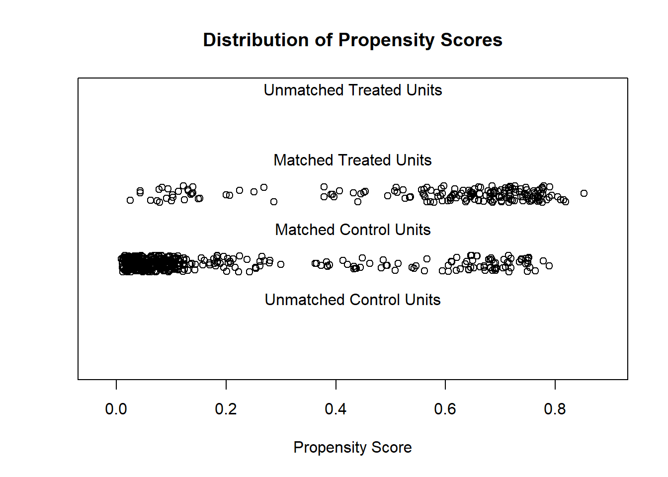
Here is what the code above did:
plot(...)– Create a plot using data from the saved objectmNULL.type = "jitter"– Slightly change the location of where each point is plotted, such that we can easily see each point.interactive = FALSE– Do not include any special or interactive features in the plot.
In the plot above, we see all of the observations in our dataset plotted. Since we have not yet done any matching yet, the computer treats all of our observations—which it calls units—as matched observations. That is why no points appear in the unmatched treatment and control sections of the plot. Let’s compare the treatment and control observations that were plotted. We see that most treatment observations have high propensity scores. Some control observations also have high propensity scores, while most have very low propensity scores. This means that for many of the observations in our data, the logistic regression model (with which we calculated propensity scores) is able to use the control independent variables to predict whether an observation was or was not in the treatment group. In other words, we see some evidence that knowledge of the control variables alone can help us predict whether a person is in the treatment group or not. This means that people in the study were clearly NOT randomized into treatment and control groups.
Areas in the plot above where we have even and numerous enough distribution of both control and treatment observations is called the region of common support. We ideally want to compare our outcome in the treatment and control groups only in the region of common support. Matching helps us achieve this by removing observations that do not fall within the region of common support.
Note that propensity scores are a good auxiliary tool as we inspect our data and prepare to use matching. However, propensity score matching is not recommended as a primary strategy for matching,178 as we will see below.
Next, arguably the most useful plot is the Love plot, which we create below:
plot(summary(mNULL))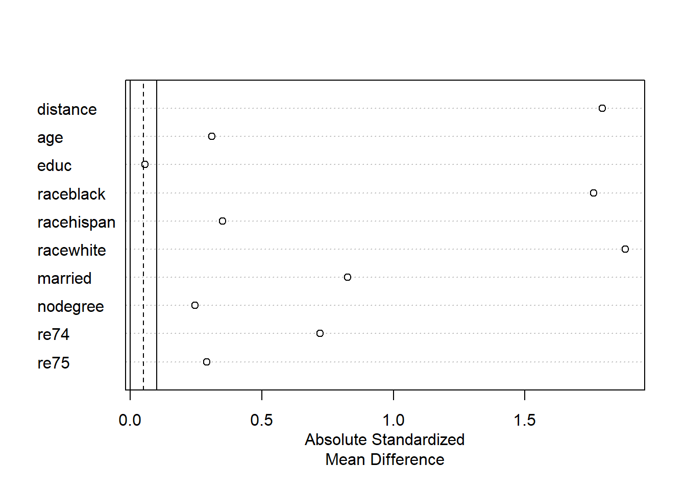
To create the Love plot above, we put our object mNULL into the summary function and put that summary(...) function into the plot(...) function.
The Love plot is a visualization of the standardized mean differences for each variable that we saw in the large balance table above. In this case, the absolute value179 of each standardized mean difference is plotted. As mentioned before, we want the standardized mean differences between the treatment and control groups for each variable to be as close to 0 as possible. In the Love plot above, we can see very easily that the education variable appears to have good balance and the rest of the variables do not.
Now that we have examined balance in our control independent variables in both tabular and visual forms, we can conclude that our dataset is not well balanced between our treatment and control groups.
9.4.3 Propensity score matching
The first form of matching that we will attempt is called propensity score matching. This is a classic and common form of matching, although it is no longer recommended180 as the best type of matching for the types of data commonly used in health and behavioral sciences. Nevertheless, we will use propensity score matching as our first attempt at creating a matched dataset.
We again use the matchit(...) function like we did earlier:
m1 <- matchit(treat ~ age + educ + race + married + nodegree + re74 + re75, data = d, method = "nearest", distance = "glm")We have now run a matching procedure and saved the results in m1. m1 contains what we could call our new matched or pruned dataset.
In the code above:
- We saved our
matchitobject asm1(we could have chosen any other name). method = "nearest"– Match each treatment group observation to the control group observation with the nearest propensity score.distance = "glm"– Use logistic regression to calculate propensity scores.- Other than these changes, everything else is the same as when we created
mNULLearlier. - Once again, remember that we do not include the dependent variable anywhere in the code above. We are only making modifications to our dataset based on the independent variables.
And now we will inspect the results for m1 like we had done earlier for mNULL:
summary(m1)##
## Call:
## matchit(formula = treat ~ age + educ + race + married + nodegree +
## re74 + re75, data = d, method = "nearest", distance = "glm")
##
## Summary of Balance for All Data:
## Means Treated Means Control Std. Mean Diff. Var. Ratio eCDF Mean
## distance 0.5774 0.1822 1.7941 0.9211 0.3774
## age 25.8162 28.0303 -0.3094 0.4400 0.0813
## educ 10.3459 10.2354 0.0550 0.4959 0.0347
## raceblack 0.8432 0.2028 1.7615 . 0.6404
## racehispan 0.0595 0.1422 -0.3498 . 0.0827
## racewhite 0.0973 0.6550 -1.8819 . 0.5577
## married 0.1892 0.5128 -0.8263 . 0.3236
## nodegree 0.7081 0.5967 0.2450 . 0.1114
## re74 2095.5737 5619.2365 -0.7211 0.5181 0.2248
## re75 1532.0553 2466.4844 -0.2903 0.9563 0.1342
## eCDF Max
## distance 0.6444
## age 0.1577
## educ 0.1114
## raceblack 0.6404
## racehispan 0.0827
## racewhite 0.5577
## married 0.3236
## nodegree 0.1114
## re74 0.4470
## re75 0.2876
##
## Summary of Balance for Matched Data:
## Means Treated Means Control Std. Mean Diff. Var. Ratio eCDF Mean
## distance 0.5774 0.3629 0.9739 0.7566 0.1321
## age 25.8162 25.3027 0.0718 0.4568 0.0847
## educ 10.3459 10.6054 -0.1290 0.5721 0.0239
## raceblack 0.8432 0.4703 1.0259 . 0.3730
## racehispan 0.0595 0.2162 -0.6629 . 0.1568
## racewhite 0.0973 0.3135 -0.7296 . 0.2162
## married 0.1892 0.2108 -0.0552 . 0.0216
## nodegree 0.7081 0.6378 0.1546 . 0.0703
## re74 2095.5737 2342.1076 -0.0505 1.3289 0.0469
## re75 1532.0553 1614.7451 -0.0257 1.4956 0.0452
## eCDF Max Std. Pair Dist.
## distance 0.4216 0.9740
## age 0.2541 1.3938
## educ 0.0757 1.2474
## raceblack 0.3730 1.0259
## racehispan 0.1568 1.0743
## racewhite 0.2162 0.8390
## married 0.0216 0.8281
## nodegree 0.0703 1.0106
## re74 0.2757 0.7965
## re75 0.2054 0.7381
##
## Sample Sizes:
## Control Treated
## All 429 185
## Matched 185 185
## Unmatched 244 0
## Discarded 0 0mNULL, which we created earlier in the chapter, was just an unmatched dataset. m1 is a matched dataset, so the output that we get above is a bit different. First of all, we are given balance tables for both the unmatched (old original) and matched (new pruned) versions of the dataset. The balance table for the unmatched data is labeled Summary of Balance for All Data and it is the same as our balance table of mNULL. The balance table for the matched data is labeled Summary of Balance for Matched Data.
At the very bottom of the output is our Sample Sizes summary table. This tells us that, as we already knew, there were 429 control observations and 185 treatment observations in our initial data. Then it tells us that 185 control observations were matched to 185 treatment observations. 244 control observations were removed (pruned) from the data.
The Summary of Balance for Matched Data shows us the balance between just the 185 control and 185 treatment observations that remain in our matched dataset. Variables such as age have improved, as we can see that the mean ages in treatment and control groups are now quite close. However, the variance ratio for age is still quite far from 1, at 0.46.
Let’s look at some visualizations before we decide if our matched dataset is satisfactory or not.
We can again plot the distribution of propensity scores against the various types of observations.
plot(m1, type = "jitter", interactive = FALSE)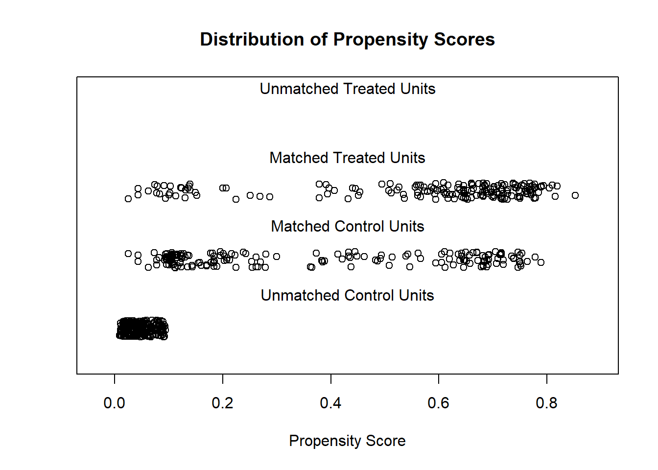
Above, we now see three types of observations. We see 185 matched observations from the treatment group, which more densely fall at higher propensity scores. We see 185 matched observations from the control group, which are most dense at lower propensity scores. And then we see the 244 unmatched control group observations that were discarded (pruned) from the dataset, all of which have low propensity scores. Since the distributions of observations in the matched treatment and control groups are visible different from each other, this suggests that we may not have good balance even after creating a matched dataset.
Let’s look at the Love plot for m1:
plot(summary(m1))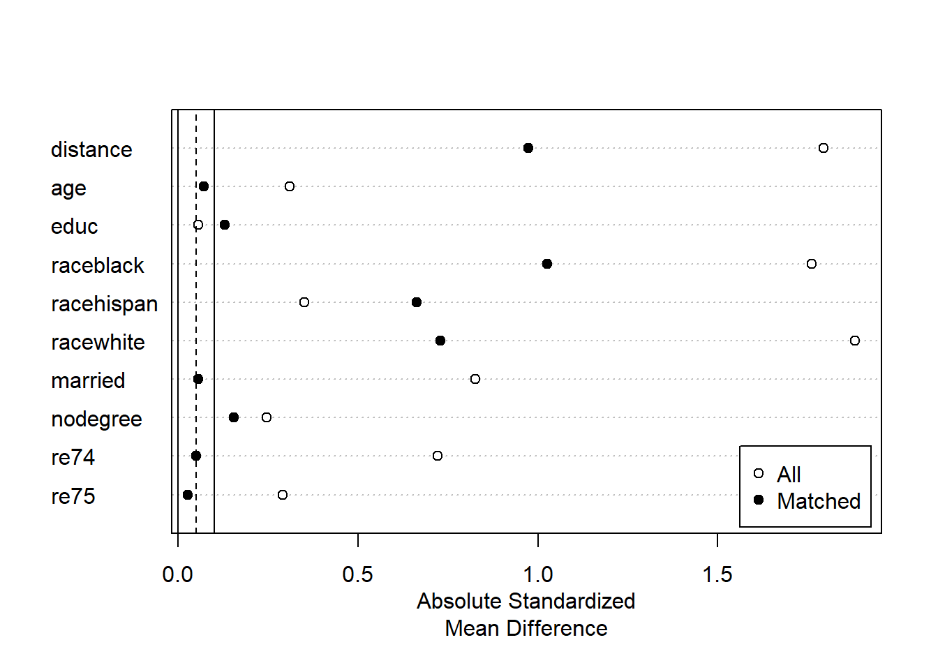
Now that we are making a Love plot on matched data, the plot we receive is different than before. This plot shows us absolute standardized mean difference for both a) our original data, labeled “All”, and b) our new matched data, labeled “Matched.” We ideally want the standardized mean differences for the matched data to be close to 0. This plot allows us to easily see that for the variables age, married, 1974 income, and 1975 income, we were able to balance our data. For dummy variables for black people, white people, and no degree, we improved but did not fully fix the balance. And for education and Hispanic people, the balance became even worse!
Taking everything above into consideration, the matched dataset we created using propensity score matching—in this case—did not yield a well-balanced dataset. There are still too many differences in control variables between the treatment and control groups for us to feel comfortable using this matched dataset to answer our question of interest. We will have to try a different matching strategy.
9.4.4 Coarsened exact matching
The next method of matching we will try is called coarsened exact matching (CEM). CEM is a more disciplined method of finding matches for each observation in our data. CEM divides each continuous control independent variable up into buckets, like we do when making a histogram. It then makes the buckets wider and wider—up to a point—until it is able to find an exact match for each observation in our data. We will not fully examine how exactly CEM works, but we will try to use CEM to create a matched dataset below and inspect the results. Propensity score matching and CEM are just two of many possible matching methods that can be used.
Let’s get started by using the same matchit(...) function that we have used twice before:
m2 <- matchit(treat ~ age + educ + race + married + nodegree + re74 + re75, data = d, method = "cem")Above, we created a matched dataset which is saved in the matchit object called m2. We used the same code as we have used twice before in the matchit(...) function, except this time we included the argument method = "cem" in the function. This tells the computer to use CEM to try to create a matched dataset for us.
Let’s inspect the matching results stored in m2:
summary(m2)##
## Call:
## matchit(formula = treat ~ age + educ + race + married + nodegree +
## re74 + re75, data = d, method = "cem")
##
## Summary of Balance for All Data:
## Means Treated Means Control Std. Mean Diff. Var. Ratio eCDF Mean
## age 25.8162 28.0303 -0.3094 0.4400 0.0813
## educ 10.3459 10.2354 0.0550 0.4959 0.0347
## raceblack 0.8432 0.2028 1.7615 . 0.6404
## racehispan 0.0595 0.1422 -0.3498 . 0.0827
## racewhite 0.0973 0.6550 -1.8819 . 0.5577
## married 0.1892 0.5128 -0.8263 . 0.3236
## nodegree 0.7081 0.5967 0.2450 . 0.1114
## re74 2095.5737 5619.2365 -0.7211 0.5181 0.2248
## re75 1532.0553 2466.4844 -0.2903 0.9563 0.1342
## eCDF Max
## age 0.1577
## educ 0.1114
## raceblack 0.6404
## racehispan 0.0827
## racewhite 0.5577
## married 0.3236
## nodegree 0.1114
## re74 0.4470
## re75 0.2876
##
## Summary of Balance for Matched Data:
## Means Treated Means Control Std. Mean Diff. Var. Ratio eCDF Mean
## age 21.6462 21.2936 0.0493 0.8909 0.0130
## educ 10.3692 10.2795 0.0446 0.8894 0.0100
## raceblack 0.8615 0.8615 0.0000 . 0.0000
## racehispan 0.0308 0.0308 0.0000 . 0.0000
## racewhite 0.1077 0.1077 0.0000 . 0.0000
## married 0.0308 0.0308 0.0000 . 0.0000
## nodegree 0.6769 0.6769 0.0000 . 0.0000
## re74 489.0612 697.6115 -0.0427 1.3916 0.0435
## re75 362.4365 520.8378 -0.0492 0.8501 0.0403
## eCDF Max Std. Pair Dist.
## age 0.0897 0.1373
## educ 0.1000 0.1949
## raceblack 0.0000 0.0000
## racehispan 0.0000 0.0000
## racewhite 0.0000 0.0000
## married 0.0000 0.0000
## nodegree 0.0000 0.0000
## re74 0.3118 0.0968
## re75 0.1598 0.1635
##
## Sample Sizes:
## Control Treated
## All 429. 185
## Matched (ESS) 41.29 65
## Matched 75. 65
## Unmatched 354. 120
## Discarded 0. 0Above, we see that out of 429 original control observations, 75 were matched successfully and included in the final dataset. Out of 185 original treatment observations, 65 were matched successfully and included in the final dataset. Note that in some matching methods, each observation in one group must uniquely match to an observation in the other group, such that in the final matched dataset, the treatment and control groups have equal numbers. Above, we allowed the computer to match some control observations to multiple treatment observations, which is why we have 75 observations in the control group and 65 in the treatment group. If all of our balance checks pass, having unevenly sized treatment and control groups is likely not a problem.
Above, the Summary of Balance for All Data table will be exactly the same as before. The Summary of Balance for Matched Data shows the balance for only our matched dataset of 140 observations (65 from the control group and 75 from the treatment group). A glance at this table shows that we now have very low differences in our means on all independent variables and variance ratios that are closer to 1 than before for the continuous numeric variables.
We will now look at some visualizations, like we have done before, to further inspect our matched dataset. Previously, we looked at a plot of propensity scores. Since CEM does not use propensity scores, none were calculated. Therefore, we will not look at the propensity score plot. It is important to note that, as Matthew Blackwell and colleagues write, “CEM automatically restricts the matched data to areas of common empirical support.”181
Now we will look at the Love plot for our m2 that was created using CEM:
plot(summary(m2))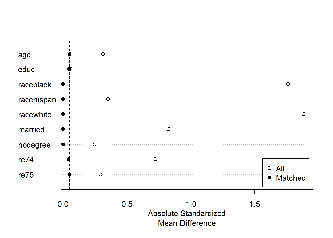
Above, the Love plot confirms that all variables appear to be balanced, with standardized mean differences very close to 0.
Now that we have created a matched dataset—stored within m2—with satisfactory balance, we can proceed with our initially intended analysis.
9.4.5 Extract matched dataset
The next step is to create a new dataset containing only the 140 observations that were successfully matched by CEM. We stored our CEM results as m2, but m2 is not a dataset. It is a matchit object. We need to convert this result into a dataset—or “data frame”—so that we can do our analysis on it.
Here we save the matched data as the dataset d.matched, by putting m2 into the match.data(...) function:
d.matched <- match.data(m2)Let’s confirm that this worked.
First, let’s remind ourselves about the structure of the original dataset d:
dim(d)## [1] 614 9The output above confirms that d has 614 observations and nine variables.
Now let’s see the structure of our new dataset d.matched:
dim(d.matched)## [1] 140 11d.matched contains only our 140 observations that were successfully matched during the CEM procedure. d.matched has 11 variables, two more than our original data d.
Let’s see what the new variables are:
names(d.matched)## [1] "treat" "age" "educ" "race" "married" "nodegree"
## [7] "re74" "re75" "re78" "weights" "subclass"The new variables are weights and subclass. weights contains sampling weights for each observation. We will not fully discuss sampling weights in this textbook. We will use these sampling weights soon when we do a regression analysis. The weights tell the computer to give more “emphasis” to certain observations and less to others. This weighting process helps our matched data in d.matched more precisely represent our initial, larger dataset d.
The subclass variable tells us which observations are matched with each other. Observations with the same subclass number are matched with each other. Below, we look at selected variables from observations with subclass less than or equal to 3, just as an example.182 You can also run View(d.matched) on your own computer to see all of the observations and their subclasses.
Selected observations and variables from d.matched:
d.matched[which(as.numeric(d.matched$subclass)<=3),][c("subclass","age","educ","married","race","re74")]## subclass age educ married race re74
## NSW147 3 19 8 0 black 0.000
## NSW153 3 19 8 0 black 2636.353
## NSW154 1 23 12 0 black 6269.341
## NSW157 2 18 9 0 black 0.000
## PSID110 1 20 12 0 black 5099.971
## PSID140 2 19 9 0 black 1079.556
## PSID157 3 17 7 0 black 1054.086Above, we see that all members of subclass 1 have similar—although not identical—characteristics as each other. All members of subclass 2 have similar—not identical—characteristics as each other. And so on.
Now that we have our matched data ready and we understand its structure, we are finally ready to do our analysis and answer our question of interest!
9.4.6 Estimate treatment effect
As a reminder, here are the details of our example:
- Question of interest: Is 1978 income associated with receiving an intervention?
- Data:
lalondedata fromMatchIt, renamed asd. - Unit of observation: person in the United States of America (USA)
- Dependent variable:
re78, income in USA dollars in 1978. - Independent variable of interest:
treat, a dummy variable telling us whether or not each observation received an intervention. - Other independent variables:
age,educ,race,married,nodegree,re74(1974 income), andre75(1975 income).
Now that we are analyzing a balanced dataset, we could theoretically just use a t-test or only include the treat dummy variable as the only independent variable in the OLS regression. However, there still may be minor differences in the treatment and control groups. The balanced dataset isn’t perfect. Therefore, we still include all of the control variables in our OLS model just to be safe. However, we only interpret the coefficient for treat, and we ignore all of the other estimates. Remember: Our question of interest only involved the independent variable treat. So we conducted our matching analysis with only the relationship between re78 and treat in mind.
Below, we run our OLS regression to answer our question of interest:
reg1 <- lm(re78 ~ treat + age + educ + race + married + nodegree +
             re74 + re75, data = d.matched, weights = weights)
Above, we ran an OLS model with d.matched as the dataset and with weights = weights as an additional argument (which tells the computer to apply the weights variable in d.matched to the observations in the regression).
Let’s look at the results:
summary(reg1)##
## Call:
## lm(formula = re78 ~ treat + age + educ + race + married + nodegree +
## re74 + re75, data = d.matched, weights = weights)
##
## Weighted Residuals:
## Min 1Q Median 3Q Max
## -13855 -4047 -1286 2177 50082
##
## Coefficients:
## Estimate Std. Error t value Pr(>|t|)
## (Intercept) -9195.1818 6711.5433 -1.370 0.1730
## treat 1207.1831 1245.9586 0.969 0.3344
## age 147.9705 107.7163 1.374 0.1719
## educ 879.9777 472.9817 1.860 0.0651 .
## racehispan 2378.6732 3678.7935 0.647 0.5190
## racewhite 1941.4650 2485.2152 0.781 0.4361
## married -3213.4702 4445.1515 -0.723 0.4710
## nodegree 1779.9000 2019.0348 0.882 0.3796
## re74 -0.2625 0.6013 -0.437 0.6632
## re75 2.0338 0.8835 2.302 0.0229 *
## ---
## Signif. codes: 0 '***' 0.001 '**' 0.01 '*' 0.05 '.' 0.1 ' ' 1
##
## Residual standard error: 7302 on 130 degrees of freedom
## Multiple R-squared: 0.07893, Adjusted R-squared: 0.01516
## F-statistic: 1.238 on 9 and 130 DF, p-value: 0.2776In the regression result above, we find that controlling for all other independent variables, using a matched dataset, the predicted 1978 income of treatment group members is 1207 dollars higher than that of the control group members, in our sample.
In the population from which our sample was drawn, we do not have any strong evidence to suggest that those in the treatment group have a different level of 1978 income than those in the control group.
9.4.7 Results, variations, and pitfalls in matching
Now that we have seen the entire matching process and estimated the association of re78 and treat as an example, we can discuss a few additional considerations when using matching. Reading the contents of this section is optional (not required).
When we report our results in an analysis that used matching, it is important to be extremely transparent about the matching methods attempted and ultimately used, the extent to which the data is balanced or imbalanced, and of course all assumptions and diagnostic test results that we would typically report when using a regression model.
Here are some additional resources related to fine-tuning and reporting results when using matching (optional to read, not required):
“Reporting Results” section in Greifer, Noah. 2020. MatchIt: Getting Started. Dec 15. https://cran.r-project.org/web/packages/MatchIt/vignettes/MatchIt.html.
If you want to adjust how close you want each observation in the matched dataset to be to its match, you can specify what is called a caliper. You can read about this in the “Caliper matching” section in: Greifer, N. (2020). “Matching Methods.” Dec 15. https://cran.r-project.org/web/packages/MatchIt/vignettes/matching-methods.html#caliper-matching-caliper.
Another thorough matching example analysis: “R Tutorial 8: Propensity Score Matching.” https://sejdemyr.github.io/r-tutorials/statistics/tutorial8.html.
Finally, below is the code for two other matching procedures that you can try with the lalonde data that we used in the example earlier in this chapter. We will not go through these examples together, but you can run them on your own computer and see the results, if you would like!
m <- matchit(treat ~ age + educ + race + married + nodegree + re74 + re75, data = d, method = "full", distance = "glm")

summary(m)
plot(summary(m))
m <- matchit(treat ~ age + educ + race + married + nodegree + re74 + re75, data = lalonde, distance = "mahalanobis")
summary(m)
plot(summary(m))9.5 Regressions for less common dependent variables
So far in this textbook, we have learned about OLS linear regression and logistic regression. We choose between these models based on the type of dependent variable we are interested in predicting. In linear regression, our dependent variable is a continuous numeric variable. And in binary logistic regression, our dependent variable is a categorical variable with two levels.
But what if our dependent variable doesn’t fit into either of these options? Below, we will explore three new types of regression analysis to broaden the possibilities for the types of dependent variables we can model: Poisson regression, ordinal logistic regression, and multinomial logistic regression.
This following table summarizes all of the possible models that you will be able to interpret and/or run by the end of this week:
| Dependent Variable Type | Example of Dependent Variable | Regression Model |
|---|---|---|
| Continuous numeric | weight, height, test score | Linear |
| Count numeric | number of students applying to medical school | Poisson |
| Categorical – Only two categories | pass vs fail | Logistic |
| Categorical – Three or more ordered (ranked) categories | Likert scale response | Ordinal Logistic |
| Categorical – Three or more unordered (unranked) categories | favorite color | Multinomial Logistic |
The three new types of regression are described in the following sections. For the purposes of our course, we will focus on learning about what types of data these models can fit and how to interpret these models. After going through this part of the chapter, you should be able to articulate situations in which we use each of these regressions and how we interpret the outputs from these regressions.
Unfortunately, in our course, we do not have time to fully cover diagnostic methods for each of these types of regression. While some selected model assumptions will be mentioned, this is not an exhaustive list.
If you end up using one of these methods in your own work or for your project in this class, please let me know and we will make sure that you have access to all of the diagnostic methods required to do a sound analysis.
All of the new forms of regression that we are exploring in this chapter use odds ratios, just like logistic regression. You might find it useful to review the characteristics of odds ratios that we learned about before. All of those characteristics apply to any situation in which odds ratios are used, not exclusively logistic regression.
9.5.1 Poisson regression
9.5.1.1 Basic details
Poisson regression is used for quantitative research questions that have count data as the dependent variable. The interpretation of the estimates of Poisson regression models is similar to the interpretation of logistic regression coefficients, meaning that the coefficients in Poisson regression are multiplicative (as in logistic regression) rather than additive (as in linear regression). We will look at an example later in this section.
Please read the following linked page, which will introduce you to how Poisson regression works, when it should be used, and how it differs from linear regression. It also explains how to run Poisson regression in R, although you will not be required to do this yourself:
9.5.1.2 Example interpretation
The output below is taken from the page linked above:
Call: glm(formula = breaks ~ wool + tension, family = poisson(link = "log"), data = data)

Deviance Residuals:
Min        1Q     Median  3Q    Max
-3.6871 -1.6503 -0.4269 1.1902 4.2616

Coefficients:
              Estimate Std. Error  z value Pr(>|z|)
(Intercept)   3.69196  0.04541      81.302 < 2e-16 ***
woolB        -0.20599  0.05157     -3.994  6.49e-05 ***
tensionM     -0.32132  0.06027     -5.332  9.73e-08 ***
tensionH     -0.51849  0.06396     -8.107  5.21e-16 ***
---
Signif. codes: 0 ‘***’ 0.001 ‘**’ 0.01 ‘*’ 0.05 ‘.’ 0.1 ‘ ’ 1

(Dispersion parameter for poisson family taken to be 1)

    Null deviance: 297.37 on 53 degrees of freedom
Residual deviance: 210.39 on 50 degrees of freedom
AIC: 493.06

Number of Fisher Scoring iterations: 4
Like with binary logistic regression, a coefficient is interpreted by exponentiating it: \(e^{coefficient}\). For the woolB dummy variable, the coefficient is equal to \(e^{-0.206} = 0.814\). 0.814 is interpreted as a multiplicative coefficient, just like an odds ratio. Since this is below 1, this is a negative relationship: For each one unit increase in woolB,183 breaks (the dependent variable) is predicted to be 0.814 times as high (meaning 18.6% lower).
This coefficient can be calculated in R like this:
exp(-.206) ## [1] 0.81383319.5.1.3 Model assumptions
Legler and Roback (2019)184 describe the assumptions of Poisson regression. They write:
Much like OLS, using Poisson regression to make inferences requires model assumptions.
- Poisson Response: The response variable is a count per unit of time or space, described by a Poisson distribution.
- Independence: The observations must be independent of one another.
- Mean=Variance: By definition, the mean of a Poisson random variable must be equal to its variance.
- Linearity: The log of the mean rate, \(log(\lambda)\), must be a linear function of x.
As I mentioned earlier, it is not necessary for you to memorize or have a full understanding of these assumptions. If you do happen to use Poisson regression for a study or project, only then it will be important to consider these more carefully.
9.5.1.4 Alternatives to Poisson regression
Sometimes, Poisson regression may not be ideal for the count data you have. For example, count data are often over-dispersed (meaning the variance is greater than the mean of the data) or under-dispersed (meaning the variance is smaller than the mean of the data). In these situations, it may be necessary to use a different type of regression that is also designed for count dependent variables but can account for a problem such as over-dispersion.
The following forms of regression—which we will not cover formally in our class—can frequently be useful to model count data when Poisson regression is inadequate:
- Negative binomial regression
- Zero-inflated negative binomial regression
- Quasi-Poisson regression
These models can correct for problems caused by violating the assumptions of Poisson regression. You may see these mentioned in resources related to Poisson regression or modeling count data.
9.5.1.5 Optional resources
The following resources regarding Poisson regression may be useful for future reference, but are not necessary to read right now:
- Coxe, S., West, S. G., & Aiken, L. S. (2009). The analysis of count data: A gentle introduction to Poisson regression and its alternatives. Journal of personality assessment, 91(2), 121-136. https://doi.org/10.1080/00223890802634175. Permalink from MGHIHP library. – Very good explanation of Poisson regression, including regression output interpretation (p. 125) and example study (starting p. 124).
- Poisson Regression | R Data Analysis Examples. https://stats.idre.ucla.edu/r/dae/poisson-regression/. – Very useful to help you run your own Poisson analysis in R.
9.5.2 Ordinal logistic regression
9.5.2.1 Basic details
Ordinal logistic regression—also known as ordered logistic regression—is used for quantitative research questions that have an ordered categorical dependent variable. The interpretation of the estimates of ordered logistic regression models is the same as the interpretation of the estimates of binary logistic regression coefficients. The main difference is that in ordered logistic regression, the categorical dependent variable can have more than two categories (whereas binary logistic regression uses just two categories in the dependent variable). However, these categories must have a clear and obvious ranking to them.
Likert scale data are a good example. Likert questions often ask a survey participant to choose one of the following options: strongly disagree, disagree, neutral, agree, strongly agree. Even though these are qualitative and categorical responses, they do have a hierarchy to them. They are ordered. Therefore, ordinal logistic regression is appropriate to fit this data.
Please read the following resource, which will introduce you to how ordinal logistic regression works, when it should be used, and how its results should be interpreted. It also explains how to run ordered logistic regression in R, although you will not be required to do this yourself:
- Ordinal Logistic Regression | R Data Analysis Examples. https://stats.idre.ucla.edu/r/dae/ordinal-logistic-regression/.
9.5.2.2 Example interpretation
Within the same resource linked above, after reading about how ordinal logistic regression is applied and looking at the regression output, please focus on the section called Interpreting the odds ratio, which starts with the sentence “There are many equivalent interpretations of the odds ratio based on how the probability is defined and the direction of the odds.” This will walk you through how to interpret the results of the model, which is the most important skill I would like you to practice.
9.5.2.3 Model assumptions
Still within the same resource, you will then see a discussion of the proportional odds assumption that must be true in your data for the regression model to be trustworthy. The following excerpt is most important:
One of the assumptions underlying ordinal logistic (and ordinal probit) regression is that the relationship between each pair of outcome groups is the same. In other words, ordinal logistic regression assumes that the coefficients that describe the relationship between, say, the lowest versus all higher categories of the response variable are the same as those that describe the relationship between the next lowest category and all higher categories, etc. This is called the proportional odds assumption or the parallel regression assumption. Because the relationship between all pairs of groups is the same, there is only one set of coefficients.185
It is not necessary for you to have a full understanding of this assumption, but I included it as an example of how some regression models can have unique model assumptions that are quite different from those of OLS linear regression or logistic regression. If you do end up using ordinal logistic regression in the future, we will need to discuss other assumptions that were not mentioned here.
9.5.3 Multinomial logistic regression
9.5.3.1 Basic details
Multinomial logistic regression is used for quantitative research questions that have an unordered categorical dependent variable with more than two categories. The interpretation of the estimates of multinomial logistic regression models is similar to the interpretation of the estimates of binary logistic regression coefficients, but with an added twist, as you will see below. Like with ordered logistic regression, the categorical dependent variable in multinomial logistic regression can have more than two categories (whereas binary logistic regression uses just two categories in the dependent variable). However, in multinomial logistic regression, these categories of the dependent variable are unordered!
An example of an unordered categorical dependent variable is favorite ice cream flavor. This data could be generated from a survey in which people are asked to choose between chocolate, vanilla, strawberry, or other as their favorite ice cream flavor. These four flavors do not have any ranking or order to them, so we cannot use ordinal logistic regression. This is where multinomial logistic regression can help us.
Just like with an unordered categorical independent variable, when we have an unordered categorical dependent variable (like favorite ice cream), we have to choose a reference category. All estimates will be interpreted relative to that reference category for the dependent variable this time.
9.5.3.2 Example interpretation
Now we will consider how multinomial logistic regression works, when it should be used, and how its results should be interpreted.
Please skim and familiarize yourself with the following example of an application of multinomial logistic regression. It also demonstrates how to run multinomial logistic regression in R (which you do not need to learn). Then we will interpret the results together, back here in our course book.
Here is the example:
- Multinomial Logistic Regression | R Data Analysis Examples. https://stats.idre.ucla.edu/r/dae/multinomial-logistic-regression/.
The example at the page above yielded the following regression output, which we will interpret together below:
Call:
multinom(formula = prog2 ~ ses + write, data = ml)

Coefficients:
          (Intercept) sesmiddle seshigh  write
general        2.852   -0.5333 -1.1628 -0.05793
vocation       5.218    0.2914 -0.9827 -0.11360

Std. Errors:
        (Intercept) sesmiddle seshigh   write
general        1.166    0.4437  0.5142 0.02141
vocation       1.164    0.4764  0.5956 0.02222

Residual Deviance: 360
AIC: 376
This output is very different from what we are used to seeing. Usually, each independent variable has its own row and then we see a coefficient (slope) estimate as well as inferential statistics for each independent variable in its own row. This time, each independent variable has its own column instead. And the different levels of the dependent variable are in their own row. Inferential statistics are shown separately in the section called “Std. Errors”.
Let’s first review the dependent variable. The dependent variable has three categories (three levels): general, academic, and vocation. In this multinomial logistic regression model, academic is the reference category and has been left out of the model. It is as if the dependent variable has been turned into two dummy variables, just like a three-category categorical independent variable would be.
Interpretations of coefficients:
- Association of
writeandgeneralis -0.05793. We exponentiate this to an odds ratio: \(e^{-0.05793}=0.943716\). For each one-unit increase inwrite, a person in our data is predicted to be 0.943716 times more likely to choosegeneralrather than the reference category ofacademic. Since \(0.943716<1\), a one-unit increase inwriteis associated with a lower chance of students choosinggeneraloveracademic(and therefore a one-unit increase inwriteis associated with a higher chance of students choosingacademicovergeneral). - Association of
writeandvocationis -0.11360. We exponentiate this to an odds ratio: \(e^{-0.11360}=0.8926149\). So this is a very similar result to the one just above. For each one-unit increase inwrite, a student is predicted to be 0.8926149 as likely to choosevocationrather than the reference category ofacademic. Writing score is negatively associated with choosingvocation(compared to choosingacademic).
As you can see, academic is the reference category for the dependent variable. Therefore, all possible outcomes are compared to academic. For each independent variable, the general level of the dependent variable is compared to academic and the vocation level of the dependent variable is also compared to academic. general and vocation are never compared to each other in this model.
9.5.3.3 Model assumptions
As always, model assumptions need to be verified and inferential statistics need to be checked before we can conclude that our model is trustworthy and that the reported trends are true effects in the population from which the sample was drawn. However, we will not go through model assumptions at this time. Again, if you do end up using multinomial logistic regression in your own work, we should discuss all of the model assumptions and make sure that your analysis strategy would be sound if you used this type of regression.
9.6 Assignment
As you do this assignment, keep in mind that OR stands for odds ratio.
9.6.1 Matching
In this part of the assignment, you will conduct a matching analysis using the hsb2 data from the openintro package that we have used before.
Please run the following code to load the data and see its variables:
if (!require(openintro)) install.packages('openintro')
library(openintro)

h <- hsb2

names(h)
Above, we loaded the hsb2 data and saved it as h. You should use h as the dataset for your assignment. You can run the command ?hsb2 on your computer to read more about this dataset.
Here are the details of the analysis you will do:
- Question of interest: Is social studies score associated with school type?
- Data:
hsb2data fromopenintro, renamed ash. - Unit of observation: high school seniors in the USA.
- Dependent variable:
socst - Independent variable of interest:
schtyp - Other independent variables (control variables):
gender,race,ses, andprog.
Note that this is a good week to use your own data for this assignment, if you would like. As long as it is appropriate for analysis using matching, you can use your own dataset that you plan to use for your final project or any other data that you are interested in studying. If you do choose to use your own data, please clearly state the question that you will be answering and list the variables you are using. As long as one of the independent variables in your own data is a dummy variable (like the variable treat in the example we went through earlier in the chapter), you should be able to use that variable as the treatment variable and use the rest of the independent variables for matching. For example, if you have a gender dummy variable in your own data, you can use that as your independent variable of interest and use all other independent variables for matching/controlling.
Task 1: Provide a standardized dataset description for the data you are using in this assignment.
Task 2: Use a table to show the two levels of schtyp and how many observations fall into each category. In this assignment, you are treating one level of schtyp as the treatment group and the other as the control group (it doesn’t matter which is which).
Task 3: Run an OLS model to answer the question of interest. This model should just use the data in its original (unmatched) form, before any matching has been conducted.
Task 4: Create a Summary of Balance for All Data table for the relevant variables for your entire dataset h. How does this dataset’s initial balance look to you?
Task 5: Plot the groups against their propensity scores to examine the region of common support. What do you learn from this plot?
Task 6: Make a Love plot for the entire dataset. What does this show? What would we ideally see in well-balanced data?
Task 7: Use CEM to create a matched dataset. In the matchit(…) function, if method="cem" does not work, change it to method="exact" and try again.
Task 8: Check for balance using a Summary of Balance for Matched Data table. How does it look? In what ways is the balance good or bad?
Task 9: Make a Love plot for your CEM matched data. What does this show?
Task 10: Run an OLS model on the matched data to answer the question of interest. Report the results clearly in a short paragraph that is five sentences or fewer. Please also address: How does this result compare to the one you ran on the unmatched data initially?
9.6.2 Choosing regression models
The following few tasks will ask you to consider all of the regression models we have learned so far and decide which one to use in which situation. The purpose of this activity is to practice determining which regression model is most appropriate to analyze particular data. We want to break the instinct to always use OLS and be open to other types of models.
For each of the tasks in this section of the assignment, please read the provided hypothetical research situation/question, take into account the structure of the dependent variable, decide which type of regression model is best suited for the question and data, and explain why. Each response should be no more than two sentences.
You will be evaluated on your ability to consider the research question and data involved and then select the regression model that allows you to analyze it properly.
Task 11: You are studying factors that are associated with medical students’ favorite learning style, using survey data. You have a random sample of 1000 medical students in the United States. The dependent variable is the respondents’ choice of favorite learning style between flashcards, lecture, reading, and small groups. Independent variables are gender, age, US state of residence, ethnic identification category, and MCAT score. Which type of regression will you use, and why?
Task 12: You are studying the amount of training that emergency residents receive on point of care ultrasound procedures. You have data on 100 residents. Your dependent variable is the number of procedures performed in a year. Your independent variables are post-graduate year, gender, age, and sub-specialty. Which type of regression will you use, and why?
Task 13: You are studying the factors associated with people scoring above or below 100 on an Intelligence Quotient (IQ) test. You have 3,000 people in your sample. Your dependent variable is whether or not people score above or below 100 on the test. Independent variables are years of education, favorite subject in school, gender, and native language. Which type of regression will you use, and why?
Task 14: You are studying the relationship between standardized test scores and hours spent studying. You have a sample of 400 medical school applicants. Your dependent variable is MCAT score. Your independent variables are hours spent studying per week, college GPA, gender, and parents’ combined income. Which type of regression will you use, and why?
Task 15: You are doing a review on the levels of Bloom’s Taxonomy (BT) that are featured in medical textbooks. In your data, each observation is a textbook. Your dependent variable is the highest level of BT that the textbook’s content incorporates (so the dependent variable can have any one of the following levels: remember, understand, apply, analyze, evaluate). Your independent variables are year of publication, number of words in the book, and number of citations the book has on Google Scholar. You have a sample of 340 books. Which type of regression will you use, and why?
Task 16: You are doing a survey on health professions educators’ favorite level of BT. In your data, each observation is a health professions educator. Your dependent variable is the self-reported favorite level of BT. Your independent variables are age, favorite color, gender, and years of teaching experience. You have a sample of 340 educators. Which type of regression will you use, and why?
9.6.3 Interpreting Poisson and logistic regressions
In this part of the assignment, you will demonstrate your understanding and interpretation of Poisson and binary logistic regression models. The purpose of this activity is to practice looking at Poisson regression results and review logistic regression results. You will be evaluated based on your ability to correctly interpret these results.
For the tasks in this section of the assignment, please refer to the following regression table:
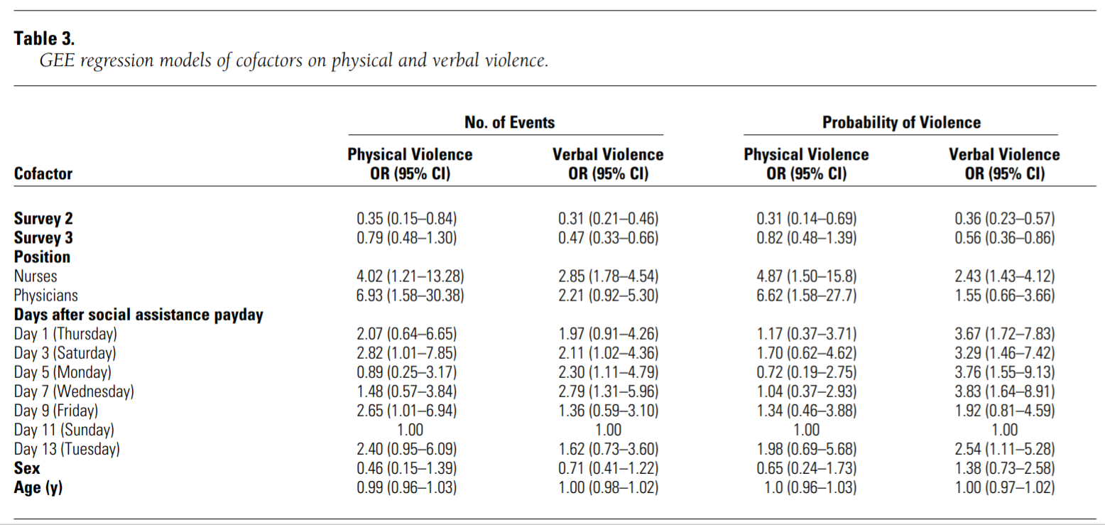
Source: Fernandes, C. M., Raboud, J. M., Christenson, J. M., Bouthillette, F., Bullock, L., Ouellet, L., & Moore, C. C. F. (2002). The effect of an education program on violence in the emergency department. Annals of emergency medicine, 39(1), 47-55. https://doi.org/10.1067/mem.2002.121202. MGHIHP Permalink.
Here is a description of the table, also from the same Fernandes et al article:
Table 3 presents the results of 4 GEE regression models. The first 2 models are GEE Poisson regression models examining the relationship of various cofactors to the numbers of physically and verbally violent events per employee per shift. The last 2 models are GEE logistic regression models of the probability of an employee experiencing either physical or verbal violence during a shift.
Note that there are four separate regression models, each with its own column of results in the results table above.
You may also find it useful to open the article to find out more.
Task 17: In the first model (physical violence as the dependent variable), interpret the Sex estimate. Include the interpretation of the effect size as well as the interpretation of the provided inferential statistics. Just pretend that female is coded as 1 and male as 0.
Task 18: In the second model (number of verbal violence events as the dependent variable), interpret the Nurses estimate. Include the interpretation of the effect size as well as the interpretation of the provided inferential statistics.
Task 19: In the third model (probability of physical violence as the dependent variable), interpret the Age estimate. Include the interpretation of the effect size as well as the interpretation of the provided inferential statistics.
Task 20: In the fourth model (probability of verbal violence as the dependent variable), interpret the Sex estimate. Include the interpretation of the effect size as well as the interpretation of the provided inferential statistics. Just pretend that female is coded as 1 and male as 0.
9.6.4 Interpreting ordinal logistic regressions
In this part of the assignment, you will demonstrate your understanding and interpretation of ordinal logistic regression models. The purpose of this activity is to practice looking at ordinal logistic regression results. You will be evaluated based on your ability to correctly interpret these results.
For the tasks in this section of the assignment, please refer to the following regression table:
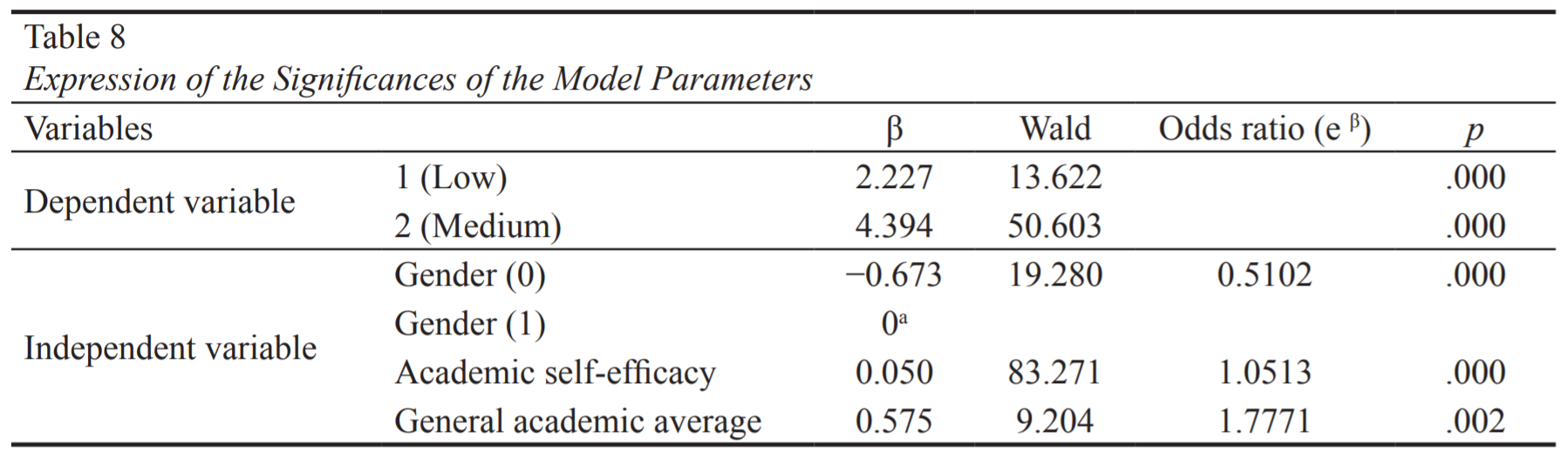
Source: Bozpolat, E. (2016). Investigation of the Self-Regulated Learning Strategies of Students from the Faculty of Education Using Ordinal Logistic Regression Analysis. Educational Sciences: Theory and Practice, 16(1), 301-318. https://eric.ed.gov/?id=EJ1101188.
Here is a description of the study, also from the same Bozpolat article:
The purpose of this study was to reveal whether the low, medium, and high level self-regulated learning strategies of third year students of the Education Faculty of Cumhuriyet University can be predicted by the variables gender, academic self efficacy, and general academic average.
You may also find it useful to open a copy of the study to learn more.
Note that males were coded as 0 and females were coded as 1.
Task 21: In the table, interpret the Gender estimate odds ratio. Include the interpretation of the effect size as well as the interpretation of the provided inferential statistics.
Task 22: In the table, interpret the General academic average estimate odds ratio. Include the interpretation of the effect size as well as the interpretation of the provided inferential statistics.
9.6.5 Interpreting multinomial logistic regressions
In this part of the assignment, you will demonstrate your understanding and interpretation of multinomial logistic regression models. The purpose of this activity is to practice looking at multinomial logistic regression results. You will be evaluated based on your ability to correctly interpret these results.
For the tasks in this section of the assignment, please refer to the following regression table:
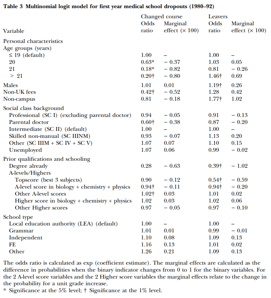
Source: Arulampalam et al. (2004). Factors affecting the probability of first year medical student dropout in the UK: a logistic analysis for the intake cohorts of 1980–92. https://doi.org/10.1046/j.1365-2929.2004.01815.x. MGHIHP Permalink.
Here is information quoted from the study, which you can also open up yourself if you wish:
Aims: To analyse the determinants of the probability that an individual medical student will drop out of medical school during their first year of study.
In this piece of analysis, we used a multinomial logistic model distinguishing between: 1. successful progression; 2 course transfer, and 3 university withdrawal.186
Table 3 presents the results of the multinomial logistic analysis, using odds ratios and marginal effects.
Note that the “Changed Odds ratio” column in the result table refers to people who fall into the “course transfer” level of the dependent variable. And the “Leavers Odds ratio” column refers to people who fall into the “university withdrawal” level of the dependent variable. The “successful progression” level of the dependent variable is not mentioned on the table.
Task 23: In the table, interpret the Males results. Include the interpretation of the effect size as well as the interpretation of the provided inferential statistics.
Task 24: In the table, interpret the Age group = 20 results. Include the interpretation of the effect size as well as the interpretation of the provided inferential statistics.
9.6.6 Additional items
You have now reached the end of this week’s assignment. The tasks below will guide you through submission of the assignment, remind you of any other items you need to complete this week, and allow us to gather questions and/or feedback from you.
Task 25: You are required to complete 15 quiz question flashcards in the Adaptive Learner App by the end of this week.
Task 26: Please write any questions you have for the course instructors (optional).
Task 27: Please write any feedback you have about the instructional materials (optional).
Task 28: Knit (export) your RMarkdown file into a format of your choosing.
Task 29: Please submit your assignment to the D2L assignment drop-box corresponding to this chapter and week of the course. And remember that if you have trouble getting your RMarkdown file to knit, you can submit your RMarkdown file itself. You can also submit an additional file(s) if needed.
King, Gary. “Why Propensity Scores Should Not Be Used for Matching”. Methods Colloquium. Sep 11, 2015. YouTube. https://www.youtube.com/watch?v=rBv39pK1iEs.↩︎
Winship, C., & Morgan, S. L. (1999). The estimation of causal effects from observational data. Annual review of sociology, 25(1), 659-706. https://doi.org/10.1146/annurev.soc.25.1.659. Direct link to PDF.↩︎
15. Model Dependence. Gary King. Aug 17, 2020. YouTube. https://youtu.be/cbrV-mM9mFk.↩︎
16. Matching Methods. Gary King. Aug 17, 2020. YouTube. https://www.youtube.com/watch?v=tvMyjDi4dyg.↩︎
For example, see: Gary King and Richard Nielsen. 2019. “Why Propensity Scores Should Not Be Used for Matching.” Political Analysis, 27, 4. Copy at https://j.mp/2oTKhnd.↩︎
Greifer, Noah. 2020. MatchIt: Getting Started. Dec 15. Accessed February 2021. https://cran.r-project.org/web/packages/MatchIt/vignettes/MatchIt.html.↩︎
The following sources discuss this issue extensively: a) Gary King, “Why Propensity Scores Should Not Be Used for Matching”. Methods Colloquium. Sep 11, 2015. YouTube. https://www.youtube.com/watch?v=rBv39pK1iEs. b) Gary King and Richard Nielsen. 2019. “Why Propensity Scores Should Not Be Used for Matching.” Political Analysis, 27, 4. Copy at https://j.mp/2oTKhnd.↩︎
This means that for any negative values, we plot the positive counterpart of that value.↩︎
The following sources discuss this issue extensively: a) Gary King, “Why Propensity Scores Should Not Be Used for Matching”. Methods Colloquium. Sep 11, 2015. YouTube. https://www.youtube.com/watch?v=rBv39pK1iEs. b) Gary King and Richard Nielsen. 2019. “Why Propensity Scores Should Not Be Used for Matching.” Political Analysis, 27, 4. Copy at https://j.mp/2oTKhnd.↩︎
p. 4 in: Blackwell, M, et al. (2010). “cem: Coarsened Exact Matching in Stata.” Feb 22. Accessed February 2021. https://gking.harvard.edu/files/gking/files/cem-stata.pdf.↩︎
Displaying just three subclasses and these particular selected variables was an arbitrary decision, just to show an example. We could have displayed more or fewer subclasses or variables, if we wanted.↩︎
In this case the coefficient is just a comparison between
woolBandwoolA, sincewoolBis a dummy variable andwoolAis its corresponding reference category.↩︎Section 4.2.1 “Poisson Regression Assumptions” in: Legler J, Roback P. (2019). Broadening Your Statistical Horizons: Generalized Linear Models and Multilevel Models. https://bookdown.org/roback/bookdown-bysh/.↩︎
From “Proportional odds assumption” section at https://stats.idre.ucla.edu/r/dae/ordinal-logistic-regression/.↩︎
I edited the formatting of this a bit.↩︎