Chapter 2 How to Visualize a Single Variable
2.1 Get to know the dataset
When opening a dataset, we don’t always know what we are dealing with. Some data can be so large it’s hard to tell how many variables and how many cases there are. Before zooming into a single variable, it’s always a good idea to get to know the data a little bit. Here’s an example with the titanic data:
First, import and name the data. Simply copy and paste the following two chunks to import titanic into your R notebook in google Colab.
The first chunk defines a function that gets data from google drive, and the second chunk uses that function to import the specific dataset.
library(foreign)

load_google_drive_data <- function(google_file_url){
    g_link = google_file_url
    file_id = substr(g_link, regexpr("/d/", g_link) + 3 ,  regexpr("/view", g_link) -1 )
    url =  paste("https://drive.google.com/uc?export=download&id=", file_id, sep="")
    download.file(url, "file.sav")
    df <- read.spss("file.sav", use.value.label=TRUE, to.data.frame=TRUE)
    return(df)
}titanic<-load_google_drive_data("https://drive.google.com/file/d/1bQmtGcS6zbuHO5JsGdF0rZ8MV720qrnK/view?usp=sharing")Now that we have named the dataset titanic, we can figure out how big it is, i.e. how many cases and variables there are with the following code
dim(titanic)## [1] 2201 4The first number is the # of cases, the second number is # of variables
Take a look at the first 6 rows (cases) of the dataset:
head(titanic)## Class Sex Age Survived
## 1 3rd Female Child N
## 2 3rd Female Child N
## 3 3rd Female Child N
## 4 3rd Female Child N
## 5 3rd Female Child N
## 6 3rd Female Child NThis allows us to get a quick sense of which variables are categorical and which are quantitative. Based on the above output, for example, it’s easy to tell that none of the variables are represented in numbers.
To figure out if a variable is categorical or not, the best way is to look at all its values.
table(titanic$Class)##
## 1st 2nd 3rd Cre
## 325 285 706 885The above output shows that the variable “Class” has 4 categories–1st, 2nd, 3rd, and Cre (Crew). The numbers under are the number of people in each category. So this variable is categorical.
When typing our code, we often need to know the exact spelling of a variable name. Here’s an easy way to find out.
names(titanic)## [1] "Class" "Sex" "Age" "Survived"2.2 Visualizing a Categorical Variable
A picture of a categorical variable should show how many cases there are in each category, aka its distribution.
The most commonly used plots for categorical variables are bar plots and pie charts. We can also simply represent them by tables, but they are less eye-catching.
2.2.1 Bar plot
Here’s how to create a simple bar plot for the variable ‘Survied’ in the titanic data. Note that we are not directly creating a bar plot from the variable. The bar plot has to be derived from a table which we called ‘t.’
t=table(titanic$Survived)
barplot(t)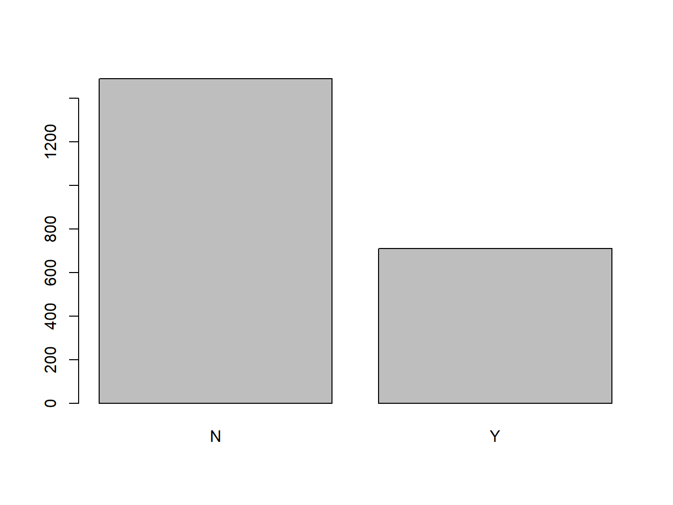
Figure 2.1: An Unadorned Bar Plot
If you want to add a title to the bar plot:
barplot(t, main="Survival Onboard the Titanic")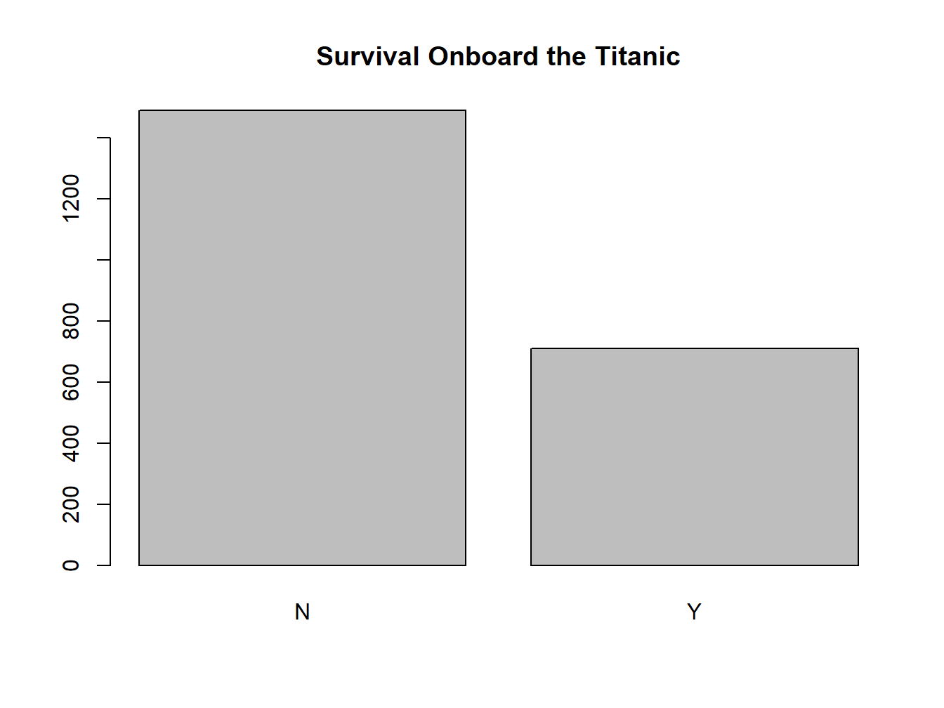
Figure 2.2: A Titled Bar Plot
If you want to give it some color:
barplot(t, main="Survival Onboard the Titanic",col="blue")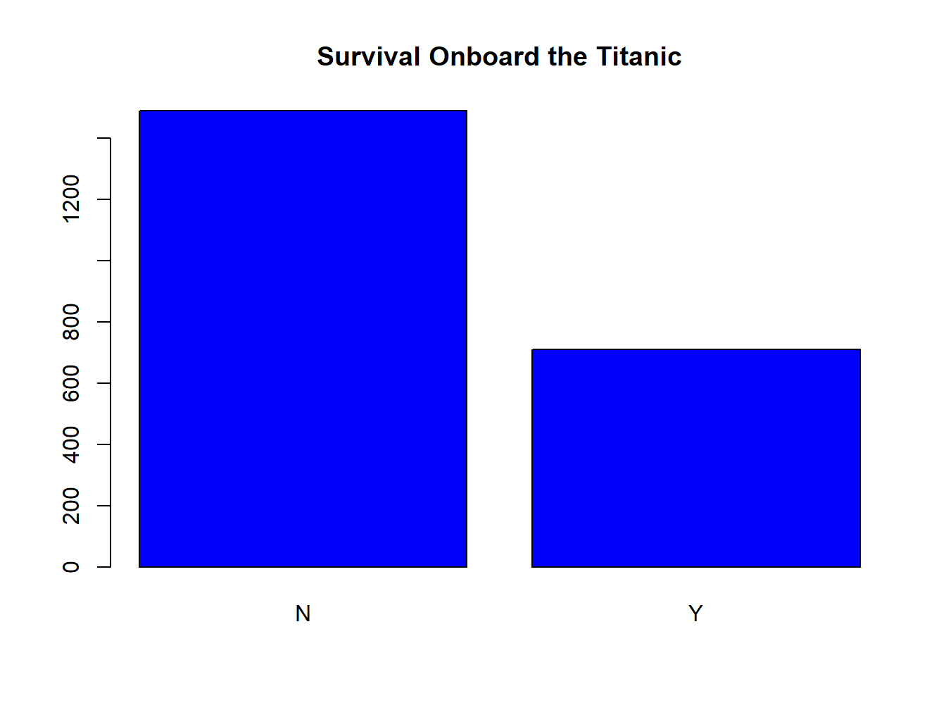
Figure 2.3: A Colored Bar Plot
2.2.2 Pie Chart
Create a pie chart for variable ‘Survived.’ Note that I can directly use ‘t’ here because ‘t’ has been created earlier as a table of ‘Survived.’ If you haven’t created this table, you’d get an error message, since R doesn’t know what you are talking about.
pie(t)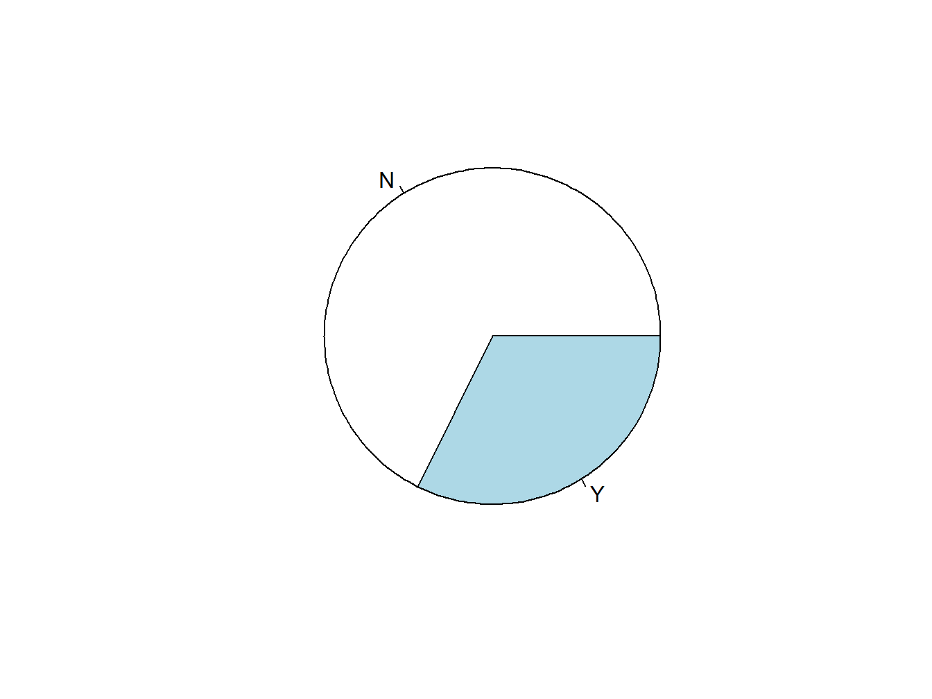
Figure 2.4: An Unadorned Pie Chart
Add a title to the pie chart:
pie(t, main="Survival Onboard the Titanic")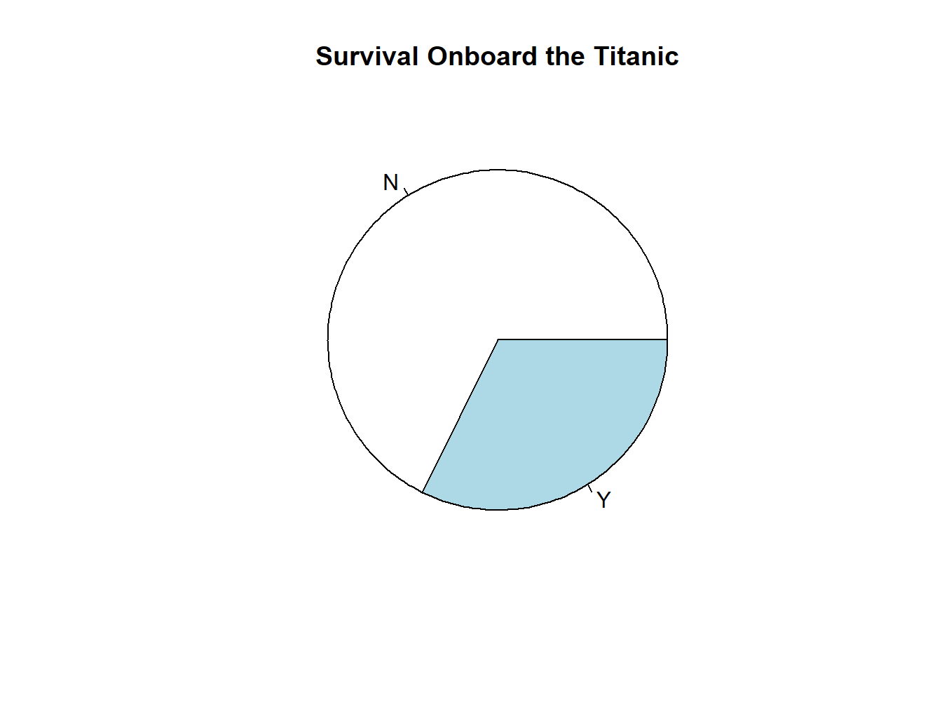
Figure 2.5: A Titled Pie Chart
Choose your own color:
pie(t, main="Survival Onboard the Titanic",col=c("blue","red"))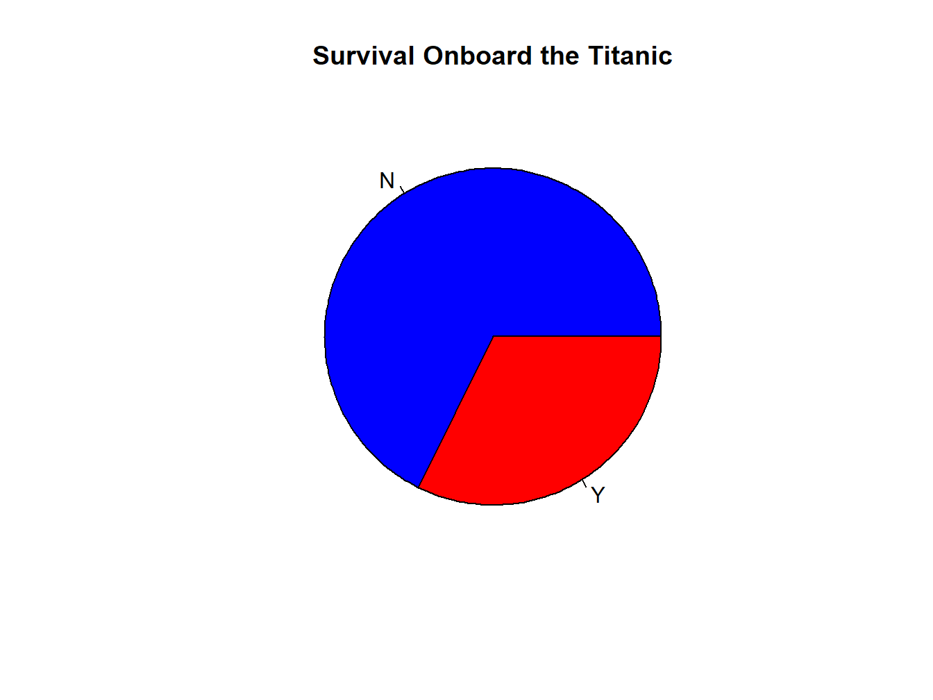
Figure 2.6: A Colored Pie Chart
2.2.3 Bar or Pie?
This could be a question of personal taste, but here’s the rule of thumb that I use: when there are more than 4-5 categories in the variable, I’d use a bar plot rather than a pie chart.
For example, can you compare the numbers of people in each class in this pie chart? You probably can, but you can see how it gets increasingly difficult when there are more categories there.
t.class=table(titanic$Class)
pie(t.class, main="Classes Onboard the Titanic")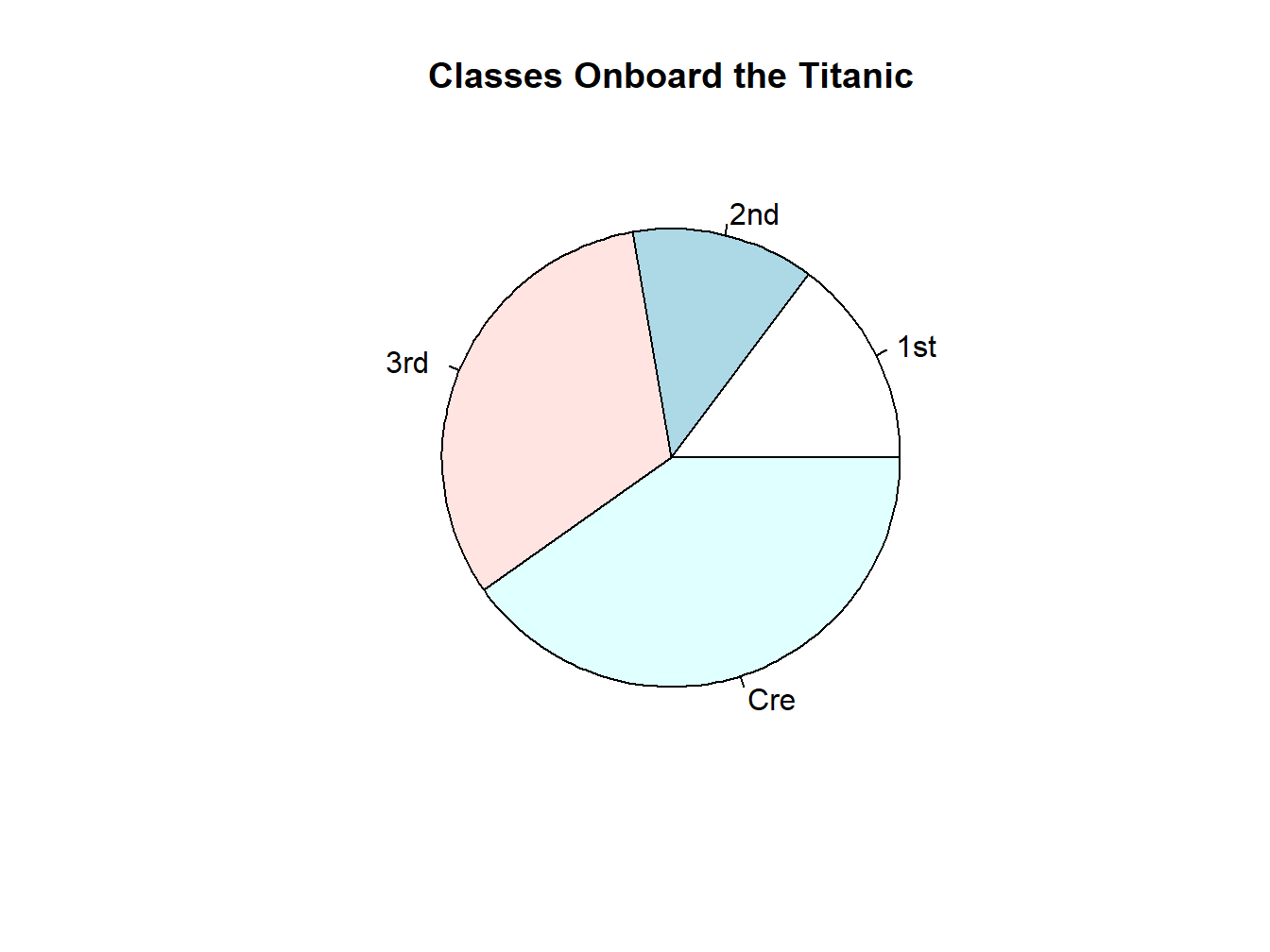
Whereas a bar plot makes it a lot easier to compare:
barplot(t.class, main="Classes Onboard the Titanic")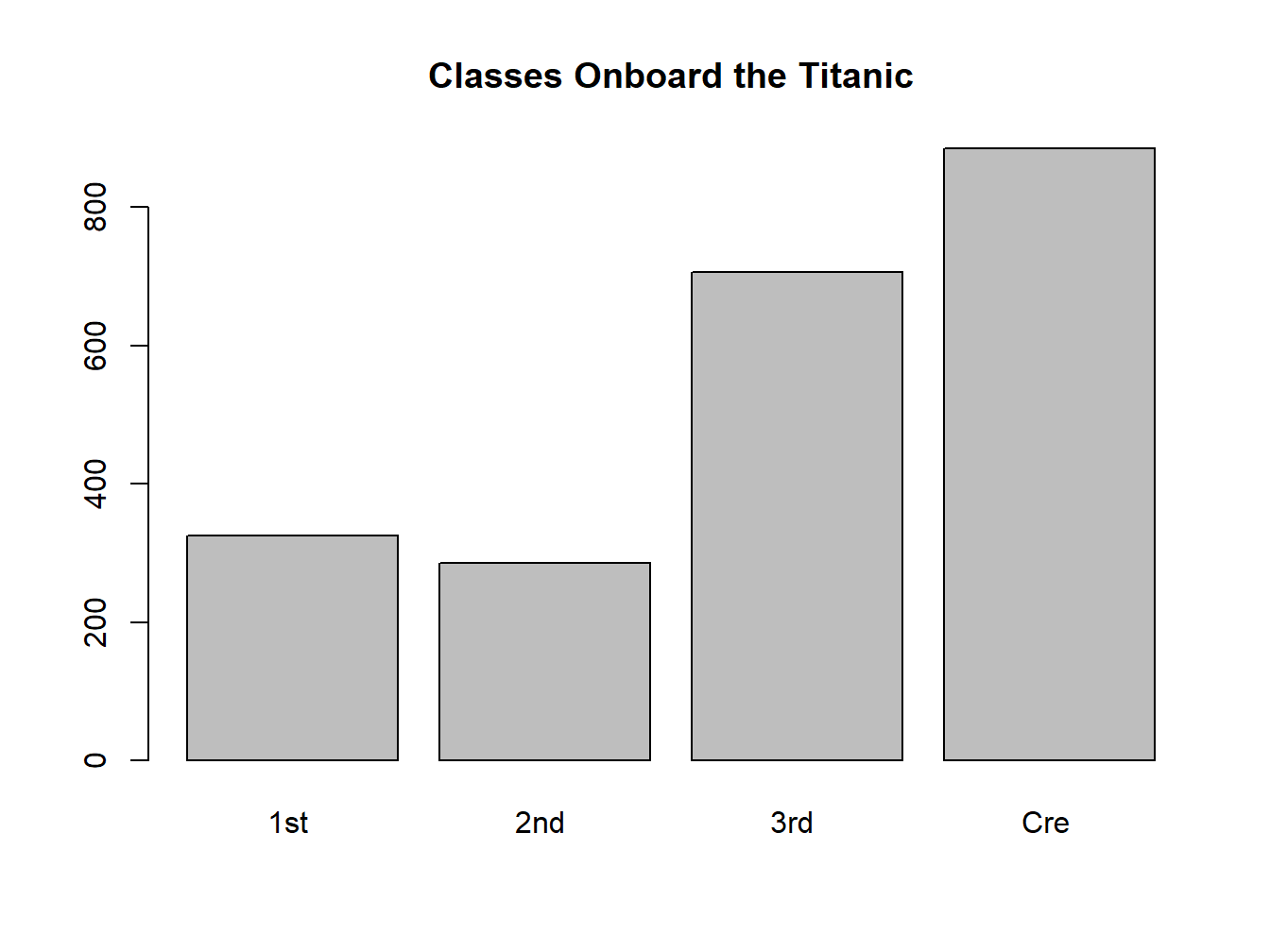
2.3 Visualizing a Quantitative Variable
A picture of a quantitative variable should show how many cases there are for each value, aka its distribution.
The most commonly used plots for quantitative variables are histograms and boxplots. We do NOT usually represent them by tables. Although creating a table for a variable of any sort will allow you to quickly judge if it is quantitative or not, it is not something that you want to include in a professional presentation if the variable happens to be quantitative–not readable!
Let us now load another dataset called ‘world95.sav.’
world95<-load_google_drive_data("https://drive.google.com/file/d/1QlSgjCadJLFWmL2vH4Dg44UWNlbaVCRj/view?usp=sharing")How many cases and how many variables are there in this dataset?
dim(world95)## [1] 109 26Are the variables categorical or quantitative?
head(world95)## country populatn density urban
## 1 Afghanistan 20500 25.0 18
## 2 Argentina 33900 12.0 86
## 3 Armenia 3700 126.0 68
## 4 Australia 17800 2.3 85
## 5 Austria 8000 94.0 58
## 6 Azerbaijan 7400 86.0 54
## religion lifeexpf lifeexpm literacy pop_incr babymort gdp_cap
## 1 Muslim 44 45 29 2.80 168.0 205
## 2 Catholic 75 68 95 1.30 25.6 3408
## 3 Orthodox 75 68 98 1.40 27.0 5000
## 4 Protstnt 80 74 100 1.38 7.3 16848
## 5 Catholic 79 73 99 0.20 6.7 18396
## 6 Muslim 75 67 98 1.40 35.0 3000
## region calories aids birth_rt death_rt aids_rt log_gdp lg_aidsr
## 1 3 NA 0 53 22 0.00000000 2.311754 0.0000000
## 2 6 3113 3904 20 9 11.51622419 3.532500 1.6302793
## 3 5 NA 2 23 6 0.05405405 3.698970 0.5579119
## 4 1 3216 4727 15 8 26.55617978 4.226548 1.9267844
## 5 1 3495 1150 12 11 14.37500000 4.264723 1.7042040
## 6 5 NA NA 23 7 NA 3.477121 NA
## b_to_d fertility log_pop cropgrow lit_male lit_fema climate
## 1 2.409091 6.90 4.311754 12 44 14 3
## 2 2.222222 2.80 4.530200 9 96 95 8
## 3 3.833333 3.19 3.568202 17 100 100 <NA>
## 4 1.875000 1.90 4.250420 6 100 100 3
## 5 1.090909 1.50 3.903090 17 NA NA 8
## 6 3.285714 2.80 3.869232 18 100 100 3Take a careful look at the variable names so we can use them later:
names(world95)## [1] "country" "populatn" "density" "urban" "religion" "lifeexpf"
## [7] "lifeexpm" "literacy" "pop_incr" "babymort" "gdp_cap" "region"
## [13] "calories" "aids" "birth_rt" "death_rt" "aids_rt" "log_gdp"
## [19] "lg_aidsr" "b_to_d" "fertility" "log_pop" "cropgrow" "lit_male"
## [25] "lit_fema" "climate"2.3.1 Histogram
Here’s how to create a histogram for the variable ‘lifeexpf,’ female life expectancy. Note that it’s simpler than creating a bar plot
hist(world95$lifeexpf) 
Figure 2.7: An Unadorned Histogram
Add title to histogram:
hist(world95$lifeexpf, main="Female Life Expectancy in 1995")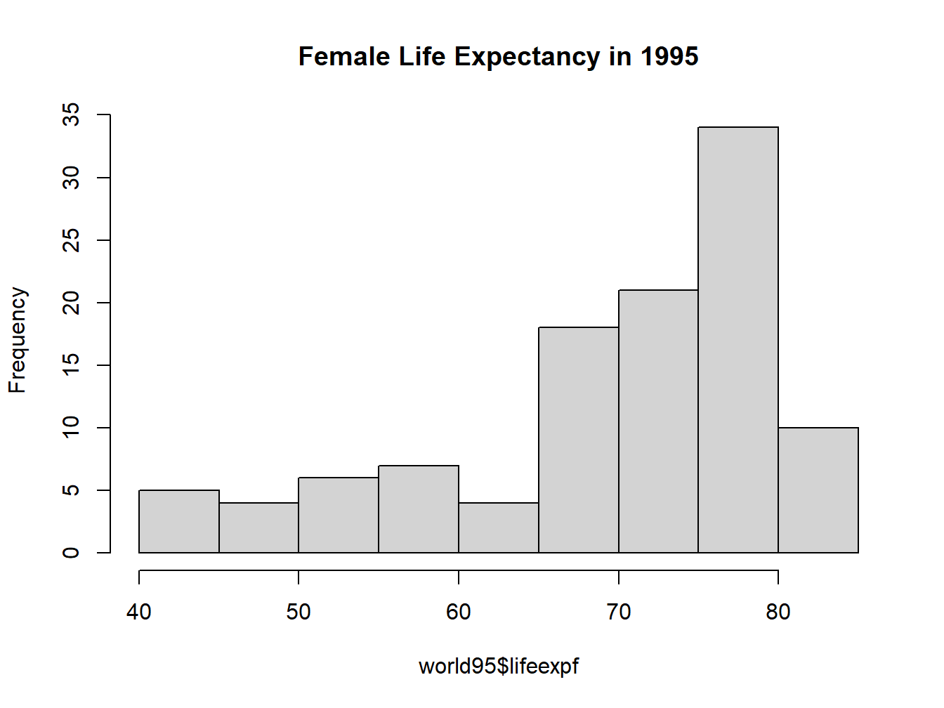
Figure 2.8: Histogram with a Title
2.3.2 Boxplot
Boxplot is also known as box-and-whisker plot.
It is sometimes represented vertically, sometimes horizontally.
We will explain the boxplot in more details next week. For now, notice how the boxplot corresponds to the histogram.
Creating a boxplot is quite simple
boxplot(world95$lifeexpf)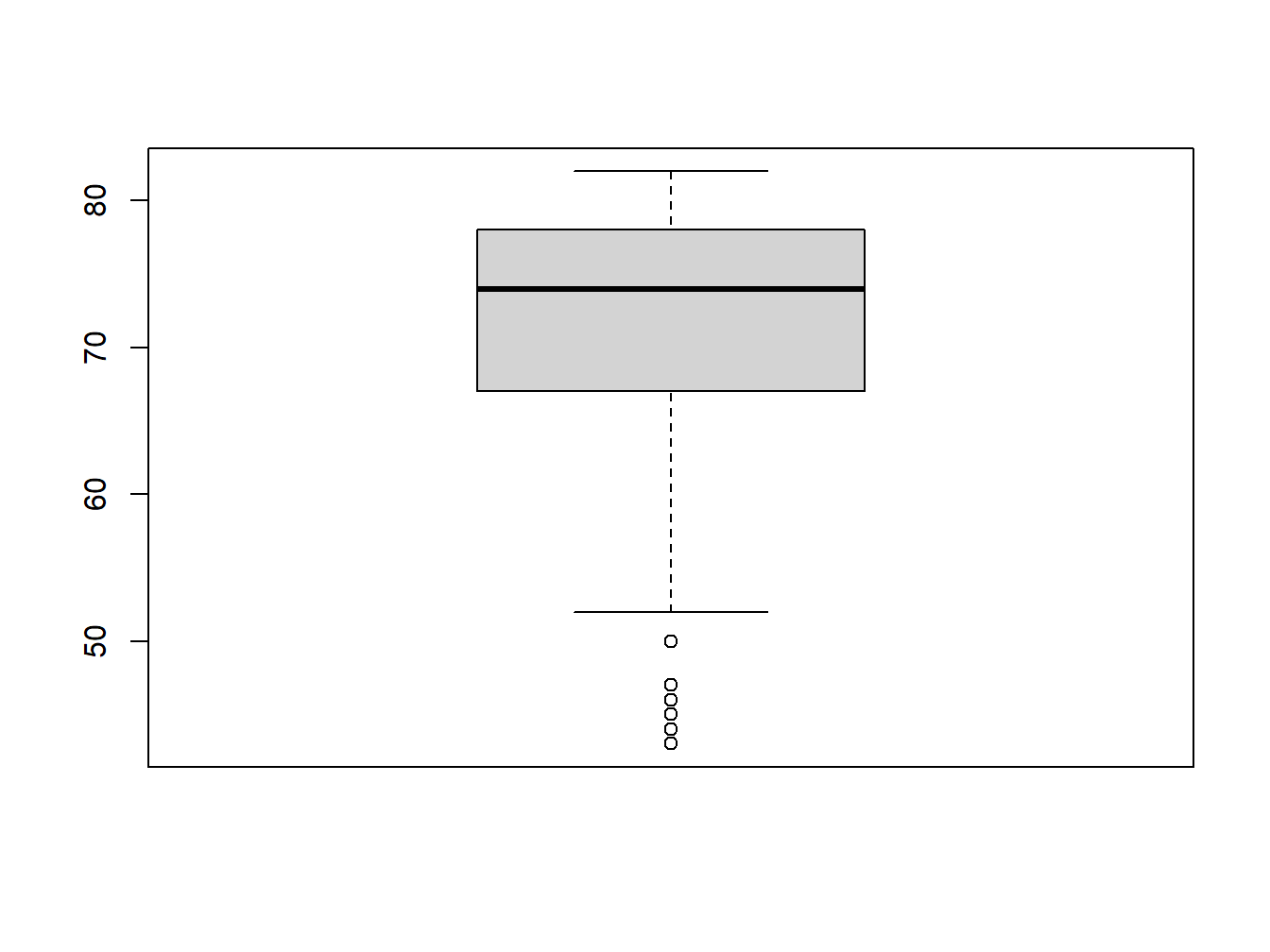
So, it looks like that if a variable has a long tail to the left in the histogram, its boxplot will have a long whisker at the bottom.
If the variable has a long tail to the right in the histogram, can you picture what the boxplot would look like?
What if the variable has equal-length tails on both sides in the histogram?
2.3.3 Comparing a Histogram with a Bar Plot
Let’s create a bar plot for population increase, “pop_incr”
t.p=table(world95$pop_incr)
barplot(t.p)
Put the bar plot and the hisogram side by side:
par(mfrow=c(1,2))
barplot(t.p)
hist(world95$pop_incr)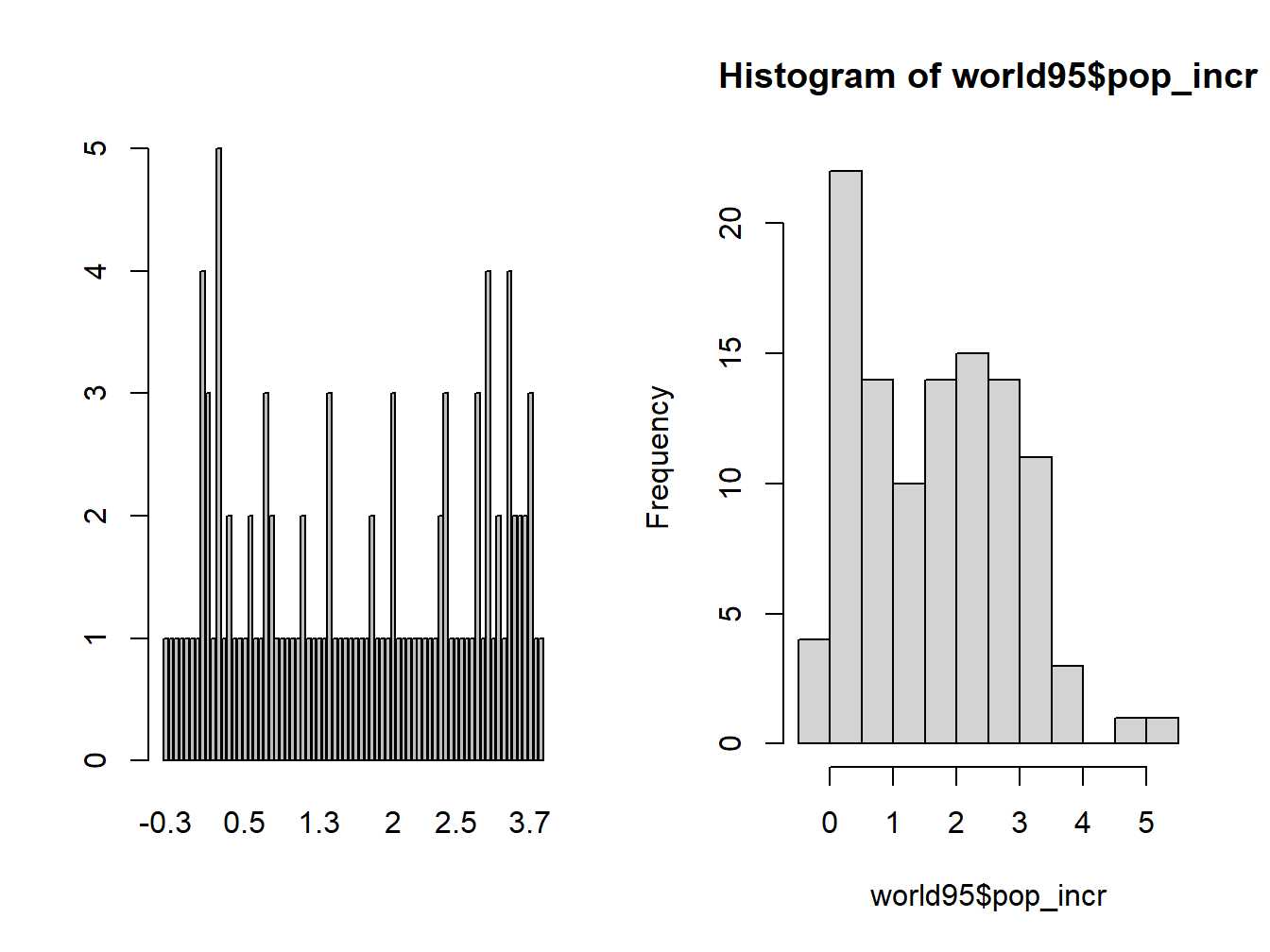
Figure 2.9: Comparing Bar chart with Histogram
What’s the difference between a bar plot and a histogram?
Why do we prefer the histogram to the bar plot when plotting quantitative variables?
2.4 Something Else about Categorical Variables–Risk and Change of Risk
In the context of a categorical variable, we often talk about the risk or chance of doing something, such as:
- the risk of getting colon cancer
- the risk of dropping out of high school
- the chance of going to college (Note that the ‘risk’ of going to college doesn’t sound quite right.)
People often talk about risk/chance and increased/decreased risk/chance without really knowing what they mean. Here are some examples to help you understand:
2.4.1 Example 1
Variable: getting colon cancer or not. We’ll name the event of getting colon cancer as ‘C.’
The risk of getting colon cancer, i.e. the probability of getting colon cancer would be \(P(C)\).
\[P(C)=\frac{\mbox{# of people with colon cancer in our data}}{\mbox{Total # of people in our data}}\]
Whenever we talk about the ‘increased risk’ or ‘decreased risk’ of something, it means that a second variable is taken into account, e.g.
1st Variable: getting colon cancer or not.
2nd Variable: eat bacon or not.
In the news, you sometimes hear them say “If you eat bacon regularly, your chance of getting colon cancer is increased by 18%.” This number, 18%, is the increased risk of bacon-eaters over non-bacon-eaters in terms of getting cancer. What does it really mean?
\[\mbox{Increased Risk of C: Bacon v. No Bacon}=\frac{P(C)_{Bacon}-P(C)_{No Bacon}}{P(C)_{No Bacon}}\] The numerator is easy to understand. It’s just the difference between bacon eaters and non-bacon eaters in their chance of getting colon cancer.
Why do we put \(P(C)_{No Bacon}\) in the denominator? The denominator serves as a measurement unit. We use it to measure how big of a difference the numerator is. For example, suppose the used car that you’ve been eyeing suddenly had a price rise of $500. How big of a deal is it? It depends on the original price of the car, doesn’t it? If the price was $5,000, a rise of $500 is 10%, sizable, but not anything catastrophic. If the price was $700, which is what my first car cost, a rise of $500 is \(\frac{500}{700}\approx 71\%\), which would be absolutely devastating to me!
2.4.2 Example 2
In 2000, the US teen birth rate, i.e. number of births per 1,000 women aged 15-19 years, was 48.7. In 2020, this number was 17.4. The risk of giving birth for a teenage girl in 2020 decreased by how many % compared to 2000?
What are the main variables in this question? Are they categorical or quantitative?
1st variable: if a teenage girl has given birth or not. We’ll name the event of giving birth as ‘B.’
2nd variable: year, 2020 v. 2000
What comes to mind naturally might be:
\[\boxed{ \mbox{Risk Change of B: 2020 v. 2000}=P(B)_{2020}-P(B)_{2000}=\frac{17.4}{1000}-\frac{48.7}{1000}=\frac{-31.3}{1000}=-3.13\%}\]
So the risk of teen birth decreased by 3.13% in two decades.
This solution is WRONG
Instead, we should use the formula from last example:
\[\mbox{Risk Change of B: 2020 v. 2000}=\frac{P(B)_{2020}-P(B)_{2000}}{P(B)_{2000}}=\frac{17.4/1000-48.7/1000}{48.7/1000}=\frac{-31.3/1000}{48.7/1000}\approx -64\%\]
If you are a journalist reporting on this, you can say that teen birth rate in the US has decreased by 64% in two decades.
2.4.3 Example 3
The Pfizer vaccine is 95% effective if you get two doses. What does this mean? Does it mean my chance of getting Covid after 2 doses of Pfizer is 95%, or 5%?
Actually neither is correct. It means that your risk of getting Covid after the Pfizer shots would decrease by 95% compared to before vaccination.
Then what is my absolute risk of getting Covid after full vaccination? Let’s work it out.
We’ll name the risk of getting Covid as \(P(C)\), the risk of getting Covid after vaccination would be \(P(C)_{V}\), the risk of getting Covid without vaccination would be \(P(C)_{NV}\).
Some experts say that before vaccines were available, a person in the United States had about a 1 in 10 chance of developing COVID-19 disease over the course of a year. So we’ll take \(P(C)_{NV}=10\%\)
Now, we know that
\[\mbox{Risk Change of C: Vaccine v. No Vaccine}=\frac{P(C)_{V}-P(C)_{NV}}{P(C)_{NV}}=\frac{P(C)_{V}-10\%}{10\%}=-95\%\]
Re-arrange the equation: \[P(C)_{V}-10\%=-95\% \times 10\%=-9.5\%\] \[P(C)_{V}=-9.5\% + 10\%=0.05\%\]
So it’s actually even better than we thought! One’s chance of getting Covid after full vaccination is even less than 1%. But of course, this was the story before Delta.
2.5 Exercise
Use the ED 101 class survey data to complete the following tasks.
For each of the 6 variables, create an appropriate chart to represent it. Write one sentence to explain what the chart shows. (6 pts)
For the variable “movies,” create both a histogram and a bar plot. Why do these charts look differently? Which chart is a better representation of the variable, and why? (2 pts)
Calculate the following quantities. PLEASE SHOW ALL STEPS (3 pts):
The chance of majoring in education among males and females respectively.
The increased or decreased chance of males vs females as education majors.
- For the “dog or cat” variable, disregard those who answered “both” or “neither.” Then calculate the following quantities (3 pts):
- The chance of being a dog lover among males and females respectively.
- The increased or decreased chance of males vs females to be a dog lover.