Chapter 9 Chi-Square Test
The ANOVA test is used when we compare several groups on a quantitative measure.
Sometimes we need to compare groups on a categorical measure. Consider the following research questions:
Are boys or girls more likely to drop out from high school?
Are men or women more likely to survive on the Titanic?
Is political outlook associated with vaccine attitude?
The \(\chi^2\) (read chi-square) test is the kind of hypothesis test that we use to examine the relationship between two categorical variables.
9.1 How does the chi-square test work?
We will use the following contingency table to answer the question “Are boys or girls more likely to drop out from high school?”
| Dropped Out | Graduated | Total | |
|---|---|---|---|
| Boys | 40 | 160 | 200 |
| Girls | 10 | 290 | 300 |
| Total | 50 | 450 | 500 |
Null hypothesis: there is no difference in boys and girls’ chances of dropping out from high school.
Now, suppose the null hypothesis is true, how would you fill out the following table?
| Dropped Out | Graduated | Total | |
|---|---|---|---|
| Boys | 200 | ||
| Girls | 300 | ||
| Total | 50 | 450 | 500 |
Since we know that 50 out of 500 dropped out, the overall drop-out rate is \(\frac{50}{500}=0.1=10\%\)
Under the Null Hypothesis, boys and girls would share this drop-out rate.
Since there are altogether 200 boys, the number of dropouts among boys would be \(200 \times 0.1=20\).
Similarly, the number of dropouts among girls would be \(300\times 0.1=30\).
We can then fill out the table as follows:
| Dropped Out | Graduated | Total | |
|---|---|---|---|
| Boys | 20 | 180 | 200 |
| Girls | 30 | 270 | 300 |
| Total | 50 | 450 | 500 |
Table 9.3 is what we would expect if the null hypothesis is true, we call it Distribution under the Null.
To recap, the expected frequency, \(E(X)\), within a given cell is calculated as: \[E(X)=\frac{\mbox{Row Total} \times \mbox{Column Total}}{\mbox{Overall Total}}\]
Table 9.1 is what we actually observe. The frequency within a given cell is \(f(X)\).
Under the null, in each given cell, \(f(X)-E(X)=0\). But it’s obviously not the case if you compare Table 9.1 with Table 9.3.
To test the null, we need to consider \(f(X)-E(X)\) for each cell. We cannot simply add them up because the positive differences and the negative differences will cancel each other out. So we square the difference first.
To make the difference meaningful, we also measure it with \(E(X)\). These logics should sound pretty familiar by now.
And finally, we sum them up: \[\chi^2=\sum \frac{f(X)-E(X)}{E(X)}\]
The resulting \(\chi^2\) follows its own distribution called the \(\chi^2\) distribution, and we can use something similar as a z-score to determine if a particular \(\chi^2\) value is too large, too small, or perfectly normal.
For those of us who won’t dive into the math, of course, it still boils down to a p-value with the same rules for rejecting or accepting the null hypothesis.
9.2 Carrying out a chi-square test
Because categorical data can be easily presented in a contingency table like Table 9.1, we actually don’t need a dataset for carrying out a \(\chi^2\) test. Here’s an example.
Example 9.1
We will finish off the \(\chi^2\) test using data from Table 9.1.
Again, the null hypothesis is: there is no difference in boys and girls’ chances of dropping out from high school.
Before we delve into the analysis, it’s helpful to calculate the drop-out rate for boys and girls respectively.
Boys’ dropout rate:
40/200## [1] 0.2Girls’ dropout rate:
10/300## [1] 0.03333333They are obviously different, but is this difference statistically significant? Now let’s get that p-value.
First, enter the data, since we don’t have a raw dataset:
boys=c(40,160)
girls=c(10,290)
Note that you must follow the same orders for boys and girls. If you put dropouts in front of graduates for boys, you must do the same for girls.
Now do the \(\chi^2\) test:
chisq.test(data.frame(boys, girls))##
## Pearson's Chi-squared test with Yates' continuity correction
##
## data: data.frame(boys, girls)
## X-squared = 35.208, df = 1, p-value = 2.963e-09Since \(p<\alpha\), we will reject the null hypothesis. Boys are significantly more likely to drop out from high school than girls.
It’s always a good idea to put a visual for any kind of statistical analysis that you did.
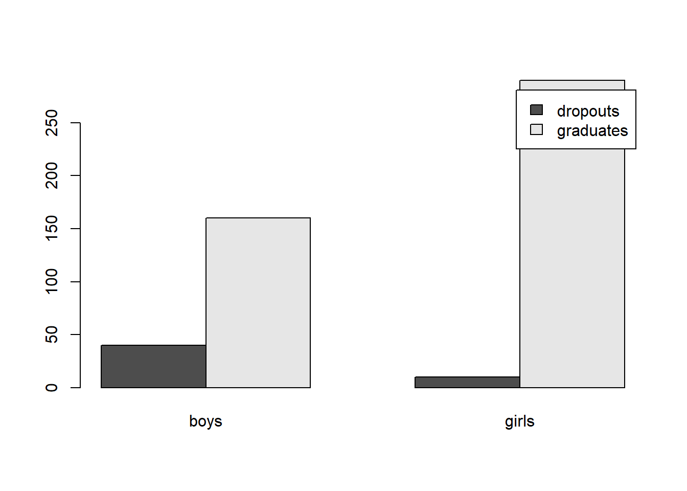
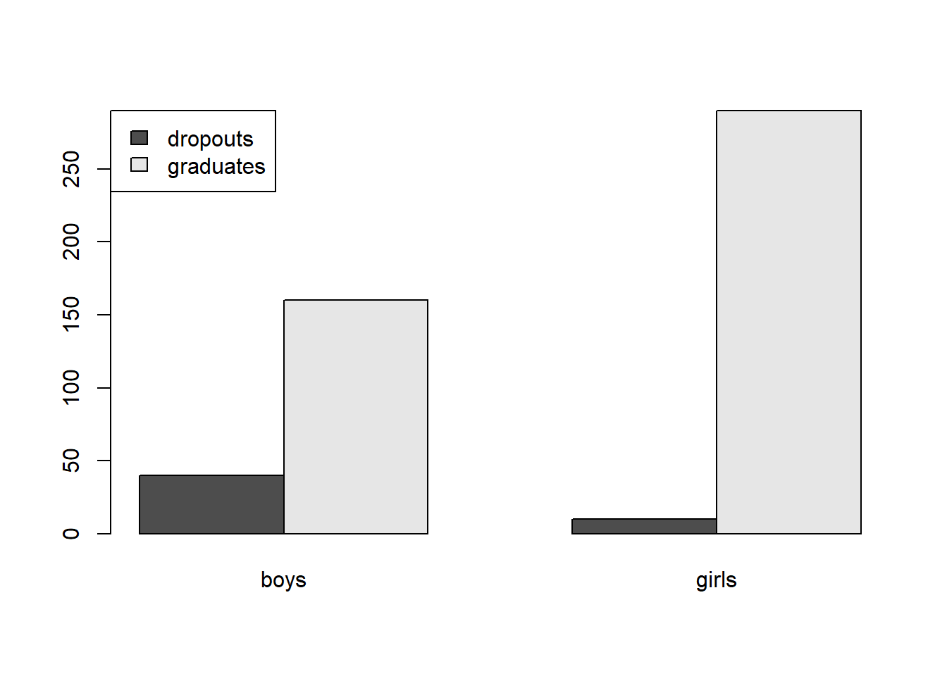
The type of plot that is often used for a \(\chi^2\) test is a side-by-side bar plot:
dropoutTable=cbind(boys, girls)
barplot(dropoutTable,beside=TRUE)
To add a legend to your side-by-side bar plot:
barplot(dropoutTable,beside=TRUE,legend=c("dropouts","graduates"))
To change the position of the legend:
barplot(dropoutTable,beside=TRUE,legend=c("dropouts","graduates"),args.legend=list(x="topleft"))
Note that reading the side-by-side bar plot is a bit tricky. We don’t just compare the dropout bar for boys and girls. Instead, what we compare is the ratio of dropout vs. graduates for boys and for girls.
What if we don’t have a contingency table, but only the raw dataset? Let’s look at another example.
Example 9.2
In this example, we use the “Titanic” dataset to answer the question: did passengers in different classes have different survival rates?
Null hypothesis: there is no difference in survival rates among passengers in different classes onboard the Titanic.
Import data into R:
library(foreign)
titanic=read.spss("titanic.sav", to.data.frame=TRUE)
attach(titanic)
Get to know the dataset:
dim(titanic)## [1] 2201 4There are 2201 individuals in this dataset and 4 variables.
names(titanic)## [1] "Class" "Sex" "Age" "Survived"The variables are: Class, Sex, Age, and Survived
head(titanic)## Class Sex Age Survived
## 1 3rd Female Child N
## 2 3rd Female Child N
## 3 3rd Female Child N
## 4 3rd Female Child N
## 5 3rd Female Child N
## 6 3rd Female Child NIt looks like all of them are categorical.
Now I’d like to know how many died and survived in each class:
table(Class, Survived)## Survived
## Class N Y
## 1st 122 203
## 2nd 167 118
## 3rd 528 178
## Cre 673 212Great! But this is not easy to compare. I need proportions of survivors in each class:
prop.table(table(Class, Survived), margin=1)## Survived
## Class N Y
## 1st 0.3753846 0.6246154
## 2nd 0.5859649 0.4140351
## 3rd 0.7478754 0.2521246
## Cre 0.7604520 0.2395480Note that if I let “margin=2,” what I get are the proportions of different classes among the dead and among the survivors. Try it out yourself.
Anyway, the proportions in the above table are exactly what we need. Let’s just turn them into percentages–multiplying by 100:
prop.table(table(Class, Survived), margin=1)*100## Survived
## Class N Y
## 1st 37.53846 62.46154
## 2nd 58.59649 41.40351
## 3rd 74.78754 25.21246
## Cre 76.04520 23.95480Now we can see that 1st class passengers did have the highest survival rate. Are the differences significant? Let’s get the p-value:
chisq.test(Class,Survived)##
## Pearson's Chi-squared test
##
## data: Class and Survived
## X-squared = 190.4, df = 3, p-value < 2.2e-16Because \(p<\alpha\), we will reject the null hypothesis.
Survival rates are associated with class. First class passengers have the highest survival rates, crew members have the lowest, and their difference is statistically significant.
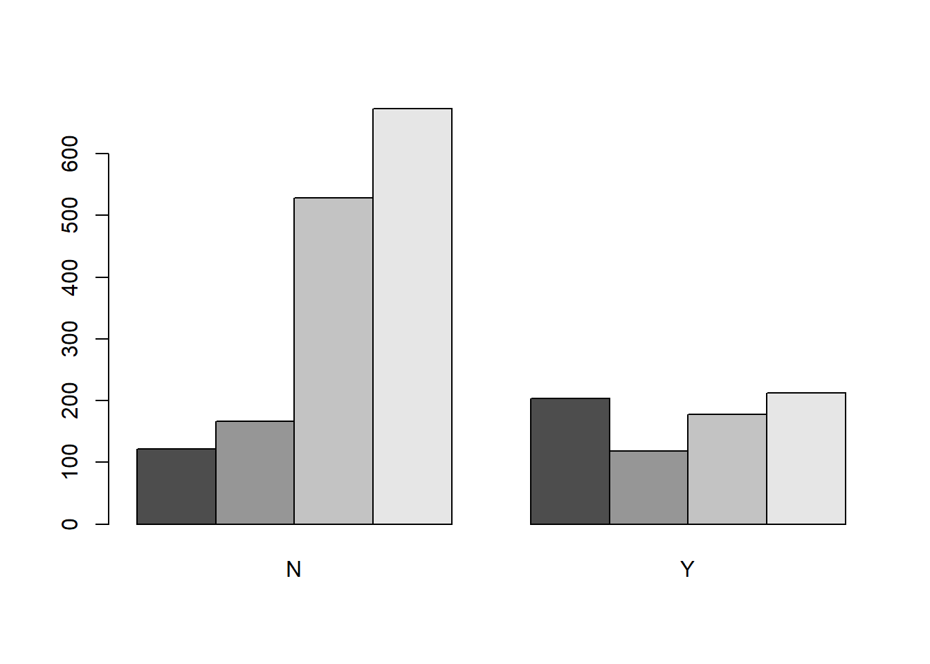
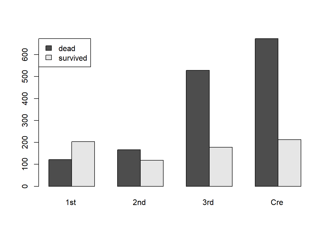
And here is a side-by-side bar plot to illustrate the comparison:
t1=table(Class, Survived)
barplot(t1,beside=TRUE)
Oops, this gives me the proportions of different classes among the dead and the survivors. Not what I want. Let’s try it again:
t2=table(Survived, Class)
barplot(t2,beside=TRUE,legend=c("dead","survived"),args.legend=list(x="topleft"))
Now that looks better.
In the argument legend=c("dead","survived"), how do I know that “dead” should come before “survived?”
This is how I found out:
t1## Survived
## Class N Y
## 1st 122 203
## 2nd 167 118
## 3rd 528 178
## Cre 673 212In the table above, “N” comes before “Y.” This means that when I make the legend, “dead,” i.e. those who did not survive, should come before “survived.”
Note how, in the bar chart, the first class is the only group where the “survived” bar is higher than the “dead” bar.
9.3 Exercises
9.3.1 Choose the appropriate kind of hypothesis test for the following research questions
Is there a correlation between children’s sun exposure (in hours) and eye sight?
Is there a difference between people with college degrees and those without in terms of their political party affiliation?
9.3.2 Carry out the appropriate hypothesis tests to answer the following questions
- What is the best way to train cats to line dance, with food or showing affection? 200 cats are recruited and trained with different rewards. At the end of the week, the researcher counted how many cats could line dance and how many could not. The results are recorded in Table 9.4.
| Could Dance | Could not Dance | Total | |
|---|---|---|---|
| Food as Reward | 28 | 10 | 38 |
| Affection as Reward | 48 | 114 | 162 |
| Total | 76 | 124 | 200 |
State the independent variable, dependent variable, and null hypothesis.
Find out the success rates among different reward groups separately.
Run a chi-square analysis. Do you accept or reject the null hypothesis?
Explain your conclusion: which type of reward is more effective? Is the difference statistically significant?
Create a side-by-side bar plot to illustrate your comparison.
- Complete a hypothesis test to find out if men and women had different survival chances on Titanic.
Create a simple bar chart or pie chart for Sex. How many men and women were there?
State the null hypothesis based on the research question.
In this research question, what is the independent variable and what is the dependent variable?
Create a contingency table for Sex and Survived, and find out the survival rates among men and women separately.
Run a chi-square analysis. Do you accept or reject the null hypothesis?
Explain your conclusion: who were more likely to survive, men or women? Is the difference statistically significant?
Create a side-by-side bar plot to illustrate your comparison.
- Researchers are interested in finding out if different kinds of praises have different effects on children. Specifically, they divided a sample of 100 children into two groups. One group was praised for their intelligence during a task (“you are such a smart kid!”), the other group was praised for their effort during the same task (“you worked so hard on this. That’s great!”). At the end of the task, they measured the children’s motivation, i.e. if they were willing to take on new challenge. Some were willing to take challenge. Some avoided challenge.
Please enter the data into R and carry out a chi-square analysis
| Took challenge | Avoided challenge | Total | |
|---|---|---|---|
| Praised for effort | 25 | 15 | 40 |
| Praised for intelligence | 5 | 55 | 60 |
| Total | 30 | 70 | 100 |
State the independent variable, dependent variable, and null hypothesis.
Find out the chances of kids taking challenge among different praise groups separately.
Run a chi-square analysis. Do you accept or reject the null hypothesis?
Explain your conclusion: which type of praise is more motivating? Is the difference statistically significant?
Create a side-by-side bar plot to illustrate your comparison.