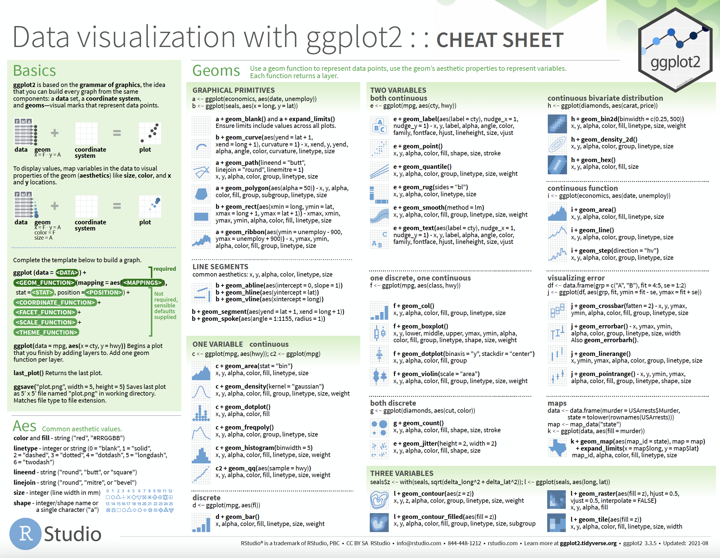
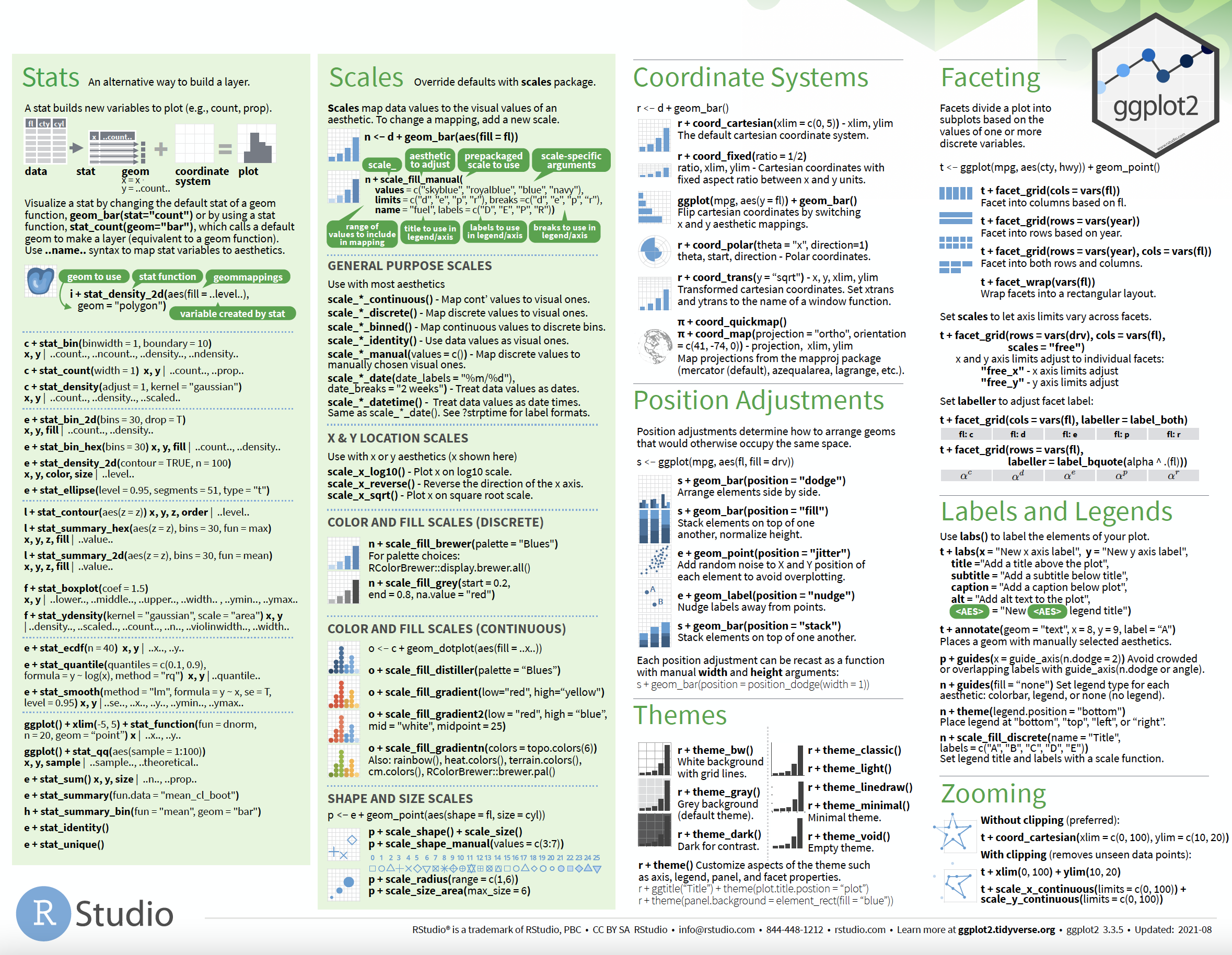
Chapter 3 Visualizing data in R – An intro to ggplot
Motivating scenarios: Motivating scenarios: you have a fresh new data set and want to check it out. How do you go about looking into it?
Learning goals: By the end of this chapter you should be able to:
- Build a simple ggplot.
- Explain the idea of mapping data onto aesthetics, and the use of different geoms.
- Match common plots to common data type.
- Use geoms in ggplot to generate the common plots (above).
mpg data.
3.1 A quick intro to data visualization.
FIGURE 3.1: Watch the first minute of this video about getting started with ggplot2 (7 min and 17 sec), from STAT 545
Recall that as bio-statisticians, we bring data to bear on critical biological questions, and communicate these results to interested folks. A key component of this process is visualizing our data.
They say “a picture is worth a thousand words,” similarly a clear graph can communicate complex patterns in our data.
3.1.1 Exploratory and explanatory visualizations
![]()
We generally think of two extremes of the goals of data visualization
- In exploratory visualizations we aim to identify any interesting patterns in the data, we also conduct quality control to see if there are patterns indicating mistakes or biases in our data, and to think about appropriate transformations of data. On the whole, our goal in exploratory data analysis is to understand the stories in the data.
![]()
- In explanatory visualizations we aim to communicate our results to a broader audience. Here our goals are communication and persuasion. When developing explanatory plots we consider our audience (scientists? consumers? experts?) and how we are communicating (talk? website? paper?).
The ggplot2 package in R is well suited for both purposes. Today we focus on exploratory visualization in ggplot2 because
- They are the starting point of all statistical analyses.
- You can do them with less
ggplot2knowledge.
- They take less time to make than explanatory plots.
Later in the term we will show how we can use ggplot2 to make high quality explanatory plots.
3.1.2 Centering plots on biology
Whether developing an explanatory or exploratory plot, you should think hard about the biology you hope to convey before jumping into a plot. Ask yourself
- What do you hope to learn from this plot?
- Which is the response variable (we usually place that on the y-axis)?
- Are data numeric or categorical?
- If they are categorical are they ordinal, and if so what order should they be in?
The answers to these questions should guide our data visualization strategy, as this is a key step in our statistical analysis of a dataset. The best plots should evoke an immediate understanding of the (potentially complex) data. Put another way, a plot should highlight both the biological question and its answer.
Before jumping into making a plot in R, it is often useful to take this step back, think about your main biological question, and take a pencil and paper to sketch some ideas and potential outcomes. I do this to prepare my mind to interpret different results, and to ensure that I’m using R to answer my questions, rather than getting sucked in to so much Ring that I forget why I even started. With this in mind, we’re ready to get introduced to ggploting!
My approach to figure-making in #ggplot ALWAYS begins with sketching out what I want the final product to look like. It feels a bit analog but helps me determine which #geom or #theme I need, what arrangement will look best, & what illustrations/images will spice it up. #rstats pic.twitter.com/GUjeEgqZxj
— Shasta E. Webb, PhD (@webbshasta) May 22, 2020
3.2 The idea of ggplot
FIGURE 3.2: Watch this video about how ggplot thinks (6 min and 43 sec). Note this is part of an intro to R series I am developing for CBS – comments appreciated
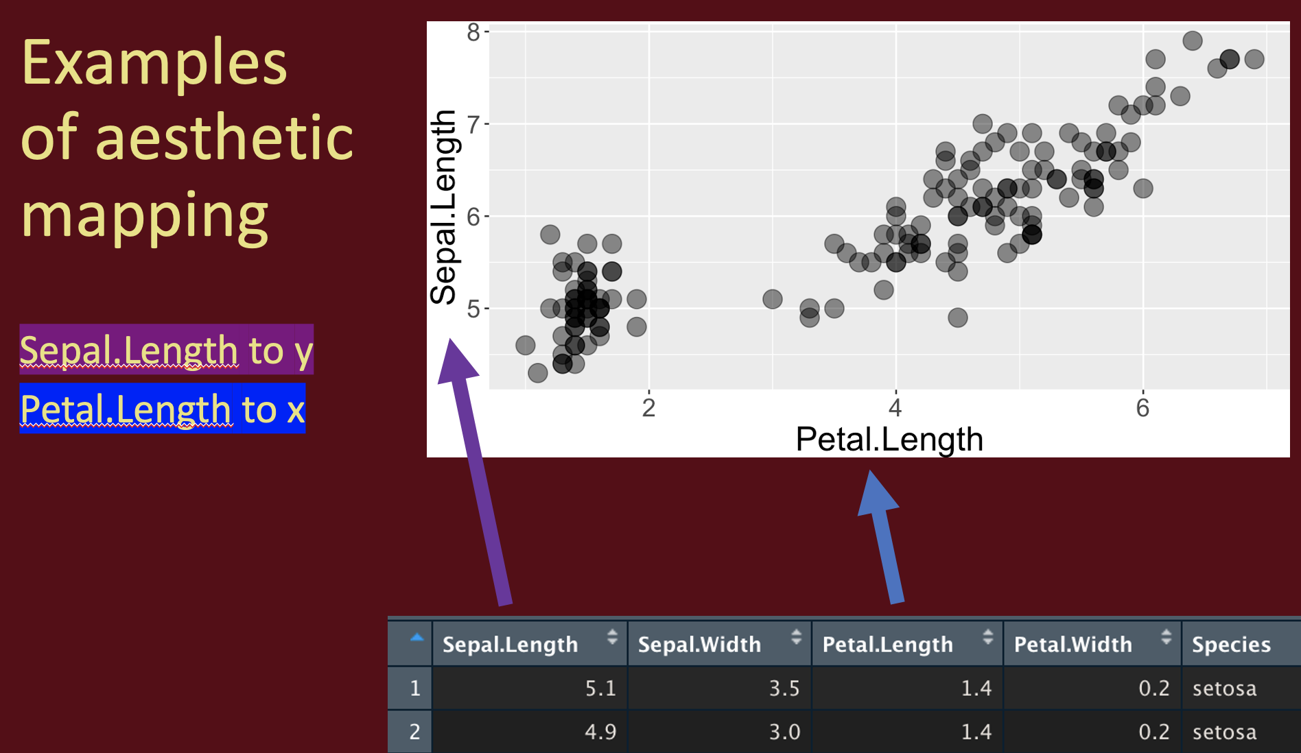
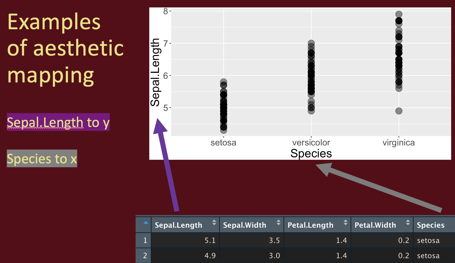
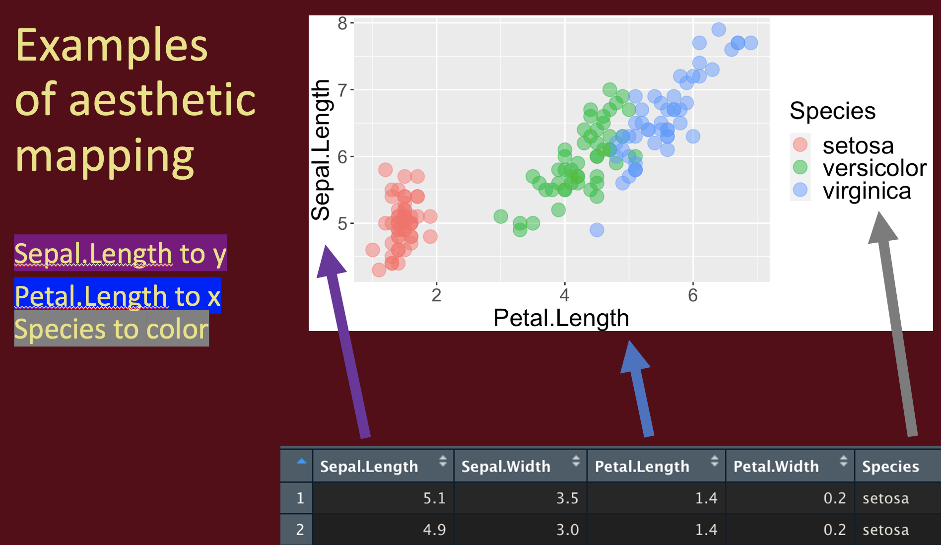
ggplot is built on a framework for building plots called the grammar of graphics. A major idea here is that plots are made up of data that we map onto aesthetic attributes.
Lets unpack this sentence, because there’s a lot there. Say we wanted to make a very simple plot e.g. observations for categorical data, or a simple histogram for a single continuous variable. Here we are mapping this variable onto a single aesthetic attribute – the x-axis.
ggplot in one place, check out the ggplot2 book (Wickham 2016) and/or the socviz book (Healy 2018).
3.2.1 Mapping aesthetics to variables
So first we need to think of the variables we hope to map onto an aesthetic.
Two of the most familiar and commonly used aesthetics are x and y. When we have two continuous variables we usually map the explanatory variable onto the x axis and the response variable onto the y.
Alternately have a categorical variable mapped onto the x.
This mapping approach can get pretty powerful, as it can allow u to visualize many dimensions. For example, we can mapping a categorical variable to shape and/or color to show additional aspects of our data.
3.2.2 Adding geom layers
geoms explain to R what we want to see: points, lines, histograms etc… In a future chapter, we will see how to add data summaries and trendlines. As we discuss below, a histogram is a great way to visualize variability, so lets add that as a geom.
Yay! OK - we’re off. Below we explore a bunch more geom and how they relate to the type of variables we’re interested in! But first, one more awesome feature of ggplot – faceting.
3.3 Making scatterplots
FIGURE 3.3: Watch this video about making scatterplots in ggplot (9 min and 37 sec). Note this is part of an intro to R series I am developing for CBS – comments appreciated
ggplot2 allows us to make nice scatterplots (usually withgeom_point()), and easily add categorical variables (most often by mapping a categorical variable onto the color and/or shape aesthetics) and trendlines (with geom_smooth(method = "lm"))
3.4 Making histograms
FIGURE 3.4: Watch this video about making histograms in ggplot (9 min and 38 sec). Note this is part of an intro to R series I am developing for CBS – comments appreciated
Histograms are a great way to show the spread and distribution of your data. We can make histograms in ggplot with geom_histogram(). We can compare distributions of a quantitative variable for different values of a categorical variable by faceting ( usually facet_wrap(~<categorical_var>)).
Alternatively we can compare distributions with density plots with geom_density() – with fit functions to histograms to approimate a distribution. The easiest way to do this is to map alpha to a value less than one – I usually start atalpha = 0.5 and adjust some).
3.5 Making jiiterplots
FIGURE 3.5: Watch this video about making jitterplots in ggplot (8 min and 43 sec). Note this is part of an intro to R series I am developing for CBS – comments appreciated
Numerous geoms, including box plots, violin plots, scatter plots, sina plots (my fav.. more to come), provide additional ways to compare distributions. Here focus on jitterplots (geom_jitter(width = 0.3)) which are effective ways to show all the data while avoiding losing information when data points keep falling on top of each other (known as overplotting).