Chapter 8 Practical Sheets
8.1 Practical 1 - Contingency Tables
In this practical, we consider exploring practical application of some of the techniques learnt in the lectures in R. This practical may seem long, however, some of it should be a nice refresher of R techniques already learnt, and some other parts are hopefully gentle and straightforward to read about and follow (although the odd more challenging exercise is thrown in!). You are encouraged to work through to the end in your own time. I would also like to note that Data Science and Statistical Computing II (DSSC II) was not a prerequisite for this course, and hence is not necessary. However, if you did take that course, you are welcome to play around with using some of the exciting skills picked up in that course in conjunction with what you learn in this course (particularly surrounding the visualisation side of things).
Finally, whilst solutions to the practical sheets will be provided, it is by attempting to answer the exercises yourself first that your practical coding skills will be developed!
8.1.1 Construction of Contingency Tables
8.1.1.1 Construction from Matrices
We here consider entering \(2 \times 2\) contingency tables manually into R. We do this as follows for the data in Table 2.3.
DR_data <- matrix( c(41, 9,
                     37, 13 ), byrow = TRUE, ncol = 2 )
dimnames( DR_data ) <- list( Dose = c("High", "Low"),
                             Result = c("Success", "Failure") )

DR_data
## Result
## Dose Success Failure
## High 41 9
## Low 37 13We can add row and column sum margins as follows
DR_contingency_table <- addmargins( DR_data )
DR_contingency_table
## Result
## Dose Success Failure Sum
## High 41 9 50
## Low 37 13 50
## Sum 78 22 1008.1.1.2 Contingency Tables of Proportions
Proportions can be obtained using prop.table.
DR_prop <- prop.table( DR_data )
DR_prop_table <- addmargins( DR_prop )
DR_prop_table
## Result
## Dose Success Failure Sum
## High 0.41 0.09 0.5
## Low 0.37 0.13 0.5
## Sum 0.78 0.22 1.0The row conditional proportions are derived by prop.table(DR_data, 1). Analogously, column conditional proportions can be obtained using prop.table(DR_data, 2).
The addmargins function also provides versatility for specifying margins for particular dimensions. We here specify that margins only be added for each row (trivially yielding 1 in each case as expected).
DR_prop_1 <- prop.table( DR_data, 1 )
DR_prop_1_table <- addmargins( DR_prop_1, margin = 2 )
DR_prop_1_table
## Result
## Dose Success Failure Sum
## High 0.82 0.18 1
## Low 0.74 0.26 1We can amend the function argument FUN so that an alternative operation is performed. Since both rows contain the same total number of subjects, we can obtain the overall proportion in each column by amending the function argument FUN as follows73:
DR_prop_2_table <- addmargins( DR_prop_1_table, margin = 1, FUN = mean )
DR_prop_2_table
## Result
## Dose Success Failure Sum
## High 0.82 0.18 1
## Low 0.74 0.26 1
## mean 0.78 0.22 1Notice that
DR_prop_3_table <- addmargins( DR_prop_1,
                               margin = c(1,2),
                               FUN = list(mean, sum) )
## Margins computed over dimensions
## in the following order:
## 1: Dose
## 2: ResultDR_prop_3_table## Result
## Dose Success Failure sum
## High 0.82 0.18 1
## Low 0.74 0.26 1
## mean 0.78 0.22 1yields the same result.
Argument margin dictates the order of dimensions over which operations are applied over, and the function list FUN dictates which function should be applied in each case. So here, R first performs mean over dimension 1 (the rows, in this case Dose), and then sum over dimension 2 (the columns, in this case Result), as is confirmed by the additional information R fed back (setting argument quiet=TRUE would remove this).
8.1.1.3 Construction from Dataframes
Here we suppose we have our data collated in a dataframe that we wish to cross-classify into a contingency table. We demonstrate doing this on the penguins dataset in library palmerpenguins (remember to install this library using install.packages("palmerpenguins") if you have not already done so).
library(palmerpenguins)
head(penguins)
## # A tibble: 6 × 8
## species island bill_length_mm bill_depth_mm flipper_length_mm body_mass_g
## <fct> <fct> <dbl> <dbl> <int> <int>
## 1 Adelie Torgersen 39.1 18.7 181 3750
## 2 Adelie Torgersen 39.5 17.4 186 3800
## 3 Adelie Torgersen 40.3 18 195 3250
## 4 Adelie Torgersen NA NA NA NA
## 5 Adelie Torgersen 36.7 19.3 193 3450
## 6 Adelie Torgersen 39.3 20.6 190 3650
## # ℹ 2 more variables: sex <fct>, year <int>You will notice that the penguins data is in the dataframe format known in R lingo as a tibble. For those of you that did not take DSSC II, a tibble is a user-friendly type of dataframe that works with the user-friendly R set of libraries tidyverse. For our purposes, a tibble can just be viewed as any other dataframe.
Firstly, find out information about the dataset using ?penguins.
We are interested in whether different types of penguin typically reside on different islands, hence we wish to tabulate the dataframe as follows.
penguins_data <- table( Species = penguins$species, Island = penguins$island )
penguins_data
## Island
## Species Biscoe Dream Torgersen
## Adelie 44 56 52
## Chinstrap 0 68 0
## Gentoo 124 0 0In this case we may be fairly certain that there is a connection between these variables…but we can test out some techniques using this contingency table nonetheless.
8.1.1.4 Exercises
These questions involve using the contingency table from the penguin data introduced in Section 8.1.1.3.
Use
addmarginsto add row and column sum totals to the contingency table of penguin data.Use
prop.tableto obtain a contingency table of proportions.Display the column-conditional probabilities, and use
addmarginsto add the column sums as an extra row at the bottom of the matrix (note: this should be a row of \(1\)’s).Suppose I want the overall proportions of penguin specie to appear in a final column on the right of the table. How would I achieve this?
8.1.2 Chi-Square Test of Independence
Run the command chisq.test on DR_data with argument correct set to FALSE.
chisq.test( DR_data, correct = FALSE )##
## Pearson's Chi-squared test
##
## data: DR_data
## X-squared = 0.9324, df = 1, p-value = 0.3342chisq.test runs a \(\chi^2\) test of independence, and setting the argument correct to FALSE tells R not to use continuity correction. Look at the help file for chisq.test, and you will see that the default is for R to use Yates’ continuity correction (see Section 2.4.3.5).
chisq.test( DR_data )##
## Pearson's Chi-squared test with Yates' continuity correction
##
## data: DR_data
## X-squared = 0.52448, df = 1, p-value = 0.4689Notice that the \(p\)-value with continuity correction is larger, as expected. The ML estimates of the expected cell frequencies can be obtained by running
chisq.test( DR_data )$expected## Result
## Dose Success Failure
## High 39 11
## Low 39 118.1.3 Data Visualisation
Here we introduce several types of data visualisation methods for categorical data presented in the form of contingency tables, and apply them to the Dose-Result contingency table.
8.1.3.1 Barplots
The exercises in this section should introduce you to (or refresh your memory of, if you have seen it before) the barplot function, as well as refresh your memory of generic R plotting function arguments.
Run
barplot( DR_prop ). What do the plots show?Investigate the
densityargument of the functionbarplotby both running the commands below, and also looking in the help file.
barplot( DR_prop, density = 70 )
barplot( DR_prop, density = 30 )
barplot( DR_prop, density = 0 )
Add a title, and x- and y-axis labels, to the plot above.
Use the help file for
barplotto find out how to add a legend to the plot.How would we alter the call to
barplotin order to view dose proportion levels conditional on result (instead of the overall proportions corresponding to each cell). You may wish to use some of the table manipulation commands from Section 8.1.1.Suppose instead that we wish to display each dose level in a bar, with the proportion of successes and failures illustrated by the shading in each bar. How would we do that?
8.1.3.2 Fourfold plots
Try running the following to obtain the plot shown in Figure 8.1.
fourfoldplot( DR_data )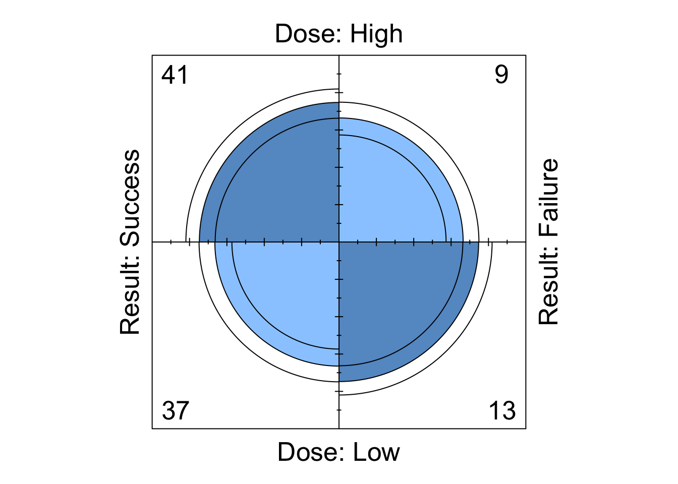
Figure 8.1: Fourfoldplot of the Dose-Result contingency table data.
A fourfold plot provides a graphical expression of the association in a \(2 \times 2\) contingency table, visualising the odds ratio. Each cell entry is represented as a quarter-circle (denoted by the middle of the three rings).
We see that the shaded diagonal areas are represented by quarter-circles with greater area than the off-diagonal areas, hence the association between the two binary classification variables in positive, that is, the odds ratio \(r_{12}\) is greater than 1. The strength of association can be visually strengthened by choice of colour (although it is subjective which colour scheme is best…). For example, to obtain a red/blue colour scheme, we can run the following to obtain the plot shown in Figure 8.2
fourfoldplot( DR_data, color = c("red", "blue") )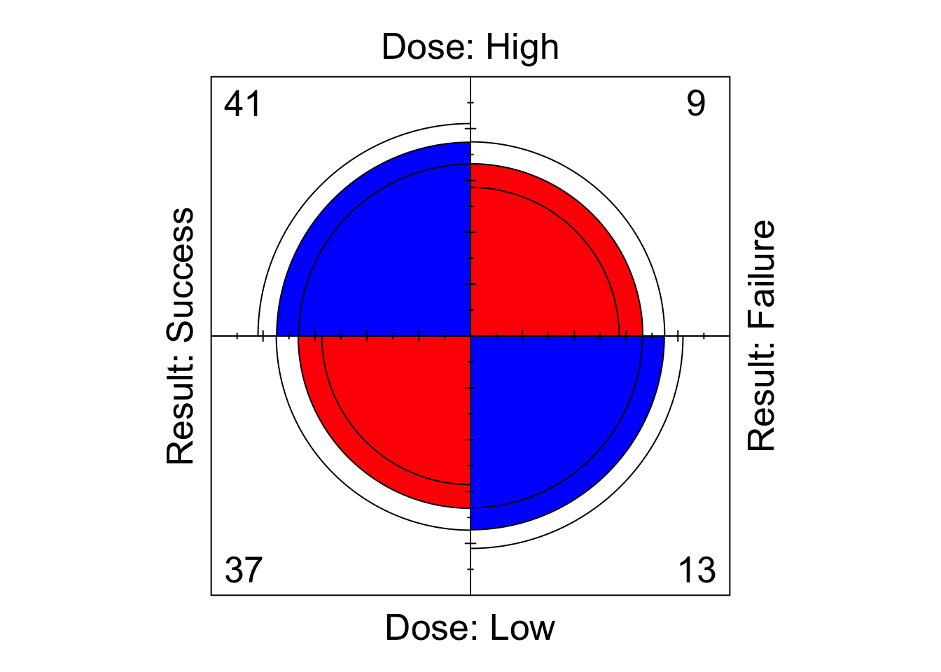
Figure 8.2: Fourfoldplot of the Dose-Result contingency table data.
The inner and outer rings of the quarter-circles correspond to confidence rings. The observed frequencies support the null hypothesis of no association between the variables if the rings for adjacent quarters overlap (we will explore this hypothesis test in the lectures…).
8.1.3.3 Sieve Diagrams
We here investigate the sieve plotting function of library vcd. Remember to look at the help file to help you understand the various arguments for this function.
- Run
library(vcd)
sieve( DR_data )
What is shown?
- Now run
library(vcd)
sieve( DR_data, shade = T )
Does this make the data easier or harder to visualise?
- Finally, run
sieve( DR_data, sievetype = "expected", shade = T )What is shown now?
8.1.3.4 Mosaic Plots
Run
mosaic( DR_data )Mosaic plots for two-way tables display graphically the cells of a contingency table as rectangular areas of size proportional to the corresponding observed frequencies. Were the classification variables independent, then the areas would be perfectly aligned in rows and columns. The worse the alignment is, the stronger the lack of fit for independence. Furthermore, specific locations of the table that deviate from independence the most may be identified and thus the pattern of underlying association attempt to be explained.
8.1.4 Odds Ratios in R
This section seeks to test your understanding of odds ratios for \(2 \times 2\) contingency tables, as well as your ability to write simple functions in R.
Write a function to compute the odds ratio of the success of event A with probability
pAagainst the sucess of event B with probabilitypB.Write a function to compute the odds ratio for a \(2 \times 2\) contingency table. Test it on the Dose-response data above.
Will there be an issue running your function from part (b) if exactly one of the cell counts of the supplied matrix is equal to zero?
What about if both cells of a particular row or column of the supplied matrix are equal to zero?
We consider two possible options for amending the function in this case.
- First option: ensure that your function terminates and returns a clear error message of what has gone wrong and why when a zero would be found to be in both the numerator and denominator of the odds ratio. Hint: The command
stopcan be used to halt execution of a function and display an error message.
- First option: ensure that your function terminates and returns a clear error message of what has gone wrong and why when a zero would be found to be in both the numerator and denominator of the odds ratio. Hint: The command
- Second option: in the case that a row or column of zeroes is found, add 0.5 to each cell of the table before calculating the odds ratio in the usual way. Make sure that your function returns a clear warning (as opposed to error) message explaining that an alteration to the supplied table was made before calculating the odds ratio because there was a row or column of zeroes present. Hint: The command
warning()can be used to display a warning message (but not halt execution of the function).
- Second option: in the case that a row or column of zeroes is found, add 0.5 to each cell of the table before calculating the odds ratio in the usual way. Make sure that your function returns a clear warning (as opposed to error) message explaining that an alteration to the supplied table was made before calculating the odds ratio because there was a row or column of zeroes present. Hint: The command
8.1.5 Further Exploration: Mushrooms
Consider the mushrooms data in Table 2.7 of Section 2.4.3.4 (note that this is the table after combining cells). Explore further the topics covered in this practical session. You will need to manually enter the data from the lecture notes as a matrix to get started.
8.2 Practical 2 - Contingency Tables
This practical gives you the opportunity to develop the techniques learnt in Practical 1 by utilising the functions presented there, as well as providing a base for exploration of new ones.
Each of the three sections below considers exploring one of three datasets. You are encouraged to explore each of these datasets using the array of techniques previously discussed, as well as utilising the presented questions and suggestions to help you learn new ones.
8.2.1 Mushrooms
We begin by returning to the mushrooms data (Table 2.7, introduced in Section 2.4.3.4). This dataset was the basis for the open-ended final exercise of Practical 1. You may have explored this dataset in some, or all, of the following ways, amongst others:
Manually input the data into R.
Investigated adding relevant margins to the tables and exploring corresponding contingency tables of proportions.
Performed a \(\chi^2\) test of independence.
Generated visual representations of the data in the form of barplots, sieve diagrams and mosaic plots.
You are encouraged to keep exploring this dataset. In particular, the following sections prompt analysis of residuals, a GLR test, and investigation into nominal odds ratios.
8.2.1.1 Residual Analysis
Pearson and Adjusted residuals can be obtained from the output of chisq.test(). Use the help file for this function to find out how.
8.2.1.2 GLR Test
The function below uses the appropriate parameters provided from the output of a call to chisq.test() to perform a GLR test.
Read through the code and try to understand what each line does.
What information/results are being returned at the end of the function?
Apply the function on the mushroom data and interpret the results.
G2 <- function( data ){
  # computes the G2 test of independence
  # for a two-way contingency table of
  # data: IxJ matrix
  X2 <- chisq.test( data )
  Ehat <- X2$expected
  df <- X2$parameter

  term.G2 <- data * log( data / Ehat )
  term.G2[data==0] <- 0 # Because if data == 0, we get NaN

  Gij <- 2 * term.G2 # Individual cell contributions to G2 statistic.
  dev_res <- sign( data - Ehat ) * sqrt( abs( Gij ) )
  G2 <- sum( Gij ) # G2 statistic
  p <- 1 - pchisq( G2, df )
  return( list( G2 = G2, df = df, p.value = p,
                Gij = Gij, dev_res = dev_res ) )
}
8.2.1.3 Nominal Odds Ratios
In Section 8.1.4, you were encouraged to write a function to calculate the odds ratio for a \(2 \times 2\) contingency table. Such a function (without concern for zeroes occurring) may be given by
OR <- function( M ){ ( M[1,1] * M[2,2] ) / ( M[1,2] * M[2,1] ) }Based on this, what does the following function do? Test the function out on the mushrooms data and interpret the results.
nominal_OR <- function( M, ref_x = nrow( M ), ref_y =  ncol( M ) ){

  # I and J
  I <- nrow(M)
  J <- ncol(M)

  # Odds ratio matrix.
  OR_reference_IJ <- matrix( NA, nrow = I, ncol = J )
  for( i in 1:I ){
    for( j in 1:J ){
      OR_reference_IJ[i,j] <- OR( M = M[c(i,ref_x), c(j,ref_y)] )
    }
  }

  OR_reference <- OR_reference_IJ[-ref_x, -ref_y, drop = FALSE]

  return(OR_reference)

}8.2.2 Dose-Result
Manually input into R the hypothetical data presented in Table 2.15. You may wish to attempt some or all of the following.
Utilise previously introduced skills on this dataset.
Amend the function presented in Section 8.2.1.3 to write two new functions
- one to compute the set of \((I-1) \times (J-1)\) local odds ratios for \(i = 1,...,I-1\) and \(j = 1,...,J-1\); and
- one to compute the set of \((I-1) \times (J-1)\) global odds ratios for \(i = 1,...,I-1\) and \(j = 1,...,J-1\).
Write a function that produces an \((I-1) \times (J-1)\) matrix of fourfold plots, each corresponding to the submatrices associated with each of the \((I-1) \times (J-1)\) local odds ratios for \(i = 1,...,I-1\) and \(j = 1,...,J-1\).
Perform a linear trend test on the data, either by writing your own code to calculate the relevant quantities, or by utilising the following function, courtesy of Kateri (2014).
linear.trend <- function( table, x, y ){
  # linear trend test for a 2-way table
  # PARAMETERS:
  # freq: vector of the frequencies, given by rows
  # NI: number of rows
  # NJ: number of columns
  # x: vector of row scores
  # y: vector of column scores
  # RETURNS:
  # r: Pearson’s sample correlation
  # M2: test statistic
  # p.value: two-sided p-value of the asymptotic M2-test
  NI <- nrow( table )
  NJ <- ncol( table )

  rowmarg <- addmargins( table )[,NJ+1][1:NI]
  colmarg <- addmargins( table )[NI+1,][1:NJ]
  n <- addmargins( table )[NI+1,NJ+1]

  xmean <- sum( rowmarg * x ) / n
  ymean <- sum( colmarg * y ) / n
  xsq <- sqrt( sum( rowmarg * ( x - xmean )^2 ) )
  ysq <- sqrt( sum( colmarg * ( y - ymean )^2 ) )

  r <- sum( ( x - xmean ) %*% table %*% ( y - ymean ) ) / ( xsq * ysq )
  M2 = (n-1)*r^2
  p.value <- 1 - pchisq( M2, 1 )
  return( list( r = r, M2 = M2, p.value = p.value ) )
}
8.2.3 Titanic
Type ?Titanic into R to learn about the Titanic dataset. You may wish to do this in conjuntion with one or more of the following
Titanic
dim( Titanic )
dimnames( Titanic )
We will explore this dataset further in Practical 3. For now, you are encouraged to explore associations between the variables in the contingency table. Some ideas and questions to get you started are:
Generate some partial tables.
Generate some marginal tables. You can do this using the function
margin.table(look at the help file).Calculate partial and marginal odds ratios, and interpret the results.
Perform a \(\chi^2\)-test of independence between
ClassandSurvival, marginalising overSexandAge.Can we perform a linear trend test between
ClassandSurvival, having marginalised overSexandAge? If you think we can, give it a go!Produce a sieve or mosaic plot of the Titanic data and interpret.
8.3 Practical 3 - Contingency Tables and LLMs
8.3.1 Contingency Tables: Titanic
We revisit the Titanic dataset introduced in Section 8.2.3.
- Run the following command to generate an alternative \(2 \times 2 \times 4\) Titanic contingency table, called
TitanicA. What does the command do?
TitanicA <- aperm( margin.table( Titanic, margin = c(1,2,4) ), c(2,3,1) )Use the command
mantelhaen.testto perform a Mantel-Haenszel Test on theTitanicAdataset for the conditional independence ofSexandSurvivedgivenClass.Use
fourfoldplot()to produce a matrix of fourfoldplots for theTitanicAdataset, each corresponding to one of the K layers forClass. Hint: look in the help file forfourfoldplotand you may find that this question is easier than you think!Run the following command to obtain another alternative Titanic contingency table, called
TitanicB. What does the command do?
TitanicB <- margin.table( Titanic[3:4,,,], c(1,2,4) )Using the table
TitanicB, calculate the marginal (overSex) odds ratio betweenClassandSurvived. Interpret the result.Using the table
TitanicB, calculate the conditional (on each level ofSex) odds ratio betweenClassandSurvived. Interpret the result and compare with the result to part (e). Do you notice anything initially counter-intuitive? Explain how this comes about.
8.3.2 LLMs: Dose-Result Data
The package for fitting LLMs in R is MASS:
library(MASS)We will learn how to implement LLMs in R using the Dose-Result data from Table 2.15, manually input into R in Section 9.2.2.
We fit the independence LLM to the Dose-Result data as shown. Note that this function assumes use of zero-sum constraints.
( I.fit <- loglm( ~ Dose + Result, data = DoseResult ) )## Call:
## loglm(formula = ~Dose + Result, data = DoseResult)
##
## Statistics:
## X^2 df P(> X^2)
## Likelihood Ratio 25.96835 4 3.211303e-05
## Pearson 25.17856 4 4.631705e-05Likelihood Ratioshows the \(G^2\) GLR goodness-of-fit test against the fully saturated model of dimension \(q\), where \(q\) is the number of variables (in this case \(q=2\)).Pearson\(\chi^2\) test: in this case that arising from the \(\chi^2\) test of independence such as derived for 2-way tables in Section 2.4.3.3.
In this case, the goodness-of-fit tests suggest to reject the independence model in favour of the fully saturated model. We thus conclude that there is an association between the Dose level and treatment Result. We therefore decide to fit the saturated model, which we do as follows (note that we only need the highest level interaction terms included when we define the model, as it is assumed the LLM is hierarchical):
( sat.fit <- loglm( ~ Dose*Result, data = DoseResult ) )## Call:
## loglm(formula = ~Dose * Result, data = DoseResult)
##
## Statistics:
## X^2 df P(> X^2)
## Likelihood Ratio 0 0 1
## Pearson 0 0 1where clearly now the statistics will be \(0\) (as the model is being compared with itself).
The parameters’ ML estimates, satisfying the zero-sum constraints,
are saved in the fitted model objects under param.
( I_param <- I.fit$param )## $`(Intercept)`
## [1] 3.493314
##
## $Dose
## High Medium Low
## -0.1729852 -0.2730687 0.4460540
##
## $Result
## Success Partial Failure
## 0.17502768 0.02757495 -0.20260263( sat_param <- sat.fit$param )## $`(Intercept)`
## [1] 3.437124
##
## $Dose
## High Medium Low
## -0.2524803 -0.2488126 0.5012929
##
## $Result
## Success Partial Failure
## 0.27862253 0.03096394 -0.30958647
##
## $Dose.Result
## Result
## Dose Success Partial Failure
## High 0.3868817 0.003268524 -0.39015024
## Medium 0.1165854 -0.128232539 0.01164718
## Low -0.5034671 0.124964015 0.37850305\(\lambda\) (
(Intercept)) is equal to the mean log expected cell count (under the specified model).\(\lambda_i^X\) (
Dose) is the difference between the mean log expected cell count for category \(i\) over \(j\) in \(1,...,J\) and the overall mean log expected cell count (under the specified model).\(\lambda_j^Y\) (
Result) is the difference between the mean log expected cell count for category \(j\) over \(i\) in \(1,...,I\) and the overall mean log expected cell count (under the specified model).\(\lambda_{ij}^{XY}\) (
Dose.Result) correspond to the differences between log expected cell count for cell \((i,j)\) and the sum of the three contributions above (under the two-way interaction model).
For example, we can verify that
exp( I_param$`(Intercept)` + I_param$Dose[2] + I_param$Result[1])## Medium
## 29.82278is equal to the expected-under-independence count for cell \((2,1)\) of the contingency table
DoseResultTable[2,4] * DoseResultTable[4,1] / DoseResultTable[4,4]## [1] 29.82278which can incidentally be calculated for all cells via
fitted(I.fit)## Re-fitting to get fitted values## Result
## Dose Success Partial Failure
## High 32.96203 28.44304 22.59494
## Medium 29.82278 25.73418 20.44304
## Low 61.21519 52.82278 41.96203For the saturated model, we can verify that
exp( sat_param$`(Intercept)` + sat_param$Dose[2]
     + sat_param$Result[1] + sat_param$Dose.Result[2,1] )
## Medium
## 36is precisely equal to cell \((2,1)\) of the observed table
DoseResult[2,1]## [1] 36Recall that the local odds ratios can be directly derived from the interaction parameters (Equation (4.4)). For example, for cell \((2,1)\), we have that
lambdaXY <- sat_param$Dose.Result
lambdaXY[2,1] + lambdaXY[3,2] - lambdaXY[2,2] - lambdaXY[3,1]
## [1] 0.873249which we can verify is equivalent to cell \((2,1)\) of the following log local OR matrix for the contingency table (obtained using the function from Solutions Section 9.2.2).
log( local_OR( DoseResult ) )## [,1] [,2]
## [1,] 0.1387953 0.5332985
## [2,] 0.8732490 0.11365938.3.3 LLMs: Extended Dose-Result Data
Consider an extended Dose-Result dataset that now cross-classifies Treatment (Success or Failure)
against presence of a prognostic factor (Yes or No) at each of six possible clinics (A-F), which we enter into R as follows:
dat <- array(c(79, 68, 5, 17,
               89, 221, 4, 46,
               141, 77, 6, 18,
               45, 26, 29, 21,
               81, 112, 3, 11,
               168, 51, 13, 12), c(2,2,6))
dimnames(dat) <- list(Treatment=c("Success","Failure"),
                        Prognostic_Factor=c("Yes","No"),
                        Clinic=c("A","B","C","D","E","F"))
We fit the homogeneous associations and conditional independence (of Prognostic_Factor and Treatment on Clinic) models as follows:
( hom.assoc <- loglm(~ Treatment*Prognostic_Factor
                   + Prognostic_Factor * Clinic
                   + Treatment * Clinic,
                   data=dat )  )
## Call:
## loglm(formula = ~Treatment * Prognostic_Factor + Prognostic_Factor *
## Clinic + Treatment * Clinic, data = dat)
##
## Statistics:
## X^2 df P(> X^2)
## Likelihood Ratio 7.949797 5 0.1590242
## Pearson 7.894439 5 0.1621501( cond.ind.TF <- loglm(~ Prognostic_Factor * Clinic
+ Treatment * Clinic, data=dat ) )## Call:
## loglm(formula = ~Prognostic_Factor * Clinic + Treatment * Clinic,
## data = dat)
##
## Statistics:
## X^2 df P(> X^2)
## Likelihood Ratio 42.79483 6 1.280709e-07
## Pearson 41.07145 6 2.803322e-07The GLR test statistic of a model against the fully saturated model can also be obtained by
hom.assoc$deviance## [1] 7.949797By subtracting the test statistic for \(\mathcal{M}_1\) from \(\mathcal{M}_0\), where \(\mathcal{M}_0\) is nested in \(\mathcal{M}_1\), we obtain the GLR test statistic between \(\mathcal{M}_0\) and \(\mathcal{M}_1\) (See Equation (4.23)).
( DG2 <- cond.ind.TF$deviance - hom.assoc$deviance )## [1] 34.84504The p-value for testing \(\mathcal{H}_0: \, \mathcal{M}_0\) against alternative \(\mathcal{H}_1: \, \mathcal{M}_1\) is then given by
( p.value <- 1 - pchisq(DG2, 1) )## [1] 3.570184e-09Finally, backwards stepwise model selection using AIC is obtained using
sat <- loglm(~ Prognostic_Factor * Clinic * Treatment, data=dat )
step( sat, direction="backward", test = "Chisq" )
## Start: AIC=48
## ~Prognostic_Factor * Clinic * Treatment
##
## Df AIC LRT Pr(>Chi)
## - Prognostic_Factor:Clinic:Treatment 5 45.95 7.9498 0.159
## <none> 48.00
##
## Step: AIC=45.95
## ~Prognostic_Factor + Clinic + Treatment + Prognostic_Factor:Clinic +
## Prognostic_Factor:Treatment + Clinic:Treatment
##
## Df AIC LRT Pr(>Chi)
## <none> 45.950
## - Prognostic_Factor:Treatment 1 78.795 34.845 3.570e-09 ***
## - Prognostic_Factor:Clinic 5 117.315 81.366 4.346e-16 ***
## - Clinic:Treatment 5 217.461 181.511 < 2.2e-16 ***
## ---
## Signif. codes: 0 '***' 0.001 '**' 0.01 '*' 0.05 '.' 0.1 ' ' 1## Call:
## loglm(formula = ~Prognostic_Factor + Clinic + Treatment + Prognostic_Factor:Clinic +
## Prognostic_Factor:Treatment + Clinic:Treatment, data = dat,
## evaluate = FALSE)
##
## Statistics:
## X^2 df P(> X^2)
## Likelihood Ratio 7.949788 5 0.1590247
## Pearson 7.895029 5 0.1621165where inclusion of test = "Chisq" results in the GLR test statistic and
corresponding p-value information being included in the output.
In this case we stop after dropping just the three-way interaction term.
8.3.4 Log linear Models: Titanic
Explicitly fit several models (i.e. without using the
stepfunction) to theTitanicdataset, including the independence model and the fully saturated model. Comment on your findings.Pick two distinct nested models, and calculate the \(G^2\) likelihood ratio test statistic testing the hypothesis \(\mathcal{H}_0: \, \mathcal{M}_0\) against alternative \(\mathcal{H}_1: \, \mathcal{M}_1\).
Use backwards selection to fit a log-linear model using AIC. Which model is chosen? What does this tell you?
Use Forwards selection to fit a log-linear model using BIC (look in the help file for
stepif you are unsure how to do this). Do you get a different model to that found in part (c)? If so, is this due to the change in model selection criterion or stepwise selection direction?
8.4 Practical 4 - Binary Regression
In this practical, there are two tasks. The first tests your understanding of binary regression as discussed in the lectures, both in terms of R coding and also general understanding. The second question goes further into the R coding side of things, touching upon topics we haven’t yet covered in lectures but which will be a useful taster for things to come. Before you start this practical, you may wish to review the practical example of Section 5.3.5.1.
You can find the datasets required for this practical on Ultra under Other Material.
8.4.1 Space Shuttle Flights
The dataset shuttle describes, for \(n = 23\) space shuttle flights before the Challenger disaster in 1986, the temperature in \(\,^{\circ}F\) at the time of take-off, as well as the occurrence or non-occurrence of a thermal overstrain of a certain component (the famous O-ring). The data set contains the variables:
flight- flight numbertemp- temperature in \(\,^{\circ}F\)td- thermal overstrain (\(1=\)yes, \(0=\)no)
You can read in the Shuttle data as follows.
## shuttle <- read.table("shuttle.asc", header=TRUE)where we need shuttle.asc to be in the working directory (or else we set as argument to read.table the location of the file).
Fit a linear model (with the temperature as covariate) using the R function
lm. Produce a plot which displays the data, as well as the fitted probabilities of thermal overstrain. Why does this model not provide a satisfactory description of the data?Fit a logistic regression model to these data, with logit link function, using function
glm.Extract the model parameters from the logistic regression model. Write a function for the expected probability of thermal overstrain
tdin terms oftempexplicitly (that is, \(\hat{P}(\textrm{td|temp})\)) using your knowledge of logistic regression models, and add its graph to the plot created in part (a).According to this model, at what temperature is the probability of thermal overstrain exactly equal to \(0.5\)?
On the day of the Challenger disaster, the temperature was \(31^{\circ}F\). Use your model to predict the probability of thermal overstrain on that day.
Replace the
logitlink by aprobitlink, and repeat the above analysis for this choice of link function.
8.4.2 US Graduate School Admissions
The dataset binary.csv contains data on the chances of admission to US Graduate School. We are interested in how GRE (Graduate Record Exam scores), GPA (grade point average) and prestige of the undergraduate institution (rated from 1 to 4, highest prestige to lowest prestige), affect admission into graduate school. The response variable is a binary variable, 0 for don’t admit, and 1 for admit.
The question is to find a model which relates the response to the regressor variables.
- First read the data in as follows…
graduate <- read.csv("binary.csv")where we need binary.csv to be in the working directory (or else we set as argument to read.csv the location of the file).
Start to examine it with the following commands
head(graduate)
summary(graduate)- As the response is binary, a natural first step is to try logistic regression. We must first tell R that
rankis a categorical variable (for example, we must tell R thatrank=2is not twice as big asrank=1).
graduate$rank <- factor(graduate$rank)
graduate.glm <- glm(admit ~ gre + gpa + rank, data = graduate,
                                          family = "binomial")
Look at summary(graduate.glm). You should see that all the terms are significant, as well as some information about the deviance and the AIC.
The logistic regression coefficients in the R output give the change in the log odds of the outcome for a one unit increase in the predictor variable. For example, for a one unit increase in GPA, the log odds of being admitted to graduate school increases by 0.804. As rank is a factor (categorical variable) the coefficients for rank have a slightly different interpretation. For example, having attended an undergraduate institution with rank of 2, versus an institution with a rank of 1, changes the log odds of admission by -0.675.
Use the command
exp(coef(graduate.glm))to get the odds ratios. This will tell you, for example, that a one point increase in GRE increases the odds of admittance to Grad school by a factor of 1.0023.Use the following command in order to use this model to predict the probability of admission for a student with GRE 700, GPA 3.7, to a rank 2 institution.
predData <- with(graduate, data.frame(gre = 700, gpa = 3.7, rank = factor(2)))
predData$prediction <- predict(graduate.glm, newdata = predData,
                                type = "response")
Look at the predData dataframe to find your predicted value.
We haven’t formally covered AIC in the context of logistic regression, but try removing terms from the model to see if it results in a significantly worse AIC value?
Repeat the analysis of parts a), b), d) and e) above for the
probitlink function (note thatexp(coef(graduate.glm))will no longer give us the odds ratios in this case). Is the model better or worse? Does the predicted admission probability of a student with GRE 700, GPA 3.7, to a rank 2 institution change?
References
This example serves to demonstrate how to change the function
FUN- I would like to reiterate that themeanfunction works for our purposes here (to get overall proportions for each column) only because the row totals are both the same.↩︎