Chapter 9 Practical Sheet Solutions
9.1 Practical 1 - Contingency Tables
9.1.1 Contingency Table Construction
We here provide solutions to the practical exercises of Section 8.1.1.4.
These questions involve using the contingency table from the penguin data introduced in Section 8.1.1.3
- Use
addmarginsto add row and column sum totals to the contingency table of penguin data.
penguins_table <- addmargins( penguins_data )
penguins_table
## Island
## Species Biscoe Dream Torgersen Sum
## Adelie 44 56 52 152
## Chinstrap 0 68 0 68
## Gentoo 124 0 0 124
## Sum 168 124 52 344- Use
prop.tableto obtain a contingency table of proportions.
penguins_prop <- prop.table( penguins_data )
penguins_prop_table <- addmargins( penguins_prop )
penguins_prop_table
## Island
## Species Biscoe Dream Torgersen Sum
## Adelie 0.1279070 0.1627907 0.1511628 0.4418605
## Chinstrap 0.0000000 0.1976744 0.0000000 0.1976744
## Gentoo 0.3604651 0.0000000 0.0000000 0.3604651
## Sum 0.4883721 0.3604651 0.1511628 1.0000000- Display the column-conditional probabilities, and use
addmarginsto add the column sums as an extra row at the bottom of the matrix (note: this should be a row of \(1\)’s).
penguins_prop_1 <- prop.table( penguins_data, 2 )
penguins_prop_1
## Island
## Species Biscoe Dream Torgersen
## Adelie 0.2619048 0.4516129 1.0000000
## Chinstrap 0.0000000 0.5483871 0.0000000
## Gentoo 0.7380952 0.0000000 0.0000000# Add margin sums only over the rows...
penguins_prop_1_table <- addmargins( penguins_prop_1, margin = 1 )
penguins_prop_1_table## Island
## Species Biscoe Dream Torgersen
## Adelie 0.2619048 0.4516129 1.0000000
## Chinstrap 0.0000000 0.5483871 0.0000000
## Gentoo 0.7380952 0.0000000 0.0000000
## Sum 1.0000000 1.0000000 1.0000000# sum is 1 in each column as expected.- Suppose I want the overall conditional proportions of penguin specie to appear in a final column on the right of the table. How would I achieve this?
# One way is as follows...

# Take the row sums (sum over the columns) on the initial
# contingency table data.
penguins_prop_2_table <- addmargins( penguins_data, 2 )

# Calculate column-conditional proportions from this table.
penguins_prop_2_table <- prop.table( penguins_prop_2_table, 2 )

# Add column sums at the bottom of the table.
penguins_prop_2_table <- addmargins( penguins_prop_2_table, 1 )

penguins_prop_2_table
## Island
## Species Biscoe Dream Torgersen Sum
## Adelie 0.2619048 0.4516129 1.0000000 0.4418605
## Chinstrap 0.0000000 0.5483871 0.0000000 0.1976744
## Gentoo 0.7380952 0.0000000 0.0000000 0.3604651
## Sum 1.0000000 1.0000000 1.0000000 1.00000009.1.2 Chi-Square Test of Independence
We here provide solutions to the practical exercise of Section 8.1.2.1.
For the penguin data, apply the \(\chi^2\) test of independence between penguin specie and island of residence, and interpret the results.
# Apply the above tests on the Penguins data.
chisq.test( penguins_data )
##
## Pearson's Chi-squared test
##
## data: penguins_data
## X-squared = 299.55, df = 4, p-value < 2.2e-16# Unsurprisingly the p-value is miniscule.9.1.3 Barplots
We here provide solutions to the practical exercises of Section 8.1.3.1.
- Run
barplot( DR_prop ). What does the plot show?
barplot( DR_prop )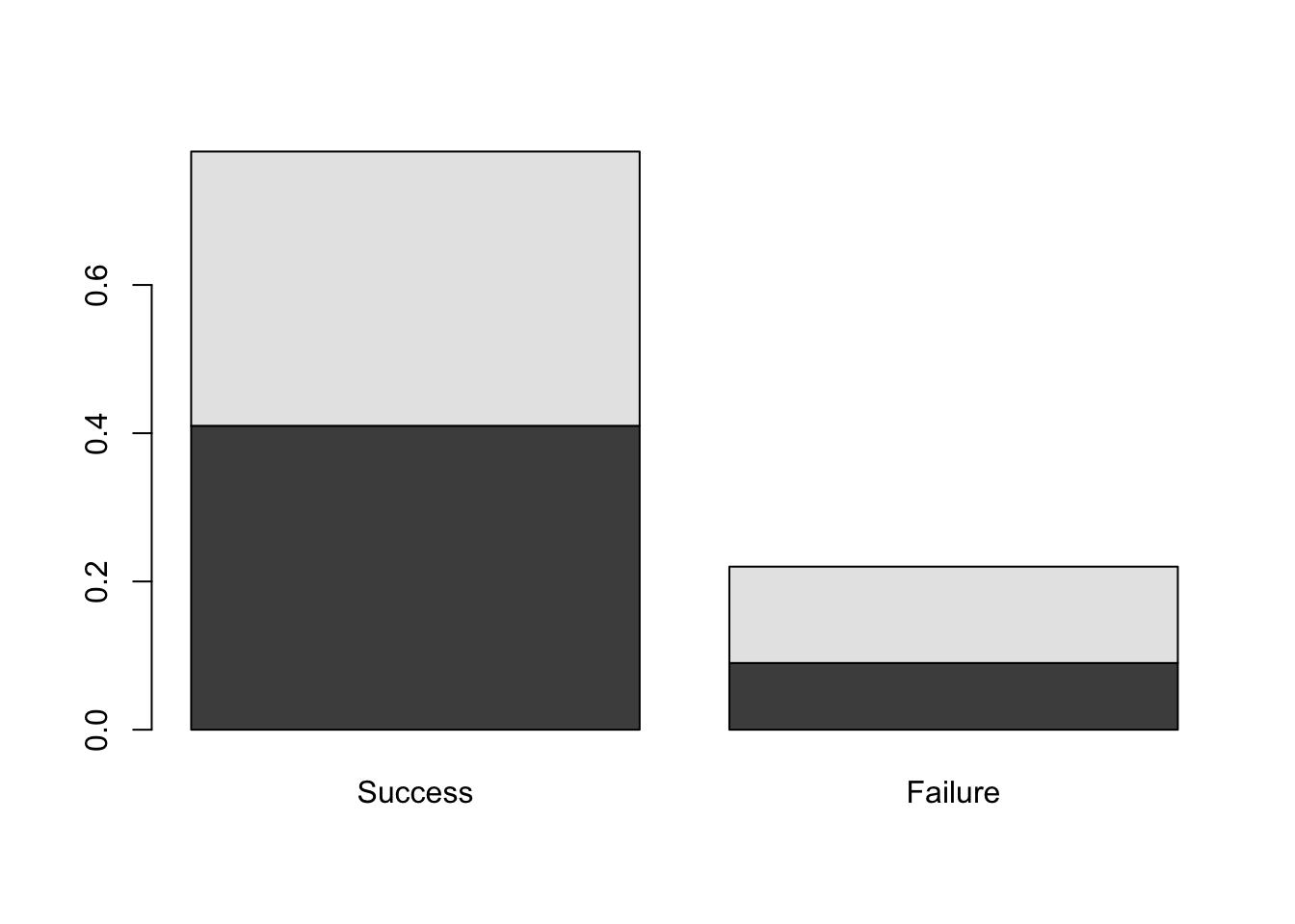
Figure 9.1: Barplots of the Dose-Result contingency table data.
We see the pair of barplots shown in Figure 9.1. In R, a matrix input to boxplot results in the column categories (in this case, Result) defining the bars while the row categories (Dose) form the stacked levels.
- Investigate the
densityargument of the functionbarplotby both running the commands below, and also looking in the help file.
par(mfrow=c(1,3))
barplot( DR_prop, density = 70 )
barplot( DR_prop, density = 30 )
barplot( DR_prop, density = 0 )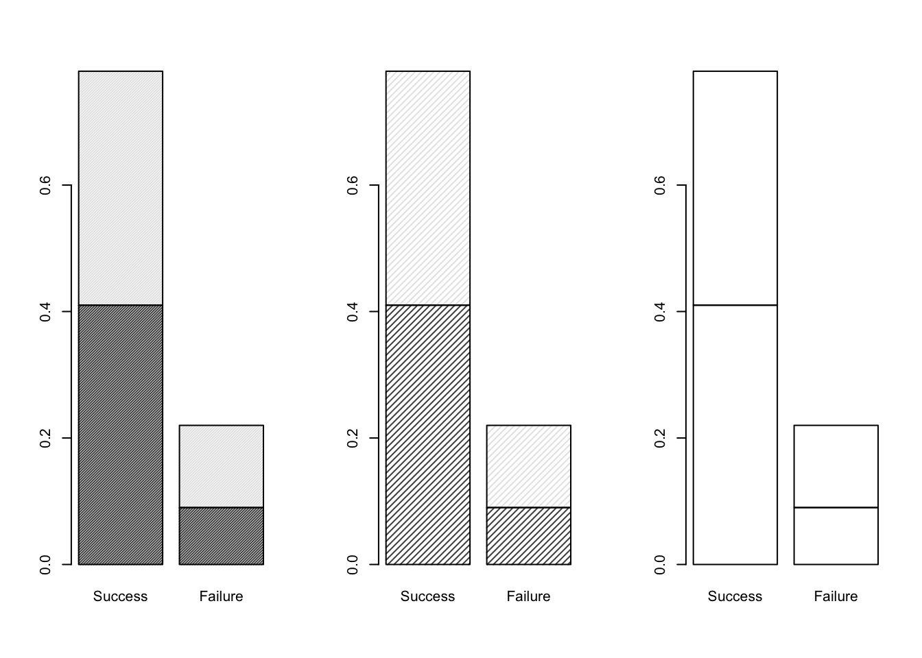
Figure 9.2: Barplots of the Dose-Result contingency table data, investigating the density parameter.
As illustrated in Figure 9.2, we can see that the density argument of boxplot changes the level of shading for the (two) categories defined by the rows (Dose) of the contingency table matrix.
- Add a title, and x- and y-axis labels, to the plot above.
We can achieve this with the code below, which yields the plot shown in Figure 9.3.
barplot( DR_prop, density = 30, main = "Comparison of Dose by Response",
         xlab = "treatment outcome", ylab = "proportions" )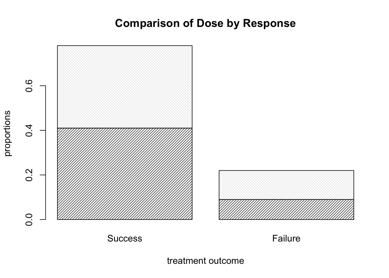
Figure 9.3: Barplots of the Dose-Result contingency table data, now with title and axis labels.
- Use the help file for
barplotto find out how to add a legend to the plot.
We set the argument legend.text to T. The code below thus yields the plot shown in Figure 9.4.
barplot( DR_prop, density = 30, legend.text = T,
         main = "Comparison of Dose by Response",
         xlab = "treatment outcome", ylab = "proportions" )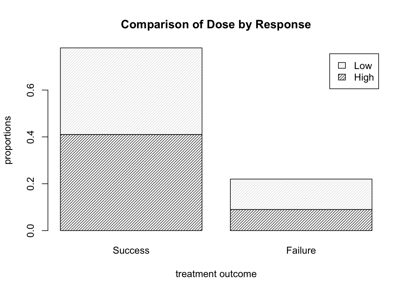
Figure 9.4: Barplots of the Dose-Result contingency table data, now with a legend.
- How would we alter the call to
barplotin order to view dose proportion levels conditional on result (instead of the overall proportions corresponding to each cell). You may wish to use some of the table manipulation commands from Section 8.1.1.
One possible solution is shown below, which yields the plot shown in Figure 9.5. Note that we can move the legend box using args.legend and setting the usual x and y location arguments for a legend within a list (that is, if we don’t want it covering up part of the plot itself). The exact necessary values of x and y depend on your plotting window.
barplot( prop.table( DR_data, 2 ), density = 30, legend.text = T,
         main = "Comparison of Dose by Response",
         xlab = "treatment outcome", ylab = "proportions",
         args.legend = list( x = 2.5, y = 1.25 )  )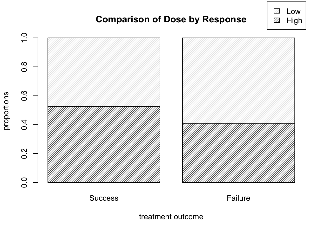
Figure 9.5: Barplots of dose level proportions corresponding to each treatment outcome.
- Suppose instead that we wish to display each dose level in a bar, with the proportion of successes and failures illustrated by the shading in each bar. How would we do that?
We can alter the code as shown below, which runs prop.table() on the transposed version of the matrix DR_data, and yields the plot shown in Figure 9.6.
barplot( prop.table( t( DR_data ), 2 ), density = 30, legend.text = T,
         main = "Comparison of Response by Dose",
         xlab = "dose level", ylab = "proportions",
         args.legend = list( x = 2.6, y = 1.25 ) )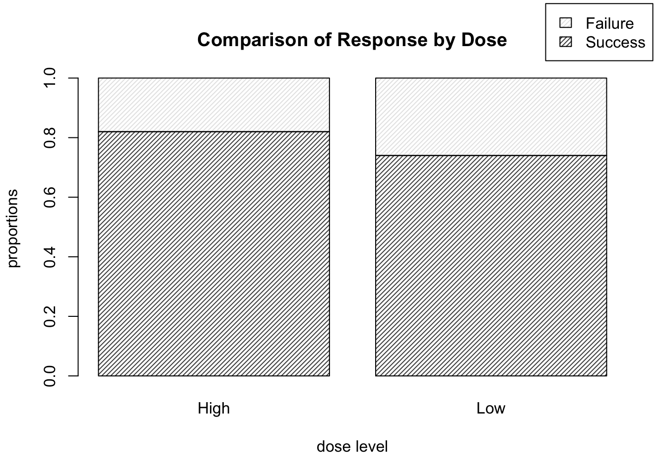
Figure 9.6: Barplots of treatment outcome proportions corresponding to each dose level.
This is of course the more informative way to display the data, as we are likely more interested in the relative proportion of high dose successes to low dose successes, rather than, say, the proportion of successes which happened to be high dose, for example.
9.1.4 Sieve Diagrams
We here provide solutions to the practical exercises of Section 8.1.3.3.
- Run
library(vcd)
sieve( DR_data )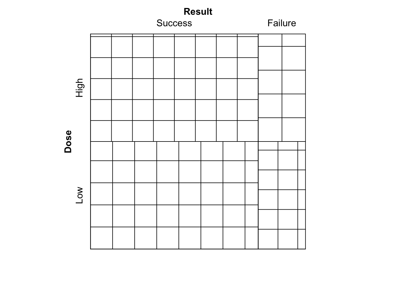
Figure 9.7: Sieve diagram comparing observed frequencies in relation to expected-under-independence frequencies for the Dose-Result data.
What is shown?
We see the plot given in Figure 9.7. A sieve (or parquet) diagram represents for an \(I \times J\) table the expected frequencies under independence as a collection of \(IJ\) rectangles, each containing a set of smaller squares/rectangles. Each of the larger rectangles has height and width proportional to the corresponding row and column marginal frequencies of the contingency table respectively. This way, the area of each rectangle is proportional to the expected-under-independence frequency for the corresponding cell. The number of smaller squares/rectangles in each larger rectangle corresponds to the observed frequency, hence a larger number of smaller squares indicate that the observed frequency was larger.
- Now run
sieve( DR_data, shade = T )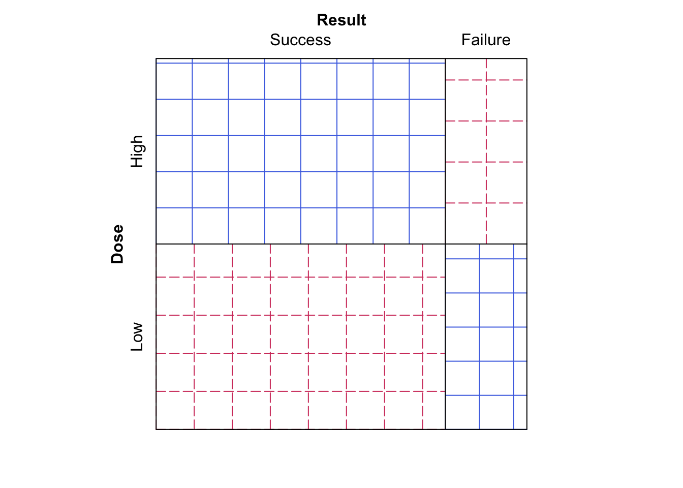
Figure 9.8: Sieve diagram comparing observed frequencies in relation to expected-under-independence frequencies for the Dose-Result data.
Does this make the data easier or harder to visualise?
We now see the plot given in Figure 9.8, which is the same plot as Figure 9.7, however now the observed frequency squares are coloured blue (undashed) if the observed frequency is larger than the expected frequency, and red (dashed) if the observed frequency is smaller than the expected frequency.
- Finally, run
sieve( DR_data, sievetype = "expected", shade = T )
Figure 9.9: Sieve diagram showing expected-under-independence frequencies for the Dose-Result data.
What is shown now?
The plot shown in Figure 9.9, which just shows the expected frequencies under independence for each cell.
9.1.5 Odds Ratios in R
We here provide solutions to the practical exercises of Section 8.1.4.
This section seeks to test your understanding of odds ratios for \(2 \times 2\) contingency tables, as well as your ability to write simple functions in R.
- Write a function to compute the odds ratio of the success of event A with probability
pAagainst the sucess of event B with probabilitypB.
Odds_Ratio <- function(pA, pB){(pA/(1-pA))/(pB/(1-pB))}
Odds_Ratio( 1/3, 1/2 ) # test the function.
## [1] 0.5- Write a function to compute the odds ratio for a \(2 \times 2\) contingency table. Test it on the Dose-response data above.
OR <- function( M ){ ( M[1,1] * M[2,2] ) / ( M[1,2] * M[2,1] ) }
OR( DR_data )
## [1] 1.600601# M is a 2 by 2 matrix representing contingency table cell counts. - Will there be an issue running your function from part (b) if exactly one of the cell counts of the supplied matrix is equal to zero?
Fine in this case as either 0 is returned if a cell count of 0 appears in the numerator of the odds ratio, or Inf is returned if a cell count of 0 is in the denominator of the odds ratio.
- What about if both cells of a particular row or column of the supplied matrix are equal to zero?
We have a problem as there will be a zero in both numerator and denominator of the odds ratio, which is undefined. For example, run…
AB <- matrix( c(3,4,0,0), ncol = 2 ) # Define such a matrix.
OR( AB ) # NaN returned.
## [1] NaN- We consider two possible options for amending the function in this case.
- First option: ensure that your function terminates and returns a clear error message of what has gone wrong and why when a zero would be found to be in both the numerator and denominator of the odds ratio. Hint: The command
stopcan be used to halt execution of a function and display an error message.
- First option: ensure that your function terminates and returns a clear error message of what has gone wrong and why when a zero would be found to be in both the numerator and denominator of the odds ratio. Hint: The command
OR_alt_1 <- function( M ){

  M_row_sum <- rowSums( M )
  M_col_sum <- colSums( M )

  if( prod( M_row_sum ) == 0 | prod( M_col_sum ) == 0 ){
    stop( "At least one row sum or column sum of M is equal
          to zero, hence the odds ratio is undefined." )
  }
  else{
    ( M[1,1] * M[2,2] ) / ( M[1,2] * M[2,1] )
  }
}

OR_alt_1( DR_data )  # works fine with DR_data
## [1] 1.600601OR_alt_1( AB ) # Execution is halted and our error returned.## Error in OR_alt_1(AB): At least one row sum or column sum of M is equal
## to zero, hence the odds ratio is undefined.- Second option: in the case that a row or column of zeroes is found, add 0.5 to each cell of the table before calculating the odds ratio in the usual way. Make sure that your function returns a clear warning (as opposed to error) message explaining that an alteration to the supplied table was made before calculating the odds ratio because there was a row or column of zeroes present. Hint: The command
warning()can be used to display a warning message (but not halt execution of the function).
- Second option: in the case that a row or column of zeroes is found, add 0.5 to each cell of the table before calculating the odds ratio in the usual way. Make sure that your function returns a clear warning (as opposed to error) message explaining that an alteration to the supplied table was made before calculating the odds ratio because there was a row or column of zeroes present. Hint: The command
OR_alt_2 <- function( M ){

  M_row_sum <- rowSums( M )
  M_col_sum <- colSums( M )

  if( prod( M_row_sum ) == 0 | prod( M_col_sum ) == 0 ){
    M <- M + 0.5 * matrix( 1, nrow = 2, ncol = 2 )
    OR <- ( M[1,1] * M[2,2] ) / ( M[1,2] * M[2,1] )
    warning( "At least one row sum or column sum of the supplied
             matrix M was equal to zero, hence an amendment of 0.5 was added
             to the value of each sum prior to calculating the odds ratio." )
    return( OR )
  }
  else{
    ( M[1,1] * M[2,2] ) / ( M[1,2] * M[2,1] )
  }
}

OR_alt_2( DR_data ) # works fine with DR_data
## [1] 1.600601OR_alt_2( AB ) # Alternative odds ratio calculated and warning returned.## Warning in OR_alt_2(AB): At least one row sum or column sum of the supplied
## matrix M was equal to zero, hence an amendment of 0.5 was added
## to the value of each sum prior to calculating the odds ratio.## [1] 0.77777789.1.6 Mushrooms
We here provide some possible analysis of the mushrooms data, with comments made in R, to get you started. The resulting barplots and sieve diagram are shown in Figures 9.10 and 9.11 respectively.
# We create a matrix with the data in.
mushroom_data <- matrix( c(101, 399, 57, 487,
                           12, 389, 150, 428 ), byrow = TRUE, ncol = 4 )

# Add dimension names as follows.
dimnames( mushroom_data ) <- list( Edibility = c("Edible", "Poisonous"),
                                   Cap_Shape = c("bell", "flat", "knobbed",
                                                 "convex/conical") )

# Have a look.
mushroom_data
## Cap_Shape
## Edibility bell flat knobbed convex/conical
## Edible 101 399 57 487
## Poisonous 12 389 150 428# Let's look at the proportion of each shape of mushroom that are
# edible or poisonous.
mushroom_table <- addmargins( mushroom_data, 2, FUN = mean )
mushroom_table <- prop.table( mushroom_table, 2 )
mushroom_table <- addmargins(mushroom_table, 1 )
mushroom_table## Cap_Shape
## Edibility bell flat knobbed convex/conical mean
## Edible 0.8938053 0.5063452 0.2753623 0.5322404 0.5160652
## Poisonous 0.1061947 0.4936548 0.7246377 0.4677596 0.4839348
## Sum 1.0000000 1.0000000 1.0000000 1.0000000 1.0000000# Let's perform a chi-square test.
chisq.test( mushroom_data )##
## Pearson's Chi-squared test
##
## data: mushroom_data
## X-squared = 113.84, df = 3, p-value < 2.2e-16# This matches the result found manually in the lectures.# Barplot
barplot( prop.table( mushroom_data, margin = 2 ), density = 50,
main = "Comparison of Edibility by Cap Shape", cex.main = 0.8,
xlab = "treatment outcome", ylab = "proportions",
legend.text = T, args.legend = list( x = 5.1, y = 1.25 ) )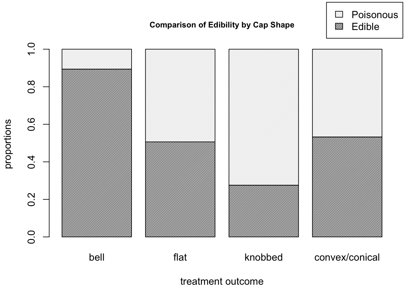
Figure 9.10: Barplots for the mushroom data of edibility proportions corresponding to each cap shape.
# Sieve diagram
sieve( mushroom_data  )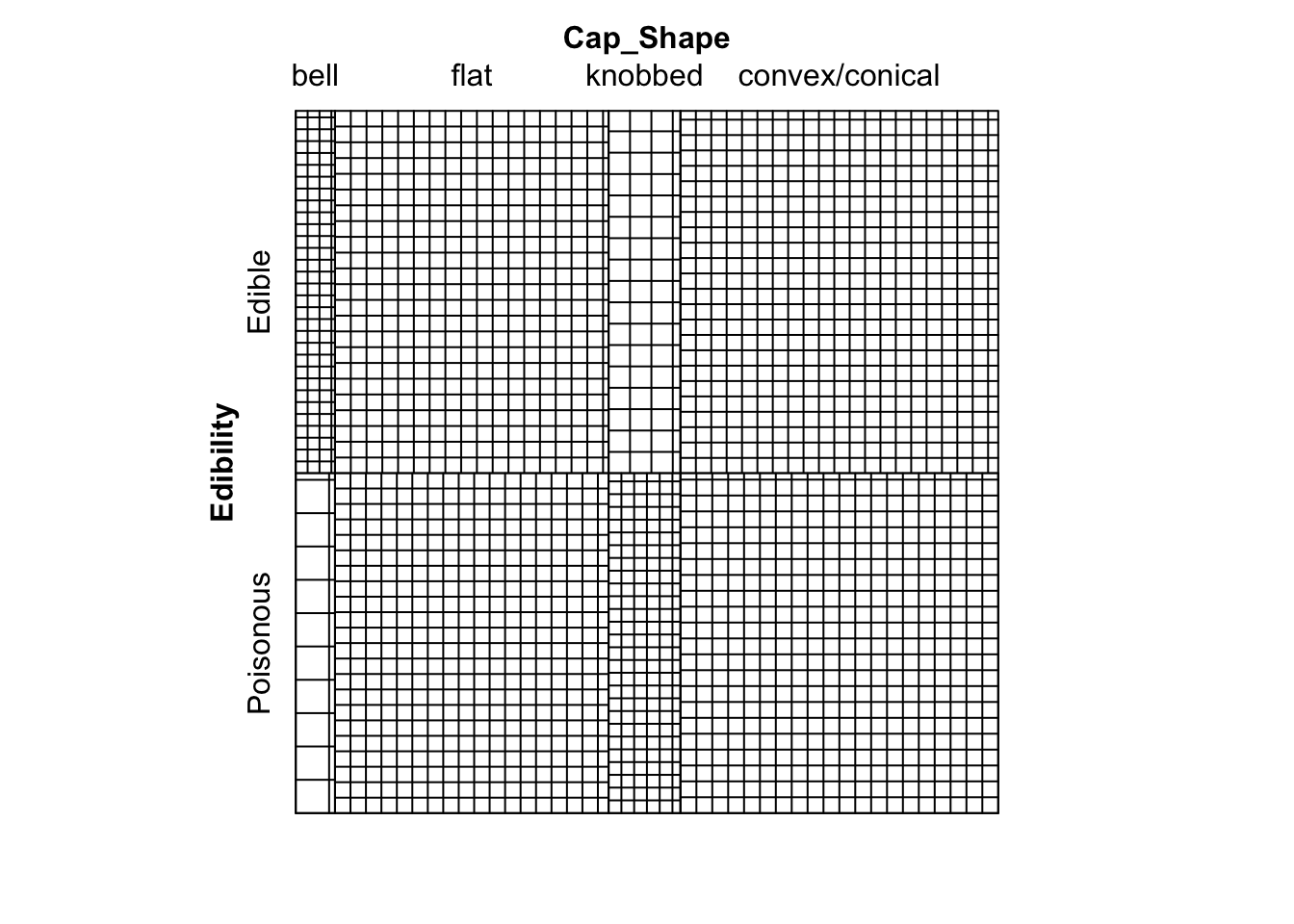
Figure 9.11: Sieve diagram showing expected-under-independence frequencies for the mushroom data.
# Much can be drawn form this diagram.  For example,
# we can see that there are far more edible bell mushrooms in our
# sample than would be expected under an assumption of independence.
9.2 Practical 2 - Contingency Tables
Practical 2 is designed to be exploratory, hence it is not possible to provide comprehensive solutions. We discuss some analysis of each dataset in accordance with the suggestions provided.
9.2.1 Mushrooms
Inputting the mushrooms data and some exploratory analysis was presented in Section 9.1.6.
We can assign the result of the \(\chi^2\) test to a named object as follows
chisq_Mush <- chisq.test( mushroom_data )
chisq_Mush
##
## Pearson's Chi-squared test
##
## data: mushroom_data
## X-squared = 113.84, df = 3, p-value < 2.2e-16This matches the result found manually in the lectures. Very strong evidence to reject the null hypothesis of independence between edibility and cap shape.
9.2.1.1 Residual Analysis
We can use the \(\chi^2\) test result to obtain Pearson residuals…
chisq_Mush$residuals## Cap_Shape
## Edibility bell flat knobbed convex/conical
## Edible 5.589590 -0.3798221 -4.820746 0.6810948
## Poisonous -5.772167 0.3922285 4.978209 -0.7033419…and also Adjusted residuals.
chisq_Mush$stdres## Cap_Shape
## Edibility bell flat knobbed convex/conical
## Edible 8.269282 -0.6987975 -7.314099 1.322946
## Poisonous -8.269282 0.6987975 7.314099 -1.322946Both residuals suggest that bell-capped mushrooms and knobbed-capped mushrooms contribute most towards the \(X^2\) statistic. For example, there are far more edible bell-capped mushrooms than would be expected if the two variables were independent.
9.2.1.2 GLR Test
We can apply the \(G^2\) GLR test on the mushroom data as follows.
G2mush <- G2( mushroom_data )
G2mush$p.value
## [1] 0G2mush$dev_res## Cap_Shape
## Edibility bell flat knobbed convex/conical
## Edible 10.53326 -3.895337 -8.462185 5.482674
## Poisonous -6.03326 3.933403 11.005295 -5.394469G2mush$Gij## Cap_Shape
## Edibility bell flat knobbed convex/conical
## Edible 110.94946 -15.17365 -71.60858 30.05971
## Poisonous -36.40022 15.47166 121.11651 -29.10030The \(p\)-value is close to 0, as expected, hence strong evidence to reject \(\mathcal{H}_0\). The deviance residuals are as calculated in lectures. Due to the relation between deviance residuals and the \(G^2\) statistic, classes of individual variables with large marginal sums of deviance residual values contribute most towards the \(G^2\) statistic. In this case, we again notice that the bell cap-shaped mushrooms have a larger contribution toward the \(G^2\) statistic, as evidenced by the large residual values, and also the large marginal sum in residual values over the two classes of edibility for bell-shaped caps.
9.2.2 Dose-Result Data
Input of data can be performed as follows:
DoseResult <- matrix( c(47, 25, 12,
                        36, 22, 18,
                        41, 60, 55), byrow = TRUE, ncol = 3 )

dimnames( DoseResult ) <- list( Dose=c("High",
                                       "Medium",
                                       "Low"),
                               Result=c("Success",
                                        "Partial",
                                        "Failure") )

DoseResultTable <- addmargins(DoseResult)
Functions for local and global odds ratios respectively, then applied on the Dose-Result data to produce the results obtained in lectures, are:
local_OR <- function( M ){

  # I and J
  I <- nrow(M)
  J <- ncol(M)

  # Odds ratio matrix.
  OR_local <- matrix( NA, nrow = I-1, ncol = J-1 )
  for( i in 1:(I-1) ){
    for( j in 1:(J-1) ){
      OR_local[i,j] <- OR( M = M[c(i,i+1), c(j,j+1)] )
    }
  }

  return(OR_local)

}

global_OR <- function( M ){

  # I and J
  I <- nrow(M)
  J <- ncol(M)

  # Odds ratio matrix.
  OR_global <- matrix( NA, nrow = I-1, ncol = J-1 )
  for( i in 1:(I-1) ){
    for( j in 1:(J-1) ){
      OR_global[i,j] <- OR( M = matrix( c( sum( M[1:i,1:j] ),
                                           sum( M[(i+1):I,1:j] ),
                                           sum( M[1:i,(j+1):J] ),
                                           sum( M[(i+1):I,(j+1):J] ) ),
                                           nrow = 2 ) )
    }
  }

  return(OR_global)

}

local_OR( DoseResult )
## [,1] [,2]
## [1,] 1.148889 1.704545
## [2,] 2.394678 1.120370global_OR( DoseResult )## [,1] [,2]
## [1,] 2.557038 2.754717
## [2,] 3.023440 2.359736A plot of multiple fourfold plots can be obtained using the following function, then applied on the Dose-Result data to produce the plots shown in Figure 9.12.
ffold_local <- function ( data ){

  # I and J
  I <- nrow(data)
  J <- ncol(data)

  par( mfrow = c(I-1, J-1) )
  for( i in 1:(I-1) ){
    for( j in 1:(J-1) ){
      sub_data <- data[c(i,i+1),c(j,j+1)]
      fourfoldplot( sub_data )
    }
  }

}

# Apply fourfold local OR plot function.
ffold_local( DoseResult )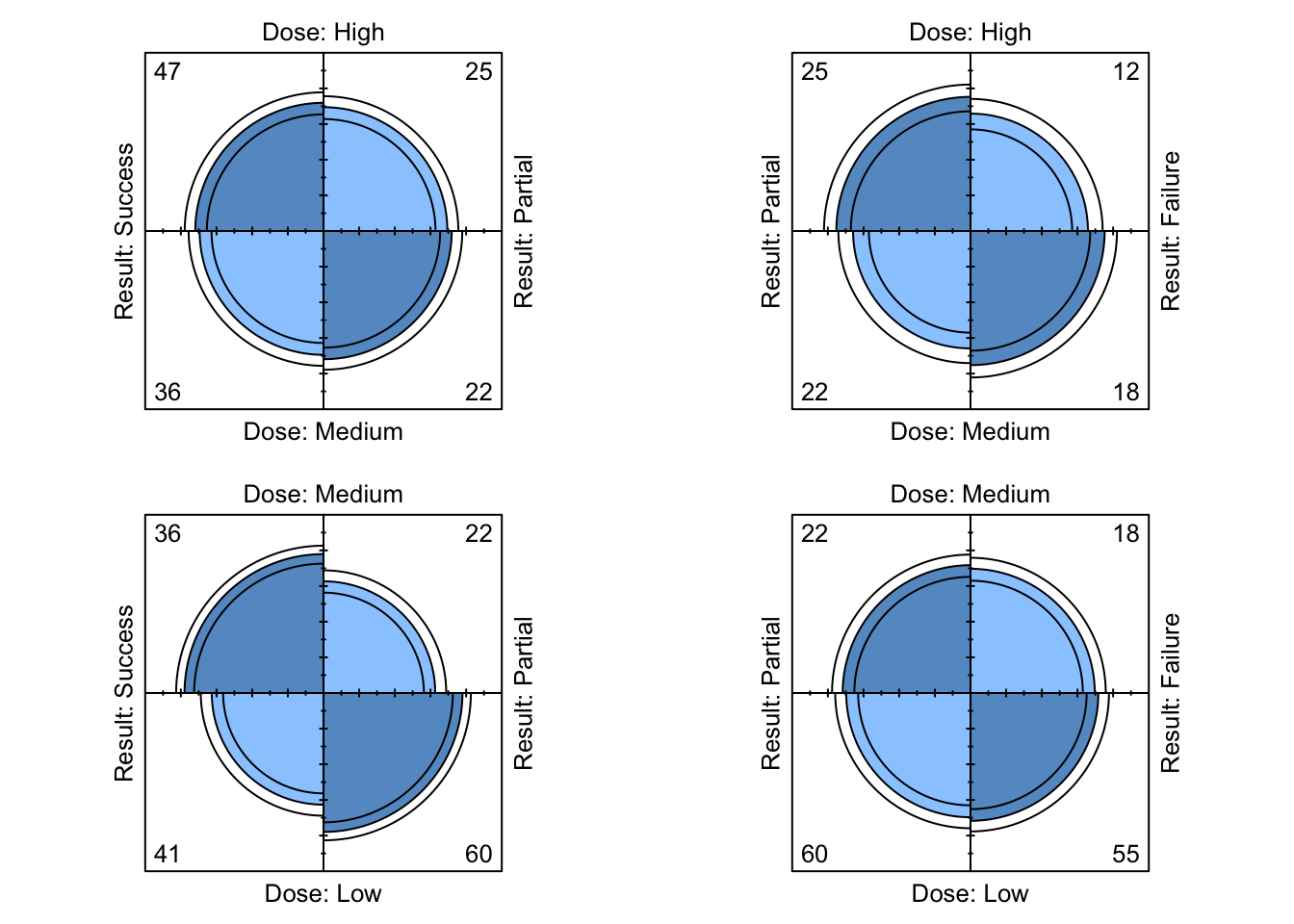
Figure 9.12: Four-fold plots of Dose-Result data
To compute the statistic for the linear trend test manually, we could…
score_x <- 1:3
score_y <- 1:3

score_xy <- crossprod( t(score_x), t(score_y) )
n <- sum(DoseResult)

sum_xy <- sum( score_xy * DoseResult )
sum_x <- sum( score_x * rowSums(DoseResult) )
sum_y <- sum( score_y * colSums(DoseResult) )
sum_x2 <- sum( score_x^2 * rowSums(DoseResult) )
sum_y2 <- sum( score_y^2 * colSums(DoseResult) )

rxy <- ( n * sum_xy - sum_x * sum_y ) / ( sqrt( n * sum_x2 - sum_x^2 ) *
                                            sqrt( n * sum_y2 - sum_y^2 ) )

M2 <- (n-1) * rxy^2

p.value <- 1-pchisq(M2,1)
Or using the function provided we can simply do
linear.trend( table = DoseResult, x = score_x, y = score_y ) ## $r
## [1] 0.2709127
##
## $M2
## [1] 23.11902
##
## $p.value
## [1] 1.522773e-06yielding the same result. The test provides evidence to reject the null hypothesis of independence between the two variables.
9.2.3 Titanic
A partial table cross-classifying Class and Sex for Age = Child and Survived = No can be obtained in the usual way of selecting particular elements of an array.
Titanic[,, Age="Child", Survived="No"]## Sex
## Class Male Female
## 1st 0 0
## 2nd 0 0
## 3rd 35 17
## Crew 0 0Marginal tables are produced using margin.table() with argument margin denoting the variables of interest (that is, those to still be included in the table). For example, a marginal table of Class and Sex summing over margins 3 and 4 (Age and Survived, thus ignoring them), and a marginal vector for Survived, are obtained as follows
margin.table( Titanic, margin = c(1,2) )## Sex
## Class Male Female
## 1st 180 145
## 2nd 179 106
## 3rd 510 196
## Crew 862 23margin.table( Titanic, margin = 4 )## Survived
## No Yes
## 1490 711We can use previous odds ratio functions on relevant \(2\times2\) marginal/partial tables.
Note that whether we can treat Class as ordinal is debatable, depending on how category Crew might fit into that. If we feel that we can treat Class as ordinal, then global Odds ratios might also be applicable. We calculate nominal, local and global marginal odds ratios for Class and Sex having marginalised over Age and Survived.
nominal_OR( margin.table( Titanic, margin = c(1,2) ) )## [,1]
## [1,] 0.03312265
## [2,] 0.04505757
## [3,] 0.06942800local_OR( margin.table( Titanic, margin = c(1,2) ) )## [,1]
## [1,] 0.7351185
## [2,] 0.6489826
## [3,] 0.0694280global_OR( margin.table( Titanic, margin = c(1,2) ) )## [,1]
## [1,] 0.26012139
## [2,] 0.22830253
## [3,] 0.05187198The nominal marginal odds ratios reflect the fact the proportion of men (or more, precisely, the odds that a randomly selected person of a particular Class is a man) is much lower for all other levels of Class relative to Crew.
Both local and global marginal odds ratios provide evidence that there is an association between Class and Sex, particularly for Crew in comparison with any of the other levels.
For calculating global odds ratios, we here treat Crew as the fourth category of an ordinal variable Class following on from 3rd.
This position in the ordinal ranking (as opposed to being otherwise positioned in the Class ordering) vastly influences the global odds ratios (but less so the local ones, which are applicable for nominal variables anyway).
A Chi square test for independence of Class and Survival, marginalising
over Sex and Age, is obtained by
chisq.test( margin.table( Titanic, margin = c(1,4) ) )##
## Pearson's Chi-squared test
##
## data: margin.table(Titanic, margin = c(1, 4))
## X-squared = 190.4, df = 3, p-value < 2.2e-16# An unsurprising overwhelming amount of evidence
# that these two are associated.A linear trend test - applicability depends if we feel that we can treat Class as an ordinal variable.
linear.trend( table = margin.table( Titanic, margin = c(1,4) ),
              x = 1:4, y = 1:2 )
## $r
## [1] -0.2713954
##
## $M2
## [1] 162.042
##
## $p.value
## [1] 0A sieve and mosaic plot could be obtained by running the following commands.
sieve( Titanic )
mosaic( Titanic )
9.3 Practical 3 - Contingency Tables and LLMs
9.3.1 Titanic
The command created a sub-table by marginalising over
Ageand then permuting the dimension order, so that we now have a \(2 \times 2 \times 4\) contingency table array.Mantel Haenszel Test carried out as follows (continuity correction can be applied similar to previous tests).
mantelhaen.test( TitanicA, correct = FALSE )##
## Mantel-Haenszel chi-squared test without continuity correction
##
## data: TitanicA
## Mantel-Haenszel X-squared = 362.67, df = 1, p-value < 2.2e-16
## alternative hypothesis: true common odds ratio is not equal to 1
## 95 percent confidence interval:
## 8.232629 14.185153
## sample estimates:
## common odds ratio
## 10.80653An unsurprisingly very small \(p\)-value giving evidence that Sex and Survived are not conditionally independent given Class.
- The Fourfold plot given in Figure 9.13 is generated as follows.
par(mfrow = c(1,1))
fourfoldplot( TitanicA )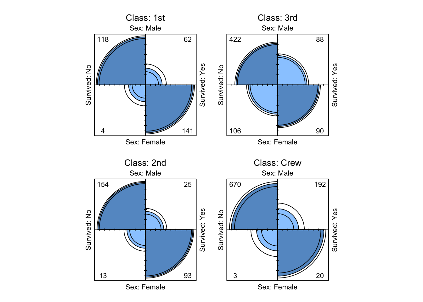
Figure 9.13: Four-fold plots of Titanic data
Visual evidence that Sex and Survived are not conditionally independent
given Class.
The submatrix marginalises out
Ageand only considers interest to lie in subjects in either of the two categories3rdorCrewforClass. Note that we do this because parts (e) and (f) consider the question of whether subjects in 3rd class or crew had a greater probability of survival.We marginalise over
Sexas follows and calculate the odds ratio:
TitanicB_margin <- margin.table( TitanicB, c(1,3) )
OR( TitanicB_margin )
## [1] 0.9344041This suggests that 3rd class passengers had greater odds
of survival than did Crew. (Note that the Odds Ratio is defined in terms of the odds
of “Surviving: No” in this case).
- Now condition on gender and calculate the odds ratios.
OR( TitanicB[,1,] )## [1] 1.37422OR( TitanicB[,2,] )## [1] 7.851852Both of these are positive, suggesting that both Male and Female
Crew had greater odds of survival than did Male
or Female 3rd class passengers respectively.
By looking at the appropriate marginal and conditional tables…
prop.table( TitanicB_margin, margin = 1 )## Survived
## Class No Yes
## 3rd 0.7478754 0.2521246
## Crew 0.7604520 0.2395480prop.table( TitanicB[,1,], margin = 1 )## Survived
## Class No Yes
## 3rd 0.8274510 0.1725490
## Crew 0.7772622 0.2227378prop.table( TitanicB[,2,], margin = 1 )## Survived
## Class No Yes
## 3rd 0.5408163 0.4591837
## Crew 0.1304348 0.8695652we can see that indeed the proportion of 3rd class passengers surviving
overall was greater than that for Crew, however, when we condition on gender,
a higher proportion of Male and Female Crew survived than did Male
or Female 3rd Class passengers respectively.
This apparent contradiction occurs because the relationship between survival and class is influenced by the confounding variable Sex, which we ignore in the table marginalising over Sex.
The conditional probability tables show that the survival rate was much lower for men compared to women on board the Titanic (perhaps because of the “women and children first” policy) when it came to getting a seat on a lifeboat. If we compare the row-proportional marginal table over survival…
prop.table( margin.table( TitanicB, margin = c(1,2) ), margin = 1 )## Sex
## Class Male Female
## 3rd 0.7223796 0.2776204
## Crew 0.9740113 0.0259887… this shows that there were a greater proportion of women in third class than in the crew – more than a quarter of third class passengers were women whereas less than \(3\%\) of the crew were Female. In this case, the difference in the proportion of women amongst the third class passengers and crew has a substantial impact on the overall survival rate for each group and has the unfortunate effect of masking the third class passengers vs crew effect when gender is ignored in the original table. Hence we have an example of Simpson’s Paradox, where trends within sub-populations can be reversed when the data are aggregated.
9.3.2 Log linear Models: Titanic
- Explicitly fit several models (i.e. without using the
stepfunction), including the independence model and the fully saturated model. Comment on your findings.
The independence model is fitted as follows:
( Titanic.I.fit <- loglm( ~ Class + Survived + Sex + Age, data=Titanic ) )## Call:
## loglm(formula = ~Class + Survived + Sex + Age, data = Titanic)
##
## Statistics:
## X^2 df P(> X^2)
## Likelihood Ratio 1243.663 25 0
## Pearson 1637.445 25 0Unsurprisingly, very strong evidence that Class, Sex and Survived are not all mutually independent.
The fully saturated model is fitted as follows:
( Titanic.sat.fit <- loglm( ~ Class*Survived*Sex*Age, data=Titanic ) )## Call:
## loglm(formula = ~Class * Survived * Sex * Age, data = Titanic)
##
## Statistics:
## X^2 df P(> X^2)
## Likelihood Ratio 0 0 1
## Pearson NaN 0 1Note the NaN appears under Pearson because the chi-squared statistic is ill-defined if there are expected values equal to zero.
- Pick two distinct nested models, and calculate the \(G^2\) likelihood ratio test statistic testing the hypothesis \(\mathcal{H}_0: \, \mathcal{M}_0\) against alternative \(\mathcal{H}_1: \, \mathcal{M}_1\).
Let’s consider \(\mathcal{H}_0: \, \mathcal{M}_0\) to be the all two-way interactions model and the \(\mathcal{H}_1: \, \mathcal{M}_1\) to be the all three-way interactions model. Then we have that:
( Three.fit <- loglm( ~ Class*Survived*Sex
                      + Class*Survived*Age
                      + Class*Sex*Age
                      + Survived*Sex*Age, data = Titanic ) )
## Call:
## loglm(formula = ~Class * Survived * Sex + Class * Survived *
## Age + Class * Sex * Age + Survived * Sex * Age, data = Titanic)
##
## Statistics:
## X^2 df P(> X^2)
## Likelihood Ratio 0.0001904416 3 0.9999993
## Pearson NaN 3 NaN( Two.fit <- loglm( ~ Class*Survived + Survived*Sex
+ Survived*Age + Class*Sex
+ Sex*Age + Class*Age, data = Titanic ) ) ## Call:
## loglm(formula = ~Class * Survived + Survived * Sex + Survived *
## Age + Class * Sex + Sex * Age + Class * Age, data = Titanic)
##
## Statistics:
## X^2 df P(> X^2)
## Likelihood Ratio 116.5881 13 0
## Pearson NaN 13 NaN( Titanic.DG2 <- Two.fit$deviance - Three.fit$deviance )## [1] 116.5879# The p-value for testing H_0: M_0 against alternative H_1: M_1 is then given by
( p.value <- 1 - pchisq(Titanic.DG2, 10) )## [1] 0# Evidence of three-way interactions between the variables.- Use backwards selection to fit a log-linear model using AIC. Which model is chosen? What does this tell you?
step( Titanic.sat.fit, direction="backward", test = "Chisq" )## Start: AIC=64
## ~Class * Survived * Sex * Age
##
## Df AIC LRT Pr(>Chi)
## - Class:Survived:Sex:Age 3 58 0.00019044 1
## <none> 64
##
## Step: AIC=58
## ~Class + Survived + Sex + Age + Class:Survived + Class:Sex +
## Survived:Sex + Class:Age + Survived:Age + Sex:Age + Class:Survived:Sex +
## Class:Survived:Age + Class:Sex:Age + Survived:Sex:Age
##
## Df AIC LRT Pr(>Chi)
## - Survived:Sex:Age 1 57.685 1.685 0.1942
## <none> 58.000
## - Class:Sex:Age 3 61.783 9.783 0.0205 *
## - Class:Survived:Age 3 89.263 37.262 4.049e-08 ***
## - Class:Survived:Sex 3 117.013 65.013 4.984e-14 ***
## ---
## Signif. codes: 0 '***' 0.001 '**' 0.01 '*' 0.05 '.' 0.1 ' ' 1
##
## Step: AIC=57.69
## ~Class + Survived + Sex + Age + Class:Survived + Class:Sex +
## Survived:Sex + Class:Age + Survived:Age + Sex:Age + Class:Survived:Sex +
## Class:Survived:Age + Class:Sex:Age
##
## Df AIC LRT Pr(>Chi)
## <none> 57.685
## - Class:Sex:Age 3 71.953 20.268 0.0001494 ***
## - Class:Survived:Age 3 95.899 44.214 1.359e-09 ***
## - Class:Survived:Sex 3 126.904 75.219 3.253e-16 ***
## ---
## Signif. codes: 0 '***' 0.001 '**' 0.01 '*' 0.05 '.' 0.1 ' ' 1## Call:
## loglm(formula = ~Class + Survived + Sex + Age + Class:Survived +
## Class:Sex + Survived:Sex + Class:Age + Survived:Age + Sex:Age +
## Class:Survived:Sex + Class:Survived:Age + Class:Sex:Age,
## data = Titanic, evaluate = FALSE)
##
## Statistics:
## X^2 df P(> X^2)
## Likelihood Ratio 1.685426 4 0.7933632
## Pearson NaN 4 NaNWe can see the backwards stepwise process of sequentially removing terms from the saturated model one-by-one until the model listed under Call: is finally chosen. In this case, we can see that we have all two-way interaction terms, and all three-way interaction terms except that corresponding to Survived, Age and Sex, thus suggesting that these three variable exhibit homogeneous associations amongst each other when conditioning on Class.
- Use Forwards selection to fit a log-linear model using BIC (look in the help file for
stepif you are unsure how to do this). Do you get a different model to that found in part (c)? If so, is this due to the change in model selection criterion or stepwise selection direction?
n <- sum( Titanic )
step( Titanic.I.fit, scope = ~ Class*Survived*Sex*Age, direction="forward",
      test = "Chisq", k = log(n) )
## Start: AIC=1297.54
## ~Class + Survived + Sex + Age
##
## Df AIC LRT Pr(>Chi)
## + Survived:Sex 1 870.77 434.47 < 2.2e-16 ***
## + Class:Sex 3 908.03 412.60 < 2.2e-16 ***
## + Class:Survived 3 1139.73 180.90 < 2.2e-16 ***
## + Class:Age 3 1172.30 148.33 < 2.2e-16 ***
## + Sex:Age 1 1281.95 23.28 1.398e-06 ***
## + Survived:Age 1 1285.68 19.56 9.746e-06 ***
## <none> 1297.54
## ---
## Signif. codes: 0 '***' 0.001 '**' 0.01 '*' 0.05 '.' 0.1 ' ' 1
##
## Step: AIC=870.77
## ~Class + Survived + Sex + Age + Survived:Sex
##
## Df AIC LRT Pr(>Chi)
## + Class:Sex 3 481.26 412.60 < 2.2e-16 ***
## + Class:Survived 3 712.96 180.90 < 2.2e-16 ***
## + Class:Age 3 745.53 148.33 < 2.2e-16 ***
## + Sex:Age 1 855.18 23.28 1.398e-06 ***
## + Survived:Age 1 858.90 19.56 9.746e-06 ***
## <none> 870.77
## ---
## Signif. codes: 0 '***' 0.001 '**' 0.01 '*' 0.05 '.' 0.1 ' ' 1
##
## Step: AIC=481.26
## ~Class + Survived + Sex + Age + Survived:Sex + Class:Sex
##
## Df AIC LRT Pr(>Chi)
## + Class:Age 3 356.02 148.327 < 2.2e-16 ***
## + Class:Survived 3 398.27 106.075 < 2.2e-16 ***
## + Sex:Age 1 465.67 23.284 1.398e-06 ***
## + Survived:Age 1 469.39 19.561 9.746e-06 ***
## <none> 481.26
## ---
## Signif. codes: 0 '***' 0.001 '**' 0.01 '*' 0.05 '.' 0.1 ' ' 1
##
## Step: AIC=356.02
## ~Class + Survived + Sex + Age + Survived:Sex + Class:Sex + Class:Age
##
## Df AIC LRT Pr(>Chi)
## + Class:Survived 3 273.03 106.075 < 2.2e-16 ***
## + Survived:Age 1 352.71 11.008 0.0009071 ***
## <none> 356.02
## + Sex:Age 1 357.63 6.086 0.0136259 *
## ---
## Signif. codes: 0 '***' 0.001 '**' 0.01 '*' 0.05 '.' 0.1 ' ' 1
##
## Step: AIC=273.03
## ~Class + Survived + Sex + Age + Survived:Sex + Class:Sex + Class:Age +
## Class:Survived
##
## Df AIC LRT Pr(>Chi)
## + Class:Survived:Sex 3 230.94 65.180 4.591e-14 ***
## + Survived:Age 1 255.15 25.583 4.237e-07 ***
## <none> 273.03
## + Sex:Age 1 274.64 6.086 0.01363 *
## ---
## Signif. codes: 0 '***' 0.001 '**' 0.01 '*' 0.05 '.' 0.1 ' ' 1
##
## Step: AIC=230.94
## ~Class + Survived + Sex + Age + Survived:Sex + Class:Sex + Class:Age +
## Class:Survived + Class:Survived:Sex
##
## Df AIC LRT Pr(>Chi)
## + Survived:Age 1 213.06 25.583 4.237e-07 ***
## <none> 230.94
## + Sex:Age 1 232.56 6.086 0.01363 *
## ---
## Signif. codes: 0 '***' 0.001 '**' 0.01 '*' 0.05 '.' 0.1 ' ' 1
##
## Step: AIC=213.06
## ~Class + Survived + Sex + Age + Survived:Sex + Class:Sex + Class:Age +
## Class:Survived + Survived:Age + Class:Survived:Sex
##
## Df AIC LRT Pr(>Chi)
## + Class:Survived:Age 3 206.94 29.2063 2.027e-06 ***
## <none> 213.06
## + Sex:Age 1 220.62 0.1356 0.7127
## ---
## Signif. codes: 0 '***' 0.001 '**' 0.01 '*' 0.05 '.' 0.1 ' ' 1
##
## Step: AIC=206.94
## ~Class + Survived + Sex + Age + Survived:Sex + Class:Sex + Class:Age +
## Class:Survived + Survived:Age + Class:Survived:Sex + Class:Survived:Age
##
## Df AIC LRT Pr(>Chi)
## <none> 206.94
## + Sex:Age 1 214.37 0.26868 0.6042## Call:
## loglm(formula = ~Class + Survived + Sex + Age + Survived:Sex +
## Class:Sex + Class:Age + Class:Survived + Survived:Age + Class:Survived:Sex +
## Class:Survived:Age, data = Titanic, evaluate = FALSE)
##
## Statistics:
## X^2 df P(> X^2)
## Likelihood Ratio 22.22167 8 0.004521358
## Pearson NaN 8 NaNWe can see the forwards stepwise process of sequentially adding terms from the first-order linear model one-by-one until the model listed under Call: is finally chosen. In this case, we can see that we have all two-way interaction terms except that between Sex and Age, and all possible three-way interactions based on this given that the model must be hierarchical. This model suggests that Sex and Age are conditionally independent given Class and Survived. It is likely that this change in model selection choice is due to the change of criteria (i.e. BIC rather than AIC), although the selection method can have an effect.
9.4 Practical 4 - Binary Regression
9.4.1 Space Shuttle Flights
The dataset shuttle describes, for \(n = 23\) space shuttle flights before the Challenger disaster in 1986, the temperature in \(\,^{\circ}F\) at the time of take-off, as well as the occurrence or non-occurrence of a thermal overstrain of a certain component (the famous O-ring). The data set contains the variables:
flight- flight numbertemp- temperature in \(\,^{\circ}F\)td- thermal overstrain (\(1=\)yes, \(0=\)no)
- Fit a linear model (with the temperature as covariate) using the R function
lm. Produce a plot which displays the data, as well as the fitted probabilities of thermal overstrain. Why does this model not provide a satisfactory description of the data?
We fit the linear model, and produce the required plot (shown in Figure 9.14), as follows:
shuttle.lm <- lm(td~temp, data=shuttle)
plot(td~temp, data=shuttle, ylab="overstrain")
abline(shuttle.lm)
The model does not provide a satisfactory desciption of the data because the fitted function could produce probabilities for overstrain that do not lie in the range \([0,1]\) - these being meaningless.
- Fit a logistic regression model to these data, with logit link function, using function
glm.
We fit a logistic regression model as follows:
( shuttle.glm <- glm(td~temp, data=shuttle, family=binomial(link="logit")) )##
## Call: glm(formula = td ~ temp, family = binomial(link = "logit"), data = shuttle)
##
## Coefficients:
## (Intercept) temp
## 15.0429 -0.2322
##
## Degrees of Freedom: 22 Total (i.e. Null); 21 Residual
## Null Deviance: 28.27
## Residual Deviance: 20.32 AIC: 24.32- Extract the model parameters from the logistic regression model. Write a function for the expected probability of thermal overstrain
tdin terms oftempexplicitly (that is, \(\hat{P}(\textrm{td|temp})\)) using your knowledge of logistic regression models, and add its graph to the plot created in part (a).
We extract the model parameters as follows:
( coefficients <- as.numeric(shuttle.glm$coef) )## [1] 15.0429016 -0.2321627where the as.numeric part just allows us to use the coefficients exactly and easily in the function below.
We hence have that \[\begin{equation} \textrm{logit}(\textrm{td|temp}) = \log( \hat{P}(\textrm{td|temp}) / (1 - \hat{P}(\textrm{td|temp})) ) = \beta_1 + \beta_2 \textrm{temp} \tag{9.1} \end{equation}\] with \(\beta_1 = 15.0429\) and \(\beta_2 = -0.2322\).
Each additional degree farenheit will reduce the odds of thermal overstrain by the factor \(e^{-0.2322} = 0.7928\).
The intercept parameter would be interpreted as the estimated odds of thermal overstrain for a temperature of 0 degrees farenheit.
To write a function that returns \(\hat{P}(\textrm{td|temp})\), we first rearrange Equation (9.1) as follows: \[\begin{equation} \hat{P}(td) = \frac{\exp(\beta_1 + \beta_2 \textrm{temp})}{1 + \exp(\beta_1 + \beta_2 \textrm{temp})} \end{equation}\] Now we need to write a function that returns this probability for any value of the covariate temperature.
shuttle.fit <- function(temp){
  exp(coefficients[1] + coefficients[2] * temp) /
             ( 1 + exp(coefficients[1] + coefficients[2] * temp) )
}
where coefficients is here assumed to be taken from the global environment. To avoid needing to make this assumption (which has risks), we could require the model to be explicitly specified as a function argument as well, that is
shuttle.fit2 <- function(temp, model){
  coefficients <- as.numeric(model$coef)
  exp(coefficients[1] + coefficients[2] * temp) /
           ( 1 + exp(coefficients[1] + coefficients[2] * temp) )
}
or as a third option we could write a function explicitly using the specific values of beta found above.
Using the second option, we use the following lines of code to add the model fit to the plot:
lines(30:90, shuttle.fit2(30:90, model = shuttle.glm), lty = 2)
legend(70, 0.8, c("Linear model", "Logistic model"), lty=c(1,2))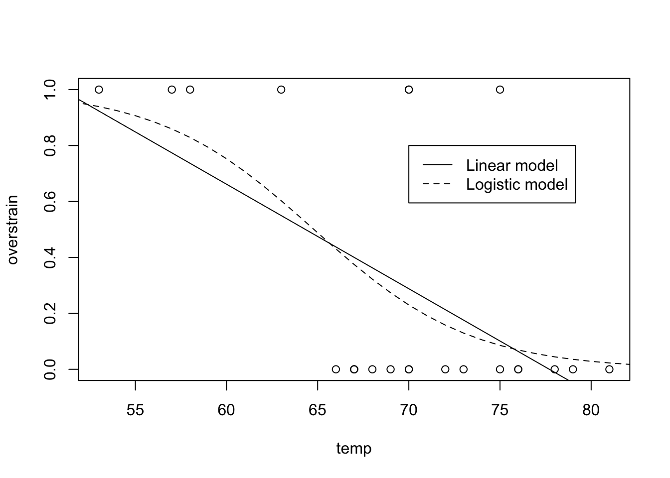
Figure 9.14: Shuttle data and required model fits for Practical 4.
- According to this model, at what temperature is the probability of thermal overstrain exactly equal to \(0.5\)?
Take the inverse of the expression for \(\hat{P}(\textrm{td|temp})\):
shuttle.fit.inverse <- function(prob, model){
  coefficients <- as.numeric(model$coef)
  (log( prob / ( 1- prob ) ) - coefficients[1]) / coefficients[2]
}
shuttle.fit.inverse(0.5, model = shuttle.glm )
## [1] 64.79464For this model, a temperature of 64.795 has a predicted probability of thermal overstrain of \(0.5\).
- On the day of the Challenger disaster, the temperature was \(31^{\circ}F\). Use your model to predict the probability of thermal overstrain on that day.
shuttle.fit2(31, model = shuttle.glm)## [1] 0.9996088The probability of thermal overstrain is predicted to be very high. As an aside, the commission that investigated the cause of the accident indeed found that a thermal overstrain in the so-called O-Rings was responsible for the disaster.
- Replace the
logitlink by aprobitlink, and repeat the above analysis for this choice of link function.
Fit a probit model and find the coefficient values as follows:
( shuttle.glm2 <- glm(td~temp, data=shuttle, family=binomial(link="probit")) )##
## Call: glm(formula = td ~ temp, family = binomial(link = "probit"),
## data = shuttle)
##
## Coefficients:
## (Intercept) temp
## 8.7749 -0.1351
##
## Degrees of Freedom: 22 Total (i.e. Null); 21 Residual
## Null Deviance: 28.27
## Residual Deviance: 20.38 AIC: 24.38shuttle.glm2$coef## (Intercept) temp
## 8.7749032 -0.1350958In this case we have that \[\begin{eqnarray} \hat{P}(\textrm{td}| \textrm{temp}) & = & \Phi( \hat{\beta}_1 + \hat{\beta}_2 \textrm{temp}) \\ \hat{\beta}_1+ \hat{\beta}_2\textrm{temp} & = & \Phi^{-1}(\hat{P}(\textrm{td}| \textrm{temp})) \\ \textrm{temp} & = & \frac{\Phi^{-1}(\hat{P}(\textrm{td}| \textrm{temp}) - \hat{\beta}_1}{\hat{\beta}_2} \end{eqnarray}\]
We can code these expressions into R functions as follows.
shuttle.fit.probit <- function( temp, model ){
  coefficients <- as.numeric(model$coef)
  pnorm(coefficients[1] + coefficients[2] * temp)
}
shuttle.fit.probit.inverse <- function( prob, model ){
  coefficients <- as.numeric(model$coef)
  ( qnorm( prob ) - coefficients[1] ) / coefficients[2]
}
We then use these new functions to predict the relevant quantities as follows:
shuttle.fit.probit.inverse( 0.5, model = shuttle.glm2 )## [1] 64.95321shuttle.fit.probit( 31, model = shuttle.glm2 )## [1] 0.99999789.4.2 US Graduate School Admissions
Here we present the code, along with the output, related to Section 8.4.2.
Having read the data in, we get the following…
head(graduate)## admit gre gpa rank
## 1 0 380 3.61 3
## 2 1 660 3.67 3
## 3 1 800 4.00 1
## 4 1 640 3.19 4
## 5 0 520 2.93 4
## 6 1 760 3.00 2summary(graduate)## admit gre gpa rank
## Min. :0.0000 Min. :220.0 Min. :2.260 Min. :1.000
## 1st Qu.:0.0000 1st Qu.:520.0 1st Qu.:3.130 1st Qu.:2.000
## Median :0.0000 Median :580.0 Median :3.395 Median :2.000
## Mean :0.3175 Mean :587.7 Mean :3.390 Mean :2.485
## 3rd Qu.:1.0000 3rd Qu.:660.0 3rd Qu.:3.670 3rd Qu.:3.000
## Max. :1.0000 Max. :800.0 Max. :4.000 Max. :4.000We fit and summarise the model as follows.
graduate$rank <- factor(graduate$rank)
( graduate.glm <- glm(admit ~ gre + gpa + rank, data = graduate,
                                          family = "binomial") )
##
## Call: glm(formula = admit ~ gre + gpa + rank, family = "binomial",
## data = graduate)
##
## Coefficients:
## (Intercept) gre gpa rank2 rank3 rank4
## -3.989979 0.002264 0.804038 -0.675443 -1.340204 -1.551464
##
## Degrees of Freedom: 399 Total (i.e. Null); 394 Residual
## Null Deviance: 500
## Residual Deviance: 458.5 AIC: 470.5summary(graduate.glm)##
## Call:
## glm(formula = admit ~ gre + gpa + rank, family = "binomial",
## data = graduate)
##
## Deviance Residuals:
## Min 1Q Median 3Q Max
## -1.6268 -0.8662 -0.6388 1.1490 2.0790
##
## Coefficients:
## Estimate Std. Error z value Pr(>|z|)
## (Intercept) -3.989979 1.139951 -3.500 0.000465 ***
## gre 0.002264 0.001094 2.070 0.038465 *
## gpa 0.804038 0.331819 2.423 0.015388 *
## rank2 -0.675443 0.316490 -2.134 0.032829 *
## rank3 -1.340204 0.345306 -3.881 0.000104 ***
## rank4 -1.551464 0.417832 -3.713 0.000205 ***
## ---
## Signif. codes: 0 '***' 0.001 '**' 0.01 '*' 0.05 '.' 0.1 ' ' 1
##
## (Dispersion parameter for binomial family taken to be 1)
##
## Null deviance: 499.98 on 399 degrees of freedom
## Residual deviance: 458.52 on 394 degrees of freedom
## AIC: 470.52
##
## Number of Fisher Scoring iterations: 4Then, to get the odds ratios, we run
exp(coef(graduate.glm))## (Intercept) gre gpa rank2 rank3 rank4
## 0.0185001 1.0022670 2.2345448 0.5089310 0.2617923 0.2119375To predict admission for a student with GRE 700, GPA 3.7, to a rank 2 institution, we run
( predData <- with(graduate, data.frame(gre = 700, gpa = 3.7, rank = factor(2))) )## gre gpa rank
## 1 700 3.7 2( predData$prediction <- predict(graduate.glm, newdata = predData,
type = "response") )## [1] 0.4736781and find that the predicted probability of admission for such a student is 0.4737.
By looking at the summary, or extracting the AIC value from the summary, for the original model, we have
summary(graduate.glm)$aic## [1] 470.5175If we remove one term at a time from the model, we get the following
graduate.glm2 <- glm(admit ~ gre + gpa, data = graduate,
                    family = "binomial")
summary(graduate.glm2)$aic
## [1] 486.344graduate.glm3 <- glm(admit ~ gre + rank, data = graduate,
family = "binomial")
summary(graduate.glm3)$aic## [1] 474.5318graduate.glm4 <- glm(admit ~ gpa + rank, data = graduate,
family = "binomial")
summary(graduate.glm4)$aic## [1] 472.8753Removing rank seems to make the AIC quite a bit worse, whereas removal of either terms gpa or gre results in a much smaller difference. This is consistent with the levels of significance for each term shown in the summary of the original model.
We now repeat the analysis fitting this time with a probit link function:
graduate.glm.probit <- glm(admit ~ gre + gpa + rank, data = graduate,
                    family = "binomial"(link="probit"))
summary(graduate.glm.probit)
##
## Call:
## glm(formula = admit ~ gre + gpa + rank, family = binomial(link = "probit"),
## data = graduate)
##
## Deviance Residuals:
## Min 1Q Median 3Q Max
## -1.6163 -0.8710 -0.6389 1.1560 2.1035
##
## Coefficients:
## Estimate Std. Error z value Pr(>|z|)
## (Intercept) -2.386836 0.673946 -3.542 0.000398 ***
## gre 0.001376 0.000650 2.116 0.034329 *
## gpa 0.477730 0.197197 2.423 0.015410 *
## rank2 -0.415399 0.194977 -2.131 0.033130 *
## rank3 -0.812138 0.208358 -3.898 9.71e-05 ***
## rank4 -0.935899 0.245272 -3.816 0.000136 ***
## ---
## Signif. codes: 0 '***' 0.001 '**' 0.01 '*' 0.05 '.' 0.1 ' ' 1
##
## (Dispersion parameter for binomial family taken to be 1)
##
## Null deviance: 499.98 on 399 degrees of freedom
## Residual deviance: 458.41 on 394 degrees of freedom
## AIC: 470.41
##
## Number of Fisher Scoring iterations: 4The model has a slightly lower AIC value.
The prediction for a student with GRE 700, GPA 3.7, to a rank 2 institution, is given by
predData$prediction2 <- predict(graduate.glm.probit, newdata = predData,
                               type = "response")
The prediction for the new data point is similar for both models, at approximately 0.47.