Part 5 Simple Linear Regression
Linear regression is one of most widely used methods for uncovering statistical relationships in data and making predictions. In this section, we focus on “simple” linear regression, which refers to regression models with just two variables. The main ideas will naturally extend to regression models with many more variables, which is discussed in the next chapter.
Our goal in this section will be to use regression to understand the association between the price and sales volume of avocados.
5.1 Data: Avocado prices
The file avocado_small.csv contains weekly prices and sales volume of
organic avocados sold in Atlanta in 2015. We begin by loading some
useful packages and reading in the data:
We can take a peek at the data using head():
##      date price   volume
## 1  1/4/15  1.76  3.84669
## 2 1/11/15  1.84  3.74382
## 3 1/18/15  1.86  4.29401
## 4 1/25/15  1.87  3.04738
## 5  2/1/15  1.44  7.66570
## 6  2/8/15  1.29 13.28830
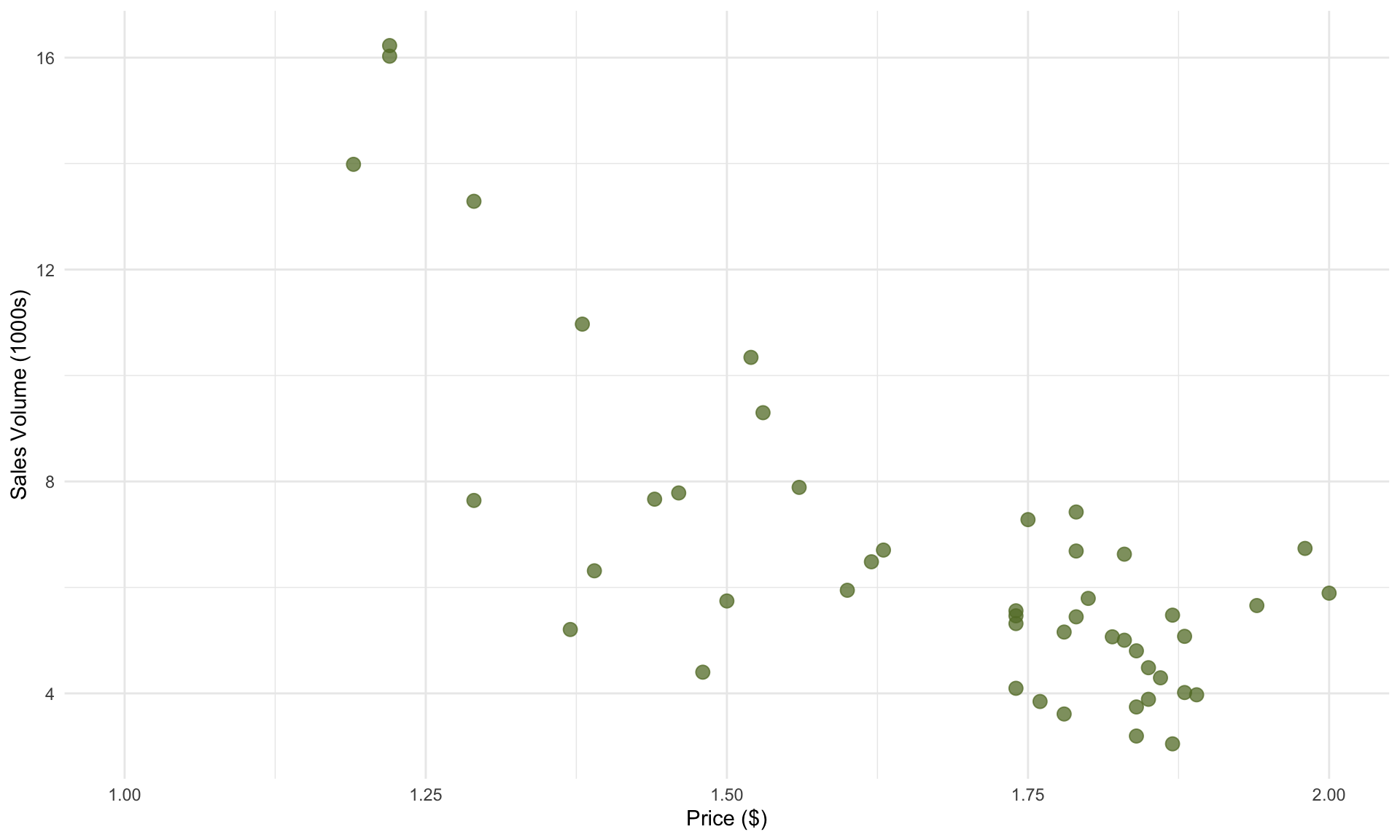
As a starting point, let’s plot volume and price:
# Pick a color scheme
cols = met.brewer("Juarez")

# Make plot
avoplot <- ggplot( avocado,  aes(x = price, y = volume)) +
  geom_point(alpha = 0.75, size = 3, color = cols[5]) +
  xlab("Price ($)") + ylab("Sales Volume (1000s)")+
  theme(legend.position="none")+
  theme_minimal()+
  xlim(c(1,2))
avoplot
In the plot above, each data point represents one week of sales in the Atlanta market. As we might expect, we see a decreasing trend: weeks with higher average prices correspond to lower total sales volume. An important caveat here is that we are not making any claims about causality – it is possible that consumers bought fewer avocados in response to higher prices, retailers lowered prices in response to week demand for avocados, or another explanation entirely.
Fortunately for us, not knowing the cause-and-effect between price and sales is not a problem, because our goal is to simply understand the association between price and volume, without drawing conclusions on why.
5.2 The linear regression model
Before throwing the data into R, we need a little bit of theory. In general, simple linear regression assumes the following statistical relationship between two random variables X and Y:
\[ Y = \beta_0 + \beta_1 \cdot X + \varepsilon\]
The equation above has five components:
Y represents the target, which is the variable we’d like to predict (e.g., sales volume).
X represents the predictor, which is the variable used to make the prediction (e.g., price).
\(\boldsymbol{\beta}_1\) is the true, unknown relationship between X and Y, often referred to as the slope. On average, a one-unit increase in X is associated with a \(\beta\) unit increase in Y.
\(\boldsymbol{\beta}_0\) is an unknown constant, often referred to as the intercept. In general, \(\beta_0\) may not be interpretable, so we will not focus on it’s meaning too much.
\(\boldsymbol{\varepsilon}\) is an error term, which represents all possible variables other than \(X\) that also contribute to determining \(Y\), but that we don’t have data for.
You can also name the target and predictor variables anything you want. In our avocado example, we can write the statistical model as
\[ \text{volume} = \beta_0 + \beta_1 \cdot \text{price} + \varepsilon\] where \(\beta_1\) is the slope for the price variable that we want to estimate from the data.
Note that we referred to \(\beta_0\) and \(\beta_1\) as being unknown. This is because in practice, we often have access to only a sample of all relevant data. As a result, we cannot pinpoint \(\beta_0\) and \(\beta_1\) from our data alone, because the patterns in our particular sample may not hold more generally. (In other words, \(\beta_0\) and \(\beta_1\) are {} parameters.)
To that end, the purpose of linear regression is then to answer three fundamental questions:
- What is our best estimate of \(\beta_1\)? We will call this estimate \(b_1\).
- How confident are we in the estimate \(b_1\)?
- If we observe \(b_1 \neq 0\) in the data, how confident are we that \(\beta_1 \neq 0\) as well?
You might be thinking that the third point above resembles a hypothesis test. This is exactly right: It turns out that linear regression allows us to test for whether the observed slope in the data is due to chance, or reflective of a ``real” relationship between the variables. Formally, running a regression analysis tests the following hypotheses (for both \(\beta_0\) and \(\beta_1\)):
\[\begin{align} &H_0 : \beta = 0 \\ &H_a : \beta \neq 0 \end{align}\]Recall from Part 4 that performing a hypothesis test requires (1) an estimate of the unknown parameter and (2) a standard error for the estimate. This is precisely what a regression analysis generates.
5.3 Building the model in R
We can run the regression analysis in a single line of R code:
In the line above, lm() takes the name of the variables and dataset as
input. Specifically, volume ~ price indicates that we want to build a
model that predicts volume from price, and the second input avocado
tells the function where to look for those variables. The object model
then stores the result of the regression analysis.
5.4 Interpreting results
Having run lm(), we can now use the summ() command from the jtools package to neatly summarize the results:
## MODEL INFO:
## Observations: 52
## Dependent Variable: volume
## Type: OLS linear regression
##
## MODEL FIT:
## F(1,50) = 59.60, p = 0.00
## R² = 0.54
## Adj. R² = 0.53
##
## Standard errors:OLS
## ------------------------------------------------
##                      Est.   S.E.   t val.      p
## ----------------- ------- ------ -------- ------
## (Intercept)         22.46   2.10    10.71   0.00
## price               -9.39   1.22    -7.72   0.00
## ------------------------------------------------
We highlight five important outputs in the table above:
\(R^2\) is a value between 0 and 1 that represents the predictive performance of the model. In our model, we have price as the only predictor and volume as the target, which produces an \(R^2 = 0.54\). In words, this means that the avocado price explains 54% of the variation in the sales volume, and that \(46\%\) of the variation in volume is unexplained by our model.1
Est. is the slope estimate \(b\) for the price variable – our estimate of the unknown parameter \(\beta_1\). The value of \(b_1 = -9.4\) indicates that on average, each additional dollar increase in the price of an avocado is associated with a decrease in sales volume of 9,400 avocados.
S.E. is the standard error of the slope estimate \(b\). This is analogous to the standard error of the estimate from a hypothesis test. The standard error can be used to generate a confidence interval for the unknown parameter \(\beta_1\):
- Next, t val. is the t-statistic associated with the hypothesis test. Formally, the t-statistic is given by
- p is the \(p\)-value associate with the hypothesis test. As in the last chapter, the \(p\)-value is a measure of how confidently we can reject the null hypothesis, with {} values indicating higher confidence. In our avocado sales example, we can see from the table that the \(p\)-value is effectively zero when rounded to 2 digits, which means we are \(99%\)+ confident that \(\beta \neq 0\). This very small \(p\)-value suggests that the downward-sloping relationship between price and volume unlikely to be due to chance.
5.5 Making predictions
Now that we have built the regression model, we can use it to make predictions of sales volume from price. Based on our estimate of \(\beta_1\), which is \(b_1 = -9.39\), we can write out the prediction line:
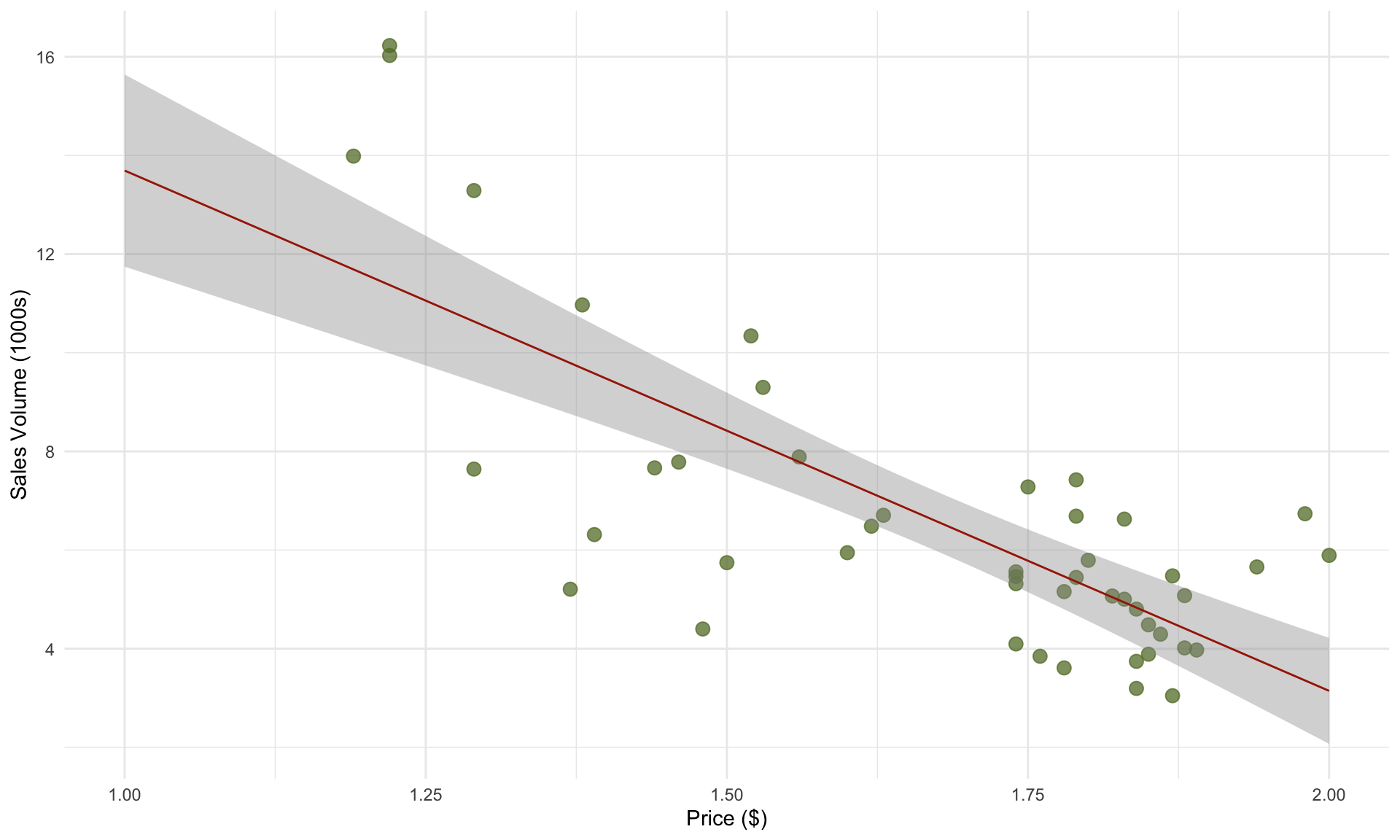
\[ \text{volume} = 22.46 - 9.39 \cdot \text{price}\] We can add the
prediction line to our plot using the geom_smooth() command in
ggplot:

The prediction line takes the predictor price as input and outputs a sales volume. In general, the prediction line is given by plugging our estimates of \(\beta_0\) and \(\beta_1\) into the regression model:
\[ \hat{y} = b_0 + b_1 \cdot x\] For example, for our avocado example, our model predicts the total weekly sales volume at a price of $1.60 to be
\[ \text{volume} = 22.46 - 9.39 \cdot 1.60 = 7.44, \] or around 7,440 avocados. Instead of computing the prediction by hand, we can do it in R in a few lines:
##        1
## 7.439126
The code above creates a new dataset with a single row, and sets the
price equal to 1.60. Then the predict() function sends this dataset to
the model object that we saved earlier, which contains the results of
the regression analysis.
5.5.1 Residuals and prediction intervals
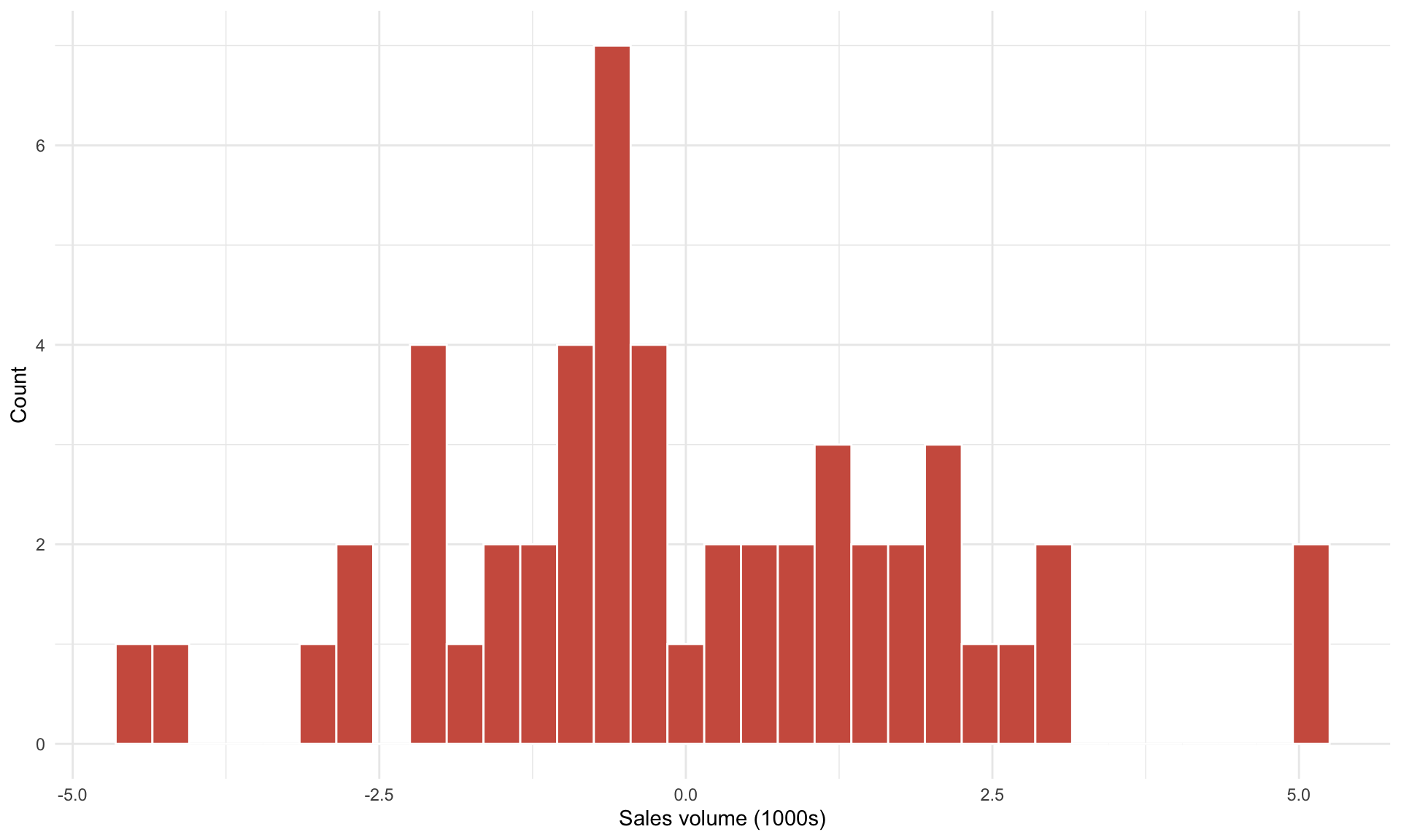
We can see from the plot above that the prediction line does not “fit” the data points perfectly – there is almost always a gap between each observed data point and its corresponding point on the prediction line. This vertical distance is referred to as a residual. Because there are 52 observations in our dataset (one for each week in 2015), we have 52 residuals. Plotting a histogram of residuals produces the following plot:

Note that the residuals are centered at 0, and vary in size (from approximately -5 to 5). This means that when we use our prediction line \(\text{volume} = 22.5 - 9.4 \cdot \text{price}\) to predict sales volume from price, sometimes we’ll over-predict by 5 (thousand avocados), sometimes we’ll under-predict by 5, and sometimes we’ll be quite close to the true value. In other words, the variation in residuals implies that our model predictions are subject to uncertainty.
We can more accurately convey the uncertainty in our predictions by using a 95% prediction interval. A 95% prediction interval is a range of values that is likely to contain the true value of a new observation with approximately 95% probability. Formally, the 95% prediction interval is given by
\[ \hat{y} \pm 2 \cdot S \] where \(\hat{y} = b_0 + b_1 \cdot x\) is our prediction of the target under the predictor value \(x\). In the formula above, \(S\) is called the residual standard error, which is equal to the standard deviation of the residuals, and is a measure of how well the regression model fits the data, similar to \(R^2\). The difference between \(S\) and \(R^2\) is that \(S\) is in the units of the target (1000s of avocados), while \(R^2\) is a normalized performance metric between 0 and 1.
We can calculate \(S\) as follows:
## [1] 2.019376Earlier, we predicted total sales at a price of $1.60 to be 7,440. To more accurately convey uncertainty in this prediction, we compute the (approximate) 95% prediction interval as well:
\[ \hat{y} \pm 2 \cdot S = 7,440 \pm 2 \cdot 2.02 \approx [3400, 11500].\]
The formula given above is an approximation. In R, we can more precisely
calculate a 95% prediction interval by simply adding the extra input
interval = "predict" in the predict() function:
##        fit      lwr      upr
## 1 7.439126 3.294986 11.58326
At the price of $1.60, we predict the total sales volume to be 7,440, with a 95% prediction interval of \([3300, 11,600]\).
5.5.2 Scatterplot of predicted vs. actual values
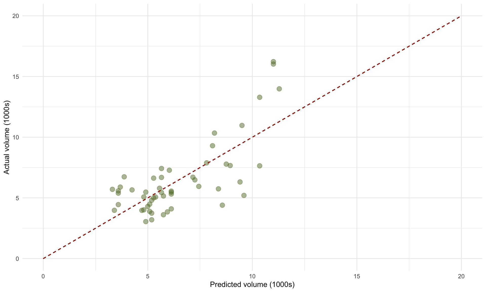
One useful way of visualizing how well our model fits the data is by plotting the predicted sales volumes for each of the 52 prices against the true sales volumes:
# store predicted and actual values in a new data frame
pred = predict(model)
act = avocado$volume
compare = as.data.frame(cbind(pred,act))

# create plot
cols = met.brewer("Juarez")
ggplot(compare, aes(x = pred, y = act))+
  geom_point(alpha = 0.5, size = 3, color = cols[5])+
  geom_segment(x =0, y = 0, xend = 20, yend = 20, linetype = "dashed", color = cols[1])+
  theme_minimal()+
  ylim(c(0,20))+ xlim(c(0,20))+
  xlab("Predicted volume (1000s)")+ ylab("Actual volume (1000s)")
The 45 degree line represents perfect prediction accuracy – deviations from this line correspond to prediction errors (i.e., residuals). The plot of predicted vs. actual volumes can be useful in identifying where the model’s predictions are likely to be less accurate, or based on a small amount of data. In the plot above, we can see that the errors appear larger when the actual volumes are large (around 15 on the vertical axis). This suggests that we may want to be more cautious about our model’s predictions at larger sales quantities.
While an \(R^2\) of \(0.54\) may sound low, it is not surprising when we consider that 54% of the sales volume is explained by price alone, and the remaining 46% are all other variables. \(R^2\) values of this magnitude or much lower are quite common in regression models when working with real-world, messy data.↩︎