Part 9 Logistic Regression
Logistic regression is one of the most widely used machine learning techniques for predicting the probability of an event and for binary classification. In this tutorial, we will apply logistic regression to a patient-level dataset to (1) understand the risk factors of heart disease and (2) predict which patients will eventually develop heart disease.3
9.1 Data: Framingham Heart Study
The data is based on the Framingham Heart Study, a long-term study aimed to identify risk factors of coronary heart disease (https://www.nhlbi.nih.gov/science/framingham-heart-study-fhs). The Framingham Heart Study is one of the most important studies in modern medicine and has been on-going since 1948. The study focuses on residents of Framingham, Massachusetts, and is now on its third generation of patients.
The file framingham.csv contains information on over 3,600 patients from the original cohort of the Framingham Heart Study. For each patient, we have the following variables:
Independent variables / Features:
- Male: Gender (1 = Male, 0 = Female)
- Age: Patient age
- Education: Education level (1 = some high school, 2 = high school/GED, 3 = some college, 4 = college)
- CurrentSmoker: 1 = patient is smoker
- CigsPerDay: Number of cigarettes patient smokes per day
- BPMeds: 1 = patient is on blood pressure medication
- PrevalentStroke: 1 = patient has previously had a stroke
- PrevalentHyp: 1 = patient has hypertension
- Diabetes: 1 = patient has diabetes
- Chol: total cholesterol (mg/dL)
- SysBP: systolic blood pressure (mmHg)
- DiaBP: diastolic blood pressure (mmHg)
- BMI: body mass index (weight / height\(^2\))
- HeartRate: Heart rate (beats per minute)
- Glucose: blood glucose level (mg/dL)
Dependent variable / Label:
- TenYearCHD: 1 = patient developed coronary heart disease within 10 years of exam
In the language of machine learning, the independent variables are often called features, and the dependent variable is often often called a label. Next, we’ll look at how to input all of these variables into a logistic regression model.
9.2 Building a logistic regression model
We will use the ROCR package, which we will use later on to make a plot.
We start by reading in the Framingham data:
Next, we randomly split the data into training and testing sets:
set.seed(0)

split = sample.split(fram, SplitRatio = 0.75)
train = subset(fram, split == TRUE)
test = subset(fram, split == FALSE)

row.names(train) <- NULL
row.names(test) <- NULL
We are now going to build a logistic regression model using the glm() command on the training data. Then the summary() command produces the output:
##
## Call:
## glm(formula = TenYearCHD ~ ., family = "binomial", data = train)
##
## Coefficients:
##                   Estimate Std. Error z value Pr(>|z|)
## (Intercept)     -8.2424789  0.8332324  -9.892  < 2e-16 ***
## Male             0.5490423  0.1278132   4.296 1.74e-05 ***
## Age              0.0560869  0.0077583   7.229 4.86e-13 ***
## Education       -0.0776599  0.0577695  -1.344  0.17885
## CurrentSmoker   -0.0308217  0.1859146  -0.166  0.86833
## CigsPerDay       0.0221400  0.0074075   2.989  0.00280 **
## BPMeds           0.1886051  0.2766197   0.682  0.49535
## PrevalentStroke  0.2776989  0.5787679   0.480  0.63136
## PrevalentHyp     0.2993613  0.1593420   1.879  0.06028 .
## Diabetes        -0.1886425  0.3799241  -0.497  0.61952
## Chol             0.0029138  0.0013243   2.200  0.02779 *
## SysBP            0.0131624  0.0044762   2.941  0.00328 **
## DiaBP           -0.0005027  0.0076974  -0.065  0.94793
## BMI              0.0114430  0.0148292   0.772  0.44032
## HeartRate       -0.0021622  0.0050148  -0.431  0.66635
## Glucose          0.0069281  0.0025061   2.764  0.00570 **
## ---
## Signif. codes:  0 '***' 0.001 '**' 0.01 '*' 0.05 '.' 0.1 ' ' 1
##
## (Dispersion parameter for binomial family taken to be 1)
##
##     Null deviance: 2292.7  on 2741  degrees of freedom
## Residual deviance: 2037.2  on 2726  degrees of freedom
## AIC: 2069.2
##
## Number of Fisher Scoring iterations: 5
The output above shows the coefficients of the logistic regression model. Positive coefficients mean the variable is associated with a higher risk of developing heart disease.
9.2.1 Odds ratios
Unlike linear regression, logistic regression coefficients are not the change in the dependent variable for every 1 unit increase in the independent variable. Instead, they are the logarithm of the odds ratios. At a high level, the odds ratio of a variable has the following interpretation:
- Odds ratio > 1 –> positive association with dependent variable
- Odds ratio = 1 –> no association with dependent variable
- Odds ratio < 1 –> negative association with dependent variable
(If you want more details, here is some some optional reading on odds ratios: https://stats.idre.ucla.edu/stata/faq/how-do-i-interpret-odds-ratios-in-logistic-regression/)
We can visualize the odds ratios of all variables as follows:
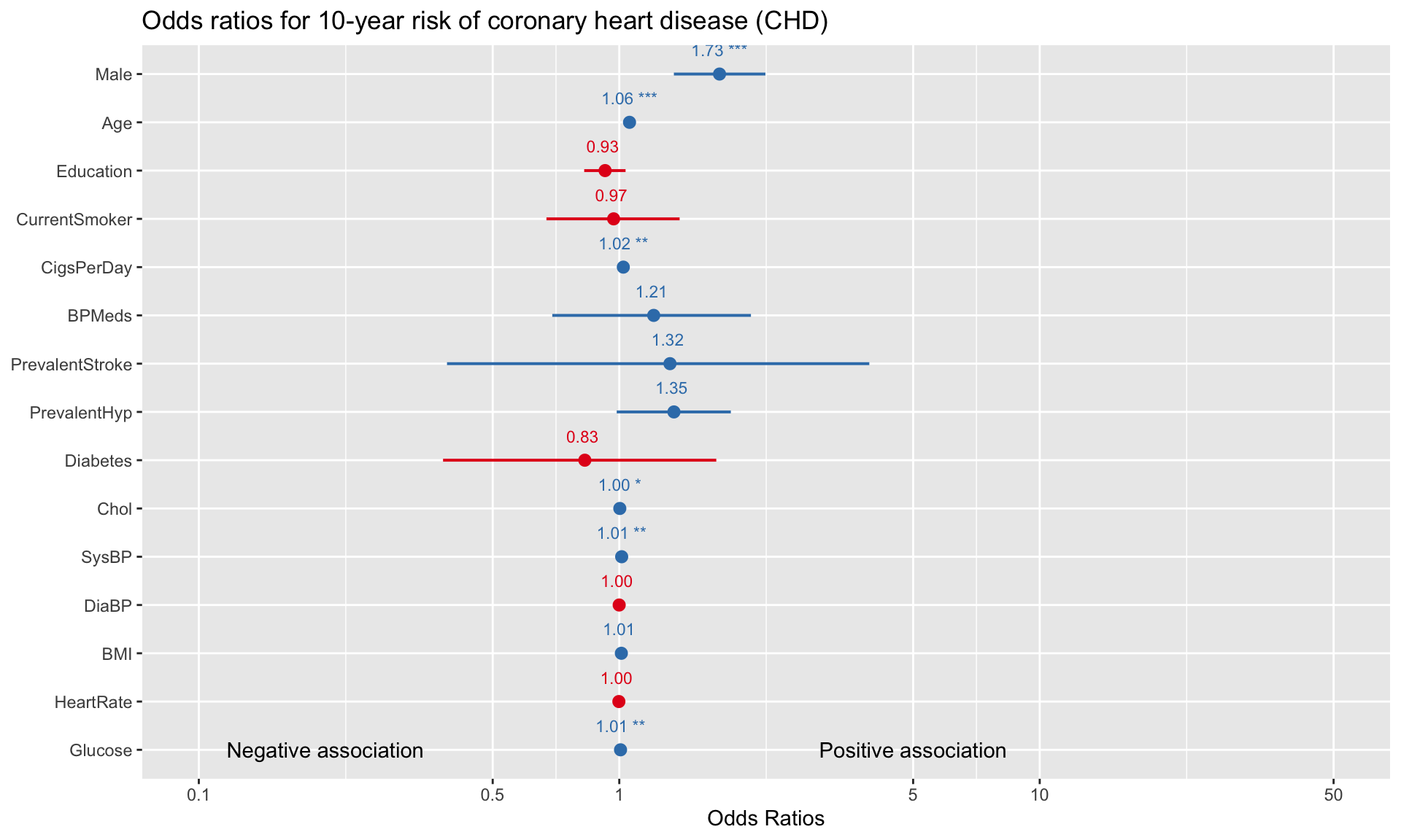
For binary variables (e.g., Male, CurrentSmoker, Diabetes), comparing the odds ratios gives us an idea of which variable is a more significant risk factor for developing heart disease. For example, the visualization above suggests that, all else equal, being male is more strongly associated with heart disease than being on blood pressure medication (1.73 vs 1.21). A limitation here is that for variables that have different units (e.g., Age vs Cholesterol), we cannot directly evaluate risk by simply looking at the odds ratios.
9.2.2 Predicting probabilities
Odds ratios are somewhat difficult to interpret, so another way of exploring the model is to directly input the features of a hypothetical patient into the model, and then look at what the model predicts for the probability of heart disease. Consider a hypothetical patient with the following features:
patient = data.frame(
Male = 1,
Age = 40,
Education = 2,
CurrentSmoker = 1,
CigsPerDay =  0,
BPMeds =  0,
PrevalentStroke = 0,
PrevalentHyp = 0,
Diabetes = 1,
Chol = 160,
SysBP = 100,
DiaBP = 80,
BMI =   35,
HeartRate =   75,
Glucose =   70)
Next, if we want to check what the model predicts for the probability of heart disease of this patient, we send patient to the predict() function:
##         1
## 0.0335949
The probability of this patient developing heart disease within 10 years is only 3.4% according to the model. What if the patient was 70-years-old instead (with the rest of the independent variables staying the same)? We can just as easily check what the model predicts by changing the relevant variables:
##         1
## 0.1575458
By changing Male from 0 to 1 and Age from 40 to 60, the probability of heart disease increases from 0.02 to 0.11. We can continue to adjust the code above to see how changing certain variables adjusts the predicted probability of heart disease for a given patient.
9.2.3 Classification
In addition to predicting probabilities, logistic regression is commonly used for binary classification. Suppose we want to use our model to predict which patients will eventually develop heart disease (i.e., we want to classify each data point as a 0 or 1). We can do this by selecting a “cutoff” point, and classifying the patient as a 1 if their predicted probability is above the cutoff.
A natural cutoff to start with is 0.5, which is equivalent to simply rounding all probabilities up or down to exactly 1 or 0. We can check the accuracy on the training dataset of a cutoff of 0.5 using the following code:
# Set cutoff value
cutoff <- 0.5

# Compute class probabilities
prob <- predict(logit,train,type='response')

# Convert to binary class predictions based on cutoff
train_matrix <- table(train$TenYearCHD, as.numeric(prob > cutoff))

# Compute training accuracy
train_accuracy <- sum(diag(train_matrix))/sum(train_matrix)
print(train_accuracy)
## [1] 0.8599562To check accuracy on the test dataset, we can use the same code but swap train for test (which we created at the beginning of this section):
# Compute class probabilities
prob <- predict(logit,test,type='response')

# Convert to binary class predictions based on cutoff
test_matrix <- table(test$TenYearCHD, as.numeric(prob > cutoff))

# Compute training accuracy
test_accuracy <- sum(diag(test_matrix))/sum(test_matrix)
print(test_accuracy)
## [1] 0.8362445With a cutoff of 0.5, the model correctly classifies 86% of observations in the training dataset and 84% in the test dataset. Recall that checking predictions on the test dataset is a vital step in validating the model, because it represents data that was not used to build the model in the first place. If our test accuracy was much lower than our training accuracy (say, more than a 5% gap), then this would raise the alarm about possible overfitting.
How does predictive accuracy vary with the cutoff point we select? We can investigate this by plotting accuracy against the cutoff value:
p <- predict(logit, train, type='response')
pr <- prediction(p, train$TenYearCHD)
acc.perf = performance(pr, measure = "acc")
plot(acc.perf)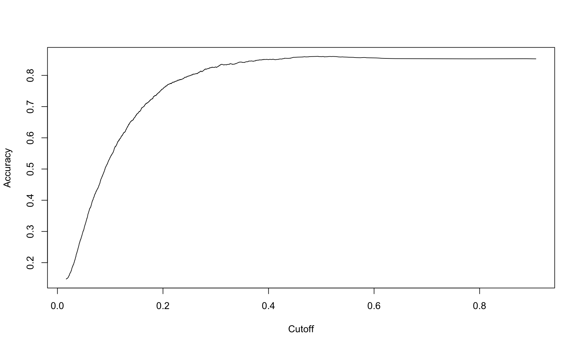
The plot above shows that the accuracy peaks around 0.4, and then is not very sensitive to the cutoff beyond that point.
9.2.4 Confusion matrix
A common way to display the results of any binary classification method is a confusion matrix. A confusion matrix is simply a 2x2 table that shows how many of the labels were classified correctly or incorrectly:
cutoff <- 0.5

# Compute class probabilities
prob <- predict(logit, test, type='response')

# Convert to binary class predictions based on cutoff
table(test$TenYearCHD, as.numeric(prob > cutoff))
##
## 0 1
## 0 758 5
## 1 145 8In the confusion matrix, the 0 and 1 refer to the actual labels of the patients, and the FALSE and TRUE refer to the predictions of the model. Let’s interpret this table carefully, one number at a time.
The total number of patients in the training dataset who did not develop heart disease is the sum of the top row, which is 758 + 5 = 763. The table tells us that out of these 763 patients, the model (correctly) predicted 758 to not develop heart disease and (incorrectly) predicted 5 of them to develop heart disease. Here, 758 are the number of true negatives (TN) and 5 is the number of false positives (FP).
Similarly, the sum of the bottom row tells us the number of patients who did develop heart disease, which is 145 + 8 = 153. Out of these 153 patients, the model (incorrectly) predicted 145 to not develop heart disease, and (correctly) predicted 8 to develop heart disease. Here, 145 is the number of false negatives (FN) and 8 is the number of true positives (TP).
Dividing the true negatives, false positives, false negatives and true positives gives us the rates. Based on the confusion matrix above, we have:
- True negative rate (TNR): 758/763 = 0.993
- False positive rate (FPR): 5/763 = 0.007
- False negative rate (FNR): 145/153 = 0.948
- True positive rate (TPR): 8/153 = 0.052
The accuracy of the model can be calculated from the table directly as well, by adding up the values along the “main diagonal” (left to right) of the matrix. The overall accuracy on the test dataset is the fraction of patients that were correctly classified, which is
\[ Accuracy = \frac{TP + TN}{P + N} = \frac{8 + 758}{153 + 763} = 0.836.\]
9.2.5 Class imbalance and area-under-the-curve (AUC)
Our model has an accuracy of around 84%, which is quite high. Is looking at accuracy good enough for evaluating our model’s performance? The answer is no, because our data set suffers from class imbalance.
Class imbalance refers to the situation where one class appears much more frequently than the other. Our Framingham study is imbalanced because the vast majority of patients do not develop heart disease:
## [1] 0.152269By taking the average of all of the actual labels, we can see that only 15% of the patients in the entire dataset developed heart disease. This imbalance can be observed from the confusion matrix of either the training or testing dataset as well:
##
##     FALSE TRUE
##   0  2327   11
##   1   373   31
The confusion matrix shows that 2327+31=2358 patients in the training dataset did not develop heart disease, while 373+11=384 did. In other words, around 85% of patients in the training dataset did not develop heart disease.
So why is class imbalance potentially problematic with respect to model accuracy? This is because accuracy can be misleading if one class appears much more frequently than another. In the context of our Framingham Study data, a model that just blindly predicts all patients to not develop heart disease would achieve an accuracy of 85%. For datasets with more extreme class imbalance (detecting credit card fraud or very rare disease), blindly predicting the majority class might even achieve an accuracy of 99% or higher.
Another way of summarizing the model’s predictive performance that partially corrects for class imbalance issues is an ROC plot (“receiver operating characteristic”). In particular, we are interested in the area under the curve (AUC) of the ROC plot. To calculate the area under the curve, we first plot the true positive rate against the false positive rate by varying the cutoff from 0 and 1. Then, we measure the area under the curve of the resulting plot.
Thanks to the ROCR package, we don’t have to manually calculate the false positive and true positive rates for many different values of the cutoff. Instead, we can create the AUC plot automatically as follows:
p <- predict(logit, test, type="response")
pr <- prediction(p, test$TenYearCHD)
prf <- performance(pr, "tpr", "fpr")
plot(prf, colorize = TRUE)
axis(1, at = seq(0,1,0.1), tck = 1, lty = 2, col = "grey", labels = NA)
axis(2, at = seq(0,1,0.1), tck = 1, lty = 2, col = "grey", labels = NA)
abline(a=0, b= 1)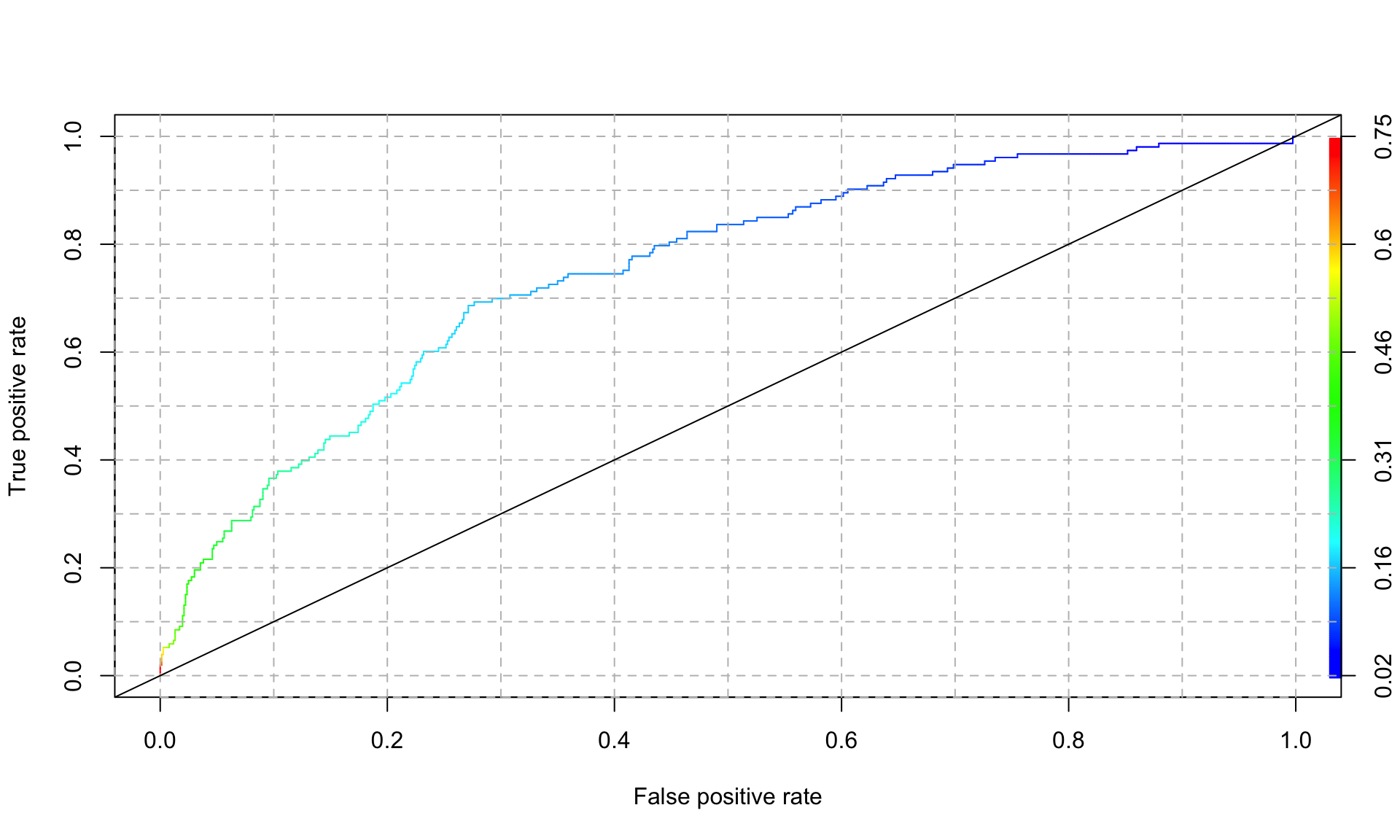
In the plot above, the color legend indicates the cutoff value associated with each point along the curve. An AUC of 1 represents a perfect model, and and AUC of 0.5 is equivalent to flipping a coin (and is represented by the 45 degree line in the plot above). We can extract the AUC of the plot above as follows:
## [1] 0.7501264Our logistic regression model achieves an AUC of 0.75, which is not bad at all.
Because the AUC takes the trade-off between false positives and true positives into account, it is typically the preferred way of measuring model performance (vs looking at accuracy alone). Another advantage of AUC is that it summarizes model performance over all possible values of the cutoff, whereas accuracy depends on what cutoff value we use. For these two reasons, AUC is one of the most common performance metrics used in machine learning.
In summary, logistic regression is one of the most widely used methods for predicting probabilities and classes, and is one of the “go-to” methods for binary classification problems. Coefficients of a logistic regression model are generally harder to interpret than in linear regression, so it is often used purely for prediction problems. Logistic regression can also be extended to handle more than 2 classes (“multinomial logistic regression”).
This example is inspired by a section from the course “The Analytics Edge” at MIT: https://ocw.mit.edu/courses/15-071-the-analytics-edge-spring-2017/pages/logistic-regression/the-framingham-heart-study-evaluating-risk-factors-to-save-lives/.↩︎