Part 6 Multiple Linear Regression
In this section, we consider linear regression with multiple predictors. Suppose we have one target variable \(Y\) and \(k\) predictors, \(X_1, X_2, \ldots, X_k\). The statistical model for linear regression in this more general setting is then:
\[ Y = \beta_0 + \beta_1 X_1 + \beta_2 X_2 \ldots \beta_k X_k + \varepsilon \] Just like in the one-variable case, the slope coefficients \(\beta_1, \beta_2, \ldots, \beta_k\) are all unknown, and our goal is to estimate them from a dataset.
6.1 Data: Avocado prices
To demonstrate linear regression with multiple predictors, we will use a larger dataset on the price and sales of avocados:
The dataset contains the following variables:
- date: week of sale
- price: average weekly price across all retailers
- volume: total sales volume (in 1000s of avocados)
- type: avocado type (conventional or organic)
- season: season of sale (Winter, Spring, Summer, or Fall)
- year: year of sale (2015, 2016, 2017 or 2018)
- region: region of sale (Atlanta, Boston, or San Diego)
Recall that the head() allows us to look at the first few rows of data, which also shows the variable names at the top:
##      date price   volume         type season year  region
## 1  1/4/15  1.00 435.0215 conventional Winter 2015 Atlanta
## 2 1/11/15  1.11 397.5427 conventional Winter 2015 Atlanta
## 3 1/18/15  1.11 431.4910 conventional Winter 2015 Atlanta
## 4 1/25/15  1.10 449.3329 conventional Winter 2015 Atlanta
## 5  2/1/15  0.96 636.7714 conventional Winter 2015 Atlanta
## 6  2/8/15  1.03 433.8839 conventional Winter 2015 Atlanta
We can check the number of rows with dim():
## [1] 1014 7We can also check the different values of the categorical type variable using levels()
## [1] "conventional" "organic"Similarly, we can check the different values of the region and season variables:
## [1] "Atlanta" "Boston" "SanDiego"## [1] "Fall" "Spring" "Summer" "Winter"6.2 Simple regression: Volume vs price
As a benchmark, we consider a simple regression model of volume on price for conventional avocados only. We start by filtering to only pull data for conventional avocados:
A linear regression with price as the only predictor yields the following output:
## MODEL INFO:
## Observations: 507
## Dependent Variable: volume
## Type: OLS linear regression
##
## MODEL FIT:
## F(1,505) = 89.928, p = 0.000
## R² = 0.151
## Adj. R² = 0.149
##
## Standard errors:OLS
## ------------------------------------------------------
##                         Est.     S.E.   t val.       p
## ----------------- ---------- -------- -------- -------
## (Intercept)          730.659   21.583   33.854   0.000
## price               -174.838   18.437   -9.483   0.000
## ------------------------------------------------------
The corresponding scatter plot and prediction line is
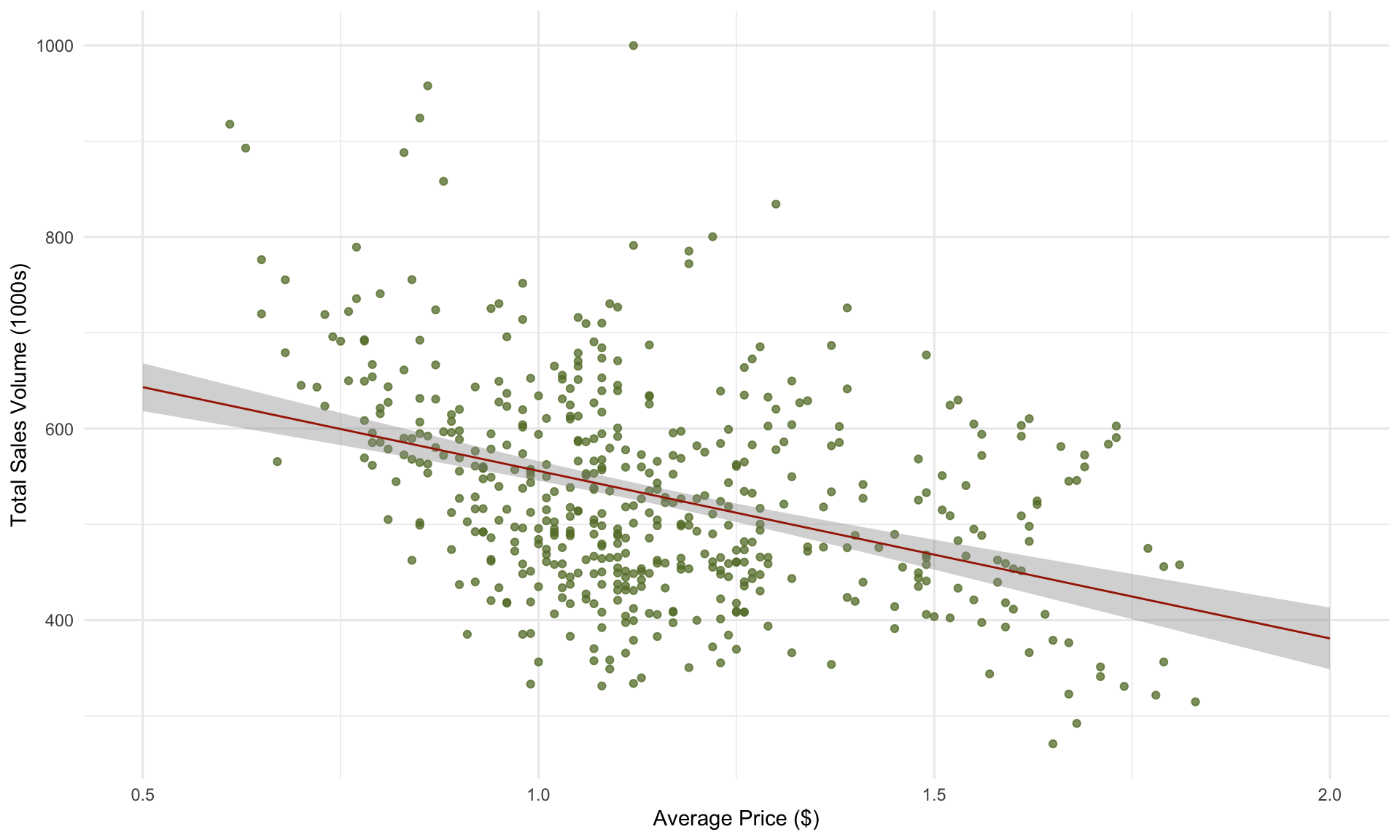
Note that the \(R^2\) of the model above is only 0.15. Part of the reason why we don’t get a particularly high \(R^2\) is because we are combining data from multiple regions (Atlanta, Boston, San Diego). What happens if we construct a separate regression model for each region?
Let’s plot volume against price again, this time separating the data by region:
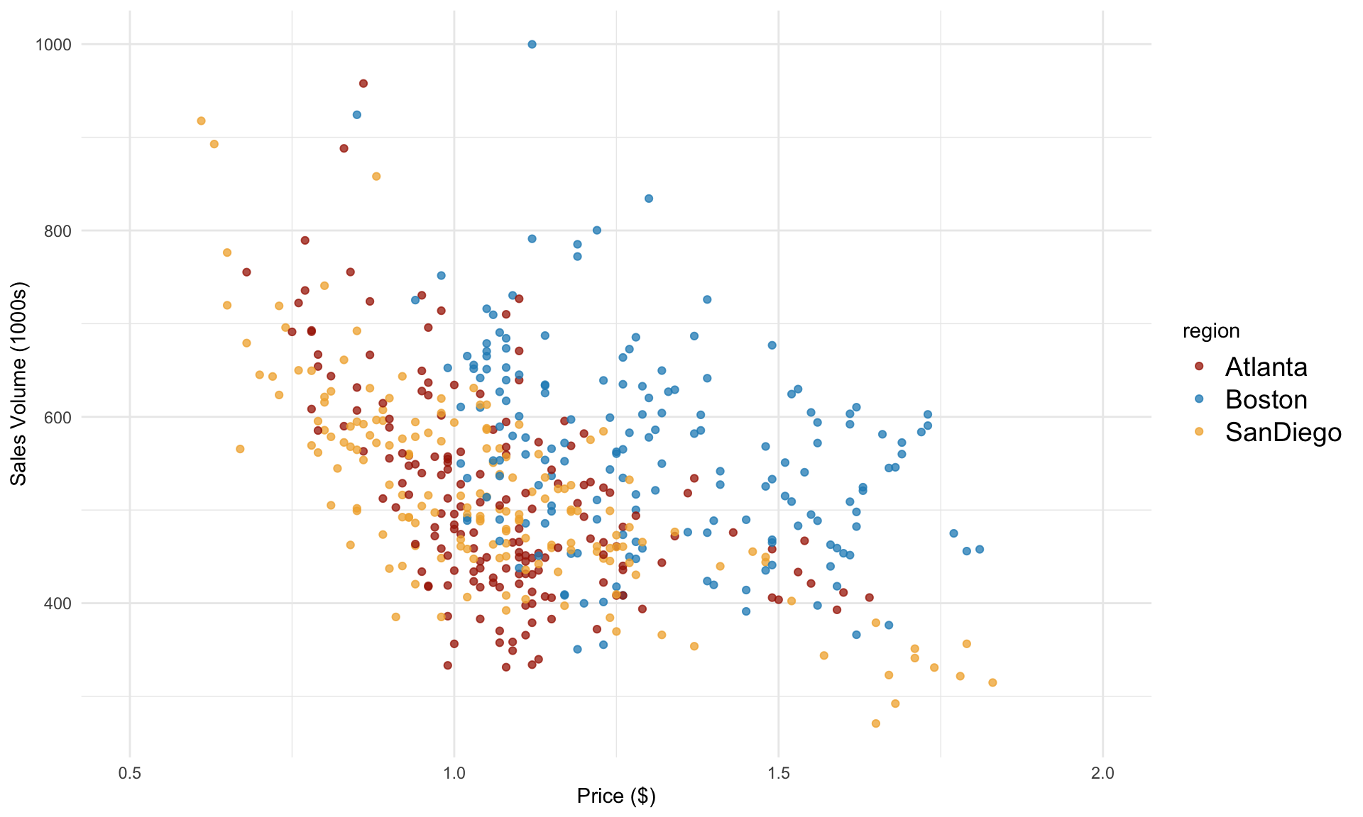 In the plot above, we can see that Boston data seems to behave differently than the other two cities. What happens if we now run a separate regression model for each city?
For Atlanta, we have
atlanta <- avocado[avocado$region=="Atlanta",]
model_atlanta = lm(volume ~ price,  atlanta)
summ(model_atlanta)
## MODEL INFO:
## Observations: 169
## Dependent Variable: volume
## Type: OLS linear regression
##
## MODEL FIT:
## F(1,167) = 68.85, p = 0.00
## R² = 0.29
## Adj. R² = 0.29
##
## Standard errors:OLS
## ---------------------------------------------------
## Est. S.E. t val. p
## ----------------- --------- ------- -------- ------
## (Intercept) 873.77 44.10 19.81 0.00
## price -337.74 40.70 -8.30 0.00
## ---------------------------------------------------For Boston, we have
boston <- avocado[avocado$region=="Boston",]
model_boston = lm(volume ~ price, boston)
summ(model_boston, digits = 3)
## MODEL INFO:
## Observations: 169
## Dependent Variable: volume
## Type: OLS linear regression
##
## MODEL FIT:
## F(1,167) = 25.265, p = 0.000
## R² = 0.131
## Adj. R² = 0.126
##
## Standard errors:OLS
## ------------------------------------------------------
## Est. S.E. t val. p
## ----------------- ---------- -------- -------- -------
## (Intercept) 792.475 46.581 17.013 0.000
## price -177.045 35.223 -5.026 0.000
## ------------------------------------------------------And for San Diego, we have
sandiego <- avocado[avocado$region=="SanDiego",]
model_sandiego = lm(volume ~ price, sandiego)
summ(model_sandiego, digits = 3)
## MODEL INFO:
## Observations: 169
## Dependent Variable: volume
## Type: OLS linear regression
##
## MODEL FIT:
## F(1,167) = 218.459, p = 0.000
## R² = 0.567
## Adj. R² = 0.564
##
## Standard errors:OLS
## -------------------------------------------------------
## Est. S.E. t val. p
## ----------------- ---------- -------- --------- -------
## (Intercept) 855.282 23.494 36.405 0.000
## price -318.561 21.553 -14.780 0.000
## -------------------------------------------------------Plotting the prediction line for each region:
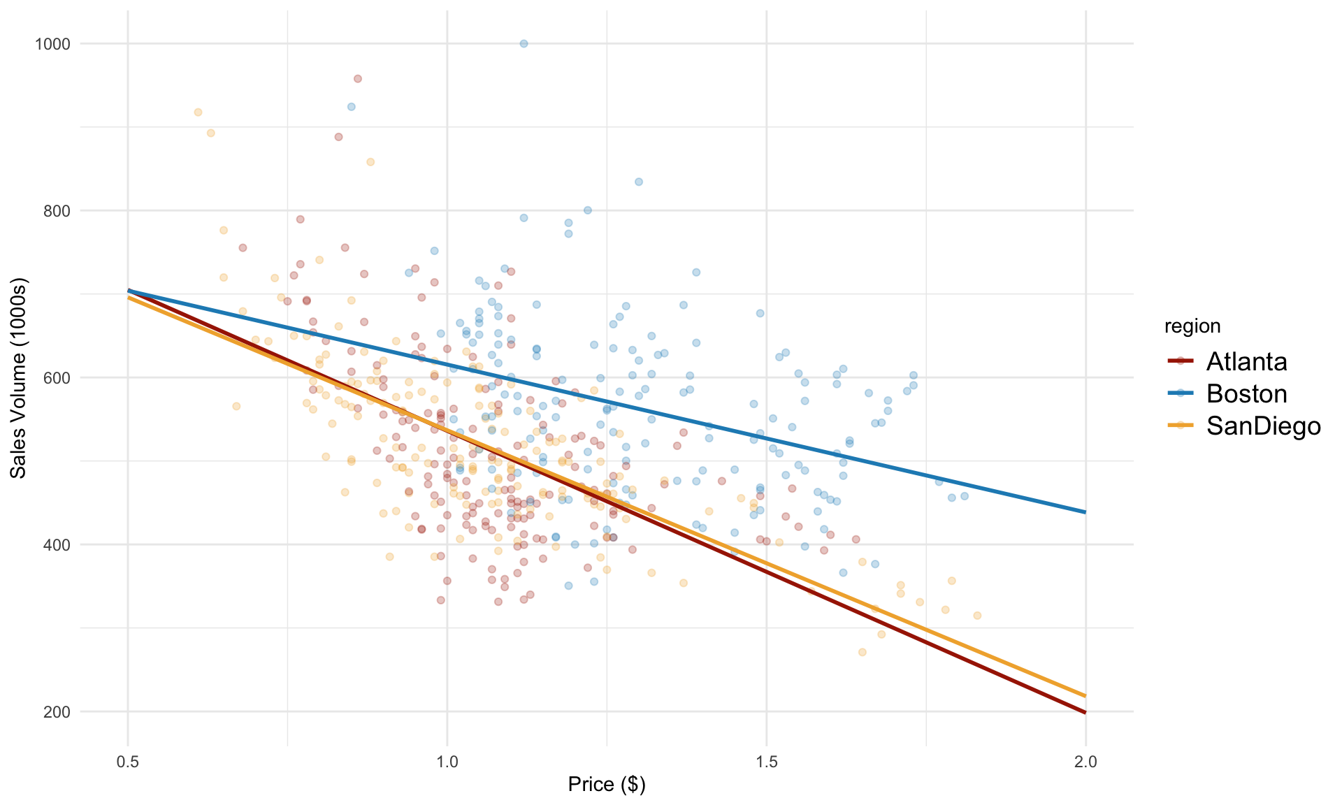 From the plot above, we can see that the prediction lines for Atlanta and San Diego are quite similar. For Boston, the slope appears to be less steep. Is this different statistically significant?
6.3 Categorical variables: Differences in intercepts
Note that the price predictor is numeric, whereas region is a categorical variable. A very important distinction between numeric and categorical variables is in how they enter into the regression model. Specifically, because we have three different regions – Atlanta, Boston and San Diego – we need to construct two indicator variables to keep track of which region each row in our dataset belongs to. Let’s define Boston and SanDiego to be two indicator variables, which can take on values of 0 or 1. Our regression model is then
\[ \text{volume} = \beta_0 + \beta_1 \cdot \text{price} + \beta_2 \cdot \text{Boston} + \beta_3 \cdot \text{SanDiego} + \varepsilon \] Note that the regression model above does not include Atlanta as a variable.
Next, we run a regression analysis that uses both price and region:
In the line above, volume ~ price + region instructs lm() to build a regression model using both the price and region variables. If we were to omit + region, then lm() would lump all of the data from the three regions together and build one-variable regression model using price only, as we did earlier.
Next, let’s look at the results:
## MODEL INFO:
## Observations: 507
## Dependent Variable: volume
## Type: OLS linear regression
##
## MODEL FIT:
## F(3,503) = 84.244, p = 0.000
## R² = 0.334
## Adj. R² = 0.330
##
## Standard errors:OLS
## ----------------------------------------------------------
##                            Est.     S.E.    t val.       p
## -------------------- ---------- -------- --------- -------
## (Intercept)             806.741   20.893    38.612   0.000
## price                  -275.025   18.446   -14.910   0.000
## regionBoston            113.537   10.704    10.607   0.000
## regionSanDiego            2.329    9.783     0.238   0.812
## ----------------------------------------------------------
Note that we now have \(R^2 = 0.33\), up from \(R^2 = 0.15\) when we ignored the different regions.
In the output table above, we now have two additional rows: regionBoston and regionSanDiego. The coefficients in the table for these two variables correspond to \(\beta_2\) and \(\beta_3\) in the regression model. The interpretation behind the coefficients is the difference in intercepts compared to the reference group of Atlanta. That is, holding the price fixed, San Diego’s sales are on average 2.33 higher than Atlanta’s, and Boston’s sales are 113.54 higher than Atlanta’s (in 1000s of avocados). Note that \(p\)-value for regionSanDiego is very large at 0.81, meaning this difference is not statistically significant.
We can visualize the regression model above as follows:
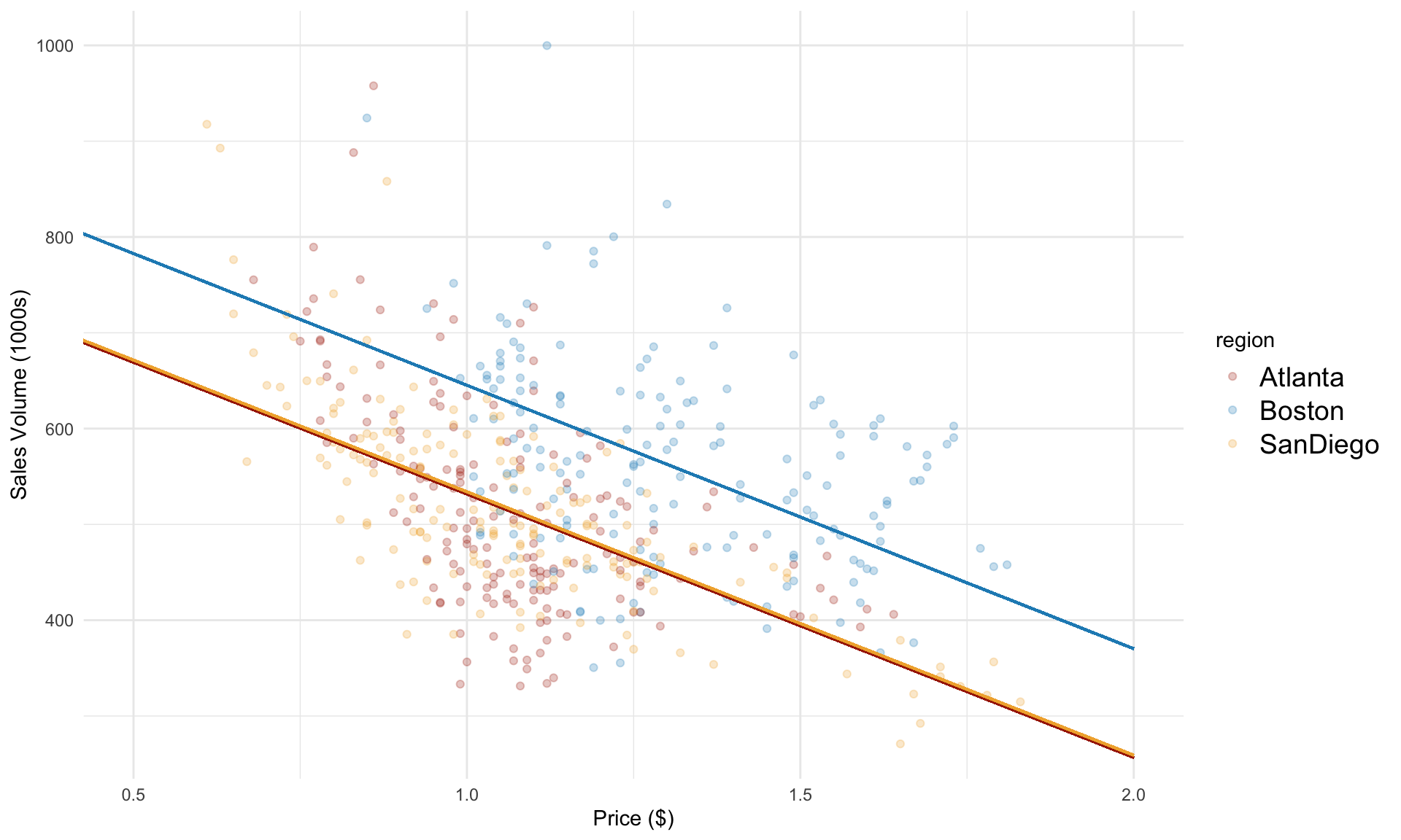 Note that the slopes are parallel. This is because all three regions share a common slope for the price variable. Next, we’ll consider how to model separate slopes for each region.
6.4 Interaction terms: Differences in slopes
By adding dummy variables for Boston and SanDiego, we were able to tease out the differences in the intercept. We found that the difference between Boston and Atlanta was statistically significant, but the difference between SanDiego and Atlanta was not.
Note that the slope for each region is assumed to be the same, which we estimated at -275. However, when we ran a separate simple regression model for each region, we found varying values for the slope parameter. How might we capture this in a multiple regression model?
The key idea is to introduce an interaction term. We expand the model as follows:
\[ \text{volume} = \beta_0 + \beta_1 \cdot \text{price} + \beta_2 \cdot \text{Boston} + \beta_3 \cdot \text{SanDiego} + \beta_4 \cdot \underbrace{\text{price} \cdot \text{Boston}}_{\text{interaction term}} + \beta_5 \cdot \underbrace{\text{price} \cdot \text{SanDiego}}_{\text{interaction term}}+ \varepsilon \]
To incorporate an interaction term between price and region, we simply add price*region as a variable in lm():
## MODEL INFO:
## Observations: 507
## Dependent Variable: volume
## Type: OLS linear regression
##
## MODEL FIT:
## F(5,501) = 54.838, p = 0.000
## R² = 0.354
## Adj. R² = 0.347
##
## Standard errors:OLS
## ---------------------------------------------------------------
##                                  Est.     S.E.   t val.       p
## -------------------------- ---------- -------- -------- -------
## (Intercept)                   873.768   41.608   21.000   0.000
## price                        -337.736   38.401   -8.795   0.000
## regionBoston                  -81.292   58.712   -1.385   0.167
## regionSanDiego                -18.486   51.315   -0.360   0.719
## price:regionBoston            160.691   49.555    3.243   0.001
## price:regionSanDiego           19.176   47.263    0.406   0.685
## ---------------------------------------------------------------
The coefficient on the interaction term tells us the difference in slope with respect to to the reference group of Atlanta. From the output above, we can see that the slope for SanDiego is estimated to be 19.2 higher than for Atlanta, although this difference is not statistically significant (p = 0.685). The slope for Boston is estimated to be 160.7 higher than for Atlanta, which is significant (\(p \approx 0.001\)).
6.5 Improving model fit
In general, we can improve model fit by thinking carefully about which other variables may be relevant in predicting the target. In our avocado example, a major aspect of avocado sales that our region-based model does not account for is seasonality. Consider the following plot of avocado sales over time:
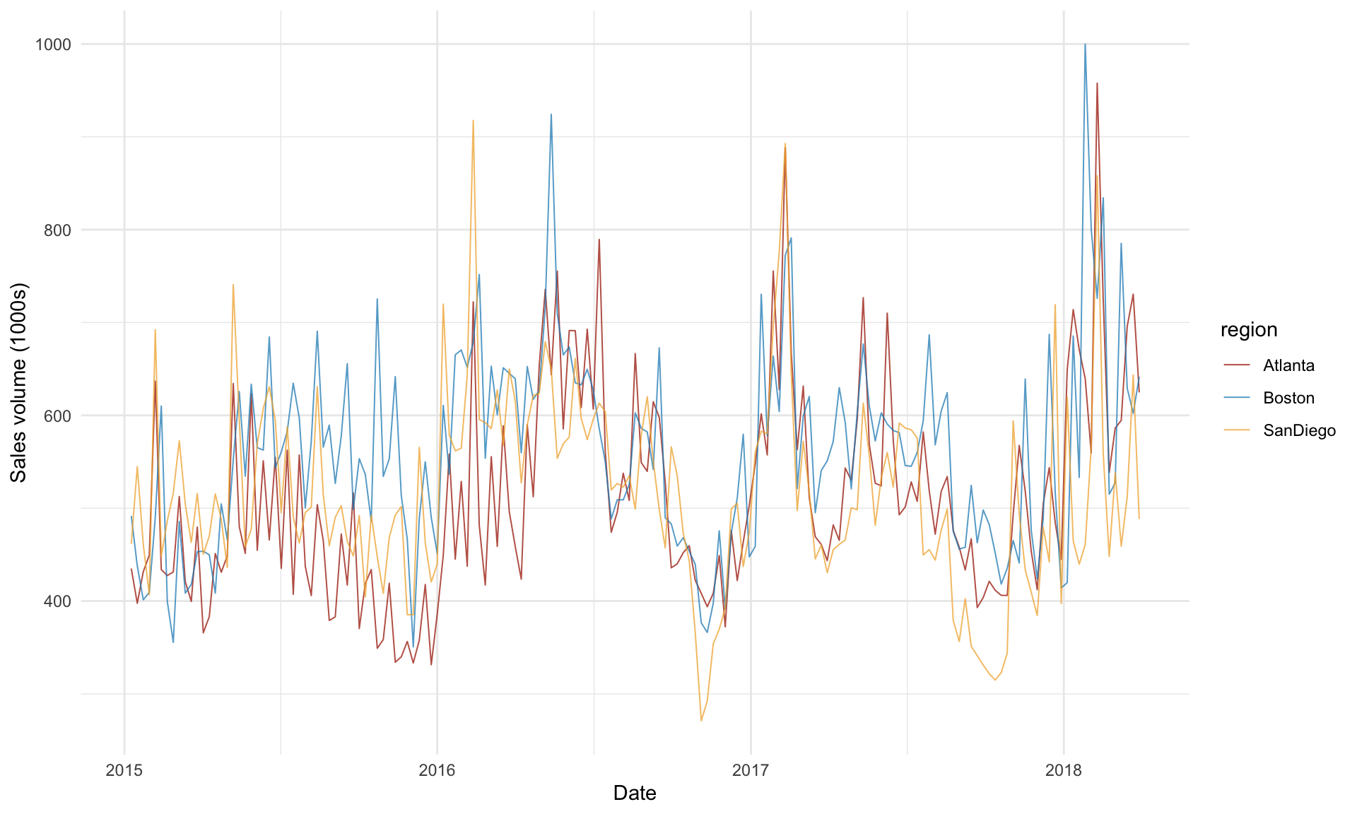
The plot above shows a strong season pattern in avocado sales over time. There may also be a slight upward trend in sales over time from 2015 to 2018. We can capture these associations by explicitly incorporating year and season into our regression model. First, we need to convert year into a categorical variable:
Next, we add year and season to our regression model with interaction terms from earlier:
## MODEL INFO:
## Observations: 507
## Dependent Variable: volume
## Type: OLS linear regression
##
## MODEL FIT:
## F(11,495) = 102.759, p = 0.000
## R² = 0.695
## Adj. R² = 0.689
##
## Standard errors:OLS
## ----------------------------------------------------------------
##                                  Est.     S.E.    t val.       p
## -------------------------- ---------- -------- --------- -------
## (Intercept)                   811.867   32.163    25.242   0.000
## price                        -399.340   28.912   -13.812   0.000
## regionBoston                   95.322   41.479     2.298   0.022
## regionSanDiego                 18.639   35.770     0.521   0.603
## year2016                       66.914    7.036     9.510   0.000
## year2017                      133.800    8.011    16.702   0.000
## year2018                      198.548   12.894    15.398   0.000
## seasonSpring                   88.076    8.126    10.839   0.000
## seasonSummer                   88.121    8.032    10.971   0.000
## seasonWinter                   34.577    8.413     4.110   0.000
## price:regionBoston             36.415   34.943     1.042   0.298
## price:regionSanDiego          -16.225   32.953    -0.492   0.623
## ----------------------------------------------------------------
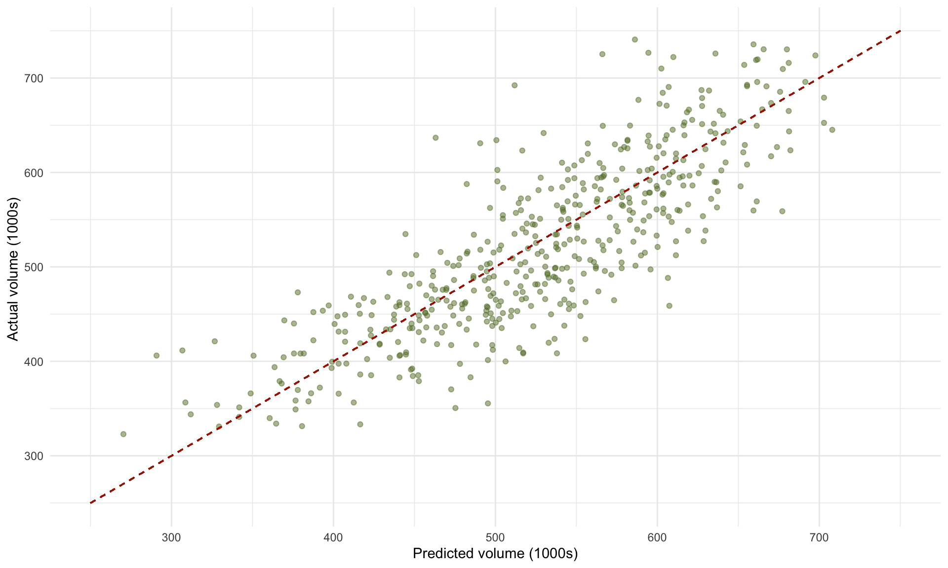
From the model above that includes year and season variables, we obtain the following scatterplot of actual vs. predicted volumes:
 We can also plot the residual scatterplot and histogram to verify whether linear regression is appropriate for this data:
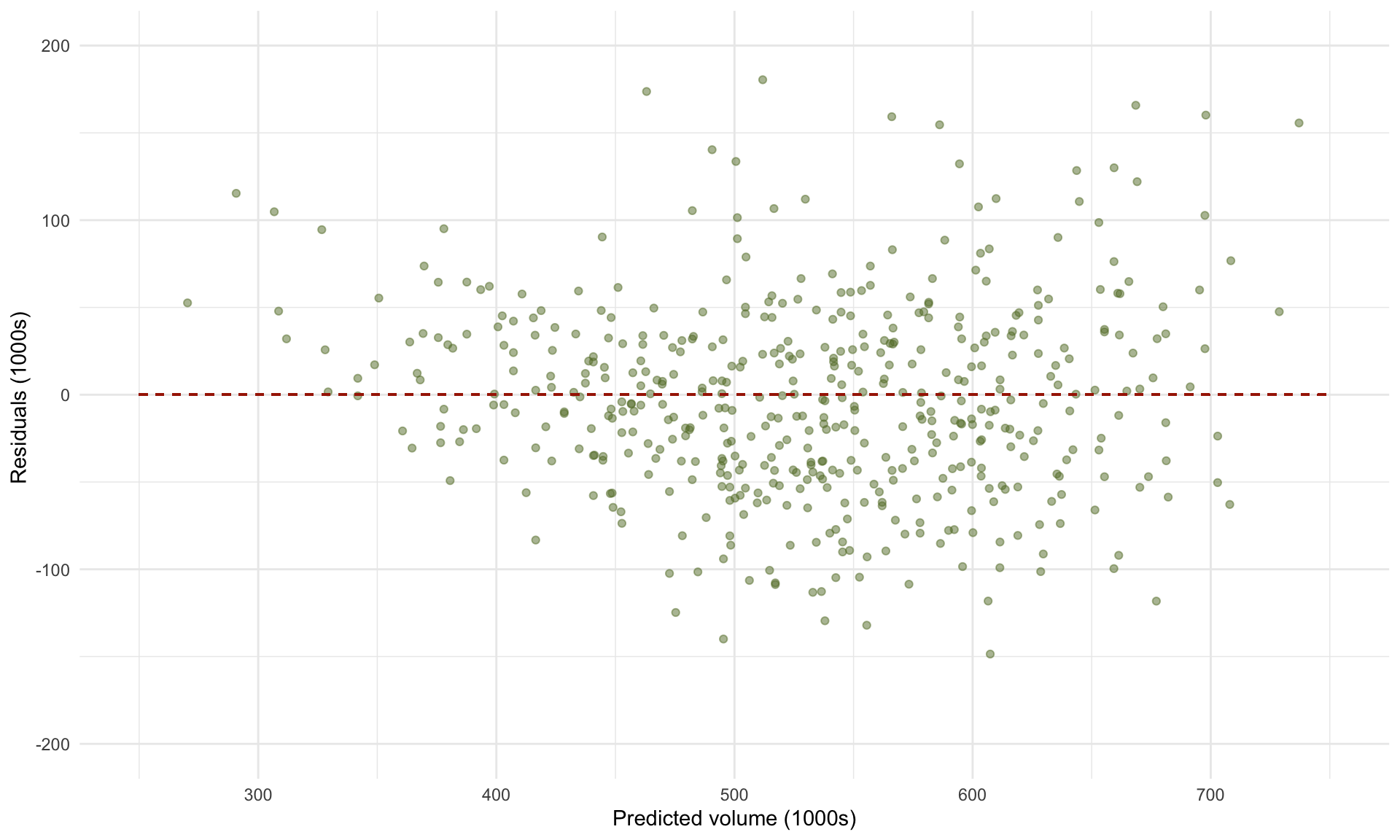
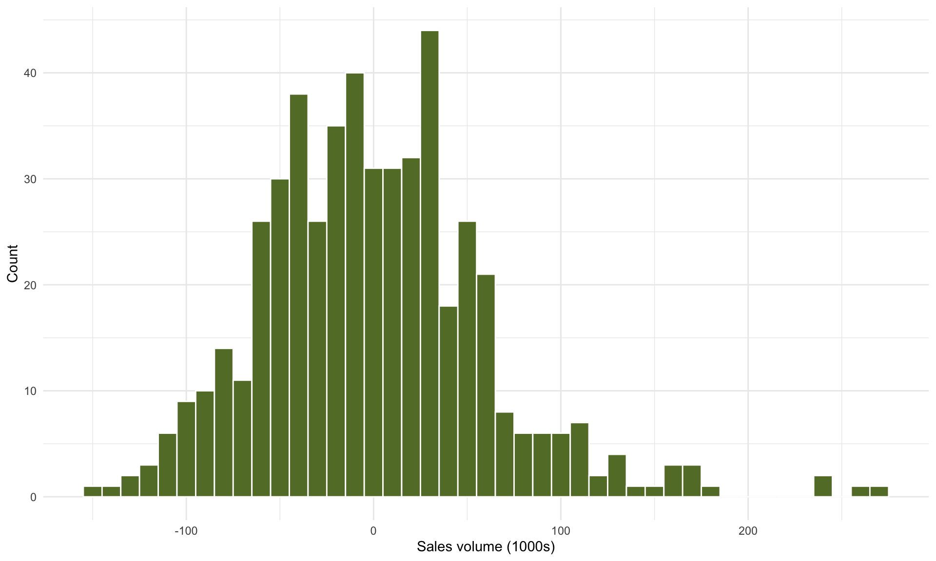 Because (1) we don’t observe any obvious structure in the residual scatterplot, and (2) the histogram of residuals looks approximately Normal, this should give us confidence in the results of the linear regression analysis (see Part 7 for a more detailed discussion on model diagnostics).
6.6 Correlation and collinearity
The correlation between two variables is a number between -1 and 1 that expresses how strongly the variables “move together”. The plots below visualize correlation for some random data:
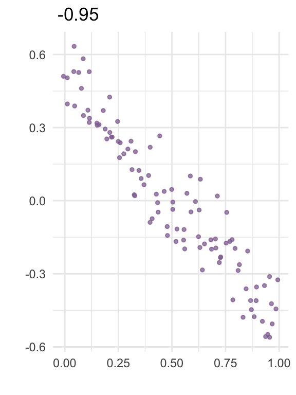
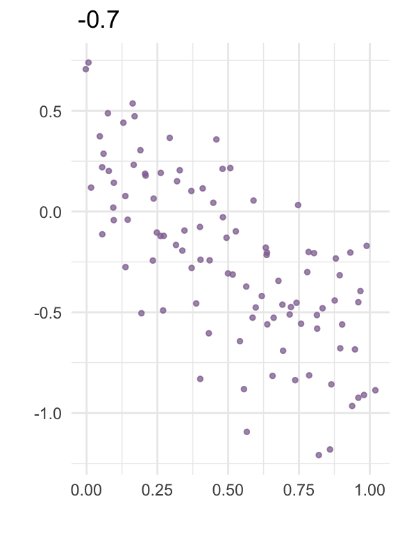
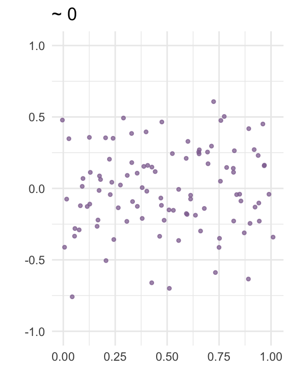
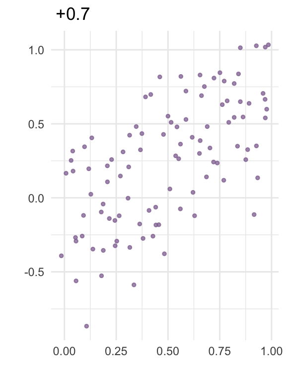
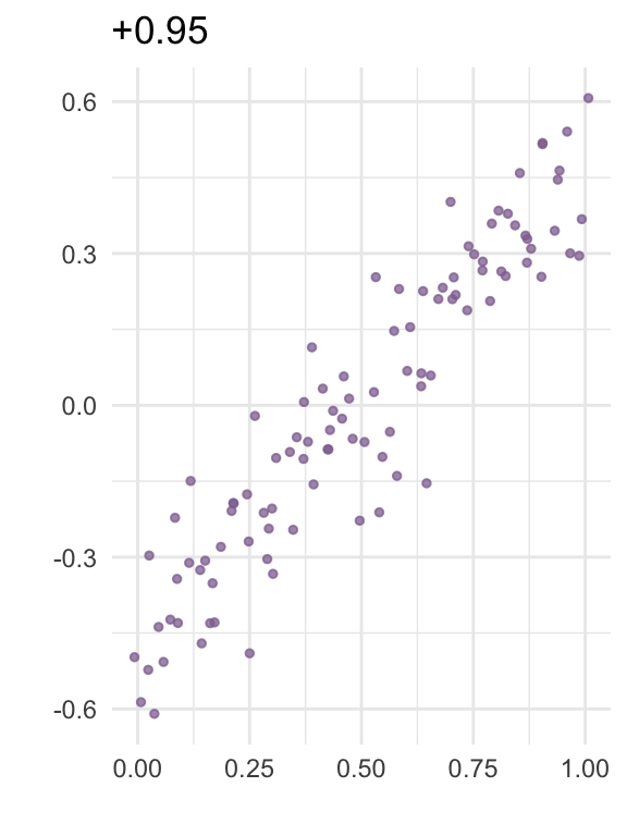
In linear regression, collinearity refers to correlation between two predictors. A high level of collinearity can reduce the precision of the estimates from a regression model, which in turn can affect the conclusions from the analysis.
It is important to note that collinearity is not inherently “bad” – low or moderate amounts of collinearity may not be a problem, and how much collinearity we are willing to tolerate depends in part on the purpose of building the model (more on this below).
We will explore the effect of collinearity using a new example. The file worldbank.csv contains macroeconomic data for 95 countries from 2014, released by the World Bank (databank.worldbank.org). The variables in the dataset are:
Country: Name of country
CO2: CO2 emissions (kg per capita)
Electricity: Electric power consumption (kWh per capita)
Renewable: share of electricity production from renewable sources (%)
EnergyUse: Energy use (kg of oil equivalent per capita)
GDP: GDP per capita (1000s of USD)
Loading the data:
##      Country       CO2 Electricity  Renewable EnergyUse       GDP
## 1    Albania  1668.337    2309.367  0.0000000  808.4558  4.578633
## 2  Argentina  4209.096    3074.702  1.9682645 2029.9228 12.334798
## 3    Armenia  1881.608    1961.610  0.0516129 1015.9099  3.986232
## 4  Australia 15830.422   10071.399  7.5008862 5334.6817 62.511691
## 5    Austria  7260.404    8355.842 14.4994807 3763.3279 51.786377
## 6 Azerbaijan  3381.199    2202.394  0.3720479 1502.0782  7.891313
For this example, we will try to predict the CO2 emissions of a country from the remaining variables. Our focus will be on inferring the association between electric power consumption (in kilowatt-hours per capita) and CO2 emissions (in kilograms per capita).
A scatterplot of CO2 against Electricity shows the following:
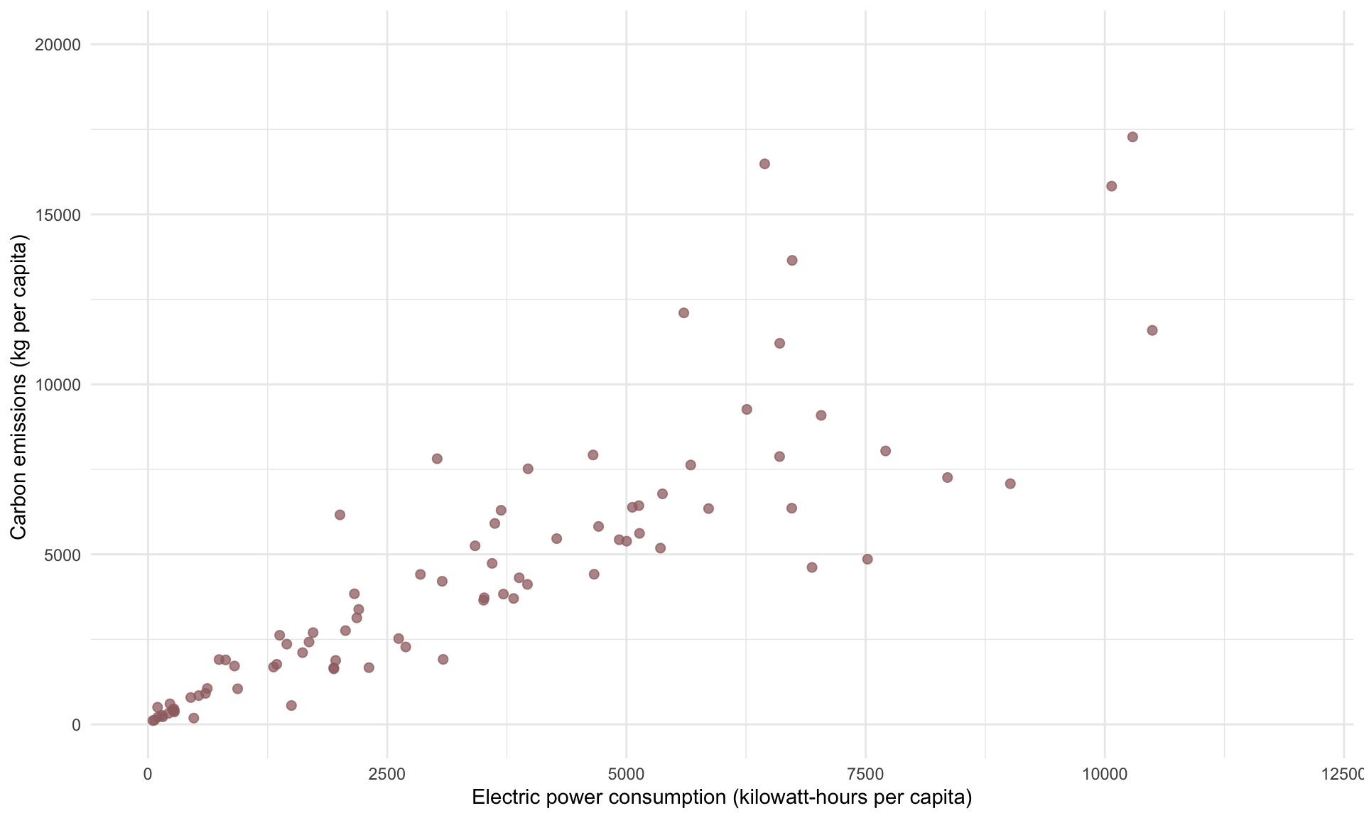
Suppose we build a simple regression model of CO2 on Electricity:
## MODEL INFO:
## Observations: 95
## Dependent Variable: CO2
## Type: OLS linear regression
##
## MODEL FIT:
## F(1,93) = 39.239, p = 0.000
## R² = 0.297
## Adj. R² = 0.289
##
## Standard errors:OLS
## -------------------------------------------------------
##                         Est.      S.E.   t val.       p
## ----------------- ---------- --------- -------- -------
## (Intercept)         3329.791   644.352    5.168   0.000
## Electricity            0.471     0.075    6.264   0.000
## -------------------------------------------------------
The model above shows Electricity to have a t-statistic of 6.26, which means it is highly significant. The slope estimate is 0.471, which we interpret as meaning that a kWH increase in electric power consumption is associated with an additional 0.471 kilograms of CO2 emissions.
Suppose we now add the variable Renewable, which is the share of electricity production that is from renewable energy sources.
## MODEL INFO:
## Observations: 95
## Dependent Variable: CO2
## Type: OLS linear regression
##
## MODEL FIT:
## F(2,92) = 21.858, p = 0.000
## R² = 0.322
## Adj. R² = 0.307
##
## Standard errors:OLS
## -------------------------------------------------------
##                         Est.      S.E.   t val.       p
## ----------------- ---------- --------- -------- -------
## (Intercept)         3905.845   707.717    5.519   0.000
## Electricity            0.502     0.076    6.601   0.000
## Renewable            -97.282    52.409   -1.856   0.067
## -------------------------------------------------------
Adding Renewable has increased the t-statistic of Electricity slightly (6.3 to 6.6), and has not changed the slope estimate or standard error too much. This minimal impact on the estimate for Electricity suggests minimal collinearity from introducing Renewable as a predictor.
Next, suppose we add GDP to our regression model:
## MODEL INFO:
## Observations: 95
## Dependent Variable: CO2
## Type: OLS linear regression
##
## MODEL FIT:
## F(3,91) = 29.523, p = 0.000
## R² = 0.493
## Adj. R² = 0.477
##
## Standard errors:OLS
## -------------------------------------------------------
##                         Est.      S.E.   t val.       p
## ----------------- ---------- --------- -------- -------
## (Intercept)         3010.271   636.121    4.732   0.000
## Electricity            0.212     0.084    2.509   0.014
## Renewable           -163.023    47.081   -3.463   0.001
## GDP                  136.329    24.594    5.543   0.000
## -------------------------------------------------------
What changed in our interpretation of the regression analysis after adding GDP? First, the \(R^2\) increased from 0.33 to 0.49. This suggests that GDP has some additional explanatory power with respect to CO2 beyond what is explained by Electricity and Renewable alone. (In fact, adding a new variable can never decrease \(R^2\)). The increase in \(R^2\) implies that adding GDP has improved the predictive power of the model.
An equivalent way of examining the impact on prediction of adding GDP to the model is to compare the residuals of both models:
## [1] 4874.732## [1] 4214.812We can see that the standard error of the residuals has decreased. Recall from earlier that the standard error of the residuals controls the width of the 95% prediction interval. This suggests we will get tighter prediction intervals under the second model.
Let’s now examine how our findings regarding Electricity has changed. After adding GDP, the t-statistic decreased (6.6 to 2.5) and the p-value increased (~0.00 to 0.014). While the p-value is still small, the increase implies that we are now less confident about the association between Electricity and CO2 after controlling for GDP. Note that the standard error of Electricity has also increased (0.076 to 0.084), which implies our slope estimate is less precise in the second model.
This loss in statistical significance of Electricity (due to the t-statistic shrinking) and slope estimate precision (due to the standard error increasing) is a typical sign of collinearity.
To check for collinearity, we construct a correlation matrix of the relevant variables using cor():
WB2 <- select(WB, c(Electricity, Renewable, GDP)) # make new data frame with relevant variables
round(cor(WB2),2) # round to 2 digits
## Electricity Renewable GDP
## Electricity 1.00 0.22 0.65
## Renewable 0.22 1.00 0.33
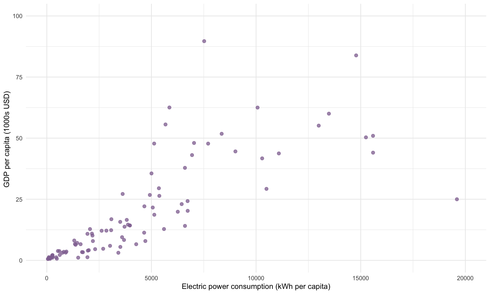
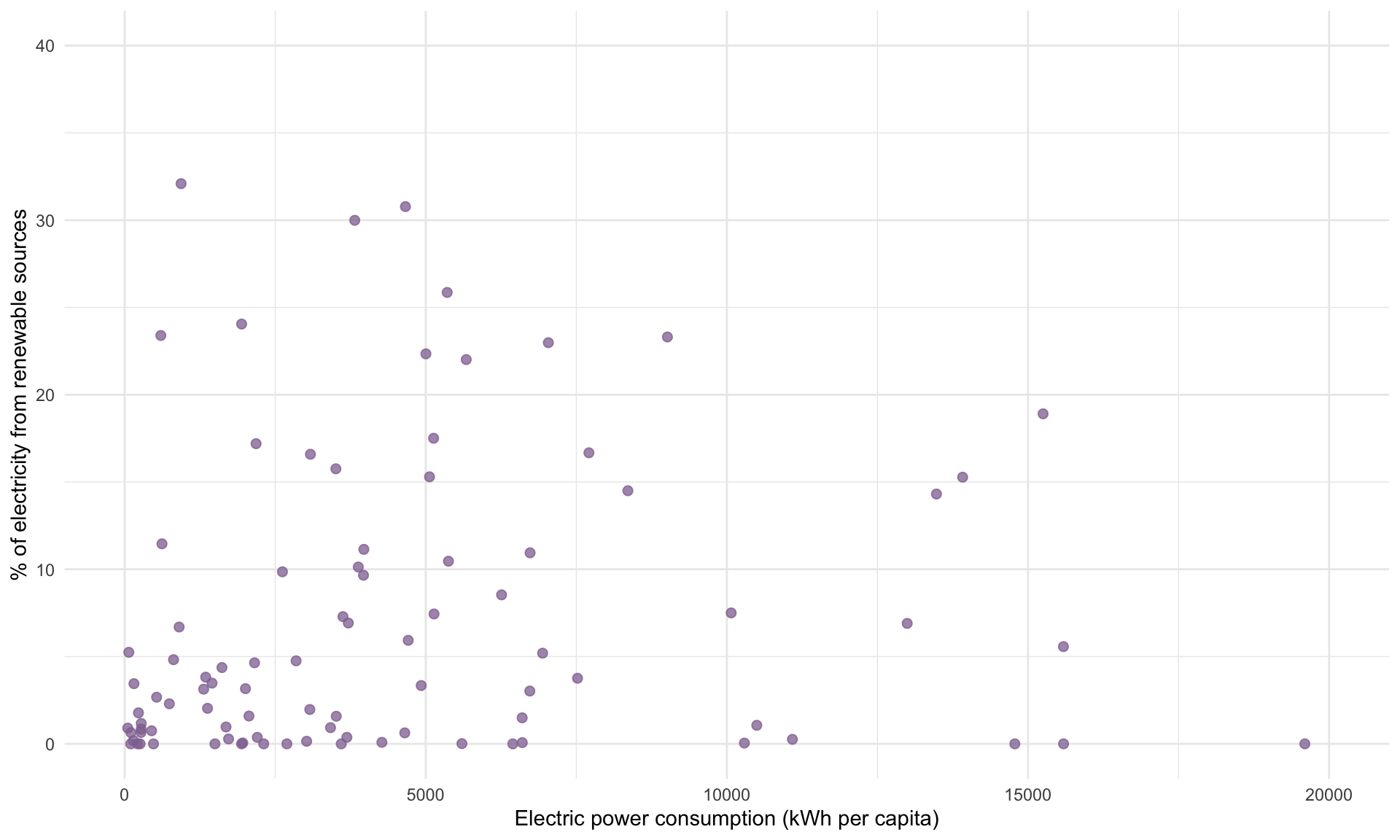
## GDP 0.65 0.33 1.00The correlation between Electricity and GDP is 0.65. This high correlation explains why the t-statistic shrank once we added GDP. In contrast, the correlation between Electricity and Renewable is only 0.22, and we saw that adding Renewable to the model had a minimal impact on the t-statistic and slope estimate for Electricity.
Plotting Electricity against GDP and Renewable allows us to visualize the correlations given in the matrix above:
Lastly, let’s add EnergyUse to the model, which is the country’s per capita energy consumption in all forms (measured in kg per oil equivalent).
## MODEL INFO:
## Observations: 95
## Dependent Variable: CO2
## Type: OLS linear regression
##
## MODEL FIT:
## F(4,90) = 142.324, p = 0.000
## R² = 0.863
## Adj. R² = 0.857
##
## Standard errors:OLS
## -------------------------------------------------------
##                         Est.      S.E.   t val.       p
## ----------------- ---------- --------- -------- -------
## (Intercept)         1209.731   351.416    3.442   0.001
## Electricity           -0.649     0.071   -9.198   0.000
## Renewable            -60.775    25.427   -2.390   0.019
## GDP                   67.072    13.579    4.939   0.000
## EnergyUse              2.470     0.158   15.624   0.000
## -------------------------------------------------------
Including EnergyUse has made the \(R^2\) jump from 0.49 to 0.86, meaning the predictive power of the model as a whole has increased considerably.
More interestingly, the magnitude of the t-statistic for Electricity has increased to 9.2, which is the largest across all regression models considered so far, whereas the t-statistic for GDP has decreased from 5.5 to 4.9. This simply highlights how the effect of adding a new variable to the model is quite difficult to know in advance.
In summary, collinearity can reduce precision in our slope estimates and lead to a loss in statistical significance, but never hurts the predictive power of the model. Whether collinearity is a problem depends on context: If we want to understand the association between a specific predictor and the target variable, then collinearity within the model can weaken our ability to draw precise conclusions. If we are interested in using linear regression for prediction only, then collinearity is generally not a problem.