Part 4 Hypothesis Testing
A hypothesis test is a statistical method for checking how strongly a dataset supports a given hypothesis. Our focus here will be on two-sample hypothesis tests, which are used extensively to investigate whether two groups differ in a statistically meaningful way. Picking up on the examples given in Part 3:
- An online retailer tests whether customer engagement under website design A is different than under website design B,
- A pharmaceutical company tests whether the efficacy of a new blood pressure medication differs from an existing competitor’s product, and
- A polling organization tests whether the strength of support for one mayoral candidate differs from another.
A challenge in working with limited data in practice is determining whether an observed difference between two groups is “real” or due to random chance. For example, suppose that the pharmaceutical company finds that its medication is more effective at lowering blood pressure than a competitor’s product, based on a clinical trial with 200 participants. Does this mean the medication is truly more effective in general, or is the difference due to random chance? The purpose of a hypothesis tests to help resolve these competing explanations.
The general steps to a hypothesis test are as follows:
- Specify a hypothesis about two groups.
- Collect a random sample of data from both groups.
- Test the hypothesis through a few short calculations.
- Draw a conclusion about whether two groups differ.
In what follows, we first discuss the mechanics of hypothesis testing in R, and how to interpret the output at an intuitive level. We’ll then discuss some of the background theory toward the end of this section.
4.2 Two-sample tests for means
Formally, a hypothesis test involves specifying a null hypothesis \((H_0)\) and an alternate hypothesis \((H_a)\). In the two-sample tests for means, the null hypothesis is always that the two groups have the same population mean.
Suppose we wish to compare the mean trip duration of monthly passholders and walk-ups. Then we can write the null and alternate hypotheses as follows.
\[\begin{align} H_0 &: \mu_m = \mu_w \\ H_a &: \mu_m \neq \mu_w. \end{align}\]
As a starting point, we visualize the trip times grouped by pass type:
# See code using the scroll bar immediately to the right ----->  #


annual_mean = mean(subset(bike, pass_type == "Annual Pass")$duration)
monthly_mean = mean(subset(bike, pass_type == "Monthly Pass")$duration)
oneday_mean = mean(subset(bike, pass_type == "One Day Pass")$duration)
walkup_mean = mean(subset(bike, pass_type == "Walk-up")$duration)

    cols = met.brewer("Monet",4)
    ggplot(bike, aes(x=pass_type, y=duration, fill=pass_type))+
    geom_boxplot(outlier.shape = NA)+
    theme_minimal()+
    geom_jitter(color="black", size=0.2, alpha=0.5)+
    scale_fill_manual(values=cols)+
    ylim(c(0,100))+
    theme(legend.position="none",plot.title = element_text(size=14))+
    ylab("Average trip duration (minutes)")+
    annotate("point", x = 1, y = annual_mean, shape=18, size=2, color="black" )+
    annotate("point", x = 2, y = monthly_mean, shape=18, size=2, color="black")+
    annotate("point", x = 3, y = oneday_mean, shape=18, size=2, color="black")+
    annotate("point", x = 4, y = walkup_mean, shape=18, size=2, color="black")+
    xlab("")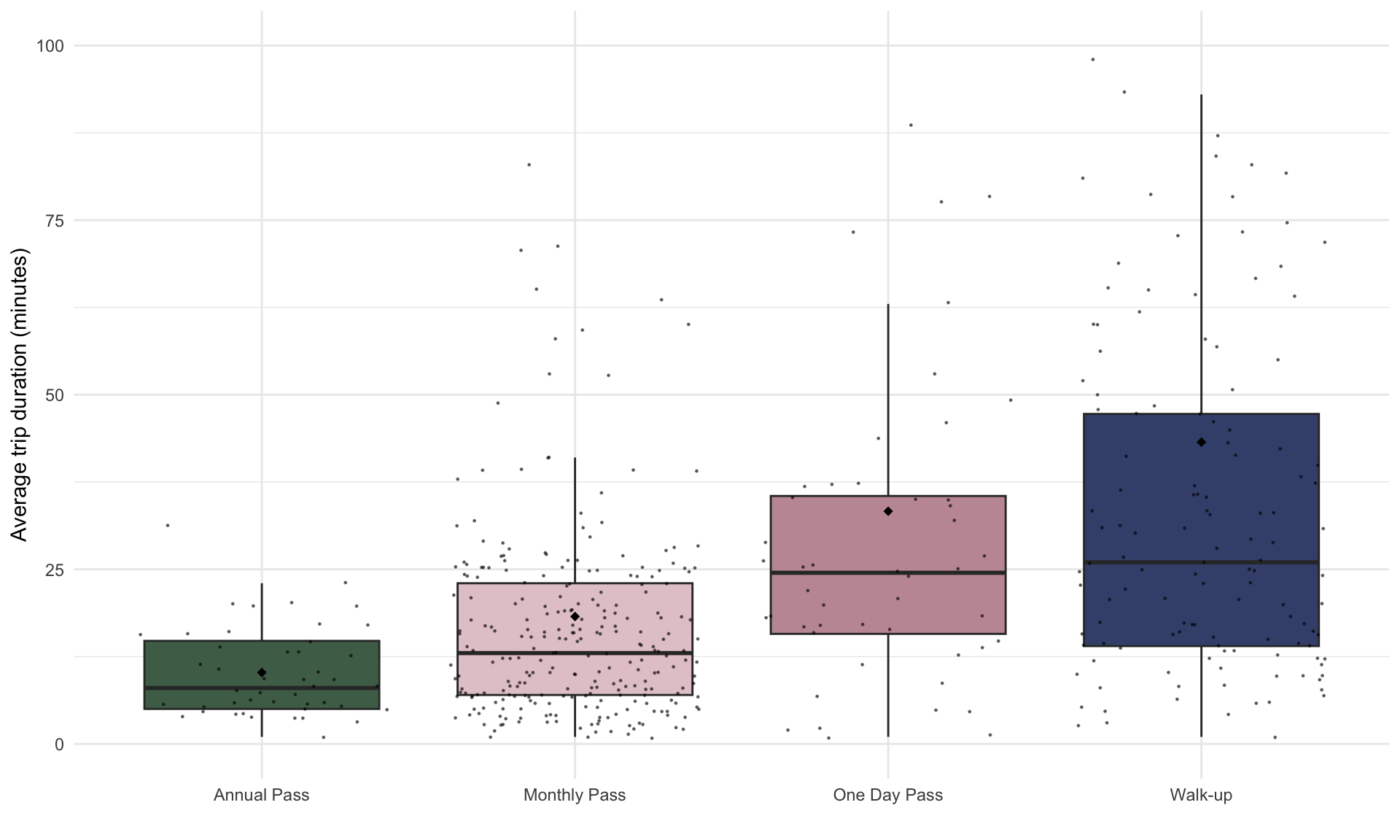
The black diamonds in the box plot above shows the mean trip duration, and the horizontal black line shows the median trip duration. Note that the mean trip duration is longer for the one day and walk-ups than annual and monthly pass. Is this different indicative of a true difference between passholders, or is it specific to our random sample of trip data? We can determine which explanation is more plausible using a hypothesis test for means.
Let’s first split the data by pass type:
annual = bike[bike$pass_type=="Annual Pass",]
monthly = bike[bike$pass_type=="Monthly Pass",]
daily = bike[bike$pass_type=="One Day Pass",]
walkup = bike[bike$pass_type=="Walk-up",]
Suppose we first want to investigate whether the mean trip duration differs between annual and monthly passholders. We can use the t.test() function to compare the trip durations for both groups:
| Test statistic | df | P value | Alternative hypothesis | mean of x |
|---|---|---|---|---|
| -4.524 | 265.3 | 9.142e-06 * * * | two.sided | 10.22 |
| mean of y |
|---|
| 18.24 |
From the output above, we can see that the average trip time for annual passholders was 10.2 minutes and the average trip time for monthly passholders was 18.2 minutes. The p-value is extremely small (0.0000126), which suggests it is extremely unlikely this difference in due to chance alone. Therefore, we conclude that monthly passholders tend to have longer trip durations than annual passholders, and that this difference is statistically significant at the \(\alpha = 0.05\) level.
A crucial condition for the analysis above to be valid is that the data to be a random sample of the population, or as close to random as possible. This often requires thinking carefully about where the data came from and what the relevant population is. If the sample is not random, then it may be biased, which means the conclusions from the hypothesis test may be invalid.
4.3 Two-sample tests for proportions
Performing a hypothesis test is for proportions is conceptually similar. Let’s suppose LA Metro wants to investigate whether the proportion of one way vs round trips differs across the various pass types.
We begin with a little data processing to store the relevant statistics:
# Frequency of one way trips by pass type
f_a = sum(annual$trip_type=="One Way")
f_m = sum(monthly$trip_type=="One Way")
f_d = sum(daily$trip_type=="One Way")
f_w = sum(walkup$trip_type=="One Way")

# Total number of trips by pass type
n_a = nrow(annual)
n_m = nrow(monthly)
n_d = nrow(daily)
n_w = nrow(walkup)
Next let’s visualize the four proportions based on the counts above:
# See code using the scroll bar immediately to the right -----> #


props <- data.frame(
  name=factor(c("Annual","Monthly","Daily","Walkup"), levels = c("Annual","Monthly","Daily","Walkup")),
  value=c(f_a/n_a,f_m/n_m,f_d/n_d,f_w/n_w))

p_a = f_a/n_a
p_m = f_m/n_m
p_d = f_d/n_d
p_w = f_w/n_w

ggplot(props, aes(x=name, y=value, fill = name)) +
  geom_bar(stat = "identity")+
  scale_fill_manual(values = cols)+
  theme_minimal()+
  theme(legend.position="none",plot.title = element_text(size=11)) +
  ylab("Proportion of one-way trips")+
  geom_errorbar(aes(x=1, ymin=p_a - 2*sqrt(p_a*(1-p_a)/n_a), ymax=p_a + 2*sqrt(p_a*(1-p_a)/n_a)), width=0.4, colour="black", alpha=0.9, size=0.25)+
    geom_errorbar(aes(x=2, ymin=p_m - 2*sqrt(p_m*(1-p_m)/n_m), ymax=p_m + 2*sqrt(p_m*(1-p_m)/n_m)), width=0.4, colour="black", alpha=0.9, size=0.25)+
    geom_errorbar(aes(x=3, ymin=p_d - 2*sqrt(p_d*(1-p_d)/n_d), ymax=p_d + 2*sqrt(p_d*(1-p_d)/n_d)), width=0.4, colour="black", alpha=0.9, size=0.25)+
    geom_errorbar(aes(x=4, ymin=p_w - 2*sqrt(p_w*(1-p_w)/n_w), ymax=p_w + 2*sqrt(p_w*(1-p_w)/n_w)), width=0.4, colour="black", alpha=0.9, size=0.25)+
  xlab("")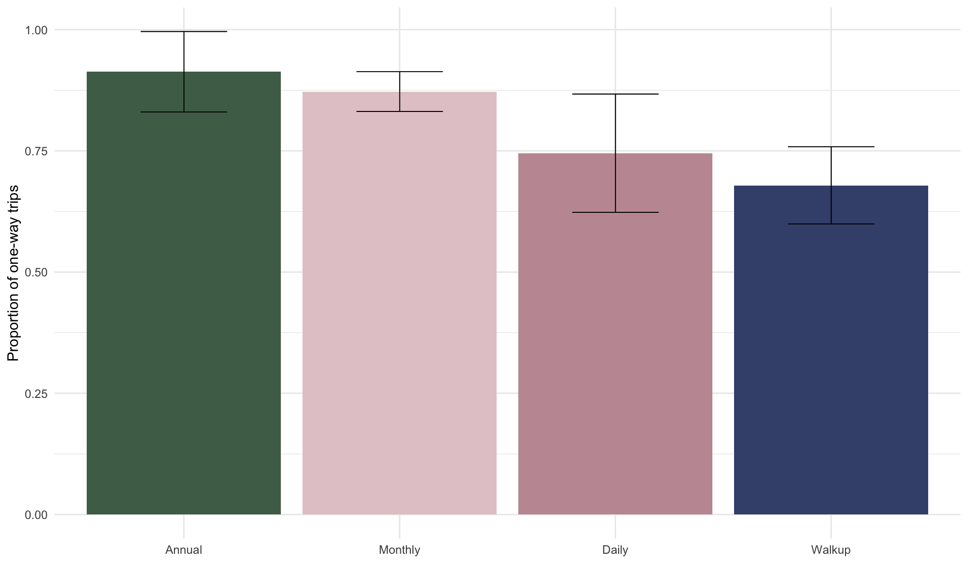
Let’s start by comparing annual passholders with walk-ups. From the plot above, we can see that within our random sample of 500 trips annual passholders are more likely to make one-way trips. Is this result statistically significant at an \(\alpha = 0.05\) significance level?
To investigate, we perform a two-sample proportion test. In R, this is done by calling the prop.test() function:
freqs = c(f_a,f_w) # store frequencies of one-way trips by annual passholders and walkups
totals = c(n_a,n_w) # store total number of trips by annual and walkups
result <- prop.test(freqs,totals) # run two sample hypothesis test for proportions
pander(result)| Test statistic | df | P value | Alternative hypothesis | prop 1 | prop 2 |
|---|---|---|---|---|---|
| 8.59 | 1 | 0.00338 * * | two.sided | 0.913 | 0.6788 |
The summary table above shows that the probability an annual passholder takes a one-way trip is 0.91, whereas the same probability for walkups is 0.67 – a difference of 0.24. Because we observe a tiny p-value of \(0.003 < 0.05\), we can conclude that this difference is statistically significant at the \(\alpha = 0.05\) level. In other words, this \(p\)-value means that if annual and walkup passholders were equally likely to make one-way trips in general, then the likelihood we would observe a difference as large as 0.24 just by chance is 3 in 1000. This is very unlikely, so we conclude the underlying population proportions are in fact not equal.
Suppose we now want to compare annual passholders to monthly passholders. We can see from the bar chart above that annual passholders are slightly more likely to make one-way trips than monthly passholders. Does this hold in general?
freqs = c(f_a,f_m) # store frequencies of one-way trips by annual and monthly passholders
totals = c(n_a,n_m) # store total number of trips by annual and monthly passholders
result <- prop.test(freqs,totals) # run two sample hypothesis test for proportions
pander(result)| Test statistic | df | P value | Alternative hypothesis | prop 1 | prop 2 |
|---|---|---|---|---|---|
| 0.2898 | 1 | 0.5903 | two.sided | 0.913 | 0.8722 |
The difference in likelihood of making a one-way trip between annual and monthly passholders is \(0.91 - 0.87 = 0.04\). The large p-value of \(0.59\) suggests that this observed difference is not statistically significant. In words, if the true population proportions were the same, there is a 59% chance we would observe a difference of at least 0.04. So, we can’t reject the null hypothesis of equal population proportions.
4.4 One-sample tests for means and proportions
Instead of testing whether two groups are different, we can also perform a one-sample test which compares one group against a reference value. For example, suppose we know that the mean duration of bike share trips by monthly holders was 22 minutes in the previous three years, and we wish to test whether it has changed this year. Because the reference value of 22 minutes is not based on a random sample of data, we treat it as a fixed number. The null and alternate hypotheses then become:
\[\begin{align} H_0 : \mu = 22, \\ H_a : \mu \neq 22. \\ \end{align}\]
In R, we run the hypothesis test in the same way, this time replacing the second sample with mu = 22:
| Test statistic | df | P value | Alternative hypothesis | mean of x |
|---|---|---|---|---|
| -2.519 | 265 | 0.01235 * | two.sided | 18.24 |
4.5 Background theory
Here we’ll give a high-level idea of the background theory for hypothesis testing. We will use one-sample hypothesis tests for means to convey the main ideas, which hold for one-sample proportion tests and both types of two-sample tests as well.
In a one-sample hypothesis test, the test statistic is
\[ t =\frac{\bar{x} - \mu}{\frac{s}{\sqrt{n}}} \] What is the interpretation of \(t\) here? Recall from Part 3 that the sample mean \(\bar{x}\) is a random variable with mean \(\mu\) and standard deviation \(\frac{s}{\sqrt{n}}\). Therefore, if \(\mu\) is the true mean, then the observed \(\bar{x}\) is \(t\) standard errors away from the mean of the sampling distribution.
To illustrate, suppose in a random sample of \(n = 100\) trips by monthly passholders, we obtain a sample mean of \(\bar{x} = 27\) minutes. Suppose now we wish to test whether the true mean is \(22\) minutes. In this case, the hypotheses are
\[\begin{align} H_0 : \mu = 22 \\ H_a : \mu \neq 22. \end{align}\]
If the null hypothesis were true, then the distribution for \(\bar{x}\) would look something like:
# See code using the scroll bar immediately to the right -----> #


cols = met.brewer("Monet")
set.seed(1)
bike = read.csv("bikeshare.csv", stringsAsFactors = TRUE)
bike = bike[bike$pass_type=="Monthly Pass",]
mu = 22


n = 100
x_bar <- list()


for(i in 1:10000){
bike_sample <- bike[sample(1:nrow(bike), n),]
x_bar[[i]] = mean(bike_sample$duration)
}


delt = mu - mean(unlist(x_bar))

CLT <-data.frame(cbind(x_bar))
CLT$x_bar=as.numeric(CLT$x_bar)+delt

ggplot(CLT, aes(x = x_bar)) +
  geom_histogram(binwidth = 0.2, color = "white", fill = cols[9]) +
  theme_minimal() +
  xlab("Mean duration of one way trips (minutes)") +
  ylab("Frequency") +
  geom_segment(aes(x = mu, y = 0, xend = mu, yend = 450),
               size = 0.5, linetype = "dashed", color = cols[6]) +
  geom_segment(aes(x = 27, y = 0, xend = 27, yend = 80),
               size = 0.5, linetype = "dashed", color = cols[6]) +
  annotate("text", x = mu + 1, y = 425, label = "mu == 22", parse = TRUE) +
  annotate("text", x = 28, y = 70, label = "x == 27", parse = TRUE) +
  scale_x_continuous(breaks = 15:30)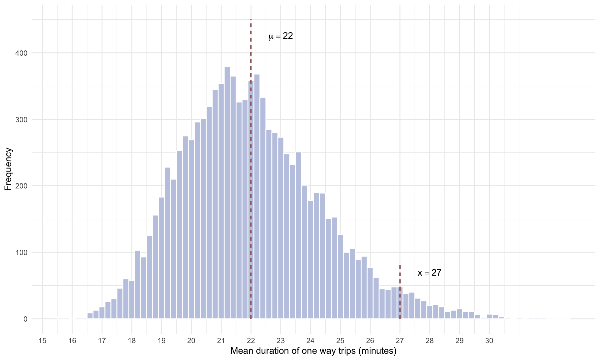
Note how far away \(\bar{x} = 27\) is from the hypothesized mean of \(\mu = 22\) minutes. That is, if the true mean really were 22 minutes, then it would be pretty rare for us to observe \(\bar{x} = 27\) (or larger) from a sample size of 100. In fact, out of 10,000 random draws of the data, the mean duration was more than 5 minutes further from the mean (in either direction) in only 353 out of 10,000 random draws, or in 3.53% of cases. This small probability is the \(p\)-value – the likelihood of seeing a deviation from the mean this large if the null were true.