Part 10 Classification and Regression Trees
Along with logistic regression, classification trees are one of the most widely used prediction methods in machine learning. Classification trees have two major selling points: (1) they are flexible and can detect complex patterns in data, and (2) they lead to intuitive visualizations that are quite straightforward to interpret.
10.1 Classification trees
10.1.1 Data: Iris flowers
For this tutorial, we will use a famous dataset related to the measurements of three different species of iris flowers. Our goal will be to predict which species a flower belongs to based on its shape.
To get started, let’s load some useful packages:
The iris dataset is a very popular example in statistics because it is nice and tidy: There are 4 independent variables / features, and the dependent variable / label has 3 classes.
Independent variables / Features:
- Sepal.Length: length of flower sepal (in cm)
- Sepal.Width: width of flower sepal (in cm)
- Petal.Length: length of flower petal (in cm)
- Petal.Width: width of flower petal (in cm)
Dependent variable / Label:
- Species: Species of iris flower (setosa, versicolor, or virginica)
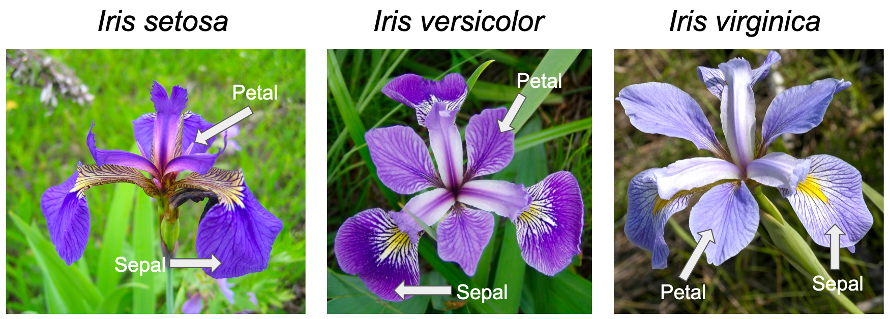
Click here for an image that shows that sepal and petal for each species.
The iris dataset is so well-known in statistics that it comes built-in with the datasets package. Printing the first 10 rows of iris shows us how the data is organized:
##   Sepal.Length Sepal.Width Petal.Length Petal.Width Species
## 1          5.1         3.5          1.4         0.2  setosa
## 2          4.9         3.0          1.4         0.2  setosa
## 3          4.7         3.2          1.3         0.2  setosa
## 4          4.6         3.1          1.5         0.2  setosa
## 5          5.0         3.6          1.4         0.2  setosa
## 6          5.4         3.9          1.7         0.4  setosa
There are three classes – one for each flower species. Each row corresponds to a single flower. The dataset contains exactly 50 observations for each class, which means that the data is balanced. Having a perfectly balanced dataset is usually not possible in practice, but it is nice to have for demonstration purposes.
As usual, it is helpful to start with a few simple visualizations of the data. The next two blocks of code create plots of the sepal length vs. sepal width, and then petal length vs. petal width.
scatter <- ggplot(data=iris, aes(x = Sepal.Length, y = Sepal.Width))
scatter + geom_point(aes(color=Species, shape=Species)) +
  xlab("Sepal Length") +  ylab("Sepal Width") +
  theme_minimal()+
  ggtitle("Sepal Length-Width")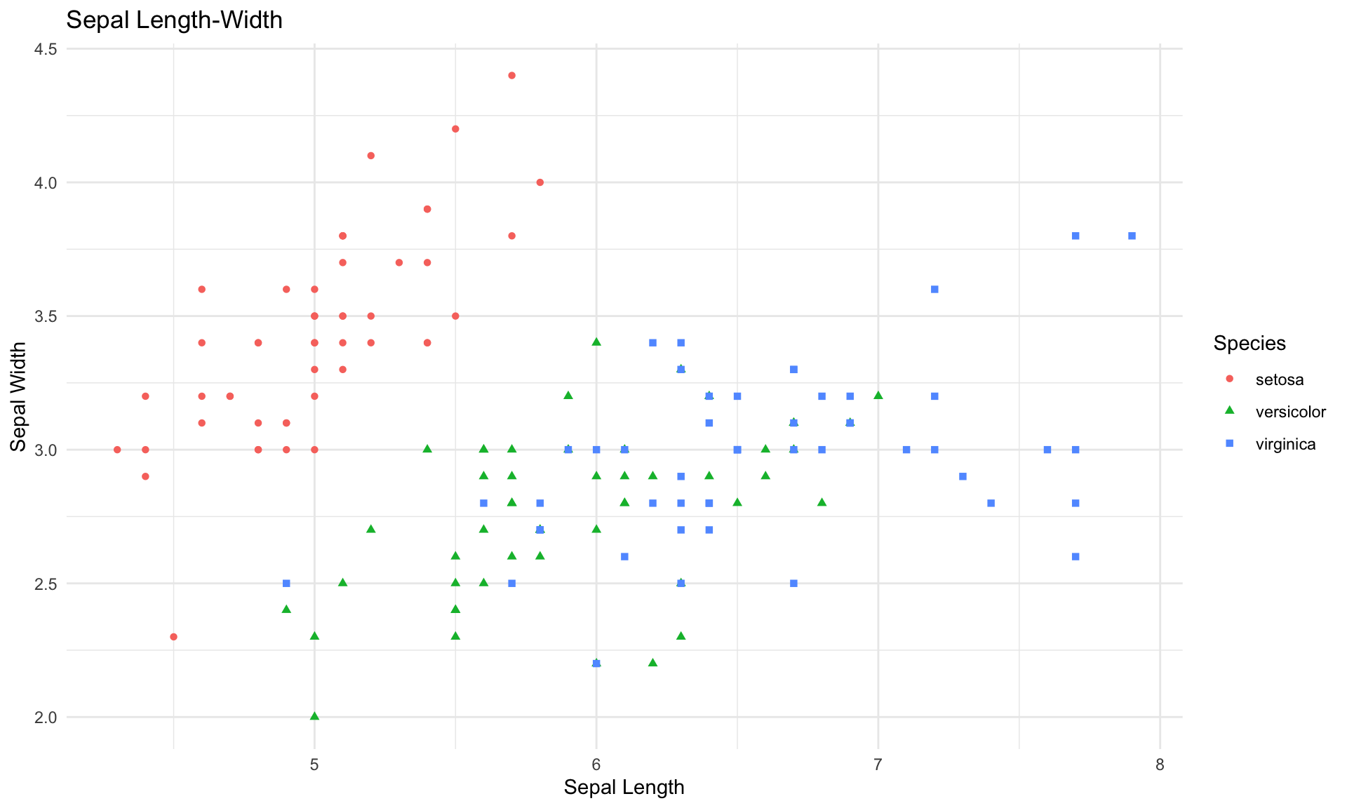
scatter <- ggplot(data=iris, aes(x = Petal.Length, y = Petal.Width))
scatter + geom_point(aes(color=Species, shape=Species)) +
  xlab("Petal Length") +  ylab("Petal Width") +
  theme_minimal()+
  ggtitle("Petal Length-Width")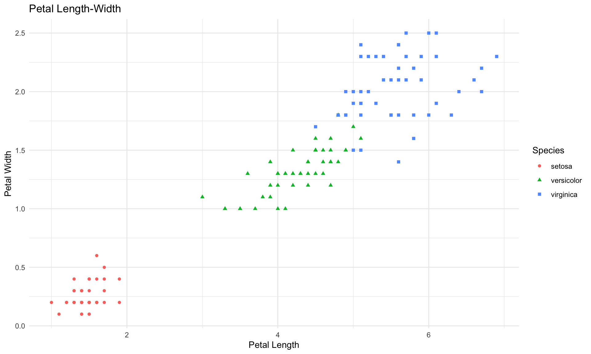
The plots above reveal some fairly clear patterns in the data, which our classification tree should be able to detect.
10.1.2 Building a classification tree
Let’s start by splitting into training and testing data:
set.seed(0)
split = sample.split(iris, SplitRatio = 0.75)
train = subset(iris, split == TRUE)
test = subset(iris, split == FALSE)
Like in logistic regression, we will use the training set to build the tree, and the test set to measure the performance of the algorithm.
We now build the tree on the train data using rpart(). Let’s start with just using default settings:
Next, we can visualize the classification tree model as follows:
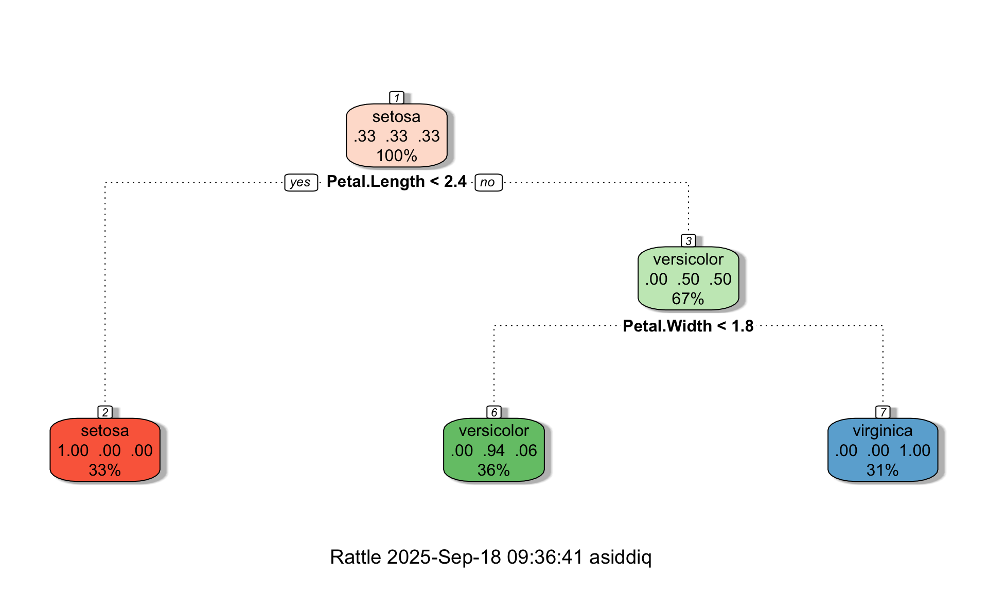
Each box in the tree diagram is called a leaf. Each leaf contains three pieces of information:
- The fraction of data points in the leaf that belong to each of the three classes
- The classification of the leaf, which is determined based on the majority class
- The total fraction of data points that end up in the leaf
For example, let’s look at the middle leaf at the bottom of the tree. For the data points in that leaf, 0% of the true labels are setosas, 94% of the true labels are versicolors, and 6% are virginicas. Therefore, based on the majority class, the tree classifies all observations in that leaf as versicolors. Further, the diagram tells us that the middle leaf contains 36% of the observations in the training set.
Crucially, the diagram also indicates the split points of the tree under each non-terminal leaf. These split points effectively turn the tree diagram into a flow-chart, and allow us to see how the tree makes predictions. For example suppose we have a new flower whose species is unknown, and we want to classify it as either a setosa, versicolor, or virginica based on its petal and sepal measurements:
- Petal.Length = 3
- Petal.Width = 1.5
- Sepal.Length = 6
- Sepal.Width = 3.5
To determine how the tree would classify this new flower, we would start at the top of the tree, and check the split conditions encountered at each leaf. More concretely:
The first condition at the top of the tree is Petal.Length < 2.4. Because our petal length is 3, the answer at the top leaf is no, and we move right.
After moving right at the previous leaf, the next leaf we encounter has the condition Petal.Width < 1.8. Because our petal width is 1.5, the answer to the split condition at this leaf is yes, and we move left.
After moving left at the previous leaf, we have landed in a terminal leaf that is labeled versicolor, meaning our model would classify our hypothetical observation as versicolor.
Interestingly, the classification tree above decided to split the data based on petal length and width only. Thesee split points are represented by the dashed lines:
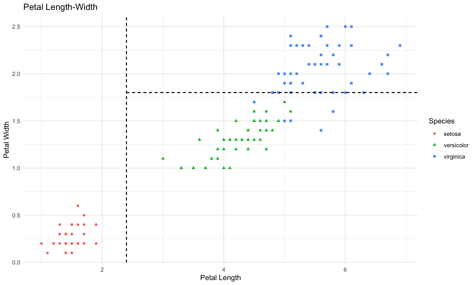
In the plot above, each rectangular box in scatterplot corresponds to one leaf in the tree diagram. In our iris data example, we are able to visualize the splits of the tree diagram in the scatterplot because there are only 2 variables in the tree diagram (Petal.Length and Petal.Width). But if our tree were to contain splits on 3 or more different variables, then we would not be able to visualize it in a simple 2-dimensional scatterplot. That said, all of the general concepts discussed in this tutorial also apply to more complex trees containing many leaves and layers.
10.1.3 Model building and variable importance
To generate additional insights from the model, it is helpful to look at variable importance, which is a measurement of the predictive power of each variable. We can extract and plot variable importance from the tree object in R as follows:
VI<-tree$variable.importance
barplot(VI, xlab="Variable", ylab="Importance", names.arg=names(VI),cex.names=0.8, col = "dodgerblue") 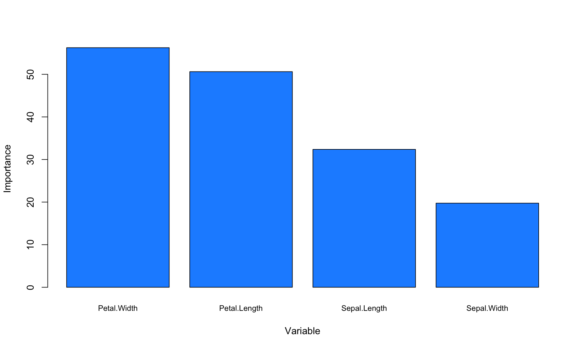
The variable importance values do not have a straightforward interpretation, so what really matters here are the relative values. The plot above suggests that petal dimensions are more important than sepal dimensions, at least for our specific goal of predicting flower species.
Another useful rule-of-thumb for determining variable importance is to look at which variables are used to create splits near the top of the tree. In our tree diagram above, we can see that Petal.Width and Petal.Length are the variables that are automatically chosen for creating splits, which roughly aligns with our variable importance plot as well.
10.1.4 Making predictions and measuring accuracy
How well does our model predict the true labels of the flowers in our test set? To evaluate prediction accuracy, we can first create the confusion matrix for the test set:
ConfusionMatrix = predict(tree,test,type="class")
matrix <- table(test$Species,ConfusionMatrix)
print(matrix)
## ConfusionMatrix
## setosa versicolor virginica
## setosa 20 0 0
## versicolor 0 19 1
## virginica 0 3 17In the confusion matrix, the rows are the true classes (i.e., the labels) and the columns are predictions. The matrix above tells us that in the test set, 1 versicolor is incorrectly classified as virginica, and 3 virginicas are incorrectly classified as versicolors. The values in the main diagonal of the confusion matrix (going from top-left to bottom-right) are the number of correctly classified observations. So we can calculate the overall accuracy on the test set by dividing the sum of the diagonal by the total number of observations:
## [1] 0.9333333The accuracy on the test set is 93%.
10.1.5 Advanced model settings
We can also specify a few options in rpart() to have more control over the model building process. There are four options:
The
maxdepthoption prevents the tree from “growing” more than a certain number of layers deep (e.g., 2,3,4…). Limiting the maximum depth of a tree can be useful if we want to build a very simple model that is easier to interpret visually.The
minsplitoption specifies the minimum number of observations that must exist in a node in order for a split to be attempted.The
minbucketoption specifies the minimum number of observations allowed in any terminal (leaf) node.The
cpoption is another way to control model complexity, but is not interpretable so we will set it to 0.
All three of these parameters affect model complexity. In particular, model complexity is reduced by setting small values for maxdepth and large values for minsplit and minbucket.
The code below shows an example of how changing these options affects the resulting tree. (Note that for demonstration purposes, we are using the full dataset below instead of just the training data).
# Setting maxdepth = 3, minsplit = 10, minbucket = 10
tree <- rpart(Species ~., data=iris, method="class", maxdepth = 3, minsplit = 10, minbucket = 10, cp = 0)
fancyRpartPlot(tree,palettes=c("Reds", "Greens","Blues"))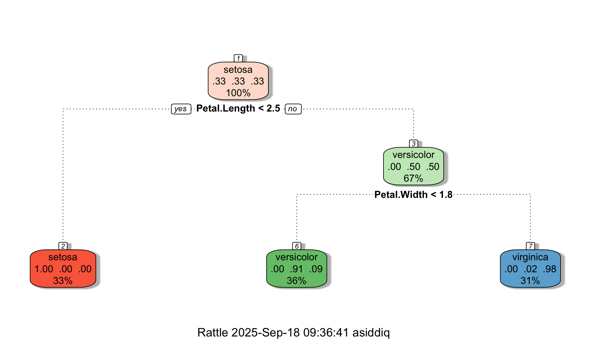
We can see in the tree above that even though maxdepth = 3, the tree is only two layers deep. Suppose we now change minbucket to 1:
# Changing minbucket = 1
tree <- rpart(Species ~., data=iris, method="class", maxdepth = 3, minsplit = 10, minbucket = 1, cp = 0)
fancyRpartPlot(tree,palettes=c("Reds", "Greens","Blues"))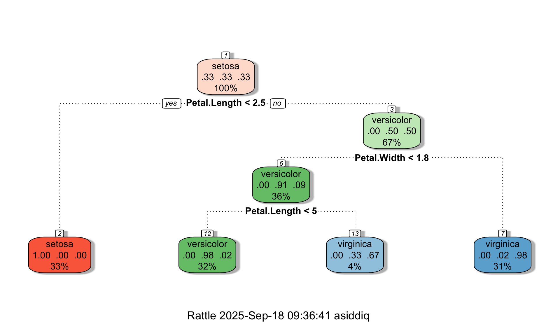
We can see that changing minbucket from 10 to 1 allowed the tree to grow. You can play around with these settings further to explore their effect on tree complexity.
10.2 Regression trees
Regression trees are conceptually similar to classification trees, except the label is a number instead of a class (just like in linear regression). To demonstrate how to build a regression tree in R, let’s load the diamond dataset:
##   carat       cut color clarity price
## 1  0.23     Ideal     E     SI2   326
## 2  0.21   Premium     E     SI1   326
## 3  0.23      Good     E     VS1   327
## 4  0.29   Premium     I     VS2   334
## 5  0.31      Good     J     SI2   335
## 6  0.24 Very Good     J    VVS2   336
Let’s again split the data into training and testing sets:
set.seed(0)
split = sample.split(diamonds, SplitRatio = 0.75)
train = subset(diamonds, split == TRUE)
test = subset(diamonds, split == FALSE)
10.2.1 Building a regression tree
Building a regression tree in R is nearly identical to building a classification tree. The only difference is we change the “method” option in rpart() from “class” to “anova”. To keep the model simple, let’s just focus on the four Cs for our independent variables: carat, cut, color, and clarity. Let’s also set a maximum depth of 2 for now:
We can visualize the tree just like we did for the iris data:
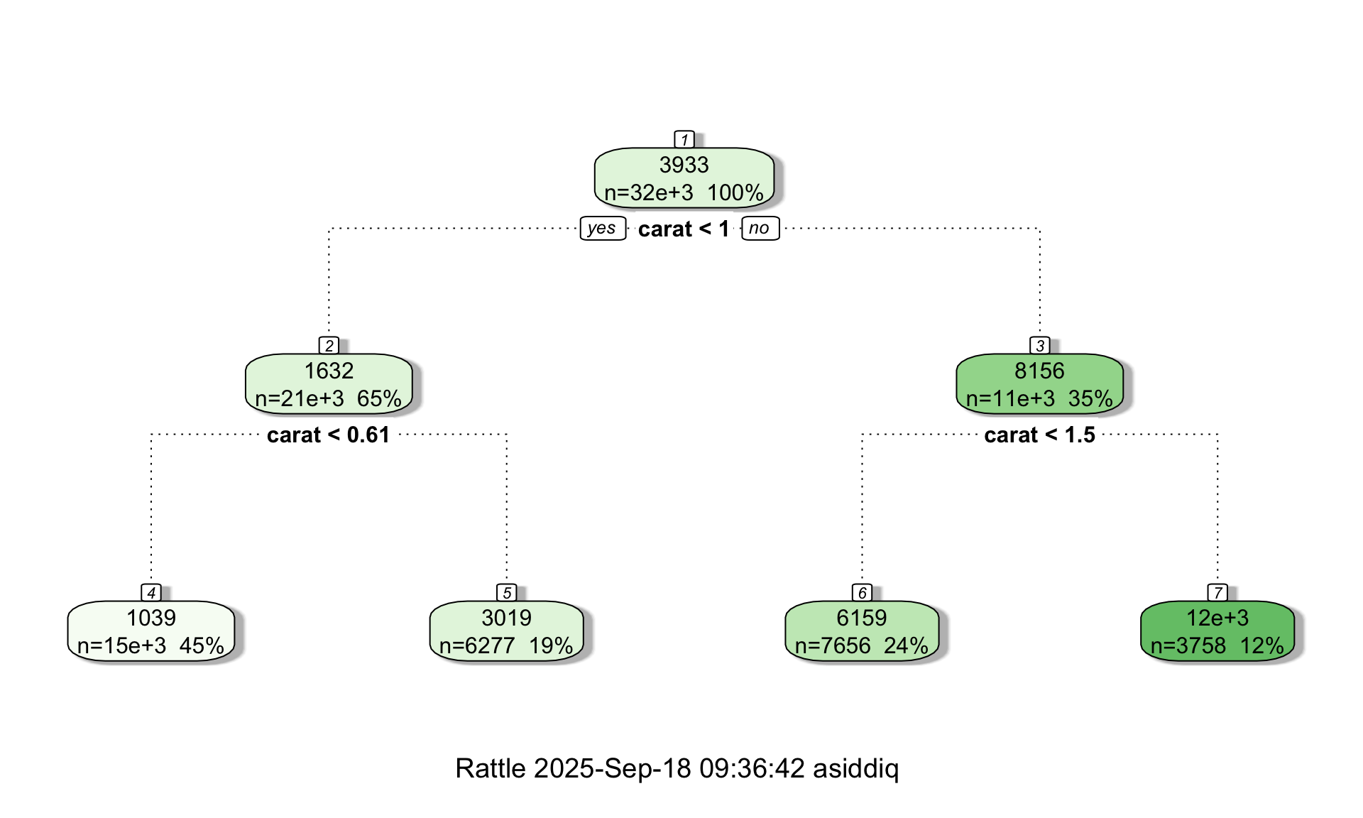
In a regression tree, each leaf of the tree diagram contains a single number which is the predicted price of all diamonds that “land” in that leaf. As before, the tree diagram also shows the number of data points contained in each leaf. Interestingly, the tree diagram splits twice on the carat variable, suggesting that the number of carats is an important variable with respect to predicting the price.
We can more formally evaluate variable importance in the exact same way as for the iris data:
VI<-tree$variable.importance
barplot(VI, xlab="Variable", ylab="Importance", names.arg=names(VI),cex.names=0.8, col = "dodgerblue") 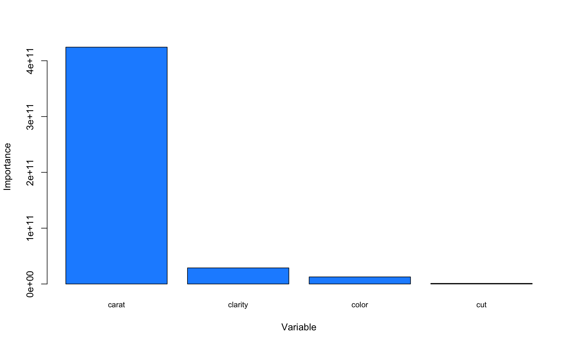
The variable importance plot above suggests that carat is clearly the most important variable with respect to predicting the price of a diamond.
10.2.2 Measuring accuracy
Because regression trees predict continuous values instead of classes, we cannot say a model is “80% accurate” or “90% accurate”. Instead, we have to find another way measuring prediction accuracy.
There are many different ways to measure the predictive performance of a regression tree. One intuitive approach is to consider the mean absolute error, which can be interpreted as the average difference between the predicted and actual values. The R code below calculates the mean absolute error for our regression tree:
pred = predict(tree,test,type="vector")
actual <- test$price
MAE <- sum(abs(pred-actual))/length(actual)
print(MAE)
## [1] 1044.194Our results show that on average, the model’s error in predicting prices is about $1044.
What happens to the mean absolute error if we use a deeper tree? Let’s re-train the model, this time setting a maximum depth of 4:
tree <- rpart(price ~ carat + cut + color + clarity, data=train, method="anova",maxdepth=4, cp = 0)
fancyRpartPlot(tree)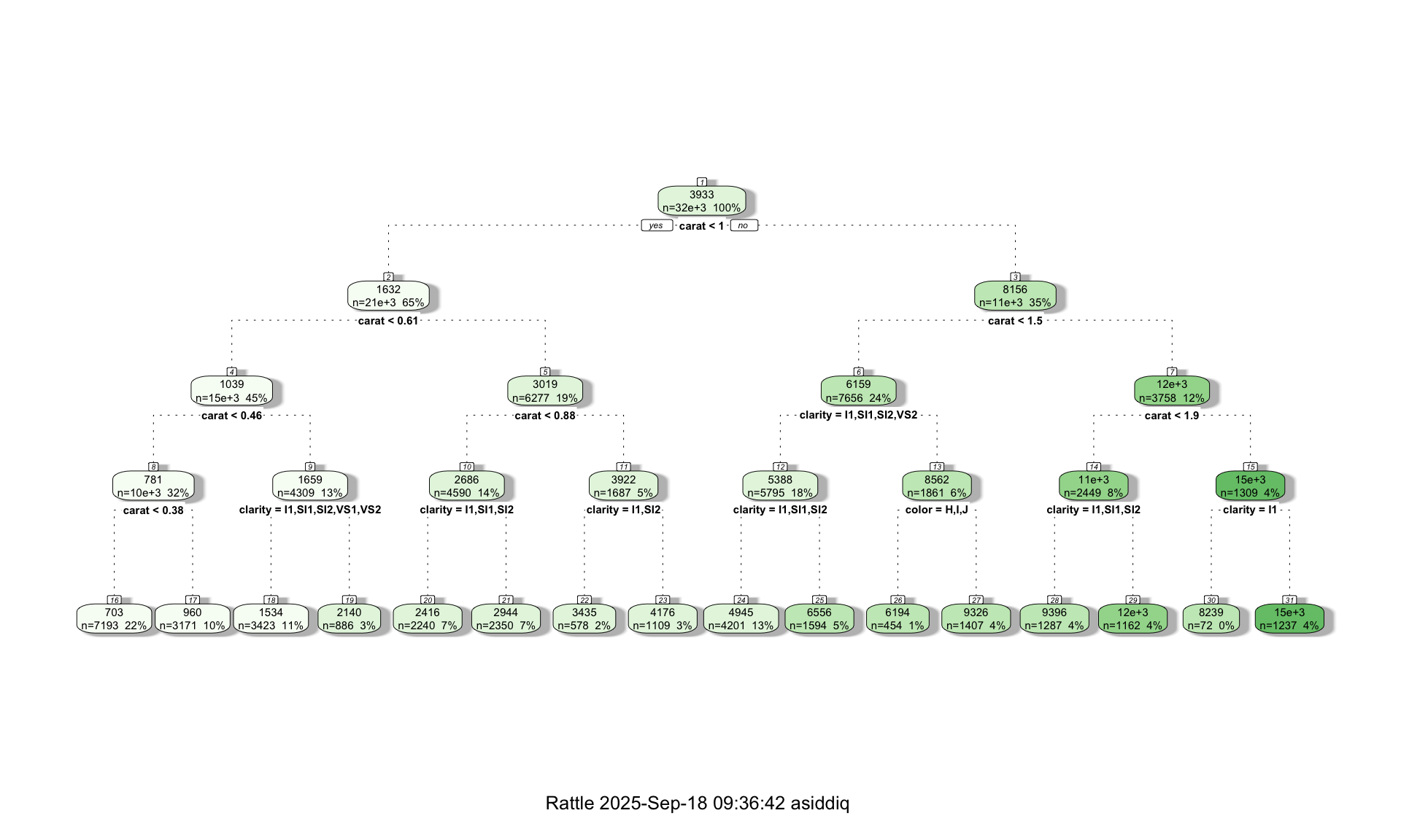
Next we re-calculate the error on the test dataset:
pred = predict(tree,test,type="vector")
actual <- test$price
MAE <- sum(abs(pred-actual))/length(actual)
print(MAE)
## [1] 670.4535Increasing the depth of the tree from 2 to 4 reduced our average error to $670. This is not surprising, because the deeper tree is more complex (which can be seen from the tree-diagram above), and can therefore detect more detailed patterns in the data. That said, increasing tree depth is not a guarantee that the predictive performance will improve, because it is possible that the more complex tree will lead to overfitting. This is why it is always important to evaluate model performance on a separate test dataset.