Part 7 Diagnostics and Transformations
Linear regression is an extremely powerful tool for discovering statistical relationships. But depending on the shape of the underlying data, the slope estimates and prediction line can sometimes be misleading. This tutorial will focus on how to use diagnostic plots to determine whether the results of a linear regression analysis are valid.
We will then consider a common method for handling non-linear data within a linear regression framework, specifically, the use of logarithmic transformations.2
7.1 Linear regression diagnostics
7.1.1 Example: Salary and seniority
Suppose you are offered a job at a (fictional) company, and want to know whether the salary offered is comparable to current employees. Luckily, you were able to get your hands on anonymized salary data from the company. The data contains the salary of 100 employees and their years of experience:
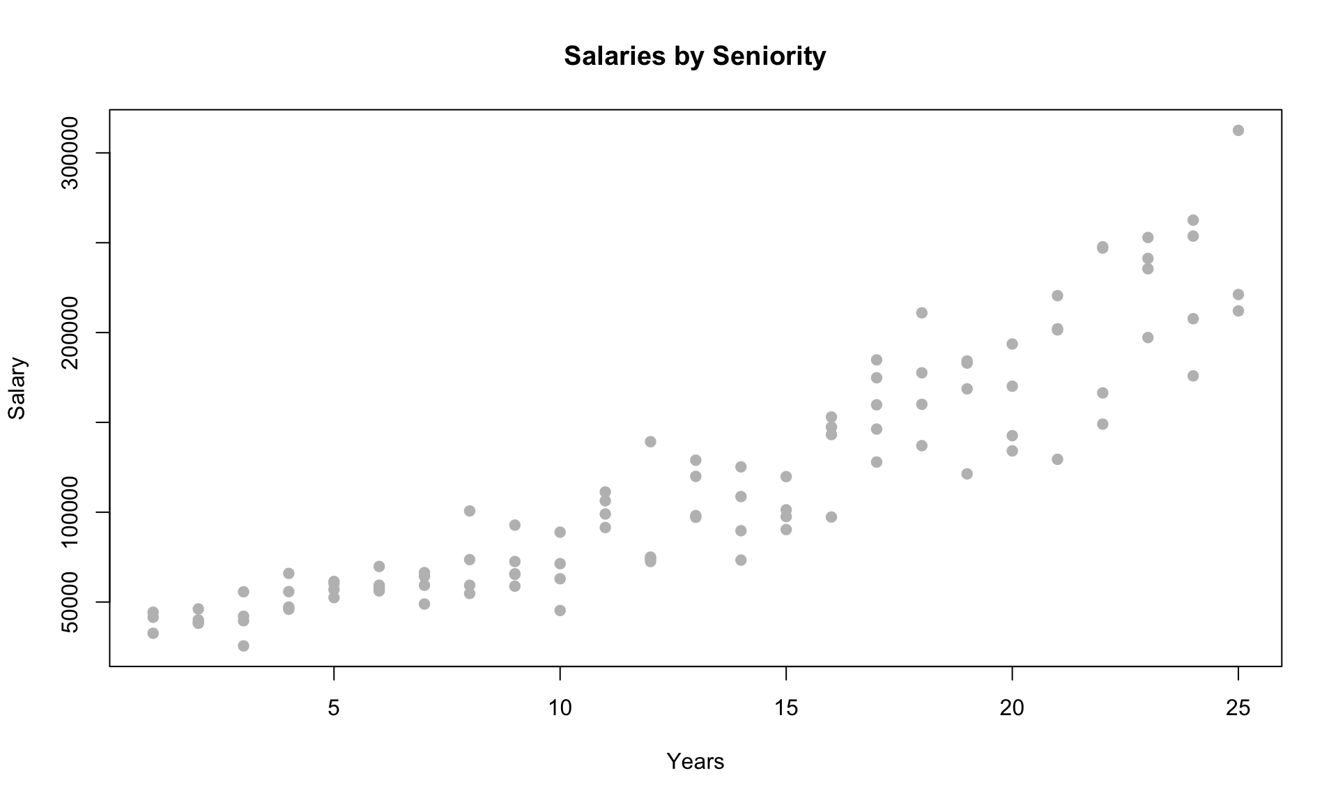
To evaluate your offer, you decide to build a regression model to understand the relationship between salary and years of experience. A simple linear regression model produces the following results:
##
## Call:
## lm(formula = salary ~ years, data = salarydata)
##
## Residuals:
##    Min     1Q Median     3Q    Max
## -57225 -18104    241  15589  91332
##
## Coefficients:
##             Estimate Std. Error t value Pr(>|t|)
## (Intercept)     5302       5750   0.922    0.359
## years           8637        389  22.200   <2e-16 ***
## ---
## Signif. codes:  0 '***' 0.001 '**' 0.01 '*' 0.05 '.' 0.1 ' ' 1
##
## Residual standard error: 27360 on 98 degrees of freedom
## Multiple R-squared:  0.8341, Adjusted R-squared:  0.8324
## F-statistic: 492.8 on 1 and 98 DF,  p-value: < 2.2e-16
The results suggest that each additional year is associated with an increase in salary of $8600. The p-value is tiny and the t-stat is large, which means the variable is highly statistically significant. But how valid are these results?
Let’s now add the regression line to the scatterplot:
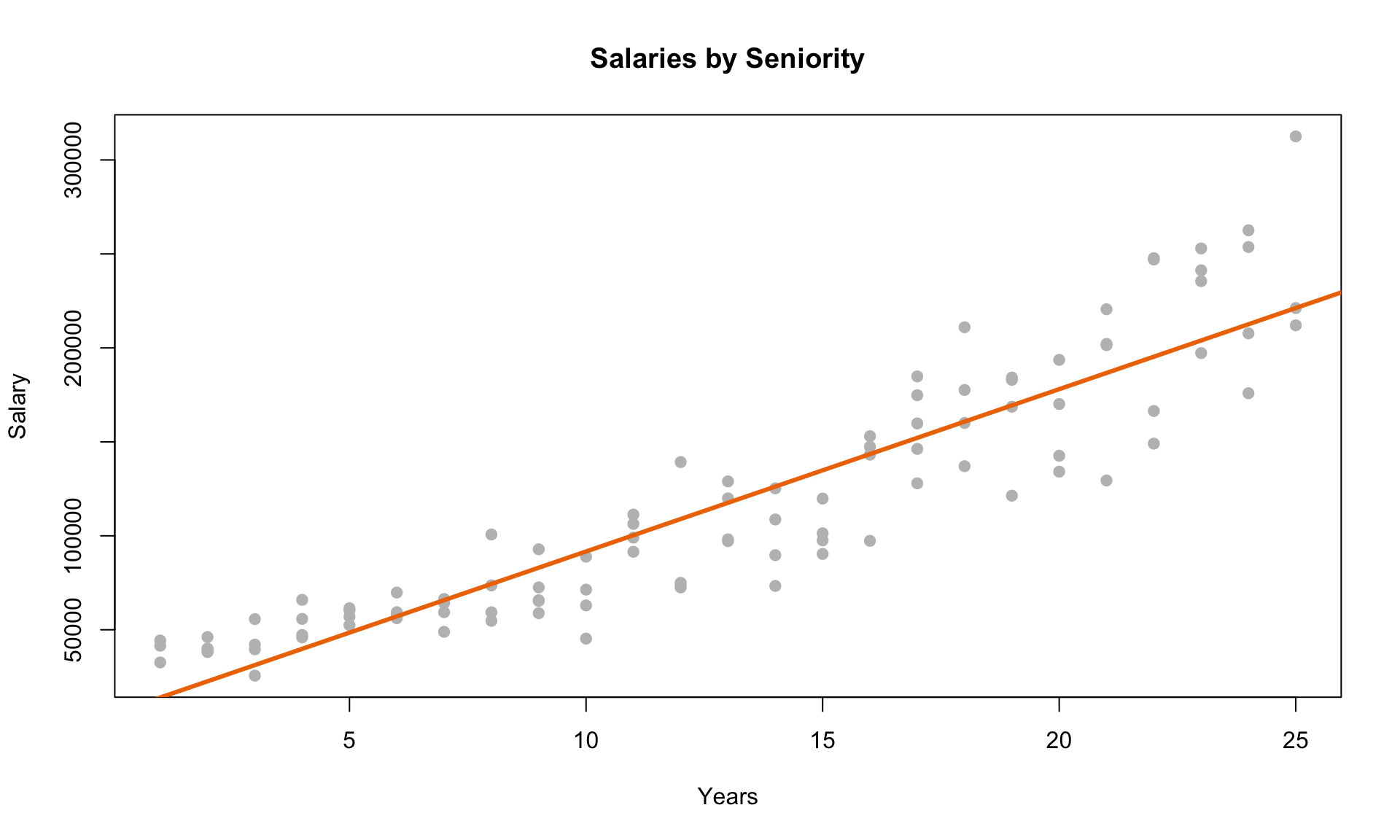
The line seems to fit the data reasonably well. Let’s now consider a plot of the residuals against the predicted values from the model:
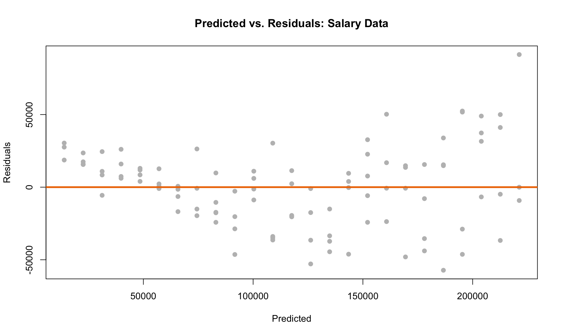
Recall that the residuals represent the difference between the regression line and each data point. The plot indicates that there is a clear pattern in the prediction errors. First, the residuals are all above 0 for low salary values. For high salaries, there is considerably more “spread” than at low salaries. Are these patterns in the residual plot acceptable?
The short answer is: no. Although the straight-line plot looks reasonable, the pattern in the residual plot indicates that linear regression may not be the best tool for quantifying the relationship between salary and years of experience. This means that the results of the regression analysis (i.e., the slope estimates) may be invalid.
7.1.2 LINE conditions and diagnostic plots
In general, how do we know if linear regression is the right tool? We use the LINE conditions as our guiding principle:
- Linearity: The relationship between the dependent and independent variables is linear.
- Independence: The residuals are independent of each other.
- Normality: The distribution of the residuals is approximately Normal (“bell-curved”).
- Equal Variance: The variance of the residuals is the same at any set of predicted values.
Let’s look at a few examples to demonstrate when these four conditions are satisfied. In particular, we will use two diagnostic plots to determine whether any of the LINE conditions are violated.
We will use three simulated datasets to demonstrate how to use the diagnostic plots. (The code is hidden in the HTML output for clarity, but you can check the R Markdown file if you want to see the details of how the data is generated and how the plots are made.)
Let’s now consider the following three plots:
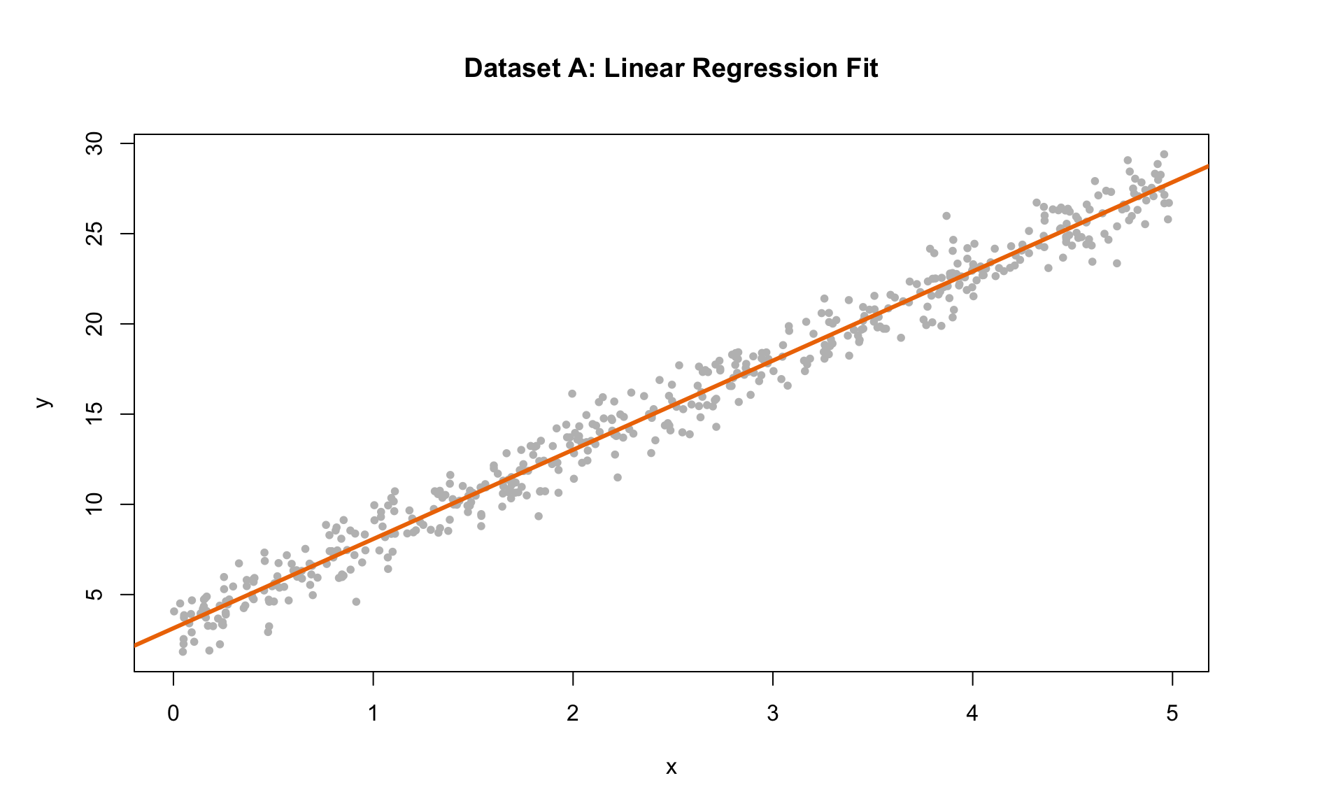
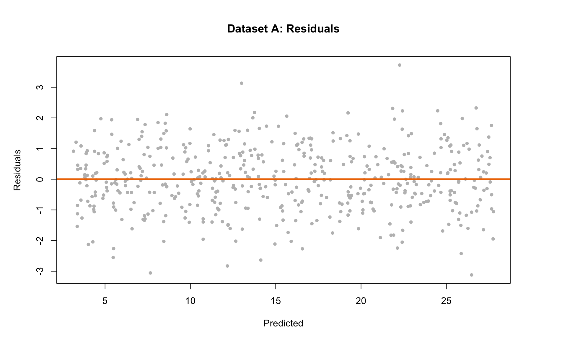
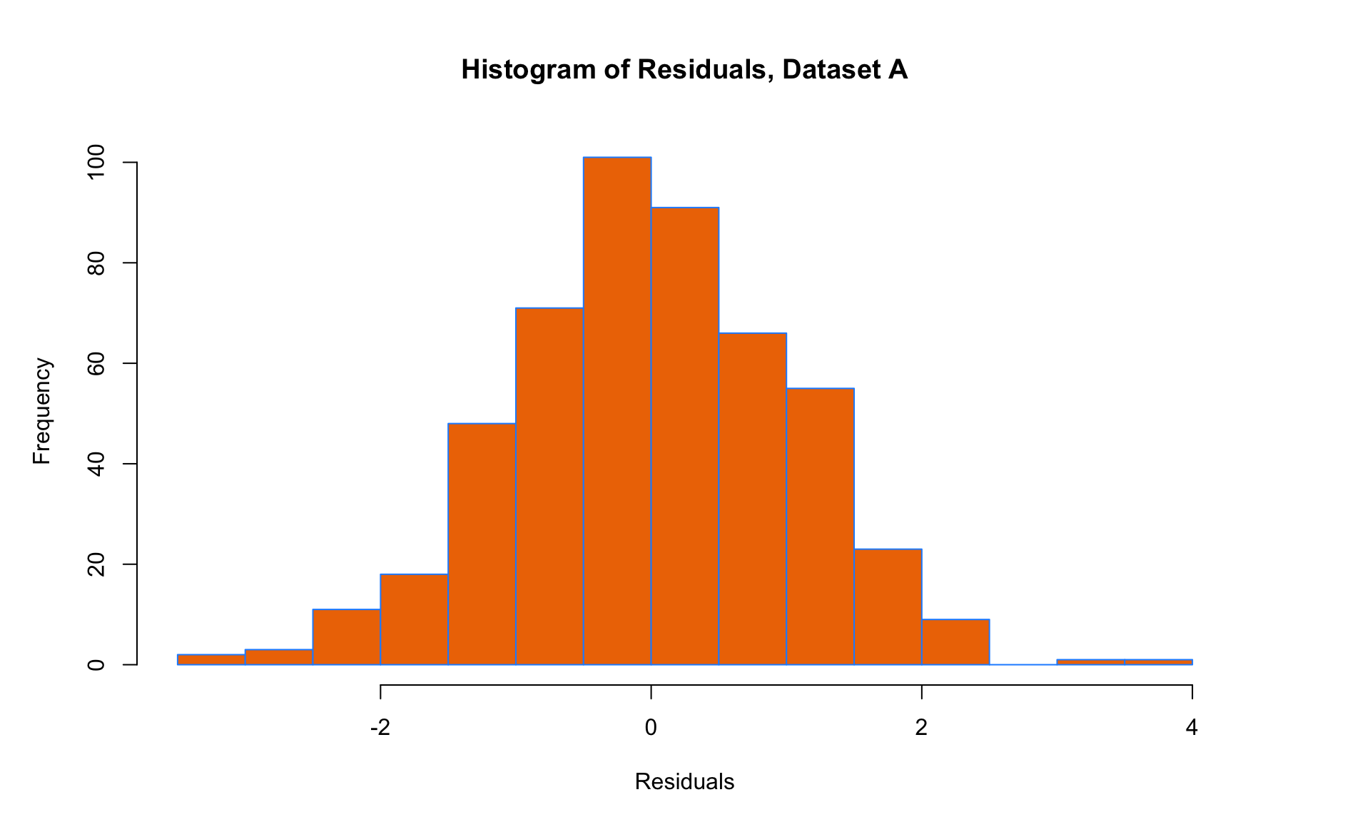
The plot on the left shows the simulated data with the regression line. The middle plot is the residual scatterplot, and the plot on the right is the histogram of residuals. The residual scatter plot is useful for checking three of the LINE conditions:
- L – mean of residuals should be 0 at each point along horizontal axis
- I – residual scatterplot should look random with no trends
- E – variance of residuals should be same at each point along horizontal axis
The histogram of residuals is useful for checking the N condition:
- N – Histogram of residuals should look approximately Normal
Based on the diagnostic plots and the conditions above, we can see that this example satisfies all four LINE conditions. In particular, the residual scatterplot is a big “blob” of data with no clear pattern, which is exactly what we want to see.
Next, let’s look at another example:
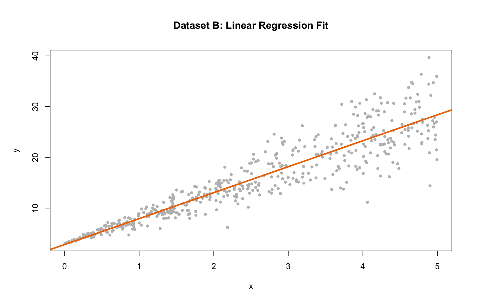
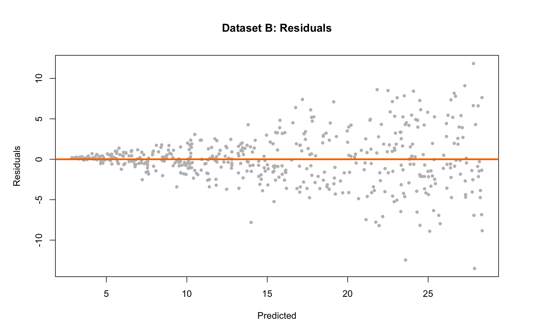
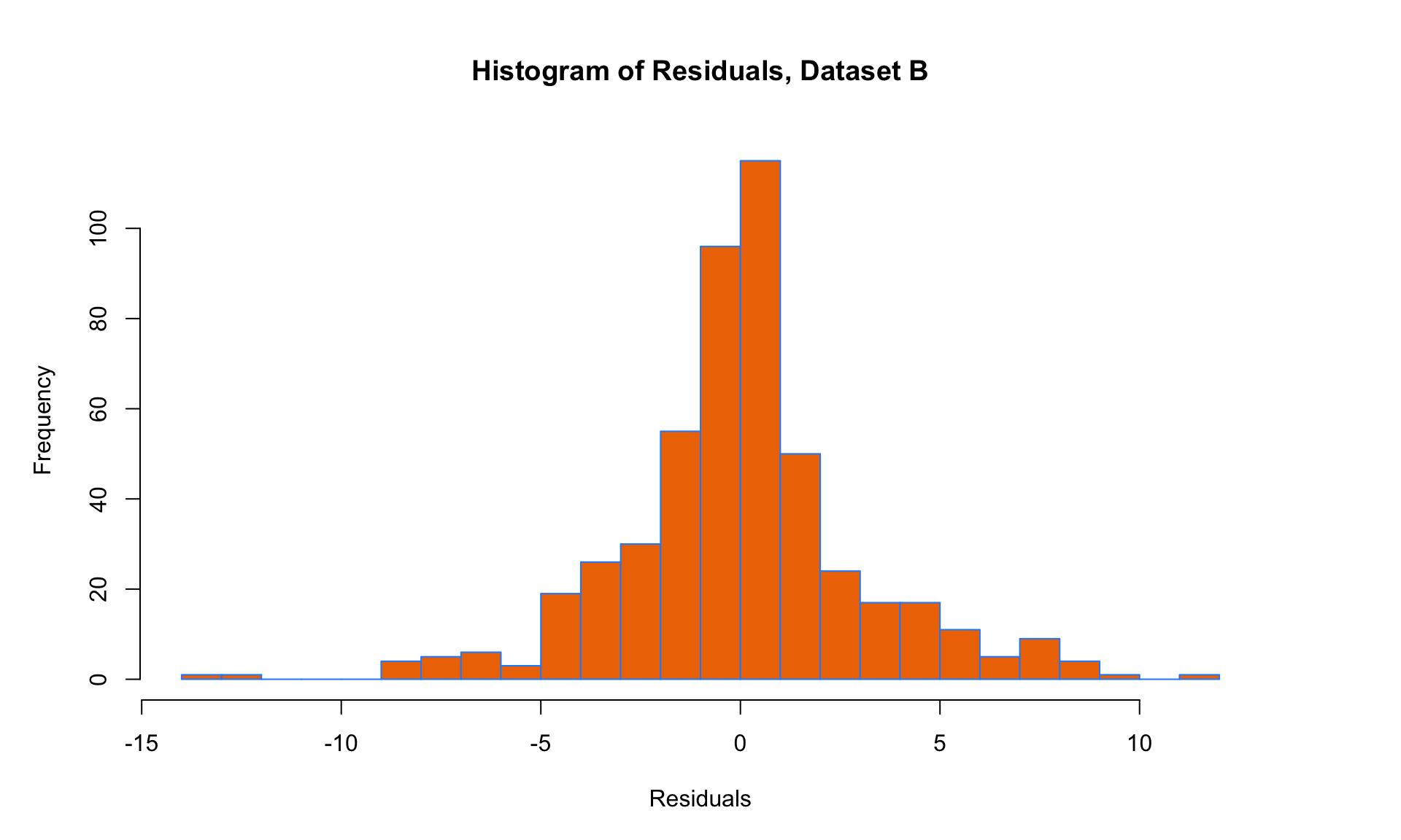
Based on the diagnostic plot criteria outlined above, we can see that conditions L, I and N are mostly satisfied (although, one might argue that the histogram of residuals is not Normal, so this one is a borderline case). In any case, condition E is clearly not satisfied, because the residuals tend to spread out (i.e., have higher variance) for larger values along the x-axis of the scatter plot. So we should be skeptical of the results of a linear regression analysis on this dataset.
Let’s look at one more example next:
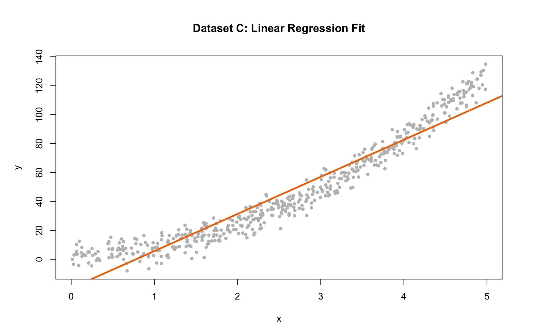
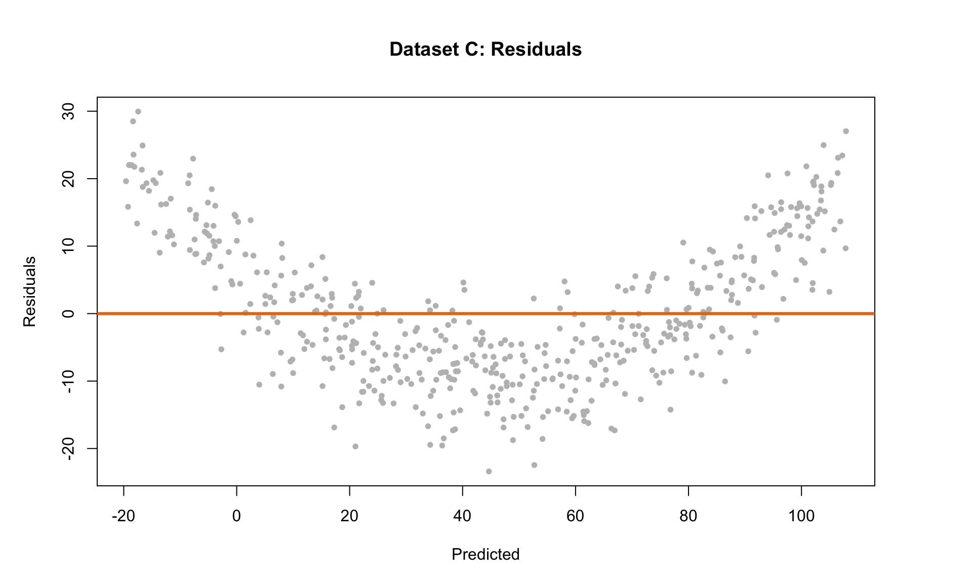
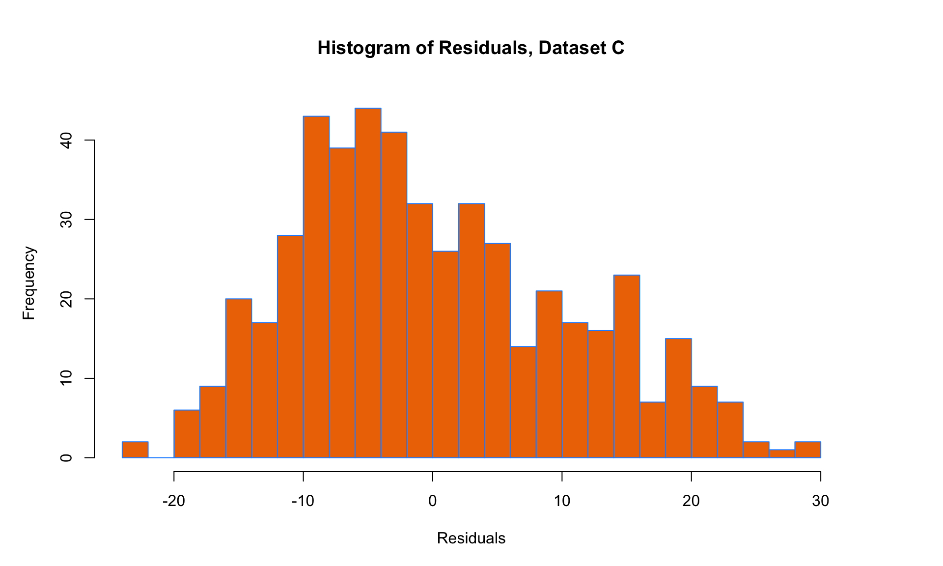 Here, we can see that the variance of the residuals is approximately the same everywhere, so the E condition is satisfied. But all three of the other conditions are violated! The mean is not zero at each point along the x-axis (condition L violated), and there is an obvious trend in the residual scatterplot (condition I violated). The histogram of residuals is also skewed and not Normal (condition N violated). Linear regression is clearly not suitable for this data set.
7.2 Logarithmic transformations
Next, we will consider how linear regression can still be useful in a setting where one of the LINE conditions is violated, in particular, the Linearity condition. This commonly arises in data with exponential relationships – for example, the growth in the price of a stock, or the depreciation in the value of a used vehicle. When faced with possible exponential relationships in data, a common way to still make use of linear regression is to perform a logarithmic transformation of one or more of the variables.
Let’s return to the salary and seniority data. How might we analyze this using linear regression? Our main trick here will be to use log(Salary) as the dependent variable instead of Salary.
plot(log(salary) ~ years, data = salarydata, col = "grey", pch = 20, cex = 1.5,
     main = "Salaries by Seniority (Log scale)", xlab = "Years", ylab = "log(Salary)")
abline(model_log, col = "darkorange2", lwd = 3)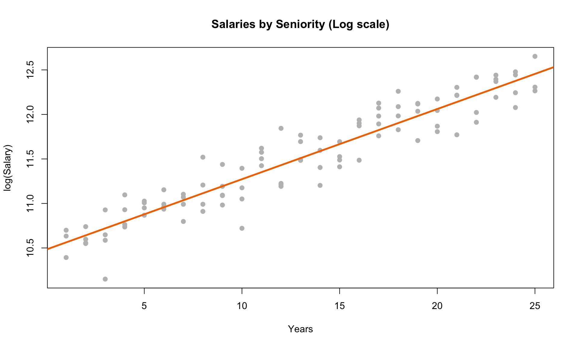
Next, we can look at the residual scatterplot. The plot on the left is the original plot without doing any transformations, and the plot on the right is the residual plot for the log transformed model:
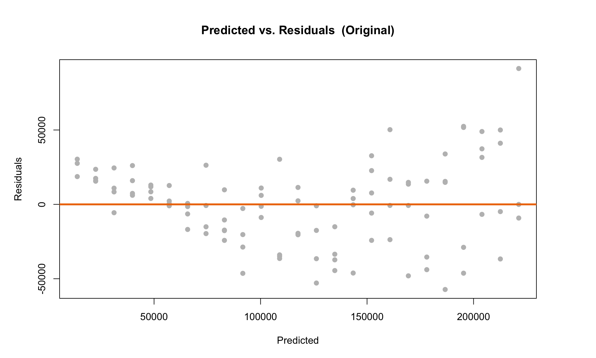
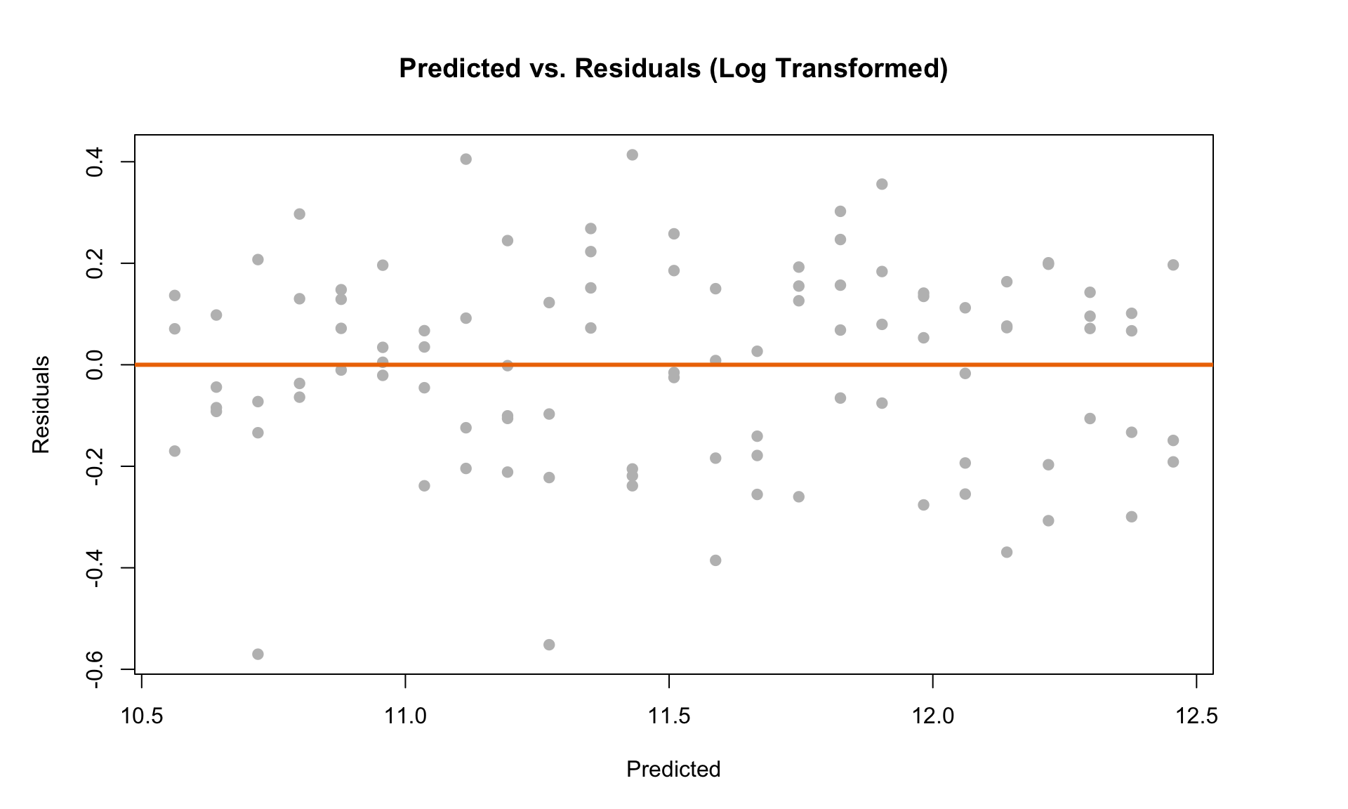
The plot on the left clearly violates LINE. But we can see that after doing the log transformation, the residual scatterplot looks like it satisfies the diagnostic plot criteria outlined above.
Finally, we can check the histogram to test the Normality assumption:
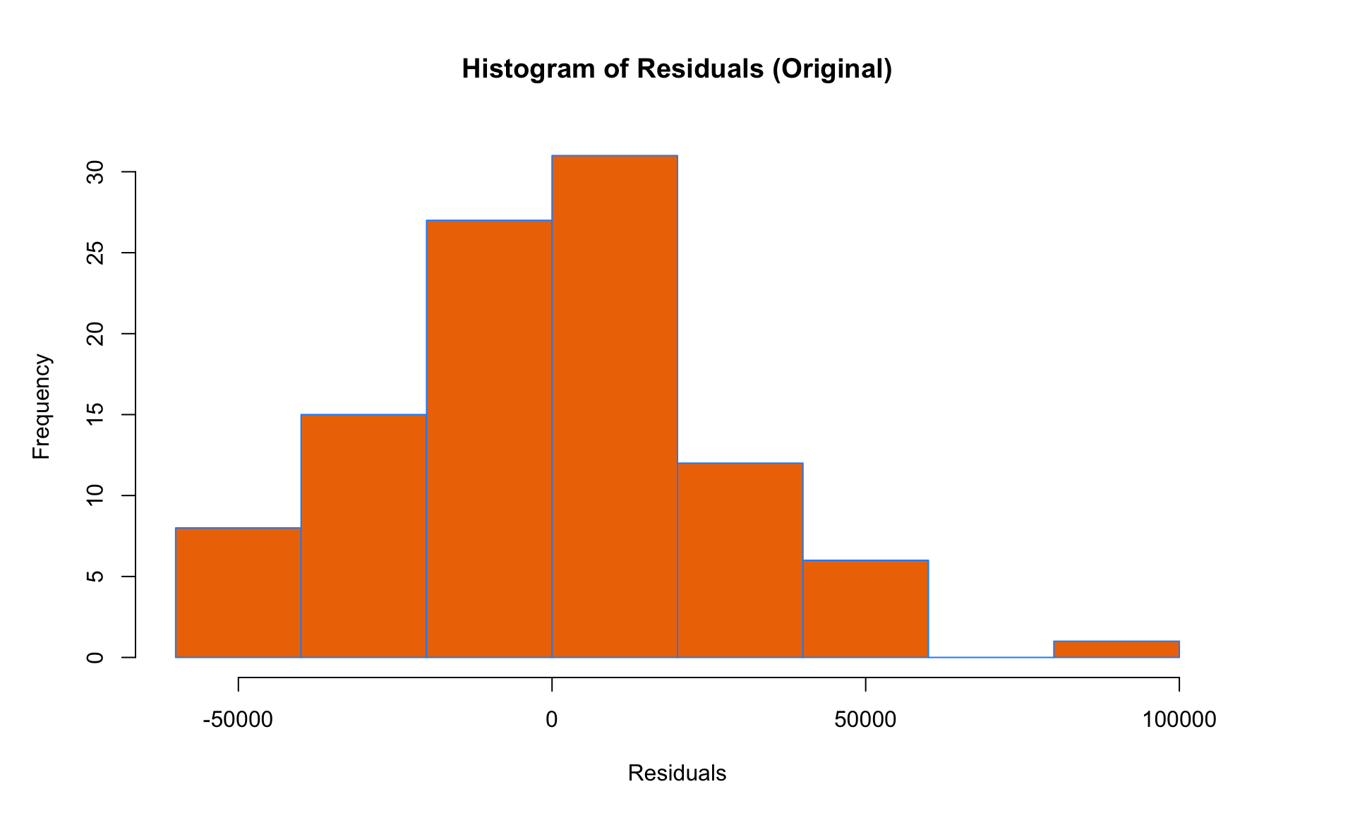
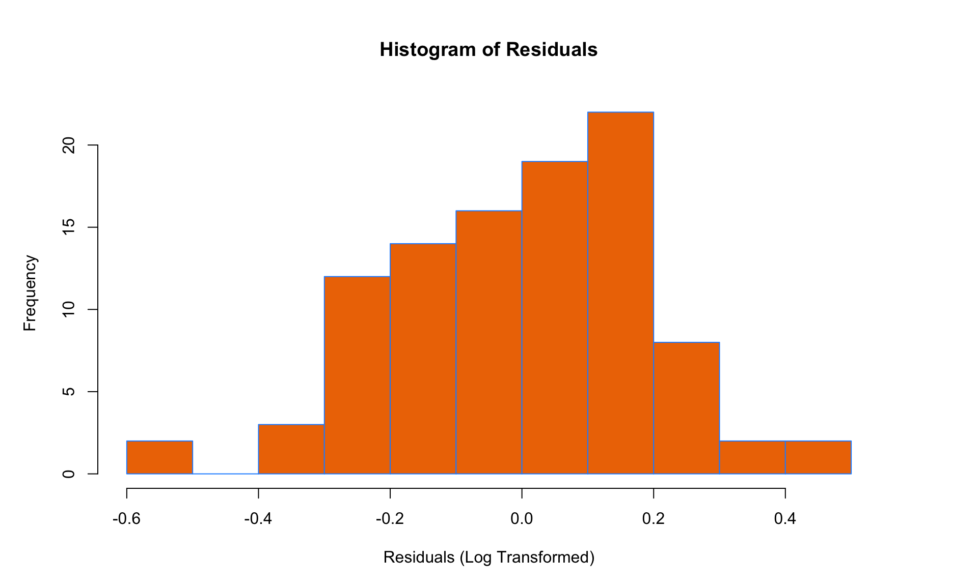
The histogram of residuals of the log-transformed model doesn’t appear to deviate too much from the Normal distribution, so all four LINE conditions seem to be satisfied after the transformation. (Note: There is obviously some subjectivity here – what we are most interested in are dramatic and obvious violations of LINE). This suggests that applying a log transformation to the salary data was a good idea!
Because the LINE conditions appear to be satisfied, we can now check the output of the regression model:
##
## Call:
## lm(formula = log(salary) ~ years, data = salarydata)
##
## Residuals:
##      Min       1Q   Median       3Q      Max
## -0.57022 -0.13560  0.03048  0.14157  0.41366
##
## Coefficients:
##             Estimate Std. Error t value Pr(>|t|)
## (Intercept) 10.48381    0.04108  255.18   <2e-16 ***
## years        0.07888    0.00278   28.38   <2e-16 ***
## ---
## Signif. codes:  0 '***' 0.001 '**' 0.01 '*' 0.05 '.' 0.1 ' ' 1
##
## Residual standard error: 0.1955 on 98 degrees of freedom
## Multiple R-squared:  0.8915, Adjusted R-squared:  0.8904
## F-statistic: 805.2 on 1 and 98 DF,  p-value: < 2.2e-16
The coefficient on the Years variable is 0.079. To interpret this coefficient, we raise the mathematical constant e (roughly equal to 2.718) to the coefficient, which gives
\[ e^{0.079} \approx 1.08 \] The interpretation here is that each additional year of experience is associated with an 8% increase in salary. This seems reasonable, given that annual salary increases in the real world tend to be exponential (i.e., based on a percentage), rather than linear.
Another useful observation is that we have \(R^2 = 0.89\) in the log-transformed model, which is an improvement over the \(R^2 = 0.83\) in the original linear regression model. This is not a requirement for using a log transformation (the diagnostic plots matter more), but it gives us confidence that the log-transformed model fits the data better.
Switching back to the original non-logarithmic scale, we can now plot the exponential curve to also evaluate its fit visually:
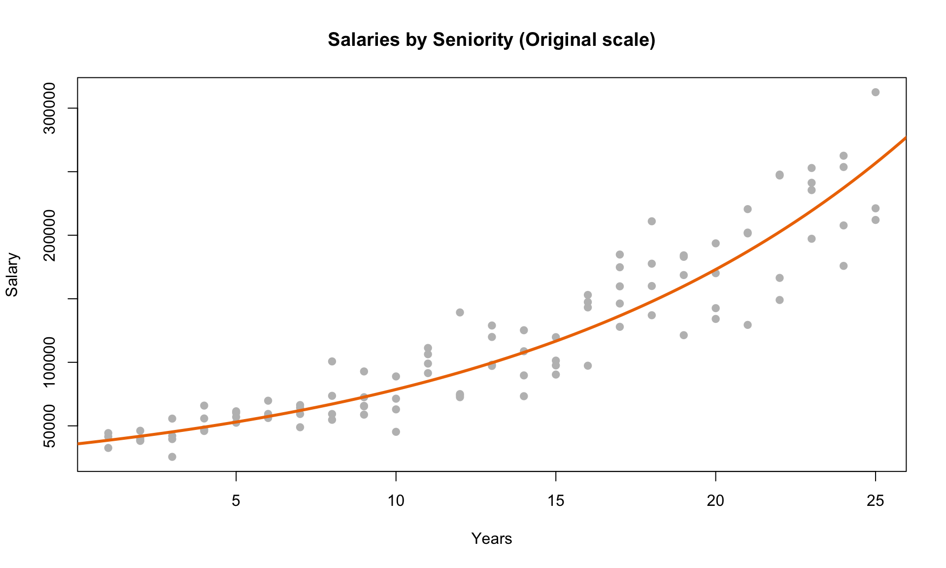
We can see from the plot above that the exponential curve that we obtained from the log-transformation fits the data quite well.
7.2.1 Interpreting coefficients
In general, we can also apply a log transformation to one or more independent variables, or both the dependent and one or more independent variables. The correct interpretation of the coefficients are as follows:
- \(y = b_0 + b\cdot x\) : Every 1 unit increase in \(x\) corresponds to a \(b\) unit increase in \(y\).
- \(\log(y) = b_0 + b\cdot x\) : Every 1 unit increase in \(x\) corresponds to \((e^b - 1)\times 100\%\) increase in \(y\).
- \(y = b_0 + b\cdot \log(x)\) : Every 1% increase in \(x\) corresponds to a \(b/100\) unit increase in \(y\).
- \(\log(y) = b_0 + b\cdot \log(x)\) : Every 1% increase in \(x\) corresponds to a \(b\%\) increase in \(y\).
In summary, linear regression is an extremely powerful tool, but the slope estimates and predictions may be inaccurate if the data violates one of the LINE conditions. Diagnostic plots can be helpful in determining whether linear regression is the right tool for the job. In some cases, a non-linear relationship in the data can be converted into a linear one using a logarithmic transformation – a very useful trick for applying linear regression to non-linear relationships.
The examples shown here are adapted from the excellent e-book Applied Statistics with R: http://daviddalpiaz.github.io/appliedstats/↩︎