Part 3 Sampling and Confidence Intervals
Much of statistics revolves around the following question: How can we use a limited amount of data to draw conclusions that hold in general? This question arises in numerous practical settings:
- An online retailer estimates the change in revenue from a new website design by rolling it out to only 1% of visitors,
- a pharmaceutical company investigates the efficacy of a new blood pressure medication by testing it on 200 clinical trial volunteers, and
- a polling organization estimates city-wide support for a mayoral candidate by randomly polling 1,000 voting-age individuals.
In each example above, the goal is to draw general conclusions by analyzing a subset of all relevant data. The reason for focusing on a subset only can vary: The retailer may not want to risk rolling out an untested website design to all visitors, the pharmaceutical company may be constrained by regulations or the availability of volunteers, and the polling organization may find it too costly to poll more than 1,000 households. While the reason for focusing on only a subset of data differs based on context, in general the way we analyze the data will not. Further, as we will see below, under the right conditions we only need a relatively small dataset to generate powerful insights that are very likely to hold in general.
In this section, our focus will be on confidence intervals, which are a method for quantifying uncertainty in the conclusions we draw from data.
3.1 Data: LA Metro bike share trips
We will use a dataset made publicly available by the LA Metro Bike Share program. The file bikeshare_all.csv contains information on all bike share trips taken from September to December in 2021. The variables included are as follows:
duration: length of bike rental in minutes
trip_type: One Way or Round Trip
pass_type: Annual Pass, Monthly Pass, Day Pass, Walk-up
bike_type: standard or electric
start_time: date and time of trip start
end_time: date and time of trip end
start_lat: latitude of trip start
start_lon: longitude of trip start
end_lat: latitude of trip end
end_lon: longitude of trip end
We begin by reading in the data:
The dataset contains information on trip duration, trip type, bike type, timestamps for when each trip began and ended, and the lat/long coordinates of the start and end locations. We can use the head() command to show the first few rows, including the variable names:
##   duration trip_type    pass_type bike_type  start_time    end_time start_lat
## 1       16   One Way      Walk-up  standard 9/1/21 0:24 9/1/21 0:40  34.09800
## 2       19   One Way      Walk-up  standard 9/1/21 0:45 9/1/21 1:04  34.10936
## 3        8   One Way Monthly Pass  standard 9/1/21 2:48 9/1/21 2:56  34.04804
## 4       24   One Way Monthly Pass  standard 9/1/21 3:33 9/1/21 3:57  34.05357
## 5        9   One Way Monthly Pass  standard 9/1/21 4:25 9/1/21 4:34  34.05110
## 6        8   One Way Monthly Pass  standard 9/1/21 5:30 9/1/21 5:38  34.00587
##   start_lon  end_lat   end_lon
## 1 -118.3005 34.05797 -118.2998
## 2 -118.2718 34.09260 -118.2809
## 3 -118.2537 34.05110 -118.2646
## 4 -118.2664 34.05110 -118.2646
## 5 -118.2646 34.03998 -118.2664
## 6 -118.4292 34.01768 -118.4091
Going forward, our focus here will be on monthly passholders only. We can select only monthly passholders with:
Further, we will focus on the following two variables:
- duration - length of trip in minutes
- trip_type - whether the trip is a one-way or a round-trip
Because we will not be using the remaining variables, we can simplify the dataset by dropping them:
We can use the dim() command to print out the dimensions of the dataset:
## [1] 30327 2Our dataset contains 30,327 rows (i.e., bikeshare trips), representing all trips by monthly passholders from September to December 2021.
A useful command for generating descriptive statistics is summary():
##     duration           trip_type
##  Min.   :  1.00   One Way   :26715
##  1st Qu.:  7.00   Round Trip: 3612
##  Median : 13.00
##  Mean   : 18.78
##  3rd Qu.: 23.00
##  Max.   :296.00
We can see from the table above that the mean trip time for monthly passholders was 18.78 minutes. We can also see the frequency of one way trips and round trips. A histogram of trip durations is below:
# See code using the scroll bar immediately to the right ----->  #


cols = met.brewer("Monet")

mu = 18.8
ggplot(bike, aes(x=duration))+
  geom_histogram(binwidth = 1, color = "white", fill=cols[8])+
  theme_minimal()+
  xlab("Bike trip duration (minutes)")+
  ylab("Frequency")+
  xlim(0,75)+
  geom_segment(aes(x = mu, y = 0, xend = mu, yend = 1700), size = 0.5 ,linetype = "dashed",color = cols[6])+
  annotate("text", size = 6, x = mu+5, y = 1600, label = "mu == 18.8", parse = TRUE)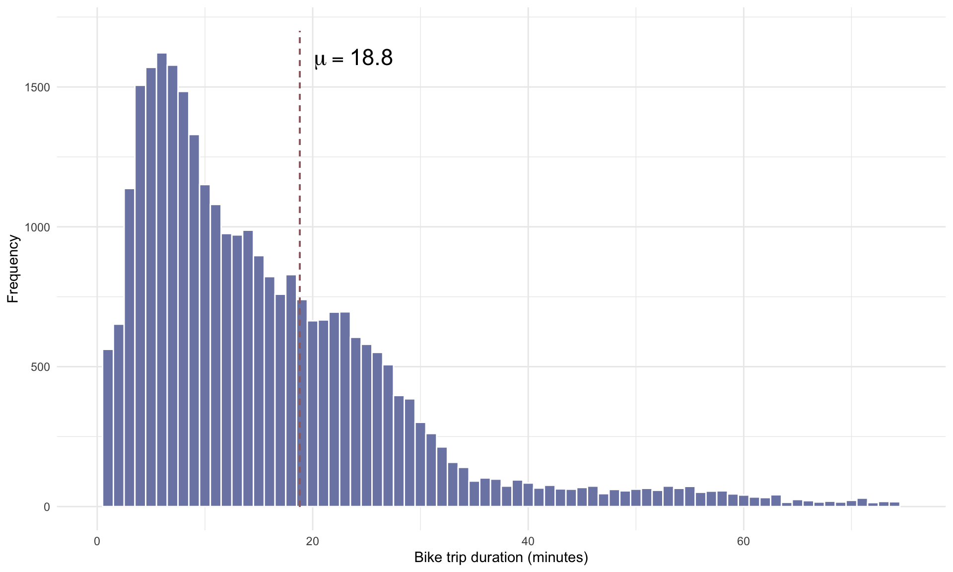
3.2 Random sampling
Before we go on, we introduce some key definitions:
- Population: The entire group that we want to draw conclusions about.
- Sample: A subset of the broader group for which we have data.
- Parameter: An unobserved number that describes the whole population.
- Statistic: An observed number that describes the sample only.
For example, in the clinical trial example, the relevant population is all possible patients that may take the new drug, and the sample is the group of individuals enrolled in the clinical trial. An example of a parameter is the average decrease in blood pressure that we would expect within the population, and the corresponding statistic is the decrease in blood pressure among clinical trial volunteers.
Let’s now run a tiny experiment using the bike share data to demonstrate the concepts defined above. Before we go further, an important caveat: For illustrative purposes, we will treat the the full set of 30,327 bike share trips as the population in the examples below. In practice, however, we don’t have data for the entire population (which is why this section exists).
Suppose we randomly sample \(n = 500\) bike share trips:
The sample is visualized below:
Let’s now look at the mean duration of trips within our random sample:
## [1] 19.11## [1] 22.22417The mean trip time in our sample of \(n=500\) rows is 19.1 minutes. This value represents an estimate of the true mean duration in the population, which is 18.8 minutes. Of course, our estimate will vary depending on which rows we happen to randomly select. If we again select 500 rows at random and compute the sample mean duration again, we get
set.seed(2)

# specify sample size
n = 500

# randomly sample n bike share trips
bike_sample <- bike[sample(1:nrow(bike), n),]

# Compute sample mean
mean(bike_sample$duration)
## [1] 17.45Note that we slightly overestimated the mean in the first random sample and underestimated it in the second. We can quantify how far off our estimate will be from the true parameter in general by constructing a confidence interval.
3.3 Confidence intervals for means
The 95% confidence interval for the mean of a population is given by:
\[ \text{95$\%$ C.I. for } \mu : \quad \bar{x} \pm 2 \cdot \frac{s}{\sqrt{n}}.\]
Let’s unpack the formula above in the context of our bike share example:
- \(\mu\) is the population mean – the average trip time over all 30,327 trips.
- \(\bar{x}\) is the sample mean – the average trip time in our random sample of 500.
- \(s\) is the sample standard deviation – the standard deviation of trip times in the random sample of 500.
- \(n\) is the sample size – the number 500.
In words, the formula above states that if we have a random sample of data with a sample mean of \(\bar{x}\), then we can be 95% confident that the true mean \(\mu\) is within \(2 \frac{s}{\sqrt{n}}\) of \(\bar{x}\). Here, ``95% confident” implies that if we were to select a random number of observations, construct a confidence interval, and repeat this experiment many, many times, in 95% of experiments the true population mean would lie inside the interval, and in 5% of experiments it would not.
The term \(\frac{s}{\sqrt{n}}\) is called the standard error, and is a measure of how much variability there is in our estimate. Note that the standard error decreases with the sample size \(n\). This implies that all else equal, larger samples sizes will generate tighter confidence intervals. The intuition is that our estimates have greater precision when more data is used to construct them.
We can now compute a 95% confidence interval for the mean trip duration in the population using the code below:
set.seed(2)

# specify sample size
n = 500

# randomly sample n bike share trips
bike_sample <- bike[sample(1:nrow(bike), n),]

# Compute sample mean
x_bar = mean(bike_sample$duration)

# Compute sample standard deviation
s = sd(bike_sample$duration)

# Construct 95% confidence interval
lower = x_bar - 2*s/sqrt(n)
upper = x_bar + 2*s/sqrt(n)

# Print confidence interval
print(lower)
## [1] 15.45136## [1] 19.44864The 95% confidence interval for the mean trip time is \([15.5, \; 19.4]\) minutes. Because the mean trip time over all 30,327 trips was \(18.8\) minutes, this particular interval captured the population mean.
The plot below visualizes 100 different confidence intervals, each constructed based on a random sample of \(n=500\) rows:
# See code using the scroll bar immediately to the right ----->  #


set.seed(17)
n = 500
x_bar <- list()
lower <- list()
upper <- list()
inds <- list()
out <- list()

mu <- mean(bike$duration)

for(i in 1:100){
bike_sample <- bike[sample(1:nrow(bike), n),]
x_bar[[i]] = mean(bike_sample$duration)
inds[[i]] <- i;
s = sd(bike_sample$duration)
lower[[i]] = x_bar[[i]] - 2*s/sqrt(n)
upper[[i]] = x_bar[[i]] + 2*s/sqrt(n)

if(lower[[i]] > mu){
  out[[i]] = "Out"
  } else if(upper[[i]] < mu){
    out[[i]] = "Out"
  } else{
    out[[i]] = "In"
}
}

out <- as.factor(unlist(out))

CI <-data.frame(cbind(inds,x_bar,lower,upper))

CI$inds=as.numeric(CI$inds)
CI$x_bar=as.numeric(CI$x_bar)
CI$lower=as.numeric(CI$lower)
CI$upper=as.numeric(CI$upper)
CI$out = out

ggplot(CI, aes(x = inds, y = x_bar, color = out)) +
  geom_point(size = 0.5) +
  geom_errorbar(aes(ymin = lower, ymax = upper))+
  theme_minimal()+
  theme(axis.title.x=element_blank(),
        axis.text.x=element_blank())+
  ylab("Mean trip duration (minutes)")+
    theme(legend.position="none")+
    scale_color_manual(values = c(cols[9],cols[7]))+
  geom_segment(aes(x = 0, y = mu, xend = 101, yend = mu), size = 0.25 ,linetype = "dashed",color = cols[6])+
  annotate("text", size = 6, x = 107, y = mu, label = "mu == 18.8", parse = TRUE)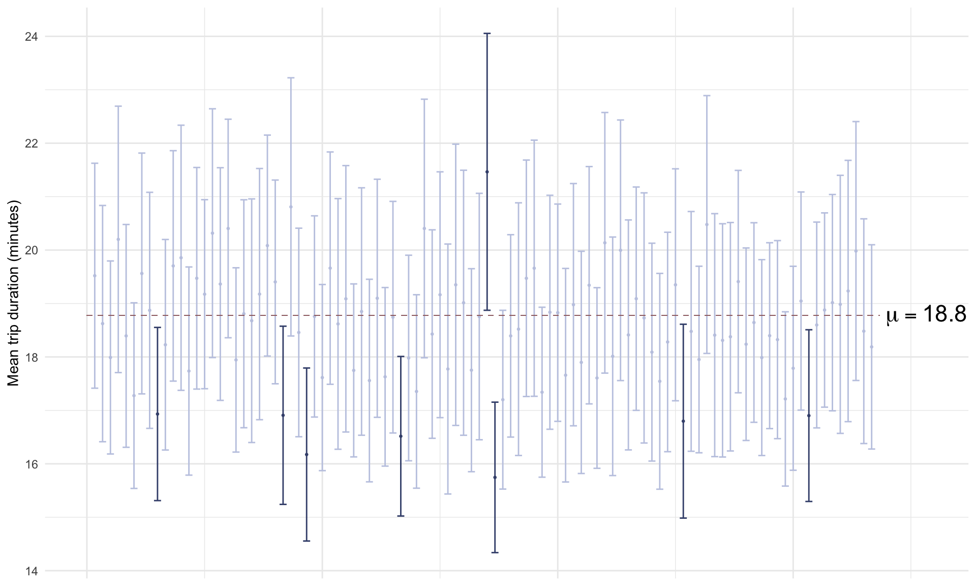
The plot above shows that the confidence intervals contained the true mean trip time in 92% of cases, which is quite close to what theory predicts.
3.4 Confidence intervals for proportions
We can construct confidence intervals for proportions too. We’ll use \(p\) to represent the population proportion, \(\bar{p}\) to represent the sample proportion, and \(n\) again to represent the sample size. The confidence interval for \(p\) is then
\[ \text{$95\%$ C.I. for $p$}: \bar{p} \pm 2 \cdot \sqrt{\frac{\bar{p}(1-\bar{p})}{n}}. \] Note that the structure of the formula is very similar to the case for sample means. The confidence interval is centered on \(\bar{p}\) (instead of \(\bar{x}\)), and the standard error is given by \(\sqrt{\frac{\bar{p}(1-\bar{p})}{n}}\) (instead of \(\frac{s}{\sqrt{n}}\)).
As an example, suppose we wish to estimate the proportion of all trips that were one-way trips from a random selection of \(n = 500\) rows. What might the confidence interval for \(p\) look like? We can construct it in R as follows:
set.seed(0)

# specify sample size
n = 500

# randomly sample n bike share trips
bike_sample <- bike[sample(1:nrow(bike), n),]

# Compute sample proportion
p_bar =  sum(bike_sample$trip_type=="One Way")/nrow(bike_sample)

# Construct 95% confidence intervals
lower = p_bar - 2*(sqrt(p_bar*(1-p_bar)/n))
upper = p_bar + 2*(sqrt(p_bar*(1-p_bar)/n))

# Print confidence intervals
print(lower)
## [1] 0.8377245## [1] 0.8982755With 95% confidence, the true proportion of trips by monthly passholders that are one way lies in the interval \([0.84, 0.90]\). What is the population parameter \(p\)?
## [1] 0.8808982The true proportion of one-way trips in the population is \(p = 0.88\). In this particular case, the confidence interval “captured” the population parameter. Just like we did for means, we can visualize what ``95% confidence” means by simulating 100 confidence intervals for \(p\), each constructed from a sample of \(n = 500\):
# See code using the scroll bar immediately to the right ----->  #


set.seed(15)
n = 500
x_bar <- list()
lower <- list()
upper <- list()
inds <- list()
out <- list()

p <- sum(bike$trip_type=="One Way")/nrow(bike)

for(i in 1:100){
bike_sample <- bike[sample(1:nrow(bike), n),]
p_bar[[i]] = sum(bike_sample$trip_type=="One Way")/nrow(bike_sample)
inds[[i]] <- i;
lower[[i]] = p_bar[[i]] - 2*sqrt(p_bar[[i]]*(1-p_bar[[i]])/n)
upper[[i]] = p_bar[[i]] + 2*sqrt(p_bar[[i]]*(1-p_bar[[i]])/n)

if(lower[[i]] > p){
  out[[i]] = "Out"
  } else if(upper[[i]] < p){
    out[[i]] = "Out"
  } else{
    out[[i]] = "In"
}
}

out <- as.factor(unlist(out))

CI <-data.frame(cbind(inds,p_bar,lower,upper))

CI$inds=as.numeric(CI$inds)
CI$x_bar=as.numeric(CI$p_bar)
CI$lower=as.numeric(CI$lower)
CI$upper=as.numeric(CI$upper)
CI$out = out

ggplot(CI, aes(x = inds, y = x_bar, color = out)) +
  geom_point(size = 0.5) +
  geom_errorbar(aes(ymin = lower, ymax = upper))+
  theme_minimal()+
  theme(axis.title.x=element_blank(),
        axis.text.x=element_blank())+
  ylab("Proportion of one-way trips")+
    theme(legend.position="none")+
    scale_color_manual(values = c(cols[3],cols[1]))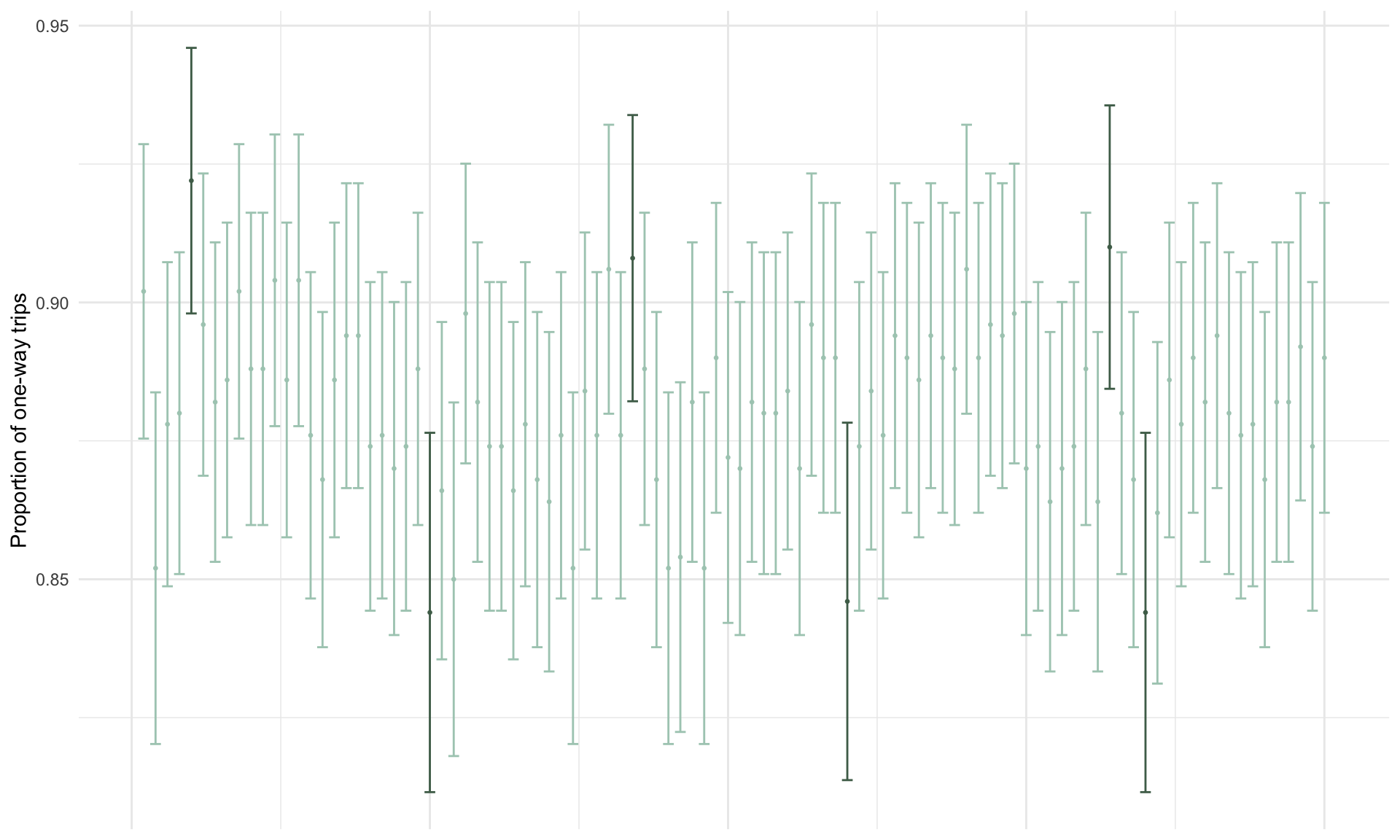
3.5 Background theory: Central Limit Theorem
Here, we’ll try to shed some light on where the confidence interval formula comes from. Suppose \(\bar{x}\) is the mean duration in a random sample of bike share trips. Because the estimate \(\bar{x}\) is based on a random sample of data, \(\boldsymbol{\bar{x}}\) is also random. Depending on the random sample that we happen to select, sometimes \(\bar{x}\) will be close to the population mean \(\mu\), and sometimes it will be far from it. Is there a way we can know how far or how close the estimate \(\bar{x}\) will be to \(\mu\) in general?
Because \(\bar{x}\) is random, we can’t know it in advance. But, as we know from the previous section, we can describe random variables by their probability distributions, and we can simulate probability distributions in R. So, we can use simulation to get an idea of how far \(\bar{x}\) will be from \(\mu\).
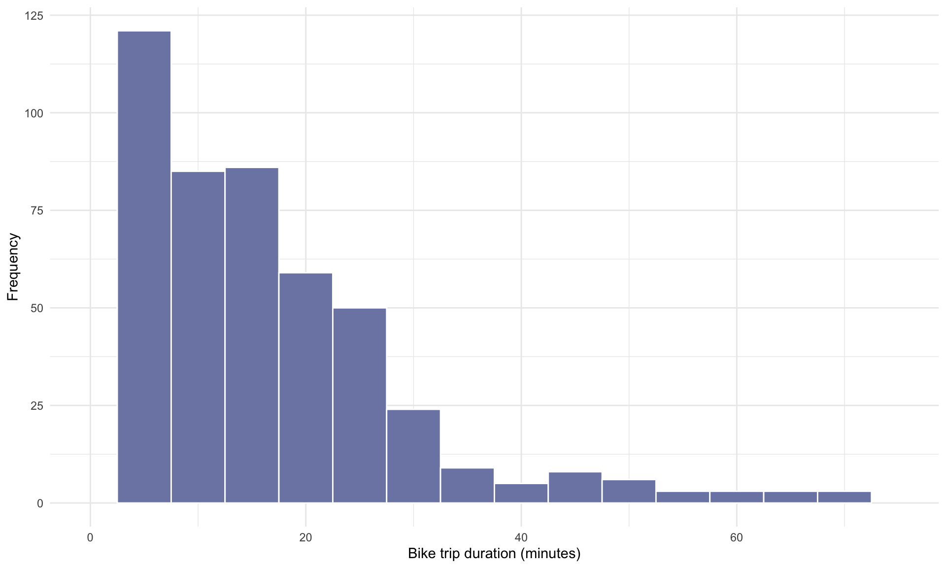
Suppose we randomly sample \(n = 50\) trips and calculate their mean duration, and repeat this 10 times. The histogram below shows the empirical distribution of the mean trip times over the 10 repetitions:
# See code using the scroll bar immediately to the right ----->  #


set.seed(1)
x_bar <- list()

n = 50

for(i in 1:10){
bike_sample <- bike[sample(1:nrow(bike), n),]
x_bar[[i]] = mean(bike_sample$duration)
}

CLT <-data.frame(cbind(x_bar))
CLT$x_bar=as.numeric(CLT$x_bar)

ggplot(CLT, aes(x=x_bar))+
  geom_histogram(binwidth = 1, color = "white", fill=cols[9])+
  theme_minimal()+
  xlab("Sample mean duration (minutes)")+
  ylab("Frequency")+
    xlim(10,30)+
 geom_segment(aes(x = mu, y = 0, xend = mu, yend = 3), size = 0.5 ,linetype = "dashed",color = cols[6])+
annotate("text", size = 6, x = mu+2, y = 2.8, label = "mu == 18.8", parse = TRUE)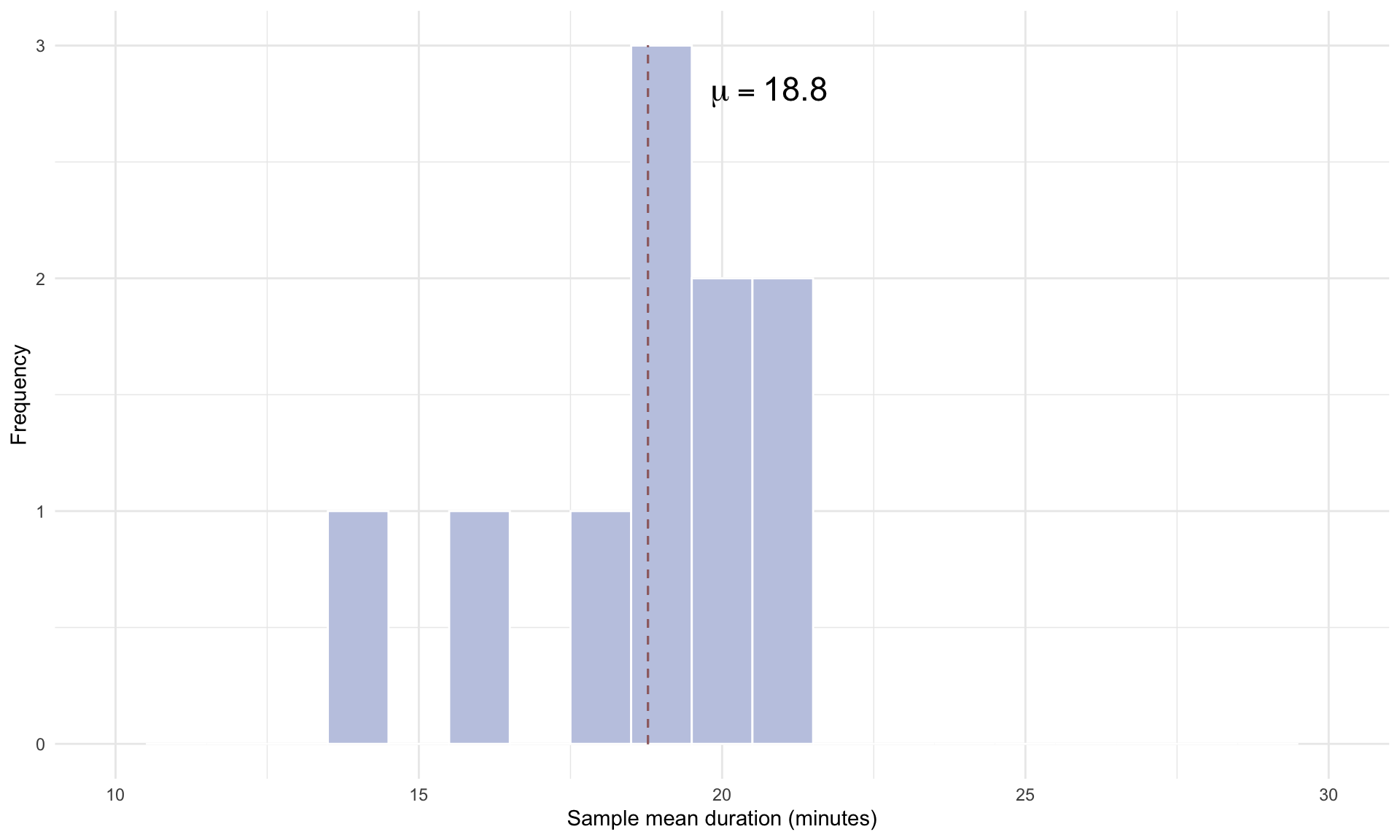
The plot above shows the mean trip time in each of the 10 different random samples, compared to the population mean of 18.8 minutes. Repeating for 100 simulation gives us
# See code using the scroll bar immediately to the right ----->  #


set.seed(1)
x_bar <- list()
for(i in 1:100){
bike_sample <- bike[sample(1:nrow(bike), n),]
x_bar[[i]] = mean(bike_sample$duration)
}

CLT <-data.frame(cbind(x_bar))
CLT$x_bar=as.numeric(CLT$x_bar)

ggplot(CLT, aes(x=x_bar))+
  geom_histogram(binwidth = 1, color = "white", fill=cols[9])+
  theme_minimal()+
  xlab("Sample mean duration (minutes)")+
  ylab("Frequency")+
  geom_segment(aes(x = mu, y = 0, xend = mu, yend = 15), size = 0.5 ,linetype = "dashed",color = cols[6])+
  annotate("text", size = 6, x = mu+2, y = 14, label = "mu == 18.8", parse = TRUE)+
  xlim(10,30)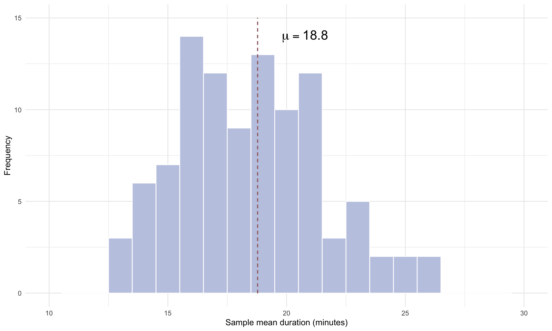
and repeating 10,000 times gives us
# See code using the scroll bar immediately to the right ----->  #


n = 50
x_bar <- list()
set.seed(1)
for(i in 1:10000){
bike_sample <- bike[sample(1:nrow(bike), n),]
x_bar[[i]] = mean(bike_sample$duration)
}

CLT <-data.frame(cbind(x_bar))
CLT$x_bar=as.numeric(CLT$x_bar)

ggplot(CLT, aes(x=x_bar))+
  geom_histogram(binwidth = 1, color = "white", fill=cols[9])+
  theme_minimal()+
  xlab("Sample mean duration (minutes)")+
  ylab("Frequency")+
  geom_segment(aes(x = mu, y = 0, xend = mu, yend = 1500), size = 0.5, linetype = "dashed", color = cols[6])+
  annotate("text", size = 6, x = mu+1.5, y = 1450, label = "mu == 18.8", parse = TRUE)+
  xlim(10,30)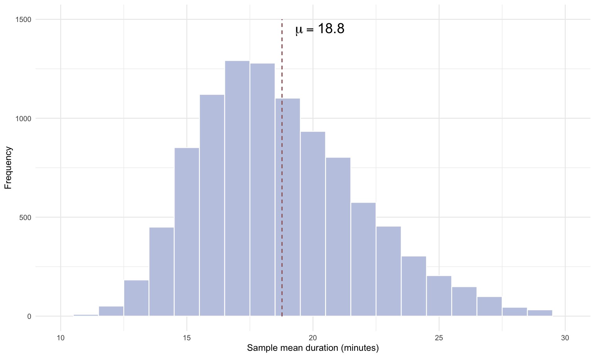
By repeating the random sampling procedure 10,000 times, we are approximating the probability distribution of the sample mean \(\bar{x}\), which is called the sampling distribution. Note that the plot of the sampling distribution looks approximately Normal, and is roughly centered on the population mean \(\mu\). This is due to the Central Limit Theorem (CLT). We give a more formal statement of the CLT below:
Central Limit Theorem: The sampling distribution of the sample mean \(\bar{x}\) will be approximately Normal with a mean of \(\mu\) and a standard deviation of \(\frac{s}{\sqrt{n}}\).
Recall that 95% of the observations in a Normal distribution are contained within 2 standard deviations of the mean. Because we know the sampling distribution of \(\bar{x}\) has a mean of \(\mu\) and a standard deviation of \(\frac{s}{\sqrt{n}}\), this implies that \(\bar{x}\) and \(\mu\) will be no further apart than \(2 \cdot \frac{s}{\sqrt{n}}\) in 95% of repetitions. This leads us directly to the confidence interval formula of \(\mu \pm 2 \frac{s}{\sqrt{n}}\).
Note that the standard deviation of the sampling distribution \(\frac{s}{\sqrt{n}}\) is inversely related to the sample size \(n\). Instead of using \(n = 50\), what happens if we randomly select \(n = 1,000\) trips and repeat the simulation?
# See code using the scroll bar immediately to the right ----->  #


x_bar <- list()
set.seed(1)
n = 1000
for(i in 1:10000){
bike_sample <- bike[sample(1:nrow(bike), n),]
x_bar[[i]] = mean(bike_sample$duration)
}

CLT <-data.frame(cbind(x_bar))
CLT$x_bar=as.numeric(CLT$x_bar)

ggplot(CLT, aes(x=x_bar))+
  geom_histogram(binwidth = 0.5, color = "white", fill=cols[9])+
  theme_minimal()+
  xlab("Sample mean duration (minutes)")+
  ylab("Frequency")+
  geom_segment(aes(x = mu, y = 0, xend = mu, yend = 2800), size = 0.5, linetype = "dashed", color = cols[6])+
  annotate("text", size = 6, x = mu+2, y = 2700, label = "mu == 18.8", parse = TRUE)+
  xlim(10,30)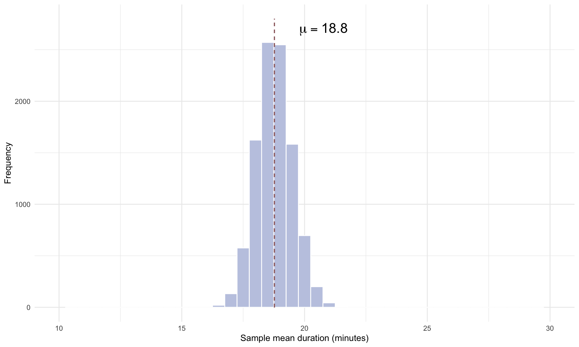
Comparing the \(n = 1,000\) plot to the \(n = 50\) plot, we can see that the standard deviation of the sampling distribution is significantly smaller for \(n = 1,000\). The intuition is that drawing a much larger random sample increases the accuracy of our estimate, which makes \(\bar{x}\) more likely to land close to the true population mean \(\mu\). This narrowing of the sampling distribution for larger sample sizes is the reason why confidence intervals tighten as the sample size \(n\) increases.
The Central Limit Theorem applies to proportions as well. In the case of proportions, the sampling distribution of the sample proportion, \(\bar{p}\), is equal to the population proportion, \(p\), and the standard deviation of the sampling distribution is approximately \(\sqrt{\frac{\bar{p}(1-\bar{p})}{n}}\).
We can again visualize the sampling distribution for proportions by randomly selecting \(n = 50\) bike share trips from the full data set and calculating the proportion of one way trips. Using \(n = 50\), the sampling distribution for the proportion of one way trips is
# See code using the scroll bar immediately to the right ----->  #


p_bar <- list()
set.seed(1)
n = 50
for(i in 1:10000){
bike_sample <- bike[sample(1:nrow(bike), n),]
p_bar[[i]] = mean(bike_sample$trip_type=="One Way")
}

p = 0.88

CLT <-data.frame(cbind(p_bar))
CLT$p_bar=as.numeric(CLT$p_bar)

ggplot(CLT, aes(x=p_bar))+
  geom_histogram(binwidth = 0.02, color = "white", fill=cols[3])+
  theme_minimal()+
  xlab("Sample proportion of one way trips")+
  ylab("Frequency")+
  geom_segment(aes(x = p, y = 0, xend = p, yend = 2000), size = 0.5, linetype = "dashed", color = cols[6])+
  annotate("text", size = 6, x = p+0.015, y = 1800, label = "p == 0.88", parse = TRUE)+
  xlim(0.75,1)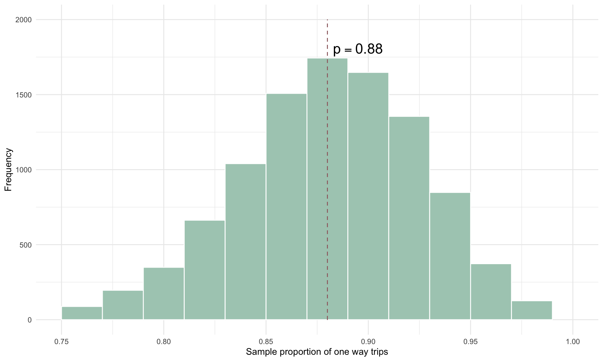
If we increase the sample size to \(n = 1000\), the sampling distribution for the proportion of one way trips is
# See code using the scroll bar immediately to the right ----->  #


p_bar <- list()
set.seed(1)
n = 1000
for(i in 1:10000){
bike_sample <- bike[sample(1:nrow(bike), n),]
p_bar[[i]] = mean(bike_sample$trip_type=="One Way")
}

p = 0.88

CLT <-data.frame(cbind(p_bar))
CLT$p_bar=as.numeric(CLT$p_bar)

ggplot(CLT, aes(x=p_bar))+
  geom_histogram(binwidth = 0.01, color = "white", fill=cols[3])+
  theme_minimal()+
  xlab("Sample proportion of one way trips")+
  ylab("Frequency")+
  geom_segment(aes(x = p, y = 0, xend = p, yend = 4000), size = 0.5, linetype = "dashed", color = cols[6])+
  annotate("text", size = 6, x = p+0.015, y = 3800, label = "p == 0.88", parse = TRUE)+
  xlim(0.75,1)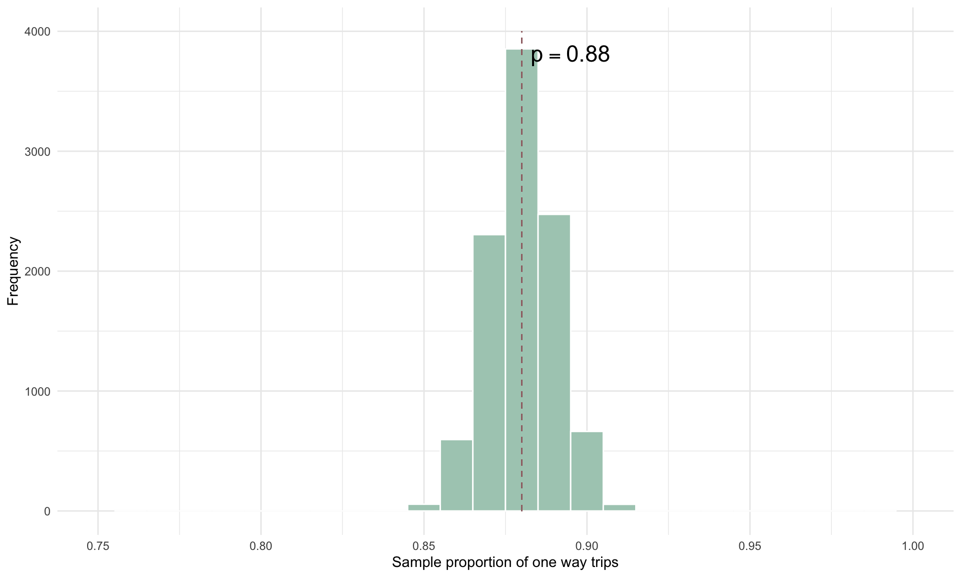
As expected, the sampling distribution narrows as \(n\) increases, because the additional data improves the precision of our estimate and reduces variability.