7 Review: Margins & Graph Design (R)
7.1 Lab Overview
This lab reviews two fundamentals: mastering margins and graph design!
Research Question: What characteristics of passengers are associated with survival on the Titanic?
Lab Files
Data:
Download titanic_df.csv
Script File:
Download lab3_F1_margins_graphs.r
Packages for this lab:
You may need to install packages that you have never used before with install.packages("packagename")
# Basic data cleaning and visualization packages
library(tidyverse)
library(ggplot2)
library(janitor)
# To plot predicted values
library(ggeffects)
# To get average marginal effect
library(margins)
7.2 Margins in R (compared to Stata)
When we are talking about margins, we are using Stata terminology. What is contained within Stata’s margins command is really two separate commands in R: predicted values OR marginal effects. These two commands help us illustrate the effects that we have found in our model for our reader. It can help convey effect size or interactions. If you master the margins command, you can use it to highlight a particular finding for your reader. You can list the values or marginal effects as numbers or plot it. I will display each of the examples via plots.
What is a predicted value?
Remember, all the models we run are based on equations that are trying to predict our dependent variable (aka our outcome - Y). Once we run the model, we actually get an equation we can use. If we plug in specific values for our independent variables (our X’s), then we can predict the value of our outcome. In a linear regression, that outcome is some continuous variable: income, years in the NBA, life expectancy, etc. In a regression with a binary outcome, the predicted value is actually a predicted probability. In a regression with a count outcome, the predicted value is, you guessed it, a count.
In R in most cases you can use
ggpredict()from the ggeffects package. It generates predicted values with some nice graphing capabilities built in.
What is a marginal effect?
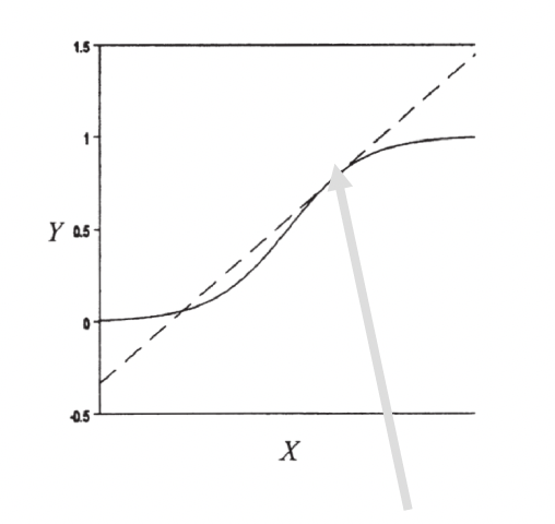
A marginal effect tells us how much our outcome (Y) changes based on a one unit change in X. This hopefully sounds familiar to you. That’s because it’s how we interpret coefficients in a linear regression. Basically, a marginal effect is a slope. In a linear regression, the slope is constant. A one unit change in X causes the same change in Y for any X value. In other models, the slope changes as you go up the range of X. It’s actually the instantaneous rate of change, meaning the slope at a particular point. This is harkening back to your calculus classes. In the image below, the dashed line shows you the slope at the point where the arrow ends.
To get a marginal effect we’ll be using the
margins()command from themarginspackage.
Now what makes each of these commands difficult is that there are so so many options we can add to the command. Do we want to focus on one of our independent variables or two? Are we holding the other variables at means or at representative values? Are we working with continuous or categorical variables? This overview today is hopefully going to help you understand the grammar of these commands and how to bend it to your will when you need to use it on your project.
To use either command, we need to run a regression first. This is the regression we’ll be basing the following sections off of…
First, set factor variables:
df_titanic <- df_titanic %>%
  mutate(port = factor(port, labels = c("Cherbourg", "Queenstown", "Southhampton")),
         female = factor(female, labels = c("Male", "Female")),
         pclass = factor(pclass, labels = c("1st (Upper)", "2nd (Middle)", "3rd (Lower)")))
Then run the regression:
fit1 <- glm(survived ~ port + female + log_fare + parch,
    data = df_titanic,
    family = binomial(link = "logit"))
7.3 Predicted Values
This is one of the two functions that margins covers. In R we use the function ggpredict() from the ggeffects package. There are three decisions you will need to make when producing predicted values. These three decisions form the basics of the many variations of the ggpredict(). All of these examples will be from a logistic regression so they will be predicted probabilities or changes in probability.
Decision 1: What is your variable of focus: categorical or continuous?
The first decision you will need to make for either predicted values is what X variable to focus on. Remember, you as the analyst are using predicted probability plot to visualize some finding, usually relating to a key independent variable in your analysis. For example, in our titanic analysis our key variable was port of boarding.
For a categorical variable you do not need to specify anything beyond the name of your variable in the
termsorvariablesarguments
Here is the predicted probability plot using ggpredict(), focusing on port of entry.
ggpredict(fit1, terms = "port") %>%
  plot()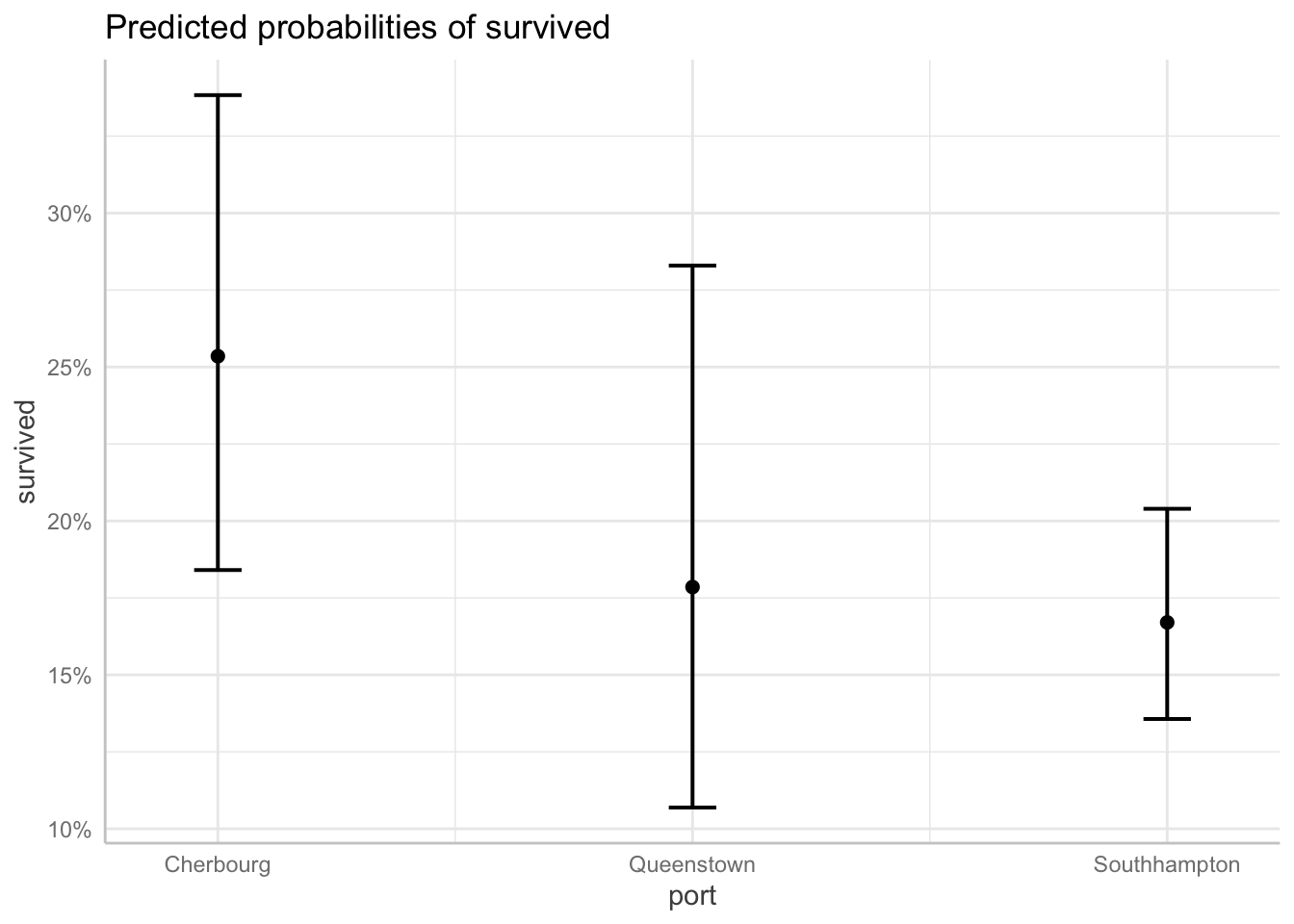
For a continuous variable you do the same thing, BUT you have to specify which values of the variable to calculate and plot for the predicted probabilities.
Here is the predicted probability plot focusing on ticket fare (logged to address skew).
ggpredict(fit1, terms = "log_fare[0, 2, 4, 6]") %>%
  plot()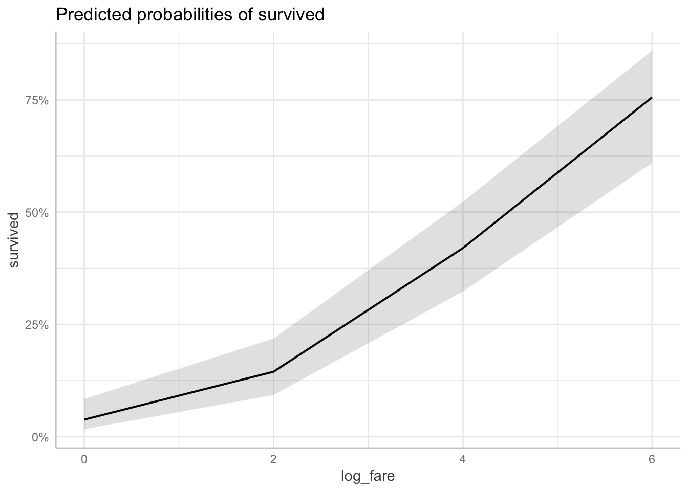
Decision 2: Add a second variable?
The second decision you will need to make is whether you want to add a second variable to focus on. Any more than two X variables of focus will lead to a complicated plot that doesn’t communicate much to your reader. But adding a second variable can help you show not only the effect of your first variable, but how that effect varies across groups. It can illustrate interactions. Again, whether your variables are categorical or continuous will affect the plot.
Two continuous or continuous/categorical: Whatever variable you specify first will be on the X axis. The second variable will split into different lines on the plot. Always put your categorical variable second.
Here is the predicted probability plot for ticket fare and number of parents/children on board.
ggpredict(fit1, terms = c("log_fare[0, 2, 4, 6]", "parch[0, 3, 6]")) %>%
  plot()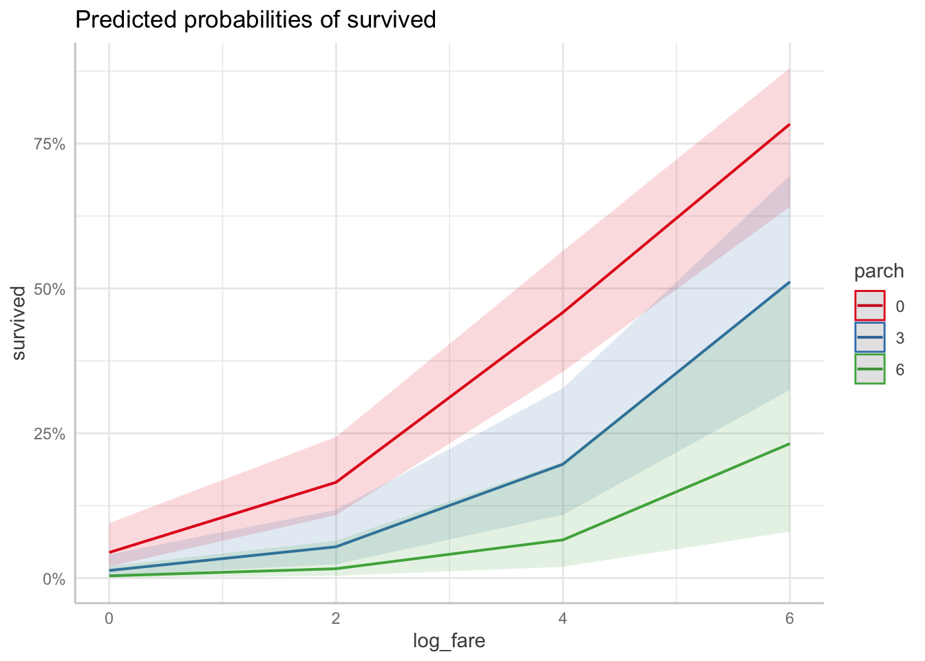
Here is the predicted probability plot for ticket fare and port of boarding.
ggpredict(fit1, terms = c("log_fare[0, 2, 4, 6]", "port")) %>%
  plot()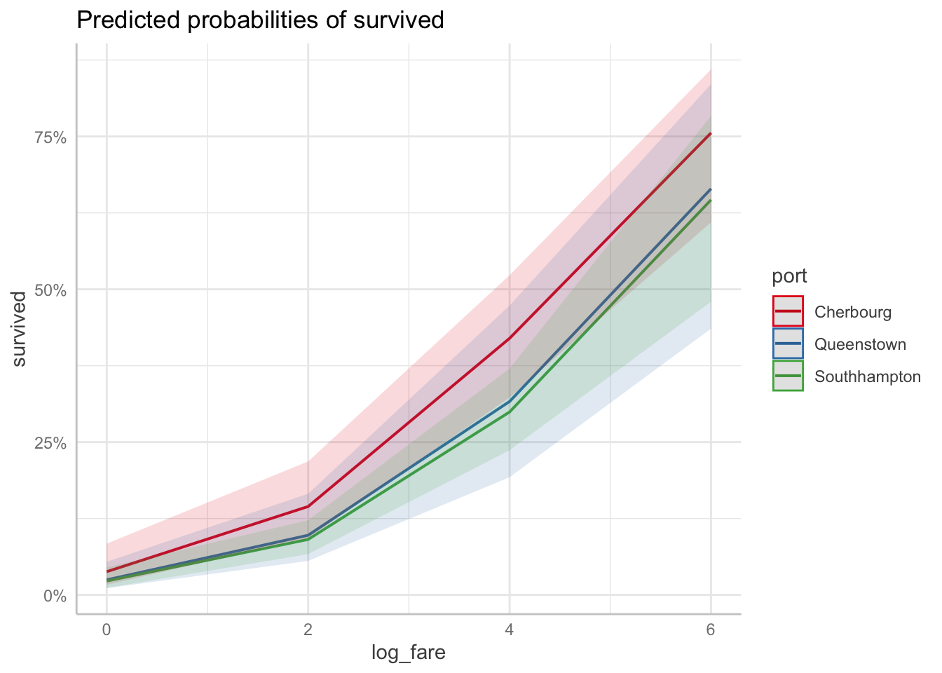
Two categorical variables: Again, whatever variable you specify first will be on the X axis. The second variable will split into different lines on the plot. Add
connect.lines = TRUEto the plot command to get the predicted points to connect, though that’s not strictly necessary. It just mimics what the plot looks like in Stata.
Here is the predicted probability plot for port of boarding and gender.
ggpredict(fit1, terms = c("port", "female")) %>%
  plot(connect.lines = TRUE)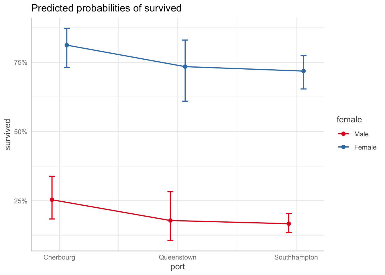
Decision 3: How will you handle the other X variables?
This is a review from last week. There are three approaches to handling the other X variables (aka the ones that are NOT the X variable you want to highlight):
- Hold other variables AT MEANS
- Hold other variables AT REPRESENTATIVE VALUES
- Run everything with observed values and compute the AVERAGE predicted value/effect. This is a pain in the ass to do in R for predicted values, and I’m still working on sample code so this lab will not cover it today.
NOTE: For these I want you to note how the actual predicted values change, so I am not going to include the plot. Look at how the actual calculated predicted probabilities change for each approach.
At means: You don’t have to do anything. This is the default for ggpredict.
Here are the predicted probabilities for port with the other variables at means.
ggpredict(fit1, terms = "port")# Predicted probabilities of survived
port | Predicted | 95% CI
---------------------------------------
Cherbourg | 0.25 | [0.18, 0.34]
Queenstown | 0.18 | [0.11, 0.28]
Southhampton | 0.17 | [0.14, 0.20]
Adjusted for:
* female = Male
* log_fare = 2.96
* parch = 0.38At representative values: You have to specify the specific values of the other variables within the
condition =option, but only ONE value per variable.
Here are the predicted probabilities for port with the other variables at representative values.
ggpredict(fit1, terms = "port",
          condition = c(female = "Female", log_fare = 2, parch = 2))
# Predicted probabilities of survived
port | Predicted | 95% CI
---------------------------------------
Cherbourg | 0.52 | [0.37, 0.68]
Queenstown | 0.41 | [0.26, 0.58]
Southhampton | 0.39 | [0.28, 0.51]Average predicted values/marginal effects: Again, despite this being the default in Stata, you have do it the by hand long way in R. I will send that code to you separately.
7.4 Marginal Effects
This is one of the two functions that margins covers. In R we use the function margins() from the margins package. There are only two big decisions you have to make when running this function: what variable to focus on and how to handle the other X variables.
Decision 1: What is your variable of focus?
With the margins command, you specify your variable of focus with the
variablesoption. It doesn’t matter whether your variable is categorical or continouous, though specificy specific values of your continuous variable if you choose.
Categorical example: Here are the marginal effects for port. There are only two because it refers back to the base category (Cherbourg).
margins(fit1, variables = "port") portQueenstown portSouthhampton
-0.07146 -0.08379Continuous example: Here is the marginal effects of ticket fair overall:
margins(fit1, variables = "log_fare") log_fare
0.1112Continuous example specifying specific values: Here is the marginal effects at different values of ticket fare (logged). You may want to use this option to show how a one unit change in fare has a larger effect at higher values of ticket fare.
margins(fit1, variables = "log_fare", at = list(log_fare = c(0, 2, 4, 6))) at(log_fare) log_fare
0 0.0581
2 0.1044
4 0.1365
6 0.1117Decision 2: How will you handle the other X variables?
Again, this is a review from last week. There are three approaches to handling the other X variables (aka the ones that are NOT the X variable you want to highlight):
- Hold other variables at means: Marginal Effects at Means (MEM)
- Hold other variables at representative values: Marginal Effects at Representative values (MER)
- Run everything with observed values and compute the average: Average Marginal Effect (AME).
Marginal Effects at Means: I found an easier way to do this compared to last week. You can use the
at =command to fill in the base categories and means for the remaining variables. This doesn’t exactly replicate what happens in Stata, so I may change this code later.
MEM for port…
margins(fit1, variables = "port",
        at = list(female = "Male", log_fare = mean(fit1$data$log_fare),
                  parch = mean(fit1$data$parch)))
Average marginal effects at specified valuesglm(formula = survived ~ port + female + log_fare + parch, family = binomial(link = "logit"), data = df_titanic) at(female) at(log_fare) at(parch) portQueenstown portSouthhampton
Male 2.962 0.3816 -0.0751 -0.08661Marginal Effects at Representative Values: specify the model results, the variable we want to find the marginal effect for, and then the specific values for the other variables that correspond with our “representative case.”
Here are the marginal effects for port at representative values:
margins(fit1, variables = "port",
        at = list(female = "Male", log_fare = 2, parch = 2))
at(female) at(log_fare) at(parch) portQueenstown portSouthhampton
Male 2 2 -0.02719 -0.03105Average Marginal Effects: this is the most common/default method in
margins()to produce marginal effects in R. You only have to specify the variable you want to calculate the marginal effects for.
Here are the average marginal effects for port:
margins(fit1, variables = "port") portQueenstown portSouthhampton
-0.07146 -0.083797.5 Basics of Graphing Aesthetics
This lab will not review in detail all of the many different ways you can change the graphs you produce in r. However, I will provide you with this reference do file for graph formatting in r. It covers:
- Titles, subtitles, and captions
- Changing axis and tick mark options
- Color of markers, lines, and the fill area
- Style of markers and lines
- Background colors for the plot area and graph area
- Labelling specific values
This is also a wonderful book with everything you could need to know about ggplot formatting: ggplot2 Elegant Graphics for Data Analysis
Here’s a resource specifically on altering ggeffects plots: Customize ggeffects plot apperance
7.6 Good Graph Design
Basic Principles of Good Graph Design
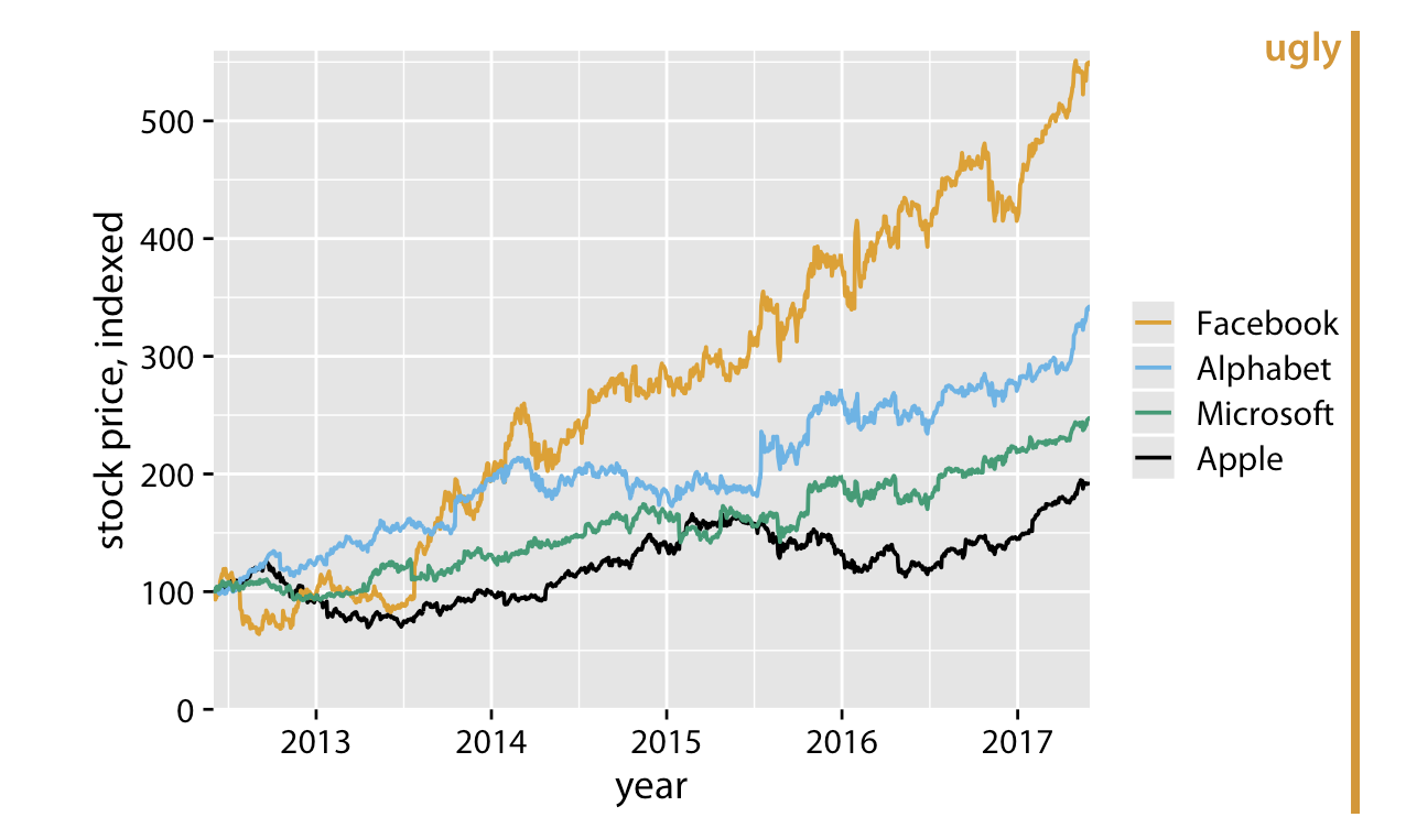
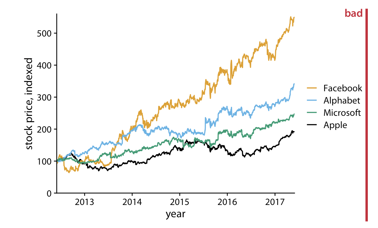
These principles are from the online The Fundamentals of Data Visualization. book. I highly recommend this book if you want to dive deeper into making great graphs. It is not written for any one statistical software, though the examples in the book are made in R. These examples plots are also taken from the book.
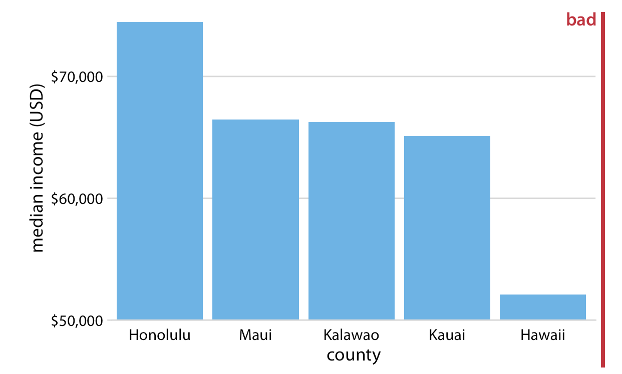
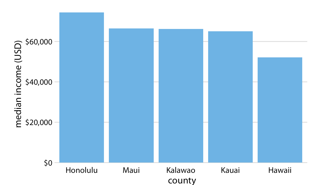
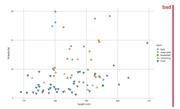
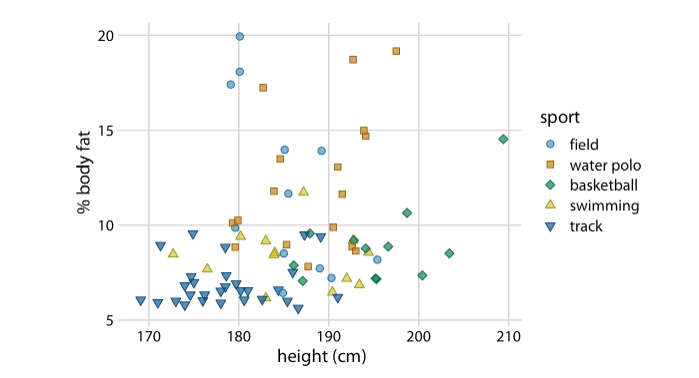
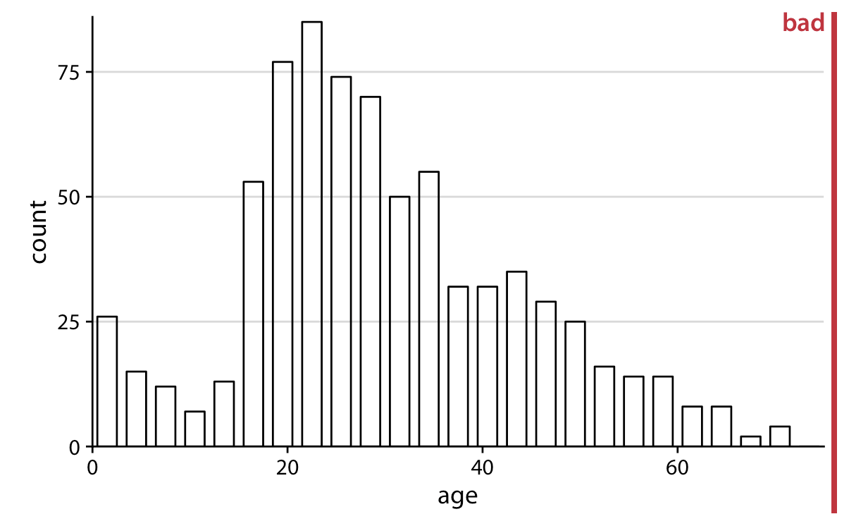
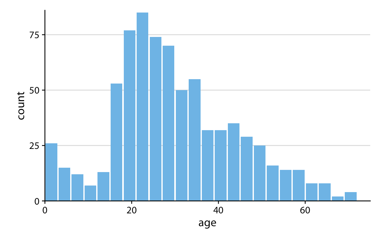
- Keep the background and grid lines of your plot light and simple. Your default should be a white background and light gray grid lines. In the graphs below the first is too busy, the second doesn’t have enough grid lines, and the third is just right.
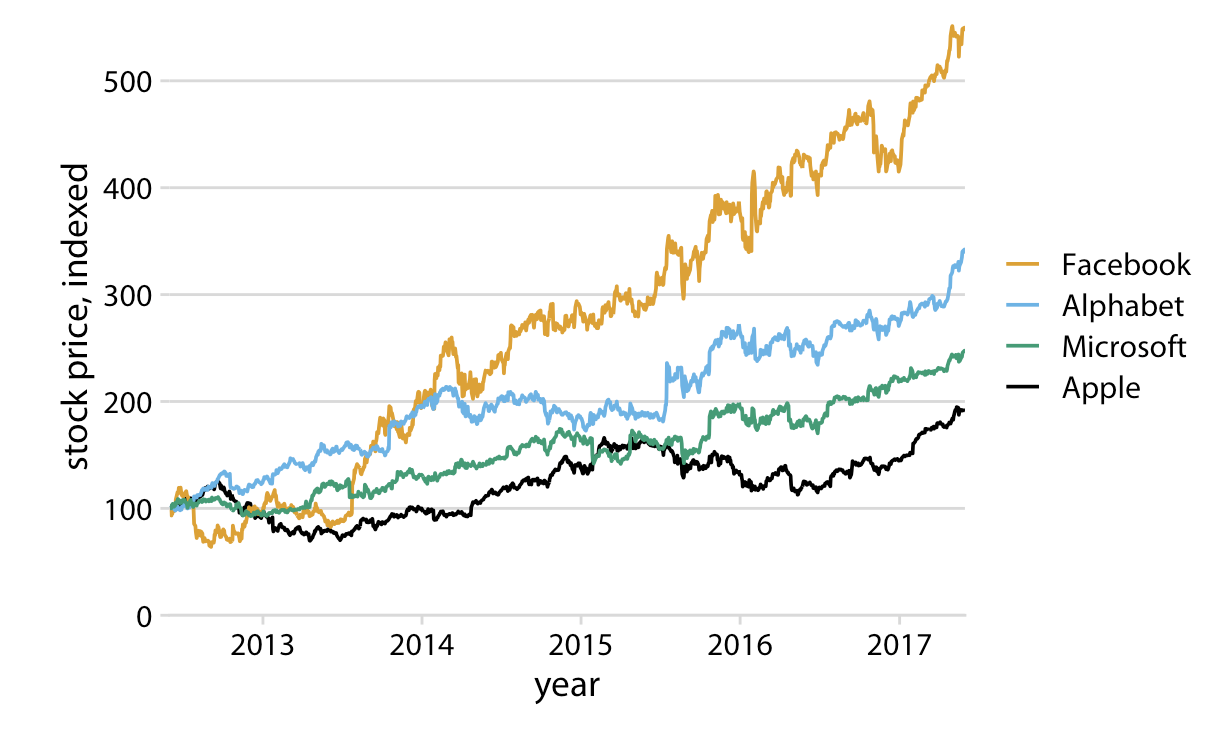
- Make sure the differences between lines, bars, points are proportional to the data. Aka. Don’t lie with your graph!.
- Color should serve a purpose in your graph. Keep it simple, and limit the total number of colored categories to 3 to 5.
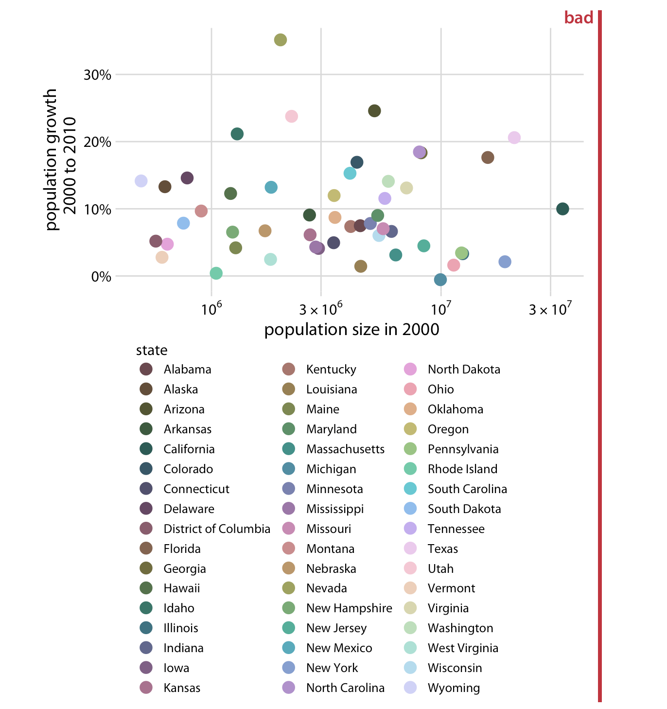
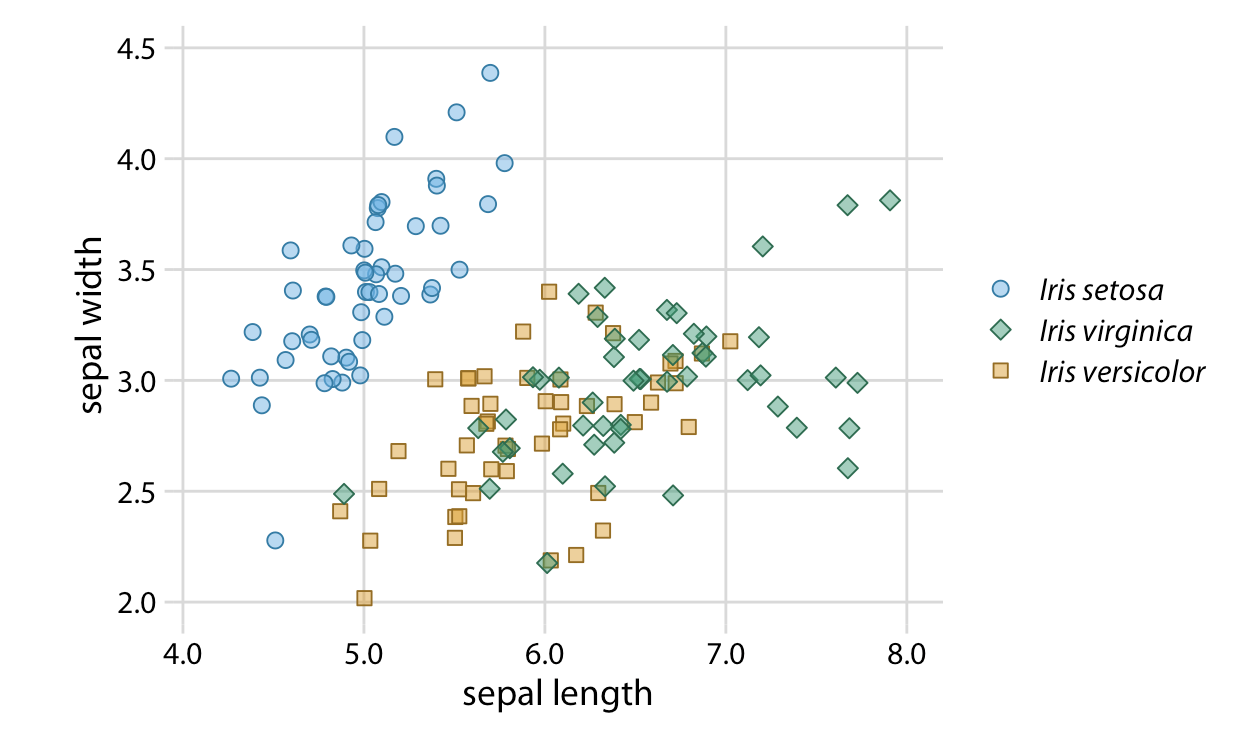
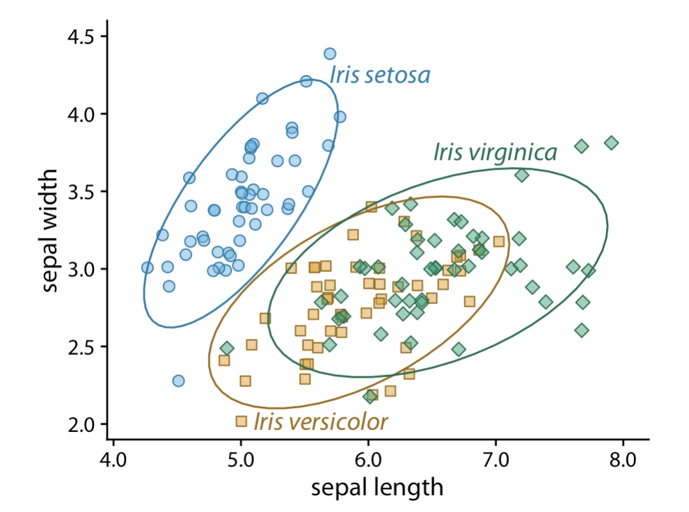
- Design clear legends with clear visual differences between categories. You can show different groups with different colors, symbol, or order on the plot. When possible, design your figure so it doesn’t need a legend.
An example where color and symbol are used to distinguish between categories.
- Use larger axis labels. Always look at scaled down versions of your figures to make sure that your axes are still readable.
- Don’t use lined drawings. Whenever possible shade in the figures on your graph. Line drawings make it harder to visually detect patterns.
Example: A journal ready predicted values plot
Here is one example of a journal ready predicted values plot. This is code you can tweak and save to be your default style when producing plots for papers. The reference file will help you make some of these changes, but a dedicated ggplot2 training will do wonders for you. In the meantime you just have to practice tweaking the theme options and messing with the scales to get plots how you want them.
ggpredict(fit1, terms = c("log_fare[0, 2, 4, 6]", "female")) %>%
    plot() +
  # add labels
    labs(
      x = "Ticket Fare (logged)",
      y = "Predicted Probability",
      title = ""
    ) +
  # change labels in legend in the scale specifications
    scale_color_brewer(palette = "Set1",
                       labels = c("Male", "Female")) +
  # apply a basic minimal theme
    theme_minimal() +
    theme(
      axis.title = element_text(size = 14), # increase axis title size
      panel.grid.minor = element_blank(), # remove some of the grid lines
      panel.grid.major = element_line(color = "lightgrey"), # make sure grey lines show up in saved image
      legend.position = c(.2,.85), # move the legend to the top left
      legend.title = element_blank(), # get rid of the legend title
      legend.direction = "horizontal" # arrange legend horizontally
      )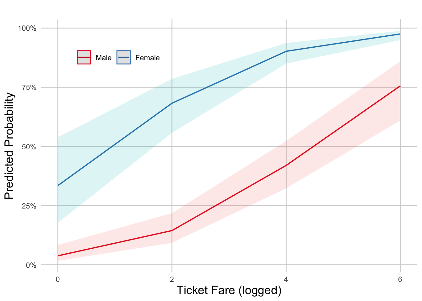
  # Specifying a height and width also effects how the final plot looks and
  # keeps it at the aspect ratio you want.
  ggsave("figs_output/probplotinr.png", width = 5, height = 4)
Note: ggplot options work here because the plot() function in the ggeffects package is built on ggplot code. If this weren’t a ggeffects plot you would need to begin the code with a ggplot(data = < >, aes(< >)) + geom_< >() call.
Here’s a resource specifically on altering ggeffects plots: Customize ggeffects plot apperance
7.7 Lab Assignment
From this logistic regression, produce a journal ready predicted probability plot with two X variables of focus (you can choose any two X variables from the regression). You can play around with the example code I provided or make your own theme tweaks!