13 Handling Influential Observations (R)
13.1 Lab Overview
This is part 2 of lab 5, looking at how to handle influential observations in logistic regression.
Research Question: What characteristics are associated with separtist movements in ethnocultural groups?
Lab Files
Data:
Download M.A.R_Cleaned.dta
Codebook: Download MAR_Codebook.pdf
Script File: Download lab5_InfluentialObvs.R
Packages for this lab:
You may need to install packages that you have never used before with install.packages("packagename")
# Basic data cleaning packages
library(tidyverse)
library(janitor)
# Table building package
library(huxtable)
13.2 Cook’s Distance
When looking for influential observations in logistic regressions, we discussed usings Pregibon’s dbeta in Stata. There’s not an easy way to replicate this R. However, R does have an easy influential observation plot built into it’s default diagnostics plot. It also provides you with a visual for the cutoff, unlike dbeta.
Cook’s Distance: Cook’s Distance is a measure of how much influence an observation has on your model. It is very similar to Pregibon’s dbeta, except a little more computationally intensive. It is a score that tells you how much the coefficients were changed if the observation at hand were removed. Higher means more influence. It uses the leverage and the residuals to calculate the score.
There is no one answer for a Cook’s Distance that is “too high.” Some people say 1 is a good threshold. Other’s say 4/N, which often leads to a very small cutoff if you have a large sample. Some say take the mean of Cook’s Distances and use 3x the mean of the distances as a cutoff (you can use the cooks.distance(model) command to list each individual distance). R uses .5 and 1 as guide cutoffs. You will need to use your judgement to decide what observations to potentially exclude.
Here is the typical process a person might undergo to evaluate their model.
First let’s run the model:
model <- glm(target_5yrs ~ pts + gp + fg + x3p + ast + blk,
              data = df_nba, family = binomial(link = logit))
STEP 1: Plot distribution of Cook’s Distance
Look at the distribution of Cook’s Distance to get a sense of whether there are any really large outliers. This is the fourth of R’s built in diagnostics plots that you can run after any regression.
You can add id.n = to specify how many points to label. By default the
3 observations with the largest Cook’s Distance are labeled.
plot(model, which = 4, id.n = 3)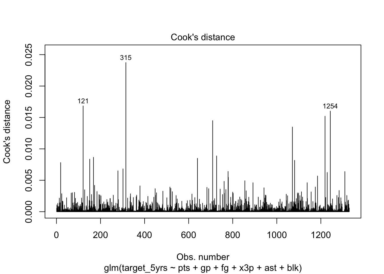
Any spikes are not definitively influential. There’s no definitive cutoff for Cook’s distance, though R’s next plot uses .5 and 1 as potential cutoffs to indicate very large distance values.
STEP 2: Look at the Residuals vs Leverage plot
This is another one of R’s built-in regression diagnostic plots that is useful for identifying influential observations. Each observtion is plotted as a point. The Y axis is the standardized residual for each observation (a standardized version of your error term). The x axis is the leverage of each point, aka how much that observation would change the coefficients if it were removed from the model. The dashed line shows the threshold of Cook’s Distance at .5 or 1.
Leverage is not the same as Cook’s Distance, though the formula for Cook’s Distance uses the leverage statistic. Leverage is a measure of how far the values of the independent variables for an observation are from values the other observations. Basically, are the values extreme?
Note: Be careful. Just because an observation has a large standardized residual absolute value does not mean it has a high leverage or Cook’s Distance.
plot(model, which = 5)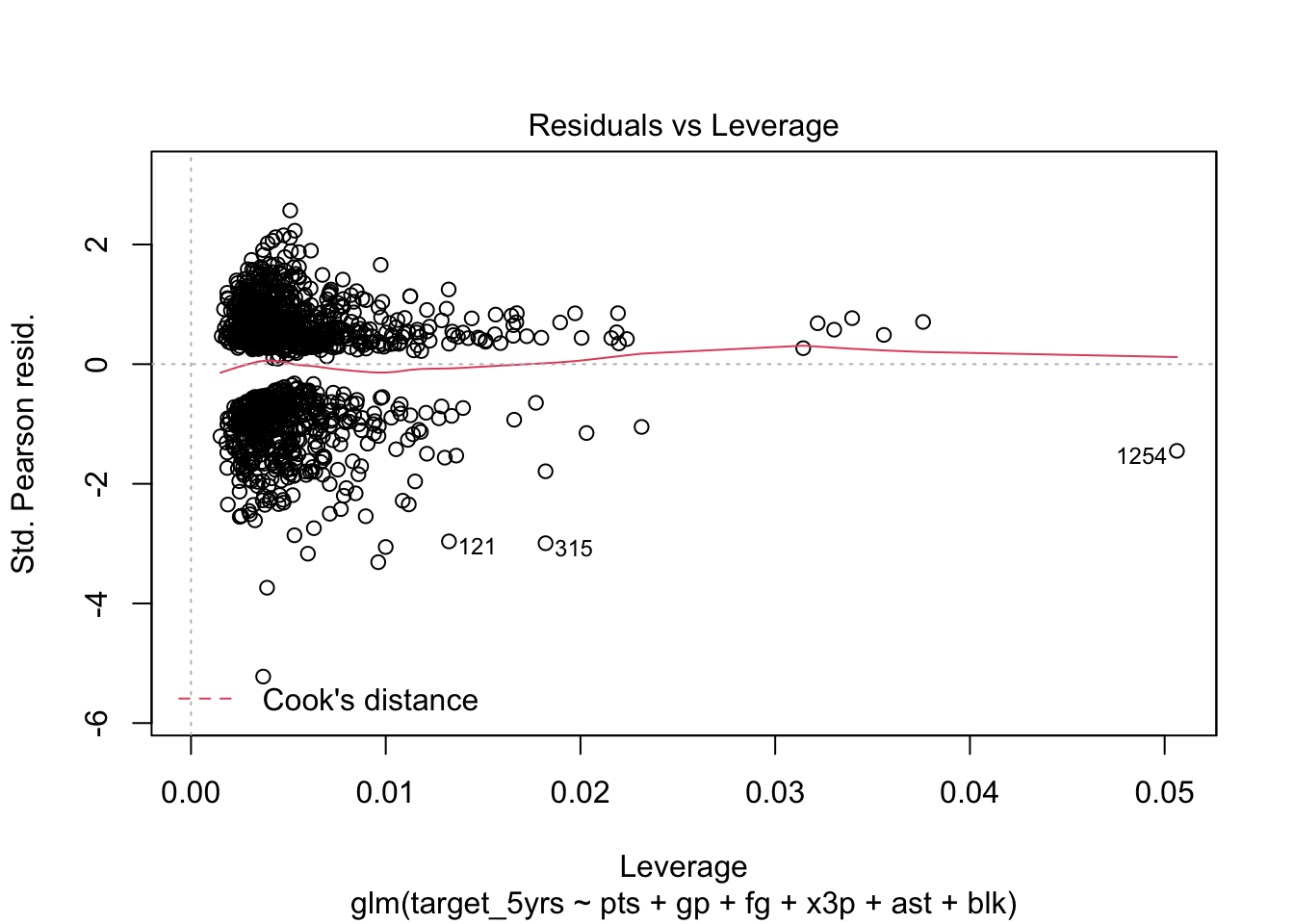
In this case, no values are beyond the Cook’s distance threshold (.5). They are so far away, the dashed line does not even show on the plot.
STEP 3: List the influential observations
You can create a list to see the characteristics of the observations that have high leverage/Cook’s distance. This code subsets to observations 315, 720, and 121, and then selects the variables to display.
df_nba[c(315, 1254, 121), ] %>% select(name, pts, blk)| name | pts | blk |
|---|---|---|
| Patrick Ewing | 20 | 2.1 |
| Eric Mobley | 3.9 | 0.6 |
| Tim Hardaway | 14.7 | 0.1 |
STEP 4: Run a regression excluding influential observations
First run the new regression.
model2 <- glm(target_5yrs ~ pts + gp + fg + x3p + ast + blk,
              data = df_nba %>% filter(name != "Patrick Ewing" &
                                         name != "Eric Mobley" &
                                         name != "Tim Hardaway"),
              family = binomial(link = logit))
Then use the huxtable package to create a quick table with both models. First create a list object and then run the huxreg() command.
models <- list(model, model2)
huxreg(models)| (1) | (2) | |
|---|---|---|
| (Intercept) | -4.007 *** | -4.104 *** |
| (0.555) | (0.563) | |
| pts | 0.066 * | 0.067 * |
| (0.026) | (0.026) | |
| gp | 0.036 *** | 0.034 *** |
| (0.004) | (0.004) | |
| fg | 0.039 ** | 0.041 *** |
| (0.012) | (0.012) | |
| x3p | 0.002 | 0.003 |
| (0.004) | (0.004) | |
| ast | 0.052 | 0.070 |
| (0.064) | (0.066) | |
| blk | 0.539 * | 0.617 ** |
| (0.229) | (0.235) | |
| N | 1329 | 1325 |
| logLik | -747.391 | -741.461 |
| AIC | 1508.781 | 1496.922 |
| *** p < 0.001; ** p < 0.01; * p < 0.05. | ||
The differences aren’t too big, which makes sense because none of these observations were past the .5 threshold for Cook’s Distance. I would not exclude them.
At the end of the day there is no hard and fast rule about what influential observations to exclude. You can use these processes to identify variables that are outliers and statistically influential, but then it’s up to you to examine each potential outlier and decide according to your theory and knowledge of the data whether it makes sense to exclude them from your analysis. Ask yourself: “If I include this/these observation(s) will my data be telling an incorrect story?”