Chapter 4 Linear modelling: introduction
4.1 Dependent and independent variables
In the previous two chapters we discussed single variables. In Chapter 2 we discussed a numeric variable that had a certain mean, for instance we talked about the height of elephants. In Chapter 3 we talked about a dichotomous categorical variable: elephants being taller than 3.40 m or not, with a certain proportion of tall elephants. This chapter deals with the relationship between two variables, more specifically the relationship between two numeric variables.
In Chapter 1 we discussed the distinction between numeric, ordinal and categorical variables. In linear modelling, there is also another important distinction between variables: dependent and independent variables. Dependency of a variable is not really a property of a variable but it is the result of the data analyst’s choice. Let’s first think about relationships between two variables. Determining whether a variable is to be treated as independent or not, is often either a case of logic or a case of theory. When studying the relationship between the height of a mother and that of her child, the more logical it would be to see the height of the child as dependent on the height of the mother. This is because we assume that the genes are transferred from the mother to the child. The mother comes first, and the height of the child is partly the result of the mother’s genes that were transmitted during fertilisation. The height of a child depends in part on the height of the mother. The variable that measures the result is usually taken as the dependent variable. The theoretical cause or antecedent is usually taken as the independent variable.
The dependent variable is often called the response variable. An independent variable is often called a predictor variable or simply predictor. Independent variables are also often called explanatory variables. We can explain a very tall child by the genes that it got from its very tall mother. The height of a child is then the response variable, and the height of the mother is the explanatory variable. We can also predict the adult height of a child from the height of the mother.
The dependent variable is usually the most central variable. It is the variable that we’d like to understand better, or perhaps predict. The independent variable is usually an explanatory variable: it explains why some people have high values for the dependent variable and other people have low values. For instance, we’d like to know why some people are healthier than others. Health may then be our dependent variable. An explanatory variable might be age (older people tend to be less healthy), or perhaps occupation (working with paint all day induces more health problems than working with students all day).
Sometimes we’re interested to see whether we can predict a variable. For example, we might want to predict longevity. Age at death would then be our dependent variable and our independent (predictor) variables might concern lifestyle and genetic make-up.
Thus, we often see four types of relations:
Variable \(A\) affects/influences another variable \(B\)
Variable \(A\) causes variable \(B\)
Variable \(A\) explains variable \(B\)
Variable \(A\) predicts variable \(B\)
In all these four cases, variable \(A\) is the independent variable and variable \(B\) is the dependent variable.
Note that in general, dependent variables can be either numeric, ordinal, or categorical. Also independent variables can be numeric, ordinal, or categorical.
4.2 Linear equations
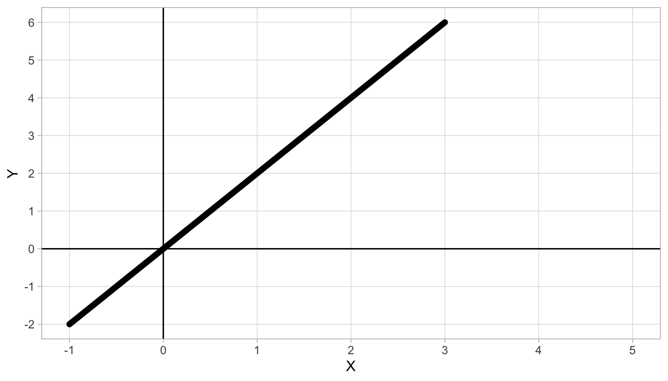
Figure 4.1: Straight line with intercept 0 and slope 2.
From secondary education you might remember linear equations. Suppose you have two quantities, \(X\) and \(Y\), and there is a straight line that describes best their relationship. An example is given in Figure 4.1. We see that for every value of \(X\), there is only one value of \(Y\). Moreover, the larger the value of \(X\), the larger the value of \(Y\). If we look more closely, we see that for each increase of 1 unit in \(X\), there is an increase of 2 units in \(Y\). For instance, if \(X=1\), we see a \(Y\)-value of 2, and if \(X=2\) we see a \(Y\)-value of 4. So if we move from \(X=1\) to \(X=2\) (a step of one on the \(X\)-axis), we move from 2 to 4 on the \(Y\)-axis, which is an increase of 2 units. This increase of 2 units for every step of 1 unit in \(X\) is the same for all values of \(X\) and \(Y\). For instance, if we move from 2 to 3 on the \(X\)-axis, we go from 4 to 6 on the \(Y\)-axis: an increase of again 2 units. This constant increase is typical for linear relationships. The increase in \(Y\) for every unit increase in \(X\) is called the slope of a straight line. In Figure 4.1, the slope is equal to 2.
The slope is one important feature of a straight line. The second important feature of a straight line is the intercept. The intercept is the value of \(Y\), when \(X=0\). In Figure 4.1 we see that when \(X=0\), \(Y\) is 0, too. Therefore the intercept of this straight line is 0.
With the intercept and the slope, we completely describe this straight line: no other information is necessary. Such a straight line describes a linear relationship between \(X\) and \(Y\). The linear relationship can be formalised using a linear equation. The general form of a linear equation for two variables \(X\) and \(Y\) is the following:
\[Y = \textrm{intercept} + \textrm{slope} \times X\]
For the linear relationship between \(X\) and \(Y\) in Figure 4.1 the linear equation is therefore
\[Y = 0 + 2 X\]
which can be simplified to
\[Y = 2 X\]
With this equation, we can find the \(Y\)-value for all values of \(X\). For instance, if we want to know the \(Y\)-value for \(X=3.14\), then using the linear equation we know that \(Y = 2 \times 3.14 = 6.28\). If we want to know the \(Y\)-value for \(X=49876.6\), we use the equation to obtain \(Y=2\times 49876.6 = 99753.2\). In short, the linear equation is very helpful to quickly say what the \(Y\)-value is on the basis of the \(X\)-value, even if we don’t have a graph of the relationship or if the graph does not extent to certain \(X\)-values.
In the linear equation, we call \(Y\) the dependent variable, and \(X\) the independent variable. This is because the equation helps us determine or predict our value of \(Y\) on the basis of what we know about the value of \(X\). When we graph the line that the equation represents, such as in Figure 4.1, the common way is to put the dependent variable on the vertical axis, and the independent variable on the horizontal axis.
Figure 4.2 shows a different linear relationship between \(X\) and \(Y\). First we look at the slope: we see that for every unit increase in \(X\) (from 1 to 2, or from 4 to 5) we see an increase of 0.5 in \(Y\). Therefore the slope is equal to 0.5. Second, we look at the intercept: we see that when \(X=0\), \(Y\) has the value -2. So the intercept is -2. Again, we can describe the linear relationship by a linear equation, which is now:
\[Y = -2 + 0.5 X\]
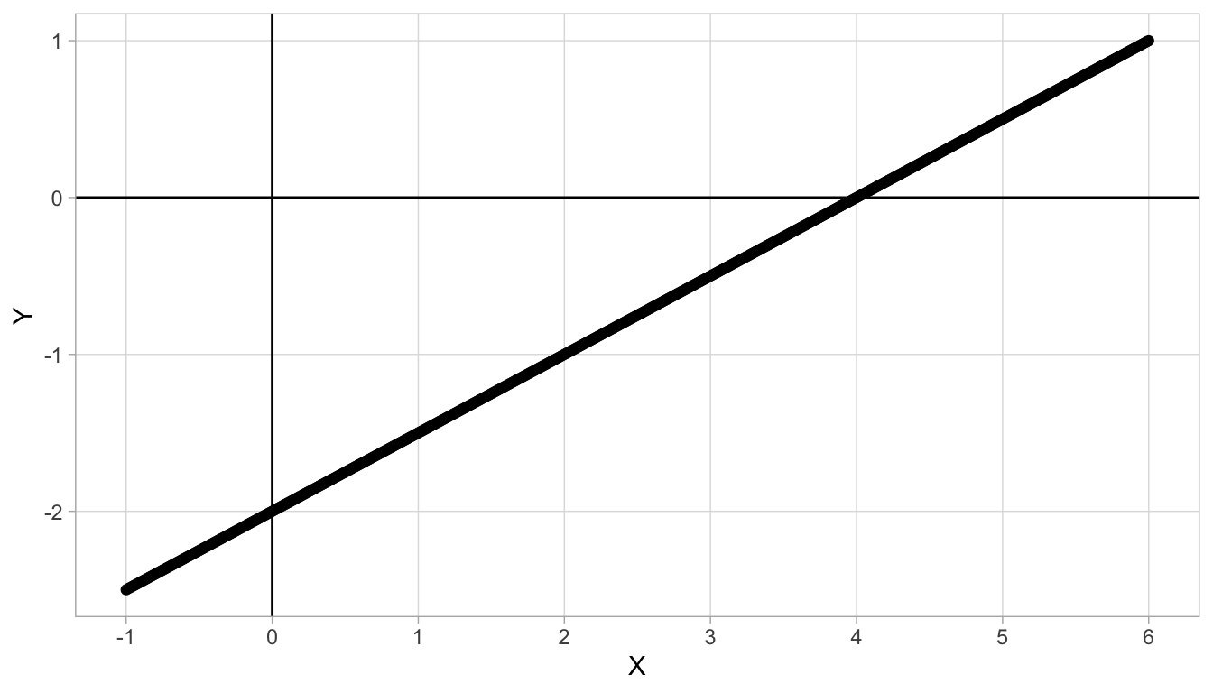
Figure 4.2: Straight line with intercept -2 and slope 0.5.
Linear relationships can also be negative, see Figure 4.3. There, we see that if we move from 0 to 1, we see a decrease of 2 in \(Y\) (we move from \(Y = -2\) to \(Y = -4\)), so \(-2\) is our slope value. Because the slope is negative, we call the relationship between the two variables negative. Further, when \(X=0\), we see a \(Y\)-value of -2, and that is our intercept. The linear equation is therefore:
\[Y = -2 - 2 X\]
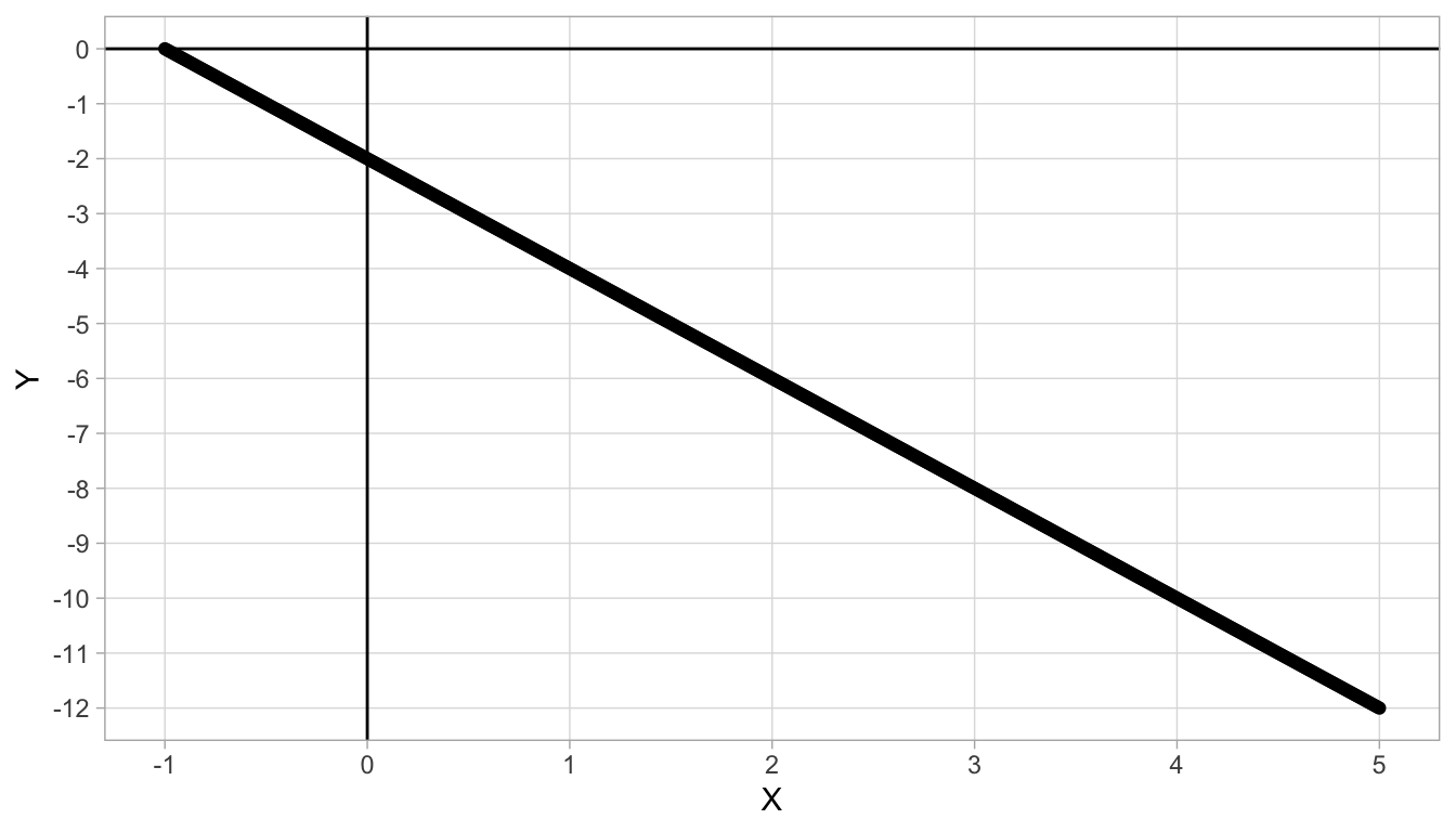
Figure 4.3: Straight line with intercept -2 and slope -2.
4.3 Linear regression
In the previous section, we saw perfect linear relationships between quantities \(X\) and \(Y\): for each \(X\)-value there was only one \(Y\)-value, and the values are all described by a straight line. Such relationships we hope to see in physics, but mostly see only in mathematics.
In social sciences we hardly ever see such perfectly linear relationships between quantities (variables). For instance, let us plot the relationship between yearly income and the amount of Euros spent on holidays. Yearly income is measured in thousands of Euros (kEuros), and money yearly spent on holidays is measured in Euros. Let us regard money spent on holidays as our dependent variable and yearly income as our independent variable (we assume money needs to be saved before it can be spent). We therefore plot yearly income on the \(X\)-axis (horizontal axis) and holiday spendings on the \(Y\)-axis (vertical axis). Let’s imagine we find the data from 100 women between 30 and 40 years of age that are plotted in Figure 4.4.
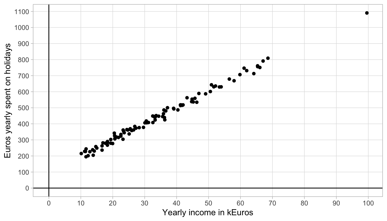
Figure 4.4: Data on holiday spending.
In the scatter plot, we see that one woman has a yearly income of 100,000 Euros, and that she spends almost 1100 Euros per year on holidays. We also see a couple of women who earn less, between 10,000 and 20,000 Euros a year, and they spend between 200 and 300 Euros per year on holiday.
The data obviously do not form a straight line. However, we tend to think that the relationship between yearly income and holiday spending is more or less linear: there is a general linear trend such that for every increase of 10,000 Euros in yearly income, there is an increase of about 100 Euros.
Let’s plot such a straight line that represents that general trend, with a slope of 100 straight through the data points. The result is seen in Figure 4.5. We see that the line with a slope of 100 is a nice approximation of the relationship between yearly income and holiday spendings. We also see that the intercept of the line is around 100.
## Warning in geom_segment(aes(x = X[order(X)][99] - 25, y = 900, xend = 67, : All aesthetics have length 1, but the data has 100 rows.
## ℹ Please consider using `annotate()` or provide this layer with data containing
##   a single row.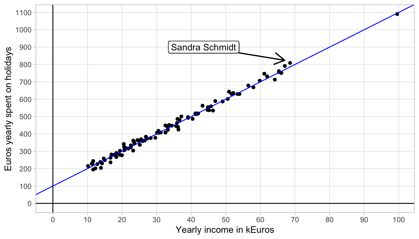
Figure 4.5: Data on holiday spending with an added straight line.
Given the intercept and slope, the linear equation for the straight line approximating the relationship is
\[\texttt{HolidaySpendings} = 100 + 100 \times \texttt{YearlyIncome}\]
In summary, data on two variables may not show a perfect linear relationship, but in many cases, a perfect straight line can be a very reasonable approximation of the data. Another word for a reasonable approximation of the data is a prediction model. Finding such a straight line to approximate the data points is called linear regression. In this chapter we will see what method we can use to find a straight line. In linear regression we describe the behaviour of the dependent variable (the \(Y\)-variable on the vertical axis) on the basis of the independent variable (the \(X\)-value on the horizontal axis) using a linear equation. We say that we regress variable \(Y\) on variable \(X\).
4.4 Residuals
Even though a straight line can be a good approximation of a data set consisting of two variables, it is hardly ever perfect: there are always discrepancies between what the straight line describes and what the data actually tell us.
For instance, in Figure 4.5, we see a woman, Sandra Schmidt, who makes 69 k Euros a year and who spends 809 Euros on holidays. According to the linear equation that describes the straight line, a woman that earns 69 kEuros a year would spend \(100 + 100 \times 69= 786\) Euros on holidays. The discrepancy between the actual amount spent and the amount prescribed by the linear equation equals \(809-786=23\) Euros. This difference is rather small and the same holds for all the other women in this data set. Such discrepancies between the actual amount spent and the amount as prescribed or predicted by the straight line are called residuals or errors. The residual (or error) is the difference between a certain data point (the actual value) and what the linear equation predicts.
Let us look at another fictitious data set where the residuals (errors) are a bit larger. Figure 4.6 shows the relationship between variables \(X\) and \(Y\). The dots are the actual data points and the blue straight line is an approximation of the actual relationship. The residuals are also visualised: sometimes the observed \(Y\)-value is greater than the predicted \(Y\)-value (dots above the line) and sometimes the observed \(Y\)-value is smaller than the predicted \(Y\)-value (dots below the line). If we denote the \(i\)th predicted \(Y\)-value (predicted by the blue line) as \(\widehat{Y_i}\) (pronounced as ‘y-hat-i’), then we can define the residual or error as the discrepancy between the observed \(Y_i\) and the predicted \(\widehat{Y_i}\):
\[e_i = Y_i - \widehat{Y_i}\]
where \(e_i\) stands for the error (residual) for the \(i\)th data point .
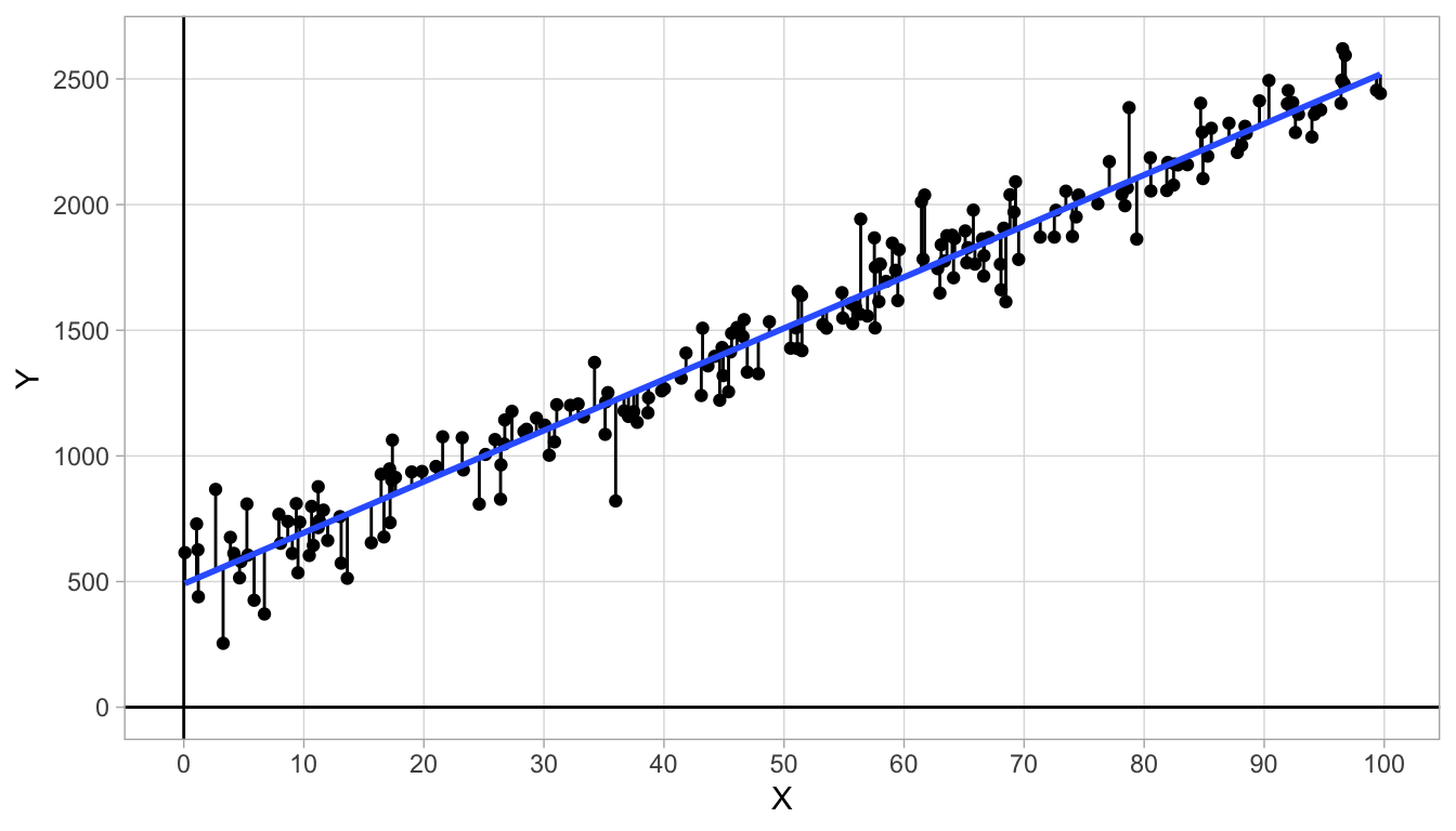
Figure 4.6: Data on variables \(X\) and \(Y\) with an added straight line.
If we compute residual \(e_i\) for all \(Y\)-values in the data set, we can plot them using a histogram, with a density plot that smooths the histogram to convey the general pattern, see Figure 4.7. We see that the residuals are on average 0, and that the histogram is symmetrical. We see that most of the residuals are around 0, and that means that most of the values \(Y\)-values are close to the line (where the predicted values are). We also see some large residuals but that there are not so many of these. Here, the residuals show a distribution with mean 0 and variance of 13336 (i.e., a standard deviation of 115).
The general assumption of linear models is that the distribution of the residuals is a normal distribution. Sometimes you see a distribution of residuals that is clearly normal, sometimes you don’t. It’s a bit hard to see from a rough histogram like this, but since the distribution is more or less symmetrical and shows a bell-shaped form, the normality assumption seems reasonable.
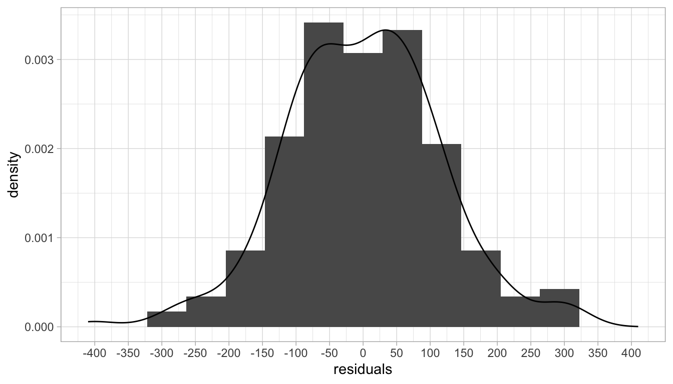
Figure 4.7: Histogram of the residuals (errors).
4.5 Least squares regression lines
You may ask yourself how to draw a straight line through the data points: How do you decide on the exact slope and the exact intercept? And what if you don’t want to draw the data points and the straight line by hand? That can be quite cumbersome if you have more than 2000 data points to plot!
First, because we are lazy, we always use a computer to draw the data points and the line, that we call a regression line. Second, since we could draw many different straight lines through a scatter of points, we need a criterion to determine a nice combination of intercept and slope. With such a criterion we can then let the computer determine the regression line with its equation for us.
The criterion that we use in this chapter is called Least Squares, or Ordinary Least Squares (OLS). To explain the Least Squares principle, look again at Figure 4.6 where we see both small and large residuals. About half of them are positive (above the blue line) and half of them are negative (below the blue line).
The most reasonable idea is to draw a straight line that is more or less in the middle of the \(Y\)-values, in other words, with about half of the residuals positive and about half of them negative. Or perhaps we could say that on average, the residuals should be 0. A third way of saying the same thing is that the sum of the residuals should be equal to 0.
However, the criterion that all residuals should sum to 0 is not sufficient. In Figure 4.8 we see a straight line with a slope of 0 where the residuals sum to 0. However, this regression line does not make intuitive sense: it does not describe the structure in the data very well. Moreover, we see that the residuals are generally much larger than in Figure 4.6.
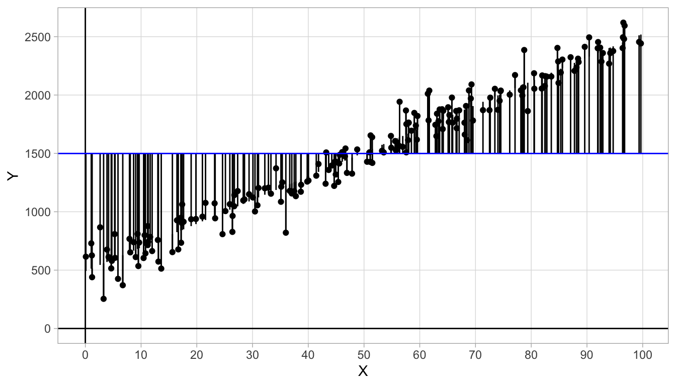
Figure 4.8: Data on variables \(X\) and \(Y\) with an added straight line. The sum of the residuals equals 0.
We therefore need a second criterion to find a nice straight line. We want the residuals to sum to 0, but also want the residuals to be as small as possible: the discrepancies between what the linear equation predicts (the \(\widehat{Y}\)-values) and the actual \(Y\)-values should be as small as possible.
So now we have two criteria: we want the sum of the residuals to be 0 (about half of them negative, half of them positive), and we want the residuals to be as small as possible. We can achieve both of these when we use as our criterion the idea that the sum of the squared residuals be as small as possible. Recall from Chapter 1 that the sum of the squared deviations from the mean is closely related to the variance. So if the sum of the squared residuals is as small as possible, we know that the variance of the residuals is as small as possible. Thus, as our criterion we can use the regression line for which the sum of the squared differences between predicted and observed \(Y\)-values is as small as possible.
Figure 4.9 shows three different regression lines for the same data set. Figure 4.10 shows the respective distributions of the residuals. For the first line, we see that the residuals sum to 0, for the residuals are on average 0 (the red vertical line). However, we see quite large residuals. The residuals for the second line are smaller: we see very small positive residuals, but the negative residuals are still quite large. We also see that the residuals do not sum to 0. For the third line, we see both criteria optimised: the sum of the residuals is zero and the residuals are all very small. We see that for regression line 3, the sum of squared residuals is at its minimum value. It can also be mathematically shown that if we minimise the sum of squared differences between the predicted and observed \(Y\)-values, they automatically show a mean of 0, satisfying the first criterion.
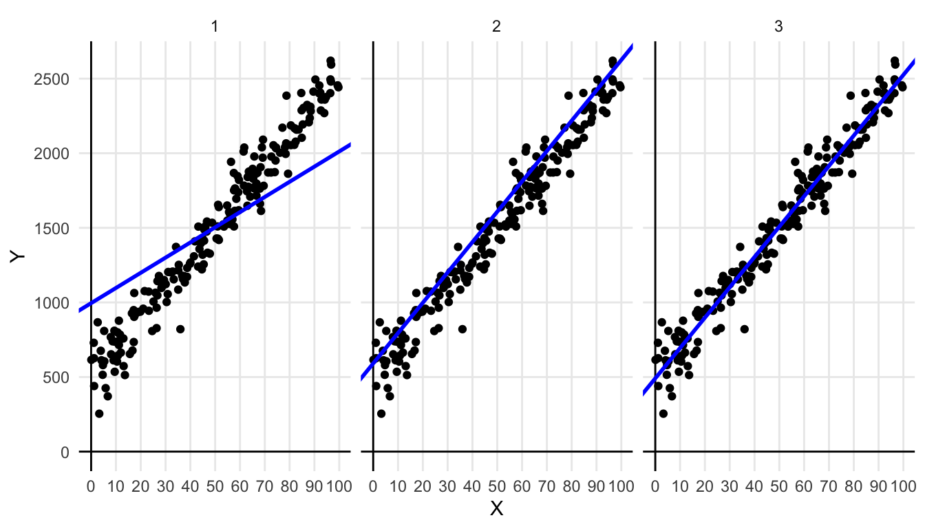
Figure 4.9: Three times the same data set, but with different regression lines.
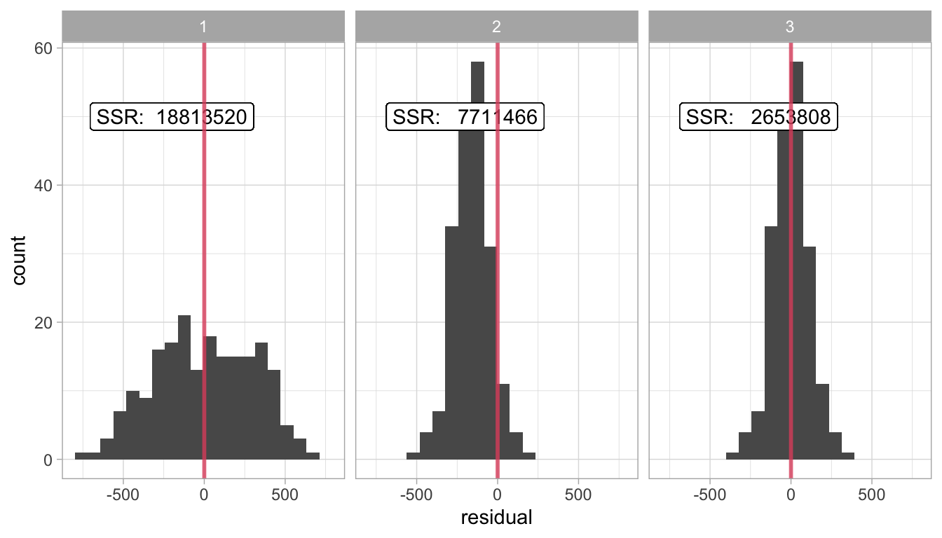
Figure 4.10: Histogram of the residuals (errors) for three different regression lines, and the respective sums of squared residuals (SSR).
In summary, when we want to have a straight line that describes our data best (i.e., the regression line), we’d like a line such that the residuals are on average 0 (i.e, sum to 0), and where we see the smallest residuals possible. We reach these criteria when we use the line in such a way that we have the lowest value for the sum of the squared residuals possible. This line is therefore called the least squares or OLS regression line.
Technical details
There are generally two ways of finding the intercept and the slope values that satisfy the Least Squares principle.
Numerical search Try some reasonable combinations of values for the intercept and slope, and for each combination, calculate the sum of the squared residuals. For the combination that shows the lowest value, try to tweak the values of the intercept and slope a bit to find even lower values for the sum of the squared residuals. Use some stopping rule otherwise you keep looking forever.
Analytical approach For problems that are not too complex, like this linear regression problem, there are simple mathematical equations to find the combination of intercept and slope that gives the lowest sum of squared residuals.
Using the analytical approach, it can be shown that the Least Squares slope can be found by solving:
\[\begin{equation} \textrm{slope} = \frac{\sum(X_i - \bar{X})(Y_i - \bar{Y})}{\sum(X_i - \bar{X})^2} \tag{4.1}\end{equation}\]
and the Least Squares intercept can be found by:
\[\begin{equation*} \textrm{intercept} = \bar{Y} - \textrm{slope} \times \bar{X} \end{equation*}\]
where \(\bar{X}\) and \(\bar{Y}\) are the means of the independent \(X_i\) and dependent \(Y_i\) observations, respectively.
In daily life, we do not compute this by hand but let computers do it for us, with software like for instance R.
4.6 Linear models
By performing a regression analysis of \(Y\) on \(X\), we try to predict the \(Y\)-value from a given \(X\) on the basis of a linear equation. We try to find an intercept and a slope for that linear equation such that our prediction is ‘best’. We define ‘best’ as the linear equation for which we see the lowest possible value for the sum of the squared residuals (least squares principle).
Thus, the prediction for the \(i\)th value of \(Y\) (\(\widehat{Y_i}\)) can be computed by the linear equation
\[\widehat{Y_i}= b_0 + b_1 X_i\]
where we use \(b_0\) to denote the intercept, \(b_1\) to denote the slope and \(X_i\) as the \(i\)th value of \(X\).
In reality, the predicted values for \(Y\) always deviate from the observed values of \(Y\): there is practically always an error \(e\) that is the difference between \(\widehat{Y_i}\) and \(Y_i\). Thus we have for the observed values of \(Y\)
\[Y_i = \widehat{Y_i} + e_i = b_0 + b_1 X_i + e_i\]
Typically, we assume that the residuals \(e\) have a normal distribution with a mean of 0 and a variance that is often unknown but that we denote by \(\sigma^2_e\). Such a normal distribution is denoted by \(N(0,\sigma^2_e)\). Taking the linear equation and the normally distributed residuals together, we have a model for the variables \(X\) and \(Y\).
\[\begin{eqnarray} Y_i &= b_0 + b_1 X_i + e_i \\ e_i &\sim N(0,\sigma^2_e) \tag{4.2}\end{eqnarray}\]
A model is a specification of how a set of variables relate to each other. Note that the model for the residuals, the normal distribution, is an essential part of the model. The linear equation only gives you predictions of the dependent variable, not the variable itself. Together, the linear equation and the distribution of the residuals give a full description of how the dependent variable depends on the independent variable.
Note that the linear model prescribes that the residual always comes from the same normal distribution with the same variance parameter \(N(0,\sigma^2_e)\). It doesn’t matter whether the predicted \(Y\)-value equals 10, 100 or -100: we expect that the errors (the residuals) always show a distribution that is normal with the same variation around the predicted variable. The prescription that the residuals show a normal distribution is called the normality assumption. The assumption that the variation around the predicted value is always of the same magnitude is called homogeneity of residual variance. Both are important assumptions when applying linear models. We will come back to them in Chapter 7.
The model prescribes not only that the residuals come from a normal distribution, but also that they are random draws from the normal distribution. That means that whether a residual is positive or negative, and whether it is large or small, is completely unpredictable. The model equation describes the predictable part of the data, the normal distribution of the residuals the unpredictable part. If in some way, there is some systematic pattern in the residuals, the model is incorrect. Any systematic pattern in the residuals is called dependency, which will also be discussed further in Chapter 7.
A model may be an adequate description of how variables relate to each other or it may not, that is for the data analyst to decide. If it is an adequate description, it may be used to predict yet unseen data on variable \(Y\) (because we can’t see into the future), or it may be used to draw some inferences on data that can’t be seen, perhaps because of limitations in data collection. Remember Chapter 2 where we made a distinction between sample data and population data. We could use the linear equation that we obtain using a random sample of data to make predictions for data in the population. We delve deeper into that issue in Chapter 5.
The model that we see in Equations (4.2) is a very simple form of the linear model. The linear model that we see here is generally known as the simple regression model: the simple regression model is a linear model for one numeric dependent variable, an intercept, a slope for only one (hence ‘simple’) numeric independent variable, and normally distributed residuals with a single variance parameter \(\sigma^2_e\). In the remainder of this book, we will see a great variety of linear models: with one or more independent variables, with numeric or with categorical independent variables, and with numeric or categorical dependent variables. All these models can be seen as extensions of this simple regression model. What they all have in common is that they aim to predict one dependent variable from one or more independent variables using a linear equation.
Note on the term linear
We saw thus far that linear models and linear regression are about straight lines. But strictly speaking, the term linear in linear model refers to the fact that we use a linear equation in the form of \(b_0 + b_1 X\). In the linear equation, we see that the increase in Y is predicted by changes in X. For every change in X, we expect to see a change in Y: we add something to the predicted Y. For every change of 1 in X, we add the value of the slope to the predicted value of Y. In linear regression, a basic form of a linear model, this simple idea results in a perfect straight line between the predictor X and the dependent variable Y. However, for more sophisticated linear models that we discuss later in this book, we will see relationships that are not straight lines.
Linear models are called linear because they are based on linear equations with an intercept and a slope, not because they result in straight lines for the relationship between X and Y.
4.7 Linear regression in R
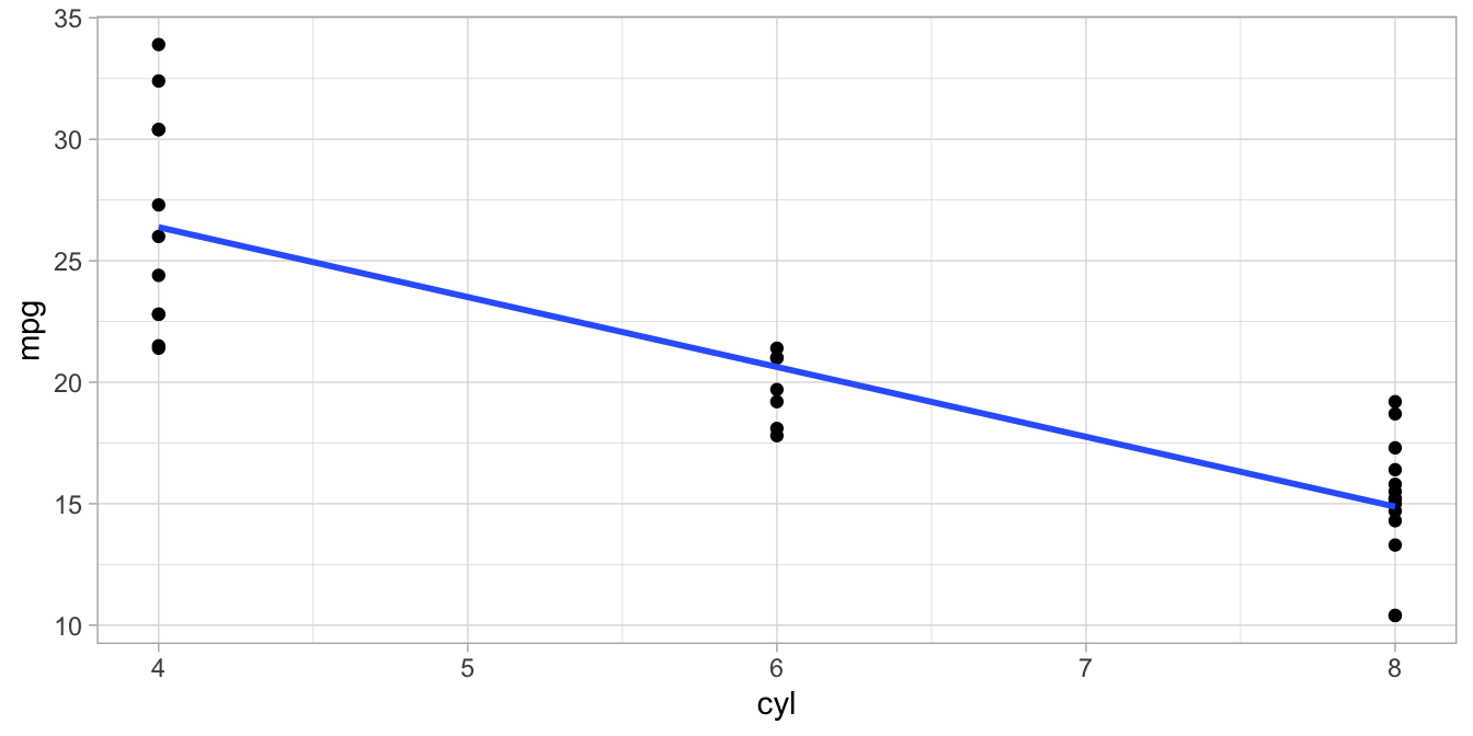
Figure 4.11: Data set on number of cylinders (cyl) and miles per gallon (mpg) in 32 cars.
Figure 4.11 shows the relationship between the number of cylinders
(cyl) and miles per gallon (mpg) in cars, based on a data set available in R under the name mtcars. The blue line is the
least squares regression line. The coefficients for this line can be
found with R using the following code:
In the code we first indicate that we start from the mtcars data
frame. Next, we use the lm() function to indicate that we want to apply
the linear model to these data. Next, we say that we want to model the
variable mpg. The \(\sim\) (‘tilde’) sign means "is modelled by" or
"is predicted by", and next we plug in the independent variable cyl.
Thus, this code says we want to model the mpg variable by the cyl
variable, or predict mpg scores by cyl. Next, because we already
indicated we use the mtcars data set, the data argument for the
lm() function should be left empty. Finally, we store the results in
the object model.
In the last line of code we indicate that we want to see the results,
that we stored in model.
##
## Call:
## lm(formula = mpg ~ cyl, data = .)
##
## Coefficients:
## (Intercept)          cyl
##      37.885       -2.876
The output above shows us a repetition of the lm() analysis, and then
two coefficients. These are the regression coefficients that we
wanted: the first is the intercept, and the second is the slope. These
coefficients are the parameters of the regression model. Parameters
are parts of a model that can vary from data set to data set, but that
are not variables (variable values vary within a data set, parameter values do not).
Here we use the linear model from Equation
(4.2) where \(b_0\), \(b_1\) and \(\sigma_e^2\) are
parameters since they are different for different data sets.
The output does not look very pretty. Using the tidy() function from the broom package, we can
get the same information about the analysis, and more:
## # A tibble: 2 × 5
##   term        estimate std.error statistic  p.value
##   <chr>          <dbl>     <dbl>     <dbl>    <dbl>
## 1 (Intercept)    37.9      2.07      18.3  8.37e-18
## 2 cyl            -2.88     0.322     -8.92 6.11e-10
R then shows two rows of values, one for the intercept and one for the slope parameter for cyl. For now, we only look at the first two columns. In these columns we find the least squares values for these parameters for this data set on 32 cars that we are analysing here.
In the second column, called estimate, we see that the intercept
parameter has the value 37.9 (when rounded to 1 decimal) and the slope
has the value -2.88. Thus, with this output, the linear equation for the
regression equation can be filled in:
\[\texttt{mpg} = 37.9 -2.88 \times \texttt{cyl} + e\]
With this equation we can predict values for mpg for number of cylinders that are not even in the data set displayed in Figure 4.11. For instance, that plot does not show a car with 2 cylinders, but on the basis of the linear equation, the best bet would be that such a car would run \(37.9 -2.88 \times 2 = 32.14\) miles per gallon.
The model and the data can be plotted, as in Figure 4.11, using the code:
The OLS linear model parameters are in the estimate column of the R
output, but there are also a number of other columns: standard error,
statistic (\(t\)), and \(p\)-value, terms that we encountered earlier in
Chapter 2.
These columns will be discussed further in Chapter
5.
4.8 Pearson correlation
For any set of two numeric variables, we can determine the least squares regression line. However, it depends on the data set how well that regression line describes the data. Figure 4.12 shows two different data sets on variables \(X\) and \(Y\). Both plots also show the least squares regression line, and they both turn out to be exactly the same: \(Y=100+10X\).
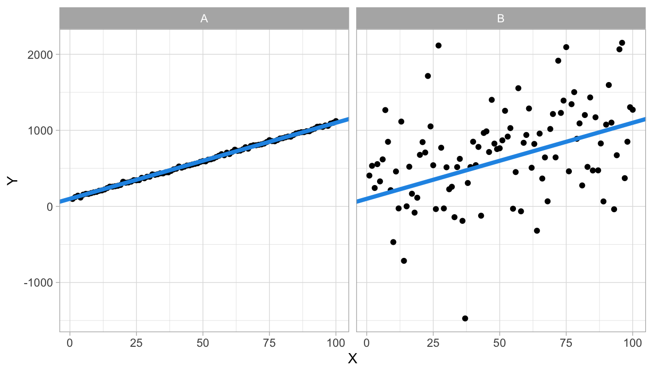
Figure 4.12: Two data sets with the same regression line.
We see that the regression line describes data set A very well (left panel): the observed dots are very close to the line, which means that the residuals are very small. The regression line does a worse job for data set B (right panel) since there are quite large discrepancies between the observed \(Y\)-values and the predicted \(Y\)-values. Put differently, the regression equation can be used to predict \(Y\)-values in data set A very well, almost without error, whereas the regression line cannot be used to predict \(Y\)-values in data set B very precisely. The regression line is also the least squares regression line for data set B, so any improvement by choosing another slope or intercept is not possible.
Francis Galton was the first to think about how to quantify this difference in the ability of a regression line to predict the dependent variable. Karl Pearson later worked on this measure and therefore it came to be called Pearson’s correlation coefficient. It is a standardised measure, so that it can be used to compare different data sets.
In order to get to Pearson’s correlation coefficient, you first need to standardise both the independent variable, \(X\), and the dependent variable, \(Y\). You standardise scores by taking their values, subtract the mean from them, and divide by the standard deviation (see Chapter 1). So, in order to obtain a standardised value for \(X=x\) we compute \(z_X\),
\[z_X = \frac{x- \bar{X}}{\sigma_X}\]
and in order to obtain a standardised value for \(Y=y\) we compute \(z_Y\),
\[z_Y = \frac{y- \bar{Y}}{\sigma_Y}.\]
Let’s do this both for data set A and data set B, and plot the standardised scores, see Figure 4.13. If we then plot the least squares regression lines for the standardised values, we obtain different equations. For both data sets, the intercept is 0 because by standardising the scores, the means become 0. But the slopes are different: in data set A, the slope is 0.997 and in data set B, the slope is 0.376.
\[\begin{eqnarray} Z_Y &= 0 + 0.997 \times Z_X \notag \\ Z_Y &= 0 + 0.376 \times Z_X \notag \end{eqnarray}\]
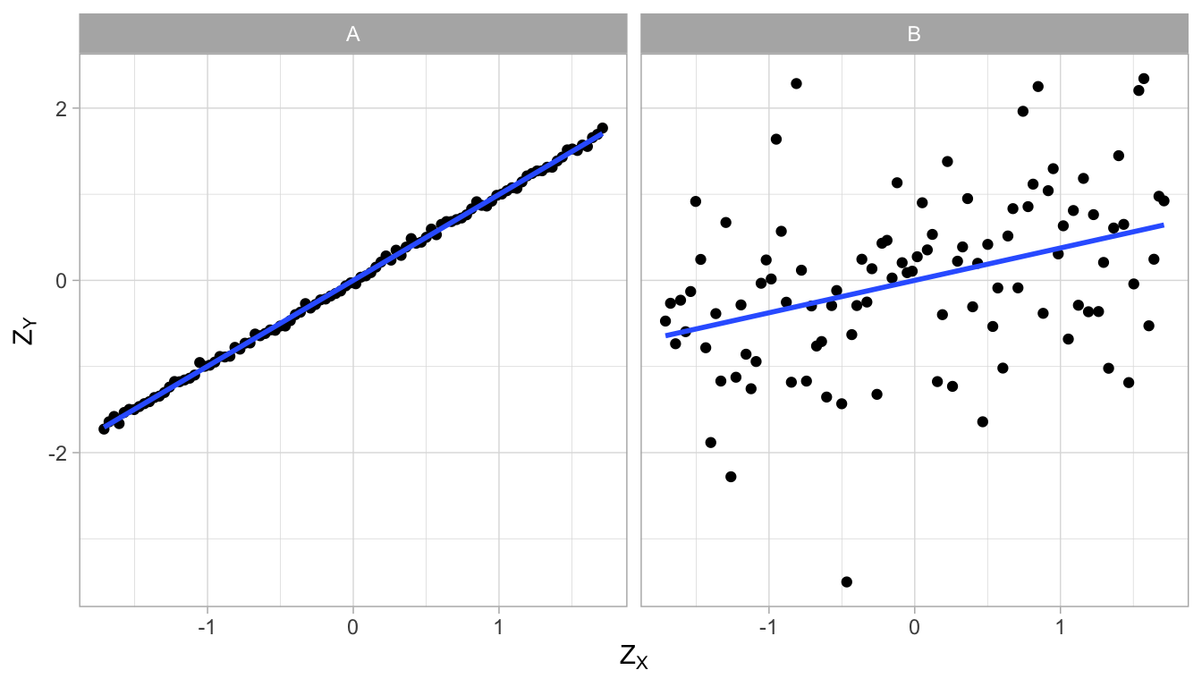
Figure 4.13: Two data sets, with different regression lines after standardisation.
These two slopes, the slope for the regression of standardised \(Y\)-values on standardised \(X\)-values, are the correlation coefficients for data sets A and B, respectively. For obvious reasons, the correlation is sometimes also referred to as the standardised slope coefficient or standardised regression coefficient.
Correlation stands for the co-relation between two variables. It tells you how well one variable can be predicted from the other using a regression line. The correlation is bi-directional: the correlation between \(Y\) and \(X\) is the same as the correlation between \(X\) and \(Y\). For instance in Figure 4.13, if we would have put the \(Z_X\)-variable on the \(Z_Y\)-axis, and the \(Z_Y\)-variable on the \(Z_X\)-axis, the slopes would be exactly the same. This is true because the variances of the \(Y\)- and \(X\)-variables are equal after standardisation (both variances equal to 1).
Since a slope can be negative, a correlation can be negative too. Furthermore, a correlation is always between -1 and 1. Look at Figure 4.13: the correlation between \(X\) and \(Y\) is 0.997. The dots are almost on a straight line. If the dots would all be exactly on the straight line, the correlation would be 1.
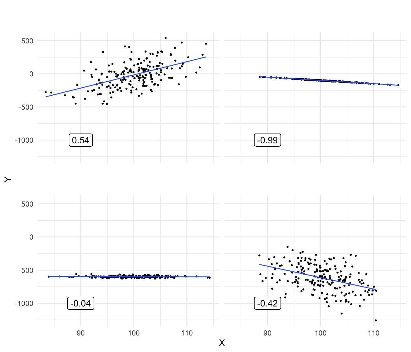
Figure 4.14: Various plots showing different correlations between variables X and Y.
Figure 4.14 shows a number of scatter plots of \(X\) and \(Y\) with different correlations. Note that if dots are very close to the regression line, the correlation can still be close to 0: if the slope is 0 (bottom-left panel), then one variable cannot be predicted from the other variable, hence the correlation is 0, too.
Interactive Figure 4.15 can be used to get an idea of what a correlation means in terms of the relationship between two variables. Change the correlation and see what happens. When the correlation is 1, the dots are on a perfect straight line; when the correlation is 0, there is complete randomness.
Figure 4.15: [Interactive] How well one variable can be predicted from a second variable can be quantified using the Pearson correlation. It is the slope of the linear regression when both variables are standardised. Change the value of the correlation, and see how that affects the relationship between the variables \(X\) and \(Y\).
In summary, the correlation coefficient indicates how well one variable can be predicted from the other variable. It is the slope of the regression line if both variables are standardised. If prediction is not possible (when the regression slope is 0), the correlation is 0, too. If the prediction is perfect, without errors (no residuals) and with a slope unequal to 0, then the correlation is either -1 or +1, depending on the sign of the slope. The correlation coefficient between variables \(X\) and \(Y\) is usually denoted by \(r_{XY}\) for the sample correlation and \(\rho_{XY}\) (pronounced ‘rho’) for the population correlation.
4.9 Covariance
The correlation \(\rho_{XY}\) as defined above is a standardised measure for how much two variables co-relate. It is standardised in such a way that it can never be outside the (-1, 1) interval. This standardisation happened through the division of \(X\) and \(Y\)-values by their respective standard deviation. There exists also an unstandardised measure for how much two variables co-relate: the covariance. The correlation \(\rho_{XY}\) is the slope when \(X\) and \(Y\) each have variance 1. When you multiply correlation \(\rho_{XY}\) by a quantity indicating the variation of the two variables, you get the covariance. This quantity is the product of the two respective standard deviations.
The covariance between variables \(X\) and \(Y\), denoted by \(\sigma_{XY}\), can be computed as:
\[\sigma_{XY} = \rho_{XY} \times \sigma_X \times \sigma_Y\]
For example, if the variance of \(X\) equals 49 and the variance of \(Y\) equals 25, then the respective standard deviations are 7 and 5. If the correlation between \(X\) and \(Y\) equals 0.5, then the covariance between \(X\) and \(Y\) is equal to \(0.5 \times 7 \times 5 = 17.5\).
Similar to the correlation, the covariance of two variables indicates by how much they co-vary. For instance, if the variance of \(X\) is 3 and the variance of \(Y\) is 5, then a covariance of 2 indicates that \(X\) and \(Y\) co-vary: if \(X\) increases by a certain amount, \(Y\) also increases. If you want to know how many standard deviations \(Y\) increases if \(X\) increases with one standard deviation, you can turn the covariance into a correlation by dividing the covariance by the respective standard deviations.
\[\rho_{XY}= \frac{\sigma_{XY}} { \sigma_X \sigma_Y}= \frac{2} { \sqrt{3} \sqrt{5}}=0.52\]
Similar to correlations and slopes, covariances can also be negative.
Instead of computing the covariance on the basis of the correlation, you can also compute the covariance using the data directly. The formula for the covariance is
\[\begin{equation*} \sigma_{XY} = \frac{\sum(X_i - \bar{X})(Y_i - \bar{Y})}{n}\end{equation*}\]
so it is the mean of the squared cross-products of two variables.16 Note that the numerator bears close resemblance to the numerator of the equation that we use to find the least squares slope, see Equation (4.1). This is not strange since both the slope and the covariance say something about the relationship between two variables. Also note that in the equation that we use to find the least squares slope the denominator bears close relationship to the formula for the variance, since \(\sigma_X^2 = \frac{\sum(X_i - \bar{X} )^2 }{n}\) (see Chapter 1). We could therefore rewrite Equation (4.1) that finds the least squares or OLS slope as:
\[\begin{eqnarray} \textrm{slope}_{OLS} &=& \frac{\sum(X_i - \bar{X})(Y_i - \bar{Y})}{\sum(X_i - \bar{X})^2} \notag \\ &=& \frac{\sigma_{XY}\times n }{\sigma_X^2\times n } \notag\\ &=& \frac{\sigma_{XY} }{\sigma_X^2 } \tag{4.3} \end{eqnarray}\]
This shows how all three quantities slope, correlation and covariance say something about the linear relationship between two variables. The slope says how much the dependent variable increases if the independent variable increases by 1, the correlation says how much of a standard deviation the dependent variable increases if the independent variable increases by one standard deviation (alternatively: the slope after standardisation), and the covariance is the mean cross-product of two variables (alternatively: the unstandardised correlation).
Numerical example of covariance, correlation and least square slope
Table 4.1 shows a small data set on two variables \(X\) and \(Y\) with 5 observations. The mean value of \(X\) is -0.4 and the mean value of \(Y\) is -0.2. If we subtract the respective mean from each observed value and multiply, we get a column of cross-products. For example, take the first row: \(X-\bar{X}= -1 - (-0.4) = -0.6\) and \(Y-\bar{Y}= 2 - (-0.2) = 2.20\). If we multiply these numbers we get the cross-product \(-0.6 \times 2.20 = -1.32\). If we compute all cross-products and sum them, we get -6.40. Dividing this by the number of observations (5), yields the covariance: -1.28.
If we compute the variances of \(X\) and \(Y\) (see Chapter 1), we obtain 1.04 and 2.16, respectively. Taking the square roots we obtain the standard deviations: 1.02 and 1.47. Now we can calculate the correlation on the basis of the covariance as \(\rho_{XY}= \frac{\sigma_{XY}}{\sigma_X\sigma_Y}=\frac{-1.28}{1.02 \times 1.47} = -0.85\).
We can also calculate the least squares slope as \(\frac{\sigma_{XY}}{\sigma^2_X}= \frac{-1.28}{1.04} = -1.23\).
The original data are plotted in Figure 4.16 together with the regression line. The standardised data and the corresponding regression line are plotted in Figure 4.17. Note that the slopes are different, and that the slope of the regression line for the standardised data is equal to the correlation.
| X | Y | X - meanX | Y - meanY | Crossproduct |
|---|---|---|---|---|
| -1 | 2 | -0.6 | 2.2 | -1.32 |
| 0 | -1 | 0.4 | -0.8 | -0.32 |
| 1 | -2 | 1.4 | -1.8 | -2.52 |
| -2 | 1 | -1.6 | 1.2 | -1.92 |
| 0 | -1 | 0.4 | -0.8 | -0.32 |
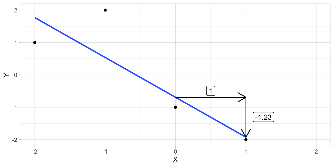
Figure 4.16: Data example and the regression line.
## Warning in geom_segment(aes(x = 0, y = 0, xend = 1, yend = 0), arrow = arrow(length = unit(0.5, : All aesthetics have length 1, but the data has 5 rows.
## ℹ Please consider using `annotate()` or provide this layer with data containing
##   a single row.
## Warning in geom_label(aes(x = 1.15, y = -0.5, label = round(sum(crossprod)/length(X)/sqrt(sum(dev_X^2)/length(X))/sqrt(sum(dev_Y^2)/length(X)), : All aesthetics have length 1, but the data has 5 rows.
## ℹ Please consider using `annotate()` or provide this layer with data containing
## a single row.## Warning in geom_label(aes(x = 0.5, y = 0.2, label = 1)): All aesthetics have length 1, but the data has 5 rows.
## ℹ Please consider using `annotate()` or provide this layer with data containing
## a single row.## Warning in geom_segment(aes(x = 1, y = 0, xend = 1, yend = predict(lm(Z_Y ~ : All aesthetics have length 1, but the data has 5 rows.
## ℹ Please consider using `annotate()` or provide this layer with data containing
## a single row.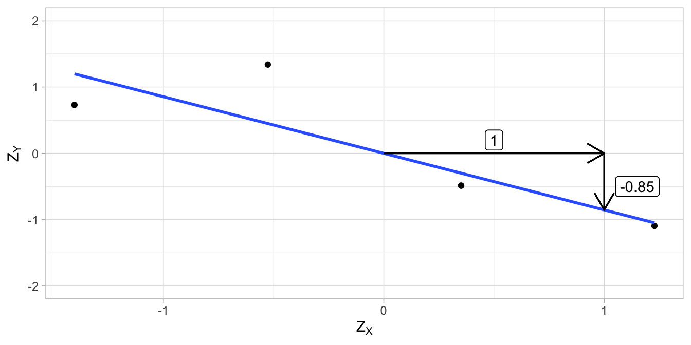
Figure 4.17: Data example (standardised values) and the regression line.
4.10 Correlation, covariance and slopes in R
Let’s use the mtcars dataframe and compute the correlation between the
number of cylinders (cyl) and miles per gallon (mpg). We do that
with the function cor():
##           cyl       mpg
## cyl  1.000000 -0.852162
## mpg -0.852162  1.000000
In the output we see a correlation matrix. On the diagonal are the
correlations of cyl and mpg with themselves, which are perfect (a
correlation of 1). On the off-diagonal, we see that the correlation
between cyl and mpg equals -0.85. This is a strong negative
correlation, which means that generally, the more cylinders a car has,
the lower the mileage. We can also compute the covariance, with the
function cov():
##           cyl       mpg
## cyl  3.189516 -9.172379
## mpg -9.172379 36.324103
On the off-diagonal we see that the covariance between cyl and mpg equals -9.17. On the diagonal we see the variances of cyl and mpg.
To determine the least squares slope for the regression line of mpg on cyl, we divide the covariance by the variance of cyl (Equation (4.3)):
## [1] -2.87579Note that both cov() and var() use \(n-1\). Since this cancels out if
we do the division, it doesn’t matter whether we use \(n\) or \(n-1\).
If we first standardise the data with the function scale() and then
compute the least squares slope, we get
z_mpg <- mtcars$mpg %>% scale()   # standardise mpg
z_cyl <- mtcars$cyl %>% scale()  # standardise cyl

cov(z_mpg, z_cyl) / var(z_cyl)
## [,1]
## [1,] -0.852162## [,1]
## [1,] -0.852162## [,1]
## [1,] -0.852162We see from the output that the slope coefficient for the standardised situation is equal to both the correlation and the covariance of the standardised values.
The same slope coefficient can of course also be obtained with a linear regression analysis using the standardised values:
##
## Call:
## lm(formula = z_mpg ~ z_cyl, data = .)
##
## Coefficients:
##            (Intercept)                   z_cyl
##  0.0000000000000006083  -0.8521619594266127695
In research practice one often wants to do inference on a correlation: Is the correlation that we find in a sample indicative of a correlation in the population, and if so, how large would that population correlation be?
In the above example, the correlation between the number of cylinders in a car and the miles per gallon was -0.85. This is the sample correlation, based on the sample data available in the mtcars dataset. If we want to test the null-hypothesis that the population correlation between the number of cylinders and miles per gallon is 0, we can do that in R with cor.test():
##
##  Pearson's product-moment correlation
##
## data:  mtcars$cyl and mtcars$mpg
## t = -8.9197, df = 30, p-value = 0.0000000006113
## alternative hypothesis: true correlation is not equal to 0
## 95 percent confidence interval:
##  -0.9257694 -0.7163171
## sample estimates:
##       cor
## -0.852162
At the end of the output, you find the correlation again, -0.85. In addition, we see a null-hypothesis test in the form of a t-test and a 95% confidence interval. Based on this output we can report:
"The correlation between the number of cylinders in a car and the miles per gallon is significantly different from 0, \(t(30) = -8.92, p < 0.001\). The 95% confidence interval for the correlation in the population is between -0.93 and -0.72. "
4.11 Explained and unexplained variance
So far in this chapter, we have seen relationships between two variables: one dependent variable and one independent variable. The dependent variable we usually denote as \(Y\), and the independent variable we denote by \(X\). The relationship was modelled by a linear equation: an equation with an intercept \(b_0\) and a slope parameter \(b_1\):
\[Y = b_0 + b_1 X\]
Further, we argued that in most cases, the relationship between \(X\) and \(Y\) cannot be completely described by a straight line. Not all of the variation in \(Y\) can be explained by the variation in \(X\). Therefore, we have residuals \(e\), defined as the difference between the observed \(Y\)-value and the \(Y\)-value that is predicted by the straight line, (denoted by \(\widehat{Y}\)):
\[e = Y - \widehat{Y}\]
Therefore, the relationship between \(X\) and \(Y\) is denoted by a regression equation, where the relationship is approached by a linear equation, plus a residual part \(e\):
\[Y = b_0 + b_1 X + e\]
The linear equation gives us only the predicted \(Y\)-value, \(\widehat{Y}\):
\[\widehat{Y} = b_0 + b_1 X\]
We’ve also seen that the residual \(e\) is assumed to have a normal distribution, with mean 0 and variance \(\sigma^2_e\):
\[e \sim N(0,\sigma^2_e)\]
Remember that linear models are used to explain (or predict) the variation in \(Y\): why are there both high values and low values for \(Y\)? Where does the variance in \(Y\) come from? Well, the linear model tells us that the variation is in part explained by the variation in \(X\). If \(b_1\) is positive, we predict a relatively high value for \(Y\) for a high value of \(X\), and we predict a relatively low value for \(Y\) if we have a low value for \(X\). If \(b_1\) is negative, it is of course in the opposite direction. Thus, the variance in \(Y\) is in part explained by the variance in \(X\), and the rest of the variance can only be explained by the residuals \(e\).
\[\textrm{Var}(Y) = \textrm{Var}(\widehat{Y}) + \textrm{Var}(e) = \textrm{Var}(b_0 + b_1 X) + \sigma^2_e\]
Because the residuals do not explain anything (we don’t know where these residuals come from), we say that the explained variance of \(Y\) is only that part of the variance that is explained by independent variable \(X\): \(\textrm{Var}(b_0 + b_1 X)\). The unexplained variance of \(Y\) is the variance of the residuals, \(\sigma^2_e\). The explained variance is often denoted by a ratio: the explained variance divided by the total variance of \(Y\):
\[\textrm{Var}_{explained} = \frac{\textrm{Var}(b_0+b_1 X)}{\textrm{Var}(Y)} = \frac{\textrm{Var}(b_0+b_1 X)}{\textrm{Var}(b_0+b_1 X) + \sigma^2_e}\]
From this equation we see that if the variance of the residuals is large, then the explained variance is small. If the variance of the residuals is small, the variance explained is large.
4.12 More than one predictor
In regression analysis, and in linear models in general, we try to make the explained variance as large as possible. In other words, we try to minimise the residual variance, \(\sigma^2_e\). One way to do that is to use more than one independent variable. If not all of the variance in \(Y\) is explained by \(X\), then why not include multiple independent variables?
Let’s use an example with data on the weight of books, the size of books (area), and the volume of books. These data are available in R, and we will show how to perform the following analyses in a later section. Let’s try first to predict the weight of a book, weight, on the basis of the volume of the book, volume. Suppose we find the following regression equation and a value for \(\sigma^2_e\):
\[\begin{eqnarray} \texttt{weight} &=& 107.7 + 0.71 \times \texttt{volume} + e \notag\\ e &\sim& N(0, 15362)\notag\end{eqnarray}\]
In the data set, the variance of the weight, \(\textrm{Var}(\texttt{weight})\) is equal to 72274. Since we also know the variance of the residuals (15362), we can solve for the variance explained by volume:
\[\begin{eqnarray} \textrm{Var}(\texttt{weight}) = 72274= \textrm{Var}(107.7 + 0.7 \times \texttt{volume}) + 15362 \nonumber\\ \textrm{Var}(107.7 + 0.7 \times \texttt{volume}) = 72274- 15362= 56912\nonumber\end{eqnarray}\]
So the proportion of explained variance is equal to
\(\frac{56912}{72274}=0.79\). This is quite a high proportion: nearly
all of the variation in the weight of books is explained by the
variation in volume.
But let’s see if we can explain even more variance if we add an extra
independent variable. Suppose we know the area of each book. We expect
that books with a large surface area weigh more. Our linear equation
then looks like this:
\[\begin{eqnarray*} \texttt{weight} &=& 22.4 + 0.71 \times \texttt{volume} + 0.5 \times \texttt{area} + e \\ e &\sim& N(0, 6031)\end{eqnarray*}\]
How much of the variance in weight does this equation explain? The amount of explained variance equals the variance of weight minus the residual variance: \(72274 - 6031 = 66243\). The proportion of explained variance is then equal to \(\frac{66243}{72274}=0.92\). So the proportion of explained variance has increased!
Note that the variance of the residuals has decreased; this is the main reason why the proportion of explained variance has increased. By adding the extra independent variable, we can explain some of the variance that without this variable could not be explained! In summary, by adding independent variables to a regression equation, we can explain more of the variance of the dependent variable. A regression analysis with more than one independent variable we call multiple regression. Regression with only one independent variable is called simple regression.
4.13 R-squared
With regression analysis, we try to explain the variance of the dependent variable. With multiple regression, we use more than one independent variable to try to explain this variance. In regression analysis, we use the term R-squared to refer to the proportion of explained variance, usually denoted with the symbol \(R^2\). The unexplained variance is of course the variance of the residuals, \(\textrm{Var}(e)\), usually denoted as \(\sigma_e^2\). So suppose the variance of dependent variable \(Y\) equals 200, and the residual variance in a regression equation equals say 80, then \(R^2\) or the proportion of explained variance is \((200-80)/200=0.60\).
\[\begin{eqnarray} R^2 &=& \sigma^2_{explained}/ \sigma^2_Y \notag \\ &=& (\sigma^2_Y-\sigma^2_{unexplained})/\sigma^2_Y \notag\\ &=& (\sigma^2_Y-\sigma^2_e)/\sigma^2_Y \tag{4.4} \end{eqnarray}\]
This is the definition of R-squared at the population level, where we know the exact values of the variances. However, we do not know these variances, since we only have a sample of all values.
As we saw in Section 4.5, in a regression analysis, the intercept and slope parameters are found by minimising the sum of squares of the residuals. Since the variance of the residuals is based on this sum of squares, in any regression analysis, the variance of the residuals is always as small as possible. The values of the parameters for which the residual variance is smallest, are the least squares regression parameters. And if the variance of the residuals is always minimised in a regression analysis, the explained variance is always maximised!
This is a good thing, since we want to have a model that makes the smallest errors possible. However, there is also a danger that we are too optimistic drawing conclusions about the population based on only a limited data sample. Maybe the best linear regression in the sample is not the same as the best linear regression in the population data.
Because in any least squares regression analysis based on a sample of data, the explained variance is always maximised, we may overestimate the variance that is explained in the population data. In regression analysis, we therefore very often use an adjusted R-squared that takes this possible overestimation (inflation) into account. The adjustment is based on the number of independent variables and sample size.
The formula is
\[\begin{equation*} R^2_{adj}= 1 - (1-R^2)\frac{n-1}{n-p-1} \end{equation*}\]
where \(n\) is sample size and \(p\) is the number of independent variables.
The more independent variables you have (\(p\)), and the smaller your data set (\(n\)), the larger the difference between the R-squared and the adjusted R-squared.
Computational example
For example, if \(R^2\) equals 0.60 and we have a sample size of 100, and 2 independent variables, the adjusted \(R^2\) is equal to \(1 - (1-0.60)\frac{100-1}{100-2-1}= 1 - (0.40)\frac{99}{97}=0.59\). Thus, the estimated proportion of variance explained at population level, corrected for inflation, equals 0.59. Because \(R^2\) is inflated, the adjusted \(R^2\) is never larger than the unadjusted R-squared.
\[R^2_{adj} \leq R^2\]
4.14 Multiple regression in R
Let’s use the book data and run a multiple regression in R. The data set
is called allbacks and is available in the R package DAAG (you may
need to install that package first). The code looks very similar to
simple regression, except that we now specify two independent variables,
volume and area, instead of one. We combine these two independent
variables using the +-sign. Below we see the code and the output:
library(DAAG)
library(broom)
model <- allbacks %>%
  lm(weight ~ volume + area, data = .)
model %>%
  tidy()
## # A tibble: 3 × 5
## term estimate std.error statistic p.value
## <chr> <dbl> <dbl> <dbl> <dbl>
## 1 (Intercept) 22.4 58.4 0.384 0.708
## 2 volume 0.708 0.0611 11.6 0.0000000707
## 3 area 0.468 0.102 4.59 0.000616There we see an intercept, a slope parameter for volume and a slope parameter for area. Remember from Section 4.2 that the intercept is the predicted value when the independent variable has value 0. This extends to multiple regression: the intercept is the predicted value when the independent variables all have value 0. Thus, the output tells us that the predicted weight of a book that has a volume of 0 and an area of 0, is 22.4. The slopes tell us that for every unit increase in volume, the predicted weight increases by 0.708, and for every unit increase in area, the predicted weight increases by 0.468.
So the linear model looks like:
\[\begin{equation*} \texttt{weight} = 22.4 + 0.708 \times \texttt{volume} + 0.468 \times \texttt{area} + e\end{equation*}\]
We can use this equation to make predictions about the weight of a particular book. For example, the predicted weight of a book that has a volume of 10 and an area of 5, the expected weight is equal to \(22.4 + 0.708 \times 10 + 0.468 \times 5 = 31.82\).
In R, the R-squared and the adjusted R-squared can be obtained by first making a summary of the results, and then accessing these statistics directly.
## [1] 0.9284738## [1] 0.9165527The output tells you that the R-squared equals 0.93 and the adjusted
R-squared 0.92. The variance (actually, the standard deviation sigma) of the residuals can also be found in the
summary object, where it is called sigma. If you square that value, you get the variance of the residuals.
## [1] 6031.0524.15 Multicollinearity
In general, if you add independent variables to a regression equation, the proportion explained variance, \(R^2\), increases. Suppose you have the following three regression equations for the relationship between the weight of a book and its volume and area:
\[\begin{eqnarray} \texttt{weight} &=& b_0 + b_1 \times \texttt{volume} + e \notag\\ \texttt{weight} &=& b_0 + b_1 \times \texttt{area} + e \notag\\ \texttt{weight} &=& b_0 + b_1 \times \texttt{volume} + b_2 \times \texttt{area} + e \notag \end{eqnarray}\]
If we carry out these three analyses, we obtain an \(R^2\) of 0.8026 if we only use volume as predictor, and an \(R^2\) of 0.1268 if we only use area as predictor. So perhaps you’d think that if we take both volume and area as predictors in the model, we would get an \(R^2\) of \(0.8026+0.1268= 0.9294\). However, if we carry out the multiple regression with volume and area, we obtain an \(R^2\) of 0.9285, which is slightly less! This is not a rounding error, but results from the fact that there is a correlation between the volume of a book and the area of a book. Here it is a tiny correlation of 0.002, but nevertheless it affects the proportion of variance explained when you use both these variables.
Let’s look at what happens when independent variables are strongly
correlated. Table 4.2 shows measurements on a breed of seals (only
measurements on the first 6 seals are shown). These data are in the
dataframe cfseals in the package DAAG.
| age | weight | heart |
|---|---|---|
| 33 | 27.5 | 127.7 |
| 10 | 24.3 | 93.2 |
| 10 | 22.0 | 84.5 |
| 10 | 18.5 | 85.4 |
| 12 | 28.0 | 182.0 |
| 18 | 23.8 | 130.0 |
Often, the age of an animal is gauged from its weight: we assume that heavier seals are older than lighter seals. If we carry out a simple regression of age on weight, we get the output
## # A tibble: 2 × 5
##   term        estimate std.error statistic  p.value
##   <chr>          <dbl>     <dbl>     <dbl>    <dbl>
## 1 (Intercept)   11.4      4.70        2.44 2.15e- 2
## 2 weight 0.817 0.0716 11.4 4.88e-12## [1] 1090.855resulting in the equation:
\[\begin{eqnarray} \texttt{age} &=& 11.4 + 0.82 \times \texttt{weight} + e \notag\\ e &\sim& N(0, 200) \notag \end{eqnarray}\]
From the data we calculate the variance of age, and we find that it is 1090.86. The variance of the residuals is 200, so that the proportion of explained variance is \((1090.86-200)/1090.86 = 0.82\).
Since we also have data on the weight of the heart alone, we could try to predict the age from the weight of the heart. Then we get output
## # A tibble: 2 × 5
##   term        estimate std.error statistic       p.value
##   <chr>          <dbl>     <dbl>     <dbl>         <dbl>
## 1 (Intercept)   20.6      5.21        3.95 0.000481
## 2 heart 0.113 0.0130 8.66 0.00000000209that leads to the equation:
\[\begin{eqnarray} \texttt{age} &=& 20.6 + 0.11 \times \texttt{heart} + e \notag \\ e &\sim& N(0, 307) \notag \end{eqnarray}\]
Here the variance of the residuals is 307, so the proportion of explained variance is \((1090.86-307)/1090.86 = 0.72\).
Now let’s see what happens if we include both total weight and weight of the heart into the linear model. This results in the following output
## # A tibble: 3 × 5
##   term        estimate std.error statistic  p.value
##   <chr>          <dbl>     <dbl>     <dbl>    <dbl>
## 1 (Intercept)  10.3       4.99       2.06  0.0487
## 2 heart        -0.0269    0.0373    -0.723 0.476
## 3 weight 0.993 0.254 3.91 0.000567with model equation:
\[\begin{eqnarray} \texttt{age} &=& 10.3 -0.03 \times \texttt{heart} + 0.99 \times \texttt{weight} + e \notag\\ e &\sim& N(0, 204)\notag \end{eqnarray}\]
Here we see that the regression parameter for weight has increased from 0.82 to 0.99. At the same time, the regression parameter for heart has decreased, has even become negative, from 0.11 to -0.03. From this equation we see that there is a strong relationship between the total weight and the age of a seal, but on top of that, for every unit increase in the weight of the heart, there is a very small decrease in the expected age. The slope for heart has become practically negligible, so we could say that on top of the effect of total weight, there is no remaining relationship between the weight of the heart and age. In other words, once we can use the total weight of a seal, there is no more information coming from the weight of the heart.
This is because the total weight of a seal and the weight of its heart are strongly correlated: heavy seals generally have heavy hearts. Here the correlation turns out to be 0.96, almost perfect! This means that if you know the total weight of a seal, you practically know the weight of its heart. This is logical of course, since the total weight is a composite of all the weights of all the parts of the animal: the total weight variable includes the weight of the heart.
Here we have seen, that if we use multiple regression, we should be aware of how strongly the independent variables are correlated. Highly correlated predictor variables do not add extra predictive power. Worse: they can cause problems in obtaining regression parameters because it becomes hard to tell which variable is more important: if they are strongly correlated (positive or negative), then they measure almost the same thing!
A situation where there are correlations among the independent variables is called multicollinearity. When two predictor variables are perfectly correlated, either 1 or -1, regression is no longer possible, the software stops and you get a warning. But also if the correlation is much smaller, you should be very careful interpreting the regression parameters. With strongly correlated variables, select the variable that makes most theoretical sense and consider to omit the other one.
In our seal data, there is a very high correlation between the variables heart and weight that can cause computational and interpretation problems. It makes theoretically more sense to use only the total weight variable, since when seals get older, all their organs and limbs grow larger, not just their heart. It also makes sense in terms of explained variance: weight on its own explains more variance (82%) than heart on its own (72%).
4.16 Simpson’s paradox
With multiple regression, you may uncover very surprising relationships between two variables, that can never be found using simple regression. In the previous section, we saw that there is a general positive relationship between the weight of a seal’s heart and its age. However, when we included the overall weight of the seal into the regression, we saw that suddenly the regression coefficient for the heart variable became small and changed direction from positive to negative. It is therefore not a trivial matter to decide which variables to add to a linear equation.
Here’s an example from Paul van der Laken17, who simulated a data set on the topic of Human Resources (HR). It nicely illustrates that you have to be very careful interpreting the regression coefficients in multiple regression, and linear models in general.
Assume you run a company with 1000 employees and you have asked all of them to fill out a Big Five personality survey. Per individual, you therefore have a score depicting their personality characteristic Neuroticism, which can run from 0 (not at all neurotic) to 7 (very neurotic). Now you are interested in the extent to which this Neuroticism of employees relates to their salary (measured in Euros per year).
We carry out a simple regression, with salary as our dependent variable and Neuroticism as our independent variable. We then find the following regression equation:
\[\texttt{salary} = 45543 + 4912 \times \texttt{Neuroticism} + e\]
Figure 4.18 shows the data and the regression line. From this visualisation it looks like neuroticism relates positively to yearly salary: more neurotic people earn more salary than less neurotic people. More precisely, we see in the equation that for every unit increase on the Neuroticism scale, the predicted salary increases with 4912 Euros a year.
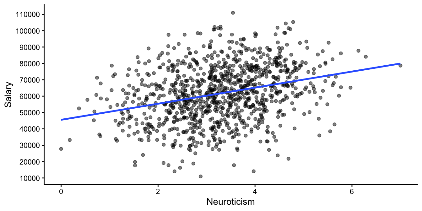
Figure 4.18: Simulated HR data set.
Next we run a multiple regression analysis. We suspect that one other very important predictor for how much people earn is their educational background. The Education variable has three levels: 0, 1 and 2. If we include both Education and Neuroticism as independent variables and run the analysis, we obtain the following regression equation:
\[\texttt{salary} = 50935 -3176 \times \texttt{Neuroticism} + 20979 \times \texttt{Education} + e\]
Note that we now find a negative slope parameter for the effect of Neuroticism! This implies there is a relationship in the data where neurotic employees earn less than their less neurotic colleagues! How can we reconcile this seeming paradox? Which result should we trust: the one from the simple regression, or the one from the multiple regression?
The answer is: neither. Or better: both! Both analyses give us different pieces of information.
Let’s look at the last equation more closely. Suppose we make a prediction for a person with a low educational background (\(\texttt{Education}=0\)). Then the equation tells us that the expected salary of a person with a neuroticism score of 0 is around 50935, and of a person with a neuroticism score of 1 is around 47759. That’s an increase of -3176, which is the slope for Neuroticism in the multiple regression. So for employees with low education, the more neurotic employees earn less! If we do the same exercise for average education and high education employees, we find exactly the same pattern: for each unit increase in neuroticism, the predicted yearly salary drops by 3176 Euros.
It is true that in this company, the more neurotic persons generally earn a higher salary. But if we take into account educational background, the relationship flips around. This can be seen from Figure 4.19: looking only at the people with a low educational background (\(\texttt{Education}=0\), the red data points), then the more neurotic people earn less than their less neurotic colleagues with a similar educational background. And the same is true for people with an average education (\(\texttt{Education}=1\), the green data points) and a high education (\(\texttt{Education}=2\), the blue data points). Only when you put all employees together in one group, you see a positive relationship between Neuroticism and salary.
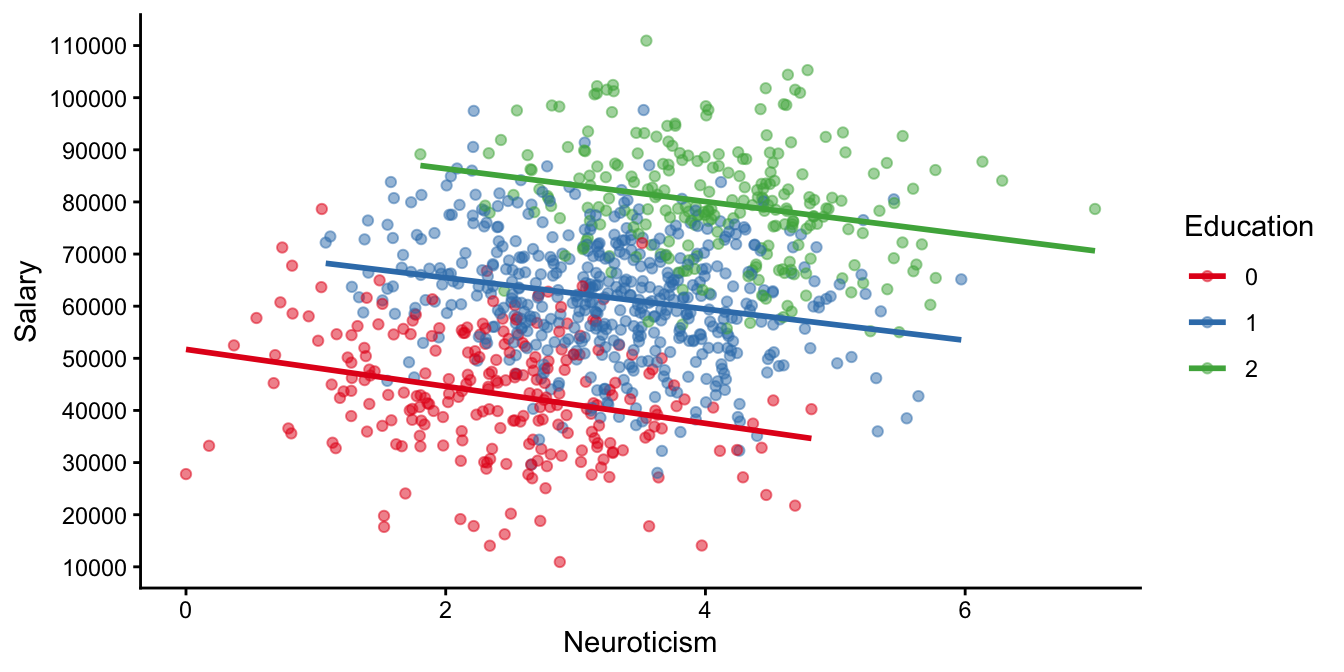
Figure 4.19: Same HR data, now with markers for different education levels.
The paradox is resolved when we look more closely at Figure 4.19. Look at the red dots in the bottom left of the graph: most of them have relatively low scores on the Neuroticsm scale (most of them less than 4). Now look at the green dots at the top right: most of them have relatively high scores on the Neuroticism scale (practically all of them more than 2). The blue dots show average Neuroticism scores. Thus, there seems to be a positive correlation between the level of education and neuroticism: employees with higher education levels are also more neurotic. Again, similar to the previous section, we see that a correlation between independent variables can cause problems with the interpretation. Yes, there is a general tendency that neurotic people earn more money. But that is not due to their neuroticism. It is the educational background that explains the differences in salary, and because neuroticism tends to be correlated with educational background, there seems to be a positive relationship between neuroticism and salary. However, if you take into account education (i.e., put Education into the model as an extra predictor), the positive correlation disappears, even becomes negative. This negative correlation means that within the educational levels, there is a tendency that neurotic people earn less than non-neurotic people.
Diving deeper into multiple regression: confounders, mediators and colliders
Figure 4.20 shows the conceptual model of how the world might work: education has an effect on neuroticism: the higher the education level, the more neurotic people are. But neuroticism in and of itself also influences salary: given a certain education level, more neuroticism leads to a lower salary. Note that this is only a theory, you might have a better idea about how these variables interact in the world.
When noting the positive correlation between neuroticism and salary, you might conclude that more neurotic people earn more money than less neurotic people. But the figure shows that education completely explains that positive relationship: because high education people have higher neuroticism scores (an arrow pointing from education to neuroticism), and because high education people have bigger salaries (an arrow pointing from education to salary), there appears to be positive relationship between neuroticism and salary. The positive relationship is however completely explained by the effects of education. Education is called here a confounder variable: a variable that induces a correlation between two other variables. In general, it is always good to add a confounder variable to your multiple regression. Looking at the effect of neuroticism on salary and including education, we see that we get to the truth: that there is actually a negative correlation between neuroticism and salary when you look at the education levels separately.
However, when you are interested in establishing the effect of education on salary, we should not use the neuroticism variable in the regression. That is because neuroticism is a mediator variable in the model: it is in the middle between education and salary and therefore mediates the effect of education on salary. To some extent neuroticism explains the correlation between education and salary: education makes people more neurotic, and neuroticism has in turn a negative effect on salary, hence it mediates a negative effect of education on salary. In addition there is non-mediated or direct effect of education on salary that is positive and strong. Taken together, the weak negative relationship mediated by neuroticism and the strong direct positive relationship result in a positive correlation. In general, in multiple regression, one should not add mediating variables in a regression analysis. Thus, when analysing the effect of education on salary, and you believe that the model in Figure 4.20 represents the state of the world, you should not include neuroticism into the regression analysis.
So far we talked about confounder and mediator variables. There is also a third kind: a collider variable. An example of a collider is when you are interested in the effect of education on neuroticism. If the model in Figure 4.20 is the correct one, both education and neuroticism have an effect on a third variable: salary. If you are interested in the effect of education on neuroticism, you should not add a variable that is affected by both these variables. An easy explanation of why you should not add collider variables into your regression analysis is based on a basketball example. If we look at the top 100 best professional basketball players, we might see that the smaller players are also the more skilled ones. This is not necessarily true for all people in the world that play basketball. In everyday life, there might be no connection between a person’s height and their skill. It is because taller people have a higher chance of becoming a professional than shorter people, and because more skilled players have a higher chance of becoming a professional than less skilled ones, you end up with a negative correlation between height and skill when you only look at the professional players. That’s because people who are not exceptionally tall, will have to be exceptionally skilled, whereas people who are not exceptionally skilled, will have to be exceptionally tall to become drafted as a professional and become one of the best. Returning to our employee data: if we are interested in the effect of education on neuroticism, and we control for salary, we will most likely see a correlation that we are not interested in. That’s because people end up in the lowest pay scale either because they have no or very low levels of education, or if they have mental problems (high neuroticism score). People within each pay-scale therefore might show a correlation between neuroticism and education level that is not particularly informative about causation.
Thinking about confounders, colliders and mediators helps us think about the problem, and helps us decide in what cases to add a variable in our regression analysis, and when it is best not to. For more on these concepts, look into the literature on causal inference, for instance Counterfactuals and Causal Inference: Methods and Principles for Social Research, by Morgan and Winship (2014), or Causal Inference in Statistics: A primer, by Pearl et al. (2016).
Figure 4.20: A path diagram for the assumed relationship between education, salary and neuroticism in the real world.
Simpson’s paradox tells us that we should always be careful when interpreting positive and negative correlations between two variables: what might be true at the total group level, might not be true at the level of smaller subgroups. Multiple linear regression helps us investigate correlations more deeply and uncover exciting relationships between multiple variables.
Simpson’s paradox helps us in interpreting the slope coefficients in multiple regression. In simple regression, when we only have one independent variable, we saw that the slope for an independent variable \(A\) is the increase in the dependent variable if we increase variable \(A\) by one unit. In multiple regression, we have multiple independent variables, say \(A\), \(B\) and \(C\). The interpretation for the slope coefficient for variable \(A\) is then the increase in the dependent variable if we increase variable \(A\) by one unit, with the other independent variables \(B\) and \(C\) held constant. For example, the slope for variable \(A\) is the increase when we take particular values for variables \(B\) and \(C\), say \(B = 5\) and \(C = 7\).
Multiple regression therefore plays an important part in studying causation. Suppose that a researcher finds in South-African beach data that on days with high ice cream sales there are also more shark attacks. Might this indicate that there is a causal relationship between ice cream sales and shark attacks? Might bellies full of ice cream be more attractive to sharks? Or when there are many shark attacks, might people prefer eating ice cream over swimming? Alternatively, there might be a third variable that explains both the shark attacks and the ice cream sales: temperature! Sharks attack during the summer when temperature is high, and that’s also the time people eat more ice cream. There is no causal relationship, since if you only look at data from sunny summer days (holding temperature constant), you don’t see a relationship between shark attacks and ice cream sales (just many shark attacks and high ice cream sales). And if you only look at cold wintry days, you also see no relationship (no shark attacks and no ice cream sales). But if you take all days into account, you see a relationship between shark attacks and ice cream sales. Because this correlation is non-causal and explained by the third variable temperature, we call this correlation a spurious correlation. The spurious correlation is induced by the confounder variable temperature.
This spurious correlation is plotted in Figure 4.21. If you look at all the data points at once, you see a steep slope in the least squares regression line for shark attacks and ice cream sales. However, if you hold temperature constant by looking at only the light blue data points (high temperatures), there is no linear relationship. Neither is there a linear relationship when you only look at the dark blue data points (low temperatures).
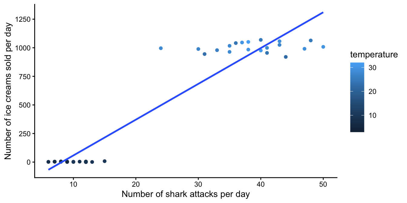
Figure 4.21: A spurious correlation between the number of shark attacks and ice cream sales.
4.17 Take-away points
A simple linear equation represents a straight line.
A straight line has an intercept and a slope.
The intercept is the value of \(Y\) given that \(X=0\).
Data usually do not show a straight line, but a straight line might be a good approximation (prediction model) for the data.
Finding a reasonable straight line is called regression.
A residual is the difference between an observed \(Y\)-value and the predicted \(Y\)-value.
Finding the best regression line is usually based on the least squares principle.
Correlation stands for the co-relation between two variables. It tells you how well one variable can be predicted from the other using a linear equation.
Correlation is standardised to be between -1 and 1. It is the slope of the regression line for standardised \(X\)- and \(Y\)-values.
Covariance is an unstandardised measure for the co-relation.
Unexplained variance is the variance of the residuals.
Explained variance is total variance of the dependent variable minus the residual variance.
R-squared is the proportion of explained variance.
It is possible to include more than one independent variable in a linear model. We then talk about multiple regression.
It is not wise to include two independent variables that are highly correlated with each other. Having correlations among independent variables is called collinearity.
The relationship between one independent variable and the dependent variable can change, depending on what other independent variables are included in the regression model. An extreme example of this is Simpson’s paradox. Whether to include or exclude variables from a regression analysis should be based on the theoretical model that lies behind the analysis.
Again, similar to what was said about the formula for the variance of a variable, on-line you will often find the formula \(\frac{\sum(X_i - \bar{X})(Y_i - \bar{Y})}{n-1}\). The difference is that here we are talking about the definition of the covariance of two observed variables, and that elsewhere one talks about trying to estimate the covariance between two variables in the population. Similar to the variance, the covariance in a sample is a biased estimator of the covariance in the population. To remedy this bias, we divide the sum of the cross-products not by \(n\) but by \(n-1\).↩︎
https://paulvanderlaken.com/2017/09/27/simpsons-paradox-two-hr-examples-with-r-code/↩︎