Chapter 7 Assumptions of linear models
7.1 Introduction
Linear models are models that describe the (theoretical) relationship between two or more variables. A good model gives a valid summary of what the relationship between the variables looks like in practice. Let’s look at a very simple example of two variables: height and weight. In a sample of 30 children from a distant country, we find 30 combinations of height in centimetres and weight in kilograms that are depicted in the scatter plot in Figure 7.1.
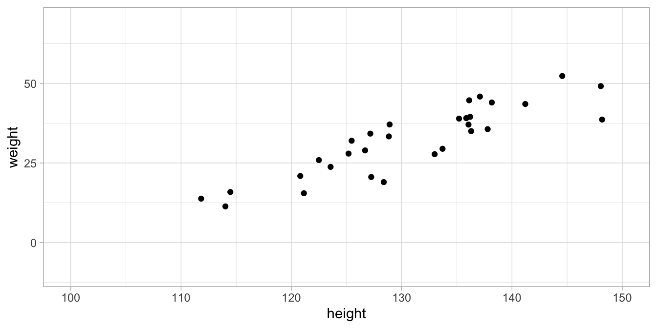
Figure 7.1: Data set on height and weight in 100 children.
We’d like to find a linear model for these data, so we determine the least squares regression line. We also determine the standard deviation of the residuals so that we have the following linear model:
\[\begin{aligned} \texttt{weight} &= -103 + 1.03 \times \texttt{height} + e \nonumber\\ e &\sim N(0, \sigma = 5.22) \nonumber \end{aligned}\]
This model – not the data – is illustrated in Figure 7.2. The blue line represents the linear equation, and the dots are the result of simulating (inventing) many independent normal residuals (\(e\)) with standard deviation 5.22. The figure shows what data points would like according to the model (equation + residuals).
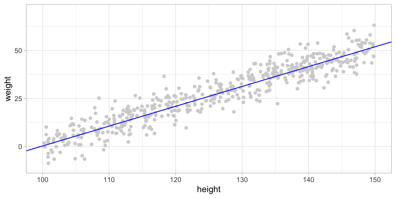
Figure 7.2: Data simulated based on a linear model. The blue line represents the regression equation, and the data points are simulated by drawing residuals from a normal distribution.
The actual data, displayed in Figure 7.1 might have arisen from this model in Figure 7.2. The data is only different from the simulated data because of the randomness of the residuals (random draws from a normal distribution). This can be seen when we overlay the actually observed data with the simulated data, see Figure 7.3.
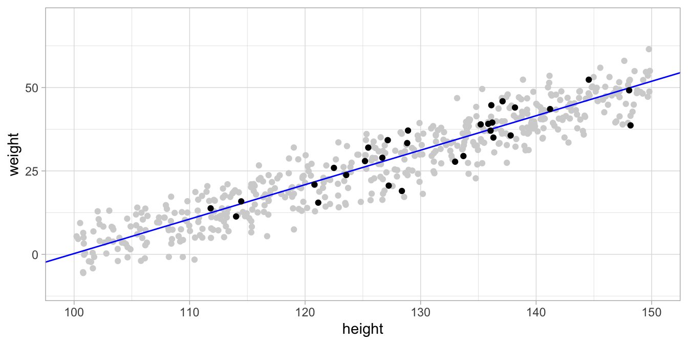
Figure 7.3: The actual data in black and the simulated data points from the model in gray. The model seems to be a good model since the actual data points are very similar to the simulated data points.
A model should be a good model for two reasons. First, a good model is a summary of the data. Instead of describing all 30 data points on the children, we could summarise these data with the linear equation of the regression line and the standard deviation (or variance) of the residuals. The second reason is that you would like to infer something about the relationship between height and weight in all children from that distant country. It turns out that the standard error, and hence the confidence intervals and hypothesis testing, are only valid if the model describes the data well. This means that if the model is not a good description of your sample data, then you draw the wrong conclusions about the population.
For a linear model to be a good model, there are four conditions that need to be fulfilled.
linearity The relationship between the variables can be described by a linear equation (also called additivity)
independence The residuals are independent of each other
equal variance The residuals have equal variance (also called homoskedasticity)
normality The distribution of the residuals is normal
If these conditions (often called assumptions) are not met, the inference with the computed standard error is invalid. That is, if the assumptions are not met, the standard error should not be trusted, or should be computed using alternative methods.
Below we will discuss these four assumptions briefly. For each assumption, we will show that the assumption can be checked by looking at the residuals. We will see that if the residuals do not look right, one or more of the assumptions are violated.
How the assumptions relate to the linear model
All four assumptions result directly from the linear model itself. The linearity assumption is simply that the linear equation gives a good description of the general trend in the data. In the case of our small data example, the linearity assumption entails that the equation
\[\texttt{weight} = -103 + 1.03 \times \texttt{height} + e\] is a good description of the relationship between height and weight in the data.
The other three assumptions (normality, independence and equal variance) relate directly to the second part of the model, the one about the residuals.
\[e \sim N(0, \sigma = 5.22)\] A more explicit form of the residual part is
\[e \overset{\mathrm{iid}}{\sim} N(0, \sigma = 5.22)\]
where iid stands for independent identically distributed. (In this book we usually leave this iid symbol out, but it is always implicitly there). This part of the model states that the residuals are independently and identically distributed as a normal distribution with standard deviation 5.22. Thus, each residual has nothing to do with any other residual (independent), it comes from a normal distribution (normality) and the variance (or standard deviation) of that normal distribution is identical (equal variance) for each residual, namely standard deviation 5.22 in this case.
Earlier, we said that we only have to look at the residuals to see if the four model assumptions are reasonable. But what does it mean that the residuals ‘look right’?
Well, the linear model says that the residuals have a normal distribution. So for the height and weight data, let’s apply regression, compute the residuals for all 100 children, and plot their distribution with a histogram, see Figure 7.4. The histogram shows a bell-shaped distribution with one peak that is more or less symmetric. The symmetry is not perfect, but you can well imagine that if we had measured more children, the distribution could more and more resemble a normal distribution.
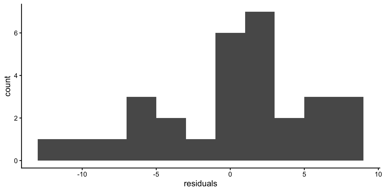
Figure 7.4: Histogram of the residuals after regressing weight on height.
Another thing the model implies is that the residuals are independent or random: they are random draws from a normal distribution. This means, if we would plot the residuals, we should see no systematic pattern in the residuals. The scatter plot in Figure 7.5 plots the residuals in the order in which they appear in the data set. The figure seems to suggest a random scatter of dots, without any kind of system or logic. We could also plot the residuals as a function of the predicted height (the dependent variable). This is the most usual way to check for any systematic pattern. Figure 7.6 shows there is no systematic relationship between the predicted height of a child and the residual.
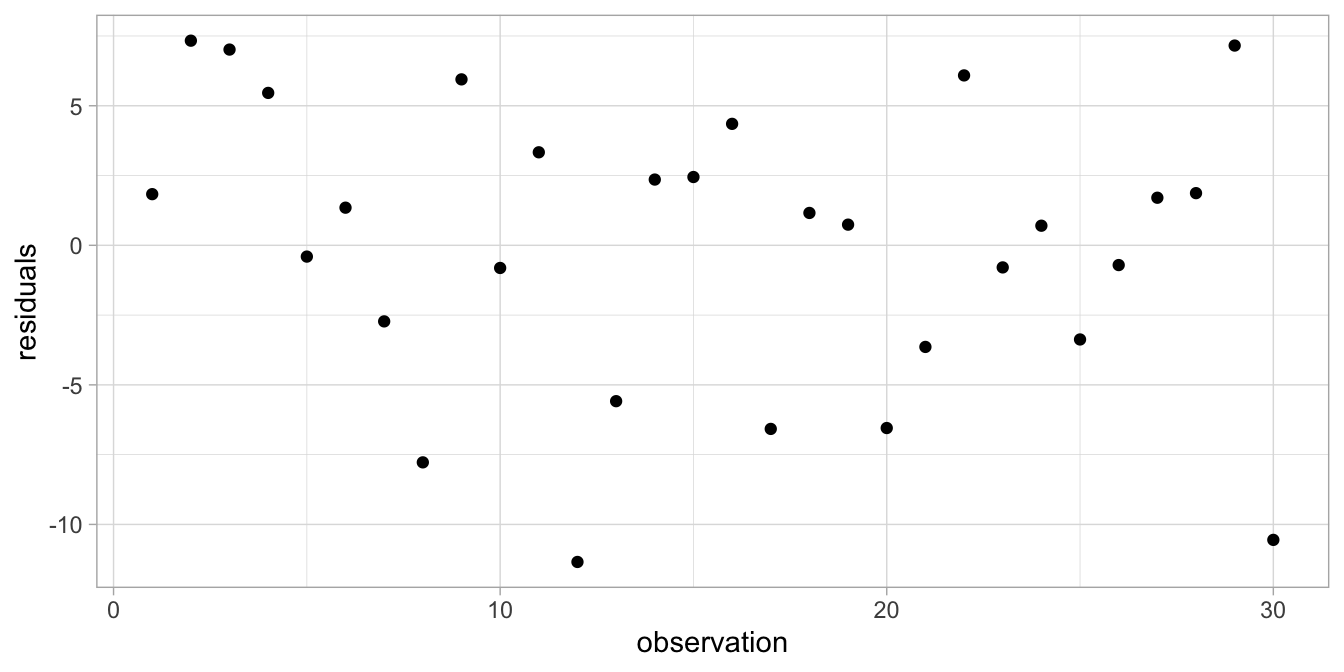
Figure 7.5: Residual plot after regressing weight on height.
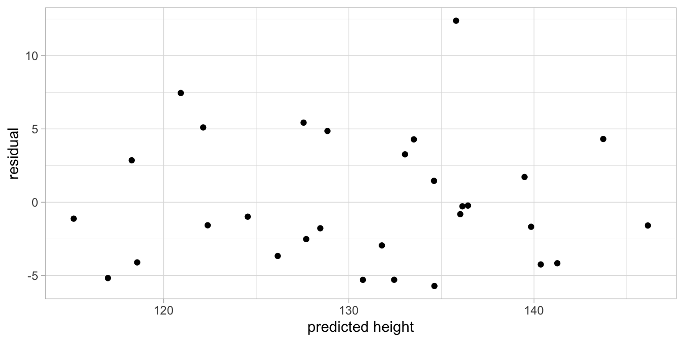
Figure 7.6: Residuals as a function of height.
When it looks like this, it shows that the residuals are randomly scattered around the regression line (the predicted heights). Taken together, Figures 7.4, 7.5 and 7.6 suggest that the assumptions of the linear model are met.
Let’s have a look at the same kinds of residual plots when each of the assumptions of the linear model are violated.
7.2 Independence
The assumption of independence is about the way in which observations are similar and dissimilar from each other. Take for instance the following regression equation for children’s height predicted by their age:
\[\begin{equation} \texttt{height} = 100 + 5 \times \texttt{age} + e \end{equation}\]
This regression equation predicts that a child of age 5 has a height of
125 and a child of age 10 has a height of 150. In fact, all children of
age 5 have the same predicted height of 125 and all children of age 10
have the same predicted height of 150. Of course, in reality, children
of the same age will have very different heights: they differ. According
to the above regression equation, children are similar in height because
they have the same age, but they differ because of the random term \(e\)
that has a normal distribution: predictor age makes them similar,
residual \(e\) makes them dissimilar. Now, if this is all there is, then
this is a good model. But let’s suppose that we’re studying height in an
international group of 50 Ethiopian children and 50 Vietnamese children.
Their heights are plotted in Figure
7.7.
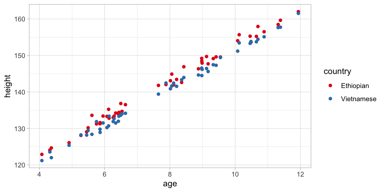
Figure 7.7: Data on age and height in children from two countries.
From this graph, we see that heights are similar because of age: older children are taller than younger children. But we see that children are also similar because of their national background: Ethiopian children are systematically taller than Vietnamese children, irrespective of age. So here we see that a simple regression of height on age is not a good model. We see that, when we estimate the simple regression on age and look at the residuals in Figure 7.8.
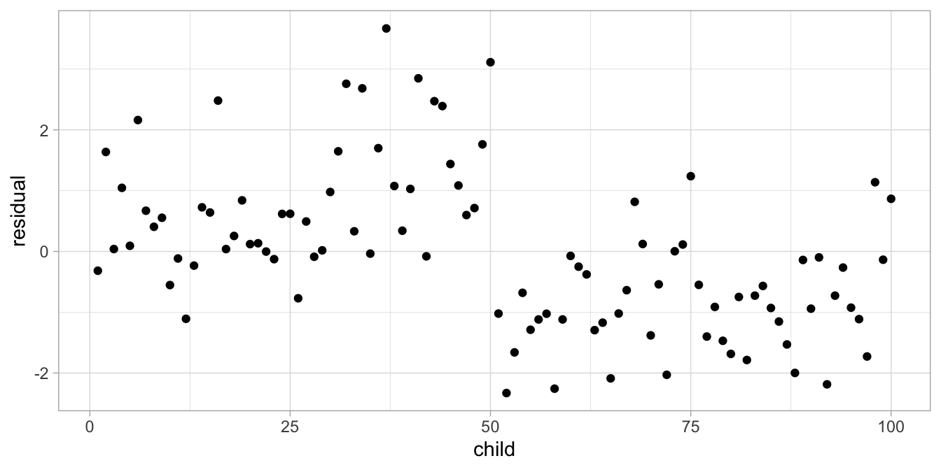
Figure 7.8: Residual plot after regressing height on age.
As our model predicts random residuals, we expect a random scatter of residuals. However, what we see here is a systematic order in the residuals: they tend to be positive for the first 50 children and negative for the last 50 children. These turn out to be the Ethiopian and the Vietnamese children, respectively. This systematic order in the residuals is a violation of independence: the residuals should be random, and they are not. The residuals are dependent on country: positive for Ethiopians, negative for Vietnamese children. We see that clearly when we plot the residuals as a function of country, in Figure 7.9.
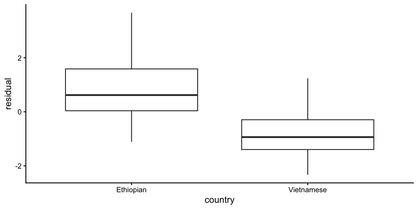
Figure 7.9: Residual plot after regressing height on age.
Thus, there is more than just age that makes children similar. That means that the model is not a good model: if there is more than just age that makes children more alike, then that should be incorporated into our model. If we use multiple regression, including both age and country, and we do the analysis, then we get the following regression equation:
\[\begin{equation} \widehat{\texttt{height}} = 102.641 + 5.017 \times \texttt{age} - 1.712 \times \texttt{countryViet} \end{equation}\]
When we now plot the residuals we see that there is no longer a clear country difference, see Figure 7.10.
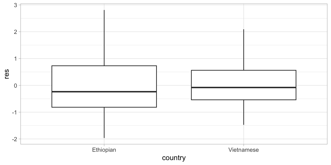
Figure 7.10: Residual plot after regressing height on age and country.
Another typical example of non-random scatter of residuals is shown in Figure 7.11.
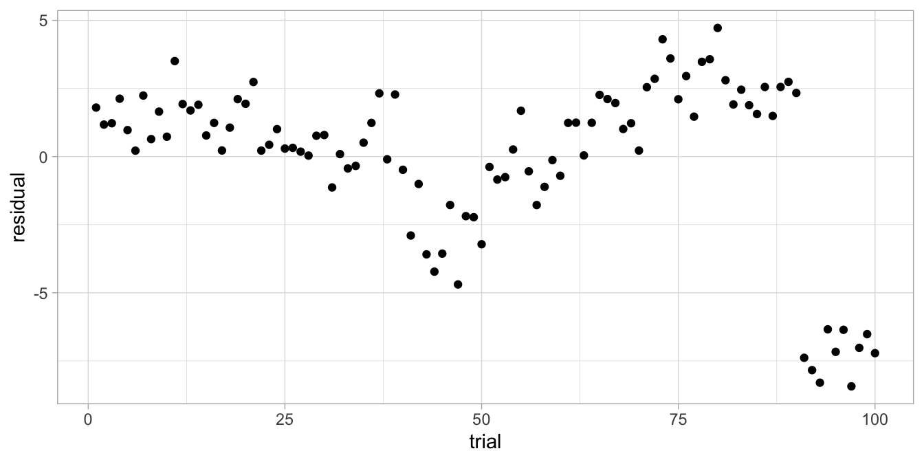
Figure 7.11: Residual plot after regressing reaction time on IQ.
They come from an analysis of reaction times, done on 10 students where we also measured their IQ. Each student was measured on 10 trials. We predicted reaction time on the basis of student’s IQ using a simple regression analysis. The residuals are clearly not random, and if we look more closely, we see some clustering if we give different colours for the data from the different students, see Figure 7.12.
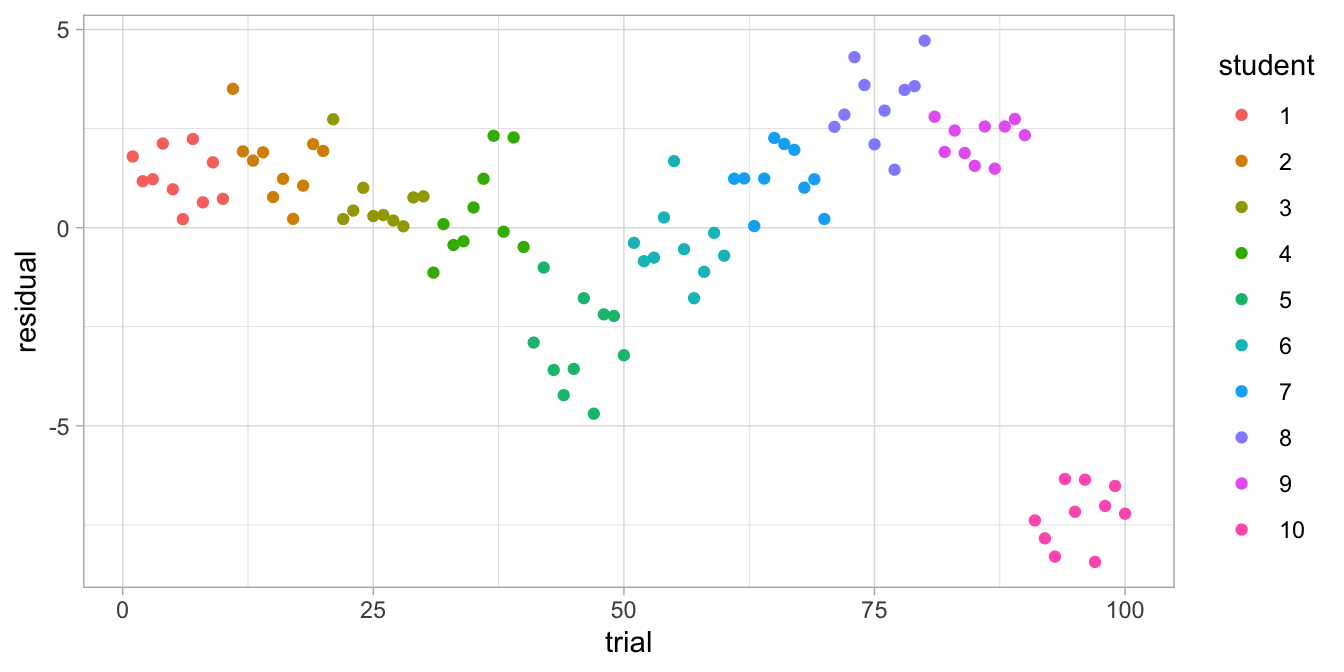
Figure 7.12: Residual plot after regressing reaction time on IQ, with separate colours for each student.
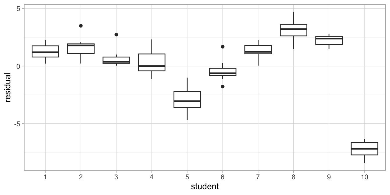
Figure 7.13: Box plot after regressing reaction time on IQ.
We see the same information if we draw a boxplot, see Figure
7.13. We see
that residuals that are close together come from the same student. So,
reaction time are not only similar because of IQ, but also because they
come from the same student: clearly something other than IQ also
explains why reaction times are different across individuals. The
residuals in this analysis based on IQ are not independent: they are
dependent on the student. This may be because of a number of factors:
dexterity, left-handedness, practice, age, motivation, tiredness, or any
combination of such factors. You may or may not have information about
these factors. If you do, you can add them to your model and see if they
explain variance and check if the residuals become more randomly
distributed. But if you don’t have any extra information, or if do you
but the residuals remain clustered, you might either consider adding the
categorical variable student to the model or use linear mixed models,
discussed in Chapter 12.
The assumption of independence is the most important assumption in linear models. Only a small amount of dependence among the observations causes your actual standard error to be much larger than reported by your software. For example, you may think that a confidence interval is [0.1, 0.2], so you reject the null-hypothesis, but in reality the standard error is much larger, resulting in a much wider confidence interval, say [-0.1, 0.4] so that in reality you are not allowed to reject the null-hypothesis. The reason that this happens can be explained when we look again at Figure 7.12. Objectively, there are 100 observations, and this is fed into the software: \(n = 100\). This sample size is then used to compute the standard error (see Chapter 5). However, because the reaction times from the same student are so much alike, effectively the number of observations is much smaller. The reaction times from one student are in fact so much alike, you could almost say that there are only 10 different reaction times, one for each student, with only slight deviations within each student. Therefore, the real number of observations is somewhere between 10 and 100, and thus the reported standard error is underestimated when there is dependence in your residuals (standard errors are inversely related to sample size, see Chapter 5).
7.3 Linearity
The assumption of linearity is often also referred to as the assumption of additivity. Contrary to intuition, the assumption is not that the relationship between variables should be linear. The assumption is that there is linearity or additivity in the parameters. That is, the effects of the variables in the model should add up.
Suppose we gather data on height and fear of snakes in 100 children from a different distant country. Figure 7.14 plots these two variables, together with the least squares regression line.
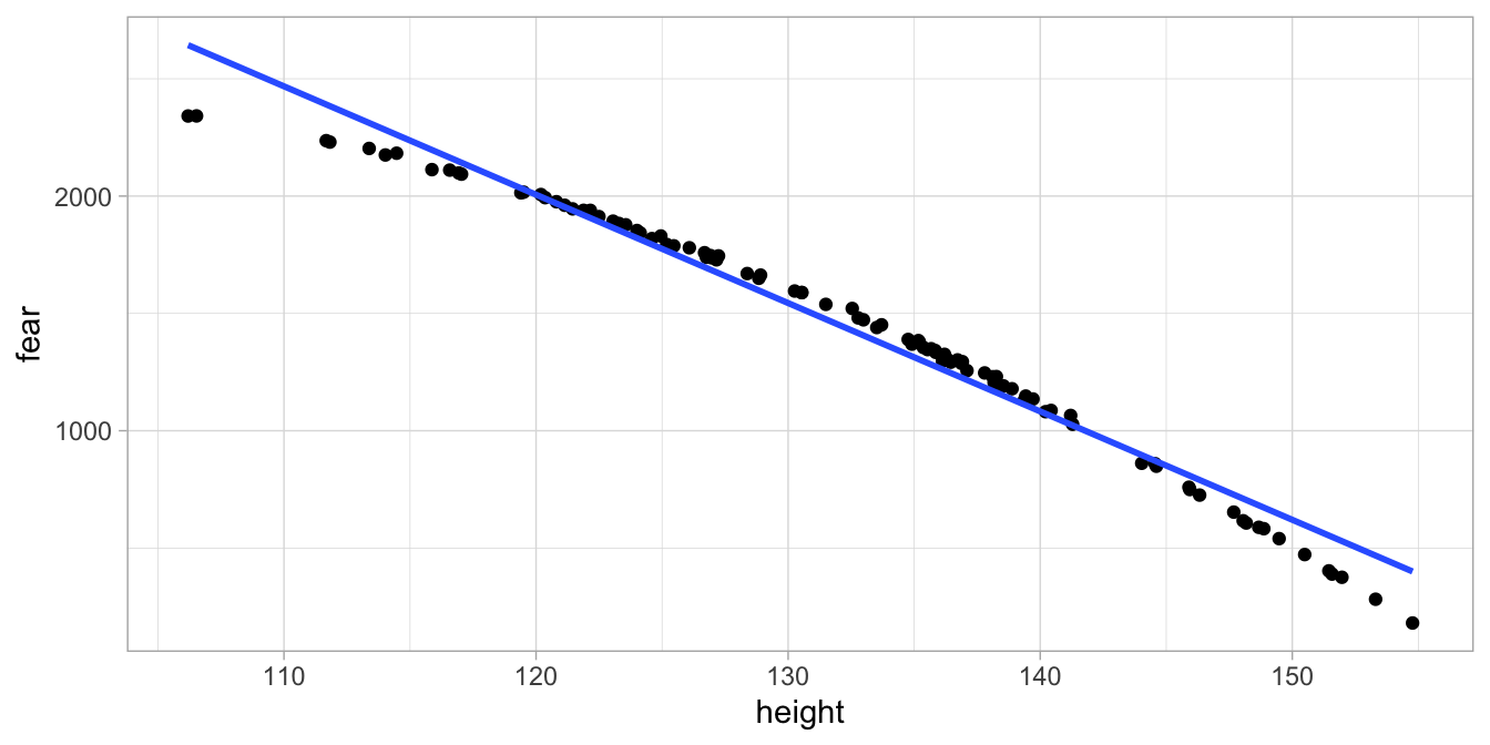
Figure 7.14: Least squares regression line for fear of snakes on height in 100 children.
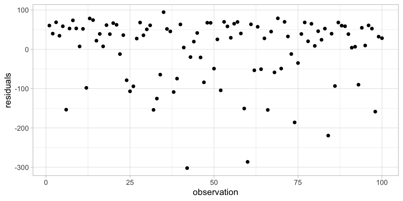
Figure 7.15: Residual plot after regressing fear of snakes on height.
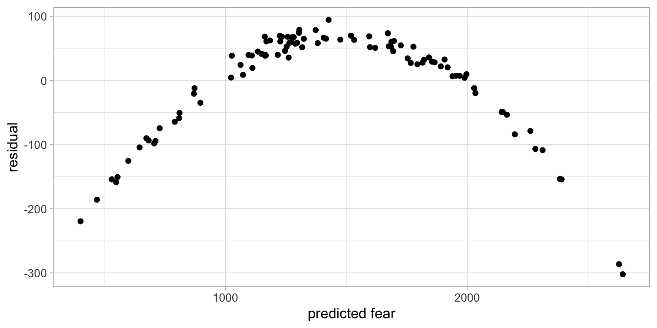
Figure 7.16: Residual plot after regressing fear of snakes on height.
Figure 7.15 shows a pattern in the residuals: the positive residuals seem to be smaller than the negative residuals. We also clearly see a problem when we plot residuals against the predicted fear (see Fig. 7.16). The same problem is reflected in the histogram in Figure 7.17, that does not look symmetric at all. What might be the problem?
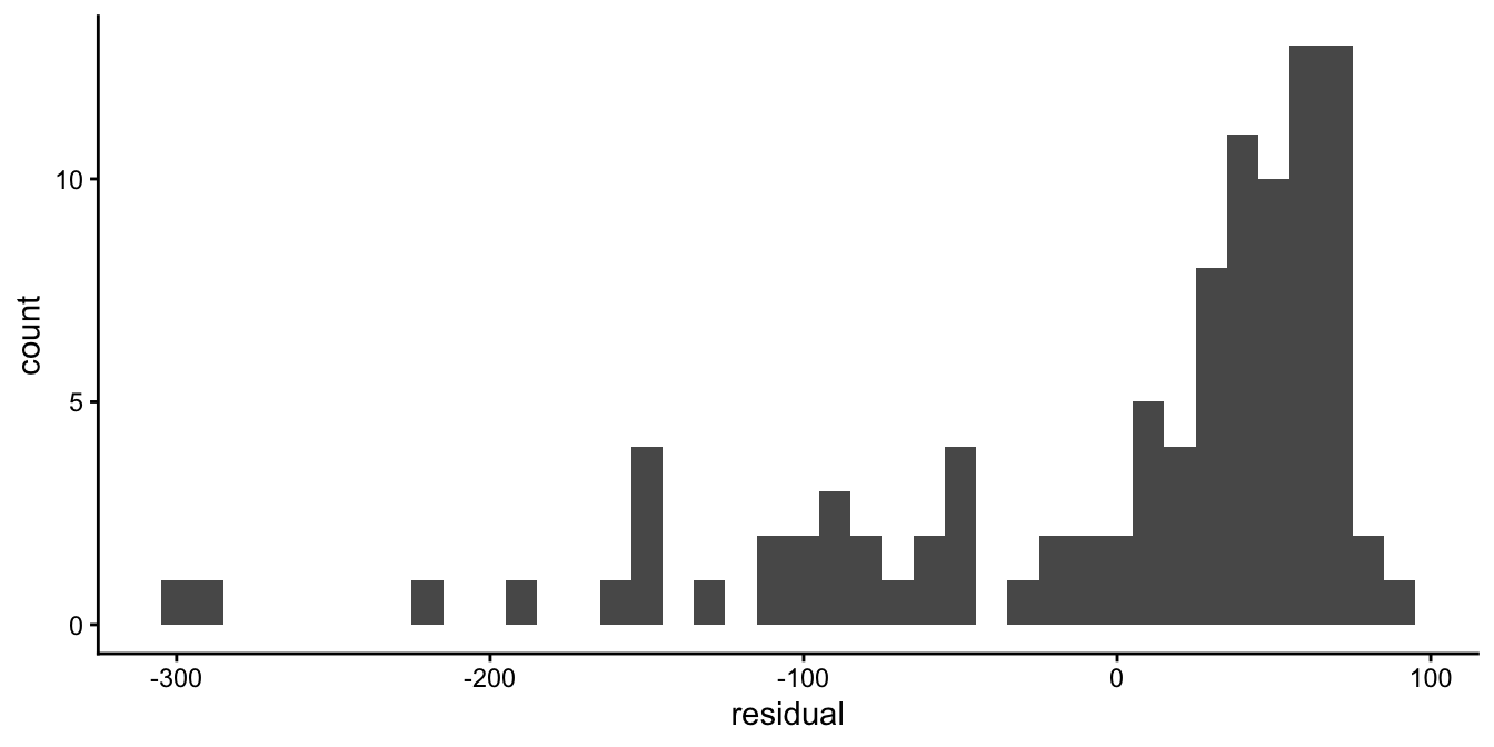
Figure 7.17: Histogram of the residuals after regressing fear of snakes on height.
Take another look at the data in Figure 7.14. We see that for small heights, the data points are all below the regression line, and the same pattern we see for large heights. For average heights, we see on the contrary all data points above the regression line. Somehow the data points do not suggest a completely linear relationship, but a curved one.
This problem of model misfit could be solved by not only using height
as the predictor variable, but also the square of height, that is,
\(\texttt{height}^2\). For each observed height we compute the square.
This new variable, let’s call it height2, we add to our regression
model. The least squares regression equation then becomes:
\[\begin{eqnarray} \widehat{\texttt{fear}} = -2000 + 100 \times \texttt{height} - 0.56 \times \texttt{height2} \tag{7.1} \end{eqnarray}\]
If we then plot the data and the regression line, we get Figure
7.18. There
we see that the regression line goes straight through the points. Note
that the regression line when plotted against height is non-linear,
but equation (7.1) itself is linear, that is, there are only two
effects added up, one from variable height and one from variable
height2. We also see from the histogram (Figure
7.19) and
the residuals plot (Figure 7.20) that the residuals are randomly drawn from a
normal distribution and are not related to predicted fear. Thus, our
additive model (our linear model) with effects of height and height
squared results in a nice-fitting model with random normally scattered
residuals.
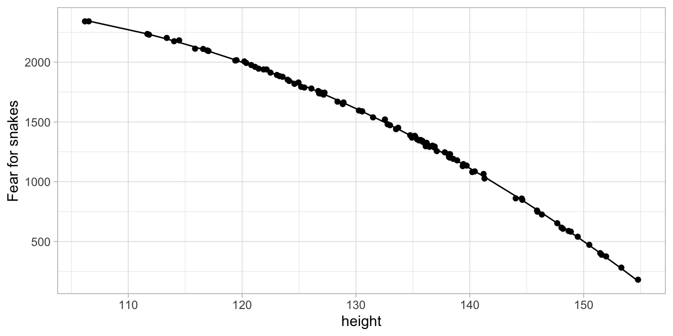
Figure 7.18: Observed and predicted fear based on a linear model with height and height squared
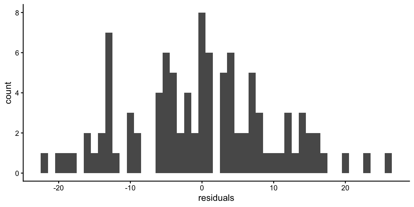
Figure 7.19: Histogram of the residuals of the fear of snakes data with height squared introduced into the linear model.
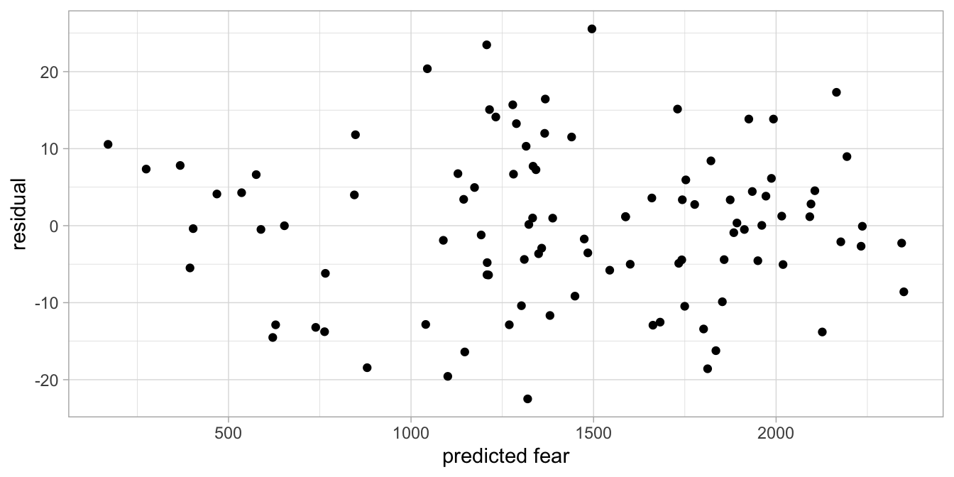
Figure 7.20: Residuals plot of the fear of snakes data with height squared introduced into the linear model.
In sum, the relationship between two variables need not be linear in order for a linear model to be appropriate. A transformation of an independent variable, such as taking a square, can result in normally randomly scattered residuals. The linearity assumption is that the effects of a number of variables (transformed or untransformed) add up and lead to a model with normally and independently, randomly scattered residuals.
7.4 Equal variances
Suppose we measure reaction times in both young and older adults. Older persons tend to have longer reaction times than young adults. Figure 7.21 shows a data set on 100 persons. Figure 7.22 shows the residuals as a function of age, and shows something remarkable: it seems that the residuals are much more varied for older people than for young people. There is more variance at older ages than at younger ages. This is a violation of the equal variance assumption. Remember that a linear model goes with a normal distribution for the residuals with a certain variance. In a linear model, there is only mention of one variance of the residuals \(\sigma^2\), not several!
The equal variance assumption is an important one: if the data show that the variance is different for different subgroups of individuals in the data set, then the standard errors of the regression coefficients cannot be trusted.
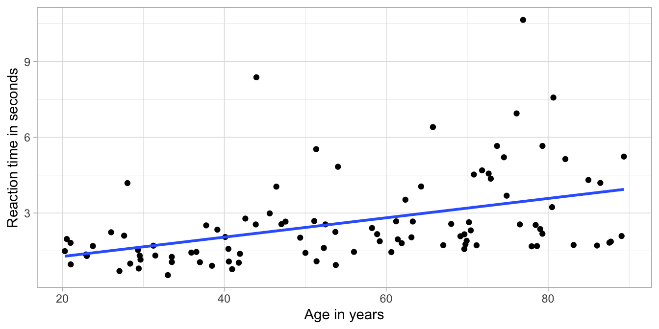
Figure 7.21: Least squares regression line for reaction time on age in 100 adults.
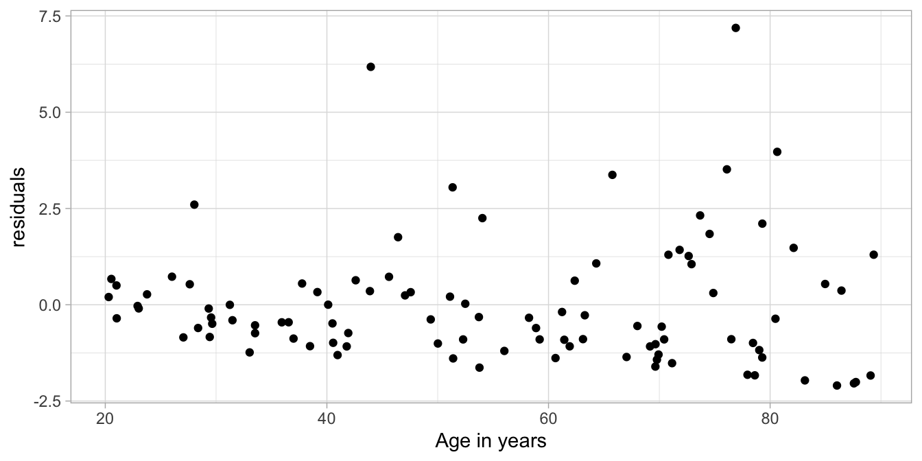
Figure 7.22: Residual plot after regressing reaction time on age.
We often see an equal variance violation in reaction times. An often used strategy of getting rid of such a problem is to work not with the reaction time, but the logarithm of the reaction time. Figure 7.23 shows the data with the computed logarithms of reaction time, and Figure 7.24 shows the residuals plot. You can see that the log-transformation of the reaction times resulted in a much better model.
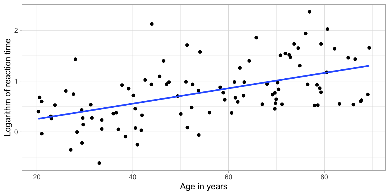
Figure 7.23: Least squares regression line for log reaction time on age in 100 adults.
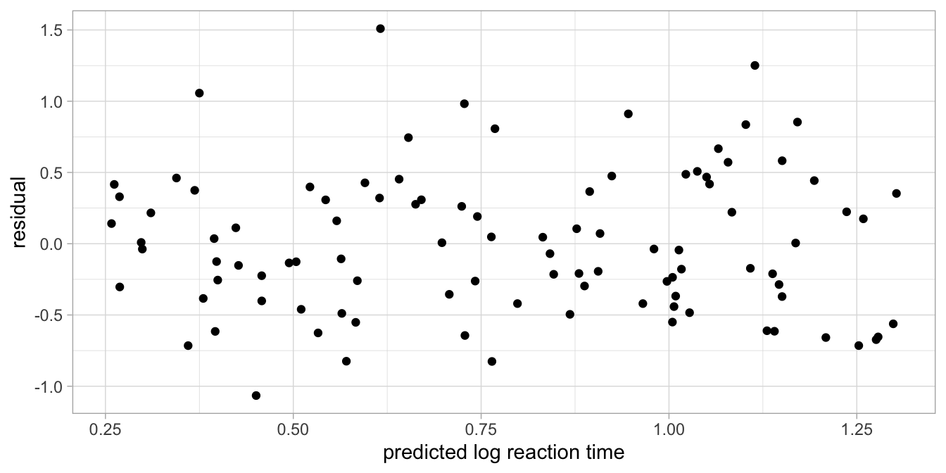
Figure 7.24: Residual plot after regressing log reaction time on age.
Note that the assumption is not about the variance in the sample data, but about the residuals in the population data. It might well be that there are slight differences in the sample data of the older people than in the sample data of the younger people. These could well be due to chance. The important thing to know is that the assumption of equal variance is that in the population of older adults, the variation in residuals is the same as the variation in residuals in the population of younger adults.
The equal variance assumption is often referred to as the homogeneity of variance assumption, or homoscedasticity. It is the assumption that variance is homogeneous (of equal size) across all levels and subgroups of the independent variables in the population. The computation of the standard error is highly dependent on the size of the variance of the residuals. If the size of this variance differs across levels and subgroups of the data, the standard error also varies and the confidence intervals cannot be easily determined. This in turn has an effect on the computation of \(p\)-values, and therefore inference. Having no homogeneity of variance therefore leads to wrong inference, with inflated or deflated type I and type II error rates. Note that the opposite of homoscedasticity is called heteroscedasticity: meaning different variances.
The inflation or deflation of type I and type II error rates are limited in the case that group sizes are more or less equal. For example, suppose you have an age variable with about an equal number of older persons and younger persons, but unequal variances of the residuals. In that case you should not worry too much about the precision of your \(p\)-values and your confidence intervals: they are more or less correct. However, if you have more than 1.5 times more elderly in your sample than youngsters (or vice versa), with unequal variances of the residuals, then you should worry. Briefly: if the greater error variance is associated with the greater group size, then the reported \(p\)-value is too small, and if the greater error variance is associated with the smaller group size, then the reported \(p\)-value is too large. If the \(p\)-value is around your pre-chosen \(\alpha\)-level and you’re unsure whether to reject or not to reject your null-hypothesis, look for more robust methods of computing standard errors.
7.5 Residuals normally distributed
As we’ve already seen, the assumption of the linear model is that the residuals are normally distributed. Let’s look at the reaction time data again and see what the histogram of the residuals and the density look like if we use reaction time as our dependent variable. Figure 7.25 shows that in that case the distribution is not symmetric: it is clearly skewed.
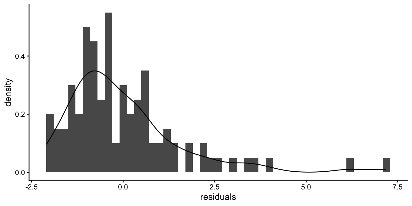
Figure 7.25: Histogram of the residuals after a regression of reaction time on age.
After a logarithmic transformation of the reaction times, we get the histogram and the density in Figure 7.26, which look more symmetric.
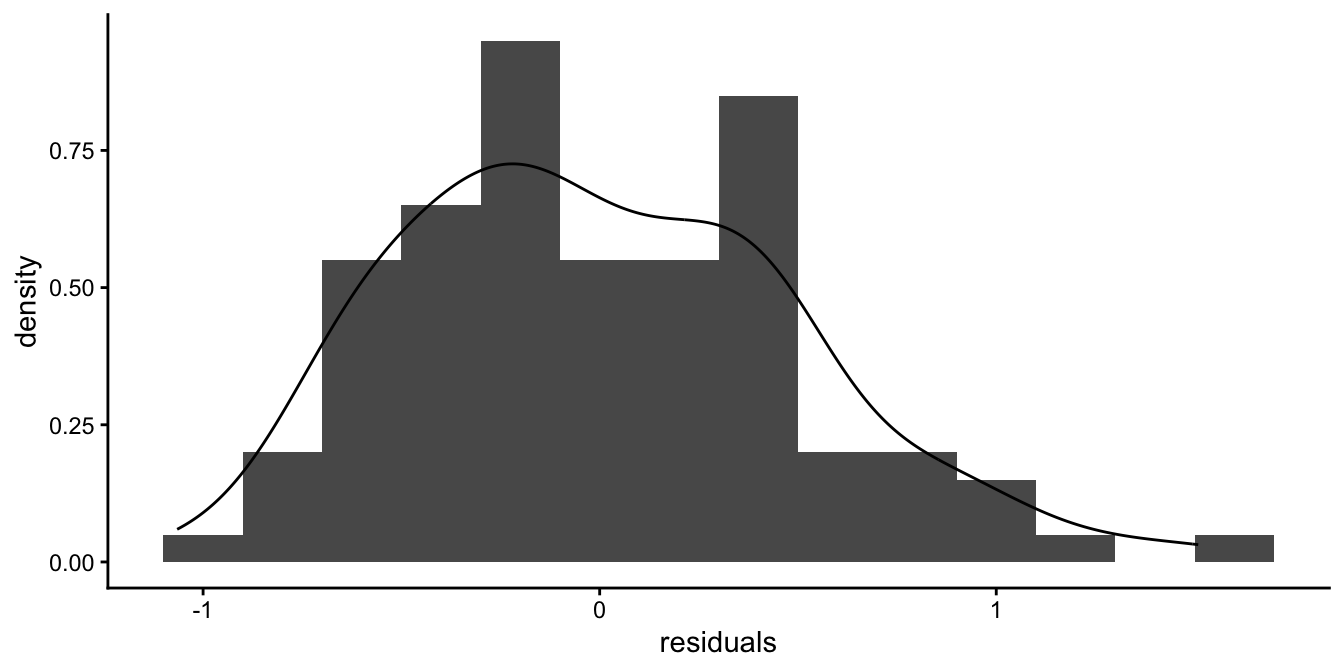
Figure 7.26: Histogram of the residuals after a regression of log reaction time on age.
Remember that if your sample size is of limited size, a distribution will never look completely normal, even if it is sampled from a normal distribution. It should however be likely to be sampled from a population of data that seems normal. That means that the histogram should not be too skewed, or too peaked, or have two peaks far apart. Only if you have a lot of observations, say 1000, you can reasonably say something about the shape of the distribution.
If you have categorical independent variables in your linear model, it is best to look at the various subgroups separately and look at the histogram of the residuals: the residuals \(e\) are defined as residuals given the rest of the linear model. For instance, if there is a model for height, and country is the only predictor in the model, all individuals from the same country are given the same expected height based on the model. They only differ from each other because of the normally distributed random residuals. Therefore look at the residuals for all individuals from one particular country to see whether the residuals are indeed normally distributed. Then do this for all countries separately. Think about it: the residuals might look non-normal from country A, and non-normal from country B, but put together, they might look very normal! This is illustrated in Figure 7.27. Therefore, when checking for the assumption of normality, do this for every subgroup separately.
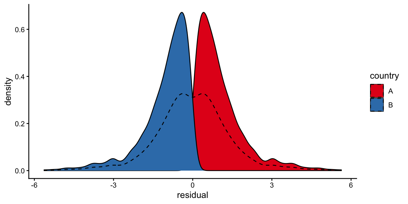
Figure 7.27: Two distributions might each be very non-normal, but the density of the combined data might look normal nevertheless (the dashed line). Normality should therefore always be checked for each subgroup separately.
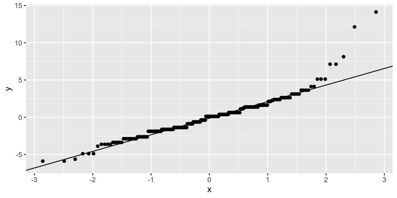
Judging normality from histograms is always a bit tricky. An often used alternative is a quantile-quantile plot, or qq-plot for short. It is based on the quantiles of a distribution. Remember quantiles from Chapter 1: If a value \(x\) is the 70th quantile of a distribution, it means that 70% of the values is smaller than \(x\). When a student’s performance is in the 90th percentile, it means that 90% of the other students show worse performance.
As we saw in Chapter 1, the quantiles of the normal distribution are known. In the qq-plot, we plot the observed quantiles of a given distribution (\(y\)-axis) against the expected quantiles of the normal distribution (\(x\)-axis). If the distribution is normal, then the data points should be on a straight line.
Figure 7.28 shows the qq-plot based on the linear regression of response times (rt) on age. When the linear model is applied to the original response time data, the residuals are clearly not normally distributed, whereas when the linear model is applied to the response time after a logarithmic transformation, the data show a more or less normal distribution.
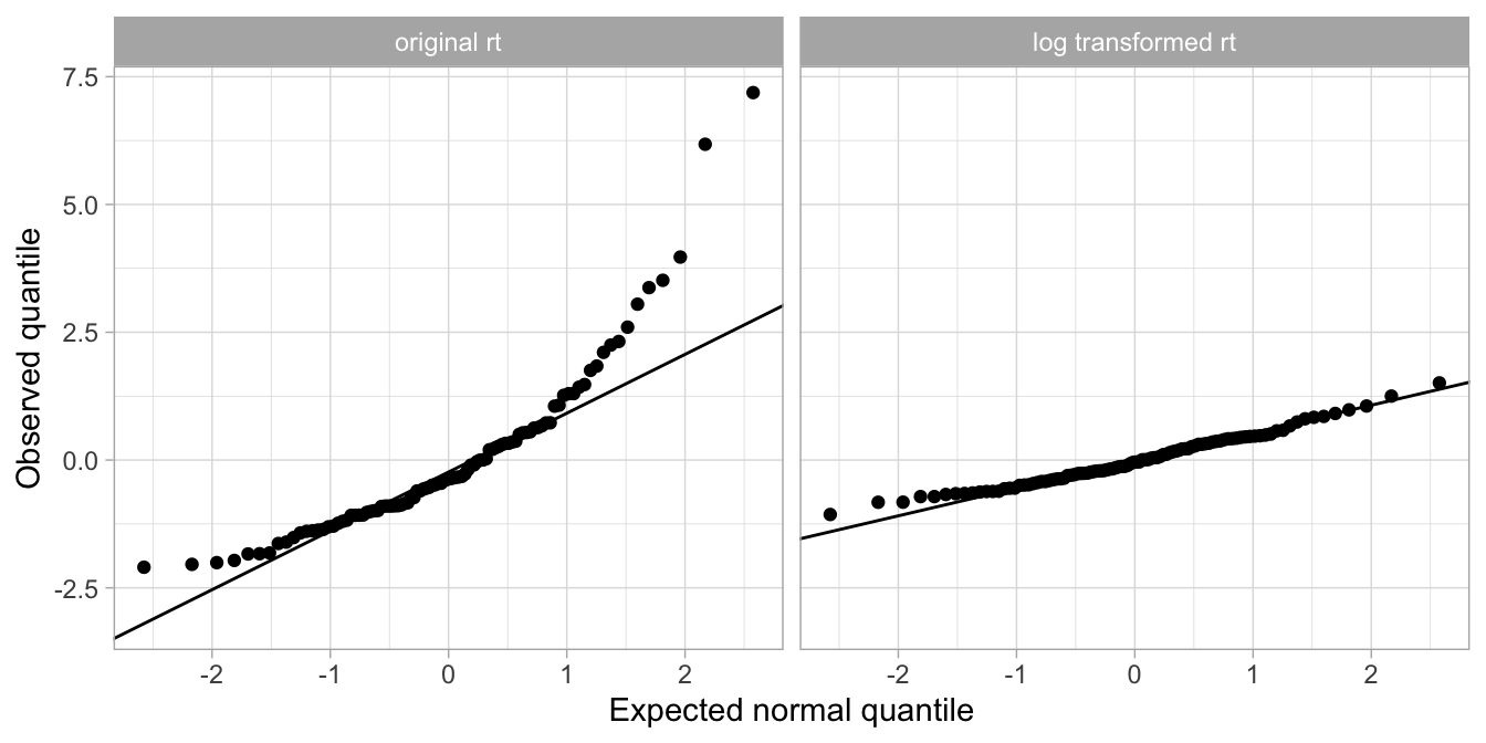
Figure 7.28: The qq-plot for the residuals based on the original response time data shows clear nonnormality (left panel), whereas the qq-plot for the residuals based on the log transformed data are close to the line, indicating normality
It should be noted that the assumption of normally distributed residuals is the least important assumption. Even when the distribution is skewed, your standard errors are more or less correct. Only in severe cases, like with the residuals in Figure 7.25, the standard errors start to be incorrect.
7.6 General approach to testing assumptions
It is generally advised to always check the residuals. All four assumptions mentioned above can be checked by looking at the residuals. We advise to do this with three types of plots.
The first is the histogram of the residuals: this shows whether the residuals are more or less normally distributed. The histogram should show a more or less symmetric distribution. A histogram can be rather coarse if your sample size is limited. Add a density to get the general idea of the distribution. A qq-plot is also very powerful. If the histogram/density plot/qq-plot does not look symmetric/normal at all, try to find a transformation of the dependent variable that makes the residuals more normal. An example of this is to log-transform reaction times.
The second type of plot that you should look at is a plot where the residuals are on the \(y\)-axis and the predicted values for the dependent variable (\(\widehat{Y}\)) is on the \(x\)-axis. Such a plot can reveal systematic deviation from normality, but also non-equal variance.
The third type of plot that you should study is one where the residuals are on the vertical axis and one of the predictor variables is on the horizontal axis. In this plot, you can spot violations of the equal variance assumption. You can also use such a plot for candidate predictor variables that are not in your model yet. If you notice a pattern, this is indicative of dependence, which means that this variable should probably be included in your model.
7.7 Checking assumptions in R
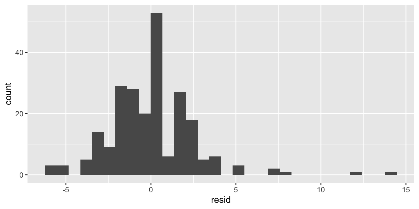
In this section we show the general code for making residual plots in R. We will look at how to make the three types of plots of the residuals to check the four assumptions.
When you run a linear model with the lm() function, you can use the
package modelr to easily obtain the residuals and predicted values
that you need for your plots. Let’s use the mpg data to illustrate the
general approach. This data set contains data on 234 cars. First we
model the number of city miles per gallon (cty) as a function of the
number of cylinders (cyl).
Next, we use the function add_residuals() from the modelr package to
add residuals to the data set and plot a histogram.
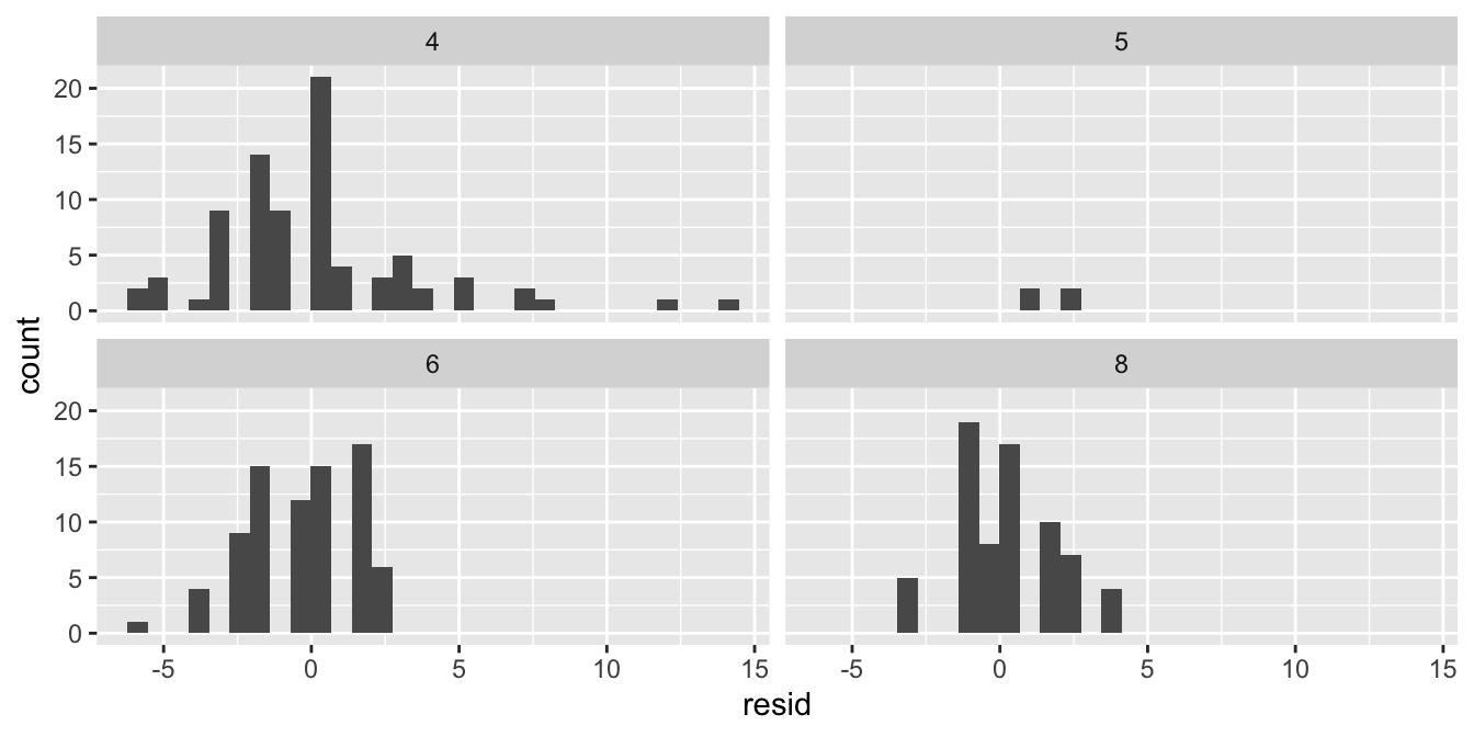
As stated earlier, it’s even better to do this for the different subgroups separately:
For a qq-plot, you can use
Note that you need to use sample instead of x for the aesthetics part.
For the second type of plot, we use two functions from the modelr
package to add predicted values and residuals to the data set, and use
these to make a residual plot:
mpg %>%
  add_residuals(out) %>%
  add_predictions(out) %>%
  ggplot(aes(x = pred, y = resid)) +
  geom_point()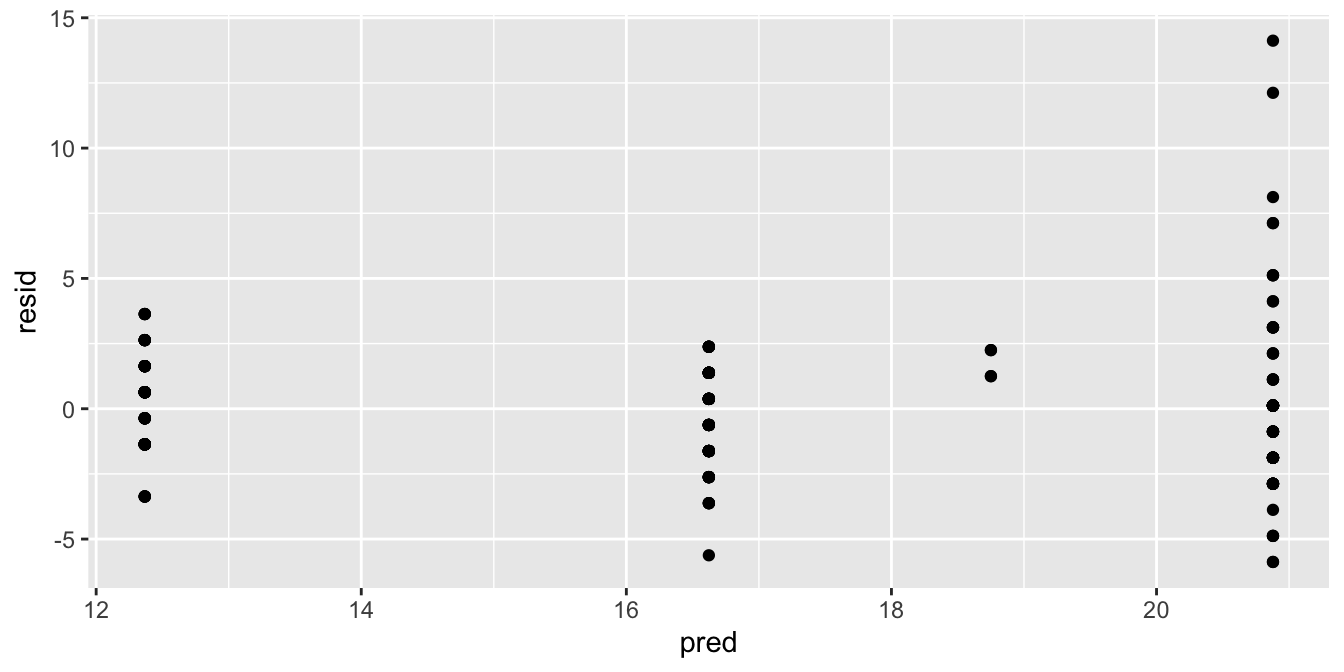
When there are few values for the predictions, or when you have a categorical predictor, it’s better to make a boxplot:
mpg %>%
  add_residuals(out) %>%
  add_predictions(out) %>%
  ggplot(aes(x = factor(pred), y = resid)) +
  geom_boxplot()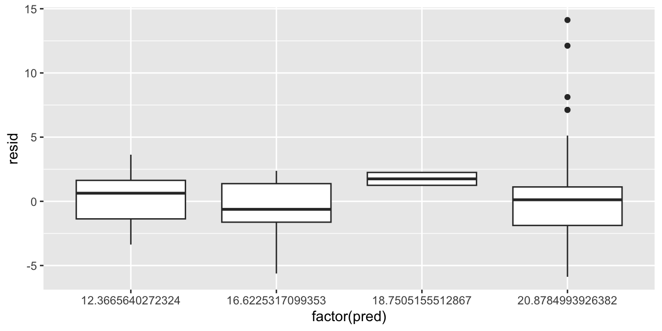
For the third type of plot, we put the predictor on the \(x\)-axis and the residual on the \(y\)-axis.
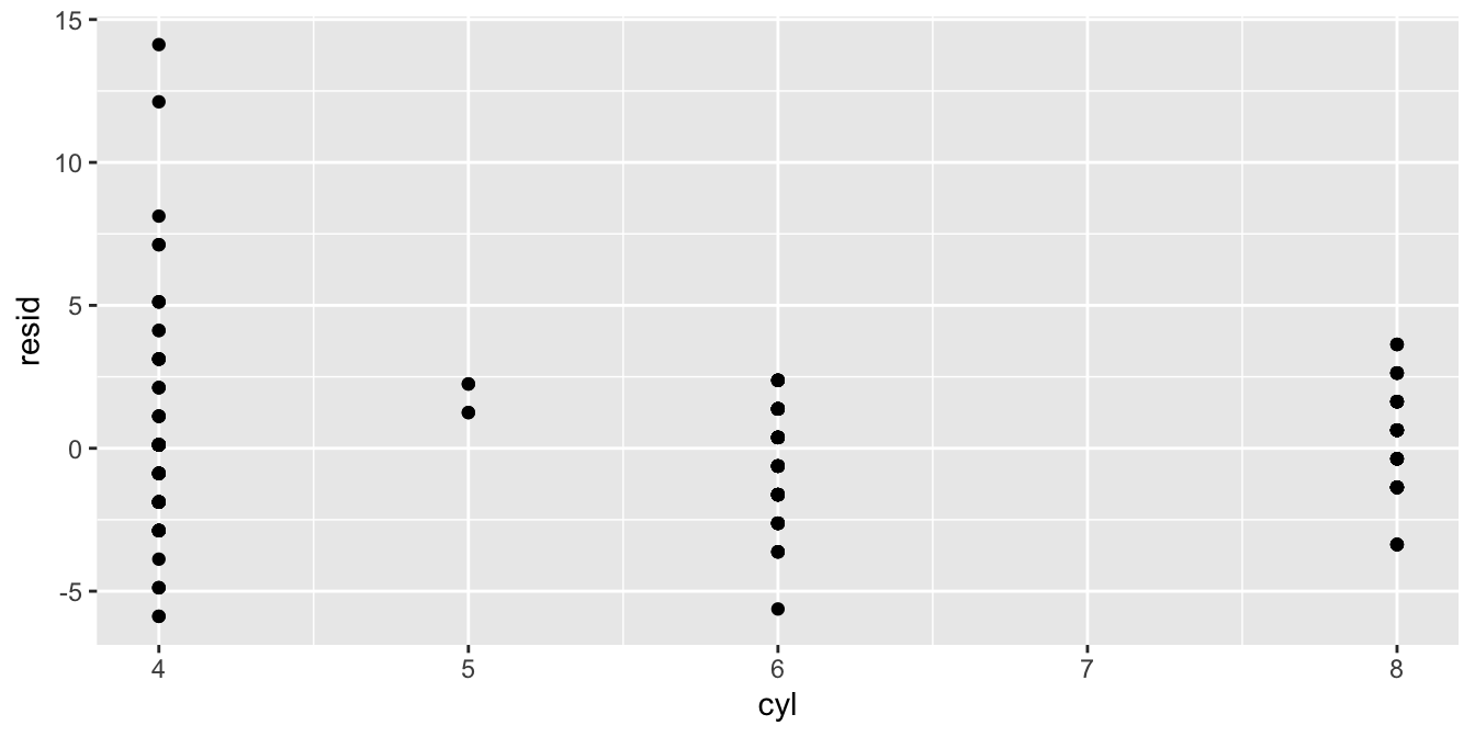
Again, with categorical variables or variables with very few categories, it is sometimes clearer to use a boxplot:
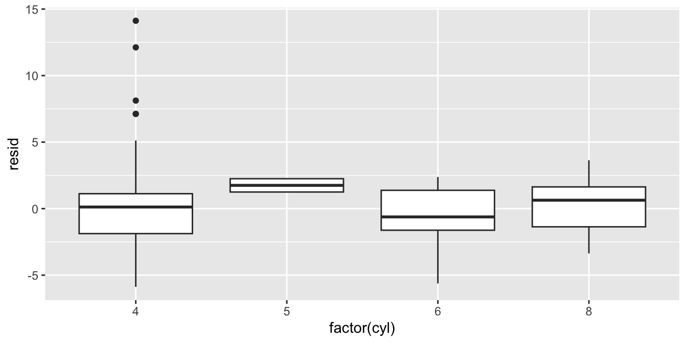
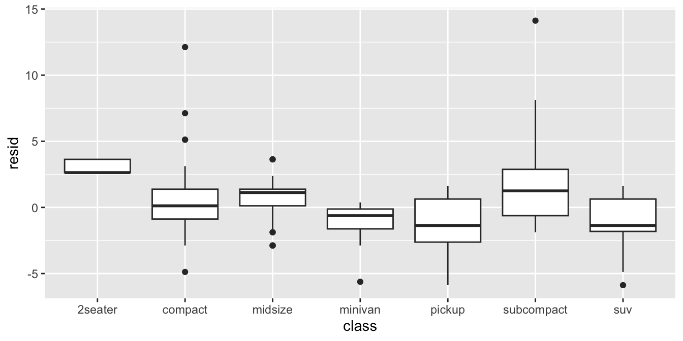
To check for independence you can also put variables on the \(x\)-axis
that are not in the model yet, for example the type of the car
(variable class):
7.8 Take-away points
The general assumptions of linear models are linearity (additivity), independence, normality and homogeneity of variance.
Linearity refers to the characteristic that the model equation is the summation of parameters, e.g. \(b_0 + b_1 X_1 + b_2 X_2 + \dots\).
Normality refers to the characteristic that the residuals are drawn from a normal distribution, i.e. \(e \sim N(0, \sigma^2)\).
Independence refers to the characteristic that the residuals are completely randomly drawn from the normal distribution. There is no systematic pattern in the residuals.
Homogeneity of variance (equal variance, homoscedasticity) refers to the characteristic that there is only one normal distribution that the residuals are drawn from, that is, with one specific variance. Variance of residuals should be the same for every meaningful subset of the data.
Assumptions are best checked visually.
Problems can often be resolved by some transformation of the data, for example taking the logarithm of a variable, or computing squares.
Inference is generally robust against violations of these assumptions, except for the independence assumption.