Chapter 2 Inference about a mean
2.1 The problem of inference
For the topic of inference, we turn to an example from biology. The human body is heavily controlled by hormones. One of the hormones involved in a healthy reproductive system is luteinising hormone (LH). This hormone is present in both females and males, but with different roles. In females, a sudden rise in LH levels triggers ovulation (the release of an egg from an ovary). We have a data set on luteinising hormone (LH) levels in one anonymous female. The data are given in Figure 2.1. In this data set, we have 48 measures, taken at 10-minute intervals. We see that LH levels show quite some variation over time. Suppose we want to know the mean level of luteinising hormone level in this woman, how could we do that?
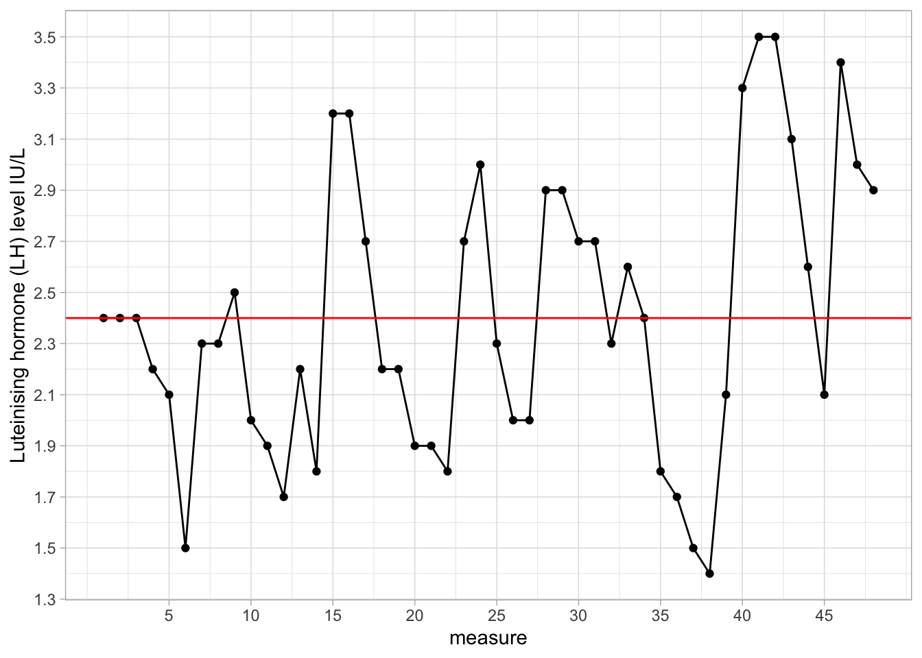
Figure 2.1: Luteinising hormone levels measured in one female, 48 measures taken at 10-minute intervals.
The easiest way is to compute the mean of all the values that we see in this graph. If we do that here, we get the value 2.4. That value is displayed as the red line in Figure 2.1. However, is that really the mean of the hormone levels during that time period? The problem is that we only have 48 measures; we do not have information about the hormone levels in between measurements. We see some very large differences between two consecutive measures, which makes the level of hormone look quite unstable. We lack information about hormone levels in between measurements because we do not have data on that. We only have information about hormone levels at the times where we have observed data. For the other times, we have unobserved or missing data.
Suppose that instead of the mean of the observed hormone levels, we want to know the mean of all hormone levels during this time period: not only those that are measured at 10-minute intervals, but also those that are not measured (unobserved/missing).
You could imagine that if we would measure LH not every 10 minutes, but every 5 minutes, we would have more data, and the mean of those measurements would probably be somewhat different than 2.4. Similarly, if we would take measurements every minute, we again would obtain a different mean. Suppose we want to know what the true mean is: the mean that we would get if we would measure LH continuously, that is, an infinite number of measurements. Unfortunately we only have these 48 measures to go on. We would like to infer from these 48 measures, what the mean is of LH level had we measured continuously.
This is the problem of inference: how to infer something about complete data, when you only see a small subset of the data. The problem of statistical inference is when you want to say something about an imagined complete data set, the population, when you only observe a relatively small portion of the data, the sample.
In order to show you how to do that, we do a thought experiment. Imagine a huge data set on African elephants where we measured the height of each elephant currently living (today around 415,000 individuals). Let’s imagine that for this huge data set, the mean and the variance are computed: a mean of 3.25 m and a variance of 0.14 (recall, from Chapter 1, that the variance is a measure of spread, based on the sums of squared differences between values and the mean). We call this data set of all African elephants currently living the population of African elephants.
Now that we know that the actual mean equals 3.25 and the actual variance equals 0.14, what happens if we only observe 10 of these 415,000 elephants? In our thought experiment we randomly pick 10 elephants. Random means that every living elephant has an equal chance of being picked. This random sample of 10 elephants is then used to compute a mean and a variance. Imagine that we do this exercise a lot of times: every time we pick a new random sample of 10 elephants, and you can imagine that each time we get slightly different values for our mean, but also for our variance. This is illustrated in Table 2.1, where we show the data from 5 different samples (in different columns), together with 5 different means and 5 different variances.
| elephant | sample1 | sample2 | sample3 | sample4 | sample5 |
|---|---|---|---|---|---|
| 1 | 2.96 | 2.94 | 3.76 | 3.08 | 2.91 |
| 2 | 3.48 | 3.41 | 3.62 | 3.92 | 3.00 |
| 3 | 3.33 | 3.19 | 3.50 | 4.12 | 3.61 |
| 4 | 3.40 | 2.61 | 3.28 | 3.44 | 2.87 |
| 5 | 3.85 | 3.09 | 3.58 | 3.57 | 2.72 |
| 6 | 3.50 | 3.46 | 3.21 | 3.36 | 3.87 |
| 7 | 3.40 | 3.21 | 3.41 | 3.81 | 3.29 |
| 8 | 2.52 | 3.24 | 3.19 | 3.10 | 2.97 |
| 9 | 3.70 | 3.04 | 2.98 | 3.16 | 2.73 |
| 10 | 3.20 | 3.31 | 3.14 | 3.43 | 3.73 |
| mean | 3.33 | 3.15 | 3.37 | 3.50 | 3.17 |
| variance | 0.13 | 0.05 | 0.05 | 0.11 | 0.16 |
What we see from this table is that the 5 sample means vary around the population mean of 3.25, and that the 5 variances vary around the population variance of 0.14. We see that therefore the mean based on only 10 elephants gives a rough approximation of the mean of all elephants: the sample mean gives a rough approximation of the population mean. Sometimes it is too low, sometimes it is too high. The same is true for the variance: the variance based on only 10 elephants is a rough approximation, or estimate, of the variance of all elephants: sometimes it is too low, sometimes it is too high.
2.2 Sampling distribution of mean and variance
How high and how low the sample mean can be, is seen in Figure 2.2. There you see a histogram of all sample means when you draw 10,000 different samples of each consisting of 10 elephants and for each sample compute the mean. This distribution is a sampling distribution. More specifically, it is the sampling distribution of the sample mean.
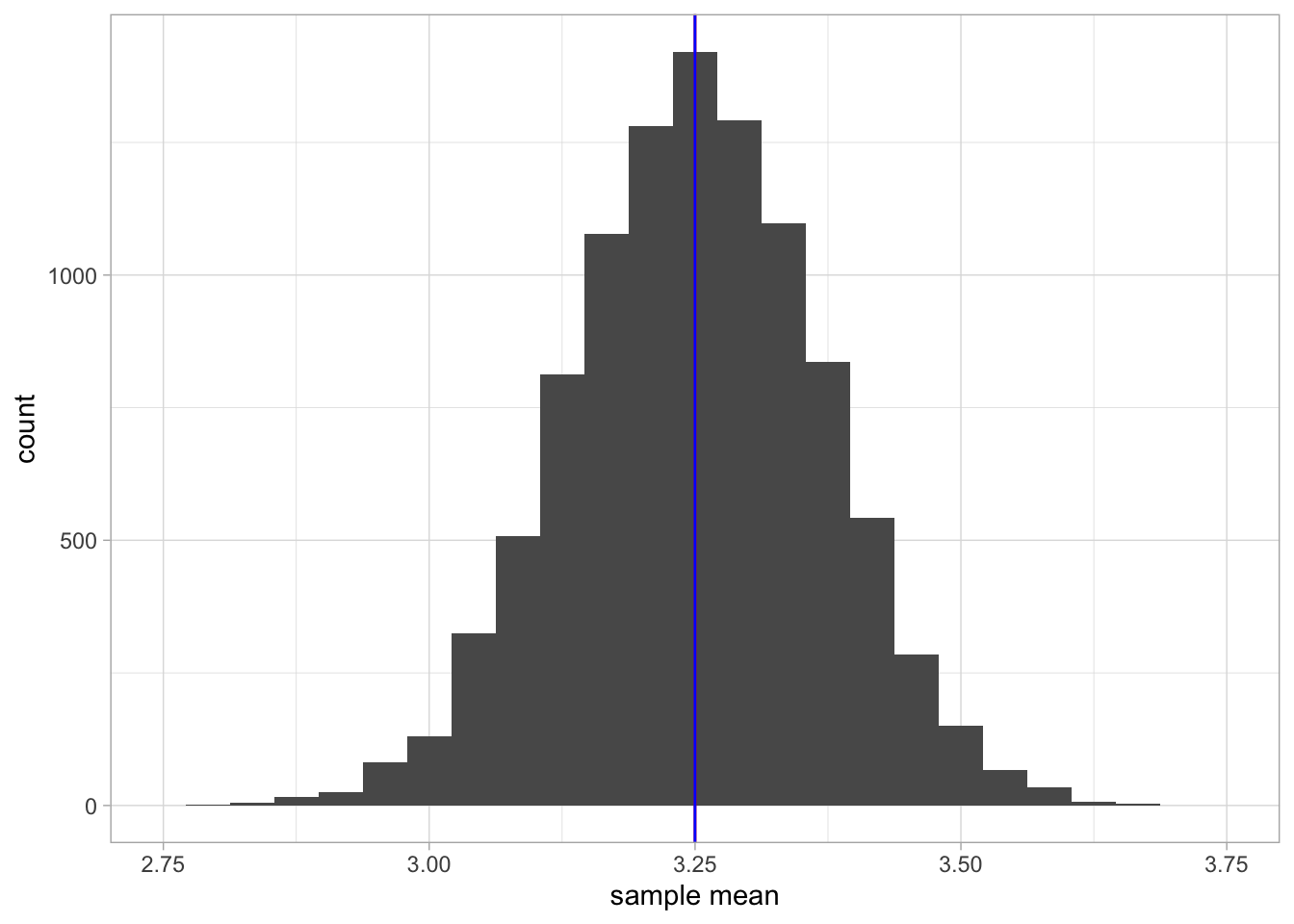
Figure 2.2: A histogram of 10,000 sample means when the sample size equals 10.
The red vertical line indicates the mean of the population data, that is, the mean of 3.25 (the population mean). The blue line indicates the mean of all these sample means together (the mean of the sample means). You see that these lines practically overlap.
What this sampling distribution tells you, is that if you randomly pick 10 elephants from a population, measure their heights, and compute the mean, this mean is on average a good estimate (approximation) of the mean height in the population. The mean height in the population is 3.25, and when you look at the sample means in Figure 2.2, they are generally very close to this value of 3.25. Another thing you may notice from Figure 2.2 is that the sampling distribution of the sample mean looks symmetrical and resembles a normal distribution.
Now let’s look at the sampling distribution of the sample variance. Thus, every time we randomly pick 10 elephants, we not only compute the mean but also the variance. Figure 2.3 shows the sampling distribution. The red line shows the variance of the height in the population, and the blue line shows the mean variance observed in the 10,000 samples. Clearly, the red and blue line do not overlap: the mean variance in the samples is slightly lower than the actual variance in the population. We say that the sample variance underestimates the population variance a bit. Sometimes we get a sample variance that is lower than the population value, sometimes we get a value that is higher than the population value, but on average we are on the low side.
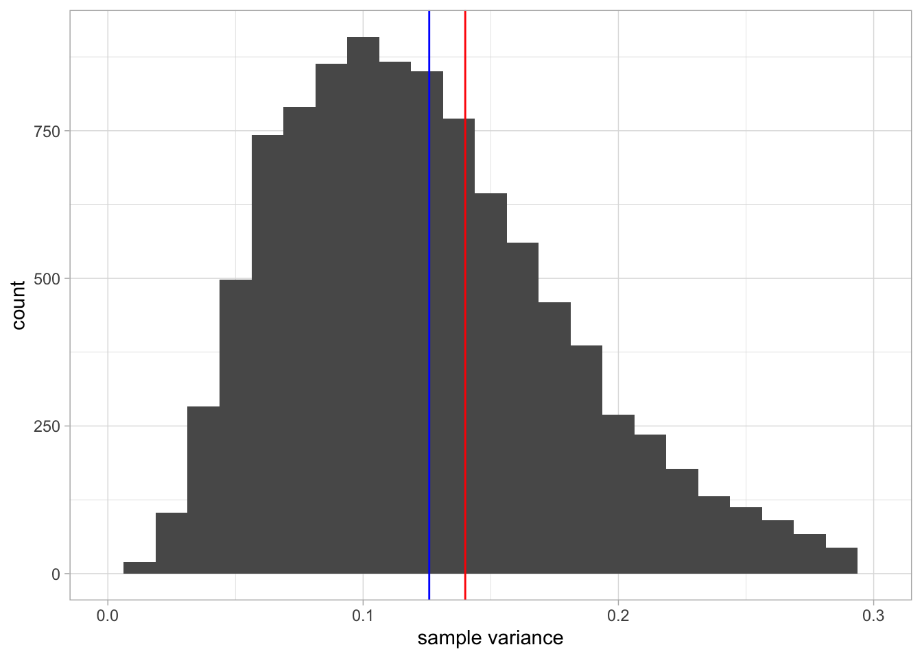
Figure 2.3: A histogram of 10,000 sample variances when the sample size equals 10. The red line indicates the population variance. The blue line indicates the mean of all variances observed in the 10,000 samples.
Overview
population: all values, both observed and unobserved
population mean: the mean of all values (observed and unobserved values)
sample: a limited number of observed values
sample size: the number of observed values
sample mean: the mean of the values in the sample
random sample: values that you observe when you randomly pick a subset of the population
random: each value in the population has an equal probability of being observed
sampling distribution of the sample mean: the distribution of means that you get when you randomly pick new samples from a population and for each sample compute the mean
sampling distribution of the sample variance: the distribution of variances that you get when you randomly pick new samples from a population and for each sample compute the variance
2.3 The effect of sample size
What we have seen so far is that when the population mean is 3.25 m and we observe only 10 elephants, we may get a value for the sample mean of somewhere around 3.25, but on average, we’re safe to say that the sample mean is a good approximation for the population mean. In statistics, we call the sample mean an unbiased estimator of the population mean, as the expected value (the average value we get when we take a lot of samples) is equal to the population value.
Unfortunately the same could not be said for the variance: the sample variance is not an unbiased estimator for the population variance. We saw that on average, the values for the variances are too low.
Another thing we saw was that the distribution of the sample means
looked symmetrical and close to normal. If we look at the sampling
distribution of the sample variance, this was less symmetrical, see
Figure 2.3. It actually has the shape of
a so-called \(\chi^2\)-(pronounced ‘chi-square’) distribution, which will
be discussed in Chapters 8, 14, 15 and 16. Let’s see what happens when we do not take
samples with 10 elephants each time, but 100 elephants.
Stop and think: What will happen to the sampling distributions of the
mean and the variance? For instance, in what way will Figure
2.2 change when we use 100
elephants instead of 10?
Figure 2.4 shows the sampling
distribution of the sample mean. Again the distribution looks normal,
again the blue and red lines overlap. The only difference with Figure
2.2 is the spread of the
distribution: the values of the sample means are now much closer to the
population value of 3.25 than with a sample size of 10. That means that
if you use 100 elephants instead of 10 elephants to estimate the
population mean, on average you get much closer to the true value!
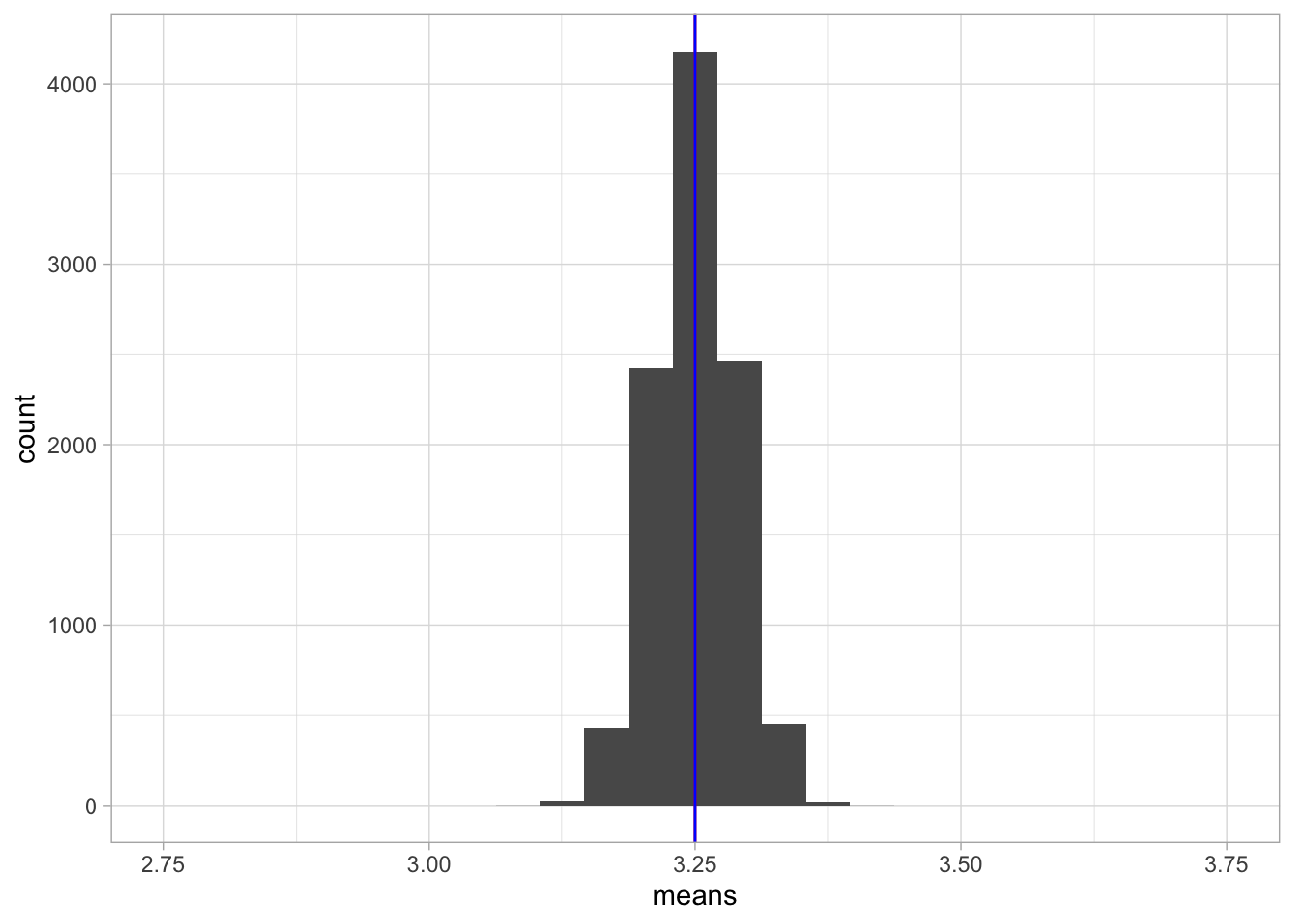
Figure 2.4: A histogram of 10,000 sample means when the sample size equals 100.
Now stop for a moment and think: is it logical that the sample means are
much closer to the population mean when you have 100 instead of 10
elephants?
Yes, of course it is, with 100 elephants you have much more information
about elephant heights than with 10 elephants. And if you have more
information, you can make a better approximation (estimation) of the
population mean.
Figure 2.5 shows the sampling distribution of the sample variance. Compared to a sample size of 10, the shape of the distribution now looks more symmetrical and closer to normal. Second, similar to the distribution of the means, there is much less variation in values: all values are now closer to the true value of 0.14. And not only that: it also seems that the bias is less, in that the blue and the red lines are closer to each other.
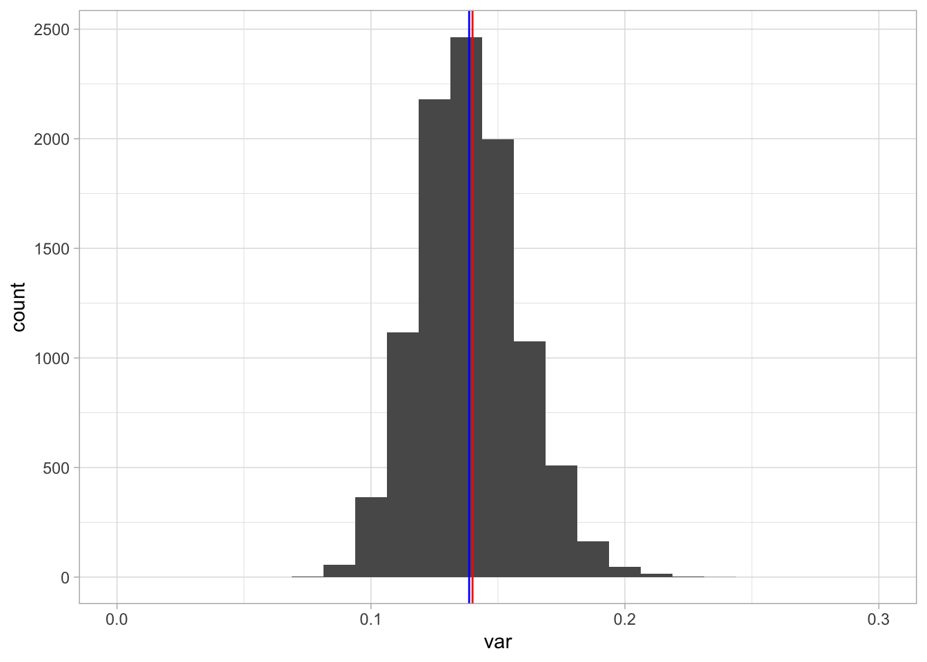
Figure 2.5: A histogram of 10,000 sample variances when the sample size equals 100.
Here we see three phenomena. The first is that if you have a statistic like a mean or a variance and you compute that statistic on the basis of randomly picked sample data, the distribution of that statistic (i.e., the sampling distribution) will generally look like a normal distribution if sample size is large enough.
It can actually be proven that the distribution of the mean will become a normal distribution if sample size becomes large enough. This phenomenon is known as the Central Limit Theorem. It is true for any population, no matter what distribution it has.12 Thus, this means that height in elephants itself does not have to be normally distributed, but the sampling distribution of the sample mean will be normal for large sample sizes (e.g., 100 elephants).
The second phenomenon is that the sample mean is an unbiased estimator of the population mean, but that the variance of the sample data is not an unbiased estimator of the population variance. Let’s denote the variance of the sample data as \(S^2\). Remember from Chapter 1 that the formula for the variance is
\[\begin{aligned} S^2 = \mathrm{Var}(Y) = \frac{\Sigma (y_i - \bar{y})^2}{n}\end{aligned}\]
We saw that the bias was large for small sample size and small for larger sample size. So somehow we need to correct for sample size. It turns out that the correction is a multiplication with \(\frac{n}{n-1}\):
\[\begin{aligned} s^2 = \frac{n}{n-1}{S^2}\end{aligned}\]
where \(s^2\) is the corrected estimator of population variance, \(S^2\) is the variance observed in the sample, and \(n\) is sample size. When we rewrite this formula and cancel out \(n\), we get a more direct way to compute \(s^2\):
\[\begin{aligned} s^2 = \frac{\Sigma (y_i - \bar{y})^2}{n-1}\end{aligned}\]
Thus, if we are interested to know the variance or the standard deviation in the population, and we only have sample data, it is better to take the sums of squares and divide by \(n-1\), and not by \(n\).
\[\begin{aligned} \widehat{\sigma^2} = s^2 = \frac{\Sigma (y_i - \bar{y})^2}{n-1}\end{aligned}\]
where \(\widehat{\sigma^2}\) (pronounced ‘sigma-squared hat’) signifies the estimator of the population variance (the little hat stands for estimator or estimated value).
The third phenomenon is that if sample size increases, the variability of the sample statistic gets smaller and smaller: the values of the sample means and the sample variances get closer to their respective population values. We will delve deeper into this phenomenon in the next section.
Overview
Central Limit Theorem: says that the sampling distribution of the sample mean will be normally distributed for infinitely large sample sizes.
estimator: a quantity that you compute based on sample data, that you hope says something about a quantity in the population data. For instance, you can use the sample mean and hope that it is close to the population mean. You use the sample mean as an approximation of the population mean.
estimate: the actual value that you get when computing an estimator. For instance, we can use the sample mean as the estimator of the population mean. The formula for the sample mean is \(\frac{\Sigma y_i}{n}\) so this formula is our estimator. Based on a sample of 10 values, you might get a sample mean of 3.5. Then 3.5 is the estimate for the population mean.
unbiased estimator: an estimator that has the population value as expected value (the mean that you get when averaging over many samples). For example, the sample mean is an unbiased estimator for the population mean because if you draw an infinite number of samples, the mean of the sample means will be equal to the population mean.
biased estimator: an estimator that does not have the population value as expected value. For example, the variance calculated using a sample is a biased estimator for the population variance because if you draw an infinite number of samples, the mean of the variances will not be equal to the population variance.
\(S^2\): the variance of the values in the sample, computed by taking the sum of squares and divide by sample size \(n\).
\(s^2\): an unbiased estimator for the population variance, often confusingly called the ‘sample variance’, computed by taking the sum of squares and divide by \(n-1\).
2.4 The standard error
In Chapter 1 we saw that a measure for spread and variability was the variance. In the previous section we saw that with sample size 100, the variability of the sample mean was much lower than with sample size 10. Let’s look at this more closely.
When we look at the sampling distribution in Figure 2.2 with sample size 10, we see that the means lie between 2.80 and 3.71. If we compute the standard deviation of the sample means, we obtain a value of 0.118. This standard deviation of the sample means is technically called the standard error, in this case the standard error of the mean. It is a measure of how uncertain we are about a population mean when we only have sample data to go on. Think about this: why would we associate a large standard error with very little certainty? In this case we have only 10 data points for each sample, and it turns out that the standard error of the mean is a function of both the sample size \(n\) and the population variance \(\sigma^2\).
\[\sigma_{\bar{y}} = \sqrt{\frac{\sigma^2}{n}}\]
Here, the population variance equals 0.14 and sample size equals 10, so the \(\sigma_{\bar{y}}\) equals \(\sqrt{\frac{0.14}{10}} = 0.118\), close to our observed value. If we fill in the formula for a sample size of 100, we obtain a value of 0.037. This is a much smaller value for the spread and this is indeed observed in Figure 2.4. Figure 2.6 shows the standard error of the mean for all sample sizes between 1 and 200.
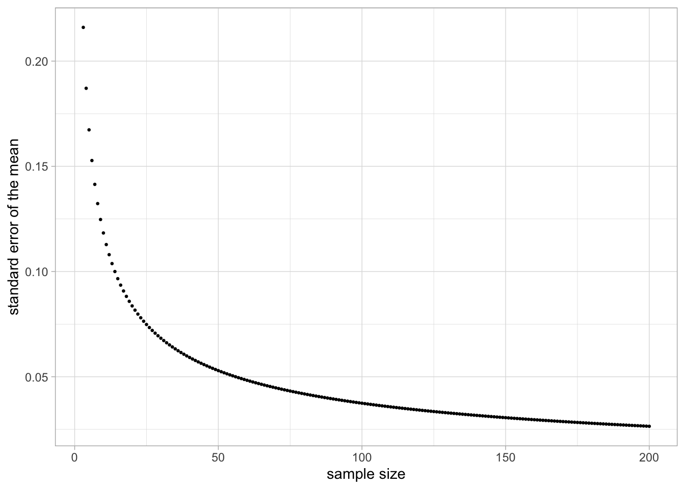
Figure 2.6: Relationship between sample size and the standard error of the mean, when the population variance equals 0.14.
In sum, the standard error of the mean is the standard deviation of the sample means, and serves as a measure of the uncertainty about the population mean. The larger the sample size, the smaller the standard error, the closer a sample mean is expected to be around the population mean, the more certain we can be about the population mean.
Similar to the standard error of the mean, we can compute the standard error of the variance. This is more complicated – especially if the population distribution is not normal – and we do not treat it here. Software can do the computations for you, and later in this book you will see examples of the standard error of the variance.
Summarising the above: when we have a population mean, we usually see that the sample mean is close to it, especially for large sample sizes. If you do not understand this yet, go back before you continue reading.
The larger the sample size, the closer the sample means are to the population means. If you turn this around, if you don’t know the population mean, you can use a large sample size, calculate the sample mean, and then you have a fairly good estimate for the population. This is useful for our problem of the LH levels, where we have 48 measures. The mean of the 48 measurements could be a good approximation of the mean LH level in general.
As an indication of how close you are to the population mean, the standard error can be used. The standard error of the mean is the standard deviation of the sampling distribution of the sample mean. The smaller the standard error, the more confident you can be that your sample mean is close to the population mean. In the next section, we look at this more closely. If we use our sample mean as our best guess for the population mean, what would be a sensible range of other possible values for the population mean, given the standard error?
Overview
standard error of the mean: the standard deviation of the distribution of sample means (the sampling distribution of the sample mean). Says something about how spread out the values of the sample means are. It can be used to quantify the uncertainty about the population mean when we only have the sample mean to go on.
standard error of the variance: the standard deviation of the sampling distribution of the sample variance. Says something about how spread out the values of the sample variances are. It can be used to quantify the uncertainty about the population variance when we only have the variance of the sample values to go on.
2.5 Confidence intervals
If we take a sample mean as our best guess of the population mean, we know that we are probably a little bit off. If we have a large standard error we know that the population mean could be very different from our best guess, and if we have a small standard error we know that the true population mean is pretty close to our best guess, but could we quantify this in a better way? Could we give a range of plausible values for the population mean?
In order to do that, let’s go back to the elephants: the true population mean is 3.25 m with variance 0.14. What would possible values of sample means look like if sample size is 4? Of course it would look like the sampling distribution of the sample mean with a sample size of 4. Its mean would be the population mean of 3.25 and its standard deviation would be equivalent to the standard error, computed as a function of the population variance and sample size, in our case \(\sqrt{\frac{0.14}{4}}= 0.19\). Now imagine that for a bunch of samples we compute the sample means. We know that the means for large sample sizes will look more or less like a normal distribution, but how about for a small sample size like \(n=4\)? If it would look like a normal distribution too, then we could use the knowledge about the standard normal distribution to say something about the distribution of the sample means.
For the moment, let’s assume the sample size is not 4, but 4000. From the Central Limit Theorem we know that the distribution of sample means is almost identical to a normal distribution, so let’s assume it is normal. From the normal distribution, we know that 68% of the observations lies between 1 standard deviation below and 1 standard deviation above the mean (see Section 1.19 and Figure 1.9). If we would therefore standardise our sample means, we could say something about their distribution given the standard error, since the standard error is the standard deviation of the sampling distribution. Thus, if the sampling distribution looks normal, then we know that 68% of the sample means lies between one standard error below the population mean and one standard error above the population mean.
So suppose we take a large number of samples from the population, compute means and variances for each sample, so that we can compute standardised scores. Remember from Chapter 1 that a standardised score is obtained by subtracting an observed score from the mean and divide by the standard deviation:
\[z_y = \frac{y - \bar{y}}{sd_y}\]
If we apply standardisation of the sample means, we get the following: for a given sample mean \(\bar{y}\) we subtract the population mean \(\mu\) and divide by the standard deviation of the sample means (the standard error):
\[z_{\bar{y}} = \frac{\bar{y} - \mu}{\sigma_{\bar{y}}}\]
If we then have a bunch of standardised sample means, their distribution should have a standard normal distribution with mean 0 and variance 1. We know that for this standard normal distribution, 68% of the values lie between -1 and +1, meaning that 68% of the values in a non-standardised situation lie between -1 and +1 standard deviations from the mean (see Section 1.19). That implies that 68% of the sample means lie between -1 and +1 standard deviations (standard errors!) from the population mean. Thus, 68% of the sample means lie between \(-1 \times \sigma_{\bar{y}}\) and \(+1 \times \sigma_{\bar{y}}\) from the population mean \(\mu\). If we have sample size 4000, \(\sigma_{\bar{y}}\) is equal to \(\sqrt{\frac{0.14}{4000}} =\) 0.006 and \(\mu = 3.25\), so that 68% of the sample means lie between 3.244 and 3.256.
This means that we also know that \(100-68=32\)% of the sample means lie farther away from the mean: that it occurs in only 32% of the samples that a sample mean is smaller than 3.244 and larger than 3.256. Taking this a bit further, since we know that 95% of the values in a standard normal distribution lie between -1.96 and +1.96 (see Section 1.19), we know that it happens in only 5% of the samples that the sample mean is smaller than \(3.25 - 1.96 \times \sqrt{\frac{0.14}{4000}} =\) 3.238 or larger than \(3.25 + 1.96 \times \sqrt{\frac{0.14}{4000}} =\) 3.262. Another way of putting this is that it happens in only 95% of the samples that a sample mean is at most \(1.96 \times \sqrt{\frac{0.14}{4000}}\) away from the population mean 3.25. This distance of 1.96 times the standard error is called the margin of error (MoE). Here we focus on the margin of error that is based on 95% observations of the observations seen in the normal distribution:
\[MoE_{0.95} = z_{0.95} \times \sigma_{\bar{y}} = 1.96 \times \sigma_{\bar{y}}\]
where \(z_{0.95}\) is the standardised value \(z\) for which holds that 95% of the values are between \(\mu- z\) and \(\mu+ z\) (i.e., 1.96).
Knowing the population mean, we know that it is very improbable (5%) that a sample mean is farther away from the population mean than this margin of error. The next step is tricky, so pay close attention. If we know the population mean, we can construct an interval based on the margin of error for where we expect sample means to lie. In the above case, knowing that the population mean is 3.25, and we use an MoE based on 95%, we expect that 95% of the sample means will lie between \(3.25 - \textrm{MoE}\) and \(3.25 + \textrm{MoE}\).
But what if we don’t know the population mean, but do know the sample mean? We could use the same interval but centred around the sample mean instead of the population mean. Thus, we have a 95% interval if we take the sample mean as the centre and the MoE around it. Suppose that we randomly draw 4000 elephants and we obtain a sample mean of \(\bar{y} = 3.26\), then we construct the 95% interval as running from \(\bar{y} - MoE = 3.26 - MoE\) to \(\bar{y} + MoE = 3.26 + MoE\). The margin of error is based on the standard error, which is in turn dependent on the population variance. If we don’t know that, we have to estimate it from the sample. So suppose we find a sample variance \(s^2 = 0.15\), we get the 95% interval from \(\bar{y} - MoE = 3.26 - 1.96 \times \sqrt{\frac{0.15}{4000}}\) to \(\bar{y} + MoE = 3.26 + 1.96 \times \sqrt{\frac{0.15}{4000}}\).
Such an interval, centred around the sample mean, is called a confidence interval. Because it is based on 95% of the sampling distribution (centred around the population mean) it is called a 95% confidence interval.
One way of thinking about this interval is that it represents 95% of the sample means had the population mean been equal to the sample mean. For example, a 95% interval around the sample mean of 3.26 represents 95% of the sample means that you would get if you would take many random samples from a population distribution with mean 3.26: the middle 95% of the sampling distribution for a population mean of 3.26.
A 95% confidence interval contains 95% of the sample means had the population mean been equal to the sample mean. Its construction is based on the estimated sampling distribution of the sample mean.
The idea is illustrated in Figure 2.7. There you see two sampling distributions: one for if the population mean is 3.25 (blue) and one for if the population mean is 3.26 (black). Both are normal distributions because sample size is large, and both have the same standard error that can be estimated using the sample variance. Whatever the true population mean, we can estimate the margin of error that goes with 95% of the sampling distribution. We can then construct an interval that stretches the length of about twice (i.e., 1.96) the margin of error around any value. We can do that for the real population mean (in blue), but the problem that we face in practice is that we don’t know the population mean. We do know the sample mean, and if we centre the interval around that value, we get what is called the 95% confidence interval. We see that it ranges from 3.248 to 3.272. This we can use as a range of plausible values for the unknown population mean. With some level of ‘confidence’ we can say that the population mean is somewhere in this interval.
## Warning in geom_segment(aes(x = 3.25 - MoE, xend = 3.25 + MoE, y = 10, yend = 10), : All aesthetics have length 1, but the data has 141 rows.
## ℹ Please consider using `annotate()` or provide this layer with data containing
##   a single row.
## Warning in geom_segment(aes(x = 3.26 - MoE, xend = 3.26 + MoE, y = 11, yend = 11), : All aesthetics have length 1, but the data has 141 rows.
## ℹ Please consider using `annotate()` or provide this layer with data containing
## a single row.## Warning in geom_segment(aes(x = 3.26 - MoE, xend = 3.26 - MoE, y = 11, yend = 0), : All aesthetics have length 1, but the data has 141 rows.
## ℹ Please consider using `annotate()` or provide this layer with data containing
## a single row.## Warning in geom_segment(aes(x = 3.26 + MoE, xend = 3.26 + MoE, y = 11, yend = 0), : All aesthetics have length 1, but the data has 141 rows.
## ℹ Please consider using `annotate()` or provide this layer with data containing
## a single row.## Warning in geom_text(aes(label = "MoE", x = 3.255, y = 13)): All aesthetics have length 1, but the data has 141 rows.
## ℹ Please consider using `annotate()` or provide this layer with data containing
## a single row.## Warning in geom_text(aes(label = "MoE", x = 3.265, y = 13)): All aesthetics have length 1, but the data has 141 rows.
## ℹ Please consider using `annotate()` or provide this layer with data containing
## a single row.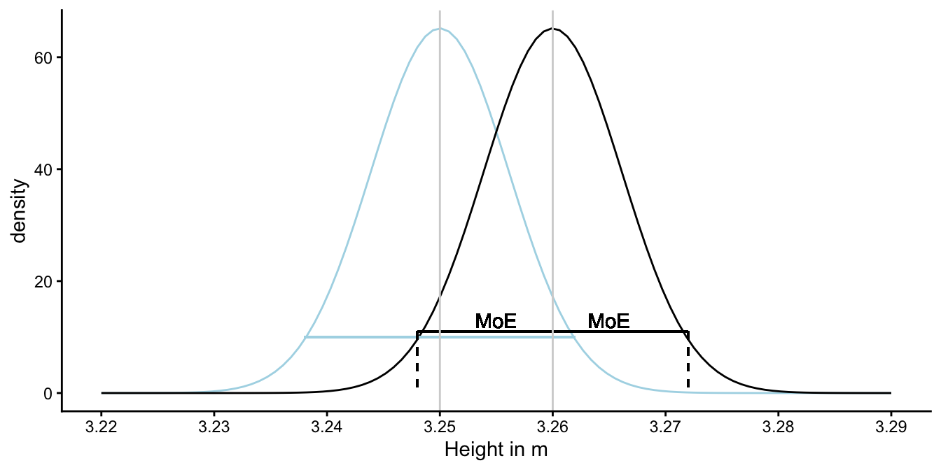
Figure 2.7: Illustration of the construction of a 95% confidence interval. Suppose we find a sample mean of 3.26 and a sample variance of 0.15, with \(n = 4000\). The black curve represents the sampling distribution if the population mean would be 3.26 and a variance of 0.15. In reality, we don’t know the population mean, it could be 3.25 or any other value. The sampling distribution for 3.25 is shown by the blue curve. Whatever the case, the length of an interval that contains 95% of the sample means is always the same: twice the margin of error. This interval centred around the sample mean, is called the 95% confidence interval.
Note that when we say: the 95% confidence interval runs from 3.248 to 3.272, we cannot say, we are 95% sure that the population mean is in there. ‘Confidence’ is not the same as probability. We’ll talk about this in a later section. First, we look at the situation where sample size is small so that we cannot use the Central Limit Theorem.
2.6 The \(t\)-statistic
In the previous section, we constructed a 95% confidence interval based on the standard normal distribution. We know from the standard normal distribution that 95% of the values are between -1.96 and +1.96. We used the standard normal distribution because the sampling distribution will look normal if sample size is large. We took the example of a sample size of 4000, and then this approach works fine, but remember that the actual sample size was 4. What if sample size is not large? Let’s see what the sampling distribution looks like in that case.
Remember from the previous section that we standardised the sample means.
\[z_{\bar{y}} = \frac{\bar{y}- \mu}{\sigma_{\bar{y}}}\]
and that \(z_{\bar{y}}\) has a standard normal distribution. But, this only works if we have a good estimate of \(\sigma_{\bar{y}}\), the standard error. If sample size is limited, our estimate is not perfect. You can probably imagine that if you take one sample of 4 randomly selected elephants, you get one value for the estimated standard error (\(\sqrt{\frac{s^2}{n}}\)), and if you take another sample of 4 elephants, you get a slightly different value for the estimated standard error. Because we do not always have a good estimate for \(\sigma_{\bar{y}}\), the standardisation becomes a bit more tricky. Let’s call the standardised sample mean \(t\) instead of \(z\):
\[t_{\bar{y}_i} = \frac{\bar{y}_i - \mu}{\sqrt{\frac{s^2_i}{n}}}\]
Thus, a standardised sample mean for sample \(i\), will be constructed using an estimate for the standard error by computing the sample variance \(s^2\) for sample \(i\).
If you standardise every sample mean, each time using a slighly different standard deviation, and you plot a histogram of the \(t\)-values, you do not get a standard normal distribution, but a slightly different one.
In summary: if you know the standard error (because you know the population variance), the standardised sample means will show a normal distribution. If you don’t know the standard error, you have to estimate it based on the sample variance. If sample size is really large, you can estimate the population variance pretty well, and the sample variances will be very similar to each other. In that case, the sampling distribution will look very much like a normal distribution. But if sample size is relatively small, each sample will show a different sample variance, resulting in different standard error estimates. If you standardise each sample mean with a different standard error, the sampling distribution will not look normal. This distribution is called a \(t\)-distribution. The difference between this distribution and the standard normal distribution is shown in Figure 2.8. The blue curve is the standard normal distribution, the red curve is the distribution we get if we have sample size 4 and we compute \(t_{\bar{y}_i} = \frac{\bar{y}_i - \mu}{\sqrt{\frac{s^2_i}{n}}}\) for many different samples.
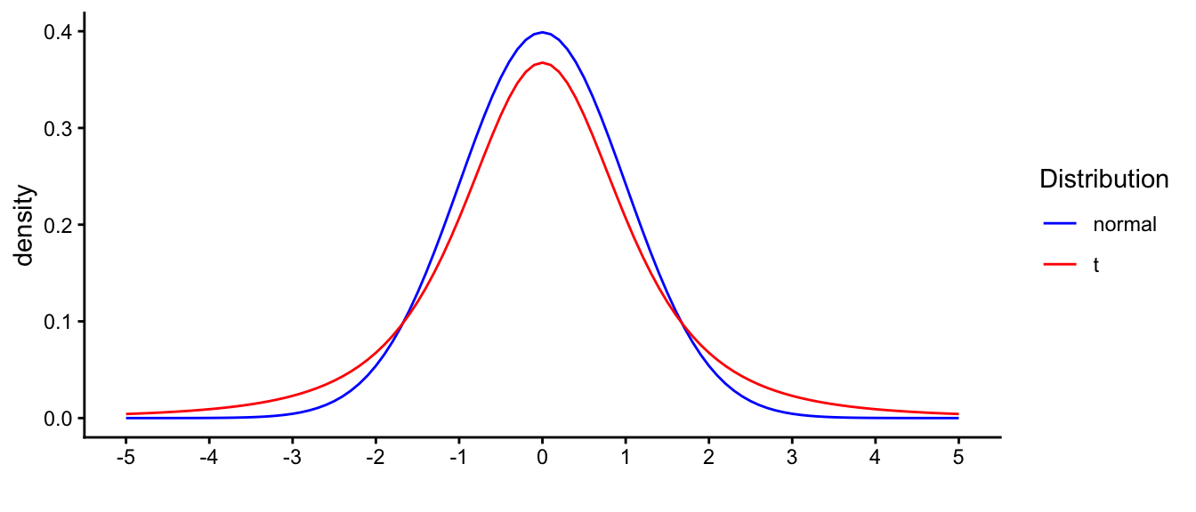
Figure 2.8: Distribution of t with sample size 4, compared with the standard normal distribution.
When you compare the two distributions, you see that compared to the normal curve, there are fewer observations around 0 for the \(t\)-distribution: the density around 0 is lower for the red curve than for the blue curve. That’s because there are more observations far away from 0: in the tails of the distributions, you see a higher density for the red curve (\(t\)) than for the blue curve (normal). They call this phenomenon ‘heavy-tailed’: relatively more observations in the tails than around the mean.
That the \(t\)-distribution is heavy-tailed has important implications. From the standard normal distribution, we know that 5% of the observations lie more than 1.96 away from the mean. But since there are relatively more observations in the tails of the \(t\)-distribution, 5% of the values lie farther away from the mean than 1.96. This is illustrated in Figure 2.9. If we want to construct a 95% confidence interval, we can therefore no longer use the 1.96 value.
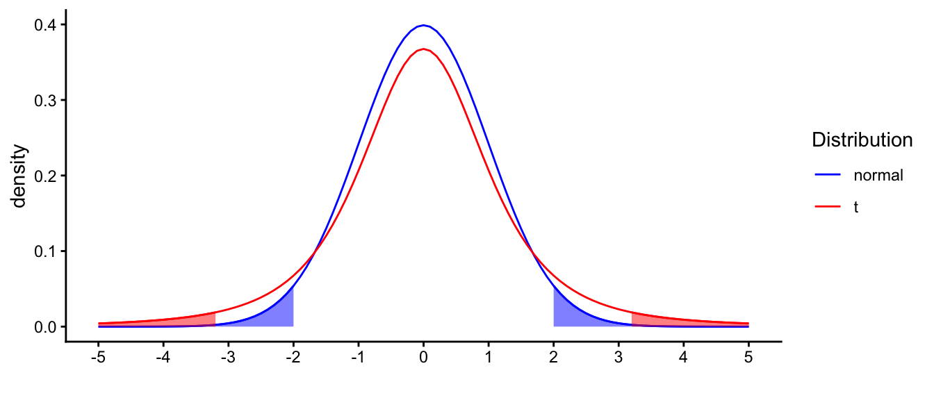
Figure 2.9: Distribution of t with sample size 4, compared with the standard normal distribution. Shaded areas represent 2.5% of the respective distribution.
With this \(t\)-distribution, 95% of the observations lie between -3.18 and +3.18. Of course, that is in the standardised situation. If we move back to our scale of elephant heights with a sample mean of 3.26, we have to transform this back to elephant heights. So -3.18 times the standard error away from the mean of 3.26, is equal to \(3.26 - 3.18 \times \sqrt{\frac{0.15}{4}} =\) 2.64, and +3.18 times the standard error away from the mean of 3.26, is equal to \(3.26 + 3.18 \times \sqrt{\frac{0.15}{4}} =\) 3.88. So the 95% interval runs from 2.64 to 3.88. This interval is called the 95% confidence interval, because 95% of the sample means will lie in this interval, if the population mean would be 3.26.
Notice that the interval includes the population mean of 3.25. If we would interpret this interval around 3.26 as containing plausible values for the population mean, we see that in this case, this is a fair conclusion, because the true value 3.25 lies within this interval.
2.7 Interpreting confidence intervals
The interpretation of confidence intervals is very difficult, and it often goes wrong, even in many textbooks on the matter.
One thing that should be very clear is that a confidence interval is constructed as if you know the population mean and variance, which, of course, you don’t. We assume that the population mean is a certain value, say \(\mu=m_0\), we assume that the standard error of the mean is equal to \(\sigma_{\bar{y}}\), and we know that if we would look at many many samples and compute standardised sample means (by using sample means \(\bar{y}\) and sample variances \(s^2\)), their distribution would be a \(t\)-distribution. Based on that \(t\)-distribution, we know in which interval 95% of the standardised sample means would lie and we use that to compute the margin of error and to construct an interval around the sample mean that we actually obtain. A lot of this reasoning is imagination: imagining that you know the population mean and the population variance. Then you imagine what sample means would be reasonable to find and what sample variances. But of course, it’s in fact the opposite: you only know the mean and variance of one sample and you want to know what are plausible values for the population mean.
You have to bear this reversal in mind when interpreting the 95% confidence interval around a sample mean. Many people state the following: with 95% probability, the 95% confidence interval contains the population mean. This is wrong. It is actually the opposite: the 95% interval around the population mean contains 95% of the sample means.
If you know the population mean \(\mu\), then 95% of the confidence intervals that you construct around the sample means that you get from random sampling will contain the mean \(\mu\). This is illustrated in Figure 2.10. Suppose we take \(\mu = 3.25\). Then if we imagine that we take 100 random samples from this population distribution, we can calculate 100 sample means and 100 sample variances. If we then construct 100 confidence intervals around these 100 sample means, we obtain the confidence intervals displayed in Figure 2.10. We see that 95 of these intervals contain the value 3.25, and 5 of them don’t: only in samples 1, 15, 20, 28 and 36, the interval does not contain 3.25.
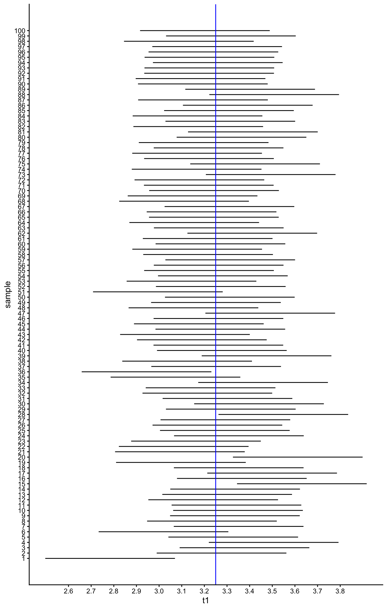
Figure 2.10: Confidence intervals.
It can be mathematically shown that given a certain population mean, when taking many, many samples and constructing 95% confidence intervals, you can expect 95% of them will contain that population mean. That does not mean however that given a sample mean with a certain 95% interval, that interval contains the population mean with a probability of 95%. It only means that were this procedure of constructing confidence intervals to be repeated on numerous samples, the fraction of calculated confidence intervals that contain the true population mean would tend toward 95%. If you only do it once (you obtain a sample mean and you calculate the 95% confidence interval) it either contains the population mean or it doesn’t: you cannot calculate a probability for this. In the statistical framework that we use in this book, one can only say something about the probability of data occurring given some population values:
Given that the population value is 3.25, and if you take many, many independent samples from the population, you can expect that 95% of the confidence intervals constructed based on resulting sample means will contain that population value of 3.25.
Using this insight, we therefore conclude that the fact we see the value of 3.25 in our 95% confidence interval around 2.9, gives us some reason to believe (‘confidence’) that 3.25 could also be a plausible candidate for the population mean.
Summarising, if we find a sample mean of say 2.9, we know that 2.9 is a reasonable guess for the population mean (it’s an unbiased estimator). Moreover, if we construct a 95% confidence interval around this sample mean, this interval contains other plausable candidates for the population mean. However, it might be possible that the true population mean is not included.
2.8 \(t\)-distributions and degrees of freedom
The standardised deviation of a sample mean from a hypothesised population mean has a \(t\)-distribution. This happens when the population variance is not known, and we therefore have to estimate the standard error based on the sample variance. Because of this uncertainty about the population variance and consequently the standard error, the standardised score does not have a normal distribution but a \(t\)-distribution.
In the previous section we saw the distribution for the case that we had a sample size of 4. With such a small sample size, we have a very inaccurate estimate of the population variance. The sample variance \(s^2\) will be very different for every new sample of size 4. But if sample size increases, our estimates for the population variance will become more precise, and they will show less variability. This results in the sampling distribution to become less heavy-tailed, until it closely resembles the normal distribution for very large sample sizes.
This means that the shape of the sampling distribution is a \(t\)-distribution but that the shape of this \(t\)-distribution depends on sample size. More precisely, the shape of the \(t\)-distribution depends on its so-called degrees of freedom (explained below). Degrees of freedom are directly linked to the sample size. Degrees of freedom can be as small as 1, very large like 250, or infinitely larger. The \(t\)-distribution with many degrees of freedom like 2500, is practically indistinguishable from a normal distribution. However for a relatively low number of degrees of freedom, the shape is very different: relatively more observations are in the tails of the distribution and less so in the middle, compared to the normal distribution, see Figure 2.11.
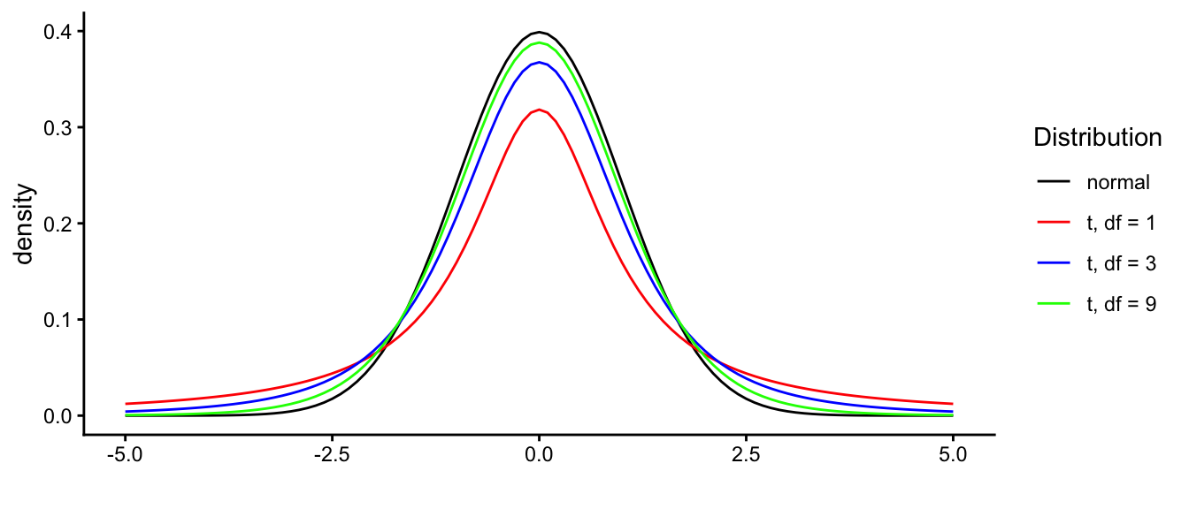
Figure 2.11: Difference in the shapes of the standard normal distribution and t-distributions with 1, 3 and 9 degrees of freedom.
The shape of the \(t\)-distribution is determined by its degrees of freedom: the higher the degrees of freedom, the more it resembles the normal distribution. So which \(t\)-distribution do we have to use when we are dealing with sample means and we want to infer something about the population mean, and what are degrees of freedom? As stated already above, the degrees of freedom is directly related to sample size: sample size determines the degrees of freedom of the \(t\)-distribution that we need. Degrees of freedom stands for the amount of information that we have and of course that depends on how many data values we have. In its most general case, the number of degrees of freedom is the number of values in the final calculation of a statistic that are free to vary. More specifically in our case, the degrees of freedom for a statistic like \(t\) are equal to the number of independent scores that go into the estimate, minus the number of parameters used as intermediate steps in the estimation of the parameter itself.
In the example above we had information about 4 elephants (4 values), so our information content is 4. However, remember that when we construct our \(t\)-value, we have to first compute the sample mean in order to compute the sample variance \(s^2\). But, suppose you know the sample mean, you don’t have to know all the 4 values anymore. Suppose the heights of the first three elephants are 3.24, 3.25 and 3.26, and someone computes the mean of all four elephants as 3.25, then you automatically know that the fourth elephant has a height of 3.25 (why?). Thus, once you know the mean of \(n\) elephants, you can give imaginary values for the heights of only \(n-1\) elephants, because given the other heights and the mean, it is already determined.
The same is true for the \(t\)-statistic: once you know 3 elephant heights and statistic \(t\), then you know the height of the fourth elephant automatically.
Because we assume the mean in our computation of \(s^2\) (we fix it) we loose one information point, leaving 3. The shape of the standardised scores of fictitious new samples then looks like a \(t\)-distribution with 3 degrees of freedom.
Generally, if we have a sample size of \(n\) and the population variance is unknown, the shape of the standardised sample means (i.e., \(t\)-scores) of fictitious new samples is that of a \(t\)-distribution with \(n-1\) degrees of freedom.
2.9 Constructing confidence intervals
In previous sections we discussed the 95% confidence interval, because it is the most widely used interval. But other intervals are also seen, for instance 99% confidence intervals or 90% confidence intervals. A 99% confidence interval is wider than a 95% confidence interval, which in turn is wider than a 90% confidence interval. The width of the confidence interval also depends on the sample size. Here we show how to construct 90%, 99% and other intervals, for different sample sizes.
As we discussed for the 95% interval above, we looked at the \(t\)-distribution of 3 degrees of freedom because we had a sample size of 4 elephants. Suppose we have a sample size of 200, then we would have to look at a \(t\)-distribution of \(200-1 = 199\) degrees of freedom. Table 2.2 shows information about a couple of \(t\)-distributions with different degrees of freedom. In the first column, cumulative probabilities are given, and the next column gives the respective quantiles. For instance, the column ‘norm’ shows that a cumulative proportion of 0.025 is associated with a quantile of -1.96 for the standard normal distribution. This means that for the normal distribution, 2.5% of the observations are smaller than -1.96. In the same column we see that the quantile 1.96 is associated with a cumulative probability of 0.975. This means that 97.5% of the observations in a normal distribution are smaller than 1.96. This implies that 100% - 97.5% = 2.5% of the observations are larger than 1.96. Thus, if 2.5% of the observations are larger than 1.96 and 2.5% of the observations are smaller than -1.96, then 5% of the observations are outside the interval (-1.96, 1.96), and 95% are inside this interval.
| probs | norm | t199 | t99 | t9 | t5 | t3 |
|---|---|---|---|---|---|---|
| 0.0005 | -3.29 | -3.34 | -3.39 | -4.78 | -6.87 | -12.92 |
| 0.0010 | -3.09 | -3.13 | -3.17 | -4.30 | -5.89 | -10.21 |
| 0.0050 | -2.58 | -2.60 | -2.63 | -3.25 | -4.03 | -5.84 |
| 0.0100 | -2.33 | -2.35 | -2.36 | -2.82 | -3.36 | -4.54 |
| 0.0250 | -1.96 | -1.97 | -1.98 | -2.26 | -2.57 | -3.18 |
| 0.0500 | -1.64 | -1.65 | -1.66 | -1.83 | -2.02 | -2.35 |
| 0.1000 | -1.28 | -1.29 | -1.29 | -1.38 | -1.48 | -1.64 |
| 0.9000 | 1.28 | 1.29 | 1.29 | 1.38 | 1.48 | 1.64 |
| 0.9500 | 1.64 | 1.65 | 1.66 | 1.83 | 2.02 | 2.35 |
| 0.9750 | 1.96 | 1.97 | 1.98 | 2.26 | 2.57 | 3.18 |
| 0.9900 | 2.33 | 2.35 | 2.36 | 2.82 | 3.36 | 4.54 |
| 0.9950 | 2.58 | 2.60 | 2.63 | 3.25 | 4.03 | 5.84 |
| 0.9990 | 3.09 | 3.13 | 3.17 | 4.30 | 5.89 | 10.21 |
| 0.9995 | 3.29 | 3.34 | 3.39 | 4.78 | 6.87 | 12.92 |
From Table 2.2, we see that for such a 95% interval, we have to use the values -1.96 and 1.96 for the normal distribution, but for the \(t\)-distribution we have to use other values, depending on the degrees of freedom. We see that for 3 degrees of freedom, we have to use the values -3.18 and 3.18, and for 199 degrees of freedom the values -1.97 and +1.97. This means that for a \(t\)-distribution with 3 degrees of freedom, 95% of the observations lie in the interval from -3.18 to 3.18. Similarly, for a \(t\)-distribution with 199 degrees of freedom, the values for cumulative probabilities 0.025 and 0.975 are -1.97 and 1.97 respectively, so we can conclude that 95% of the observations lie in the interval from -1.97 to 1.97.
Now instead of looking at 95% intervals for the \(t\)-distribution, let’s try to construct a 90% confidence interval around an observed sample mean. With a 90% confidence interval, 10% lies outside the interval. We can divide that equally to 5% on the low side and 5% on the high side. We therefore have to look at cumulative probabilities 0.05 and 0.95 in Table 2.2. The corresponding quantiles for the normal distribution are -1.64 and 1.64, so we can say that for the normal distribution, 90% of the values lie in the interval (-1.64, 1.64). For a \(t\)-distribution with 9 degrees of freedom, we see that the corresponding values are -1.83 and 1.83. Thus we conclude that with a \(t\)-distribution with 9 degrees of freedom, 90% of the observed values lie in the interval (-1.83, 1.83).
However, now note that we are not interested in the values of the \(t\)-distribution, but in likely values for the population mean. The standard normal and the \(t\)-distribution are standardised distributions. In order to get values for the confidence interval around the sample mean, we have to unstandardise the values. The value of 1.83 above means "1.83 standard errors away from the mean (the sample mean)". So suppose we find a sample mean of 3, with a standard error of 0.5, then we say that a 90% confidence interval for the population mean runs from \(3 - 1.83 \times 0.5\) to \(3 + 1.83 \times 0.5\), so from 2.09 to 3.92.
Follow these steps to compute a \(x\)% confidence interval:
Constructing confidence intervals
- Compute the sample mean \(\bar{y}\).
- Estimate the population variance \(s^2 = \frac{\Sigma_i (y_i-\bar{y})}{n-1}\).
- Estimate the standard error \(\hat{\sigma}_{\bar{y}} = \sqrt{\frac{s^2}{n}}\).
- Compute degrees of freedom as \(n-1\).
- Look up \(t_{\frac{1-x}{2}}\). Take the \(t\)-distribution with the right number of degrees of freedom and look for the critical \(t\)-value for the confidence interval: if \(x\) is the confidence level you want, then look for quantile \(\frac{1-x}{2}\). Then take its absolute value. That’s your \(t_{\frac{1-x}{2}}\).
- Compute margin of error (MoE) as \(\textrm{MoE} = t_{\frac{1-x}{2}} \times \hat{\sigma}_{\bar{y}}\).
- Subtract and sum the sample mean with the margin of error: \((\bar{y} - \textrm{MoE}, \bar{y} + \textrm{MoE})\).
Note that for a large number of degrees of freedom, the values are very close to those of the standard normal.
2.10 Obtaining a confidence interval for a population mean in R
Suppose we have values on miles per gallon (mpg) in a sample of 32
cars, and we wish to construct a 99% confidence interval for the
population mean. We can do that in the following manner. We take all the
mpg values from the mtcars data set, and set our confidence level to
0.99 in the following manner:
## [1] 20.09062## [1] 17.16706 23.01419
## attr(,"conf.level")
## [1] 0.99It shows that the 99% confidence interval runs from 17.2 to 23.0. In a report we can state:
"In a our sample of 32 cars, we found a mean mileage of 20.1 miles per gallon. The 99% confidence interval for the mean miles per gallon in the population of cars runs from 17.2 to 23.0 miles per gallon."
or, somewhat shorter:
"Based on our sample of 32 cars, we found an estimate for the mean mileage in the population of 20.1 miles per gallon (99% CI: 17.2, 23.0)."
The t.test() function does more than simply constructing confidence
intervals. That is the topic of the next section.
2.11 Null-hypothesis testing
Suppose a professor of biology claims, based on years of measuring the height of elephants in Tanzania, that the mean height of elephants in Tanzania is 3.38 m. Suppose that you come up with data on a relatively small number of South-African elephants and the professor would like to know whether the two groups of elephants have the same population mean. Do both the Tanzanian and South-African populations have the same mean of 3.38, or is there perhaps a difference in the means? A difference in means could indicate that there are genetic differences between the two elephant populations. The professor would like to base her conclusion on your sample of data, and you assume that the professor is right in that the population mean of Tanzanian elephants is 3.38 m.
One way of addressing a question like this is to look at the confidence interval for the South-African mean. Suppose you construct a 95% confidence interval. Based on a sample mean of 3.27, a sample variance \(s^2\) of 0.14 and a sample size of 40, you calculate that the interval runs from 3.15 to 3.39. Based on that interval, you can conclude that 3.38 is a reasonable value for the population mean, and that it could well be that the both the Tanzanian and South-African populations have the same mean height of 3.38 m.
However, as we have seen in the previous section, there are many confidence intervals that we could compute. If instead of the 95% confidence interval, we would compute a 90% confidence interval, we would end up with an interval that runs from 3.17 to 3.37. In that case, the Tanzanian population mean is no longer included in the confidence interval for the South-African population mean, and we’d have to conclude that the populations have different means.
What interval to choose? Especially if you have questions like "Do the two populations have the same mean" and you want to have a clear yes or no answer, then null-hypothesis testing might be a solution. With null-hypothesis testing, a null-hypothesis is stated, after which you decide based on sample data whether or not the evidence is strong enough to reject that null-hypothesis. In our example, the null-hypothesis is that the South-African population mean has the value 3.38 (the Tanzanian mean). We write that as follows:
\[H_0: \mu_{SA} = 3.38\]
We then look at the data on South-African elephants that could give us evidence that is either in line with this hypothesis or not. If it is not, we say that we reject the null-hypothesis.
The objective of null-hypothesis testing is that we either reject the null-hypothesis, or not. This is done using the data from a sample. In the null-hypothesis procedure, we simply assume that the null-hypothesis is true, and compare the sample data with data that would result if the null-hypothesis were true.
So, let’s assume the null-hypothesis is true. In our case that means that the mean height of all South-African elephants is equal to that of all Tanzanian elephants, namely 3.38 m. Next, we compare our actual observed data with data that would theoretically result from a population mean of 3.38. What would sample data theoretically look like if the population mean is 3.38? In the previous sections, we learned what possible sample means would look like. Thus, let’s focus on the sample mean.13
Based on what we learned about the sampling distribution of the sample mean, we know that possible values for the sample mean come from this distribution. It is more or less a normal distribution with mean 3.38, but what the variance is (the standard error), we don’t know. We’d have to take a guess, based on the sample data that we have. Based on the sample data, we could compute the sample variance \(s^2\), and then estimate the standard error as \(\hat{\sigma}_{\bar{y}} = \sqrt{\frac{s^2}{n}}\). However, as we saw earlier, because we have to estimate the standard error, the sample means are no longer normally distributed, but \(t\)-distributed.
Suppose we observe 40 South-African elephants, and we obtain a sample mean of 3.27 and a sample variance \(s^2\) of 0.14. The hypothesised population mean is 3.38. We know that the sampling distribution is a \(t\)-distribution because we do not know the population variance. To know the shape of the sampling distribution, we need three things: the mean of the sampling distribution (assuming the population mean is 3.38), the standard deviation (or variance) of the distribution, and the exact shape of the \(t\)-distribution (the degrees of freedom). The mean is easy: that is equal to the hypothesised population mean of 3.38 (why?). The standard deviation (standard error) is more difficult, but we can use the sample data to estimate it. We compute it using the sample variance: \(\hat{\sigma}_{\bar{y}} = \sqrt{\frac{s^2}{n}} = 0.059\). And the last bit is easy: the degrees of freedom is simply sample size minus 1: \(40-1 = 39\).
We plot this sampling distribution of the sample mean in Figure 2.12. This figure tells us that if the null-hypothesis is really true and that the South-African mean height is 3.38, and we would take many different random samples of 40 elephants, we would see only sample means between 3.20 and 3.55. Other values are in fact possible, but very unlikely. But how likely is our observed sample mean of 3.27: do we feel that it is a likely value to find if the population mean is 3.38, or is it rather unlikely?
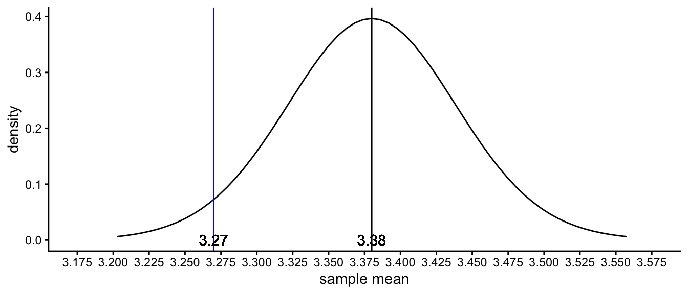
Figure 2.12: The sampling distribution under the null-hypothesis that the South-African population mean is 3.38. The blue line represents the sample mean for our observed sample mean of 3.27.
What do you think? Think this over for a bit before you continue to read.
In fact, every unique value for a sample mean is rather unlikely. If the population mean is 3.38, it will be very improbable that you will find a sample mean of exactly 3.38, because by sheer chance it could also be 3.39, or 3.40 or 3.37. But relatively speaking, those values are all more likely to find than more deviant values. The density curve tells you that values around 3.38 are more likely than values around 3.27 or 3.50, because the density is higher around the value of 3.38 than around those other values.
What to do?
The solution is to define regions for sample means where we think the sample mean is no longer probable under the null-hypothesis, and a region where it is probable enough to believe that the null-hypothesis could be true.
For example, we could define an acceptance region where 95% of the sample means would fall if the null-hypothesis is true, and a rejection region where only 5% of the sample means would fall if the null-hypothesis is true. Let’s put the rejection region in the tails of the distribution, where the most extreme values can be found (farthest away from the mean). We put half of the rejection region in the left tail and half of it in the right tail of the distribution, so that we have two regions that each covers 2.5% of the sampling distribution. These regions are displayed in Figure 2.13. The red ones are the rejection regions, and the green one is the acceptance region (covering 95% of the area).
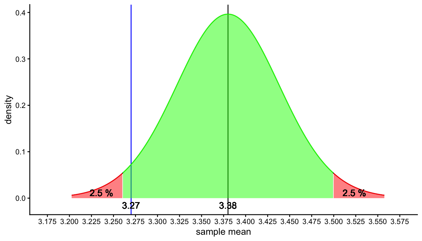
Figure 2.13: The sampling distribution under the null-hypothesis that the South-African population mean is 3.38. The red area represents the range of values for which the null-hypothesis is rejected (rejection region), the green area represents the range of values for which the null-hypothesis is not rejected (acceptance region).
Why 5%, why not 10% or 1%? Good question. It is just something that is accepted in a certain group of scientists. In the social and behavioural sciences, researchers feel that 5% is a small enough chance. In contrast, in quantum mechanics, researchers feel that 0.000057% is a small enough chance. Both values are completely arbitrary. We’ll dive deeper into this arbitrary chance level in a later section. For now, we continue to use 5%.
From Figure 2.13 we see that the sample mean that we found for your 40 South-African elephants (3.27) does not lie in the red rejection region. We see that 3.27 lies well within the green section where we decide that sample means are likely to occur when the population is 3.38. Because this is likely, we think that the null-hypothesis is plausible: if the population mean is 3.38, it is plausible to expect a sample mean of 3.27, because in 95% of random samples we would see a sample mean between 3.255 and 3.500. The value 3.27 is a very reasonable value and we therefore do not reject the null-hypothesis. We conclude therefore that it could well be that both Tanzanian and South-African elephants have the same average height of 3.38, that is, we do not have any evidence that the population mean is not 3.38.
This is the core of null-hypothesis testing for a population mean: 1) you determine a null-hypothesis that states that the population mean has a certain value, 2) you figure out what kind of sample means you would get if the population mean would have that value, 3) you check whether the sample mean that you actually have is far enough from the population mean to say that it is unlikely enough to result from the hypothesised population mean. If that is the case, then you reject the null-hypothesis, meaning you don’t believe in it. If it is likely to result from the hypothesised population, you do not reject the null-hypothesis: there is no reason to suspect that the null-hypothesis is false.
2.12 Null-hypothesis testing with \(t\)-values
In the above example, we looked explicitly at the sampling distribution for a hypothesised value for the population mean. By determining what the distribution would look like (determining the mean, standard error and degrees of freedom), we could see whether a certain sample mean would give enough evidence to reject the null-hypothesis.
In this section we will show how to do this hypothesis testing more easily by first standardising the problem. The trick is that we do not have to make a picture of the sampling distribution every time we want to do a null-hypothesis test. We simply know that its shape is that of a \(t\)-distribution with degrees of freedom equal to \(n-1\). \(t\)-distributions are standardised distributions, always with a mean of 0. They are the distribution of standardised \(t\)-statistics, where a sample mean is standardised by subtracting the population mean and dividing the result by the standard error.
Let’s do this standardisation for our observed sample mean of 3.27. With a population mean of 3.38 and a standard error of \(\hat{\sigma}_{\bar{y}} = \sqrt{\frac{s^2}{n}} = \sqrt{\frac{0.14}{40}} = 0.059\), we obtain:
\[t = \frac{3.27-3.38}{0.059} = -1.864\]
We can then look at a \(t\)-distribution of \(40-1 = 39\) degrees of freedom to see how likely it is that we find such a \(t\)-score if the null-hypothesis is true. The \(t\)-distribution with 39 degrees of freedom is depicted in Figure 2.14. Again we see the population mean represented, now standardised to a \(t\)-score of 0 (why?), and the observed sample mean, now standardised to a \(t\)-score of -1.864. As you can see, this graph gives you the same information as the sampling distribution in Figure 2.13. The advantage of using standardisation and using the \(t\)-distribution is that we can now easily determine whether or not an observed sample mean is somewhere in the red zone or in the green zone, without making a picture.
We have to find the point in the \(t\)-distribution where the red and green zones meet. These points in the graph are called critical values. From Figure 2.14 we can see that these critical values are around -2 and 2. But where exactly? This information can be looked up in the \(t\)-tables that were discussed earlier in this chapter. We plot such a table again in Table 2.4. A larger version is given in Appendix B.
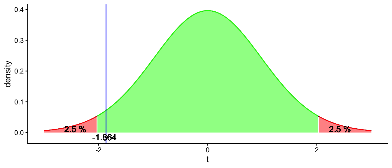
Figure 2.14: A t-distribution with 39 degrees of freedom to test the null-hypothesis that the South-African population mean is 3.38. The blue line represents the T-score for our observed sample mean of 3.27.
| probs | norm | t199 | t99 | t47 | t39 | t9 | t5 | t3 |
|---|---|---|---|---|---|---|---|---|
| 0.0005 | -3.29 | -3.34 | -3.39 | -3.51 | -3.56 | -4.78 | -6.87 | -12.92 |
| 0.0010 | -3.09 | -3.13 | -3.17 | -3.27 | -3.31 | -4.30 | -5.89 | -10.21 |
| 0.0050 | -2.58 | -2.60 | -2.63 | -2.68 | -2.71 | -3.25 | -4.03 | -5.84 |
| 0.0100 | -2.33 | -2.35 | -2.36 | -2.41 | -2.43 | -2.82 | -3.36 | -4.54 |
| 0.0250 | -1.96 | -1.97 | -1.98 | -2.01 | -2.02 | -2.26 | -2.57 | -3.18 |
| 0.0500 | -1.64 | -1.65 | -1.66 | -1.68 | -1.68 | -1.83 | -2.02 | -2.35 |
| 0.1000 | -1.28 | -1.29 | -1.29 | -1.30 | -1.30 | -1.38 | -1.48 | -1.64 |
| 0.9000 | 1.28 | 1.29 | 1.29 | 1.30 | 1.30 | 1.38 | 1.48 | 1.64 |
| 0.9500 | 1.64 | 1.65 | 1.66 | 1.68 | 1.68 | 1.83 | 2.02 | 2.35 |
| 0.9750 | 1.96 | 1.97 | 1.98 | 2.01 | 2.02 | 2.26 | 2.57 | 3.18 |
| 0.9900 | 2.33 | 2.35 | 2.36 | 2.41 | 2.43 | 2.82 | 3.36 | 4.54 |
| 0.9950 | 2.58 | 2.60 | 2.63 | 2.68 | 2.71 | 3.25 | 4.03 | 5.84 |
| 0.9990 | 3.09 | 3.13 | 3.17 | 3.27 | 3.31 | 4.30 | 5.89 | 10.21 |
| 0.9995 | 3.29 | 3.34 | 3.39 | 3.51 | 3.56 | 4.78 | 6.87 | 12.92 |
In such a table, you can look up the 2.5th percentile. That is, the value for which 2.5% of the \(t\)-distribution is equal or smaller. Because we are dealing with a \(t\)-distribution with 39 degrees of freedom, we look in the column t39, and then in the row with cumulative probability 0.025 (equal to 2.5%), we see a value of -2.02. This is the critical value for the lower tail of the \(t\)-distribution. To find the critical value for the upper tail of the distribution, we have to know how much of the distribution is lower than the critical value. We know that 2.5% is higher, so it must be the case that the rest of the distribution, \(100-2.5 = 97.5\)% is lower than that value. This is the same as a probability of 0.975. If we look for the critical value in the table, we see that it is 2.02. Of course this is the opposite of the other critical value, because the \(t\)-distribution is symmetrical.
Now that we know that the critical values are -2.02 and +2.02, we know that for our standardised \(t\)-score of -1.864 we are still in the green area, so we do not reject the null-hypothesis. We don’t need to draw the distribution any more. For any value, we can directly compare it to the critical values. And not only for this example of 40 elephants and a sample mean of 3.27, but for any combination.
Suppose for example that we would have had a sample size of 10 elephants, and we would have found a sample mean of 3.28 with a slightly different sample variance, \(s^2 = 0.15\). If we want to test the null-hypothesis again that the population mean is 3.38 based on these results, we would have to do the following steps:
Null-hypothesis testing
- Estimate the standard error \(\hat{\sigma}_{\bar{Y}} = \sqrt{\frac{s^2}{n}}\).
- Calculate the \(t\)-statistic \(t = \frac{\bar{Y} - \mu}{\hat{\sigma}_{\bar{Y}}}\), \(\mu\) is the population mean under the null-hypothesis.
- Determine the degrees of freedom, \(n - 1\).
- Determine the critical values for lower and upper tail of the appropriate \(t\)-distribution, using 2.4.
- If the \(t\)-statistic is between the two critical values, then we’re in the green, we still believe the null-hypothesis is plausible.
- If the \(t\)-statistic is not between the two critical values, we are in the red zone and we reject the null-hypothesis.
So let’s do this for our hypothetical result:
Estimate the standard error: \(\sqrt{\frac{0.15}{10}} =\) 0.122
Calculate the \(t\)-statistic: \(t = \frac{3.28-3.38}{0.122} =\) -0.82
Determine the degrees of freedom: sample size minus 1 equals 9
In Table 2.4 we look for the row with probability 0.025 and the column for t9. We see a value of -2.26. The other critical value then must be 2.26.
The \(t\)-statistic of -0.82 lies between these two critical values, so these sample data do not lead to a rejection of the null-hypothesis that the population mean is 3.38. In other words, these data from 10 elephants do not give us reason to doubt that the population mean is 3.38.
2.13 The \(p\)-value
What we saw in the previous section was the classical null-hypothesis testing procedure: calculating a \(t\)-statistic and determine whether or not this \(t\)-score is in the red zone or green zone, by comparing them to critical values. In the old days, this was done by hand: the calculation of \(t\) and looking up the critical values in tables published in books.
These days we have the computer do the work for us. If you have a data set, a program can calculate the \(t\)-score for you. However, when you look at the output, you actually never see whether this \(t\)-score leads to a rejection of the null-hypothesis or not. The only thing that a computer prints out is the \(t\)-score, the degrees of freedom, and a so-called \(p\)-value. In this section we explain what a \(p\)-value is and how you can use it for null-hypothesis testing.
Let’s go back to our example in the previous section, where we found a sample mean height of 3.28 with only 10 elephants. We computed the \(t\)-score and obtained -0.82. We illustrate this result in Figure 2.15 where the red line indicates the \(t\)-score. By comparing this \(t\)-value with the critical values, we could decide that we do not reject the null-hypothesis. However, if you would do this calculation with a computer program like R, we would get the following result:
t = -0.82, df = 9, p-value = 0.434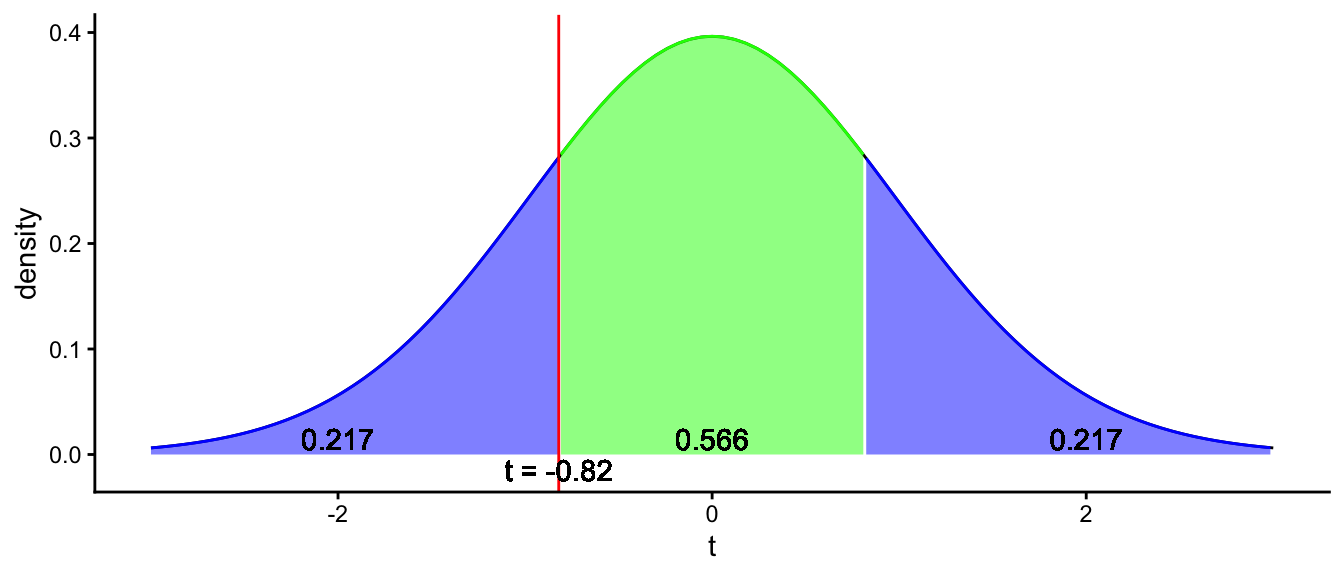
Figure 2.15: Illustration of what a p-value is. The total blue area represents the probability that under the null-hypothesis, you find a more extreme value than the t-score or its opposite. The blue area covers a proportion of 0.217 + 0.217 = 0.434 of the t-distribution. This amounts to a p-value of 0.434.
Figure 2.15 shows what this \(p\)-value of 0.434 means. The green area in the middle represents the probability that a \(t\)-score lies between -0.82 and +0.82. That probability is shown in the figure as 0.567, so 56.7%. The left blue region represents the probability that if the null-hypothesis is true, the \(t\)-score will be less than -0.82. That probability is 0.217, so 21.7%. Because of symmetry, the probability that the \(t\)-score is more than 0.82 is also 0.217. The blue regions together therefore represent the probability that you find a \(t\)-score of less than -0.82 or more than 0.82, and that probability equals 0.217 + 0.217 = 0.434. Therefore, the probability that you find a \(t\)-value of \(\pm 0.82\) or more extreme equals 0.434. This probability is called the \(p\)-value.
Why is this value useful?
Let’s imagine that we find a \(t\)-score of exactly equal to one of the critical values. The critical value for a sample size of 10 animals related to a cumulative proportion of 0.025 equals -2.26 (see Table 2.4). Based on this table, we know that the probability of a \(t\)-value of -2.26 or lower equals 0.025. Because of symmetry, we also know that the probability of a \(t\)-value of 2.26 or higher also equals 0.025. This brings us to the conclusion that the probability of a \(t\)-score of \(\pm 2.26\) or more extreme, is equal to \(0.025+0.025 = 0.05 = 5\%\). Thus, when the \(t\)-score is equal to the critical value, then the \(p\)-value is equal to 5%. You can imagine that if the \(t\)-score becomes more extreme than the critical value the \(p\)-value will become less than 5%, and if the \(t\)-score becomes less extreme (closer to 0), the \(p\)-value becomes larger.
In the previous section, we said that if a \(t\)-score is more extreme than one of the critical values (i.e., when it doesn’t have a value between them) then we reject the null-hypothesis. Thus, a \(p\)-value of 5% or less means that we have a \(t\)-score more extreme than the critical values, which in turn means we have to reject the null-hypothesis. Thus, based on the computer output, we see that the \(p\)-value is larger than 0.05, so we do not reject the null-hypothesis.
Overview
critical value: the minimum (or maximum) value that a \(t\)-score should have to be in the red zone (the rejection region). If a \(t\)-value is more extreme than a critical value, then the null-hypothesis is rejected. The red zone is often chosen such that a \(t\)-score will be in that zone 5% of the time, assuming that the null-hypothesis is true.
\(p\)-value: indicates the probability of finding a \(t\)-value equal or more extreme than the one found, assuming that the null-hypothesis is true. Often a \(p\)-value of 5% or smaller is used to support the conclusion that the null-hypothesis is not tenable. This is equivalent to a rejection region of 5% when using critical values.
Let’s apply this null-hypothesis testing to our luteinising hormone (LH) data. Based on the medical literature, we know that LH levels for women in their child-bearing years vary between 0.61 and 56.6 IU/L. Values vary during the menstrual period. If values are lower than normal, this can be an indication that the woman suffers from malnutrition, anorexia, stress or a pituitary disorder. If the values are higher, this is an indication that the woman has gone through menopause.
We’re going to use the LH data presented earlier in this chapter to make a decision whether the woman has a healthy range of values for a woman in her child-bearing years by testing the null-hypothesis that the mean LH level in this woman is the same as the mean of LH levels in healthy non-menopausal women.
First we specify the null-hypothesis. Suppose we know that the mean LH level in this woman should be equal to 2.54, given her age and given the timing of her menstrual cycle. Thus our null-hypothesis is that the mean LH in our particular woman is equal to 2.54:
\[H_0: \mu = 2.54\]
Next, we look at our sample mean and see whether this is a likely or unlikely value to find under this null-hypothesis. The sample mean is 2.40. To know whether this is a likely value to find, we have to know the standard error of the sampling distribution, and we can estimate this by using the sample variance. The sample variance happens to be \(s^2 = 0.304\) and we had 48 measures, so we estimate the standard error as \(\hat{\sigma}_{\bar{y}} = \sqrt{\frac{s^2}{n}} = \sqrt{\frac{0.304}{48}} = 0.080\). We then apply standardisation to get a \(t\)-value:
\[t = \frac{2.40 - 2.54}{0.080} = -1.75\]
Next, we look up in a table whether this \(t\)-value is extreme enough to be considered unlikely under the null-hypothesis. In Table 2.4, we see that for 47 degrees of freedom, the critical value for the 0.025 quantile equals -2.01. For the 0.975 quantile it is 2.01. Our observed \(t\)-value of -1.75 lies within this range. This means that a sample mean of 2.40 is likely to be found when the population mean is 2.54, so we do not reject the null-hypothesis. We conclude that the LH levels are healthy for a woman her age.
When we report the results from a null-hypothesis test, we often talk about significance. When the results show that the null-hypothesis can be rejected, we talk about a statistically significant result. When the null-hypothesis cannot be rejected, we call the results non-significant. Note that this says nothing about the importance or size of the results.
In a report, you could state:
"We tested the null-hypothesis that the mean LH level is 2.54. Taking a sample of 48 measurements, we obtained a mean of 2.40. A \(t\)-test showed that this sample mean was not significantly different from 2.54, \(t(47) = -1.75, p > .05\)."
2.14 Null-hypothesis testing using R
We can do the null-hypothesis testing also with R. Let’s analyse the data in R and do the computations with the following code. First we load the LH data:
Next, we test whether the population mean could be 2.54:
##
##  One Sample t-test
##
## data:  lh
## t = -1.7584, df = 47, p-value = 0.08518
## alternative hypothesis: true mean is not equal to 2.54
## 95 percent confidence interval:
##  2.239834 2.560166
## sample estimates:
## mean of x
##       2.4
In the output we see that the \(t\)-value is equal to -1.7584, similar to our -1.75. The difference is due to our rounding of the sample variance. The sample variance \(s^2\) can be obtained by
## [1] 0.3042553We see that the number of degrees of freedom is 47 (\(n-1\)) and that the \(p\)-value equals 0.085. This \(p\)-value is larger than 0.05, so we do not reject the null-hypothesis that the mean LH level in this woman equals 2.54. Her LH level is healthy.
When reporting a null-hypothesis test, the convention is to report the exact \(p\)-value. We can omit the 0 in front of the decimal sign since a \(p\)-value is always between 0 and 1 (i.e., .085 instead of 0.085). Three decimals are usually more than enough.
"We tested the null-hypothesis that the mean LH level is 2.54. Taking a sample of 48 measurements, we obtained a mean of 2.40. A \(t\)-test showed that this sample mean was not significantly different from 2.54, \(t(47) = -1.758, p = .085\)."
2.15 One-sided versus two-sided testing
In the previous sections, we tested a null-hypothesis in order to find evidence that an observed sample mean was either too large or too small to result from random sampling. For example, in the previous section we saw that the observed LH levels were not too low and we did not reject the null-hypothesis. But had the LH levels been too high or too low, then we would have rejected the null-hypothesis.
In the reasoning that we followed, there were actually two hypotheses: the null-hypothesis that the population mean was exactly 2.54, and the alternative hypothesis that the population is not exactly 2.54:
\[\begin{aligned} H_0: \mu = 2.54 \\ H_A: \mu \neq 2.54\end{aligned}\]
This kind of null-hypothesis testing is called two-sided or two-tailed testing: we look at two critical values, and if the computed \(t\)-score is outside this range (i.e., somewhere in the two tails of the distribution), we reject the null-hypothesis.
The alternative to two-sided testing is one-sided or one-tailed testing. Sometimes before an analysis you already have an idea of what direction the data will go. For instance, imagine a zoo where they have held elephants for years. These elephants always were of Tanzanian origin, with a mean height of 3.38. Lately however, the manager observes that the opening that connects the indoor housing with the outdoor housing gets increasingly damaged. Since the zoo recently acquired 4 new elephants of South-African origin, the manager wonders whether South-African elephants are on average taller than the Tanzanian elephants. To figure out whether South-African elephants are on average taller than the Tanzanian average of 3.38 or not, the manager decides to apply null-hypothesis testing. She has two hypotheses: null-hypothesis \(H_0\) and alternative hypothesis \(H_A\):
\[\begin{aligned} H_0: \mu_{SA} = 3.38 \\ H_A: \mu_{SA} > 3.38\end{aligned}\]
This set of hypotheses leaves out one option: the South-African mean might be lower than the Tanzanian one. Therefore, one often writes the set of hypotheses like this:
\[\begin{aligned} H_0: \mu_{SA} \leq 3.38 \\ H_A: \mu_{SA} > 3.38\end{aligned}\]
She next tests the null-hypothesis, more specifically the one where \(\mu_{SA} = 3.38\). From the damaged doorway she expects the sample mean to be higher than 3.38, but is it high enough to serve as evidence that the population mean is also higher than 3.38? She decides that when the sample mean is in the rejection zone in the right tail of the sampling distribution, then she will decide that the null-hypothesis is not true, but that the alternative hypothesis must be true.
This is illustrated in Figure 2.16. It shows the sampling distribution if we happen to have 4 new South-African elephants, with a sample mean of 3.45 and a standard error of 0.059. In red, we see the rejection region: if the sample mean happens to be in that zone we decide to reject the null-hypothesis. Similar to two-tailed testing, we decide that an area of 5% is small enough to suggest that the null-hypothesis is not true. Note that in two-tailed testing, this area of 5% was divided equally into the upper tail and the lower tail of the distribution, but with one-tailed testing we put it all in the tail where we expect to find the sample mean based on a theory or a hunch.
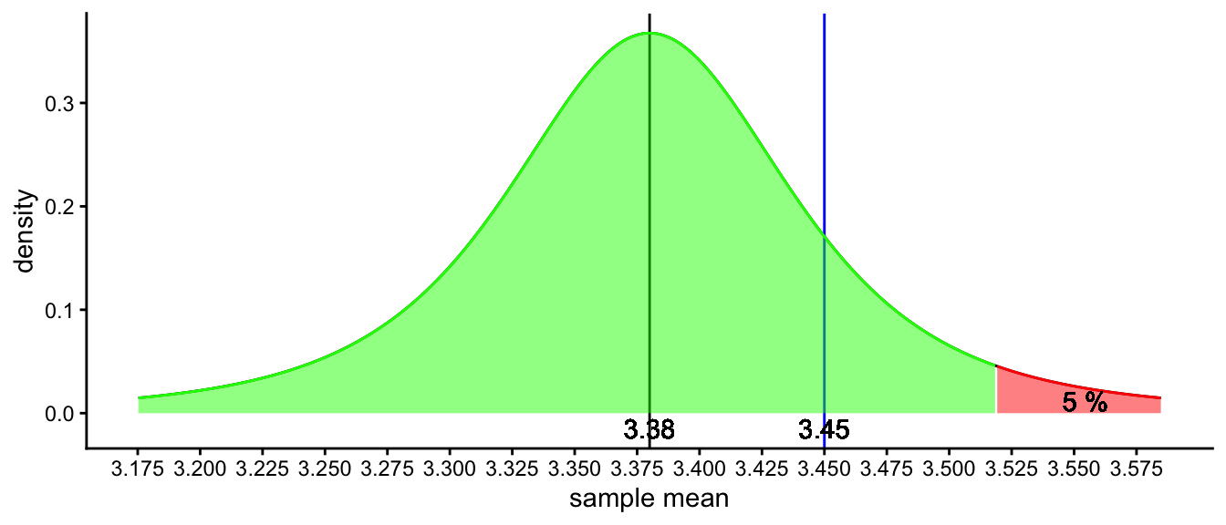
Figure 2.16: The sampling distribution under the null-hypothesis that the South-African population mean is 3.38. In one-tailed testing, the rejection area is located in only one of the tails. The red area represents the range of values for which the null-hypothesis is rejected (rejection region), the green area represents the range of values for which the null-hypothesis is not rejected (acceptance region).
In this sampling distribution, based on 3 degrees of freedom, we see that the sample mean is not in the red zone – the rejection region – therefore we do not reject the null-hypothesis. We conclude that based on this random sample of 4 elephants, there is no evidence to suggest that South-African elephants are on average taller than Tanzanian elephants.
The same procedure can be done with standardisation. We compute the \(t\)-statistic as
\[t = \frac{3.45 - 3.38}{0.059} = 1.19\]
In Table 2.4 we have to look up where the red zone starts: that is for the 0.95 quantile, because below that value lies 95% (green zone) and above it 5% (the red zone). We see that the 95th percentile for a \(t\)-distribution with 3 degrees of freedom is equal to 2. Our \(t\)-value 1.19 is less than that, so that we do not reject the null-hypothesis.
A third way is to compute a one-tailed \(p\)-value. This is illustrated in Figure 2.17. The one-tailed \(p\)-value for a \(t\)-statistic of 1.19 and 3 degrees of freedom turns out to be 0.16. That is the proportion of the \(t\)-distribution that is blue. That means that if the null-hypothesis is true, you will find a \(t\)-value of 1.19 or larger in 16% of the cases. Because this proportion is more than 5%, we do not reject the null-hypothesis.
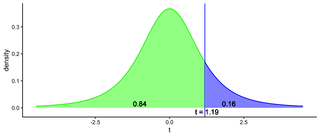
Figure 2.17: The sampling distribution under the null-hypothesis that the South-African population mean is 3.38. For one-tailed testing, the rejection area is located in only one of the tails. The green area represents the probability of seeing a t-value smaller than 1.19, the blue are represents the probability of seeing a t-value larger than 1.19. The latter probability is the p-value.
2.16 One-tailed testing applied to LH levels
As we have seen, LH levels that are too high are indicative of menopause, a normal transition for women. However, LH levels that are too low are indicative of an illness or malnutrition. In that case, it is important that the source of this malnutrition or the specific illness is diagnosed. You could therefore say that if LH levels are too low, a red flag should be put up, whereas if the LH levels are normal or higher, then there is usually no reason to worry.
LH levels can therefore be used to construct a diagnostic red flag decision system. If normal or high, then nothing happens, if too low, then something should be done. We could formulate these two alternative states of reality as two hypotheses:
\[\begin{aligned} H_0: \mu_{LH} \geq 2.54 \\ H_A: \mu_{LH} < 2.54\end{aligned}\]
We decide beforehand that if a \(t\)-value is too far out in the left tail of the distribution, the LH levels are too low. We again use 5% of the area of the \(t\)-distribution. This decision process is illustrated in Figure 2.18 where we see a critical \(t\)-value of -1.68 when we we have 47 degrees of freedom (see Table 2.4).
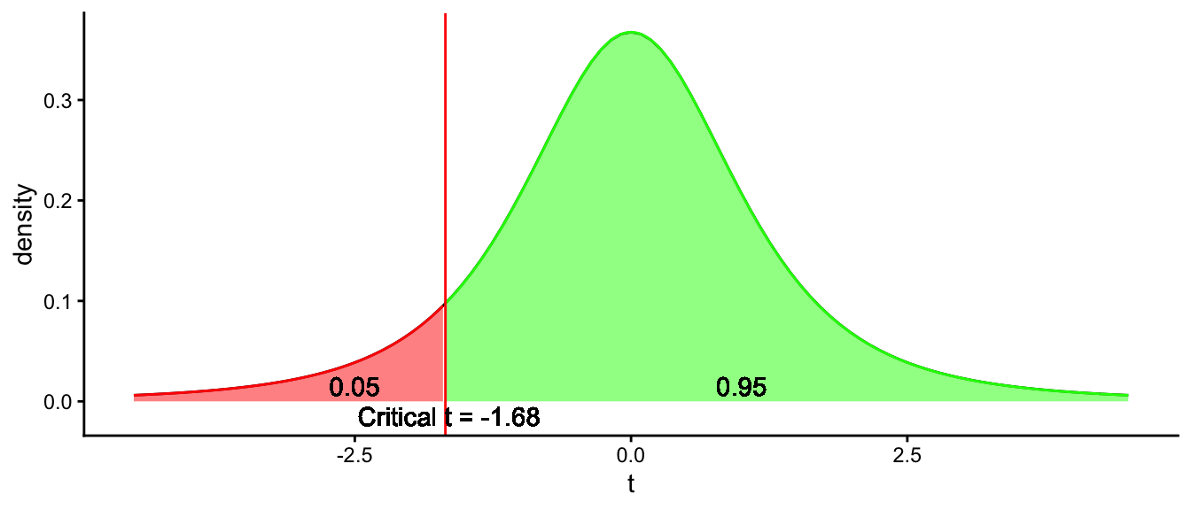
Figure 2.18: One-tailed decision process for deciding whether the average LH level in a woman is too low.
We calculate our \(t\)-value and find -1.75, see section 2.13. We see that this \(t\)-value is smaller than the critical value -1.68, so it is in the red rejection area. This is the area that we use for the rejection of the null-hypothesis, so based on these data we decide that the mean LH level in this woman is abnormally low.
Importantly, note that when we applied two-tailed hypothesis testing, we decided to not reject the null-hypothesis, whereas here with one-tailed testing, we decide to reject the null-hypothesis. All based on the same data, and the same null-hypothesis. The difference lies in the choice of the alternative hypothesis. When doing one-tailed testing, we put all of the critical region in only one tail of the \(t\)-distribution. This way, it becomes easier to reject a null-hypothesis, if the mean LH level is indeed lower than normal. However, it could also be easier to make a mistake: if the mean LH level is in fact normal, we could make a mistake in thinking that the sample mean is deviant, where it is actually not. Making mistakes in inference is the topic of the next section.
It is generally advised to use two-tailed testing rather than one-tailed testing. The reason is that in hypothesis testing, it is always the null-hypothesis that is being used as the starting point: what would the sample means (or their standardised versions: \(t\)-scores) look like if the null-hypothesis is true? Based on a certain null-hypothesis, say population mean \(\mu\) equals 2.54, sample means could be as likely higher or lower than the population mean (since the sampling distribution is symmetrical). Even if you suspect that \(\mu\) is actually lower, based on a very good theory, you would help yourself too much to falsify the null-hypothesis by putting the rejection area only in the left tail of the distribution. And what do you actually do if you find a sample mean that is in the far end of the right tail? Do you still accept the null-hypothesis? That would not make much sense. It is therefore better to just stick to the null-hypothesis, and see whether the sample mean is far enough removed to reject the null-hypothesis. If the sample mean is in the anticipated tail of the distribution, that supports the theory you had, and if the sample mean is in the opposite tail, it does not support the theory you had.
2.17 One-tailed testing using R
Compare one-tailed and two-tailed testing in R using the LH data. By default, R applies two-tailed testing. R gives the following output:
##
##  One Sample t-test
##
## data:  lh
## t = -1.7584, df = 47, p-value = 0.08518
## alternative hypothesis: true mean is not equal to 2.54
## 95 percent confidence interval:
##  2.239834 2.560166
## sample estimates:
## mean of x
##       2.4
If you want one-tailed testing, where you expect that the mean LH level is lower than 2.54, you do that in the following manner14:
##
##  One Sample t-test
##
## data:  lh
## t = -1.7584, df = 47, p-value = 0.04259
## alternative hypothesis: true mean is less than 2.54
## 95 percent confidence interval:
##      -Inf 2.533589
## sample estimates:
## mean of x
##       2.4
With one-tailed testing, you can report:
"We tested the null-hypothesis that the mean LH level is 2.54, against the alternative hypothesis that the mean LH level is less than 2.54. Taking a sample of 48 measurements, we obtained a mean of 2.40. A one-tailed \(t\)-test showed that this sample mean was significantly less than 2.54, \(t(47) = -1.758, p = .043\)."
When you compare the \(p\)-values, you see that the \(p\)-value using one-tailed testing is half the size of the \(p\)-value using two-tailed testing (.04259 vs .08518). Based on the previous sections, you should know why the \(p\)-value is halved! (Because the \(t\)-distribution is symmetrical and you placed all of the 5% rejection area only on the left of the \(t\)-distribution). In the second output, using a critical \(p\)-value of 5% you would reject the null-hypothesis, whereas in the first output, you would not reject the null-hypothesis. Using one-tailed testing could lead to a big mistake: thinking that the sample mean is deviant enough to reject the null-hypothesis, while the null-hypothesis is actually true. We delve deeper into such mistakes in the next section.
2.18 Type I and type II errors
In the preceding sections, we have used the value of 5% a lot of times. We deemed that this was a fairly low probability, that allows us to take the decision to reject the null-hypothesis. We looked at the distribution of sample means, given that there was a certain population mean, and we looked at how often we can expect a sample mean that is smaller or larger than certain critical values. These critical values were based on 5% of the area of the sampling distribution. With two-tailed testing, this 5% was divided over the two extreme tails of the sampling distribution, and with one-tailed testing, this 5% rejection area was put in the tail end where we expected the population to be according to the alternative hypothesis (based on theory).
In this null-hypothesis testing procedure there is always the risk that we take the wrong decision. Let’s return to our elephant example where we had the null-hypothesis that the population mean for South-African elephants equals 3.38. The alternative two-sided hypothesis was that the population mean was not equal to 3.38. After calculating the standard error, we calculated the \(t\)-score. We said that we reject the null-hypothesis when the obtained \(t\)-score was somewhere in the extreme ends of the tail: more specifically, in the rejection area that made up 5% of the area of the \(t\)-distribution. That means that if the null-hypothesis is true, there is a 5% probability that we find such a \(t\)-score. In that case we reject the null-hypothesis. But that could be the wrong decision: if the null-hypothesis is true it will happen in 5% of the cases that a \(t\)-score will be in the 5% rejection region. We then reject the null-hypothesis while it is actually true! Such a mistake is called a type I error. In this case, type I error rate is 5%. It is a conditional probability. Conditional probabilities are probabilities that start from some given information. In this case, the given information is that the null-hypothesis is true: given that the null-hypothesis is true, it is the probability that we reject the null-hypothesis. Because we do not like to make mistakes, we want to have the probability of a mistake as low as possible.
In the social and behavioural sciences, one thinks that a probability of 5% is low enough to take the risk of making the wrong decision. As stated earlier, in quantum mechanics one is even more careful, using a probability of 0.000057 %. So why don’t we also use a much lower probability of making a type I error? The answer is that we do not want to make another type of mistake: a type II error. A type II error is the mistake that we make when we do not reject the null-hypothesis, while it is not true. Taking the example of the elephants again, suppose that the population mean is not equal to 3.38, but the \(t\)-score is not in the rejection area, so we believe that the population mean is 3.38. This is then the wrong decision. The type of mistake we then make is a type II error.
Let’s take this example further. Suppose we have a two-tailed decision process, where we compare two hypotheses about South-African elephants: either their mean height is equal to 3.38 (\(H_0\)), or it is not (\(H_A\)). We compute the \(t\)-statistic and determine the critical values based on 5% area in the tails of the \(t\)-distribution. This means that we allow ourselves to make a mistake in 5% of the cases: the probability that we find a \(t\)-score in one of the 2.5% tails equals 2.5% + 2.5% = 5%. This is the probability of a type I error. Note that we chose this value deliberately. This 5% we call \(\alpha\) (‘alpha’): it is the relative frequency we allow ourselves to make a type I error. We say then that our \(\alpha\) is fixed to 0.05, or 5%. This means that if the null-hypothesis is true, the probability that the \(t\)-statistic will be in in the tails will be 5%.
Then what is the probability of a type II error? A type II error is based on the premise that the alternative hypothesis is true. That alternative hypothesis states that the population mean is not equal to 3.38. Given that, what is the probability that we do not reject the null-hypothesis?
This is impossible to compute, because the alternative hypothesis is very vaguely stated: it could be anything, as long as it is not 3.38. Let’s make it a bit easier and state that the alternative hypothesis states that the population mean equals 3.42.
\[\begin{aligned} H_0: \mu_{SA} = 3.38 \\ H_A: \mu_{SA} = 3.42\end{aligned}\]
If the population mean height is equal to 3.42, what would sample means look like? That’s easy, that is the sampling distribution of the sample mean. The mean of that sampling distribution would be 3.42. This is illustrated in Figure 2.19. The left curve is the sampling distribution for a population mean of 3.38. The red area represents the probability of a type I error. The right curve is the sampling distribution for a population mean of 3.42. The blue area represents the probability of rejecting the null-hypothesis. This is because if the sample mean is smaller than 3.26 or larger than 3.50, the sample mean is in the rejection area of the null-hypothesis testing and the null-hypothesis will therefore be rejected. The probability of this happening given that the alternative hypothesis is true (\(H_A = 3.42\)), is represented by the area under that curve: the blue area. If we determine the two blue areas in Figure 2.19, we end up with \(0.004 + 0.097 = 0.101\). This is the probability of rejecting the null-hypothesis while it is not true, so this is no mistake at all. We would make a mistake when the alternative hypothesis is true, and we would not reject the null-hypothesis. This is represented by the dark green area. That area is equal to 1 minus the blue area: \(1- 0.101 = 0.899\).
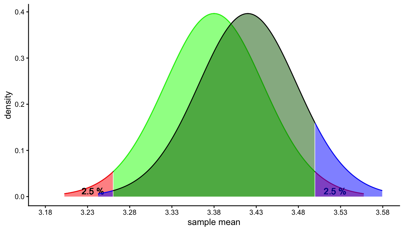
Figure 2.19: Two sampling distributions, one for a population mean of 3.38 (null-hypothesis) and one for a population mean of 3.42 (alternative hypothesis). The red areas represent the probability of a type I error, the dark green area the probability of a type II error. The blue areas represent the probability of making the (correct) decision that the null-hypothesis is not true when it is indeed not true.
When we have to draw a conclusion about a population mean, the null-hypothesis framework can be used for that. Usually we don’t want to make type I error mistakes, so we pick a low probability like 5% for the tails of the sampling distribution under the \(H_0\). This value is called \(\alpha\): if the null-hypothesis is true, we don’t want to reject it, so we allow this to happen in only 5% of the cases. One chooses \(\alpha\) before collecting the data. You have to be careful with this choice of \(\alpha\) though because it directly affects the probability of making a type II error. This probability is denoted by \(\beta\) (‘beta’): how often does it happen that if the alternative hypothesis is true, we do not reject the null-hypothesis. This relationship is illustrated in Figure 2.20. There, an \(\alpha\) of 1% is chosen, using both tails (a two-tailed null-hypothesis test). You immediately see that the blue areas have also become smaller, and that by consequence the dark green area becomes larger: the probability of a type II error.
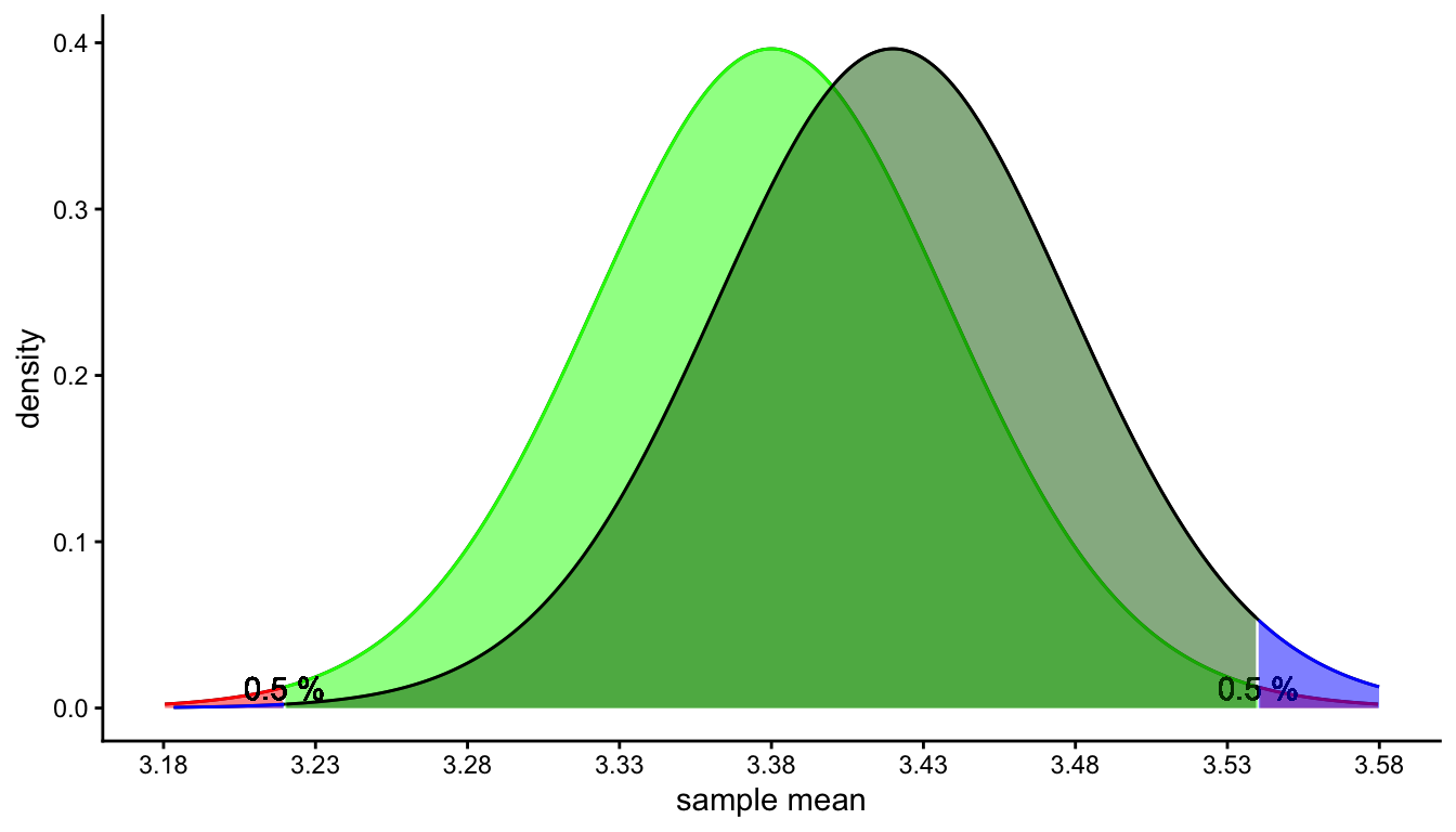
Figure 2.20: Two sampling distributions, one for a population mean of 3.38 (null-hypothesis) and one for a population mean of 3.42 (alternative hypothesis). The red areas represent the probability of a type I error, the dark green area the probability of a type II error. The blue area represents the probability of making the (correct) decision that the null-hypothesis is not true when it is indeed not true.
Thus, the \(\alpha\) should be chosen wisely: if it is too large, you run a high risk of a type I error. But if it is too low, you run a high risk of a type II error. Let’s think about this in the context of our luteinising hormone problem.
We saw that if the LH level is low, this could be an indication of malnutrition or a disease and the patient should have further checks to see what the problem is. But if the LH level is normal or above normal, there is no disease and no further checks are required. Again we take the null-hypothesis that the mean LH level in this woman equals 2.54. What would be a type I error in this case, and what would be a type II error?
The type I error is the mistake of rejecting the null-hypothesis while it is in fact true. Thus, the woman’s mean LH level is 2.54, but by coincidence, the mean of the 48 measurements that we have turns out to be in the rejection area of the sampling distribution. If this happens we make the mistake that we do a lot of tests with this woman to find out what’s wrong with her, while in fact she is perfectly healthy! How bad would such a mistake be? It would certainly lead to extra costs, but also a lot of the woman’s time. She would also probably start worrying that something is wrong with her. So we definitely don’t want this to happen. We can minimise the risk of a type I error by choosing a low \(\alpha\).
The type II error is the mistake of not rejecting the null-hypothesis while it is in fact not true. Thus, the woman’s mean LH level is lower than 2.54, but by coincidence, the sample mean of the 48 measurements that we have turns out to be in the acceptance area of the sampling distribution. This means that the woman’s LH level does not seem to be abnormal, and the woman is sent home. How bad would such a mistake be? Well, pretty bad because the woman’s hormone level is not normal, but everybody thinks that she is OK. She could be very ill but nothing is found in further tests, because there are no further tests. So we definitely don’t want this to happen. We can minimise the risk of a type II error by choosing a higher \(\alpha\).
So here we have a conflict, and we have to make a balanced choice for \(\alpha\): too low we run the risk of type II errors, too high we run the risk of a type I error. Then you have to decide what is worse: a type I mistake or a type II mistake. In this case, you could defend that sending the woman home while she is ill, is worse than spending money on tests that are actually not needed. Then you would choose a rather high \(\alpha\), say 10%. That means that if you have several women who are in fact healthy, 10% of them would receive extra testing. This is a fairly high percentage, but you are more sure that women with an illness will be detected and receive proper care.
But if you think it is most important that you don’t spend too much money and that you don’t want women to start worrying when it is not needed, you can pick a low \(\alpha\) like 1%: then when you have a lot of healthy women, only 1% of them will receive unnecessary testing.
2.19 Take-away points
In statistics, inference refers to drawing conclusions about population (complete) data on the basis of sample data (a selection of data).
When you randomly draw equally-sized samples from a population, and for each sample you compute the mean, you can make a histogram of all sample means. This histogram represents the sampling distribution of the sample mean.
When you randomly draw equally-sized samples from a population, and for each sample you compute the variance, you can make a histogram of all sample variances. This histogram represents the sampling distribution of the sample variance.
The sample mean is an unbiased estimator of the population mean.
The sample variance is a biased estimator of the population variance.
The standard deviation of the sampling distribution is called the standard error.
The larger the sample size, the smaller the standard error.
A 95% confidence interval contains 95% of the sample means had the population mean been equal to the sample mean. Its construction is based on the estimated sampling distribution of the sample mean.
If you know the standard error (because you know the population variance), the standardised sample means will show a normal distribution. If you don’t know the standard error, you have to estimate it based on the sample variance. If sample size is really large, you can estimate the population variance pretty well, and the sample variances will be very similar to each other. In that case, the sampling distribution will look very much like a normal distribution. But if sample size is relatively small, each sample will show a different sample variance, resulting in different standard error estimates. If you standardise each sample mean with a different standard error, the sampling distribution will not look normal. This distribution is called a \(t\)-distribution.
The shape of the sampling distribution is a \(t\)-distribution. The shape of this \(t\)-distribution depends on sample size (expressed as degrees of freedom).
The objective of null-hypothesis testing is that we either reject the null-hypothesis, or not. This is done using the data from a random sample. In the null-hypothesis procedure, we assume that the null-hypothesis is true, and compare the sample data with data that would result if the null-hypothesis were true.
The \(p\)-value represents the probability of finding a \(t\)-value equal or more extreme than the one found, assuming that the null-hypothesis is true. Often a \(p\)-value of 5% or smaller is used to support the conclusion that the null-hypothesis is not tenable.
In two-tailed testing, we have rejection regions on both sides of the \(t\)-distribution. In one-tailed testing, we have only one rejection region.
A type I error is the mistake of rejecting the null-hypothesis while it is in fact true.
A type II error is the mistake of not rejecting the null-hypothesis while it is in fact not true.
Key concepts
- Inference
- Population
- Sample
- Random sample
- Standard error
- Sampling distribution
- Central Limit Theorem
- Confidence interval
- \(t\)-statistic
- \(t\)-distribution
- Degrees of freedom
- Null-hypothesis testing
- Rejection region
- Acceptance region
- Critical value
- \(p\)-value
- One-sided and two-sided testing
- Alternative hypothesis
- Type I and type II errors
This is true except for the case that you have fewer than 3 data points and for a few special cases, that you don’t need to know about in this book.↩︎
The sample mean is called a sufficient statistic for the population mean. That means, if you want to know something about the population mean, the only information you need to get from the sample data is the mean of the sample values. Knowing the exact values does not give you extra information: the sample mean suffices. The proof for this is beyond this book.↩︎
If you expect that the LH level will higher than 2.54, you use "greater" instead of "less".↩︎