Code
## run code only once manually ##########

## get pdmp data from .csv file of the book
pdmp_2017_book <- readr::read_csv("data/chap04/pdmp_2017_kff_ch4.csv")
save_data_file("chap04", pdmp_2017_book, "pdmp_2017_book.rds")Objectives for chapter 04
SwR Achievements
There is an alarming increases in drug overdoses in the United States in recent years (see County Health Rankings & Roadmaps website and Data & Documentation).
The CDC Wonder website has data on the underlying cause of each death in the United States. For drug deaths, the CDC WONDER data include the drug implicated in each death, if available.
States had begun to adopt policies to try to combat the opioid epidemic. Some of the state-level policy solutions to addressing the increasing number of opioid overdoses:
The Kaiser Family Foundation (KFF) keeps track of the adoption of these policies across all 50 states and the District of Columbia.
Treatment programs as well as policies depend partly on the distance people have to travel to the nearest health facility. amfAR, the Foundation for AIDS Research, which has an Opioid & Health Indicators Database (https://opioid.amfar.org). The data in amfAR’s database includes distance to the nearest substance abuse treatment facility that has medication assisted therapies (MAT).
Resource 4.1 : Data, codebook, and R packages for learning about descriptive statistics
Data
pdmp_2017_kff_ch4.csv and opioid_dist_to_facility_2017_ch4.csv from https://edge.sagepub.com/harris1e.Codebook
Two options:
opioid_county_codebook.xlsx from https://edge.sagepub.com/harris1e.Packages
Example 4.1 : Get data for chapter 4
R Code 4.1 : Get the cleaned PDMP data from the book .csv file
## run code only once manually ##########
## get pdmp data from .csv file of the book
pdmp_2017_book <- readr::read_csv("data/chap04/pdmp_2017_kff_ch4.csv")
save_data_file("chap04", pdmp_2017_book, "pdmp_2017_book.rds")(For this R code chunk is no output available)
R Code 4.2 : Numbered R Code Title (Tidyverse)
## run only once, manually ############
amfar_file <- "data/chap04/opioid_dist_to_facility_2017_ch4.csv"

dist_mat <- readr::read_csv(amfar_file)
save_data_file("chap04", dist_mat, "dist_mat.rds")(For this R code chunk is no output available)
Example 4.2 : Show raw data for chapter 4
R Code 4.3 : Show data for the prescription drug monitoring programs (PDMPs)
#> ********************* Show summary *******************
#>     States          Opioid Quantity Limits Clinical Edits in Claim System
#>  Length:51          Length:51              Length:51
#>  Class :character   Class :character       Class :character
#>  Mode  :character   Mode  :character       Mode  :character
#>  Opioid Step Therapy Requirements
#>  Length:51
#>  Class :character
#>  Mode  :character
#>  Other Prior Authorization Requirements for Opioids
#>  Length:51
#>  Class :character
#>  Mode  :character
#>  Required Use of Prescription Drug Monitoring Programs
#>  Length:51
#>  Class :character
#>  Mode  :character
#>  Any Opioid Management Strategies In Place
#>  Length:51
#>  Class :character
#>  Mode  :character
#>
#> ****************** Show selected data ****************
#> # A tibble: 10 × 8
#>      obs States        `Opioid Quantity Limits` `Clinical Edits in Claim System`
#>    <int> <chr>         <chr>                    <chr>
#>  1     1 Alabama       Yes                      Yes
#>  2     1 Alabama       Yes                      Yes
#>  3    10 Mississippi   Yes                      Yes
#>  4    18 Washington    Yes                      Yes
#>  5    24 Connecticut   Yes                      Yes
#>  6    25 Delaware      Yes                      Yes
#>  7    36 New Hampshire Yes                      Yes
#>  8    37 New Mexico    Yes                      No
#>  9    49 Virginia      Yes                      Yes
#> 10    51 Wisconsin     Yes                      Yes
#> # ℹ 4 more variables: `Opioid Step Therapy Requirements` <chr>,
#> #   `Other Prior Authorization Requirements for Opioids` <chr>,
#> #   `Required Use of Prescription Drug Monitoring Programs` <chr>,
#> #   `Any Opioid Management Strategies In Place` <chr>
R Code 4.4 : Show the distances to nearest substance abuse facility providing medication assisted treatment (MAT)
#> ********************* Show summary *******************
#>     STATEFP         COUNTYFP          YEAR       INDICATOR
#>  Min.   : 1.00   Min.   :  1.0   Min.   :2017   Length:3214
#>  1st Qu.:19.00   1st Qu.: 35.0   1st Qu.:2017   Class :character
#>  Median :30.00   Median : 79.0   Median :2017   Mode  :character
#>  Mean   :31.25   Mean   :101.9   Mean   :2017
#>  3rd Qu.:46.00   3rd Qu.:133.0   3rd Qu.:2017
#>  Max.   :72.00   Max.   :840.0   Max.   :2017
#>      VALUE           STATE           STATEABBREVIATION     COUNTY
#>  Min.   :  0.00   Length:3214        Length:3214        Length:3214
#>  1st Qu.:  9.25   Class :character   Class :character   Class :character
#>  Median : 18.17   Mode  :character   Mode  :character   Mode  :character
#>  Mean   : 24.04
#>  3rd Qu.: 31.00
#>  Max.   :414.86
#>
#> ****************** Show selected data ****************
#> # A tibble: 10 × 9
#>      obs STATEFP COUNTYFP  YEAR INDICATOR VALUE STATE   STATEABBREVIATION COUNTY
#>    <int>   <dbl>    <dbl> <dbl> <chr>     <dbl> <chr>   <chr>             <chr>
#>  1     1       1        1  2017 dist_MAT  23.5  Alabama AL                Autau…
#>  2   634      17       77  2017 dist_MAT   8.73 Illino… IL                Jacks…
#>  3  1098      21      209  2017 dist_MAT   6    Kentuc… KY                Scott…
#>  4  1152      22       77  2017 dist_MAT  25.4  Louisi… LA                Point…
#>  5  1177      22      127  2017 dist_MAT  36    Louisi… LA                Winn …
#>  6  1252      26       41  2017 dist_MAT  14.6  Michig… MI                Delta…
#>  7  2097      39      107  2017 dist_MAT  21.8  Ohio    OH                Merce…
#>  8  2369      46       15  2017 dist_MAT  26.7  South … SD                Brule…
#>  9  2609      48      171  2017 dist_MAT  31.8  Texas   TX                Gille…
#> 10 3214 72 153 2017 dist_MAT 14 Puerto… PR Yauco…Example 4.3 : Recode data for chapter 4
R Code 4.5 : Extend amfAR data with transformed values
#>     STATEFP         COUNTYFP          YEAR       INDICATOR
#>  Min.   : 1.00   Min.   :  1.0   Min.   :2017   Length:3214
#>  1st Qu.:19.00   1st Qu.: 35.0   1st Qu.:2017   Class :character
#>  Median :30.00   Median : 79.0   Median :2017   Mode  :character
#>  Mean   :31.25   Mean   :101.9   Mean   :2017
#>  3rd Qu.:46.00   3rd Qu.:133.0   3rd Qu.:2017
#>  Max.   :72.00   Max.   :840.0   Max.   :2017
#>      VALUE           STATE           STATEABBREVIATION     COUNTY
#>  Min.   :  0.00   Length:3214        Length:3214        Length:3214
#>  1st Qu.:  9.25   Class :character   Class :character   Class :character
#>  Median : 18.17   Mode  :character   Mode  :character   Mode  :character
#>  Mean   : 24.04
#>  3rd Qu.: 31.00
#>  Max.   :414.86
#>   square_root       cube_root          log           inverse
#>  Min.   : 0.000   Min.   :0.000   Min.   : -Inf   Min.   :0.00241
#>  1st Qu.: 3.041   1st Qu.:2.099   1st Qu.:2.225   1st Qu.:0.03226
#>  Median : 4.263   Median :2.629   Median :2.900   Median :0.05504
#>  Mean   : 4.492   Mean   :2.663   Mean   : -Inf   Mean   :    Inf
#>  3rd Qu.: 5.568   3rd Qu.:3.141   3rd Qu.:3.434   3rd Qu.:0.10811
#>  Max.   :20.368   Max.   :7.458   Max.   :6.028   Max.   :    Inf
#> # A tibble: 10 × 13
#>      obs STATEFP COUNTYFP  YEAR INDICATOR VALUE STATE   STATEABBREVIATION COUNTY
#>    <int>   <dbl>    <dbl> <dbl> <chr>     <dbl> <chr>   <chr>             <chr>
#>  1     1       1        1  2017 dist_MAT  23.5  Alabama AL                Autau…
#>  2   634      17       77  2017 dist_MAT   8.73 Illino… IL                Jacks…
#>  3  1098      21      209  2017 dist_MAT   6    Kentuc… KY                Scott…
#>  4  1152      22       77  2017 dist_MAT  25.4  Louisi… LA                Point…
#>  5  1177      22      127  2017 dist_MAT  36    Louisi… LA                Winn …
#>  6  1252      26       41  2017 dist_MAT  14.6  Michig… MI                Delta…
#>  7  2097      39      107  2017 dist_MAT  21.8  Ohio    OH                Merce…
#>  8  2369      46       15  2017 dist_MAT  26.7  South … SD                Brule…
#>  9  2609      48      171  2017 dist_MAT  31.8  Texas   TX                Gille…
#> 10  3214      72      153  2017 dist_MAT  14    Puerto… PR                Yauco…
#> # ℹ 4 more variables: square_root <dbl>, cube_root <dbl>, log <dbl>,
#> #   inverse <dbl>
R Code 4.6 : Rename amfAR VALUE to distance
dist_mat_clean2 <- dist_mat |>
    dplyr::rename(distance = VALUE)

save_data_file("chap04", dist_mat_clean2, "dist_mat_clean2.rds")(For this R code chunk is no output available)
R Code 4.7 : Rename column in PDMP and recode Yes/No to 1/0
pdmp_2017_book <- base::readRDS("data/chap04/pdmp_2017_book.rds")

## recode Yes to 1 and No to 0
pdmp_2017_book_clean <- pdmp_2017_book |>
    dplyr::rename(PDMP = 6) |>
    dplyr::mutate(PDMP =
          dplyr::if_else(PDMP == "Yes", 1, 0)
          ) |>
    dplyr::mutate(PDMP = as.numeric(PDMP))

save_data_file("chap04", pdmp_2017_book_clean, "pdmp_2017_book_clean.rds")(For this R code chunk is no output available)
A probability distribution is the set of probabilities that each possible value (or range of values) of a variable occurs.
Probability distributions have two characteristics:
There are two categories of probability distributions:
Bullet List
The binomial distribution is defined by two things:
Example 4.4 : Statistical properties of binomial distributions
R Code 4.8 : Compute binomial probability with exact number of success
## exact 5 successes from 20 selections
## with 51% probability of success
stats::dbinom(x = 5, size = 20, prob = .51) * 100
#> [1] 1.205691Computed the probability given
x),size =), andprob =).The probabilities are very small for scenarios of getting exactly 10 states with PDMPs in a sample.
The probabilities are very small for scenarios of getting exactly 10 states with PDMPs in a sample. The cumulative distribution function for the binomial distribution can determine the probability of getting some range of values, which is often more useful than finding the probability of one specific number of successes.
R Code 4.9 : Compute binomial probability of getting some range of values
base::options(scipen = 999)


## 5 or less successes from 20 selections
## with 51% probability of success
pbinom(q = 5, size = 20, prob = .51) * 100

## 10 or more successes from 20 selections
### with 51% probability of success
pbinom(q = 5, size = 20, prob = .51, lower.tail = FALSE) * 100


base::options(scipen = 0)
#> [1] 1.664024
#> [1] 98.33598base::round(dbinom(x = 5, size = 20, prob = .51) * 100, 3) : 1.206%.base::round(pbinom(q = 5, size = 20, prob = .51) * 100, 3): 1.664%.base::round(pbinom(q = 5, size = 20, prob = .51, lower.tail = FALSE) * 100, 3): 98.336%.For probabilities q and more you have to take q - 1 and add lower.tail = FALSE.
R Code 4.10 : Sample 25 states from population data (n = 51)
pdmp_2017_book <- base::readRDS("data/chap04/pdmp_2017_book.rds")

## set a starting value for sampling
set.seed(seed = 10)

## sample 25 states and check
pdmp_2017_book |>
    dplyr::select(`Required Use of Prescription Drug Monitoring Programs`) |>
    dplyr::mutate(`Required Use of Prescription Drug Monitoring Programs` =
          forcats::as_factor(`Required Use of Prescription Drug Monitoring Programs`)) |>
    dplyr::slice_sample(n = 25) |>
    base::summary()
#> Required Use of Prescription Drug Monitoring Programs
#> No :10
#> Yes:15The book features a lengthy explication of the set.seed() function and their revised working after R version 3.6. But this important detail is now — several years after 3.6.0 appeared in April 2019 — not so relevant anymore.
I had to recode the character variable to a factor and I used dplyr::slice_sample() instead of the superseded dplyr::sample_n() function.
Example 4.5 : Visualizing the binomial distribution
R Code 4.11 : Binomial distribution of 20 selected states when 51% have PDMPs
base::set.seed(42)

binomial_data <- tibble::tibble(stats::rbinom(1000, 20, .51)) |>
    dplyr::rename(data = 1) |>
    dplyr::mutate(my_color =
                dplyr::if_else(data <= 5, "purple", "grey")
    )


binomial_data |>
    ggplot2::ggplot() +
    ggplot2::aes(x = data,
                 y = ggplot2::after_stat(count) /
                     base::sum(count)
                 ) +
    ggplot2::geom_histogram(
        color = "black",
        fill = "grey",
        binwidth = 1
        ) +
    ggplot2::theme_bw() +
    ggplot2::scale_x_continuous(
        breaks = base::seq(0, 20, 2)) +
    ggplot2::labs(x = 'States with monitoring programs',
       y = 'Probability exactly this many selected')
Resource 4.2 Helpful code snippet at “ECON 41 Lab”
I got help for the code from 15 Tutorial 4: The Binomial Distribution (Butler 2019).
R Code 4.12 : Probability of 5 or fewer selected states with PDMPs out of 20 total selected % have PDMPs overall
base::set.seed(42)

colors <- c(rep("purple", 2), rep("grey", 13))

binomial_data <- tibble::tibble(stats::rbinom(1000, 20, .51)) |>
    dplyr::rename(data = 1) |>
    dplyr::mutate(my_color =
                dplyr::if_else(data <= 5, "purple", "grey")
    )


binomial_data |>
    ggplot2::ggplot() +
    ggplot2::aes(x = data,
                 y = ggplot2::after_stat(count) /
                     base::sum(count)
                 ) +
    ggplot2::geom_histogram(
        color = "black",
        fill = colors,
        binwidth = 1
        ) +
    ggplot2::geom_vline(xintercept = 5,
             linewidth = 1,
             linetype = 'dashed',
             color = 'red') +
    ggplot2::theme_bw() +
    ggplot2::scale_x_continuous(breaks = base::seq(0, 20, 2)) +
    ggplot2::labs(x = 'States with monitoring programs',
y = 'Probability exactly this many selected') 
R Code 4.13 : Probability of 5 or fewer selected states with PDMPs out of 20 total selected % have PDMPs overall
base::set.seed(42)

binomial_data <- tibble::tibble(stats::rbinom(1000, 20, .51)) |>
    dplyr::rename(data = 1) |>
    dplyr::mutate(my_color =
            dplyr::if_else(data <= 5, "purple", "grey")
    ) |>
    dplyr::mutate(my_color =
            forcats::as_factor(my_color))


binomial_data |>
    ggplot2::ggplot() +
    ggplot2::aes(x = data,
                 y = ggplot2::after_stat(count) /
                     base::sum(count),
                 fill = my_color
                 ) +
    ggplot2::geom_histogram(
        binwidth = 1,
        color = "black"
    ) +
    ggplot2::geom_vline(xintercept = 5,
             linewidth = 1,
             linetype = 'dashed',
             color = 'red') +
    ggplot2::theme_bw() +
    ggplot2::scale_x_continuous(breaks = base::seq(0, 20, 2)) +
    ggplot2::scale_fill_manual(name = "Number of states\nwith PDMP",
                               values = c("grey" = "grey",
                               "purple" = "purple"),
                               labels = c("> 5", "5 or fewer")) +
    ggplot2::labs(x = 'States with monitoring programs',
y = 'Probability exactly this many selected') 
Binomial data in social sciences are only one type of data. Many data are continuous variables. Just as the shape of the binomial distribution is determined by n and p, the shape of the normal distribution for a variable in a sample is determined by $mu$ and $sigma$.
Example 4.6 : Distribution of the distances to nearest facility providing MAT
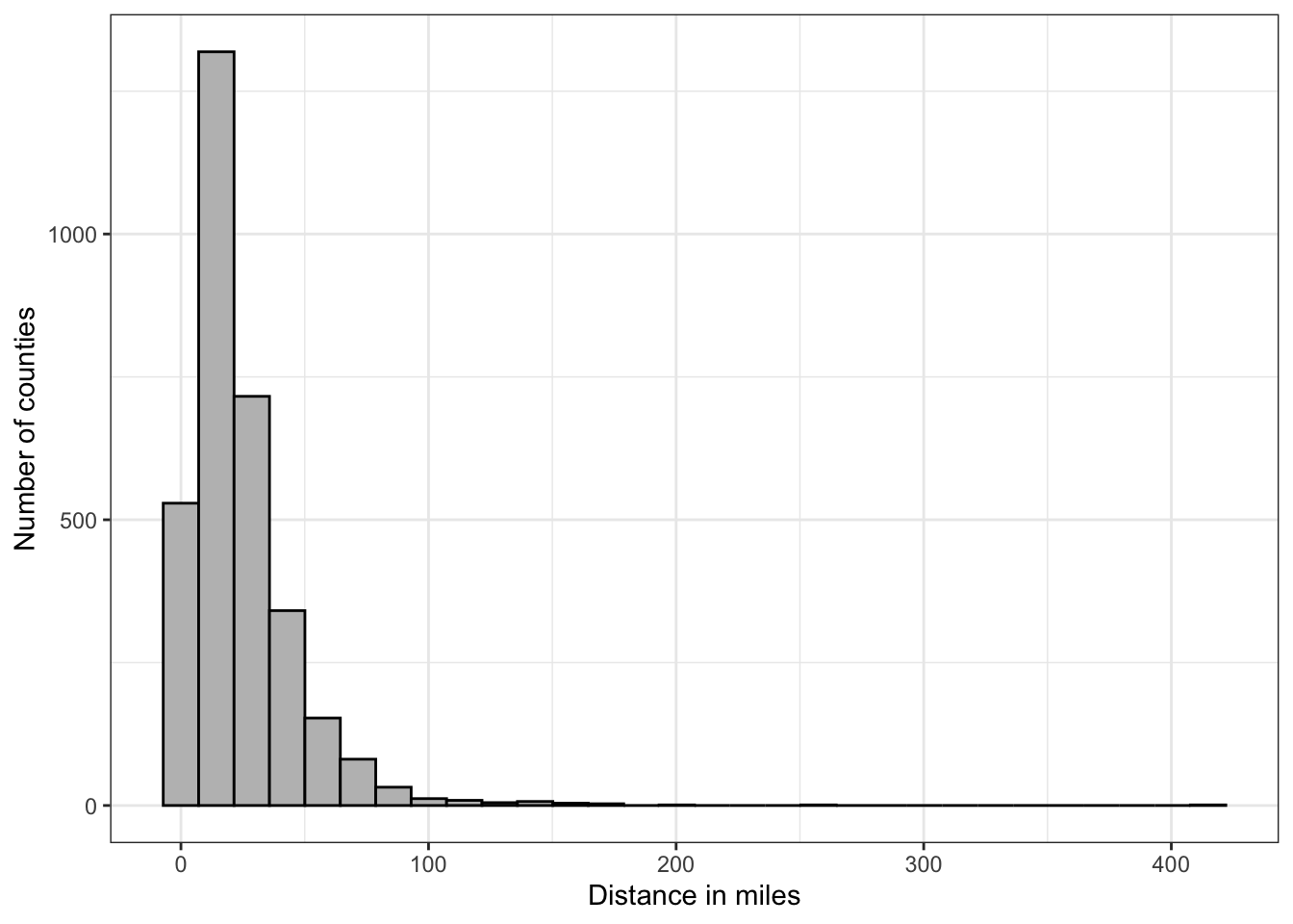
R Code 4.14 : Distribution of the original distance variable
R Code 4.15 : Distribution of the distance variable transformed by various factors
## using the extended data frame
## with square root, cube root, inverse $ log values

p_cube_root <- dist_mat_clean |>
    ggplot2::ggplot(
        ggplot2::aes(x = cube_root)
    ) +
    ggplot2::geom_density(
        color = "black",
        fill = "grey"
    ) +
    ggplot2::theme_bw() +
    ggplot2::labs(
        x = "Cube root of miles to nearest facility",
        y = "Density"
    )


p_square_root <- dist_mat_clean |>
    ggplot2::ggplot(
        ggplot2::aes(x = square_root)
    ) +
    ggplot2::geom_density(
        color = "black",
        fill = "grey"
    ) +
    ggplot2::theme_bw() +
    ggplot2::labs(
        x = "Distance in square root of miles",
        y = "Density"
    )

p_inverse <- dist_mat_clean |>
    ggplot2::ggplot(
        ggplot2::aes(x = inverse)
    ) +
    ggplot2::geom_density(
        color = "black",
        fill = "grey"
    ) +
    ggplot2::theme_bw() +
    ggplot2::xlim(0, 1) +
    ggplot2::labs(
        x = "Inverse of miles to nearest facility",
        y = "Density"
    )

p_log <- dist_mat_clean |>
    ggplot2::ggplot(
        ggplot2::aes(x = log)
    ) +
    ggplot2::geom_density(
        color = "black",
        fill = "grey"
    ) +
    ggplot2::theme_bw() +
    ggplot2::labs(
        x = "Log of miles to nearest facility",
        y = "Density"
    )
gridExtra::grid.arrange(grobs = list(p_cube_root,
                                     p_square_root,
                                     p_inverse,
                                     p_log),
ncol = 2)The best result of these transformation was with cube root.
I tried to write a function for these four graphs, but it was not easy to pass the dataframe and column to the function. I finally succeeded with passing the column name as character string and using [[ inside the function to select the column. (See StackOverflow) But I gave up with xlim() parameter for the inverse transformation.
R Code 4.17 : Probability density function for a variable with a mean of 2.66 and a standard deviation of .79
base::set.seed(42)
normal_data <- tibble::tibble(stats::rnorm(
    n = 1e3,
    mean = 2.66,
    sd = .79)) |>
    dplyr::rename(data = 1)

normal_data |>
    ggplot2::ggplot() +
    ggplot2::aes(x = data,
                 y = ggplot2::after_stat(count) /
                     base::sum(count)
                 ) +
    ggplot2::geom_density() +
    ggplot2::theme_bw() +
    ggplot2::labs(x = 'Cube root of miles to the nearest facility with MAT',
       y = 'Probability density')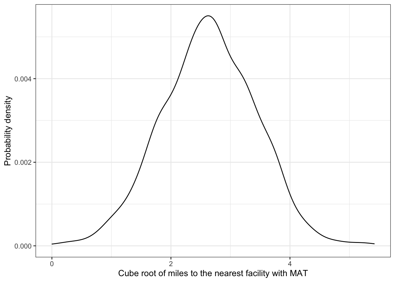
In this plot I draw the probability density function with randomly generated data. The above curve will smooth out when I will take a bigger sample (for instance 1e5 instead 1e3).
R Code 4.18 : Probability density function of the cube root transformation for 64 miles distance to a treatment facility
normal_data |>
    ggplot2::ggplot(
        ggplot2::aes(x = data)
    ) +
    ggplot2::stat_function(
        fun = dnorm,
        n = 1e3,
        args = list(mean = 2.66,
                    sd = .79),
        linewidth = .5) +
    ggplot2::geom_area(stat = 'function',
            fun = dnorm,
            fill = 'blue',
            args = list(mean = 2.66,
                    sd = .79),
            xlim = c(4, 6),
            alpha = 0.3) +
    ggplot2::theme_bw() +
    ggplot2::labs(x = 'Cube root of miles to the nearest facility with MAT',
       y = 'Probability density')
For this plot I have used the dnorm() function. Therefore this normal distribution curve is smooth.
The shaded area is the probability for counties that are \(4^3 = 64\) miles from a facility that provides medical assisted treatment (MAT)
R Code 4.19 : Compute shaded area: Percentage of counties where the nearest facility with MAT is 64 miles or more far away
stats::pnorm(4, 2.66, .79, lower.tail = FALSE)#> [1] 0.04492377If you want to calculate the right part of the distribution then you need to change the default value from lower.tail = TRUE to lower.tail = FALSE.
4.49% of observations were in the shaded part of this distribution and therefore had a value for the distance variable of 4 or greater. Reversing the transformation, this indicated that residents of 4.49% of counties have to travel 43 or 64 miles or more to get to the nearest substance abuse facility providing medication-assisted treatment.
Shows shading for the part of the distribution that is less than 2. Estimate (without computing the answer) the percentage of counties in the shaded area.
Exercise 4.1 : Achievement 3: Check understanding
R Code 4.20 : Shows shading for the part of the distribution that is less than 2
dist_mat_clean |>
    ggplot2::ggplot(
        ggplot2::aes(x = cube_root)
    ) +
    ggplot2::stat_function(
            fun = dnorm,
            n = 1e3,
            args = list(mean = 2.66,
                        sd = .79),
            linewidth = .5) +
    ggplot2::geom_area(stat = 'function',
            fun = dnorm,
            fill = 'blue',
            args = list(mean = 2.66,
                    sd = .79),
            xlim = c(0, 2),
            alpha = 0.3) +
    ggplot2::theme_bw() +
    ggplot2::labs(x = 'Cube root of miles to the nearest facility with MAT',
       y = 'Probability density')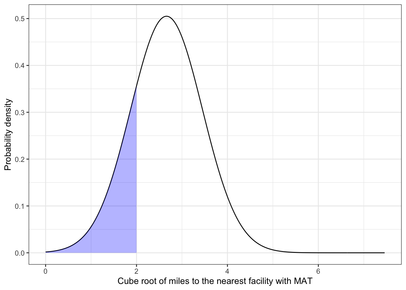
R Code 4.21 : Compute area of the shading for the part of the distribution that is 8 miles or less from the nearest facility with MAT
stats::pnorm(2, mean = 2.66, sd = .79)#> [1] 0.2017342About 20% of the counties are 8 miles or less from the nearest facility with MAT. My estimation of the shaded area without computation would have been much more (about 30-35%).
Values of normally distributed variables
Regardless of what the mean and standard deviation are, a normally distributed variable has approximately
These characteristics of the normal distribution can be used to describe and compare how far individual observations are from a mean value.
Formula 4.1 : Z-Score formula
\[ z_{i} = \frac{x_{i} - m_{x}}{s_{x}} \tag{4.1}\]
The z-score for an observation is the number of standard deviations from the mean.
Example 4.7 : Calculation and interpretation of z-scores
R Code 4.22 : Z-score for a county with residents who have to travel 50 miles to the nearest facility
cube_miles <- 50^(1/3)
mean = 2.66
sd = .79

(cube_miles - mean) / sd
#> [1] 1.296242This example county is farther than the mean away from the nearest facility with MAT.
R Code 4.23 : Z-score for a county with residents who have to travel 10 miles to the nearest facility
cube_miles <- 10^(1/3)
mean = 2.66
sd = .79

(cube_miles - mean) / sd
#> [1] -0.6399561This example county is less than the mean away from the nearest facility with MAT.
R Code 4.24 : Z-score for a county where you have to drive 15 miles to the nearest facility with MAT.
cube_miles <- 15^(1/3)
mean = 2.66
sd = .79

(cube_miles - mean) / sd
#> [1] -0.2453012This example county is less than the mean away from the nearest facility with MAT. (The mean of our transformed data is \(2.66^3\) miles = 18.821096).
Example 4.8 : Estimating population means
R Code 4.25 : Summarize distances from the amfAR database
#> # A tibble: 1 × 3
#>   mean_distance sd_distance     n
#>           <dbl>       <dbl> <int>
#> 1          24.0        22.7  3214
These are the value for the population of (almost all) counties of the US (n = 3214). We are going now to get a sample of 500 counties to see how near we will come with the sample summaries to mean and sd of the population .
R Code 4.26 : Draw a sample of 500 counties and compute the summaries
set.seed(seed = 1945)
dist_mat_clean2 |>
    dplyr::slice_sample(n = 500, replace = TRUE) |>
    dplyr::summarize(
    mean_distance = base::mean(distance),
    sd_distance = stats::sd(distance),
    n = dplyr::n()
    )

set.seed(seed = 48)
dist_mat_clean2 |>
    dplyr::slice_sample(n = 500, replace = TRUE) |>
    dplyr::summarize(
    mean_distance = base::mean(distance),
    sd_distance = stats::sd(distance),
    n = dplyr::n()
    )
#> # A tibble: 1 × 3
#> mean_distance sd_distance n
#> <dbl> <dbl> <int>
#> 1 24.4 23.8 500
#> # A tibble: 1 × 3
#> mean_distance sd_distance n
#> <dbl> <dbl> <int>
#> 1 23.5 20.1 500One sample is somewhat higher, the other a little lower than the population mean.
R Code 4.27 : Examining a sample of 20 samples from a population
## get 20 samples
## each sample has 500 counties
## put samples in a data frame with each sample
## having a unique id called "sample_num"

base::set.seed(111)
dist_mat_sample_20 <-
    dplyr::bind_rows(
        base::replicate(n = 20, dist_mat_clean2 |>
                        dplyr::slice_sample(n = 500, replace = TRUE),
                        simplify = FALSE),
        .id = "sample_num")

## find the mean for each sample
dist_mat_sample_20_means <- dist_mat_sample_20 |>
    dplyr::group_by(sample_num) |>
    dplyr::summarize(
        mean_distance = mean(x = distance, na.rm = TRUE))

dist_mat_sample_20_means

## find the mean of the 20 sample means
dist_mat_sample_20_means |>
    dplyr::summarize(mean_20_means = mean(mean_distance))
#> # A tibble: 20 × 2
#> sample_num mean_distance
#> <chr> <dbl>
#> 1 1 24.2
#> 2 10 22.0
#> 3 11 23.9
#> 4 12 23.8
#> 5 13 23.1
#> 6 14 23.0
#> 7 15 22.6
#> 8 16 24.4
#> 9 17 24.4
#> 10 18 24.0
#> 11 19 23.7
#> 12 2 24.2
#> 13 20 23.1
#> 14 3 23.9
#> 15 4 24.4
#> 16 5 24.7
#> 17 6 22.8
#> 18 7 24.2
#> 19 8 23.9
#> 20 9 24.2
#> # A tibble: 1 × 1
#> mean_20_means
#> <dbl>
#> 1 23.7R Code 4.28 : Examining a sample of 100 samples from a population
## get 100 samples
## each sample has 500 counties
## put samples in a data frame with each sample
## having a unique id called "sample_num"

base::set.seed(143)
dist_mat_sample_100 <-
    dplyr::bind_rows(
        base::replicate(n = 100, dist_mat_clean2 |>
                        dplyr::slice_sample(n = 500, replace = TRUE),
                        simplify = FALSE),
        .id = "sample_num")

## find the mean for each sample
dist_mat_sample_100_means <- dist_mat_sample_100 |>
    dplyr::group_by(sample_num) |>
    dplyr::summarize(
        mean_distance = mean(x = distance, na.rm = TRUE))

dist_mat_sample_100_means

## find the mean of the 100 sample means
dist_mat_sample_100_means |>
    dplyr::summarize(mean_100_means = mean(mean_distance))

dist_mat_sample_100_means |>
    ggplot2::ggplot(
        ggplot2::aes(x = mean_distance)
    ) +
    ggplot2::geom_histogram(
        bins = 30,
        color = "black",
        fill = "grey") +
    ggplot2::theme_bw()
#> # A tibble: 100 × 2
#>    sample_num mean_distance
#>    <chr>              <dbl>
#>  1 1                   22.9
#>  2 10                  23.3
#>  3 100                 23.8
#>  4 11                  23.2
#>  5 12                  24.9
#>  6 13                  23.8
#>  7 14                  24.8
#>  8 15                  23.5
#>  9 16                  25.5
#> 10 17                  24.1
#> # ℹ 90 more rows
#> # A tibble: 1 × 1
#>   mean_100_means
#>            <dbl>
#> 1           24.0
Even if the mean of the 100 sample means is already very near from the population value (23.9591026 versus 24.0427722, difference = -0.0836696) the sampling distribution is still far from a nice normal distribution. This will change if we are going to generate 1000 sample means.
R Code 4.29 : Plot the sample distribution of 1000 samples
## get 1000 samples
## each sample has 500 counties
## put samples in a data frame with each sample
## having a unique id called "sample_num"

base::set.seed(159)
dist_mat_sample_1000 <-
    dplyr::bind_rows(
        base::replicate(n = 1000, dist_mat_clean2 |>
                        dplyr::slice_sample(n = 500, replace = TRUE),
                        simplify = FALSE),
        .id = "sample_num")

## find the mean for each sample
dist_mat_sample_1000_means <- dist_mat_sample_1000 |>
    dplyr::group_by(sample_num) |>
    dplyr::summarize(
        mean_distance = mean(x = distance, na.rm = TRUE))

dist_mat_sample_1000_means

## find the mean of the 100 sample means
dist_mat_sample_1000_means |>
    dplyr::summarize(mean_1000_means = mean(mean_distance))

dist_mat_sample_1000_means |>
    ggplot2::ggplot(
        ggplot2::aes(x = mean_distance)
    ) +
    ggplot2::geom_histogram(
        bins = 30,
        color = "black",
        fill = "grey") +
    ggplot2::theme_bw()
#> # A tibble: 1,000 × 2
#> sample_num mean_distance
#> <chr> <dbl>
#> 1 1 24.8
#> 2 10 24.1
#> 3 100 23.8
#> 4 1000 24.5
#> 5 101 22.3
#> 6 102 24.4
#> 7 103 23.7
#> 8 104 24.2
#> 9 105 23.0
#> 10 106 24.6
#> # ℹ 990 more rows
#> # A tibble: 1 × 1
#> mean_1000_means
#> <dbl>
#> 1 24.0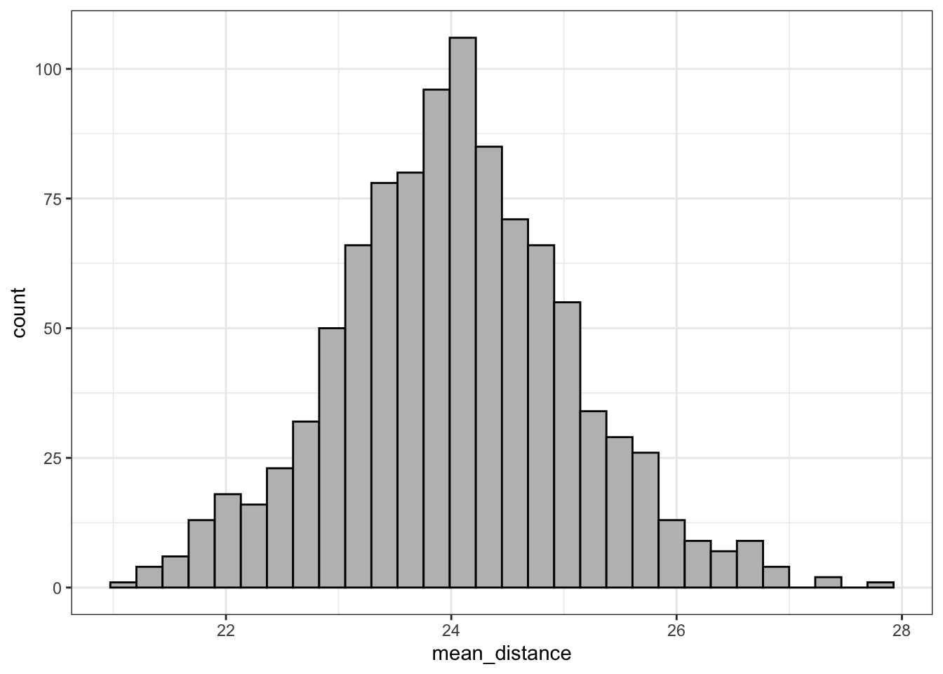
Taking a lot of large samples and graphing their means results in a sampling distribution that looks like a normal distribution, and, more importantly, the mean of the sample means is nearly the same as the population mean (24.0360017 versus 24.0427722, difference = -0.0067706).
The fact that the mean of the sample distribution of many samples approximates the population mean is called Central Limit Theorem. It holds true for continuous variables that both are and are not normally distributed.
Another characteristic of the Central Limit Theorem is that the standard deviation of the sample means can be estimated using the population standard deviation and the size of the samples that make up the distribution:
\[ s_{sample\space distribution} = \frac{\sigma}{\sqrt{n}} \tag{4.2}\]
If we want to calculate the standard deviation of the population we cannot use the stats::sd(). The reason is that stats::sd() uses the Bessel’s correction for samples which is not correct for the standard deviation of the population.
Instead to apply the rather complex procedure in the book, I recommend to use the sd_pop() function from the {sjstats} package (see Section A.83).
The standard deviation of the sampling distribution shows how much we expect sample means to vary from the population mean.
R Code 4.30 : Compute estimated standard deviation of the sampling distributions
## compute parameters for population
dist_mat_clean2  |>
    tidyr::drop_na(distance) |> # not necessary - no NAs
    dplyr::summarize(n = dplyr::n(),
                     pop.var = sjstats::var_pop(distance),
                     pop.sd = sjstats::sd_pop(distance),
                     samp_dist_est = pop.sd / base::sqrt(x = 500)
    )

## computing the sample dist standard deviation
## directly from the 1000 sample means

sd(x = dist_mat_sample_1000_means$mean_distance,
   na.rm = T)
#> # A tibble: 1 × 4
#> n pop.var pop.sd samp_dist_est
#> <int> <dbl> <dbl> <dbl>
#> 1 3214 514. 22.7 1.01
#> [1] 1.04966Since it is unusual to have the entire population for computing the population standard deviation, and it is also unusual to have a large number of samples from one population, a close approximation to this value is called the standard error of the mean (often referred to simply as the “standard error”). The standard error is computed by dividing the standard deviation of a variable by the square root of the sample size.
\[ se = \frac{s}{\sqrt{n}} \tag{4.3}\]
R Code 4.31 : Compute standard error of the mean
## mean, sd, se for first sample of 500 counties
set.seed(seed = 1945)
dist_mat_clean2 |>
    dplyr::slice_sample(n = 500, replace = TRUE) |>
    dplyr::summarize(
    mean_distance = base::mean(distance),
    sd_distance = stats::sd(distance),
    se_distance = stats::sd(x = distance) /
        base::sqrt(x = base::length(x = distance)),
    n = dplyr::n()
    )

set.seed(seed = 48)
dist_mat_clean2 |>
    dplyr::slice_sample(n = 500, replace = TRUE) |>
    dplyr::summarize(
    mean_distance = base::mean(distance),
    se_distance = stats::sd(x = distance) /
        base::sqrt(x = base::length(x = distance)),
    sd_distance = stats::sd(distance),
    n = dplyr::n()
    )
#> # A tibble: 1 × 4
#> mean_distance sd_distance se_distance n
#> <dbl> <dbl> <dbl> <int>
#> 1 24.4 23.8 1.06 500
#> # A tibble: 1 × 4
#> mean_distance se_distance sd_distance n
#> <dbl> <dbl> <dbl> <int>
#> 1 23.5 0.898 20.1 500Both of the standard error (se) values are close to the sampling distribution standard deviation of 1.05, but they are not exactly the same. The first sample standard error of 1.06 was a little above and the second sample standard error of .90 was a little below.
Summary
Most of the time researchers have a single sample and so the only feasible way to determine the standard deviation of the sampling distribution is by computing the standard error of the single sample. This value tends to be a good estimate of the standard deviation of sample means.
The sample standard error is a good estimate of the sampling distribution standard deviation!
Difference between standard deviation and standard error
The standard deviation is a measure of the variability in the sample, while the standard error is an estimate of how closely the sample represents the population.
95% confidence interval (CIs) show the range where the population value would likely be 95 times if the study were conducted 100 times.
The 95% interval idea summarized:
In the following example I am going to replicate Figure 4.20 and 4.21 of the book. For these two graphs there exist no demonstration how to use R code to produce the figures in the book.
Example 4.9 : Working with 95% confidence intervals
R Code 4.32 : Compute with a sample of 500 counties CI together with mean, sd, and se
## get the population mean
dist_mat_clean2 <- base::readRDS("data/chap04/dist_mat_clean2.rds")
mean_dist_pop <- dist_mat_clean2 |>
    dplyr::summarize(mean_pop = mean(distance)) |>
    dplyr::pull()

## mean, sd, se and 95% ci for first sample of 500 counties
set.seed(seed = 1945)
dist_mat_sample1 <- dist_mat_clean2 |>
    dplyr::slice_sample(n = 500, replace = TRUE)

dist_mat_param_sample1 <-  dist_mat_sample1 |>
    dplyr::summarize(
    mean_distance = base::mean(distance),
    sd_distance = stats::sd(distance),
    se_distance = stats::sd(distance) /
        base::sqrt(x = base::length(distance)),
    lower_ci_distance = mean_distance - 1.96 * se_distance,
    upper_ci_distance = mean_distance + 1.96 * se_distance
)The mean distance in miles to the nearest substance abuse treatment facility with MAT in a sample of 500 counties is 24.4; the true or population mean distance in miles to a facility likely lies between 22.32 and 26.49 (m = 24.4; 95% CI = 22.32 – 26.49).
In this special case we have the population mean also available: So we can compare: The population mean = 24.04, e.g., it lies withing the 95 CI!
R Code 4.33 : Compute with another sample of 500 counties CI together with mean, sd, and se
dist_mat_clean2 <-  base::readRDS("data/chap04/dist_mat_clean2.rds")

## mean, sd, se and 95% ci for first sample of 500 counties
set.seed(seed = 48)
dist_mat_sample2 <- dist_mat_clean2 |>
    dplyr::slice_sample(n = 500, replace = TRUE)

dist_mat_param_sample2 <-  dist_mat_sample2 |>
    dplyr::summarize(
    mean_distance = base::mean(distance),
    sd_distance = stats::sd(distance),
    se_distance = stats::sd(distance) /
        base::sqrt(x = base::length(distance)),
    lower_ci_distance = mean_distance - 1.96 * se_distance,
    upper_ci_distance = mean_distance + 1.96 * se_distance
)The mean distance in miles to the nearest substance abuse treatment facility with MAT in a sample of 500 counties is 23.5; the true or population mean distance in miles to a facility likely lies between 21.74 and 25.26 (m = 23.5; 95% CI = 21.74 – 25.26).
In this special case we have the population mean also available: So we can compare: The population mean = 24.04, e.g., it lies withing the 95 CI!
R Code 4.34 : Plot CI of a sample 0f 500 counties compared with population mean
## create data frame for the 4 different vertical lines
vlines <- tibble::tibble(labels = c(
        "Lower CI", "Upper CI",
        "Sample Mean", "Population Mean"
        ),
    xintercepts = c(
        dist_mat_param_sample1$lower_ci_distance,
        dist_mat_param_sample1$upper_ci_distance,
        dist_mat_param_sample1$mean_distance,
        mean_dist_pop
        ),
    colors = c("coral", "blue4", "seagreen", "yellow"),
    linetypes = c("solid", "solid", "dotted", "dashed" )
     )

## plot with scale & legend ##############
dist_mat_sample1 |>
    ggplot2::ggplot(
        ggplot2::aes(x = distance)
        ) +
    ggplot2::geom_histogram(
        bins = 30,
        fill = "grey",
        color = "black"
        ) +

    ## add all vertical lines via data frame
    ggplot2::geom_vline(
        data = vlines,
        ggplot2::aes(
            xintercept = xintercepts,
            color = colors, # color order is alphabetically
            linetype = linetypes)
    ) +

    ## change / prepare legend
    ggplot2::scale_color_identity(
        name = "Parameter",
        labels = vlines$labels,
        guide = "legend",
        breaks = c("coral", "blue4", "seagreen", "yellow")
        ) +

    ## prevent second legend for line type
    ## `guide = "none"` as default not necessary
    ggplot2::scale_linetype_identity(guide = "none") +
    ggplot2::theme_bw() +

    ## make legend bigger so that the lines are better visible
    ## and position legend on top with a border around
    ggplot2::guides(color =
        ggplot2::guide_legend(override.aes = base::list(size = 8))) +
    ggplot2::theme(
        legend.position = "top",
        legend.background =
           ## color = legend border,
           ## fill would be background, here not used
           ggplot2::element_rect(color = "black")
        ) +
    ggplot2::labs(
        x = "Distance in miles",
        y = "Number of counties"
    )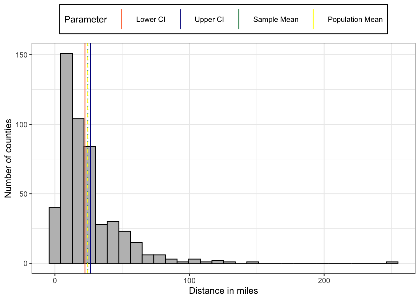
The 95% interval is very small. The population mean is inside the sample CI, very near and therefore almost overlapping the sample mean.
Order of legend labels
The standard for the order of the legend label is alphabetically. For instance I could manage my desired order with colors = c("blue4", "coral", "seagreen", "yellow") in the vlines data frame.
But I wanted to learn how to re-order the colors if they are not sorted. So I have changed my color code to colors = c("coral", "blue4", "seagreen", "yellow") in the vlines data frame. The first two colors are exchanged and not alphabetically sorted anymore.
It turned out that in this case I need to add the breaks argument with the correct order of colors inside my scale specification. So I have added breaks = c("coral", "blue4", "seagreen", "yellow") into ggplot2::scale_color_identity().
BTW: ggplot2::scale_color_identity() was necessary because I have passed the color names to be used for the vertical lines directly from the data frame (and not via a color palette). Calling scale_color_indentity() tells ggplot2 that it doesn’t need to create a new color scale in that situation.
R Code 4.35 : Plot CI of another sample 0f 500 counties compared with population mean
## plot with scale & legend ##############
dist_mat_sample2 |>
    ggplot2::ggplot(
        ggplot2::aes(x = distance)
        ) +
    ggplot2::geom_histogram(
        bins = 30,
        fill = "grey",
        color = "black"
        ) +

    ## add all vertical lines via data frame
    ggplot2::geom_vline(
        data = vlines,
        ggplot2::aes(
            xintercept = xintercepts,
            color = colors, # color order is alphabetically
            linetype = linetypes)
    ) +

    ## change / prepare legend
    ggplot2::scale_color_identity(
        name = "Parameter",
        labels = vlines$labels,
        guide = "legend",
        breaks = c("coral", "blue4", "seagreen", "yellow")
        ) +

    ## prevent second legend for line type
    ## `guide = "none"` as default not necessary
    ggplot2::scale_linetype_identity(guide = "none") +
    ggplot2::theme_bw() +

    ## make legend bigger so that the lines are better visible
    ## and position legend on top with a border around
    ggplot2::guides(color =
        ggplot2::guide_legend(override.aes = base::list(size = 8))) +
    ggplot2::theme(
        legend.position = "top",
        legend.background =
           ## color = legend border,
           ## fill would be background, here not used
           ggplot2::element_rect(color = "black")
        ) +
    ggplot2::labs(
        x = "Distance in miles",
        y = "Number of counties"
    )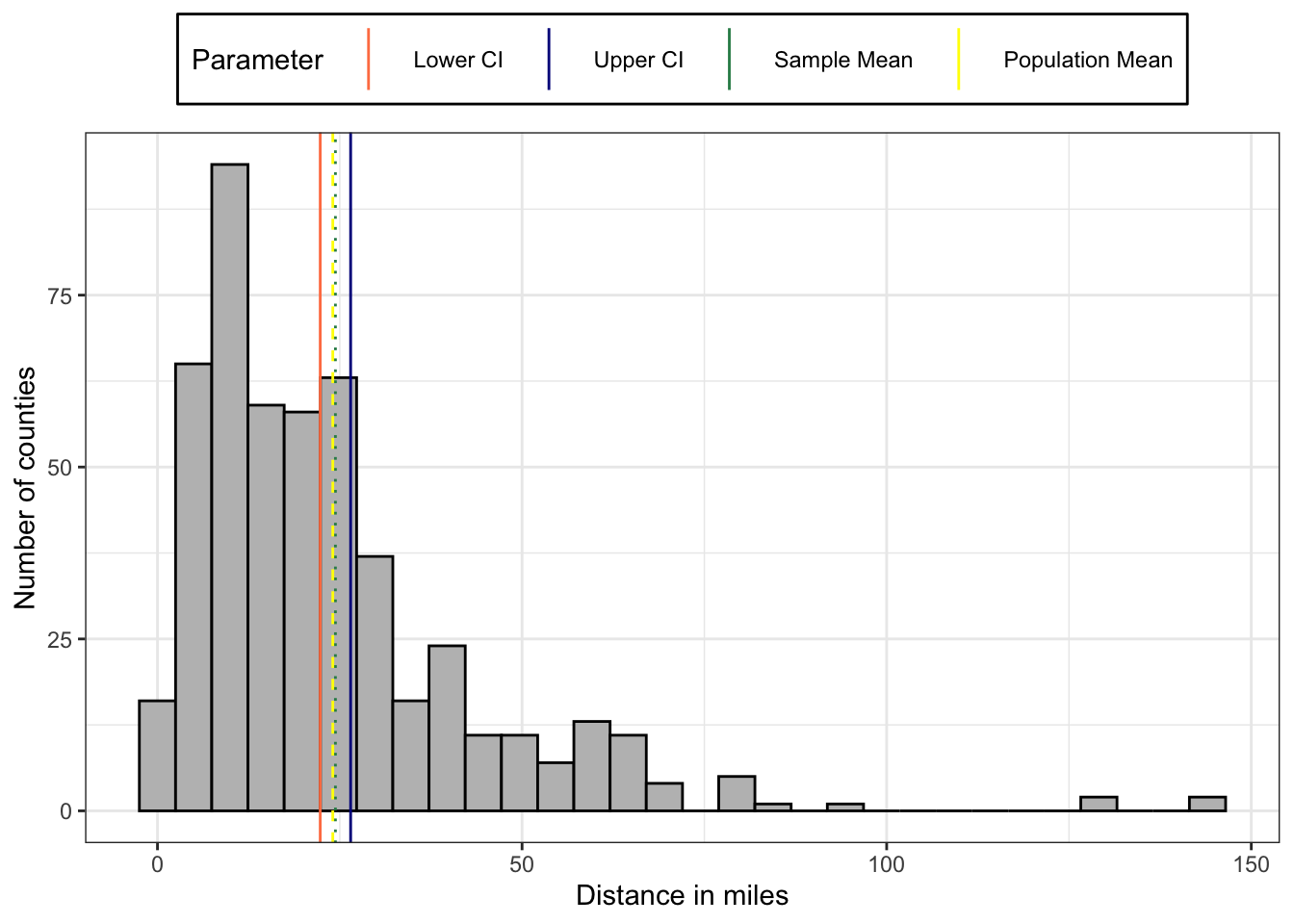
The 95% interval is very small. The population mean is inside the sample CI, very near and therefore almost overlapping the sample mean.
Order of legend labels
The standard for the order of the legend label is alphabetically. For instance I could manage my desired order with colors = c("blue4", "coral", "seagreen", "yellow") in the vlines data frame.
But I wanted to learn how to re-order the colors if they are not sorted. So I have changed my color code to colors = c("coral", "blue4", "seagreen", "yellow") in the vlines data frame. The first two colors are exchanged and not alphabetically sorted anymore.
It turned out that in this case I need to add the breaks argument with the correct order of colors inside my scale specification. So I have added breaks = c("coral", "blue4", "seagreen", "yellow") into ggplot2::scale_color_identity().
BTW: ggplot2::scale_color_identity() was necessary because I have passed the color names to be used for the vertical lines directly from the data frame (and not via a color palette). Calling scale_color_indentity() tells ggplot2 that it doesn’t need to create a new color scale in that situation.
We have seen that the population mean of both samples is inside the 95% confidence intervals. But lets get more calculation and see if 5% of the samples — per definition — really fall outside the CIs.
Example 4.10 : Check how often the population mean falls outside the sample CIs
R Code 4.36 : Visualizing position of population mean in relation to 95% confidence intervals of 20 samples
sample_stats_20 |>
    dplyr::group_by(sample_num) |>
    ggplot2::ggplot(
        ggplot2::aes(x = sample_num,
                     y = mean_20
        )
    ) +
    ggplot2::geom_errorbar(
        ggplot2::aes(
            ymin = ci_lower_20,
            ymax = ci_upper_20,
            linetype = "95% CI\nof sample mean"
        )
    ) +
    ggplot2::geom_point(
        ggplot2::aes(
            x = sample_num,
            y = mean_20,
            size = "Sample mean"
        )
    ) +
    ggplot2::geom_hline(
        ggplot2::aes(
            yintercept = mean_dist_pop,
            color = "darkred"
        ),
        linewidth = 1.5
    ) +
    ggplot2::theme_bw() +
    ggplot2::labs(
        x = "Sample",
        y = "Mean distance to treatment facility (95% CI)"
    ) +
    ggplot2::scale_color_discrete(
        name = "",
        labels = "Population mean"
    ) +
    ggplot2::scale_linetype_manual(
        name = "",
        values = c(1, NULL)
    ) +
    ggplot2::scale_size_manual(
        name = "",
        values = 4
    ) +
    ggplot2::theme(
        legend.position = "top"
) 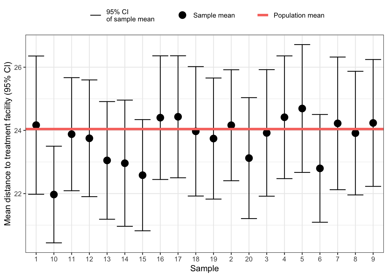
One confidence interval did not contain the population mean. This is 5% of 20 sample, which corresponds exactly to the definition of the 95% CI!
R Code 4.37 : Visualizing position of population mean in relation to 95% confidence intervals of 100 samples
sample_stats_100 <- dist_mat_sample_100 |>
    dplyr::group_by(sample_num) |>
    dplyr::summarize(mean_100 = mean(distance),
                     sd_100 = sd(distance),
                     se_100 = sd_100 /
                         base::sqrt(dplyr::n()),
                     ci_lower_100 = mean_100 - 2 * se_100,
                     ci_upper_100 = mean_100 + 2 * se_100
                     )

sample_stats_100 |>
    dplyr::group_by(sample_num) |>
    ggplot2::ggplot(
        ggplot2::aes(x = sample_num,
                     y = mean_100
        )
    ) +
    ggplot2::geom_errorbar(
        ggplot2::aes(
            ymin = ci_lower_100,
            ymax = ci_upper_100,
            linetype = "95% CI\nof sample mean"
        )
    ) +
    ggplot2::geom_point(
        ggplot2::aes(
            x = sample_num,
            y = mean_100,
            size = "Sample mean"
        )
    ) +
    ggplot2::geom_hline(
        ggplot2::aes(
            yintercept = mean_dist_pop,
            color = "darkred"
        ),
        linewidth = .5
    ) +
    ggplot2::theme_bw() +
    ggplot2::labs(
        x = "Sample",
        y = "Mean distance to treatment facility (95% CI)"
    ) +
    ggplot2::scale_color_discrete(
        name = "",
        labels = "Population mean"
    ) +
    ggplot2::scale_linetype_manual(
        name = "",
        values = c(1, NULL)
    ) +
    ggplot2::scale_size_manual(
        name = "",
        labels = "Sample mean",
        values = 1
    ) +
    ggplot2::scale_x_discrete(
        breaks = NULL
    ) +
    ggplot2::theme(
        legend.position = "top"
) 
This time four confidence intervals that did contain the population mean. This is within the tolerance limit of the 95% CI: With 100 samples 5 would be allowed not to contain the population mean.
Form the graph it is difficult to find those CIs that do not contain the population mean. In the next tab I am trying to colorize those intervals.
In the book the scale of the x-axis was removed with ggplot2::theme(axis.text.x = ggplot2::element_blank()). I have used ggplot2::scale_x_discrete(breaks = NULL) with the same effect.
R Code 4.38 : Visualizing position of population mean in relation to 95% confidence intervals of 100 samples, colorizing those CIs that do not include the population mean
sample_stats_100 <- dist_mat_sample_100 |>
    dplyr::group_by(sample_num) |>
    dplyr::summarize(mean_100 = mean(distance),
                     sd_100 = sd(distance),
                     se_100 = sd_100 /
                         base::sqrt(dplyr::n()),
                     ci_lower_100 = mean_100 - 2 * se_100,
                     ci_upper_100 = mean_100 + 2 * se_100
                     )

sample_stats_100 |>
    dplyr::group_by(sample_num) |>
    ggplot2::ggplot(
        ggplot2::aes(x = sample_num,
                     y = mean_100
        )
    ) +
    ggplot2::geom_errorbar(
        ggplot2::aes(
            ymin = ci_lower_100,
            ymax = ci_upper_100,
            linetype = "95% CI\nof sample mean"
        ),
        color = dplyr::if_else(
            mean_dist_pop >= sample_stats_100$ci_lower_100 &
            mean_dist_pop <= sample_stats_100$ci_upper_100,
            "black",
            "orange"
        )
    ) +
    ggplot2::geom_point(
        ggplot2::aes(
            x = sample_num,
            y = mean_100,
            size = "Sample mean"
        )
    ) +
    ggplot2::geom_hline(
        ggplot2::aes(
            yintercept = mean_dist_pop,
            color = "darkred"
        ),
        linewidth = .5
    ) +
    ggplot2::theme_bw() +
    ggplot2::labs(
        x = "Sample",
        y = "Mean distance to treatment facility (95% CI)"
    ) +
    ggplot2::scale_color_discrete(
        name = "",
        labels = "Population mean"
    ) +
    ggplot2::scale_linetype_manual(
        name = "",
        values = c(1, NULL)
    ) +
    ggplot2::scale_size_manual(
        name = "",
        labels = "Sample mean",
        values = 1
    ) +
    ggplot2::scale_x_discrete(
        breaks = NULL
    ) +
    ggplot2::theme(
        legend.position = "top"
) 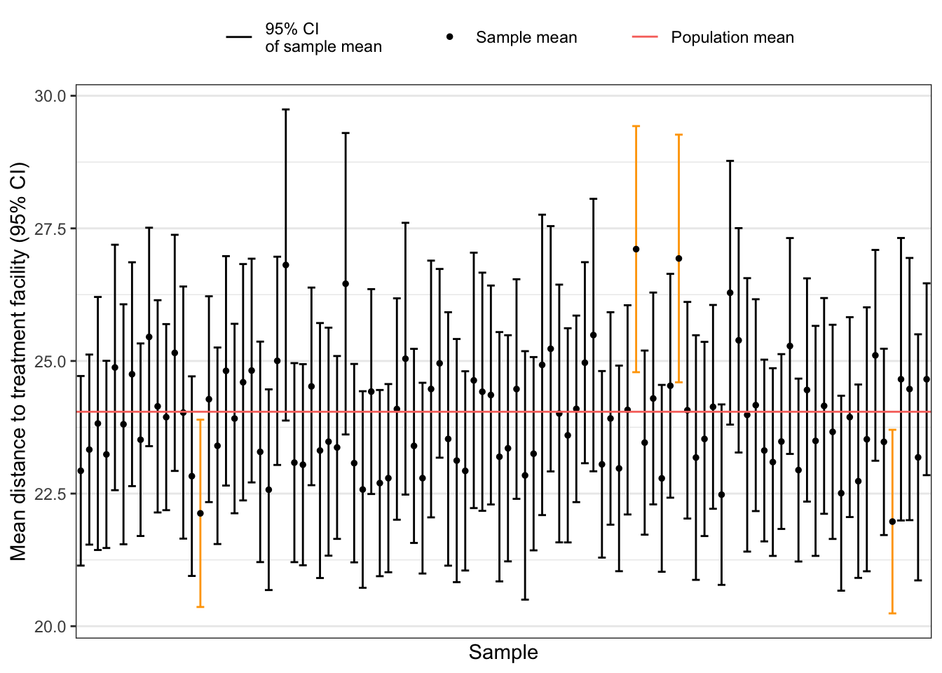
Now you can better see that 4 CIs do not include the population mean. The graph is a reproduction of book’s Figure 4.24 which is not accompanied with the appropriate R code.
In the book the scale of the x-axis was removed with ggplot2::theme(axis.text.x = ggplot2::element_blank()). I have used ggplot2::scale_x_discrete(breaks = NULL) with the same effect.
Given that the sampling distribution is normally distributed, 95% of sample means would be within two standard deviations of the mean of the means. This is also valid for binomial distributions, e.g. there are also confidence interval around the proportion of successes for a binary variable.
But there are two points to observe:
p for proportion rather than m for mean.)How to calculate the standard error for binomial distributions?
Instead of the formula for standard error for continuous variables (see Equation 4.3) the standard error for binomial distribution is:
\[ \sqrt\frac{p (1 - p)}{n} \tag{4.4}\]
The essence of this difference: Instead of computing the CI via the standard deviation you have to calculate the CIs directly from mean and standard error.
Example 4.11 : Population mean & sample CIs for binomial variable
R Code 4.39 : Get 100 samples of 30 states for PDMPs
pdmp_2017_book_clean <- base::readRDS("data/chap04/pdmp_2017_book_clean.rds")

## find the mean of pdmp
pdmp_mean_2017 <- pdmp_2017_book_clean |>
    dplyr::summarize(p = base::mean(PDMP)) |>
    dplyr::pull()


## get 100 samples: each sample has 30 states
## put samples in a data frame with each sample having
## a unique id called sample_num

base::set.seed(143)
pdmp_2017_book_samples <-
    dplyr::bind_rows(
        base::replicate(n = 100,
            pdmp_2017_book_clean |>
                        dplyr::slice_sample(n = 30, replace = TRUE),
                        simplify = FALSE),
        .id = "sample_num")

## find the mean for each sample
pdmp_2017_book_samples_states <-  pdmp_2017_book_samples |>
    dplyr::group_by(sample_num) |>
    dplyr::summarize(pdmp_p = base::mean(PDMP))

pdmp_mean_2017
pdmp_2017_book_samples_states
#> [1] 0.627451
#> # A tibble: 100 × 2
#> sample_num pdmp_p
#> <chr> <dbl>
#> 1 1 0.6
#> 2 10 0.633
#> 3 100 0.5
#> 4 11 0.633
#> 5 12 0.467
#> 6 13 0.567
#> 7 14 0.767
#> 8 15 0.433
#> 9 16 0.6
#> 10 17 0.667
#> # ℹ 90 more rowsR Code 4.40 : Histogram of 100 samples of states with PDMPs (2017)
pdmp_2017_book_samples_states |>
    ggplot2::ggplot(
        ggplot2::aes(x = pdmp_p)
    ) +
    ggplot2::geom_histogram(
        bins = 10,
        color = "black",
        fill = "grey") +
    ggplot2::theme_bw()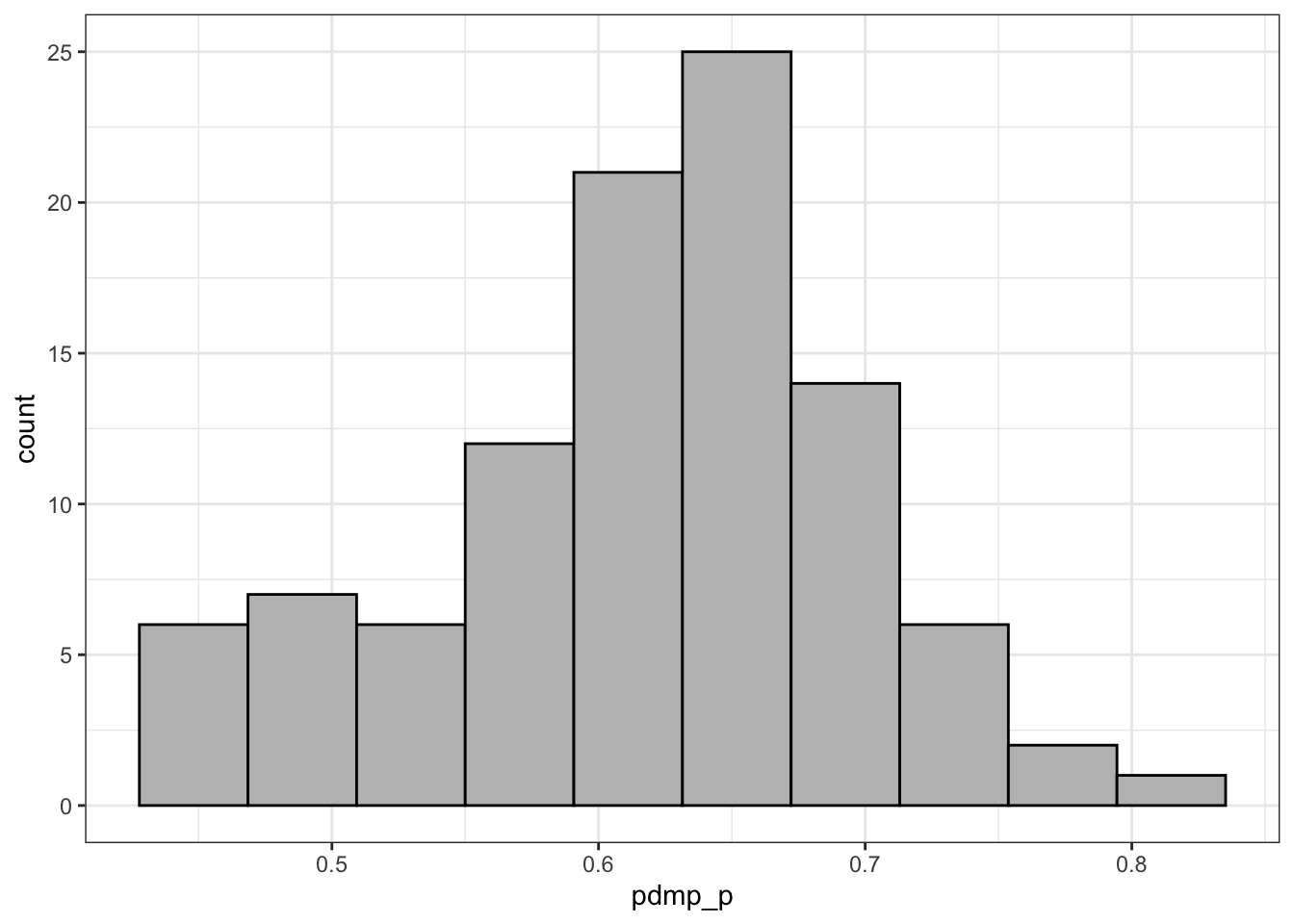
The group looks normally distributed and it would even look more normally distributed with more samples. Given that the sampling distribution is normally distributed, 95% of sample means would be within 1.96 standard deviations of the mean of the means.
R Code 4.41 : Visualizing position of population mean in relation to 95% confidence intervals of 100 samples of the binomial distribution of the BDMPs, colorizing those CIs that do not include the population mean
sample_binomial_100 <- pdmp_2017_book_samples |>
    dplyr::group_by(sample_num) |>
    dplyr::summarize(mean_100 = base::mean(PDMP),
                     se_100 = base::sqrt(mean_100 * (1 - mean_100) /
                              dplyr::n()),
                     ci_lower_100 = mean_100 - 2 * se_100,
                     ci_upper_100 = mean_100 + 2 * se_100
                     )

sample_binomial_100 |>
    dplyr::group_by(sample_num) |>
    ggplot2::ggplot(
        ggplot2::aes(x = sample_num,
                     y = mean_100
        )
    ) +
    ggplot2::geom_errorbar(
        ggplot2::aes(
            ymin = ci_lower_100,
            ymax = ci_upper_100,
            linetype = "95% CI\nof sample mean"
        ),
        color = dplyr::if_else(
            pdmp_mean_2017 >= sample_binomial_100$ci_lower_100 &
            pdmp_mean_2017 <= sample_binomial_100$ci_upper_100,
            "black",
            "orange"
        )
    ) +
    ggplot2::geom_point(
        ggplot2::aes(
            x = sample_num,
            y = mean_100,
            size = "Sample mean"
        )
    ) +
    ggplot2::geom_hline(
        ggplot2::aes(
            yintercept = pdmp_mean_2017,
            color = "darkred"
        ),
        linewidth = .5
    ) +
    ggplot2::theme_bw() +
    ggplot2::labs(
        x = "Sample",
        y = "Mean distance to treatment facility (95% CI)"
    ) +
    ggplot2::scale_color_discrete(
        name = "",
        labels = "Population mean"
    ) +
    ggplot2::scale_linetype_manual(
        name = "",
        values = c(1, NULL)
    ) +
    ggplot2::scale_size_manual(
        name = "",
        labels = "Sample mean",
        values = 1
    ) +
    ggplot2::scale_x_discrete(
        breaks = NULL
    ) +
    ggplot2::theme(
        legend.position = "top"
) 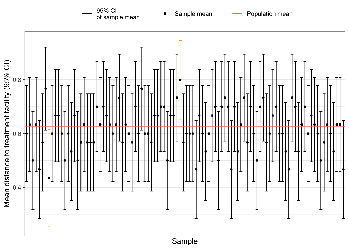
We see that 2 CIs do not include the population mean. The graph is a reproduction of book’s Figure 4.26 which is not accompanied with the appropriate R code.
The three most common intervals have the following z-scores:
Bullet List
Confidence intervals for small samples, usually defined as samples with fewer than 30 observations (Field, Miles, and Field 2012), use a t-statistic instead of a z-score in computing confidence interval for means and in other types of analyses.
The t-statistic is from the t-distribution and, like the z-score, it measures the distance from the mean. However, the t-statistic does this using the standard deviation of the sampling distribution, also known as the standard error, rather than the standard deviation of the sample.
\[ \begin{align*} t = \frac{m}{\frac{s}{\sqrt{n}}} \\ m = \text{sample mean for a variable} \\ s = \text{sample standard deviation for the same variable} \\ n = \text{sample size} \\ note = \text{the denominator for t is} \frac{s}{\sqrt(n)}\text{This is the standard error!} \end{align*} \tag{4.5}\]
The main practical difference between the two is that the t-statistic works better when samples are small; once samples are very large (n > 1,000), the two values will be virtually identical. (See Chapter 6 for more about the t-statistics.)
Experiment 4.1 : Get Prescription Drug Monitory Program (PMDP) data
R Code 4.42 : Get the cleaned PDMP data from the book .csv file
## run code only once manually ##########

## get pdmp data from books .csv
pdmp_2017_book <- readr::read_csv("data/chap04/pdmp_2017_kff_ch4.csv")
save_data_file("chap04", pdmp_2017_book, "pdmp_2017_book.rds").csv file
(For this R code chunk is no output available)
R Code 4.43 : Get PDMP data with {tabulizer}
## run only once (manually) ##########

## get pdmp table via tabulizer
pdmp_2017_temp <- tabulizer::extract_tables(
    "data/chap04/PDMPs-2017.pdf")
pdmp_2017_tabulizer <- pdmp_2017_temp[[1]]

save_data_file("chap04", pdmp_2017_tabulizer, "pdmp_2017_tabulizer.rds")(For this R code chunk is no output available)
R Code 4.44 : Get PDMP data via clipboard
## run code only once manually ###########

## readr::read_delim("clipboard") # Windows

pdmp_2017_clipboard1 <- readr::read_table(pipe("pbpaste")) # normal copy & paste
pdmp_2017_clipboard2 <- readr::read_table(pipe("pbpaste")) # TextSniper
save_data_file("chap04", pdmp_2017_clipboard1, "pdmp_2017_clipboard1.rds")
save_data_file("chap04", pdmp_2017_clipboard2, "pdmp_2017_clipboard2.rds")(For this R code chunk is no output available)
With this approach I have selected the table data and copied it into the clipboard. Be aware that here are two different functions for Windows and macOS.
R Code 4.45 : Get the PDMP data with {rvest}
## run code only once manually

## 1. check if web scrapping is allowed
url <- paste0("https://www.kff.org/report-section/",
  "implementing-coverage-and-payment-initiatives-benefits-and-pharmacy/")
robotstxt::paths_allowed((url))

## 2. get the whole KFF page
pdmp_2017_page <- rvest::read_html(url)
save_data_file("chap04", pdmp_2017_page, "pdmp_2017_page.rds")

## 3. extract PDMP table
pdmp_2017_rvest <- pdmp_2017_page |>
    rvest::html_nodes("table") |>
    purrr::pluck(10) |>
    rvest::html_table()

save_data_file("chap04", pdmp_2017_rvest, "pdmp_2017_rvest.rds")(For this R code chunk is no output available)
In Experiment 4.1 I have data imported in four different ways:
.csv file of the book.Conclusion: If I would not have the data to work with, I would take for further recoding the table the data imported by web scparing with {rvest}.
| term | definition |
|---|---|
| amfAR | amfAR, the Foundation for AIDS Research, known until 2005 as the American Foundation for AIDS Research, is an international nonprofit organization dedicated to the support of AIDS research, HIV prevention, treatment education, and the advocacy of AIDS-related public policy. (<a href="https://en.wikipedia.org/wiki/AmfAR">Wikipedia</a>) |
| Bessel’s Correction | Bessel's correction is the use of n − 1 instead of n in the formula for the sample variance and sample standard deviation, where n is the number of observations in a sample. This method corrects the bias in the estimation of the population variance. It also partially corrects the bias in the estimation of the population standard deviation. However, the correction often increases the mean squared error in these estimations. This technique is named after Friedrich Bessel. (<a href="https://en.wikipedia.org/wiki/Bessel%27s_correction">Wikipedia</a>) |
| CDC | Centers for Disease Control and Preventation (CDC) is the U.S. leading science-based, data-driven, service organization that protects the public’s health. (<a href="https://www.cdc.gov/about/">CDC</a>) |
| Central Limit Theorem | A foundational idea in inferential statistics that shows the mean of a sampling distribution of a variable will be a close approximation to the mean of the variable in the population, regardless of whether the variable is normally distributed. The Central Limit Theorem demonstrates why samples can be used to infer information about the population. (SwR, Glossary) |
| Confidence Interval | A range of values, calculated from the sample observations, that is believed, with a particular probability, to contain the true parameter value. (Cambridge Dictionary of Statistics, 4th ed., p.98) |
| Cumulative Distribution Function | A cumulative distribution function (CDF) tells us the probability that a random variable takes on a value less than or equal to x. (<a href="https://www.statology.org/cdf-vs-pdf/">Statology</a>) It sums all parts of the distribution, replacing a lot of calculus work. The CDF takes in a value and returns the probability of getting that value or lower. (BF, Chap.13) A CDF is a hypothetical model of a distribution, the ECDF models empirical (i.e. observed) data. (<a href="https://www.statisticshowto.com/empirical-distribution-function/">Statistics How To</a>) |
| KFF | Kaiser Family Foundation (KFF) is a non-partisan organization focused on health policy. It conducts its own research, polling, journalism, and specialized public health information campaigns and its website has been heralded for having the "most up-to-date and accurate information on health policy"[4] and as a "must-read for healthcare devotees." (<a href="https://en.wikipedia.org/wiki/Kaiser_Family_Foundation">Wikipdia</a>) |
| PDMP | In the United States, prescription monitoring programs (PMPs) or prescription drug monitoring programs (PDMPs) are state-run programs which collect and distribute data about the prescription and dispensation of federally controlled substances and, depending on state requirements, other potentially abusable prescription drugs. PMPs are meant to help prevent adverse drug-related events such as opioid overdoses, drug diversion, and substance abuse by decreasing the amount and/or frequency of opioid prescribing, and by identifying those patients who are obtaining prescriptions from multiple providers (i.e., "doctor shopping") or those physicians overprescribing opioids. (<a href="https://en.wikipedia.org/wiki/Prescription_monitoring_program">Wikipedia</a>) |
| Probability Distribution | It is a way of describing all possible events and the probability of each one happening. Probability distributions are also very useful for asking questions about ranges of possible values. (BF, Chap.4) The two defining features are: (1) All values of the distribution must be real and non-negative. (2) The sum (for discrete random variables) or integral (for continuous random variables) across all possible values of the random variable must be 1. (BS, Chap.3) |
| Sampling Distribution | A sampling distribution is the distribution of summary statistics, like means, from repeated samples taken from a population. (SwR, Glossary) |
| Standard Deviation | The standard deviation is a measure of the amount of variation or dispersion of a set of values. A low standard deviation indicates that the values tend to be close to the mean (also called the expected value) of the set, while a high standard deviation indicates that the values are spread out over a wider range. The standard deviation is the square root of its variance. A useful property of the standard deviation is that, unlike the variance, it is expressed in the same unit as the data. Standard deviation may be abbreviated SD, and is most commonly represented in mathematical texts and equations by the lower case Greek letter $\sigma$ (sigma), for the population standard deviation, or the Latin letter $s$ for the sample standard deviation. ([Wikipedia] |
| Standard Error | The standard error (SE) of a statistic is the standard deviation of its [sampling distribution]. If the statistic is the sample mean, it is called the standard error of the mean (SEM). (<a href="https://en.wikipedia.org/wiki/Standard_error">Wikipedia</a>) The standard error is a measure of variability that estimates how much variability there is in a population based on the variability in the sample and the size of the sample. (SwR, Glossary) |
| T-Statistic | The T-Statistic is used in a T test when you are deciding if you should support or reject the null hypothesis. It’s very similar to a Z-score and you use it in the same way: find a cut off point, find your t score, and compare the two. You use the t statistic when you have a small sample size, or if you don’t know the population standard deviation. (<a href="https://www.statisticshowto.com/t-statistic/">Statistics How-To</a>) |
| Z-score | A z-score (also called a standard score) gives you an idea of how far from the mean a data point is. But more technically it’s a measure of how many standard deviations below or above the population mean a raw score is. (<a href="https://www.statisticshowto.com/probability-and-statistics/z-score/#Whatisazscore">StatisticsHowTo</a>) |
Session Info
sessioninfo::session_info()#> ─ Session info ───────────────────────────────────────────────────────────────
#> setting value
#> version R version 4.4.2 (2024-10-31)
#> os macOS Sequoia 15.1
#> system x86_64, darwin20
#> ui X11
#> language (EN)
#> collate en_US.UTF-8
#> ctype en_US.UTF-8
#> tz Europe/Vienna
#> date 2024-11-13
#> pandoc 3.5 @ /usr/local/bin/ (via rmarkdown)
#>
#> ─ Packages ───────────────────────────────────────────────────────────────────
#> package * version date (UTC) lib source
#> cli 3.6.3 2024-06-21 [2] CRAN (R 4.4.1)
#> codetools 0.2-20 2024-03-31 [2] CRAN (R 4.4.2)
#> colorspace 2.1-1 2024-07-26 [2] CRAN (R 4.4.0)
#> commonmark 1.9.2 2024-10-04 [2] CRAN (R 4.4.1)
#> crayon 1.5.3 2024-06-20 [2] CRAN (R 4.4.0)
#> curl 6.0.0 2024-11-05 [2] CRAN (R 4.4.1)
#> datawizard 0.13.0 2024-10-05 [2] CRAN (R 4.4.1)
#> digest 0.6.37 2024-08-19 [2] CRAN (R 4.4.1)
#> dplyr 1.1.4 2023-11-17 [2] CRAN (R 4.4.0)
#> evaluate 1.0.1 2024-10-10 [2] CRAN (R 4.4.1)
#> fansi 1.0.6 2023-12-08 [2] CRAN (R 4.4.0)
#> farver 2.1.2 2024-05-13 [2] CRAN (R 4.4.0)
#> fastmap 1.2.0 2024-05-15 [2] CRAN (R 4.4.0)
#> forcats 1.0.0 2023-01-29 [2] CRAN (R 4.4.0)
#> generics 0.1.3 2022-07-05 [2] CRAN (R 4.4.0)
#> ggplot2 3.5.1 2024-04-23 [2] CRAN (R 4.4.0)
#> glossary * 1.0.0.9003 2024-08-05 [2] Github (debruine/glossary@05e4a61)
#> glue 1.8.0 2024-09-30 [2] CRAN (R 4.4.1)
#> gridExtra 2.3 2017-09-09 [2] CRAN (R 4.4.0)
#> gtable 0.3.6 2024-10-25 [2] CRAN (R 4.4.1)
#> here 1.0.1 2020-12-13 [2] CRAN (R 4.4.0)
#> htmltools 0.5.8.1 2024-04-04 [2] CRAN (R 4.4.0)
#> htmlwidgets 1.6.4 2023-12-06 [2] CRAN (R 4.4.0)
#> insight 0.20.5 2024-10-02 [2] CRAN (R 4.4.1)
#> jsonlite 1.8.9 2024-09-20 [2] CRAN (R 4.4.1)
#> kableExtra 1.4.0 2024-01-24 [2] CRAN (R 4.4.0)
#> knitr 1.49 2024-11-08 [2] CRAN (R 4.4.1)
#> labeling 0.4.3 2023-08-29 [2] CRAN (R 4.4.0)
#> lifecycle 1.0.4 2023-11-07 [2] CRAN (R 4.4.0)
#> magrittr 2.0.3 2022-03-30 [2] CRAN (R 4.4.0)
#> markdown 1.13 2024-06-04 [2] CRAN (R 4.4.0)
#> munsell 0.5.1 2024-04-01 [2] CRAN (R 4.4.0)
#> performance 0.12.4 2024-10-18 [2] CRAN (R 4.4.1)
#> pillar 1.9.0 2023-03-22 [2] CRAN (R 4.4.0)
#> pkgconfig 2.0.3 2019-09-22 [2] CRAN (R 4.4.0)
#> purrr 1.0.2 2023-08-10 [2] CRAN (R 4.4.0)
#> R6 2.5.1 2021-08-19 [2] CRAN (R 4.4.0)
#> rlang 1.1.4 2024-06-04 [2] CRAN (R 4.4.0)
#> rmarkdown 2.29 2024-11-04 [2] CRAN (R 4.4.1)
#> rprojroot 2.0.4 2023-11-05 [2] CRAN (R 4.4.0)
#> rstudioapi 0.17.1 2024-10-22 [2] CRAN (R 4.4.1)
#> rversions 2.1.2 2022-08-31 [2] CRAN (R 4.4.0)
#> scales 1.3.0 2023-11-28 [2] CRAN (R 4.4.0)
#> sessioninfo 1.2.2 2021-12-06 [2] CRAN (R 4.4.0)
#> sjstats 0.19.0 2024-05-14 [2] CRAN (R 4.4.0)
#> stringi 1.8.4 2024-05-06 [2] CRAN (R 4.4.0)
#> stringr 1.5.1 2023-11-14 [2] CRAN (R 4.4.0)
#> svglite 2.1.3 2023-12-08 [2] CRAN (R 4.4.0)
#> systemfonts 1.1.0 2024-05-15 [2] CRAN (R 4.4.0)
#> tibble 3.2.1 2023-03-20 [2] CRAN (R 4.4.0)
#> tidyr 1.3.1 2024-01-24 [2] CRAN (R 4.4.0)
#> tidyselect 1.2.1 2024-03-11 [2] CRAN (R 4.4.0)
#> utf8 1.2.4 2023-10-22 [2] CRAN (R 4.4.0)
#> vctrs 0.6.5 2023-12-01 [2] CRAN (R 4.4.0)
#> viridisLite 0.4.2 2023-05-02 [2] CRAN (R 4.4.0)
#> withr 3.0.2 2024-10-28 [2] CRAN (R 4.4.1)
#> xfun 0.49 2024-10-31 [2] CRAN (R 4.4.1)
#> xml2 1.3.6 2023-12-04 [2] CRAN (R 4.4.0)
#> yaml 2.3.10 2024-07-26 [2] CRAN (R 4.4.0)
#>
#> [1] /Library/Frameworks/R.framework/Versions/4.4-x86_64/library
#> [2] /Library/Frameworks/R.framework/Versions/4.4-x86_64/Resources/library
#>
#> ──────────────────────────────────────────────────────────────────────────────