Code
## run only once (manually)
water_educ <- readr::read_csv(
    file = "data/chap08/water_educ_2015_who_unesco_ch8.csv",
    show_col_types = FALSE
    )

save_data_file("chap08", water_educ, "water_educ.rds")Objectives for chapter 08
SwR Achievements
Goals
Resource 8.1 : Data, codebook, and R packages for learning about descriptive statistics
Data
Two options:
water_educ_2015_who_unesco_ch8.csv and 2015-outOfSchoolRate-primarySecondary-ch8.xlsx data sets from https://edge.sagepub.com/harris1e.Using data provided from the book
I have learned a lot about data cleaning procedures in the last chapters. I feel secure and decided from now on that I will take data provided by the book. This help me to focus my attention on the statistical subjects of the book.
Codebook
Two options:
opioid_county_codebook.xlsx from https://edge.sagepub.com/harris1e.Packages
Example 8.1 : Get data and show raw for chapter 8
R Code 8.1 : Get Water-Education data
## run only once (manually)
water_educ <- readr::read_csv(
file = "data/chap08/water_educ_2015_who_unesco_ch8.csv",
show_col_types = FALSE
)
save_data_file("chap08", water_educ, "water_educ.rds")(For this R code chunk is no output available)
R Code 8.2 : Show Water & Education data
| Name | water_educ |
| Number of rows | 97 |
| Number of columns | 10 |
| _______________________ | |
| Column type frequency: | |
| character | 1 |
| numeric | 9 |
| ________________________ | |
| Group variables | None |
Variable type: character
| skim_variable | n_missing | complete_rate | min | max | empty | n_unique | whitespace |
|---|---|---|---|---|---|---|---|
| country | 0 | 1 | 4 | 52 | 0 | 97 | 0 |
Variable type: numeric
| skim_variable | n_missing | complete_rate | mean | sd | p0 | p25 | p50 | p75 | p100 | hist |
|---|---|---|---|---|---|---|---|---|---|---|
| med.age | 0 | 1.00 | 30.33 | 8.69 | 15.00 | 22.50 | 29.70 | 39.00 | 45.90 | ▆▇▇▆▇ |
| perc.1dollar | 33 | 0.66 | 13.63 | 20.52 | 1.00 | 1.00 | 1.65 | 17.12 | 83.80 | ▇▁▁▁▁ |
| perc.basic2015sani | 0 | 1.00 | 79.73 | 27.18 | 7.00 | 73.00 | 93.00 | 99.00 | 100.00 | ▁▁▁▁▇ |
| perc.safe2015sani | 47 | 0.52 | 71.50 | 25.84 | 9.00 | 61.25 | 76.50 | 93.00 | 100.00 | ▂▂▁▆▇ |
| perc.basic2015water | 1 | 0.99 | 90.16 | 15.82 | 19.00 | 88.75 | 97.00 | 100.00 | 100.00 | ▁▁▁▁▇ |
| perc.safe2015water | 45 | 0.54 | 83.38 | 22.34 | 11.00 | 73.75 | 94.00 | 98.00 | 100.00 | ▁▁▁▂▇ |
| perc.in.school | 0 | 1.00 | 87.02 | 13.94 | 33.32 | 83.24 | 92.02 | 95.81 | 99.44 | ▁▁▁▂▇ |
| female.in.school | 0 | 1.00 | 87.06 | 15.10 | 27.86 | 83.70 | 92.72 | 96.61 | 99.65 | ▁▁▁▂▇ |
| male.in.school | 0 | 1.00 | 87.00 | 12.95 | 38.66 | 82.68 | 91.50 | 95.57 | 99.36 | ▁▁▁▂▇ |
Instead of base::summary() I used skimr::skim() which fives more descriptive information.
Codebook
The two variables of interests are:
Example 8.2 : Exploring data for chapter 8
R Code 8.3 : Mean and standard deviation for female.in.school and perc.basic2015water
| Name | water_educ |
| Number of rows | 97 |
| Number of columns | 10 |
| _______________________ | |
| Column type frequency: | |
| numeric | 2 |
| ________________________ | |
| Group variables | None |
Variable type: numeric
| skim_variable | n_missing | complete_rate | mean | sd | p0 | p25 | p50 | p75 | p100 | hist |
|---|---|---|---|---|---|---|---|---|---|---|
| female.in.school | 0 | 1.00 | 87.06 | 15.10 | 27.86 | 83.70 | 92.72 | 96.61 | 99.65 | ▁▁▁▂▇ |
| perc.basic2015water | 1 | 0.99 | 90.16 | 15.82 | 19.00 | 88.75 | 97.00 | 100.00 | 100.00 | ▁▁▁▁▇ |
The mean percent of school-aged females in school was 87.06 (sd = 15.1), and the mean percent of citizens who had basic access to water was 90.16 (sd = 15.82).
This is a pretty high percentage. The very high median shows that there is a heavy left-skewed distribution. 93 & 97% are in the first half of the distribution located!
Advantages of the skimr::skim() function
This above summary show the advantage of the skimr::skim() function versus the base::summary() resp. the extra calculation of mean and sd. skimr::skim() is (a) easier to use (just one line!) and (b) displays much more information, e.g., different percentiles with a small histogram. Important here is, for instance, that we can compare mean and median in one step.
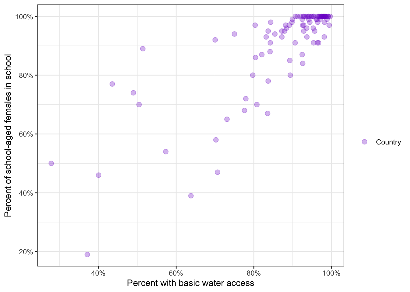
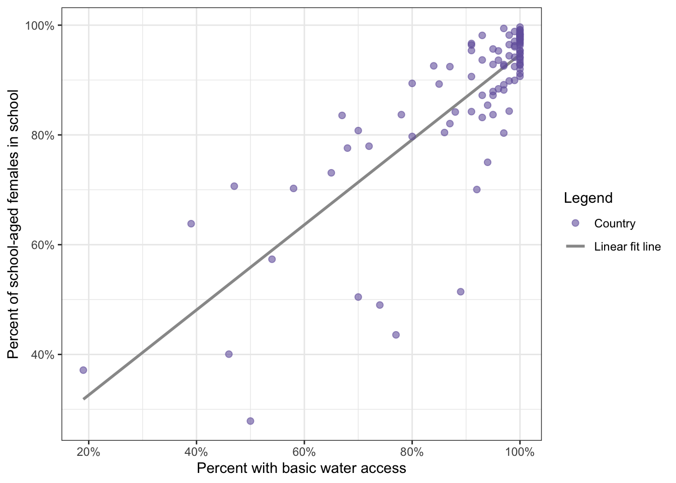
R Code 8.4 : Scatterplot of female.in.school and perc.basic2015water
water_educ |>
    ggplot2::ggplot(
        ggplot2::aes(
            x = female.in.school / 100,
            y = perc.basic2015water / 100
        )
    ) +
    ggplot2::geom_point(
        na.rm = TRUE,
        ggplot2::aes(
            color = "Country"
        ),
        size = 2.5,
        alpha = 0.3
    ) +
    ggplot2::labs(
        x = "Percent with basic water access",
        y = "Percent of school-aged females in school"
    ) +
    ggplot2::scale_color_manual(
        name = "",
        values = "purple3"
    ) +
    ggplot2::scale_x_continuous(
        labels = scales::label_percent()
    ) +
    ggplot2::scale_y_continuous(
        labels = scales::percent
    )
I have used two different argument styles for the percent scale from the {scales} package (see: Section A.78):
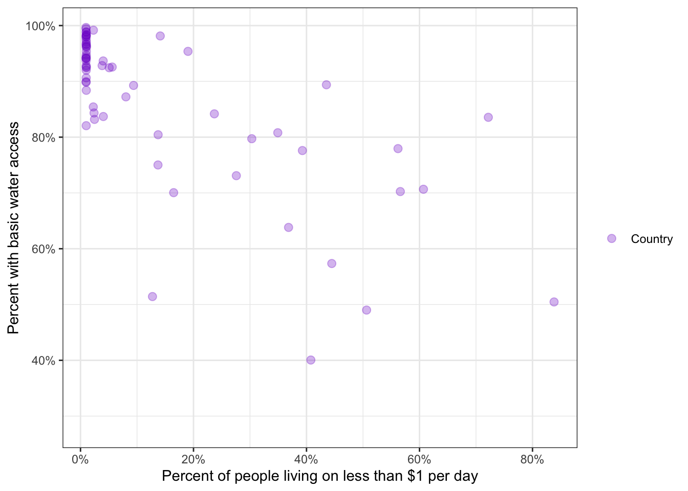
labels = scales::percent as in the booklabels = scales::label_percent() from the help file of the {scales} package.R Code 8.5 : Scatterplot of female.in.school and perc.1dollar
water_educ |>
    ggplot2::ggplot(
        ggplot2::aes(
            x = perc.1dollar / 100,
            y = female.in.school / 100
        )
    ) +
    ggplot2::geom_jitter(
        na.rm = TRUE,
        ggplot2::aes(
            color = "Country"
        ),
        size = 2.5,
        alpha = 0.3
    ) +
    ggplot2::labs(
        x = "Percent of people living on less than $1 per day",
        y = "Percent with basic water access"
    ) +
    ggplot2::scale_color_manual(
        name = "",
        values = "purple3"
    ) +
    ggplot2::scale_x_continuous(
        labels = scales::label_percent()
    ) +
    ggplot2::scale_y_continuous(
        labels = scales::percent
    )
One method of measuring the relationship between two continuous variable is covariance, which quantifies whether two variables vary together (co-vary).
Formula 8.1 : Formula for covariance
\[ cov_{xy} = \sum_{i=1}^{n}\frac{(x_{i}-m_{x})(y_{i}-m_{y})}{n-1} \tag{8.1}\]
The numerator essentially adds up how far each observation is away from the mean values of the two variables being examined, so this ends up being a very large number quantifying how far away all the observations are from the mean values. The denominator divides this by Bessel’s correction (Section 4.8.2) of \(n – 1\), which is close to the sample size and essentially finds the average deviation from the means for each observation.
I skipped Figure 8.4 and 8.5 because they do not bring any news for me. (Note that there is a wrong label for x-axis in Figure 8.5: Instead of “Percent living on less than $1 per day” it says wrongly “Percent with basic water access”.)
The covariance function stats::cov() is like the base::mean() function in that it cannot handle NA values. As we are going to calculate female.in.school with perc.basic2015water and female.in.school with perc.1dollar we would have three different variables with NA’s.
It is important not to to remove all rows with missing data of all three variables at the same time because that would delete more rows as for each pair of variable would be necessary. We know from Table 8.1 that
female.in.school has no missing valuesperc.basic2015water has 1 missing valueperc.1dollar has 33 missing valuesThere are two options:
tidyr::drop_na() function as used finally in the book.use argument of the stats::cov() function for each calculations, which I will use and which was the first try in the book.R Code 8.6 : Covariance of females in school and percentage with basic access to drinking water
#> # A tibble: 1 × 2
#>   cov_females_water cov_females_pov
#>               <dbl>           <dbl>
#> 1              194.           -203.
The book argument for NA’s is use = "complete" which is an allowed abbreviation for use = "complete.obs". I have employed use = "pairwise.complete.obs" which is a more precise argument but works only for the (default) “pearson” method.
The covariance does not have an intuitive inherent meaning; it is not a percentage or a sum or a difference. In fact, the size of the covariance depends largely on the size of what is measured. For example, something measured in millions might have a covariance in the millions or hundreds of thousands. The value of the covariance indicates whether there is a relationship at all and the direction of the relationship — that is, whether the relationship is positive or negative.
In this case, a nonzero value indicates that there is some relationship. In the first case (cov_females_water) it is a positive relationship; in the second case (cov_females_pov) it is a negative relationship. The size of the numbers are irrelevant!
Therefore standardization by dividing by the standard deviation of the two involved variables is necessary. The result is called the correlation coefficient and is referred to as r.
Formula 8.2 : Computing the Pearson r correlation between two variables
\[ \begin{align*} r_{xy} = \frac{cov_{xy}}{s_{x}s_{y}} \\ r_{xy} = \sum_{i = 1}^{n}\frac{z_{x}z_{y}}{n-1} \end{align*} \tag{8.2}\]
The second line is also know as the product-moment correlation coefficient. The formula for r can be organized in many different ways, one of which is as the mean of the summed products of z-scores.
Assessment 8.1 : Range of Pearson’s r and interpretation of strength
Example 8.3 : Compute and show correlation
R Code 8.7 : Compute correlations for water access, poverty and female education
#> # A tibble: 1 × 2
#>   cor_females_water cor.females.pov
#>               <dbl>           <dbl>
#> 1             0.809          -0.714
R Code 8.8 : Display correlation water access and female education with lm and loess smoother with a special constructed legend
water_educ |>
  ggplot2::ggplot(
      ggplot2::aes(
          y = female.in.school/100,
          x = perc.basic2015water/100
          )
      ) +
  ggplot2::geom_smooth(
      ggplot2::aes(color = "Linear fit line"),
      formula = y ~ x,
      method = "lm",
      se = FALSE,
      na.rm = TRUE
      ) +
    ggplot2::geom_smooth(
      ggplot2::aes(color = "Loess line"),
      formula = y ~ x,
      method = "loess",
      se = FALSE,
      na.rm = TRUE
      ) +
  ggplot2::geom_point(
      ggplot2::aes(size = "Country"),
      color = "#7463AC",
      alpha = .6,
      na.rm = TRUE
      ) +
  ggplot2::labs(
      y = "Percent of school-aged females in school",
      x = "Percent with basic water access"
      ) +
  ggplot2::scale_x_continuous(labels = scales::percent) +
  ggplot2::scale_y_continuous(labels = scales::percent) +
  ggplot2::scale_color_manual(
      values = c("gray60", "darkred"),
      name = ""
      ) +
  ggplot2::scale_size_manual(values = 2, name = "")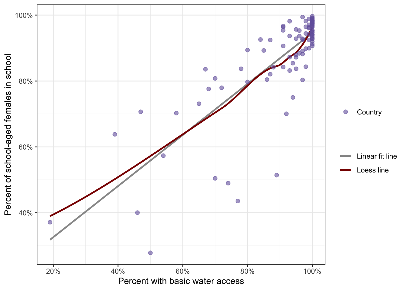
lm and loess smoother with a special constructed legend
ggplot2::geom_smooth() layer
lm than the default value would have been chosen, e.g. (depending on fewer than 1000) which is a local polynomial regression fitting.method = lm and in another layer method = loess. The Loess curve results in the slightly curved line (the red curve). Instead of fitting the whole data at once (= “lm”), method “loess” creates a local regression because the fitting at say point x is weighted toward the data nearest to x and not to the general mean.WATCH OUT! Legends are generated from attributes inside the ggplot2::aes() statement
It is important to know:
ggplot2::aes() functions then there is not legend generated.In this case I have used twice the “color” aesthetic, but as value I gave as argument was the type of line and not an actual color. The actual color for the lines you will fin in the ggplot2::scale_color_manual() layer at the very bottom of the code.
See also the next two graphs (Graph 8.4 and Graph 8.5) about water access and female education where I have explored different types of points and lines inside the aesthetic function.
R Code 8.9 : Display correlation water access and female education with two legends explaining what the different symbols represent
water_educ |>
  ggplot2::ggplot(
      ggplot2::aes(
          y = female.in.school/100,
          x = perc.basic2015water/100
          )
      ) +
  ggplot2::geom_smooth(
      ggplot2::aes(color = "Linear fit line"),
      formula = y ~ x,
      method = "lm",
      se = FALSE,
      na.rm = TRUE
      ) +
  ggplot2::geom_point(
      ggplot2::aes(size = "Country"),
      color = "#7463AC",
      alpha = .6,
      na.rm = TRUE
      ) +
  ggplot2::labs(
      y = "Percent of school-aged females in school",
      x = "Percent with basic water access"
      ) +
  ggplot2::scale_x_continuous(labels = scales::percent) +
  ggplot2::scale_y_continuous(labels = scales::percent) +
  ggplot2::scale_color_manual(values = "gray60", name = "Legend 2") +
  ggplot2::scale_size_manual(values = 2, name = "Legend 1")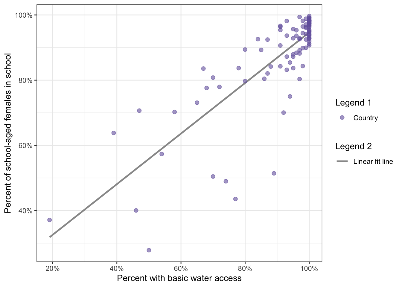
WATCH OUT! Legends are generated from attributes inside the ggplot2::aes() statement
The two ggplot2::aes() functions used for this graph are ggplot2::aes(size = "Country") and ggplot2::aes(linetype = "Linear fit line"). To get two different legends (point and lines), two different attributes were used within the aes().
: Display correlation water access and female education with a legend explaining what the different symbols represent
water_educ |>
  ggplot2::ggplot(
      ggplot2::aes(
          y = female.in.school/100,
          x = perc.basic2015water/100
          )
      ) +
  ggplot2::geom_smooth(
      ggplot2::aes(color = "Linear fit line"),
      formula = y ~ x,
      method = "lm",
      se = FALSE,
      na.rm = TRUE
      ) +
  ggplot2::geom_point(
      ggplot2::aes(color = "Country"),
      size = 2,
      alpha = .6,
      na.rm = TRUE
      ) +
  ggplot2::labs(
      y = "Percent of school-aged females in school",
      x = "Percent with basic water access"
      ) +
  ggplot2::scale_x_continuous(labels = scales::percent) +
  ggplot2::scale_y_continuous(labels = scales::percent) +
  ggplot2::scale_color_manual(
      name = "Legend",
      values = c("#7463AC", "gray60")
      )
WATCH OUT! The name of the attribute inside the aes() is arbitrary
Graph 8.5 has the color attribute for both the points and the line within aes() and so both colors are included in the only legend.
The name of the attribute inside the aes() is arbitrary and will result in the label of the legend. The type of this attribute has to be addressed and specified with the correct manual scale (ggplot2::scale_xxx_manual()) and will display the appropriate symbol for the attribute.
ATTENTION: With new versions of {ggplot2} the symbols are not merged as in the book’s version. This would have been not correct, because the line does not go through all points. Points and lines are different aesthetics but they are merged under on legend with one common attribute, their color.
The Pearson’s product-moment correlation coefficient demonstrated that the percentage of females in school is positively correlated with the percentage of citizens with basic access to drinking water (r = 0.81). Essentially, as access to water goes up, the percentage of females in school also increases in countries.
R Code 8.10 : Display relationship of percentage of citizens living on less than $1 per day and the percent of school-aged females in school in countries worldwide
water_educ |>
  ggplot2::ggplot(
      ggplot2::aes(
          y = female.in.school/100,
          x = perc.1dollar/100
          )
      ) +
  ggplot2::geom_smooth(
      ggplot2::aes(color = "Linear fit line"),
      formula = y ~ x,
      method = "lm",
      se = FALSE,
      na.rm = TRUE
      ) +
  ggplot2::geom_point(
      ggplot2::aes(color = "Country"),
      size = 2,
      alpha = .6,
      na.rm = TRUE
      ) +
  ggplot2::labs(
      y = "Percent of school-aged females in school",
      x = "Percent of citizens living on less than $1 per day"
      ) +
  ggplot2::scale_x_continuous(labels = scales::percent) +
  ggplot2::scale_y_continuous(labels = scales::percent) +
  ggplot2::scale_color_manual(
      name = "",
      values = c("#7463AC", "gray60")
      )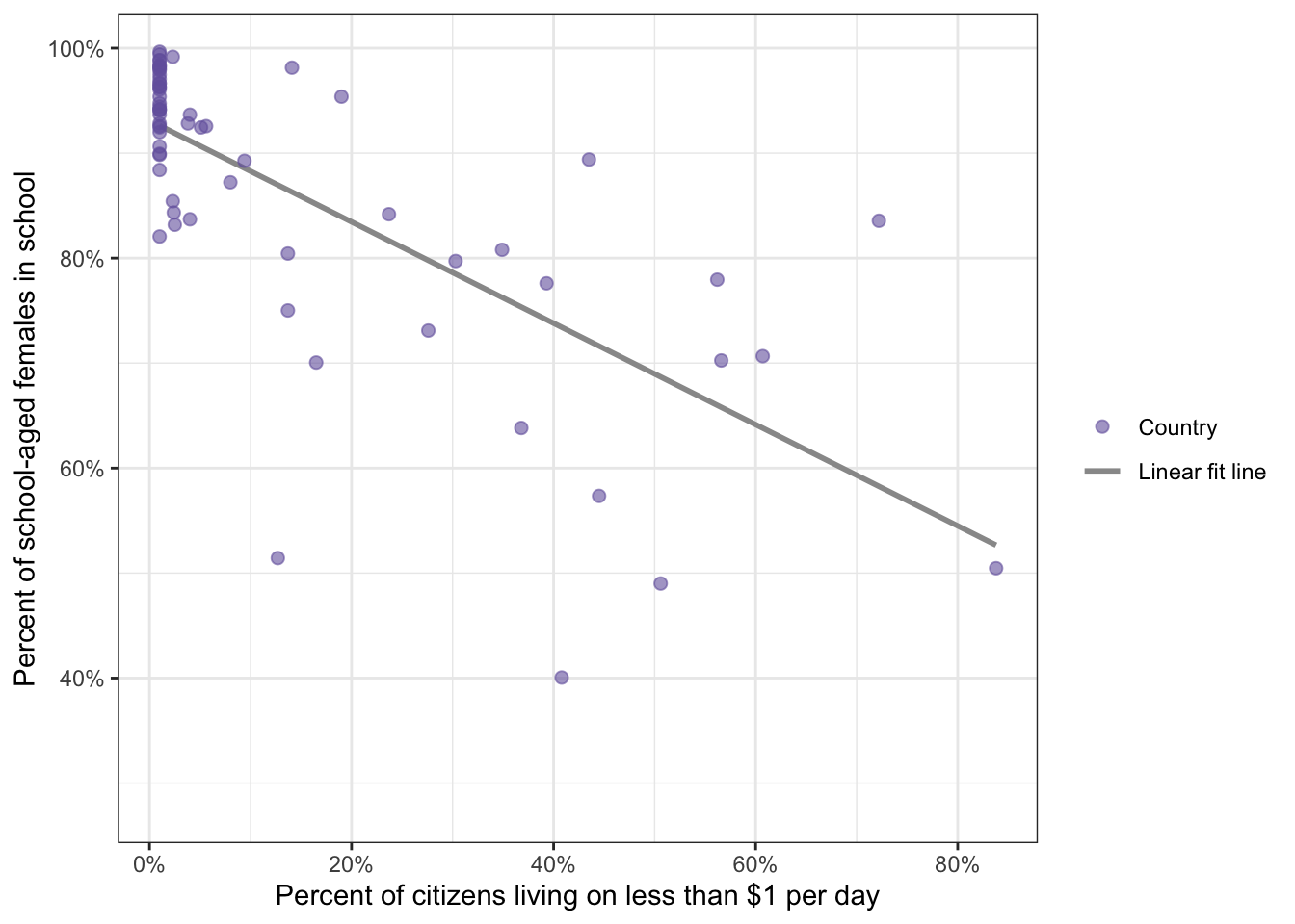
The Pearson’s product-moment correlation coefficient demonstrated that the percentage of females in school is negatively correlated with the percentage of citizens living on less than $1 per day (r = -0.71). Essentially, as the percentage of citizens living on less than $1 per day goes up, the percentage of females in school decreases in countries.
The null hypothesis is tested using a t-statistic comparing the correlation coefficient of r to a hypothesized value of zero.
Formula 8.3 : One.sample t-test
\[ t = \frac{m_{x}-0}{se_{m_{x}}} \tag{8.3}\]
But we are not actually working with means, but instead comparing the correlation of \(r_{xy}\) to zero.
: Rewriting Equation 8.3 to get the t-statistic for the significance test of r
\[ t = \frac{r_{xy}}{se_{r_{xy}}} \tag{8.4}\]
There are multiple ways to compute the standard error for a correlation coefficient:
Formula 8.4 : Standard error for a correlation coefficient
\[ se_{r_{xy}} = \sqrt\frac{1-r_{xy}^2}{n-2} \tag{8.5}\]
Now we can substitute \(se_{r_{xy}}\) into the t-statistic of Equation 8.4 and simplify the formula.
: t-statistic for the significance test of r
\[ \begin{align*} t = \frac{r_{xy}}{\sqrt\frac{1-r_{xy}^2}{n-2}} =\\ t = \frac{r_{xy}\sqrt{n-2}}{\sqrt{1-r_{xy}^2}} \end{align*} \tag{8.6}\]
Write the null and alternate hypotheses:
Compute the test statistic.
Example 8.4 : Compute t-statistic for the significance test of r
R Code 8.11 : Compute t-statistic for the significance test of r manually
test_data <- water_educ |>
  tidyr::drop_na(perc.basic2015water)  |>
  tidyr::drop_na(female.in.school) |>
  dplyr::summarize(
      cor_females_water = cor(
          x = perc.basic2015water,
          y = female.in.school
          ),
      sample_n = dplyr::n()
      )

(test_data$cor_females_water * (sqrt(test_data$sample_n - 2))) /
    (sqrt(1 - (test_data$cor_females_water^2)))
#> [1] 13.32774R Code 8.12 : Compute t-statistic for the significance test of r with stats::cor.test()
# cor.test(x = water_educ$perc.basic2015water,
#          y = water_educ$female.in.school)

# using instead the formula interface
cor.test(
    formula = ~ female.in.school + perc.basic2015water,
    data = water_educ
)stats::cor.test()
#>
#>  Pearson's product-moment correlation
#>
#> data:  female.in.school and perc.basic2015water
#> t = 13.328, df = 94, p-value < 2.2e-16
#> alternative hypothesis: true correlation is not equal to 0
#> 95 percent confidence interval:
#>  0.7258599 0.8683663
#> sample estimates:
#>       cor
#> 0.8086651
I have used the formula interface because it has a different syntax as I thought. My first trials were with female.in.school ~ perc.basic2015water but this didn’t work. The (last) example in the help page demonstrated to me the other syntax.
Note that it is not necessary to remove NA’s before applying cor.test() in both cases.
Review and interpret the test statistics: Calculate the probability that your test statistic is at least as big as it is if there is no relationship (i.e., the null is true).
The very tiny p-value is statistically significant.
Conclude and write report.
The percentage of people who have basic access to water is statistically significantly, positively, and very strongly correlated with the percentage of primary- and secondary-age females in school in a country [r = .81; t(94) = 13.33; p < .05]. As the percentage of people living with basic access to water goes up, the percentage of females in school also goes up. While the correlation is .81 in the sample, it is likely between .73 and .87 in the population (95% CI: .73–.87).
Pearson’r is already a kind of effect size because it measures the strength of a relationship. But with the coefficient of determination \(R^2\) (also \(r^2\)) there is another effect size measure with a more direct interpretation. The coefficient of determination is the percentage of the variance in one variable that is shared, or explained, by the other variable.
Formula 8.5 : Computing the coefficient of determination \(R^2\)
\[ r_{xy}^2 = (\frac{cov_{xy}}{s_{x}s_{y}})^2 \tag{8.7}\]
R Code 8.13 : Compute r-squared (\(R^2\))
(stats::cor.test(
    x = water_educ$perc.basic2015water,
    y = water_educ$female.in.school)$estimate
)^2
#> cor
#> 0.6539392The stats::cor.test() function creates an object of type htest which is a list of 9 different object. One of these object is the numeric vector estimate that holds the correlation value. There are two option to calculate r-squared:
stats::cor.test() function to a named object. Append $estimate^2 to this object to get r-squared. I have this done in one step, and appended $estimate^2 at the end of the function without providing an interim object.stats:cor() or stats::cor.test() and then take the result and square it to get r-squared. But this method is more error-prone.Bullet List
So far the book had mentioned siblings and other family members or testing the same individuals several time as examples for not independent observations. Now we got two more examples:
Both variables need to be of type numeric. In our case we have the number of countries as integer variable: Counting something is integer, measuring something is continuous. But in our case it can be treated statistically like a continuous variable.
The same is true with percent values, but there are some worries how to model percentages statistically.
A couple of … papers suggested that percentage variables are problematic for statistical models that have the purpose of predicting values of the outcome because predictions can fall outside the range of 0 to 100.
Resource 8.2 Dealing with percentage data
Comparing histograms and Q-Q plots is one of the most applied techniques to test the normality assumption. I am also using histograms with an overlaid normal distribution and have an extra function developed for this recurring task.
I will provide all three different graphs here one again, although I have already understood and memorized these practices.
Example 8.5 : Checking the normality assumption
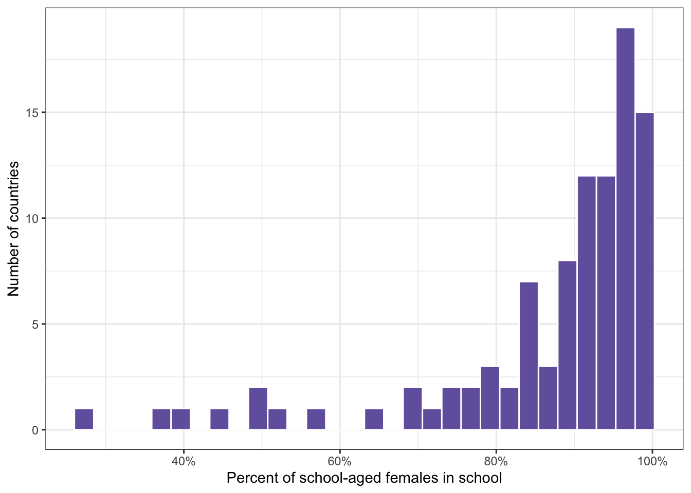
R Code 8.14 : Check normality of female.in.school variable
water_educ  |>
  ggplot2::ggplot(
      ggplot2::aes(x = female.in.school / 100)) +
  ggplot2::geom_histogram(
      fill = "#7463AC",
      col = "white",
      bins = 30,
      na.rm = TRUE
  ) +
  ggplot2::labs(
      x = "Percent of school-aged females in school",
      y = "Number of countries"
  ) +
  ggplot2::scale_x_continuous(
      labels = scales::percent
  )
R Code 8.15 : Percentage of school-aged females in school with an overlaid normal distribution
my_hist_dnorm(
    df = water_educ,
    v = water_educ$female.in.school / 100,
    n_bins = 30,
    x_label = "Percent of school-aged females in school"
    ) +
  ggplot2::scale_x_continuous(labels = scales::percent)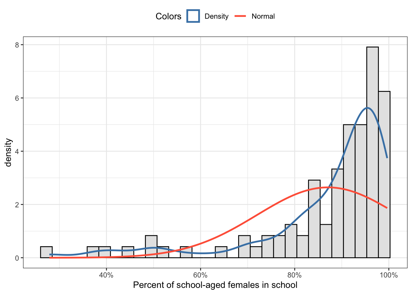
R Code 8.16 : Comparison of the distribution of school-aged females in school with the theoretical normal distribution
water_educ  |>
  ggplot2::ggplot(
      ggplot2::aes(sample = female.in.school)
  ) +
  ggplot2::stat_qq(
      ggplot2::aes(color = "Country"),
      alpha = .6
  ) +
  ggplot2::geom_abline(
      ggplot2::aes(
          intercept = base::mean(female.in.school),
          slope = stats::sd(female.in.school),
          linetype = "Normally distributed"
      ),
          color = "gray60",
          linewidth = 1
  ) +
  ggplot2::labs(
      x = "Theoretical normal distribution",
      y = "Observed values of percent of\nschool-aged females in school",
      title = "Q-Q plot of female.in.school with `geom_abline()` and `ylim()`") +
  ggplot2::ylim(0,100) +
  ggplot2::scale_linetype_manual(values = "solid", name = "") +
  ggplot2::scale_color_manual(values = "purple4", name = "")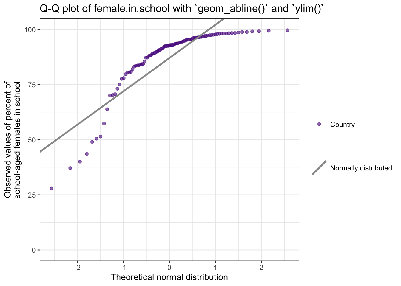
This graph is the replication of Figure 8.15. It uses ggplot2::geom_abline() by calculating the mean as intercept and the slop as standard deviation. This is more complex as the ggplot2::geom_qq_line() resp. ggplot2::stat_qq_line() but has the advantage that the legend displays the line symbol with the same slope.
A more simple alternative is ggplot2::geom_qq_line() resp. ggplot2::stat_qq_line() because these commands compute automatically the slope and intercept of the line connecting the points at specified quartiles of the theoretical and sample distributions. I have this more simple approach already used when I checked the t-test assumptions in Section 6.9.
But here we are using percentages, e.g. we need to limit the y-axis to values between 0 and 100%. And this restrictions prevents to show the line of the theoretical normal distribution.
WATCH OUT! Do not forget, that the required aesthetic for the q-q-plot is “sample” and not “x”!
R Code 8.17 : Comparison of the distribution of school-aged females in school with the theoretical normal distribution
p1 <- water_educ  |>
  ggplot2::ggplot(
      ggplot2::aes(sample = female.in.school)
  ) +
  ggplot2::stat_qq(
      ggplot2::aes(color = "Country"),
      alpha = .6
  ) +
  ggplot2::stat_qq_line(
      ggplot2::aes(linetype = "Normally distributed"),
     linewidth = 1,
     color = "grey60",
     fullrange = TRUE
  ) +
  ggplot2::labs(
      x = "Theoretical normal distribution",
      y = "Observed values of percent of\nschool-aged females in school",
      title = "Q-Q plot of female.in.school\nwith `stat__qq_line()` witht `ylim()`") +
  ggplot2::ylim(0,100) +
  ggplot2::scale_linetype_manual(values = "solid", name = "") +
  ggplot2::scale_color_manual(values = "purple4", name = "") +
  ggplot2::theme(legend.position = "top")


p2 <- water_educ  |>
  ggplot2::ggplot(
      ggplot2::aes(sample = female.in.school)
  ) +
  ggplot2::stat_qq(
      ggplot2::aes(color = "Country"),
      alpha = .6
  ) +
  ggplot2::stat_qq_line(
      ggplot2::aes(linetype = "Normally distributed"),
     linewidth = 1,
     color = "grey60",
     fullrange = TRUE
  ) +
  ggplot2::labs(
      x = "Theoretical normal distribution",
      y = "Observed values of percent of\nschool-aged females in school",
      title = "Q-Q plot of female.in.school\nwith `stat__qq_line()` without `ylim()`") +
  ggplot2::scale_linetype_manual(values = "solid", name = "") +
  ggplot2::scale_color_manual(values = "purple4", name = "") +
  ggplot2::theme(legend.position = "top")

gridExtra::grid.arrange(
    p2, p1, ncol = 2
)
#> Warning: Removed 1 row containing missing values or values outside the scale range
#> (`geom_path()`).#> `geom_path()`: Each group consists of only one observation.
#> ℹ Do you need to adjust the group aesthetic?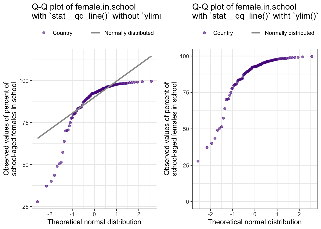
geom_path()).ggplot2::ylim(0, 100) restriction. It display the line for the theoretical normal distribution far outside the upper limit.There is nothing new when checking the normality assumption for basic water access. So I will skip these two graphs.
The linearity assumption requires that the relationship between the two variables falls along a line. I have already graphed the appropriate data in a previous section. For instance this assumption is met in Graph 8.4. If it is difficult to tell, a Loess curve can be added to confirm linearity as I have done it in Graph 8.3.
It is instructive to see relationships that are non-linear. The next graph shows some relationships but they fall along curves instead of along straight lines.
Another example of failing the linearity assumption can be seen after data transforming in Graph 8.20.
Another assumption is the equal distribution of points around the line, which is often called the assumption of homoscedasticity.
Besides a visual graphical inspection the Breusch-Pagan test could be used to test the null hypothesis that the variance is constant around the line. The Breusch-Pagan test relies on the chi-squared distribution, and the lmtest::bptest() function can be found in the {lmtest} package (see Section A.45).
Example 8.6 : Check if the homoscedasticity assumption is met
R Code 8.18 : Examine graphically if the equal distribution of points around the line (homoscedasticity assumption) is met
plt <- water_educ |>
  ggplot2::remove_missing(
        na.rm = TRUE,
        vars = c("perc.basic2015water", "female.in.school")
  ) |>
  ggplot2::ggplot(
        ggplot2::aes(
            y = female.in.school/100,
            x = perc.basic2015water/100
          )
  ) +
  ggplot2::geom_point(
      ggplot2::aes(
          size = "Country"
          ),
      color = "purple4",
      alpha = .6
  ) +
  ggplot2::geom_smooth(
      formula = y ~ x,
      ggplot2::aes(
          linetype = "Linear fit line"
          ),
      color = "grey60",
      method = "lm",
      se = FALSE
      ) +
  ggplot2::geom_segment(
      ggplot2::aes(
          linetype = "homoscedasticity check"
      ),
      y = 57 / 100, x = 17 / 100,
      xend = 97 / 100, yend = 100 / 100,
      linewidth = 0.5,
      color = "grey60"
  ) +
    ggplot2::geom_segment(
      ggplot2::aes(
          linetype = "homoscedasticity check"
      ),
      x = 72 / 100, y = 25 / 100,
      xend = 100 / 100, yend = 80 / 100,
      linewidth = 0.5,
      color = "grey60"
  ) +
  ggplot2::labs(
      y = "Percent of school-aged females in school",
      x = "Percent with basic access to water") +
  ggplot2::scale_x_continuous(labels = scales::percent) +
  ggplot2::scale_y_continuous(labels = scales::percent) +
  ggplot2::scale_color_manual(
      values = c("gray60", "darkred"), name = "") +
  ggplot2::scale_size_manual(values = 2, name = "") +
  ggplot2::scale_linetype_manual(values = c(2, 1), name = "")

base::suppressWarnings(base::print(plt))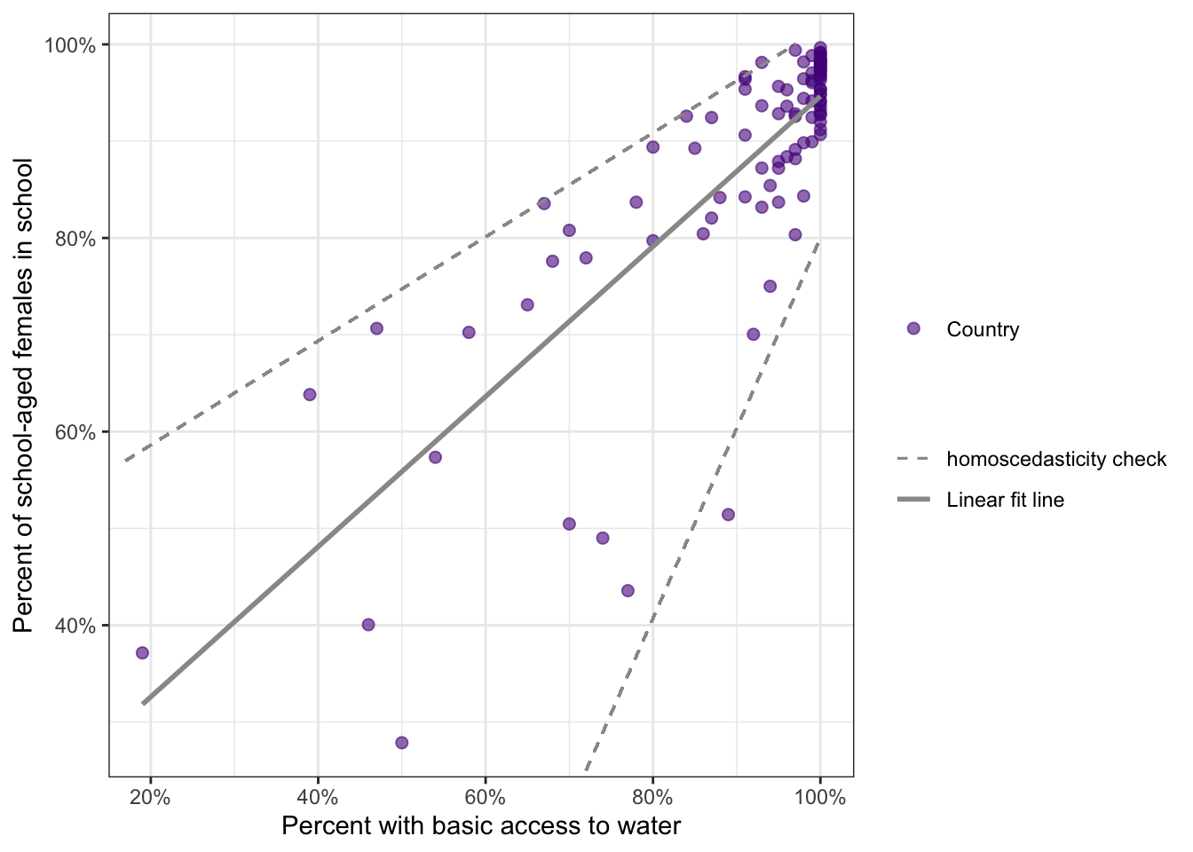
This is the replication of Figure 8.20 of the book, that had no accompanying R code. I have applied trial and error for the geom_segment() layer. Later I noticed that I could have used the figures of the last paragraph of the fig-alt description.
The funnel shape of the data indicated that the points were not evenly spread around the line from right to left. On the left of the graph they were more spread out than on the right, where they were very close to the line. This indicates the data do not meet the homoscedasticity assumption.
I suppressed two warning from {ggplot2}, one for each ggplot2::geom_segment() layer:
All aesthetics have length 1, but the data has 96 rows. Did you mean to use
annotate()?
R Code 8.19 : Check homoscedasticity with the Breusch-Pagan test
lmtest::bptest(
    formula = water_educ$female.in.school ~ water_educ$perc.basic2015water)
#>
#> studentized Breusch-Pagan test
#>
#> data: water_educ$female.in.school ~ water_educ$perc.basic2015water
#> BP = 12.368, df = 1, p-value = 0.0004368The Breusch-Pagan test statistic has a low p-value (BP = 12.37; p = 0.0004), indicating that the null hypothesis that the variance is constant would be rejected, e.g., the homoscedasticity assumption is not met.
Bullet List
The big question is: What can be done that several of the assumptions are not met? The books gives some words of advice:
My opinion to the three tips
female.in.school but not for the perc.basic2015water variable. More on this analysis in
Compare testing the assumptions for Pearson’s r in the example data in Bullet List 8.2 with testing the assumptions for Pearson’s r with the transformed data in Bullet List 8.4.
One of the ways to deal with data that do not meet assumptions for Pearson’s r is to use a data transformation and examine the relationship between the transformed variables.
: Types of data transformations
Formula 8.6 : Formula for the logit transformation
\[ y_{logit} = log(\frac{y}{1-y}) \tag{8.8}\]
The logit transformation uses Equation 8.8 to make percentage data more normally distributed.
Formula 8.7 : Formula for the arcsine transformation
\[ y_{arcsine} = arcsine(\sqrt{y}) \tag{8.9}\]
The arcsine transformation is the inverse of the sine function. This function is also used to normalize percentage or proportion data by using Equation 8.9 to transform the variable \(y\). Besides calculating manually, it could also be computed with car::logit() (see Section A.4 and a practical example in Listing / Output 9.30).
Formula 8.8 : Formula for the folded power transformation
\[ y_{folded.power} = y^\frac{1}{p} - (1-y)^\frac{1}{p} \tag{8.10}\]
\(p\) is the power to raise that could be calculated with rcompanion::transformTukey() (see Section A.70).
Example 8.7 : Transforming data and checking normality assumptions
R Code 8.20 : Logit and arcsine transformation of variables female.in.school & perc.basic2015water
water_educ2 <- water_educ  |>
  dplyr::mutate(
      logit.female.school = base::log(
          x = (female.in.school / 100) / (1 - female.in.school / 100)
          )
    ) |>
  dplyr::mutate(
      logit.perc.basic.water = base::log(
          x = (perc.basic2015water / 100) / (1 - perc.basic2015water / 100)
          )
      )  |>

  dplyr::mutate(
      arcsin.female.school = asin(
          x = base::sqrt(female.in.school / 100)
          )
      )  |>
  dplyr::mutate(
      arcsin.perc.basic.water = asin(
          x = base::sqrt(perc.basic2015water/100)
          )
      )

save_data_file("chap08", water_educ2, "water_educ2.rds")

# check the data
skimr::skim(water_educ2)
#> Warning: There was 1 warning in `dplyr::summarize()`.
#> ℹ In argument: `dplyr::across(tidyselect::any_of(variable_names),
#> mangled_skimmers$funs)`.
#> ℹ In group 0: .
#> Caused by warning:
#> ! There was 1 warning in `dplyr::summarize()`.
#> ℹ In argument: `dplyr::across(tidyselect::any_of(variable_names),
#> mangled_skimmers$funs)`.
#> Caused by warning in `inline_hist()`:
#> ! Variable contains Inf or -Inf value(s) that were converted to NA.| Name | water_educ2 |
| Number of rows | 97 |
| Number of columns | 14 |
| _______________________ | |
| Column type frequency: | |
| character | 1 |
| numeric | 13 |
| ________________________ | |
| Group variables | None |
Variable type: character
| skim_variable | n_missing | complete_rate | min | max | empty | n_unique | whitespace |
|---|---|---|---|---|---|---|---|
| country | 0 | 1 | 4 | 52 | 0 | 97 | 0 |
Variable type: numeric
| skim_variable | n_missing | complete_rate | mean | sd | p0 | p25 | p50 | p75 | p100 | hist |
|---|---|---|---|---|---|---|---|---|---|---|
| med.age | 0 | 1.00 | 30.33 | 8.69 | 15.00 | 22.50 | 29.70 | 39.00 | 45.90 | ▆▇▇▆▇ |
| perc.1dollar | 33 | 0.66 | 13.63 | 20.52 | 1.00 | 1.00 | 1.65 | 17.12 | 83.80 | ▇▁▁▁▁ |
| perc.basic2015sani | 0 | 1.00 | 79.73 | 27.18 | 7.00 | 73.00 | 93.00 | 99.00 | 100.00 | ▁▁▁▁▇ |
| perc.safe2015sani | 47 | 0.52 | 71.50 | 25.84 | 9.00 | 61.25 | 76.50 | 93.00 | 100.00 | ▂▂▁▆▇ |
| perc.basic2015water | 1 | 0.99 | 90.16 | 15.82 | 19.00 | 88.75 | 97.00 | 100.00 | 100.00 | ▁▁▁▁▇ |
| perc.safe2015water | 45 | 0.54 | 83.38 | 22.34 | 11.00 | 73.75 | 94.00 | 98.00 | 100.00 | ▁▁▁▂▇ |
| perc.in.school | 0 | 1.00 | 87.02 | 13.94 | 33.32 | 83.24 | 92.02 | 95.81 | 99.44 | ▁▁▁▂▇ |
| female.in.school | 0 | 1.00 | 87.06 | 15.10 | 27.86 | 83.70 | 92.72 | 96.61 | 99.65 | ▁▁▁▂▇ |
| male.in.school | 0 | 1.00 | 87.00 | 12.95 | 38.66 | 82.68 | 91.50 | 95.57 | 99.36 | ▁▁▁▂▇ |
| logit.female.school | 0 | 1.00 | 2.46 | 1.31 | -0.95 | 1.64 | 2.54 | 3.35 | 5.66 | ▂▅▇▆▂ |
| logit.perc.basic.water | 1 | 0.99 | Inf | NaN | -1.45 | 2.07 | 3.48 | Inf | Inf | ▁▅▅▇▇ |
| arcsin.female.school | 0 | 1.00 | 1.24 | 0.20 | 0.56 | 1.16 | 1.30 | 1.39 | 1.51 | ▁▁▂▇▇ |
| arcsin.perc.basic.water | 1 | 0.99 | 1.34 | 0.25 | 0.45 | 1.23 | 1.40 | 1.57 | 1.57 | ▁▁▂▃▇ |
female.in.school & perc.basic2015water
We got several warnings. We can easily see that our new variable logit.perc.basic.water has problems because it contains infinite values. The reason is the formula for the logit function, that has as denominator \(1-y\). When \(y = 1\) for 100%, the denominator is zero and it is impossible to divide by zero.
The intuitive idea to change the original data slightly, e.g., to subtract a very tiny amount so that the results is not zero anymore, is a bad idea. It destroys the reproducibility and adds error into the dataset. A better solution is to try instead another transformation.
The suggestion is to use the folded power transformation (Formula 8.8). But before we can apply the formula we need to compute the power for the transforming of the variables.
R Code 8.21 : Tukey transformation to get power for transforming the variables female.in.school & perc.basic2015water
## use Tukey transformation to get power for transforming
## female in school variable to more normal distribution
p_female <- rcompanion::transformTukey(
    x = water_educ$female.in.school,
    plotit = FALSE,
    quiet = TRUE,
    returnLambda = TRUE
    )


# use Tukey transformation to get power for transforming
# basic 2015 water variable to more normal distribution
p_water <- rcompanion::transformTukey(
    x = water_educ$perc.basic2015water,
    plotit = FALSE,
    quiet = TRUE,
    returnLambda = TRUE
    )
Using the Tukey transformation we get as power for transforming for the
: Tukey transformation to get power for transforming the variables female.in.school & perc.basic2015water with accompanying plots
p_female <- rcompanion::transformTukey(
    x = water_educ$female.in.school,
    plotit = TRUE,
    quiet = TRUE,
    returnLambda = TRUE
    )

p_water <- rcompanion::transformTukey(
    x = water_educ$perc.basic2015water,
    plotit = TRUE,
    quiet = TRUE,
    returnLambda = TRUE,
    statistic = 2
)After changing the argument from plotit = FALSE to the default value of plotit = TRUE we get different plots for the normality assumption.
female.in.school variable (argument: statistic = 1, the default value).perc.basic2015water variable (argument: statistic = 2).For more information about Shapiro-Wilk and Anderson-Darling tests see Section 6.9.3.2.
R Code 8.22 : Compute variable with folded power transformation
## create new transformation variables
water_educ3 <- water_educ  |>
  dplyr::mutate(
      arcsin.female.school =
          base::asin(x = base::sqrt(female.in.school/100))
      )  |>
  dplyr::mutate(
      arcsin.perc.basic.water =
          base::asin(x = base::sqrt(perc.basic2015water/100))
      ) |>
  dplyr::mutate(
      folded.p.female.school =
          (female.in.school/100)^(1/p_female) -
          (1-female.in.school/100)^(1/p_female)
      )  |>
  dplyr::mutate(
      folded.p.basic.water =
          (perc.basic2015water/100)^(1/p_water) -
          (1-perc.basic2015water/100)^(1/p_water)
      )

save_data_file("chap08", water_educ3, "water_educ3.rds")

# check the data
skimr::skim(water_educ3)| Name | water_educ3 |
| Number of rows | 97 |
| Number of columns | 14 |
| _______________________ | |
| Column type frequency: | |
| character | 1 |
| numeric | 13 |
| ________________________ | |
| Group variables | None |
Variable type: character
| skim_variable | n_missing | complete_rate | min | max | empty | n_unique | whitespace |
|---|---|---|---|---|---|---|---|
| country | 0 | 1 | 4 | 52 | 0 | 97 | 0 |
Variable type: numeric
| skim_variable | n_missing | complete_rate | mean | sd | p0 | p25 | p50 | p75 | p100 | hist |
|---|---|---|---|---|---|---|---|---|---|---|
| med.age | 0 | 1.00 | 30.33 | 8.69 | 15.00 | 22.50 | 29.70 | 39.00 | 45.90 | ▆▇▇▆▇ |
| perc.1dollar | 33 | 0.66 | 13.63 | 20.52 | 1.00 | 1.00 | 1.65 | 17.12 | 83.80 | ▇▁▁▁▁ |
| perc.basic2015sani | 0 | 1.00 | 79.73 | 27.18 | 7.00 | 73.00 | 93.00 | 99.00 | 100.00 | ▁▁▁▁▇ |
| perc.safe2015sani | 47 | 0.52 | 71.50 | 25.84 | 9.00 | 61.25 | 76.50 | 93.00 | 100.00 | ▂▂▁▆▇ |
| perc.basic2015water | 1 | 0.99 | 90.16 | 15.82 | 19.00 | 88.75 | 97.00 | 100.00 | 100.00 | ▁▁▁▁▇ |
| perc.safe2015water | 45 | 0.54 | 83.38 | 22.34 | 11.00 | 73.75 | 94.00 | 98.00 | 100.00 | ▁▁▁▂▇ |
| perc.in.school | 0 | 1.00 | 87.02 | 13.94 | 33.32 | 83.24 | 92.02 | 95.81 | 99.44 | ▁▁▁▂▇ |
| female.in.school | 0 | 1.00 | 87.06 | 15.10 | 27.86 | 83.70 | 92.72 | 96.61 | 99.65 | ▁▁▁▂▇ |
| male.in.school | 0 | 1.00 | 87.00 | 12.95 | 38.66 | 82.68 | 91.50 | 95.57 | 99.36 | ▁▁▁▂▇ |
| arcsin.female.school | 0 | 1.00 | 1.24 | 0.20 | 0.56 | 1.16 | 1.30 | 1.39 | 1.51 | ▁▁▂▇▇ |
| arcsin.perc.basic.water | 1 | 0.99 | 1.34 | 0.25 | 0.45 | 1.23 | 1.40 | 1.57 | 1.57 | ▁▁▂▃▇ |
| folded.p.female.school | 0 | 1.00 | 0.23 | 0.12 | -0.10 | 0.17 | 0.25 | 0.31 | 0.47 | ▂▂▆▇▂ |
| folded.p.basic.water | 1 | 0.99 | 0.48 | 0.39 | -0.13 | 0.18 | 0.29 | 1.00 | 1.00 | ▃▇▂▁▇ |
R Code 8.23 : Check the normality assumptions of the transformed data with histograms
water_educ3 <- base::readRDS("data/chap08/water_educ3.rds")

# histogram of arcsin females in school (Figure 8.21)
plt1 <- my_hist_dnorm(
    df = water_educ3,
    v = water_educ3$arcsin.female.school,
    n_bins = 30,
    x_label = "Arcsine transformation of females in school"
    )

# histogram of folded power transf females in school (Figure 8.22)
plt2 <- my_hist_dnorm(
    df = water_educ3,
    v = water_educ3$folded.p.female.school,
    n_bins = 30,
    x_label = "Folded power transformation of females in school"
    )

# histogram of arcsine of water variable (Figure 8.23)
plt3 <- my_hist_dnorm(
    df = water_educ3,
    v = water_educ3$arcsin.perc.basic.water,
    n_bins = 30,
    x_label = "Arcsine transformed basic water access"
    )

# histogram of folded power transformed water variable (Figure 8.24)
plt4 <- my_hist_dnorm(
    df = water_educ3,
    v = water_educ3$folded.p.basic.water,
    n_bins = 30,
    x_label = "Folded power transformed basic water access"
    )

gridExtra::grid.arrange(
    plt1, plt2, plt3, plt4, nrow = 2
)The book suggests that the perc.basic2015water variable should better be recoded into categories. Since so many countries have 100% access, the variable could be binary, with 100% access in one category and less than 100% access in another category.
Although perc.basic2015water did not meet the normality assumption the book applies the NHST procedure. I think the reason was just to practice the procedure because in my opinion it would not make sense to apply a significance test for correlation if several of the assumptions are not met.
This assumption is not met, see the different graphs in Section 8.9.5.
R Code 8.24 : Check linearity assumption with transformed data with linear fit line and Loess curve
# explore plot of transformed females in school and basic water
# with linear fit line and Loess curve (Figure 8.25)
water_educ3 |>
  tidyr::drop_na(c(
      folded.p.female.school,
      folded.p.basic.water
  )) |>
  ggplot2::ggplot(
      ggplot2::aes(
          y = folded.p.female.school,
          x = folded.p.basic.water)
      ) +
  ggplot2::geom_smooth(
      formula = y ~x,
      ggplot2::aes(
          color = "linear fit line"
          ),
      method = "lm",
      se = FALSE
      ) +
  ggplot2::geom_smooth(
      formula = y ~x,
      ggplot2::aes(
          color = "Loess curve"
          ),
      method = "loess",
      se = FALSE
      ) +
  ggplot2::geom_point(
      ggplot2::aes(
          size = "Country"
          ),
      color = "#7463AC",
      alpha = .6
      ) +
  ggplot2::labs(
      y = "Power transformed percent of females in school",
      x = "Power transformed percent with basic water access"
      ) +
  ggplot2::scale_color_manual(
      name = "Type of fit line",
      values = c("gray60","darkred")) +
ggplot2::scale_size_manual(values = 2)The plot shows a pretty terrible deviation from linearity, which looks like it is mostly due to all the countries with 100% basic water access. An indicator for this guess is that both lines are bent by the right vertical line of countries with 100% basic water access. Without the lines would end around 0.45x / 0.5y.
Transforming the data worsened the linearity assumption, as you can see with a comparison of Graph 8.3.
Write the null and alternate hypotheses:
Compute the test statistic.
R Code 8.25 : Check homoscedasticity assumption with transformed data
# testing for homoscedasticity
lmtest::bptest(
    formula =
        water_educ3$folded.p.female.school ~
        water_educ3$folded.p.basic.water
    )
#>
#> studentized Breusch-Pagan test
#>
#> data: water_educ3$folded.p.female.school ~ water_educ3$folded.p.basic.water
#> BP = 6.3816, df = 1, p-value = 0.01153Review and interpret the test statistics: Calculate the probability that your test statistic is at least as big as it is if there is no relationship (i.e., the null is true).
The p-value of .01 is below .05 therefore statistically significant.
Conclude and write report.
With a p-value of .01, the null hypothesis is rejected and the assumption fails. The data transformation worked to mostly address the problem of normality for the females in school variable, but the transformed data were not better for linearity or homoscedasticity.
There was a statistically significant, positive, and strong (r = .67; t = 8.82; p < .05; 95% CI: .55–.77) relationship between the transformed variables for percentage of females in school and percentage of citizens with basic water access in a sample of countries. As the percentage of citizens with basic water access increases, so does the percentage of school-age females in school. The data failed several of the assumptions for **r* and so these results should not be generalized outside the sample.
Inferential statistics without generalizing conclusion outside the sample?
I find it very disappointing that most of the time the assumptions for the different tests are not met. As far as I understand all the many tests and hypotheses failed, so that one can’t say anything outside the data of the sample.
In the above summary are included a p-value and a confidence interval. As both values are for generalizing from a sample to a population and some of the assumptions are not met, it is — in my opinion — not allowed to mention these values. They “could” not omitted as the book claims but I think the should mandatory not included in the summary. These results are not reliable when the assumptions are failed and should not be mentioned at all because that creates more informative results as effectively is the case.
Another thing that annoys me after eight chapter is the high redundancy with all the tests and NHST procedures. I got the impression that the honest account of the book shows that there is something wrong with the frequentist approach of statistics. Most of the frequentist textbooks I already have read do not so thoroughly check their assumptions. I am eager to learn more about the Bayesian alternative!
Bullet List
All in all the situation has deteriorated: In contrast to the example data the linearity assumption is not met after the transformation. Compare Graph 8.3 with Section 8.9.6.2.
Spearman’s rho rank correlation coefficient is the most common alternative for Pearson’s r. Spearman’s rho or \(r_{s}\) is just using another transformation, but instead of computing the arcsine or raising the variables to a power, the values of the variables are transformed into ranks, like with some of the alternatives to the t-tests. The values of the variables are ranked from lowest to highest, and the calculations for correlation are conducted using the ranks instead of the raw values for the variables.
Formula 8.9 : Compute Spearman’s rho
\[ p = \frac{6 \sum{d^2}}{n(n^2-1)} \tag{8.11}\]
For females in school and basic water access Spearman’s rho would be computed by first ranking the values of percentage of females in school from lowest to highest and then ranking the values of basic water access from lowest to highest.
Write the null and alternate hypotheses:
Compute the test statistic.
R Code 8.26 : Computing Spearman’s rho
(
    spearman_female_water <- stats::cor.test(
        x = water_educ$perc.basic2015water,
        y = water_educ$female.in.school,
        method = "spearman")
)#> Warning in cor.test.default(x = water_educ$perc.basic2015water, y =
#> water_educ$female.in.school, : Cannot compute exact p-value with ties#>
#> Spearman's rank correlation rho
#>
#> data: water_educ$perc.basic2015water and water_educ$female.in.school
#> S = 34050, p-value < 2.2e-16
#> alternative hypothesis: true rho is not equal to 0
#> sample estimates:
#> rho
#> 0.7690601While Pearson’s r between females in school and basic water access in R Code 8.12 was 0.81, \(r_{s}\) is slightly lower at 0.77.
Instead of a t-statistic, the output for \(r_{s}\) reports the S test statistic.
Formula 8.10 : Formula for Spearman’s rho S test statistic
\[ S = (n^3 - n) \frac{1-r_{s}}{6} \tag{8.12}\]
The p-value in the output of the stats::cor.test() function is not from the S test statistic. Instead, it is determined by computing an approximation of the t-statistic and degrees of freedom.
Formula 8.11 : Approximation of t-statistic
\[ t_{s} = r_{s}\sqrt\frac{n-2}{1-r_{s}^2} \tag{8.13}\]
While it is not included in the output from R, the t-statistic can be computed easily by using R as a calculator.
R Code 8.27 : Approximating t-statistics for Spearman’s rho manually
Review and interpret the test statistics: Calculate the probability that your test statistic is at least as big as it is if there is no relationship (i.e., the null is true).
R Code 8.28 : Display a student-t distribution
ggplot2::ggplot() +
    ggplot2::xlim(-5, 15) +
    ggplot2::geom_function(
        fun = dt,
        args = list(df = 94)
        ) +
    ggplot2::geom_vline(
        xintercept = 11.67,
        color = "darkred") +
    ggplot2::labs(
        x = "t-value",
        y = "Density"
    )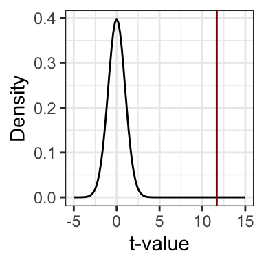
In this case, t is 11.67 with 94 degrees of freedom (n = 96). A quick plot of the t-distribution with 94 degrees of freedom revealed that the probability of a t-statistic this big or bigger would be very tiny if the null hypothesis were true.
Conclude and write report. With this tiny p-value we have to reject the Null.
There was a statistically significant positive correlation between basic access to water and females in school \((r_{s} = 0.77; p < .001)\). As the percentage of the population with basic access to water increases, so does the percentage of females in school.
Bullet List
Nothing has changed with the data source. This assumption is still not met. (See Section 8.8.1 for the argumentation.)
This assumption is met, because both variables are continuous.
A monotonic relationship is a relationship that goes in only one direction, e.g. the relationship can have curves as long as it goes always in the same direction. For instance in a positive correlation the rate of the ascending y-value can change but must not be under 0, e.g. reversing the direction.
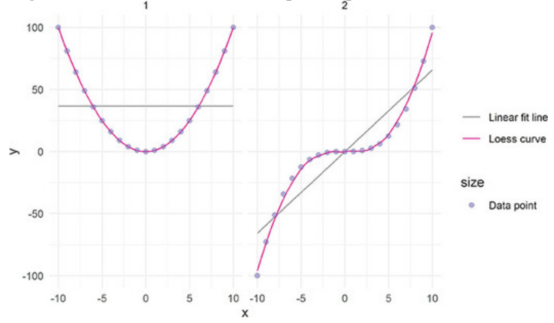
The following screenshot from the books demonstrates this with different examples:
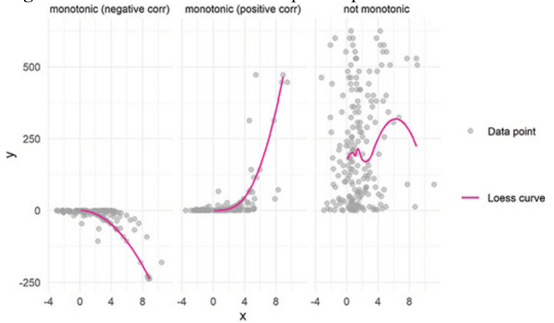
The Loess curve in Graph 8.20 only goes up, which demonstrates that the relationship between females in school and basic water access meets the monotonic assumption.
Summary of testing the assumptions for Spearman’s rho
Spearman’s rho met more assumptions than Pearson’s r with the original data or with the transformed variables. Even so, the independent observation assumption failed, so any reporting should stick to descriptive statistics about the sample and not generalize to the population.
There was a positive correlation between basic access to water and females in school (\(r_{s} = 0.77\)). As the percentage of the population with basic access to water increases, so does the percentage of females in school.
Many assumptions not met
With the exception of the chi-squared test of systolic blood pressure in Chapter 5 all of the test assumptions have failed.
This is not only disappointing but I believe also a disaster for frequentist inferential statistics. As far as I understood it means that — with the one mentioned exception — we cannot say anything about the population parameters and have to stick with the description of the sample. Instead of inferential statistics just descriptive statistics.
I am not sure if the situation would be better with Bayesian statistics. I still have alsmost no experience with Bayesian statistics. But after a quick research I got the impression that all the assumptions that hold for the frequentist approach must also to be met with the Bayesian framework. (See: What are the assumptions in bayesian statistics? in CrossValidated)
Partial corrections is a method for examining how multiple variables share variance with each other.
For instance it could be the case that females in school and basic water access might both be related to poverty, and that poverty might be the reason both of these variables increase at the same time. The argumentation is: Countries with higher poverty have fewer females in school and lower percentages of people with basic water access. So in the end poverty was the reason for the shared variance between females in school and basic water access.
Example 8.8 : Computing Pearson’ r partial correlation
R Code 8.29 : Examine bivariate Pearson’s r correlation
water_educ4 <- water_educ |>
    dplyr::select(
        female.in.school,
        perc.basic2015water,
        perc.1dollar
    ) |>
    tidyr::drop_na()

save_data_file("chap08", water_educ4, "water_educ4.rds")

water_educ4 |>
    dplyr::summarize(
        female_water = stats::cor(
            x = female.in.school,
            y = perc.basic2015water
        ),
        female_dollar = stats::cor(
            x = female.in.school,
            y = perc.1dollar
        ),
        water_dolloar = stats::cor(
            x = perc.basic2015water,
            y = perc.1dollar
        )
    )
#> # A tibble: 1 × 3
#> female_water female_dollar water_dolloar
#> <dbl> <dbl> <dbl>
#> 1 0.765 -0.714 -0.832All three correlations are strong related. Using ppcor::pcor() determines how they were interrelated.
R Code 8.30 : Partial correlation of Pearson’s r of poverty
water_educ4 |>
    ppcor::pcor(method = "pearson")
#> $estimate
#> female.in.school perc.basic2015water perc.1dollar
#> female.in.school 1.0000000 0.4395917 -0.2178859
#> perc.basic2015water 0.4395917 1.0000000 -0.6336436
#> perc.1dollar -0.2178859 -0.6336436 1.0000000
#>
#> $p.value
#> female.in.school perc.basic2015water perc.1dollar
#> female.in.school 0.0000000000 3.125684e-04 8.626064e-02
#> perc.basic2015water 0.0003125684 0.000000e+00 2.490386e-08
#> perc.1dollar 0.0862606413 2.490386e-08 0.000000e+00
#>
#> $statistic
#> female.in.school perc.basic2015water perc.1dollar
#> female.in.school 0.000000 3.822455 -1.743636
#> perc.basic2015water 3.822455 0.000000 -6.397046
#> perc.1dollar -1.743636 -6.397046 0.000000
#>
#> $n
#> [1] 64
#>
#> $gp
#> [1] 1
#>
#> $method
#> [1] "pearson"While Pearson’s r between females in school and basic water access in Table 8.2 was 0.81, Speaman’s \(r_{s}\) is in Table 8.3 slightly lower at 0.77.
Looking at the first section of the output from ppcor::pcor() under the $estimate subheading, it shows the partial correlations between all three of the variables. The partial correlation between females in school and basic water access is \(r_{partial} = .44\). So, after accounting for poverty, the relationship between females in school and basic water access is a moderate .44.
To understand partial correlation better some screenshots from the book may help:
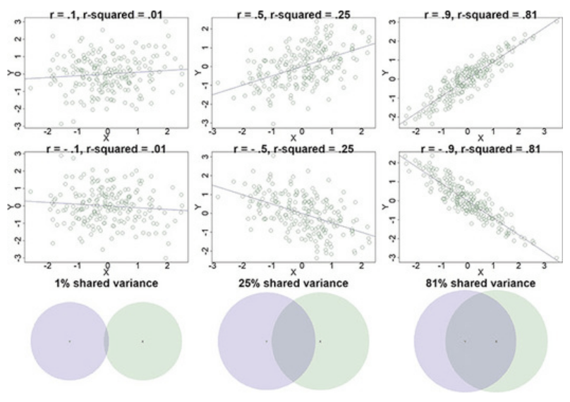
Shared variance and Venn diagrams for two variables
Shared variance with Venn diagrams with three variables
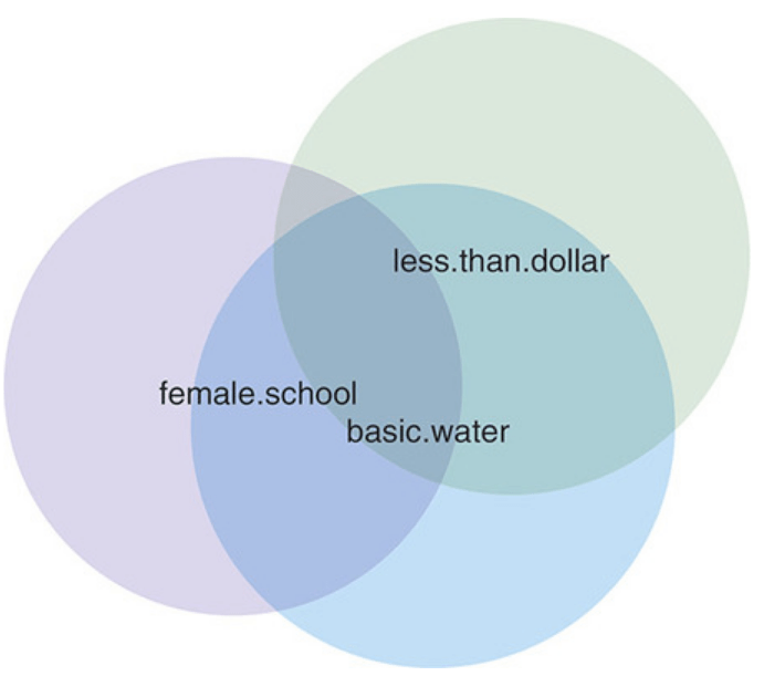
There are two ways the variables overlap in Figure 8.28. There are places where just two of the variables overlap in fig-shared-variance-three-variables (female.in.school and perc.basic2015water overlap, female.in.school and perc.1dollar overlap, perc.basic2015water and perc.1dollar overlap), and there is the space where female.in.school and perc.basic2015water and perc.1dollar all overlap in the center of the diagram.
The overlap between just two colors is the partial correlation between the two variables. It is the extent to which they vary in the same way after accounting for how they are both related to the third variable involved.
To get the percentage of shared variance, this coefficient of determination \(r^2\) could be computed and reported as a percentage. The squared value of .44 is .194, so 19.4% of the variance in percentage of females in school is shared with the percentage who have basic access to water.
The assumptions that applied to the two variables for a Pearson’s r correlation would apply to all three variables for a partial Pearson’s r correlation. Each variable would be continuous and normally distributed, each pair of variables would demonstrate linearity, and each pair would have to have constant variances (homoscedasticity).
R Code 8.31 : Partial correlation of Spearman’s rho of poverty
water_educ4 |>
ppcor::pcor(method = "spearman")#> $estimate
#> female.in.school perc.basic2015water perc.1dollar
#> female.in.school 1.0000000 0.4305931 -0.2841782
#> perc.basic2015water 0.4305931 1.0000000 -0.5977239
#> perc.1dollar -0.2841782 -0.5977239 1.0000000
#>
#> $p.value
#> female.in.school perc.basic2015water perc.1dollar
#> female.in.school 0.0000000000 4.272781e-04 2.399667e-02
#> perc.basic2015water 0.0004272781 0.000000e+00 2.312820e-07
#> perc.1dollar 0.0239966731 2.312820e-07 0.000000e+00
#>
#> $statistic
#> female.in.school perc.basic2015water perc.1dollar
#> female.in.school 0.000000 3.726169 -2.314944
#> perc.basic2015water 3.726169 0.000000 -5.823078
#> perc.1dollar -2.314944 -5.823078 0.000000
#>
#> $n
#> [1] 64
#>
#> $gp
#> [1] 1
#>
#> $method
#> [1] "spearman"Speaman’s \(r_{s}\) was originally in Table 8.3 0.77, but the partial Spearman’s rs correlation between females in school and basic water access after accounting for poverty was .43. Including poverty reduced the magnitude of the correlation by nearly half.
R Code 8.32 : Compute p-value of partial correlation
ppcor::pcor.test(
    x = water_educ4$female.in.school,
    y = water_educ4$perc.basic2015water,
    z = water_educ4$perc.1dollar,
    method = "spearman"
)ppcor::pcor.test()
#>    estimate      p.value statistic  n gp   Method
#> 1 0.4305931 0.0004272781  3.726169 64  1 spearman
With ppcor::pcor.test() there is a special function for testing significance of a partial correlation. But you can also take the p-values from the result of the ppcor::pcor() function. Compare the second section titled $p.value in Table 8.4 with the result in Table 8.5.
The partial correlation between percentage of females in school and the percentage of citizens who have basic water access was moderate, positive, and statistically significant (\(r_{s}.partial = 0.43; t = 3.73; p < .05\)). Even after poverty is accounted for, increased basic water access was moderately, positively, and significantly associated with an increased percentage of females in school.
Compare this report with Report 8.2.
WATCH OUT! Assumptions not met therefore no statistically significance test possible
As several assumption for the partial correlation are not met it is not correct to report about the result of a statistically significance test.
The partial correlation between the percentage of females in school and the percentage of citizens who have basic water access was moderate and positive (\(r_{s.partial} = 0.43\)). Even after poverty is accounted for, increased basic water access was moderately and positively associated with an increased percentage of females in school. The assumptions were not met, so it is not clear that the partial correlation from the sample of countries can be generalized to the population of all countries.
Compare this report with Report 8.1.
Before reporting we have to check the assumptions. We know already that
female.in.school and perc.basic2015.water is met.We still have to check
female.in.school and perc.1dollar
perc.basic2015.water and perc.1dollar
Example 8.9 : Check the monotonic assumptions with female in schools and basic water access
R Code 8.33 : Check the monotonic assumption for females and poverty
water_educ4 |>
  ggplot2::ggplot(
      ggplot2::aes(
          y = female.in.school/100,
          x = perc.1dollar/100
          )
      ) +
  ggplot2::geom_smooth(
      formula = 'y ~ x',
      ggplot2::aes(
            color = "Linear fit line"
          ),
      method = "lm",
      se = FALSE
      ) +
  ggplot2::geom_smooth(
      formula = 'y ~ x',
      ggplot2::aes(
            color = "Loess curve"
          ),
      method = "loess",
      se = FALSE
      ) +
  ggplot2::geom_point(
      ggplot2::aes(
            size = "Country"
          ),
      color = "#7463AC",
      alpha = .6
      ) +
  ggplot2::labs(
      y = "Percent of school-aged females in school",
      x = "Percent living on < $1 per day"
      ) +
  ggplot2::scale_x_continuous(labels = scales::percent) +
  ggplot2::scale_y_continuous(labels = scales::percent) +
  ggplot2::scale_color_manual(name = "", values = c("gray60", "darkred")) +
  ggplot2::scale_size_manual(name = "", values = 2)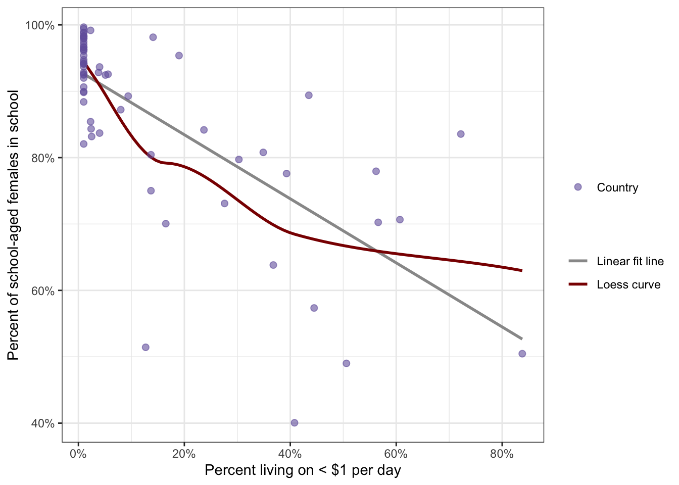
R Code 8.34 : Check the monotonic assumption for water access and poverty
water_educ4 |>
  ggplot2::ggplot(
      ggplot2::aes(
          y = perc.basic2015water/100,
          x = perc.1dollar/100
          )
      ) +
  ggplot2::geom_smooth(
      formula = 'y ~ x',
      ggplot2::aes(
            color = "Linear fit line"
          ),
      method = "lm",
      se = FALSE
      ) +
  ggplot2::geom_smooth(
      formula = 'y ~ x',
      ggplot2::aes(
            color = "Loess curve"
          ),
      method = "loess",
      se = FALSE
      ) +
  ggplot2::geom_point(
      ggplot2::aes(
            size = "Country"
          ),
      color = "#7463AC",
      alpha = .6
      ) +
  ggplot2::labs(
      y = "Percent of basic water access",
      x = "Percent living on < $1 per day"
      ) +
  ggplot2::scale_x_continuous(labels = scales::percent) +
  ggplot2::scale_y_continuous(labels = scales::percent) +
  ggplot2::scale_color_manual(name = "", values = c("gray60", "darkred")) +
  ggplot2::scale_size_manual(name = "", values = 2)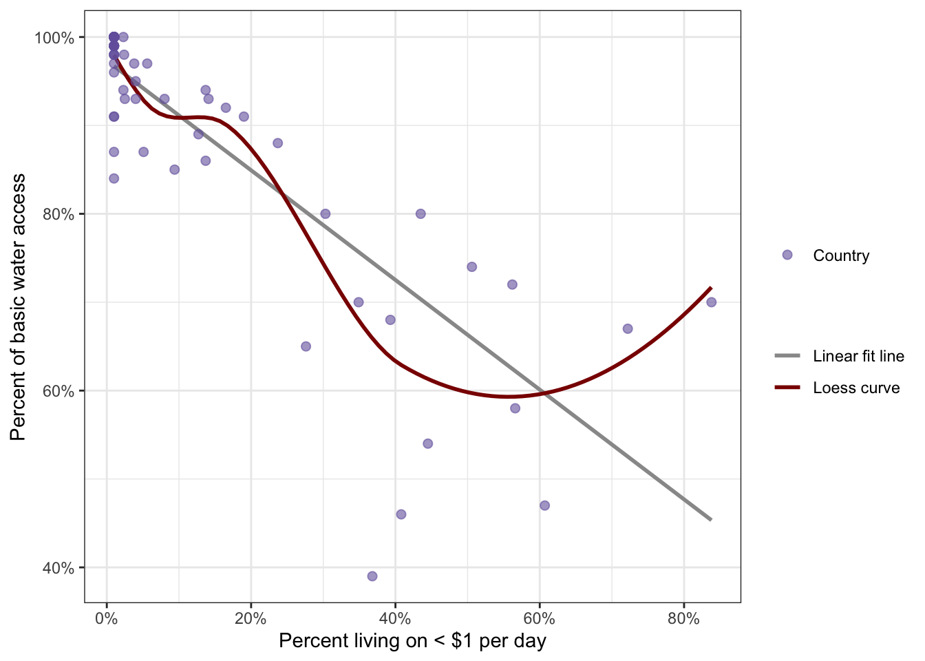
It turned out that the monotonic assumption was met for female.in.school and perc.1dollar but not for perc.basic2015water and perc.1dollar.
Assumption of independent observations not met
The book mentions twice the idea to recode variables that do not met their normality, linearity or monotonic assumptions. For instance one could recode the basic access to water into a binomial variable (has basic access, does not have basic access). The second idea was to recode the poverty variable into an ordinal variable. The ordinal variable could then be used in place of the original version of the variable and the \(r_{s}\) analysis could be conducted again.
But then there is still the problem that the assumption of the independent observation are not met. This failure has two aspects:
Ad 1) The only way to overcome failed assumption is to get data of all countries. We would then work with the population and not a sample. Or we could draw a sample from this population. — I wonder what different framework of analysis is necessary if working with population data instead with data from a sample. One obvious change is that we would not need significance tests and confidence intervals. Also we would not need Bessel’s correction for the variance calculation. What else?
Ad 2) I see no way to overcome the influence of neighboring countries. But maybe with a real sample or population data, this assumption would not be a problem. One could argue that similar natural conditions like climate or regional cultural customs are a fact that we should take into account and should not classify as a failed assumption.
| term | definition |
|---|---|
| Anderson-Darling | The Anderson-Darling Goodness of Fit Test (AD-Test) is a measure of how well your data fits a specified distribution. It’s commonly used as a test for normality. (<a href="https://www.statisticshowto.com/anderson-darling-test/">Statistics How-To</a>) |
| Arcsine Transformations | Arcsine transformation are data transformation techniques often recommended to normalize percent or proportion data; the arcsine transformation uses the inverse of the sine function and the square root of the variable to transform. (SwR, Glossary) |
| Bessel’s Correction | Bessel's correction is the use of n − 1 instead of n in the formula for the sample variance and sample standard deviation, where n is the number of observations in a sample. This method corrects the bias in the estimation of the population variance. It also partially corrects the bias in the estimation of the population standard deviation. However, the correction often increases the mean squared error in these estimations. This technique is named after Friedrich Bessel. (<a href="https://en.wikipedia.org/wiki/Bessel%27s_correction">Wikipedia</a>) |
| Breusch-Pagan | Breusch-Pagan is a statistical test for determining whether variance is constant, which is used to test the assumption of homoscedasticity; Breusch-Pagan relies on the [chi-squared] distribution and is used during assumption checking for [homoscedasticity] in [linear regression]. (SwR, Glossary) |
| Ceiling | A ceiling effect happens when many observations are at the highest possible value for a variable. (SwR, Glossary) |
| Chi-squared | Chi-squared is the test statistic following the chi-squared probability distribution; the chi-squared test statistic is used in inferential tests, including examining the association between two categorical variables and determining statistical significance for a logistic regression model. (SwR, Glossary) |
| Confidence Interval | A range of values, calculated from the sample observations, that is believed, with a particular probability, to contain the true parameter value. (Cambridge Dictionary of Statistics, 4th ed., p.98) |
| Correlation | Correlation coefficients are a standardized measure of how two variables are related, or co-vary. They are used to measure how strong a relationship is between two variables. There are several types of correlation coefficient, but the most popular is Pearson’s. Pearson’s correlation (also called Pearson’s R) is a correlation coefficient commonly used in linear regression. ([Statistics How To](https://www.statisticshowto.com/probability-and-statistics/correlation-coefficient-formula/)) |
| Covariance cov | Covariance is a measure of how much two random variables vary together. It’s similar to variance, but where variance tells you how a single variable varies, co variance tells you how two variables vary together. ([Statistics How To](https://www.statisticshowto.com/probability-and-statistics/statistics-definitions/covariance/)) |
| Degrees of Freedom | Degree of Freedom (df) is the number of pieces of information that are allowed to vary in computing a statistic before the remaining pieces of information are known; degrees of freedom are often used as parameters for distributions (e.g., chi-squared, F). (SwR, Glossary) |
| Determination | Coefficient of determination is the percentage of variance in one variable that is accounted for by another variable or by a group of variables; often referred to as R-squared and used to determine model fit for linear models. (SwR, Glossary) |
| Floor | A floor effect happens when a variable has many observations that take the lowest value of the variable, which can indicate that the range of values was insufficient to capture the true variability of the data. (SwR, Glossary) |
| Histograms | Histograms are visual displays of data used to examine the distribution of a numeric variable. (SwR, Glossary) |
| Homoscedasticity | Homoscedasticity is [homogeneity of variances], contrast is [Heteroscedasticity]. Homoscedasticity is an assumption of correlation and linear regression that requires that the variance of y be constant across all the values of x; visually, this assumption would show points along a fit line between x and y being evenly spread on either side of the line for the full range of the relationship. (SwR, Glossary) |
| Linear Transformation | Linear transformation are transformations that keep existing linear relationships between variables, often by multiplying or dividing one or both of the variables by some amount. (SwR, Glossary) |
| Linearity | Linearity is the assumption of some statistical models that requires the outcome, or transformed outcome, to have a linear relationship with numeric predictors, where linear relationships are relationships that are evenly distributed around a line. (SwR, Glossary) |
| Loess | Loess curve is a graph curve that shows the relationship between two variables without constraining the line to be straight; it can be compared to a linear fit line to determine whether the relationship is close to linear or not (= checking the [linearity] assumption). The procedure originated as LOWESS (LOcally WEighted Scatter-plot Smoother). is a nonparametric method because the linearity assumptions of conventional regression methods have been relaxed. It is called local regression because the fitting at say point x is weighted toward the data nearest to x. (SwR, Glossary and <a href="https://www.statsdirect.com/help/Default.htm#nonparametric_methods/loess.htm">LOESS Curve Fitting (Local Polynomial Regression</a>)) |
| Logit Transformations | Logit transformations are transformations that takes the log value of p/(1-p); this transformation is often used to normalize percentage data and is used in the logistic model to transform the outcome. (SwR, Glossary) |
| Monotonic | Monotonic is a statistical relationship that, when visualized, goes up or down, but not both. (SwR, Glossary) |
| NHST | Null Hypothesis Significance Testing (NHST) is a process for organizing inferential statistical tests. (SwR, Glossary) |
| Nonlinear Transformations | Nonlinear transformations are transformations that increases (or decreases) the linear relationship between two variables by applying an exponent (i.e., [power transformation]) or other function to one or both of the variables. (SwR, Glossary) |
| p-value | The p-value is the probability that the test statistic is at least as big as it is under the null hypothesis (SwR, Glossary) |
| PartialCorr | Partial correlation is a standardized measure of the amount of variance two variables share after accounting for variance they both share with a third variable. (SwR, Glossary) |
| Pearson | Pearson’s r is a statistic that indicates the strength and direction of the relationship between two numeric variables that meet certain assumptions. (SwR, Glossary) |
| Power Transformations | Power transformations are transformations of a measure using an exponent like squaring or cubing or taking the square root or cube root; power transformations are nonlinear transformations. (SwR, Glossary) |
| Q-Q-Plot | A quantile-quantile plot is a visualization of data using probabilities to show how closely a variable follows a normal distribution. (SwR, Glossary) This plot is made up of points below which a certain percentage of the observations fall. On the x-axis are normally distributed values with a mean of 0 and a standard deviation of 1. On the y-axis are the observations from the data. If the data are normally distributed, the values will form a diagonal line through the graph. (SwR, chapter 6) |
| Shapiro-Wilk | The Shapiro-Wilk test is a statistical test to determine or confirm whether a variable has a normal distribution; it is sensitive to small deviations from normality and not useful for sample sizes above 5,000 because it will nearly always find non-normality. (SwR, Glossary) |
| Spearman | Spearman’s rho a statistical test used to examine the strength, direction, and significance of the relationship between two numeric variables when they do not meet the assumptions for [Pearson]’s r. (SwR, Glossary) |
| Standard Deviation | The standard deviation is a measure of the amount of variation or dispersion of a set of values. A low standard deviation indicates that the values tend to be close to the mean (also called the expected value) of the set, while a high standard deviation indicates that the values are spread out over a wider range. The standard deviation is the square root of its variance. A useful property of the standard deviation is that, unlike the variance, it is expressed in the same unit as the data. Standard deviation may be abbreviated SD, and is most commonly represented in mathematical texts and equations by the lower case Greek letter $\sigma$ (sigma), for the population standard deviation, or the Latin letter $s$ for the sample standard deviation. ([Wikipedia] |
| Standardization | In statistics, standardization (also called Normalizing) is the process of putting different variables on the same scale. This process allows you to compare scores between different types of variables. Typically, to standardize variables, you calculate the mean and standard deviation for a variable. Then, for each observed value of the variable, you subtract the mean and divide by the standard deviation. ([Statistics by Jim](https://statisticsbyjim.com/glossary/standardization/)) See `scale()` in R. (Chap.4) |
| T-Statistic | The T-Statistic is used in a T test when you are deciding if you should support or reject the null hypothesis. It’s very similar to a Z-score and you use it in the same way: find a cut off point, find your t score, and compare the two. You use the t statistic when you have a small sample size, or if you don’t know the population standard deviation. (<a href="https://www.statisticshowto.com/t-statistic/">Statistics How-To</a>) |
| T-Test | A t-test is a type of statistical analysis used to compare the averages of two groups and determine whether the differences between them are more likely to arise from random chance. (<a href="https://en.wikipedia.org/wiki/Student%27s_t-test">Wikipedia</a>) |
| Z-score | A z-score (also called a standard score) gives you an idea of how far from the mean a data point is. But more technically it’s a measure of how many standard deviations below or above the population mean a raw score is. (<a href="https://www.statisticshowto.com/probability-and-statistics/z-score/#Whatisazscore">StatisticsHowTo</a>) |
Session Info
sessioninfo::session_info()#> ─ Session info ───────────────────────────────────────────────────────────────
#> setting value
#> version R version 4.4.2 (2024-10-31)
#> os macOS Sequoia 15.1
#> system x86_64, darwin20
#> ui X11
#> language (EN)
#> collate en_US.UTF-8
#> ctype en_US.UTF-8
#> tz Europe/Vienna
#> date 2024-11-13
#> pandoc 3.5 @ /usr/local/bin/ (via rmarkdown)
#>
#> ─ Packages ───────────────────────────────────────────────────────────────────
#> package * version date (UTC) lib source
#> base64enc 0.1-3 2015-07-28 [2] CRAN (R 4.4.0)
#> boot 1.3-31 2024-08-28 [2] CRAN (R 4.4.2)
#> cellranger 1.1.0 2016-07-27 [2] CRAN (R 4.4.0)
#> class 7.3-22 2023-05-03 [2] CRAN (R 4.4.2)
#> cli 3.6.3 2024-06-21 [2] CRAN (R 4.4.1)
#> codetools 0.2-20 2024-03-31 [2] CRAN (R 4.4.2)
#> coin 1.4-3 2023-09-27 [2] CRAN (R 4.4.0)
#> colorspace 2.1-1 2024-07-26 [2] CRAN (R 4.4.0)
#> commonmark 1.9.2 2024-10-04 [2] CRAN (R 4.4.1)
#> curl 6.0.0 2024-11-05 [2] CRAN (R 4.4.1)
#> data.table 1.16.2 2024-10-10 [2] CRAN (R 4.4.1)
#> DescTools 0.99.58 2024-11-08 [2] CRAN (R 4.4.1)
#> digest 0.6.37 2024-08-19 [2] CRAN (R 4.4.1)
#> dplyr 1.1.4 2023-11-17 [2] CRAN (R 4.4.0)
#> e1071 1.7-16 2024-09-16 [2] CRAN (R 4.4.1)
#> evaluate 1.0.1 2024-10-10 [2] CRAN (R 4.4.1)
#> Exact 3.3 2024-07-21 [2] CRAN (R 4.4.0)
#> expm 1.0-0 2024-08-19 [2] CRAN (R 4.4.1)
#> fansi 1.0.6 2023-12-08 [2] CRAN (R 4.4.0)
#> farver 2.1.2 2024-05-13 [2] CRAN (R 4.4.0)
#> fastmap 1.2.0 2024-05-15 [2] CRAN (R 4.4.0)
#> forcats 1.0.0 2023-01-29 [2] CRAN (R 4.4.0)
#> generics 0.1.3 2022-07-05 [2] CRAN (R 4.4.0)
#> ggplot2 3.5.1 2024-04-23 [2] CRAN (R 4.4.0)
#> gld 2.6.6 2022-10-23 [2] CRAN (R 4.4.0)
#> glossary * 1.0.0.9003 2024-08-05 [2] Github (debruine/glossary@05e4a61)
#> glue 1.8.0 2024-09-30 [2] CRAN (R 4.4.1)
#> gridExtra 2.3 2017-09-09 [2] CRAN (R 4.4.0)
#> gtable 0.3.6 2024-10-25 [2] CRAN (R 4.4.1)
#> haven 2.5.4 2023-11-30 [2] CRAN (R 4.4.0)
#> here 1.0.1 2020-12-13 [2] CRAN (R 4.4.0)
#> hms 1.1.3 2023-03-21 [2] CRAN (R 4.4.0)
#> htmltools 0.5.8.1 2024-04-04 [2] CRAN (R 4.4.0)
#> htmlwidgets 1.6.4 2023-12-06 [2] CRAN (R 4.4.0)
#> httr 1.4.7 2023-08-15 [2] CRAN (R 4.4.0)
#> jsonlite 1.8.9 2024-09-20 [2] CRAN (R 4.4.1)
#> kableExtra 1.4.0 2024-01-24 [2] CRAN (R 4.4.0)
#> knitr 1.49 2024-11-08 [2] CRAN (R 4.4.1)
#> labeling 0.4.3 2023-08-29 [2] CRAN (R 4.4.0)
#> lattice 0.22-6 2024-03-20 [2] CRAN (R 4.4.2)
#> libcoin 1.0-10 2023-09-27 [2] CRAN (R 4.4.0)
#> lifecycle 1.0.4 2023-11-07 [2] CRAN (R 4.4.0)
#> lmom 3.2 2024-09-30 [2] CRAN (R 4.4.1)
#> lmtest 0.9-40 2022-03-21 [2] CRAN (R 4.4.0)
#> magrittr 2.0.3 2022-03-30 [2] CRAN (R 4.4.0)
#> markdown 1.13 2024-06-04 [2] CRAN (R 4.4.0)
#> MASS 7.3-61 2024-06-13 [2] CRAN (R 4.4.2)
#> Matrix 1.7-1 2024-10-18 [2] CRAN (R 4.4.2)
#> matrixStats 1.4.1 2024-09-08 [2] CRAN (R 4.4.1)
#> mgcv 1.9-1 2023-12-21 [2] CRAN (R 4.4.2)
#> modeltools 0.2-23 2020-03-05 [2] CRAN (R 4.4.0)
#> multcomp 1.4-26 2024-07-18 [2] CRAN (R 4.4.0)
#> multcompView 0.1-10 2024-03-08 [2] CRAN (R 4.4.0)
#> munsell 0.5.1 2024-04-01 [2] CRAN (R 4.4.0)
#> mvtnorm 1.3-2 2024-11-04 [2] CRAN (R 4.4.1)
#> nlme 3.1-166 2024-08-14 [2] CRAN (R 4.4.2)
#> nortest 1.0-4 2015-07-30 [2] CRAN (R 4.4.0)
#> pillar 1.9.0 2023-03-22 [2] CRAN (R 4.4.0)
#> pkgconfig 2.0.3 2019-09-22 [2] CRAN (R 4.4.0)
#> plyr 1.8.9 2023-10-02 [2] CRAN (R 4.4.0)
#> ppcor 1.1 2015-12-03 [2] CRAN (R 4.4.0)
#> proxy 0.4-27 2022-06-09 [2] CRAN (R 4.4.0)
#> purrr 1.0.2 2023-08-10 [2] CRAN (R 4.4.0)
#> R6 2.5.1 2021-08-19 [2] CRAN (R 4.4.0)
#> rcompanion 2.4.36 2024-05-27 [2] CRAN (R 4.4.0)
#> Rcpp 1.0.13-1 2024-11-02 [1] CRAN (R 4.4.1)
#> readxl 1.4.3 2023-07-06 [2] CRAN (R 4.4.0)
#> repr 1.1.7 2024-03-22 [2] CRAN (R 4.4.0)
#> rlang 1.1.4 2024-06-04 [2] CRAN (R 4.4.0)
#> rmarkdown 2.29 2024-11-04 [2] CRAN (R 4.4.1)
#> rootSolve 1.8.2.4 2023-09-21 [2] CRAN (R 4.4.0)
#> rprojroot 2.0.4 2023-11-05 [2] CRAN (R 4.4.0)
#> rstudioapi 0.17.1 2024-10-22 [2] CRAN (R 4.4.1)
#> rversions 2.1.2 2022-08-31 [2] CRAN (R 4.4.0)
#> sandwich 3.1-1 2024-09-15 [2] CRAN (R 4.4.1)
#> scales 1.3.0 2023-11-28 [2] CRAN (R 4.4.0)
#> sessioninfo 1.2.2 2021-12-06 [2] CRAN (R 4.4.0)
#> skimr 2.1.5 2022-12-23 [2] CRAN (R 4.4.0)
#> stringi 1.8.4 2024-05-06 [2] CRAN (R 4.4.0)
#> stringr 1.5.1 2023-11-14 [2] CRAN (R 4.4.0)
#> survival 3.7-0 2024-06-05 [2] CRAN (R 4.4.2)
#> svglite 2.1.3 2023-12-08 [2] CRAN (R 4.4.0)
#> systemfonts 1.1.0 2024-05-15 [2] CRAN (R 4.4.0)
#> TH.data 1.1-2 2023-04-17 [2] CRAN (R 4.4.0)
#> tibble 3.2.1 2023-03-20 [2] CRAN (R 4.4.0)
#> tidyr 1.3.1 2024-01-24 [2] CRAN (R 4.4.0)
#> tidyselect 1.2.1 2024-03-11 [2] CRAN (R 4.4.0)
#> utf8 1.2.4 2023-10-22 [2] CRAN (R 4.4.0)
#> vctrs 0.6.5 2023-12-01 [2] CRAN (R 4.4.0)
#> viridisLite 0.4.2 2023-05-02 [2] CRAN (R 4.4.0)
#> withr 3.0.2 2024-10-28 [2] CRAN (R 4.4.1)
#> xfun 0.49 2024-10-31 [2] CRAN (R 4.4.1)
#> xml2 1.3.6 2023-12-04 [2] CRAN (R 4.4.0)
#> yaml 2.3.10 2024-07-26 [2] CRAN (R 4.4.0)
#> zoo 1.8-12 2023-04-13 [2] CRAN (R 4.4.0)
#>
#> [1] /Library/Frameworks/R.framework/Versions/4.4-x86_64/library
#> [2] /Library/Frameworks/R.framework/Versions/4.4-x86_64/Resources/library
#>
#> ──────────────────────────────────────────────────────────────────────────────The book says ‘percent’, but I believe proportion would be correct, as the range of percents is from 0-100%↩︎