Note 9.1: Different chapter structure, especially in EDA (Section 9.4)
As I have already read some books on linear regression I will not follow exactly the text in this chapter. I will leave out those passages that are not new for me and where I feel confident. Other passages I will only summarize to have content to consult whenever I would need it.
9.1 Achievements to unlock
Objectives for chapter 09
SwR Achievements
Achievement 1: Using exploratory data analysis to learn about the data before developing a linear regression model (Section 9.4)
Achievement 2: Exploring the statistical model for a line (Section 9.5)
Achievement 3: Computing the slope and intercept in a simple linear regression (Section 9.6)
Achievement 5: Model significance and model fit (Section 9.8)
Achievement 6: Checking assumptions and conducting diagnostics (Section 9.9)
Achievement 7: Adding variables to the model and using transformation (Section 9.10)
Objectives 9.1: Achievements for chapter 09
9.2 The needle exchange examination
Some infectious diseases like HIV and Hepatitis C are on the rise again with young people in non-urban areas having the highest increases and needle-sharing being a major factor. Clean needles are distributed by syringe services programs (SSPs), which can also provide a number of other related services including overdose prevention, referrals for substance use treatment, and infectious disease testing. But even there are programs in place — which is not allowed legally in some US states! — some people have to travel long distances for health services, especially for services that are specialized, such as needle exchanges.
In discussing the possible quenstion one could analyse it turned out that for some questions critical data are missing:
There is a distance-to-syringe-services-program variable among the health services data sources of amfAR (https://opioid.amfar.org/).
Many of the interesting variables were not available for much of the nation, and many of them were only at the state level.
Given these limitations, the book focuses whether the distance to a syringe program could be explained by
whether a county is urban or rural,
what percentage of the county residents have insurance (as a measure of both access to health care and socioeconomic status [SES]),
HIV prevalence,
and the number of people with opioid prescriptions.
As there is no variable for rural or urban status in the amfAR database, the book will tale a variable from the U.S. Department of Agriculture Economic Research Services website (https://www.ers.usda.gov/data-products/county-typology-codes/) that classifies all counties as metro or non-metro.
9.3 Resources & Chapter Outline
9.3.1 Data, codebook, and R packages
Resource 9.1 : Data, codebook, and R packages for learning about descriptive statistics
Data
Two options for accessing the data:
Download the clean data set dist_ssp_amfar_ch9.csv from https://edge.sagepub.com/harris1e.
Follow the instructions in Box 9.1 to import, merge, and clean the data from multiple files or from the original online source
Codebook
Two options for accessing the codebook:
Download the codebook file opioid_county_codebook.xlsx from https://edge.sagepub.com/harris1e.
Use the online codebook from the amfAR Opioid & Health Indicators Database website (https://opioid.amfar.org/)
Packages
Packages used with the book (sorted alphabetically)
{broom}, Section A.3 (David Robinson and Alex Hayes)
I will use the data file provided by the book because I am feeling quite confident with reading and recoding the original data. But I will change the columns names so that the variable names conform to the tidyverse style guide.
## run only once (manually)distance_ssp<-readr::read_csv("data/chap09/dist_ssp_amfar_ch9.csv", show_col_types =FALSE)distance_ssp_clean<-distance_ssp|>dplyr::rename( state ="STATEABBREVIATION", dist_ssp ="dist_SSP", hiv_prevalence ="HIVprevalence", opioid_rate ="opioid_RxRate", no_insurance ="pctunins")|>dplyr::mutate( state =forcats::as_factor(state), metro =forcats::as_factor(metro))|>dplyr::mutate( hiv_prevalence =dplyr::na_if( x =hiv_prevalence, y =-1))save_data_file("chap09", distance_ssp_clean, "distance_ssp_clean.rds")
For the exploratory data analysis I need more details about the association between the distance to the next SSP separated for people living in metro and non-metro areas. See
WATCH OUT! Do missing values have a pattern?
We know from Table 9.1 that the variable hiv_prevalence has many missing values. In all the forthcoming analyses we will remove those 70 NAs and work with complete cases. 70 NA’s in a sample of 500 is with 14% a big proportion from the available data. The question arises: Is there a reason why there are so many missing values? Could it be that this reason is distorting our analysis?
Most of the time I have provided code that suppresses these warnings. This is a dangerous enterprise as it could bias results and conclusions without knowledge of the researcher. I think that a more prudent approach would need an analysis of the missing values. I do not know how to do this yet, but with {naniar} (Section A.52) there is a package for exploring missing data structures. Its website and package has several vignettes to learn its functions and there is also an scientific article about the package (Tierney and Cook 2023).
Exploring missing data structures is in the book no planned achievement, therefore it is here enough to to get rid of the NA’s and to follow the books outline. But I am planning coming back to this issue and learn how to address missing data structures appropriately.
9.4 Achievement 1: Explorative Data Analysis
9.4.1 Introduction
Instead following linearly the chapter I will try to compute my own EDA. I will try three different method:
Manufacturing the data and graphs myself. Writing own functions and using {tidyverse} packages to provide summary plots and statistics.
Experimenting with {GGally}, an extension package to {ggplot2} where one part (GGally::ggpairs()) is the equivalent to the base R graphics::pairs() function.
9.4.2 Steps for EDA
I will apply the following steps:
Procedure 9.1 : Some useful steps to explore data for regression analysis
Order and completeness of the following tasks is not mandatory.
Browse the data:
RStudio Data Explorer: I am always using the data explorer in RStudio to get my first impression of the data. Although this step is not reproducible it forms my frame of mind what EDA steps I should follow and if there are issues I need especially to care about.
Skim data: Look at the data with skimr::skim() to get a holistic view of the data: names, data types, missing values, ordered (categorical) minimum, maximum, mean, sd, distribution (numerical).
Read the codebook: It is important to understand what the different variables mean.
Check structure: Examine with utils::str() if the dataset has special structures, e.g. labelled data, attributes etc.
Glimpse actual data: To get a feeling about data types and actual values use dplyr::glimpse().
Glance at example rows: As an alternative of utils::head() / utils::tails() get random row examples including first and last row of the dataset with my own function my_glance_data().
Check normality assumption:
Draw histograms of numeric variables: To get a better idea I have these histograms overlaid with the theoretical normal distributions and the density plots of the current data. The difference between these two curves gives a better impression if normality is met or not.
Draw Q-Q plots of numeric variables: Q-Q plots gives even a more detailed picture if normality is met.
Check homogeneity assumption: If the normality assumption is not met, then test if the homogeneity of variance assumption between groups is met with Levene’s test or with the more robust Fligner-Killeen’s test. In the following steps use always median instead of mean and do not compute the Pearson’s r but the Spearman’s rho coefficient.
Compute correlation coefficient: Apply either Pearson’s r or the Spearman’s rho coefficient.
Explore categorical data with box plots or violin plots: Box plots work well between a numerical and categorical variable. You could also overlay the data and violin plots to maximize the information in one single graph (see Graph 9.4).
There are packages like {GGally} and {ggfortify} (see Section A.25 and Section A.26) that provide a graphical and statistical representation of all combinations of bivariate relationships. They can be used as convenient shortcuts to many of the task listed here above.
9.4.3 Executing EDA for chapter 9
Example 9.2 : Explorative Data Analysis for chapter 9
skimr::skim() with Table 9.1 is a much better alternative! The second version of {tableone} in the book with the median instead of the mean is not necessary because it is in skimr::skim() integrated.
R Code 9.5 : Histograms of numeric variables
Code
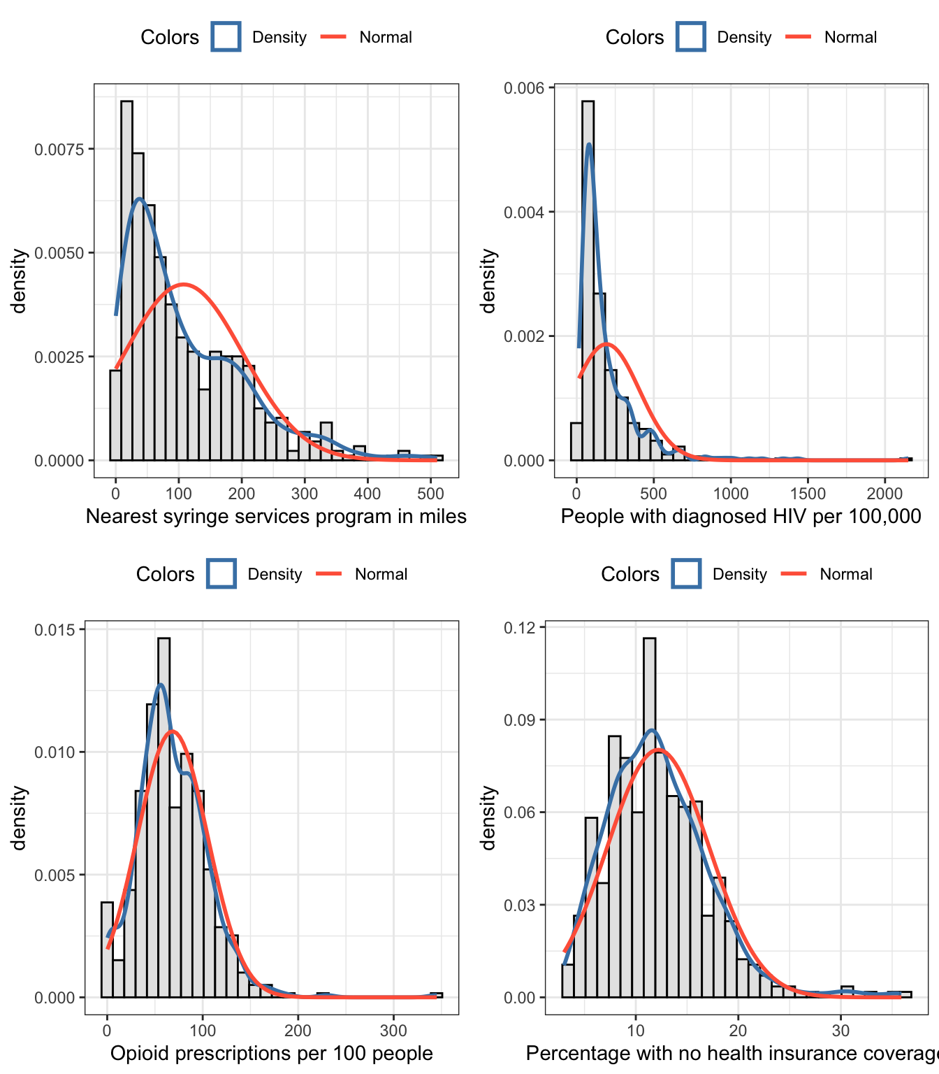
hist_distance<-my_hist_dnorm( df =distance_ssp_clean, v =distance_ssp_clean$dist_ssp, n_bins =30, x_label ="Nearest syringe services program in miles")hist_hiv<-my_hist_dnorm( df =distance_ssp_clean, v =distance_ssp_clean$hiv_prevalence, n_bins =30, x_label ="People with diagnosed HIV per 100,000")hist_opioid<-my_hist_dnorm( df =distance_ssp_clean, v =distance_ssp_clean$opioid_rate, n_bins =30, x_label ="Opioid prescriptions per 100 people")hist_insurance<-my_hist_dnorm( df =distance_ssp_clean, v =distance_ssp_clean$no_insurance, n_bins =30, x_label ="Percentage with no health insurance coverage")gridExtra::grid.arrange(hist_distance, hist_hiv, hist_opioid, hist_insurance, nrow =2)
Graph 9.1: Histograms for numeric variables of chapter 9
I developed a function where I can overlay the theoretical normal distribution and the density of the current data. The difference between the two curves gives an indication if we have a normal distribution.
From our data we see that the biggest difference is between SPP distance and HIV prevalence. This right skewed distribution could also be detected from other indicator already present in the skimr::skim()view of Table 9.1: - The small histogram on the right is the most right skewed distribution. - The standard deviation of hiv_prevalence is the only one, that is bigger than the mean of the variable. - There is a huge difference between mean and the median (p50) where the mean is much bigger than the median (= right skewed distribution), e.g. there is a long tail to the right as can also be seen in the tiny histogram.
Aside from hiv_prevalence the variable distance_ssp is almost equally right skewed. The situation seems better for the rest of the numeric variables. But let’s manufacture Q-Q plots for all of them to see more in detail if they are normally distributed or not.
R Code 9.6 : Q-Q plots of numeric variables
Code
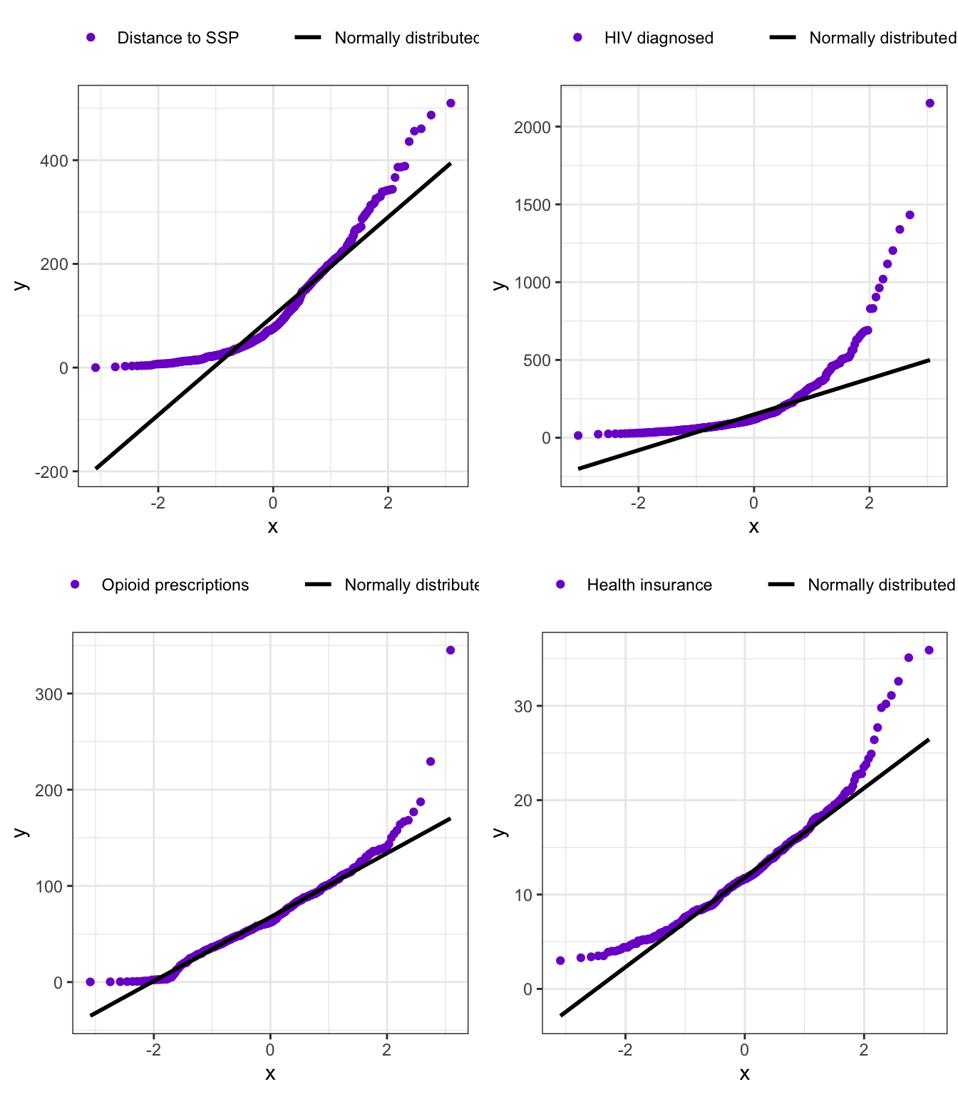
qq_distance<-my_qq_plot( df =distance_ssp_clean, v =distance_ssp_clean$dist_ssp, col_qq ="Distance to SSP")qq_hiv<-my_qq_plot( df =distance_ssp_clean, v =distance_ssp_clean$hiv_prevalence, col_qq ="HIV diagnosed")qq_opioid<-my_qq_plot( df =distance_ssp_clean, v =distance_ssp_clean$opioid_rate, col_qq ="Opioid prescriptions")qq_insurance<-my_qq_plot( df =distance_ssp_clean, v =distance_ssp_clean$no_insurance, col_qq ="Health insurance")gridExtra::grid.arrange(qq_distance, qq_hiv, qq_opioid, qq_insurance, nrow =2)
Graph 9.2: Q-Q plots for numeric variables of chapter 9
It turned out that all four numeric variables are not normally distributed. Some of them looked in the histograms quite OK, because the differences to the normal distribution on the lower and upper end of the data compensate each other.
Testing normality with Shapiro-Wilk or Anderson-Darling test will show that they are definitely not normally distributed.
R Code 9.7 : Normality checking with Shapiro-Wilk & Anderson-Darling tests
Table 9.3: Testing normality with Shapiro-Wilk & Anderson-Darling tests
#> # A tibble: 8 × 4
#>   variable       statistic  p.value method
#>   <chr>              <dbl>    <dbl> <chr>
#> 1 dist_ssp           0.874 1.10e-19 Shapiro-Wilk normality test
#> 2 hiv_prevalence     0.649 8.72e-29 Shapiro-Wilk normality test
#> 3 opioid_rate        0.938 1.55e-13 Shapiro-Wilk normality test
#> 4 no_insurance       0.946 1.85e-12 Shapiro-Wilk normality test
#> 5 dist_ssp          18.0   3.7 e-24 Anderson-Darling normality test
#> 6 hiv_prevalence    37.0   3.7 e-24 Anderson-Darling normality test
#> 7 opioid_rate        2.68  9.14e- 7 Anderson-Darling normality test
#> 8 no_insurance       3.43  1.39e- 8 Anderson-Darling normality test
The p-values from both tests are for all four variables very small, e.g. statistically significant. Therefore we have to reject the Null that they are normally distributed.
Report
It turned out that all four variable are not normally distributed. We can’t therefore not use Pearson’s r coefficient.
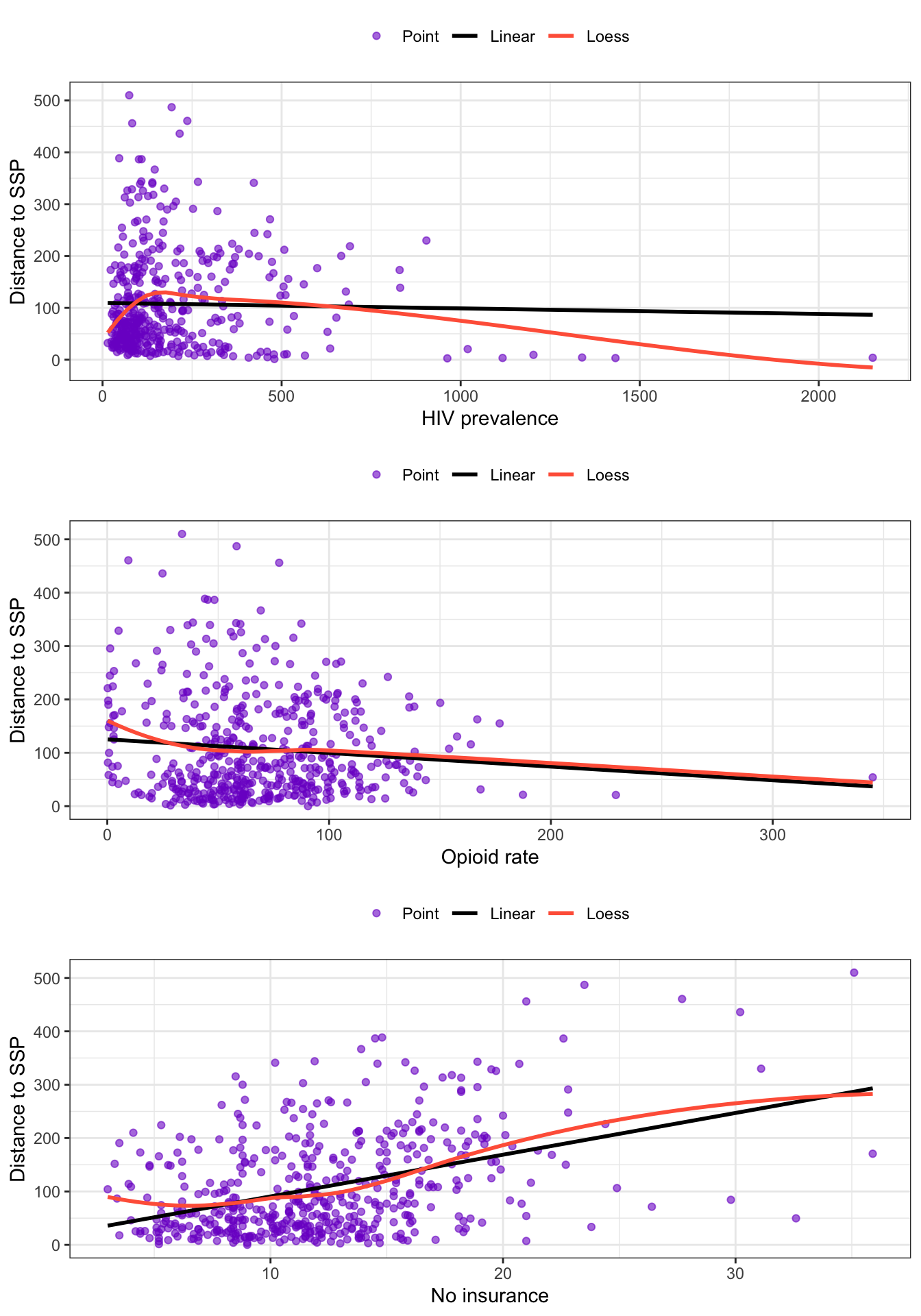
scatter_dist_hiv<-my_scatter( df =distance_ssp_clean, v =distance_ssp_clean$hiv_prevalence, w =distance_ssp_clean$dist_ssp, x_label ="HIV prevalence", y_label ="Distance to SSP")scatter_dist_opioid<-my_scatter( df =distance_ssp_clean, v =distance_ssp_clean$opioid_rate, w =distance_ssp_clean$dist_ssp, x_label ="Opioid rate", y_label ="Distance to SSP")scatter_dist_insurance<-my_scatter( df =distance_ssp_clean, v =distance_ssp_clean$no_insurance, w =distance_ssp_clean$dist_ssp, x_label ="No insurance", y_label ="Distance to SSP")gridExtra::grid.arrange(scatter_dist_hiv, scatter_dist_opioid, scatter_dist_insurance, nrow =3)
Graph 9.3: Scatterplots of numeric variables
R Code 9.9 : Testing homogeneity of variances with Levene’s and Fligner-Killeen’s test
Code
hiv_test<-stats::fligner.test(distance_ssp_clean$dist_ssp,distance_ssp_clean$hiv_prevalence)opioid_test<-stats::fligner.test(distance_ssp_clean$dist_ssp,distance_ssp_clean$opioid_rate)insurance_test<-stats::fligner.test(distance_ssp_clean$dist_ssp,distance_ssp_clean$no_insurance)hiv_test2<-car::leveneTest(distance_ssp_clean$dist_ssp,forcats::as_factor(distance_ssp_clean$hiv_prevalence))opioid_test2<-car::leveneTest(distance_ssp_clean$dist_ssp,forcats::as_factor(distance_ssp_clean$opioid_rate))insurance_test2<-car::leveneTest(distance_ssp_clean$dist_ssp,forcats::as_factor(distance_ssp_clean$no_insurance))homogeneity_test<-dplyr::bind_rows(broom::tidy(hiv_test2),broom::tidy(opioid_test2),broom::tidy(insurance_test2))|>dplyr::mutate(method ="Levene's Test for Homogeneity of Variance")|>dplyr::bind_rows(broom:::glance.htest(hiv_test),broom:::glance.htest(opioid_test),broom:::glance.htest(insurance_test),)|>dplyr::bind_cols( variable =c("dist_hiv","dist_opioid", "dist_insurance","dist_hiv","dist_opioid", "dist_insurance"))|>dplyr::relocate(variable)homogeneity_test
Table 9.4: Homogeneity of variances tested with Levene’s and Fligner-Killeen’s test
#> # A tibble: 6 × 7
#>   variable       statistic p.value    df df.residual method            parameter
#>   <chr>              <dbl>   <dbl> <int>       <int> <chr>                 <dbl>
#> 1 dist_hiv           0.493  0.999    395          34 Levene's Test fo…        NA
#> 2 dist_opioid        0.893  0.770    406          93 Levene's Test fo…        NA
#> 3 dist_insurance     0.750  0.983    171         328 Levene's Test fo…        NA
#> 4 dist_hiv         408.     0.312     NA          NA Fligner-Killeen …       395
#> 5 dist_opioid      451.     0.0609    NA          NA Fligner-Killeen …       406
#> 6 dist_insurance   170.     0.502     NA          NA Fligner-Killeen …       171
All p-values are higher than the threshold of .05 and are therefore not statistically significant. The Null must not rejected, the homogeneity of variance assumption for all variables is met.
R Code 9.10 : Correlations for numeric variables of chapter 9
Code
cor_pearson<-distance_ssp_clean|>dplyr::summarize( hiv_cor =stats::cor( x =dist_ssp, y =hiv_prevalence, use ="complete.obs", method ="pearson"), opioid_cor =stats::cor( x =dist_ssp, y =opioid_rate, use ="complete.obs", method ="pearson"), insurance_cor =stats::cor( x =dist_ssp, y =no_insurance, use ="complete.obs", method ="pearson"), `n (sample)` =dplyr::n())cor_spearman<-distance_ssp_clean|>dplyr::summarize( hiv_cor =stats::cor( x =dist_ssp, y =hiv_prevalence, use ="complete.obs", method ="spearman"), opioid_cor =stats::cor( x =dist_ssp, y =opioid_rate, use ="complete.obs", method ="spearman"), insurance_cor =stats::cor( x =dist_ssp, y =no_insurance, use ="complete.obs", method ="spearman"), `n (sample)` =dplyr::n())cor_kendall<-distance_ssp_clean|>dplyr::summarize( hiv_cor =stats::cor( x =dist_ssp, y =hiv_prevalence, use ="complete.obs", method ="kendall"), opioid_cor =stats::cor( x =dist_ssp, y =opioid_rate, use ="complete.obs", method ="kendall"), insurance_cor =stats::cor( x =dist_ssp, y =no_insurance, use ="complete.obs", method ="kendall"), `n (sample)` =dplyr::n())cor_chap09<-dplyr::bind_rows(cor_pearson, cor_spearman, cor_kendall)cor_chap09<-dplyr::bind_cols( method =c("Pearson", "Spearman", "Kendall"), cor_chap09)cor_chap09
Table 9.5: Correlations for numeric variables of chapter 9
Here I have computed for a comparison all three correlation coefficients of the nearest distance to the next SSP with the numeric variabeles of the dataset.
Pearson’s \(r\) is not allowed for all of the three variables, because our data didn’t meet the normality assumption.
Using Spearman’s \(\rho\) or Kendall’s \(\tau\) instead of Pearson’s \(r\) results in big differences. For instance: the correlation of distance to the next SSP and HIV prevalence reverses it direction.
Kendall’s tau \(\tau\) is more conservative (smaller) than Spearman’s rho and it is also preferred in most scenarios. (Kendall’s tau is not mentioned in the book. Maybe the reason is — as far as I understand – that Spearman’s is the most widely used correlation coefficient?)
I want to confirm my internet research with the following quotes:
First quote
In the normal case, Kendall correlation is more robust and efficient than Spearman correlation. It means that Kendall correlation is preferred when there are small samples or some outliers. (Pearson vs Spearman vs Kendall) (Pluviophile 2019).
Second quote
Kendall’s Tau: usually smaller values than Spearman’s rho correlation. Calculations based on concordant and discordant pairs. Insensitive to error. P values are more accurate with smaller sample sizes.
Spearman’s rho: usually have larger values than Kendall’s Tau. Calculations based on deviations. Much more sensitive to error and discrepancies in data.
The main advantages of using Kendall’s tau are as follows:
The distribution of Kendall’s tau has better statistical properties.
The interpretation of Kendall’s tau in terms of the probabilities of observing the agreeable (concordant) and non-agreeable (discordant) pairs is very direct.
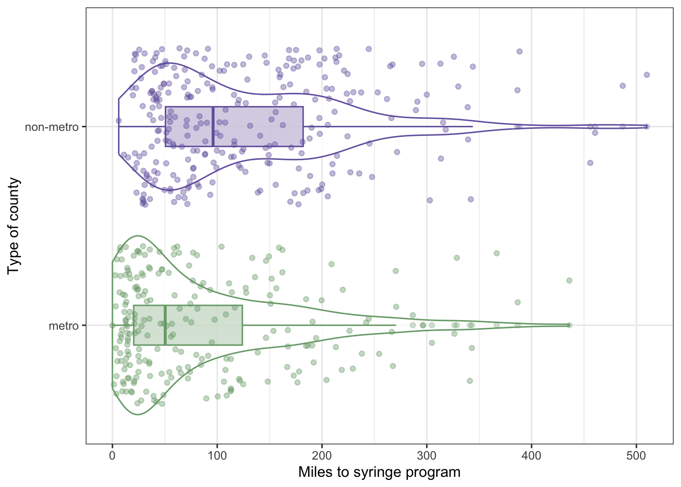
The big difference between mean and median reflects a right skewed distribution. There are some people living extremely far from the next SSP both in non-metro and metro areas.
It is no surprise that the distance for people living in a non-metro area is much longer than for people in big city. But what certainly surprised me, is that even in big cities half of people live more than 50 miles form the next SSP.
R Code 9.12 : Distance in miles to nearest syringe programs by metro or non-metro status for a sample of 500 counties
Code
distance_ssp_clean|>ggplot2::ggplot(ggplot2::aes( x =metro, y =dist_ssp, fill =metro))+ggplot2::geom_violin(ggplot2::aes( color =metro), fill ="white", alpha =.8)+ggplot2::geom_boxplot(ggplot2::aes( fill =metro, color =metro), width =.2, alpha =.3)+ggplot2::geom_jitter(ggplot2::aes( color =metro), alpha =.4)+ggplot2::labs( x ="Type of county", y ="Miles to syringe program")+ggplot2::scale_fill_manual( values =c("#78A678", "#7463AC"), guide ="none")+ggplot2::scale_color_manual( values =c("#78A678", "#7463AC"), guide ="none")+ggplot2::coord_flip()
Graph 9.4: Distance in miles to nearest syringe programs by metro or non-metro status for a sample of 500 counties
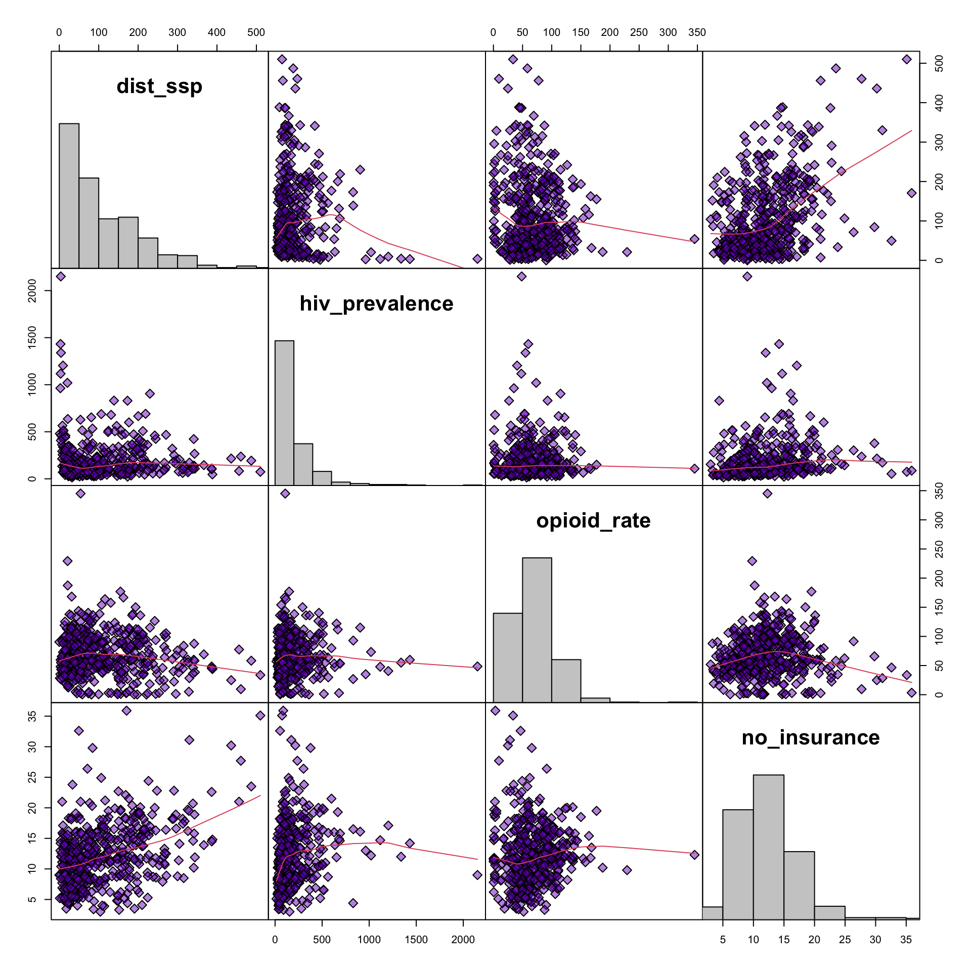
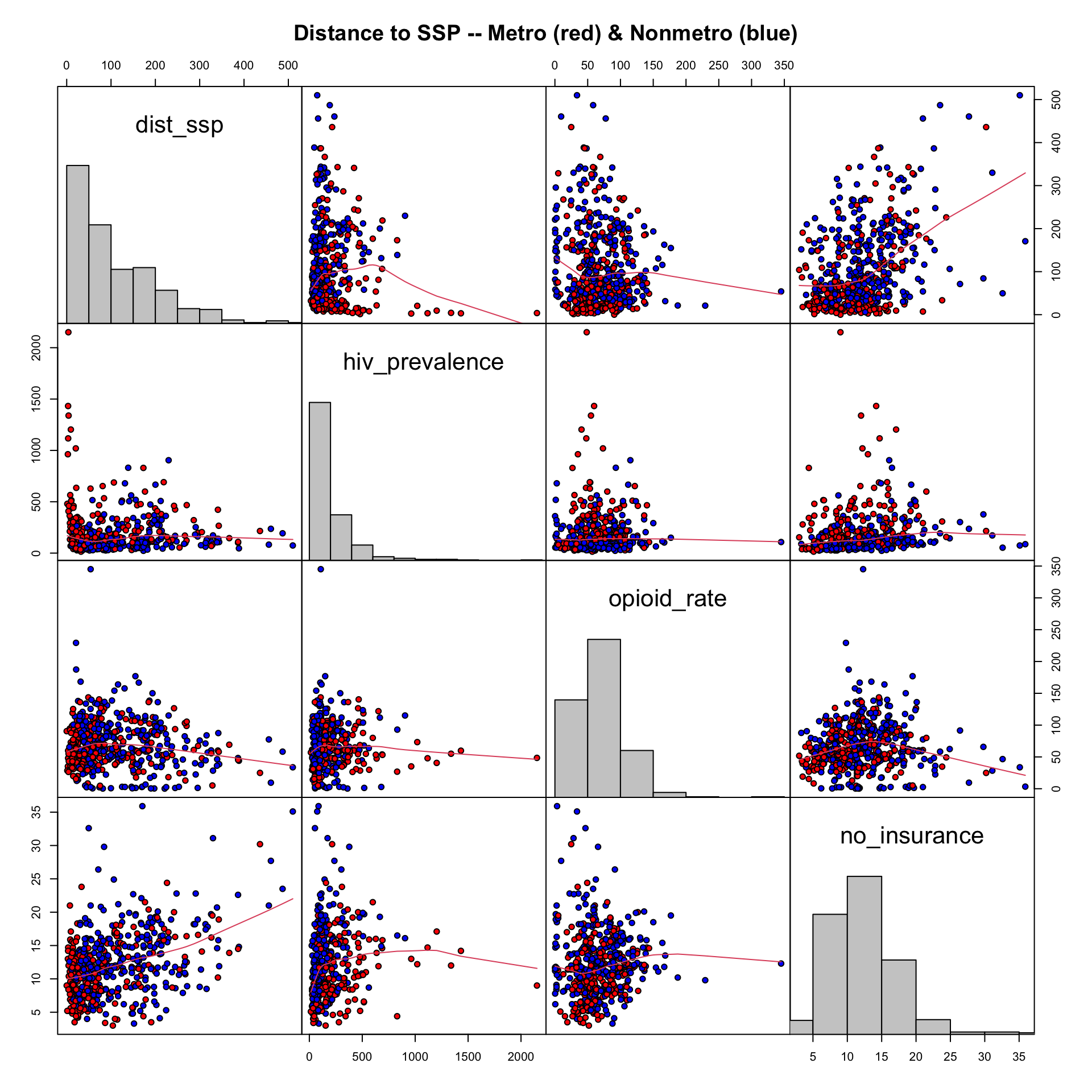
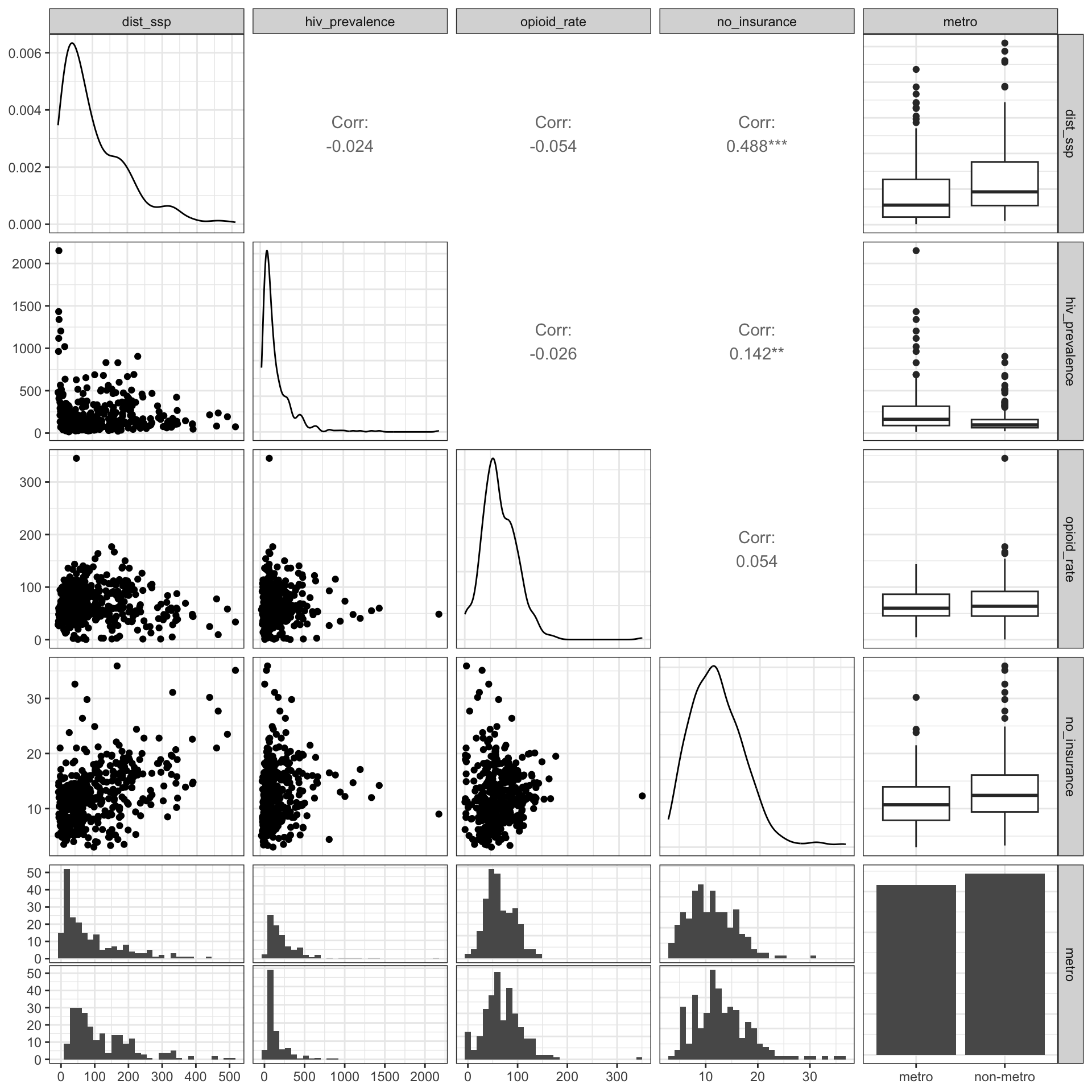
TODO: Exploring several variables together with {**GGally}
During working the material of SwR I had often to look for more details in the internet. During one of this (re)searches I learned about about the possibility to explore multiple variables together with graphics::pairs and the {tidyverse} pendant {GGally}.
After exploring {GGally} I noticed that there is with the ggnostic() function, working as a wrapper around GGally::ggduo(), also a tool that displays full model diagnostics for each given explanatory variable. There are even many other tools where “GGally extends ggplot2 by adding several functions to reduce the complexity of combining geoms with transformed data” GGally: Extension to ggplot2.
I plotted some examples in Section 9.11 but I need to learn these very practical tools much more in detail. Admittedly I have to understand all these different diagnostic tests before I am going to read the extensive documentation (currently 14 articles) and trying to apply shortcuts with the {GGally} functions.
TODO 9.1: Learn to explore several variables together with {GGally}
9.5 Achivement 2: Exploring line model
9.5.1 Introduction
Formula 9.1 : Equation for linear model
\[
\begin{align*}
y = &m_{x}+b \\
y = &b_{0}+b_{1}x \\
y = &c+b_{1}x
\end{align*}
\tag{9.1}\]
\(b, b_{0}, c\): y-intercept of the line, or the value of y when x = 0
\(x, y\): the coordinates of each point along the line
Sometimes \(b^*\) is used. This means that the variable had been standardized, or transformed into z-scores, before the regression model was estimated.
An example of a linear equation would be \(y = 3 + 2x\).
Important 9.1: Variable names and the difference between deterministic and stochastic
The y variable on the left-hand side of the equation is called the dependent or outcome variable.
The x variable(s) on the right-hand side of the equation is/are called the independent or predictor variable(s).
A deterministic equation, or model, has one precise value for y for each value of x. Some equation in physics are deterministic, e.g., \(e = mc^2\).
In a stochastic equation, or model, you cannot predict or explain something exactly. Most of the time, there is some variability that cannot be fully explained or predicted. This unexplained variability is represented by an error term that is added to the equation. Relationships measured in social science are typically stochastic.
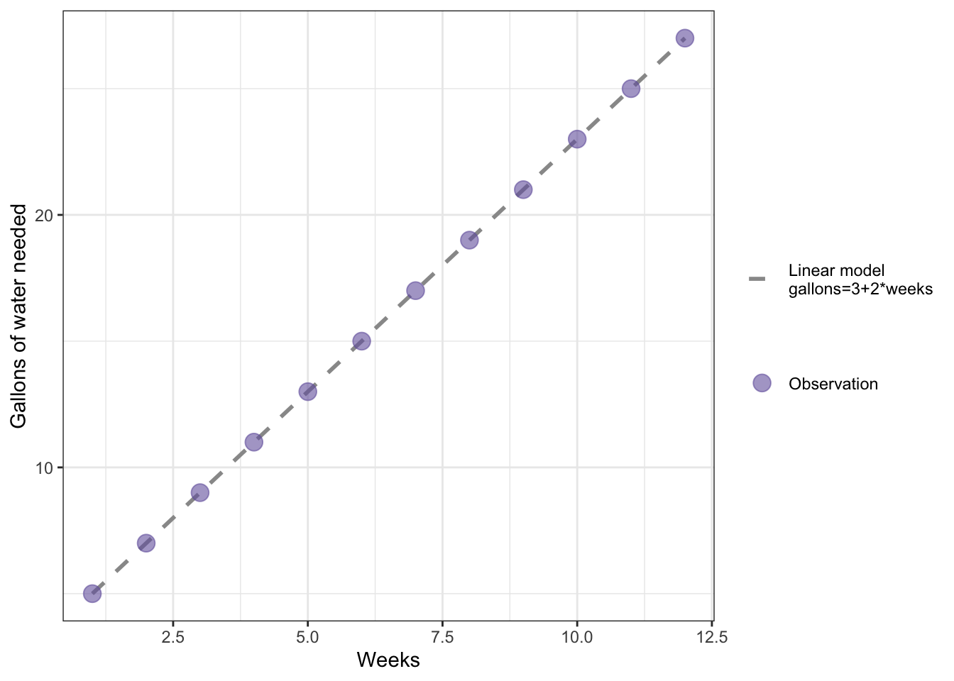
R Code 9.13 : Example of a deterministic linear model with gallons of water needed as an outcome and weeks as a predictor
Code
# make a vector called weeks that has the values 1 through 12 in itweeks<-1:12# use the regression model to make a vector called gallons with# weeks as the valuesgallons<-3+2*weeks# make a data frame of weeks and gallonswater<-data.frame(weeks, gallons)# Make a plot (Figure 9.9)water|>ggplot2::ggplot(ggplot2::aes( x =weeks, y =gallons))+ggplot2::geom_line(ggplot2::aes( linetype ="Linear model\ngallons=3+2*weeks"), color ="gray60", linewidth =1)+ggplot2::geom_point(ggplot2::aes( color ="Observation"), size =4, alpha =.6)+ggplot2::labs( x ="Weeks", y ="Gallons of water needed")+ggplot2::scale_linetype_manual(values =2, name ="")+ggplot2::scale_color_manual(values ="#7463AC", name ="")
Graph 9.5: Example of a linear model with gallons of water needed as an outcome and weeks as a predictor
There is nothing new in this code chunk, therefore I have just taken the code from the book only adapted with changes resulting from newer versions of {ggplot2} (e.g., linewidth instead of size).
It is important to know that the graph does not use the calculation of a linear model with ggplot2::geom_smooth() but merely uses ggplot2::geom_line to connect the points. We are using #eq-chap09-linear-model, e.g. a deterministic formula.
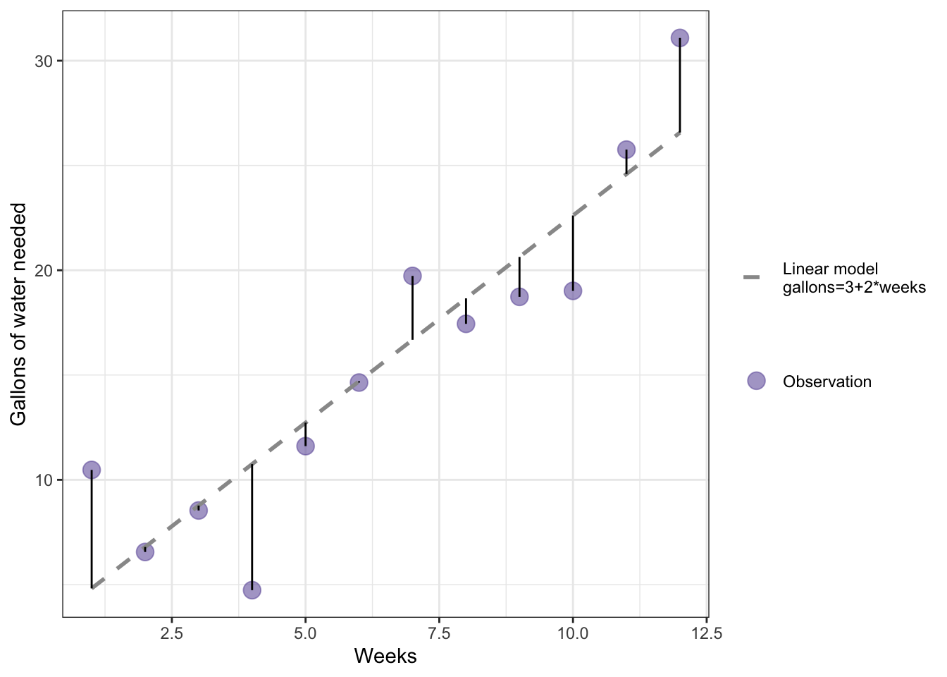
R Code 9.14 : Example of a stochastic linear model with gallons of water needed as an outcome and weeks as a predictor
Code
# make a vector called weeks that has the values 1 through 12 in itweeks<-1:12# use the regression model to make a vector called gallons with# weeks as the values # but this time with simulated residualsset.seed(1001)# for reproducibilitygallons<-3+(2*weeks)+rnorm(12, 0, 2.5)# make a data frame of weeks and gallonswater<-data.frame(weeks, gallons)# calculate the residuals from the linear modelres<-base::summary(stats::lm(gallons~weeks, data =water))$residualswater|>ggplot2::ggplot(ggplot2::aes( x =weeks, y =gallons))+ggplot2::geom_point(ggplot2::aes( color ="Observation"), size =4, alpha =.6)+ggplot2::geom_smooth( formula =y~x, method ="lm", se =FALSE,ggplot2::aes( linetype ="Linear model\ngallons=3+2*weeks"), color ="gray60", linewidth =1)+ggplot2::geom_segment(ggplot2::aes( x =weeks, y =gallons, xend =weeks, yend =gallons-res))+ggplot2::labs( x ="Weeks", y ="Gallons of water needed")+ggplot2::scale_linetype_manual(values =2, name ="")+ggplot2::scale_color_manual(values ="#7463AC", name ="")
Graph 9.6: Example of a linear model with gallons of water needed as an outcome and weeks as a predictor with deviations (errors)
This is my replication of book’s Figure 9.10, where no R example code is available. I am proud to state that I did this graph without looking ahead or to read the tutorial by Jackson (2016) that is recommended later in the book. To draw this graph I had to take three new actions:
Without these three code addition, I wouldn’t have been able to draw the vertical lines from the observations to the line of the linear model.
Although I managed to create Graph 9.6 myself I mixed up in the explaining text the concepts of errors and residuals.
Important 9.2: Errors vs. Residuals
Errors and residuals are two closely related and easily confused measures:
The error of an observation is the deviation of the observed value from the true value of a quantity of interest (for example, a population mean).
The residual is the difference between the observed value and the estimated value of the quantity of interest (for example, a sample mean).
9.6 Achievement 3: Slope and Intercept
9.6.1 Introduction
A simple linear- regression model could be used to examine the relationship between the percentage of people without health insurance and the distance to a syringe program for a county.
Formula 9.3 : Regression of people without health insurance and the distance to SSP
The slope formula in Equation 9.4 is adding up the product of differences between the observed values and mean value of percentage uninsured (no_insurance) and the observed values and mean value of distance to syringe program (dist_ssp) for each of the 500 counties. This value is divided by the summed squared differences between the observed and mean values of no_insurance for each county.
\(i\): individual observation, in this case a county
\(n\): sample size, in this case 500
\(x_{i}\): mean value of no_insurance for the sample
\(y_{i}\): value of dist_ssp for \(i\)
\(m_{y}\): mean value of dist_ssp for the sample
\(\sum\): symbol for the sum
\(b_{i}\): slope
9.6.3 Computing the intercept
Once the slope is computed, the intercept can be computed by putting the slope and the values of \(m_{x}\) and \(m_{y}\) into the equation for the line with x and y replaced by \(m_{x}\) and \(m_{y}\), \(m_{y} = b_{0} + b_{1} times m_{x}\), and solving it for \(b_{0}\), which is the y-intercept. Because this method of computing the slope and intercept relies on the squared differences and works to minimize the residuals overall, it is often called ordinary least squares or OLS regression.
9.6.4 Estimating the linear regression model with R
R Code 9.15 : Linear regression of distance to syringe program by percent uninsured
Code
## linear regression of distance to syringe program by percent uninsuredlm9.1<-stats::lm( formula =dist_ssp~no_insurance, data =distance_ssp_clean, na.action =na.exclude)save_data_file("chap09", lm9.1, "lm9.1.rds")lm9.1
Listing / Output 9.2: Linear regression of distance to syringe program by percent uninsured
The books does not go into details of the results from stats::lm() but recommends immediately to use base::summary(stats::lm()) to get the best results. The reason is that the summary output of the linear model has much more details (See lst-chap09-summary-lm-distance-uninsured). But I think that it is important to know that there are many different aspects of the result incorporated in the lm object that are not reported.
Graph 9.7: Screenshot of the lm9.1 object
Hidden in the object are important results:
residuals: In Section 9.6.5 I have used the computed residuals from the lm9.1 object to draw the vertical lines from the observation points (dist_ssp) to the regression line in Listing / Output 9.4.
fitted.values: These values build the regression line and are identical with the results from stats::predict(lm9.1) used in Listing / Output 9.7.
effects: There is also a vector the size of the sample (500) called effects. I have looked up what this mean and came to the following definition which I do not (up to now) understand:
For a linear model fitted by lm or aov, the effects are the uncorrelated single-degree-of-freedom values obtained by projecting the data onto the successive orthogonal subspaces generated by the QR decomposition during the fitting process. The first r (the rank of the model) are associated with coefficients and the remainder span the space of residuals (but are not associated with particular residuals). (effects: Effects from Fitted Model)
Some help what effects are why they are important is the explanation of orthogonal in a statistical context. After reading (Orthogonal: Models, Definition & Finding) I got some first vague ideas about the meaning of effects. Hopefully I will learn later was they mean in details and how they are computed.
R Code 9.16 : Estimating the linear regression model of people without health insurance and the distance to SSP using R
Code
# linear regression of distance to syringe program by percent uninsuredbase::summary(lm9.1)
#>
#> Call:
#> stats::lm(formula = dist_ssp ~ no_insurance, data = distance_ssp_clean,
#>     na.action = na.exclude)
#>
#> Residuals:
#>     Min      1Q  Median      3Q     Max
#> -217.71  -60.86  -21.61   47.73  290.77
#>
#> Coefficients:
#>              Estimate Std. Error t value Pr(>|t|)
#> (Intercept)   12.4798    10.1757   1.226    0.221
#> no_insurance   7.8190     0.7734  10.110   <2e-16 ***
#> ---
#> Signif. codes:  0 '***' 0.001 '**' 0.01 '*' 0.05 '.' 0.1 ' ' 1
#>
#> Residual standard error: 85.91 on 498 degrees of freedom
#> Multiple R-squared:  0.1703, Adjusted R-squared:  0.1686
#> F-statistic: 102.2 on 1 and 498 DF,  p-value: < 2.2e-16
Listing / Output 9.3: Summary of linear regression of distance to syringe program by percent uninsured
Intercept: The \(y\)-intercept of 12.48 is the \(y\)-value when \(x\) is zero. The model predicts that a county with 0% of people being uninsured would have a distance to the nearest syringe program of 12.48 miles.
Slope: The slope of 7.82 is the change in \(y\) for every one-unit change in \(x\). If the percent uninsured goes up by 1% in a county, the distance in miles to a syringe program would change by 7.82 miles.
\[
\begin{align*}
distance = 12.48 + 7.82 \times \text{no\_insurance} \\
distance = 12.48 + 7.82 \times 10 = 90.68
\end{align*}
\] Based on the linear regression model, a county with 10% of people uninsured would be 90.68 miles from the nearest syringe program.
9.6.5 Understanding residuals
In Graph 9.6 I have already graphed a demonstration how the residuals relate to the regression line. The regression line minimizes the residual differences between the values predicted by the regression line and the observed values.
This is how OLS works. OLS minimizes those distances captured in Graph 9.6 by the solid vertical lines: It minimizes the residuals.
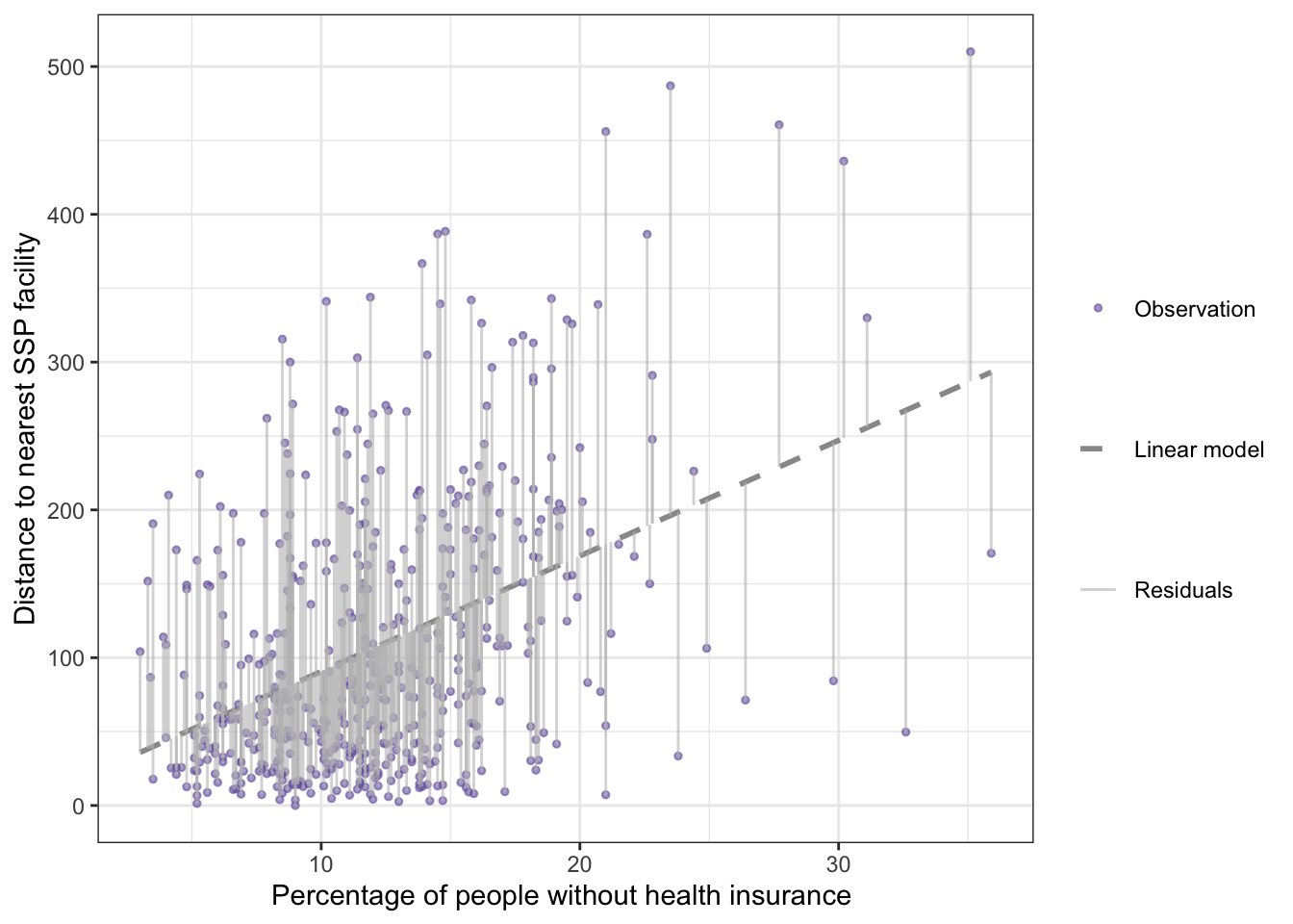
R Code 9.17 : Regression with residuals between percentage without health insurance and distance to nearest SSP
Code
## for a later calculationdist_mean<-base::mean(distance_ssp_clean$dist_ssp)## provide all data into one data frame## to check which column to subtract from what columndf_lm<-distance_ssp_clean|>dplyr::mutate( lm_residuals =lm9.1$residuals, lm_fitted_values =lm9.1$fitted.values, lm_mean =dist_ssp-dist_mean)save_data_file("chap09", df_lm, "df_lm.rds")gg_residuals<-df_lm|>ggplot2::ggplot(ggplot2::aes( y =dist_ssp, x =no_insurance))+ggplot2::geom_smooth( formula =y~x, method ="lm", se =FALSE,ggplot2::aes( linetype ="Linear model"), color ="gray60", linewidth =1)+ggplot2::geom_point(ggplot2::aes( color ="Observation"), size =1, alpha =.6)+ggplot2::geom_segment(ggplot2::aes( x =no_insurance, y =dist_ssp, xend =no_insurance, yend =dist_ssp-lm_residuals, linewidth ="Residuals"), linetype ="solid", color ="grey", alpha =.6)+ggplot2::labs( y ="Distance to nearest SSP facility", x ="Percentage of people without health insurance ")+ggplot2::scale_linetype_manual(values =2, name ="")+ggplot2::scale_linewidth_manual(values =.5, name ="")+ggplot2::scale_color_manual(values ="#7463AC", name ="")gg_residuals
Listing / Output 9.4: Relationship between percentage without health insurance and distance to nearest syringe program in 500 counties with residuals (vertical lines)
This is the replication of Figure 9.12, where no example code is available. After I had calculated the linear model I needed either the position on the regression line (lm_fitted_values in my case) or the values of the residuals (lm_residuals). I couldn’t use base::summary(stats::lm()) because fitted.values are calculated only for the lm object (in my case lm_dist), which also has the residuals computed and included.
In the end I decided to subtract the residuals from the distance to get the position of the regression line (and the end of the vertical line from the observation).
9.7 Achievement 4: Slope interpretation and significance
9.7.1 Interpreting statistical significance of the slope
The output of Listing / Output 9.2 for the linear model included a p-value for the slope (<2e16) and a p-value for the intercept (0.221). The statistical significance of the slope in linear regression is tested using a Wald test, which is like a one-sample t-test where the hypothesized value of the slope is zero. To get the p-value from the regression model of distance to syringe program, the slope of 12.48 was compared to a hypothesized value of zero using the Wald test.
9.7.1.1 NHST Step 1
Write the null and alternate hypotheses:
Wording for H0 and HA
H0: The slope of the line is equal to zero.
HA: The slope of the line is not equal to zero.
9.7.1.2 NHST Step 2
Compute the test statistic.
The test statistic for the Wald test in OLS regression is the t-statistic.
Formula 9.5 : Formula for the for the Wald test in OLS regression
\[
\begin{align*}
t = &\frac{b_{1}-0}{se_{b_{1}}} \\
t = &\frac{7.8190-0}{0.7734} = 10.11
\end{align*}
\tag{9.5}\]
Note that the formula is the same as the formula for the one-sample t-test from Equation 6.1, but with the slope of the regression model instead of the mean. The t-statistic, that was computed manually in Equation 9.5 can also be found in the model output of Listing / Output 9.2.
9.7.1.3 NHST Step 3
Review and interpret the test statistics: Calculate the probability that your test statistic is at least as big as it is if there is no relationship (i.e., the null is true).
The p-value is < 0.01 and therefore the null hypothesis is rejected in favor of the alternate hypothesis that the slope is not equal to zero.
Report 9.1: Interpretation of the linear regression model lm9.1 after NHST (first draft)
The percentage of uninsured residents in a county is a statistically significant predictor of the distance to the nearest syringe program (b = 7.82; p < .05) in our sample. For every 1% increase in uninsured residents in a county, the predicted distance to the nearest syringe program increases by 7.82 miles.
9.7.2 Computing confidence intervals
stats::confint() computes the confidence interval for the intercept and the slope.
R Code 9.18 : Confidence interval for regression parameters
Listing / Output 9.5: Confidence interval for regression parameters
The intercept is often reported but not interpreted because it does not usually contribute much to answering the research question.
Report 9.2: Interpretation of the linear regression model lm9.1 after statistical significance and confidence intervals (second draft)
The percentage of uninsured residents in a county is a statistically significant predictor of the distance to the nearest syringe program (b = 7.82; p < .05). For every 1% increase in uninsured residents in a county, the predicted distance to the nearest syringe program increases by 7.82 miles. The value of the slope in the sample is 7.82, and the value of the slope is likely between 6.30 and 9.34 in the population that the sample came from (95% CI: 6.30–9.34). With every 1% increase in uninsured residents in a county, the nearest syringe program is between 6.30 and 9.34 more miles away. These results suggest that counties with a larger percentage of uninsured are farther from this resource, which may exacerbate existing health disparities.
9.7.3 Making predcitions
Predicted values of \(y\) are called y-hat and denoted \(\hat{y}\). The stats::predict() function can be used to find the predicted values for all observations, or for a specific value of the independent variable.
stats::predict() is a generic function for predictions from the results of various model fitting functions. The function invokes particular methods which depend on the class of the first argument.
In our case we have to consult the help page of stats::predict.lm(). R knows which method to apply so just using stats::predict() is enough to invoke the correct computation. But for us users to know which arguments to apply we need the specified help page and not the explanation of the generic command.
Most prediction methods which are similar to those for linear models have an argument newdata specifying the first place to look for explanatory variables to be used for prediction.
Listing / Output 9.6: Predicted distance for a county where 10% of people are uninsured
The predicted distance to a syringe program from a county with 10% of people uninsured is 90.67 miles with a confidence interval for the prediction (sometimes called a prediction interval) of 82.42 to 98.92 miles.
R Code 9.20 : Find predictions for all observed values
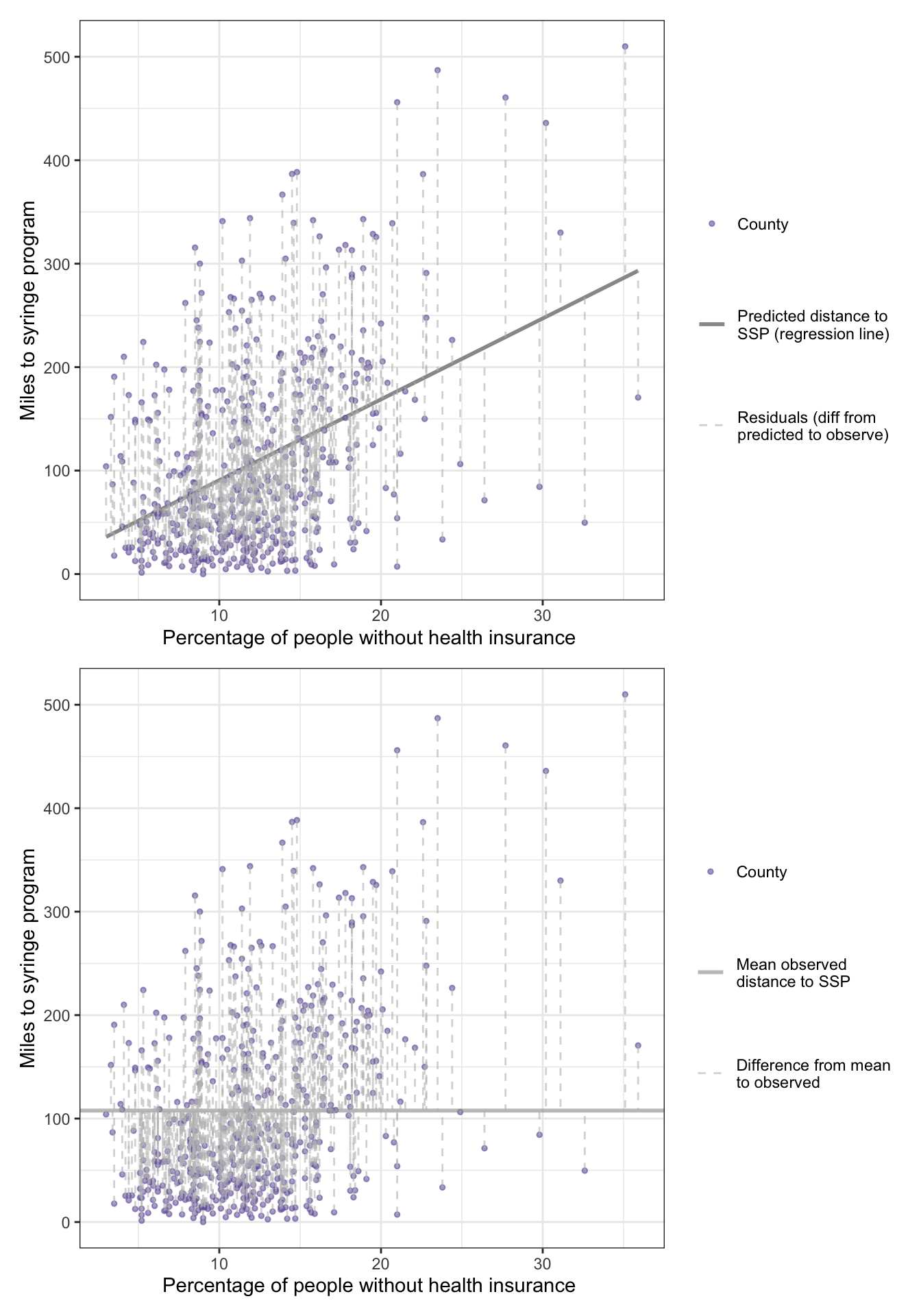
There is another p-value toward the bottom of Listing / Output 9.3. This p-value was from a test statistic that measures how much better the regression line is at getting close to the data points compared to the mean value of the outcome. Essentially, the question asked to produce this p-value is: Are the predicted values shown by the regression line in Figure 9.13 better than the mean value of the distance to the syringe program at capturing the relationship between no_insurance and dist_ssp?
Important 9.4: F-statistic for linear regression
Like the t-statistic is the test statistic for a t-test comparing two means, the F-statistic is the test statistic for linear regression comparing the regression line to the mean.
It is the same F-statistic that we have seen working with ANOVA in Chapter 7. ANOVA is actually a special type of linear model where all the predictors are categorical.
R Code 9.21 : Distance to mean versus regression line
Code
gg_means<-df_lm|>ggplot2::ggplot(ggplot2::aes( y =dist_ssp, x =no_insurance))+ggplot2::geom_point(ggplot2::aes( color ="County"), size =1, alpha =.6)+ggplot2::geom_hline(ggplot2::aes( linewidth ="Mean observed\ndistance to SSP", yintercept =dist_mean,), color ="grey60", alpha =.6)+ggplot2::geom_segment(ggplot2::aes( x =no_insurance, y =dist_ssp, xend =no_insurance, yend =dist_ssp-lm_mean, linetype ="Difference from mean\nto observed"), color ="grey", alpha =.6)+ggplot2::labs( y ="Miles to syringe program", x ="Percentage of people without health insurance ")+ggplot2::scale_linewidth_manual(values =1, name ="")+ggplot2::scale_linetype_manual(values =c(2, 2), name ="")+ggplot2::scale_color_manual(values ="#7463AC", name ="")gg_residuals2<-df_lm|>ggplot2::ggplot(ggplot2::aes( y =dist_ssp, x =no_insurance))+ggplot2::geom_smooth( formula =y~x, method ="lm", se =FALSE,ggplot2::aes( linetype ="Predicted distance to\nSSP (regression line)"), color ="gray60", linewidth =1)+ggplot2::geom_point(ggplot2::aes( color ="County"), size =1, alpha =.6)+ggplot2::geom_segment(ggplot2::aes( x =no_insurance, y =dist_ssp, xend =no_insurance, yend =dist_ssp-lm_residuals, linewidth ="Residuals (diff from\npredicted to observe)"), linetype ="dashed", color ="grey", alpha =.6)+ggplot2::labs( y ="Miles to syringe program", x ="Percentage of people without health insurance ")+ggplot2::scale_linetype_manual(values =1, name ="")+ggplot2::scale_linewidth_manual(values =.5, name ="")+ggplot2::scale_color_manual(values ="#7463AC", name ="")patchwork:::"/.ggplot"(gg_residuals2,gg_means)
Listing / Output 9.8: What is smaller? Sum of distances to regression line or distances to mean?
9.8.2 Understanding F-statistic
The F-statistic is a ratio of explained information (in the numerator) to unexplained information (in the denominator). If a model explains more than it leaves unexplained, the numerator is larger and the F-statistic is greater than 1. F-statistics that are much greater than 1 are explaining much more of the variation in the outcome than they leave unexplained. Large F-statistics are more likely to be statistically significant.
Formula 9.6 : F-statistic for the linear regression
\[
\begin{align*}
F = \frac{\frac{\sum_{i=1}^{n}(\hat{y}-m_{y})^2}{p-1}}{\frac{\sum_{i=1}^{n}(y_{i}-\hat{y_{i}})^2}{n-p}}
\end{align*}
\tag{9.6}\]
\(i\): individual observation, in this case a county
\(n\): sample size, or total number of counties, in this case 500
\(p\): number of parameters in the model; slope and intercept are parameters
\(y_{i}\): observed outcome of distance to syringe program for county \(i\)
\(\hat{y_{i}}\): predicted value of distance to syringe program for county \(i\)
\(m_{y}\): mean of the observed outcomes of distance to syringe program
Numerator: How much differ the predicted values from the observed mean on average. (\(MS_{regression}\)) Denominator: How much differ the predicted values from the actual observed values on average. (\(MS_{residual}\))
The F-statistic is how much a predicted value differs from the mean value on average — which is explained variance, or how much better (or worse) the prediction is than the mean at explaining the outcome — divided by how much an observed value differs from the predicted value on average, which is the residual information or unexplained variance. Or: Explained variance divided by residual information resp. unexplained variance,
Sometimes, these relationships are referred to in similar terminology to ANOVA: the numerator is the \(MS_{regression}\) (where MS stands for mean square) divided by the \(MS_{residual}\).
Bullet List 9.2
: Features of the F-statistic
The F-statistic is always positive, due to the squaring of the terms in the numerator and denominator.
The F-statistic starts at 0 where the regression line is exactly the same as the mean.
The larger the F-statistic gets the more the model explains the variation in the outcome.
F-statistics with large values are less likely to occur when there is no relationship between the variables.
The shape of the F-distribution depends on the number of parameters in the statistical model and the sample size, which determine two degrees of freedom (df) values.
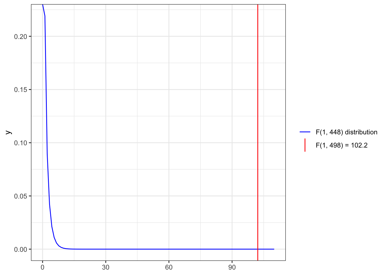
For instance in the last line of Listing / Output 9.3 we see that the value of the F-statistic is 102.2 with 1 (p - 1 = 2 - 1 = 1) and 498 (n - p = 500 - 2 = 498) df.
\(R^2\) is the amount of variation in the outcome that the model explains and is reported as a measure of model fit.
When the model predicts values that are close to the observed values, the correlation is high and the \(R^2\) is high.
To get the percentage of variance explained by the model, multiply \(R^2\) by 100.
Subtracting \(R^2\) from 1 (1 – \(R^2\)) and multiplying by 100 for a percent will give the percent of variance not explained by the model.
The value of \(R^2\) tends to increase with each additional variable added to the model, whether the variable actually improves the model or not.
Adjusted \(R^2\) (\(R^2_{adj}\)) penalizes the value of \(R^2\) a small amount for each additional variable added to the model to ensure that the only increases when the additional predictors explain a notable amount of the variation in the outcome.
\(R^2\) is computed by squaring the value of the correlation between the observed distance to syringe programs in the 500 counties and the values of distance to syringe programs predicted for the 500 counties by the model.
For the relationship between uninsured percentage and distance to syringe program in Listing / Output 9.3, the \(R^2\) is 0.1703. To get the percentage of variance explained by the model, multiply by 100, so 17.03% of the variation in distance to syringe programs is explained by the percentage of uninsured people living in a county.
Important 9.5: \(R^2_{adj}\) is more commonly reported than \(R^2\)
9.8.4 Reproting linear regression results
Bullet List 9.4
: Simple linear regression analysis results to report
Interpretation of the value of the slope (b)
Significance of the slope (t and p, confidence intervals)
Significance of the model (F and p)
Model fit (\(R^2\) or better \(R_{adj}^2\))
The following report is for our linear model lm9.1 example takein into account information from the
Report 9.3: Interpretation of the linear regression model lm9.1 after model fit (third draft)
A simple linear regression analysis found that the percentage of uninsured residents in a county is a statistically significant predictor of the distance to the nearest syringe program (b = 7.82; p < .001). For every 1% increase in uninsured residents, the predicted distance to the nearest syringe program increases by 7.82 miles. The value of the slope is likely between 6.30 and 9.34 in the population that the sample came from (95% CI: 6.30–9.34). With every 1% increase in uninsured residents in a county, there is likely a 6.30- to 9.34-mile increase to the nearest syringe program. The model was statistically significantly better than the baseline model (the mean of the distance to syringe program) at explaining distance to syringe program [F(1, 498) = 102.2; p < .001] and explained 16.86% of the variance in the outcome (\(R_{adj}^2\) = .1686). These results suggest that counties with lower insurance rates are farther from this resource, which may exacerbate existing health disparities.
9.9 Achievement 6: Conducting diagnostics
9.9.1 Introduction
Bullet List 9.5
: Assumptions of simple linear regression
Observations are independent.
The outcome is continuous.
The relationship between the two variables is linear (linearity).
The variance is constant with the points distributed equally around the line (homoscedasticity).
There is no perfect multicollinearity. (Only valid for multiple regression for continuous variables, see Section 9.10.5.)
9.9.2 Linearity
R Code 9.24 : Check linearity with loess curve
Code
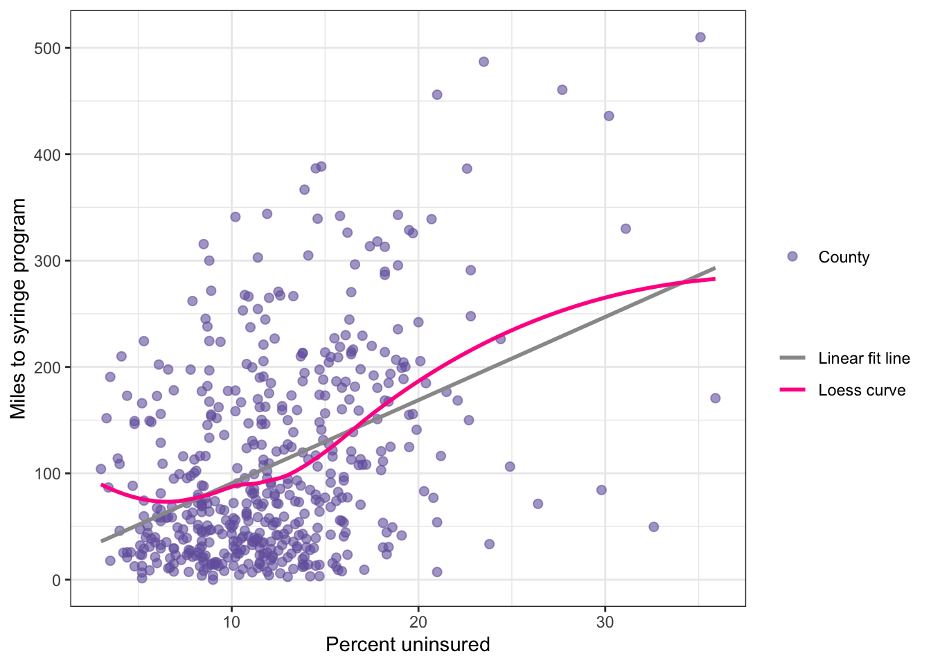
distance_ssp_clean|>ggplot2::ggplot(ggplot2::aes( x =no_insurance, y =dist_ssp))+ggplot2::geom_point(ggplot2::aes( size ="County"), color ="#7463AC", alpha =.6)+ggplot2::geom_smooth( formula =y~x,ggplot2::aes( color ="Linear fit line"), method ="lm", se =FALSE)+ggplot2::geom_smooth( formula =y~x,ggplot2::aes( color ="Loess curve"), method ="loess", se =FALSE)+ggplot2::labs( y ="Miles to syringe program", x ="Percent uninsured")+ggplot2::scale_color_manual( values =c("gray60", "deeppink"), name ="")+ggplot2::scale_size_manual(values =2, name ="")
Listing / Output 9.11: Checking the linearity assumption
The linearity assumption is met if a scatterplot of the two variables shows a relationship that falls along a line. An example where this assumption is met in the author’s opinion is Graph 8.3. The route of the loess curve follows not exact the regression line, but there are only small deviations from the regression line.
The situation in Listing / Output 9.11 is a little different: Here the loess line is curved and shows deviation from the linear relationship especially at the lower level of the predictor but also at the zeniths of the two arcs. Harris therefore decided that in Listing / Output 9.11 the linearity assumption has failed.
Conclusion: The linearity assumption is not met.
TODO: How to test the linearity assumption more objectively?
Diagnostics are very important for linear regression models. I have not (yet) much experience but I am pretty sure there exist some tests for the linearity assumption of linear models. I just have to look and find them!
TODO 9.2: Look for packages with linearity test functions
#>
#>  studentized Breusch-Pagan test
#>
#> data:  lm9.1
#> BP = 46.18, df = 1, p-value = 1.078e-11
Listing / Output 9.12: Checking the homoscedasticity with the Breusch-Pagan test
The assumption of homoscedasticity requires the data points are evenly distributed around the regression line. One way would be to check again Listing / Output 9.11: The points seem closer to the line on the far left and then are more spread out around the line at the higher values of percentage uninsured. Zhis is an indicator that the assumption has failed.
But the Breusch-Pagan test is another – more objective – way to test the homoscedasticity assumption. The tiny p-value confirm our first impression: The Null assumption, that the data points are evenly distributed around the regression line has to be rejected.
Conclusion: The homoscedasticity assumption is not met.
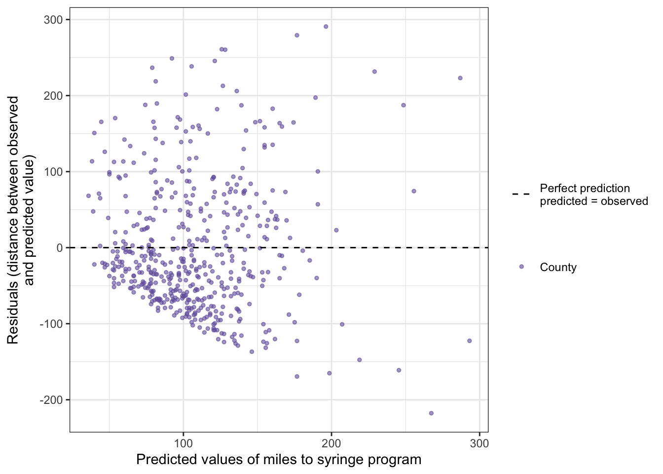
R Code 9.26 : Check homoscedasticity assumption plotting predicted values vs. residuals
Code
## scatterplot with mean as reference linegg_scatter_mean<-df_lm|>ggplot2::ggplot(ggplot2::aes( x =lm_fitted_values, y =lm_residuals))+ggplot2::geom_point(ggplot2::aes( color ="County"), size =1, alpha =.6)+ggplot2::geom_hline(ggplot2::aes( yintercept =base::mean(lm_residuals), linetype ="Perfect prediction\npredicted = observed"))+ggplot2::labs( x ="Predicted values of miles to syringe program", y ="Residuals (distance between observed\nand predicted value)")+ggplot2::scale_linetype_manual(values =2, name ="")+ggplot2::scale_color_manual(values ="#7463AC", name ="")gg_scatter_mean
Listing / Output 9.13: Predicted values and residuals from linear regression model of distance to syringe program by percentage uninsured in a county
Another (third) way to examine the constant error variance assumption is plotting the predicted values versus the residuals. In Listing / Output 9.13 a dashed line is shown to indicate no relationship between the fitted (or predicted) values and the residuals, which would be the ideal situation to meet the assumption. This line is a helpful reference point for looking at these types of graphs.
For the homoscedasticity assumption to be met, the points should be roughly evenly distributed around the dashed line with no clear patterns. It should look like a cloud or random points on the graph with no distinguishable patterns.
In Listing / Output 9.13, there is a clear pattern. Under the dashed line the distribution of the points suggest a negative correlation whereas above the line the points are distributed more randomly. This finding confirms the Breusch-Pagan test result.
Conclusion: The homoscedasticity assumption of the residuals is not met.
9.9.4 Independent residuals
R Code 9.27 : Testing the independence of residuals with the Durbin-Watson test
#>
#>  Durbin-Watson test
#>
#> data:  lm9.1
#> DW = 2.0103, p-value = 0.5449
#> alternative hypothesis: true autocorrelation is greater than 0
Listing / Output 9.14: Testing the independence of residuals with the Durbin-Watson test
Residuals have to be independent or unrelated to each other. Residuals that are independent do not follow a pattern. Conceptually, residuals are the variation in the outcome that the regression line does not explain. If the residuals form a pattern then the regression model is doing better for certain types of observations and worse for others.
The independence assumption of the residuals can be checked with the Durbin-Watson test. A Durbin-Watson (DW, or D-W) statistic of 2 indicates perfectly independent residuals, meaning that the null hypothesis of the test (that the residuals are independet) cannot be rejected. An this in fact the case in Listing / Output 9.14, as the DW-value is very near to 2.
Conclusion: The independence of residuals assumption is met.
9.9.5 Normality of residuals
Example 9.8 : Testing the normality of residuals assumption
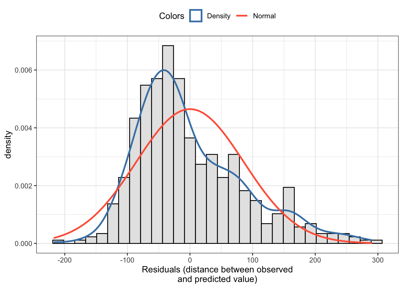
my_hist_dnorm( df =df_lm, v =df_lm$lm_residuals, n_bins =30, x_label ="Residuals (distance between observed\nand predicted value)")
Listing / Output 9.15: Testing the normality of residuals assumption with a histogram of the residuals
The histogram with the overlaid density curve of the theoretical normal distribution in Listing / Output 9.15 shows a right skewed distribution. This is an indicator that the normality assumption is not met.
Conclusion: The normality assumption of the residuals is not met
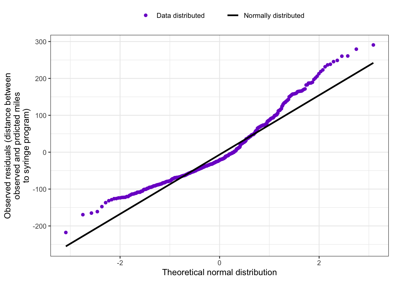
R Code 9.29 : Checking normality assumption of the residuals with a Q-Q plot
Code
my_qq_plot( df =df_lm, v =df_lm$lm_residuals, x_label ="Theoretical normal distribution", y_label ="Observed residuals (distance between\nobserved and prdicted miles\nto syringe program)")
Listing / Output 9.16: Testing the normality of residuals assumption with a q-q plot
The q-q plot in Listing / Output 9.16 shows some deviation form the normal distribution. Although it is again a quite subjective decision (See TODO 9.2) it seems that the assumption of normality has failed.
Conclusion: The normality assumption of the residuals is not met.
R Code 9.30 : Checking normality assumption of the residuals with the Shapiro-Wilk normality test
#>
#>  Shapiro-Wilk normality test
#>
#> data:  df_lm$lm_residuals
#> W = 0.94357, p-value = 7.437e-13
Listing / Output 9.17: Checking normality assumption of the residuals of linear model lm9.1 with the Shapiro-Wilk normality test
This method is not mentioned, but I believe that you can also use the Shapiro-Wilk test for testing the normal distribution of residuals. At least the very tiny p-value rejects the Null (that the residuals have a normal distribution) and suggest the same conclusion as the other two (visually decided) tests.
Conclusion: The normality assumption of the residuals is not met.
9.9.6 Interpreting the assumption tests
Bullet List 9.6
: Checking simple linear regression assumptions for model lm9.1m
Observations are independent. No: Counties in the same state are not really independent. (This is a general problem for geographical data analysis.)
The outcome is continuous. Yes: The distance to a syringe program is measured in miles and can take any value of zero or higher.
The relationship between the two variables is linear (linearity). No: See: Section 9.9.2
Because linear model lm9.1 does not meet all the assumptions, the model has to be considered biased and should be interpreted with caution. Specifically, the results of a biased model are not usually considered generalizable to the population.
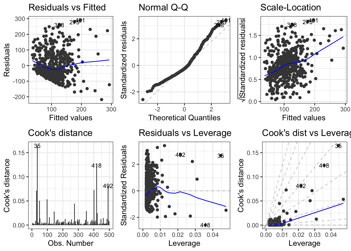
9.9.7 Using models diagnostics
We are not quite done checking model quality using diagnostics. In addition to testing assumptions, we need to identify problematic observations: outliers or other influential observations.
There are several measures:
standardized residuals,
df-betas,
Cook’s distance, and
leverage.
One good strategy for identifying the truly problematic observations is to identify those observations that are outliers or influential observations on two or more of these four measures.
Example 9.9 : Using models diagnostics to find outliers and influential values
Caution 9.1: Filter counties with absolute values of the residuals greater than 1.96
In my first trial, I forgot to filter using the absolute standardized residual values. I got a list of 24 counties – the two counties at the top of the list with negative values were missing.
That there are only two counties with negative values means that most counties had 2018 distances to syringe programs that were farther away than predicted. Another observation: Most of the outlier counties are situated in Texas, including one that is nearer than predicted.
There are 26 counties with outlier values, e.g., standardized residuals with an absolute value greater than 1.96.
R Code 9.32 : Standardize residuals manually to find outliers
With Listing / Output 9.19 I have standardized residuals manually through (lm_residuals - base::mean(lm_residuals)) / stats::sd(lm_residuals). There are small rounding differences in some counties but the list of outlier counties is identical.
R Code 9.33 : Using dfbeta to find influential values
Listing / Output 9.20: Computing dfbeta to find influential values with dfbeta > 2
Computing dfbeta is a method to find influential values. df_beta removes each observation from the data frame, conducts the analysis again, and compares the intercept and slope for the model with and without the observation. Observations with high dfbeta values may be influencing the model. The book recommends a cutoff of 2.
Warning 9.1: Difference between dfbeta and dfbetas
Reading other resources (Zach 2020; Goldstein-Greenwood 2022) I noticed that they used another threshold: Instead of using 2 they recommended \(2 / \sqrt{n}\), where n is the sample size. But this would result in a cutoff value of \(2 / \sqrt{500}\) = 0.0894427 with the absurd high number of 343 counties as influential values.
But later I became aware that these resources are talking of dfbetas (plural) and not of dfbeta (singular). Between these two measure there is a big difference: dfbetas are the standardized values, whereas dfbeta values depend on the scale of the data.
The result is a list of seven counties, six situated in Texas and one in Florida. All of them are listed because of higher absolute dfbeta intercept values.
R Code 9.34 : Using dfbetas to find influential values
#> # A tibble: 32 × 6
#>    county           state dist_ssp no_insurance predicted cooks_d
#>    <chr>            <fct>    <dbl>        <dbl>     <dbl>   <dbl>
#>  1 gillespie county TX      313            18.2     155.  0.00845
#>  2 webb county      TX      436            30.2     249.  0.0713
#>  3 garfield county  NE      300             8.8      81.3 0.00954
#>  4 starr county     TX      510            35.1     287.  0.165
#>  5 hendry county    FL       84.3          29.8     245.  0.0505
#>  6 scott county     KS      210             4.1      44.5 0.0137
#>  7 presidio county  TX      171.           35.9     293.  0.0533
#>  8 wyandotte county KS        7.25         21       177.  0.0164
#>  9 concordia parish LA       71.3          26.4     219.  0.0281
#> 10 coryell county   TX      341.           10.2      92.2 0.00977
#> 11 hill county      TX      326.           19.7     167.  0.0115
#> 12 essex county     MA      191.            3.5      39.8 0.0127
#> 13 pawnee county    KS      262             7.9      74.2 0.00838
#> 14 dewitt county    TX      388.           14.8     128.  0.0118
#> 15 jim wells county TX      456            21       177.  0.0446
#> 16 llano county     TX      318            17.8     152.  0.00862
#> 17 somervell county TX      329.           19.5     165.  0.0117
#> 18 kennebec county  ME      316.            8.5      78.9 0.0118
#> 19 dallam county    TX      106.           24.9     207.  0.0107
#> 20 gonzales county  TX      386.           22.6     189.  0.0291
#> 21 guadalupe county TX      387.           14.5     126.  0.0113
#> 22 lamb county      TX       54            21       177.  0.00860
#> 23 brooks county    TX      487            23.5     196.  0.0727
#> 24 comal county     TX      367.           13.9     121.  0.00918
#> 25 burnet county    TX      342            15.8     136.  0.00885
#> 26 gaines county    TX       49.7          32.6     267.  0.124
#> 27 el paso county   TX       33.5          23.8     199.  0.0245
#> 28 maverick county  TX      330            31.1     256.  0.0124
#> 29 bosque county    TX      339            20.7     174.  0.0147
#> 30 falls county     TX      343            18.9     160.  0.0129
#> 31 duval county     TX      461.           27.7     229.  0.0816
#> 32 caledonia county VT      224.            5.3      53.9 0.0116
Listing / Output 9.22: Using Cook’s distance to find influential values
Cook’s D is computed in a very similar way as dfbeta(s). That is, each observation is removed and the model is re-estimated without it. Cook’s D then combines the differences between the models with and without an observation for all the parameters together instead of one at a time like the dfbeta(s).
The cutoff for a high Cook’s D value is usually \(4/n\).
Thirty-two counties had a high Cook’s D. Most were in Texas (TX), but a few were in Maine (ME), Massachusetts (MA), and Vermont (VT).
R Code 9.36 : Using leverage to find influential values
#> # A tibble: 28 × 6
#>    county                state dist_ssp no_insurance predicted leverage
#>    <chr>                 <fct>    <dbl>        <dbl>     <dbl>    <dbl>
#>  1 berkshire county      MA      104.            3        35.9  0.00883
#>  2 webb county           TX      436            30.2     249.   0.0283
#>  3 starr county          TX      510            35.1     287.   0.0446
#>  4 hendry county         FL       84.3          29.8     245.   0.0271
#>  5 val verde county      TX      248.           22.8     191.   0.0111
#>  6 presidio county       TX      171.           35.9     293.   0.0476
#>  7 wyandotte county      KS        7.25         21       177.   0.00830
#>  8 caldwell parish       LA      116.           21.2     178.   0.00859
#>  9 concordia parish      LA       71.3          26.4     219.   0.0184
#> 10 essex county          MA      191.            3.5      39.8  0.00811
#> 11 carroll county        IA      152.            3.3      38.3  0.00839
#> 12 jim wells county      TX      456            21       177.   0.00830
#> 13 kinney county         TX      291            22.8     191.   0.0111
#> 14 nicollet county       MN       17.8           3.5      39.8  0.00811
#> 15 sabine county         TX      168.           22.1     185.   0.00997
#> 16 bremer county         IA       86.7           3.4      39.1  0.00825
#> 17 kodiak island borough AK      150            22.7     190.   0.0110
#> 18 dallam county         TX      106.           24.9     207.   0.0151
#> 19 gonzales county       TX      386.           22.6     189.   0.0108
#> 20 lamb county           TX       54            21       177.   0.00830
#> 21 brooks county         TX      487            23.5     196.   0.0124
#> 22 jefferson county      TX      177.           21.5     181.   0.00903
#> 23 gaines county         TX       49.7          32.6     267.   0.0358
#> 24 dawson county         TX       77            20.8     175.   0.00802
#> 25 el paso county        TX       33.5          23.8     199.   0.0129
#> 26 maverick county       TX      330            31.1     256.   0.0310
#> 27 brantley county       GA      226.           24.4     203.   0.0141
#> 28 duval county          TX      461.           27.7     229.   0.0215
Listing / Output 9.23: Using leverage to find influential values
Leverage is determined by the difference between the value of an observation for a predictor and the mean value of the predictor. The farther away an observed value is from the mean for a predictor, the more likely the observation will be influential. Leverage values range between 0 and 1. A threshold of \(2p / n\) is often used with p being the number of parameters and n being the sample size.
The leverage values to find influential states are computed by using the stats::hatvalues() function, because the predicted value of \(y\) is often depicted as \(\hat{y}\).
This time we got a list of 28 counties.
9.9.8 Summarizing outliers and influential values
It would be useful to have all the counties identified by at least two of these four measures in a single list or table to more easily see all the counties that seemed problematic.
Example 9.10 : Summarizing outliers and influential values
Listing / Output 9.24: Listing of all counties with influential values at least in two tests (using dfbeta like in the book)
Here I have use the threshold for the non-standardized dfbeta values, which in my opinion is the wrong option.
I have used the R datatable package {DT} (see: Section A.19), so you can experiment with the listed counties, for example sorting after certain columns or filtering certain states.
R Code 9.38 : Summarizing diagnostics for outliers and influential values with dfbetas
Listing / Output 9.25: Listing of all counties with influential values at least in two tests (using dfbetas, different from the book)
Here I have use the threshold for the standardized dfbetas values, which in my opinion is the correct option. Although there is a big difference in the number of counties with cutoff dfbeta (7 counties) to dfbetas(40 counties) in the end the difference is only 11 counties. The listing shows some counties exceeding the threshold 5 times. The reason is that counties can have outliers corresponding to dfbetas intercept and dfbetas slope.
I have used the R datatable package {DT} (see: Section A.19), so you can experiment with the listed counties, for example sorting after certain columns or filtering certain states. If you sort for instance the distances to the next syringe program you will see that there are some counties with similar values that are not included in Listing / Output 9.24, like kiowa county with similar values as garfied county.
R Code 9.39 : Difference between dfbeta and dfbetas results
Code
county_join<-dplyr::full_join(df_lm_diag1, df_lm_diag2, by =c("county", "state"))county_diff<-county_join|>dplyr::filter(is.na(dist_ssp.x))|>dplyr::select(-(3:6))|>dplyr::arrange(desc(dist_ssp.y))print(county_diff, n =20)
Listing / Output 9.26: Additional counties calculated with the standardized dfbetas (and not dfbeta)
These 11 counties have not been included in the book’s version because of a different method (using unstandardized dfbeta with an undocumented threshold of 2 versus standardized dfbetas with the in several resource documented cutoff \(2 / \sqrt{n = samplesize}\).
When an observation is identified as an outlier or influential value, it is worth looking at the data to see if there is anything that seems unusual. Sometimes, the observations are just different from the rest of the data, and other times, there is a clear data entry or coding error.
Report 9.4: Interpretation of the linear regression model lm9.1 after diagnostics (final version)
A simple linear regression analysis found that the percentage of uninsured residents in a county is a statistically significant predictor of the distance to the nearest syringe program (b = 7.82; p < .001). For every 1% increase in uninsured residents, the distance to the nearest syringe program is expected to increase by 7.82 miles. The value of the slope is likely between 6.30 and 9.34 in the population that the sample came from (95% CI: 6.30–9.34), so with every 1% increase in uninsured residents, there is likely a 6.30- to 9.34-mile increase in distance to the nearest syringe program. The model was statistically significantly better than the baseline at explaining distance to syringe program (F[1, 498] = 102.2; p < .001) and explained 16.86% of the variance in the outcome (\(R_{adj}^2\) = .1686). These results suggest that counties with lower insurance rates are farther from this type of resource, which may exacerbate existing health disparities.
An examination of the underlying assumptions found that the data fail several of the assumptions for linear regression, and so the model should be interpreted with caution; the results do not necessarily generalize to other counties beyond the sample. In addition, regression diagnostics found a number of counties that were outliers or influential observations. Many of these counties were in Texas, which may suggest that counties in Texas are unlike the rest of the sample.
9.10 Achievement 7: Adding variables and transformation
9.10.1 Adding a binary variable metro to the model
Example 9.11 : Adding binary variable metro to the model
R Code 9.40 : Linear regression: Distance to syringe program by uninsured percent and metro status
Code
lm9.2<-stats::lm(formula =dist_ssp~no_insurance+metro, data =distance_ssp_clean)save_data_file("chap09", lm9.2, "lm9.2.rds")base::summary(lm9.2)
#>
#> Call:
#> stats::lm(formula = dist_ssp ~ no_insurance + metro, data = distance_ssp_clean)
#>
#> Residuals:
#>     Min      1Q  Median      3Q     Max
#> -219.80  -60.07  -18.76   48.33  283.96
#>
#> Coefficients:
#>                Estimate Std. Error t value Pr(>|t|)
#> (Intercept)      3.4240    10.3621   0.330 0.741212
#> no_insurance     7.3005     0.7775   9.389  < 2e-16 ***
#> metronon-metro  28.0525     7.7615   3.614 0.000332 ***
#> ---
#> Signif. codes:  0 '***' 0.001 '**' 0.01 '*' 0.05 '.' 0.1 ' ' 1
#>
#> Residual standard error: 84.89 on 497 degrees of freedom
#> Multiple R-squared:  0.1915, Adjusted R-squared:  0.1883
#> F-statistic: 58.88 on 2 and 497 DF,  p-value: < 2.2e-16
Listing / Output 9.27: Linear regression: Distance to syringe program by uninsured percent and metro status
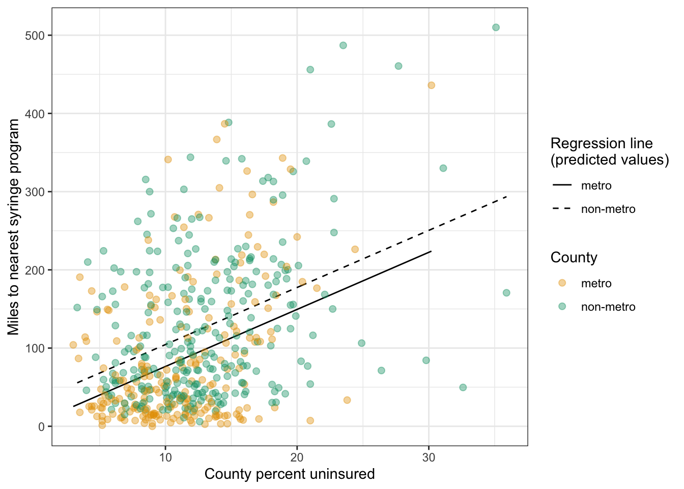
Small p-values indicate that percentage uninsured and metro status both statistically significantly help to explain the distance to a syringe program.
The model is statistically significant, with an F-statistic of F(2, 497) = 58.88 and a p-value of < .001.
\(R_{adj}^2\) indicates that 18.83% of the variation in distance to syringe program is accounted for by this model with no_insurance and metro in it. This is somewhat higher than the \(R_{adj}^2\) of 16.86 from the simple linear model with just no_insurance in it.
The coefficient for no_insurance of 7.30 means that for a county with 1% more uninsured people the distance to SSP grows by 7.30 miles.
metronon-metro is confusing because it combines two aspects: The variable name (here metro) and the category to which the coefficient refers (here non-metro). The other group name metro is the reference group for the metro variable2. The non-metro counties are 28.05 miles farther away from the nearest syringe program than the metro counties.
R Code 9.41 : Graphing the regression model lm9.2 with percent uninsured and metro
Code
distance_ssp_clean|>ggplot2::ggplot(ggplot2::aes( x =no_insurance, y =dist_ssp, group =metro))+ggplot2::geom_line( data =broom::augment(x =lm9.2),ggplot2::aes( y =.fitted, linetype =metro))+ggplot2::geom_point(ggplot2::aes( text =county, color =metro), size =2)+ggplot2::labs( y ="Miles to nearest syringe program", x ="County percent uninsured")+ggokabeito::scale_color_okabe_ito( order =c(1,3), alpha =.4, name ="County")+ggplot2::scale_linetype_manual( values =c(1, 2), name ="Regression line\n(predicted values)")
#> Warning in ggplot2::geom_point(ggplot2::aes(text = county, color = metro), :
#> Ignoring unknown aesthetics: text
Listing / Output 9.28: Regression model lm9.2 with percent uninsured and metro
This is my reproduction of Figure 9.21. There are two differences noteworthy:
I used the colorblind friendly palette scale_color_okabe_ito() from the {ggokabeito} package (See: Barrett (2021)). Therefore my colors are different from Figure 9.21. scale_color_okabe_ito() has 9 colors (default = order = 1:9). With the order argument you determine which colors you want to use. In my case the first and third color. order = c(1, 3).
Listing / Output 9.28 is the first time that I have used the augment() function from the {broom} package (See: Section A.3). I have already used broom::glance() and broom::tidy() in this chapter but I have not understood why and when to use one of these three functions. Therefore I am exploring how to apply these {broom} function in Section 9.11.2.
9.10.2 Using the multiple regression model
Formula 9.7 : Applying multiple regression model lm9.2
I am going to use as an example Miami county (Indiana) with exactly 10% of their residents not insured. This conforms to the book’s example. For a metro county I am using Sonoma county (California) with a slight different uninsured population of 10.1%.
#>          county state dist_ssp no_insurance     metro  .fitted   .lower  .upper
#> 1  miami county    IN    48.88         10.0 non-metro 104.4813 -62.6779 271.640
#> 2 sonoma county    CA    13.11         10.1     metro  77.1589 -90.0093 244.327
#>     .resid
#> 1 -55.6013
#> 2 -64.0489
Listing / Output 9.29: Compute lm9.2 model values for Miami county (IN) and Sonoma county (CA)
Our values calculated manually (104.48 and 77.15) match the values in .fitted column! We also see that the real values (48.88 and 13.11) are very far from our predicted values but inside the insanely huge 95% predicted intervals.
If we add the values in the column .resid to our predicted values in .fitted we will get the real distances to the nearest Syringe Services Program (SSP). For example: 104.4813 - 55.50131 = 48.97999.
9.10.3 Adding more variables
Before adding (more) variables one has to check the assumptions. For instance: Before we are going to add another continuous variable we should check for normality. If they are not normally distributed then it doesn’t pay the effort to regress with these variables without an appropriate transformation.
Checking the distribution of the continuous variables brings nothing new to my understanding. It is the already usual plotting of histograms and q-q plots. So I will not go into every details.
But what is interesting is the book’s conclusion of the no_insurance distribution (the percentage of uninsured residents): It claims that the normality assumption is met. But I will show that this is not the case and that a logit transformation improves the situation essentially.
Example 9.12 : Exploring no_insurance distribution
#>
#>  Shapiro-Wilk normality test
#>
#> data:  dist_ssp2$no_insurance_logit
#> W = 0.9921, p-value = 0.009428
Listing / Output 9.31: Checking normality assumption of residents without insurance after logit transformation. Left: Histogram with overlaid density curve. Right: Q-Q plot. Bottom: Shapiro-Wilk test.
The Shapiro-Wilk test is still statistically significant p < .05, and therefore the Null (that the no_insurance is normally distributed) has to be rejected. But the situation has drastically improved as one can seen in both graphs. In contrast to the book I would the percentage of uninsured residents logit transform.
Note 9.2
In contrast to Listing / Output 8.1 where I computed the logit transformation manually I used here the logit() function from the {car} package (see Section A.4).
9.10.4 Identifying transformation procedures
All of the continuous variables are right skewed. To find an appropriate transformation algorithm the book proposes to check with several procedures and to compare the results: Square, cube, inverse and log transformation are used. (For percent or proportions literature recommend the logit or arcsine transformation. — I have also tried arcsine and square but logit was by far the best.)
It is easy to find out with visual inspection the best transformation by comparing their histograms. Even if the situations with all of them has improved no histogram or q-q plot was so normally shaped as my no_insurance variable. But even my logit() transformation was not good enough that the Shapiro-Wilk test could confirm that the variable is normally distributed!
Remark 9.1. : What should I do if the assumptions are not met?
To choose the most normally distributed of the options does not guarantee that the variable finally really meet the assumption. What does this mean and how has one to proceed?
The only option as far as I have learned in SwR is to interpret the results cautiously and to prevent inferences from the sample to the population. But then I do not understand the purpose of the whole inference procedure when — in the end — one has to abstain from inferences.
As I am not going to reproduce all the details of the section about finding the appropriate transformation, I will at least report two other noteworthy things I learned from the book:
It is not necessary to generate a new column in the data.frame of the transformed variable. You could add the transformation directly into the ggplot2::aes() or stats:lm() code.
A disadvantages of transformed variables is the model interpretation. We cannot take the values from the printed output to interpret the model as I have demonstrated it in Equation 9.8. We have to take into account the transformation and to reverse the transformation for the interpretation. For instance if we have log-transformed one variable then we have to inverse this transformation by the appropriate exponential function. Or if we have applied a cube transformation then we need to raise the printed output by the power of 3.
9.10.5 No multicollinearity assumption
For multiple regression. e.g., when there are multiple predictor variables in the model, there is another assumption to met: Multicollinearity. (I have added this assumption to the Bullet List 9.5.)
Multicollinearity occurs when predictors are linearly related, or strongly correlated, to each other. When two or more variables are linearly related to one another, the standard errors for their coefficients will be large and statistical significance will be impacted. This can be a problem for model estimation, so variables that are linearly related to each other should not be in a model together.
There are several ways to check for multicollinearity. Examining correlation or — with more complex models, where one variable is linearly related to a combination of other variables — the use of variance inflation factor (VIF) statistics.
The VIF statistics are calculated by running a separate regression model for each of the predictors where the predictor is the outcome and everything else stays in the model as a predictor. With this model, for example, the VIF for the no_insurance variable would be computed by running the model \(no_insurance = log(x = hiv_prevalence) + metro\).
The \(R^2\) from this linear regression model would be used to determine the VIF by substituting it into Equation 9.9:
Formula 9.8 : Computing the variance inflation factor (VIF)
2.5: Cutoff; too much collinearity. Corresponds to \(R^2\) of 60% \(\approx\) r of 77%, a little more than often used when correlation coefficients are calculated for checking multicollinearity.
Listing / Output 9.32: Checking for multicollinearity with correlation
.24 is a weak correlation between percent residents uninsured (no_insurance) and the transformed value of hiv_prevalence. Multicollinearity would be a problem when the result would have been .7 or higher.
R Code 9.46 : Checking for multicollinearity with variance inflation factor (VIF)
Code
lm9.3<-lm(formula =(dist_ssp)^(1/3)~no_insurance+log(x =hiv_prevalence)+metro, data =distance_ssp_clean, na.action =na.exclude)car::vif(mod =lm9.3)
#>            no_insurance log(x = hiv_prevalence)                   metro
#>                1.165165                1.207491                1.186400
Listing / Output 9.33: Checking for multicollinearity with variance inflation factor (VIF)
The VIF values are small, especially given that the lower limit of the VIF is 1. This confirmed no problem with multicollinearity with this model. The model meets the assumption of no perfect multicollinearity.
There is nothing new in checking the other assumption. It is the same procedure as used for simple linear regression model.
9.10.6 Partial-F test: Choosing a model
I skipped so far the summary of the third model with the hiv_prevalencevariable. To fully understand this section I need to add it:
#>
#> Call:
#> lm(formula = (dist_ssp)^(1/3) ~ no_insurance + log(x = hiv_prevalence) +
#>     metro, data = distance_ssp_clean, na.action = na.exclude)
#>
#> Residuals:
#>     Min      1Q  Median      3Q     Max
#> -3.2624 -0.8959 -0.0745  0.8032  3.1967
#>
#> Coefficients:
#>                         Estimate Std. Error t value Pr(>|t|)
#> (Intercept)              3.03570    0.38448   7.896 2.48e-14 ***
#> no_insurance             0.11269    0.01220   9.237  < 2e-16 ***
#> log(x = hiv_prevalence) -0.06529    0.07729  -0.845 0.398691
#> metronon-metro           0.48808    0.12763   3.824 0.000151 ***
#> ---
#> Signif. codes:  0 '***' 0.001 '**' 0.01 '*' 0.05 '.' 0.1 ' ' 1
#>
#> Residual standard error: 1.214 on 426 degrees of freedom
#>   (70 observations deleted due to missingness)
#> Multiple R-squared:  0.2372, Adjusted R-squared:  0.2318
#> F-statistic: 44.16 on 3 and 426 DF,  p-value: < 2.2e-16
Listing / Output 9.34: Summary of the full model (lm9.3)
Which model to choose? The HIV variable was not a significant predictor in the full model, and all three models failed one or more of the assumptions.
Before thinking about how a model performed, we have to ensure that
the model addresses the research question of interest and
the model includes variables that have been demonstrated important in the past to help explain the outcome. (For instance: Smoking has to be included in a lung cancer study.)
One tool for choosing between two linear regression models is a statistical test called the Partial-F test. The Partial-F test compares the fit of two nested models to determine if the additional variables in the larger model improve the model fit enough to warrant keeping the variables and interpreting the more complex model.
#> Analysis of Variance Table
#>
#> Model 1: dist_ssp ~ no_insurance
#> Model 2: dist_ssp ~ no_insurance + metro
#>   Res.Df     RSS Df Sum of Sq      F    Pr(>F)
#> 1    498 3675855
#> 2    497 3581712  1     94143 13.063 0.0003318 ***
#> ---
#> Signif. codes:  0 '***' 0.001 '**' 0.01 '*' 0.05 '.' 0.1 ' ' 1
Listing / Output 9.36: Computing Partial-F statistic with anova()
The manual calculation of the Partial-F was with 13.03 a pretty good approximation to the stats::anova() computation with 13.06. to understand the p-value of .0003 we need a NHST procedure.
9.10.6.1 NHST Step 1
Write the null and alternate hypotheses:
Wording for H0 and HA
H0: The larger model is no better than the smaller model at explaining the outcome.
HA: The larger model is better than the smaller model at explaining the outcome.
Review and interpret the test statistics: Calculate the probability that your test statistic is at least as big as it is if there is no relationship (i.e., the null is true).
The p-value is very small (\(p = .0003\)), so the probability is tiny that the test statistic would be this big or bigger if the null hypothesis were true.
9.10.6.4 NHST Step 4
Conclude and write report. The null hypothesis is rejected.
Report 9.5: Interpretation of the linear regression model lm9.3 (without diganostics and assumption testing)
A linear regression model including percent uninsured and metro status of a county to explain distance in miles to the nearest syringe program was statistically significantly better than a baseline model at explaining the outcome [F(2, 497) = 58.88]. The model explained 18.83% of the variation in distance to syringe programs . Percent uninsured was a statistically significant predictor of distance to the nearest syringe program (b = 7.30; t = 9.39; p < .001). In the sample, for every additional 1% uninsured people in a county, the distance to the nearest syringe program is 7.30 miles farther. The 95% confidence interval for the coefficient suggested that a 1% increase in uninsured in a county was associated with a 5.77- to 8.83-mile increase in distance to the nearest syringe program. Metro status was also a significant predictor of distance to a syringe program (b = 28.05; t = 7.76; p = .0003). Nonmetro counties are 28.05 miles farther than metro counties to the nearest syringe exchange in the sample and are 12.80 to 43.30 miles farther than metro counties from syringe programs in the population. Overall, the results suggest that more rural counties and counties that are poorer are farther from this health service, potentially exacerbating existing health disparities.
9.11 Experiments
9.11.1 Compute and visualize several variables combined
During working the material of SwR I consulted many times the internet. So I learned about the reference to plots where several graphs are combined. See: Linear Regression Assumptions and Diagnostics in R: Essentials(Kassambara 2018). It includes functions for plotting a collection of four diagnostic tests either in base R with stats::plot(<model name>) or using {ggfortify} with ggplot2::autoplot(). There exist also with the {autoplotly} package an interactive version of {ggfortify}.
After exploring {GGally} I noticed that there is with the ggnostic() function, working as a wrapper around GGally::ggduo(), also a tool that displays full model diagnostics for each given explanatory variable.
TODO: Looking at the packages {ggfortify} and {autoplotly}
In addition to learn {GGally} I have also to study the packages {ggfortify} — and together with {plotly} — the package {autoplotly}.
{ggfortify}: This package offers fortify() and autoplot() functions to allow automatic {ggplot2} to visualize statistical result of popular R packages. (See: Section A.26).
{autoplotly}: provides functionalities to automatically generate interactive visualizations for many popular statistical results supported by {ggfortify} package with plotly.js and {ggplot2} style. The generated visualizations can also be easily extended using {ggplot2} syntax while staying interactive. (See: Section A.64 and Section A.1).
TODO 9.3: Learning how to work with {ggfortify} and {autoplotly}
To give you examples of the power of these functions I did several experiments. But I have to confess that I do still not understand the different options.
Experiment 9.1 : Visualizing several variables together
Listing / Output 9.38: Applying {ggfortify} to model and diagnose our model lm9.1
9.11.2 Using {broom}
{broom} converts untidy output into tidy tibbles. This is important whenever you want to combine results from multiple model (or tests). I have {broom} already used to compare results from the normality tests (Shapiro-Wilk and Anderson-Darling), and homogeneity tests (Levene and Fligner-Killeen. In the first case (normality) both tests result in htest objects. I could therefore bind them as different rows in a new tibble dataframe (see: Table 9.3). In the second case (homogeneity) I got with htest and anova two different objects and had to work around the differences manually before I could bind them into the same tibble (See: Table 9.4).
At that time I didn’t know that I should have used only broom::tidy() and not improvise with broom:::glance.htest(). The real advantage of glance can be seen when it is applied to a linear model.
Important 9.6: Three verbs in {broom} to make it convenient to interact with model objects
broom::tidy()summarizes information about model components
#>
#>  Shapiro-Wilk normality test
#>
#> data:  distance_ssp_clean$dist_ssp
#> W = 0.87419, p-value < 2.2e-16
#>
#>
#>  Anderson-Darling normality test
#>
#> data:  distance_ssp_clean$dist_ssp
#> A = 17.995, p-value < 2.2e-16
#>
#> # A tibble: 2 × 3
#>   statistic  p.value method
#>       <dbl>    <dbl> <chr>
#> 1     0.874 1.10e-19 Shapiro-Wilk normality test
#> 2    18.0   3.7 e-24 Anderson-Darling normality test
Listing / Output 9.39: Compare Shapiro-Wilk with Anderson-Darling normality test
Even the details differ both tests result show a tiny p-value < .001 and support therefore the same decision to reject the Null.
It is of interest that the p-value for each test reported individually is the same and does not conform with the value in the htest object. It is with 2.22e-16 — as my internet research had turned out (How should tiny 𝑝 -values be reported? (and why does R put a minimum on 2.22e-16?)) “a value below which you can be quite confident the value will be pretty numerically meaningless - in that any smaller value isn’t likely to be an accurate calculation of the value we were attempting to compute”.
And even more important from the same author:
But statistical meaning will have been lost far earlier. Note that p-values depend on assumptions, and the further out into the extreme tail you go the more heavily the true p-value (rather than the nominal value we calculate) will be affected by the mistaken assumptions, in some cases even when they’re only a little bit wrong. (Glen_b 2013)
As a result of this discussion:
The broom::tidy() version reports the value inside the htestobject, showing that they are different and that Shapiro-Wilk is the more conservative test. But statistically it has no relevance because the report according to the recommendation of the APA style guide is: Do not use any value smaller than p < 0.001(Jaap 2013).
R Code 9.55 : Using broom::glance() to report information about the entire model
Listing / Output 9.40: Using broom::glance() to report additional information about the entire model
I have put together three types of model output:
The first call is just printing the model: lm9.2.
The second call summarizes more information in a convenient format: `base::summary(lm9.2)``
The third part of Listing / Output 9.40 finally shows the output generated with broom::glance(lm9.2). It adds some important information for evaluation of the model quality and for model comparison. Some of these parameters (logLik, AIC, BIC and deviance) We haven’t not learned so far in this book.
logLik: log-likelihood value
The log-likelihood value of a regression model is a way to measure the goodness of fit for a model. The higher the value of the log-likelihood, the better a model fits a dataset.
The log-likelihood value for a given model can range from negative infinity to positive infinity. The actual log-likelihood value for a given model is mostly meaningless, but it’s useful for comparing two or more models. (Zach 2021b)
AIC: Akaike information criterion
Akaike information criterion (AIC) is a metric that is used to compare the fit of different regression models.
There is no value for AIC that can be considered “good” or “bad” because we simply use AIC as a way to compare regression models. The model with the lowest AIC offers the best fit. The absolute value of the AIC value is not important. (Zach 2021a)
BIC: Bayesian Information Criterion
The Bayesian Information Criterion (BIC) is an index used in Bayesian statistics to choose between two or more alternative models. The BIC is also known as the Schwarz information criterion (abrv. SIC) or the Schwarz-Bayesian information criteria.
Comparing models with the Bayesian information criterion simply involves calculating the BIC for each model. The model with the lowest BIC is considered the best, and can be written BIC* (or SIC* if you use that name and abbreviation). (Glenn 2018)
Deviance
in statistics, a measure of the goodness of fit between a smaller hierarchical model and a fuller model that has all of the same parameters plus more. If the deviance reveals a significant difference, then the larger model is needed. If the deviance is not significant, then the smaller, more parsimonious model is retained as more appropriate. (https://dictionary.apa.org/deviance)
R Code 9.56 : Using broom::augment() to add information about observations to a dataset
Sigma, here as column .sigma for the “estimated residual standard deviation when corresponding observation is dropped from model”. (Where’s the .sigma equivalent in this chapter?)
Additionally there is the option to include:
Standard errors of fitted values (column .se.fit): (Where’s the .se.fit equivalent in this chapter?)
Confidence intervals (columns .lower and .upper) or alternative predicted intervals: See Listing / Output 9.5 or Listing / Output 9.7. Here I have used interval = prediction.
9.11.3 Interactive plots
R Code 9.57 : Graphing the regression model lm9.2 as an interactive plot
Code
test_plot<-distance_ssp_clean|>ggplot2::ggplot(ggplot2::aes( x =no_insurance, y =dist_ssp, group =metro))+ggplot2::geom_line( data =broom::augment(x =lm9.2),ggplot2::aes( y =.fitted, linetype =metro))+ggplot2::geom_point(ggplot2::aes( text =county, color =metro), size =2)+ggplot2::labs( y ="Miles to nearest syringe program", x ="County percent uninsured")+ggokabeito::scale_color_okabe_ito( order =c(1,3), alpha =.4, name ="County")+ggplot2::scale_linetype_manual( values =c(1, 2), name ="Regression line\n(predicted values)")
#> Warning in ggplot2::geom_point(ggplot2::aes(text = county, color = metro), :
#> Ignoring unknown aesthetics: text
Code
plotly::ggplotly( p =test_plot, tooltip =c("dist_ssp", "no_insurance", "text"))
Listing / Output 9.42: Interactive regression model lm9.2 with percent uninsured and metro
This is an experiment with interactive graphic using the ggplotly() function from the {plotly) package. This is my first try. There is still something wrong with the legend.
TODO: Interactive graphics with {plotly}
The problem with the legend indicates my lacking knowledge about the {plotly} package. I have to go into more detail. Although it is easy to apply {plotly} by converting a {ggplot2} graph, there are many finer points to learn. It is therefore one of my most important intent to study Interactive Web-Based Data Visualization With R, Plotly, and Shiny(Sievert 2020).
BTW: The package {autoplotly} in the context of {ggfortify) as mentioned in TODO 9.3 is another is another tool supporting interactive plots.
TODO 9.4: Learning to develop interactive graphics with {plotly}
9.12 Exercises (empty)
9.13 Glossary
term
definition
Adjusted-R2
Adjusted R-squared is a measure of model fit for ordinary least squares linear regression that penalizes the R-squared, or percentage of variance explained, for the number of variables in the model (SwR, Glossary)
amfAR
amfAR, the Foundation for AIDS Research, known until 2005 as the American Foundation for AIDS Research, is an international nonprofit organization dedicated to the support of AIDS research, HIV prevention, treatment education, and the advocacy of AIDS-related public policy. (<a href="https://en.wikipedia.org/wiki/AmfAR">Wikipedia</a>)
Anderson-Darling
The Anderson-Darling Goodness of Fit Test (AD-Test) is a measure of how well your data fits a specified distribution. It’s commonly used as a test for normality. (<a href="https://www.statisticshowto.com/anderson-darling-test/">Statistics How-To</a>)
ANOVA
Analysis of variance is a statistical method used to compare means across groups to determine whether there is a statistically significant difference among the means; typically used when there are three or more means to compare. (SwR, Glossary)
Breusch-Pagan
Breusch-Pagan is a statistical test for determining whether variance is constant, which is used to test the assumption of homoscedasticity; Breusch-Pagan relies on the [chi-squared] distribution and is used during assumption checking for [homoscedasticity] in [linear regression]. (SwR, Glossary)
Cook’s D
Cook’s distance (often abbreviated Cook’s D) is used in Regression Analysis to find influential outliers in a set of predictor variables. IIt is a way to identify points that negatively affect the regression model. ([Statistics How To](https://www.statisticshowto.com/cooks-distance/))
Correlation
Correlation coefficients are a standardized measure of how two variables are related, or co-vary. They are used to measure how strong a relationship is between two variables. There are several types of correlation coefficient, but the most popular is Pearson’s. Pearson’s correlation (also called Pearson’s R) is a correlation coefficient commonly used in linear regression. ([Statistics How To](https://www.statisticshowto.com/probability-and-statistics/correlation-coefficient-formula/))
Degrees of Freedom
Degree of Freedom (df) is the number of pieces of information that are allowed to vary in computing a statistic before the remaining pieces of information are known; degrees of freedom are often used as parameters for distributions (e.g., chi-squared, F). (SwR, Glossary)
Density Plots
Density plots are used for examining the distribution of a variable measured along a continuum; density plots are similar to histograms but are smoothed and may not show existing gaps in data (SwR, Glossary)
Deterministic
A deterministic equation, or model, has one precise value for y for each value of x. (SwR, Chap09)
Diagnostics
Diagnostics in linear and logistic regression are a set of tests to identify outliers and influential values among the observations. (SwR, Glossary)
Durbin-Watson
Durbin-Watson test is a statistical test that is used to check the assumption of independent residuals in linear regression; a Durbin-Watson statistic of 2 indicates that the residuals are independent. (SwR, Glossary)
EDA
Explorative Data Analysis is an approach of analyzing data sets to summarize their main characteristics, often using statistical graphics and other data visualization methods. A statistical model can be used or not, but primarily EDA is for seeing what the data can tell us beyond the formal modeling and thereby contrasts traditional hypothesis testing. (<a href="https://en.wikipedia.org/wiki/Exploratory_data_analysis">Wikipedia</a>)
F-Statistic
F-statistic is a test statistic comparing explained and unexplained variance in [ANOVA] and linear regression. The F-statistic is a ratio where the variation between the groups is compared to the variation within the groups. (SwR, Glossary)
Fligner
The Fligner-Killeen test is a non-parametric test for homogeneity of group variances based on ranks. It is useful when the data is non-normal or when there are outliers. (<a href="https://real-statistics.com/one-way-analysis-of-variance-anova/homogeneity-variances/fligner-killeen-test/">Real Statistics Using Excel</a>)
Histograms
Histograms are visual displays of data used to examine the distribution of a numeric variable. (SwR, Glossary)
Homoscedasticity
Homoscedasticity is [homogeneity of variances], contrast is [Heteroscedasticity]. Homoscedasticity is an assumption of correlation and linear regression that requires that the variance of y be constant across all the values of x; visually, this assumption would show points along a fit line between x and y being evenly spread on either side of the line for the full range of the relationship. (SwR, Glossary)
Influential Observation
An influential observation is an observation that changes the slope of a regression line. (SwR, Glossary) Influential points are observed data points that are far from the other observed data points in the horizontal direction. These points may have a big effect on the slope of the regression line. To begin to identify an influential point, you can remove it from the data set and see if the slope of the regression line is changed significantly. (<a href= "https://openstax.org/books/introductory-statistics/pages/12-6-outliers">Introductory Statistics 12.6</a>)
Intercept
The intercept is the value of the dependent variables if all independent variables have the value zero. (<a href="https://link.springer.com/referenceworkentry/10.1007/978-94-007-0753-5_1486">Intercept, Slope in Regression</a>)
Levene
Levene’s test is a statistical test to determine whether observed data meet the homogeneity of variances assumption; Levene’s test is used to test this assumption for t-tests and analysis of variance. (SwR, Glossary)
Linearity
Linearity is the assumption of some statistical models that requires the outcome, or transformed outcome, to have a linear relationship with numeric predictors, where linear relationships are relationships that are evenly distributed around a line. (SwR, Glossary)
Mean Square
Mean square is the mean of the squared differences between two values; mean squares are used to compute the F-statistic in analysis of variance and linear regression. (Swr, Glossary)
Model-fit
Model fit means how well the model captures the relationship in the observed data. (SwR, Glossary)
OLS
Ordinary least square regression (OLS) is a method of estimating a linear regression model that finds the regression line by minimizing the squared differences between each data point and the regression line. (Swr; Glossary)
One-sample
One-sample t-test, also known as the single-parameter t-test or single-sample t-test, is an inferential statistical test comparing the mean of a numeric variable to a population or hypothesized mean. (SwR, Glossary)
Outliers
Outliers are observations with unusual values. (SwR, Glossary). Outliers are observed data points that are far from the least squares line. They have large "errors", where the "error" or residual is the vertical distance from the line to the point. (<a href= "https://openstax.org/books/introductory-statistics/pages/12-6-outliers">Introductory Statistics 12.6</a>)
p-value
The p-value is the probability that the test statistic is at least as big as it is under the null hypothesis (SwR, Glossary)
Partial-F
Partial-F test is a statistical test to see if two nested linear regression models are statistically significantly different from each other; this test is usually used to determine if a larger model accounts for enough additional variance to justify the complexity in interpretation that comes with including more variables in a model. (SwR, Glossary)
Pearson
Pearson’s r is a statistic that indicates the strength and direction of the relationship between two numeric variables that meet certain assumptions. (SwR, Glossary)
Q-Q-Plot
A quantile-quantile plot is a visualization of data using probabilities to show how closely a variable follows a normal distribution. (SwR, Glossary) This plot is made up of points below which a certain percentage of the observations fall. On the x-axis are normally distributed values with a mean of 0 and a standard deviation of 1. On the y-axis are the observations from the data. If the data are normally distributed, the values will form a diagonal line through the graph. (SwR, chapter 6)
R-squared
R-squared is the percent of variance in a numeric variable that is explained by one or more other variables; the r-squared is also known as the coefficient of determination and is used as a measure of model fit in linear regression and an effect size in correlation analyses. (SwR, Glossary)
Residually
Residuals are the differences between the observed values and the predicted values. (SwR, Glossary)
Shapiro-Wilk
The Shapiro-Wilk test is a statistical test to determine or confirm whether a variable has a normal distribution; it is sensitive to small deviations from normality and not useful for sample sizes above 5,000 because it will nearly always find non-normality. (SwR, Glossary)
Simple-Linear-Regression
Simple does not mean easy; instead, it is the term used for a statistical model used to predict or explain a continuous outcome by a single predictor. (SwR, Glossary, Chap09)
Slope
The slope is the increase in the dependent variable when the independent variable increases with one unit and all other independent variables remain the same. (<a href="https://link.springer.com/referenceworkentry/10.1007/978-94-007-0753-5_1486">Intercept, Slope in Regression</a>)
Spearman
Spearman’s rho a statistical test used to examine the strength, direction, and significance of the relationship between two numeric variables when they do not meet the assumptions for [Pearson]’s r. (SwR, Glossary)
SSP
SSP stands for Syringe Services Program (SwR)
SwR
SwR is my abbreviation of: Harris, J. K. (2020). Statistics With R: Solving Problems Using Real-World Data (Illustrated Edition). SAGE Publications, Inc.
T-Statistic
The T-Statistic is used in a T test when you are deciding if you should support or reject the null hypothesis. It’s very similar to a Z-score and you use it in the same way: find a cut off point, find your t score, and compare the two. You use the t statistic when you have a small sample size, or if you don’t know the population standard deviation. (<a href="https://www.statisticshowto.com/t-statistic/">Statistics How-To</a>)
T-Test
A t-test is a type of statistical analysis used to compare the averages of two groups and determine whether the differences between them are more likely to arise from random chance. (<a href="https://en.wikipedia.org/wiki/Student%27s_t-test">Wikipedia</a>)
VIF
The variance inflation factor (VIF) is a statistic for determining whether there is problematic multicollinearity in a linear regression model. (SwR, Glossary)
Wald
Wald test is the statistical test for comparing the value of the coefficient in linear or logistic regression to the hypothesized value of zero; the form is similar to a one-sample t-test, although some Wald tests use a t-statistic and others use a z-statistic as the test statistic. (SwR, Glossary)
Z-score
A z-score (also called a standard score) gives you an idea of how far from the mean a data point is. But more technically it’s a measure of how many standard deviations below or above the population mean a raw score is. (<a href="https://www.statisticshowto.com/probability-and-statistics/z-score/#Whatisazscore">StatisticsHowTo</a>)
Glen_b, (https://stats.stackexchange.com/users/805/glen-b). 2013. “How Should Tiny p-Values Be Reported? (And Why Does r Put a Minimum on 2.22e-16?),” December. https://stats.stackexchange.com/q/78840.
Jaap, (https://stats.stackexchange.com/users/22387/jaap). 2013. “How Should Tiny p-Values Be Reported? (And Why Does r Put a Minimum on 2.22e-16?),” December. https://stats.stackexchange.com/q/78852.
Tierney, Nicholas, and Dianne Cook. 2023. “Expanding Tidy Data Principles to Facilitate Missing Data Exploration, Visualization and Assessment of Imputations.”Journal of Statistical Software 105 (February): 1–31. https://doi.org/10.18637/jss.v105.i07.
Maybe one should say that \(R^2\) is not the but only one measure of model fit?↩︎
Especially confusing here is that the variable has the same name as one group and additionally it is puzzling the the other group non-metro has a dash in its name that separates the second part with exactly the same name as variable and group coefficient. Another example to make things clearer: Imagine a binary variable region that consists of the two categories urban and countryside then we would see regionurban instead of metronon-metro.↩︎
Source Code
# Linear regression {#sec-chap09}```{r}#| label: setup#| include: falseoptions(warn =0) # default value: change for debuggingbase::source(file ="R/helper.R")ggplot2::theme_set(ggplot2::theme_bw()) ```::: {.callout-note #nte-chap09-differenct-chapter-structure style="color: blue;"}### Different chapter structure, especially in `r glossary("EDA")` (@sec-chap09-achievement1)As I have already read some books on linear regression I will not follow exactly the text in this chapter. I will leave out those passages that are not new for me and where I feel confident. Other passages I will only summarize to have content to consult whenever I would need it.:::## Achievements to unlock::: {#obj-chap09}::: {.my-objectives}::: {.my-objectives-header}Objectives for chapter 09:::::: {.my-objectives-container}**SwR Achievements**- **Achievement 1**: Using exploratory data analysis to learn about the data before developing a linear regression model (@sec-chap09-achievement1)- **Achievement 2**: Exploring the statistical model for a line (@sec-chap09-achievement2)- **Achievement 3**: Computing the slope and intercept in a simple linear regression (@sec-chap09-achievement3)- **Achievement 4**: Slope interpretation and significance ($b_{1}$, p-value, CI) (@sec-chap09-achievement4)- **Achievement 5**: Model significance and model fit (@sec-chap09-achievement5)- **Achievement 6**: Checking assumptions and conducting diagnostics (@sec-chap09-achievement6)- **Achievement 7**: Adding variables to the model and using transformation (@sec-chap09-achievement7)::::::Achievements for chapter 09:::## The needle exchange examinationSome infectious diseases like HIV and Hepatitis C are on the rise again with young people in non-urban areas having the highest increases and needle-sharing being a major factor. Clean needles are distributed by syringe services programs (SSPs), which can also provide a number of other related services including overdose prevention, referrals for substance use treatment, and infectious disease testing. But even there are programs in place --- which is not allowed legally in some US states! --- some people have to travel long distances for health services, especially for services that are specialized, such as needle exchanges.In discussing the possible quenstion one could analyse it turned out that for some questions critical data are missing: - There is a distance-to-syringe-services-program variable among the health services data sources of `r glossary("amfAR")` (https://opioid.amfar.org/). - Many of the interesting variables were not available for much of the nation, and many of them were only at the state level.Given these limitations, the book focuses whether the distance to a syringe program could be explained by - whether a county is urban or rural, - what percentage of the county residents have insurance (as a measure of both access to health care and socioeconomic status [SES]), - HIV prevalence, - and the number of people with opioid prescriptions.As there is no variable for rural or urban status in the amfAR database, the book will tale a variable from the U.S. Department of Agriculture Economic Research Services website (https://www.ers.usda.gov/data-products/county-typology-codes/) that classifies all counties as metro or non-metro.## Resources & Chapter Outline### Data, codebook, and R packages {#sec-chap04-data-codebook-packages}::: {.my-resource}::: {.my-resource-header}:::::: {#lem-chap09-resources}: Data, codebook, and R packages for learning about descriptive statistics:::::::::::: {.my-resource-container}**Data**Two options for accessing the data:1. Download the clean data set `dist_ssp_amfar_ch9.csv` from https://edge.sagepub.com/harris1e.2. Follow the instructions in Box 9.1 to import, merge, and clean the data from multiple files or from the original online source **Codebook**Two options for accessing the codebook: 1. Download the codebook file `opioid_county_codebook.xlsx` from https://edge.sagepub.com/harris1e.2. Use the online codebook from the amfAR Opioid & Health Indicators Database website (https://opioid.amfar.org/)**Packages**1. Packages used with the book (sorted alphabetically)- {**broom**}, @sec-broom (David Robinson and Alex Hayes)- {**car**}, @sec-car (John Fox)- {**lmtest**}: @sec-lmtest (Achim Zeileis) - {**tableone**}: @sec-tableone (Kazuki Yoshida) - {**tidyverse**}: @sec-tidyverse (Hadley Wickham)2. My additional packages (sorted alphabetically)- {**gt**}: @sec-gt (Richard Iannone)- {**gtsummary**}: @sec-gtsummary (Daniel D. Sjoberg)::::::### Get, recode and show dataI will use the data file provided by the book because I am feeling quite confident with reading and recoding the original data. But I will change the columns names so that the variable names conform to the [tidyverse style guide](https://style.tidyverse.org/).:::::{.my-example}:::{.my-example-header}:::::: {#exm-chap09-data}: Data for chapter 9:::::::::::::{.my-example-container}::: {.panel-tabset}###### Get & recode:::::{.my-r-code}:::{.my-r-code-header}:::::: {#cnj-chap09-get-recode-data}: Get & recode data for chapter 9:::::::::::::{.my-r-code-container}```{r}#| label: get-recode-data#| eval: FALSE## run only once (manually)distance_ssp <- readr::read_csv("data/chap09/dist_ssp_amfar_ch9.csv",show_col_types =FALSE)distance_ssp_clean <- distance_ssp |> dplyr::rename(state ="STATEABBREVIATION",dist_ssp ="dist_SSP",hiv_prevalence ="HIVprevalence",opioid_rate ="opioid_RxRate",no_insurance ="pctunins" ) |> dplyr::mutate(state = forcats::as_factor(state),metro = forcats::as_factor(metro) ) |> dplyr::mutate(hiv_prevalence = dplyr::na_if(x = hiv_prevalence,y =-1 ) )save_data_file("chap09", distance_ssp_clean, "distance_ssp_clean.rds")```(*For this R code chunk is no output available*):::::::::###### Show data:::::{.my-r-code}:::{.my-r-code-header}:::::: {#cnj-chap09-show-data}: Show data for chapter 9:::::::::::::{.my-r-code-container}```{r}#| label: tbl-chap09-show-data#| tbl-cap: "Descriptive statistics for data of chapter 9"distance_ssp_clean <- base::readRDS("data/chap09/distance_ssp_clean.rds")skimr::skim(distance_ssp_clean)```:::::::::***:::{.my-bulletbox}:::: {.my-bulletbox-header}::::: {.my-bulletbox-icon}::::::::::: {#bul-chap09-codebook}::::::: Codebook: Explanation of variables used in Chapter 9:::::::: {.my-bulletbox-body}- **county**: the county name - **state**: the two-letter abbreviation for the state the county is in - **dist_ssp**: distance in miles to the nearest syringe services program - **hiv_prevalence**: people age 13 and older living with diagnosed HIV per 100,000- **opioid_rate**: number of opioid prescriptions per 100 people - **no_insurance**:percentage of the civilian non-institutionalized population with no health insurance coverage - **metro**: county is either non-metro, which includes open countryside, rural towns, or smaller cities with up to 49,999 people, or metro:::::::###### metro:::::{.my-r-code}:::{.my-r-code-header}:::::: {#cnj-chap09-metro}: Summary of `metro` variable:::::::::::::{.my-r-code-container}::: {#lst-chap09-metro}```{r}#| label: chap09-metrodistance_ssp_clean |> dplyr::group_by(metro) |> skimr::skim()```Summary of `metro` variable:::***For the exploratory data analysis I need more details about the association between the distance to the next SSP separated for people living in metro and non-metro areas. See ::::::::::::::::::::::::::{.my-watch-out}:::{.my-watch-out-header}WATCH OUT! Do missing values have a pattern?:::::::{.my-watch-out-container}We know from @tbl-chap09-show-data that the variable `hiv_prevalence` has many missing values. In all the forthcoming analyses we will remove those 70 `NAs` and work with complete cases. 70 NA’s in a sample of 500 is with 14% a big proportion from the available data. The question arises: Is there a reason why there are so many missing values? Could it be that this reason is distorting our analysis?Most of the time I have provided code that suppresses these warnings. This is a dangerous enterprise as it could bias results and conclusions without knowledge of the researcher. I think that a more prudent approach would need an analysis of the missing values. I do not know how to do this yet, but with {**naniar**} (@sec-naniar) there is a package for exploring missing data structures. Its website and package has [several vignettes](https://naniar.njtierney.com/) to learn its functions and there is also an scientific article about the package [@tierney2023].Exploring missing data structures is in the book no planned achievement, therefore it is here enough to to get rid of the NA’s and to follow the books outline. But I am planning coming back to this issue and learn how to address missing data structures appropriately.:::::::::## Achievement 1: Explorative Data Analysis {#sec-chap09-achievement1}### IntroductionInstead following linearly the chapter I will try to compute my own `r glossary("EDA")`. I will try three different method:1. Manufacturing the data and graphs myself. Writing own functions and using {**tidyverse**} packages to provide summary plots and statistics.2. Trying out the `graphics::pairs()` function.3. Experimenting with {**GGally**}, an extension package to {**ggplot2**} where one part (`GGally::ggpairs()`) is the equivalent to the base R `graphics::pairs()` function.### Steps for EDAI will apply the following steps::::::{.my-procedure}:::{.my-procedure-header}:::::: {#prp-chap09-eda-steps}: Some useful steps to explore data for regression analysis:::::::::::::{.my-procedure-container}Order and completeness of the following tasks is not mandatory.1. **Browse the data**: - **RStudio Data Explorer**: I am always using the data explorer in RStudio to get my first impression of the data. Although this step is not reproducible it forms my frame of mind what EDA steps I should follow and if there are issues I need especially to care about. - **Skim data**: Look at the data with `skimr::skim()` to get a holistic view of the data: names, data types, missing values, ordered (categorical) minimum, maximum, mean, sd, distribution (numerical). - **Read the codebook:** It is important to understand what the different variables mean. - **Check structure:** Examine with `utils::str()` if the dataset has special structures, e.g. labelled data, attributes etc. - **Glimpse actual data**: To get a feeling about data types and actual values use `dplyr::glimpse()`. - **Glance at example rows**: As an alternative of `utils::head()` / `utils::tails()` get random row examples including first and last row of the dataset with my own function `my_glance_data()`.2. **Check normality assumption**: - **Draw histograms of numeric variables**: To get a better idea I have these `r glossary("histograms")` overlaid with the theoretical normal distributions and the `r glossary("density plots")` of the current data. The difference between these two curves gives a better impression if normality is met or not. - **Draw Q-Q plots of numeric variables**: `r glossary("Q-Q-Plot", "Q-Q plots")` gives even a more detailed picture if normality is met. - **Compute normality tests**: If your data has less than 5.000 rows then use the `r glossary("Shapiro-Wilk", "Shapiro-Wilk test")`, otherwise the `r glossary("Anderson-Darling"," Anderson-Darling test")`. 3. **Check homogeneity assumption**: If the normality assumption is not met, then test if the homogeneity of variance assumption between groups is met with `r glossary("Levene", "Levene’s test")` or with the more robust `r glossary("Fligner", "Fligner-Killeen’s test")`. In the following steps use always median instead of mean and do not compute the `r glossary("Pearson", "Pearson’s r")` but the `r glossary("Spearman", "Spearman’s rho")` coefficient. 4. **Compute correlation coefficient**: Apply either Pearson’s r or the Spearman’s rho coefficient. 5. **Explore categorical data with box plots or violin plots**: Box plots work well between a numerical and categorical variable. You could also overlay the data and violin plots to maximize the information in one single graph (see @fig-chap09-eda-violin-boxplot).***There are packages like {**GGally**} and {**ggfortify**} (see @sec-GGally and @sec-ggfortify) that provide a graphical and statistical representation of all combinations of bivariate relationships. They can be used as convenient shortcuts to many of the task listed here above.:::::::::### Executing EDA for chapter 9:::::{.my-example}:::{.my-example-header}:::::: {#exm-chap09-eda}: Explorative Data Analysis for chapter 9:::::::::::::{.my-example-container}::: {.panel-tabset}###### tableone:::::{.my-r-code}:::{.my-r-code-header}:::::: {#cnj-chap09-eda-tableone}: Descriptive statics with the {**tableone**} package:::::::::::::{.my-r-code-container}```{r}#| label: tbl-eda-tableone#| tbl-cap: "Descriptive statics with the 'tableone' package"tableone::CreateTableOne(data = distance_ssp_clean,vars =c('dist_ssp', 'hiv_prevalence','opioid_rate', 'no_insurance','metro'))```***`skimr::skim()` with @tbl-chap09-show-data is a much better alternative! The second version of {**tableone**} in the book with the median instead of the mean is not necessary because it is in `skimr::skim()` integrated.:::::::::###### Histograms:::::{.my-r-code}:::{.my-r-code-header}:::::: {#cnj-chap09-eda-histograms}: Histograms of numeric variables:::::::::::::{.my-r-code-container}```{r}#| label: fig-eda-histograms#| fig-cap: "Histograms for numeric variables of chapter 9"#| fig-height: 8hist_distance <-my_hist_dnorm(df = distance_ssp_clean,v = distance_ssp_clean$dist_ssp,n_bins =30,x_label ="Nearest syringe services program in miles") hist_hiv <-my_hist_dnorm(df = distance_ssp_clean,v = distance_ssp_clean$hiv_prevalence,n_bins =30,x_label ="People with diagnosed HIV per 100,000") hist_opioid <-my_hist_dnorm(df = distance_ssp_clean,v = distance_ssp_clean$opioid_rate,n_bins =30,x_label ="Opioid prescriptions per 100 people")hist_insurance <-my_hist_dnorm(df = distance_ssp_clean,v = distance_ssp_clean$no_insurance,n_bins =30,x_label ="Percentage with no health insurance coverage")gridExtra::grid.arrange( hist_distance, hist_hiv, hist_opioid, hist_insurance, nrow =2)```***I developed a function where I can overlay the theoretical normal distribution and the density of the current data. The difference between the two curves gives an indication if we have a normal distribution.From our data we see that the biggest difference is between SPP distance and HIV prevalence. This right skewed distribution could also be detected from other indicator already present in the `skimr::skim()`view of @tbl-chap09-show-data:- The small histogram on the right is the most right skewed distribution.- The standard deviation of `hiv_prevalence` is the only one, that is bigger than the mean of the variable. - There is a huge difference between mean and the median (p50) where the mean is much bigger than the median (= right skewed distribution), e.g. there is a long tail to the right as can also be seen in the tiny histogram.Aside from `hiv_prevalence` the variable `distance_ssp` is almost equally right skewed. The situation seems better for the rest of the numeric variables. But let's manufacture `r glossary("Q-Q-Plot", "Q-Q plots")` for all of them to see more in detail if they are normally distributed or not.:::::::::###### Q-Q plots:::::{.my-r-code}:::{.my-r-code-header}:::::: {#cnj-chap09-eda-qq-plots}: Q-Q plots of numeric variables:::::::::::::{.my-r-code-container}```{r}#| label: fig-eda-qq-plots#| fig-cap: "Q-Q plots for numeric variables of chapter 9"#| fig-height: 8qq_distance <-my_qq_plot(df = distance_ssp_clean,v = distance_ssp_clean$dist_ssp,col_qq ="Distance to SSP")qq_hiv <-my_qq_plot(df = distance_ssp_clean,v = distance_ssp_clean$hiv_prevalence,col_qq ="HIV diagnosed")qq_opioid <-my_qq_plot(df = distance_ssp_clean,v = distance_ssp_clean$opioid_rate,col_qq ="Opioid prescriptions")qq_insurance <-my_qq_plot(df = distance_ssp_clean,v = distance_ssp_clean$no_insurance,col_qq ="Health insurance")gridExtra::grid.arrange( qq_distance, qq_hiv, qq_opioid, qq_insurance, nrow =2)```***It turned out that all four numeric variables are not normally distributed. Some of them looked in the histograms quite OK, because the differences to the normal distribution on the lower and upper end of the data compensate each other.Testing normality with `r glossary("Shapiro-Wilk")` or `r glossary("Anderson-Darling")` test will show that they are definitely not normally distributed.:::::::::###### Normality:::::{.my-r-code}:::{.my-r-code-header}:::::: {#cnj-chap09-eda-test-normality}: Normality checking with Shapiro-Wilk & Anderson-Darling tests:::::::::::::{.my-r-code-container}```{r}#| label: tbl-chap09-eda-test-normality#| tbl-cap: "Testing normality with Shapiro-Wilk & Anderson-Darling tests"dist_test <- stats::shapiro.test(distance_ssp_clean$dist_ssp)hiv_test <- stats::shapiro.test(distance_ssp_clean$hiv_prevalence)opioid_test <- stats::shapiro.test(distance_ssp_clean$opioid_rate)insurance_test <- stats::shapiro.test(distance_ssp_clean$no_insurance)dist_test2 <- nortest::ad.test(distance_ssp_clean$dist_ssp)hiv_test2 <- nortest::ad.test(distance_ssp_clean$hiv_prevalence)opioid_test2 <- nortest::ad.test(distance_ssp_clean$opioid_rate)insurance_test2 <- nortest::ad.test(distance_ssp_clean$no_insurance)normality_test <- dplyr::bind_rows( broom:::glance.htest(dist_test), broom:::glance.htest(hiv_test), broom:::glance.htest(opioid_test), broom:::glance.htest(insurance_test), broom:::glance.htest(dist_test2), broom:::glance.htest(hiv_test2), broom:::glance.htest(opioid_test2), broom:::glance.htest(insurance_test2) ) |> dplyr::bind_cols(variable =c("dist_ssp", "hiv_prevalence","opioid_rate", "no_insurance","dist_ssp", "hiv_prevalence","opioid_rate", "no_insurance") ) |> dplyr::relocate(variable)normality_test```***The `r glossary("p-value", "p-values")` from both tests are for all four variables very small, e.g. statistically significant. Therefore we have to reject the Null that they are normally distributed.:::::::::::: {.callout-tip}It turned out that all four variable are not normally distributed. We can't therefore not use `r glossary("Pearson", "Pearson’s r coefficient")`. :::Before we are going to use `r glossary("Spearman", "Spearman’s rho")` let's check the homogeneity of variance assumption (`r glossary("homoscedasticity")`) with a scatterplot with `lm` and `loess` curve and using `r glossary("Levene", "Levene’s Test")` and the `r glossary("Fligner", "Fligner-Killeen’s test")`.###### Scatterplots:::::{.my-r-code}:::{.my-r-code-header}:::::: {#cnj-chap09-eda-scatterplots}: Scatterplots of numeric variables:::::::::::::{.my-r-code-container}```{r}#| label: fig-eda-scatterplots#| fig-cap: "Scatterplots of numeric variables"#| fig-height: 10scatter_dist_hiv <-my_scatter(df = distance_ssp_clean,v = distance_ssp_clean$hiv_prevalence,w = distance_ssp_clean$dist_ssp,x_label ="HIV prevalence",y_label ="Distance to SSP")scatter_dist_opioid <-my_scatter(df = distance_ssp_clean,v = distance_ssp_clean$opioid_rate,w = distance_ssp_clean$dist_ssp,x_label ="Opioid rate",y_label ="Distance to SSP")scatter_dist_insurance <-my_scatter(df = distance_ssp_clean,v = distance_ssp_clean$no_insurance,w = distance_ssp_clean$dist_ssp,x_label ="No insurance",y_label ="Distance to SSP")gridExtra::grid.arrange( scatter_dist_hiv, scatter_dist_opioid, scatter_dist_insurance, nrow =3)```:::::::::###### Homogeneity:::::{.my-r-code}:::{.my-r-code-header}:::::: {#cnj-chap09-eda-test-homogeneity}: Testing homogeneity of variances with Levene’s and Fligner-Killeen’s test:::::::::::::{.my-r-code-container}```{r}#| label: tbl-chap09-eda-test-homogeneity#| tbl-cap: "Homogeneity of variances tested with Levene’s and Fligner-Killeen’s test"#| results: holdhiv_test <- stats::fligner.test( distance_ssp_clean$dist_ssp, distance_ssp_clean$hiv_prevalence )opioid_test <- stats::fligner.test( distance_ssp_clean$dist_ssp, distance_ssp_clean$opioid_rate )insurance_test <- stats::fligner.test( distance_ssp_clean$dist_ssp, distance_ssp_clean$no_insurance )hiv_test2 <- car::leveneTest( distance_ssp_clean$dist_ssp, forcats::as_factor(distance_ssp_clean$hiv_prevalence) )opioid_test2 <- car::leveneTest( distance_ssp_clean$dist_ssp, forcats::as_factor(distance_ssp_clean$opioid_rate) )insurance_test2 <- car::leveneTest( distance_ssp_clean$dist_ssp, forcats::as_factor(distance_ssp_clean$no_insurance) )homogeneity_test <- dplyr::bind_rows( broom::tidy(hiv_test2), broom::tidy(opioid_test2), broom::tidy(insurance_test2) ) |> dplyr::mutate(method ="Levene's Test for Homogeneity of Variance") |> dplyr::bind_rows( broom:::glance.htest(hiv_test), broom:::glance.htest(opioid_test), broom:::glance.htest(insurance_test), ) |> dplyr::bind_cols(variable =c("dist_hiv","dist_opioid", "dist_insurance","dist_hiv","dist_opioid", "dist_insurance" ) ) |> dplyr::relocate(variable)homogeneity_test```***All p-values are higher than the threshold of .05 and are therefore not statistically significant. The Null must not rejected, the homogeneity of variance assumption for all variables is met.:::::::::###### Correlations:::::{.my-r-code}:::{.my-r-code-header}:::::: {#cnj-chap09-eda-cor}: Correlations for numeric variables of chapter 9:::::::::::::{.my-r-code-container}```{r}#| label: tbl-chap09-cor#| tbl-cap: "Correlations for numeric variables of chapter 9"cor_pearson <- distance_ssp_clean |> dplyr::summarize(hiv_cor = stats::cor(x = dist_ssp,y = hiv_prevalence,use ="complete.obs",method ="pearson" ),opioid_cor = stats::cor(x = dist_ssp,y = opioid_rate,use ="complete.obs",method ="pearson" ),insurance_cor = stats::cor(x = dist_ssp,y = no_insurance,use ="complete.obs",method ="pearson" ),`n (sample)`= dplyr::n() )cor_spearman <- distance_ssp_clean |> dplyr::summarize(hiv_cor = stats::cor(x = dist_ssp,y = hiv_prevalence,use ="complete.obs",method ="spearman" ),opioid_cor = stats::cor(x = dist_ssp,y = opioid_rate,use ="complete.obs",method ="spearman" ),insurance_cor = stats::cor(x = dist_ssp,y = no_insurance,use ="complete.obs",method ="spearman" ),`n (sample)`= dplyr::n() )cor_kendall <- distance_ssp_clean |> dplyr::summarize(hiv_cor = stats::cor(x = dist_ssp,y = hiv_prevalence,use ="complete.obs",method ="kendall" ),opioid_cor = stats::cor(x = dist_ssp,y = opioid_rate,use ="complete.obs",method ="kendall" ),insurance_cor = stats::cor(x = dist_ssp,y = no_insurance,use ="complete.obs",method ="kendall" ),`n (sample)`= dplyr::n() )cor_chap09 <- dplyr::bind_rows(cor_pearson, cor_spearman, cor_kendall)cor_chap09 <- dplyr::bind_cols(method =c("Pearson", "Spearman", "Kendall"), cor_chap09)cor_chap09```***Here I have computed for a comparison all three correlation coefficients of the nearest distance to the next `r glossary("SSP")` with the numeric variabeles of the dataset. - Pearson’s $r$ is not allowed for all of the three variables, because our data didn't meet the normality assumption. - Using Spearman’s $\rho$ or Kendall’s $\tau$ instead of Pearson’s $r$ results in big differences. For instance: the correlation of distance to the next SSP and HIV prevalence reverses it direction.- Kendall’s tau $\tau$ is more conservative (smaller) than Spearman’s rho and it is also preferred in most scenarios. (Kendall’s tau is not mentioned in the book. Maybe the reason is --- as far as I understand -- that Spearman’s is the most widely used correlation coefficient?)***I want to confirm my internet research with the following quotes:**First quote**> In the normal case, Kendall correlation is more robust and efficient than Spearman correlation. It means that Kendall correlation is preferred when there are small samples or some outliers. ([Pearson vs Spearman vs Kendall](https://datascience.stackexchange.com/questions/64260/pearson-vs-spearman-vs-kendall)) [@pluviophile2019].**Second quote**> Kendall’s Tau: usually smaller values than Spearman’s rho correlation. Calculations based on concordant and discordant pairs. Insensitive to error. P values are more accurate with smaller sample sizes.>> Spearman’s rho: usually have larger values than Kendall’s Tau. Calculations based on deviations. Much more sensitive to error and discrepancies in data.>> The main advantages of using Kendall’s tau are as follows:>> - The distribution of Kendall’s tau has better statistical properties.> - The interpretation of Kendall’s tau in terms of the probabilities of observing the agreeable (concordant) and non-agreeable (discordant) pairs is very direct.> - In most of the situations, the interpretations of Kendall’s tau and Spearman’s rank correlation coefficient are very similar and thus invariably lead to the same inferences. ([Kendall’s Tau and Spearman’s Rank Correlation Coefficient](https://www.statisticssolutions.com/free-resources/directory-of-statistical-analyses/kendalls-tau-and-spearmans-rank-correlation-coefficient/)) [@statisticssolutionsn.d]**Third quote**> - Kendall Tau-b is more accurate for small sample sizes with strong correlations.> - Spearman’s rho is preferred for weak correlations in small datasets.> - In large samples, Kendall Tau-b’s reliability surpasses Spearman’s rho.> - Kendall’s Tau is a robust estimator against outliers and non-normality.> - Overall, Kendall Tau-b outperforms Spearman for most statistical scenarios [Kendall Tau-b vs Spearman: Which Correlation Coefficient Wins?](https://statisticseasily.com/kendall-tau-b-vs-spearman/)[@learnstatisticseasily2024]:::::{.my-resource}:::{.my-resource-header}:::::: {#lem-chap09-corr-coefficient}Understanding the different correlation coefficients:::::::::::::{.my-resource-container}- [Kendall Tau-b vs Spearman: Which Correlation Coefficient Wins?](https://statisticseasily.com/kendall-tau-b-vs-spearman/): This important article wxplains the decisive factors in choosing the proper non-parametric correlation coefficient (Kendall Tau-b vs Spearman) for your data analysis. [@learnstatisticseasily2024]- [Pearson, Spearman and Kendall correlation coefficients by hand](https://statsandr.com/blog/pearson-spearman-kendall-correlation-by-hand/#introduction): This articles illustrates how to compute the Pearson, Spearman and Kendall correlation coefficients by hand and under two different scenarios (i.e., with and without ties). [@soetewey2023]- [Chapter 22: Correlation Types and When to Use Them](https://ademos.people.uic.edu/Chapter22.html): This chapter of [@demos2024] covers the strengths, weaknesses, and when or when not to use three common types of correlations (Pearson, Spearman, and Kendall). It’s part statistics refresher, part R tutorial. [@sarmenton.d]::::::::::::::::::###### metro:::::{.my-r-code}:::{.my-r-code-header}:::::: {#cnj-chap09-eda-metro}: Distance in miles to nearest syringe programs by metro or non-metro status for a sample of 500 counties:::::::::::::{.my-r-code-container}```{r}#| label: tbl-chap09-eda-violin-boxplot#| tbl-cap: "Distance in miles to nearest syringe programs by metro or non-metro status for a sample of 500 counties"distance_ssp_clean |> dplyr::group_by(metro) |> dplyr::summarize(mean.dist = base::mean(dist_ssp),median.dist = stats::median(dist_ssp),min.dist = base::min(dist_ssp),max.dist = base::max(dist_ssp) )```***The big difference between mean and median reflects a right skewed distribution. There are some people living extremely far from the next `r glossary("SSP")` both in non-metro *and* metro areas. It is no surprise that the distance for people living in a non-metro area is much longer than for people in big city. But what certainly surprised me, is that even in big cities half of people live more than 50 miles form the next SSP.:::::::::###### Violin:::::{.my-r-code}:::{.my-r-code-header}:::::: {#cnj-chap09-eda-violin-plot}: Distance in miles to nearest syringe programs by metro or non-metro status for a sample of 500 counties:::::::::::::{.my-r-code-container}```{r}#| label: fig-chap09-eda-violin-boxplot#| fig-cap: "Distance in miles to nearest syringe programs by metro or non-metro status for a sample of 500 counties"distance_ssp_clean |> ggplot2::ggplot( ggplot2::aes(x = metro, y = dist_ssp, fill = metro ) ) + ggplot2::geom_violin( ggplot2::aes(color = metro ), fill ="white", alpha = .8 ) + ggplot2::geom_boxplot( ggplot2::aes(fill = metro, color = metro ), width = .2, alpha = .3 ) + ggplot2::geom_jitter( ggplot2::aes(color = metro ), alpha = .4 ) + ggplot2::labs(x ="Type of county",y ="Miles to syringe program" ) + ggplot2::scale_fill_manual(values =c("#78A678", "#7463AC"), guide ="none") + ggplot2::scale_color_manual(values =c("#78A678", "#7463AC"), guide ="none") + ggplot2::coord_flip()```***::::::::::::::::::::::::::: {#tdo-chap09-exploring-several-variables-together}:::::{.my-checklist}:::{.my-checklist-header}TODO: Exploring several variables together with {**GGally}:::::::{.my-checklist-container}During working the material of `r glossary("SwR")` I had often to look for more details in the internet. During one of this (re)searches I learned about about the possibility to explore multiple variables together with graphics::pairs and the {**tidyverse**} pendant {**GGally**}.After exploring {**GGally**} I noticed that there is with the `ggnostic()` function, working as a wrapper around `GGally::ggduo()`, also a tool that displays full model diagnostics for each given explanatory variable. There are even many other tools where "GGally extends ggplot2 by adding several functions to reduce the complexity of combining geoms with transformed data" [GGally: Extension to ggplot2](https://ggobi.github.io/ggally/index.html). I plotted some examples in @sec-chap09-experiments but I need to learn these very practical tools much more in detail. Admittedly I have to understand all these different diagnostic tests before I am going to read the extensive documentation (currently 14 articles) and trying to apply shortcuts with the {**GGally**} functions.:::::::::Learn to explore several variables together with {**GGally**}:::## Achivement 2: Exploring line model {#sec-chap09-achievement2}### Introduction:::::{.my-theorem}:::{.my-theorem-header}:::::: {#thm-chap09-line-model}: Equation for linear model:::::::::::::{.my-theorem-container}$$\begin{align*}y = &m_{x}+b \\y = &b_{0}+b_{1}x \\y = &c+b_{1}x\end{align*}$$ {#eq-chap09-linear-model}***- $m, b_{1}$: `r glossary("slope")` of the line - $b, b_{0}, c$: y-`r glossary("intercept")` of the line, or the value of y when x = 0- $x, y$: the coordinates of each point along the lineSometimes $b^*$ is used. This means that the variable had been standardized, or transformed into z-scores, before the regression model was estimated.:::::::::An example of a linear equation would be $y = 3 + 2x$.::: {.callout-important #imp-variable-names-linear-equation}## Variable names and the difference between deterministic and stochastic- The y variable on the left-hand side of the equation is called the dependent or outcome variable. - The x variable(s) on the right-hand side of the equation is/are called the independent or predictor variable(s).***- A deterministic equation, or model, has one precise value for y for each value of x. Some equation in physics are deterministic, e.g., $e = mc^2$.- In a stochastic equation, or model, you cannot predict or explain something exactly. Most of the time, there is some variability that cannot be fully explained or predicted. This unexplained variability is represented by an error term that is added to the equation. Relationships measured in social science are typically stochastic.:::@eq-chap09-linear-model can be re-written with these terms::::::{.my-theorem}:::{.my-theorem-header}:::::: {#thm-chap09-linear-model}: Equation of a linear model (rewritten):::::::::::::{.my-theorem-container}$$\begin{align*}outcome = &b_{0} + b_{1} \times predictor \\outcome = &b_{0} + b_{1} \times predictor + error \\\end{align*}$$ {#eq-chap09-lm-rewritten}:::::::::### Plotting an example:::::{.my-example}:::{.my-example-header}:::::: {#exm-chap09-example-lm}: Example of a linear model:::::::::::::{.my-example-container}::: {.panel-tabset}###### deterministic:::::{.my-r-code}:::{.my-r-code-header}:::::: {#cnj-chap09-example-lm-water-weeks}: Example of a deterministic linear model with gallons of water needed as an outcome and weeks as a predictor :::::::::::::{.my-r-code-container}```{r}#| label: fig-example-lm-water-weeks#| fig-cap: "Example of a linear model with gallons of water needed as an outcome and weeks as a predictor"# make a vector called weeks that has the values 1 through 12 in itweeks <-1:12# use the regression model to make a vector called gallons with# weeks as the valuesgallons <-3+2* weeks# make a data frame of weeks and gallonswater <-data.frame(weeks, gallons)# Make a plot (Figure 9.9)water |> ggplot2::ggplot( ggplot2::aes(x = weeks, y = gallons ) ) + ggplot2::geom_line( ggplot2::aes(linetype ="Linear model\ngallons=3+2*weeks" ), color ="gray60", linewidth =1 ) + ggplot2::geom_point( ggplot2::aes(color ="Observation" ), size =4, alpha = .6 ) + ggplot2::labs(x ="Weeks", y ="Gallons of water needed" ) + ggplot2::scale_linetype_manual(values =2, name ="") + ggplot2::scale_color_manual(values ="#7463AC", name ="")```***There is nothing new in this code chunk, therefore I have just taken the code from the book only adapted with changes resulting from newer versions of {**ggplot2**} (e.g., `linewidth` instead of `size`). It is important to know that the graph does not use the calculation of a linear model with `ggplot2::geom_smooth()` but merely uses `ggplot2::geom_line` to connect the points. We are using #eq-chap09-linear-model, e.g. a `r glossary("deterministic")` formula.:::::::::###### stochastic:::::{.my-r-code}:::{.my-r-code-header}:::::: {#cnj-chap09-example-lm-water-weeks-with-errors}: Example of a stochastic linear model with gallons of water needed as an outcome and weeks as a predictor :::::::::::::{.my-r-code-container}```{r}#| label: fig-example-lm-water-weeks-with-errors#| fig-cap: "Example of a linear model with gallons of water needed as an outcome and weeks as a predictor with deviations (errors)"# make a vector called weeks that has the values 1 through 12 in itweeks <-1:12# use the regression model to make a vector called gallons with# weeks as the values # but this time with simulated residualsset.seed(1001) # for reproducibilitygallons <-3+ (2* weeks) +rnorm(12, 0, 2.5)# make a data frame of weeks and gallonswater <-data.frame(weeks, gallons)# calculate the residuals from the linear modelres <- base::summary( stats::lm(gallons ~ weeks, data = water) )$residualswater |> ggplot2::ggplot( ggplot2::aes(x = weeks,y = gallons ) ) + ggplot2::geom_point( ggplot2::aes(color ="Observation" ), size =4, alpha = .6 ) + ggplot2::geom_smooth(formula = y ~ x,method ="lm",se =FALSE, ggplot2::aes(linetype ="Linear model\ngallons=3+2*weeks" ), color ="gray60", linewidth =1 ) + ggplot2::geom_segment( ggplot2::aes(x = weeks,y = gallons,xend = weeks,yend = gallons - res ) ) + ggplot2::labs(x ="Weeks", y ="Gallons of water needed" ) + ggplot2::scale_linetype_manual(values =2, name ="") + ggplot2::scale_color_manual(values ="#7463AC", name ="")```***This is my replication of book’s Figure 9.10, where no R example code is available. I am proud to state that I did this graph without looking ahead or to read the tutorial by Jackson [-@jackson2016] that is recommended later in the book. To draw this graph I had to take three new actions:1. I had to simulate with `stats::rnorm()` residuals to change from @eq-chap09-linear-model to the second line of @eq-chap09-lm-rewritten.2. I had to calculate a linear model to get the residuals with `base::summary(stats::lm())`.3. I had this time to compute the line for the linear model with `ggplot2::geom_smooth()`.Without these three code addition, I wouldn’t have been able to draw the vertical lines from the observations to the line of the linear model. :::::::::::::::::::::Although I managed to create @fig-example-lm-water-weeks-with-errors myself I mixed up in the explaining text the concepts of errors and residuals.::: {.callout-important #imp-errors-residuals}##### Errors vs. ResidualsErrors and residuals are two closely related and easily confused measures:- The error of an observation is the deviation of the observed value from the true value of a quantity of interest (for example, a population mean). - The residual is the difference between the observed value and the estimated value of the quantity of interest (for example, a sample mean).:::## Achievement 3: Slope and Intercept {#sec-chap09-achievement3}### IntroductionA `r glossary("simple-linear-regression", "simple linear- regression")` model could be used to examine the relationship between the percentage of people without health insurance and the distance to a syringe program for a county.:::::{.my-theorem}:::{.my-theorem-header}:::::: {#thm-chap09-formula-distance-insurance}: Regression of people without health insurance and the distance to SSP:::::::::::::{.my-theorem-container}$$distance = b_{0} + b_{1} \times \text{no\_insurance}$$ {#eq-chap09-distance-insurance-regression}:::::::::### Computing the slopeThe slope formula in @eq-chap09-slope is adding up the product of differences between the observed values and mean value of percentage uninsured (`no_insurance`) and the observed values and mean value of distance to syringe program (`dist_ssp`) for each of the 500 counties. This value is divided by the summed squared differences between the observed and mean values of `no_insurance` for each county.:::::{.my-theorem}:::{.my-theorem-header}:::::: {#thm-chap09-slope}: Computing the slope:::::::::::::{.my-theorem-container}$$b_{1} = \frac{\sum_{i = 1}^n (x_{i}-m_{x})(y_{i}-m_{y})}{\sum_{i = 1}^n (x_{i}-m_{x})^2}$$ {#eq-chap09-slope}***- $i$: individual observation, in this case a county- $n$: sample size, in this case 500- $x_{i}$: mean value of `no_insurance` for the sample- $y_{i}$: value of `dist_ssp` for $i$- $m_{y}$: mean value of `dist_ssp` for the sample- $\sum$: symbol for the sum- $b_{i}$: slope:::::::::### Computing the interceptOnce the slope is computed, the intercept can be computed by putting the slope and the values of $m_{x}$ and $m_{y}$ into the equation for the line with x and y replaced by $m_{x}$ and $m_{y}$, $m_{y} = b_{0} + b_{1} times m_{x}$, and solving it for $b_{0}$, which is the y-intercept. Because this method of computing the slope and intercept relies on the squared differences and works to minimize the residuals overall, it is often called ordinary least squares or `r glossary("OLS")` regression.### Estimating the linear regression model with R:::::{.my-example}:::{.my-example-header}:::::: {#exm-ID-text}: Numbered Example Title:::::::::::::{.my-example-container}::: {.panel-tabset}###### lm9.1:::::{.my-r-code}:::{.my-r-code-header}:::::: {#cnj-chap09-lm-distance-uninsured}: Linear regression of distance to syringe program by percent uninsured:::::::::::::{.my-r-code-container}::: {#lst-chap09-lm-distance-uninsured}```{r}#| label: lm-distance-uninsured## linear regression of distance to syringe program by percent uninsuredlm9.1<- stats::lm(formula = dist_ssp ~ no_insurance,data = distance_ssp_clean, na.action = na.exclude )save_data_file("chap09", lm9.1, "lm9.1.rds")lm9.1```Linear regression of distance to syringe program by percent uninsured:::***The books does not go into details of the results from `stats::lm()` but recommends immediately to use `base::summary(stats::lm())` to get the best results. The reason is that the summary output of the linear model has much more details (See lst-chap09-summary-lm-distance-uninsured). But I think that it is important to know that there are many different aspects of the result incorporated in the `lm` object that are not reported. 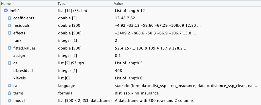{#fig-chap09-lm9.1-screenshot fig-alt="The screenshot lists different aspects of the result. From top to bottom: coefficients, residuals, effects, rank, fitted.values, assign, qr, df.residual, xlevels, call, terms, model" fig-align="center" width="95%"}***Hidden in the object are important results:- `r glossary("residually", "residuals")`: In @sec-chap09-understanding-residuals I have used the computed residuals from the `lm9.1` object to draw the vertical lines from the observation points (`dist_ssp`) to the regression line in @lst-chap09-regression-with-residuals.- `fitted.values`: These values build the regression line and are identical with the results from `stats::predict(lm9.1)` used in @lst-chap09-predict-all-values.- `effects`: There is also a vector the size of the sample (500) called `effects`. I have looked up what this mean and came to the following definition which I do not (up to now) understand:> For a linear model fitted by lm or aov, the effects are the uncorrelated single-degree-of-freedom values obtained by projecting the data onto the successive orthogonal subspaces generated by the QR decomposition during the fitting process. The first r (the rank of the model) are associated with coefficients and the remainder span the space of residuals (but are not associated with particular residuals). ([effects: Effects from Fitted Model](https://rdrr.io/r/stats/effects.html))Some help what effects are why they are important is the explanation of orthogonal in a statistical context. After reading ([Orthogonal: Models, Definition & Finding](https://statisticsbyjim.com/regression/orthogonality/)) I got some first vague ideas about the meaning of effects. Hopefully I will learn later was they mean in details and how they are computed.:::::::::###### summary lm9.1:::::{.my-r-code}:::{.my-r-code-header}:::::: {#cnj-chap09-summary-lm-distance-uninsured}: Estimating the linear regression model of people without health insurance and the distance to SSP using R:::::::::::::{.my-r-code-container}::: {#lst-chap09-summary-lm-distance-uninsured}```{r}#| label: summary-lm-distance-uninsured# linear regression of distance to syringe program by percent uninsuredbase::summary(lm9.1)```Summary of linear regression of distance to syringe program by percent uninsured:::***- `r glossary("Intercept")`: The $y$-intercept of 12.48 is the $y$-value when $x$ is zero. The model predicts that a county with 0% of people being uninsured would have a distance to the nearest syringe program of 12.48 miles.- `r glossary("Slope")`: The slope of 7.82 is the change in $y$ for every one-unit change in $x$. If the percent uninsured goes up by 1% in a county, the distance in miles to a syringe program would change by 7.82 miles.***$$\begin{align*}distance = 12.48 + 7.82 \times \text{no\_insurance} \\distance = 12.48 + 7.82 \times 10 = 90.68\end{align*}$$Based on the linear regression model, a county with 10% of people uninsured would be 90.68 miles from the nearest syringe program.:::::::::::::::::::::***### Understanding residuals {#sec-chap09-understanding-residuals}In @fig-example-lm-water-weeks-with-errors I have already graphed a demonstration how the residuals relate to the regression line. The regression line minimizes the residual differences between the values predicted by the regression line and the observed values. This is how `r glossary("OLS")` works. OLS minimizes those distances captured in @fig-example-lm-water-weeks-with-errors by the solid vertical lines: It minimizes the `r glossary("residually", "residuals")`.:::::{.my-r-code}:::{.my-r-code-header}:::::: {#cnj-chap05-regression-with-residuals}: Regression with residuals between percentage without health insurance and distance to nearest SSP:::::::::::::{.my-r-code-container}::: {#lst-chap09-regression-with-residuals}```{r}#| label: regression-with-residuals## for a later calculationdist_mean <- base::mean(distance_ssp_clean$dist_ssp)## provide all data into one data frame## to check which column to subtract from what columndf_lm <- distance_ssp_clean |> dplyr::mutate(lm_residuals = lm9.1$residuals,lm_fitted_values = lm9.1$fitted.values,lm_mean = dist_ssp - dist_mean )save_data_file("chap09", df_lm, "df_lm.rds")gg_residuals <- df_lm |> ggplot2::ggplot( ggplot2::aes(y = dist_ssp,x = no_insurance ) ) + ggplot2::geom_smooth(formula = y ~ x,method ="lm",se =FALSE, ggplot2::aes(linetype ="Linear model" ), color ="gray60", linewidth =1 ) + ggplot2::geom_point( ggplot2::aes(color ="Observation" ), size =1, alpha = .6 ) + ggplot2::geom_segment( ggplot2::aes(x = no_insurance,y = dist_ssp,xend = no_insurance,yend = dist_ssp - lm_residuals,linewidth ="Residuals" ),linetype ="solid",color ="grey",alpha = .6 ) + ggplot2::labs(y ="Distance to nearest SSP facility", x ="Percentage of people without health insurance " ) + ggplot2::scale_linetype_manual(values =2, name ="") + ggplot2::scale_linewidth_manual(values = .5, name ="") + ggplot2::scale_color_manual(values ="#7463AC", name ="")gg_residuals```Relationship between percentage without health insurance and distance to nearest syringe program in 500 counties with residuals (vertical lines):::***This is the replication of Figure 9.12, where no example code is available. After I had calculated the linear model I needed either the position on the regression line (`lm_fitted_values` in my case) or the values of the residuals (`lm_residuals`). I couldn't use `base::summary(stats::lm())` because `fitted.values` are calculated only for the `lm` object (in my case `lm_dist`), which also has the residuals computed and included. In the end I decided to subtract the residuals from the distance to get the position of the regression line (and the end of the vertical line from the observation).:::::::::## Achievement 4: Slope interpretation and significance {#sec-chap09-achievement4}### Interpreting statistical significance of the slopeThe output of @lst-chap09-lm-distance-uninsured for the linear model included a `r glossary("p-value")` for the `r glossary("slope")` (<2e16) and a p-value for the `r glossary("intercept")` (0.221). The statistical significance of the slope in linear regression is tested using a `r glossary("Wald", "Wald test")`, which is like a `r glossary("one-sample", "one-sample t-test")` where the hypothesized value of the slope is zero. To get the p-value from the regression model of distance to syringe program, the slope of 12.48 was compared to a hypothesized value of zero using the Wald test.#### NHST Step 1Write the null and alternate hypotheses:::: {.callout-note}- **H0**: The slope of the line is equal to zero.- **HA**: The slope of the line is not equal to zero.:::#### NHST Step 2Compute the test statistic. The test statistic for the Wald test in `r glossary("OLS")` regression is the `r glossary("t-statistic")`.:::::{.my-theorem}:::{.my-theorem-header}:::::: {#thm-chap09-wald-test}: Formula for the for the Wald test in OLS regression:::::::::::::{.my-theorem-container}$$\begin{align*}t = &\frac{b_{1}-0}{se_{b_{1}}} \\t = &\frac{7.8190-0}{0.7734} = 10.11\end{align*}$$ {#eq-chap09-wald-test}***Note that the formula is the same as the formula for the one-sample t-test from @eq-chap06-t-statistic, but with the slope of the regression model instead of the mean. The t-statistic, that was computed manually in @eq-chap09-wald-test can also be found in the model output of @lst-chap09-lm-distance-uninsured.:::::::::#### NHST Step 3Review and interpret the test statistics: Calculate the probability that your test statistic is at least as big as it is if there is no relationship (i.e., the null is true).The p-value of the slope in @lst-chap09-lm-distance-uninsured is < 2e-16.#### NHST Step 4Conclude and write report.The p-value is < 0.01 and therefore the null hypothesis is rejected in favor of the alternate hypothesis that the slope is not equal to zero.::: {.callout#rep-chap09-lm9.1-1}## Interpretation of the linear regression model `lm9.1` after NHST (first draft)The percentage of uninsured residents in a county is a statistically significant predictor of the distance to the nearest syringe program (b = 7.82; p < .05) in our sample. For every 1% increase in uninsured residents in a county, the predicted distance to the nearest syringe program increases by 7.82 miles.:::### Computing confidence intervals`stats::confint()` computes the confidence interval for the intercept and the slope.:::::{.my-r-code}:::{.my-r-code-header}:::::: {#cnj-chap09-compute-confint}: Confidence interval for regression parameters:::::::::::::{.my-r-code-container}::: {#lst-chap09-compute-confint}```{r}#| label: compute-confintstats::confint(lm9.1)```Confidence interval for regression parameters:::***The intercept is often reported but not interpreted because it does not usually contribute much to answering the research question.::: {.callout #rep-chap09-lm9.1-2}## Interpretation of the linear regression model `lm9.1` after statistical significance and confidence intervals (second draft)The percentage of uninsured residents in a county is a statistically significant predictor of the distance to the nearest syringe program (b = 7.82; p < .05). For every 1% increase in uninsured residents in a county, the predicted distance to the nearest syringe program increases by 7.82 miles. The value of the slope in the sample is 7.82, and the value of the slope is likely between 6.30 and 9.34 in the population that the sample came from (95% CI: 6.30–9.34). With every 1% increase in uninsured residents in a county, the nearest syringe program is between 6.30 and 9.34 more miles away. These results suggest that counties with a larger percentage of uninsured are farther from this resource, which may exacerbate existing health disparities.::::::::::::### Making predcitionsPredicted values of $y$ are called `y-hat` and denoted $\hat{y}$. The `stats::predict()` function can be used to find the predicted values for all observations, or for a specific value of the independent variable.::: {.callout-important #imp-ID}## `stats::predict()` as a generic function `stats::predict()` is a generic function for predictions from the results of various model fitting functions. The function invokes particular methods which depend on the class of the first argument. In our case we have to consult the help page of `stats::predict.lm()`. R knows which method to apply so just using `stats::predict()` is enough to invoke the correct computation. But for us users to know which arguments to apply we need the specified help page and not the explanation of the generic command.Most prediction methods which are similar to those for linear models have an argument `newdata` specifying the first place to look for explanatory variables to be used for prediction. ::::::::{.my-example}:::{.my-example-header}:::::: {#exm-chap09-prediction}: Using the model to make prediction:::::::::::::{.my-example-container}::: {.panel-tabset}###### Predict value:::::{.my-r-code}:::{.my-r-code-header}:::::: {#cnj-chap09-predict-one-value}: Predict distance for a county where 10% of people are uninsured:::::::::::::{.my-r-code-container}::: {#lst-chap09-predict-one-value}```{r}#| label: predict-one-valuestats::predict( lm9.1,newdata =data.frame(no_insurance =10),interval ="confidence")```Predicted distance for a county where 10% of people are uninsured:::***The predicted distance to a syringe program from a county with 10% of people uninsured is 90.67 miles with a confidence interval for the prediction (sometimes called a prediction interval) of 82.42 to 98.92 miles.:::::::::###### Predict all:::::{.my-r-code}:::{.my-r-code-header}:::::: {#cnj-chap09-predict-all-values}: Find predictions for all observed values:::::::::::::{.my-r-code-container}::: {#lst-chap09-predict-all-values}```{r}#| label: predict-all-valuespred_all <- tibble::as_tibble( stats::predict( lm9.1,interval ="confidence" ))my_glance_data(pred_all)```Predicted values for all observed x:::***This is the same code as in @lst-chap09-predict-one-value but without the `newdata` line.:::::::::::::::::::::***## Achievement 5: Model fit {#sec-chap09-achievement5}### IntroductionThere is another `r glossary("p-value")` toward the bottom of @lst-chap09-summary-lm-distance-uninsured. This p-value was from a test statistic that measures how much better the regression line is at getting close to the data points compared to the mean value of the outcome. Essentially, the question asked to produce this p-value is: Are the predicted values shown by the regression line in Figure 9.13 better than the mean value of the distance to the syringe program at capturing the relationship between `no_insurance` and `dist_ssp`?::: {.callout-important #imp-chap07-f-statistic}## F-statistic for linear regressionLike the `r glossary("t-statistic")` is the test statistic for a `r glossary("t-test")` comparing two means, the `r glossary("F-statistic")` is the test statistic for linear regression comparing the regression line to the mean.It is the same F-statistic that we have seen working with `r glossary("ANOVA")` in @sec-chap07. ANOVA is actually a special type of linear model where all the predictors are categorical.::::::::{.my-r-code}:::{.my-r-code-header}:::::: {#cnj-chap09-mean-vs-regression}: Distance to mean versus regression line:::::::::::::{.my-r-code-container}::: {#lst-chap09-mean-vs-regression}```{r}#| label: mean-vs-regression#| fig-height: 10gg_means <- df_lm |> ggplot2::ggplot( ggplot2::aes(y = dist_ssp,x = no_insurance ) ) + ggplot2::geom_point( ggplot2::aes(color ="County" ), size =1, alpha = .6 ) + ggplot2::geom_hline( ggplot2::aes(linewidth ="Mean observed\ndistance to SSP",yintercept = dist_mean, ),color ="grey60",alpha = .6 ) + ggplot2::geom_segment( ggplot2::aes(x = no_insurance,y = dist_ssp,xend = no_insurance,yend = dist_ssp - lm_mean,linetype ="Difference from mean\nto observed" ),color ="grey",alpha = .6 ) + ggplot2::labs(y ="Miles to syringe program", x ="Percentage of people without health insurance " ) + ggplot2::scale_linewidth_manual(values =1, name ="") + ggplot2::scale_linetype_manual(values =c(2, 2), name ="") + ggplot2::scale_color_manual(values ="#7463AC", name ="")gg_residuals2 <- df_lm |> ggplot2::ggplot( ggplot2::aes(y = dist_ssp,x = no_insurance ) ) + ggplot2::geom_smooth(formula = y ~ x,method ="lm",se =FALSE, ggplot2::aes(linetype ="Predicted distance to\nSSP (regression line)" ),color ="gray60",linewidth =1 ) + ggplot2::geom_point( ggplot2::aes(color ="County" ),size =1,alpha = .6 ) + ggplot2::geom_segment( ggplot2::aes(x = no_insurance,y = dist_ssp,xend = no_insurance,yend = dist_ssp - lm_residuals,linewidth ="Residuals (diff from\npredicted to observe)" ),linetype ="dashed",color ="grey",alpha = .6 ) + ggplot2::labs(y ="Miles to syringe program",x ="Percentage of people without health insurance " ) + ggplot2::scale_linetype_manual(values =1, name ="") + ggplot2::scale_linewidth_manual(values = .5, name ="") + ggplot2::scale_color_manual(values ="#7463AC", name ="")patchwork:::"/.ggplot"( gg_residuals2, gg_means)```What is smaller? Sum of distances to regression line or distances to mean?::::::::::::### Understanding F-statisticThe F-statistic is a ratio of explained information (in the numerator) to unexplained information (in the denominator). If a model explains more than it leaves unexplained, the numerator is larger and the F-statistic is greater than 1. F-statistics that are much greater than 1 are explaining much more of the variation in the outcome than they leave unexplained. Large F-statistics are more likely to be statistically significant.:::::{.my-theorem}:::{.my-theorem-header}:::::: {#thm-chap09-f-statistic}: F-statistic for the linear regression:::::::::::::{.my-theorem-container}$$\begin{align*}F = \frac{\frac{\sum_{i=1}^{n}(\hat{y}-m_{y})^2}{p-1}}{\frac{\sum_{i=1}^{n}(y_{i}-\hat{y_{i}})^2}{n-p}}\end{align*}$$ {#eq-chap09-f-statistic}***- $i$: individual observation, in this case a county- $n$: sample size, or total number of counties, in this case 500- $p$: number of parameters in the model; slope and intercept are parameters- $y_{i}$: observed outcome of distance to syringe program for county $i$- $\hat{y_{i}}$: predicted value of distance to syringe program for county $i$- $m_{y}$: mean of the observed outcomes of distance to syringe program**Numerator**: How much differ the predicted values from the observed mean on average. ($MS_{regression}$)**Denominator**: How much differ the predicted values from the actual observed values on average. ($MS_{residual}$):::::::::The `r glossary("F-statistic")` is how much a predicted value differs from the mean value on average --- which is explained variance, or how much better (or worse) the prediction is than the mean at explaining the outcome --- divided by how much an observed value differs from the predicted value on average, which is the residual information or unexplained variance. Or: Explained variance divided by residual information resp. unexplained variance,Sometimes, these relationships are referred to in similar terminology to `r glossary("ANOVA")`: the numerator is the $MS_{regression}$ (where MS stands for `r glossary("mean square")`) divided by the $MS_{residual}$.::: {.my-bulletbox }::::{.my-bulletbox-header} ::::: {.my-bulletbox-icon}::::::::::: {#bul-f-statistic}:::::: : Features of the F-statistic:::::::: {.my-bulletbox-body } - The F-statistic is always positive, due to the squaring of the terms in the numerator and denominator.- The F-statistic starts at 0 where the regression line is exactly the same as the mean.- The larger the F-statistic gets the more the model explains the variation in the outcome.- F-statistics with large values are less likely to occur when there is no relationship between the variables.- The shape of the F-distribution depends on the number of parameters in the statistical model and the sample size, which determine two `r glossary("degrees of freedom")` (df) values.***For instance in the last line of @lst-chap09-summary-lm-distance-uninsured we see that the value of the F-statistic is 102.2 with 1 (p - 1 = 2 - 1 = 1) and 498 (n - p = 500 - 2 = 498) df.::::::::::::{.my-example}:::{.my-example-header}:::::: {#exm-chap09-graph-f-statistic}: F-distributions:::::::::::::{.my-example-container}::: {.panel-tabset}###### Examples for F-distributions:::::{.my-r-code}:::{.my-r-code-header}:::::: {#cnj-chap09-f-statistic-examples}: Examples of the distribution of probability density for $F$:::::::::::::{.my-r-code-container}::: {#lst-chap09-f-statistic-examples}```{r}#| label: f-statistic-examplesggplot2::ggplot() + ggplot2::xlim(0, 5) + ggplot2::stat_function(fun = df,geom ="line",args =list(df1 =1, df2 =20), ggplot2::aes(color ="F(1, 20)") ) + ggplot2::stat_function(fun = df,geom ="line",args =list(df1 =2, df2 =50), ggplot2::aes(color ="F(2, 50)") ) + ggplot2::stat_function(fun = df,geom ="line",args =list(df1 =5, df2 =100), ggplot2::aes(color ="F(5, 100)") ) + ggplot2::stat_function(fun = df,geom ="line",args =list(df1 =10, df2 =200), ggplot2::aes(color ="F(10, 200") ) + ggplot2::scale_color_manual(name ="Distribution",values =c("darkgreen", "darkred", "darkblue", "darkorange") )```Examples of the distribution of probability density for $F$:::***This is the replication of Figure 9.15.:::::::::###### F-distribution `lm9.1`:::::{.my-r-code}:::{.my-r-code-header}:::::: {#cnj-chap09-f-dist-lm9.1}: F-distribution for model `lm9.1`:::::::::::::{.my-r-code-container}::: {#lst-chap09-f-dist-lm9.1}```{r}#| label: f-dist-lm9.1ggplot2::ggplot() + ggplot2::xlim(0, 110) + ggplot2::stat_function(fun = df,geom ="line",args =list(df1 =1, df2 =448), ggplot2::aes(color ="F(1, 448) distribution") ) + ggplot2::geom_vline( ggplot2::aes(xintercept =102.2,color ="F(1, 498) = 102.2" ) ) + ggplot2::scale_color_manual(name ="",values =c("blue", "red") )```F-distribution with 1 and 498 degrees of freedom for model of distance to syringe program by uninsured:::*** This is the replication of Figure 9.16 of the book.There is very little space under the curve from F = 102.2 to the right, which is consistent with the tiny p-value (p < .001) in @lst-chap09-summary-lm-distance-uninsured.:::::::::::::::::::::### Understanding $R^2$ measure of model fitThe measure[^linear-regression-1] how well the `r glossary("model-fit", "model fits")` is $R^2$ or `r glossary("R-squared")`. [^linear-regression-1]: Maybe one should say that $R^2$ is not *the* but only *one* measure of model fit?:::{.my-bulletbox}:::: {.my-bulletbox-header}::::: {.my-bulletbox-icon}::::::::::: {#bul-chap09-r2}::::::: Features of R-squared and adjusted R-squared:::::::: {.my-bulletbox-body}- $R^2$ is the amount of variation in the outcome that the model explains and is reported as a measure of model fit. - When the model predicts values that are close to the observed values, the correlation is high and the $R^2$ is high. - To get the percentage of variance explained by the model, multiply $R^2$ by 100.- Subtracting $R^2$ from 1 (1 – $R^2$) and multiplying by 100 for a percent will give the percent of variance *not* explained by the model.- The value of $R^2$ tends to increase with each additional variable added to the model, whether the variable actually improves the model or not.- `r glossary("adjusted-r2", "Adjusted $R^2$")` ($R^2_{adj}$) penalizes the value of $R^2$ a small amount for each additional variable added to the model to ensure that the only increases when the additional predictors explain a notable amount of the variation in the outcome.***$R^2$ is computed by squaring the value of the `r glossary("correlation")` between the observed distance to syringe programs in the 500 counties and the values of distance to syringe programs predicted for the 500 counties by the model.For the relationship between uninsured percentage and distance to syringe program in @lst-chap09-summary-lm-distance-uninsured, the $R^2$ is 0.1703. To get the percentage of variance explained by the model, multiply by 100, so 17.03% of the variation in distance to syringe programs is explained by the percentage of uninsured people living in a county.:::::::::: {.callout-important style="color: red;" #imp-r2adj}###### $R^2_{adj}$ is more commonly reported than $R^2$:::### Reproting linear regression results:::{.my-bulletbox}:::: {.my-bulletbox-header}::::: {.my-bulletbox-icon}::::::::::: {#bul-chap09-regression-report}::::::: Simple linear regression analysis results to report:::::::: {.my-bulletbox-body}- Interpretation of the value of the slope (b) - Significance of the slope (t and p, confidence intervals) - Significance of the model (F and p) - Model fit ($R^2$ or better $R_{adj}^2$):::::::The following report is for our linear model lm9.1 example takein into account information from the- summary of the computed model (@lst-chap09-summary-lm-distance-uninsured) and the- computed confidence intervals (@lst-chap09-compute-confint).::: {.callout #rep-chap09-lm9.1-3}##### Interpretation of the linear regression model `lm9.1` after model fit (third draft)A simple linear regression analysis found that the percentage of uninsured residents in a county is a statistically significant predictor of the distance to the nearest syringe program (b = 7.82; p < .001). For every 1% increase in uninsured residents, the predicted distance to the nearest syringe program increases by 7.82 miles. The value of the slope is likely between 6.30 and 9.34 in the population that the sample came from (95% CI: 6.30–9.34). With every 1% increase in uninsured residents in a county, there is likely a 6.30- to 9.34-mile increase to the nearest syringe program. The model was statistically significantly better than the baseline model (the mean of the distance to syringe program) at explaining distance to syringe program [F(1, 498) = 102.2; p < .001] and explained 16.86% of the variance in the outcome ($R_{adj}^2$ = .1686). These results suggest that counties with lower insurance rates are farther from this resource, which may exacerbate existing health disparities.:::## Achievement 6: Conducting diagnostics {#sec-chap09-achievement6}### Introduction:::{.my-bulletbox}:::: {.my-bulletbox-header}::::: {.my-bulletbox-icon}::::::::::: {#bul-chap09-lm-assumptions}::::::: Assumptions of simple linear regression:::::::: {.my-bulletbox-body}- Observations are independent. - The outcome is continuous.- The relationship between the two variables is linear (`r glossary("linearity")`).- The variance is constant with the points distributed equally around the line (`r glossary("homoscedasticity")`). - The `r glossary("residually", "residuals")` are independent.- The residuals are normally distributed.- There is no perfect multicollinearity. (Only valid for multiple regression for continuous variables, see @sec-chap09-multicollinearity-assumption.):::::::### Linearity {#sec-chap09-check-linearity}:::::{.my-r-code}:::{.my-r-code-header}:::::: {#cnj-chap09-check-linearity}: Check linearity with loess curve:::::::::::::{.my-r-code-container}::: {#lst-chap09-check-linearity}```{r}#| label: check-linearitydistance_ssp_clean |> ggplot2::ggplot( ggplot2::aes(x = no_insurance, y = dist_ssp)) + ggplot2::geom_point( ggplot2::aes(size ="County" ), color ="#7463AC", alpha = .6 ) + ggplot2::geom_smooth(formula = y ~ x, ggplot2::aes(color ="Linear fit line" ), method ="lm", se =FALSE) + ggplot2::geom_smooth(formula = y ~ x, ggplot2::aes(color ="Loess curve" ), method ="loess",se =FALSE ) + ggplot2::labs(y ="Miles to syringe program", x ="Percent uninsured") + ggplot2::scale_color_manual(values =c("gray60", "deeppink"), name ="" ) + ggplot2::scale_size_manual(values =2, name ="")```Checking the linearity assumption:::***The linearity assumption is met if a scatterplot of the two variables shows a relationship that falls along a line. An example where this assumption is met in the author’s opinion is @fig-graph1-cor. The route of the loess curve follows not exact the regression line, but there are only small deviations from the regression line. The situation in @lst-chap09-check-linearity is a little different: Here the loess line is curved and shows deviation from the linear relationship especially at the lower level of the predictor but also at the zeniths of the two arcs. Harris therefore decided that in @lst-chap09-check-linearity the linearity assumption has failed. **Conclusion**: The linearity assumption is *not* met.::::::::::::::: {#tdo-chap09-linearity-test}:::::{.my-checklist}:::{.my-checklist-header}TODO: How to test the linearity assumption more objectively?:::::::{.my-checklist-container}I think that linearity judgements on the basis of visualizations are quite subjective. It would be nice to have a more objective test, similar to the `r glossary("Breusch-Pagan", "Breusch-Pagan test")` for the `r glossary("homoscedasticity")` assumption in @lst-chap09-check-homoscedasticity-breusch-pagan or generally the `r glossary("Shapiro-Wilk")` or `r glossary("Anderson-Darling")` tests for the normality assumption.Diagnostics are very important for linear regression models. I have not (yet) much experience but I am pretty sure there exist some tests for the linearity assumption of linear models. I just have to look and find them!:::::::::Look for packages with linearity test functions:::### Checking homoscedasticity {#sec-chap09-check-homoscedasticity}:::::{.my-example}:::{.my-example-header}:::::: {#exm-chap09-check-homoscedasticity}: Checking homoscedasticity:::::::::::::{.my-example-container}::: {.panel-tabset}###### Breusch-Pagan:::::{.my-r-code}:::{.my-r-code-header}:::::: {#cnj-chap09-check-homoscedasticity-breusch-pagan}: Check homoscedasticity with Breusch-Pagan test:::::::::::::{.my-r-code-container}::: {#lst-chap09-check-homoscedasticity-breusch-pagan}```{r}#| label: check-homoscedasticity-breusch-paganlmtest::bptest(formula = lm9.1)```Checking the homoscedasticity with the Breusch-Pagan test:::***The assumption of `r glossary("homoscedasticity")` requires the data points are evenly distributed around the regression line. One way would be to check again @lst-chap09-check-linearity: The points seem closer to the line on the far left and then are more spread out around the line at the higher values of percentage uninsured. Zhis is an indicator that the assumption has failed.But the `r glossary("Breusch-Pagan", "Breusch-Pagan test")` is another -- more objective -- way to test the homoscedasticity assumption. The tiny p-value confirm our first impression: The Null assumption, that the data points are evenly distributed around the regression line has to be rejected.**Conclusion**: The homoscedasticity assumption is *not* met.:::::::::###### predicted values vs. residuals:::::{.my-r-code}:::{.my-r-code-header}:::::: {#cnj-chap09-check-homoscedasticity-residuals}: Check homoscedasticity assumption plotting predicted values vs. residuals:::::::::::::{.my-r-code-container}::: {#lst-chap09-check-homoscedasticity-residuals}```{r}#| label: check-homoscedasticity-residuals## scatterplot with mean as reference linegg_scatter_mean <- df_lm |> ggplot2::ggplot( ggplot2::aes(x = lm_fitted_values,y = lm_residuals ) ) + ggplot2::geom_point( ggplot2::aes(color ="County" ), size =1, alpha = .6 ) + ggplot2::geom_hline( ggplot2::aes(yintercept = base::mean(lm_residuals),linetype ="Perfect prediction\npredicted = observed" ) ) + ggplot2::labs(x ="Predicted values of miles to syringe program", y ="Residuals (distance between observed\nand predicted value)" ) + ggplot2::scale_linetype_manual(values =2, name ="") + ggplot2::scale_color_manual(values ="#7463AC", name ="")gg_scatter_mean```Predicted values and residuals from linear regression model of distance to syringe program by percentage uninsured in a county:::***Another (third) way to examine the constant error variance assumption is plotting the predicted values versus the residuals. In @lst-chap09-check-homoscedasticity-residuals a dashed line is shown to indicate no relationship between the fitted (or predicted) values and the residuals, which would be the ideal situation to meet the assumption. This line is a helpful reference point for looking at these types of graphs.For the homoscedasticity assumption to be met, the points should be roughly evenly distributed around the dashed line with no clear patterns. It should look like a cloud or random points on the graph with no distinguishable patterns. In @lst-chap09-check-homoscedasticity-residuals, there is a clear pattern. Under the dashed line the distribution of the points suggest a negative correlation whereas above the line the points are distributed more randomly. This finding confirms the Breusch-Pagan test result.Conclusion: The homoscedasticity assumption of the residuals is **not** met.:::::::::::::::::::::### Independent residuals {#sec-chap09-check-residuals-independence}:::::{.my-r-code}:::{.my-r-code-header}:::::: {#cnj-chap09-check-residuals-independence}: Testing the independence of residuals with the Durbin-Watson test:::::::::::::{.my-r-code-container}::: {#lst-chap09-check-residuals-independence}```{r}#| label: check-residuals-independencelmtest::dwtest(formula = lm9.1)```Testing the independence of residuals with the Durbin-Watson test:::***Residuals have to be independent or unrelated to each other. Residuals that are independent do not follow a pattern. Conceptually, residuals are the variation in the outcome that the regression line does not explain. If the residuals form a pattern then the regression model is doing better for certain types of observations and worse for others.The independence assumption of the residuals can be checked with the `r glossary("Durbin-Watson", "Durbin-Watson test")`. A Durbin-Watson (`DW`, or `D-W`) statistic of 2 indicates perfectly independent residuals, meaning that the null hypothesis of the test (that the residuals are independet) cannot be rejected. An this in fact the case in @lst-chap09-check-residuals-independence, as the DW-value is very near to 2.**Conclusion**: The independence of residuals assumption *is* met.:::::::::### Normality of residuals {#sec-chap09-check-normality-residuals}:::::{.my-example}:::{.my-example-header}:::::: {#exm-chap09-check-normality-residuals}: Testing the normality of residuals assumption:::::::::::::{.my-example-container}::: {.panel-tabset}###### hist:::::{.my-r-code}:::{.my-r-code-header}:::::: {#cnj-chap09-check-normality-residuals-hist}: Histogramm of residuals:::::::::::::{.my-r-code-container}::: {#lst-chap09-check-normality-residuals-hist}```{r}#| label: check-normality-residuals-histmy_hist_dnorm(df = df_lm, v = df_lm$lm_residuals, n_bins =30,x_label ="Residuals (distance between observed\nand predicted value)" )```Testing the normality of residuals assumption with a histogram of the residuals:::***The histogram with the overlaid density curve of the theoretical normal distribution in @lst-chap09-check-normality-residuals-hist shows a right skewed distribution. This is an indicator that the normality assumption is not met.Conclusion: The normality assumption of the residuals is *not* met:::::::::###### q-q plot:::::{.my-r-code}:::{.my-r-code-header}:::::: {#cnj-chap09-check-normality-residuals-qq-plot}: Checking normality assumption of the residuals with a Q-Q plot:::::::::::::{.my-r-code-container}::: {#lst-chap09-check-normality-residuals-qq-plot}```{r}#| label: check-normality-residuals-qq-plotmy_qq_plot(df = df_lm,v = df_lm$lm_residuals,x_label ="Theoretical normal distribution",y_label ="Observed residuals (distance between\nobserved and prdicted miles\nto syringe program)")```Testing the normality of residuals assumption with a q-q plot:::The q-q plot in @lst-chap09-check-normality-residuals-qq-plot shows some deviation form the normal distribution. Although it is again a quite subjective decision (See @tdo-chap09-linearity-test) it seems that the assumption of normality has failed.**Conclusion**: The normality assumption of the residuals is *not* met.::::::::::::::{.my-r-code}:::{.my-r-code-header}:::::: {#cnj-chap09-normality-residuals-shapiro-wilk}: Checking normality assumption of the residuals with the Shapiro-Wilk normality test:::::::::::::{.my-r-code-container}::: {#lst-chap09-normality-residuals-shapiro-wilk}```{r}#| label: normality-residuals-shapiro-wilkstats::shapiro.test(df_lm$lm_residuals)```Checking normality assumption of the residuals of linear model `lm9.1` with the Shapiro-Wilk normality test:::This method is not mentioned, but I believe that you can also use the `r glossary("Shapiro-Wilk", "Shapiro-Wilk test")` for testing the normal distribution of residuals. At least the very tiny p-value rejects the Null (that the residuals have a normal distribution) and suggest the same conclusion as the other two (visually decided) tests.**Conclusion**: The normality assumption of the residuals is *not* met.:::::::::::::::::::::### Interpreting the assumption tests:::{.my-bulletbox}:::: {.my-bulletbox-header}::::: {.my-bulletbox-icon}::::::::::: {#bul-chap09-lm-assumptions-lm9.1}::::::: Checking simple linear regression assumptions for model `lm9.1m`:::::::: {.my-bulletbox-body}- Observations are independent. **No**: Counties in the same state are not really independent. (This is a general problem for geographical data analysis.)- The outcome is continuous. **Yes**: The distance to a syringe program is measured in miles and can take any value of zero or higher.- The relationship between the two variables is linear (`r glossary("linearity")`). **No**: See: @sec-chap09-check-linearity- The variance is constant with the points distributed equally around the line (`r glossary("homoscedasticity")`). **No**: See @lst-chap09-check-homoscedasticity-breusch-pagan and @lst-chap09-check-homoscedasticity-residuals.- The `r glossary("residually", "residuals")` are independent. **Yes**: See @sec-chap09-check-residuals-independence.- The residuals are normally distributed. **No**: See @lst-chap09-check-normality-residuals-hist and @lst-chap09-check-normality-residuals-qq-plot.:::::::Because linear model `lm9.1` does not meet all the assumptions, the model has to be considered biased and should be interpreted with caution. Specifically, the results of a biased model are not usually considered generalizable to the population.### Using models diagnosticsWe are not quite done checking model quality using `r glossary("diagnostics")`. In addition to testing assumptions, we need to identify problematic observations: `r glossary("outliers")` or other `r glossary("influential observation", "influential observations")`.There are several measures: - standardized residuals, - df-betas, - Cook’s distance, and - leverage. One good strategy for identifying the truly problematic observations is to identify those observations that are outliers or influential observations on two or more of these four measures.:::::{.my-example}:::{.my-example-header}:::::: {#exm-chap09-models-diagnostics}: Using models diagnostics to find outliers and influential values:::::::::::::{.my-example-container}::: {.panel-tabset}###### Standardizing residuals {#sec-chap09-standardized-residuals}:::::{.my-r-code}:::{.my-r-code-header}:::::: {#cnj-chap09-diagnostics-standardized-residuals}: Standardize residuals to find outliers with `stats::rstandard()`:::::::::::::{.my-r-code-container}::: {#lst-chap09-diagnostics-standardized-residuals}```{r}#| label: diagnostics-standardized-residuals#| results: hold#| cache: truedf2_lm <- df_lm |> dplyr::mutate(standard_res = stats::rstandard(model = lm9.1),predicted = stats::predict(object = lm9.1) ) save_data_file("chap09", df2_lm, "df2_lm.rds")lm9.1_std_res <- df2_lm |> dplyr::filter(base::abs(standard_res) >1.96) |> dplyr::select(c(county, state, dist_ssp, no_insurance, standard_res, predicted)) |> dplyr::arrange(standard_res)print(lm9.1_std_res, n =30)```Standardizing residuals to find outliers with `stats::rstandard`:::***Standardized `r glossary("residually", "residuals")` are `r glossary("z-score", "z-scores")` for the residual values. ::: {.callout-caution #cau-diagnostics-standardize-residuals}##### Filter counties with absolute values of the residuals greater than 1.96In my first trial, I forgot to filter using the *absolute* standardized residual values. I got a list of 24 counties -- the two counties at the top of the list with negative values were missing.:::That there are only two counties with negative values means that most counties had 2018 distances to syringe programs that were farther away than predicted. Another observation: Most of the outlier counties are situated in Texas, including one that is nearer than predicted.:::::::::There are 26 counties with outlier values, e.g., standardized residuals with an absolute value greater than 1.96.###### Standardizing residuals 2:::::{.my-r-code}:::{.my-r-code-header}:::::: {#cnj-chap09-diagnostics-standardize-residuals2}: Standardize residuals manually to find outliers:::::::::::::{.my-r-code-container}::: {#lst-chap09-diagnostics-standardize-residuals2} ```{r}#| label: diagnostics-standardize-residuals2#| results: hold#| cache: truedf2a_lm <- df_lm |> dplyr::mutate(standard_res = (lm_residuals - base::mean(lm_residuals)) / stats::sd(lm_residuals),predicted = stats::predict(object = lm9.1) ) lm9.1_outlier2 <- df2a_lm |> dplyr::filter(base::abs(standard_res) >1.96) |> dplyr::select(c(county, state, dist_ssp, no_insurance, standard_res, predicted)) |> dplyr::arrange(standard_res)print(lm9.1_outlier2, n =30)```Find outliers with standardized residuals computed manually:::***With @lst-chap09-diagnostics-standardize-residuals2 I have standardized residuals manually through `(lm_residuals - base::mean(lm_residuals)) / stats::sd(lm_residuals)`. There are small rounding differences in some counties but the list of outlier counties is identical.:::::::::###### dfbeta:::::{.my-r-code}:::{.my-r-code-header}:::::: {#cnj-chap09-diagnostics-dfbeta}: Using `dfbeta` to find influential values:::::::::::::{.my-r-code-container}::: {#lst-chap09-diagnostics-dfbeta}```{r}#| label: diagnostics-dfbetadf3a_lm <- df2_lm |> dplyr::mutate(dfbeta_intercept = stats::dfbeta(model = lm9.1)[, 1],dfbeta_slope = stats::dfbeta(model = lm9.1)[, 2] ) save_data_file("chap09", df3a_lm, "df3a_lm.rds")lm9.1_dfbeta <- df3a_lm |> dplyr::filter(base::abs(dfbeta_intercept) >2| base::abs(dfbeta_slope) >2) |> dplyr::select(c(county, state, dist_ssp, no_insurance, predicted, dfbeta_intercept, dfbeta_slope))print(lm9.1_dfbeta, n =30)```Computing `dfbeta` to find influential values with `dfbeta` > 2:::***Computing `dfbeta` is a method to find influential values. `df_beta` removes each observation from the data frame, conducts the analysis again, and compares the intercept and slope for the model with and without the observation. Observations with high `dfbeta` values may be influencing the model. The book recommends a cutoff of 2.::: {.callout-warning #wrn-chap09-diagnostics-df-beta}##### Difference between `dfbeta` and `dfbetas`Reading other resources [@zach2020a; @goldstein-greenwood2022] I noticed that they used another threshold: Instead of using 2 they recommended $2 / \sqrt{n}$, where `n` is the sample size. But this would result in a cutoff value of $2 / \sqrt{500}$ = `r 2 / sqrt(500)` with the absurd high number of 343 counties as influential values.But later I became aware that these resources are talking of `dfbetas` (plural) and not of `dfbeta` (singular). Between these two measure there is a big difference: `dfbetas` are the standardized values, whereas `dfbeta` values depend on the scale of the data. > Consequently, some analysts opt to standardize DFBETA values—in which case they’re referred to as DFBETAS --- by dividing each DFBETA by the standard error estimate for $\hat{\beta_{j}}$ [Detecting Influential Points in Regression with DFBETA(S)](https://library.virginia.edu/data/articles/detecting-influential-points-in-regression-with-dfbetas)[@goldstein-greenwood2022]::::::::::::The result is a list of seven counties, six situated in Texas and one in Florida. All of them are listed because of higher absolute `dfbeta` intercept values.###### dfbetas:::::{.my-r-code}:::{.my-r-code-header}:::::: {#cnj-chap09-diagnostics-dfbetas}: Using `dfbetas` to find influential values:::::::::::::{.my-r-code-container}::: {#lst-chap09-diagnostics-dfbetas}```{r}#| label: diagnostics-dfbetasdf3b_lm <- df3a_lm |> dplyr::mutate(dfbetas_intercept = stats::dfbetas(model = lm9.1)[, 1],dfbetas_slope = stats::dfbetas(model = lm9.1)[, 2] ) save_data_file("chap09", df3b_lm, "df3b_lm.rds")lm9.1_dfbetas <- df3b_lm |> dplyr::filter(base::abs(dfbetas_intercept) > (2/ base::sqrt(dplyr::n())) | base::abs(dfbetas_slope) > (2/ base::sqrt(dplyr::n()))) |> dplyr::select(c(county, state, dist_ssp, no_insurance, predicted, dfbetas_intercept, dfbetas_slope))print(lm9.1_dfbetas, n =50)```Computing `dfbetas` to find influential values with `dfbetas` > $ 2 / \sqrt(500)$::::::::::::Instead of seven we got now a bigger list with 40 counties.###### Cook’s D:::::{.my-r-code}:::{.my-r-code-header}:::::: {#cnj-chap09-diagnostics-cooks-d}: Using Cook’s distance to find influential values:::::::::::::{.my-r-code-container}::: {#lst-chap09-diagnostics-cooks-d}```{r}#| label: diagnostics-cooks-ddf4_lm <- df3b_lm |> dplyr::mutate(cooks_d = stats::cooks.distance(model = lm9.1) ) save_data_file("chap09", df4_lm, "df4_lm.rds")lm9.1_cooks_d <- df4_lm |> dplyr::filter(cooks_d > (4/ dplyr::n())) |> dplyr::select(c(county, state, dist_ssp, no_insurance, predicted, cooks_d))print(lm9.1_cooks_d, n =50)```Using Cook’s distance to find influential values:::***`r glossary("Cook’s D")` is computed in a very similar way as `dfbeta(s)`. That is, each observation is removed and the model is re-estimated without it. Cook’s D then combines the differences between the models with and without an observation for all the parameters together instead of one at a time like the `dfbeta(s)`.The cutoff for a high Cook’s D value is usually $4/n$.:::::::::Thirty-two counties had a high Cook’s D. Most were in Texas (TX), but a few were in Maine (ME), Massachusetts (MA), and Vermont (VT).###### leverage:::::{.my-r-code}:::{.my-r-code-header}:::::: {#cnj-chap09-diagnostics-leverage}: Using leverage to find influential values:::::::::::::{.my-r-code-container}::: {#lst-chap09-diagnostics-leverage}```{r}#| label: diagnostics-leveragedf5_lm <- df4_lm |> dplyr::mutate(leverage = stats::hatvalues(model = lm9.1) ) save_data_file("chap09", df5_lm, "df5_lm.rds")lm9.1_leverage <- df5_lm |> dplyr::filter(leverage >2*2/ dplyr::n()) |> dplyr::select(c(county, state, dist_ssp, no_insurance, predicted, leverage))print(lm9.1_leverage, n =50)```Using leverage to find influential values:::***Leverage is determined by the difference between the value of an observation for a predictor and the mean value of the predictor. The farther away an observed value is from the mean for a predictor, the more likely the observation will be influential. Leverage values range between 0 and 1. A threshold of $2p / n$ is often used with `p` being the number of parameters and `n` being the sample size.The leverage values to find influential states are computed by using the `stats::hatvalues()` function, because the predicted value of $y$ is often depicted as $\hat{y}$.:::::::::This time we got a list of 28 counties.::::::::::::### Summarizing outliers and influential valuesIt would be useful to have all the counties identified by at least two of these four measures in a single list or table to more easily see all the counties that seemed problematic.:::::{.my-example}:::{.my-example-header}:::::: {#exm-diagnostics-summary}: Summarizing outliers and influential values:::::::::::::{.my-example-container}::: {.panel-tabset}###### Outliers 1:::::{.my-r-code}:::{.my-r-code-header}:::::: {#cnj-chap09-diagnostics-summary1}: Summarizing diagnostics for outliers and influential values with `dfbeta`:::::::::::::{.my-r-code-container}::: {#lst-chap09-diagnostics-summary1}```{r}#| label: diagnostics-summary1df_lm_diag1 <- df5_lm |> dplyr::mutate(outliers =as.numeric(x = leverage >2*2/ dplyr::n()) +as.numeric(x = cooks_d >4/ dplyr::n()) +as.numeric(x =abs(x = dfbeta_intercept) >2) +as.numeric(x =abs(x = dfbeta_slope) >2) +as.numeric(x =abs(x = standard_res) >1.96)) |> dplyr::filter(outliers >=2) |> dplyr::select(county, state, dist_ssp, no_insurance, predicted, outliers) |> dplyr::mutate(county = stringr::word(county, 1))df_print1 <- df_lm_diag1 |> DT::datatable(class ="compact",options =list(paging =FALSE,searching =FALSE ),filter ="top",colnames =c("ID"=1) ) |> DT::formatRound(c("dist_ssp", "predicted"), 2) |> DT::formatRound("no_insurance", 1)df_print1```Listing of all counties with influential values at least in two tests (using `dfbeta` like in the book):::***Here I have use the threshold for the non-standardized `dfbeta` values, which in my opinion is the wrong option.I have used the R datatable package {**DT**} (see: @sec-DT), so you can experiment with the listed counties, for example sorting after certain columns or filtering certain states.:::::::::###### Outliers 2:::::{.my-r-code}:::{.my-r-code-header}:::::: {#cnj-chap09-diagnostics-summary2}: Summarizing diagnostics for outliers and influential values with `dfbetas`:::::::::::::{.my-r-code-container}::: {#lst-chap09-diagnostics-summary2} ```{r}#| label: diagnostics-summary2df_lm_diag2 <- df5_lm |> dplyr::mutate(outliers =as.numeric(x = leverage >2*2/ dplyr::n()) +as.numeric(x = cooks_d >4/ dplyr::n()) +as.numeric(x =abs(x = dfbetas_intercept) >2/sqrt(dplyr::n())) +as.numeric(x =abs(x = dfbetas_slope) >2/sqrt(dplyr::n())) +as.numeric(x =abs(x = standard_res) >1.96)) |> dplyr::filter(outliers >=2) |> dplyr::select(county, state, dist_ssp, no_insurance, predicted, outliers) |> dplyr::mutate(county = stringr::word(county, 1))df_print2 <- df_lm_diag2 |> DT::datatable(class ="compact",options =list(paging =FALSE,searching =FALSE ),filter ="top",colnames =c("ID"=1) ) |> DT::formatRound(c("dist_ssp", "predicted"), 2) |> DT::formatRound("no_insurance", 1)df_print2```Listing of all counties with influential values at least in two tests (using `dfbetas`, different from the book):::***Here I have use the threshold for the standardized `dfbetas` values, which in my opinion is the correct option. Although there is a big difference in the number of counties with cutoff `dfbeta` (7 counties) to `dfbetas`(40 counties) in the end the difference is only 11 counties. The listing shows some counties exceeding the threshold 5 times. The reason is that counties can have outliers corresponding to `dfbetas` intercept and `dfbetas` slope.I have used the R datatable package {**DT**} (see: @sec-DT), so you can experiment with the listed counties, for example sorting after certain columns or filtering certain states. If you sort for instance the distances to the next syringe program you will see that there are some counties with similar values that are not included in @lst-chap09-diagnostics-summary1, like kiowa county with similar values as garfied county.:::::::::###### difference:::::{.my-r-code}:::{.my-r-code-header}:::::: {#cnj-chap09-diagnostics-dfbetas-diff}: Difference between `dfbeta` and `dfbetas` results:::::::::::::{.my-r-code-container}::: {#lst-chap09-diagnostics-dfbetas-diff}```{r}#| label: diagnostics-dfbetas-diffcounty_join <- dplyr::full_join(df_lm_diag1, df_lm_diag2, by =c("county", "state"))county_diff <- county_join |> dplyr::filter(is.na(dist_ssp.x)) |> dplyr::select(-(3:6)) |> dplyr::arrange(desc(dist_ssp.y))print(county_diff, n =20)```Additional counties calculated with the standardized `dfbetas` (and not `dfbeta`):::***These 11 counties have not been included in the book’s version because of a different method (using unstandardized `dfbeta` with an undocumented threshold of 2 versus standardized `dfbetas` with the in several resource documented cutoff $2 / \sqrt{n = samplesize}$.:::::::::::::::::::::When an observation is identified as an outlier or influential value, it is worth looking at the data to see if there is anything that seems unusual. Sometimes, the observations are just different from the rest of the data, and other times, there is a clear data entry or coding error.::: {.callout #rep-chap09-lm9.1-4}##### Interpretation of the linear regression model `lm9.1` after diagnostics (final version)A simple linear regression analysis found that the percentage of uninsured residents in a county is a statistically significant predictor of the distance to the nearest syringe program (b = 7.82; p < .001). For every 1% increase in uninsured residents, the distance to the nearest syringe program is expected to increase by 7.82 miles. The value of the slope is likely between 6.30 and 9.34 in the population that the sample came from (95% CI: 6.30–9.34), so with every 1% increase in uninsured residents, there is likely a 6.30- to 9.34-mile increase in distance to the nearest syringe program. The model was statistically significantly better than the baseline at explaining distance to syringe program (F[1, 498] = 102.2; p < .001) and explained 16.86% of the variance in the outcome ($R_{adj}^2$ = .1686). These results suggest that counties with lower insurance rates are farther from this type of resource, which may exacerbate existing health disparities. An examination of the underlying assumptions found that the data fail several of the assumptions for linear regression, and so the model should be interpreted with caution; the results do not necessarily generalize to other counties beyond the sample. In addition, regression diagnostics found a number of counties that were outliers or influential observations. Many of these counties were in Texas, which may suggest that counties in Texas are unlike the rest of the sample.:::## Achievement 7: Adding variables and transformation {#sec-chap09-achievement7}### Adding a binary variable `metro` to the model:::::{.my-example}:::{.my-example-header}:::::: {#exm-chap09-lm9.2}: Adding binary variable `metro` to the model:::::::::::::{.my-example-container}::: {.panel-tabset}###### Compute lm9.2:::::{.my-r-code}:::{.my-r-code-header}:::::: {#cnj-chap09-lm9.2}: Linear regression: Distance to syringe program by uninsured percent and metro status:::::::::::::{.my-r-code-container}::: {#lst-chap09-lm9.2}```{r}#| label: lm9.2lm9.2<- stats::lm(formula = dist_ssp ~ no_insurance + metro,data = distance_ssp_clean)save_data_file("chap09", lm9.2, "lm9.2.rds")base::summary(lm9.2)```Linear regression: Distance to syringe program by uninsured percent and metro status:::- Small p-values indicate that percentage uninsured and metro status both statistically significantly help to explain the distance to a syringe program.- The model is statistically significant, with an `r glossary("F-statistic")` of F(2, 497) = 58.88 and a p-value of < .001.- $R_{adj}^2$ indicates that 18.83% of the variation in distance to syringe program is accounted for by this model with `no_insurance` and `metro` in it. This is somewhat higher than the $R_{adj}^2$ of 16.86 from the simple linear model with just `no_insurance` in it.- The coefficient for no_insurance of 7.30 means that for a county with 1% more uninsured people the distance to SSP grows by 7.30 miles.- `metronon-metro` is confusing because it combines two aspects: The variable name (here `metro`) and the category to which the coefficient refers (here `non-metro`). The other group name `metro` is the reference group for the `metro` variable[^linear-regression-2]. The non-metro counties are 28.05 miles farther away from the nearest syringe program than the metro counties.[^linear-regression-2]: Especially confusing here is that the variable has the same name as one group and additionally it is puzzling the the other group `non-metro` has a dash in its name that separates the second part with exactly the same name as variable and group coefficient. Another example to make things clearer: Imagine a binary variable `region` that consists of the two categories `urban` and `countryside` then we would see `regionurban` instead of `metronon-metro`.:::::::::###### Plot lm9.2:::::{.my-r-code}:::{.my-r-code-header}:::::: {#cnj-chap09-plot-lm9.2}: Graphing the regression model `lm9.2` with percent uninsured and metro:::::::::::::{.my-r-code-container}::: {#lst-chap09-plot-lm9.2} ```{r}#| label: plot-lm9.2distance_ssp_clean |> ggplot2::ggplot( ggplot2::aes(x = no_insurance, y = dist_ssp, group = metro) ) + ggplot2::geom_line(data = broom::augment(x = lm9.2), ggplot2::aes(y = .fitted, linetype = metro ) ) + ggplot2::geom_point( ggplot2::aes(text = county,color = metro ), size =2 ) + ggplot2::labs(y ="Miles to nearest syringe program",x ="County percent uninsured" ) + ggokabeito::scale_color_okabe_ito(order =c(1,3),alpha = .4,name ="County" ) + ggplot2::scale_linetype_manual(values =c(1, 2), name ="Regression line\n(predicted values)") ```Regression model `lm9.2` with percent uninsured and metro:::*** This is my reproduction of Figure 9.21. There are two differences noteworthy:- I used the colorblind friendly palette `scale_color_okabe_ito()` from the {**ggokabeito**} package (See: @ggokabeito). Therefore my colors are different from Figure 9.21. `scale_color_okabe_ito()` has 9 colors (default = `order = 1:9`). With the `order` argument you determine which colors you want to use. In my case the first and third color. `order = c(1, 3)`.- @lst-chap09-plot-lm9.2 is the first time that I have used the `augment()` function from the {**broom**} package (See: @sec-broom). I have already used `broom::glance()` and `broom::tidy()` in this chapter but I have not understood why and when to use one of these three functions. Therefore I am exploring how to apply these {**broom**} function in @sec-chap09-broom-exeriments.:::::::::::::::::::::### Using the multiple regression model:::::{.my-theorem}:::{.my-theorem-header}:::::: {#thm-chap09-apply-model}: Applying multiple regression model `lm9.2`:::::::::::::{.my-theorem-container}I am going to use as an example Miami county (Indiana) with exactly 10% of their residents not insured. This conforms to the book's example. For a metro county I am using Sonoma county (California) with a slight different uninsured population of 10.1%.$$\begin{align*}\text{Distance to SSP} = \text{Intercept} &+ \text{SlopeV1} \times \text{ValueV1} + \\&+ \text{SlopeV2} \times \text{ValueV2} \\\end{align*}$$ {#eq-chap09-formula-multiple-regression}$$\begin{align*}\text{For Miami (IN) to SSP} &= 3.42 + 7.3 * 10 + 28.05 * 1 = 104.48\\\text{For Sonoma (CA) to SSP} &= 3.42 + 7.3 * 10.1 + 28.05 * 0 = 77.15 \\\end{align*}$$ {#eq-chap09-example-multiple-regression}:::::::::Let's now check these two values with the real data::::::{.my-r-code}:::{.my-r-code-header}:::::: {#cnj-chap09-check-values-computed-manually}: Compute the values for Miami and Sonoma county:::::::::::::{.my-r-code-container}::: {#lst-chap09-check-values-computed-manually}```{r}#| label: check-values-computed-manuallytbl9.2_check <- broom::augment( lm9.2,interval =c("prediction") ) |> dplyr::bind_cols(distance_ssp_clean[, 1:2]) |> dplyr::relocate(county, state) |> dplyr::select(1:9) |> dplyr::filter( county =="miami county"& state =="IN"| county =="sonoma county"& state =="CA") |> dplyr::arrange(no_insurance)print.data.frame(tbl9.2_check, digits =6)```Compute `lm9.2` model values for Miami county (IN) and Sonoma county (CA):::Our values calculated manually (104.48 and 77.15) match the values in `.fitted` column! We also see that the real values (48.88 and 13.11) are very far from our predicted values but inside the insanely huge 95% predicted intervals.If we add the values in the column `.resid` to our predicted values in `.fitted` we will get the real distances to the nearest Syringe Services Program (SSP). For example: 104.4813 - 55.50131 = `r 104.4813 - 55.50131`.:::::::::### Adding more variablesBefore adding (more) variables one has to check the assumptions. For instance: Before we are going to add another continuous variable we should check for normality. If they are not normally distributed then it doesn't pay the effort to regress with these variables without an appropriate transformation.Checking the distribution of the continuous variables brings nothing new to my understanding. It is the already usual plotting of histograms and q-q plots. So I will not go into every details.But what is interesting is the book's conclusion of the `no_insurance` distribution (the percentage of uninsured residents): It claims that the normality assumption is met. But I will show that this is not the case and that a logit transformation improves the situation essentially.:::::{.my-example}:::{.my-example-header}:::::: {#exm-chap09-exploring-no-insurance-dist}: Exploring `no_insurance` distribution:::::::::::::{.my-example-container}::: {.panel-tabset}###### check:::::{.my-r-code}:::{.my-r-code-header}:::::: {#cnj-code-name-a}: Checking normality assumption of `no_insurance`:::::::::::::{.my-r-code-container}::: {#lst-chap09-logit-no-insurance}```{r}#| label: logit-noinsurance#| results: holdgg1 <-my_hist_dnorm(distance_ssp_clean, distance_ssp_clean$no_insurance)gg2 <-my_qq_plot(distance_ssp_clean, distance_ssp_clean$no_insurance)ggplot2:::"+.gg"(gg1, gg2)shapiro.test(distance_ssp_clean$no_insurance)```Checking normality assumption of residents without insurance. Left: Histogram with overlaid density curve. Right: Q-Q plot. Bottom: Shapiro-Wilk test.:::***All three checks indicate that the normality assumption with the percentage of uninsured residents is not met. :::::::::###### logit:::::{.my-r-code}:::{.my-r-code-header}:::::: {#cnj-chap09-logit-transform-noinsurance}: Checking normality assumption of `no_insurance` after logit transformation:::::::::::::{.my-r-code-container}::: {#lst-listing-ID} ```{r}#| label: logit-transform-noinsurance#| results: holddist_ssp2 <- distance_ssp_clean |> dplyr::mutate(no_insurance_logit = car::logit(no_insurance))gg1 <-my_hist_dnorm(dist_ssp2, dist_ssp2$no_insurance_logit)gg2 <-my_qq_plot(dist_ssp2, dist_ssp2$no_insurance_logit)ggplot2:::"+.gg"(gg1, gg2)shapiro.test(dist_ssp2$no_insurance_logit)```Checking normality assumption of residents without insurance after logit transformation. Left: Histogram with overlaid density curve. Right: Q-Q plot. Bottom: Shapiro-Wilk test.:::The Shapiro-Wilk test is still statistically significant p < .05, and therefore the Null (that the `no_insurance` is normally distributed) has to be rejected. But the situation has drastically improved as one can seen in both graphs. In contrast to the book I would the percentage of uninsured residents logit transform. ::: {.callout-note #nte-chap09-car-logit}In contrast to @lst-chap08-transform-logit-arcsine where I computed the logit transformation manually I used here the `logit()` function from the {**car**} package (see @sec-car).::::::::::::::::::::::::### Identifying transformation proceduresAll of the continuous variables are right skewed. To find an appropriate transformation algorithm the book proposes to check with several procedures and to compare the results: Square, cube, inverse and log transformation are used. (For percent or proportions literature recommend the logit or arcsine transformation. --- I have also tried arcsine and square but logit was by far the best.)It is easy to find out with visual inspection the best transformation by comparing their histograms. Even if the situations with all of them has improved no histogram or q-q plot was so normally shaped as my `no_insurance` variable. But even my `logit()` transformation was not good enough that the Shapiro-Wilk test could confirm that the variable is normally distributed! :::::{.my-remark}:::{.my-remark-header}:::::: {#rem-chap09-assumtions-not-met}: What should I do if the assumptions are not met?:::::::::::::{.my-remark-container}To choose the most normally distributed of the options does not guarantee that the variable finally really meet the assumption. What does this mean and how has one to proceed?The only option as far as I have learned in SwR is to interpret the results cautiously and to prevent inferences from the sample to the population. But then I do not understand the purpose of the whole inference procedure when --- in the end --- one has to abstain from inferences.:::::::::As I am not going to reproduce all the details of the section about finding the appropriate transformation, I will at least report two other noteworthy things I learned from the book:- It is not necessary to generate a new column in the data.frame of the transformed variable. You could add the transformation directly into the `ggplot2::aes()` or `stats:lm()` code.- A disadvantages of transformed variables is the model interpretation. We cannot take the values from the printed output to interpret the model as I have demonstrated it in @eq-chap09-example-multiple-regression. We have to take into account the transformation and to reverse the transformation for the interpretation. For instance if we have log-transformed one variable then we have to inverse this transformation by the appropriate exponential function. Or if we have applied a cube transformation then we need to raise the printed output by the power of 3.### No multicollinearity assumption {#sec-chap09-multicollinearity-assumption}For multiple regression. e.g., when there are multiple predictor variables in the model, there is another assumption to met: Multicollinearity. (I have added this assumption to the @bul-chap09-lm-assumptions.)Multicollinearity occurs when predictors are linearly related, or strongly correlated, to each other. When two or more variables are linearly related to one another, the standard errors for their coefficients will be large and statistical significance will be impacted. This can be a problem for model estimation, so **variables that are linearly related to each other should not be in a model together**.There are several ways to check for multicollinearity. Examining correlation or --- with more complex models, where one variable is linearly related to a combination of other variables --- the use of variance inflation factor (VIF) statistics.The VIF statistics are calculated by running a separate regression model for each of the predictors where the predictor is the outcome and everything else stays in the model as a predictor. With this model, for example, the VIF for the `no_insurance` variable would be computed by running the model $no_insurance = log(x = hiv_prevalence) + metro$. The $R^2$ from this linear regression model would be used to determine the VIF by substituting it into @eq-chap09-vif::::::{.my-theorem}:::{.my-theorem-header}:::::: {#thm-chap09-vif}: Computing the variance inflation factor (VIF):::::::::::::{.my-theorem-container}$$\begin{align*}VIF_{no\_insurance} = \frac{1}{1-R^2}\end{align*}$$ {#eq-chap09-vif}::::::::::::::{.my-assessment}:::{.my-assessment-header}:::::: {#cor-chap09-vif}: Assessment of VIFs:::::::::::::{.my-assessment-container}- **1**: No variance- **> 1**: There is variance- **2.5**: Cutoff; too much collinearity. Corresponds to $R^2$ of 60% $\approx$ r of 77%, a little more than often used when correlation coefficients are calculated for checking multicollinearity. ::::::::::::::{.my-example}:::{.my-example-header}:::::: {#exm-chap09-check-multicollinearity}: Checking for multicollinearity:::::::::::::{.my-example-container}::: {.panel-tabset}###### cor:::::{.my-r-code}:::{.my-r-code-header}:::::: {#cnj-chap09-check-multicollinearity-cor}: Using correlation to check multicollinearity:::::::::::::{.my-r-code-container}::: {#lst-chap09-check-multicollinearity-cor}```{r}#| label: check-multicollinearity-cordistance_ssp_clean |> dplyr::mutate(log_hiv_prevalence =log(x = hiv_prevalence)) |> tidyr::drop_na(log_hiv_prevalence) |> dplyr::summarize(cor_hiv_insurance = stats::cor(x = log_hiv_prevalence, y = no_insurance) )```Checking for multicollinearity with correlation:::***.24 is a weak correlation between percent residents uninsured (`no_insurance`) and the transformed value of `hiv_prevalence`. Multicollinearity would be a problem when the result would have been .7 or higher.:::::::::###### VIF:::::{.my-r-code}:::{.my-r-code-header}:::::: {#cnj-chap09-check-multilinearity-vif}: Checking for multicollinearity with variance inflation factor (VIF):::::::::::::{.my-r-code-container}::: {#lst-chap09-check-multilinearity-vif} ```{r}#| label: check-multilinearity-viflm9.3<-lm(formula = (dist_ssp)^(1/3) ~ no_insurance +log(x = hiv_prevalence) + metro, data = distance_ssp_clean, na.action = na.exclude )car::vif(mod = lm9.3)```Checking for multicollinearity with variance inflation factor (VIF):::***The `r glossary("VIF")` values are small, especially given that the lower limit of the VIF is 1. This confirmed no problem with multicollinearity with this model. The model meets the assumption of no perfect multicollinearity.:::::::::::::::::::::There is nothing new in checking the other assumption. It is the same procedure as used for simple linear regression model.### Partial-F test: Choosing a modelI skipped so far the summary of the third model with the `hiv_prevalence`variable. To fully understand this section I need to add it::::::{.my-r-code}:::{.my-r-code-header}:::::: {#cnj-chap09-summary-lm9.3}: Summarize full model (`lm9.3`):::::::::::::{.my-r-code-container}::: {#lst-chap09-summary-lm9.3}```{r}#| label: summary-lm9.3base::summary(lm9.3)```Summary of the full model (`lm9.3`)::::::::::::Which model to choose? The HIV variable was not a significant predictor in the full model, and all three models failed one or more of the assumptions.Before thinking about how a model performed, we have to ensure that 1. the model addresses the research question of interest and2. the model includes variables that have been demonstrated important in the past to help explain the outcome. (For instance: Smoking has to be included in a lung cancer study.)One tool for choosing between two linear regression models is a statistical test called the Partial-F test. The Partial-F test compares the fit of two nested models to determine if the additional variables in the larger model improve the model fit enough to warrant keeping the variables and interpreting the more complex model.:::::{.my-theorem}:::{.my-theorem-header}:::::: {#thm-chap09-partial-f-test}: Formula for the Partial-F test:::::::::::::{.my-theorem-container}$$\begin{align*}F_{partial} = \frac{\frac{R_{full}^2 - R_{reduced}^2}{q}}{\frac{1-R_{full}^2}{n-p}}\end{align*}$$ {#eq-chap09-partial-f-test}***- **$R_{full}^2$**: $R^2$ for the larger model- **$R_{reduced}^2$**: $R^2$ for the smaller nestes model- **n**: sample size- **q**: difference in the number of parameters for the two models- **p**: number of parameters in the larger modelThe $F_{partial}$ statistic has $q$ and $n – p$ degrees of freedom.::::::::::::::{.my-example}:::{.my-example-header}:::::: {#exm-chap09-compute-partial-f-test}: Numbered Example Title:::::::::::::{.my-example-container}::: {.panel-tabset}###### manualFill into formula @eq-chap09-partial-f-test the values from the summaries of `lm9.1` (@lst-chap09-summary-lm-distance-uninsured) and `lm9.2` (@lst-chap09-lm9.2)::::::{.my-r-code}:::{.my-r-code-header}:::::: {#cnj-chap09-compute-partial-f-test-manual}: Computing Partial-F statistic manually:::::::::::::{.my-r-code-container}::: {#lst-chap09-compute-partial-f-test-manual}```{r}#| label: compute-partial-f-test-manual((.1915- .1703) /1) / ((1- .1915) / (500-3))```Computing Partial-F statistic manually::::::::::::###### anova():::::{.my-r-code}:::{.my-r-code-header}:::::: {#cnj-chap09-compute-partial-f-test-anova}: Computing Partial-F statistic with `anova()`:::::::::::::{.my-r-code-container}::: {#lst-chap09-compute-partial-f-test-anova} ```{r}#| label: compute-partial-f-test-anovastats::anova(object = lm9.1, lm9.2)```Computing Partial-F statistic with `anova()`:::***The manual calculation of the Partial-F was with 13.03 a pretty good approximation to the `stats::anova()` computation with 13.06. to understand the p-value of .0003 we need a NHST procedure.:::::::::::::::::::::#### NHST Step 1Write the null and alternate hypotheses:::: {.callout-note}- **H0**: The larger model is no better than the smaller model at explaining the outcome.- **HA**: The larger model is better than the smaller model at explaining the outcome.:::#### NHST Step 2Compute the test statistic: The `r glossary("Partial-F")` is 13.06 with 1 and 497 `r glossary("degrees of freedom")`.#### NHST Step 3Review and interpret the test statistics: Calculate the probability that your test statistic is at least as big as it is if there is no relationship (i.e., the null is true).The p-value is very small ($p = .0003$), so the probability is tiny that the test statistic would be this big or bigger if the null hypothesis were true.#### NHST Step 4Conclude and write report. The null hypothesis is rejected.::: {.callout #rep-chap09-lm9.3}##### Interpretation of the linear regression model `lm9.3` (without diganostics and assumption testing)A linear regression model including percent uninsured and metro status of a county to explain distance in miles to the nearest syringe program was statistically significantly better than a baseline model at explaining the outcome [F(2, 497) = 58.88]. The model explained 18.83% of the variation in distance to syringe programs . Percent uninsured was a statistically significant predictor of distance to the nearest syringe program (b = 7.30; t = 9.39; p < .001). In the sample, for every additional 1% uninsured people in a county, the distance to the nearest syringe program is 7.30 miles farther. The 95% confidence interval for the coefficient suggested that a 1% increase in uninsured in a county was associated with a 5.77- to 8.83-mile increase in distance to the nearest syringe program. Metro status was also a significant predictor of distance to a syringe program (b = 28.05; t = 7.76; p = .0003). Nonmetro counties are 28.05 miles farther than metro counties to the nearest syringe exchange in the sample and are 12.80 to 43.30 miles farther than metro counties from syringe programs in the population. Overall, the results suggest that more rural counties and counties that are poorer are farther from this health service, potentially exacerbating existing health disparities.:::## Experiments {#sec-chap09-experiments}### Compute and visualize several variables combinedDuring working the material of SwR I consulted many times the internet. So I learned about the reference to plots where several graphs are combined. See: [Linear Regression Assumptions and Diagnostics in R: Essentials](http://www.sthda.com/english/articles/39-regression-model-diagnostics/161-linear-regression-assumptions-and-diagnostics-in-r-essentials#regression-diagnostics-reg-diag)[@kassambara2018]. It includes functions for plotting a collection of four diagnostic tests either in base R with `stats::plot(<model name>)` or using {**ggfortify**} with `ggplot2::autoplot()`. There exist also with the {**autoplotly**} package an interactive version of {**ggfortify**}.After exploring {**GGally**} I noticed that there is with the `ggnostic()` function, working as a wrapper around `GGally::ggduo()`, also a tool that displays full model diagnostics for each given explanatory variable. :::::: {#tdo-chap09-learn-ggfortify}:::::{.my-checklist}:::{.my-checklist-header}TODO: Looking at the packages {**ggfortify**} and {**autoplotly**}:::::::{.my-checklist-container}In addition to learn {**GGally**} I have also to study the packages {**ggfortify**} --- and together with {**plotly**} --- the package {**autoplotly**}.- {**ggfortify**}: This package offers `fortify()` and `autoplot()` functions to allow automatic {**ggplot2**} to visualize statistical result of popular R packages. (See: @sec-ggfortify).- {**autoplotly**}: provides functionalities to automatically generate interactive visualizations for many popular statistical results supported by {**ggfortify**} package with [plotly.js](https://plotly.com/javascript/) and {**ggplot2**} style. The generated visualizations can also be easily extended using {**ggplot2**} syntax while staying interactive. (See: @sec-plotly and @sec-autoplotly).:::::::::Learning how to work with {**ggfortify**} and {**autoplotly**}:::To give you examples of the power of these functions I did several experiments. But I have to confess that I do still not understand the different options.:::::{.my-experiment}:::{.my-experiment-header}:::::: {#def-chap09-combining-geoms}: Visualizing several variables together:::::::::::::{.my-experiment-container}::: {.panel-tabset}###### pairs:::::{.my-r-code}:::{.my-r-code-header}:::::: {#cnj-chap09-plot-pairs}: Scatterplots of variable pairs from dataset of chapter 9:::::::::::::{.my-r-code-container}```{r}#| label: fig-plot-pairs#| fig-cap: "Scatterplots of variable pairs from dataset of chapter 9"#| fig-height: 10#| fig-width: 10lt_purple <-t_col("purple3", perc =50, name ="lt.purple")panel.hist <-function(x, ...){ usr <-par("usr")par(usr =c(usr[1:2], 0, 1.5) ) h <-hist(x, plot =FALSE) breaks <- h$breaks; nB <-length(breaks) y <- h$counts; y <- y/max(y)rect(breaks[-nB], 0, breaks[-1], y, col ="grey80", ...)}graphics::pairs(distance_ssp_clean[3:6], pch =23, panel = panel.smooth,cex =1.5, bg = lt_purple, horOdd =TRUE,diag.panel = panel.hist, cex.labels =2, font.labels =2,gap =0 )```:::::::::###### metro:::::{.my-r-code}:::{.my-r-code-header}:::::: {#cnj-chap09-plot-pairs-metro}: Distance to SSP with different numeric variable and metro/nonmetro location:::::::::::::{.my-r-code-container}```{r}#| label: fig-plot-pairs-metro#| fig-cap: "Distance to SSP -- Metro (red) & Nonmetro (blue)"#| fig-height: 10#| fig-width: 10panel.hist <-function(x, ...) { usr <-par("usr")par(usr =c(usr[1:2], 0, 1.5) ) h <-hist(x, plot =FALSE) breaks <- h$breaks; nB <-length(breaks) y <- h$counts; y <- y/max(y)rect(breaks[-nB], 0, breaks[-1], y, col ="grey80", ...)}graphics::pairs(distance_ssp_clean[3:6], main ="Distance to SSP -- Metro (red) & Nonmetro (blue)",panel = panel.smooth,horOdd =TRUE,diag.panel = panel.hist, pch =21, gap =0,bg =c("red", "blue")[unclass(distance_ssp_clean$metro)])```:::::::::###### GGally::ggpairs():::::{.my-r-code}:::{.my-r-code-header}:::::: {#cnj-chap09-plot-ggpairs}: Bivariate exploratory data analysis for variables of chapter 9:::::::::::::{.my-r-code-container}::: {#lst-chap09-plot-ggpairs}```{r}#| label: plot-ggpairs#| fig-height: 10#| fig-width: 10pm <- distance_ssp_clean |> tidyr::drop_na() |># remove 70 NA's from hiv_prevalence GGally::ggpairs(columns =3:7,lower = base::list(combo = GGally::wrap("facethist", bins =30) ) )pm```Bivariate exploratory data analysis for variables of chapter 9 (removed 70 NA's from `hiv_prevalence`)::::::::::::###### ggfortify::autoplot():::::{.my-r-code}:::{.my-r-code-header}:::::: {#cnj-chap09-test-ggfortify}: Applying {**ggfortify**} to model and diagnose our model `lm9.1`:::::::::::::{.my-r-code-container}::: {#lst-chap09-test-ggfortify}```{r}#| label: test-ggfortify#| results: falselibrary(ggfortify)graphics::par(mfrow =c(1, 2))m <- stats::lm(dist_ssp ~ no_insurance, data = df_lm)ggplot2::autoplot(m, which =1:6, ncol =3, label.size =3)base::detach("package:ggfortify", unload =TRUE)base::detach("package:ggplot2", unload =FALSE)```Applying {**ggfortify**} to model and diagnose our model `lm9.1`::::::::::::::::::::::::***### Using {**broom**} {#sec-chap09-broom-exeriments}{**broom**} converts untidy output into tidy tibbles. This is important whenever you want to combine results from multiple model (or tests). I have {**broom**} already used to compare results from the normality tests (`r glossary("Shapiro-Wilk")` and `r glossary("Anderson-Darling")`), and homogeneity tests (`r glossary("Levene")` and `r glossary("Fligner", "Fligner-Killeen")`. In the first case (normality) both tests result in `htest` objects. I could therefore bind them as different rows in a new tibble dataframe (see: @tbl-chap09-eda-test-normality). In the second case (homogeneity) I got with `htest` and `anova` two different objects and had to work around the differences manually before I could bind them into the same tibble (See: @tbl-chap09-eda-test-homogeneity). At that time I didn't know that I should have used only `broom::tidy()` and not improvise with `broom:::glance.htest()`. The real advantage of glance can be seen when it is applied to a linear model. ::: {.callout-important #imp-chap09-diff-broom-tidy-glance}##### Three verbs in {**broom**} to make it convenient to interact with model objects- `broom::tidy()` **summarizes** information about **model components**- `broom::glance()` **reports** information about the **entire model**- `broom::augment()` **adds information** about observations to a dataset::::::::{.my-experiment}:::{.my-experiment-header}:::::: {#def-chap09-using-broom}: How to use {**broom**}?:::::::::::::{.my-experiment-container}::: {.panel-tabset}###### tidy():::::{.my-r-code}:::{.my-r-code-header}:::::: {#cnj-chap09-broom-tidy}: Using `broom::tidy()` to compare different normality tests:::::::::::::{.my-r-code-container}::: {#lst-chap09-broom-tidy}```{r}#| label: broom-tidy#| results: hold(test_shapiro = stats::shapiro.test(distance_ssp_clean$dist_ssp))(test_ad = nortest::ad.test(distance_ssp_clean$dist_ssp))test_compare <- dplyr::bind_rows( broom::tidy(test_shapiro), broom::tidy(test_ad) )test_compare```Compare Shapiro-Wilk with Anderson-Darling normality test:::***Even the details differ both tests result show a tiny p-value < .001 and support therefore the same decision to reject the Null.It is of interest that the p-value for each test reported individually is the same and does not conform with the value in the `htest` object. It is with 2.22e-16 --- as my internet research had turned out ([How should tiny 𝑝-values be reported? (and why does R put a minimum on 2.22e-16?)](https://stats.stackexchange.com/questions/78839/how-should-tiny-p-values-be-reported-and-why-does-r-put-a-minimum-on-2-22e-1)) "a value below which you can be quite confident the value will be pretty numerically meaningless - in that any smaller value isn't likely to be an accurate calculation of the value we were attempting to compute". And even more important from the same author:> But *statistical* meaning will have been lost far earlier. Note that p-values depend on assumptions, and the further out into the extreme tail you go the more heavily the true p-value (rather than the nominal value we calculate) will be affected by the mistaken assumptions, in some cases even when they're only a little bit wrong. [@glenb2013]As a result of this discussion: The `broom::tidy()` version reports the value inside the `htest`object, showing that they are different and that Shapiro-Wilk is the more conservative test. But **statistically** it has no relevance because the report according to the recommendation of the APA style guide is: **Do not use any value smaller than p < 0.001** [@jaap2013].:::::::::###### glance():::::{.my-r-code}:::{.my-r-code-header}:::::: {#cnj-chap09-broom-glance}: Using `broom::glance()` to report information about the entire model:::::::::::::{.my-r-code-container}::: {#lst-chap09-broom-glance} ```{r}#| label: broom-glance#| results: holdlm9.2base::summary(lm9.2)print(broom::glance(lm9.2), width =Inf)```Using `broom::glance()` to report additional information about the entire model:::***I have put together three types of model output:1. The first call is just printing the model: `lm9.2`.2. The second call summarizes more information in a convenient format: `base::summary(lm9.2)``3. The third part of @lst-chap09-broom-glance finally shows the output generated with `broom::glance(lm9.2)`. It adds some important information for evaluation of the model quality and for model comparison. Some of these parameters (logLik, AIC, BIC and deviance) We haven't not learned so far in this book. *****logLik: log-likelihood value**> The log-likelihood value of a regression model is a way to measure the goodness of fit for a model. The higher the value of the log-likelihood, the better a model fits a dataset.> The **log-likelihood value** for a given model can range from negative infinity to positive infinity. The actual log-likelihood value for a given model is mostly meaningless, but **it’s useful for comparing two or more models**. [@zach2021]*****AIC: Akaike information criterion**> Akaike information criterion (AIC) is a metric that is used to compare the fit of different regression models.> There is no value for AIC that can be considered “good” or “bad” because we simply use AIC as a way to compare regression models. The model with the lowest AIC offers the best fit. The absolute value of the AIC value is not important. [@zach2021a]*****BIC: Bayesian Information Criterion**> The Bayesian Information Criterion (BIC) is an index used in Bayesian statistics **to choose between two or more alternative models**. The BIC is also known as the Schwarz information criterion (abrv. SIC) or the Schwarz-Bayesian information criteria.> Comparing models with the Bayesian information criterion simply involves **calculating the BIC for each model**. The model with the lowest BIC is considered the best, and can be written BIC* (or SIC* if you use that name and abbreviation). [@glenn2018]*****Deviance**> in statistics, a measure of the goodness of fit between a smaller hierarchical model and a fuller model that has all of the same parameters plus more. If the deviance reveals a significant difference, then the larger model is needed. If the deviance is not significant, then the smaller, more parsimonious model is retained as more appropriate. (https://dictionary.apa.org/deviance):::::::::###### augment():::::{.my-r-code}:::{.my-r-code-header}:::::: {#cnj-chap09-broom-augment}: Using broom::augment() to add information about observations to a dataset:::::::::::::{.my-r-code-container}::: {#lst-chap09-broom-augment}```{r}#| label: broom-augmenttbl9.2_aug <- broom::augment( lm9.2,se_fit =TRUE,interval =c("prediction") ) |> dplyr::bind_cols(distance_ssp_clean[, 1:2]) |> dplyr::relocate(county, state)save_data_file("chap09", tbl9.2_aug, "tbl9.2_aug.rds")print(tbl9.2_aug, width =Inf)```Using broom::augment() to add information about observations to a dataset:::With `broom::augment()` we got those diagnostic values that we have calculated individually for the `lm9.1` model in previous sections of this chapter:- Residuals and fitted values (columns `.resid` and `.fitted`): See @lst-chap09-regression-with-residuals.- Standardized residuals (column `.std.resid`): See (@lst-chap09-diagnostics-standardized-residuals).- Cook’s Distance (column `.cooksd`): See @lst-chap09-diagnostics-cooks-d.- Leverage (column `.hat`): See @lst-chap09-diagnostics-leverage- Sigma, here as column `.sigma` for the "estimated residual standard deviation when corresponding observation is dropped from model". (Where's the `.sigma` equivalent in this chapter?)Additionally there is the option to include:- Standard errors of fitted values (column `.se.fit`): (Where's the `.se.fit` equivalent in this chapter?)- Confidence intervals (columns `.lower` and `.upper`) or alternative predicted intervals: See @lst-chap09-compute-confint or @lst-chap09-predict-all-values. Here I have used `interval = prediction`.:::::::::::::::::::::### Interactive plots:::::{.my-r-code}:::{.my-r-code-header}:::::: {#cnj-chap09-plot-interactive-lm9.2}: Graphing the regression model `lm9.2` as an interactive plot:::::::::::::{.my-r-code-container}::: {#lst-chap09-plot-interactive-lm9.2} ```{r}#| label: plot-lm9.2-interactivetest_plot <- distance_ssp_clean |> ggplot2::ggplot( ggplot2::aes(x = no_insurance, y = dist_ssp, group = metro) ) + ggplot2::geom_line(data = broom::augment(x = lm9.2), ggplot2::aes(y = .fitted, linetype = metro ) ) + ggplot2::geom_point( ggplot2::aes(text = county,color = metro ), size =2 ) + ggplot2::labs(y ="Miles to nearest syringe program",x ="County percent uninsured" ) + ggokabeito::scale_color_okabe_ito(order =c(1,3),alpha = .4,name ="County" ) + ggplot2::scale_linetype_manual(values =c(1, 2), name ="Regression line\n(predicted values)") plotly::ggplotly(p = test_plot,tooltip =c("dist_ssp", "no_insurance", "text"))```Interactive regression model `lm9.2` with percent uninsured and metro:::*** This is an experiment with interactive graphic using the `ggplotly()` function from the {**plotly**) package. This is my first try. There is still something wrong with the legend. :::::: {#tdo-chap09-learning-plotly}:::::{.my-checklist}:::{.my-checklist-header}TODO: Interactive graphics with {**plotly**}:::::::{.my-checklist-container}The problem with the legend indicates my lacking knowledge about the {**plotly**} package. I have to go into more detail. Although it is easy to apply {**plotly**} by converting a {**ggplot2**} graph, there are many finer points to learn. It is therefore one of my most important intent to study [Interactive Web-Based Data Visualization With R, Plotly, and Shiny](https://plotly-r.com/)[@sievert2020].BTW: The package {**autoplotly**} in the context of {**ggfortify**) as mentioned in @tdo-chap09-learn-ggfortify is another is another tool supporting interactive plots.:::::::::Learning to develop interactive graphics with {**plotly**}::::::::::::## Exercises (empty)## Glossary```{r}#| label: glossary-table#| echo: falseglossary_table()```------------------------------------------------------------------------## Session Info {.unnumbered}:::::{.my-r-code}:::{.my-r-code-header}Session Info:::::::{.my-r-code-container}```{r}#| label: session-infosessioninfo::session_info()```:::::::::