Chapter 3 Scatter Plot
Scatter plots can help you identify the relationship between two data samples. A scatter plot is a simple plot of one variable against another.
3.1 How to draw a scatter plot in base R?
Let’s consider mtcars data set being available in R.
head(mtcars) #the first six observation of mtcars being an available in R is shown## mpg cyl disp hp drat wt qsec vs am gear carb
## Mazda RX4 21.0 6 160 110 3.90 2.620 16.46 0 1 4 4
## Mazda RX4 Wag 21.0 6 160 110 3.90 2.875 17.02 0 1 4 4
## Datsun 710 22.8 4 108 93 3.85 2.320 18.61 1 1 4 1
## Hornet 4 Drive 21.4 6 258 110 3.08 3.215 19.44 1 0 3 1
## Hornet Sportabout 18.7 8 360 175 3.15 3.440 17.02 0 0 3 2
## Valiant 18.1 6 225 105 2.76 3.460 20.22 1 0 3 1plot(mtcars$wt, mtcars$mpg) #to draw a scatter plot, use plot command 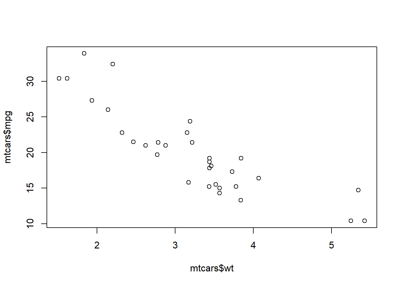
3.2 How can we draw scatter plot in ggplot2?
qplot(mtcars$wt, mtcars$mpg) #first way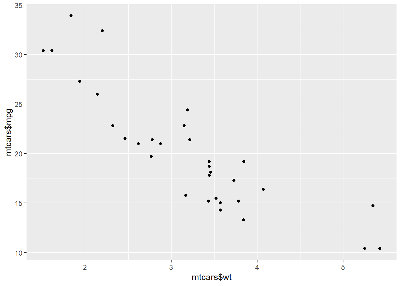
If the two vectors are already in the same data frame, you can use the following syntax:
qplot(wt, mpg, data=mtcars) 
Another way
ggplot(mtcars, aes(x=wt, y=mpg)) + geom_point() #suggested way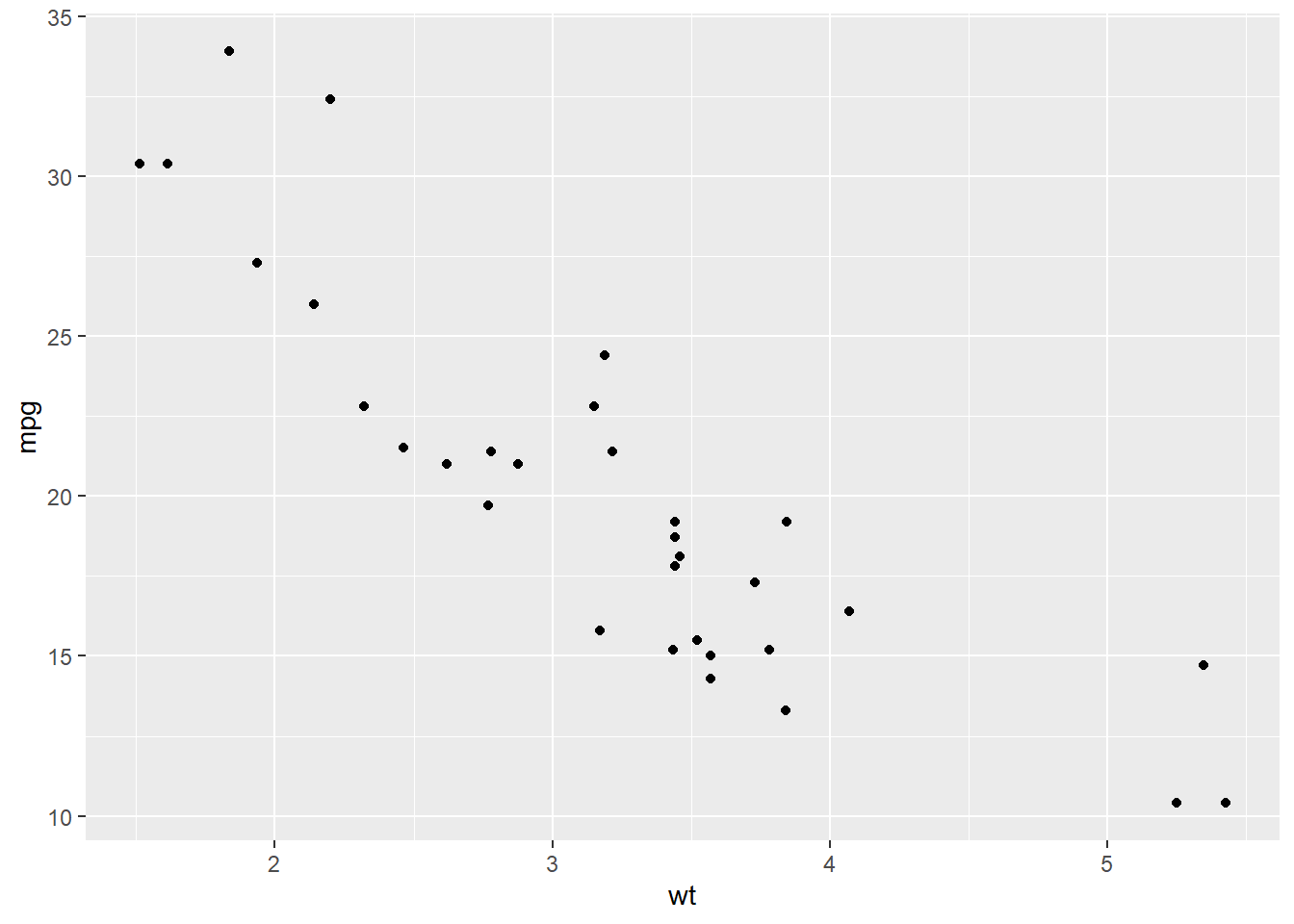
#geom_point function creates your plot as scatter plotThis way is the better one.
3.3 Adding Label Names and Titles
To add title and label names into your plot, labs command is used. Consider the previous plot.
ggplot(mtcars, aes(x=wt, y=mpg)) + geom_point()+labs(title="Scatter plot of wt and mpg",x="wt", y = "mpg") 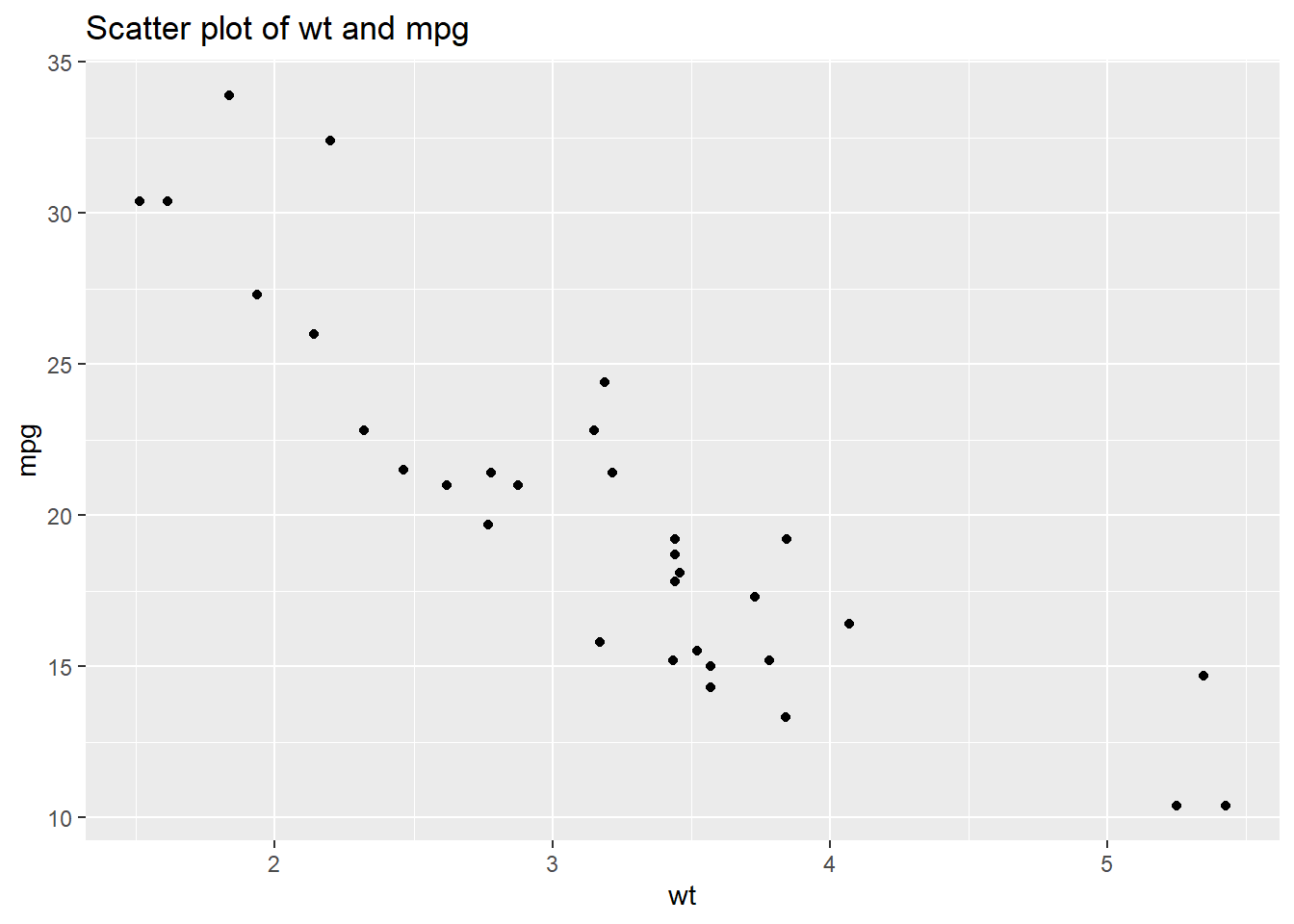
#title is used to add title
#x change the name of x axes
#y change the name of y axes
The labs command can be used not only scatter plot, but also other plots to add title etc.
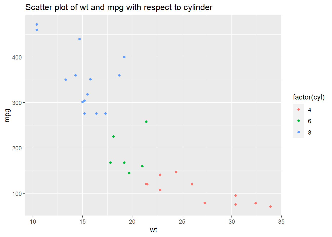
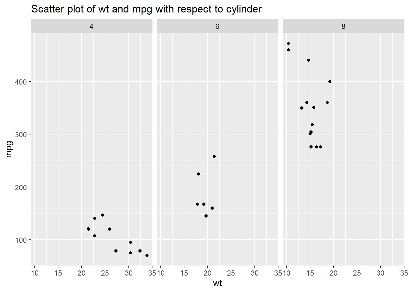
3.4 Drawing scatter plot of two continious variables conditioned on one categorical variables
head(mtcars)## mpg cyl disp hp drat wt qsec vs am gear carb
## Mazda RX4 21.0 6 160 110 3.90 2.620 16.46 0 1 4 4
## Mazda RX4 Wag 21.0 6 160 110 3.90 2.875 17.02 0 1 4 4
## Datsun 710 22.8 4 108 93 3.85 2.320 18.61 1 1 4 1
## Hornet 4 Drive 21.4 6 258 110 3.08 3.215 19.44 1 0 3 1
## Hornet Sportabout 18.7 8 360 175 3.15 3.440 17.02 0 0 3 2
## Valiant 18.1 6 225 105 2.76 3.460 20.22 1 0 3 1table(mtcars$cyl) #produces frequency table##
## 4 6 8
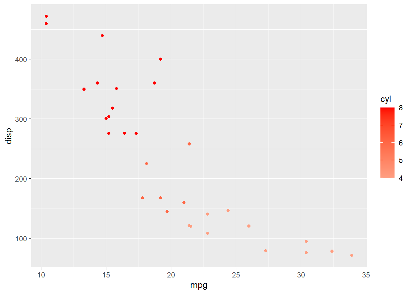
## 11 7 14ggplot(data = mtcars,aes(x = mpg,y = disp,colour = factor(cyl))) + geom_point()+labs(title="Scatter plot of wt and mpg with respect to cylinder",x="wt", y = "mpg")