Chapter 10 Lollipop Plot
Lollipop plot is basically a barplot, where the bar is transformed in a line and a dot. It shows the relationship between a numeric and a categorical variable. A lollipop is built using geom_point() for the circle, and geom_segment() for the stem.
Consider uspopchange data from gcookbook package.
uspopchange <- gcookbook::uspopchange
t = table(uspopchange$Region)
df = data.frame(t)
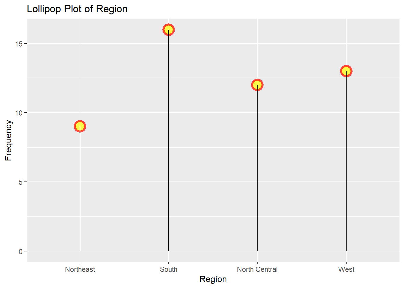
df## Var1 Freq
## 1 Northeast 9
## 2 South 16
## 3 North Central 12
## 4 West 13ggplot(df,aes(x=Var1,y=Freq)) +geom_point() + geom_segment(aes(x=Var1, xend=Var1, y=0, yend=Freq))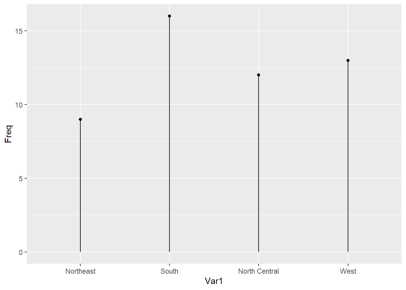
ggplot(df,aes(x=Var1,y=Freq)) +geom_point(size=5, color="red", fill="yellow", alpha=0.7, shape=21, stroke=2) +geom_segment(aes(x=Var1, xend=Var1, y=0, yend=Freq))+labs(title="Lollipop Plot of Region",x="Region",y="Frequency")