Chapter 6 Box-Plot
We use five number summary which are minimum, 1st quartile, median, 3rd quartile and maximum values of data to draw a box plot. On each box, the central mark indicates the median, and the bottom and top edges of the box indicate the 25th and 75th percentiles, respectively. The whiskers extend to the most extreme data points not considered outliers, and the outliers are plotted individually using the ’*’ symbol.
Box-Plot can be used for continious type of random variables
to find out the shape of the distribution of the variable of interest.
to detect the outlier.
+to compare the variable of interest with respect to categorical variable.
6.1 How to draw a Box-Plot in base R?
Let’s consider mtcars data set being available in R.
boxplot(mtcars$mpg)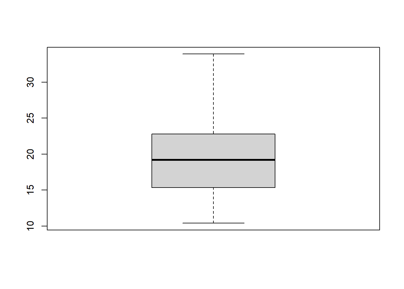
6.2 How can we draw Box-Plot in ggplot2?
ggplot(mtcars,aes(x=factor(0),mpg))+geom_boxplot()+
   theme(axis.title.x=element_blank(),
    axis.text.x=element_blank(),
    axis.ticks.x=element_blank())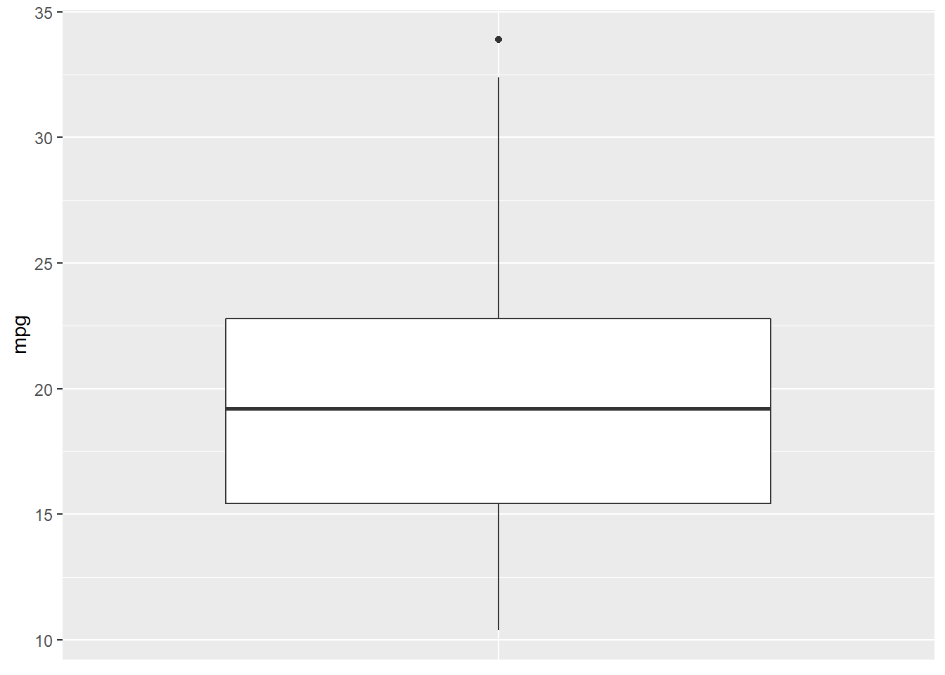
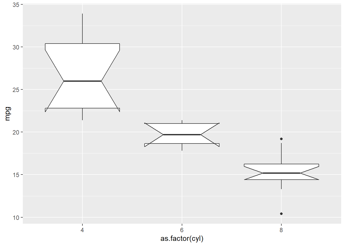
boxplot(mtcars$mpg~mtcars$cyl,main="Distribution of mpg with respect to cyl",col="red")#a simple box plot 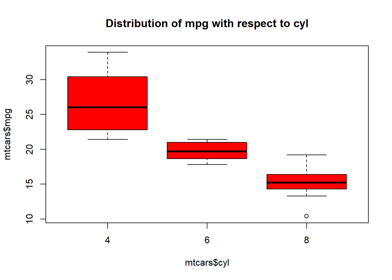
6.3 How can we draw a Box-Plot in ggplot2?
qplot(as.factor(mtcars$cyl),mtcars$mpg,geom = "boxplot")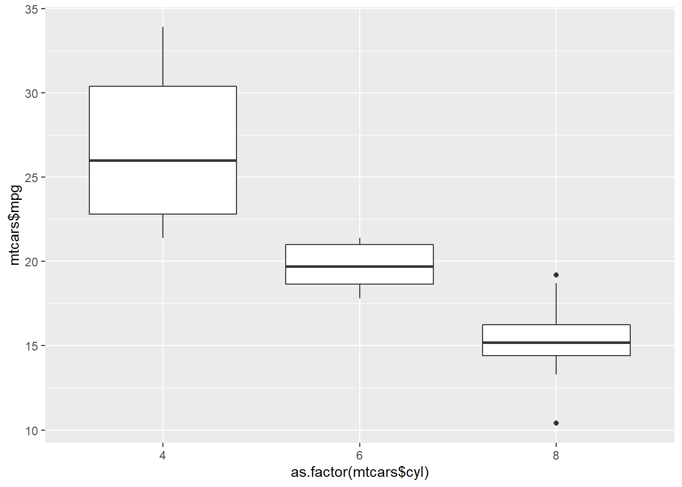
If the variables are in the same data frame
qplot(as.factor(cyl),mpg,data=mtcars,geom="boxplot")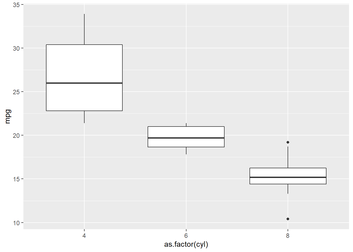
Another way
ggplot(mtcars, aes(x=as.factor(cyl), y=mpg)) + geom_boxplot( )
This way is the better one.
6.4 Customizing Box-Plot
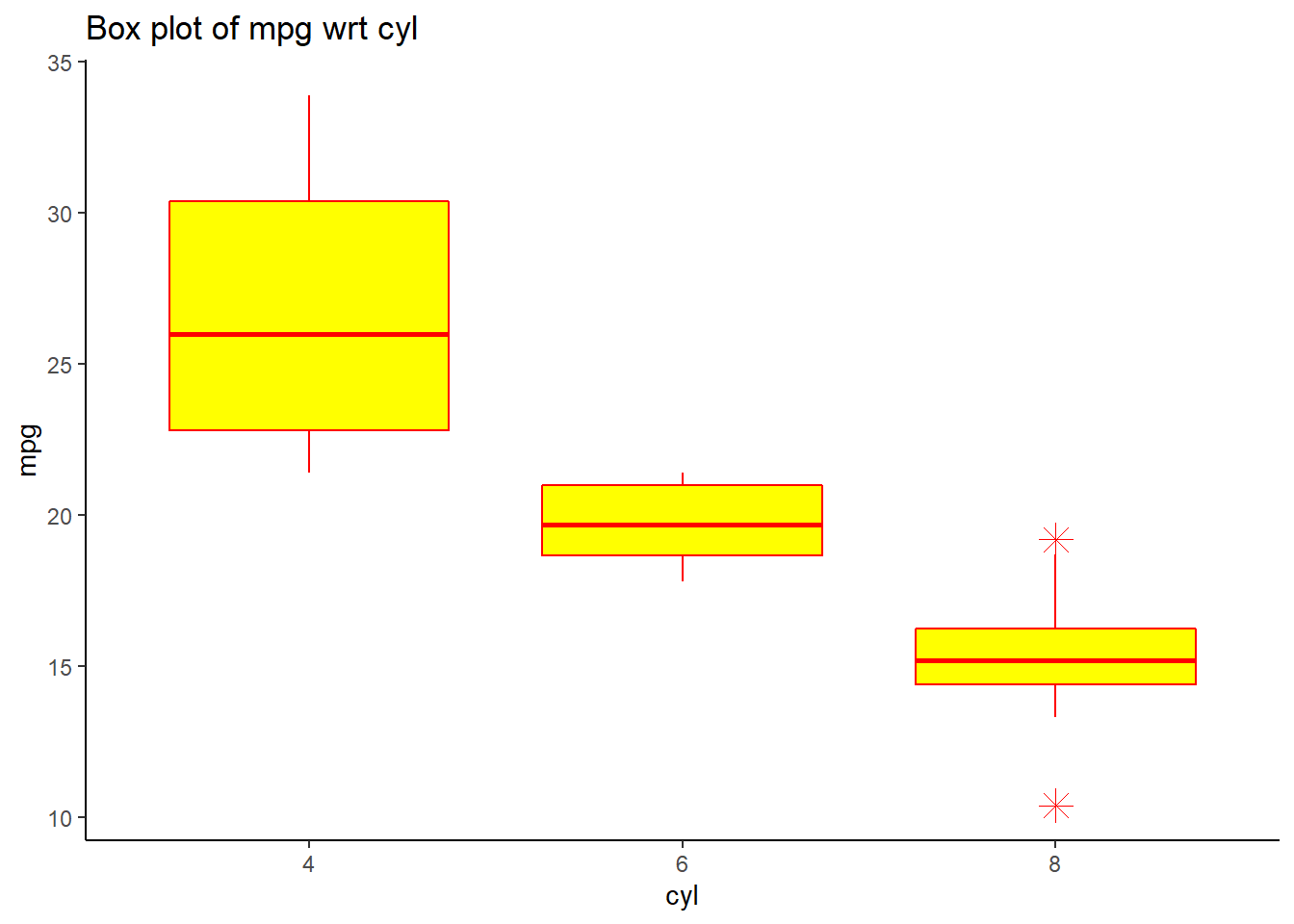
ggplot(mtcars, aes(x=as.factor(cyl), y=mpg)) + geom_boxplot(outlier.colour="red", outlier.shape=8,outlier.size=4,fill="yellow",colour="red")+
labs(title="Box plot of mpg wrt cyl",x="cyl", y = "mpg")+ theme_classic()