Chapter 9 Pie Chart
A pie chart (or a circle chart) is a circular statistical graphic which is divided into slices to illustrate numerical proportion. It is mainly used to represent categorical variables.
9.1 How to draw a Pie Chart in base R?
slices <- c(10, 12,4, 16, 8)
lbls <- c("US", "UK", "Australia", "Germany", "France")
pie(slices, labels = lbls, main="Pie Chart of Countries") #label shows the label names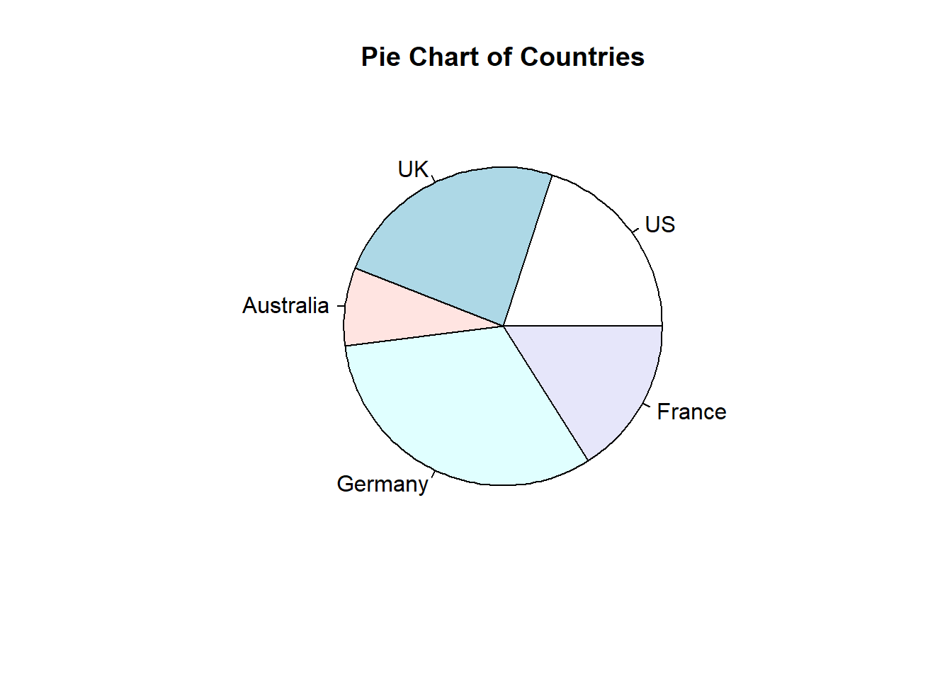
To draw a pie chart in ggplot2, you have to create a bar plot at first. Then, you should convert your bar plot into pie chart.
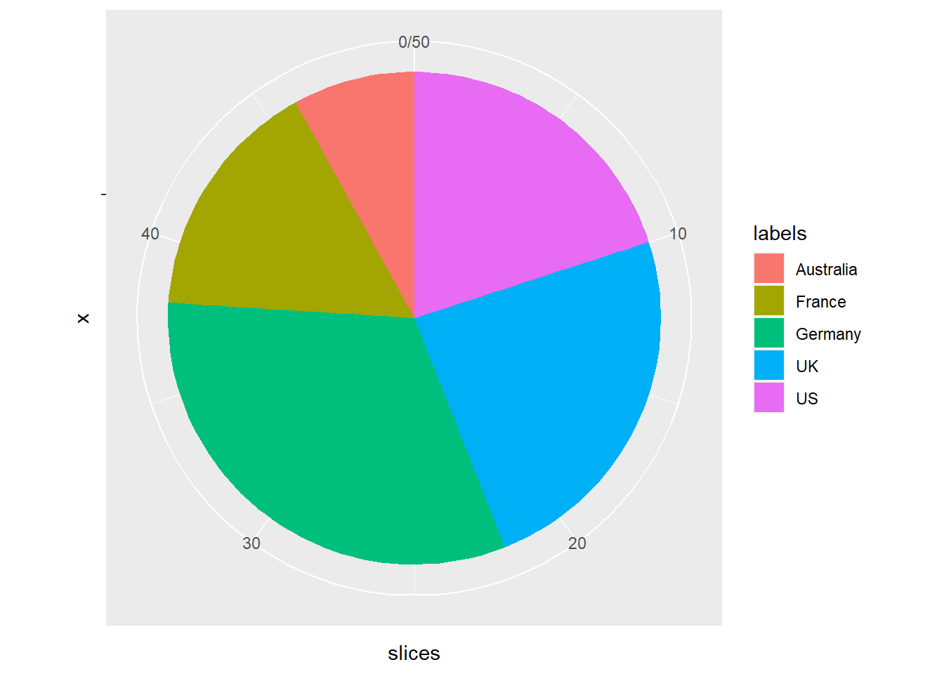
9.2 How can we draw a pie chart in ggplot2?
df<-data.frame(slices=c(10, 12,4, 16, 8),labels=c("US", "UK", "Australia", "Germany", "France"))
df
## slices labels
## 1 10 US
## 2 12 UK
## 3 4 Australia
## 4 16 Germany
## 5 8 France# Barplot
bp<- ggplot(df, aes(x="", y=slices, fill=labels))+geom_bar(width = 1, stat = "identity")
bp#ggplot2 pie chart for data visualization in R software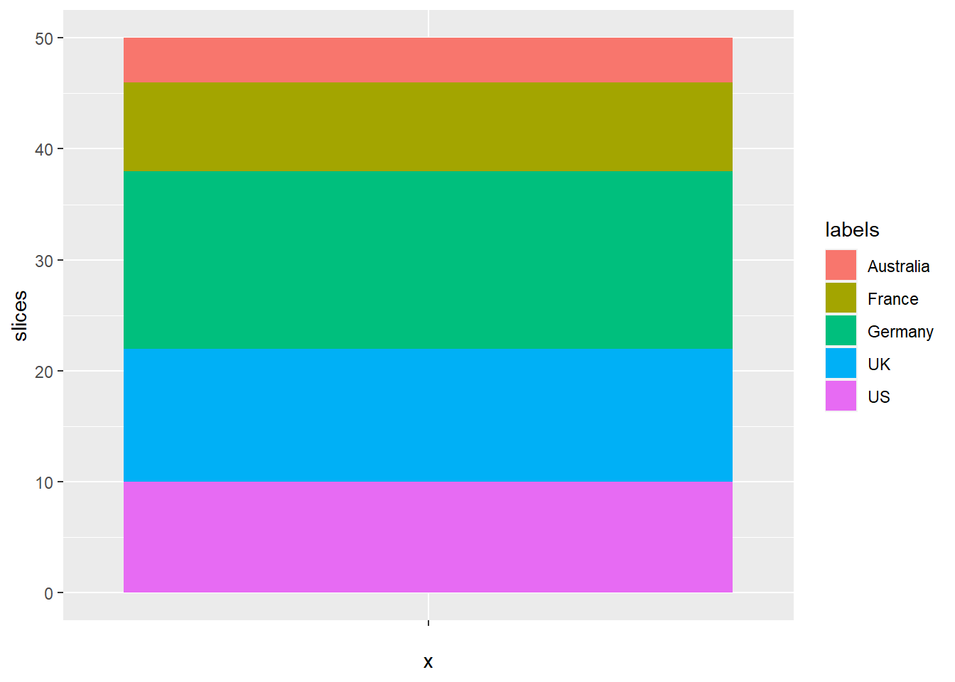
#Create a pie chart :
bp + coord_polar("y", start=0)