Chapter 4 Line Plot
Line graph is used to look at the changes in variable over time or look at the relationship between two variable. In both cases, x axis corresponds to the independent variable (time, days etc), y axis corresponds to the dependent variable (temperature, income etc).
4.1 How to draw a line plot in base R?
Let’s consider pressure data set being available in R.
head(pressure) #shows first 6 observations## temperature pressure
## 1 0 0.0002
## 2 20 0.0012
## 3 40 0.0060
## 4 60 0.0300
## 5 80 0.0900
## 6 100 0.2700plot(pressure$temperature, pressure$pressure, type="l",xlab="Temperature",ylab="Pressure",main="Relationship btw Pressure and Temperature") #type="l"
#xlab and ylab options arrange axes name.
# To add points and/or multiple lines (Figure 2-3, right), first call plot() for the first line,
#then add points with points() and additional lines with lines():
points(pressure$temperature, pressure$pressure) #add black points
lines(pressure$temperature, pressure$pressure/2, col="red") #add red lines
points(pressure$temperature, pressure$pressure/2, col="red") #add points to the lines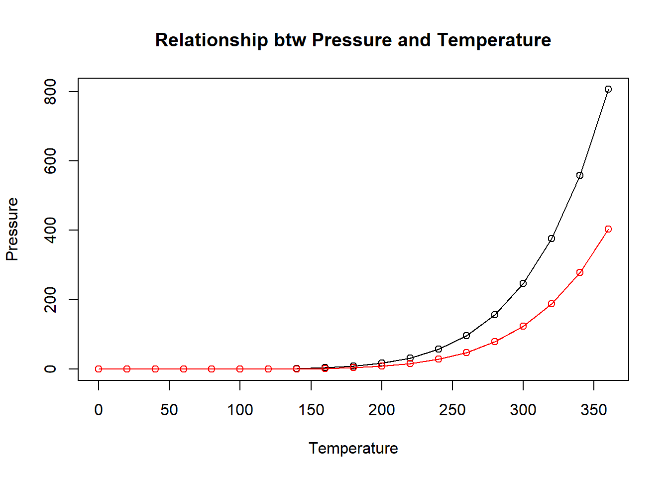
4.2 How can we draw line plot in ggplot2?
qplot(pressure$temperature, pressure$pressure, geom="line")
If the two vectors are already in the same data frame, you can use the following syntax:
qplot(temperature, pressure, data=pressure, geom="line") #with label name
Another way
ggplot(pressure, aes(x=temperature, y=pressure)) + geom_line() #geom_line converts your plot into line plot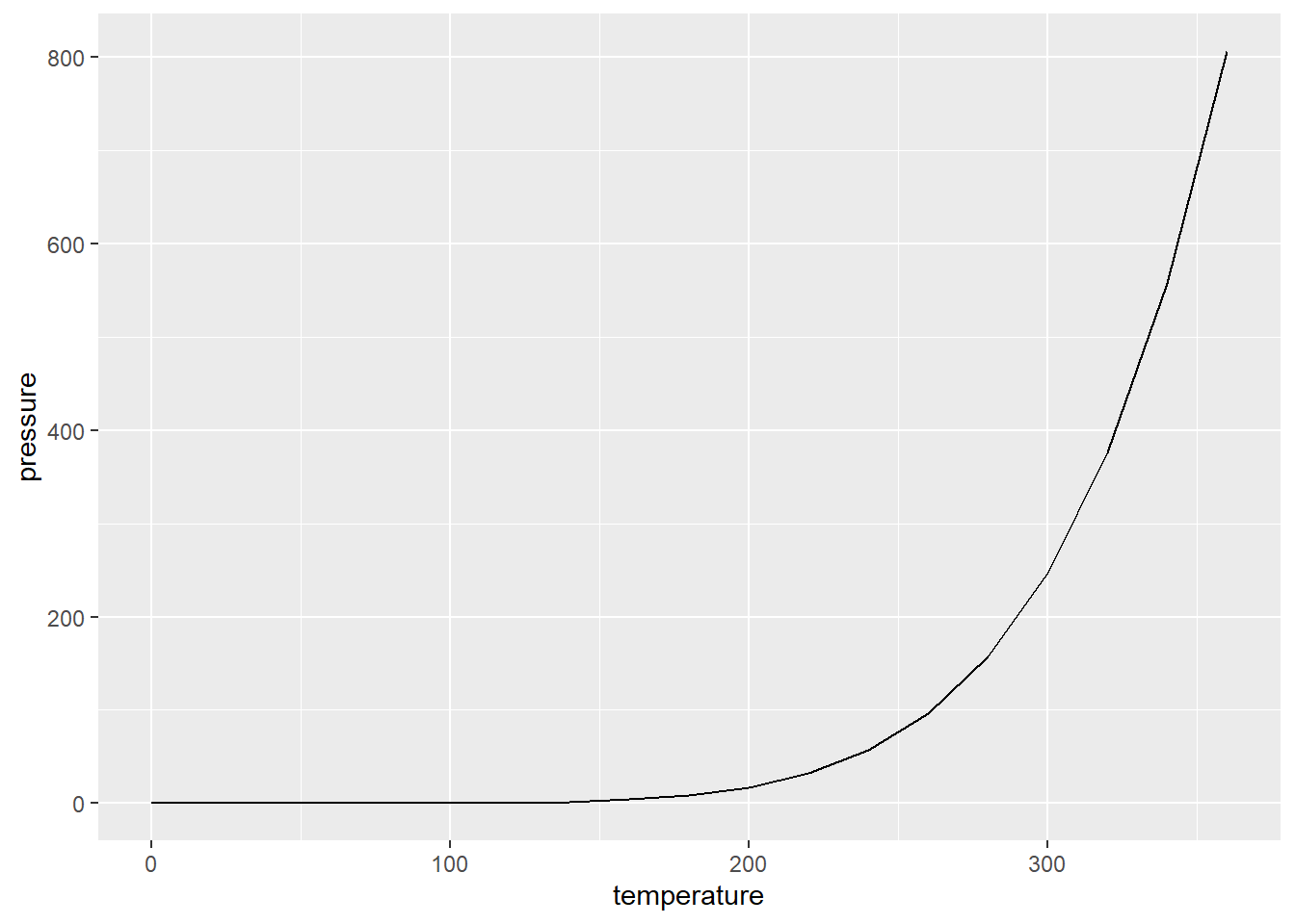
ggplot(pressure, aes(x=temperature, y=pressure)) + geom_line() + geom_point() #to add points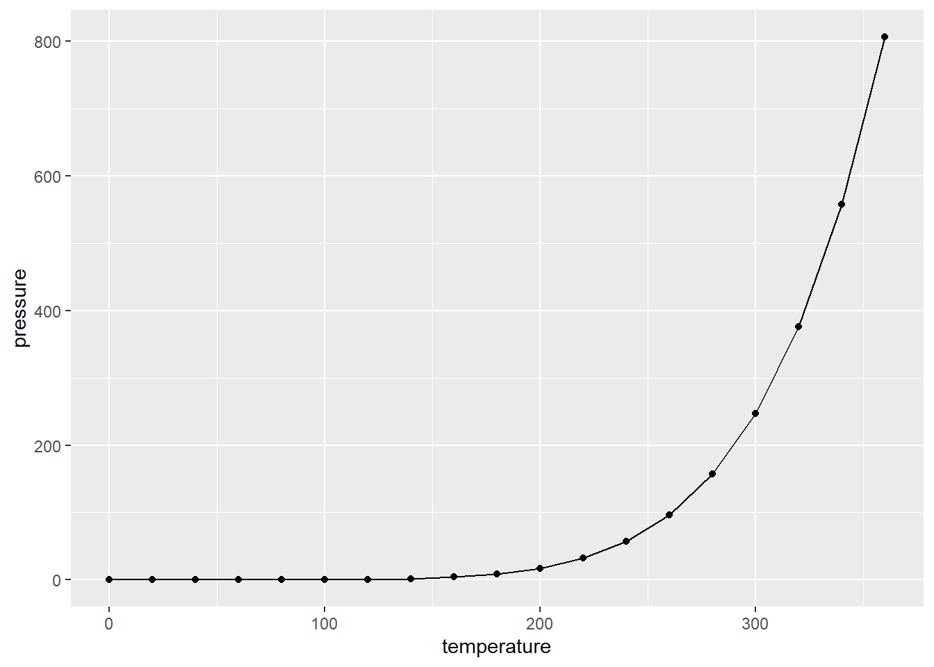
qplot(temperature, pressure, data=pressure, geom=c("line", "point"),col="red") #to change colors of point and line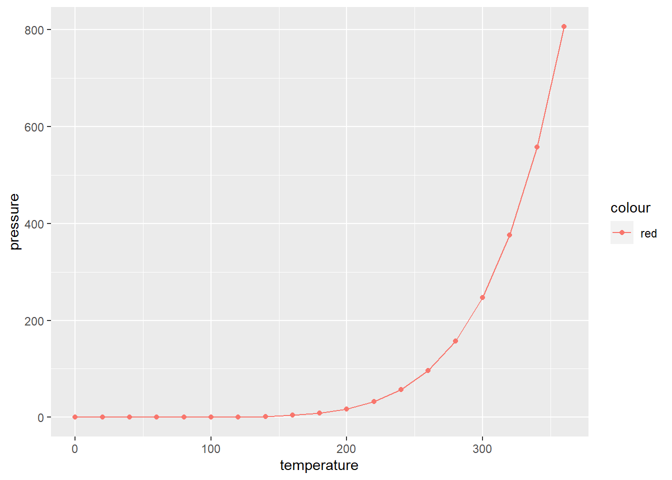
This way is the better one.