Chapter 8 Bar Plot
A bar chart or bar graph is a chart or graph that presents categorical data with rectangular bars with heights or lengths proportional to the values that they represent. It assumes that the heights of your bars are conveniently stored in a vector.
8.1 How to draw a Bar Plot in base R?
Let’s consider mtcars data set being available in R.
barplot(table(mtcars$cyl))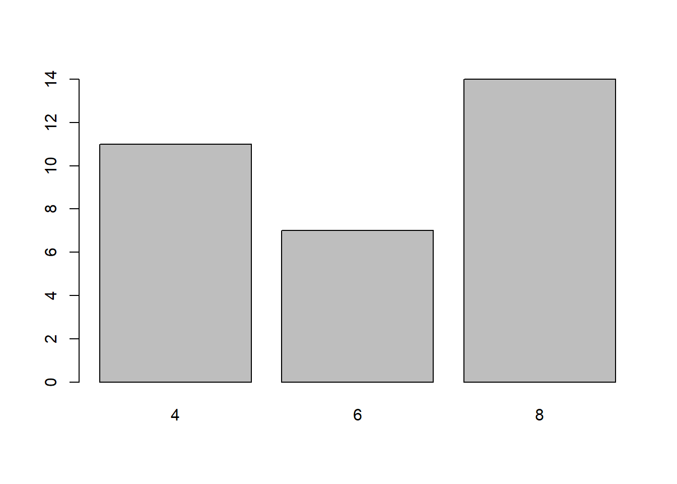
barplot(table(mtcars$cyl),col=c("red","yellow","black"),main="Barplot of cyl")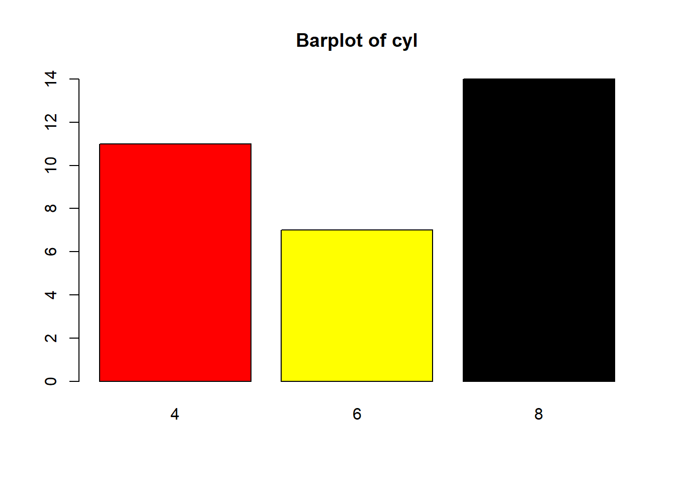
8.2 How can we draw bar plot in ggplot2?
ggplot(mtcars, aes(x=cyl)) + geom_bar()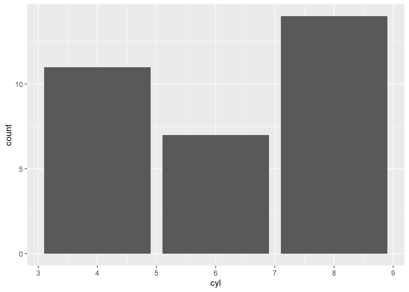
ggplot(mtcars, aes(x=cyl)) + geom_bar(fill="red",col="yellow")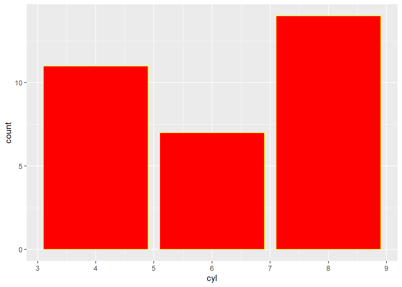
ggplot(mtcars,aes(x=cyl))+geom_bar(fill=c("yellow","blue","red"))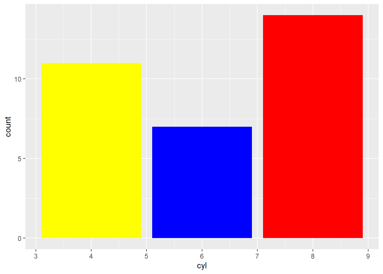
ggplot(mtcars,aes(x=cyl))+geom_bar(fill=c("yellow","blue","red"))+labs(title="Bar plot of cyl",x="number of cyl")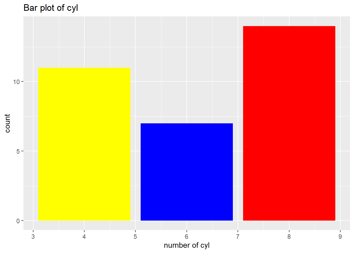
8.3 Drawing bar plot of continious variable with respect to one categorical variable
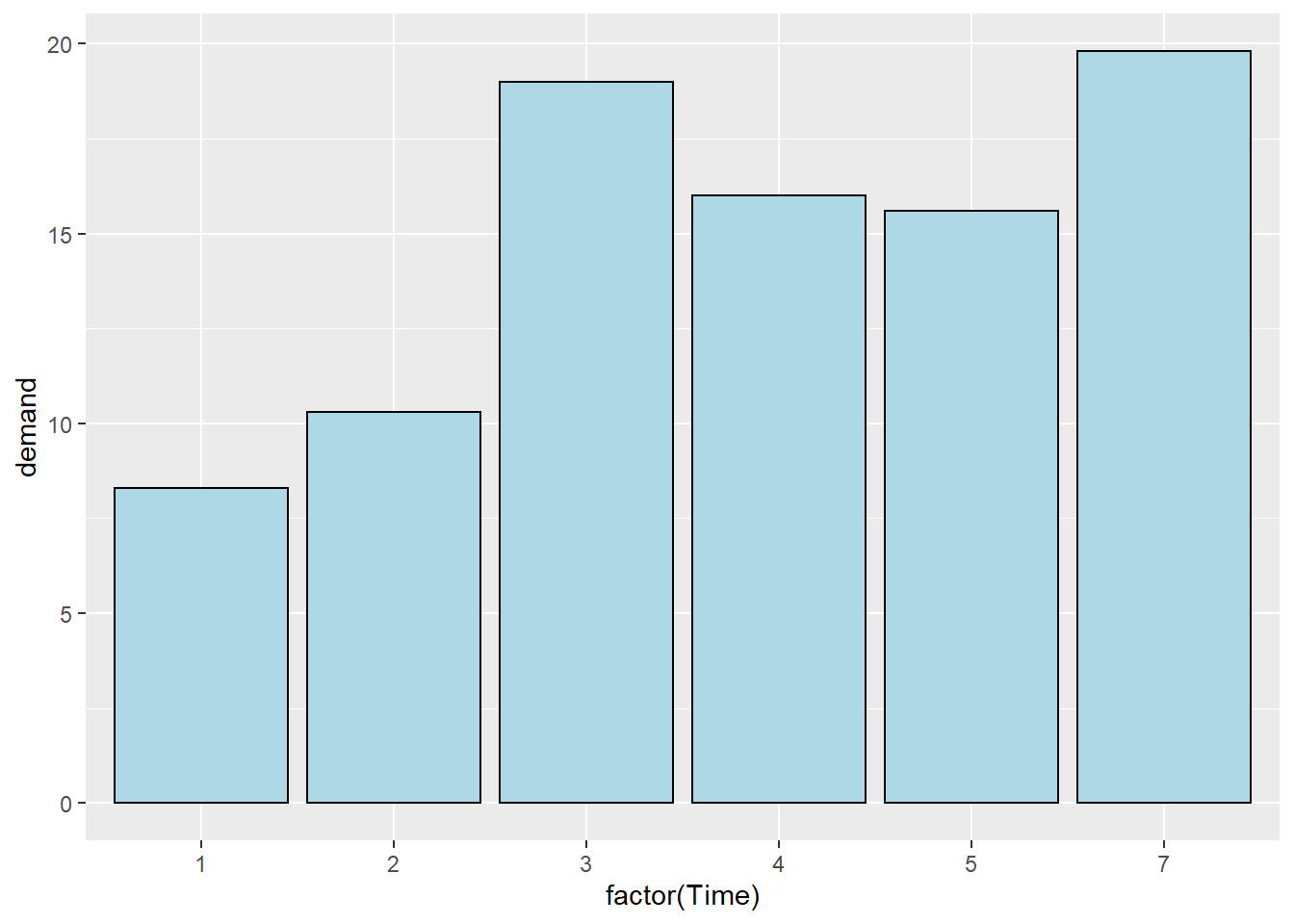
We use BOD dataset from gcookbook package.
library(gcookbook)## Warning: package 'gcookbook' was built under R version 4.1.1BOD## Time demand
## 1 1 8.3
## 2 2 10.3
## 3 3 19.0
## 4 4 16.0
## 5 5 15.6
## 6 7 19.8ggplot(BOD, aes(x=factor(Time), y=demand)) + geom_bar(stat="identity")# Convert Time to a discrete (categorical) variable with factor()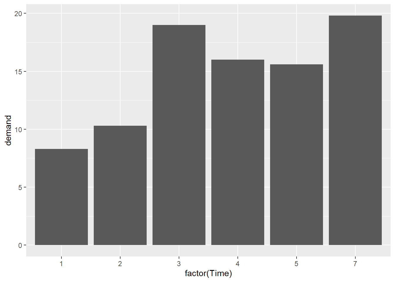
ggplot(BOD, aes(x=factor(Time), y=demand))+geom_bar(stat="identity", fill="lightblue", colour="black")