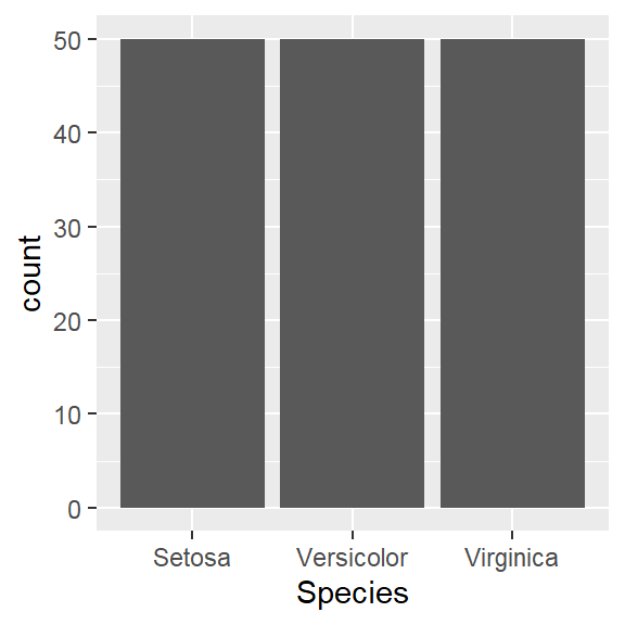
 They are discrete variables.
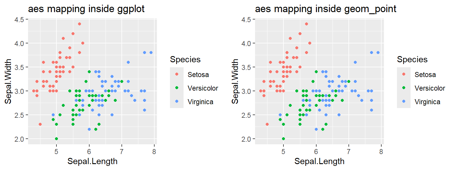
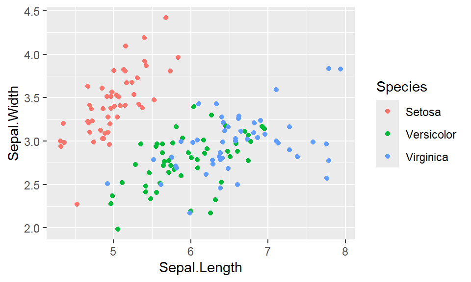
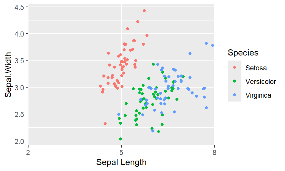
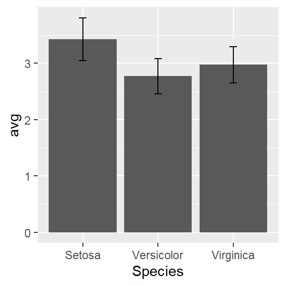
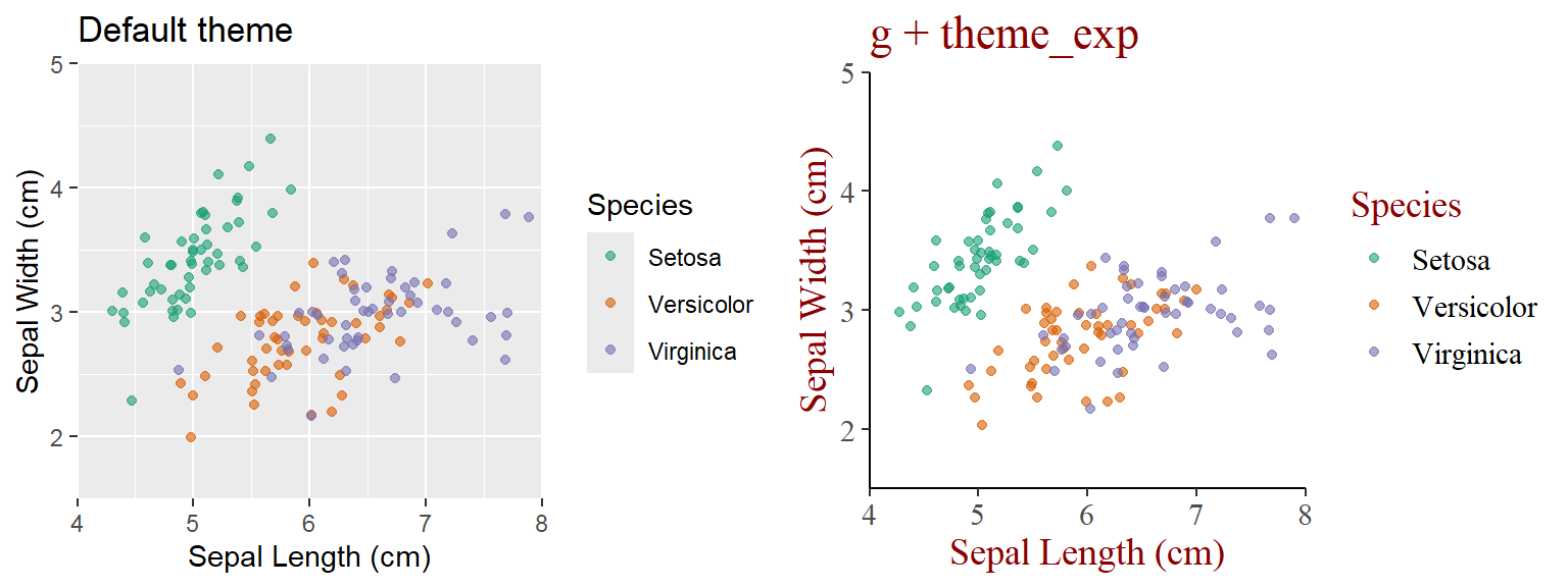
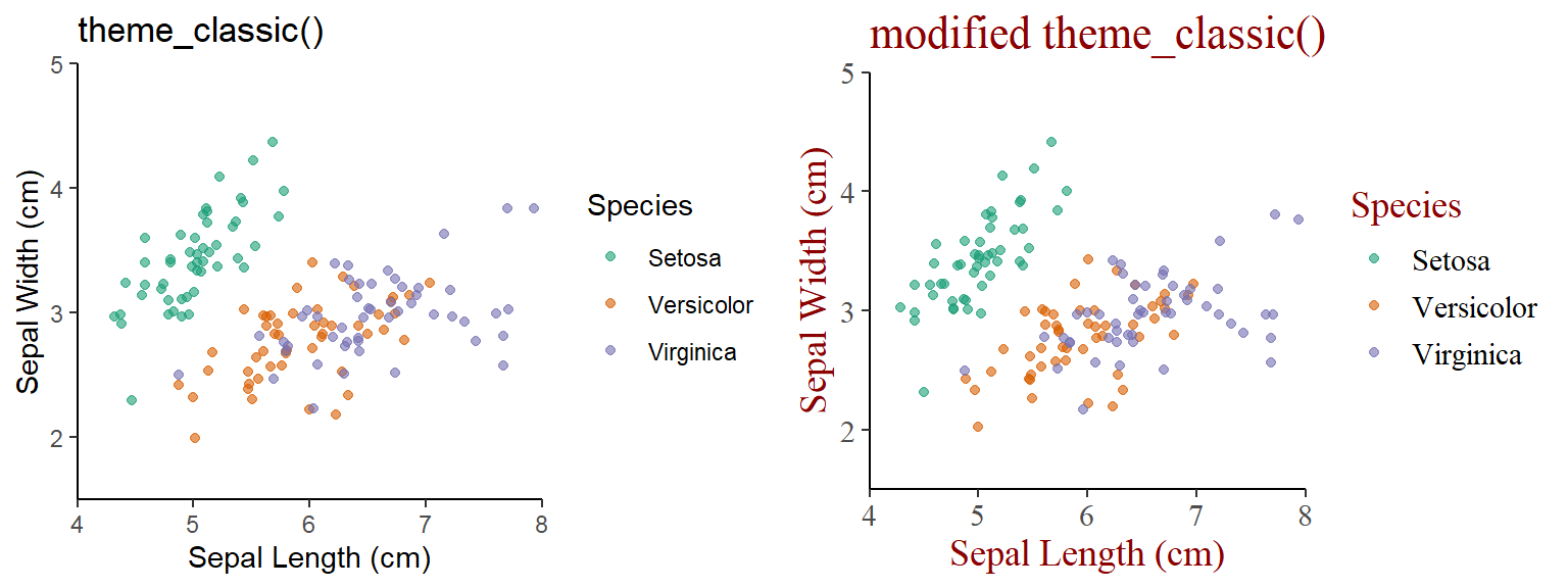
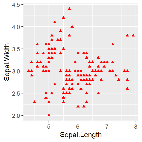 The color attribute is set to “red”
Attribute is set inside geom_*() .
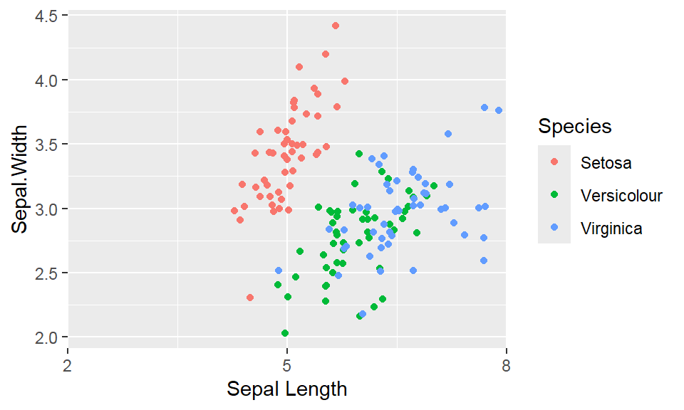
The color attribute is set to “red”
Attribute is set inside geom_*() .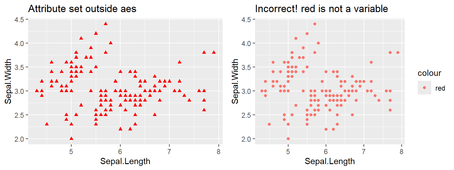
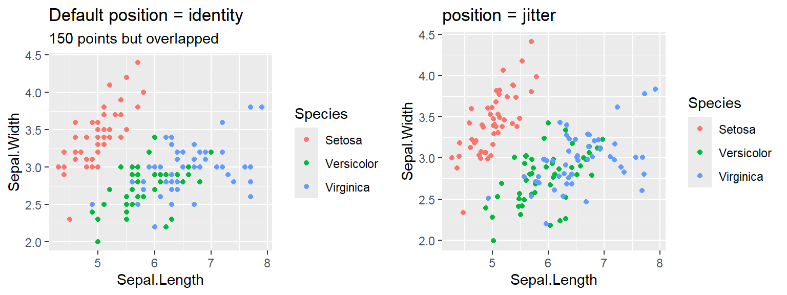


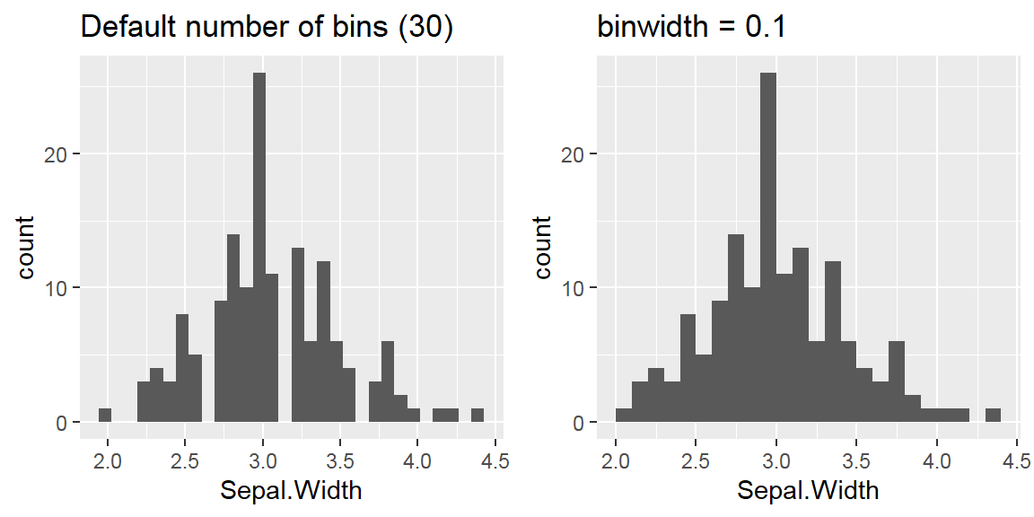
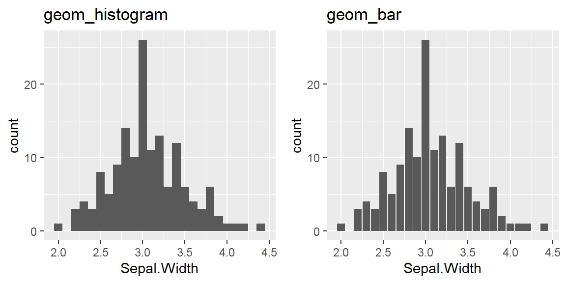
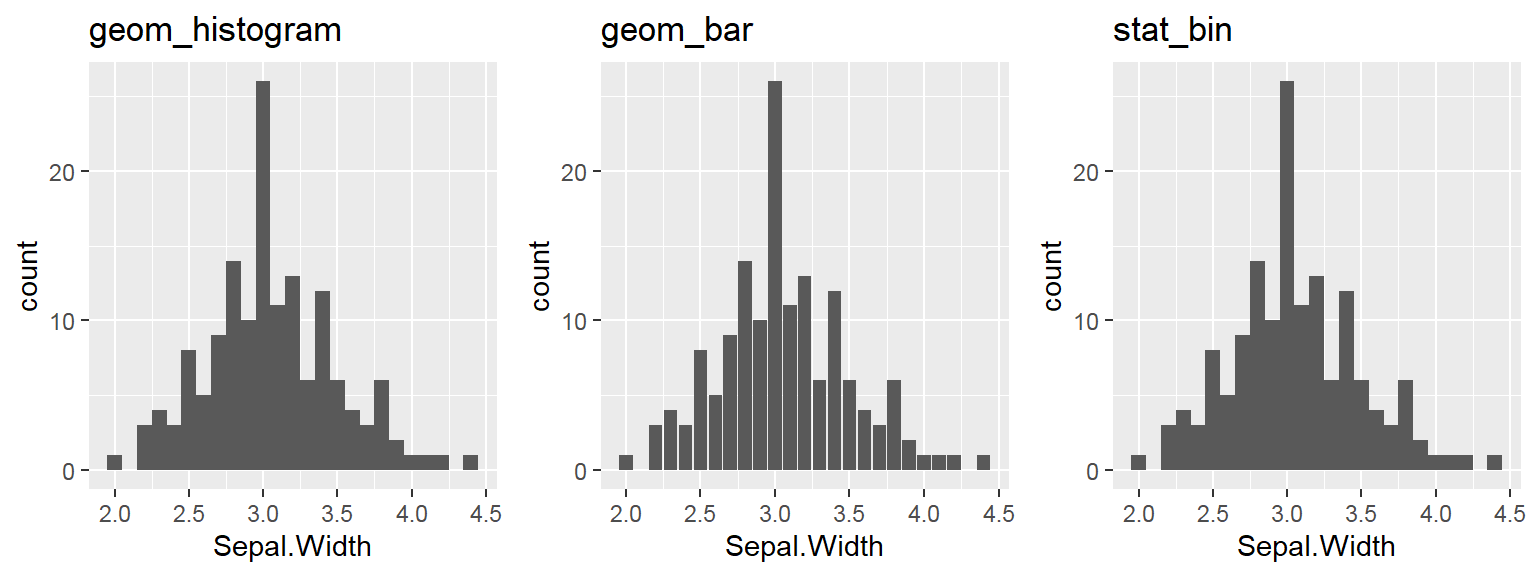
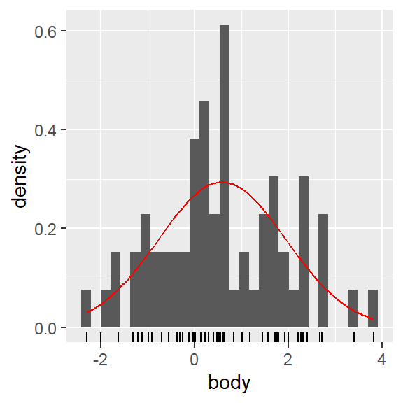
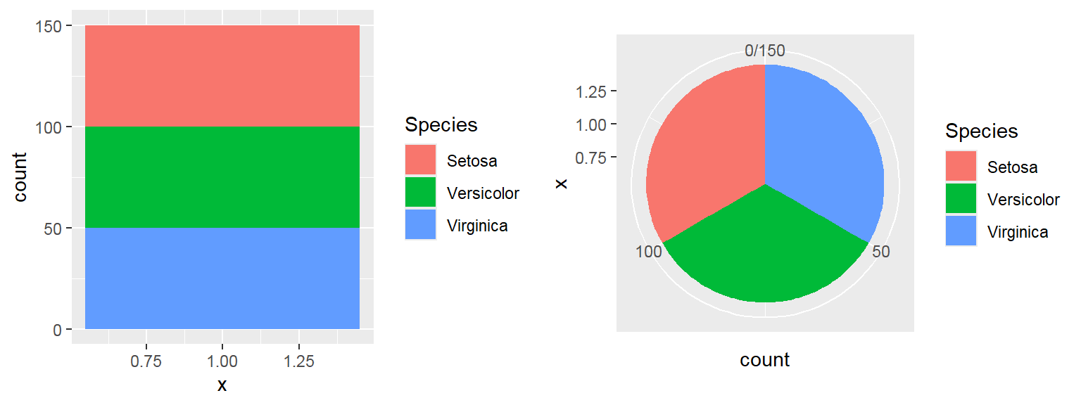
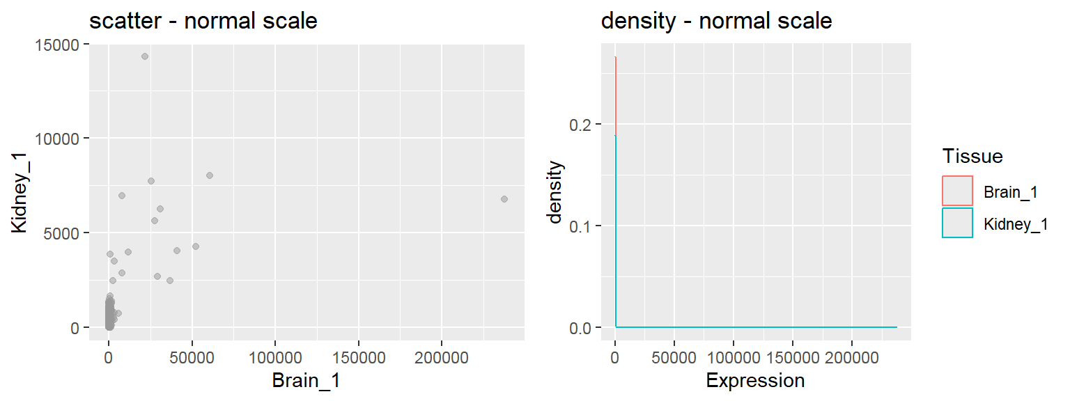
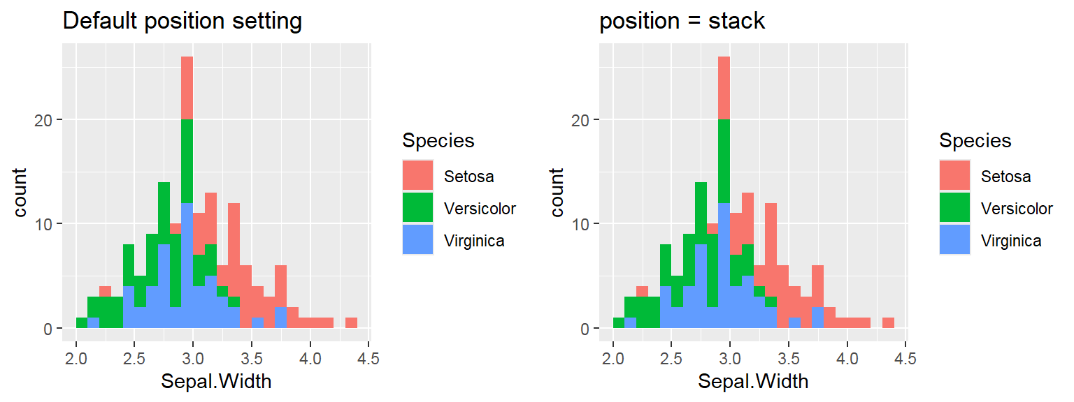 We cant say whether the histogram bars are stacked or overlapped onto each other
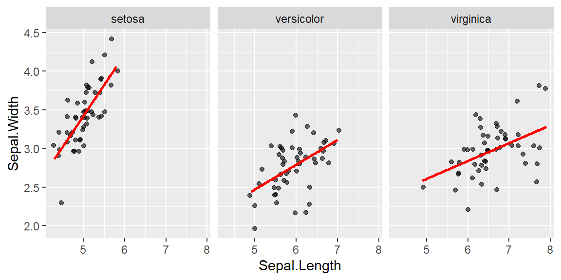
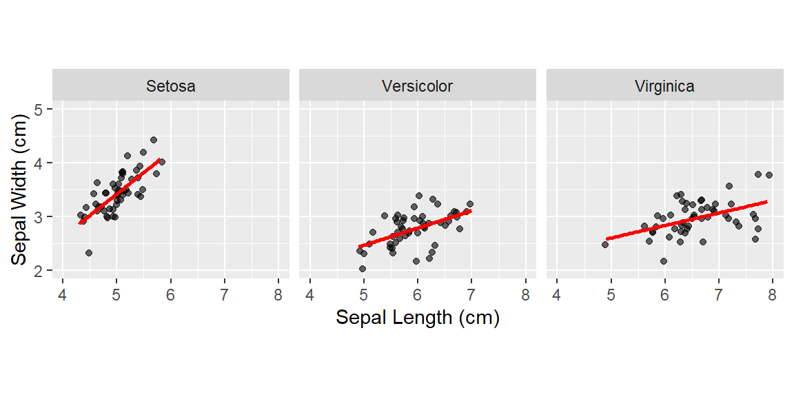
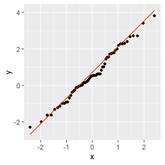
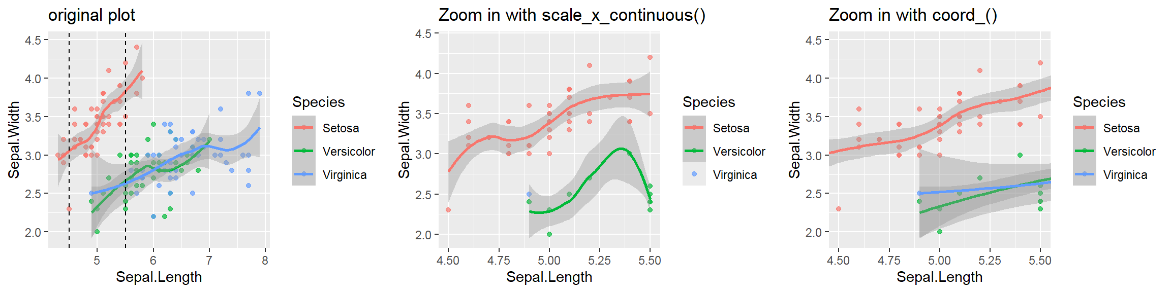
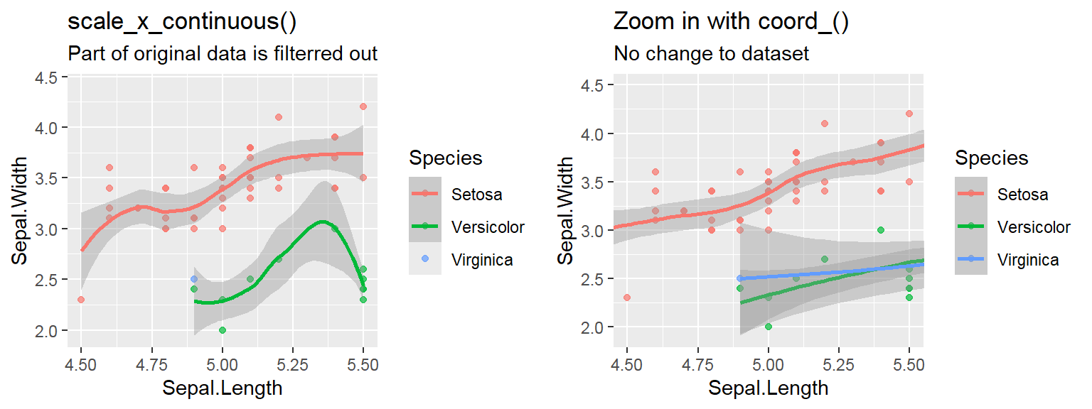
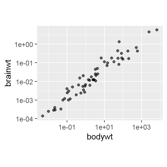
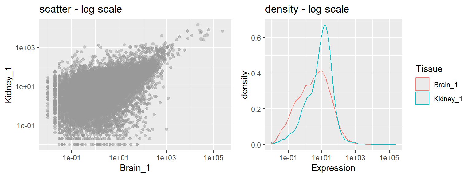
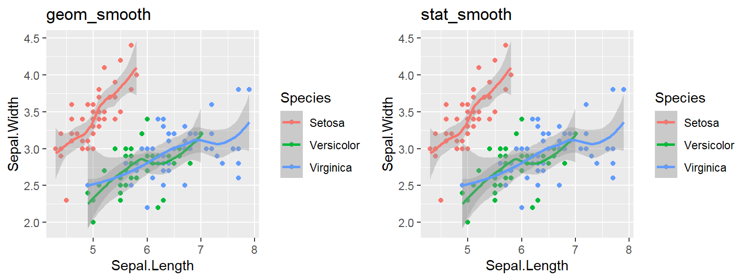 Note: By default, loess regression is used. It is a non-parametric methods where least squares regression is performed in localized subsets, and used when n < 1000. We can change smoothing method with the
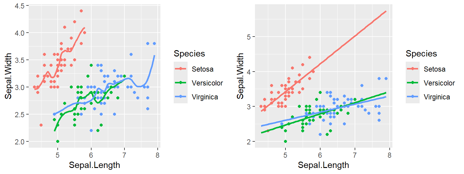

3.2.1 Main content
High-dimensional data
- Feature projection / Manifold learning
- 4 popular feature projection techniques: PCA, MDS, t-SNE, UMAP
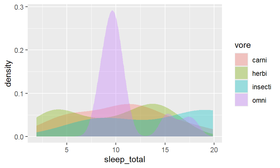
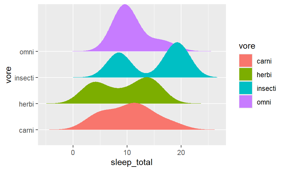
Distribution plot
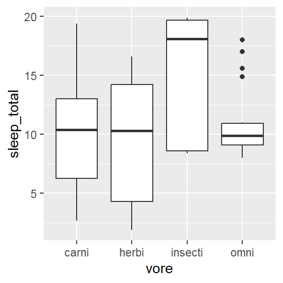
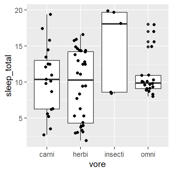
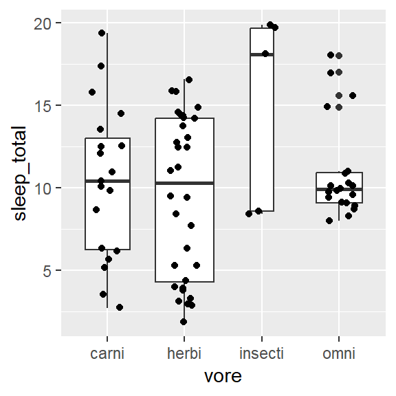
- Within 1 variable:
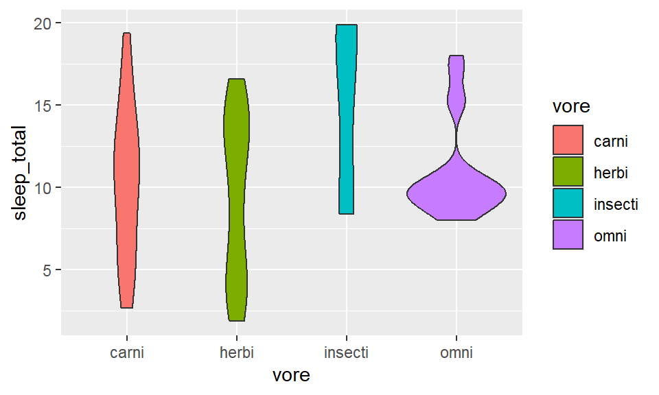
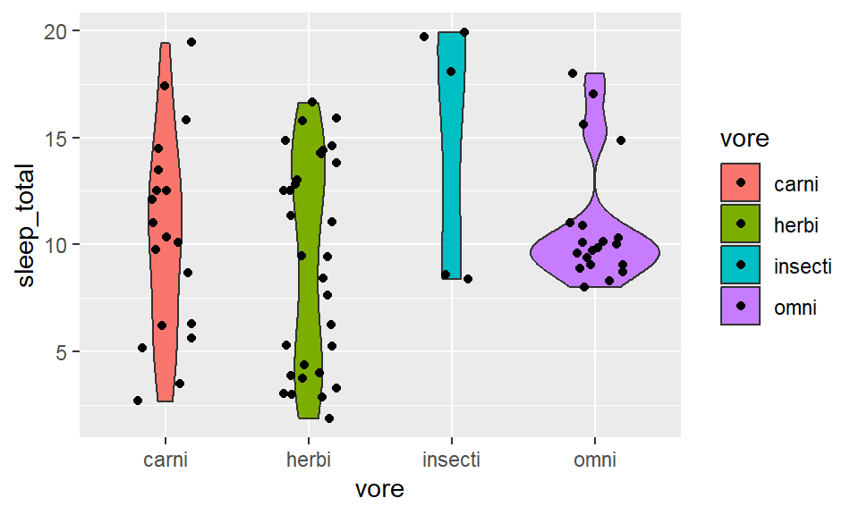
- Weighted box/ violin
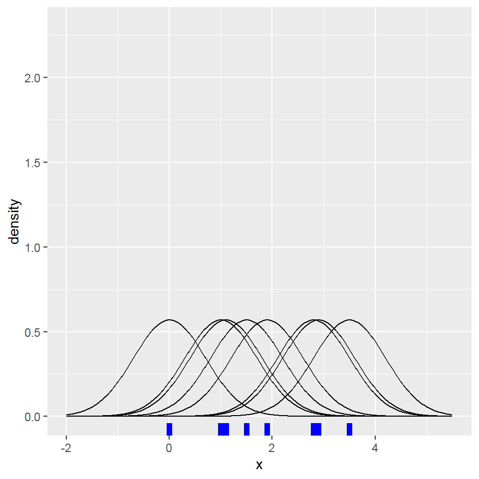
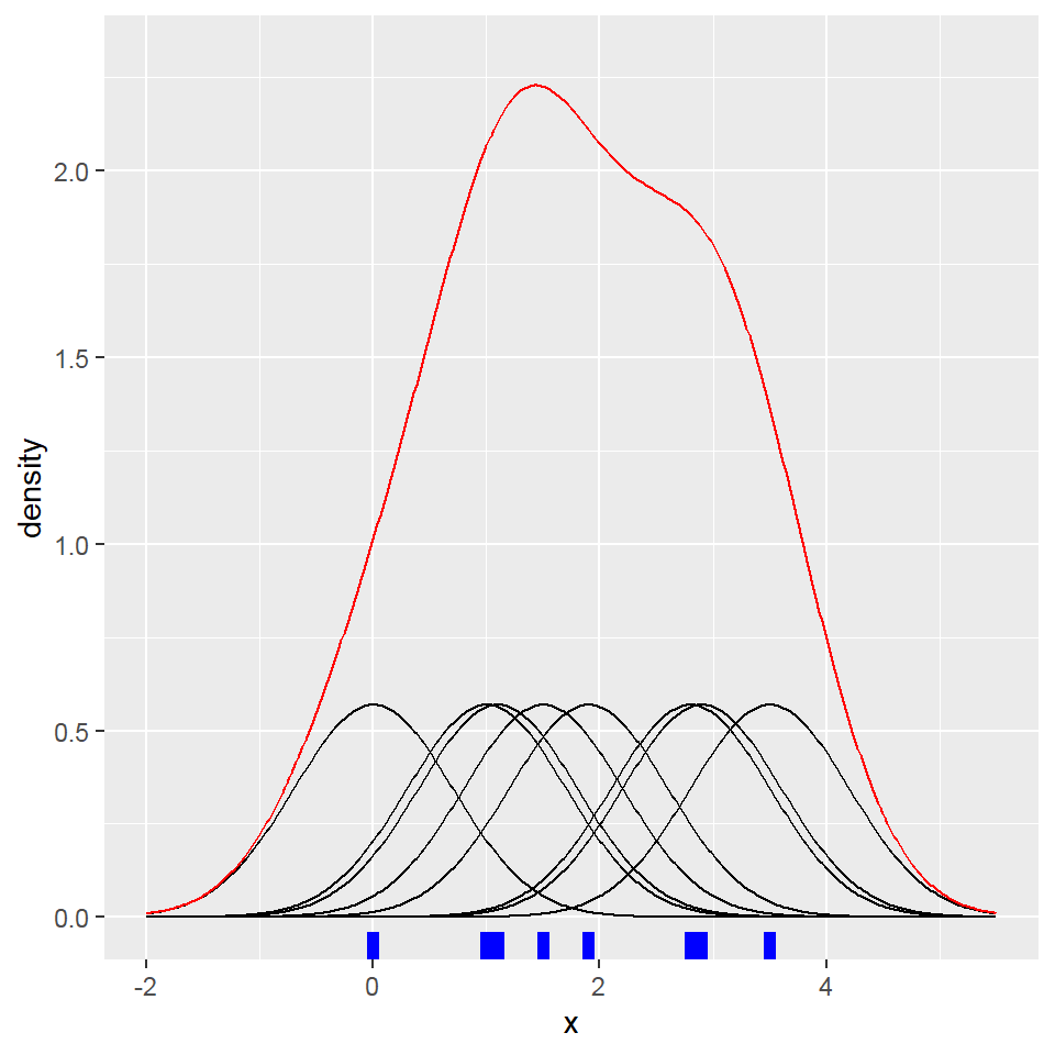
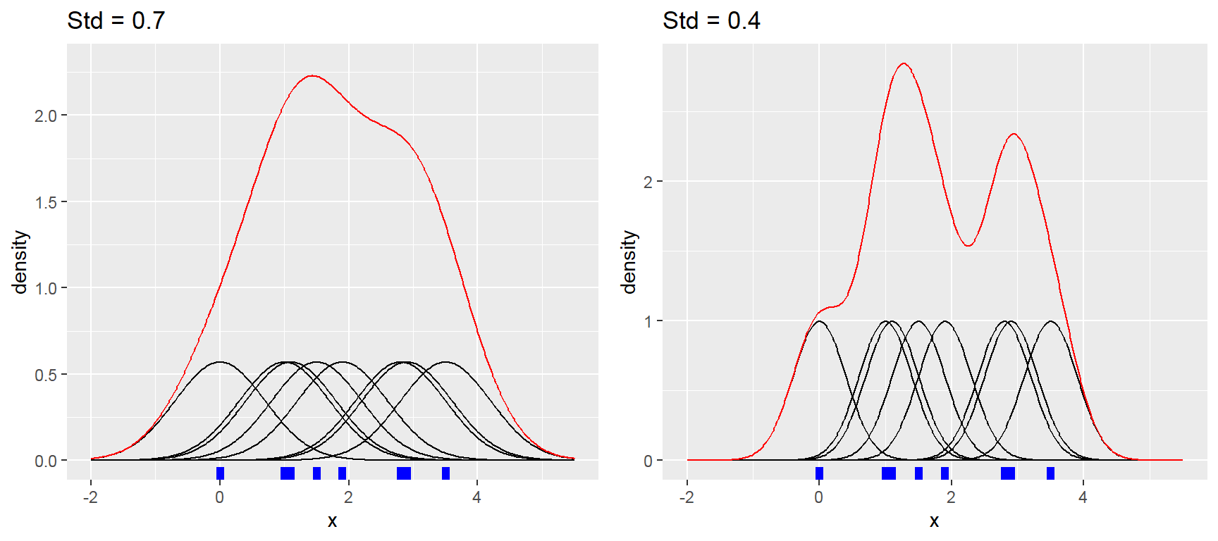
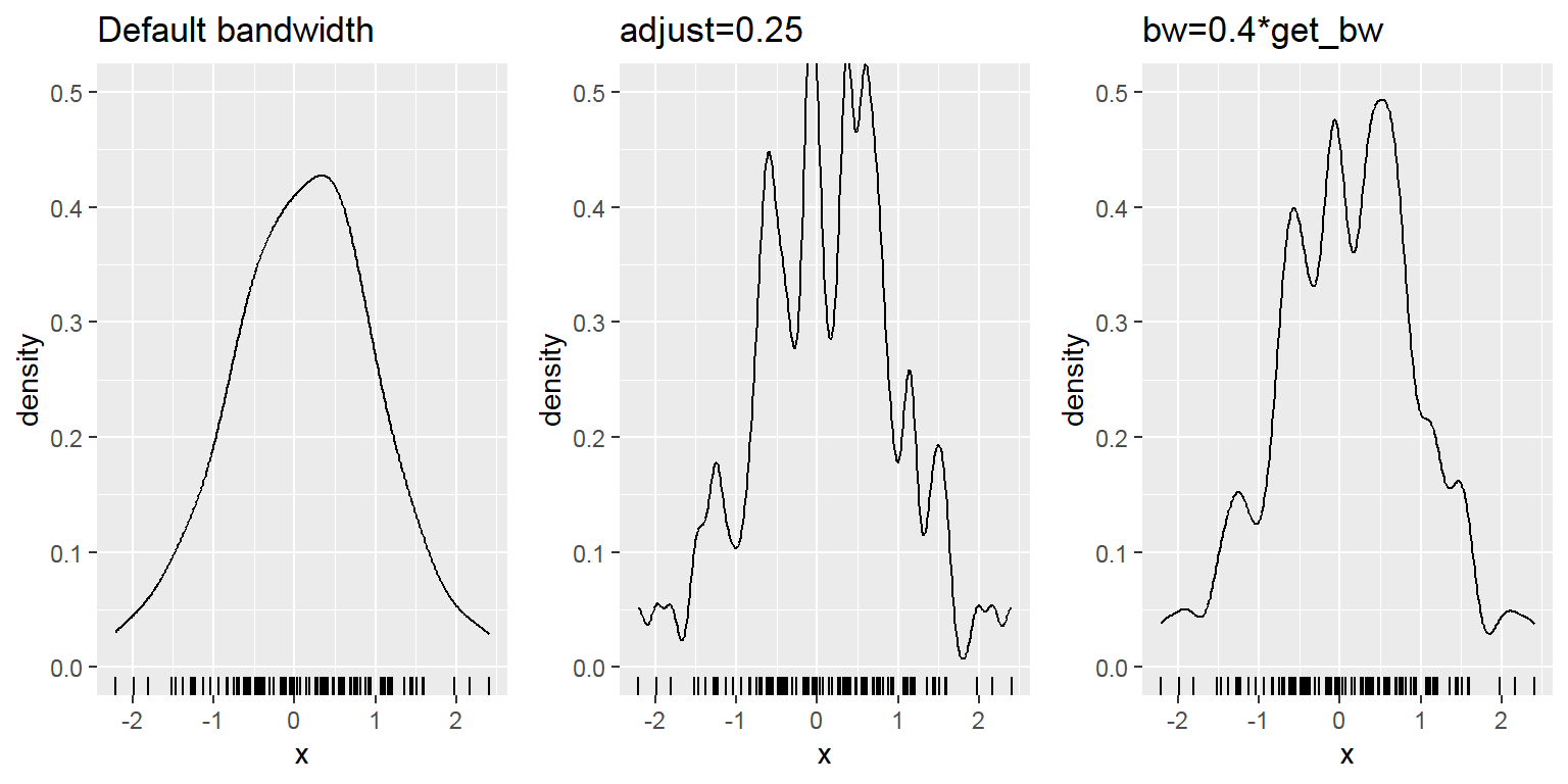
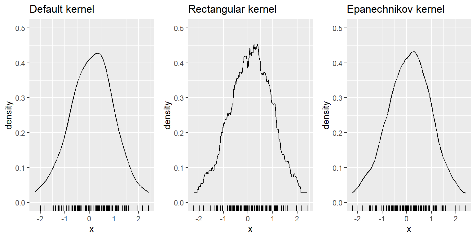
- Density
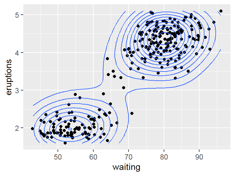
- 2 Separate variables:
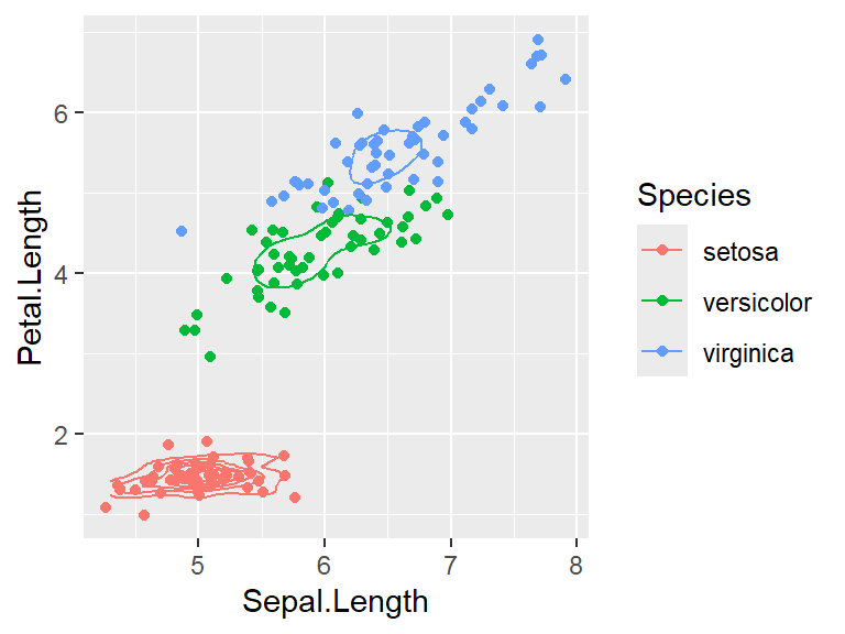
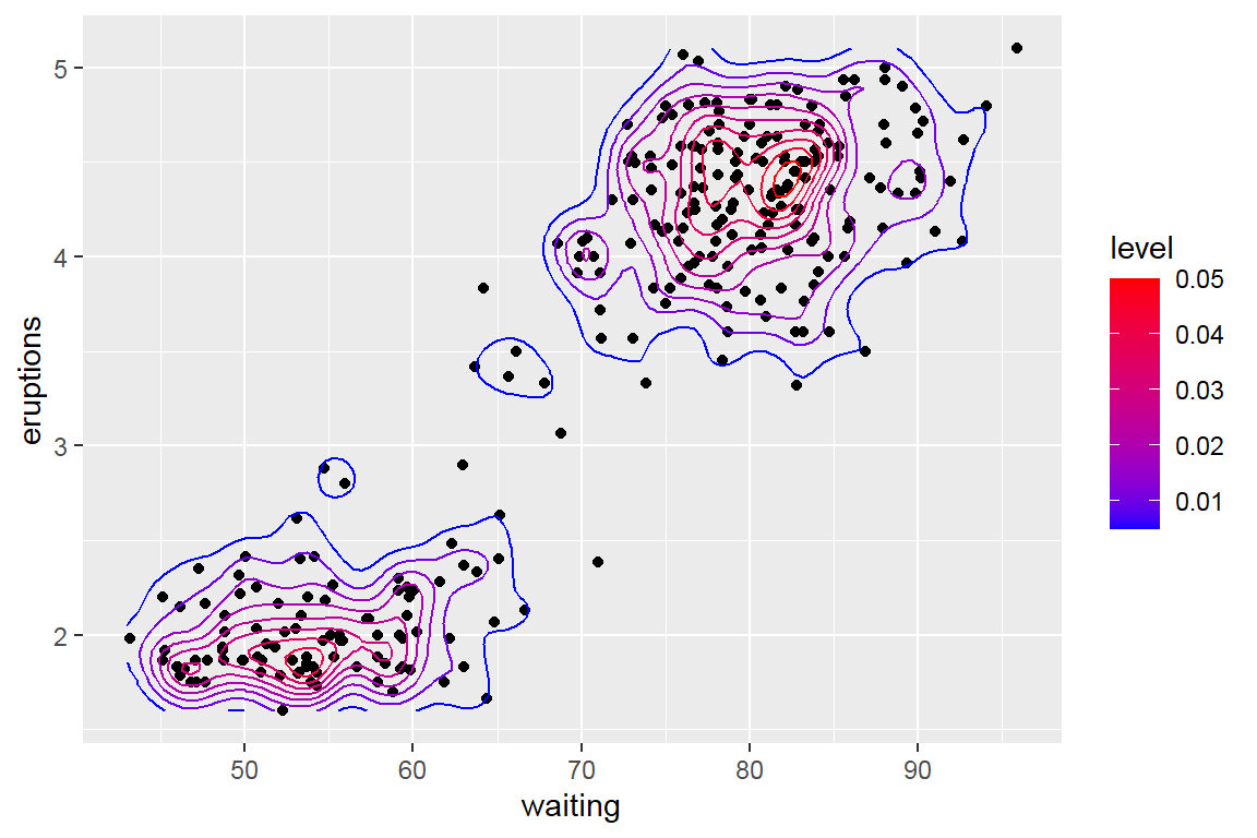
- 2D density
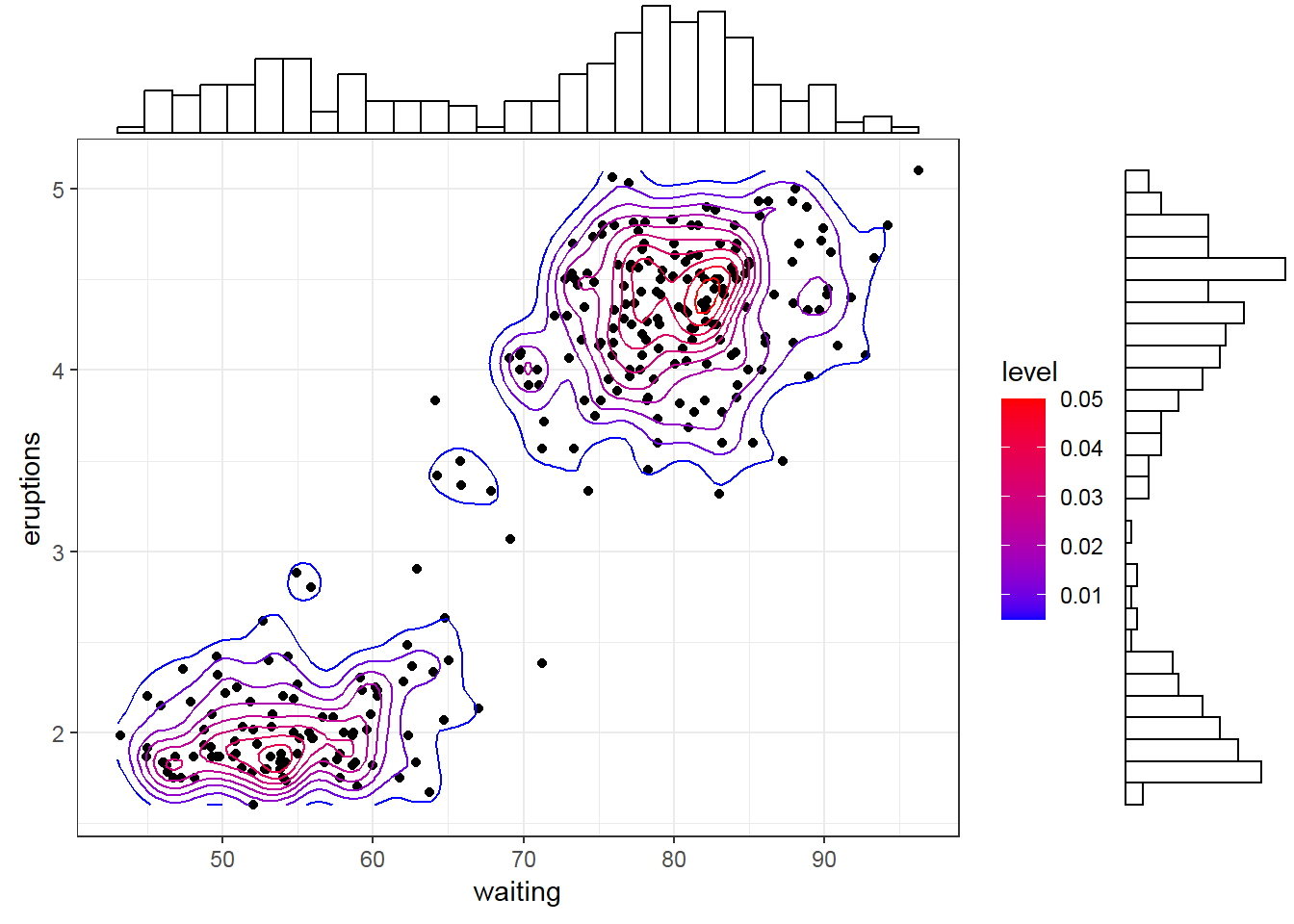
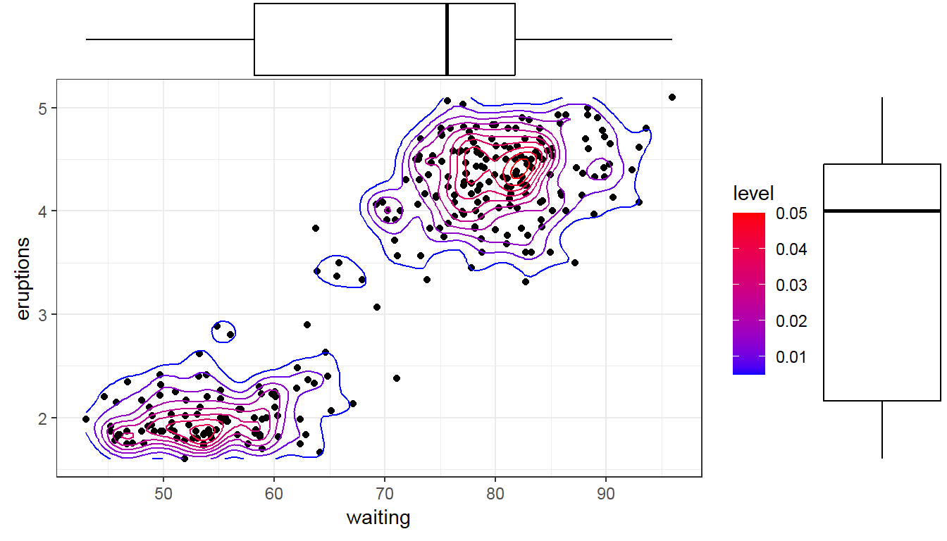
- Marginal histogram/ box plot
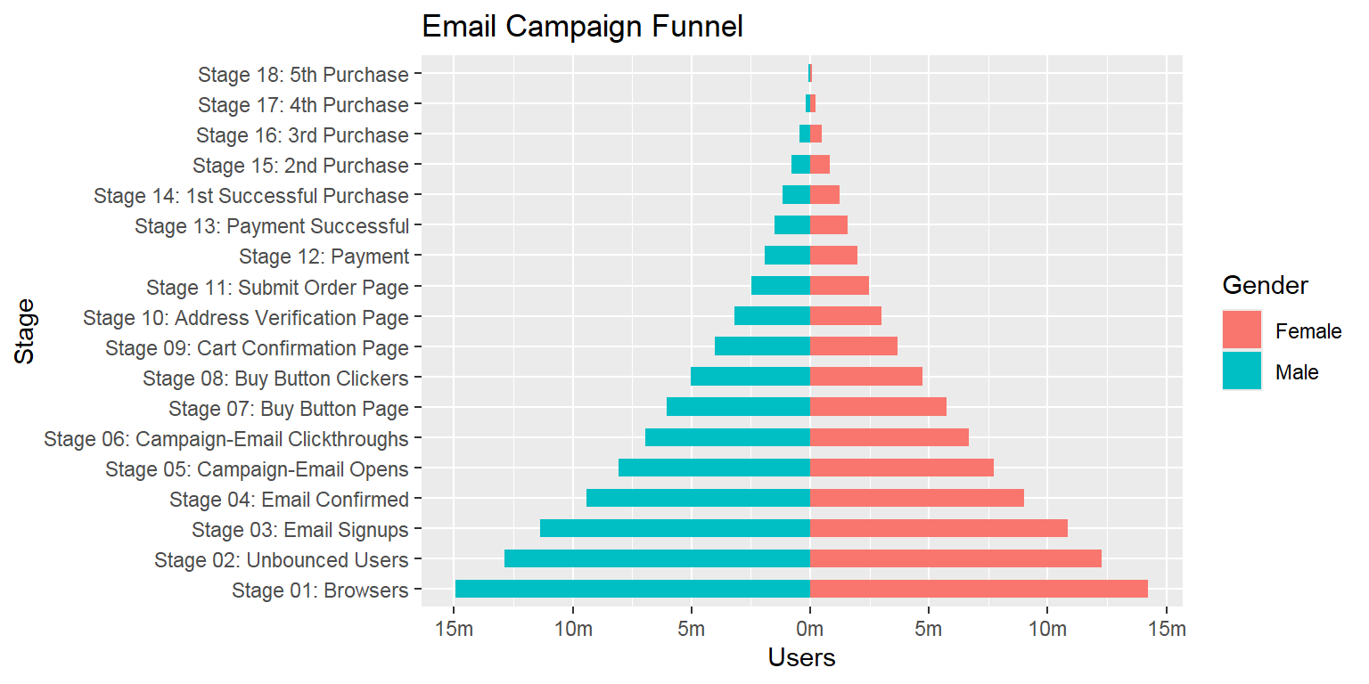
- Population pyramid
- Within 1 variable:
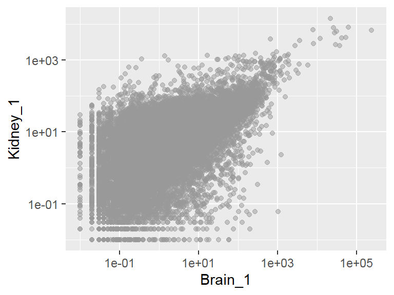
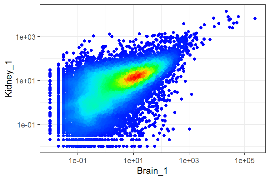
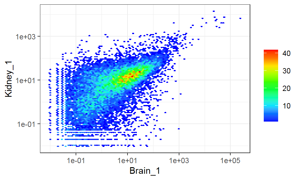
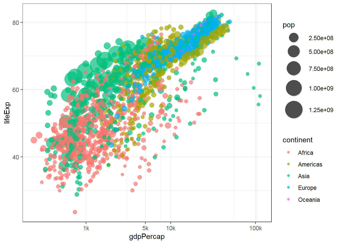
Deal with large number of observations
- Binned scatter
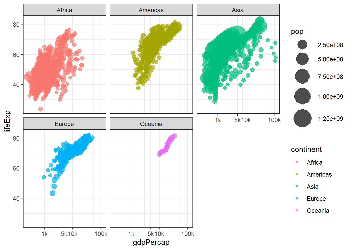
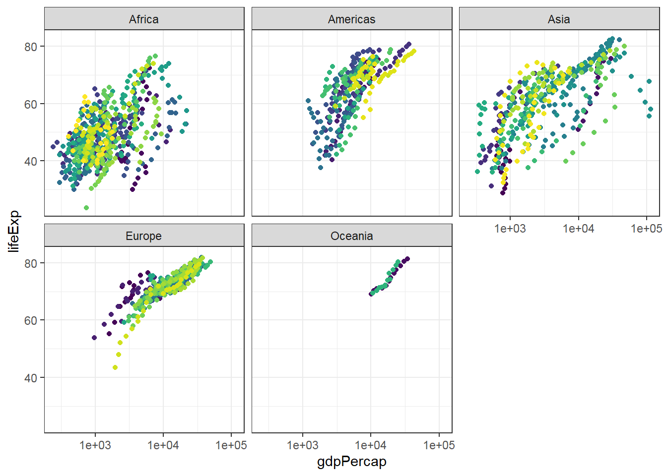
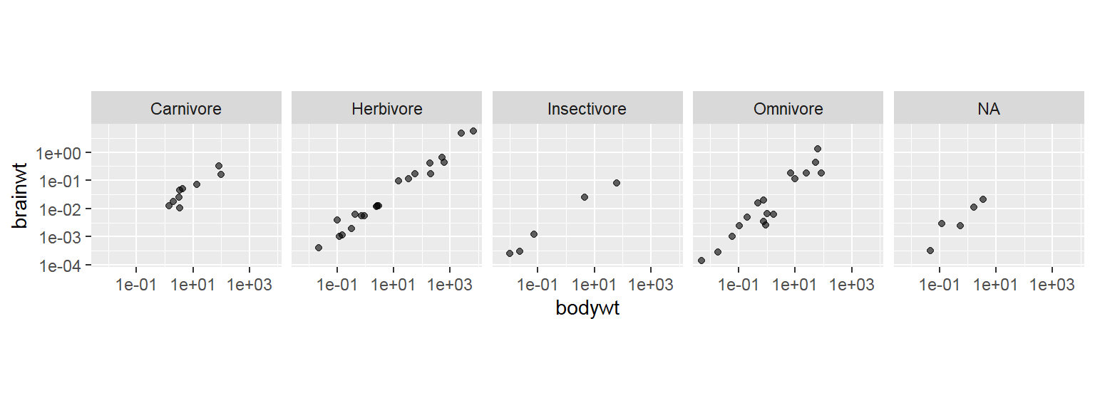
Deal with multi-dimensional data
- Feature projection/ Manifold learning >> high-dimensional
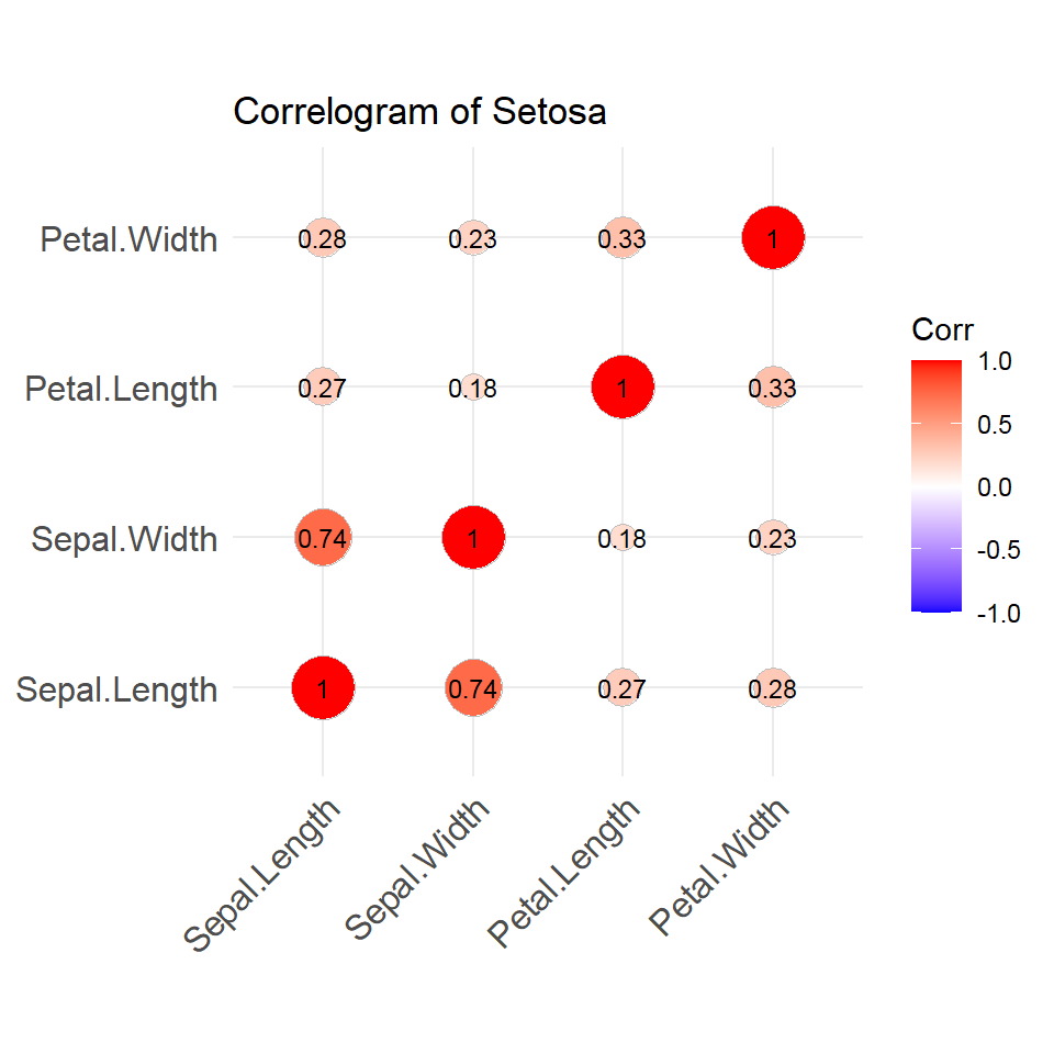
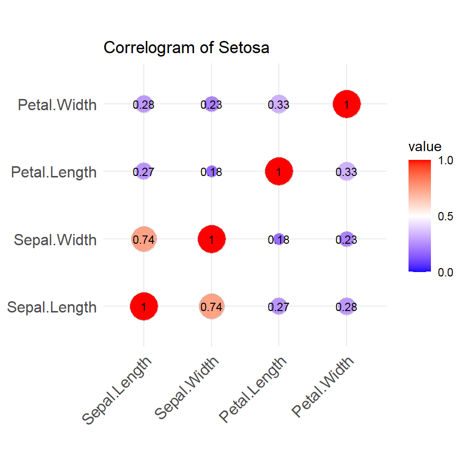
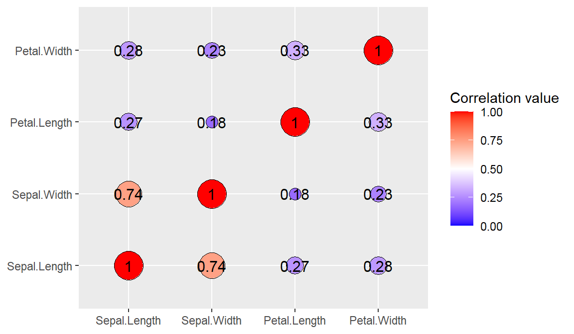
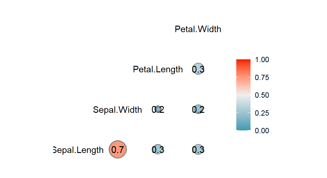
- Correlogram
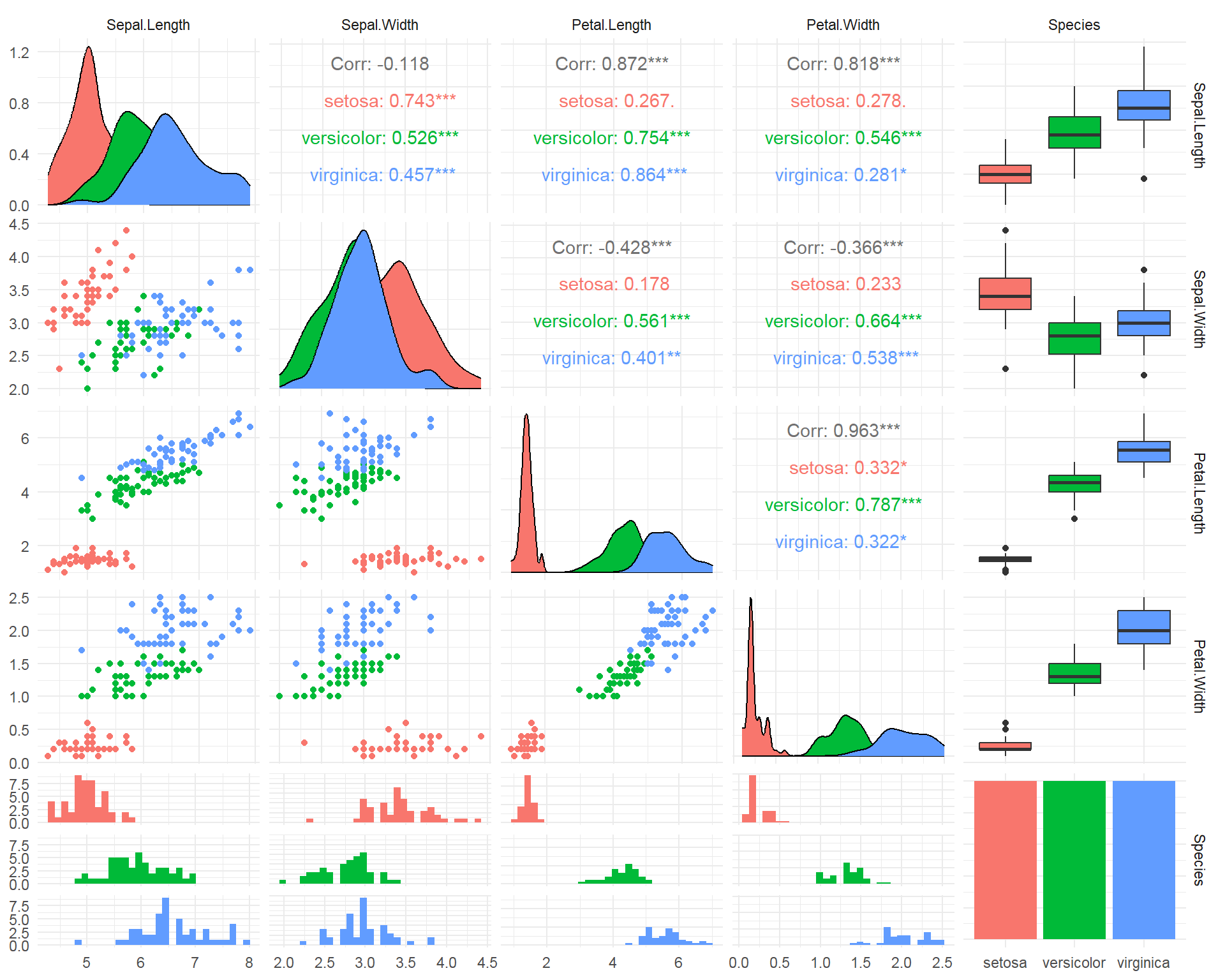
- SPLOM - Scatter PLOt Matrix
Map
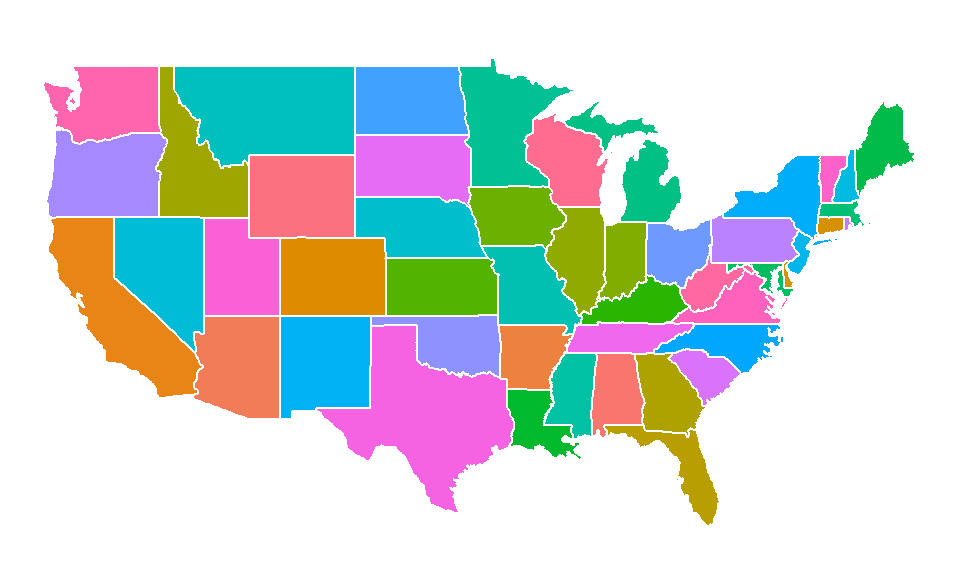
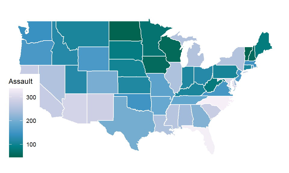
- Chorophleth
Animation
Honorable mentions
plotly
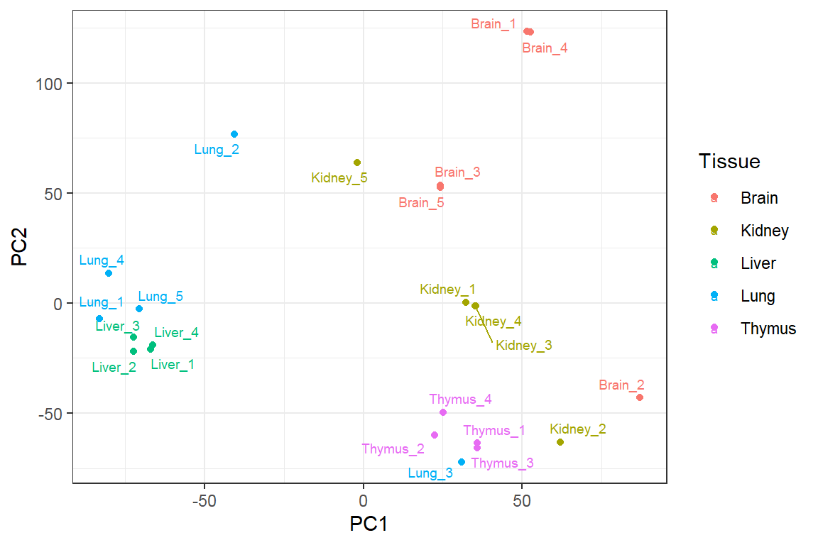
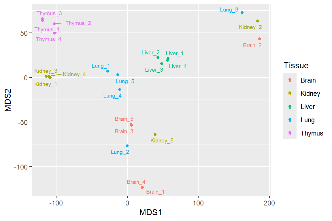
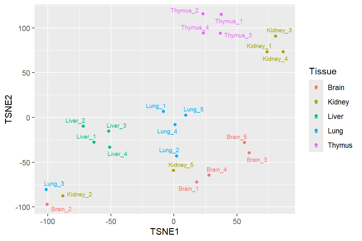
Feature projection/ Manifold learning
Principal Component Analysis
Multidimensional scaling
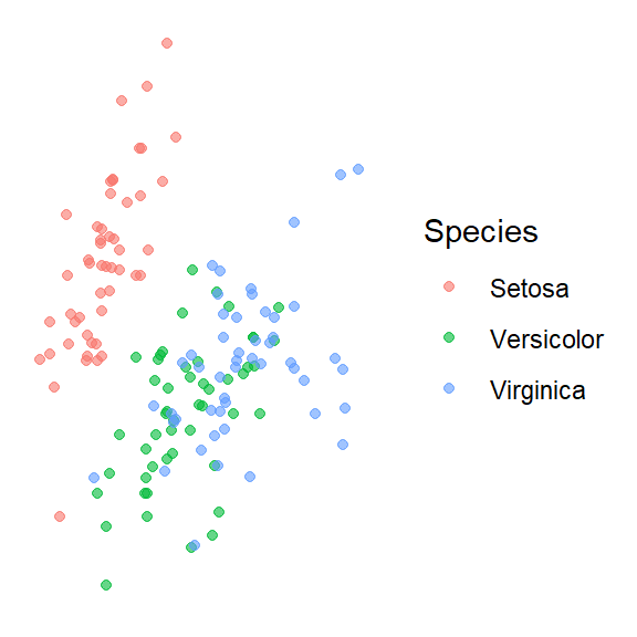
t-distributed stochastic neighbor embedding (t-SNE)
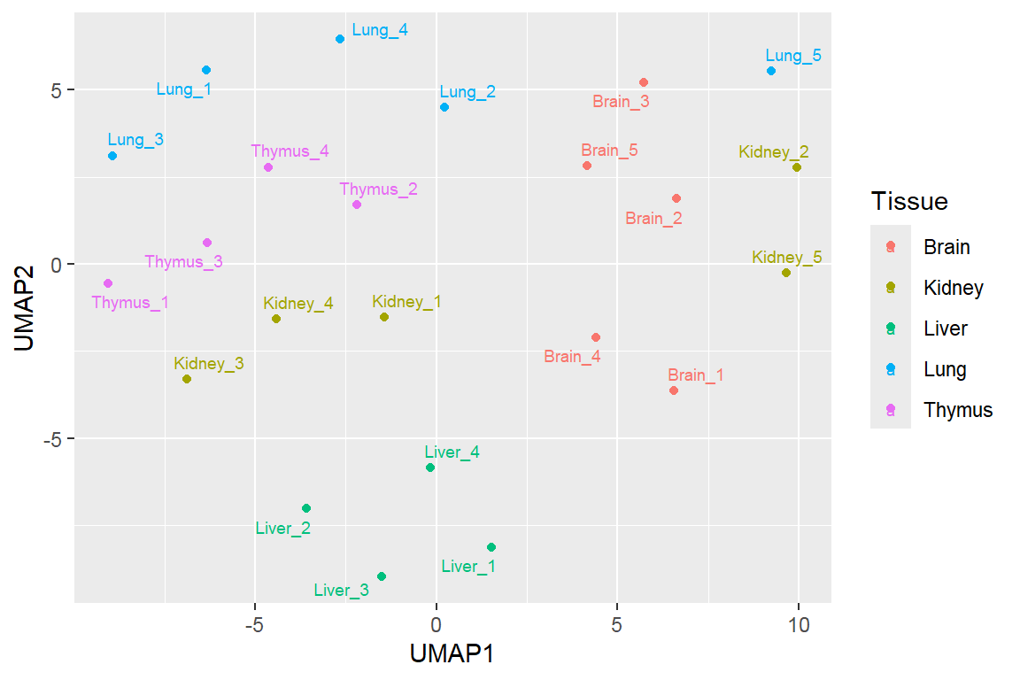
Uniform manifold approximation and projection (UMAP)
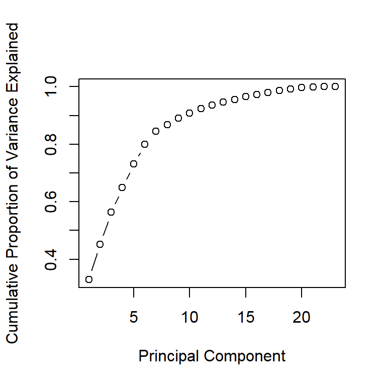
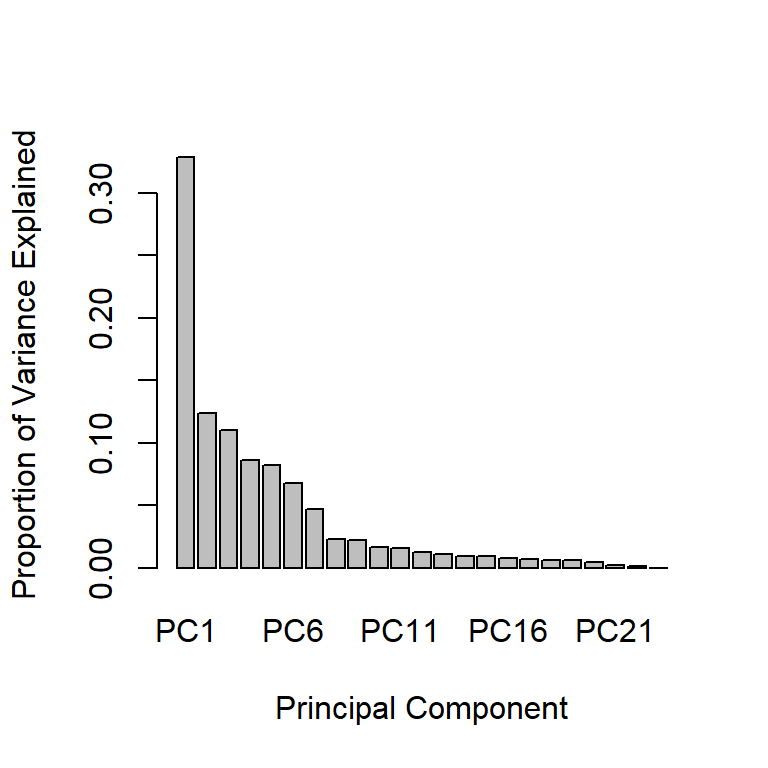 - In addition to the individual variance explained plots, also the cumulative variance explained is frequently looked at.