Chapter 5 Vector Geospatial Data
Until now, this book has focused on non-spatial tabular datasets. This chapter will make the shift to processing and visualizing vector geospatial data. Vector data consists of features that represent geographic phenomena. Points can be used to represent small objects such as wells, weather stations, or field plot locations. Lines represent one-dimensional linear features such as roads and streams. Polygons represent two-dimensional natural features such as lakes, vegetation patches, and burn scars as well as administrative units such as counties, districts, and counties. The type of geometry used to represent a particular feature may depend on the scale of the measurement. Points can be used to represent city locations at a continental scale, whereas a polygon would be used to map the boundary of an individual city.
Each feature in a vector dataset is described by a set of spatial coordinates and one or more attributes that characterize the feature. For example, a vector dataset of forest stands would include the vertices of each stand boundary polygon as well an attribute table containing variables such as stand age, tree species abundances, and timber volume for each stand. This book uses the sf package (Pebesma 2022) to work with vector datasets as “simple features” in R. This approach uses data frame objects to store vector data. Each feature is represented by one row in the data frame, with attributes stored as columns and spatial information stored in a special geometry column. This means that we can continue to use the same dplyr and tidyr functions that have already been covered to work with geospatial data. The ggplot2 package can also be used to generate maps from data frames containing geospatial data.
This chapter will use the sf package along with several of the tidyverse packages from the previous chapters and several other packages that contain some helpful graphics functions. If these packages are not already installed, you can install them using the install.packages() function or by selecting Tools > Install Packages in the RStudio menu.
library(sf)
library(rgdal)
library(ggplot2)
library(dplyr)
library(tidyr)
library(scales)
library(RColorBrewer)
library(units)
library(cowplot)
5.1 Importing Geospatial Data
This chapter uses several datasets that characterize the historical distribution of tornadoes in the state of Oklahoma. They are provided in ESRI shapefile format, which was developed several decades ago but remains one of the widely used file formats for vector geospatial data. It is a multiple file format, where separate files contain the feature geometries, attribute table, spatial indices, and coordinate reference system. All files have the same filename with different extensions. The shapefiles are imported to sf objects using the st_read() function. The quiet = FALSE argument suppresses output to the console when importing spatial datasets. To read in a shapefile, it is only necessary to specify the filename with a “.shp” extension. However, all the files, including the “.shp” file as well as the “.dbf”, “.shx”, and “.prj” files, need to be present in the directory from which the data are read. Remember that all of the code in this book is written with the assumption that data are being read from the user’s working directory.
The ok_counties.shp dataset contains county boundaries for the state of Oklahoma. The ok_tornado_point.shp dataset and the ok_tornado_path.shp dataset contain historical information about tornadoes in Oklahoma. The points are the initial locations of tornado touchdown, and the paths are lines that identify the path of each tornado after touchdown. These data were derived from larger, national-level datasets generated by the National Oceanographic and Atmospheric Administration (NOAA) National Weather Service Storm Prediction Center (https://www.spc.noaa.gov/gis/svrgis/).
okcounty <- st_read("ok_counties.shp", quiet = TRUE)
tpoint <- st_read("ok_tornado_point.shp", quiet = TRUE)
tpath <- st_read("ok_tornado_path.shp", quiet = TRUE)
class(okcounty)
## [1] "sf"         "data.frame"
glimpse(okcounty)
## Rows: 77
## Columns: 8
## $ STATEFP  <chr> "40", "40", "40", "40", "40", "40", "40",…
## $ COUNTYFP <chr> "077", "025", "011", "107", "105", "153",…
## $ COUNTYNS <chr> "01101826", "01101800", "01101793", "0110…
## $ AFFGEOID <chr> "0500000US40077", "0500000US40025", "0500…
## $ GEOID    <chr> "40077", "40025", "40011", "40107", "4010…
## $ NAME     <chr> "Latimer", "Cimarron", "Blaine", "Okfuske…
## $ LSAD     <chr> "06", "06", "06", "06", "06", "06", "06",…
## $ geometry <POLYGON [°]> POLYGON ((-95.50766 35.0292..., P…
The sf objects contain a column called geometry. This is a special column that contains the geospatial information about the location of each feature. This column should not be modified directly. It is used by the functions in the sf package for geospatial data processing.
An older package that is still frequently used for working with geospatial data in R is sp. This package has been around for much longer than sf, and there are a number of other R packages that work with geospatial data objects defined in sp. Therefore, it is sometimes necessary to convert geospatial data between these two object classes. The following examples show how to convert okcounty into an sp SpatialPolygonsDataFrame object and then back to an sf object.
okcounty_sp <- as(okcounty, 'Spatial')
class(okcounty_sp)
## [1] "SpatialPolygonsDataFrame"
## attr(,"package")
## [1] "sp"
okcounty_sf <- st_as_sf(okcounty_sp)
class(okcounty_sf)
## [1] "sf"         "data.frame"
5.2 Creating Simple Maps
To generate a map of counties using ggplot() with a sf object, the geom_sf() function is used. This map shows the borders of all counties in Oklahoma. No plot aesthetics are specified, and fill = NA makes the counties transparent. The map is displayed over the default gray background, and graticules of longitude and latitude are shown and labeled. (Figure 5.1).
ggplot(data = okcounty) +
  geom_sf(fill = NA)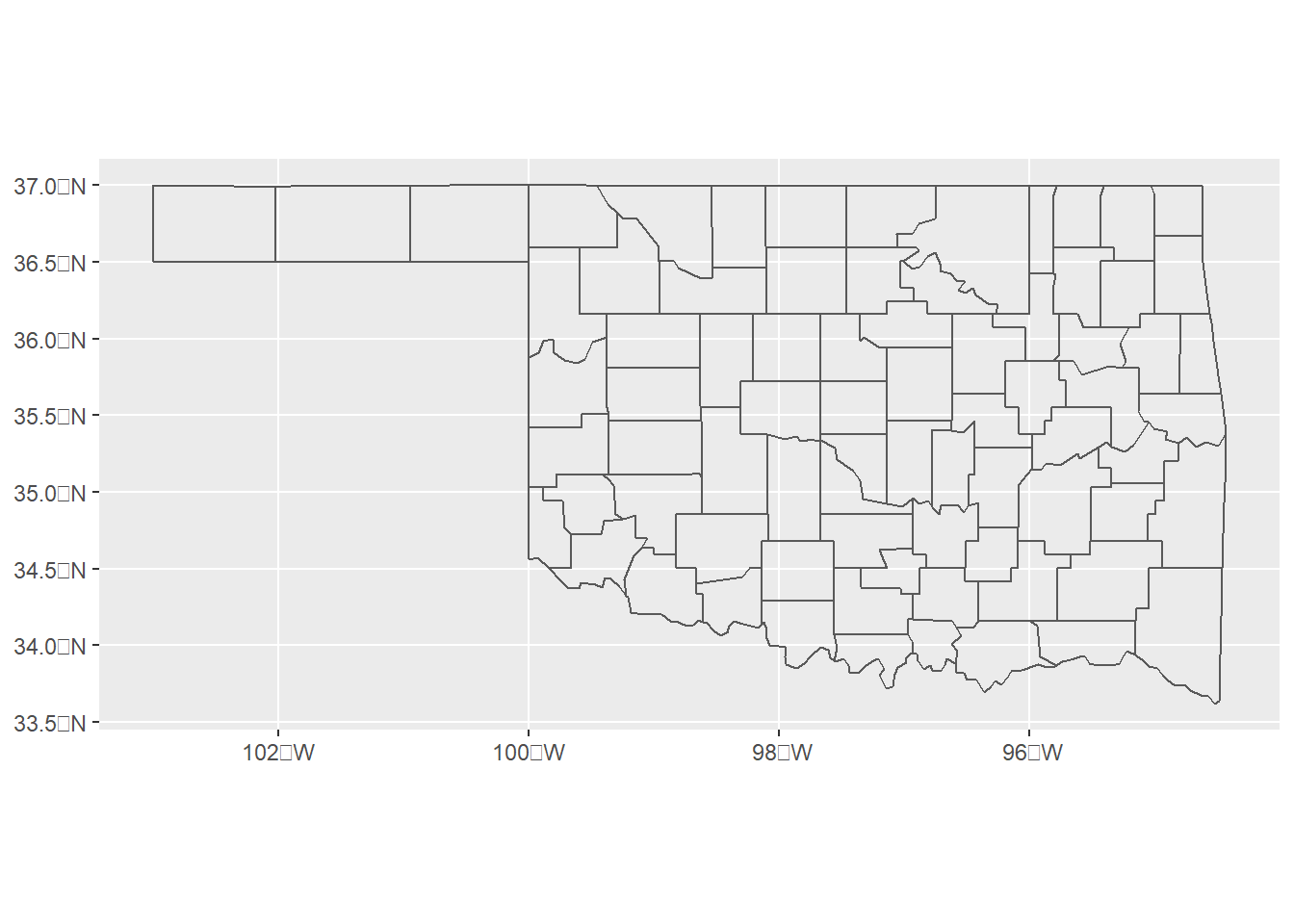
FIGURE 5.1: Oklahoma county boundaries.
The tornado dataset contains data from 1950-2021. If the objective is to map tornadoes for only recent years, then the sf object needs to be modified to contain only the desired years. Because sf objects are a type of data frame, they can be modified using the dplyr functions that were covered in Chapter 3. The tornado data include a number of columns with information on the timing, locations, and effects of the tornadoes.
names(tpoint)
##  [1] "om"       "yr"       "mo"       "dy"       "date"
##  [6] "time"     "tz"       "st"       "stf"      "stn"
## [11] "mag"      "inj"      "fat"      "loss"     "closs"
## [16] "slat"     "slon"     "elat"     "elon"     "len"
## [21] "wid"      "fc"       "geometry"
The yr column indicates the year of each tornado and can be used to filter the data to a smaller year range from 2016-2021. This column is retained in the output along with om, a unique ID code, and date, the date of each tornado.
tpoint_16_21 <- tpoint %>%
  filter(yr >= 2016 & yr <= 2021) %>%
  select(om, yr, date)
tpath_16_21 <- tpath %>%
  filter(yr >= 2016 & yr <= 2021) %>%
  select(om, yr, date)
Now, the tornado points and paths can be mapped. Two geom_sf() functions are used, one to map the county boundaries and another to map the tornadoes. Because each function maps a different dataset, the data argument must be provided in each geom_sf() function instead of in the ggplot() function. The theme_bw() function is also used to display the map over a white background while retaining the graticules (Figure 5.2).
ggplot() +
  geom_sf(data = okcounty, fill = NA) +
  geom_sf(data = tpoint_16_21) +
  theme_bw()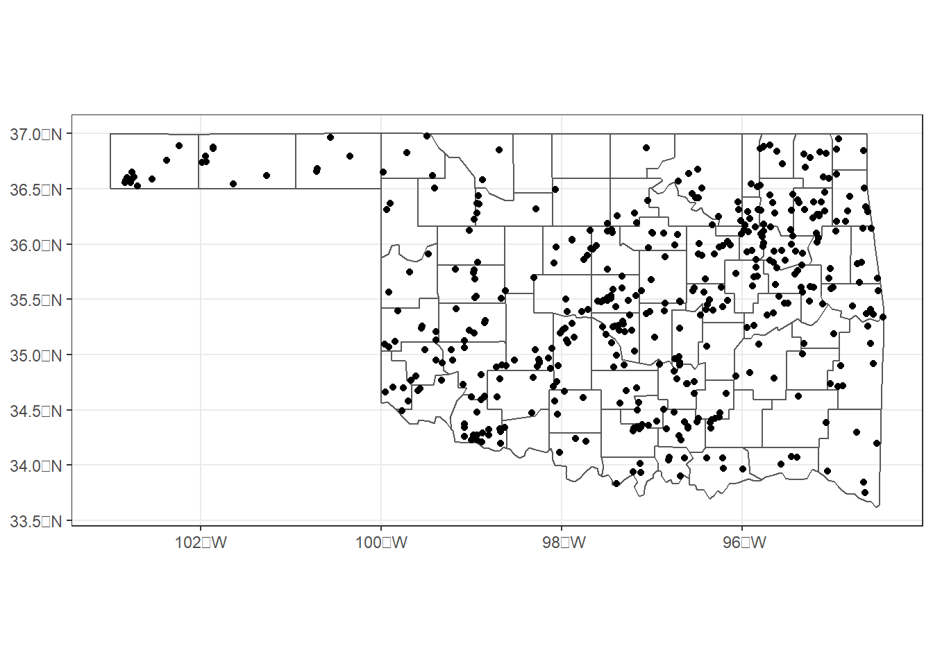
FIGURE 5.2: Initiation points of tornadoes in Oklahoma from 2016-2021.
To make the tornado path lines easier to see in relation to the county boundaries, they are displayed in red and their sizes are increased to be larger than the default line width of 0.5 (Figure 5.3).
ggplot() +
  geom_sf(data = okcounty, fill = NA) +
  geom_sf(data = tpath_16_21,
          color = "red",
          size = 1) +
  theme_bw()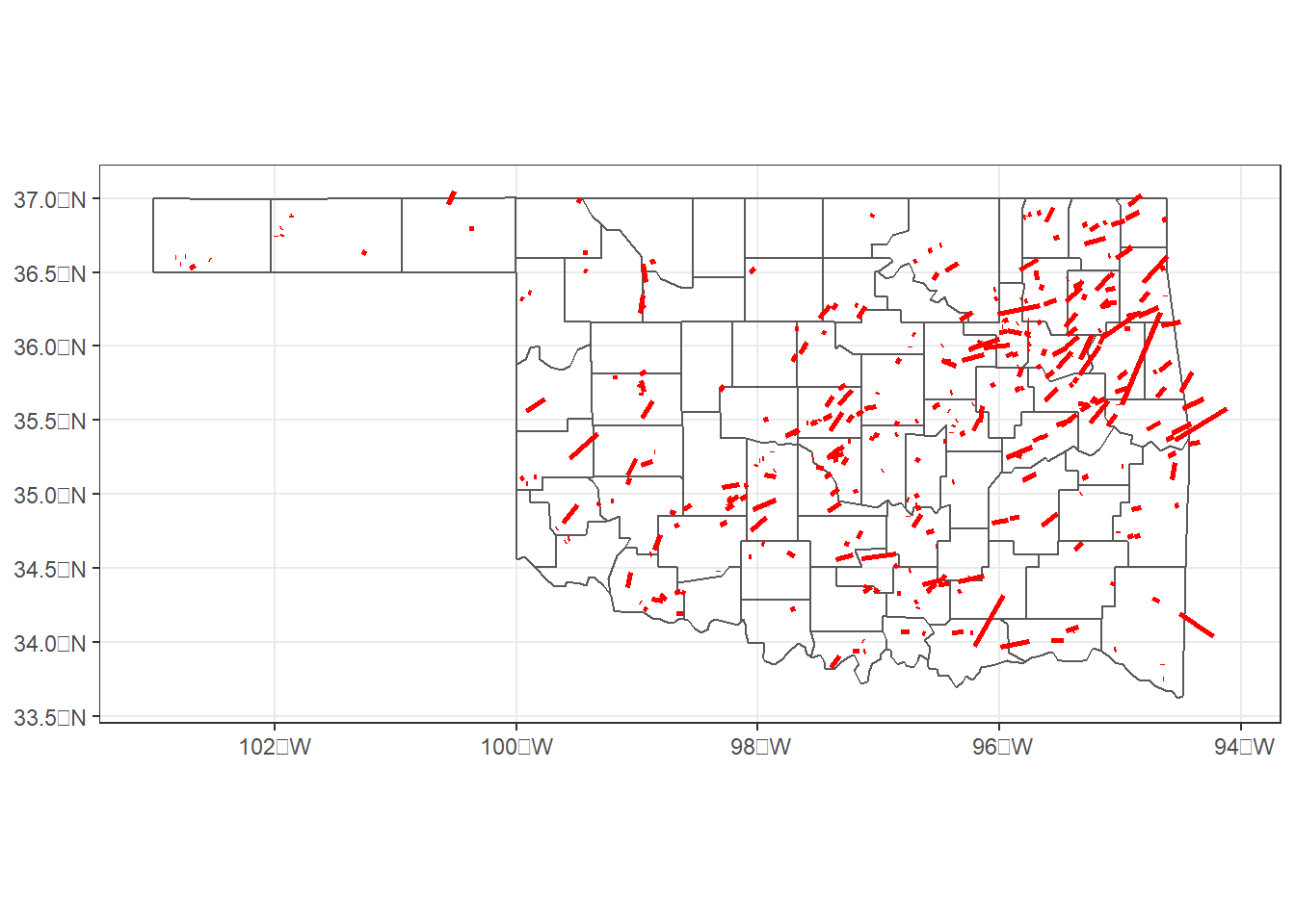
FIGURE 5.3: Paths of tornadoes in Oklahoma from 2016-2021.
To view the years of the tornadoes on the map, an aesthetic can be specified. The color argument is specified as as.factor(yr) so that the year is displayed as a discrete variable instead of a continuous variable. The scale_color_discrete() function is then used to set the legend name. The theme_void() function removes the plot axes and labels and shows only the map (Figure 5.4).
ggplot() +
  geom_sf(data = tpoint_16_21,
          aes(color = as.factor(yr))) +
  geom_sf(data = okcounty, fill = NA) +
  scale_color_discrete(name = "Year") +
  coord_sf(datum = NA) +
  theme_void()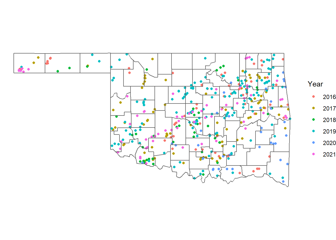
FIGURE 5.4: Initiation points of tornadoes in Oklahoma from 2016-2021 with years represented by the color aesthetic.
Alternately, facet_wrap() can be used to display the tornadoes for each year on a separate map. The sizes of the points are reduced slightly so that they are easier to see on the smaller maps (Figure 5.5).
ggplot() +
  geom_sf(data = okcounty,
          fill = NA,
          color = "gray") +
  geom_sf(data = tpoint_16_21, size = 0.75) +
  facet_wrap(vars(yr), ncol = 2) +
  coord_sf(datum = NA) +
  theme_void()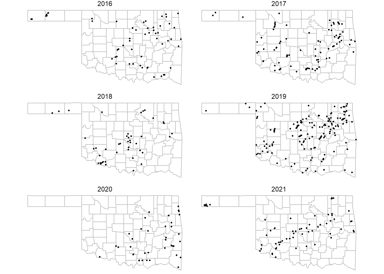
FIGURE 5.5: Initiation points of tornadoes in Oklahoma from 2016-2021 with years mapped as separate facets.
5.3 Overlaying Vector Datasets
The number of tornado points in each county can be calculated using the st_join() function to carry out a spatial join. This is different from the join functions covered in Chapter 3 in that st_join() links rows from the two tables based on the spatial locations instead of their attributes. Afterward, each row in countypnt contains additional columns from the okcounty dataset that correspond to the county that the tornado is within.
countypnt <- st_join(tpoint_16_21, okcounty)
glimpse(countypnt)
## Rows: 434
## Columns: 11
## $ om       <dbl> 613662, 613675, 613676, 613677, 613678, 6…
## $ yr       <dbl> 2016, 2016, 2016, 2016, 2016, 2016, 2016,…
## $ date     <chr> "2016-03-23", "2016-03-30", "2016-03-30",…
## $ STATEFP  <chr> "40", "40", "40", "40", "40", "40", "40",…
## $ COUNTYFP <chr> "001", "113", "105", "131", "035", "139",…
## $ COUNTYNS <chr> "01101788", "01101844", "01101840", "0110…
## $ AFFGEOID <chr> "0500000US40001", "0500000US40113", "0500…
## $ GEOID    <chr> "40001", "40113", "40105", "40131", "4003…
## $ NAME     <chr> "Adair", "Osage", "Nowata", "Rogers", "Cr…
## $ LSAD     <chr> "06", "06", "06", "06", "06", "06", "06",…
## $ geometry <POINT [°]> POINT (-94.5042 35.6916), POINT (-9…
The joined data frame still contains one record for each tornado. To compute the total number of tornadoes per county, countypnt must be grouped by the GEOID county code. Then, the numbers of tornadoes in each county can be calculated using summarize() with the n() function to count the records in each group. Before grouping and summarizing, countypnt must be converted from an sf object to a normal data frame using st_drop_geometry().
countypnt <- st_drop_geometry(countypnt)
countysum <- countypnt %>%
  group_by(GEOID) %>%
  summarize(tcnt = n())
glimpse(countysum)
## Rows: 75
## Columns: 2
## $ GEOID <chr> "40001", "40005", "40007", "40009", "40011",…
## $ tcnt  <int> 6, 3, 4, 8, 1, 4, 10, 5, 7, 5, 3, 12, 10, 5,…
Next, okcounty is joined to countysum so that each polygon is associated with the appropriate tornado summary. Using left_join() instead of inner_join() ensures that all of the county polygons are retained in the output of the join. A few counties that had no tornadoes during 2016-2021 are missing from countysum, and therefore have NA values in the joined table. In this case, we know that NA means zero tornadoes, so the NA values are replaced by zeroes. The mutate() function computes the area of each county using st_area() and then calculates the density of tornadoes per county. Density is initially in tornadoes per square meter, but is converted to tornadoes per 1000 km2. The st_area() function returns a column with explicit measurement units, but these are removed using the drop_units() function for simplicity. For more information about measurement units, consult the documentation of the units package (Pebesma et al. 2022).
countymap <- okcounty %>%
  left_join(countysum, by = "GEOID") %>%
  replace(is.na(.), 0) %>%
  mutate(area = st_area(okcounty),
         tdens = 10^6 * 10^3 * tcnt / area) %>%
  drop_units()
glimpse(countymap)
## Rows: 77
## Columns: 11
## $ STATEFP  <chr> "40", "40", "40", "40", "40", "40", "40",…
## $ COUNTYFP <chr> "077", "025", "011", "107", "105", "153",…
## $ COUNTYNS <chr> "01101826", "01101800", "01101793", "0110…
## $ AFFGEOID <chr> "0500000US40077", "0500000US40025", "0500…
## $ GEOID    <chr> "40077", "40025", "40011", "40107", "4010…
## $ NAME     <chr> "Latimer", "Cimarron", "Blaine", "Okfuske…
## $ LSAD     <chr> "06", "06", "06", "06", "06", "06", "06",…
## $ tcnt     <dbl> 1, 12, 1, 10, 6, 2, 6, 0, 4, 9, 3, 10, 12…
## $ geometry <POLYGON [°]> POLYGON ((-95.50766 35.0292..., P…
## $ area     <dbl> 1890663261, 4766283042, 2427121029, 16572…
## $ tdens    <dbl> 0.5289149, 2.5176851, 0.4120108, 6.034094…
The st_write() function can be used to save sf objects to a variety of file formats. In many cases, the function can determine the output format from the output filename extension. The following code saves the county-level tornado summaries in ESRI shapefile format. The append = FALSE option overwrites the shapefile if it already exists.
st_write(countymap,
         dsn = "oktornadosum.shp",
         append = FALSE)
An alternative format for storing geospatial data is the Open Geospatial Consortium (OGC) GeoPackage. The data are stored in a SQLite database that may contain one or more layers. In this example, the delete_dsn = TRUE argument overwrites the entire GeoPackage. Leaving this argument at its default value of FALSE would add a new layer to an existing database.
st_write(countymap,
         dsn = "oktornado.gpkg",
         layer = "countysum",
         delete_dsn = TRUE)
Another commonly-used open geospatial data format is GeoJSON. It is based on Javascript Object Notation (JSON), a human-readable text format that stores data in ASCII files. The layer_options argument must be set to "RFC7946 = YES" to save the data in the newest GeoJSON specification.
st_write(countymap, "oktornado.geojson",
         layer_options = "RFC7946 = YES")
5.4 Choropleth Maps
Another way to display the tornadoes is as a choropleth map, where summary statistics for each county are displayed as different colors. The county-level tornado density can be as a choropleth using the fill aesthetic with geom_sf(). By default, the fill colors are based on a dark-to-light blue color ramp. The theme_void() function eliminates the axes and graticules and displays only the map on a white background (Figure 5.6).
ggplot(data = countymap) +
  geom_sf(aes(fill = tdens)) +
  theme_void()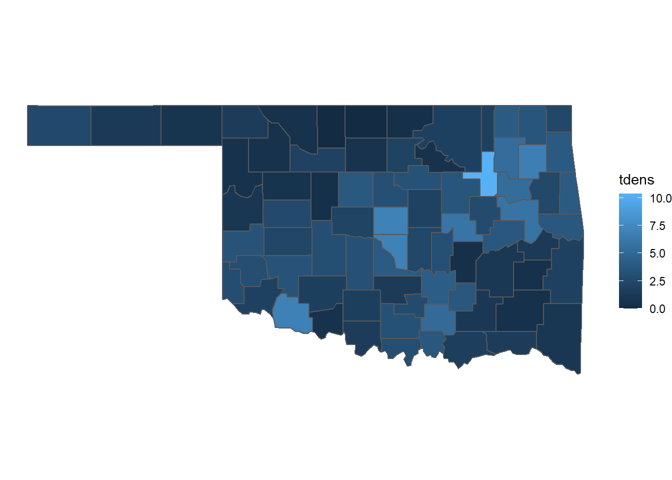
FIGURE 5.6: Densities of tornadoes in Oklahoma counties from 2016-2021 mapped as a choropleth.
In general, choropleth maps are most effective when mapping rates, such as the density of tornadoes per area or the prevalence of a disease per number of people. In some cases, it is necessary to map count data such as the number of tornadoes or disease cases in each county. People tend to naturally associate sizes with quantitie when viewing maps, and displaying the counts as graduated symbols is often an effective approach.
To map symbols, the county polygons must first be converted to points. The st_centroid() generates a point feature located at the centroid of each county. The st_geometry_type() function returns the feature geometry type. Setting by_geometry = FALSE returns one geometry type for the entire dataset instead of for every feature.
st_geometry_type(okcounty, by_geometry=FALSE)
## [1] POLYGON
## 18 Levels: GEOMETRY POINT LINESTRING POLYGON ... TRIANGLE
okcntrd = st_centroid(countymap)
st_geometry_type(okcntrd, by_geometry = FALSE)
## [1] POINT
## 18 Levels: GEOMETRY POINT LINESTRING POLYGON ... TRIANGLE
The tornado counts can be mapped using the okcentrd dataset with the size aesthetic. One point is plotted for each county centroid, and the size of the point is proportional to the number of tornadoes in the county (Figure 5.7).
ggplot() +
  geom_sf(data = okcntrd, aes(size = tcnt)) +
  geom_sf(data = okcounty, fill = NA) +
  theme_void()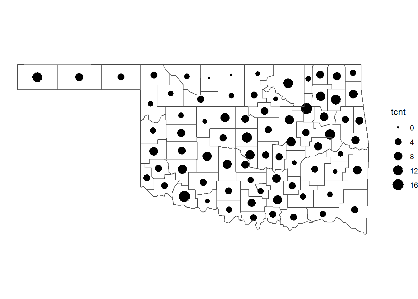
FIGURE 5.7: Numbers of tornadoes in Oklahoma counties from 2016-2021 mapped as graduated symbols.
5.5 Modifying the Appearance of the Map
Additional ggplot2 functions can be added to improve the appearance of the map. The scale_fill_distiller() function allows the specification of a different color ramp. This example uses the “YlOrRd” palette from the RColorBrewer package. The pretty_breaks() function from the scales package is used to automatically select a set of breaks for the legend. The legend is moved to the bottom of the map to better accomodate the longer legend title (Figure 5.8).
Note that using a “complete” theme like theme_void() will remove any settings made by a previous theme() function. Therefore, it is necessary to call theme_void() before theme() in the ggplot() call to implement the combined settings. Also, note how the expression() function is used in specifying the name argument for scale_fill_distiller() to combine text with a superscript.
ggplot(data = countymap) +
  geom_sf(aes(fill = tdens)) +
  scale_fill_distiller(name = expression("Tornadoes/1000 km"^2),
                       palette = "YlOrRd",
                       breaks = pretty_breaks(),
                       direction = 1) +
  theme_void() +
  theme(legend.position = "bottom")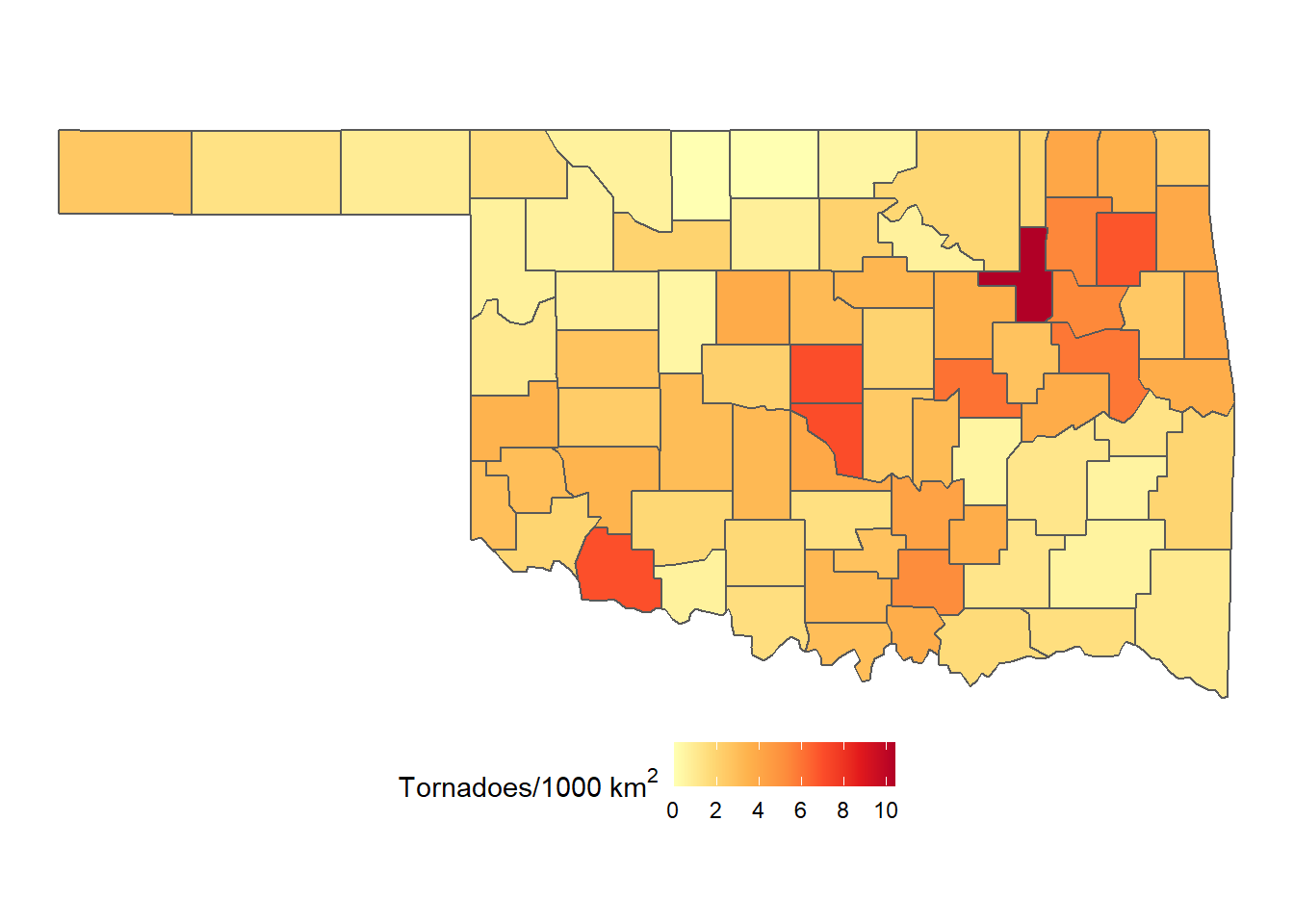
FIGURE 5.8: Densities of tornadoes in Oklahoma counties from 2016-2021 mapped as a choropleth with a custom palette.
The RColorBrewer package provides a selection of palettes designed for choropleth mapping (Harrower and Brewer 2003). The display_brewer_all() function generates a chart with examples of all the available palettes (Figure 5.9).
display.brewer.all()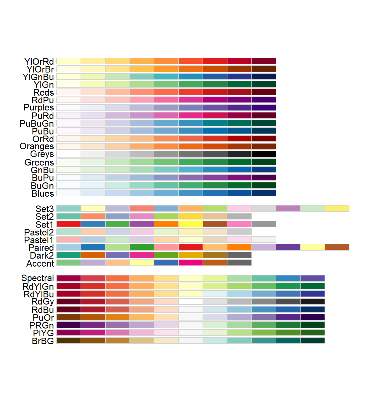
FIGURE 5.9: All the palettes available in the RColorBrewer package.
There are three types of ColorBrewer palettes. The top group is Figure 5.9 contains sequential palettes that are suitable for mapping ordered data along numerical scales (e.g., temperatures ranging from 0 to 30 degrees C) or ordinal categories (e.g., temperatures classified as cold, warm, and hot). These sequential palettes may include a single color or multiple colors, but have no clear breaks in the scale. The middle group in Figure 5.9 contains qualitative palettes, which use color to distinguish between different categories without implying order. The lower group in Figure 5.9 contains divergent palettes that emphasize a specific breakpoint in the data. Divergent palettes are often used to indicate values that are above or below the mean or to highlight values that are higher or lower than zero. More details about these palettes, including recommendations for color schemes that are most effective for different types of computer displays and for accommodating color-blind viewers, are available at http://colorbrewer2.org.
The ColorBrewer palettes each contain a finite number of colors that are intended to be associated with categories in a choropleth map. Note that the scale_fill_distiller() function used to generate the color scale for the map in Figure 5.8 operates a bit differently. This function takes a ColorBrewer palette and converts it to a continuous color ramp. The next map example will show how to define categories and map each one as a distinctive color. To view the colors for a given number of categories and a specific palette, the display.brewer.pal() function is used with the number of categories as the first argument and the palette name as the second palette (Figure 5.10).
display.brewer.pal(5, "YlGnBu")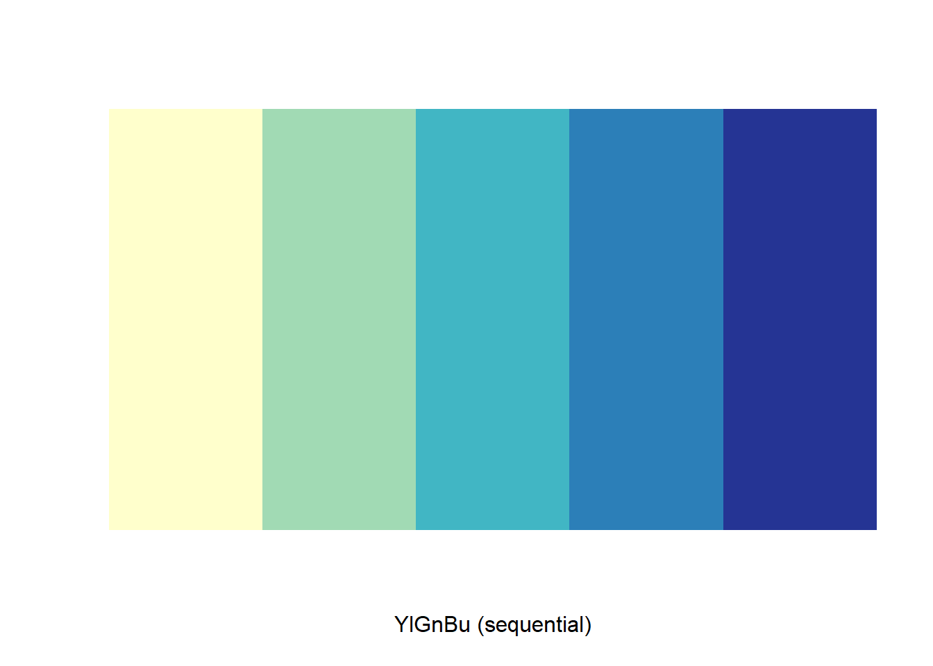
FIGURE 5.10: The ColorBrewer yellow-green-blue color palette with five categories.
Rather than using continuous scales for color and size, it is often recommended to aggregate the data into a small number of classes (typically 3-6). Using discrete classes makes it easier to associate each color or symbol in the map with a specific range of values. To accomplish this step, we need to add a couple of new classified variables using mutate(). The cut() function is used to split the continuous variables based on user-specified breaks. The incidence variable is split based on quantiles (i.e., percentiles) defined in the qbrks object. The population breaks are manually specified.
numclas <- 4
qbrks <- seq(0, 1, length.out = numclas + 1)
qbrks
## [1] 0.00 0.25 0.50 0.75 1.00
countymap <- countymap %>%
  mutate(tdens_c1 = cut(tdens,
                        breaks = quantile(tdens, breaks = qbrks),
                        include.lowest = T))
The new tdens_c1 column is a discrete factor instead of a continuous numerical variable as in the previous example. As a result, the scale_fill_brewer() function is now used instead of scale_fill_distiller(). The comma-separated numbers specify the range of tornado densities for each of the categories (Figure 5.11).
ggplot(data = countymap) +
  geom_sf(aes(fill = tdens_c1)) +
  scale_fill_brewer(name = expression("Tornadoes/1000 km"^2),
                    palette = "YlOrRd") +
  theme_void() +
theme(legend.position = "bottom") 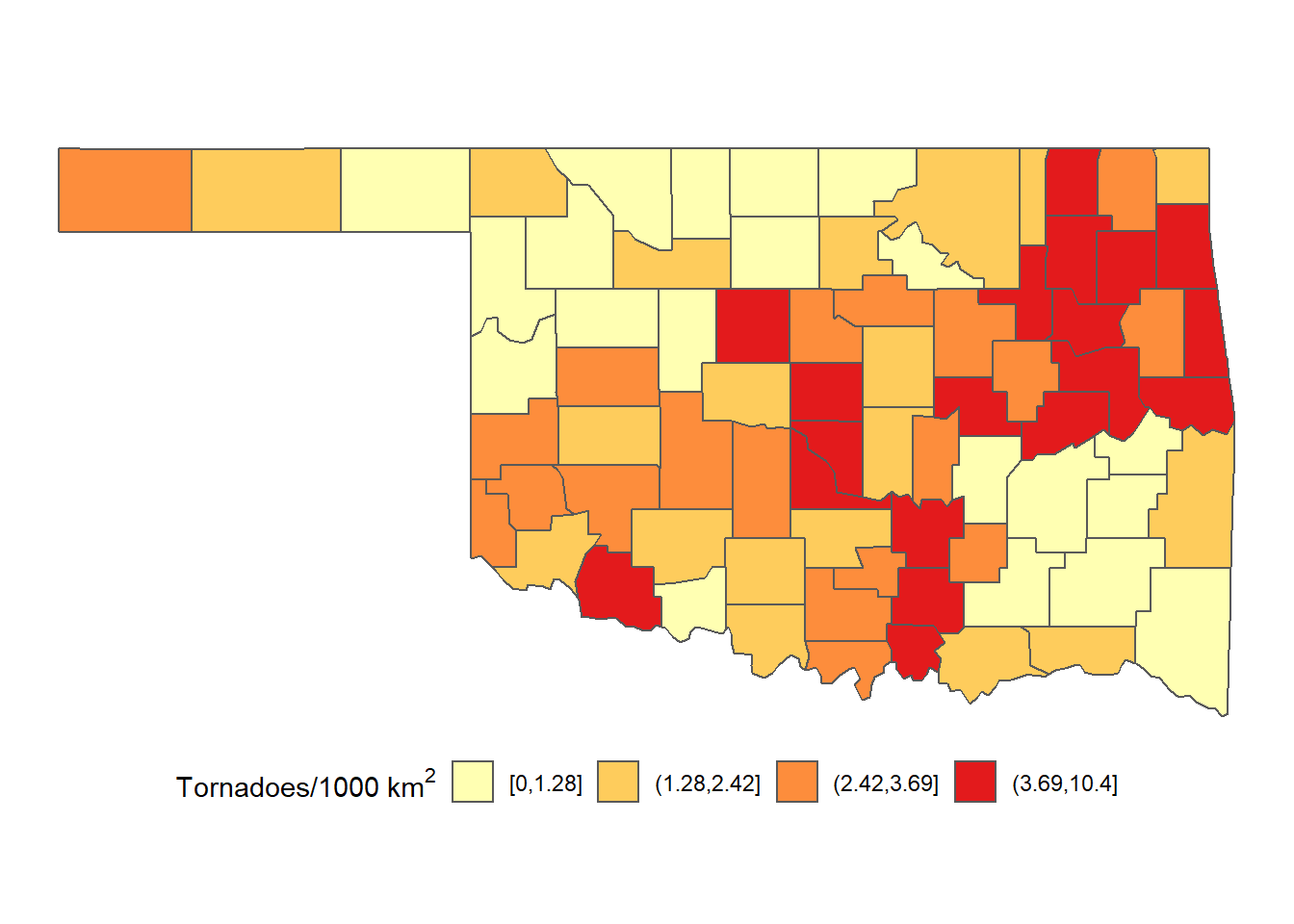
FIGURE 5.11: Densities of tornadoes in Oklahoma counties from 2016-2021 mapped as a choropleth with four categories.
Similar to choropleth maps, graduated symbol maps are often easier to interpret if they include a limited number of symbol sizes. To generate a classified map of tornado counts, they are converted to discrete categories using the cut() function. Instead of using quantiles, the breakpoints for the classification are selected manually and stored in the brkpts vector.
maxcnt <- max(okcntrd$tcnt)
brkpts <- c(0, 2, 5, 10, maxcnt)
okcntrd <- okcntrd %>%
  mutate(tcnt_c1 = cut(tcnt,
                        breaks = brkpts,
                        include.lowest = T))
The resulting map has four symbol sizes, each associated with a specific range of tornado counts (Figure 5.12).
ggplot(data = okcntrd) +
  geom_sf(aes(size = tcnt_c1)) +
  scale_size_discrete(name="Tornadoes") +
  geom_sf(data = okcounty, fill = NA) +
  theme_void() +
  theme(legend.position = "bottom")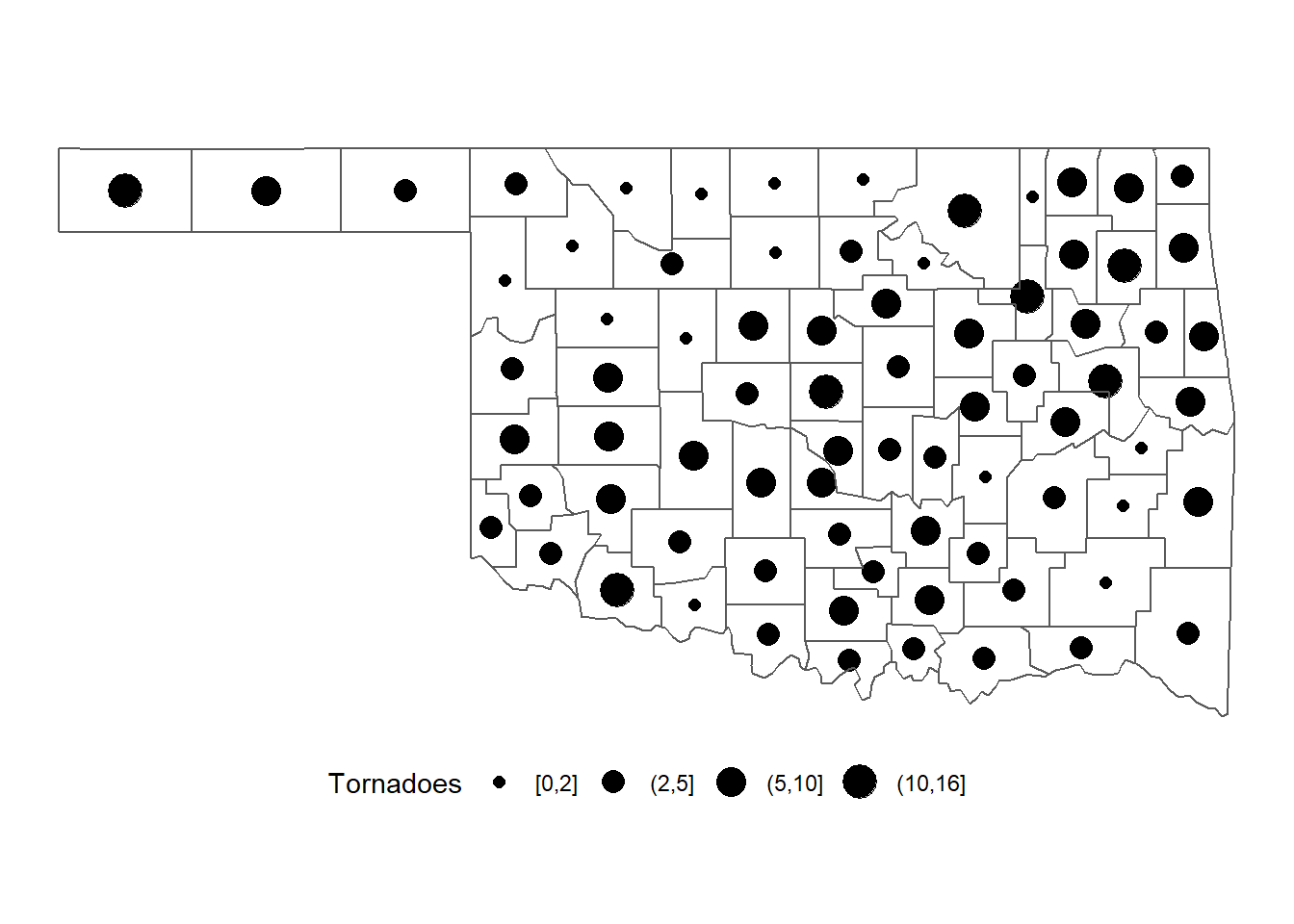
FIGURE 5.12: Numbers of tornadoes in Oklahoma counties from 2016-2021 mapped as graduate symbols with categories.
5.6 Exporting Graphics Output
By default, maps and charts generated using ggplot() are output to the Plots tab in the lower right-hand corner of the RStudio GUI. However, it is often necessary to export maps and other graphics to files and explicitly specify their dimensions and resolution. This is usually the case when generating graphics for publications that must meet specific size and formatting criteria. The simplest way to do this is with the ggsave() function. This example exports the most recent output of ggplot() to a portable network graphics (PNG) file called tornado.png with dimensions of 6 x 4 inches and a resolution of 300 pixels per inch. Other units besides inches can be used by specifying the units argument.
ggsave("tornado.png",
       width = 6,
       height = 4,
       dpi = 300)
ggsave("tornado2.png",
       width = 15,
       height = 10,
       units = "cm",
       dpi = 100)
A variety of graphical file types are supported, including TIFF, JPEG, and PDF files. Note that the arguments vary with the type of file being created. When saving a JPEG, the quality option can be specified. When saving a TIFF, a compression type can be specified. When saving a PDF, the dpi argument is ignored.
ggsave("tornado.jpeg",
       width = 6,
       height = 4,
       dpi = 300,
       quality = 90)
ggsave("tornado.tiff",
       width = 6,
       height = 4,
       dpi = 300,
       compression = "lzw")
ggsave("tornado.pdf",
       width = 6,
       height = 4)
The output of ggplot() can also be saved as an R object that can be output to graphics files using ggsave(). The plot argument is used to specify the ggplot object to be saved.
choropleth <- ggplot(data = countymap) +
  geom_sf(aes(fill = tdens_c1)) +
  scale_fill_brewer(name="Density",
                    palette = "YlOrRd") +
  theme_void()

gradsymbol <- ggplot(data = okcntrd) +
  geom_sf(aes(size = tcnt_c1)) +
  scale_size_discrete(name="Count") +
  geom_sf(data = okcounty, fill = NA) +
  theme_void()

ggsave("choropleth.tiff",
       plot = choropleth,
       width = 6,
       height = 4,
       dpi = 300,
       compression = "lzw")

ggsave("gradsymbol.tiff",
       plot = gradsymbol,
       width = 6,
       height = 4,
       dpi = 300,
       compression = "lzw")
Saved graphs and maps can also be combined into a composite figure using the cowplot package (Wilke 2020). The plot_grid() function provides a variety of options for arranging figures in a regular grid. This basic example provides a label for each subplot and specifies additional arguments to plot the maps in a single column, justify the labels, move the labels to the top of each map, and align the maps horizontally and vertically, so they are exactly the same size.
plot_grid(choropleth, gradsymbol,
          labels = c("A) Choropleth Map",
                     "B) Graduated Symbol Map",
                     label_size = 12),
          ncol = 1,
          hjust = 0,
          label_x = 0,
          align = "hv")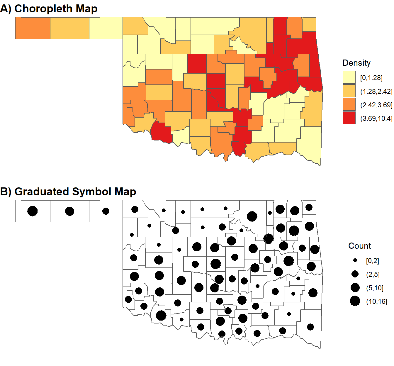
FIGURE 5.13: Mutiple map figure generated with the cowplot package.
A variety of additional resources for working with the sf package can be found at https://r-spatial.github.io/sf/index.html. These include a link to the sf “cheatsheet” as well as a variety of articles, vignettes, and blog posts that provide additional examples of how to work with vector geospatial data using this package. The book Geocomputation with R by Robin Lovelace and others (Lovelace, Nowosad, and Muenchow 2019) is also an excellent reference that encompasses sf as well as many other R packages for working with geospatial data. Look for their forthcoming second edition for the most up-to-date information on geospatial data processing with R.
5.7 Practice
Generate a map of tornado paths where the paths from each year are displayed as a different color, similar to the map of tornado points in Figure 5.4. Create a composite figure containing the map of tornado paths and the map of tornado points using
plot_grid().Summarize the density of tornado points by both county and year and generate a faceted plot that displays maps of county-level tornado density from 2016-2021.
Generate four choropleth maps of tornado density based on quantile breaks with numbers of classes ranging from 3 to 6. Create a composite figure containing the four maps using
plot_grid()and examine how the number of classes changes the interpretation of the map.