Chapter 2 Graphics with ggplot2
This chapter presents fundamentals of data visualization in R using the ggplot2 package. One of R’s strengths is that it empowers a large global community of developers to create and disseminate new functionality through user-contributed packages. As a result, there are many packages that improve on the data manipulation and plotting capabilities included with the base R installation. Each package provides a set of functions with accompanying documentation and datasets. In this chapter, we will begin to explore several packages that are part of the tidyverse collection of data science tools. For simplicity, we will start by working with non-spatial datasets. In upcoming chapters, these techniques will be extended to generate maps and analyze geospatial data.
The library() function is used to load R packages. If these packages are not yet on your computer, you will need to install them using the install.packages() function or the installation tools available in RStudio under Tools > Install Packages.
library(ggplot2)
library(dplyr)
library(readr)
library(readxl)
Nearly every script requires loading one or more packages. Although a package only needs to be installed once, it must be loaded with library() every time a new R session is started. Therefore, it is good practice to include the necessary code at the beginning of the script file. This approach ensures that the packages are loaded at the beginning of your session and makes it easier to see which packages are being used in the script.
The data used in this chapter are meteorological observations from the Oklahoma Mesonet, a network of environmental monitoring stations distributed throughout Oklahoma (https://weather.ok.gov/). The data are provided in a comma-separated values (CSV) file, which can be read and stored as a data frame object using the read_csv() function from the readr package. This function does essentially the same thing as the base read.csv() function that was used in the last tutorial, but has a few added features and is faster for reading large csv files.
mesosm <- read_csv("mesodata_small.csv", show_col_types = FALSE)
class(mesosm)
## [1] "spec_tbl_df" "tbl_df"      "tbl"         "data.frame"
mesosm
## # A tibble: 240 × 9
##    MONTH  YEAR STID   TMAX  TMIN  HMAX  HMIN  RAIN
##    <dbl> <dbl> <chr> <dbl> <dbl> <dbl> <dbl> <dbl>
##  1     1  2014 HOOK   49.5  17.9  83.0  29.0  0.17
##  2     2  2014 HOOK   47.2  17.1  88.3  39.9  0.3
##  3     3  2014 HOOK   60.7  26.1  79.0  25.4  0.31
##  4     4  2014 HOOK   72.4  39.3  81.8  21.0  0.4
##  5     5  2014 HOOK   84.4  48.3  75.4  18.8  1.25
##  6     6  2014 HOOK   90.7  61.9  90.9  28.8  3.18
##  7     7  2014 HOOK   90.6  64.7  88.2  33.1  2.58
##  8     8  2014 HOOK   95.8  64.5  85.4  21.8  0.95
##  9     9  2014 HOOK   84.3  58.0  91.2  36.4  1.48
## 10    10  2014 HOOK   76.1  44.9  85.7  28.1  1.72
## # … with 230 more rows, and 1 more variable: DATE <date>
Note that the mesosm data frame has multiple classes including tbl and tbl_df. It is an enhanced version of a data frame called a tibble that is part of the tidyverse, a collection of R packages for data science. A tibble is identical to a data frame but includes some additional features. For example, the default print method for a tbl object provides an abbreviated view of the first few rows of the data frame rather than trying to print all the data to the screen. In most cases, tbl objects can be used in exactly the same way as data frame objects, and these object types will be treated as synonymous throughout the book.
There are functions in R for importing data from just about any external file type. For example, the read_excel() function from the readxl package can be used to import data from XLS and XLSX files. Note that these spreadsheet files can contain multiple sheets, so it may be necessary to specify the sheet containing the data. In this example, the first sheet contains a data dictionary and the second sheet contains the data. Additional arguments can also be provided to extract data from a specific range of cells.
mesosm2 <- read_excel("mesodata_small.xlsx", sheet=2)
class(mesosm2)
## [1] "tbl_df"     "tbl"        "data.frame"
mesosm2
## # A tibble: 240 × 9
##    MONTH  YEAR STID   TMAX  TMIN  HMAX  HMIN  RAIN
##    <dbl> <dbl> <chr> <dbl> <dbl> <dbl> <dbl> <dbl>
##  1     1  2014 HOOK   49.5  17.9  83.0  29.0  0.17
##  2     2  2014 HOOK   47.2  17.1  88.3  39.9  0.3
##  3     3  2014 HOOK   60.7  26.1  79.0  25.4  0.31
##  4     4  2014 HOOK   72.4  39.3  81.8  21.0  0.4
##  5     5  2014 HOOK   84.4  48.3  75.4  18.8  1.25
##  6     6  2014 HOOK   90.7  61.9  90.9  28.8  3.18
##  7     7  2014 HOOK   90.6  64.7  88.2  33.1  2.58
##  8     8  2014 HOOK   95.8  64.5  85.4  21.8  0.95
##  9     9  2014 HOOK   84.3  58.0  91.2  36.4  1.48
## 10    10  2014 HOOK   76.1  44.9  85.7  28.1  1.72
## # … with 230 more rows, and 1 more variable: DATE <dttm>
The data contain monthly summaries of several meteorological variables from 2014-2018. We will work with the following data columns.
- STID: Station ID code
- TMAX: Monthly mean of maximum daily temperature (°F)
- TMIN: Monthly mean of minimum daily temperature (°F)
- RAIN: Cumulative monthly rainfall (inches)
- DATE: Date of observation
There are a couple of new classes in these imported data frames. In the mesosm data frame, the DATE column belongs to the date class. In the mesosm2 data frame, the DATE column belongs to the dttm (date/time) class. Don’t worry about these details for now. The functions in ggplot2 will know how handle these classes automatically. An upcoming chapter will provide more information about how to import and manipulate date objects.
2.1 Creating a Simple Plot
One of the most common types of scientific graphics is a time series plot, in which the date or time element is on the x-axis, and the measured variable of interest is on the y-axis. The data values are usually connected by a line to indicate progression through time.
The following code uses the filter() function from the dplyr package to extract the rows containing meteorological data for the Mount Herman station (MTHE). More details about filter() and other dplyr functions will be provided in Chapter 4. Here, the output of filter() is assigned to a new object called mesomthe. Then, a time series graph of monthly rainfall is generated (Figure 2.1). By default, the graphical output is written to the Plot tab in the RStudio GUI.
mesomthe <- filter(mesosm, STID =="MTHE")
ggplot(data = mesomthe) +
  geom_line(mapping = aes(x = DATE, y = RAIN))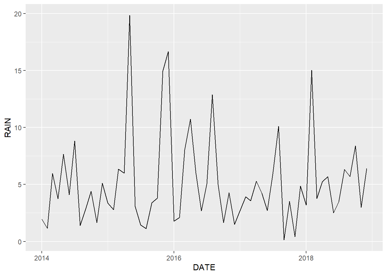
FIGURE 2.1: Line graph of monthly rainfall for Mount Herman.
The ggplot() function creates a coordinate system onto which data can be plotted. The first argument to ggplot() is data, the dataset to plot. Running only the first line, ggplot(data = mesomthe), would create just the blank coordinate system. To add data and modify the appearance of the graph, additional functions from the ggplot2 package are used. In the previous example geom_line() adds lines to the plot. The + symbol indicates that the line will be added to the coordinate system created by ggplot() using the mesomthe data frame
The mapping argument specifies the aesthetic mapping to use. Aesthetic mappings indicates which columns in the dataset get used for (or “mapped to”) various features of the plot. The mapping is always specified by the aes() function. In this example, the code specifies that the DATE column contains x-axis values and the RAIN column contains y-axis values.
2.2 Aesthetic Mappings
In the previous example, data columns were mapped to the x and y axes. To visualize a third column of data, it needs to be mapped to some other aspect of the plot. To illustrate, we will use the full mesosm dataset, which contains five years of monthly meteorological data from four sites: HOOK (Hooker in western OK), MTHE (Mount Herman in southeastern OK), SKIA (Skiatook in northeastern OK), and SPEN (Spencer in central OK).
Because there are four sites in this dataset, there needs to be a way to distinguish lines for the sites. A common choice is to show different lines with different colors. Here the STID column is mapped to the color aesthetic (Figure 2.2).
ggplot(data = mesosm) +
  geom_line(mapping = aes(x = DATE,
                          y = RAIN,
                          color = STID))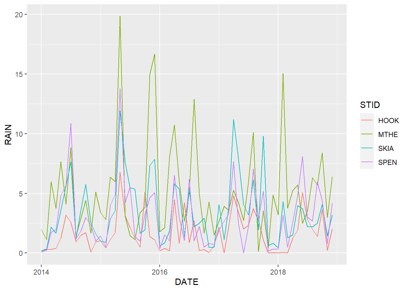
FIGURE 2.2: Line graph of monthly rainfall with a different line color for each station.
Taking a critical look at 2.2, it is possible to differentiate the colored lines. However, they overlap considerably, and the time series of the different stations are difficult to identify and compare. We can experiment with different aesthetics to see if the graph can be improved. One idea is to try mapping multiple aesthetics to the same column. In this example, each site has a different line pattern as well as a different color (Figure 2.3).
ggplot(data = mesosm) +
  geom_line(mapping = aes(x = DATE,
                          y = RAIN,
                          color = STID,
                          linetype = STID))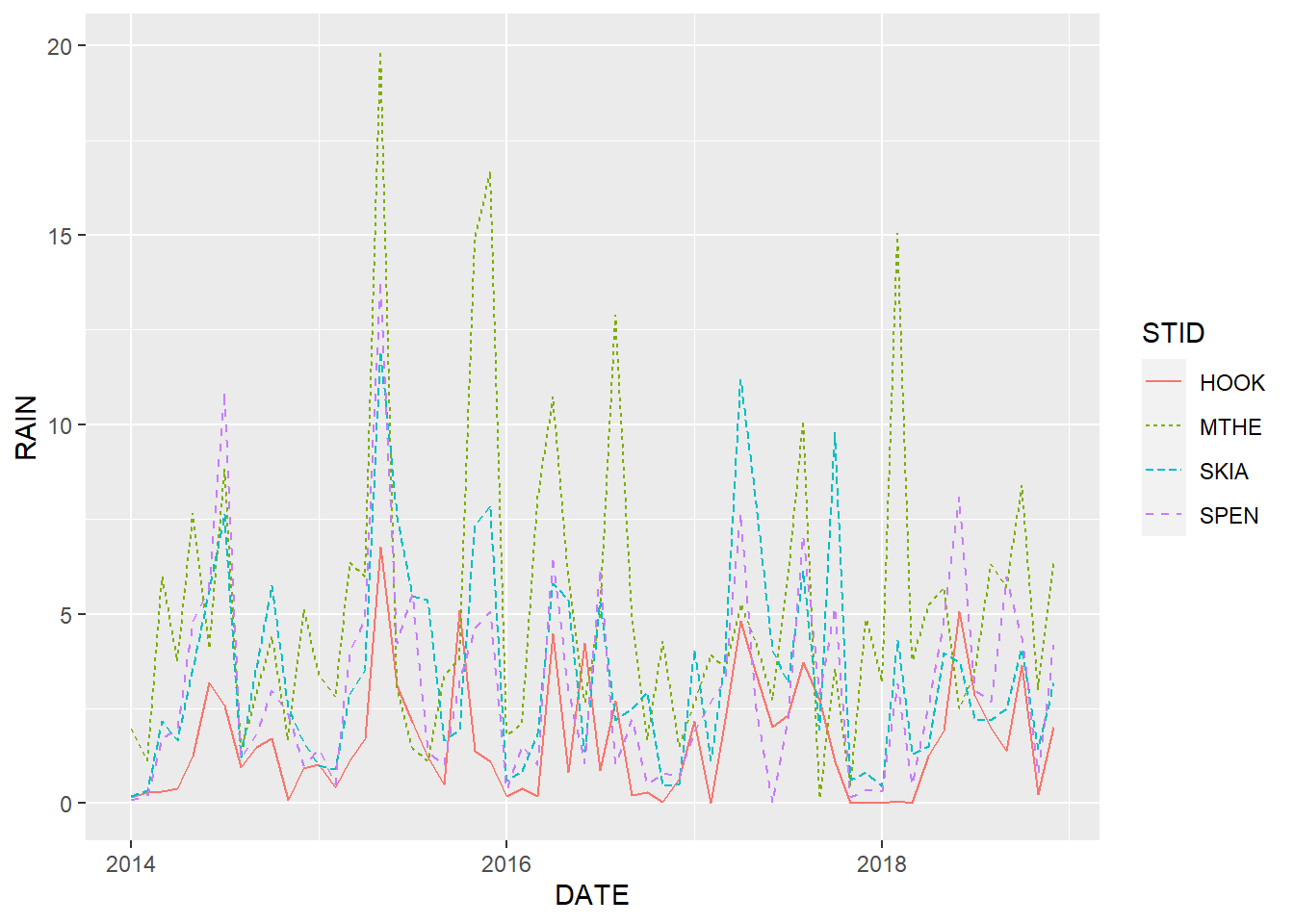
FIGURE 2.3: Line graph of monthly rainfall with a different line color and line pattern for each station.
Mapping aesthetics based on patterns in addition to (or instead of) color is important in many situations. For example, pattern-based aesthetics can be interpreted by color-blind individuals and reproduced in black and white. However, in this situation, they don’t really help with distinguishing the overlapping lines in the graph.
Other aspects of the graph’s aesthetics can be manipulated. An aesthetic can be set to a fixed value by defining that aesthetic outside of the aes() function. The following code increases the width of every line slightly to make them easier to see. In this example, the default line size of 0.5 is increased to 1.0 (Figure 2.4). The colors of the thicker lines are a bit easier to distinguish from one another.
ggplot(data = mesosm) +
  geom_line(mapping = aes(x = DATE,
                          y = RAIN,
                          color = STID),
            size = 1.0)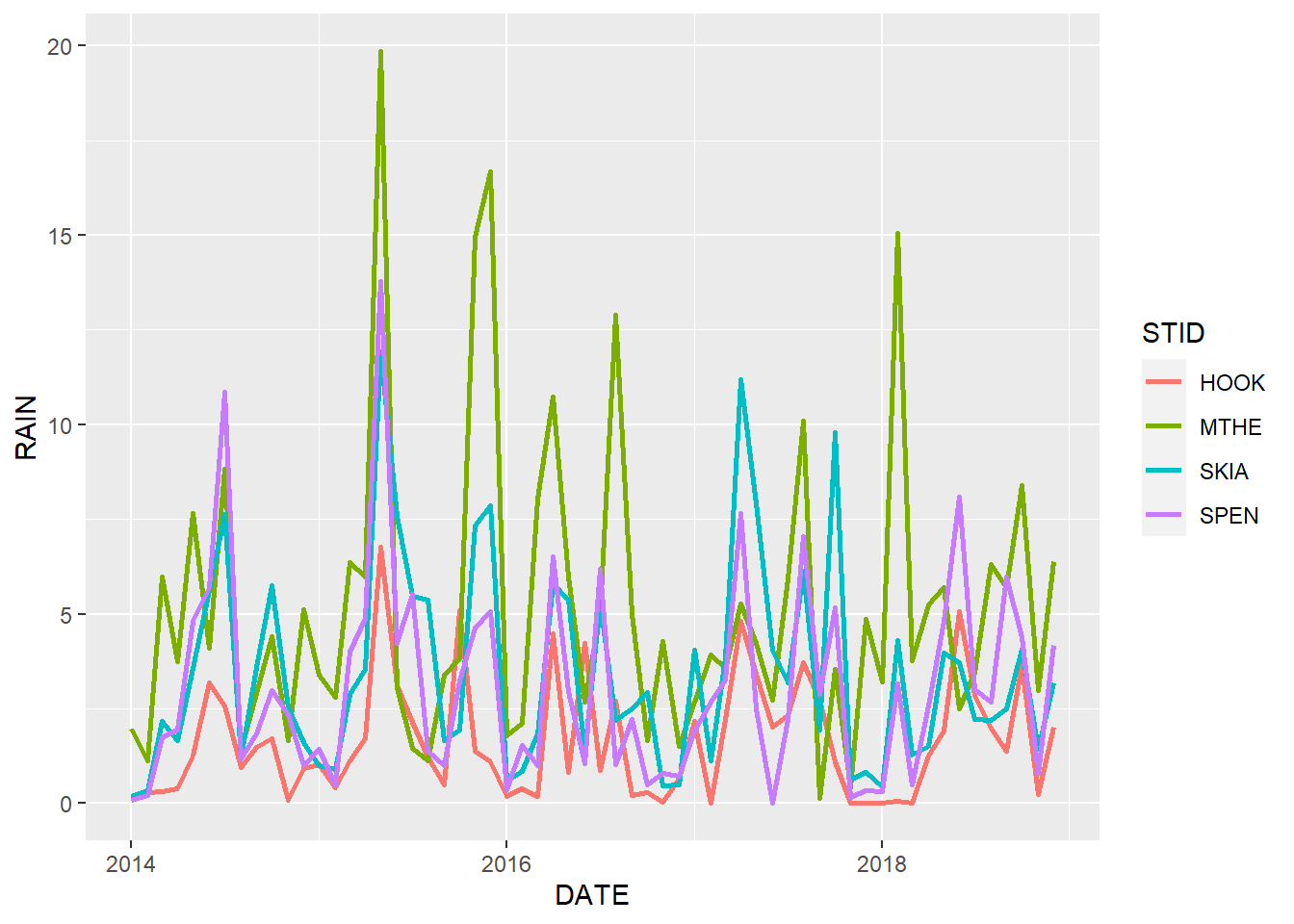
FIGURE 2.4: Line graph of monthly rainfall with a different line color for each station and increased line size.
2.3 Facets
In this sample dataset, the rainfall values from all the stations fall within the same range of values. No matter how the plot aesthetics are modified, they will be crowded and difficult to view on a single set of plot axes. An alternative is to organize these data into multiple plots using facets. Faceting splits the data into subsets based on one or more columns in the data frame and creates a separate chart for each subset.
To facet by a single variable, the facet_wrap() function is used. Another + operator is used at the end of the geom_line() function to indicate that all of these functions are combined to generate the plot. In this example, the facets argument takes the name of a single column. The vars() function is also needed to convert the column name into a format recognized by facet_wrap(). The STID column contains a character vector with four different station codes, so four facets are generated (Figure 2.5).
ggplot(data = mesosm) +
  geom_line(mapping = aes(x = DATE, y = RAIN)) +
  facet_wrap(facets = vars(STID))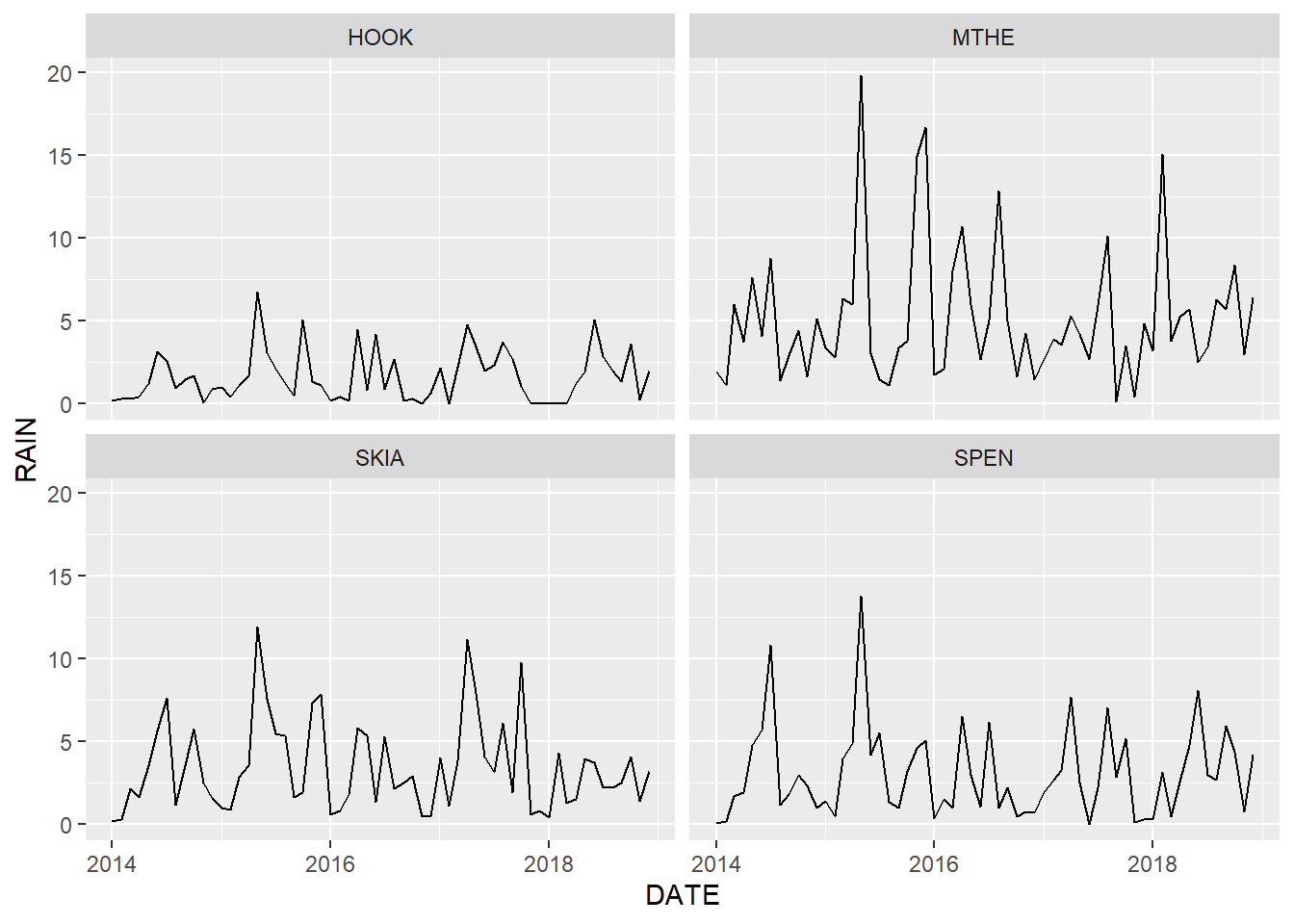
FIGURE 2.5: Line graph of monthly rainfall with each station plotted in a different facet.
Because these are time series data, it is often helpful to arrange the subplots on top of each other instead of side-by-side. This format makes it easy to compare values from the different stations at a given time point by scanning vertically across the subplots (Figure 2.6). The layout can be changed by using the ncol or nrow argument to specify the number of columns or rows.
ggplot(data = mesosm) +
  geom_line(mapping = aes(x = DATE, y = RAIN)) +
  facet_wrap(facets = vars(STID), ncol = 1)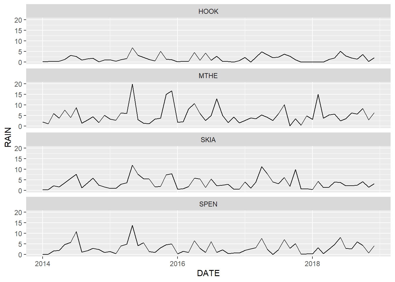
FIGURE 2.6: Line graph of monthly rainfall with facets arranged in a single column.
By default, the facet_wrap() function uses the same data range for each of the subplots. This approach clearly shows differences in the overall magnitude of rainfall across the subplots. In particular, rainfall at the Hooker Mesonet station in western Oklahoma is considerably lower than at the other stations. The rainfall values at Hooker are compressed within a relatively small portion of the y-axis, which makes it difficult to discern variation through time. Setting the scales argument to "free_y" allows the data in each facet to take up the entire vertical space. Alternate values for scales include "free_x" for scales to vary freely in the x dimension and "free" to allow them to vary freely in both dimensions. The resulting plot more clearly shows the relative variations in precipitation across the four stations (Figure 2.7).
ggplot(data = mesosm) +
  geom_line(mapping = aes(x = DATE, y = RAIN)) +
  facet_wrap(facets = vars(STID),
             ncol = 1,
             scales = "free_y")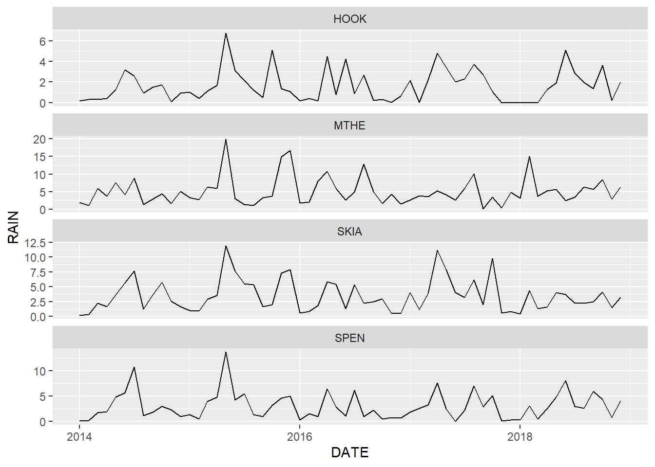
FIGURE 2.7: Line graph of monthly rainfall with free scales on the y axis. Note that each subplot has a different range of rainfall values.
One problem with allowing the scales to vary across facets is that readers may not carefully examine the y-axis of each plot. A naive viewer might look at Figure 2.7 and assume that rainfall is similar at all four locations based on the aesthetics alone. This approach should therefore be used with caution, and the differences in axis ranges should be explicitly noted in the figure caption and other accompanying text.
2.4 Geometric Objects
A geom is the geometrical object that a plot uses to represent data. There are often multiple ways to represent the same data visually. For example, we have been using the geom_line() function to visualize our time series of weather data as line geometries. Line graphs can be very useful for mapping time series such as weather data because the lines that connect the data points highlight the changes that occur between time periods. Another common technique for graphing data is to use a point for each combination of x and y values with no connecting lines. Replacing the geom_line with the geom_point() function generates the following graph (Figure 2.8).
ggplot(data = mesosm) +
  geom_point(mapping = aes(x = DATE, y = RAIN)) +
  facet_wrap(facets = vars(STID), ncol = 1)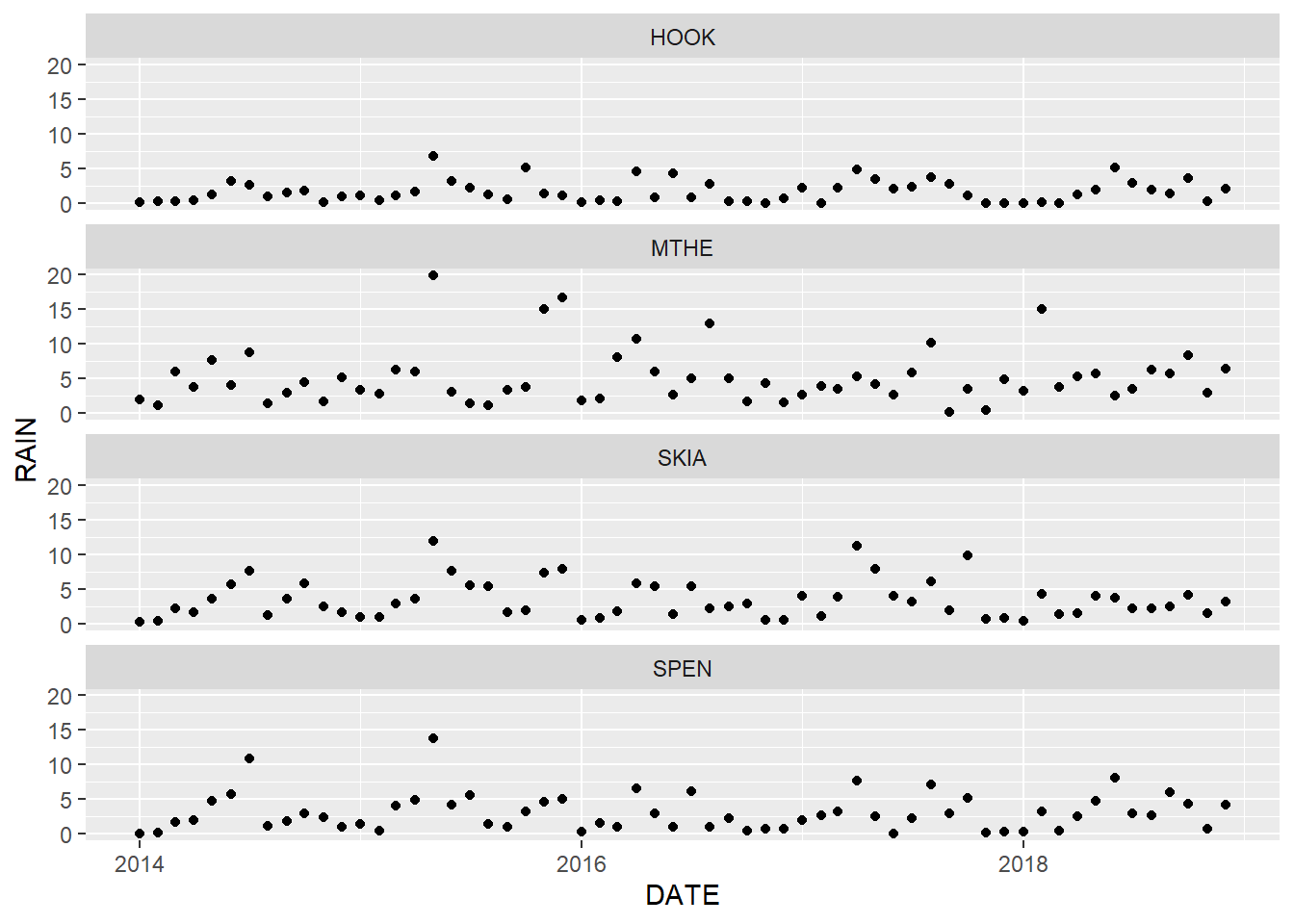
FIGURE 2.8: Point graph of monthly rainfall with facets arranged in a single column.
In most cases, using points alone is not a great choice for time series graphs because the connections between subsequent time periods are not as apparent as in the line graph. Conversely, lines should not be used with data that do not have a natural ordering because they will falsely imply connections between adjacent values in the graph. In some situations, it makes sense to plot data using multiple geometries. For example, with line graphs, it can be difficult to identify values at specific points in time based only on changes in line direction.
Including both lines and points can be effective when it is important to emphasize the sequential nature of time series data and clearly see the individual measurements at each time interval (Figure 2.9). However, the graph is also more crowded and complicated than the simple line graph, and the additional point symbols may become a distraction if they are not really needed. In general, the key to effective scientific graphics is to include just enough details to effectively communicate the important patterns in the data while resisting the urge to add unnecessary embellishments.
ggplot(data = mesosm) +
  geom_line(mapping = aes(x = DATE, y = RAIN)) +
  geom_point(mapping = aes(x = DATE, y = RAIN)) +
  facet_wrap(facets = vars(STID),
             ncol = 1,
             scales = "free_y")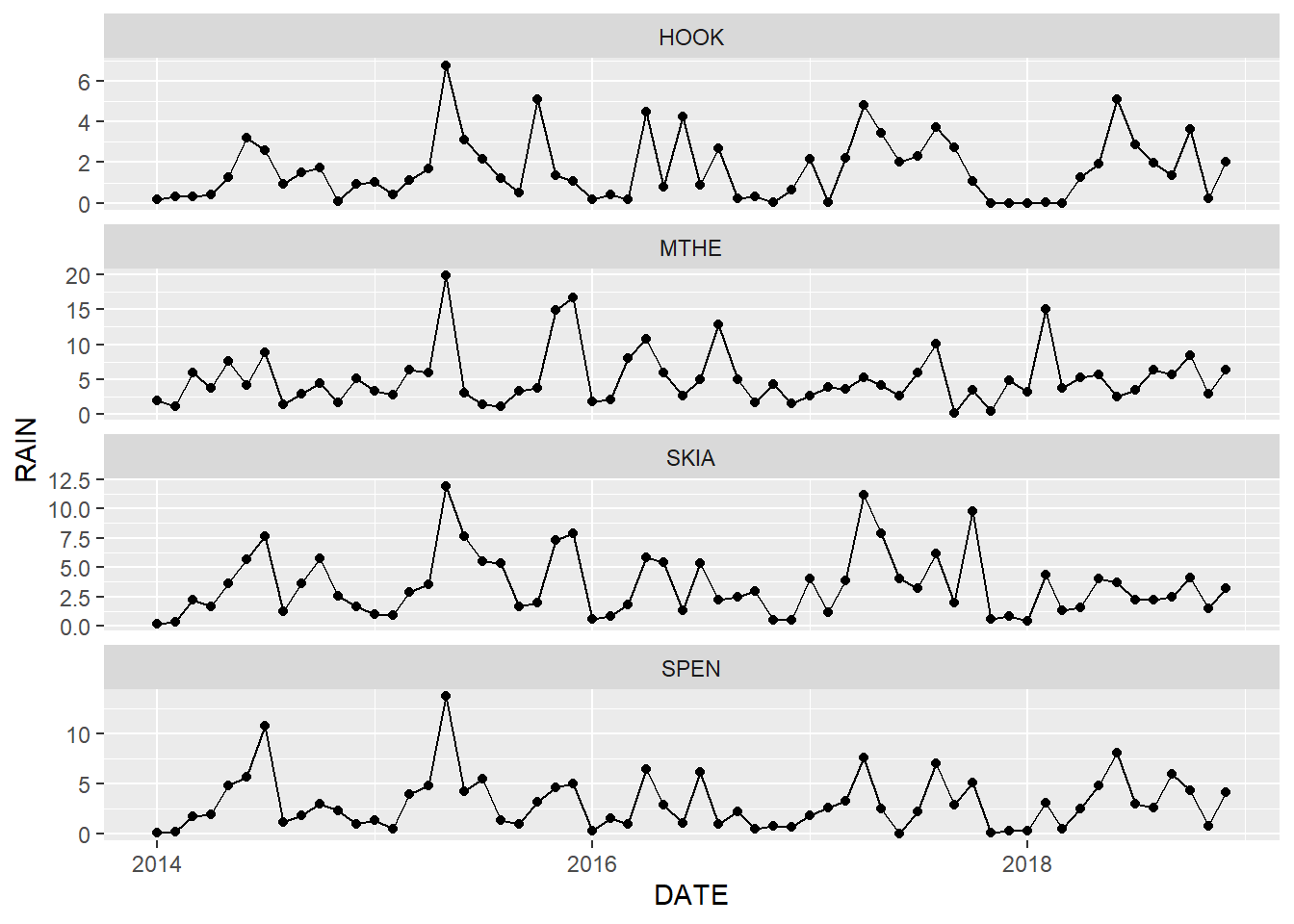
FIGURE 2.9: Combined line and point graph of monthly rainfall with facets arranged in a single column.
Note that some aesthetics can only be used with certain geoms. For example, points can have a shape aesthetic, but lines cannot. Conversely, lines can have a linetype aesthetic, but points cannot.
2.5 Scales
Scales control how data values are translated to visual properties. The default scale setting can be overridden to adjust details like axis labels and legend keys or to use a completely different translation from data to aesthetic.
The labs() function can be used to change the axis, legend, and plot labels. Additional arguments to labs() include subtitle, caption, tag, and any other aesthetics that have been mapped such as color or linetype. This example shows precipitation data from the four stations on a single plot with labels that specify the x-axis values, y-axis values, title for the legend of station colors, and an overall plot title (Figure 2.10).
ggplot(data = mesosm) +
  geom_line(mapping = aes(x = DATE,
                          y = RAIN,
                          color = STID),
            size = 1.0) +
  labs(x = "Date",
       y = "Rainfall (in)",
       color = "Station ID",
       title = "Rainfall from Four Stations in OK")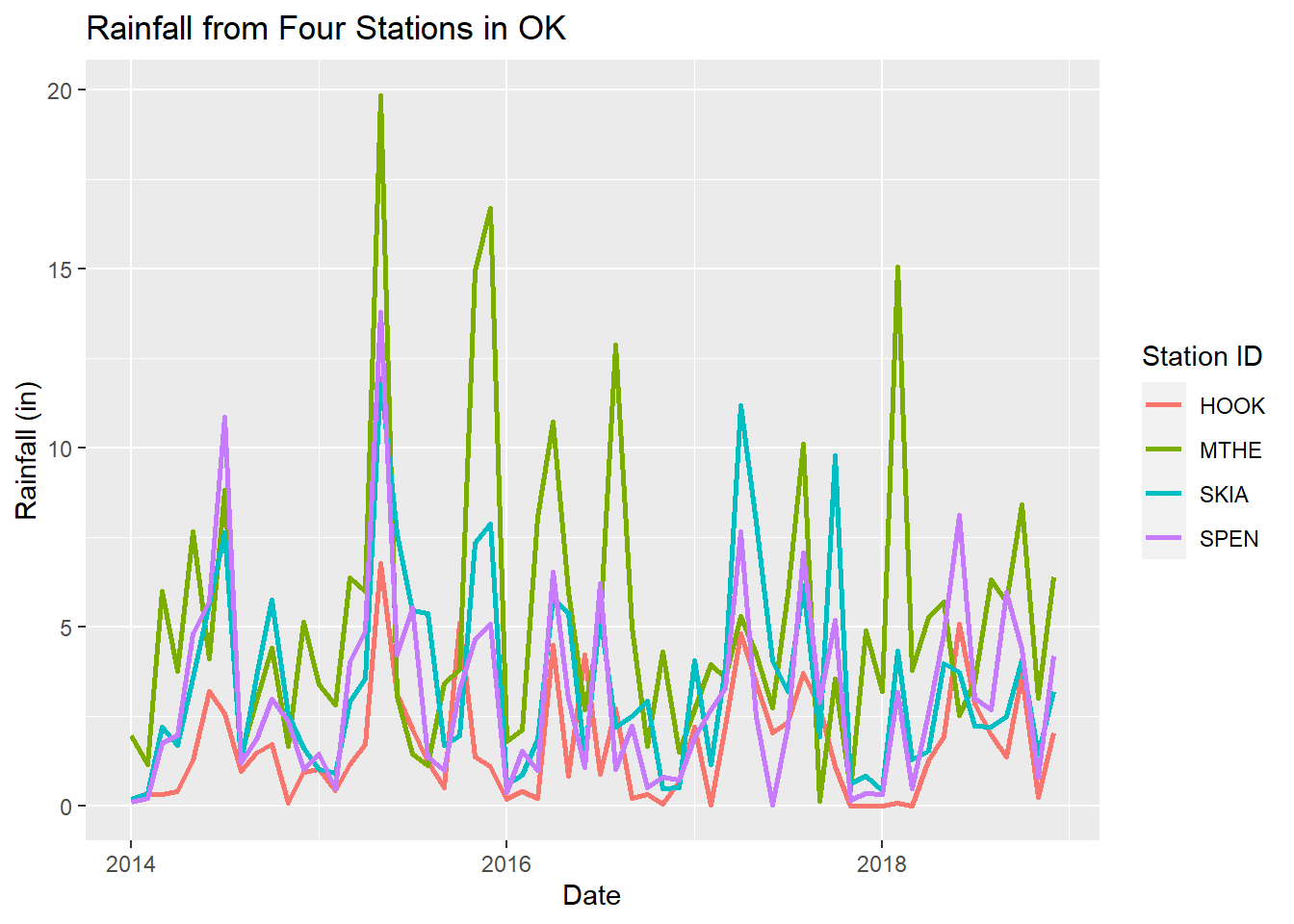
FIGURE 2.10: Line graph of monthly rainfall with a different line color for each station and modified labels.
Including a graph title is not necessary in many cases. The title can usually be added later in a presentation or document file, and descriptive information can be provided in a separate caption. However, it is good practice to always add descriptive axis and legend titles with measurement units where appropriate. By default, these labels are just the column names from the data frame. Although the analyst may be familiar with these codes, they will usually not be interpretable by other people viewing the graph.
Tick marks and associated text labels indicate how the data are scaled along the axes of the graph. The ggplot() function uses an algorithm to optimize the default number and placement of the ticks along each axis. In general, there should be enough ticks to make it easy to associate plot aesthetics with axis values, but not so many that the axis becomes cluttered and difficult to interpret. Ticks are associated with round numbers to make the labels easier to read.
In some situations, it is necessary to change the placement of the tick marks and their labels. In the time series graphs produced so far, there is one tick mark every two years on the x-axis, with each tick located on the first day of the year. The wide spacing between ticks makes it difficult to determine what year we are looking at when examining the precipitation patterns. It would be helpful to change the x-axis so that there are ticks and labels for every year.
The scale_x_date() function allows modification of the tick marks and labels on the x-axis. There are also scale_x_continuous() and scale_x_discrete() functions that are appropriate when there are continuous or discrete variables mapped to the axis, as well as versions of all these functions for the y-axis. Two arguments are provided to scale_x_date(). The breaks argument indicates where tick marks and labels will be placed, and the date_label argument indicates how the dates will be formatted. The %Y code indicates that only the year will be displayed. The resulting graph now shows one tick mark and label per year (Figure 2.11).
datebreaks <- c("2014-01-01", "2015-01-01", "2016-01-01",
                "2017-01-01", "2018-01-01", "2019-01-01")
datebreaks <- as.Date((datebreaks))
ggplot(data = mesosm) +
  geom_line(mapping = aes(x = DATE, y = RAIN)) +
  facet_wrap(facets = vars(STID), ncol = 1) +
  labs(x = "Date",
       y = "Rainfall (in)",
       color = "Station ID") +
  scale_x_date(breaks = datebreaks, date_label = "%Y")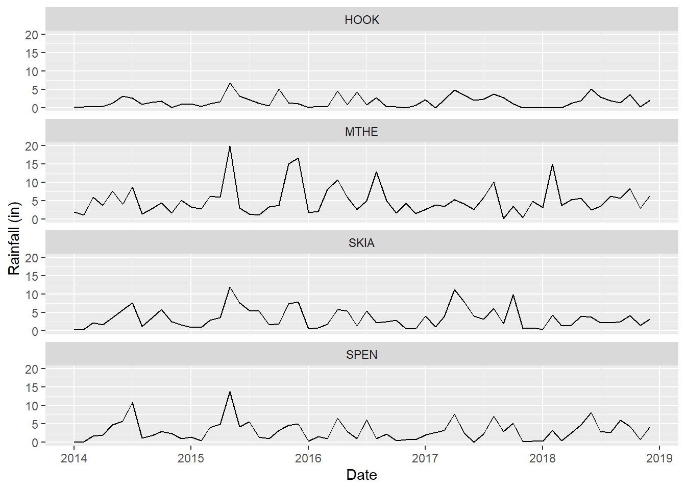
FIGURE 2.11: Line graph of monthly rainfall with modified tick marks and labels on the x-axis.
Remember that the DATE variable plotted on the x-axis is a Date object. This is why it is necessary to use the scale_x_date() function, and why the datebreaks vector needs to be converted from a character vector to a date vector using the as.Date() function. Chapter 4 will provide more information about date variables and how to manipulate them.
Scale functions are frequently used to specify the colors and symbols that will be mapped to the data values. For example, the scale_color_manual() function can be used to manually specify the colors for each value of the STID variable associated with the color aesthetic (Figure 2.12). Note that other aesthetics have their own scale functions, such as scale_linetype() and scale_size(). Additional examples of scale functions will be provided as more complex plots and maps are developed throughout the book.
ggplot(data = mesosm) +
  geom_line(mapping = aes(x = DATE,
                          y = RAIN,
                          color = STID),
            size = 1.0) +
  labs(x = "Date",
       y = "Rainfall (in)",
       color = "Station ID") +
  scale_x_date(breaks = datebreaks, date_label = "%Y") +
  scale_color_manual(values = c("firebrick",
                                "steelblue",
                                "olivedrab",
                                "gold"))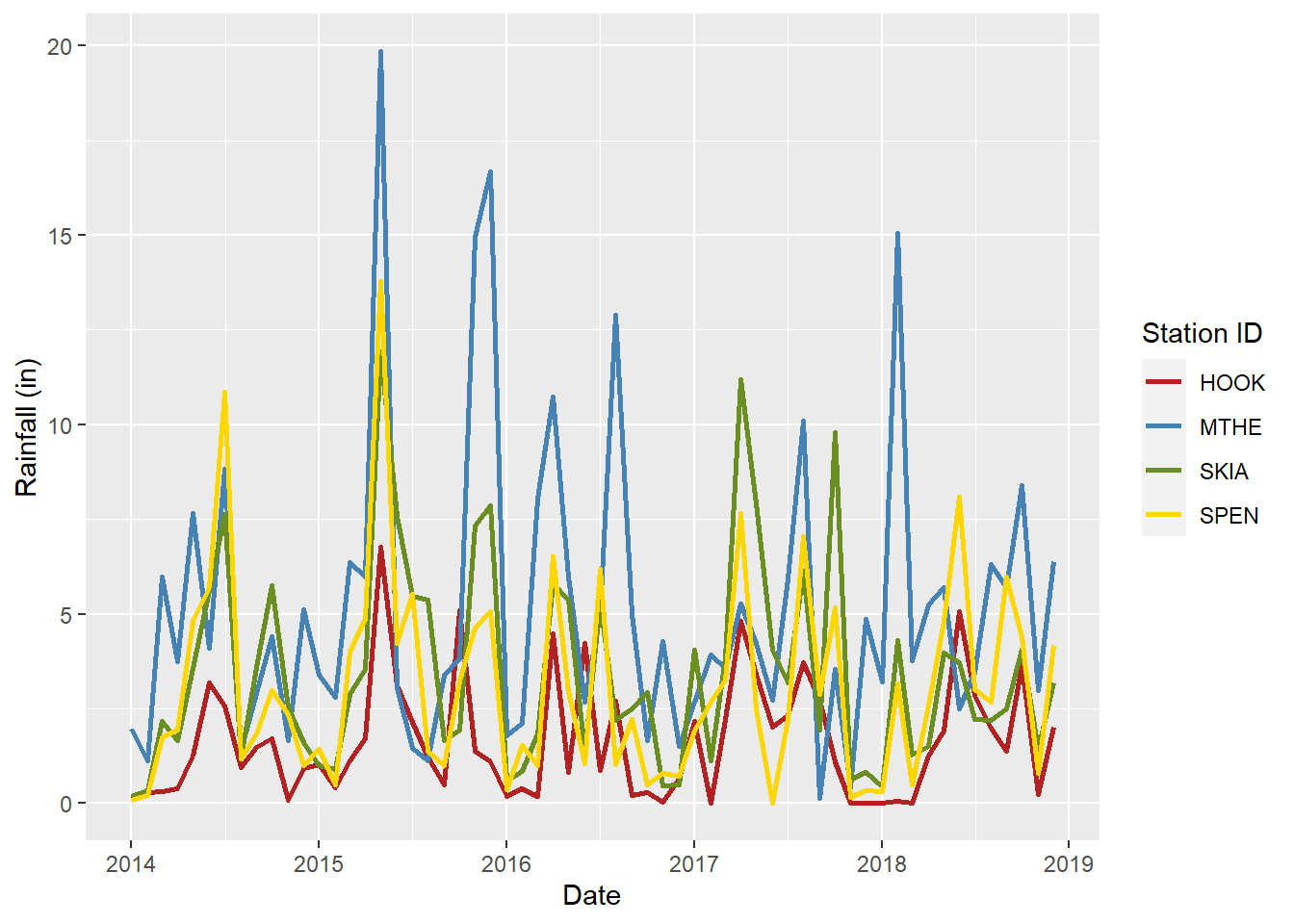
FIGURE 2.12: Line graph of monthly rainfall with manually selected line colors for each station.
Colors can be specified in several ways in R. The previous example uses a character string with the name of each color name. A list of the 657 color names available in R can be obtained by running the function colors(). Colors can also be specified directly in terms of their red, green, and blue (RGB) components with a hexadecimal string of the form “#RRGGBB”. With so many possibilities, selecting effective colors for scientific graphics is a formidable challenge. There are several resources available online that list and display all of the named R colors, including the “R color cheatsheet” provided by the National Center for Ecological Analysis and Synthesis at https://www.nceas.ucsb.edu/r-spatial-guides. There are also R packages that can be used to automatically generate color palettes for graphs and maps. We will use several of these packages in upcoming chapters.
2.6 Themes
The default “look” of graphs created with ggplot() has some distinctive and recognizable features. The plot background is light gray with white gridlines that align with the axis ticks. There are no axis lines and the tick marks extent outward from the edge of the background grid. This default theme is relatively simple, and many types of graphs are easy to read against this background. However, users may prefer an alternative graph design or need to modify the plot elements to meet publication requirements. One way to change the theme is by specifying an alternative theme function. For example, the theme_bw() function uses a black grid on a white background (Figure 2.13).
ggplot(data = mesosm) +
  geom_line(mapping = aes(x = DATE,
                          y = RAIN,
                          color = STID),
            size = 1.0) +
  labs(x = "Date",
       y = "Rainfall (in)",
       color = "Station ID") +
  scale_color_manual(values = c("firebrick",
                                "steelblue",
                                "olivedrab",
                                "gold")) +
  scale_x_date(breaks = datebreaks, date_label = "%Y") +
  theme_bw()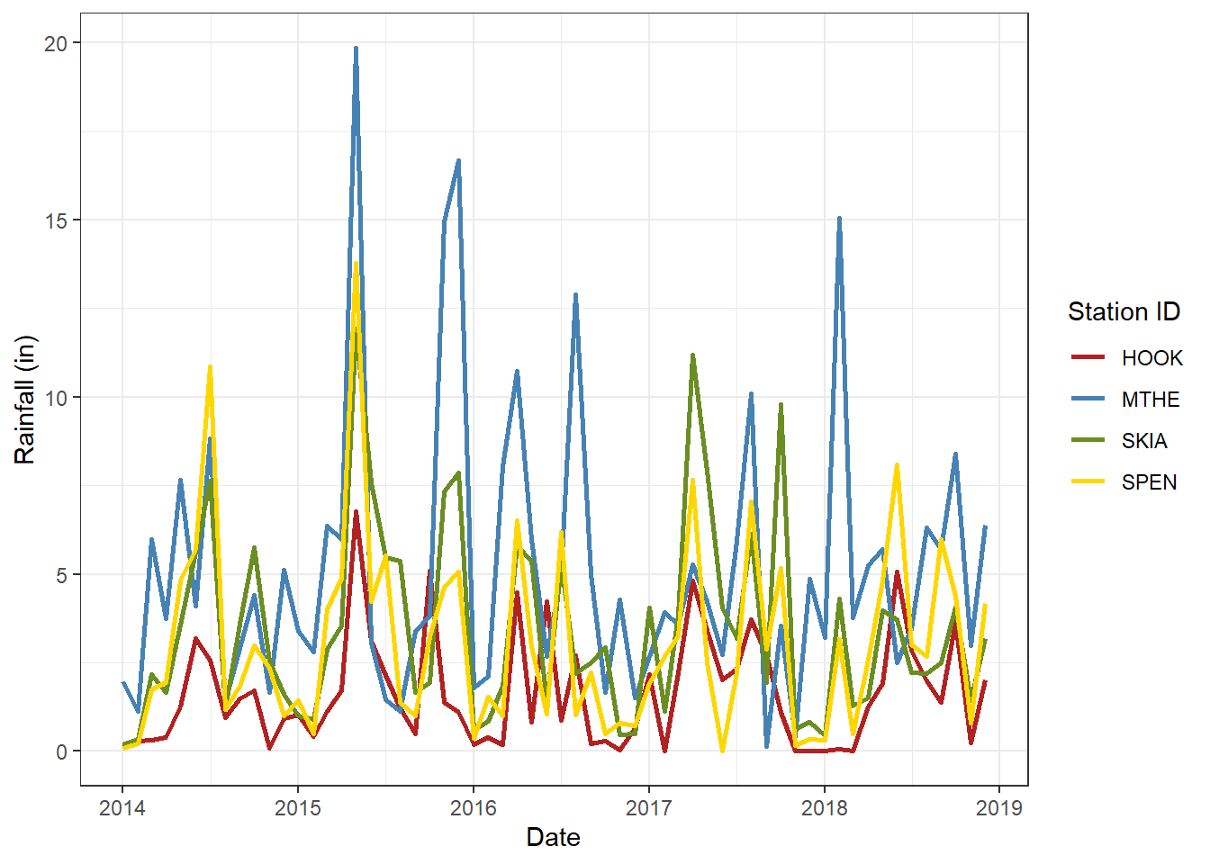
FIGURE 2.13: Line graph of monthly rainfall with a black-and-white theme.
The theme() function allows detailed formatting of plot components, including text, lines, and the plot area. The following example shows how to modify various text elements including axis text, legend text, and the main title. The element_text() function is used to provide formatting details to each argument of the theme() function. Arguments to element_text() control text color, size, and angle. The hjust and vjust arguments control horizontal text justification along the x-axis and vertical text justification along the y-axis (0 = left, 0.5 = center, 1 = right). The face argument changes the font type from the default of plain to bold, italic, or bold.italic. Compared to Figure 2.13, the resulting plot has slightly larger text (Figure 2.14). The plot, axis, and legend titles are dark blue and bolded. The plot title is also left justified. The x-axis title is suppressed by specifying element_blank(). The x-axis tick label text is angled to avoid crowding the larger text and justified to increase separation from the axis.
ggplot(data = mesosm) +
  geom_line(mapping = aes(x = DATE,
                          y = RAIN,
                          color = STID),
            size = 1.0) +
  labs(x = "Date",
       y = "Rainfall (in)",
       color = "Station ID",
       title = "Rainfall from Four Stations in OK") +
  scale_color_manual(values = c("firebrick",
                                "steelblue",
                                "olivedrab",
                                "gold")) +
  scale_x_date(breaks = datebreaks, date_label = "%Y") +
  theme_bw() +
  theme(axis.text.x = element_text(angle = 45,
                                   size = 14,
                                   hjust = 1,
                                   vjust = 1),
        axis.text.y = element_text(size = 14),
        axis.title.x = element_blank(),
        axis.title.y = element_text(color = "darkblue",
                                    size = 16),
        legend.text = element_text(size = 14),
        legend.title = element_text(color = "darkblue",
                                    size = 16,
                                    face = "bold"),
        plot.title = element_text(color = "darkblue",
                                  size = 18,
                                  hjust = 0.5,
                                  face = "bold"),
)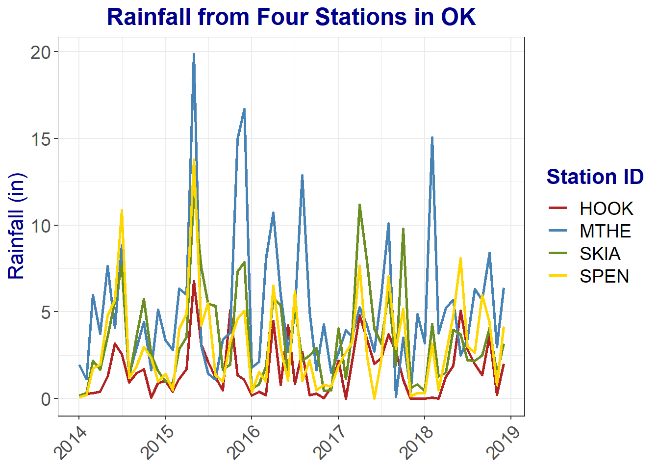
FIGURE 2.14: Line graph of monthly rainfall with modifications to text elements.
A common problem with plots and maps is text that is too small to be easily readable. Always check the size of your text and consider the size and manner in which your plot will be displayed. Will it be embedded in a PDF document? Displayed on a website that will be viewed on a computer screen? Projected on a large screen in front of a lecture hall? Different text sizes may be required for each of these examples. You can use arguments to theme() like in the previous example to control text size and appearance in different sections of the graph. There are many more arguments to the theme() function that can be used to control other aspects of plot appearance, and additional examples will be provided in later chapters.
2.7 Combining ggplot Functions
Building a scientific graphic with ggplot involves a number of steps that are implemented with different types of functions.
- Create a ggplot using
ggplot(). - Add geometric representations of data to a plot using geoms.
- Map data columns to plot aesthetics.
- Split your dataset into subplots using facets.
- Control the visual properties of your plot using scales.
- Control other aspects of plot appearance by modifying themes .
Throughout the rest of the book, various combinations of these steps will be used to create charts and maps. By learning this process, you will be able to generate a wide variety of graphs and maps using diverse datasets. The upcoming chapters will provide many more examples of how to use ggplot() for data visualization. In addition to covering the technical aspects of coding, they will continue to explore how to design scientific graphics so that they summarize data effectively and communicate the resulting information clearly and accurately to viewers.
2.8 Other Types of Plots
The following subsections provide examples of how to generate other types of standard plots with ggplot(), including scatterplots, bar charts, histograms, and boxplots. Each example also uses a different theme function to show some of the options that are available in the ggplot2 package.
2.8.1 Scatterplots
Scatterplots are used to show the relationship between two variables. They are similar to time series plots, but they use points for the geometry, and both axes are measured variables rather than just the y-axis. This example shows the relationship between monthly summaries of daily minimum and maximum temperatures (Figure 2.15). There is one point for each monthly record at each of the four meteorological stations. The scale_color_manual() function is used to assign a different color to each of the four stations. The plot shows that there is a very strong linear relationship between the monthly minimum and maximum temperatures at each station. The temperatures at Hooker are much higher than those at the other three stations.
ggplot(data = mesosm) +
  geom_point(mapping = aes(x = TMIN,
                           y = TMAX,
                           color = STID)) +
  labs(x = "Minimum Temperature (\u00B0F)",
       y = "Maximum Temperature (\u00B0F)",
       color = "Station ID") +
  scale_color_manual(values = c("firebrick",
                                "steelblue",
                                "olivedrab",
                                "gold")) +
  theme_minimal()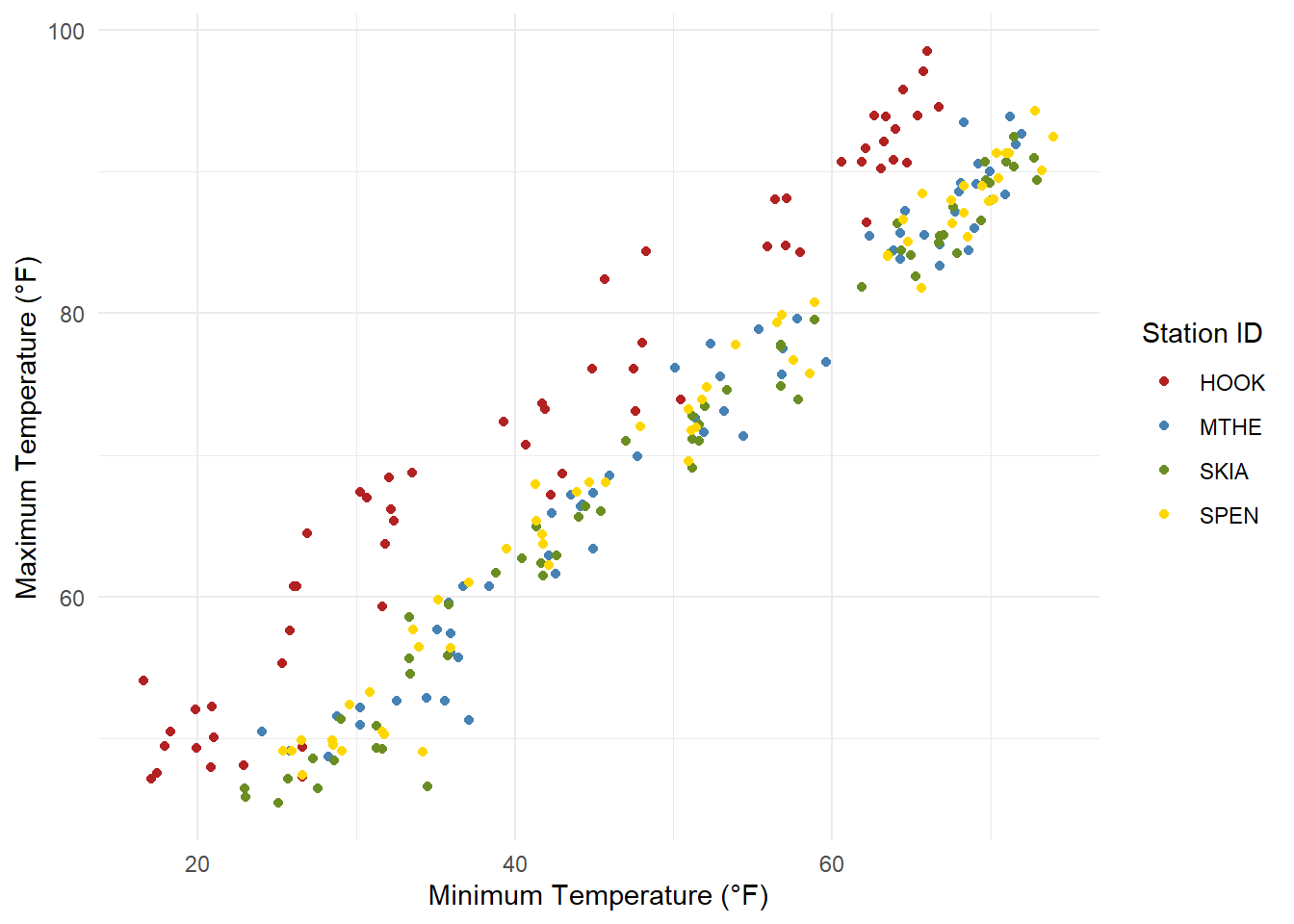
FIGURE 2.15: Scatterplot of monthly minimum and maximum temperatures at four weather stations.
2.8.2 Bar Charts
Bar charts represent data values using the heights of horizontal or vertical bars, and the color and arrangement of the bars can be used to represent groupings within the data. The following example creates a simple bar chart to display the precipitation times series as bars rather than lines or dots (Figure 2.16). Other examples of grouped bar charts will be provided in later chapters. Because the monthly precipitation values represent cumulative sums for each month, the relative heights of the bars provide an intuitive representation of the month-to-month variation.
ggplot(data = mesosm) +
  geom_col(mapping = aes(x = DATE, y = RAIN)) +
  labs(x = "Date",
       y = "Precipitation (in)") +
  facet_wrap(facets = vars(STID)) +
  theme_bw()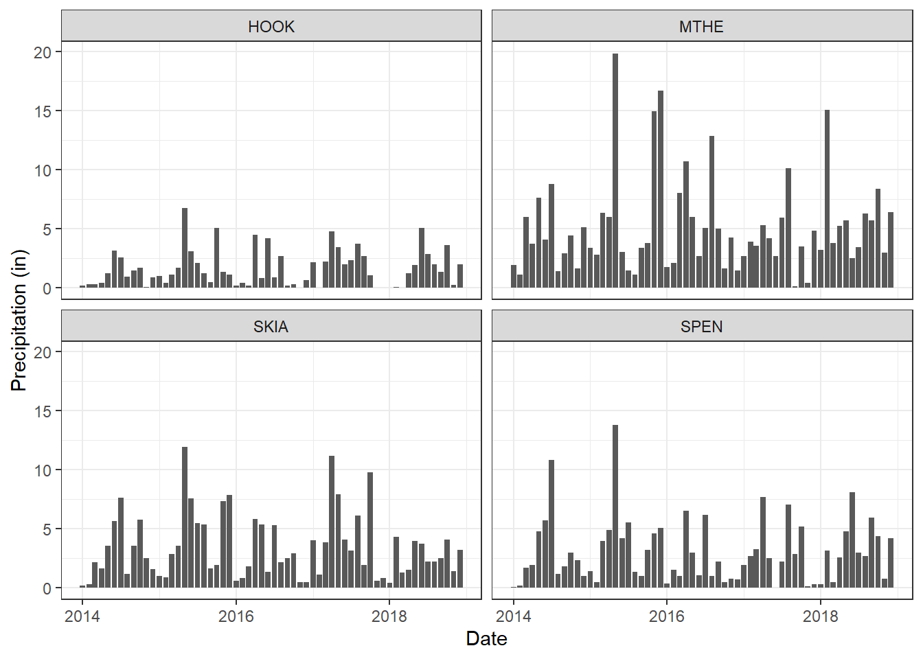
FIGURE 2.16: Bar charts of monthly rainfall at four weather stations.
2.8.3 Histograms
A histogram is a graphical representation of the distribution of numerical data. The heights of the bars are proportional to the frequencies of observations within different value ranges. The example below plots the frequency distribution of rainfall at the Mount Herman station (Figure 2.17). Custom labels are added to the axes, and the text is bolded and increased in size to make it more readable. The graphs shows that most months in the dataset have rainfall between about 2-7 inches, but there are a few outlying months with rainfall between 10-20 inches.
ggplot(data = mesomthe) +
  geom_histogram(aes(x = RAIN), bins = 10) +
  labs(x = "Precipitation (in)",
       y = "Count of observations") +
  theme_linedraw() +
  theme(axis.text.x = element_text(size = 12, face = "bold"),
        axis.text.y = element_text(size = 12, face = "bold"),
        axis.title.x = element_text(size = 14, face = "bold"),
        axis.title.y = element_text(size = 14, face = "bold"))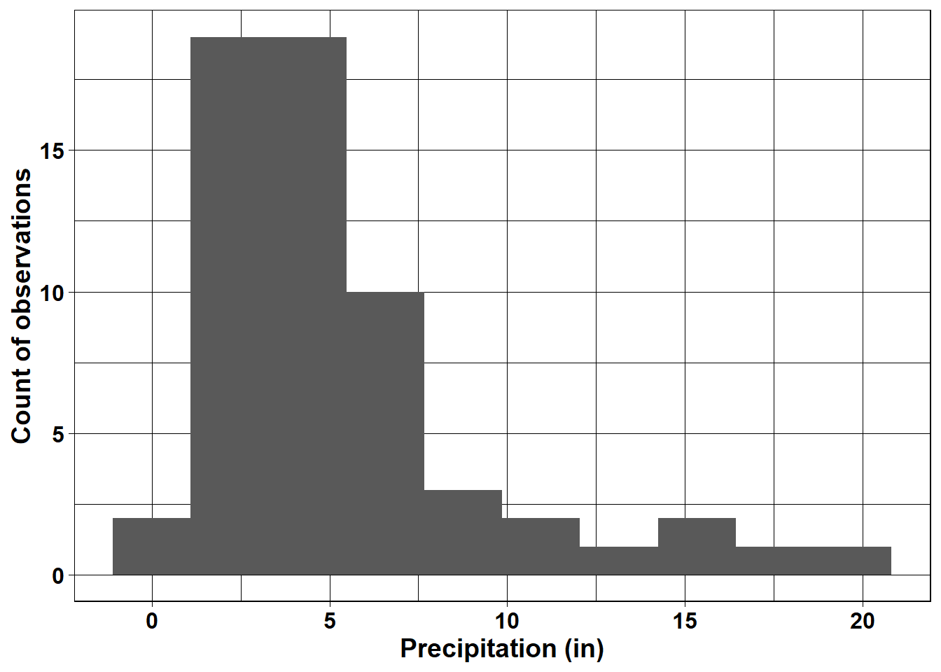
FIGURE 2.17: Histogram of monthly rainfall at Mt. Herman.
2.8.4 Boxplots
Like histograms, boxplots also display the distributions of data. Boxplots provide a more simplified representation of the distribution than histograms, and it is often easier to compare multiple variables using boxplots. This example shows the rainfall distributions for the four mesonet stations (Figure 2.18). For boxplots generated with ggplot(), the horizontal line represents the median value, and the box represents the inter-quartile range (the 25th through 75th percentiles). The upper and lower whiskers extend to the largest and smallest value no further than 1.5 times the hinges (the edges of the box). Data with higher or lower values than the whiskers are called “outliers” and are plotted individually.
ggplot(data = mesosm) +
  geom_boxplot(aes(x = STID, y = RAIN)) +
  labs(x = "Station Code",
       y = "Precipitation (in)") +
  theme_classic()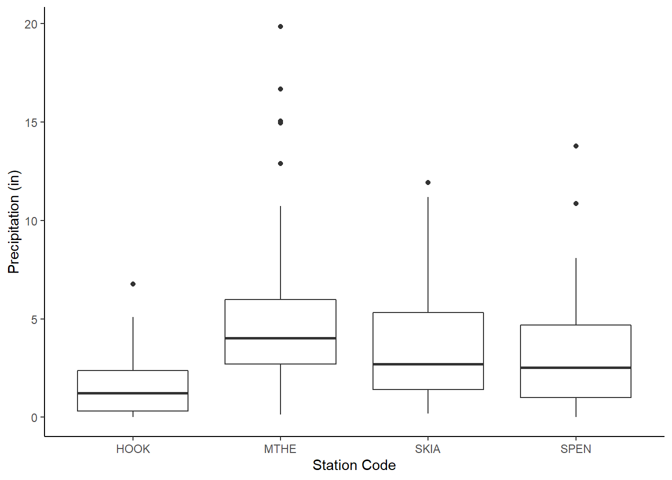
FIGURE 2.18: Boxplots of rainfall at four weather stations.
Although this chapter has covered a lot of information, it has only begun to scratch the surface of what is possible with the ggplot2 package (Wickham 2016). For a complete listing of ggplot2 functions, you can check out the online reference at https://ggplot2.tidyverse.org. Another helpful reference is the ggplot2 “cheatsheet”, which is available at https://www.rstudio.com/resources/cheatsheets/ and provides an overview of the most important ggplot2 functions.
2.9 Practice
Write code to generate the following graphs based on the mesosm dataset. You can start with the examples provided in the text and modify them as needed.
Create a graph that displays four scatterplots of TMIN versus TMAX - one for each site.
Create a boxplot that compares the distribution of TMAX for each site. Make the axis text and labels bold so that they are easier to see.
Create a graph that displays four histograms of RAIN, one for each site. Experiment with changing the number of bins in the histograms to see how this affects the visualization.