Chapter 7 Raster Geospatial Data - Discrete
The previous chapter covered raster datasets with continuous variables, which potentially have an infinite number of values. This chapter introduces raster datasets with discrete variables, which are classified into a limited number of values. We still use numbers to work with discrete data. For example, different types of land cover can be identified using integers. Water might be coded as 11, built-up areas as 23, and deciduous forests as 41. In this situation, the numbers themselves are not meaningful, so summary statistics such as sum() and mean() would not provide any useful information. Therefore, different approaches are needed when visualizing and summarizing discrete raster data.
This chapter will use classified land cover data from the National Land Cover Database (NLCD). The NLCD produces a standardized land cover data product for the United States. Data are available from 2001-2019 at 2-3 year intervals. These products have been generated from Landsat satellite imagery using consistent methods that make the resulting products suitable for change analysis. More information on the NLCD can be found at the Multi-Resolution Land Characteristics Consortium (MRLC) website http://www.mrlc.gov/. Data can be downloaded as very large files covering the conterminous U.S., Alaska, or U.S. Islands and Territories from the MRLC website. Smaller areas can be selected and downloaded using the MRLC viewer at https://www.mrlc.gov/viewer/. For this exercise, we will work with a small portion of the NLCD encompassing Walton County, GA. This rural county is located on the outskirts of the Atlanta metropolitan area and is under considerable development pressure.
Most of the required packages have been used in previous chapters. The colorspace package is new and contains functions for manipulating colors and palettes.
library(RColorBrewer)
library(ggplot2)
library(colorspace)
library(dplyr)
library(tidyr)
library(readr)
library(sf)
library(terra)
7.1 Importing and Mapping Land Cover Data
The Walton County data are read from a TIFF file to create a SpatRaster object. The dataset is a grid of 30 m square cells with 1579 rows and 1809 columns.
nlcd19 <- rast("NLCD_2019_Land_Cover_Walton.tiff")
class(nlcd19)
## [1] "SpatRaster"
## attr(,"package")
## [1] "terra"
nrow(nlcd19)
## [1] 1579
ncol(nlcd19)
## [1] 1809
res(nlcd19)
## [1] 30 30
Mapping these raster data with ggplot() requires the rasterdf() custom function to convert them to a data frame. To avoid having to paste the code for this function into every script, it can be stored in a separate file and run using the source() function. The file containing the function code needs to be in the working directory, or else the file path needs to be explicitly specified.
source("rasterdf.R")
nlcd19_df <- rasterdf(nlcd19)
By default, the geom_raster() function generates a raster map with a continuous color ramp in shades of blue (Figure 7.1).
ggplot(data = nlcd19_df) +
  geom_raster(aes(x = x,
                  y = y,
                  fill = value))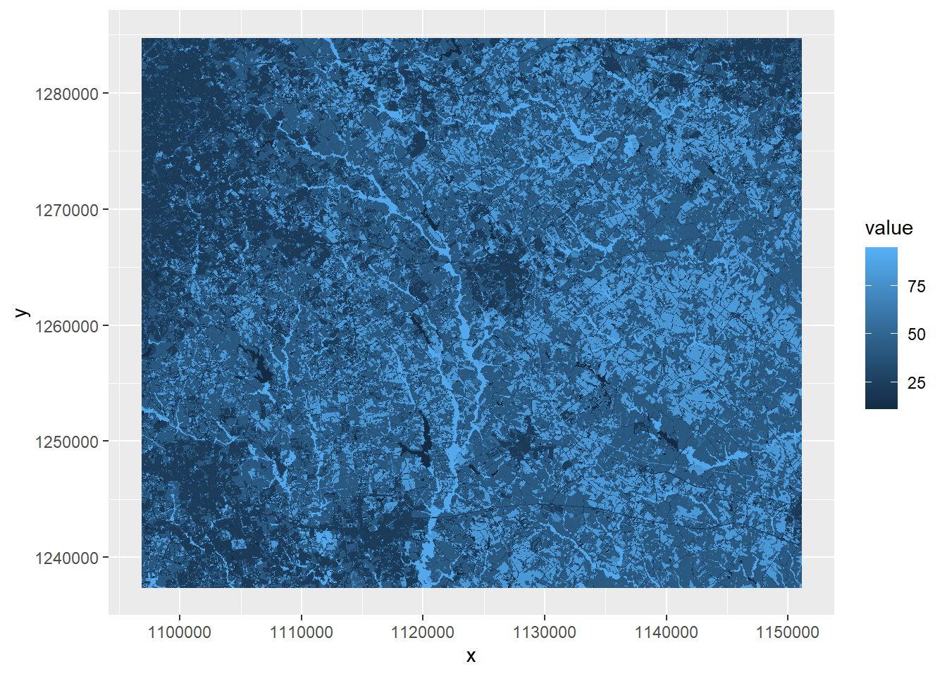
FIGURE 7.1: Land cover map with default color ramp.
This map and the accompanying legend are not particularly useful. The values stored in the land cover raster are numeric codes. For example, a value of 11 represents water, whereas a value of 21 represents low-density residential development. The default chart created by ggplot() maps these values on a continuous scale rather than as categories, and the resulting symbology and legend have no real meaning. A detailed list of all the NLCD codes can be found at https://www.mrlc.gov/data/legends/national-land-cover-database-class-legend-and-description.
To generate a better-looking map, it will be necessary to assign each land cover code in the map a unique name and color for display. The unique() function can be used to extract all of the numerical land cover codes that are present in the Walton County dataset. The function output is a data frame with one column, which is extracted using subscripts.
LCcodes <- unique(nlcd19)[, 1]
LCcodes
##  [1] 11 21 22 23 24 31 41 42 43 52 71 81 82 90 95
Although the NLCD contains sixteen different land cover types for the conterminous United States, there are only fifteen in Walton County. The ice and snow class (12) is missing. Another vector is created with the corresponding human-readable names for each land cover class.
LCnames <-c(
  "Water",
  "DevelopedOpen",
  "DevelopedLow",
  "DevelopedMed",
  "DevelopedHigh",
  "Barren",
  "DeciduousForest",
  "EvergreenForest",
  "MixedForest",
  "ShrubScrub",
  "GrassHerbaceous",
  "PastureHay",
  "CultCrops",
  "WoodyWetlands",
  "EmergentHerbWet")
Next, the coltab() function is used to extract color table information from the SpatRaster object. This color table is embedded in the NLCD TIFF data files and was read in and stored along with the data. Not all raster datasets include a color table, but we can take advantage of it here to display the land cover classes using the “official” NLCD color scheme. Color information in the red, green, and blue channels is extracted with the coltab() function and converted to a data frame. Then, the rows associated with the NLCD land cover codes are extracted by subscripting. Finally, the rgb() function is used to convert the red, green, and blue information into hexadecimal color codes.
nlcdcols <- data.frame(coltab(nlcd19))
nlcdcols <- nlcdcols[LCcodes + 1,]
LCcolors <- rgb(red = nlcdcols$red,
                green = nlcdcols$green,
                blue = nlcdcols$blue,
                names = as.character(LCcodes),
                maxColorValue = 255)
LCcolors
##        11        21        22        23        24        31
## "#466B9F" "#DEC5C5" "#D99282" "#EB0000" "#AB0000" "#B3AC9F"
##        41        42        43        52        71        81
## "#68AB5F" "#1C5F2C" "#B5C58F" "#CCB879" "#DFDFC2" "#DCD939"
##        82        90        95
## "#AB6C28" "#B8D9EB" "#6C9FB8"
Now the ggplot() function can be used to plot the NLCD land cover raster. In the aes() function, the raster value is converted to a character so that ggplot() will recognize as a categorical variable. The scale_fill_manual() function is used to specify the colors that match the NLCD codes. The na.translate argument is specified as FALSE so that an NA value does not show up in the legend (Figure 7.2).
ggplot(data = nlcd19_df) +
  geom_raster(aes(x = x,
                  y = y,
                  fill = as.character(value))) +
  scale_fill_manual(name = "Land cover",
                    values = LCcolors,
                    labels = LCnames,
                    na.translate = FALSE) +
  coord_sf(expand = FALSE) +
  theme_void()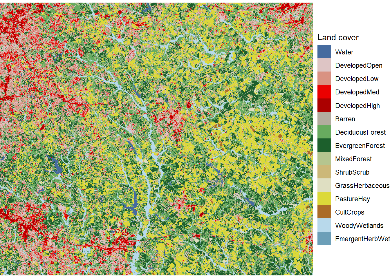
FIGURE 7.2: Land cover map with unique colors and labels for every land cover class.
In the last chapter, the size of a raster dataset was reduced by defining a new extent and then using the crop() function. It is also possible to zoom in and map a portion of a raster dataset without modifying the underlying data. Here, a subset of Walton County is mapped by setting the x and y limits of the plot using the coord_sf() function (Figure 7.3).
ggplot(data = nlcd19_df) +
  geom_raster(aes(x = x,
                  y = y,
                  fill = as.character(value))) +
  scale_fill_manual(name = "Land cover",
                    values = LCcolors,
                    labels = LCnames,
                    na.translate = FALSE) +
  coord_sf(expand = FALSE,
           xlim = c(1114000, 1125000),
           ylim = c(1260000, 1270000)) +
  theme_void()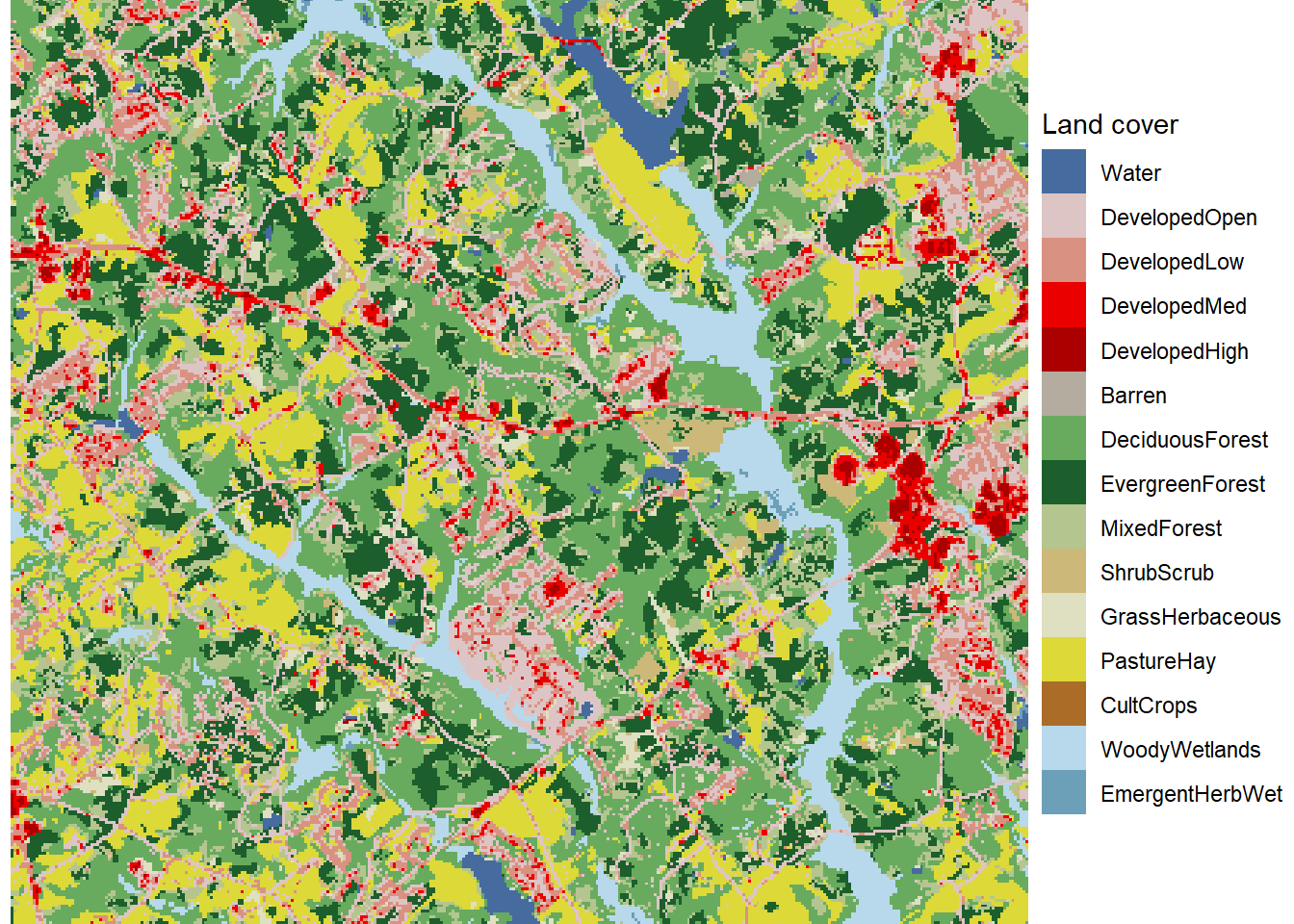
FIGURE 7.3: Zoomed in land cover map with unique colors and labels for every land cover class.
7.2 Reclassifying Raster Data
Often, land cover patterns can be seen more clearly if the land cover classes are aggregated into a smaller number of broader land cover types. After listing the classes in the Walton County dataset, a vector is created with the codes for the new land cover classes. These two vectors are combined to create a lookup table that associates the old and new codes. The classify() function is then used to assign a new land cover class to every pixel in Walton County. Vectors are also created with the names and display colors for the new classes.
LCcodes
##  [1] 11 21 22 23 24 31 41 42 43 52 71 81 82 90 95
newclas <- c(1, 2, 2, 2, 2, 3, 4, 4, 4, 5, 5, 5, 6, 7, 7)
lookup <- data.frame(LCcodes, newclas)
nlcd19_rc <- classify(nlcd19, lookup)
newnames <- c("Water",
               "Developed",
               "Barren",
               "Forest",
               "GrassShrub",
               "Cropland",
               "Wetland")
newcols <- c("mediumblue",
             "firebrick2",
             "gray60",
             "darkgreen",
             "yellow2",
             "orange4",
             "paleturquoise2")
The same ggplot() code as before can be used to generate a categorical map with the new reclassified raster dataset (Figure 7.4). In the scale_fill_manual() function, the new colors and class names for the reclassified data are specified for the values and labels arguments.
nlcd19_rc_df <- rasterdf(nlcd19_rc)

ggplot(data = nlcd19_rc_df) +
  geom_raster(aes(x = x, y = y, fill = as.character(value))) +
  scale_fill_manual(name = "Land cover",
                    values = newcols,
                    labels = newnames,
                    na.translate = FALSE) +
  coord_sf(expand = FALSE) +
  theme_void()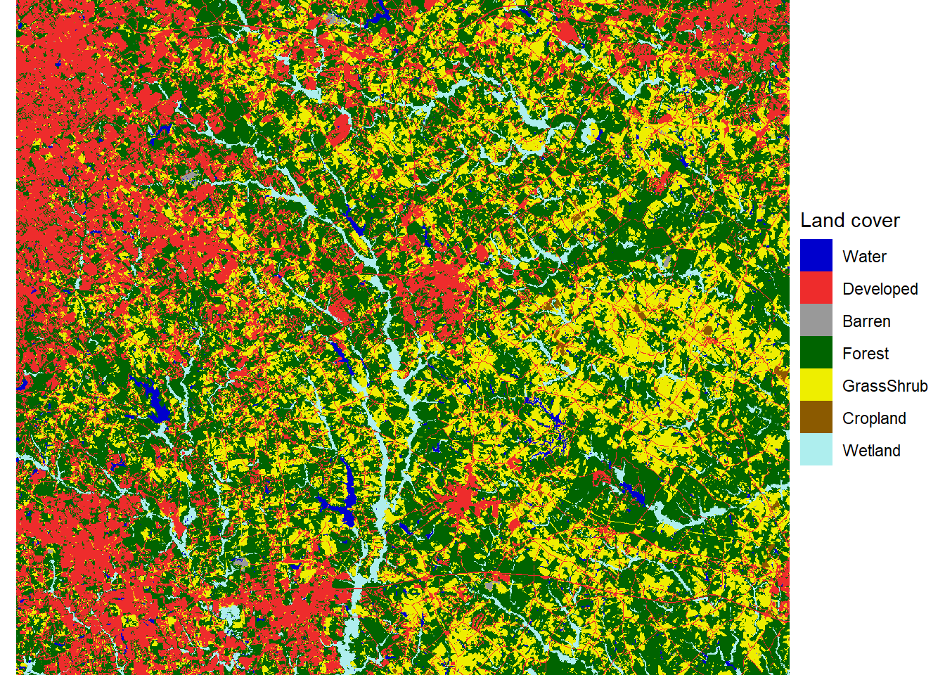
FIGURE 7.4: Land cover map with reclassified land cover types.
The colors displayed in the map are heavily saturated - they appear bold and vivid. However, mixing many bright, saturated colors in a map can make it difficult to discern the underlying patterns. Thus, it is often useful to desaturate the colors used in maps. Desaturating mixes gray into the colors to make them appear softer and more muted. A simple way to do this is to use the desaturate() function from the colorspace package. The amount argument controls how much saturation is reduced for all the colors in the palette.
newcols2 <- desaturate(newcols, amount = 0.4)The map of the reclassified land cover data can now be recreated using the desaturated color palette (Figure 7.5).
ggplot(data = nlcd19_rc_df) +
  geom_raster(aes(x = x,
                  y = y,
                  fill = as.character(value))) +
  scale_fill_manual(name = "Land cover",
                    values = newcols2,
                    labels = newnames,
                    na.translate = FALSE) +
  coord_sf(expand = FALSE) +
  theme_void()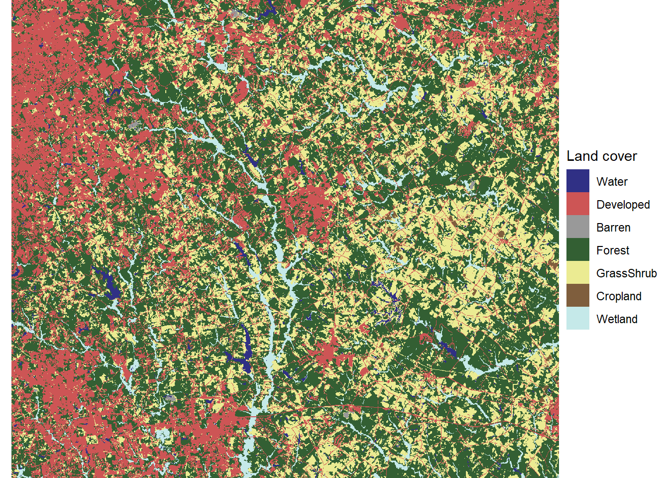
FIGURE 7.5: Land cover map with reclassified land cover types and desaturated colors.
Another useful visualization technique is the “small multiples” approach, in which each land cover class is displayed in a separate map. To generate this map, a separate binary raster must be generated for each of the land cover types. One way to do this is with a logical statement. The following example converts the reclassified land cover raster into a new raster where cells belonging to the developed class have a value of TRUE (1) and all other cells have a value of FALSE (0).
developed <- nlcd19_rc == 2
summary(developed)
##     Layer_1
##  Min.   :0.000
##  1st Qu.:0.000
##  Median :0.000
##  Mean   :0.244
##  3rd Qu.:0.000
##  Max.   :1.000
To convert multiple classes, the segregate() function can be used to convert every unique class in a discrete raster to a 1/0 binary raster. Because there are seven reclassified land cover types, the output of segregate() is a SpatRaster object with seven layers ordered by the land cover codes. Subscripting is used to remove the water layer from the SpatRaster object and the vector of class names.
nlcd19_stk <- segregate(nlcd19_rc)
nlcd19_stk <- nlcd19_stk[[-1]]
names(nlcd19_stk) <- newnames[-1]
As demonstrated in the previous chapter, the rasterdf() function can be used to convert multi-layer rasters as well as single-layer rasters into data frames for mapping with ggplot(). In the resulting data frame, the variable column contains the name of each raster layer in the stack.
nlcd19_stk_df <- rasterdf(nlcd19_stk)
summary(nlcd19_stk_df)
##        x                 y               value
##  Min.   :1096830   Min.   :1237410   Min.   :0.0000
##  1st Qu.:1110390   1st Qu.:1249230   1st Qu.:0.0000
##  Median :1123950   Median :1261080   Median :0.0000
##  Mean   :1123950   Mean   :1261080   Mean   :0.1645
##  3rd Qu.:1137510   3rd Qu.:1272930   3rd Qu.:0.0000
##  Max.   :1151070   Max.   :1284750   Max.   :1.0000
##        variable
##  Developed :2856411
##  Barren    :2856411
##  Forest    :2856411
##  GrassShrub:2856411
##  Cropland  :2856411
##  Wetland   :2856411
These data can be used to generate a series of binary maps - one for each of the six land cover classes (Figure 7.6). Mapping each class separately makes it easier to see the rare classes, such as barren land and cropland. Patterns in some of the other classes, such as the higher concentration of developed land in the eastern part of the map, are also easier to discern than in the multiclass map.
ggplot(data = nlcd19_stk_df) +
  geom_raster(aes(x = x,
                  y = y,
                  fill = as.character(value))) +
  scale_fill_manual(name = "Present",
                    values = c("gray80", "gray20"),
                    labels = c("No", "Yes"),
                    na.translate = FALSE) +
  facet_wrap(facets = vars(variable), ncol = 3) +
  coord_sf(expand = FALSE) +
  theme_void() +
  theme(strip.text.x = element_text(size=12, face="bold"),
        legend.position="bottom")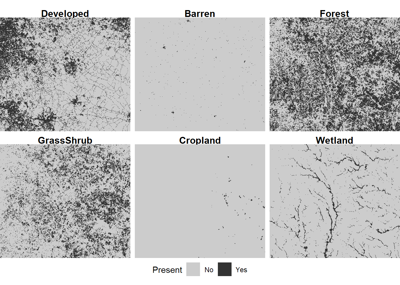
FIGURE 7.6: Land cover map with reclassified land cover types displayed as small multiples.
7.3 Focal Analysis of Raster Data
Focal analysis computes a summary of all the cells within a window surrounding an individual cell and assigns the value of the summary to that cell. This operation is repeated for all cells in a raster dataset, producing a new raster where every cell contains a focal summary. In most cases, the result of a focal analysis is a smoothed version of the input raster, where variation at smaller scales than the summary window is removed and broader scale spatial patterns are emphasized.
To carry out a focal analysis, a weights object must be defined using the focalWeight() function. Here, a range of circular windows with radii from 100 m to 2000 m are used. By default, the weight of each cell within this window is equal to its proportion of the total window.
forest <- nlcd19_stk[["Forest"]]
fwts100 <- focalMat(forest, d=100, type = "circle")
fwts500 <- focalMat(forest, d=500, type = "circle")
fwts1000 <- focalMat(forest, d=1000, type = "circle")
fwts2000 <- focalMat(forest, d=2000, type = "circle")
Then the focal() function is called with the weights objects and a summary function as arguments. By summing across the weights, the focal() function computes the proportion of each land cover class within the specified windows.
for_100 <- focal(forest, w=fwts100, fun=sum)
for_500 <- focal(forest, w=fwts500, fun=sum)
for_1000 <- focal(forest, w=fwts1000, fun=sum)
for_2000 <- focal(forest, w=fwts2000, fun=sum)
focal_stk <- c(for_100, for_500, for_1000, for_2000)
names(focal_stk) <- c("100m", "500m", "1000m", "2000m")
Changing the size of the focal window changes the degree of smoothing in the resulting maps, similar to the bandwidth of a kernel density analysis (Figure 7.7).
focal_stk_df <- rasterdf(focal_stk)

ggplot(data = focal_stk_df) +
  geom_raster(aes(x = x,
                  y = y,
                  fill = value)) +
  scale_fill_distiller(name = "Density",
                       palette = "YlOrRd") +
  facet_wrap(facets = vars(variable), ncol = 2) +
  coord_sf(expand = TRUE) +
  theme_void() +
  theme(strip.text.x = element_text(size=12, face="bold"),
        legend.position="bottom")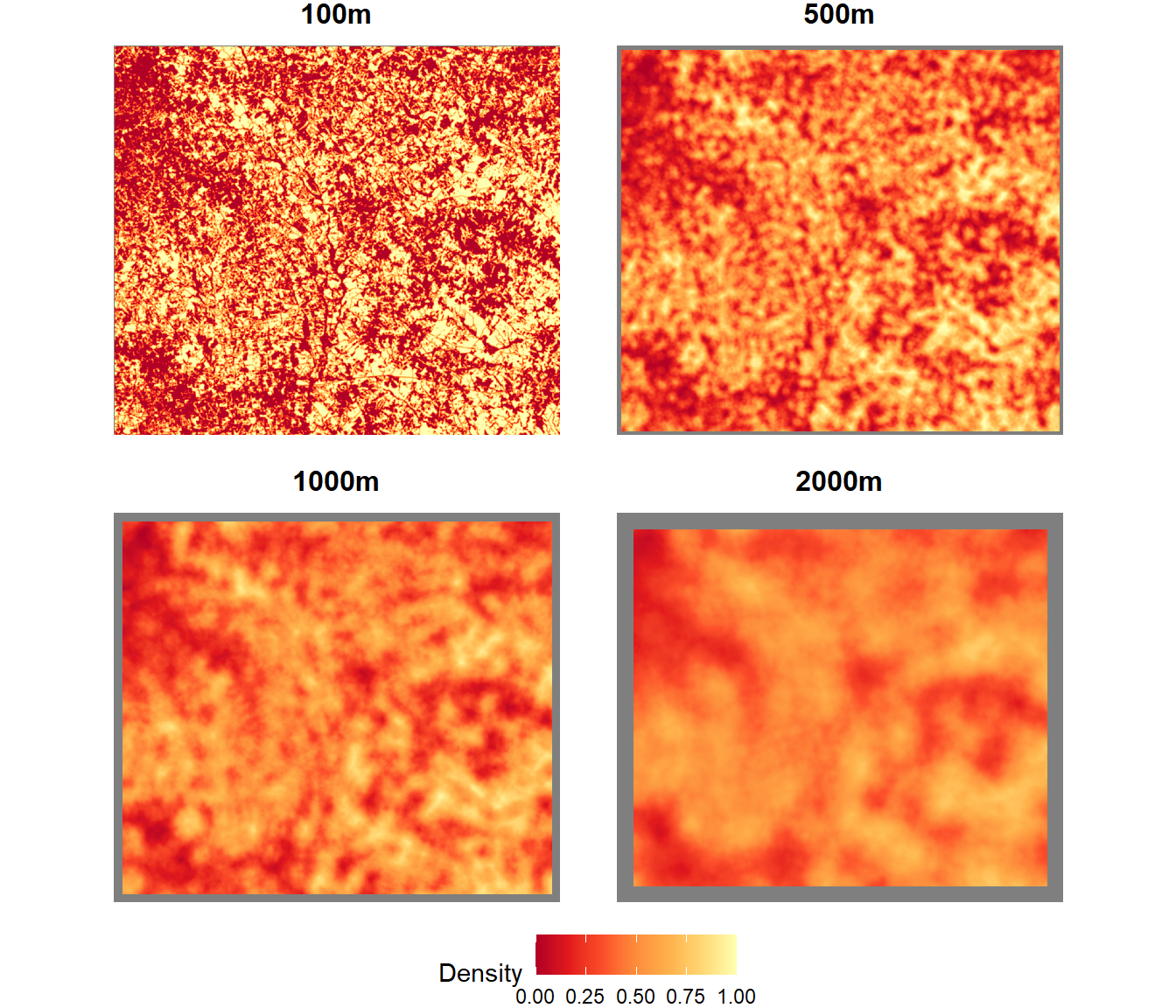
FIGURE 7.7: Forest density summarized as a focal mean within different-sized circular windows.
By default, the focal() function will return a value of NA if there are any NA values inside the window, or if the window extends outside the boundary of the raster dataset. These NA values are displayed in gray in the preceding figure, and the gray boundary around the outside of the dataset increases in width as the window size increases.
7.4 Land Cover Change Analysis
Land cover patterns change over time as a result of urban growth, agricultural abandonment, clearcutting, and other land use activities. These trends can be quantified and analyzed using multiple years of NLCD data. The following code imports eight NLCD data files, spanning 2001-2019, into a multilayer raster dataset. Then the data are reclassified into the seven broader land cover classes using the classify() function.
nlcd_stk <- rast(c("NLCD_2001_Land_Cover_Walton.tiff",
                   "NLCD_2004_Land_Cover_Walton.tiff",
                   "NLCD_2006_Land_Cover_Walton.tiff",
                   "NLCD_2008_Land_Cover_Walton.tiff",
                   "NLCD_2011_Land_Cover_Walton.tiff",
                   "NLCD_2013_Land_Cover_Walton.tiff",
                   "NLCD_2016_Land_Cover_Walton.tiff",
                   "NLCD_2019_Land_Cover_Walton.tiff"))

nlcd_rc <- classify(nlcd_stk, lookup)
names(nlcd_rc) <- c("2001", "2004", "2006", "2008", "2011",
                    "2013", "2016", "2019")
The ggplot() function can be used with facet_wrap() to map the time series of land cover (Figure 7.8). Before it is converted to a data frame with rasterdf(), the multilayer raster object is subscripted with double brackets to select four years for visualization.
nlcd_rc_df  <- rasterdf(nlcd_rc[[c("2001", "2008",
                                   "2013", "2019")]])

ggplot(data = nlcd_rc_df) +
  geom_raster(aes(x = x,
                  y = y,
                  fill = as.character(value))) +
  scale_fill_manual(name = "Land cover",
                    values = newcols2,
                    labels = newnames,
                    na.translate = FALSE) +
  coord_sf(expand = TRUE) +
  facet_wrap(facets = vars(variable), ncol = 2) +
  theme_void() +
  theme(strip.text.x = element_text(size = 12, face="bold"),
        legend.position="bottom")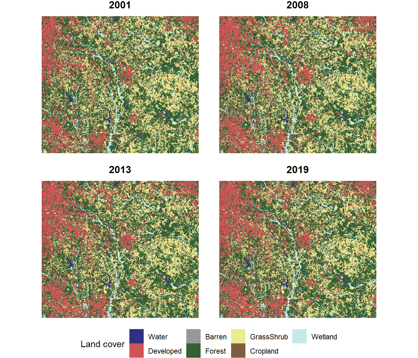
FIGURE 7.8: Land cover map with four years of data.
When working with land cover data, it is usually important to know which land cover classes are increasing or decreasing and by how much. By looking closely at these maps, it is possible to see areas where land cover is changing. However, it is not easy to discern the overall trends. One way to visualize the changes more effectively is to calculate the total area of each land cover class in each year and plot the changes over time.
The rectangular boundary of the raster dataset includes Walton County as well as other surrounding areas that fit within the bounding box. The Walton County boundaries are extracted from the same shapefile of Georgia counties that was introduced in Chapter 6. These data are reprojected to be in the same coordinate reference system as the NLCD data.
gacounty <- st_read("GA_SHP.shp", quiet = TRUE)
gacounty <- st_transform(gacounty, crs(nlcd_rc))
walton <- filter(gacounty, NAME10 == "Walton")
To restrict the analysis to only Walton county, the crop() and mask() functions are used to trim the size of the raster to the borders of Walton County and convert all pixels outside of Walton County to NA values. When vector data are supplied as an argument to a terra function, they must be converted to objects of the class SpatVector(). This conversion is accomplished using the vect() function.
nlcd_rc_crp <- crop(nlcd_rc, vect(walton))
nlcd_rc_msk <- mask(nlcd_rc_crp, vect(walton))
The cropped and masked dataset now only contains land cover data within the boundaries of Walton County (Figure 7.9).
nlcd_msk_df <- rasterdf(nlcd_rc_msk[[c("2001", "2008",
                                       "2013", "2019")]])

ggplot(data = nlcd_msk_df) +
  geom_raster(aes(x = x,
                  y = y,
                  fill = as.character(value))) +
  scale_fill_manual(name = "Land cover",
                    values = newcols2,
                    labels = newnames,
                    na.translate = FALSE) +
  coord_sf(expand = TRUE) +
  facet_wrap(facets = vars(variable), ncol = 2) +
  theme_void() +
  theme(strip.text.x = element_text(size=12, face="bold"),
        legend.position="bottom")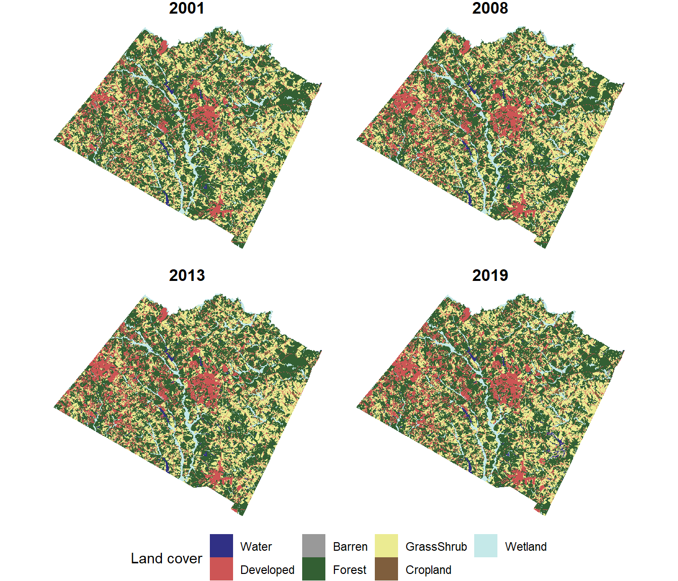
FIGURE 7.9: Land cover map with four years of data cropped and masked to the Walton County boundaries.
The freq() function can be used to extract the number of cells in each land cover class from each layer in the raster stack. The output is a data frame with one row for each combination of year and land cover class.
freq_df <- freq(nlcd_rc_msk, usenames=TRUE)
glimpse(freq_df)
## Rows: 56
## Columns: 3
## $ layer <chr> "2001", "2001", "2001", "2001", "2001", "200…
## $ value <dbl> 1, 2, 3, 4, 5, 6, 7, 1, 2, 3, 4, 5, 6, 7, 1,…
## $ count <dbl> 9669, 127218, 3674, 458074, 299985, 2707, 51…
Before plotting the data frame, a series of dplyr functions is used to modify the columns. The count of 30-meter square cells is converted to square kilometers. The value column is converted to a new factor column called class with labels corresponding to the class names. Using the class column will ensure that the land cover class will be treated like a categorical variable instead of a numeric variable and that the appropriate label for each class will be displayed in the graphs. The layer column, which contains the name of each raster layer, is converted to a numeric column containing the year value.
nlcd_chg <- freq_df %>%
  mutate(km2 = count * 900 / 1000000,
         class = factor(value,
                        levels = 1:7,
                        labels = newnames),
         year = as.numeric(layer))
The change in area over time for each class can be displayed as a line graph (Figure 7.10). The lines for different land cover maps classes are distinguished by color, and the same colors that were used in the land cover maps are assigned for consistency. As shown in Chapter 5, the expression() function is used to generate a superscript. To include the final parenthesis, a star (*) is required after the superscript expression to indicate that it will be followed by more text.
ggplot(data = nlcd_chg) +
  geom_line(aes(x = year, y = km2, color = class)) +
  geom_point(aes(x = year, y = km2, color = class)) +
  scale_color_manual(name = "Land Cover Class",
                     values = newcols) +
  labs(x = "Year", y = expression("Area(km"^2*")")) +
  theme_classic()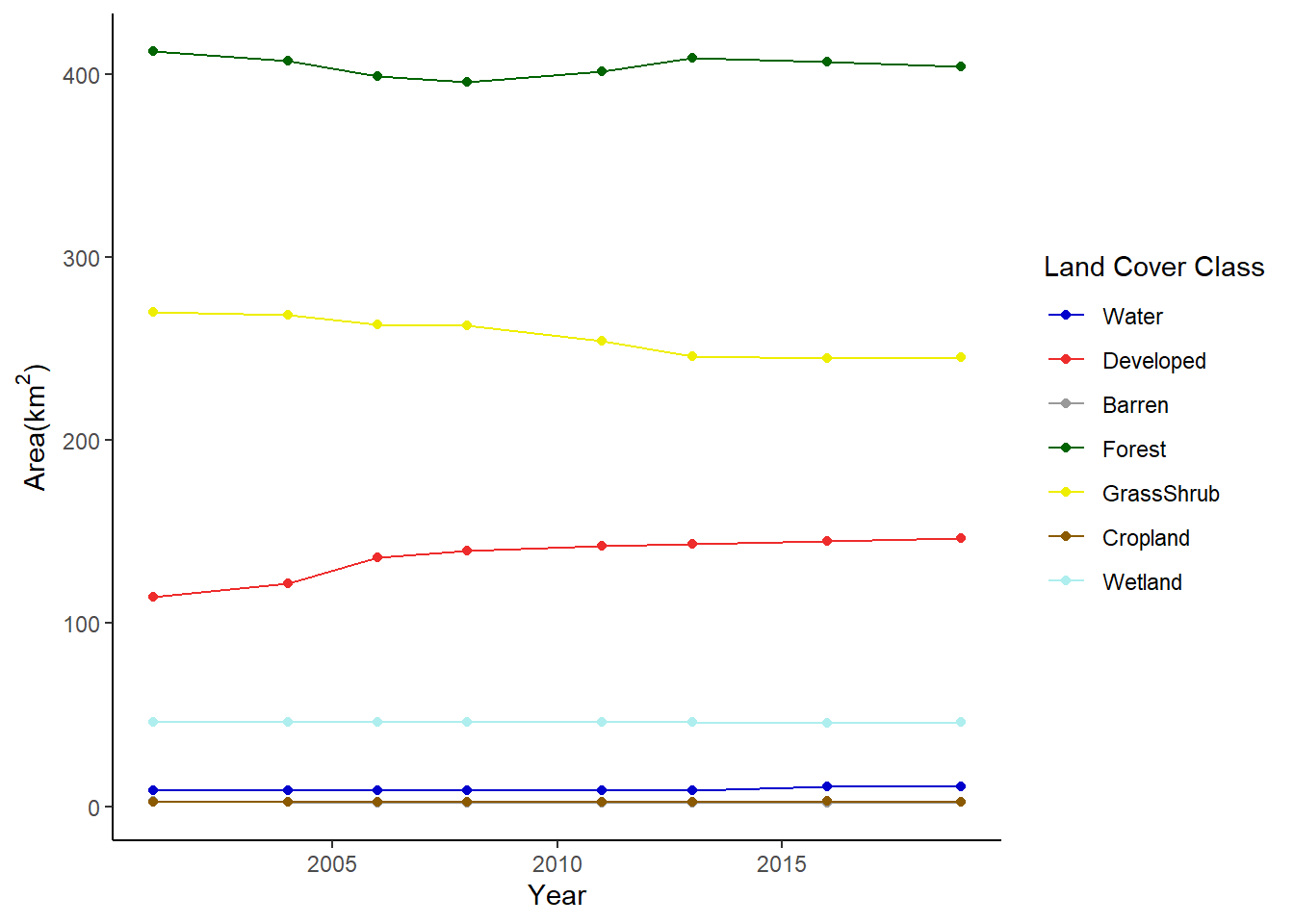
FIGURE 7.10: Change in area of land cover classes in Walton County displayed as a line graph.
Another way to graph the changes is using facet_wrap() to create a separate subplot for each land cover class (Figure 7.11).
ggplot(data = nlcd_chg) +
  geom_line(aes(x = year, y = km2)) +
  facet_wrap(facets = vars(class), ncol = 4) +
  labs(x = "Year", y = expression("Area(km"^2*")")) +
  theme_bw()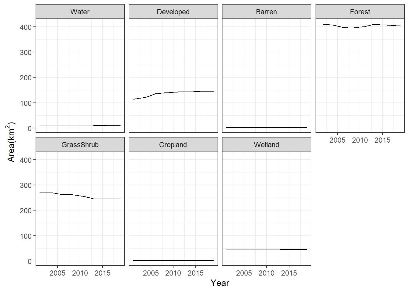
FIGURE 7.11: Change in area of land cover classes in Walton County displayed as a faceted line graph.
In both of the previous graphs, it is very difficult to see the trends of the less common land cover classes. To see their change more clearly, the scale of the y-axis can be changed to vary freely with the range of values for each class (Figure 7.12).
ggplot(data = nlcd_chg) +
  geom_line(aes(x = year, y = km2)) +
  facet_wrap(facets = vars(class),
             scales = "free_y",
             ncol = 4) +
  labs(x = "Year", y = expression("Area(km"^2*")")) +
  theme_bw()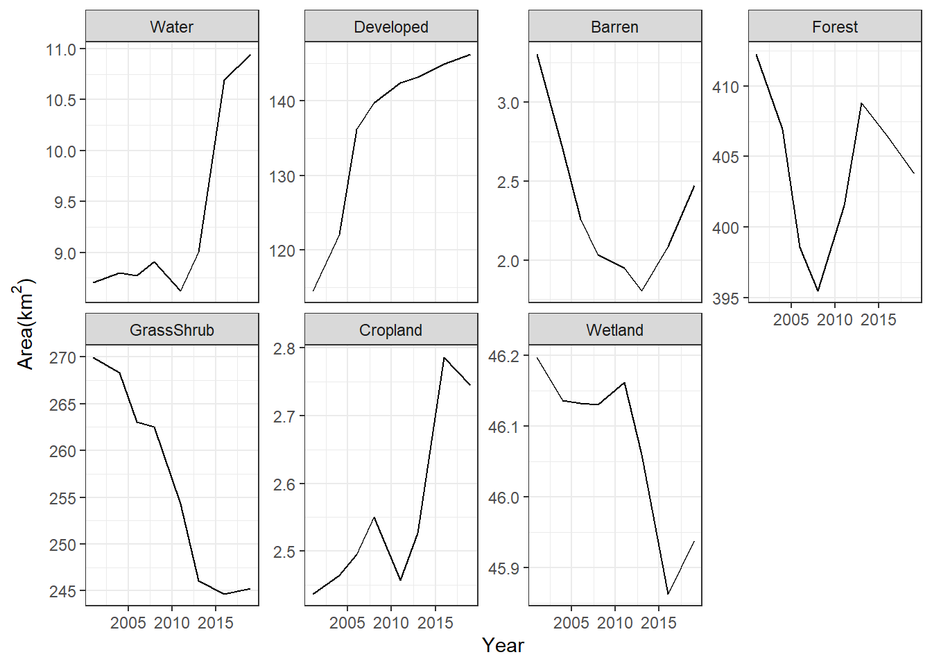
FIGURE 7.12: Change in area of land cover classes in Walton County displayed as a faceted line graph with free scales on the y-axis.
7.5 Land Cover Transition Matrices
Another way to quantify land cover change between two years is through a transition matrix. Generating the transition matrix requires a multilayer raster containing land cover layers for the beginning (2001) and end (2019) of the change period. The crosstab() function is then used to calculate the transition values. This function outputs the results as a table object, which is then converted to a tibble (data frame) object.
changeras <- c(nlcd_rc_msk[["2001"]],
               nlcd_rc_msk[["2019"]])
changeout <- crosstab(changeras)
class(changeout)
## [1] "xtabs" "table"
changedf <- as_tibble(changeout)
class(changedf)
## [1] "tbl_df"     "tbl"        "data.frame"
The data frame has one row for each combintation of 2001 and 2019 land cover classes. The columns with the 2001 and 2019 class codes have an X added to their names because column names cannot begin with a number. The Freq column contains the pixel counts for each combination of 2001 and 2019 land cover classes.
changedf
## # A tibble: 49 × 3
##    X2001 X2019      n
##    <chr> <chr>  <int>
##  1 1     1       9136
##  2 2     1          0
##  3 3     1         49
##  4 4     1       2055
##  5 5     1        350
##  6 6     1          0
##  7 7     1        575
##  8 1     2         58
##  9 2     2     127218
## 10 3     2       1428
## # … with 39 more rows
To make the output easier to work with, the data frame is modified using dplyr functions. The class codes are converted to factors and labeled with the abbreviated class names. A combintation of group_by() and mutate() (instead of summarize()) is used to compute the total area of each class in 2001. When sum() and other summary functions are used inside of the mutate() function after the data have been grouped, they return one value for each row in the data frame instead of one value per group. Then, the area of each transition is computed as a percentage of the 2001 area of each land cover class.
shortnames <- c("Wat",
                "Dev",
                "Bare",
                "For",
                "Grass",
                "Crop",
                "Wet")

changedf <- changedf %>%
  mutate(X2001 = factor(X2001,
                        levels = 1:7,
                        labels = shortnames),
         X2019 = factor(X2019,
                        levels = 1:7,
                        labels = shortnames),
         ha = n * 900/10000) %>%
  group_by(X2001) %>%
  mutate(tot2001 = sum(ha),
         perc = 100 * ha / tot2001)

changedf
## # A tibble: 49 × 6
## # Groups:   X2001 [7]
##    X2001 X2019      n       ha tot2001    perc
##    <fct> <fct>  <int>    <dbl>   <dbl>   <dbl>
##  1 Wat   Wat     9136   822.      870.  94.5
##  2 Dev   Wat        0     0     11450.   0
##  3 Bare  Wat       49     4.41    331.   1.33
##  4 For   Wat     2055   185.    41227.   0.449
##  5 Grass Wat      350    31.5   26999.   0.117
##  6 Crop  Wat        0     0       244.   0
##  7 Wet   Wat      575    51.8    4620.   1.12
##  8 Wat   Dev       58     5.22    870.   0.600
##  9 Dev   Dev   127218 11450.    11450. 100
## 10 Bare  Dev     1428   129.      331.  38.9
## # … with 39 more rows
These transitions are often displayed as a change matrix. This is an n x n matrix, where n is the number of land cover classes (Table 7.1).
changemat <- matrix(changedf$ha,
                    nrow = 7,
                    ncol = 7)
rownames(changemat) <- shortnames
colnames(changemat) <- shortnames| Wat | Dev | Bare | For | Grass | Crop | Wet | |
|---|---|---|---|---|---|---|---|
| Wat | 822.2 | 5.2 | 0.4 | 15.3 | 6.5 | 0.0 | 20.6 |
| Dev | 0.0 | 11449.6 | 0.0 | 0.0 | 0.0 | 0.0 | 0.0 |
| Bare | 4.4 | 128.5 | 159.7 | 28.0 | 9.8 | 0.0 | 0.3 |
| For | 184.9 | 1606.2 | 45.7 | 36915.0 | 2463.1 | 0.6 | 11.0 |
| Grass | 31.5 | 1410.6 | 40.9 | 3419.9 | 22040.6 | 48.7 | 6.5 |
| Crop | 0.0 | 18.4 | 0.0 | 0.0 | 0.0 | 225.2 | 0.1 |
| Wet | 51.8 | 6.9 | 0.7 | 1.4 | 3.7 | 0.0 | 4555.4 |
In this example, the 2001 classes are displayed as rows, and the 2019 classes are displayed as columns. For a particular class in 2001 (row), the numbers in each column show how much area of that class has transitioned to the other land cover classes.
When interpreting a change matrix, note that the numbers along the diagonal from upper left to lower right represent cells that did not change, including water cells that remained water, developed cells that remained developed, etc. Calculating the total of each row will provide the area of each class in 2001, and the total of each column will provide the area of each class in 2019.
It is also useful to generate the transition matrix with the percentage of each 2001 class that changed to each 2019 class (Table 7.2).
percmat <- matrix(changedf$perc,
                  nrow = 7,
                  ncol = 7)
rownames(percmat) <- shortnames
colnames(percmat) <- shortnames| Wat | Dev | Bare | For | Grass | Crop | Wet | |
|---|---|---|---|---|---|---|---|
| Wat | 94.5 | 0.6 | 0.0 | 1.8 | 0.7 | 0.0 | 2.4 |
| Dev | 0.0 | 100.0 | 0.0 | 0.0 | 0.0 | 0.0 | 0.0 |
| Bare | 1.3 | 38.9 | 48.3 | 8.5 | 3.0 | 0.0 | 0.1 |
| For | 0.4 | 3.9 | 0.1 | 89.5 | 6.0 | 0.0 | 0.0 |
| Grass | 0.1 | 5.2 | 0.2 | 12.7 | 81.6 | 0.2 | 0.0 |
| Crop | 0.0 | 7.5 | 0.0 | 0.0 | 0.0 | 92.4 | 0.0 |
| Wet | 1.1 | 0.2 | 0.0 | 0.0 | 0.1 | 0.0 | 98.6 |
Using the original data frame, the data in the change matrix can be plotted as a grouped barchart. Each group represents a 2001 land cover class, and each bar within a group represents a 2019 land cover class (Figure 7.13).
ggplot(data = changedf) +
  geom_bar(aes(x = X2001,
               y = ha,
               group = X2019,
               fill = X2019),
           color = "black",
           position = "dodge",
           stat = "identity") +
  scale_fill_manual(name = "2019 Land Cover", values = newcols) +
  labs(x = "2001 Land Cover",
       y = expression("Area(km"^2*")")) +
  theme_bw() +
  theme(legend.position="bottom")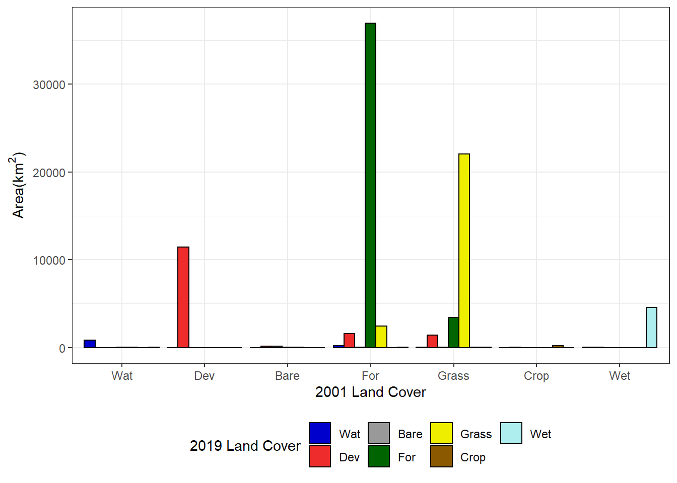
FIGURE 7.13: Area of each 2001 land cover class changing to each 2019 land cover class.
Plotting change as percent area (relative to the 2001 area of each land cover class) makes it easier to see the changes occurring in the less abundant classes (Figure 7.14).
ggplot(data = changedf) +
  geom_bar(aes(x = X2001,
               y = perc,
               group = X2019,
               fill = X2019),
           color = "black",
           position = "dodge",
           stat = "identity") +
  scale_fill_manual(name = "2019 Land Cover", values = newcols) +
  labs(x = "2001 Land Cover", y = "% Area") +
  theme_bw() +
  theme(legend.position="bottom")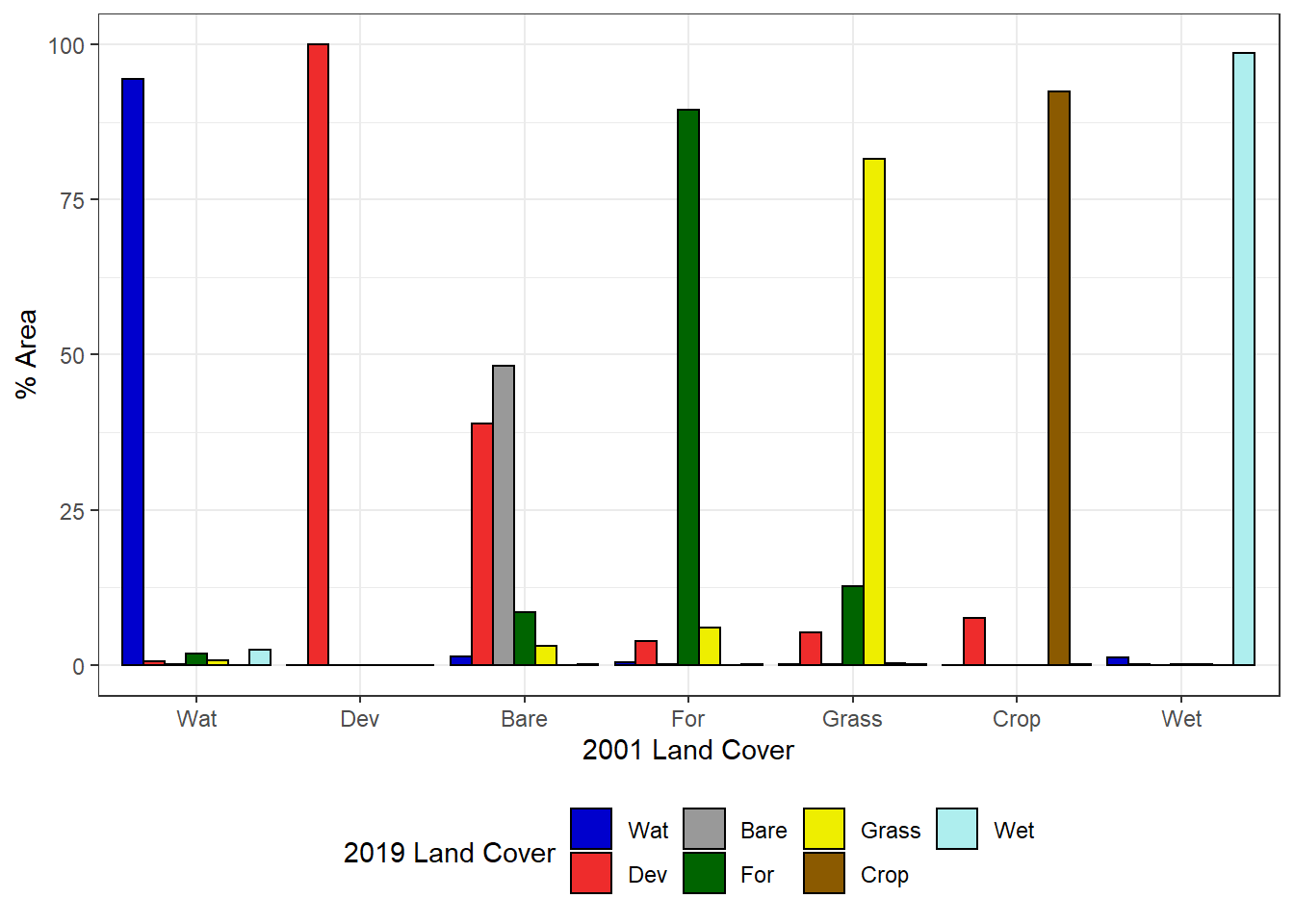
FIGURE 7.14: Percentage of each 2001 land cover class changing to each 2019 land cover class.
7.6 Mapping Specific Land Cover Changes
To better see where specific types of change are occurring, new classified data characterizing change events can be generated. The example will focus on changes in forest cover. Forest loss is classified as pixels with forest in 2001 and no forest in 2019, and forest gain is classified as pixels with no forest in 2001 and forest in 2019.
nlcd01_rc <- nlcd_rc[["2001"]]
nlcd19_rc <- nlcd_rc[["2019"]]
forloss <- nlcd01_rc == 4 & nlcd19_rc != 4
forgain <- nlcd01_rc != 4 & nlcd19_rc == 4
The forloss and forgain rasters contain binary variables that indicate where forest loss and forest gain occurred. Using a mathematical expression, they are combined into a single layer where 1 = no forest change, 2 = forest loss, and 3 = forest gain.
forchange <- 1 + forloss + forgain * 2This raster can be used to visualize the locations where forest cover has increased and decreased. Forests have been mostly lost in the northwest corner of the study area and mostly gained in the southeast corner, with a mixture of loss and gain in most other locations (Figure 7.15).
forchange_df <- rasterdf(forchange)

names_chg <- c("No Change",
               "Forest Loss",
               "Forest Gain")
cols_chg <- c("lightgrey",
              "red",
              "blue")

ggplot(forchange_df) +
  geom_raster(aes(x = x,
                  y = y,
                  fill = as.character(value))) +
  scale_fill_manual(name = "Land cover",
                    values = cols_chg,
                    labels = names_chg,
                    na.translate = FALSE) +
  coord_sf(expand = FALSE) +
  theme_void()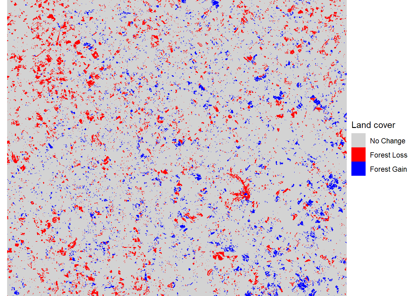
FIGURE 7.15: Forest loss and gain between 2001 and 2019.
7.7 Practice
Conduct focal analyses of forest land cover using 100 m, 500 m, 1000 m, and 2000 m circular window sizes. Display the maps of the results using a faceted plot.
Generate two Walton County change matrices, one from 2001-2008 and another from 2011-2019. Compare these results to assess whether land cover transitions have been consistent over time.
Generate a classified change map highlighting areas of gain and loss of the Grass/Shrub land cover class.